

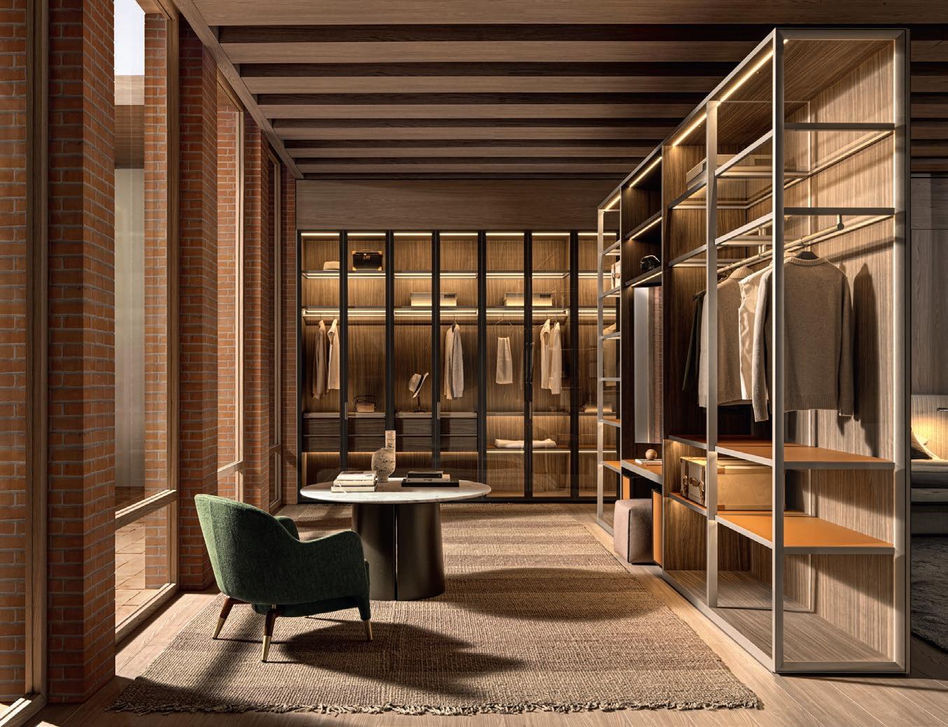
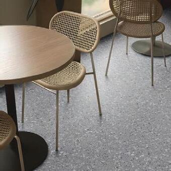
...herringbone oak floors in beautiful places.


From forest to floor
Hardwood Flooring, Cladding & Decking Manufacturers


...herringbone oak floors in beautiful places.
From forest to floor
Hardwood Flooring, Cladding & Decking Manufacturers
There’s something about Milan Design Week that defies explanation. Every year we say, “We’ll skip this one; there’s no way it can outdo the last”. Yet somehow, we find ourselves drawn back — seduced by the promise of passion, craftsmanship, and creation. Every year it delivers newness and nowness!
It’s a visceral, surreal experience – a whirlwind of people, events, products, and ideas, all colliding in a city that feels entirely transformed. The streets hum with creative electricity as hundreds and thousands of designers, architects, and visitors weave their way through stands and installations so meticulously curated that you’d swear you’re moving through a series of living art. And then there are the showrooms, from Moooi to Minotti, Molteni&C to Natuzzi, Gucci to Infinity Surfaces, Rugiano to Prada, Roche Bobois to Audi!
During the Salone, Milan is alive in a way no other city is. It feels as though fashion, architecture, art, and design are performing one long, heady conversation — and for a few precious days, you’re invited to be part of it. But still, I wonder, what is it that demands our return each year?
Is it the installations? The kind that meanders through your mind long after the fair ends.
The ones that shift your sense of space and story in ways you never expected.
I will never forget Aesop’s ‘The Second Skin’ installation: a masterclass in sensory storytelling, a guided tour through movement and contemporary dance – a magnifying glass held to the dermis and its design. Organic and pure, twisted and unexpected.
Or is it the creativity unleashed by new partnerships? Seeing film directors and architects collaborate on stands and collections with furniture brands, we were guided to the golden thread running through the Salone: design and narrative is at the heart of it all!
Or maybe it’s the sheer scale — the undeniable pulse of a global industry gathered in one place, fluently speaking one bold, beautiful language of design.
What makes the Salone so special? Maybe it’s this: who wouldn’t want to be part of the ultimate design conversation?

Timeless and luxurious flooring.
Smooth, versatile and hygienic.
Seamless indoor to outdoor flow.
Ideal for residential and hospitality.
Suitable for commercial and retail.


Impact and scratch-resistant.
Stain-resistant.
Slip-resistant.
Low maintenance and durable.
Eco-friendly and sustainable
100% UV stable and colour-fast.
Can be applied directly over tiles, eliminating grout lines.
Quick and neat installation by certified national applicators.
Available in 36 colours.
Available in 60 countries worldwide.
Interior designer Nicole Wrensch from Soda Custom spoke to Scape about the forecasts for luxury surfaces, an essential ingredient for design that evokes feeling — that’s capable of moving you. Nicole shared these sentiments after carefully scrutinising the clean, elegant grooves and imperceptible joints on a nearby Fossil slab: a piece from Arkèon, the brand new, designer collection by Infinity Surfaces for high-end spaces.
In your opinion, what makes truly great design?
For me, great design is achieved when you really know who you are. When you create a home or space that reflects you and your personality. It evokes that feeling within you. As an interior designer, I focus a lot on the mood of an environment which includes all the senses – believe it or not, we focus a lot on smell and sound too. You don’t want to walk into a Soda Custom place and be overwhelmed. You want to walk in and not feel overdressed nor underdressed. The overall experience must be relaxed and just feel good.

The Next Era of Designer Finishes Launches Inside the Infinity Surfaces Stand at the 2025 Salone del Mobile
With any design, where do you begin, and what are your go-to materials?
Floors and walls are great places to start. I really like wood because it’s soft, warm, and inviting. We love working with oak and travertine because they’re soft, a little masculine, but very contemporary and warm at the same time. For the walls, I would choose something more industrial or cold like a tile, marble, or engineered stone. When you mix engineered stone and wood, you don’t get a clinical, cold feeling.
When designing a home, where would you place engineered surfaces?
I would use it in the kitchen. You know things get a little bit messy, and engineered surfaces are amazing because it doesn’t scratch and it’s not porous, so it doesn’t stain like real marble. My favourite stone is the Fossil: the grooves are so beautiful. The floor tile meets the wall tile in large formats where you can barely see a joint, making the space look clean, elegant, and contemporary.
Your projects show such acute attention to finishings. What other details are essential for design perfection?
I’m very involved in the finishing process. What’s amazing about Infinity is that you get a 6 mm and a 12 mm. Certain slabs look like marble, but they’re engineered stone. So, if you want a marble floor and marble on the wall, it’s great to match the real marble to the engineered marble. That 6 mm allows you to make everything look integrated. And that’s an incredible design element – when everything looks like it was made for the space.
Which surface trends are standing out in the industry?
Beautiful tiles, that have been honed by hand, are everywhere and used in different ways – even on kitchen counters. People are edging away from the light and the neutral – instead, they’re going for moodier marbles that have more soul, that are a little bit darker, and have lots of movement. Darker travertines, viola with a pop of purple or a pop of red. Colour has been a big part of some of your projects too. I’m thinking about the iconic pink-and-green restaurant, Sonny and Irene, that Soda Custom designed in Seapoint. What was the inspiration for the material choices there?
The concept behind Sonny and Irene was a place for women to take their designer bags to for breakfast. We chose an architectural base of art deco and then we made it a little more contemporary.
"What’s amazing about Infinity is that you get a 6mm and a 12 mm. Certain slabs look like marble, others like natural stone. Either way, if you want to match a wall and floor surface, everything looks integrated."
Forging the contemporary and classical is also a theme in Infinity’s new collection, Arkèon. We turned to Fabrizio Coppete who opened up about the brand’s new direction that’s very quickly garnering global attraction – from the USA to South Africa to Korea.
What does ‘Arkèon’mean?
‘Arkèon’ is a Greek word meaning ‘the origin of matter and form’. The collection was conceived from a study; a deliberate inquiry into the essence of form and the precise curation of matter. During this show we are presenting three different concepts: Fossil, Plaster, and Sandstone.
“My favourite porcelain slab at the Infinity Surfaces stand is the Fossil: the grooves are so beautiful. You can barely see a joint which makes the space look so clean, so elegant, and so contemporary.”
A return to the classics! Yet there’s still something different and new about this particular collection.
The collection is a collaboration with a famous designer and architect, Giuseppe Bavuso. Together, we sought to articulate the perfect balance between technical precision and elegance. We really wanted to work with him in order to develop something new – something that was following the trend of luxury surfaces – in our way. As you can see from the booth, we are replicating and creating a very luxury environment where there is a good balance between rich colours and, let’s say, surfaces of plain colours which we are doing with the fossil, sandstone, and plaster. As you are familiar with our brand, Infinity is a company rich in colour. We are moving towards the direction of changing our vision to be more, let’s say, elegant and minimalist rather than to only offer colour.


“The collection was conceived from a deliberate inquiry into the essence of form and the precise curation of matter.”

I have to say in the Fossil collection, I love Row; the one with vertical lines next to the surface. Very elegant and very fancy.
The versatility of the collection speaks to the success Infinity Surfaces has had, don’t you think?
The mission is to be everywhere. That is the mission – to succeed as a floor and wall application, as well as on countertops and feature walls. We are trying with different thicknesses to be in every application – from villas to hotels and resorts. Using this material for façades is a good solution: first of all, these are durable materials that can stay on the façade forever. It does not change colour, which is the problem you have with natural material. Though natural materials are beautiful, you must face the issues that come with it. We are doing many façade projects all over the world from Korea to the US to Italy and… we are doing a great collaboration in South Africa. The brand being in South Africa, it makes us proud.
“…soft, a little bit masculine, but very contemporary and warm at the same time.”


“People are going for moodier materials that have more soul and are a little darker, like travertines.”
Rooted in Family Values, Molteni&C Honours Its Italian Heritage and Craftsmanship


An enduring legacy comes from a deep commitment to tradition. Molteni&C celebrates their heritage and Italian craftsmanship in their latest collection, presented at Milan Design Week. Taking inspiration from the 70s and 80s, the collection reimagines Molteni&C’s archival pieces in the modern era. Scape met with Giulia Molteni, Chief Marketing Officer at the Molteni Group and granddaughter of Angelo Molteni, the founder, to learn more about the family legacy.
Later on, we spoke to Giovanni Pivetta, the director of Peerutin Karol Architects, to discuss his perspective on great design.
Molteni&C has been around for nearly a century and has solidified its place in Italian design. What, in your view, defines the brand?
To give some background, for those who might not know, Molteni&C was founded 90 years ago in 1934. We started as a small company, created by my grandparents, and the focus was on craftsmanship: reproducing high-quality, classical furniture. In 1968, we had this big shift to the design sector. We were one of the first companies in Italy to found the Salone

We’re still family-owned though there’s a mix of external management and it being family-run. The family is the centre of the company, but we also have a big structure and an external CEO that has helped us a lot with the growth of Molteni&C.
I think the secret is maintaining a balance between innovation and tradition. For example, every year, we include a new addition to our offerings. Like today, we launched a new chair by Tobis Scarpa, which is from a past collection from 1973. But, with that, we also
“We have big values in our DNA like tradition, family, and innovation.”
del Mobile and turn production from classic to modern contemporary with the best architects who were outside of the family and outside of the company.
Today, we are the biggest privately-owned Italian group in furniture and design, and we are still family-run. So, we have big values in our DNA like tradition, family, and innovation. Innovation at Molteni is very important. We have a huge research and development department where we can explore new processes, new products, and new materials.
As a family business that’s been able to grow as a global leader in luxury design is a huge feat. What do you think is the secret in maintaining your reputation of being a family-led company while still having a huge presence in the commercial industry?
Yes, we’ve grown a lot. What started as a small family is now a much bigger ‘work’ family. We have 130 mono-branded stores in five continents, and we have 12 subsidiary companies.
add new contributors to expand the collection. We collaborate with many designers such as GamFratesi and Christophe Delcourt, along with Vincent Van Duysen who is our creative director. These additional perspectives allow us to innovate with new materials and new sustainable production processes.
As the brand continues to grow, what is your vision for the future of Molteni&C?
A lot of our focus going forward will be on expansion. There are a few countries where we don’t have a presence and where there’s a growing interest in Italian design. So, the aim there is to make Molteni more accessible to a wider audience. To highlight great Italian design and Italian heritage and share that story with the rest of the world. Through this, we uphold the memory of my grandfather, the founder of Molteni, and the values the company: innovation, fine craftsmanship, and great design.
We’re also looking to open up to other disciplines and to work through cultural collaborations to explore the different faces of Italian culture.
Architect and director of Peerutin Karol Architects, Giovanni Pivetta, joined the conversation. As an Italian designer now living and working in South Africa, Scape spoke to Giovanni to understand the intricacies of his design process and what defines robust, timeless design.
As an Italian living in South Africa, what makes Italian design so special and alluring to South African clientele?
I would say it’s our heritage. It goes back many centuries, and interestingly, it’s very multicultural, though people may not realise it. We have influences from the Arab world, from Nordic and European countries. We’re also surrounded by water, so there was a lot of movement throughout history. That cross-cultural exchange is reflective in Italian architecture, and that’s what makes it so incredible. I find contemporary Italian design can be a bit sterile sometimes. I prefer the warmer styles, and, in particular,
Italian Rationalism, which is minimal without being bland. This is exactly what I try to bring into my work at Peerutin Karol.
Milan is a kind of hub of creativity and craftsmanship. What do you think makes the city the perfect backdrop for celebrating this event?
You said it right; it is the hub. Milan is famous for being a very industrial city and evolving new ideas, especially nowadays where that comes along with technology. It’s cosmopolitan. It’s both old and new. It’s a blend of tradition and innovation. And that encompasses a lot of what Italian design is.
It’s interesting that you speak of technology and design. Is that a big interest of yours?
“The secret is keeping a balance between innovation and tradition.”
It is. It has to be. Technology is design. Especially nowadays because you evolve with design. Every single piece that you look at is about technology. It’s easy to be resistant to this change, to want to stick to convention, but technology isn’t an auxiliary to the industry – it informs and structures our practice.
This is a bit of a tricky question, but what inspires you to push the boundaries of design?


To me, it's actually not really tricky. I believe in simplicity. To quote one of my favourite artists: Bruno Munari says, ‘To complicate is easy; to simplify is difficult.’ I think about that a lot in my designs – focusing on simplicity and really allowing elements such as materiality and structure to shine on their own. It’s odd that the word simplicity, or simple, can sometimes be associated with ‘cheap’ or ‘in budget’. This perception is far from true: the entire thought process behind a minimalist design is not visible. As I said earlier, to simplify is not easy. What do you think will define the next movement in residential design? You were talking about how every decade has its mark. What do you think will be the next mark for, say, the 2030s?
The next movement will depend on the new lifestyle. Our lifestyle evolves so quickly that you can’t really know what’s going to happen. You have to let it take its course. I would say open spaces will still be the main element.
“To complicate is easy; to simplify is difficult.”
And environment will probably take a big step, especially in South Africa, and it has to be because that’s the evolution. You have to work with nature and protect nature. We’re heading there already.
Peerutin Karol has a unique, collaborative approach. How do you work together to create meaningful and memorable designs? At the end of the day, it’s really about the clients. We tailor every project, each with a unique design to meet our clients' needs.


We have four core partners: one of the founders, David [Peerutin], and I are on the design side, Tarryn [Cohen] is the managing director, and Henning [Van As] is the technical director. We have a very strong, balanced team. But for all of us, our focus is on good, simple, and functional designs, and of course, making our clients happy.


“I would say what makes Italian design special is our heritage.”

Every prodigy has an origin story. At Milan Design Week 2025, Natuzzi Italia unveiled its ‘Rooted in Harmony’ exhibition: a collection that pays homage to the brand’s Apulian heritage, a region known for its centuries-old architecture, clear blue-green waters, and rugged stone hills. The centrepiece of the collection, ‘Radice’, is an ode to the harmony between heritage and contemporary design. Scape met with Pasquale Junior Natuzzi for an exclusive conversation on authenticity and staying rooted. Later, South African designers from Ohkre Collective joined the conversation.
What is in the Natuzzi DNA?
We are really lovers, shapers, and crafters of comfort, right? If you think about it, comfort is not something we should be ashamed of. Comfort can be beautiful and functional.
Seven or eight years ago, I started this journey to bring a more collaborative design culture to Natuzzi. To show something unexpected. And it happened. Diversity is what we are pursuing because if you blend water and water, you end up having Natuzzi couches that all look the same.
What does excellent design entail?
I put emotions, I put narrative, I put authenticity into the relationship before anything else. In co-creating you need to trust the process, show respect for mutual diversity, and give your heart to it. Otherwise, the projects and products come out expressing a non-authentic feeling. Would you describe yourself a visionary?
Visionaries are gifted people, you know? I’m not sure if I’m gifted, but I’m definitely lucky because I inherited passion for this company… a hybrid between addiction and devotion.
What is the Natuzzi way of experiencing Italian design excellency?
For me, to continue the business with its natural and normal aesthetic would have been bor-
ing, but I didn’t just want change for the love of it. For me it was a change that had a very clear vision, which was to transform Natuzzi into a lifestyle brand within an ecosystem where we don’t just produce designs, but we shape inspirations, we shape emotions, we shape narratives and transform that into a very sophisticated presentation.
What personal inspiration drives your vision and the values of Natuzzi?
There is a quote from my father that I want to get tattooed. It’s a quote of his saying, ‘Figs in the basket’. It’s a narrative of a kid that goes out hunting in the morning, grasping for fruits in the forest. But he gets lost and goes back home. So, there’s no figs – and no fruit – in the basket, right?
It’s a very Machiavellian interpretation of life that shaped my behaviour in being 60% creative and 40% focused on deployment and organisational ideas. If you have a good idea, but not a great plan, then you will lose against the person with the stupid idea that’s executed it well.
Natuzzi has been in South Africa for 23 years. Nazih Mustapha, the brand’s representative, explained what makes the brand resonate in the furthest parts of the world. Why do you think the brand resonates with South Africans?
From my experience in South Africa, it’s so cosmopolitan and it’s always evolving. South Africans are, yes, inspired by their heritage – but they’re inspired by the world because there are many cultures in South Africa. It’s one of
Pasquale Junior Natuzzi on the Essence of Luxury Comfort
Seeking to understand the
South African designers Phillip Nel and Heinrich van Zyl from Ohkre Collective visited the Natuzzi showroom, seeking brands that resonate with their architectural language: curated and minimal, neutral and laid-back luxury. Like Natuzzi, their design practice is founded on a collaborative philosophy — and it’s precisely this value that led them to Italy, despite their work dominating the African context.
What makes Italian design so special?
Phillip: Italian design takes proportion into consideration. The ergonomics of the designs are well thought through. And the detailing is exquisite: small details, bigger details; it all works together.
What materialities and textures have you noticed at Milan Design Week?
Phillip: Earthy tones were prominent this year. A lot of travertine, a lot of deep brown, and rusty burnt oranges. It’s like a return to nature. Heinrich: There’s also a huge shift to softer curves, more organic shapes, and a big move back to the 70s design with oversized, modular, more flexible design.
What is Ohkre Collective's design philosophy?
Phillip: We're a collaborative platform of designers. We believe people come with a lot of good ideas. Every designer or person has a different opinion, and that, in the end, really
“I put emotions, I put narrative, I put authenticity into the co-design relationship before anything else.”
the most open-minded countries I have lived in. And they love design. They love beauty. So Natuzzi fits: as a company that has sold its product for over 60 years, you will find a comfortable Natuzzi couch whatever your likes and design preferences are.
elevates a design to become well thoughtthrough and unique.
Heinrich: Client identity is very important for the work that we do. We want to understand the client and how they live their lives. Something as simple as how they use the


kitchen – the living space becomes the backdrop to their everyday life so it’s important it functions well. When people work together, it brings a better end result.
How does your philosophy translate into architectural language across your projects?
Heinrich: A golden thread running through all of our projects is the neutral, laid-back luxury that still has warmth – warm tones but still keeping the space very curated and minimal. We really enjoy working with natural stone and bringing out different textures. I think you can do so much with stone: it’s such as sculptural element in kitchens and vanities, or feature walls.
Phillip: In interiors or architecture, I really like to incorporate steel elements, more natural bronzes: those beautiful details from raw materials. If not, a beautiful piece of marble and the diversity of stone is just as exciting. In residential architecture, what is your favourite room to design?
Phillip: The lounge. As a very curated space, you have the opportunity to put something together that speaks of who you are as a person. Whether it’s the artwork or furniture pieces like a coffee table. It’s always so fun to choose. You can really go wild with armchairs in a design and tie it all together with a nice neutral sofa that really balances it out. Natuzzi’s Infinity Sofa is quite quirky. With the right fabric it
could really be a conversational piece in a foyer or an informal lounge.
Heinrich: The kitchen space – not only does it hold potential with tactile finishes and joinery, it also forms an integral part of my daily routine where we come together as family and spend time together. They say the ‘kitchen is the heart of the home’. For me, designing for functionality and beauty once is exciting. What do you want the Ohkre Collective legacy to be?
Phillip: Creating a narrative through design identity. We play a role as architects in leading clients to good design. But there’s also the part where the client leads us to design that brings out their identity.
"I’m not sure if I’m gifted, but I’m definitely lucky because I inherited passion for this company...a hybrid between addiction and devotion."


"Earthy
tones were prominent this year. A lot of travertine, a lot of deep brown, and rusty burnt oranges. It’s like a return to nature."


Timeless elegance is crafted with people at its core. Fine craftsmanship and intentional design come front and centre in Rugiano’s well-treasured pieces. To uncover the heart and soul of Rugiano, Scape spoke to Nazih Mustapha at Milan Design Week to learn more about what makes Rugiano special and its appeal to South Africans. We were later joined by Rugiano’s art director Domenico (Dodo) De Palo and South African interior designer, Kelly Fischer, from ARRCC.
Over the years, Rugiano has established itself as the premium furniture brand both in Italy and abroad. In your opinion, what attracts people to Rugiano?
At Rugiano, everything is alive. And that comes with working with special people. Here, people work with the heart. When you are working with these very high-end products, you are working with the best designers to bring the best craftmanship. From the people making the furniture, to people designing the furniture, to the people in the office — this is a big family that really works together with passion to deliver the best to the world. And in the world of luxury, it’s about the product: good design with the purpose of making it last long Rugiano has grown popularity in South Africa. Where do you see these products working really well in South Africa?
The South African market is evolving all the time. And it’s very brand conscious. I saw a gap in South Africa with consumers who want highend brands, but they also want personality. And this is what Rugiano is; it has a strong personality, yet it is very modern and luxurious. When we first brought Rugiano to South Africa, we didn’t explain the story behind the brand. We simply presented the product to the community and they took to the brand almost instantly. The reaction we received from South Africa was truly amazing. We knew, then, that a brand like Rugiano was missing in the South African market. That’s why we are open-
ing two showrooms, one in Johannesburg and another in Cape Town, dedicated solely to this brand to enable the South Africans to see the products, to experience it, and to appreciate it. The art director of Rugiano joined the conversation to tell us more about their designs showcased at Milan Design Week.
Can you walk us through the collection displayed at Milan Design Week? What was the process of conceptualising these designs?
There’s a range of pieces here. We
“What makes Rugiano so special and unique is that everything is alive… Here, people work with the heart.”
have both indoor and outdoor furniture. A lot of these designs, you’ll see, are centred around the body. It’s round and it’s soft; it’s meant to feel like a hug. We wanted the sofas and chairs to shape the body. We also designed with comfort in mind. We have the Manta Chaise Longue, which is quite elongated and great for relaxing. That’s what all of our sofas and chairs are for. We’re always thinking about what people want; besides something that looks beautiful, they are also looking for comfort. It’s functional; it’s a piece that you will use. And you can see that they’re all quite sculptural. I don’t like straight lines. So, there’s this organic, dynamic feel to the pieces.
Regarding form and materiality, how do you design to highlight both the functional and structural appeal of Rugiano? Again, comfort and functionality are our main priority when it comes to choosing materials. And that goes hand-in-hand with the design. The Abbra sofa has soft foam and curves, so you don’t need cushions. The Nido chair has this weave-like structure, and the fabric is weather-proofed using strong, durable textiles. Across all of our products, to maintain the stylistic and elegant touch of Rugiano, we craft with luxurious fabrics in a sculptural form. Every element is intentional. It serves a purpose beyond aesthetics that extends to comfort, practicality, and function.
Similarly, South African interior design firm, ARRCC, curates homes that are centred around intimacy. Through designing residential, hospitality, and leisure interiors, the firm focuses on personality-driven designs that are exclusive but contextually relevant. Interior designer Kelly Fischer explains the impulse to design spaces that feel lived-in and reflect their clients’ tastes. Aware that Rugiano is expanding to a local market, she joined the conversation to give insight into the South African interior design landscape and the growing local luxury space.
What is ARRCC’s design philosophy and how does it relate to the finishes you ultimately choose for projects?


ARRCC’s philosophy is rooted in human-centric design. So, we pick finishes and materials that are personal for our clients and make the space engaging and feel like home. ARRCC has a distinctive design language that blends contemporary luxury with bold, African influences. How do you see South African interior design evolving in the global luxury space?
South Africa offers a unique perspective. We have designs that are rooted in nature and culture and soul. As the global market is seeking more connection between regions, the South African influence becomes more pivotal and our clients are seeking South African designers so that we can offer something unique to their projects.
Furniture also plays a pivotal role in shaping how an interior informs its personality or the emotion of a space. What do you ultimately want a homeowner to feel in their space?
We want them to feel at home. We want them to feel comfortable like it’s a space that they had a hand in creating. We want to make it seem as though there was never a designer involved, like the space has been curated over a long period of time and not like we just went and bought a catalogue of furniture. We’re always trying to tell the story of how our clients got to where they are in their lives and how they enjoy living in their space.

“This is a big family that really works together with passion to deliver the best to the world.”


As we end off Milan Design Week, what do you think makes this event, an event of the scale, so significant and exciting for designers?
It’s really one-of-a-kind. It brings together visionaries in the design industry, from very established brands and designers to those that are up-and-coming. And it also offers a platform for dialogue about new trends and how we can evolve design in a meaningful way.


Relive the Iconic Design Week Through the Eyes of Interior Designer Julia Day
Milan, my cherished city, harmoniously juxtaposes history, the present, and the future in design, particularly during the annual Design Week of the Salone del Mobile.
Having attended Salone del Mobile for three and a half decades, I have developed a profound connection to the city and its protagonists who gather annually to create an extraordinary design extravaganza.
Salone del Mobile, the exhibition around which the Design Week is centred, celebrates its 63rd edition, featuring 2100 exhibitors from various global locations. However, it is the streets of Milan that truly come alive during this week.
The exclusive Milanese experience
This year I stayed in the Porta Nuova district, an exemplary manifestation of Milan’s design prowess. Seamlessly integrating the past, present, and future, this district is named after the neoclassical gate constructed in 1810. It has transformed into a prominent high-tech and

international hub, home to Italy’s tallest building, the UniCredit Tower, contrasting with the residential vertical towers adorned with trees and vegetation known as Bosco Verticale.
The Salone del Mobile offers unique and magical landscapes that give visitors a glimpse into a very Milanese experience, often reserved for exclusive encounters. Milan’s cityscape boasts the magnificent Art Nouveau Palazzo Castiglioni and the 18th-century neoclassical Palazzo Bovara. These, and numerous other classical landmarks, provide the backdrop for the most spectacular activations during the week, juxtaposing the ancient with

the contemporary and evoking both the emotional and visual aspects of design.
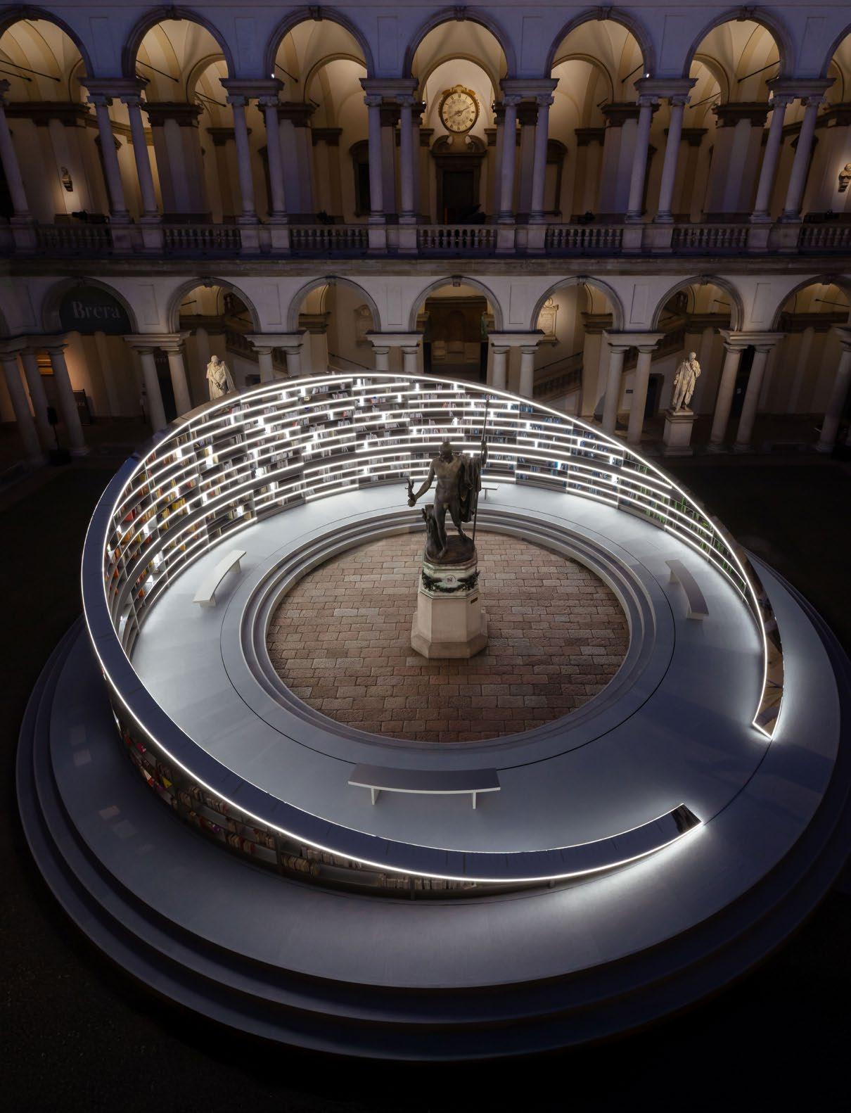
Illuminating ancient spaces
The historical, 17th-century courtyard of the Pinacoteca di Brera housed a revolving, kinetic sculpture crafted from over 2000 books. The exhibition ‘Library of Lights’ by British artist Es Devlin is a spectacular site, especially when visited at night: the sculpture is illuminated, throwing amazing shadows across the architecture.
Palazzo Bovara metamorphosised under the creative vision of Patricia Urquiola for Elle Decor, resulting in an experiential manifestation of ‘alchemy’ through ten distinct environments.
Beyond the city centre, the Alcova platform showcased remarkable emerging international and Italian talent within the magnificent modernist masterpiece Villa Borsani and the once pristine, but now decaying, 19th-century Villa Bagatti Velsecchi. Notably, some of Milan’s design showrooms
are housed in buildings that harmoniously blend the city’s industrial and classical pasts. Contemporary design blends with classic elements, and in some instances, high-end design is integrated into former industrial working spaces.
The De Padova showroom on Via Santa Cecilia occupies a former workspace of the renowned fashion duo Dolce & Gabbana. In my opinion, it is one of Milan’s most aesthetically pleasing spaces, characterised by abundant natural light emanating through skylights and large windows with interlocking spaces created by rough, whitewashed brick walls and modernist structures. The layout evokes the ambiance of a New York loft where timeless interior solutions seamlessly interact with the furnishings of De Padova, creating a constant dialogue between design, functionality, and emotion.
Another notable space that encapsulates Milan’s propensity for combining the past, present, and future is Nina Yashar’s Nulifar Depot.

"This year I stayed in the Porta Nuova district, an exemplary manifestation of Milan’s design prowess."

@juliaday_interiors
www.juliaday.co.za

Spanning 1500 square metres, this exhibition space draws inspiration from the La Scala Opera House. Founded in 1979, it is renowned for displaying vintage design masterpieces alongside contemporary pieces curated by Nina Yashar in this spectacular setting. I made a special point of spending a good few hours wandering through the space, admiring a fantastic array of Geo Ponti pieces amongst the latest offerings from artists and architects.
Espresso with a slice of Cova Sacher cake
There is no surviving a week of the Salone without a coffee and a pastry, which is very much part of the Milanese heritage, both past and
present. A must-visit destination on Via Monte Napoleone is Pasticceria Cova, established in 1817. As one of Milan’s oldest patisseries, it offers a delightful experience of savouring an espresso and a slice of the iconic Cova Sacher cake while observing the city’s elite.
It is also worth visiting Marchesi 1824, located on Via S. Maria al Porto. This family-owned patisserie, which opened in 1824, is renowned for its Panettone. The Prada Foundation has acquired and restored the establishment, adhering to the Milanese tradition of honouring the past while embracing the future. As a result, contemporary Marchesi stores can now be found in Milan and London.

This year’s Salone was a resounding success, and the city once again succeeded in impressing design enthusiasts by encapsulating the rich design history and a promising future for international architecture and design.

PATRICIA URQUIOLA

Launched

Patricia Urquiola creates durable, stylish design: minimalistic while still possessing a strong design identity. By combining premium features with first-class finishing, she sets a completely new standard in the medium price segment, making her design accessible.
The objects in the range pair simple, geometric forms with clear lines, creating a pared-down, classical aesthetic emanating warmth. ‘The design plays with differences in height, projections, and the overlapping of materials and textures which is also where the name ‘Balcoon’ comes from,’ explains Patricia Urquiola.
The above-counter basins create a sculptural focal point in the room that extends way beyond pure function. By placing round and oval washbasins on a square plinth, the designer safeguards an impressive architectural presence. Playing with two different levels is a feature across the entire collection – from the wallmounted washbasins, toilets, and bidets through to the furniture elements and bathtubs.
An earthy terracotta shade was chosen for the Balcoon ceramic objects, bringing their tactile materiality to the fore. ‘Clay Terra Matt is the central colour of the new collection: a shade that makes the ceramics look even more authentic and handmade,’ the designer explains. This also inspired the natural colour scheme for the bathroom furniture, from white to earthy brown shades and anthracite. The mineral consoles, available in three colour shades, add even more depth to the furniture while playful, textured accents complete the range.

Within the Balcoon washing area, storage solutions beneath the console are designed with an unusual, partly asymmetric arrangement of drawers and open shelves. The visual tension of the furniture elements is reinforced by the combination of contrasting colours. ‘The furniture is given a very special upgrade with consoles in a sophisticated terrazzo look and ribbed furniture fronts,’ says Patricia. She opted for plain décors in a range of colour gradations, excellent options in the medium price segment.
The Balcoon acrylic, built-in bathtubs feature not just one but two visually striking details: the oval, raised edge of the tub sitting on a seamless acrylic panel and an ergonomically-designed interior, both of which are easy to clean and invite you to indulge in a relaxing bathing experience.
Matching faucets round off the range: their cylindrical handles gently transition into the curved faucet body, making them pleasant to hold. Available in Chrome, Matt Black, and Stainless Steel, they complement the harmonious color spectrum flawlessly. With their resource-saving functions, Fresh Start and Minus Flow, saving energy and water has never been easier – and you don’t have to compromise on aesthetic.
Waterway House, Canal District, V&A Waterfront, Cape Town, 8002 T. +27 (0)21 419 5445 E. info@domum.co.za


Where Fashion and Architecture Collide
Over the years, architecture and fashion have grown in a symbiotic relationship. With both industries honouring materiality, form, and movement, these boundaries have become more porous: collaborations between architects and fashion designers celebrate these disciplines as artforms, in and of themselves.


There are many fashion designers who take cues from architecture. With structured garments that feel almost sculptural, prints that mirror mosaic, or textiles that play with light and movement, fashion and architecture’s unique exchange pushes the boundaries of disciplinary practice.
Sculptural configurations
In a recent collaboration between Young Urbanists and Design Week South Africa, one of Cape Town’s busiest streets was turned into a runway with a showcase by fashion designer Onesimo of One I Am.
‘Seeing these models walk around Bree Street, it was like these moving objects, like moving buildings, with the way they navigated through that space, and I could see my garments as a kind of armour,’ Onesimo reflects on the showcase. ‘I’ve always thought of myself as a fashion artist,’ he explains. His pieces are sculpturally driven, blurring the lines between fashion, art, and architecture.
Onesimo draws on his Xhosa heritage in his work, particularly Umbhaco, which is traditional attire that has a strong sculptural silhouette that he then reconfigures into his work. In this way, Onesimo echoes the sentiments of South African architect, Johannes Berry, who says, ‘work that does not naturalize the structures of culture — and thus reconfigures them — asks to be understood not in terms of what it looks like, but in terms of what it means. If a work fails to do this, it is no longer architecture or fashion, but merely buildings or a garment.’
For internationally renowned fashion designer, Sindiso Khumalo, materials inform her design practice and storytelling. Having studied and worked in architecture, Sindiso designed her newly launched flagship store to be centred around her deep connection to materials and textiles.
‘All the elements that I think about when I’m making a garment sort of came into fruition when I was making the store,’ Sindiso explains, describing her approach to designing her flagship store. She wove sustainable approaches into the layout of the space, ‘All the conversations the brand has been having in terms of working with waste, making and remaking, and reimagining waste have also come back into the shop itself.’
She worked with local designers such as Dokter and Misses, ARRANGE Studio, and Wunders to capture the story of South African design, highlighting its focus on sustainability, craftsmanship, and innovation.

“These collaborations showcase how disciplines can work together to create pieces that are rich in meaningful storytelling.”

Storytelling as utility
‘Architecture and fashion, unlike the arts, carry a functional value, and unlike utility, carry an expressive value. This mediation between the real and the representational offers a unique position to these works and shapes how they relate to us,’ says Johannes.
This blending of industries showcases how disciplines can work together to create work that is rich in meaningful storytelling. To create across disciplines, where art exists at these intersections, is an act of enriching our understanding of the role art and architecture play in society and culture. They demonstrate that, ultimately, architecture and fashion form two parts of the same artistic practice.

In collaboration between Namu Ceramics Photography and styling by Wijdan Hendricks www.studiolloyd.com


For Nicole Nomsa Moyo, the Cultural Evolution of Design Is Limitless
This time last year, Nicole checked in 18 boxes of luggage from Pretoria to Miami – all filled with larger-than-human-sized jewellery beaded by over 100 Ndebele women. The earrings would later hang from trees, luring people to look up and long to touch them. The artwork, just like Nicole, is well acquainted with migration. Having lived in Zimbabwe, South Africa, Canada, and now, the United States, Nicole produces African design that is authentic to her cultural evolution. ‘When I bring things across borders, they transform in the process,’ Nicole says, describing the journey of Pearl Jam, her public art installation inspired by Ndebele jewellery, currently on display in Miami.


“As much as her design revives African it is an intentional form of cultural exchange: invitation to share in familiarity and


It's African – and it’s not
Although Nicole dreams of having an African design district, she won a commission with the renowned Miami Design District where she now presents her work. Here, she introduces the story of Ndebele beading with her exhibition affectionately called ‘A Love Letter to Ndebele Women’ featuring a hands-on beading workshop. Both Ndebele beading and jewellery are connected to womanhood, with its patterns marking key transitions in a woman’s life. In preserving its significance in a new setting, Nicole partakes in what she calls ‘cultural sustainability’: a reimagining of old traditions that conserves knowledge and suggests new possibilities.
When asked about placing something so connected to Africa in Miami, Nicole contends that the work’s cross-continental character demonstrates the unboundedness of African design – not limited to a geography, but rather a dialogue that deserves global engagement. She says, ‘It’s a way of expanding the conversation, asking: what does it mean for African cultural expression to exist
in new geographies? How do we honour tradition while allowing it to evolve and engage with the world?’
The bench – mimicking a deconstructed Ndebele necklace – is placed below the trees. It is intentionally designed as a place for people to sit, pause, and admire the earrings in the tree. When people want to touch the earrings, far out of their reach, she reprimands them: ‘No one touches the earrings on your ears. They’re precious.’ Nicole’s design brings a constant reflection of self, through the other – be it a tree or the colours of a new culture. As much as her design revives African authenticity, it is an intentional form of cultural exchange: children and adults are drawn to the bright colours; an invitation to share in familiarity and foreignness. ‘Sometimes, we’re just so attached to our designs. But I’m more interested in how other people are attached to the design,’ Nicole reflects. The Ndebele-inspired installation prompts the discovery of familiarity amongst the unknown.
Thinking in scales
Nicole rejects disciplinary limitations as an architect, urban designer, and artist – or, as she describes herself, a rulebreaker. Her process reflects the belief that architecture is a multidisciplinary art: like a filmmaker, Nicole approaches the design project as a sequence of moments, curating the user’s experience. It begins with storyboarding: blank squares are used to sketch and plot the building’s transformation.
To understand form and scale, one must inherently borrow from alternative knowledge systems. Take light, neurology, and sculpting, by way of example – each is networked to architecture in uncanny ways. For Nicole, a small detail in a piece of jewellery can relate to broader patterns of urban design. Her own practice, G.U.D (Good Urban Design), is founded on the limitless potential of cross-disciplinary practice and her signature talent – storytelling. Narrative proliferates the research phase, an interrogation of history and lived experiences. Modelmaking, digital iterations, and prototyping follow, scene after scene, in a spontaneous process. ‘What does the design want to be?’ she asks. This is the question she returns to – allowing the design to lead, to tell its story.

Nicole Nomsa Moyo


www.dokterandmisses.com
Architect Robert Silke Whimsically
Re-writes ‘High-rise’ in Cape Town

High-rise, urban buildings conjure the image of grey, monotonous pieces –distasteful, glass-concrete blocks obtruding the skies. But Robert Silke’s surrealistlike forms are turning Cape Town’s densest cityscape into a whimsical fantasy.
Words by Sameeah Ahmed-Arai

The Flamingo is a playful sculpture: teasing you with its name (no, the building is not pink – it’s white), its odd anatomy, and radical angles. Liberated from the need for parking space, the building could shift to create a series of columns protruding at 45-degree angles. Like many of Robert Silke’s high-rise apartments and hotels, the story begins rather unromantically: scheduling dimensions within the parameters of the site and financial requirements – a challenge this architect is all too ready for. ‘If you can just somehow be excited by the constraints, you can have fun with the project,’ he says. Infusing personality into these lifeless forms, Robert must ask: ‘How much of your own whimsy can you inject?’


“Robert sees himself as an ‘applied artist’ that meets financial demands with personality.”
On the periphery
It began with the unhinged: satyrs, spinsters, and fairytale characters from Robert’s life in Holyrood, an art deco studio apartment complex in Cape Town’s CBD. These personalities were featured in his 2009 mockumentary The Satyr of Springbok Heights, each containing a little bit of himself and the realities of life in Holyrood. Every character was based on a real person, with all of them being ‘fringe outsiders’ and (proud) ‘oddballs on the periphery of society’.
The narrow apartment block was designed by Cedric Melbourne Sherlock in 1939 and, according to Robert, houses an entire society inside – one that is characterised by solitude and survival. The architecture itself is responsible for this, thanks to its cramped space and studio-only offering that induces lonely living, ‘All the bachelor flats face the front; they’re a little bit blinkered and introverted. You’re not aware of your neighbours.’ One of those bachelor flats is his own: during his upper years of architecture school, Robert moved into his first ever apartment in Holyrood where he would continue to live for 20 years. This would also mark the original inspiration behind his affinity for unusual studio apartments and aparthotels.
‘I've just been fascinated with the way that people use hotels and the way people live,’ Robert explains. In bringing peripheral living to the city centre, these playful, sometimes outrageous, designs offer a new path to urban living – unserious, fun, and far from ordinary.
As developments in Cape Town continue to soar, the competition to design better buildings supports a more creative property development industry. Robert sees himself as an ‘applied artist’ that meets financial demands with personality, beginning the design process by addressing the most basic necessities such as toilets and taps that are uncreative and functional. Working within economic constraints, one must channel creativity, and as a result, the buildings are quite close to art. Unintentionally, too: ‘It's just by accepting the limits of our powers.’ Robert’s high-rise apartments are becoming more and more popular as his ‘handwriting’ (as a fellow architect once described it) is now all over the city. Aside from The Flamingo, his newer works like the Tropicana aparthotel, Dolce Vita (under construction), and Spindle (in planning) follow a similar pattern of heavily curved forms next to nautical, round windows that, together, form a graceful, high-rise build.

"These new arrivals in the city centre bring playful, sometimes outrageous, designs, offering a new path to urban living – unserious, fun, and far from ordinary.”

Robert Silke, Founder @robertlaszlosilke www.robertsilke.com

But some are more radical than the rest: at Tropicana, a series of vacation flats, the rooms really are pastel pink and blue. Its visitors may well appreciate an eccentrically coloured room that allows them a ‘holiday from their taste’. It’s theatrical and memorable, a high-end Wes Anderson abode, touched by surreal moments: like the arched window to the city, set at the end of the rooftop pool and shaded by a modern, squared-off cave. Each hotel room is a compressed, 25-metre-squared absorption into a greater fantasy. For the interiors, Dokter and Misses designed bespoke pieces: strelitzia lights, bulky-yet-graceful armchairs whose curved shapes reflects the smooth bends of the building, and malt beds raised on multi-coloured blocks.


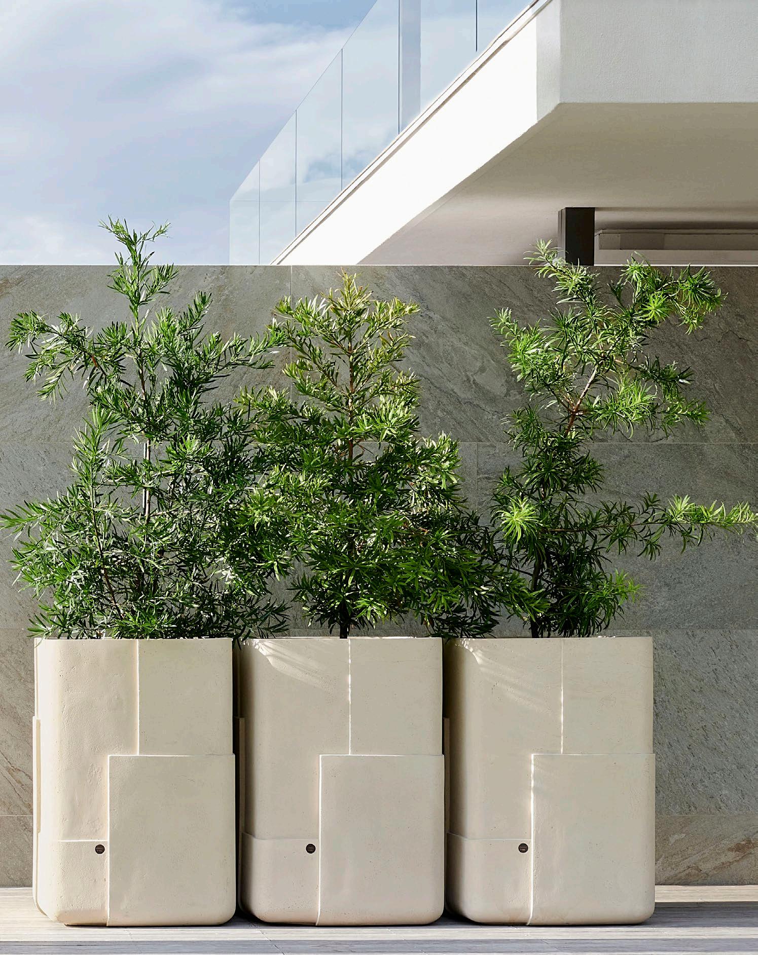
Determined to elevate the status of planters, Indigenus collaborates with top local and international designers such as Sebastian Herkner and Yabu Pushelberg to create the most exquisite planters. Founded by Peter van der Post in 2014, the Cape Town-based brand has distributors worldwide.
The planters are lightweight and easy to manoeuvre; their carefully scaled designs complement the finest furniture and décor in interior or exterior spaces. Clever drainage systems and softtouch feet are designed to protect luxurious carpets and high-end flooring.
In handcrafting the planters and sourcing all materials sustainably, Indigenus’ craftsmanship is in a league of its own. Each range of planters is unique and demonstrates the impact of beautifully sculpted planters on architecture and landscapes.


With stylish, timeless appeal and impressive sustainability credentials - the enduring hues and textures of clay brick are low maintenance and look beautiful for a lifetime.
CBASA represents clay brick & paver manufacturers across Southern Africa and drives inclusive, sustainable practices in the industry. We inspire energy-efficient, contemporary architecture and paving that supports our local producers, landscapers and architects.
Free technical and construction guides for clay bricks & pavers at www.claybrick.org

Yaniv Chen on Creating Timeless Spaces That Evoke Emotion and Disrupt the Perfect

Between the gothic echoes of Turin and the modernist pulse of Cape Town, Yaniv Chen, founder of Master Studio and designer at Lemon, builds spaces where beauty does not shy away from imperfection. His work deliberately disrupts the ‘too perfect’ — adding the unexpected to create interiors that are not just designed but felt. While developers increasingly hide behind what he calls ‘cop-out minimalism’ where some designers churn out sanitised spaces for profit, Yaniv’s browser tabs evidence his dive into medieval architecture references as he mines 18th-century material archives for authenticity.
Yaniv Chen, Founder
www.masterinteriorarchitecture.com

With new collections debuting at Salone del Mobile 2025 and the completion of a Cape Winelands estate later in the year, Yaniv continues to redefine design as a deeply emotional experience — one that challenges the commonplace and invites something far more profound. We caught up with him to discuss imperfection, the emotional power of design, and what it means to create sacred spaces.
My furniture pieces are designed with very little ego. They are created to fill a void in a room rather than to draw attention. They are soft, gentle, and kind. I think that is what they would say about me. However, this is only one side of my personality, and I choose to activate that side when designing furniture.
You design both furniture and interiors. Which medium gives you the most immediate emotional satisfaction, and which rewards you in slower, more subtle ways?
Neither. The satisfaction comes much later. The feeling that runs through you when you know you’ve solved something — created something that isn’t derivative and hasn’t existed before. The moment you create a new world, you transport people into the rare intermingling of the past, present, and future. This feeling is only achieved through time and immense thought, both practically and emotionally.

How do you approach materiality to achieve a sense of familiarity and timelessness?
I always choose local materials that were used from the late 1600s to the late 1800s. This was before we began mass importing what I believe to be unnecessary materials.
What are some unexpected ways you’ve designed for emotion?
I find beauty in darkness. I am inspired by haunted houses, eeriness, and music. A quietness that’s a little too quiet, where it becomes somewhat serene and somewhat unnerving. I like this type of interplay.
How do you approach imperfection in your work?
When discussing imperfection, I refer to the tension between ugly and beautiful — the tension between a revolutionary choice of colour, which can either be a disaster or a triumph. Often, I will look at an interior render for a project and tell my team it’s too pretty, too perfect. I then add something garish, something obscure, or something that completely juxtaposes the design direction. This offsets it and brings it to life. If there is no juxtaposition and imperfection, everything becomes flat.


You have studios in both Cape Town and Turin, two cities with vastly different cultural and architectural DNA. How does working between these two places influence your approach to design, and do you find yourself drawn to the tensions — or the harmonies — between them?
I am currently spending time equally between the two. I am designing a hotel and wine estate in South Africa. I have been designing them from Turin, which has allowed me to capture African design through a European lens. I’ve been able to work with historical European detailing and translate it into an African, placespecific context. Europe, and Turin specifically, has brought me back to the beauty and intricacy of ornamentation, whether it’s cornicing, joinery detailing, or fabrics. I believe this is lacking in contemporary design globally, but especially in Cape Town. Developers are using ‘minimalism’ as a cop-out to save money; designers and architects are using it as a means of working faster, making more money, and doing more projects. I’ve vacillated a bit, but it always comes back to Turin and its historical architecture, bringing me a new approach to design.
Are there any architectural influences you’re exploring currently, and can you tell us a bit about these?
They vary from day to day; however, Gothic and medieval architecture are currently open in many tabs.
Lemon’s process involves ‘delving into archives.’ Which obscure influence has most profoundly shaped a recent design?
Esoteric symbols and places have been some of the most abstract inspirations I’ve worked with.
Do you think nostalgia plays an active role in how people experience modern interiors and furniture?
I don’t. I feel this needs to change.
What does the term ‘sacred’ mean in the context of your interior design work, and how do you ensure a space feels sacred without being precious?
A sacred space is one designed specifically for the client. The focus shifts to them. It’s a space where my ego takes a back seat, and I become an extension of the client’s needs. The word ‘sacred’ goes beyond design. ‘Designed’ spaces feel precious. Sacred spaces create an emotional link between the place and the people that inhabit them.


Photography by Paris Brummer www.spectrummirror.com
www.molteni.it

The Rationalist Spirit of Rome at the EDITION Hotel
Stepping into the hotel’s symmetrical centre feels like an Alice Through the Looking Glass moment — like falling through the rabbit hole! I am instantly transported to another world.

Words by Anji Connell
In a city where every corner resonates with tales of emperors, artists, and time-honoured traditions, the Rome EDITION is a luxurious, urban retreat that fuses contemporary style with rich Roman heritage. Heralding the brand’s first foray into Italy, EDITION repurposed a 1940s Banco di Roma building in the historical Esposizione Universale Roma district known for its impressive Rationalist architecture. This district is only minutes away from the city’s iconic architectural wonders, including the high-end street Via Veneto which was made famous by the 1960 film La Dolce Vita – director Federico Fellini’s biting satire on Roman ‘sophisticates’ and Italian urbanity.
The building’s flawless symmetrical façade, true to the Rationalist sensibility, emerges from a proliferation of luxuriant foliage. A grand central entrance, adorned with subtle cornicing, is flanked by large metal-framed windows and softened with an abundance of sweet-smelling jasmine, gracefully draped over the façade.
The centre of the hotel is in complete harmony with the building’s architecture: a voluminous, expansive room, bathed in light, radiates a meticulously curated space with understated elegance. Crisp travertine and white linen, spread over large sofas, contrast with bold, saturated hues. Together, they each inject personality and warmth into the space. Vibrant, emerald green velvet drapes, sculpted into perfectly measured folds, echo the outdoor foliage. They hang from the soaring ceiling, strategically lit by discreet floor lighting.
Philippe Starck’s signature Rosy Angelis tripod-legged floor lamps are placed for maximum impact, casting a diffused light through lightweight fabric shades. A singular zing of orange blasts from a snooker table, adding a playful touch. Another EDITION signifier, a Salvador Dali Leda chair, stands nearby. The proportionally magnificent room has a gender-neutral aesthetic fostering an inclusive ambience – bold, opulent, yet welcoming.

As the saying goes, ‘It’s all in the details’.
Paying attention to the small, often overlooked, elements elevates a design, making it more refined. As my eyes dart around, I catch tantalising glimpses of the spaces leading off the lobby. I’m excited for the discoveries that await: electric Yves Klein blue, followed by fresh forest green in the restaurant, and the deep, moody red in the Punch Room. Next, the Jade Bar is a jewel box of a room. True to its name, antique Jade marble is aglow with shiny golden accents, complemented by sculptural pieces inspired by artist Jeff Koons. EDITION’s masterful use of bold hues is cleverly used to define areas within the space, enrich the overall ambience, evoke specific emotions, and create an atmosphere encouraging social interaction.


The guest rooms and suites have a calming white-on-white aesthetic with walnut accents. Playful light floods through the sheer draping, bringing the rooms to life with the ever-changing light dancing across surfaces. The rooms look over the majestic Church of San Nicola and over the red rooftops of city streets.
The rooftop terrace does not disappoint; this crowning glory is a playground screaming, ‘Chill, please!’ Relaxing here with a cocktail is de rigueur! Just kick back and take in the stunning, unobstructed views of the city skyline while you enjoy a little il dolce far niente — the sweetness of doing nothing.
The ultimate question: Is this just a ‘design driven’ hotel?
Is the hotel merely ‘style over substance’? For me, the answer is a resounding no.
Buildings should make you feel something — and not only does the Rome EDITION look fantastic, but it also makes you feel fantastic; it’s uplifting and offers everything you might need, and more, for a city break. Buildings need both a human-centric approach and a focus on sensorial design — and the Rome EDITION paves the way! In the words of the architect Stephen Gardiner, ‘Good buildings come from good people, and all problems are solved by good design’.


Anji Connell, Interior Architect and Writer
@anjiconnell_acidplus
www.anjiconnellinteriordesign.com
Steep slopes bring many risks: for you and your property. Nestled in the scenic town of Dundee (KZN), a property’s embankment faced multiple pressures: erosion risks, a history of repetitive failures, mass slides, and rolling boulders – all threatening the embankment’s structural integrity.
To ensure long-term stability, Gabion Baskets offered expert engineering and practical geotechnical solutions delivered by a dedicated, expert team committed to sustainable solutions.
At the property in Dundee, there were several reasons for the slope’s instability, including recurrent failures, mass slides, the displacement of boulders, and areas prone to slippages or erosion.
To secure the site, Gabion Baskets developed a comprehensive site plan to guide safety and precision. Next, they designed tailored solutions: SANS 1200DK standards were used to address the unique geological challenges. The massive effort was executed without accident or damage to the existing dwelling, with over 19 000 m³ of material excavated and around 400 tons of Gabion rock supplied.


Below ground, over 100 galvanised Gabion Baskets, measuring 2x1x1 m, were installed to support soil retention, prevent erosion, and improve structural stability. This was fortified by the stormwater project: drainage systems engineered to direct water flow away from the slope, minimising erosion and enhancing slope stability.
Long-term reliability
The property is secured for the future: the proposed plans include woodchip blankets to optimise vegetation growth in newly excavated areas, ensuring sustainable, long-term stability. Future extensions are set to install Gabion mattresses, drains, and curbs to strengthen the slope.
Boasting innovative solutions, the project sets a standard for sustainable engineering practices. The stabilisation project in Dundee showcases outstanding geotechnical engineering, executed by Gabion Baskets’ collaborative efforts – safeguarding the site and, most importantly, the property’s value.
Gabion Baskets www.gabionbaskets.co.za


The Blue Marlin Restaurant in Mauritius Is Crowned the World’s No.1 Hotel Restaurant Interior
Design Partnership, a leading South African interior design and architecture studio, has garnered international acclaim for its redesign of the Blue Marlin Restaurant at Beachcomber Paradis in Le Morne, Mauritius. Founded in 1994, Design Partnership has a dynamic team of more than 80 colleagues led by directors Adrian Morris, Richard Laws, and Carina Share.


Located on the beachfront, the Blue Marlin Restaurant is designed to attract both locals and tourists. It is a prime example of Design Partnership’s deep understanding of the human experience: knowledge they use to create spaces that meet the needs of their clients and customers. The success of the restaurant’s design is based on a celebration of Mauritian culture, offering guests an exceptional dining experience that is both immersive and memorable.
From the project’s inception, Design Partnership understood a simple truth: everyone wants to enjoy their food in a comfortable, stylish setting and, most importantly, people want a view of the ocean.
The Blue Marlin Restaurant pays homage to the legendary blue marlin gamefish, once abundant in the waters of the Le Morne Peninsula. Over 70 years ago, the resort’s main jetty served as a gathering spot for fishermen to showcase their daily catches, creating a tapestry of stories and community. However, the restaurant’s connection to this vibrant history waned over time and the space became a generic dining area lacking a distinct identity. Recognising this disconnect, Design Partnership began to weave the area’s heritage back into the restaurant’s fabric, crafting a unique and immersive brand narrative.


Aquatic tales
The gamefish inspired the materials and textures: smooth timber surfaces with gently curved edges evoke the sensation of water gliding over the fish’s back. The interplay of textures adds depth and fluidity to the space, mirroring the marine environment. Curved arches at the main entrance, uniquely designed wine display cabinets, and carved nooks incorporate scale-like patterns, reinforcing the aquatic narrative. Suspended artworks, with hues of silver, white, and blue, resemble the blue marlin navigating through oceanic waters. The foyer features a layered installation capturing the intense motion of predator and prey, adding a dramatic flair to the entrance.
Honouring tradition
Beyond the fish, the design pays tribute to Mauritian heritage. The original building’s shingle roof architecture inspired the extension’s design that maintained the traditional aesthetic while enhancing functionality. Local artisans and craftsmen contributed bespoke features, infusing authenticity and locality into the space. The restaurant harmoniously blends innovation with tradition. Solitary and graceful, simple and enduring.
An award-winning setting for culinary delight
The redesign focused on creating a seamless flow and an engaging environment for guests through three elements: indooroutdoor connection, a revamped entrance layout, and an open kitchen concept.
In the open-air ambience, guests can enjoy fine dining with unobstructed shoreline views and watch the chefs prepare their meals. Guests are guided to a seemingly casual fine dining experience, both engaging and transparent. With natural and organic materials and comfortable furniture, guests are encouraged to linger in this calm, relaxing space.
The Blue Marlin Restaurant was honoured with the Best Hotel Restaurant Award at the International Property Awards 2024, solidifying its status as a premier African dining destination. Following that, it progressed into the global awards and took home the internationally acclaimed winner status in 2025.


Studio Kalki

Nestled at the foot of the breathtaking Helderberg Mountain range, the Erinvale Estate Hotel & Spa is a property rich in history, with its original farmhouse dating back to the 1700s. Over the years, this heritage site has evolved into a world-class, 5-star hotel, housing an internationally renowned restaurant, Stefan’s, within its carefully restored farmhouse.
The latest chapter in this ongoing evolution is the addition of a new spa, gym, 25-metre lap pool, terrace, and bar that introduce a contemporary, Zen-inspired aesthetic complementing the Estate’s timeless charm.
Size: 482 m² | Location: Somerset West, Western Cape
A vision for tranquillity and wellness
Initially envisioned as a renovation of the existing wellness facilities, the project evolved into a full-scale redevelopment, leading to the demolition of the old structure and the construction of three standalone buildings.
The design delivers a refined yet understated environment — where simplicity meets sophistication. A restrained material palette and meticulous detailing ensure a calming, immersive experience for guests, well-suited to the restorative treatments and facilities on offer.
Square timber screens serve multiple functions: these elegant, wooden slats are intended as acoustic panelling in the reception
and dry lounge, but they also extend into the gym’s ceiling and screen, and to the pool bar pergola, creating a cohesive architectural language that unites the spaces.
Overcoming challenges: precision in execution
One of the most significant challenges was the ambitious, sevenmonth construction timeline, which included demolition, site preparation, and full construction. Close collaboration between the design team and contractors was essential to ensure that every detail aligned with the vision while remaining practical and buildable.
Despite the tight schedule, the team successfully delivered a space that balances luxury, tranquillity, and modern elegance — an achievement made possible through precision, dedication, and skilful craftsmanship.


MEET THE TEAM
Architects and Interior Designers: Clinton Savage Interior and Architects | Landscape Designer: Alan Dawson Gardens | Contractor: W. Unser Construction | Structural Engineer: Finlay Consulting


Founder @clintonsavage www.clintonsavage.co.za

Sanware: Flush Bathrooms | Flooring: Oggie Hardwood Flooring | Ironmongery: Decor Handles | Brass signage: Patina Patina | Internal tiling: SQM Flooring | External tiling: Stiles | Joinery: Instyle Creations | Lighting: One to One by Martin Döller | Sculpture: Jan Ernst Wallpaper: Robin Sprong Wallpaper | Gym equipment: Technogym Mirrors and Shower Doors: Glasshopper


Studio Goodd’s Home Reflects the Changing Character of the Ocean and the Mountain
Light alters the appearance of things: think about the warm glow over the mountain at sunrise compared to its rich green-grey colours when the sky is clear. Instead of a flat interpretation of ‘ocean’ and ‘mountain’, Studio
Goodd’s designers were acutely aware of the temporally-informed hues in the residence’s surroundings.
They used this as inspiration to transform the building, formerly a hotel, into a seven-storey, private residence – with views of the 12 Apostles Mountain, Clifton 1st Beach, and Lion’s Head on the adjacent side.
Size: 850 m2
Location: Cape Town, Western Cape
Embracing the colours of day
With beach views seen from every window, the project was grounded in its surroundings. Anchored in the textures of the mountain and colours of the ocean, the home is designed to refresh: embracing the change in colour occurring throughout the day.
In the morning, Lion’s Head shades the house so the colours are deeper, darker blues. By the afternoon, the rooms are filled with golden hues of warmth, reflected in the richer terracotta tones, honey yellows, and sunset pops of deep orange.
Contently blue (and green)
Marble and onyx of excellent quality, both imported from Italy, were chosen to reflect the quality of waves. In the master bedroom, blue iceberg laguna, which looks like ocean waves crashing on the shore, replaced the original vision of calacatta carrara. The chosen marble was spotted during the architects’ stone sourcing trip in Verona. Passing the quarry, they immediately knew, ‘This is the one for the master bedroom wall!’


“The home is designed to refresh: embracing the change in colour occurring throughout the day.”


As for the basins, these were CNC carved bianco neve marble, and the vanity was fossil black marble, both carved from solid blocks in Italy. A ‘blue iceberg laguna’ marble, resembling shallow water on the beach, was also selected from the quarry in Italy.

As for the mountain textures, Armourcoat, a specialist in sustainable, luxury plaster texture, created unique finishes and colour palettes for the walls – ensuring that the layers were not as heavy as panelling and not as plain and simple as paint. Alongside this, the custom John de Jager stone vanity incorporates ‘bubble onyx’stone inspired by the textures of the mountain.
Locally inspired
The furniture and décor – from rugs to scatter pillows – were custom designed by Studio Goodd and other brands. Local craftmanship and artisans were celebrated as a priority: seen in the handmade Akashic Tiles from Knysna and the custom firepit made from local granite. A block custom, handcrafted in Cape Town, was selected by Studio Goodd for its natural, wave-like movement in blue tones.
The mountainous location, while inspiring, also brought distinct challenges. On such a steep site, the only access to the numerous levels was through the house or via crane over the seven-storey house. With a complex FF&E installation, the crane option was chosen to carefully deliver each furniture piece per floor over the delicate frameless glass balustrades – a hair-raising experience.
Every element of the concept narrative – blues of the ocean, chunkiness of the mountain – came together to create a holistic design, grounding the home in its surroundings.
Photographer: Mark Williams Photography

Exterior furniture: DEDON, Ethimo | Decorative lighting: Crema Design: Bocci, Marset Lighting, Ferm Living, Audo Copenhagen, &Tradition | Key wall finishes: Armourcoat | Joinery: Spotlight Joinery | Custom stone firepit and vanity: John de Jager Studio | Timber flooring: Bestwood Flooring | Sanitaryware: AXOR | Ceramic tiles: Akashic Tiles


@studiogoodd www.studiogoodd.com


Wider 228mm Sapphire SPC ooring boards with a super UV wear-resistant layer are perfect for high-tra c areas. Water-resistant and easy to install, Sapphire SPC ooring combines durability and practicality, making it ideal for kitchens, bathrooms, and beyond. Plank dimensions: 1230 x 228 x 5.5mm.


Design is the fusion of form and function


Our Aggregate LVT range captures the raw beauty of natural stone, enhanced by the resilience and superior comfort of Belgotex Luxury Vinyl Tiles.