1 INCLUSIVE SPACE IMPOSSIBILITY of IMPOSSIBILITY OF INCLUSIVE SPACE IMPOSSIBILITY OF INCLUSIVE SPACE IMPOSSIBILITY OF INCLUSIVE SPACE IMPOSSIBILITY OF INCLUSIVE SPACE SDN3001 SPATIAL DESIGN STUDIO 4 IMPOSSIBILITY OF INCLUSIVE SPACE IMPOSSIBILITY OF INCLUSIVE SPACE IMPOSSIBILITY OF INCLUSIVE SPACE IMPOSSIBILITY OF INCLUSIVE SPACE IMPOSSIBILITY OF INCLUSIVE SPACE IMPOSSIBILITY OF INCLUSIVE SPACE IMPOSSIBILITY OF INCLUSIVE SPACE IMPOSSIBILITY OF INCLUSIVE SPACE IMPOSSIBILITY OF INCLUSIVE SPACE IMPOSSIBILITY OF INCLUSIVE SPACE IMPOSSIBILITY OF INCLUSIVE SPACE IMPOSSIBILITY OF INCLUSIVE SPACE IMPOSSIBILITY OF INCLUSIVE SPACE IMPOSSIBILITY OF INCLUSIVE SPACE IMPOSSIBILITY OF INCLUSIVE SPACE IMPOSSIBILITY OF INCLUSIVE SPACE IMPOSSIBILITY OF INCLUSIVE SPACE IMPOSSIBILITY OF INCLUSIVE SPACE IMPOSSIBILITY OF INCLUSIVE SPACE IMPOSSIBILITY OF INCLUSIVE SPACE IMPOSSIBILITY OF INCLUSIVE SPACE IMPOSSIBILITY OF INCLUSIVE SPACE IMPOSSIBILITY OF INCLUSIVE SPACE IMPOSSIBILITY OF INCLUSIVE SPACE IMPOSSIBILITY OF INCLUSIVE SPACE IMPOSSIBILITY OF INCLUSIVE SPACE IMPOSSIBILITY OF INCLUSIVE SPACE IMPOSSIBILITY OF INCLUSIVE SPACE IMPOSSIBILITY OF INCLUSIVE SPACE IMPOSSIBILITY OF INCLUSIVE SPACE IMPOSSIBILITY OF INCLUSIVE SPACE IMPOSSIBILITY OF INCLUSIVE SPACE IMPOSSIBILITY OF INCLUSIVE SPACE IMPOSSIBILITY OF INCLUSIVE SPACE IMPOSSIBILITY OF INCLUSIVE SPACE IMPOSSIBILITY OF INCLUSIVE SPACE IMPOSSIBILITY OF INCLUSIVE SPACE IMPOSSIBILITY OF INCLUSIVE SPACE SDN3001 SPATIAL DESIGN STUDIO 4 IMPOSSIBILITY OF INCLUSIVE SPACE IMPOSSIBILITY OF INCLUSIVE SPACE IMPOSSIBILITY OF INCLUSIVE SPACE IMPOSSIBILITY OF INCLUSIVE SPACE
TABLE CONTENT Warm-Up Sketches Collage 8 10 14 17 19 20 24 32 34 OF WEEK 1: CONCEPTUALISING URBAN, SAFETY & GENDER EXPERIENCE WEEK 3: SITE SYNTHESIS + MAPPING CONTEXT WEEK 2: DISSECTING DATA WEEK 4: SITE SELECTION + NAVIGATION Identifying Hotspots Coding Insights Data Visualisation Precedents Hotspot Diagrams Quotes Sites Audit
50 54 94 96 62 100 102 104 66 68 78 79 114 116 120 82 87 88 90 124 126 128 146 Site Drawings Site Analysis Midterm Poster & Feedbacks Advocacy Precedents Inclusive Spaces Catalogue Guerilla Marketing Precedents Zine Precedents Brainstorming & Idea Sketches Site Model Model Iteration 1 Model Iteration 2 Model Iteration 3 Model Iteration 4 Model Iteration 5 Advocacy Site Drawings (Updated) Model Iteration 6 Presentation Drawings Presentation Choreography Final Poster & Feedbacks Model Iteration 7 Presentation Drawings (Updated) Reflection WEEK 5: DOCUMENTATION WEEK 9: ADVOCACY & ACTIVISM WEEK 7: CONCEPT INCEPTION WEEK 11: PRESENTATION PRACTICE WEEK 6: MIDTERM SUBMISSION WEEK 10: DOCUMENTATION WEEK 8: CONCEPT ITERATIONS WEEK 12: FINAL SUBMISSION
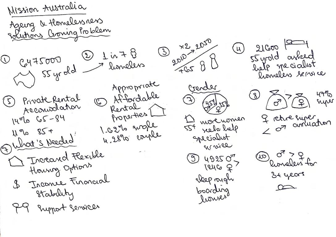
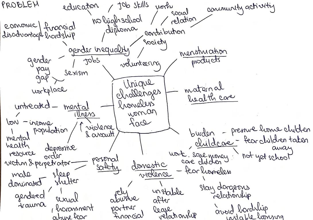
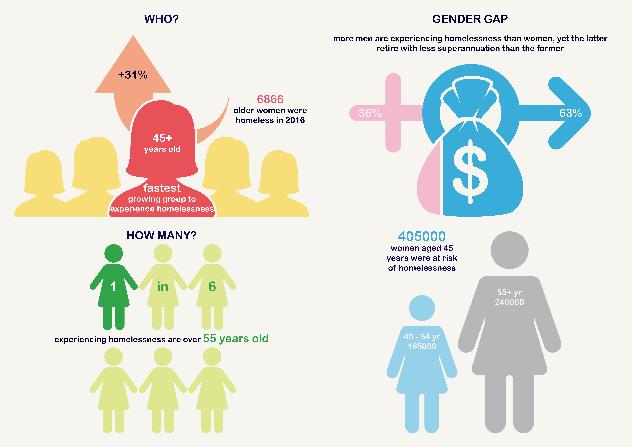
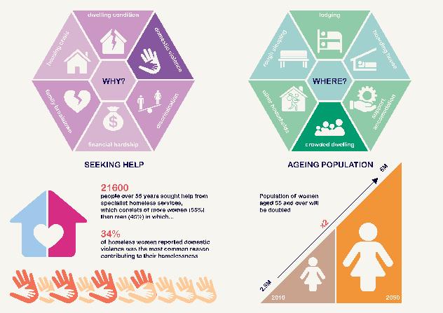
Everyone deserves safe and secure homes where they can live their happilyever-after and heart-warming life with their family, friends, and loved ones. However, homelessness has been emerging as an alarmingly ever-growing crisis across the world, specifically, with more than 116000 people in Australia are reported to experience such EVERY NIGHT. According to the Housing Aged Action Group (HAAG), women aged 45 years and over are the fastest rising population group to experience such a crisis with an estimated number of 405000. Reasons for this diversly range from unaffordable housing prices leading to eviction, to financial hardship resulting from unemployment or gender pay gap, or even domestic violence, which was reported to be the most common factor leading to homelessness. Many others chose to actively leave their houses and resort to living on the streets instead, as a way to escape their abusive relationship, some others, on the other hand, reluctantly have no choice but to continue to stay with their abusive partner as they have nowhere else to live, which, in a sense, already equivalates to homelessness (Victoria The Place To Be 2002, 41).

FOREWORD 4
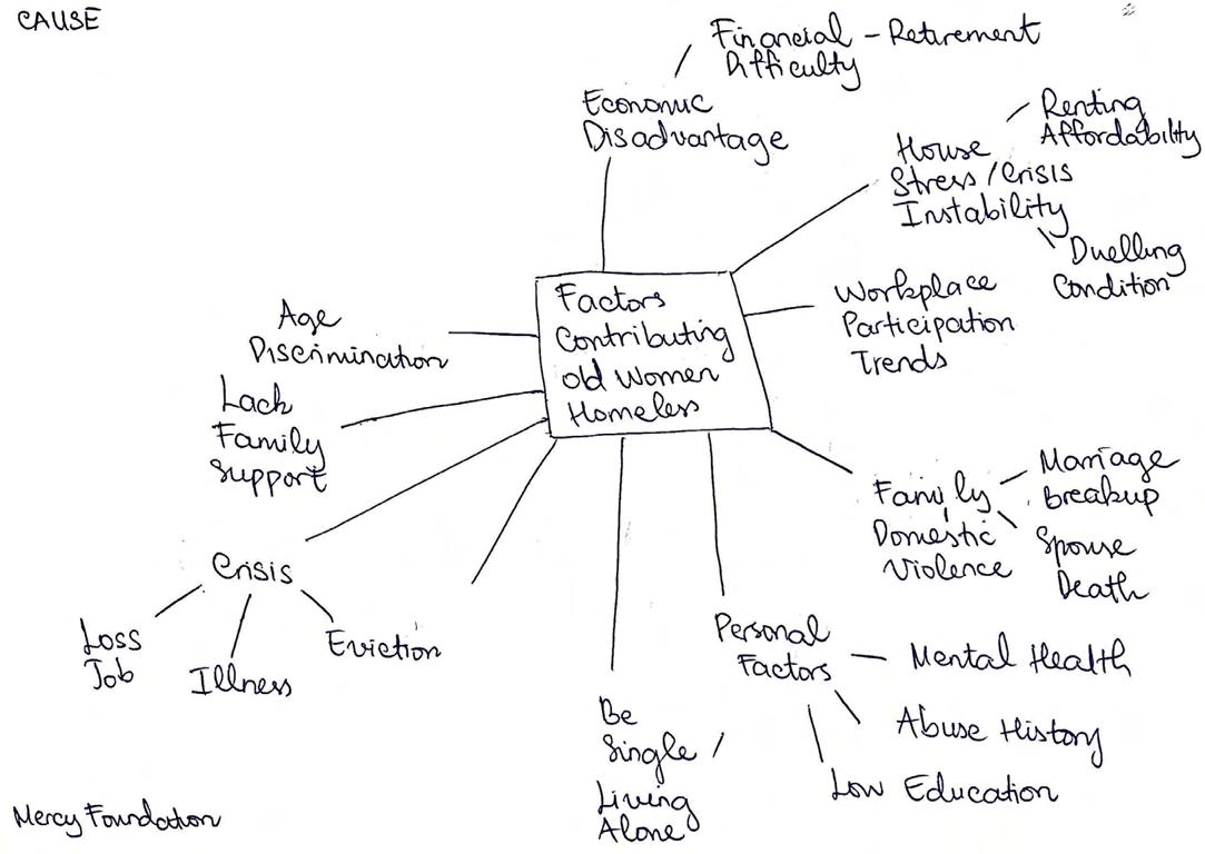
Hence, instilling a new found belief that every person in Australia should be deserving access to safe and secure housing as it is a human right, after all, my design intervention, called Ex-Scape, offers a place of programs where people at risk of or experiencing homelessness can come seek emergent help of finding transitional supported accommodations that are safe and inclusive. My main target group will be elder women whose homelessness stems from their past experiences of low superannuation due to gender or age discrimination, or past traumas of relationship breakdown from their abusive partners or informally dubbed as ‘ex’ husbands. Rather than generically providing fancy shelters for them which tend to only serve shortterm function, my design intervention offers more than just that. It proposes a help center (it can be from Housing Aged Action Group, Mission Australia, or the Victorian Government,...) where the homeless, including old women, are POSSIBLE to access a range of support services through their programs that aim to help them find a safe home, and more importantly, to ‘escape’ their traumatizing past, or ‘ex’ unhappy rock-bottom darkness of their life, and restart another yet happy chapter.
This project journal of the studio, Impossibility of Inclusive Spaces, will walk you through different phases of how my design intervention, Ex-Scape, has been put together into the final outcome, with the main mission of one day helping to tackle the homelessness of older women. Now, let’s shall begin the journey!


5
CONTEPTUALISING URBAN, SAFETY & GENDER EXPERIENCE

Starting the semester explained the general concept of gender space inequity with women perception of safety and unsafety differ with men when going out to public spaces. With irrational fear of their safety being vulnerable as being attacked and harassed by the men, this limits down their usage and access to public space, which creates lack of diversity in gender usage, hence an unfair bias graviating towards the men as the dominating power of masculinity. Regardless of not being a woman, I still find their perspective very relatable to me as I do feel unsafe a few times when I had to go out and come home midnight, especially commuting through out-of-city suburbs which are far more secluded, dangerous, and even squalid in terms of urban infrastructure. This is something that I need to keep in mind upon the journey of this semester’s project.
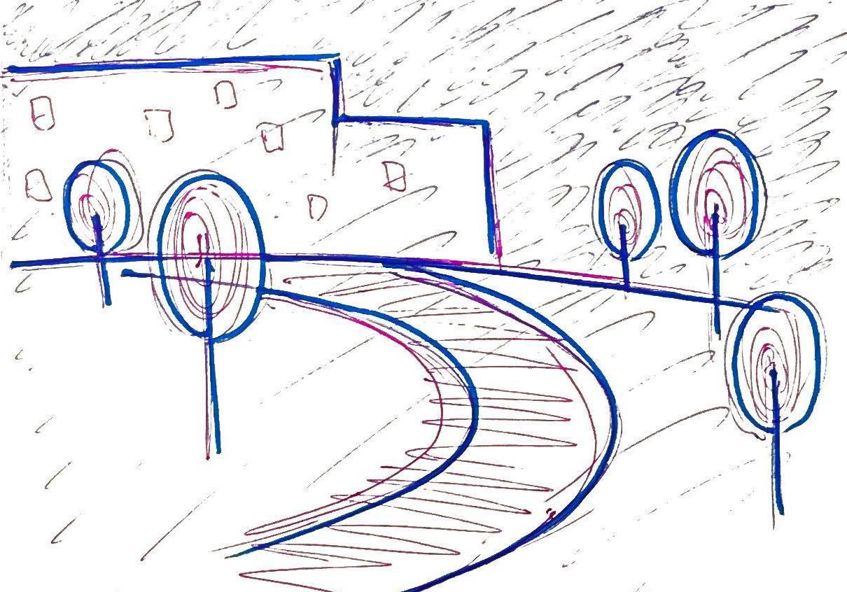
1. Monash Clayton
This is a public walking path within the Clayton campus of Monash University. The walking areas in there are typically open and spatious, since Monash Clayton is pretty famous and well-developed with a lot more buildings than any other campuses. Regardless, whilst this place is usually crowded during the day with lots of students, it can also become a nightmare after dark, personally for me. On top of secluded and quiet atmosphere with very few people around, the lighting is weak, pale, and faded, which the whole place is covered in immense darkness. I remember one time having to walk through that place after school with my heart almost dropping out because of fear of someone following behind and might attacking me.

SKETCH 8
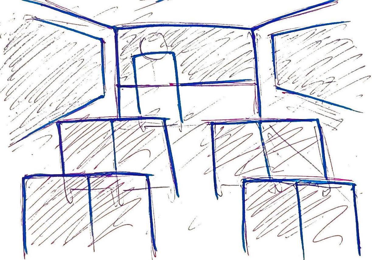
2. Public Transportation - Bus & Train
Typically I don’t find public transportations to be unsafe for me, until when I have to use them during late nights, especially during lockdown. There was one time I got lost when going on a bus in Clayton. As I was trying to travel to the train station via bus from Monash Clayton campus, I got lost of exceeding the destination. I finally departed to the last destination, which was Jewell station. From what I could remember, there was literally a very few people on the bus that day, and the lighting on bus was very subtle and pale too. The train station was not any much better as there was no one around as well, which added more of me feeling more unsafe.

9
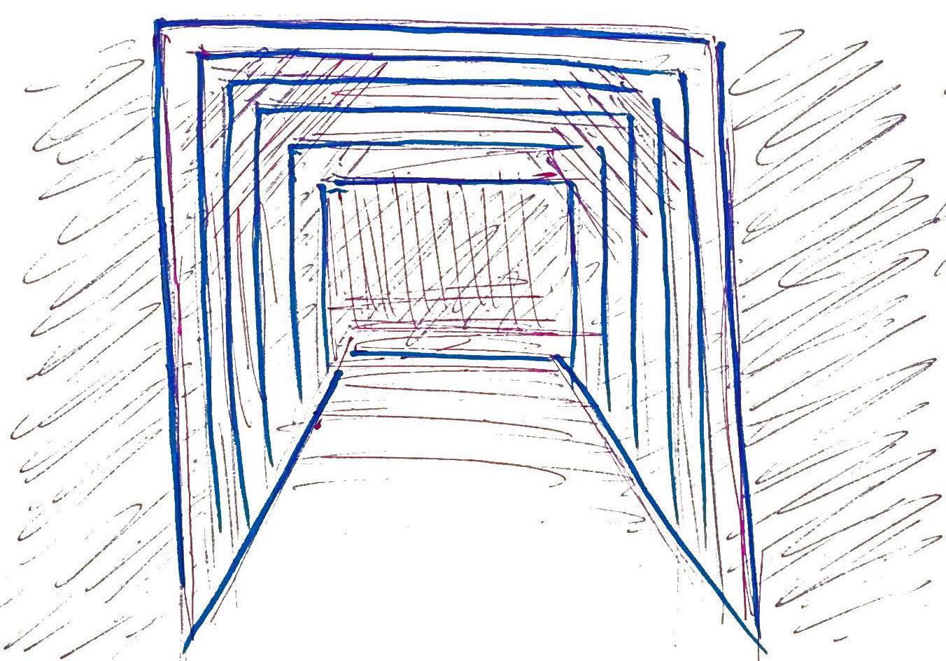
3. Construction Tunnel
A few months ago, there used to be a construction site nearby where I live for a newly repaired makeup of a hotel building. The structure of that construction was set up like a tunnel for the pedestrians to safely walk through and underneath that for the construction workers to do their fixing on top. The tunnel was quite narrow and dark as it obstructed all the light coming in. The street vendor itself is already dark as it usually is, so building a tunnel temporarily made it feel even more unsafe. Plus, it blocked the view between in and out, so this engenders a sense of fear of being followed when going through that tunnel.

10
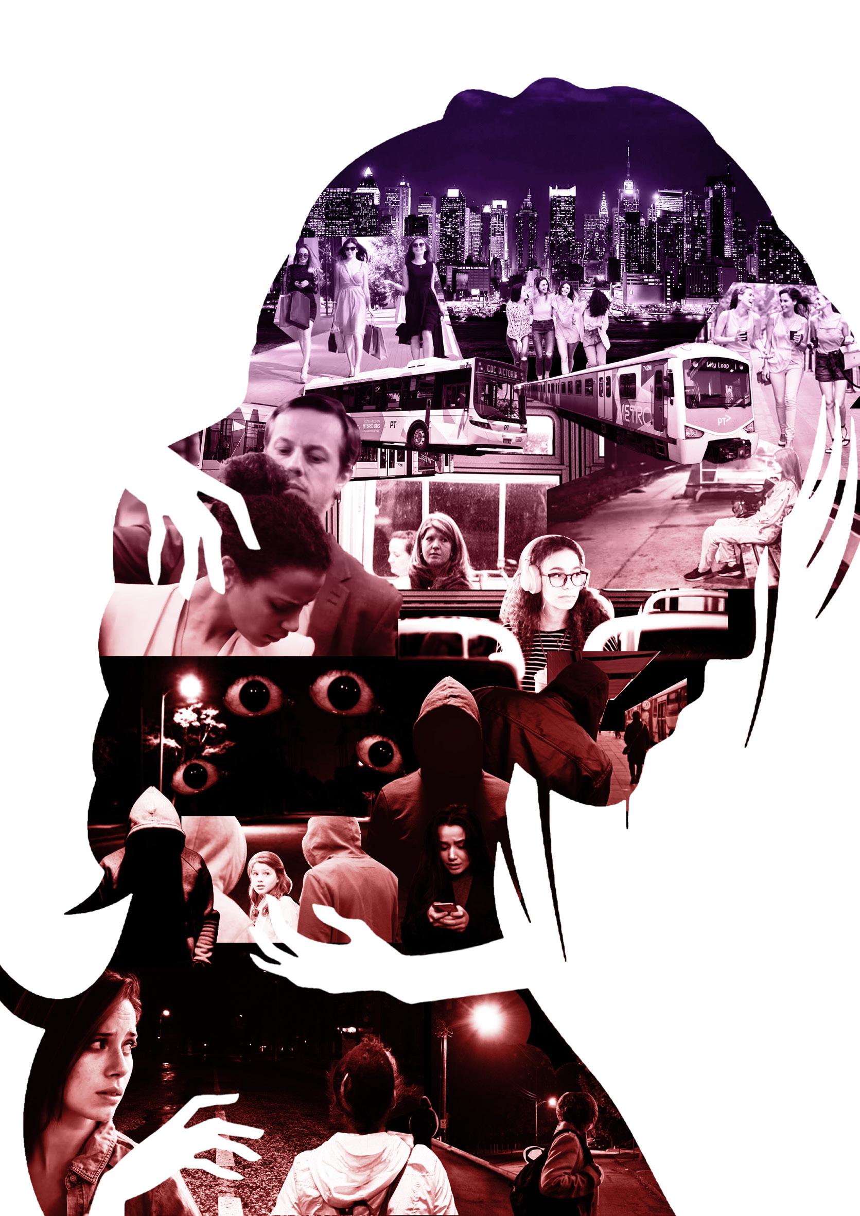
Ending the first week required us to create a conceptual collage about our own view and perspective about women’s safety in public spaces. My collage explores different state of women experience from having fun hanging out with friends to the state of insecurity and fear when going on to the public transport and then walking home alone. This shift of emotion is conveyed through a subtle gradient color change from purple to red, indicating the two contrast states- fun and fear.

COLLAGE 11
DISSECTING DATA

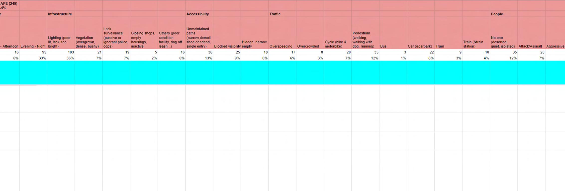
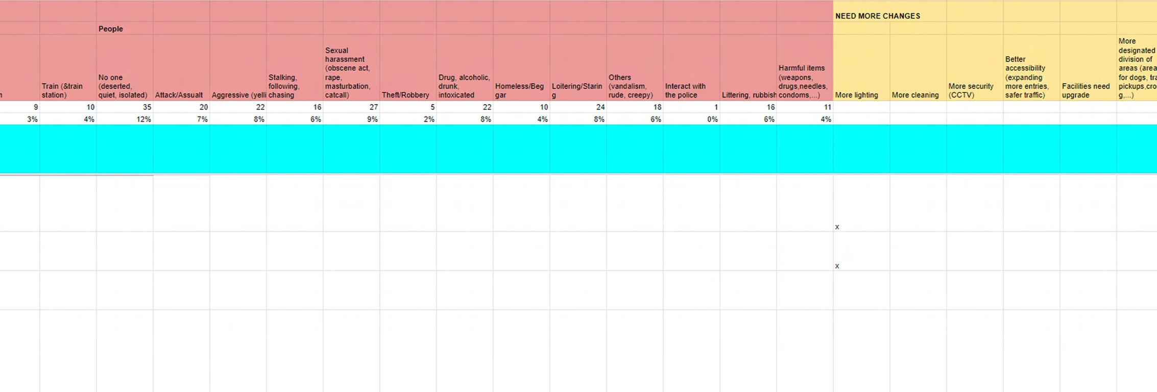
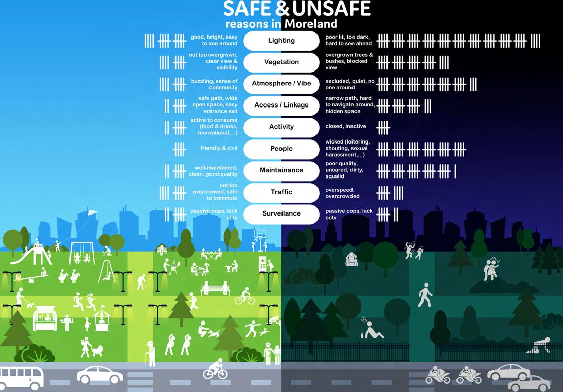
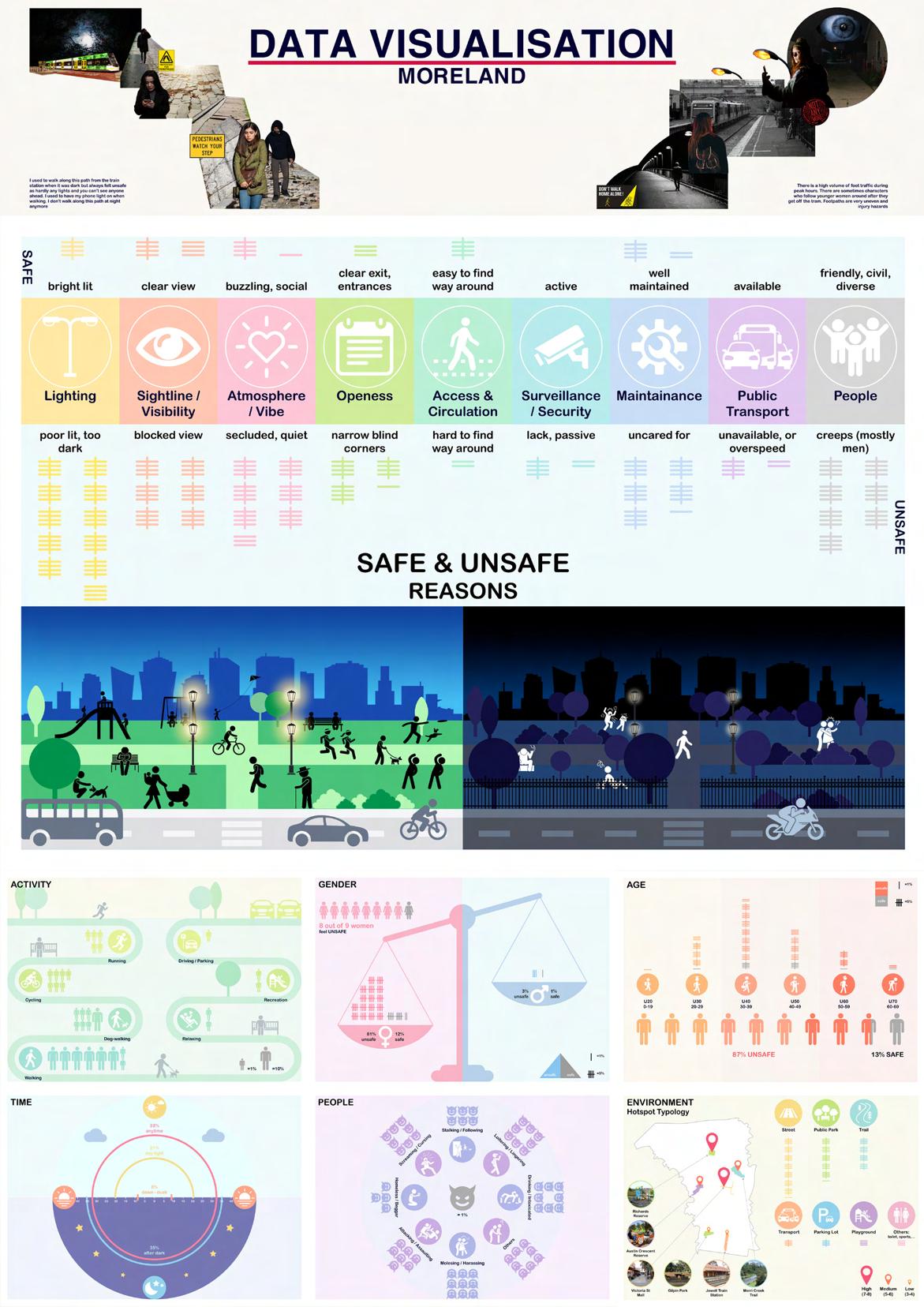
After a week of warm up conceptualizing the idea of women safety around social space, the second week progresses with identifying hotspots of a particular suburb, followed by dissecting data and coding them into specific category. It is crucially important to organize all comments from YourGround into different kinds of reasons and factors that contribute to most women sense of unsafety. What I find most challenging is sorting through all nearly 300 comments by using Microsoft Excel formulas to calculate the percentages or proportions of unsafe and safe elements to then visualize these in creative diagrams as accurately as possible, which causes confusion for me at times.
IDENTIFYING HOTSPOTS


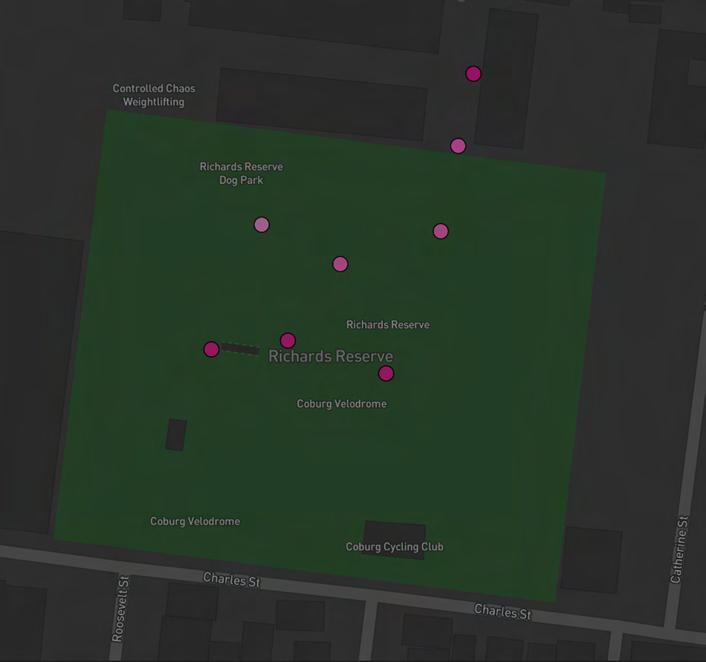
Richards Reserve
“This is a very off putting entry to Richards Reserve. You can’t see who’s up ahead, it’s unsafe for cyclists and pedestrians. It’s worrying and creepy for lone park users, and the hill makes access hard, dangerous and insecure for those with mobility issues.”
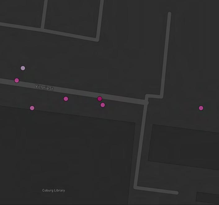
Victoria St Alley
“The area along the Victoria street mall directly outside the Coburg library is extremely dirty, not looked after and too many homeless people just spend all day lying across benches which should be used by people to enjoy the sunshine, a bite to eat etc. Walking through that area is something I try my hardest to avoid..”
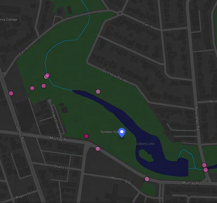
Coburg Lake Reserve
“Why is there no lighting at night at coburg lake? Even around the main lake park? There have been so many reports of sexual assault and I don’t feel walking around the lake at night. Even with my male partner at 7pm.”

14
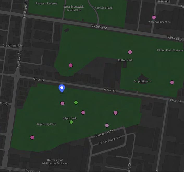
Gilpin Park
“ At dusk the dog park and surrounds are poorly lit. The paths are poorly kept and the parks are messy. It’s a high traffic area in the day... But not much at night.”


“ I used to walk along this path from the train station when it was dark but always felt unsafe as hardly any lights and you can’t see anyone ahead. I used to have my phone light on when walking. I don’t walk along this path at night anymore”
“This is a place that I have to walk to get from the train to my house, often when it is dark. The lighting is very bad and there is a “garden” (strip of unmaintained grass and shrubbery) in between the road and the path, making it feel isolated and potentially giving an attacker a place to hide in the bushes, making it feel unsafe.”
15
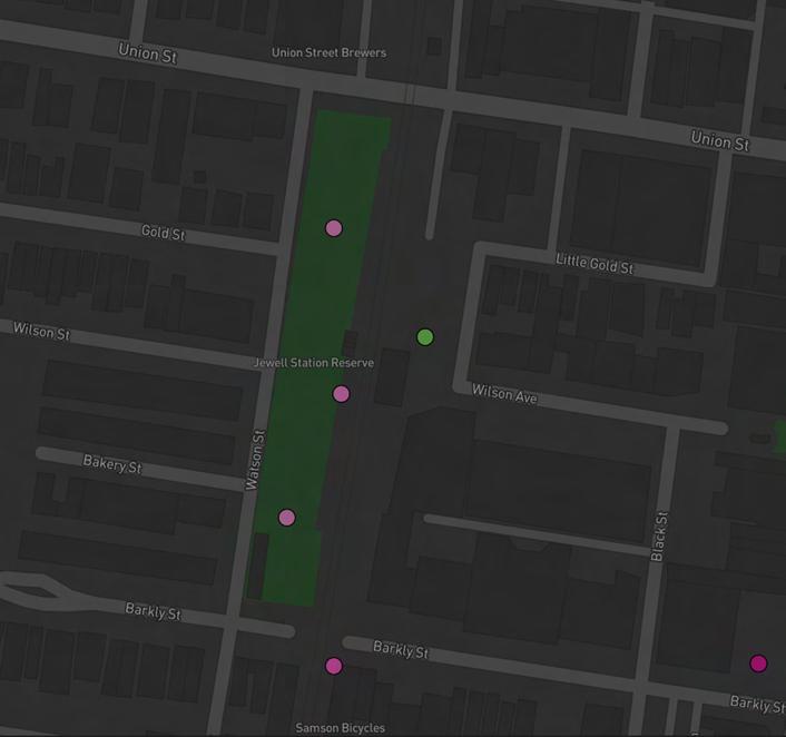
Jewell Station
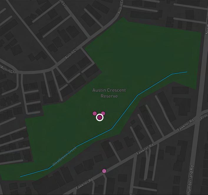
Austin Crescent Reserve
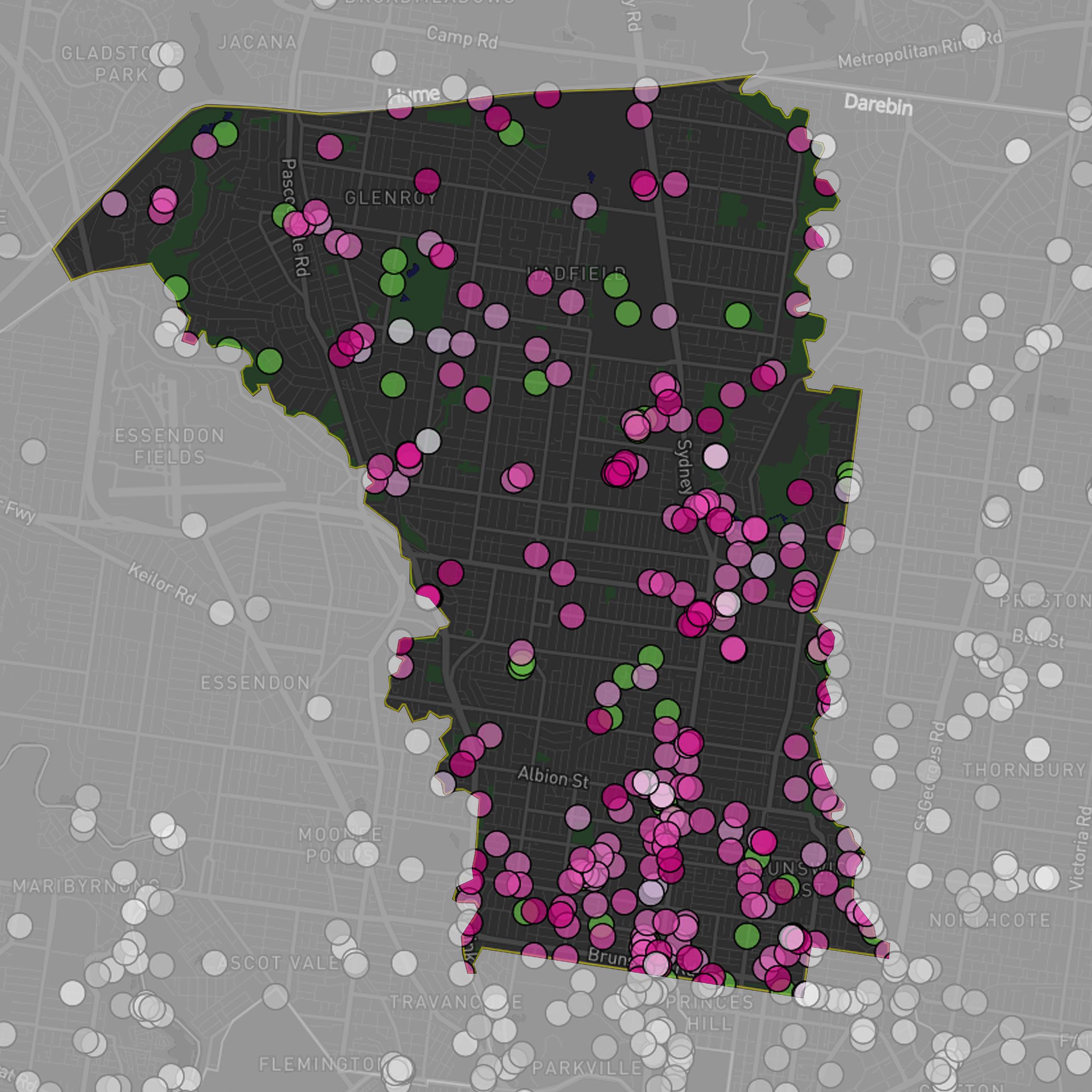
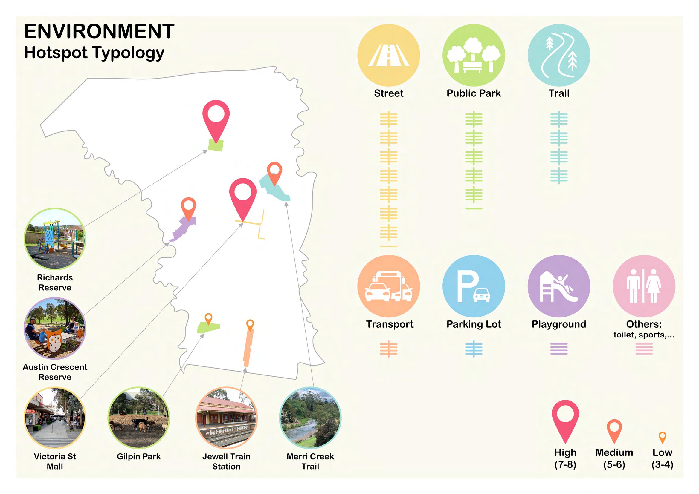
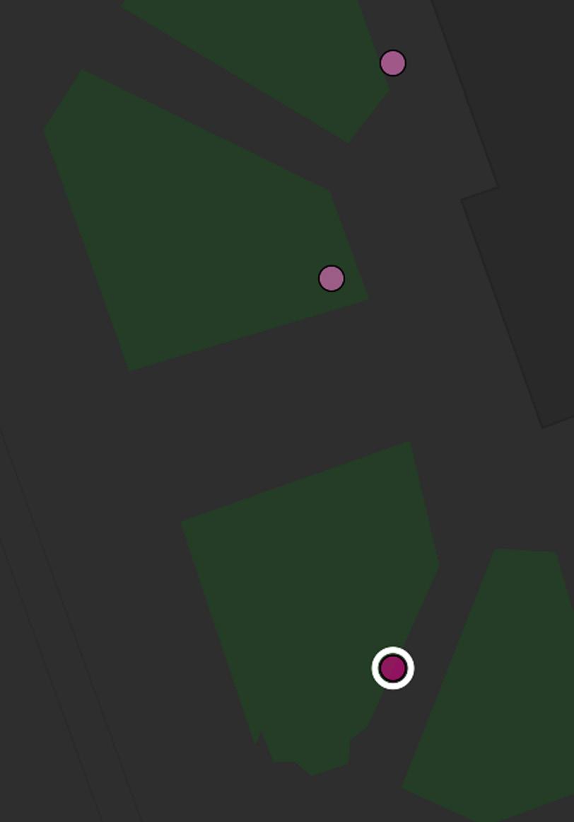
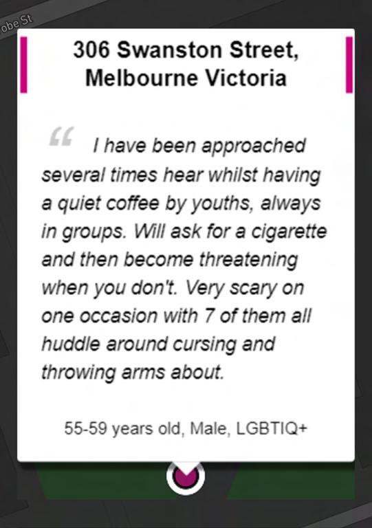
My group is assigned to find six hotspots in the City of Moreland in Brunswick. Whilst there seems to exist abundant unsafe dots spreading across the city, they are very scattered and isolated actually, which is hard for me to identify whether it is a hotspot or not. With only a very few dots clusterring nearby each other, such as the Richard Reserve or the Vic St Mall compared to other groups that have a lot more dots, what I can only imply on a surface level is that this particular suburb is not too dangerous to visit, neither safe nor unsafe.

16
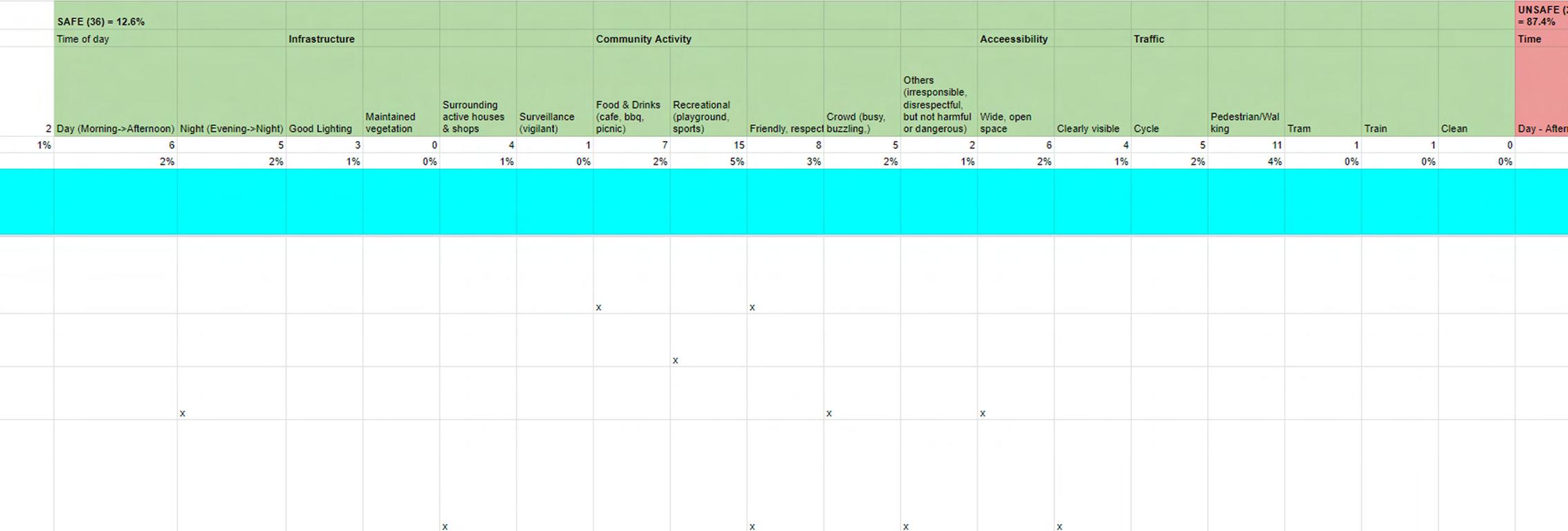
The coding activity is not too hard for me, though I do have a little trouble understanding what, how, and why we are doing this initially. What is more challenging was that by the time I start coding, there are only two of us in the same group on campus, while the other two are online, which we had no idea how to reach contact to them so that we could have delegated equally for all four of us.
Hence, I spent a lot of time working on this, mostly by myself, for about two third of the data. In fact, our assigned suburb Moreland has more data to sort through, which is 285, while other teams had more members on campus, they need to sort through about 50-60 less than us.
Regardless, finishing all these codings would greatly help us for our next activity (the most fun for me), which is data visualization, or hotspot infographics.

CODING 17


18
Key statistics:
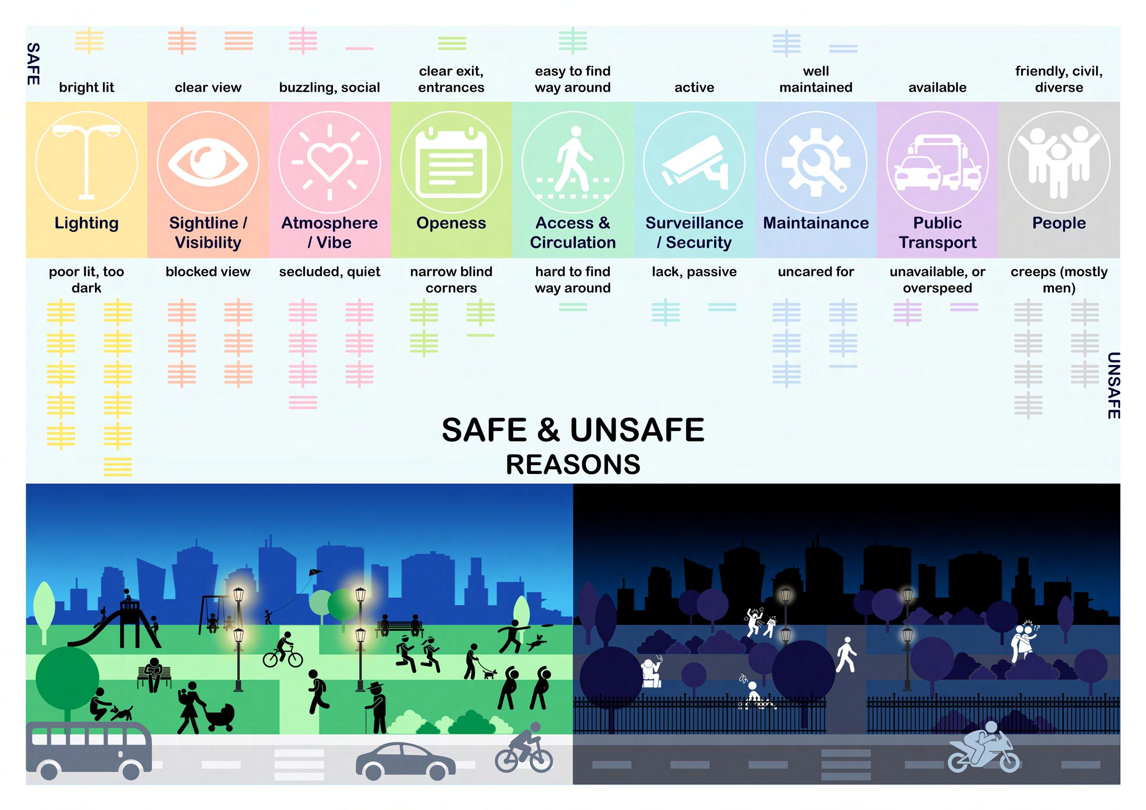
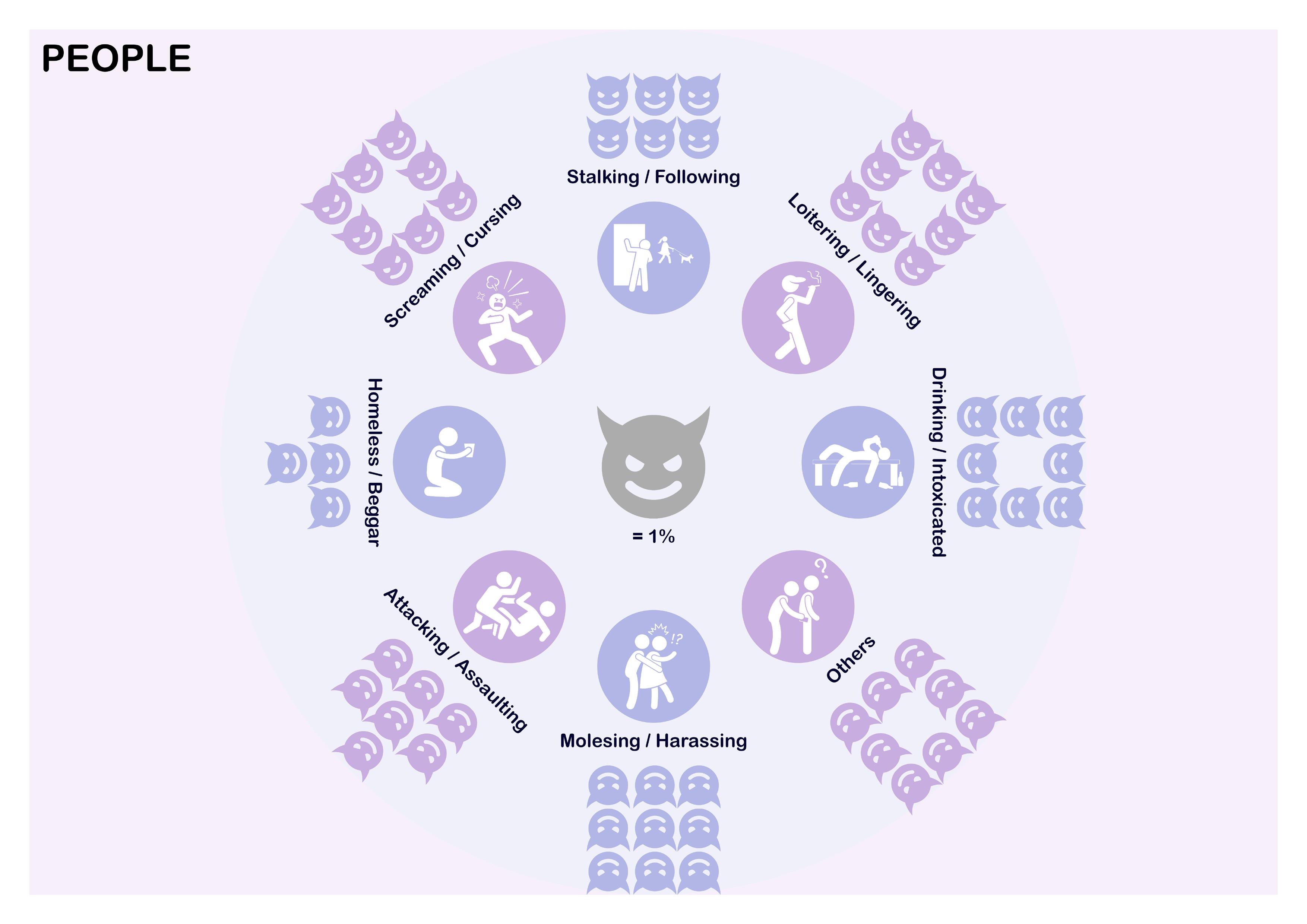
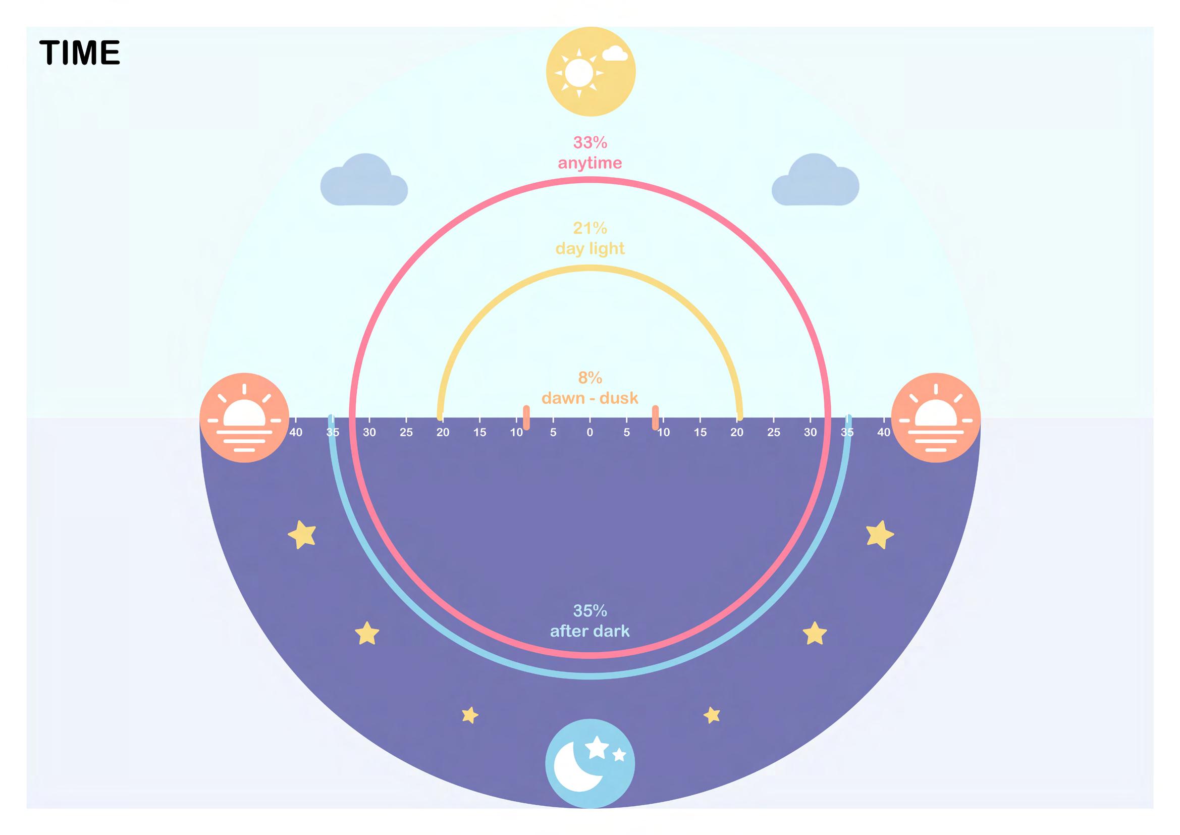
1) Presence of unpredictable people, as well as poor-lit lighting, were reported to be the two most common reasons for feeling unsafe (54% & 35% respectively).
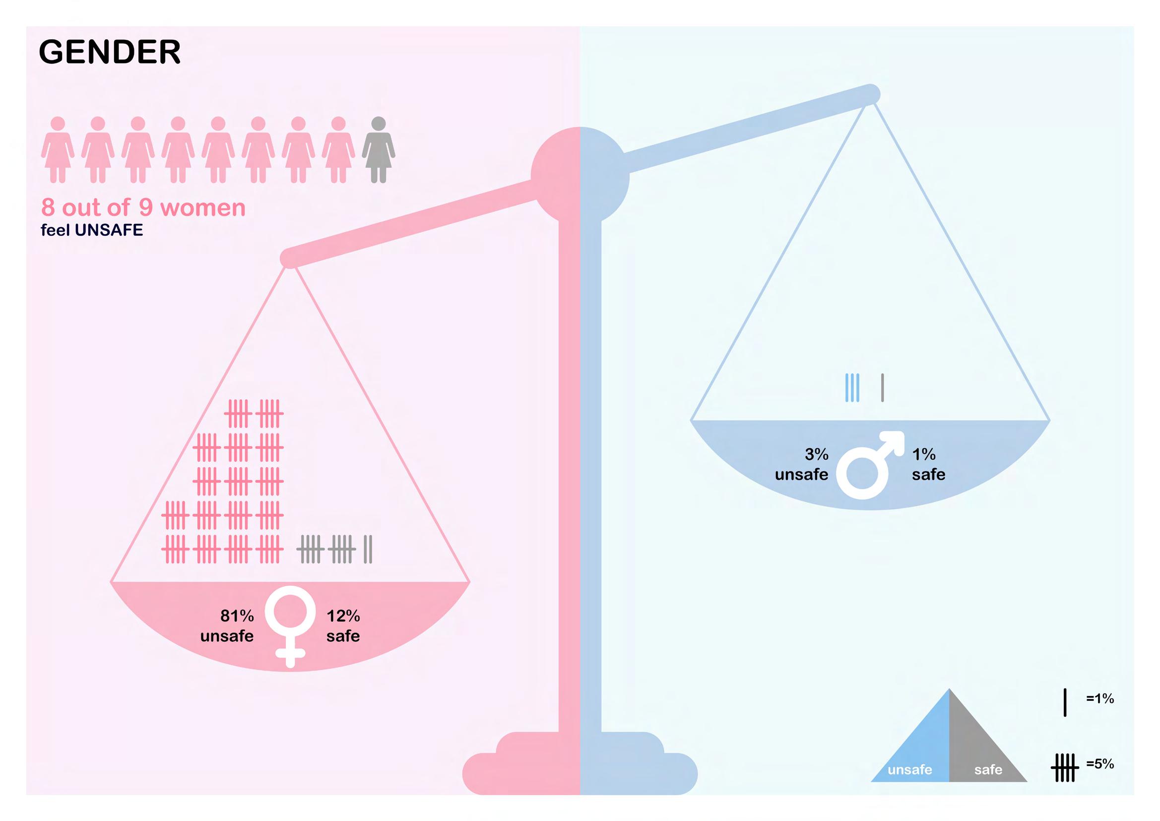
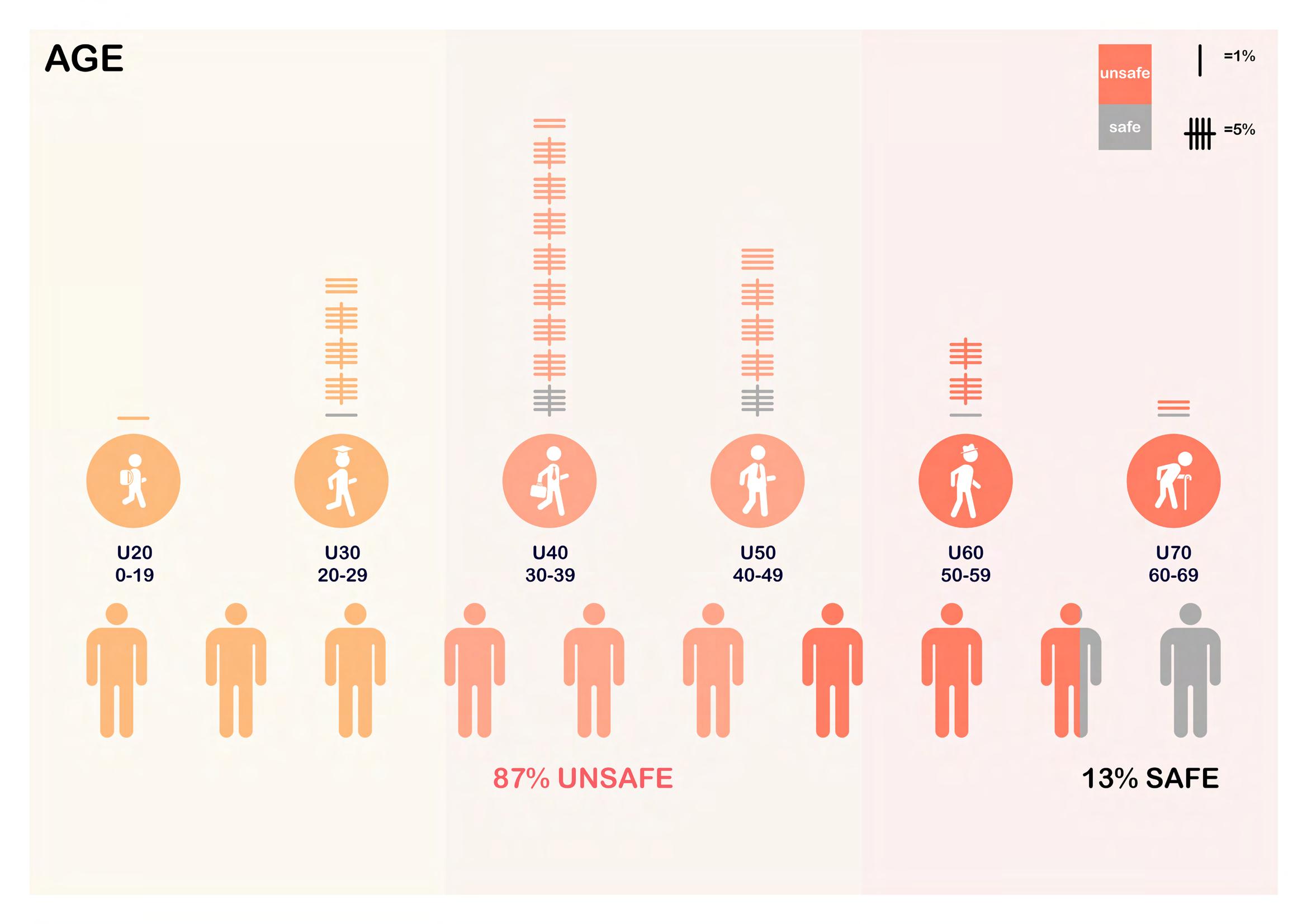
2) More than 80% of women surveyed claimed to feel unsafe in Moreland, whereas only a diminutive 3% of men feel the same way.
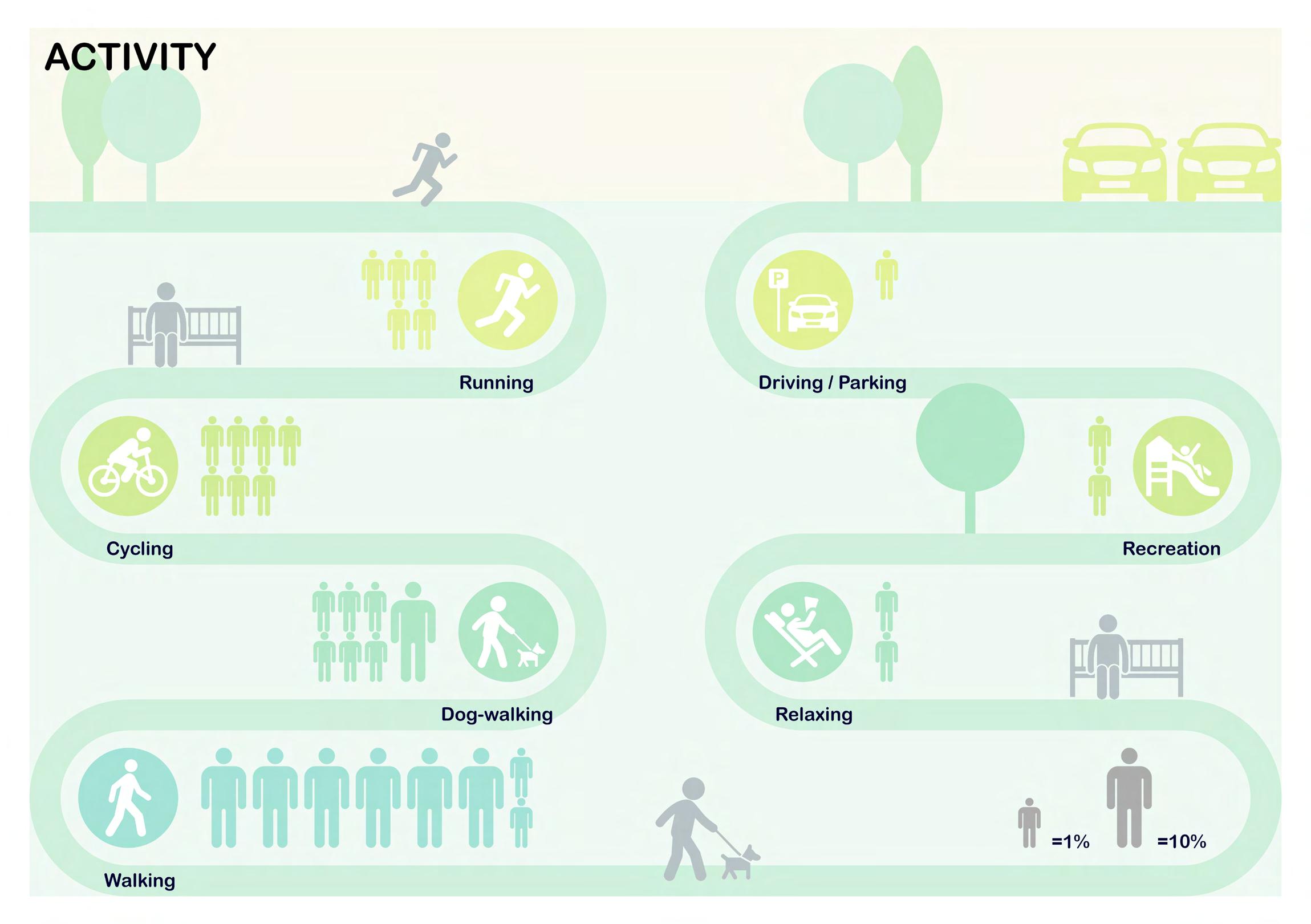
3) Walking is the most common activity for 60% of Moreland surveyees, which 36% recalled feeling the most dangerous when simply just taking a walk on urban streets, followed by public parks as the second least safe areas with just 10% less than those of streets.
4) Nearly 10% experienced groping and harassment when commuting within Moreland as the most common violation.

INSIGHTS 19
precedents


DATA
20
VISUALIZATION
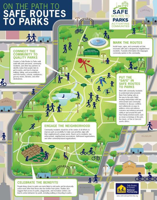
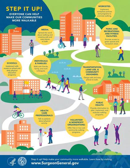
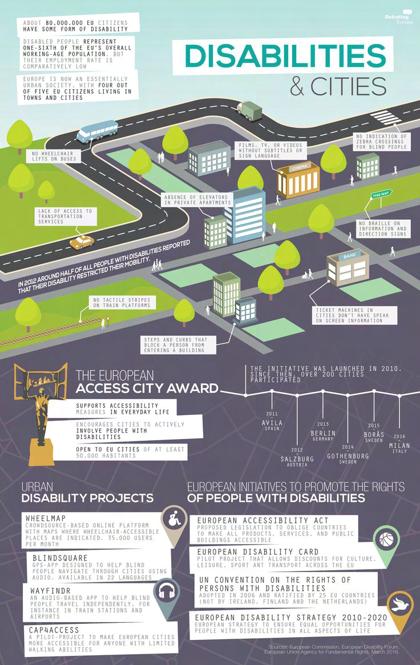
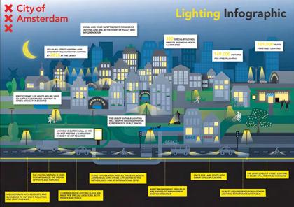
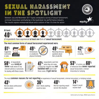
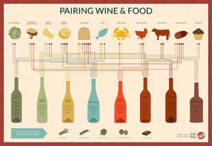
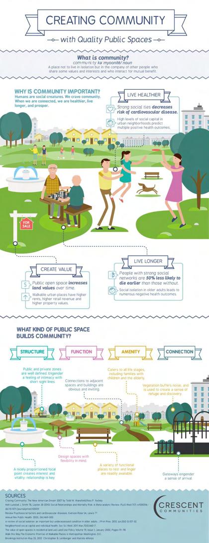
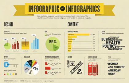
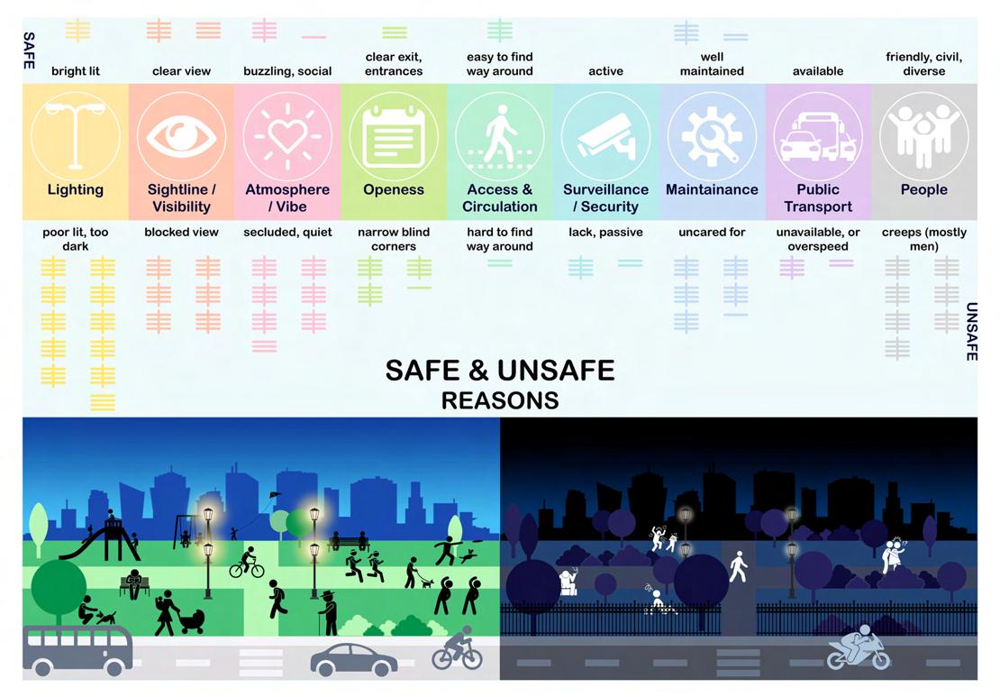
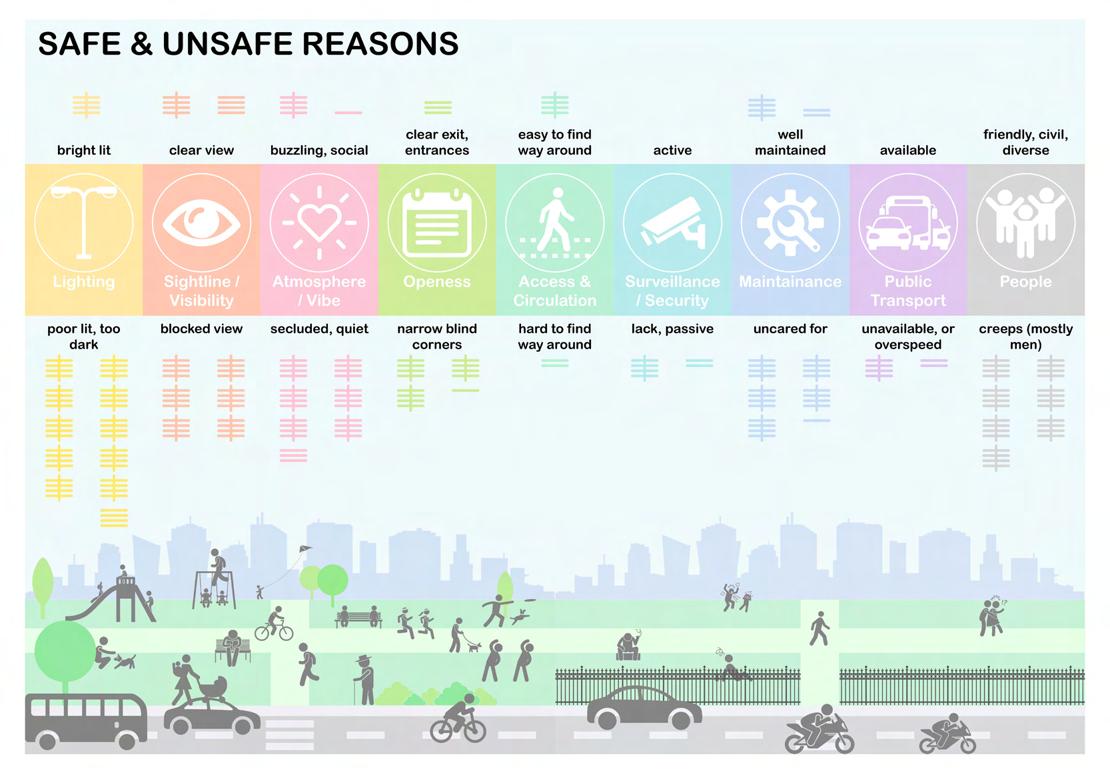
For my upcoming task of visualizing the coded data previously, I want my diagrams to look not only as detailed and informative but also fun to read as well. I have an idea of creating public-park-themed visualization that somehow take the readers a quick journey through an urban space that will give them insights of how unsafe Moreland is. Hence, I have collected a few precedents that will help me do that, with lots of popping colors that vivify the diagrams or infograhics. I don’t want mine to appear mundane and boring with barely just numbers, words, and basic shapes of common simple charts or basic graphs of data.


21
SITE SYNTHESIS + MAPPING CONTEXT

The third week activity mainly involves with starting on visualizing data that was coded in the spreadsheet from the last week task. Since my group had a sluggish start of the coding, my process for the data visualization also got delayed too, yet I still managed to pull it off anyway. Regardless, while working on data visual for hotspot diagram, a key concern or element that I tried to consider and implement was how I could make my diagrams look fun and interactive while also conveying important data. and statistic numbers. This indeed is a strong powerful tool that can help transform tedious amount of numerical data into visually appealing diagrams in the most interesting way as I learned from Gene Bawden crash course on this area in clsss.
DIAGRAMS
I find this activity of visualizing these infographics quite fun (despite a lot more time consuming than I expected) as it allows me to be as creative as I want. However, what I could have done differently is perhaps labelling each specific elements to the atmospheric parks below of what they actually mean, such as pinpointing what dense vegetation really looks like that may cause blocked vision as illustrated underneath.


HOTSPOT
24

25

26

27

28

29

30

31
QUOTES & VIBES
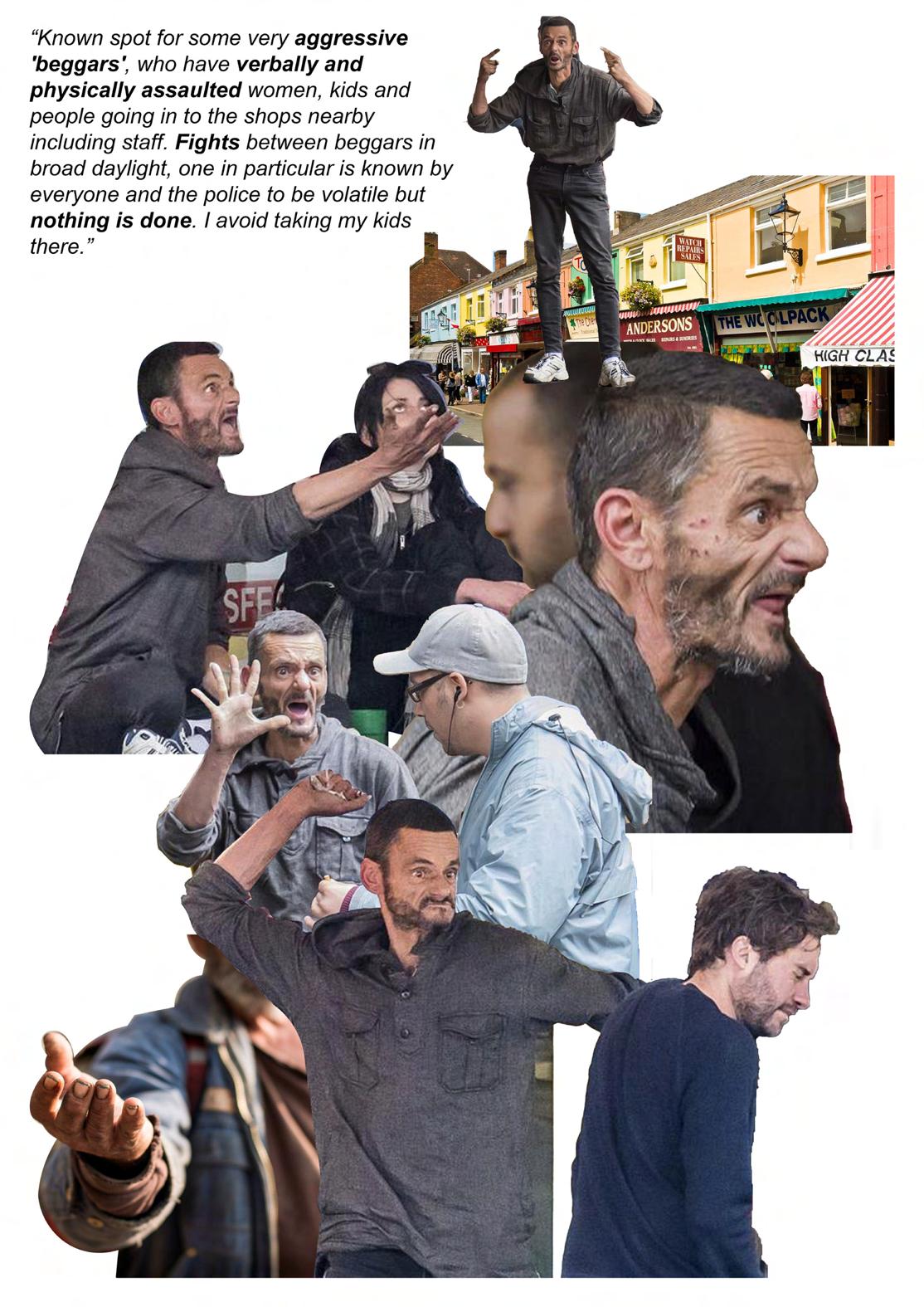
1) “Known spot for some very aggressive ‘beggars’, who have verbally and physically assaulted women, kids and people going in to the shops nearby including staff. Fights between beggars in broad daylight, one in particular is known by everyone and the police to be volatile but nothing is done. I avoid taking my kids there.”

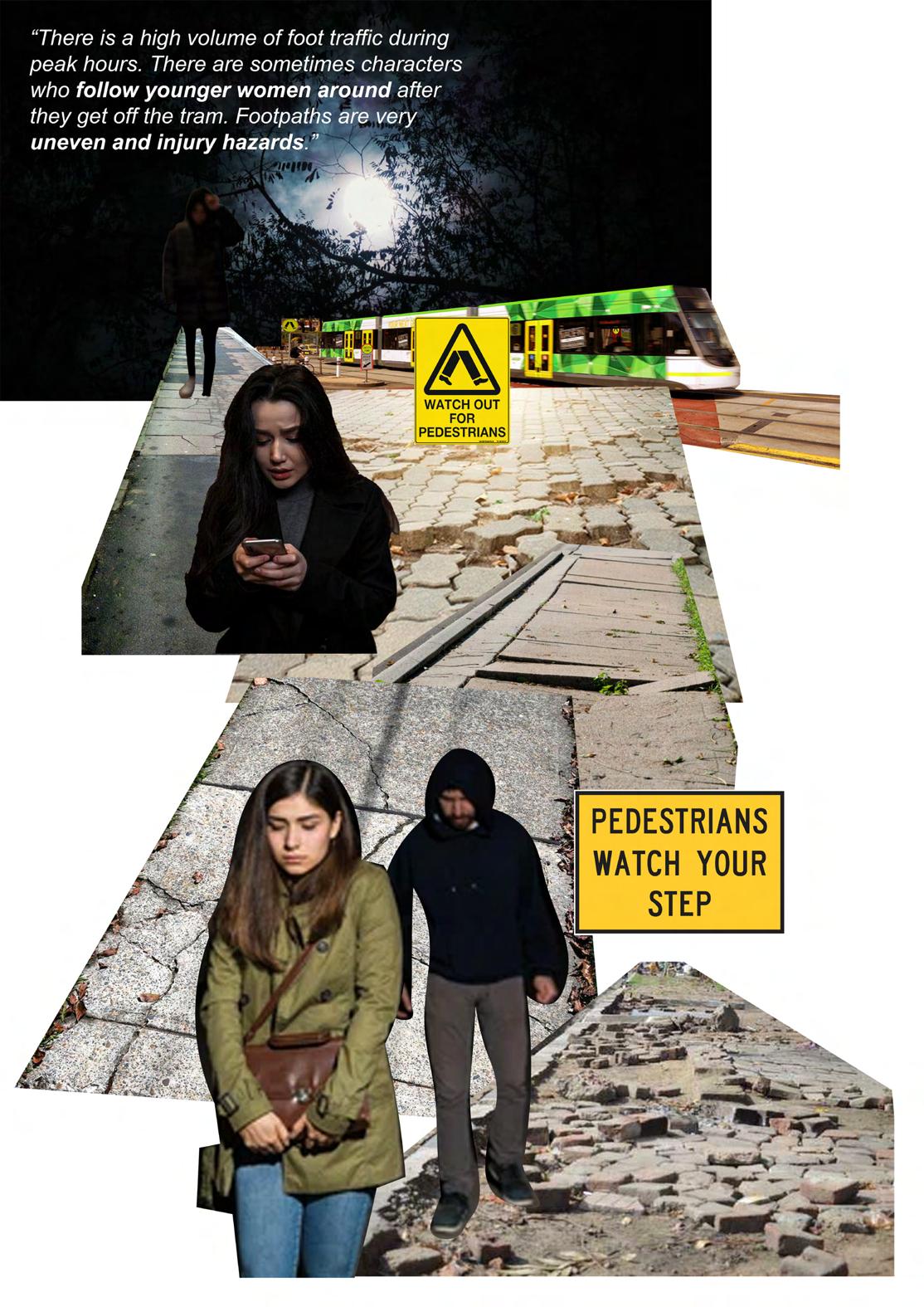
2) “There is a high volume of foot traffic during peak hours. There are sometimes characters who follow younger women around after they get off the tram. Footpaths are very uneven and injury hazards.”
3) “I used to walk along this path from the train station when it was dark but always felt unsafe as hardly any lights and you can’t see anyone ahead. I used to have my phone light on when walking. I don’t walk along this path at night anymore.”
32


33
SITE SELECTION + NAVIAGTION

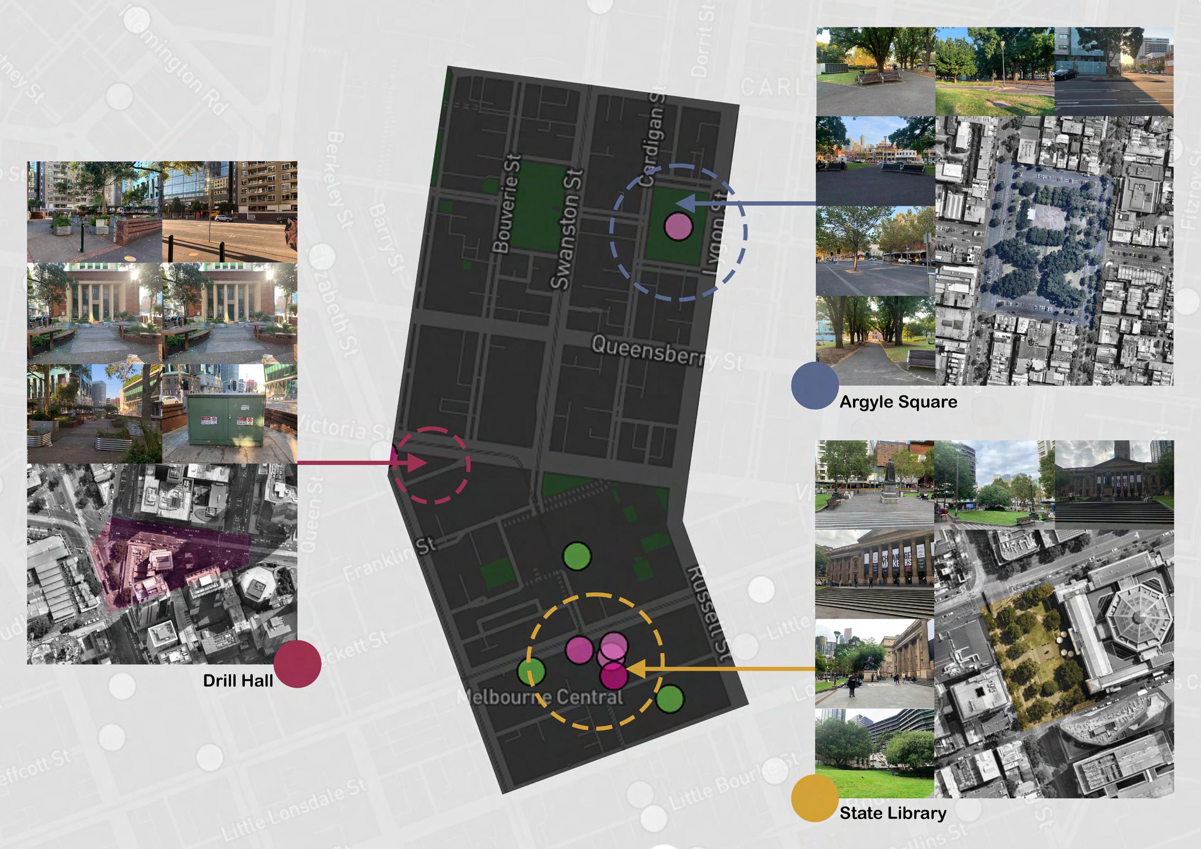
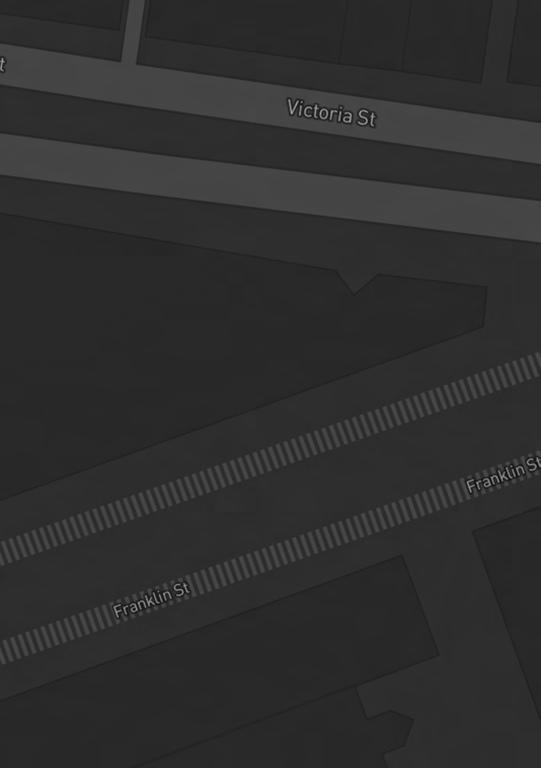
The fourth week approached with doing research and analysis of the site. My three potential sites of choice around my nearby neighborhood are the State Library Victoria (which is my final chosen site), Argyle Square, and the Community Garden as selected according to the comments on Your Ground. Throughout the week, I kept finding myself so hesitant and struggling of choosing which site to work on. My personal perception of safety and the comments from YourGround were completely opposite. Regardless of how much I struggled to finalize my decision on the site, the tutors had helped me understand that as a designer, I should be leaning away from my personal bias and solely focus on the public safety as inclusivity is the key armature for designing urban interventions, and by inclusivity means that everyone has equal rights of accessing and using the design regardless their gender or identity in general. This is something that I have to keep in mind when progressing through the project.

36 SITES
AUDIT
37 Lighting Little None Enough Bright 0 Security Minimal None Moderate High Public Transport Distant Unavailable Nearby Very close Openess Partially open Not open Mostly open Completely open Feeling Uncomfortable Frightening Acceptable Comfortable People A few Deserted Some Crowded Walk Path Poor None Fair Good Visibility Few eyes No eyes More eyes High visibility Gender Usage Somewhat diverse Not diverse Fairly diverse Diverse 1 2 3


38
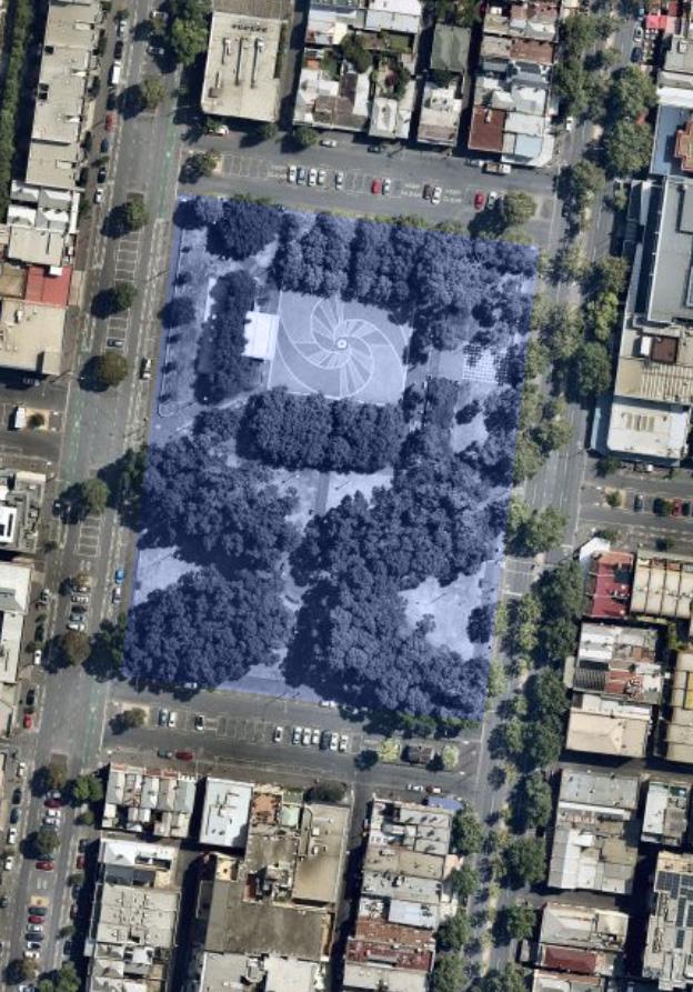
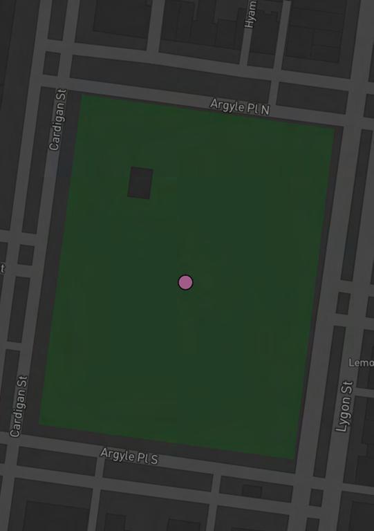
Argyle Square
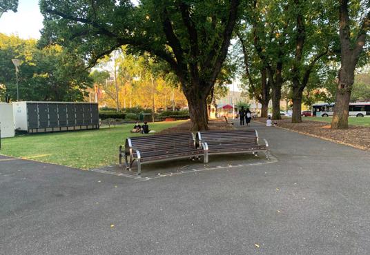
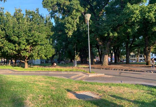
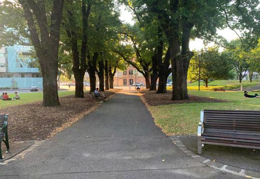
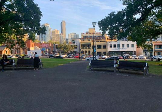
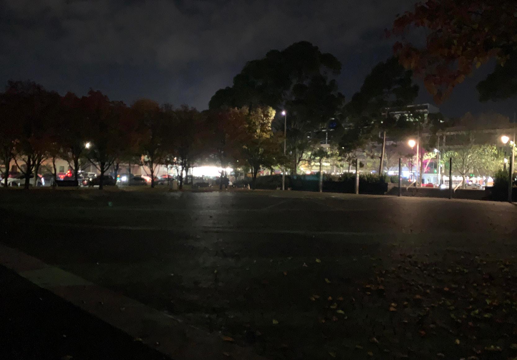
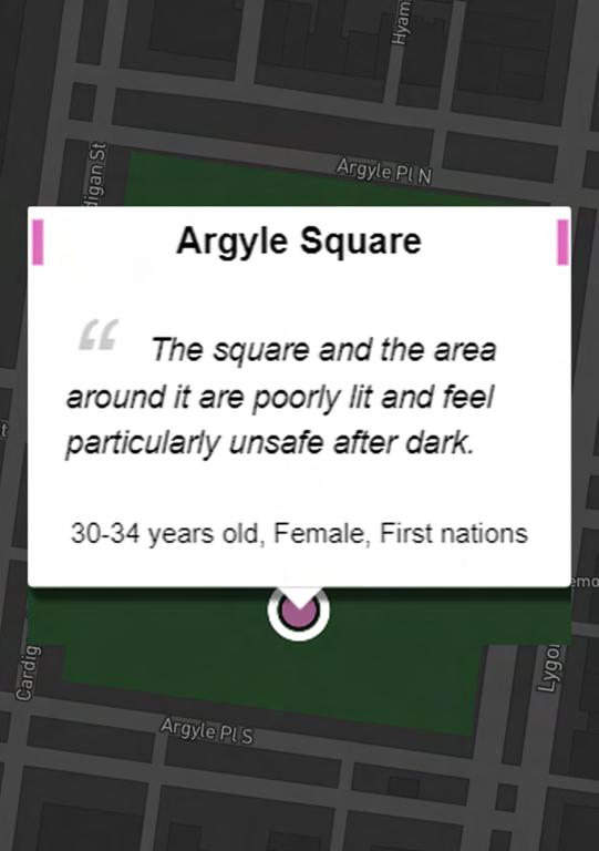
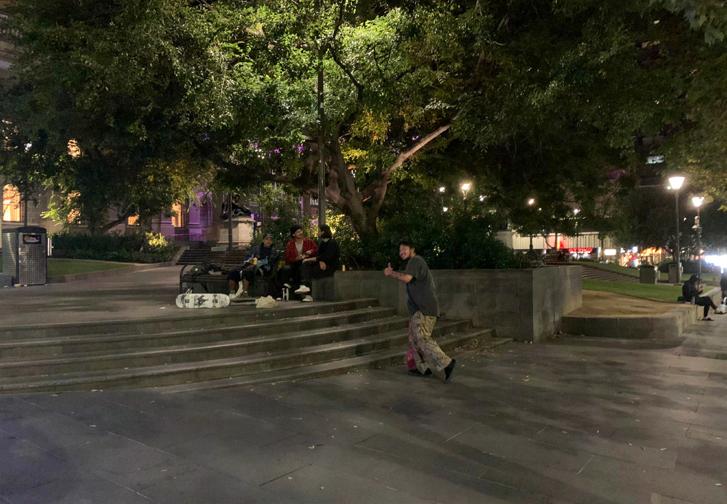
The Argyle Square is a wide-open space park located in the heart of Carlton, adjacent to the Lygon St, which is well known as the Little Italy for its wide array of Italian restaurants and small cuisine bistros. The path circulating around the park is well-maintained, allowing easy movement and exiting. There are lots of people with diverse range of age groups and gender, which creates a sense of community and buzzling vibe throughout the day. However, the overall space can be quite dim and dark during the evening, after dusk, as the lighting installation is not bright lit enough. Tall trees aligning the X-shaped path creating an open ‘chamber’ that acts as a sunshade above, sheltering the people underneath during the day for us to relax, yet this open ‘chamber’ can also be a place for vigorous teenage skaters to hang around as their territory, which can create an unsafe feeling for people walking around at night. Moreover, while the space access and linkage is wide open, there is not enough (only one) formal crossing for pedestrian to walk, so we have to be very careful and vigilant looking on both sides if there are cars fleeting through.

39


40
Drill Hall
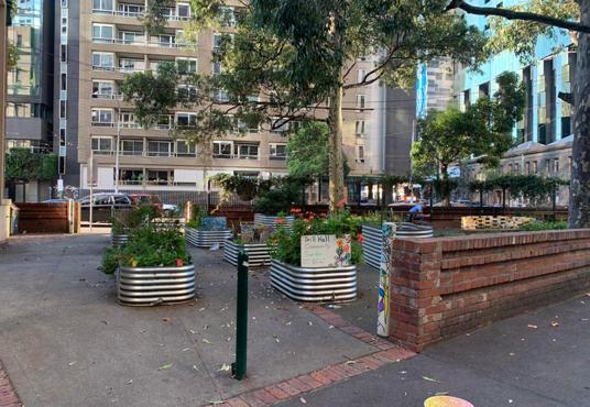
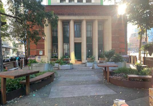
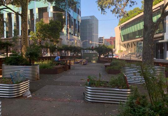
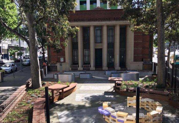
This is a community garden for a multicultural hub Drill Hall on the Therry St. The overall space is quite small, so are the exit and entrances but the path is well-maintained with plant boxes arranged very neatly, which allows easy circulation. However, this place can get quite dark in the evening as there are no lighting installations onsite, even though the surrounding might be well-lit. Also, the columns distributing across the front facade can be the hiding corners for weird people hanging out since the building has been inactive for a while, which creates an eerie and uncomfortable vibe and feeling to people walking past by. Moreover, the accessibility in and out of this area seems to feel a bit unsafe as the traffic surrounding is very busy with some cars driving through quite fast since it is a spacious highway street, which poses some danger for the pedestrian to cross.
41


42
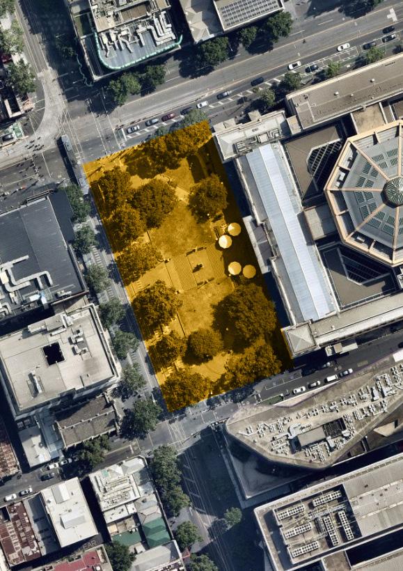
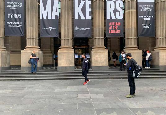
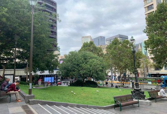
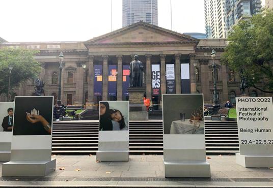
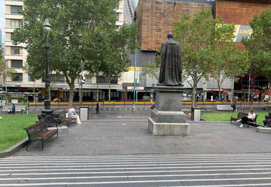
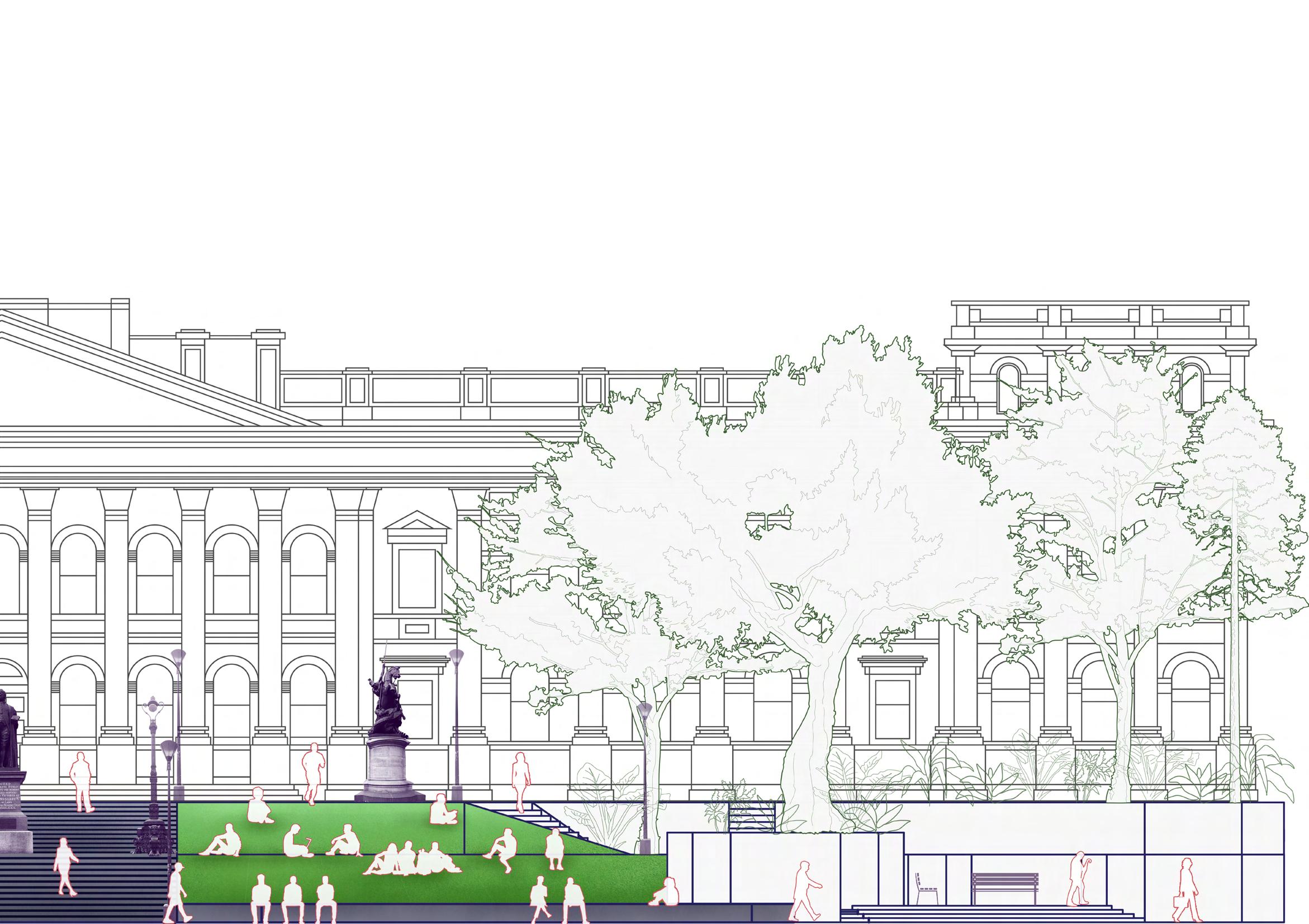
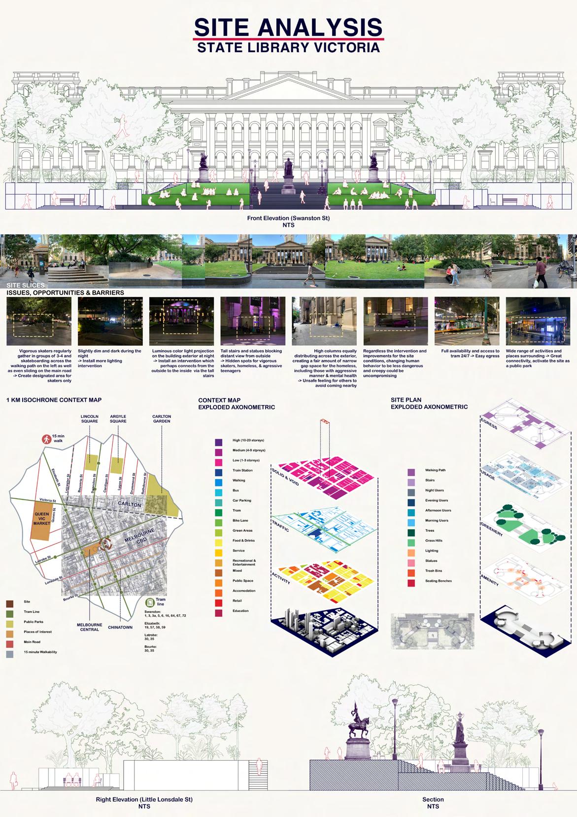
State Library Victoria

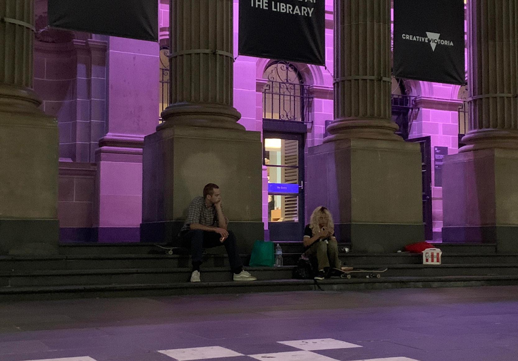
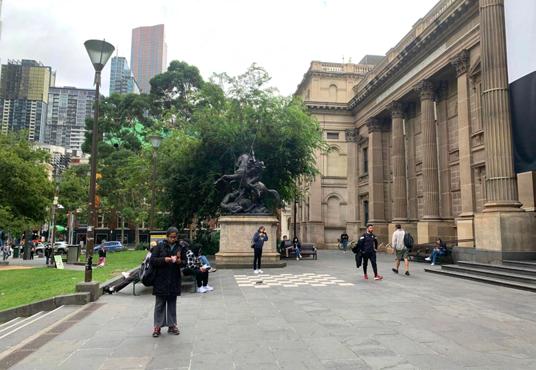
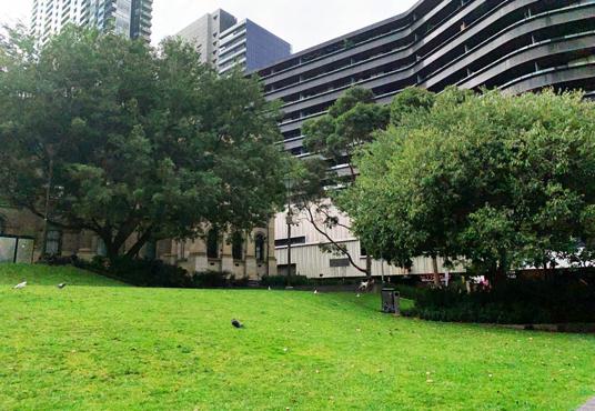
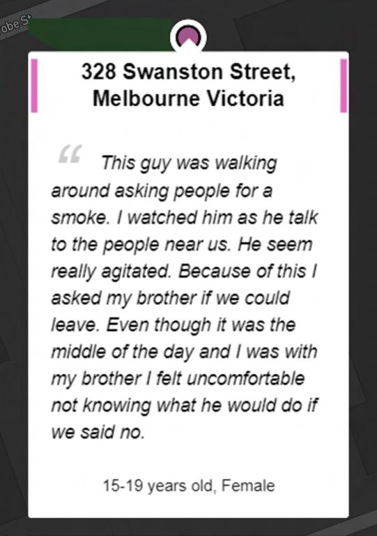
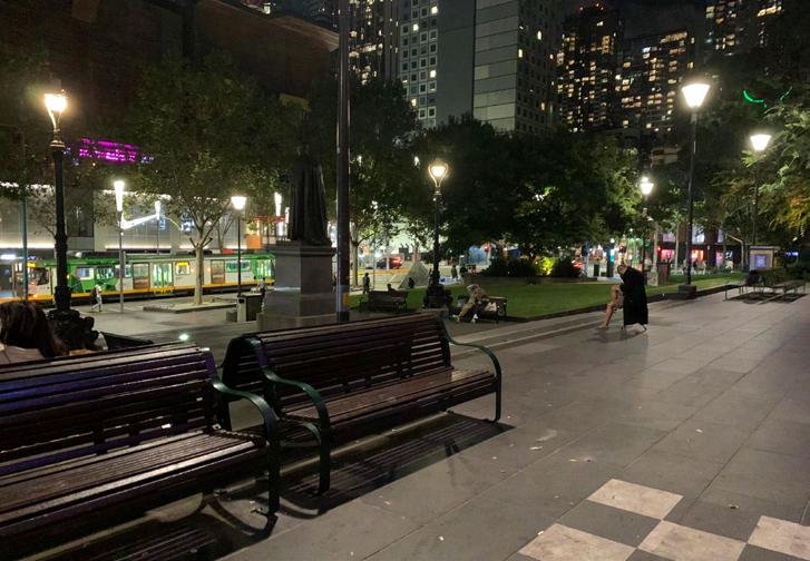
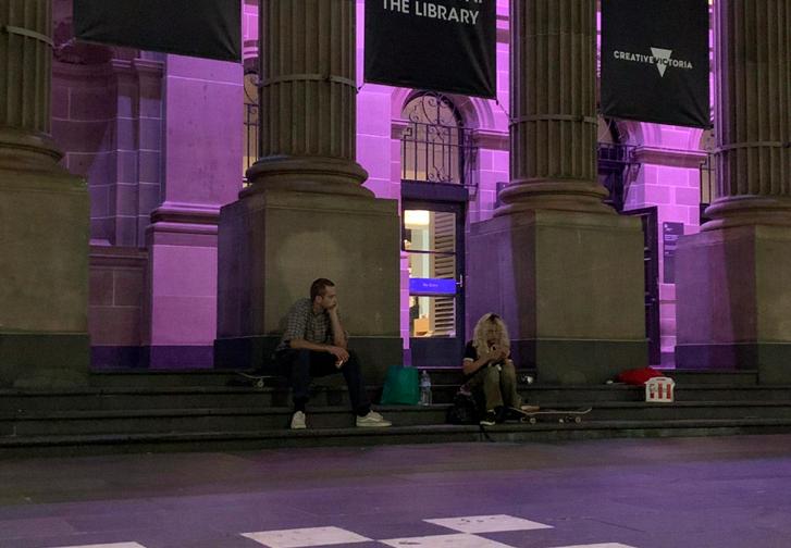
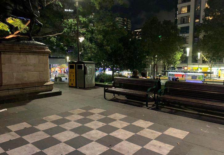
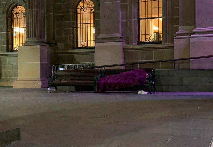
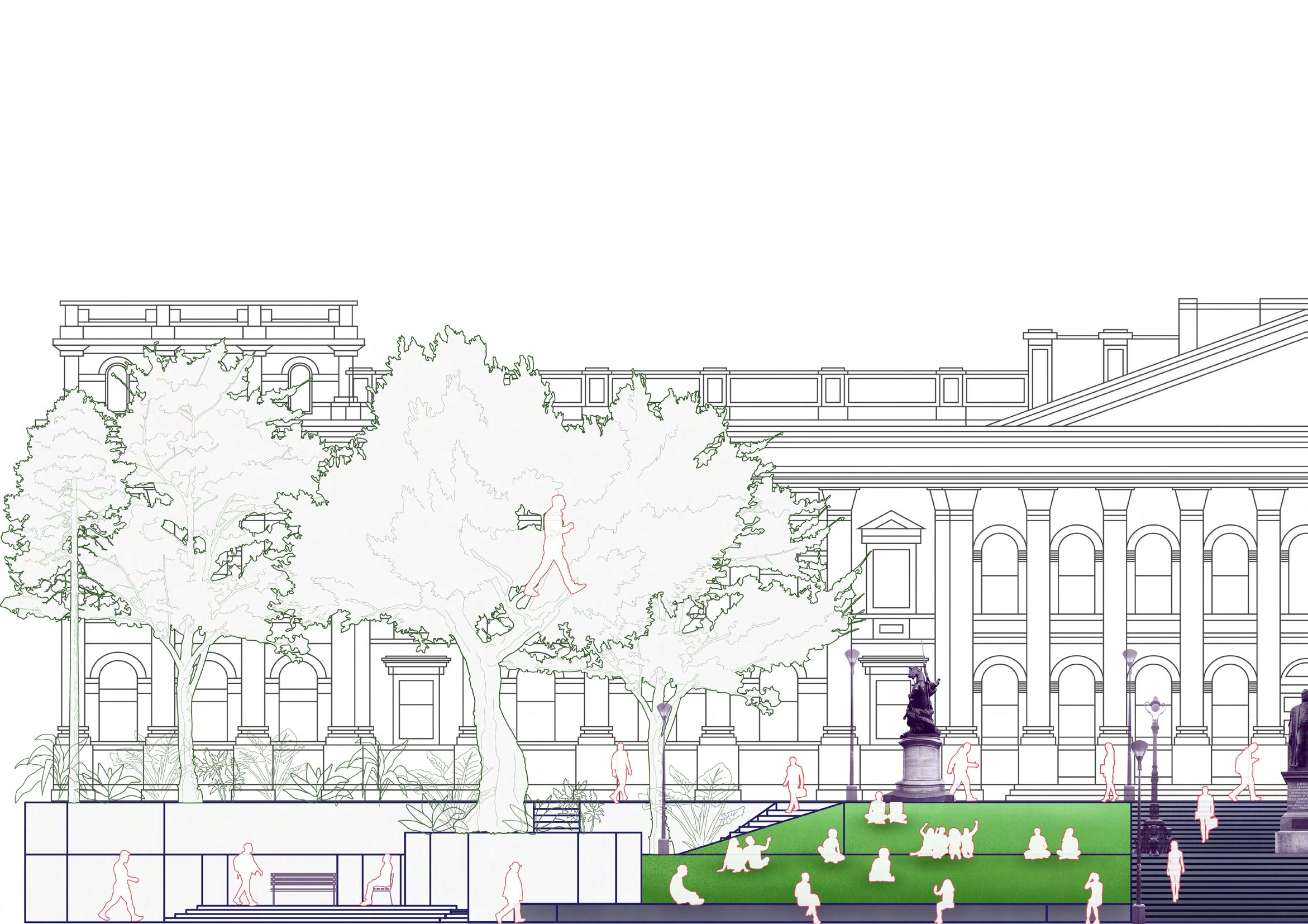
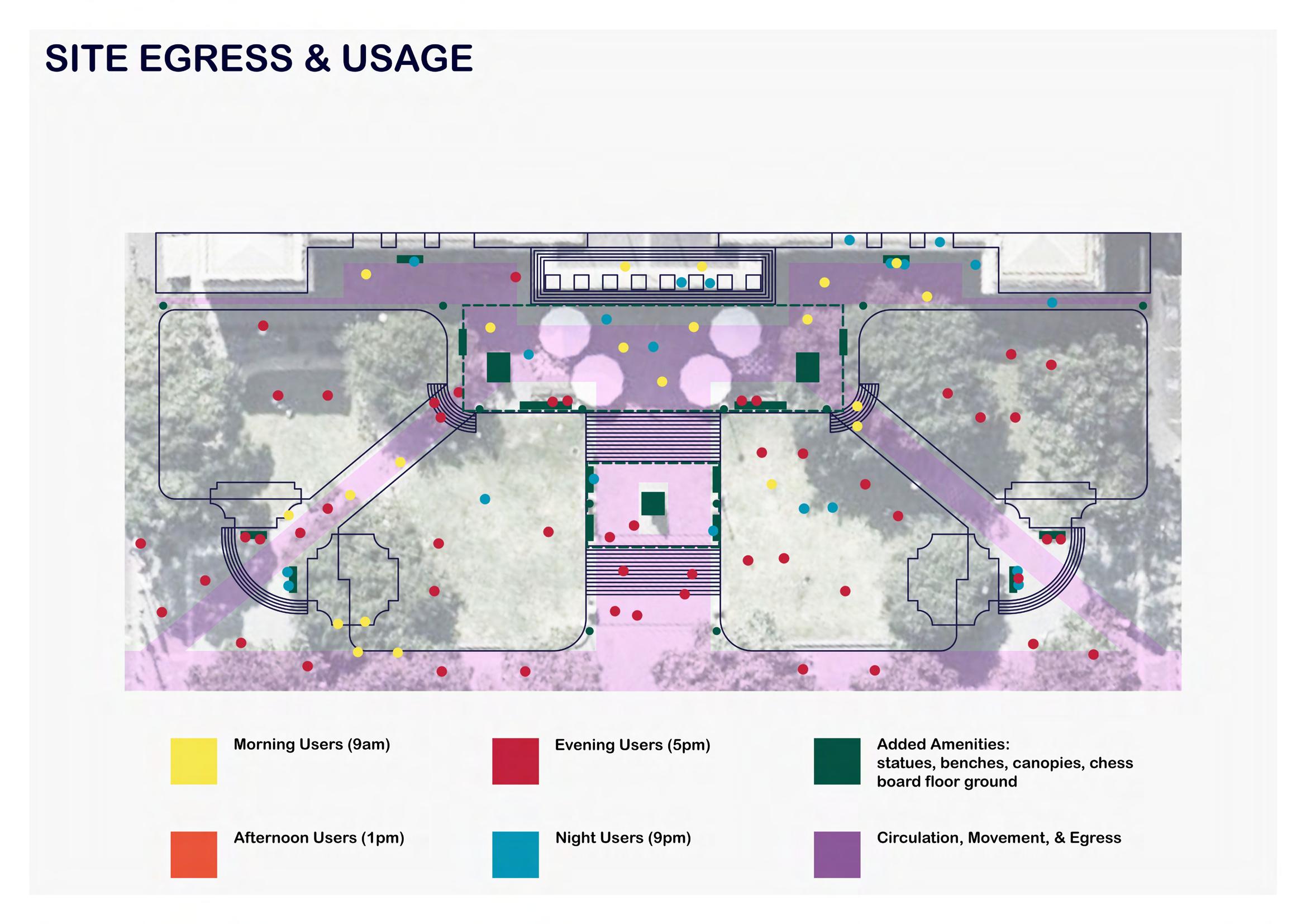
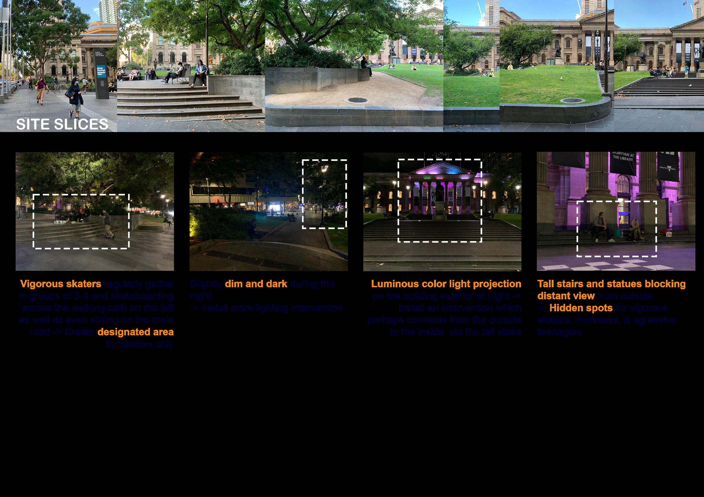
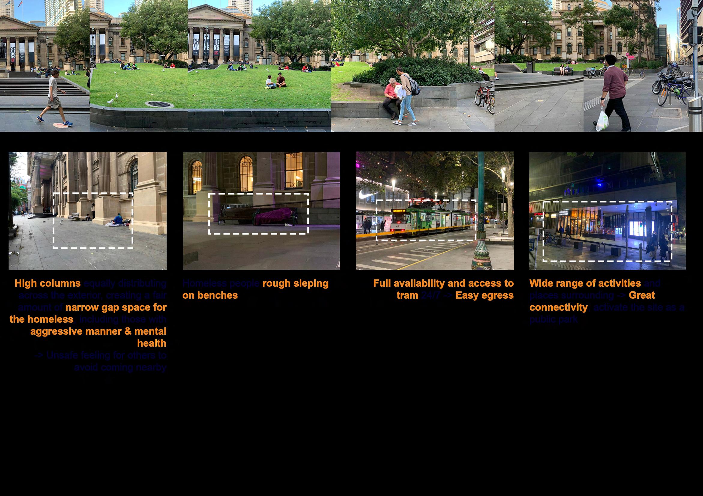
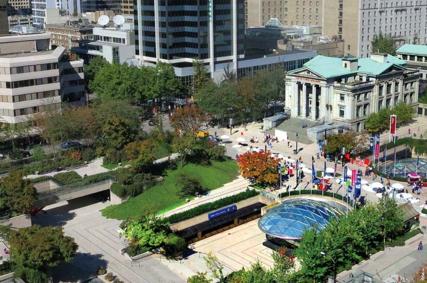
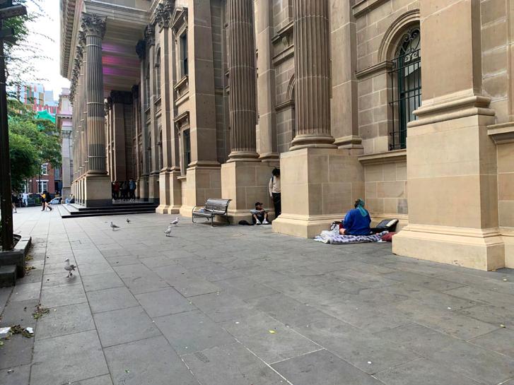
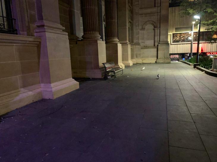
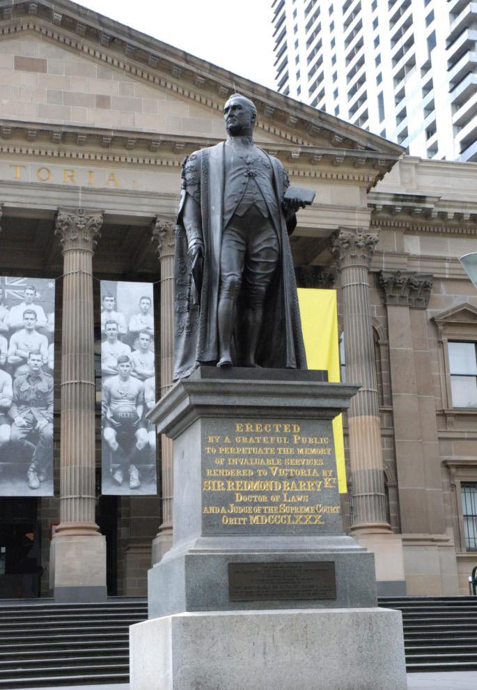
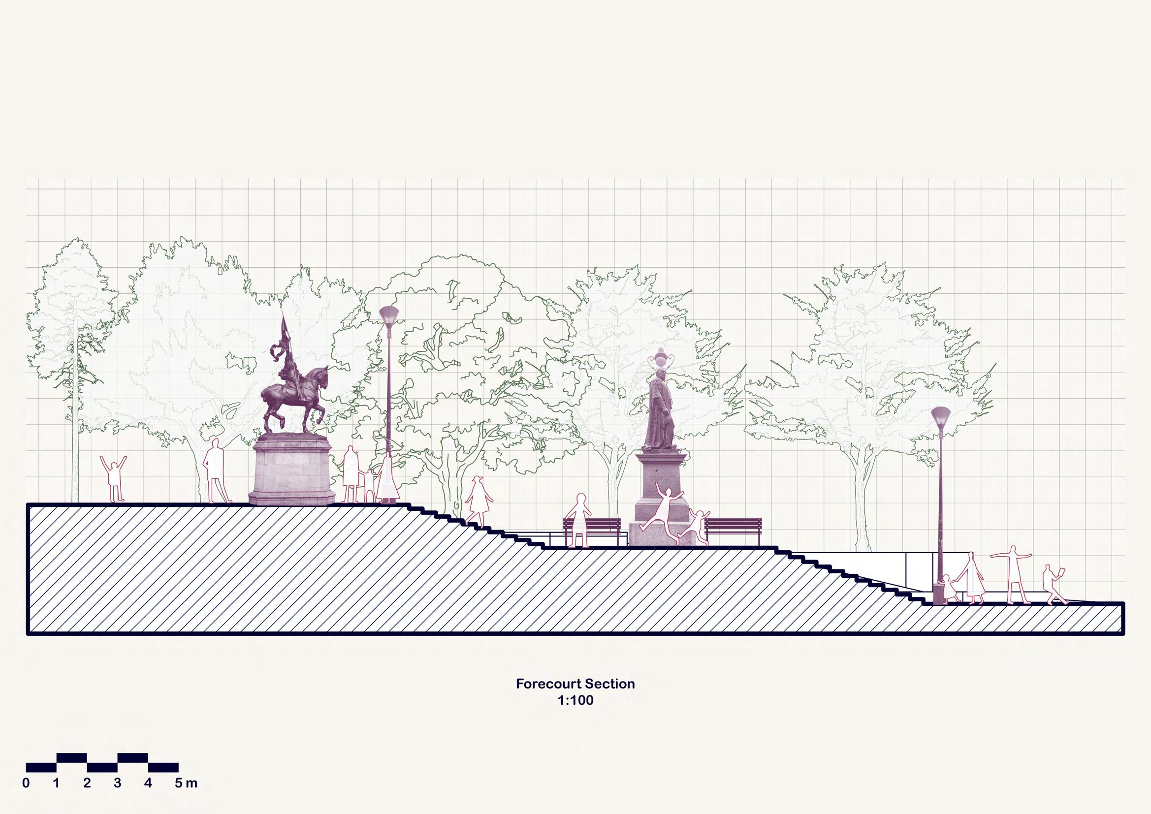
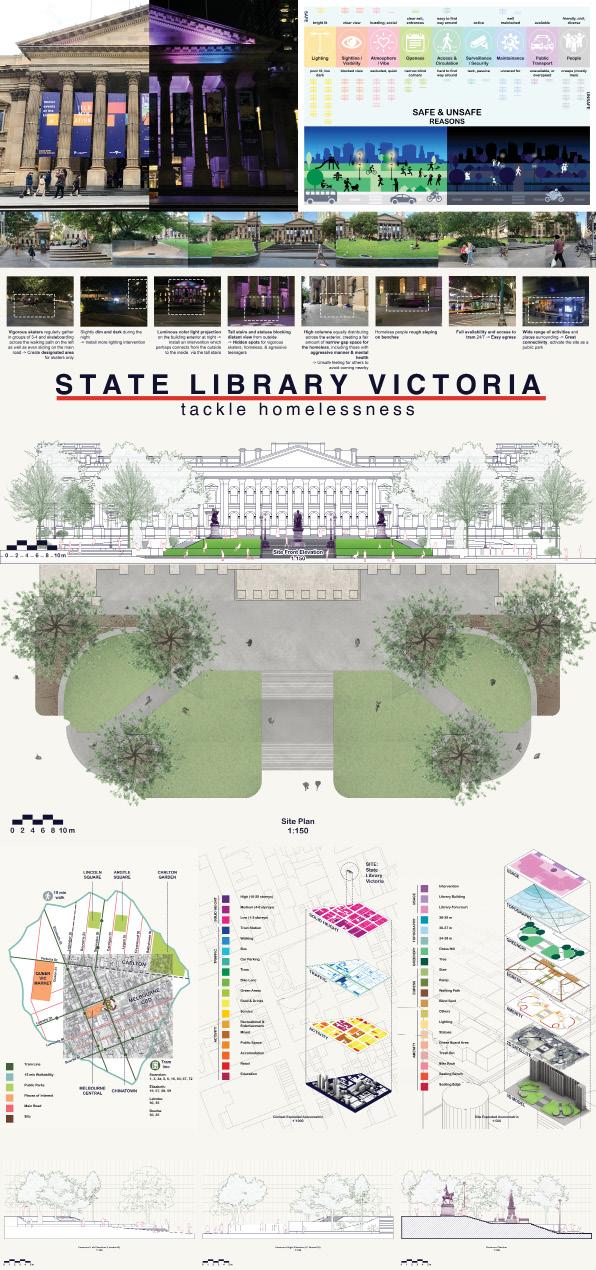
The State Library is one of the iconic public spaces spots in Melbourne where everyone is welcome to come to study inside or simply hang out and relax outdoors. The exterior is designed very spatious with benches and steep grass hills to sit and lie on, large size statues as well as chess pieces to play, wide open stairs paths on both sides and main middle, all arranged and situated neatly which allows easy circulation and free movement. However, during the evening, the space seems to be quite dark, although there are a fair amount of street lights but it is not lit enough. Tall trees and dense bushes, statues, and the building columns create perfect spots for the unpredictable people to gather and hang around, especially the homeless and the intoxicated with mental health issues when they can get easily infuriated when unsuccessfully asking for cigarettes.

43
After walking through about choosing the State Library and Argyle Square, I feel like I am in a position where I am stuck in a hole of uncertainty. For some reason, I could not really decide which site I would be interested to go with. The comments on the YourGround website are all contradictory to what I perceive from my on-site observation of the two locations. I personally feel that the Argyle is less safe than the State Library, the whole space seems quite poorly lit after dark. Meanwhile, as I am more convinced that the latter, State Library, is much safer, there exist several comments on YourGround reporting the opposite, mostly because of the intoxicated beggars out there.
After expressing my uncertainty, the tutors have been helping me explain that as the project requires creating inclusive spaces, and that inclusivity is meant for everyone, I shall need to step away from my personal point of view and try to put myself in other shoes as to why they might feel unsafe. Therefore, as much as I am more interested in working with Argyle Square as I feel it offers more scope than the library which already appears more established and well-maintained, I still decide to go with the State Library, as I want to tackle the people, specifically the homeless people as it seems more interesting, while the Argyle is quite too dark, hence unsafe for me to
44
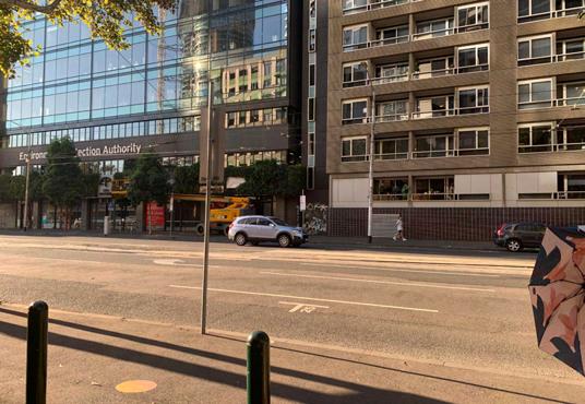
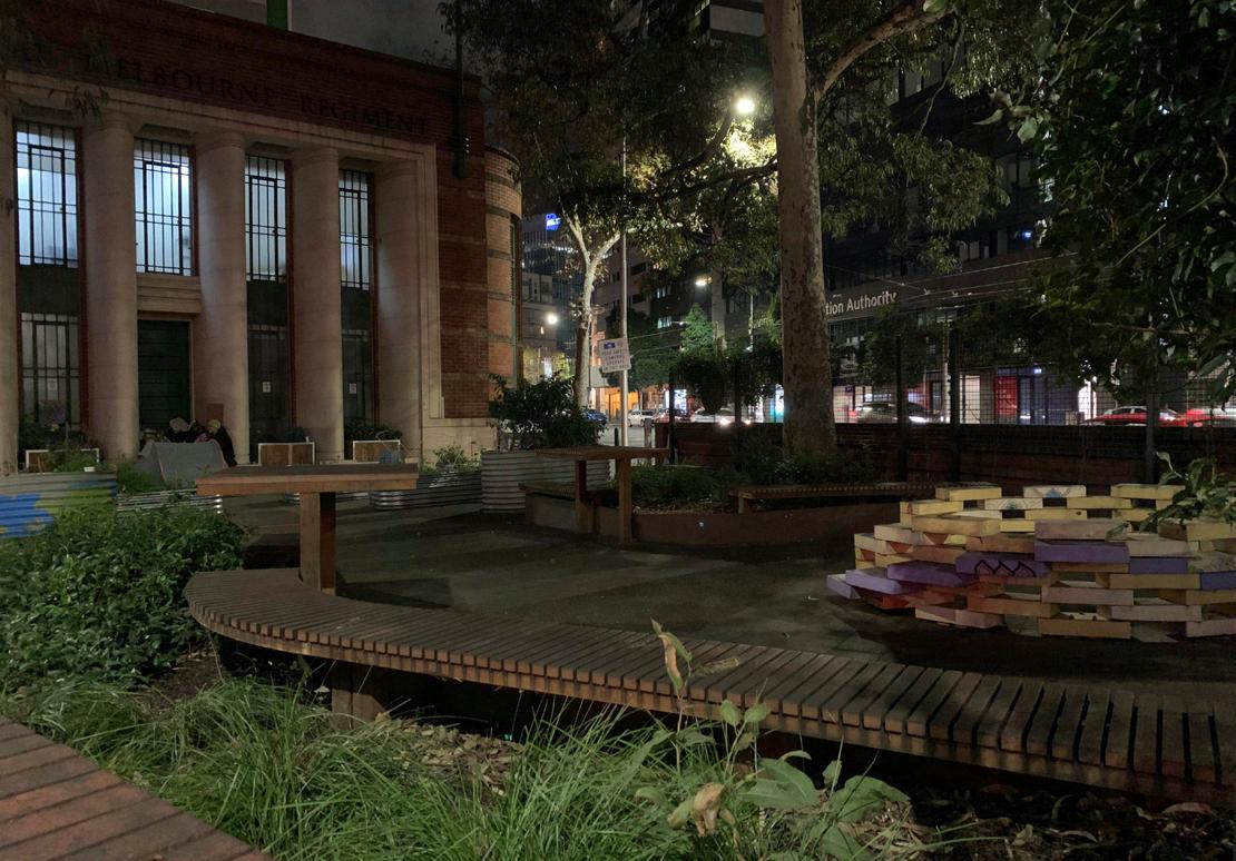
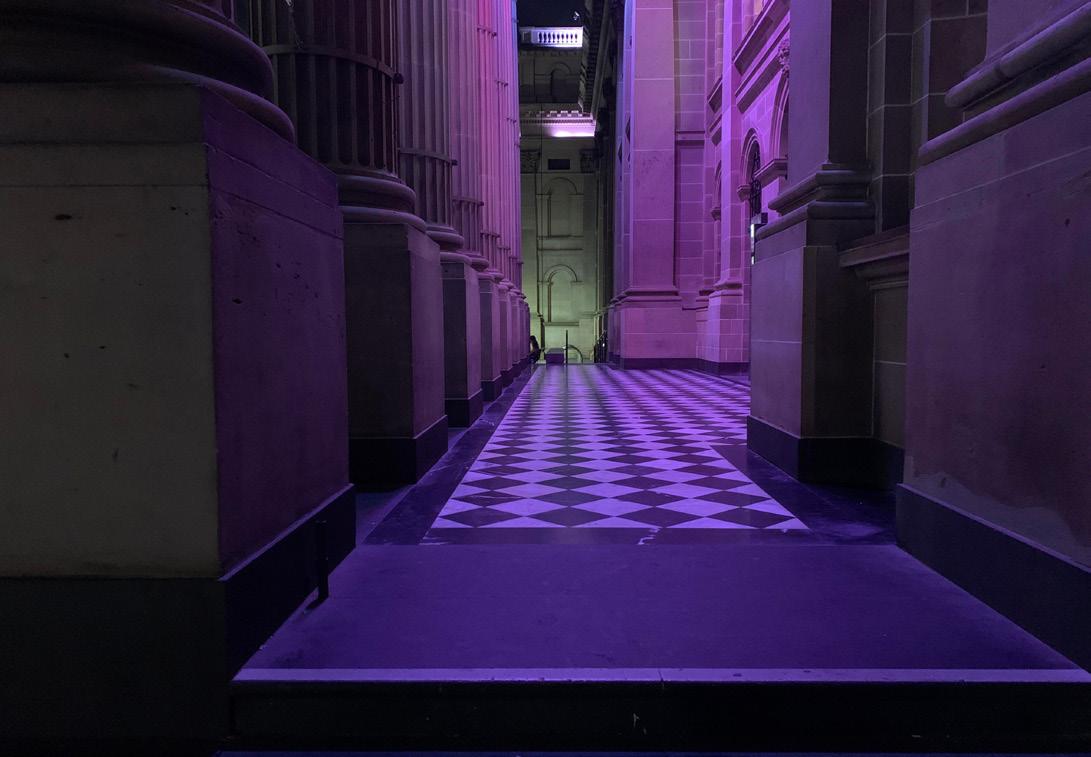
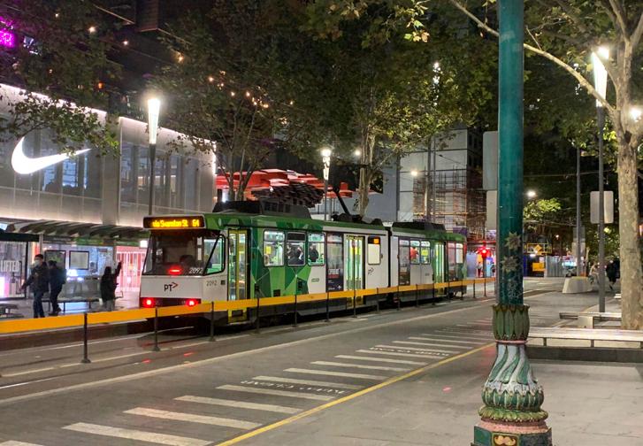
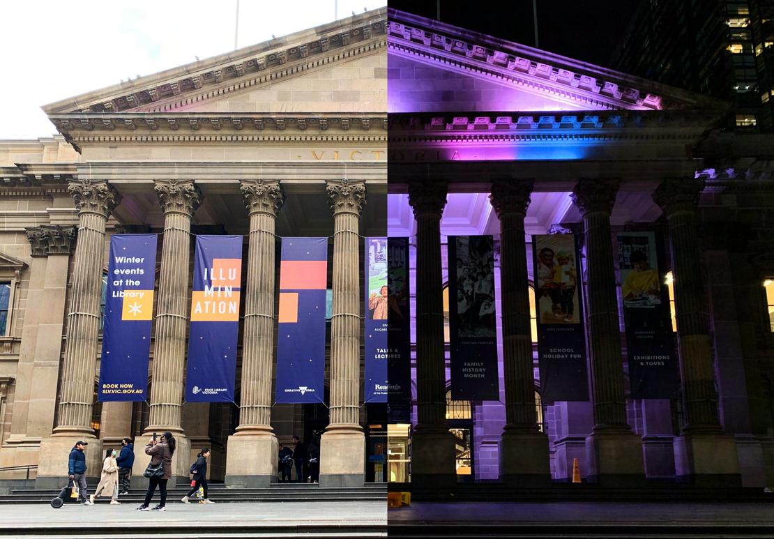
After finalizing my choice of the site as the State Library of Victoria, I have done more site visits, especially during late nights to observe what makes it unsafe as reported on YourGround. Whilst I can see that the building’s facade is projected with beautiful pink colors during late evening as well as a fair amount of people lingering by on the hills and the benches for chit-chats, I still need to observe more on why it is unsafe for some people.


46


47
DOCUMENTATION

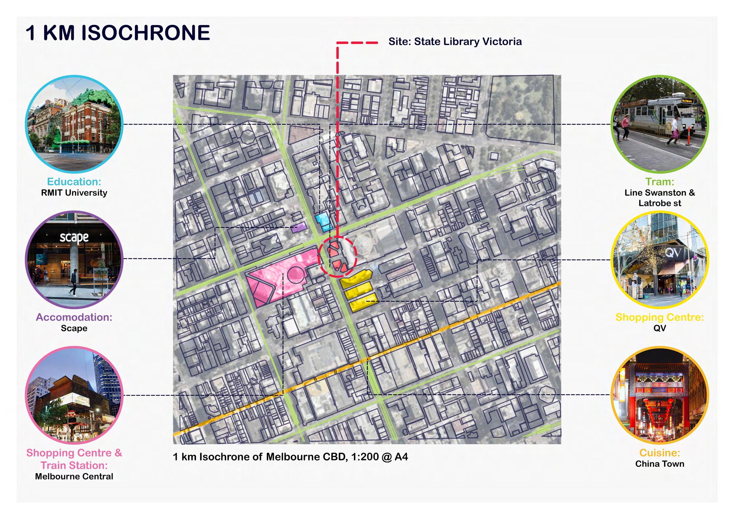
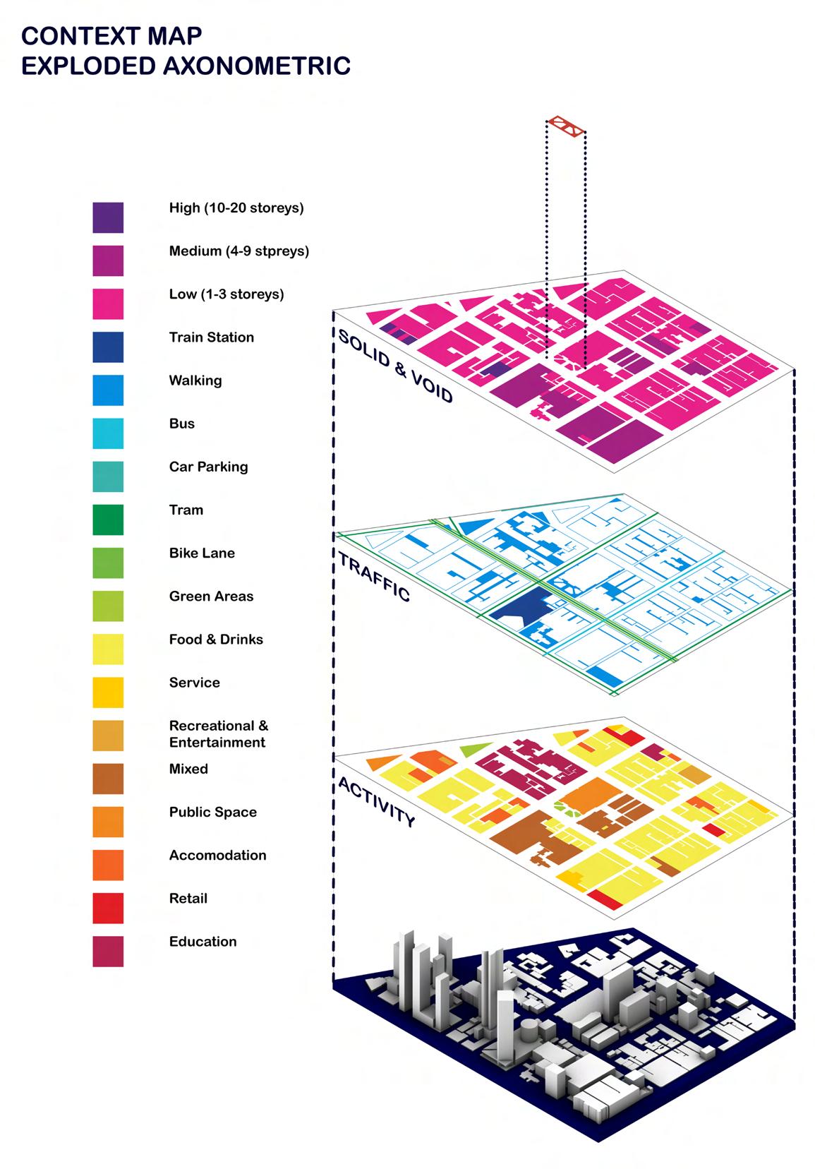
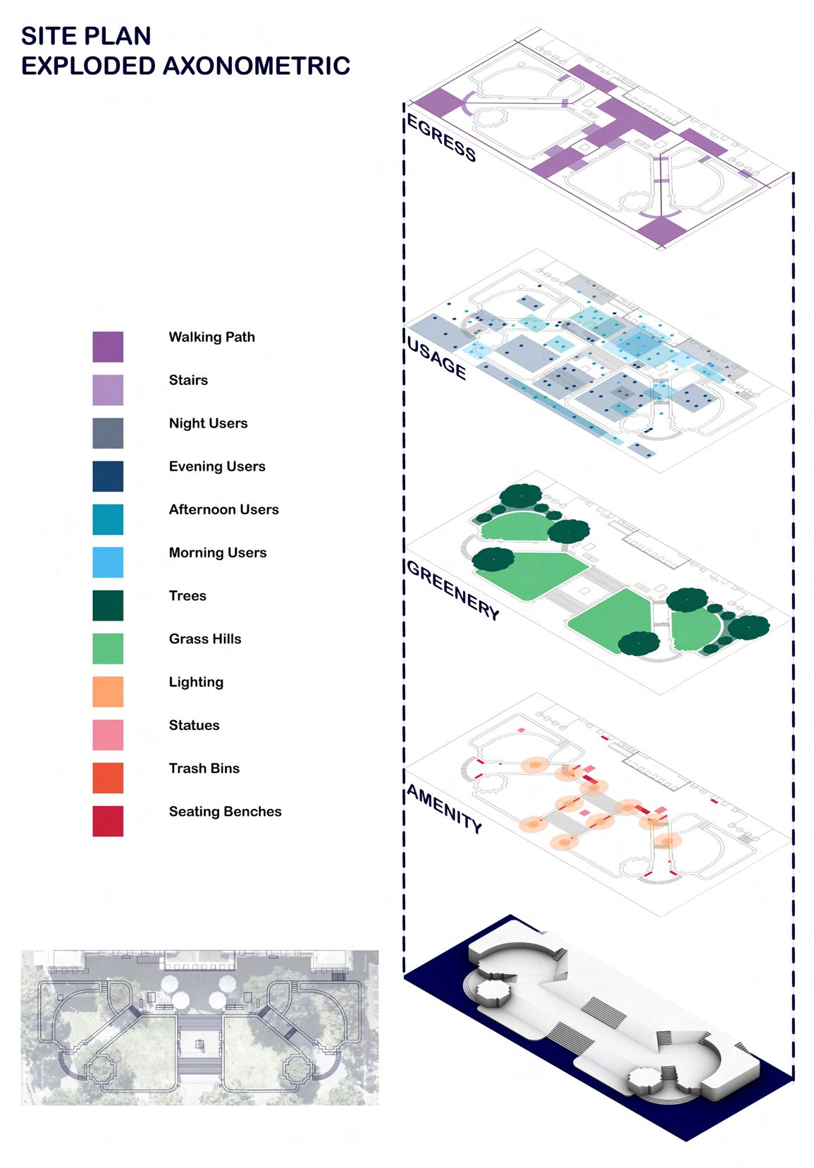
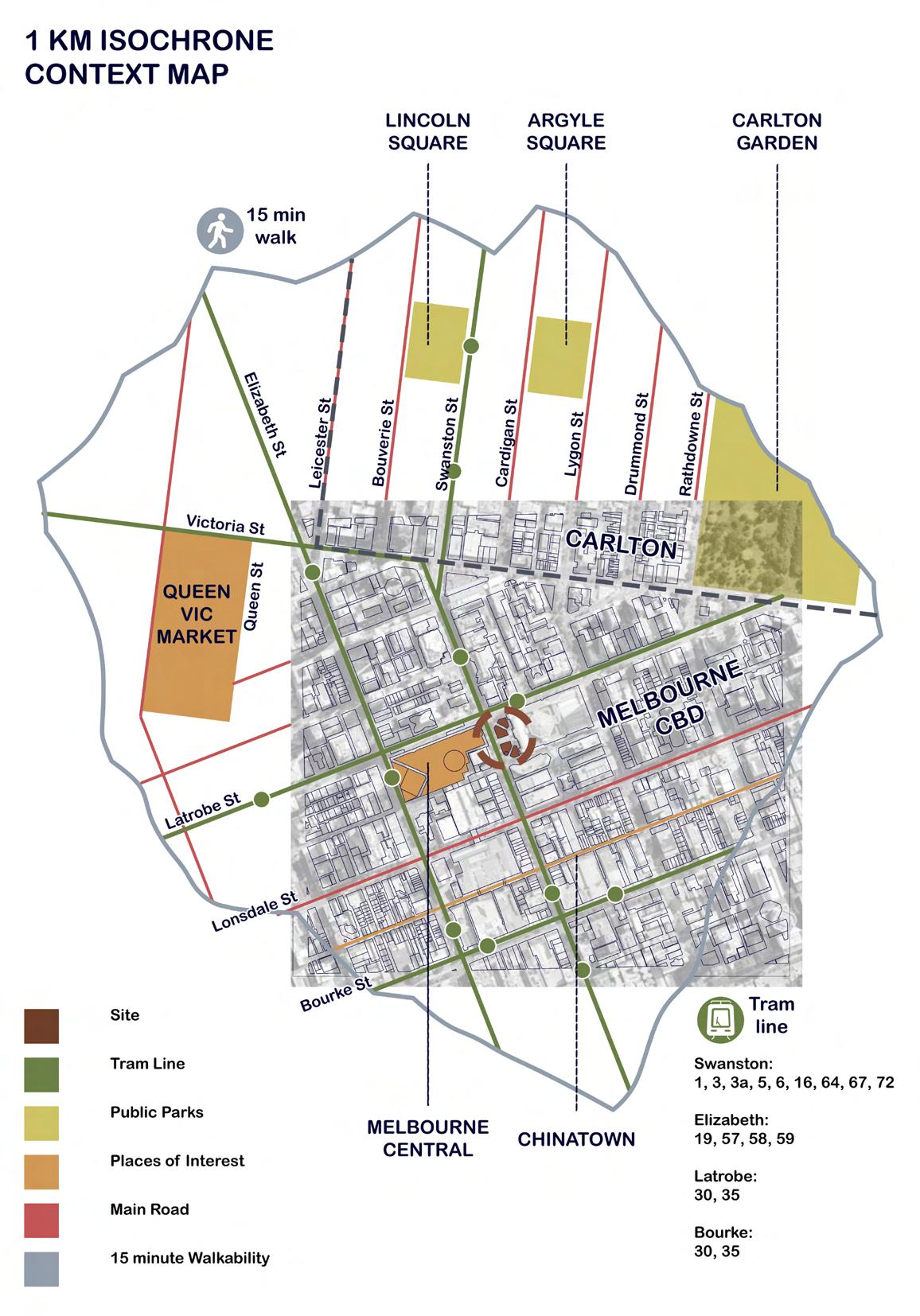
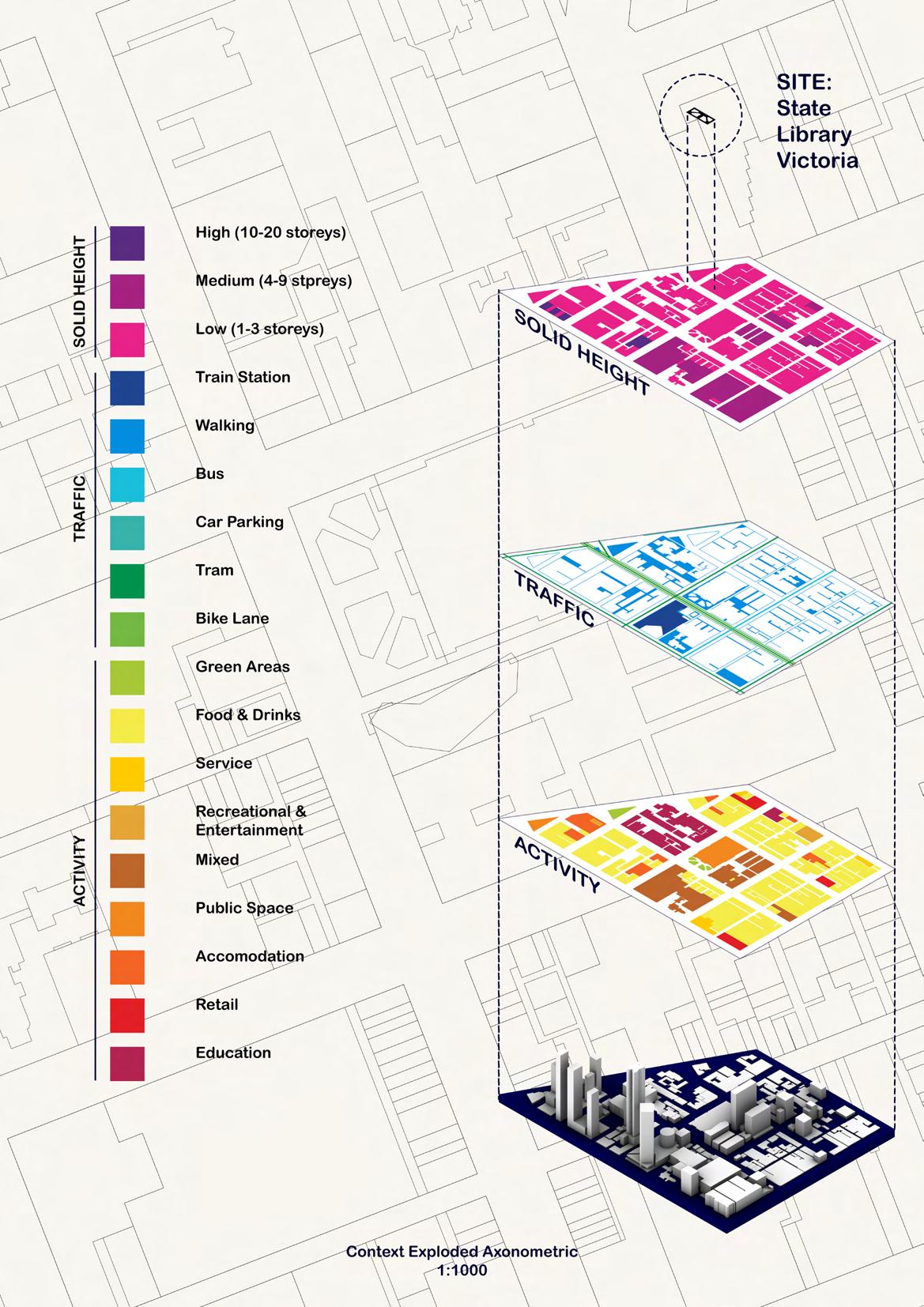
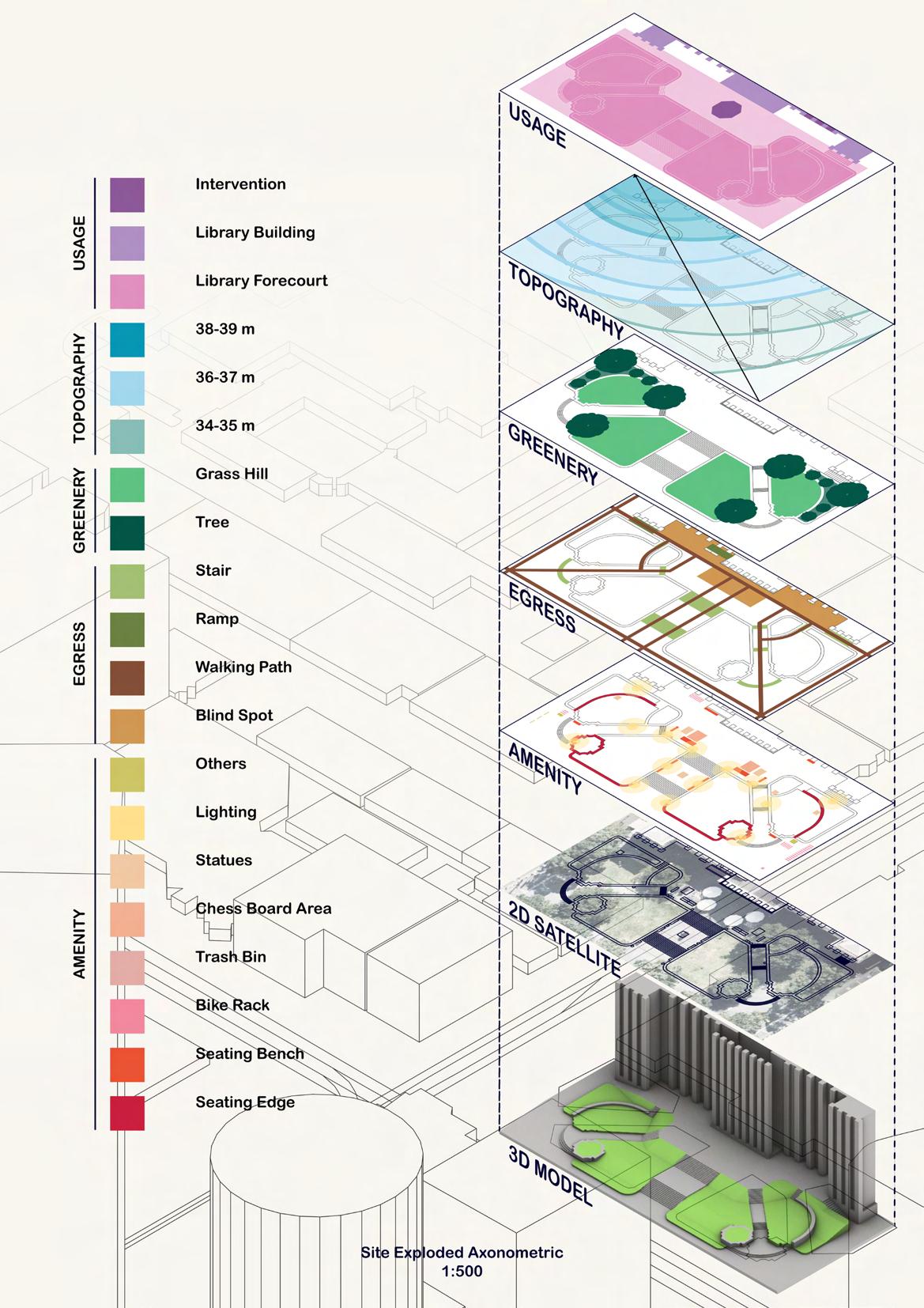
After collecting materials for site analysis, the fifth week progresses with documentation, which is also one of the busiest and most stressful weeks that we have to speed up our work. Throughout the week, as I have been trying to finish as much as I could, I have made some mistakes in terms of misunderstanding the required tasks (the wrong isochrone and exploded axon drawings). This had caused a delay in my documentation progress, and presentation choreography as I had to redo and add more missing parts. Also, one thing I might have to consider is putting a fair amount of work on posters or avoiding putting too much, as the rest or those excluded from the poster would be included in the journal anyway.

SITES
50
ANALYSIS
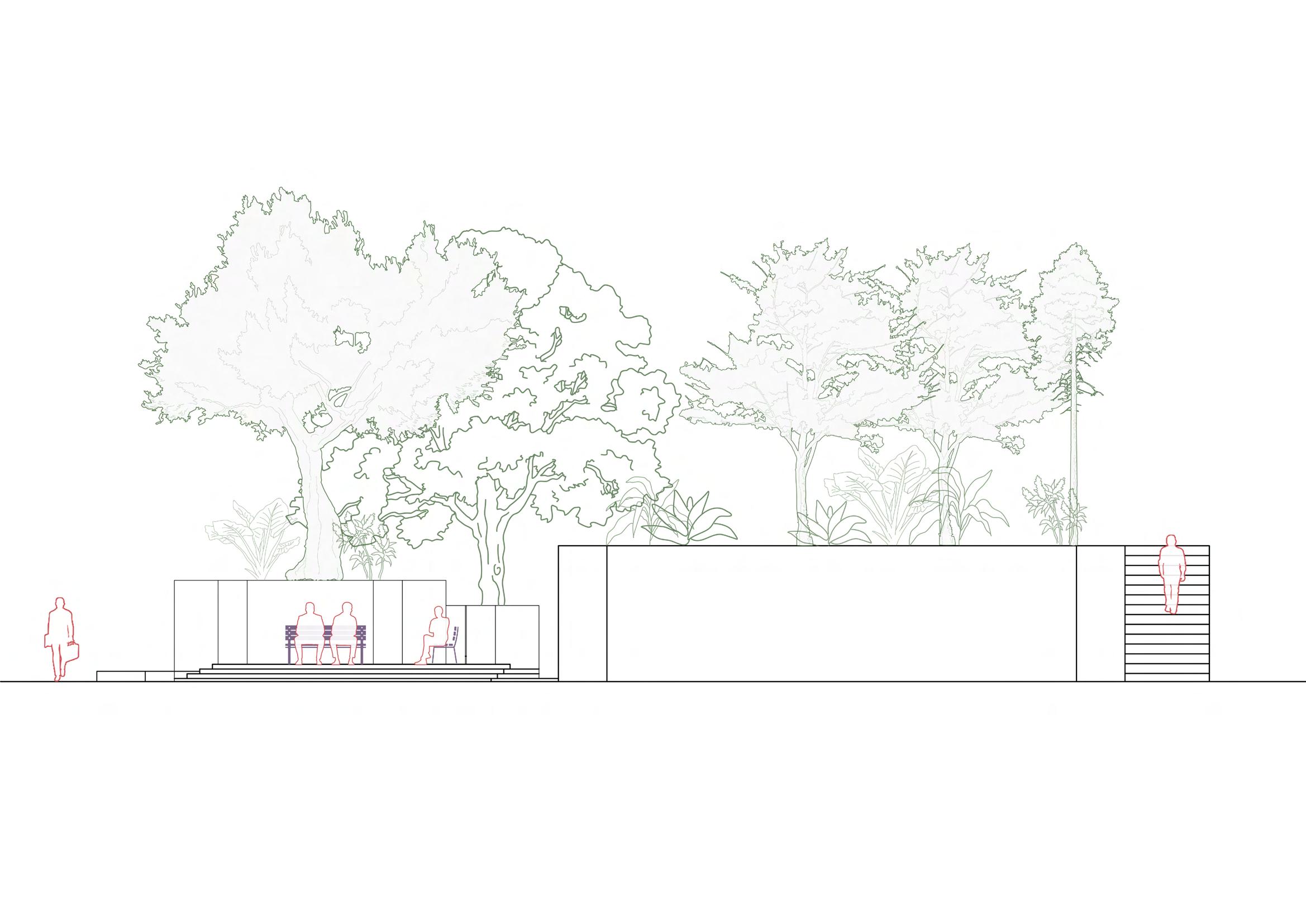
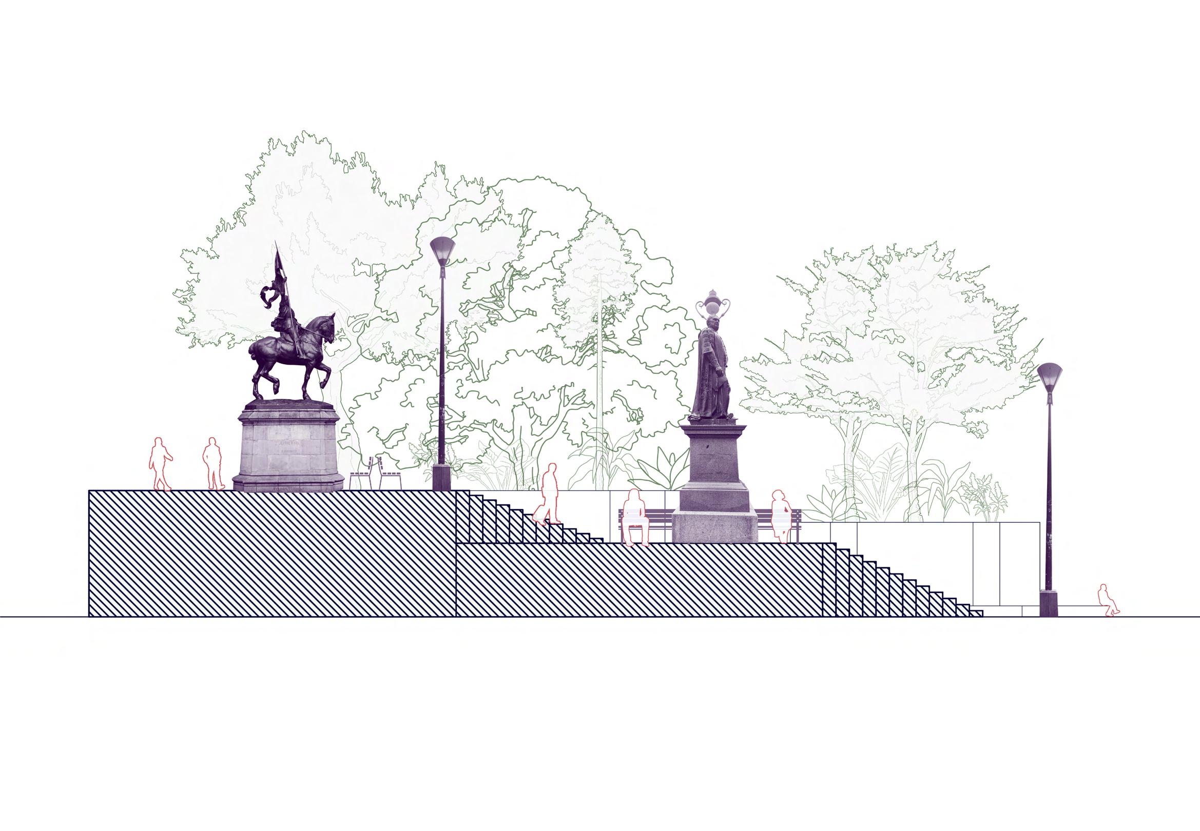
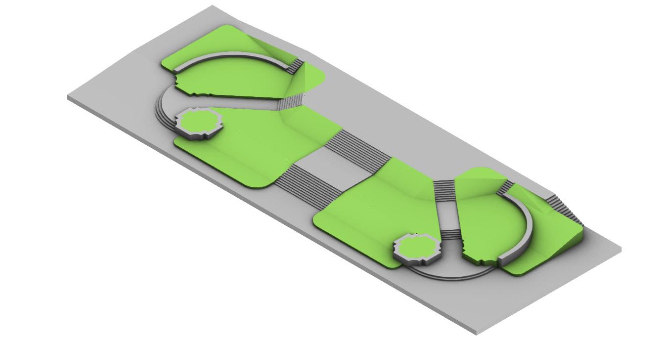
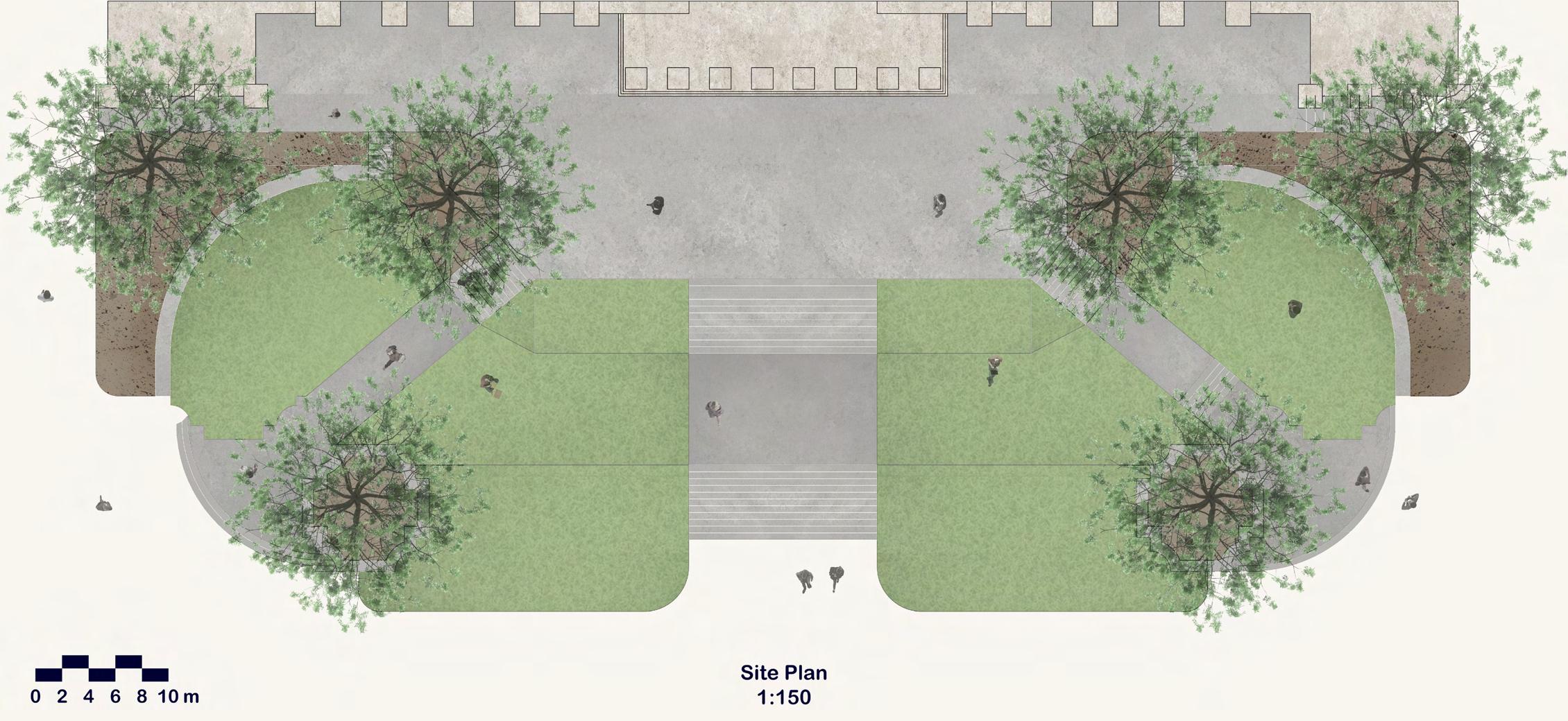
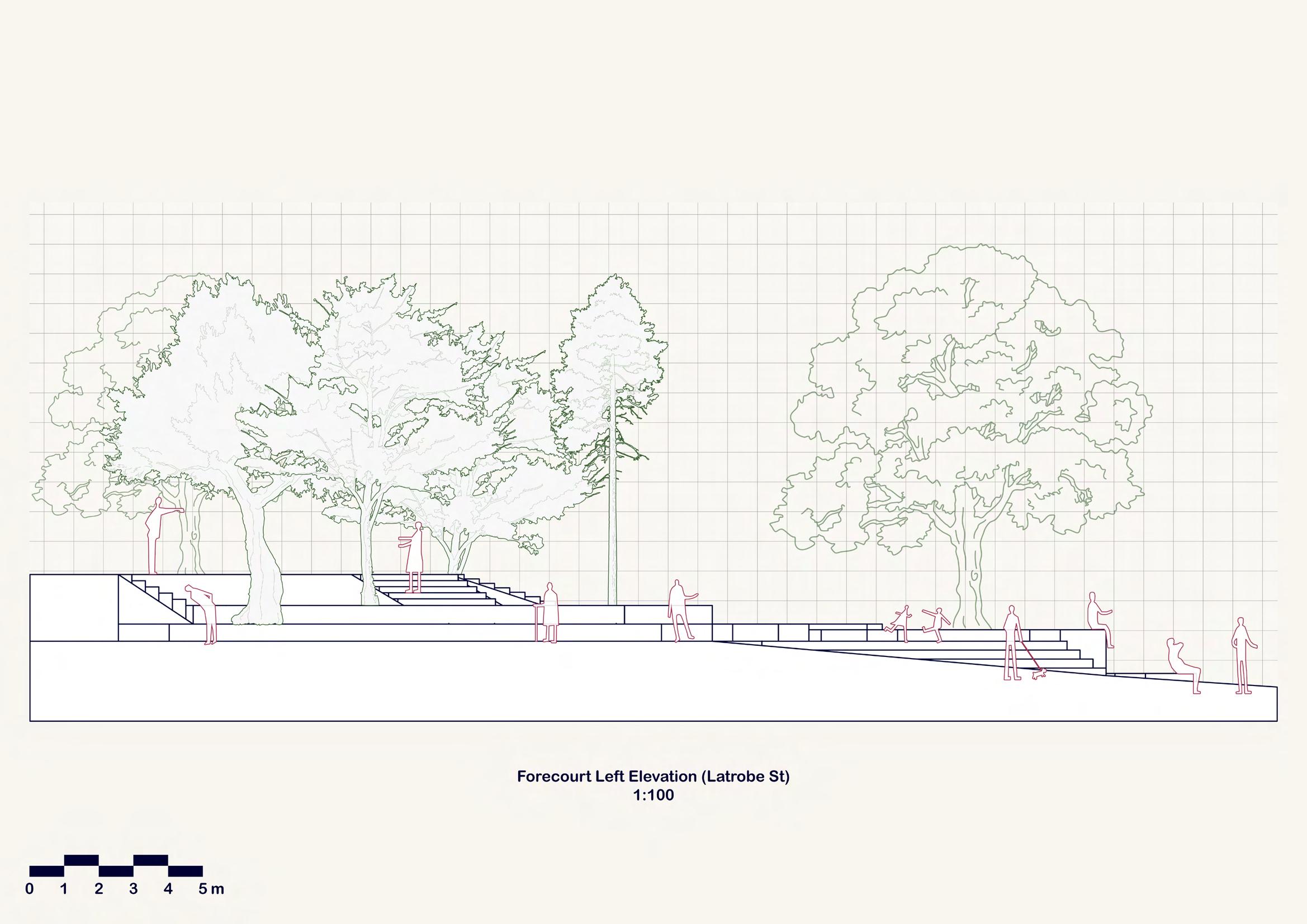
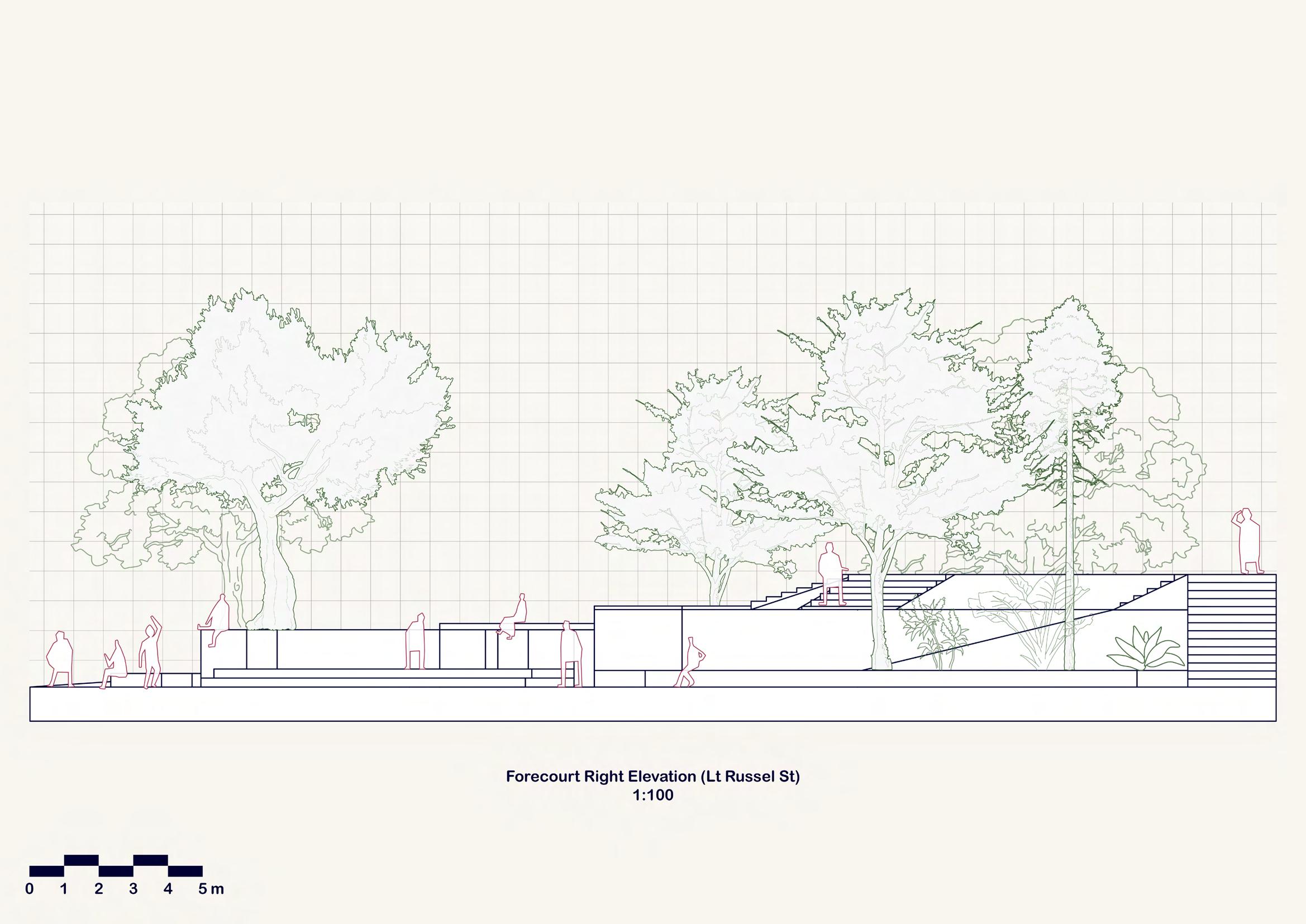
Modelling the site takes me a lot longer than I would hope in order to resemble the most exact and similar to the actual forecourt in reality. When taking a brief look, they look seemingly symmetrical and quite simple to construct. However, due to my lack of understanding of how the terrain slope affects the site design as well as inaccurate measurement, the model comes out inaccurate, which also affects the scale of the drawings too. Hence, I have to put the caption as ‘Not To Scale’.

51

52

53

54

55


56
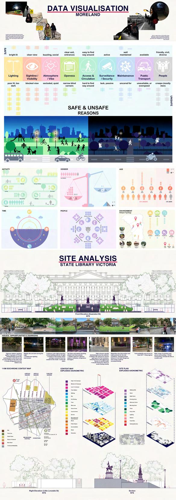
While practicing my draft presentation, my tutor helps me spot some minor flaws on my poster that might affect the clarity of my work. Since I have two exploded axonometric drawings ‘by accident’ (I mistaken the site map as the context map), I need to make sure that each map and layers have clearly distinctive color-coding. Initially, when I place them next to each other, they look quite similar, which causes some great confusion for my tutor when looking at them.

57


MIDTERM PRESENTATION

As the midterm approached, I felt confident with my work as the visual of my documentation of diagrams and drawings on my posters turn out as decently strong as I expected. However, the feedback given after the presentation did not align with my selfassurance. As I was so passionate about the amount of work and effort that I put into my documentation that I just include everything on my posters so that they could look busy and complex. However, it is because of the business on my work that ends up turning out into a big pile of mess and chaos as there is so much going on within the posters. Also, to be honest, as I was so consumed with the fact that the midterm presentation would not be graded, I did not really do preparation and practice for my presentation, which had caused me to stutter and screw up completely when it mattered the most. What is more concerning is that it is my lack of rehearsal and sloppy presentation that caused misunderstanding about my project between the guest critics and the tutors. However, I then realized that the fact that it was not graded could be a good thing as I feel that my work still needs a lot more improvement
The midterm presentation did not go out well for me at all as I ran out of time rehearsing myself before the event. This unfortunately caused miscommunication and misunderstanding among the tutors as well as the guest critic thinking that my future design aims to exclude and remove the homeless away from the site, which is opposite to what the project brief asks for. Also, another markdown for my midterm submission is that my posters consist of too many visuals, as they look very busy and overwhelming to read. Because I was too passionate about my drawings as well as the amount of hard work I put in, this creates a false mental impression that I need to include everything in my posters so they can look busy and intricate as possible.

62
MIDTERM POSTER


63
CONCEPT INCEPTION

With the second half of the semester commenced, week 7 requires us to collect a catalog of images of inclusive urban interventions and activism/advocacies about women’s safety and women’s inclusiveness as inspiration for future concept iterations. Hence, this week is just another fresh relaxing starter involving no designing work. However, after the previous midterm presentation and feedback given as well as going through a list of tasks that needs to be done during the Easter holiday break, I feel pretty stressed, daunted, and lost as I have absolutely no idea what or where to proceed next, especially coming with designs that are ‘radical’ for the homeless.
precedents
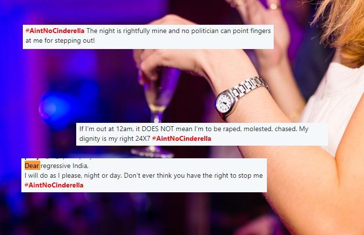
Ain’t No Cinderella campaign, 2017.

A social media movement initiated from an incidence where an Indian was victim-blamed for going out late after being harassed by strangers. The hashtag draws inspiration from Disney movie Cinderella who had to come home before midnight. This encourages women rights of going out whenever they want, wearing whtever they like, without feeling ashamed

ADVOCACY & ACTIVISM
66
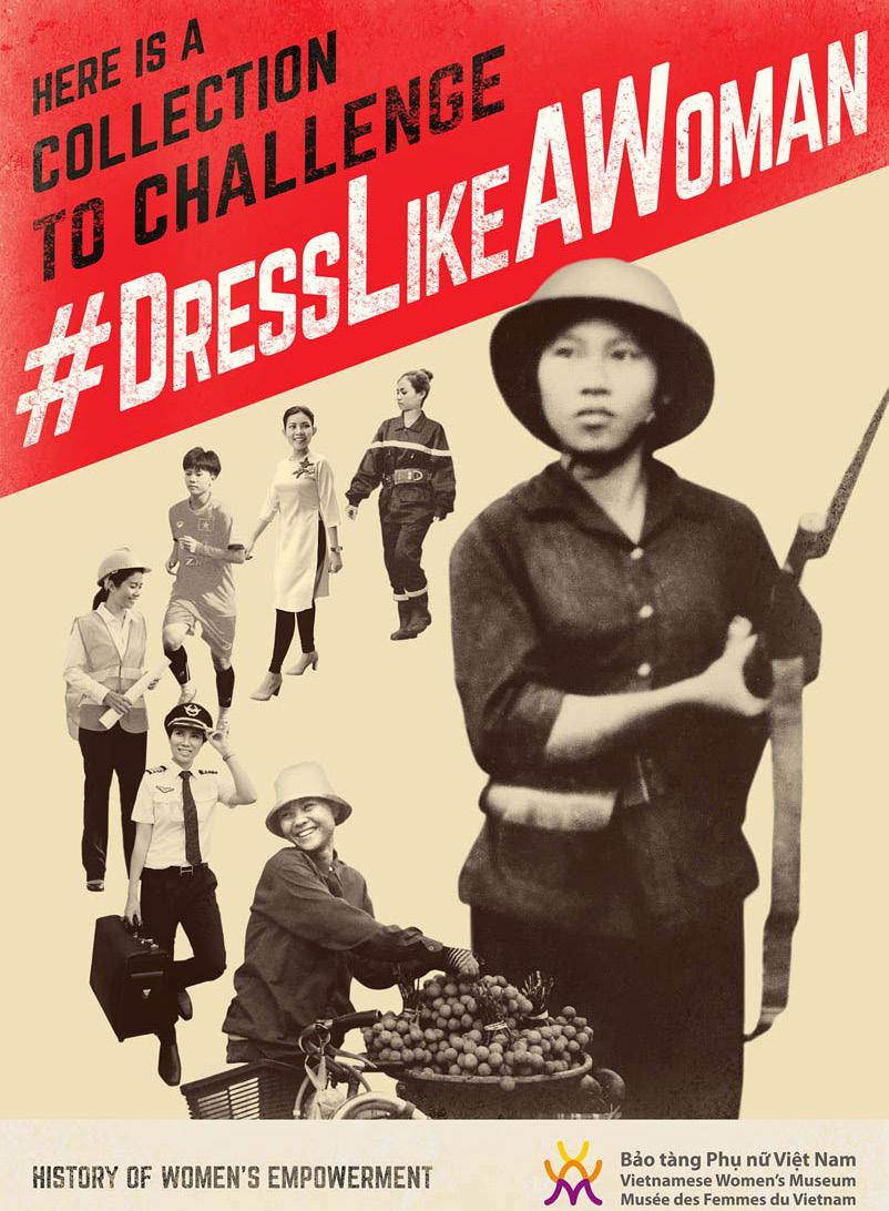
Dress Like A Woman, 2014.
The poster experess fearless spiritual women during the World War through showcasing the simplicity yet elegance in their outfits and the culture of Vietnam. It also conveys a linking history of Vietnamese women with current trends in global media through the use of yellowish monochromatic images of women from past present generation,

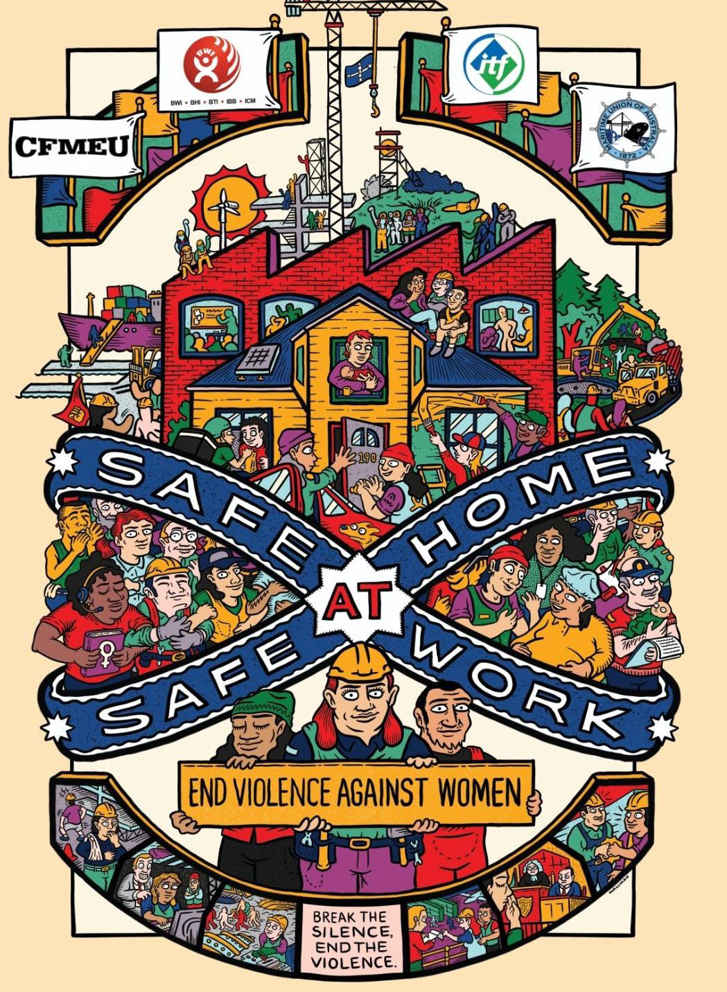
Safe At Home, Safe At Work.
2020.
A caricature shows workers from different cultures, who all deserve freedom from violence and harassment.The illustration style is pretty complex yet fun and interesting to view with lots of color but still able to convey the focal point of safety at home and work using capitalized fonts and types. It also showcases lots of human figure that resembles unity of

67
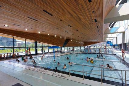
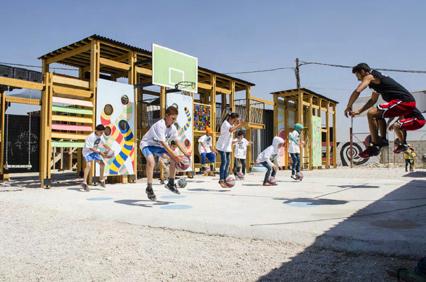
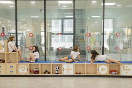
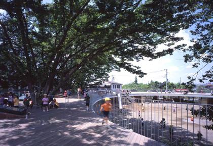
INCLUSIVE SPACES precedents


Insights:
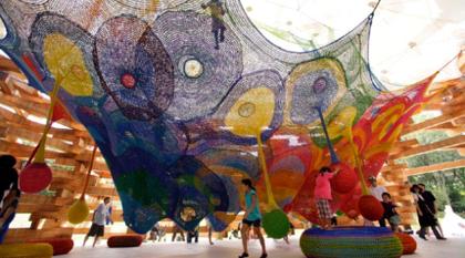
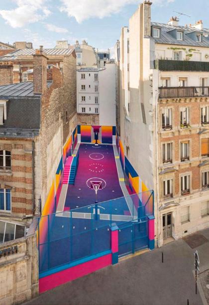
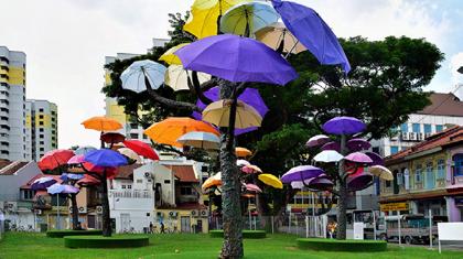
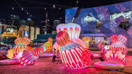
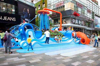
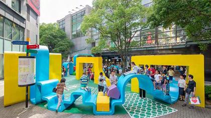
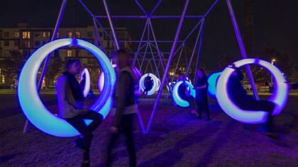
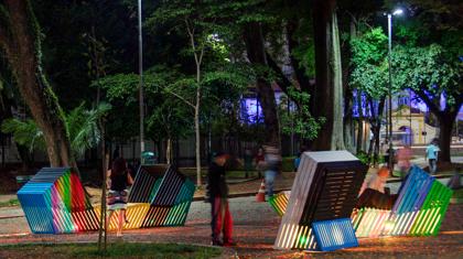
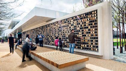
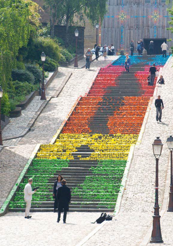
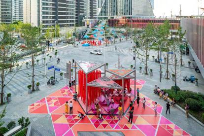
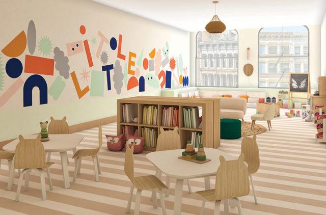
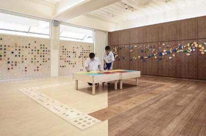
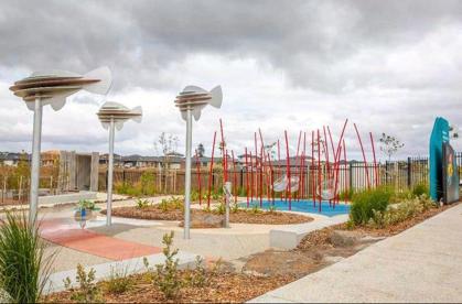
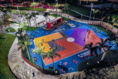
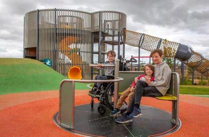
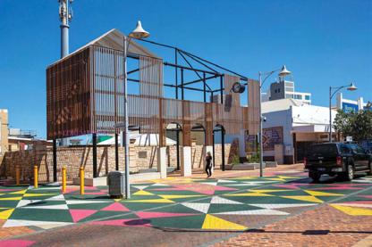
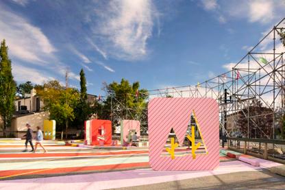
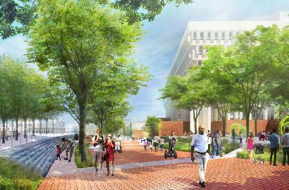
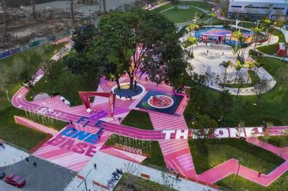
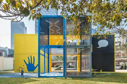
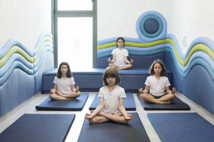
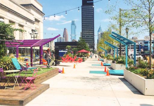
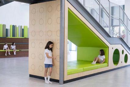
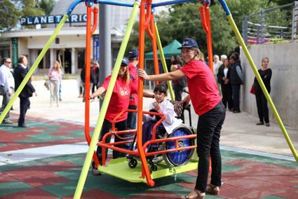
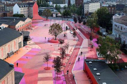
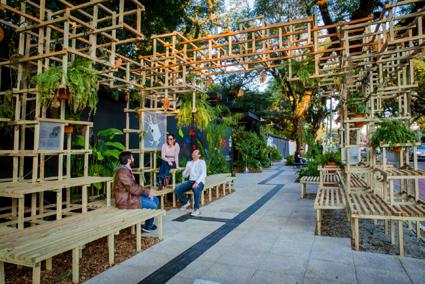
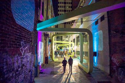
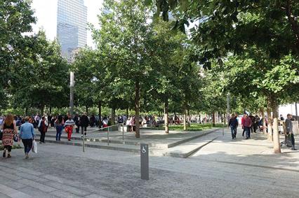
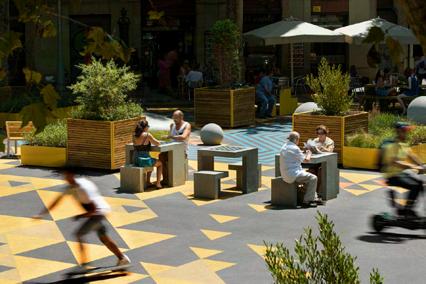
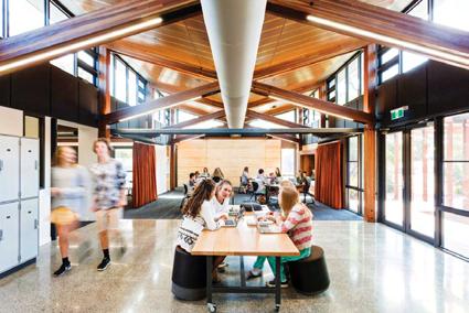
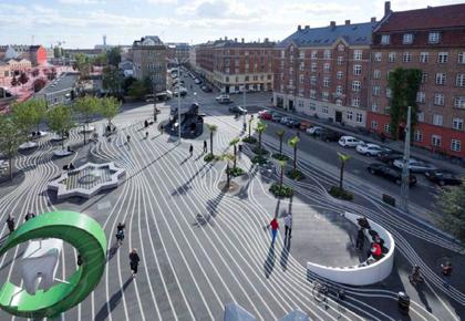
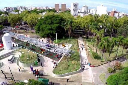
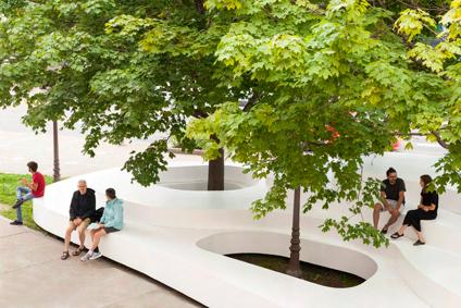
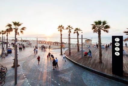
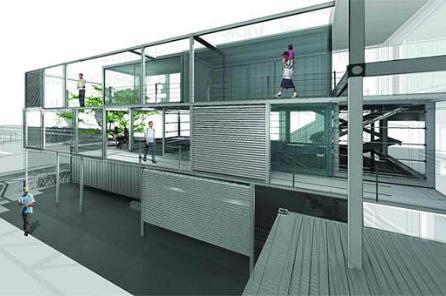
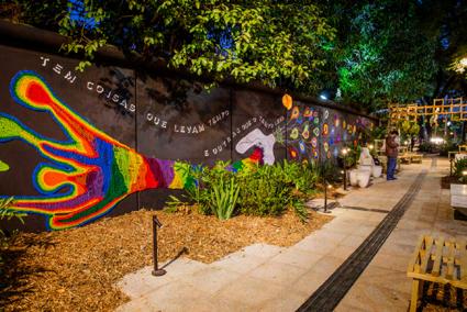
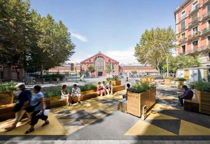
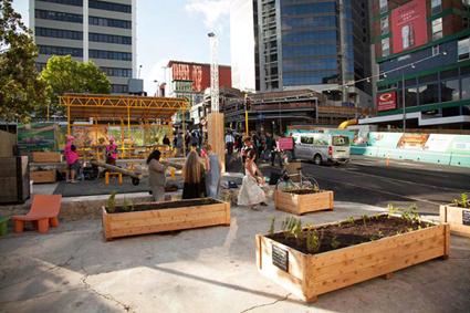
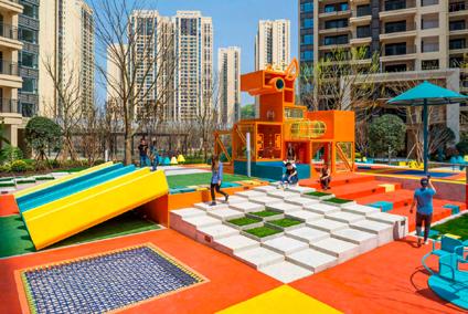
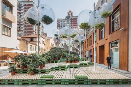
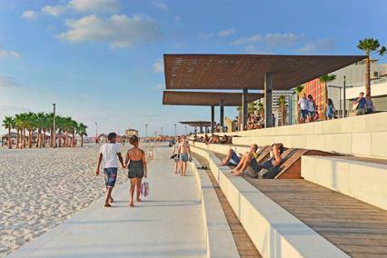
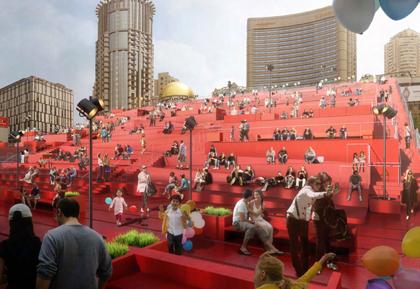
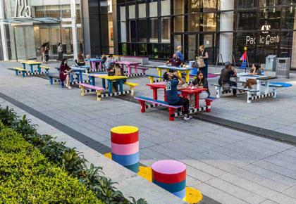
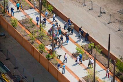
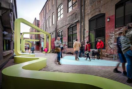
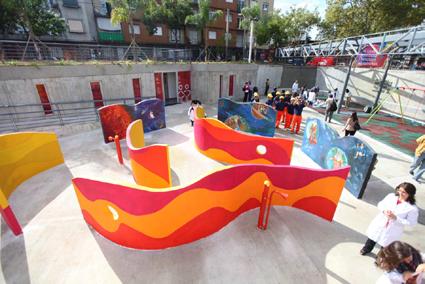
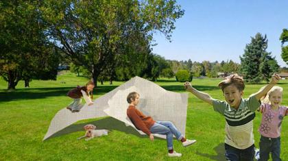
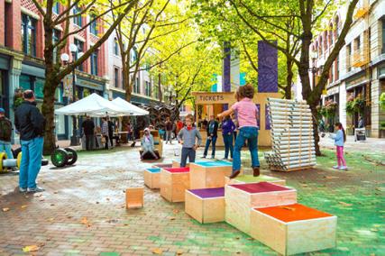
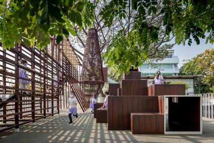
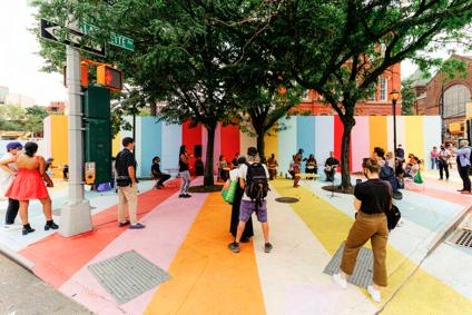
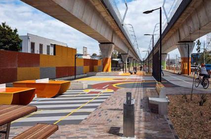
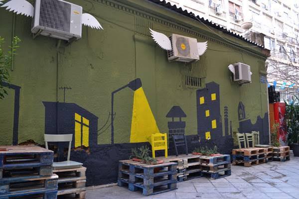
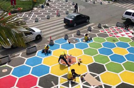
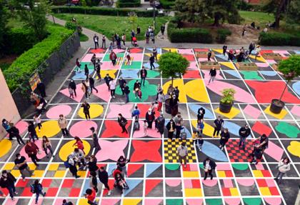
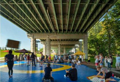
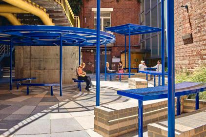
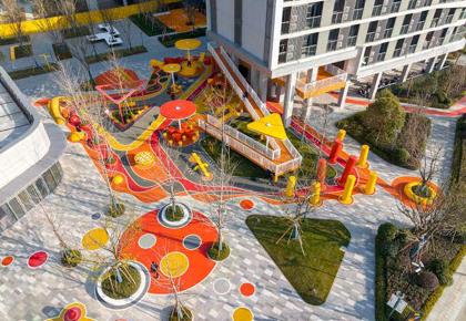
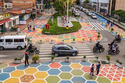
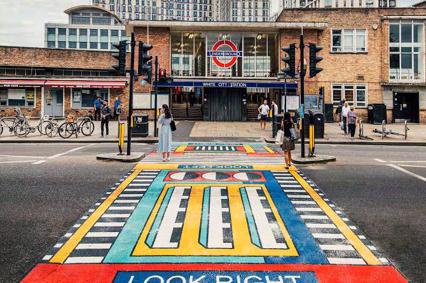
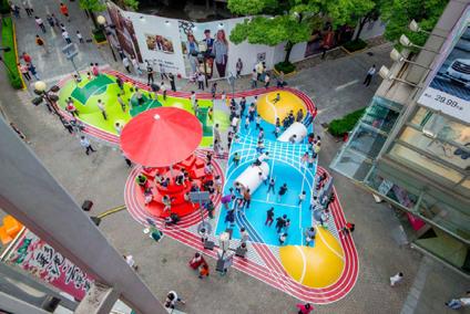
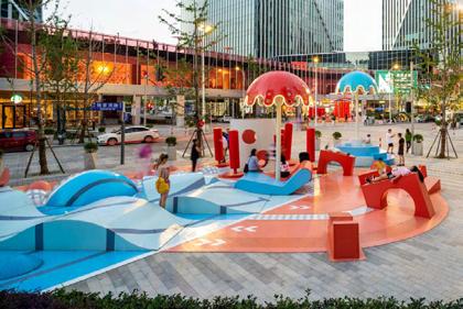
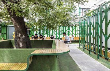
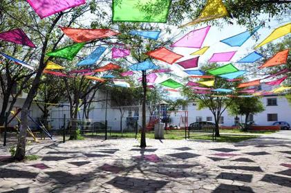
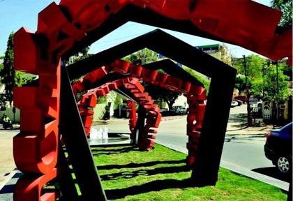
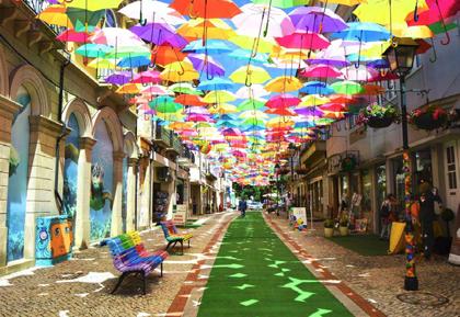
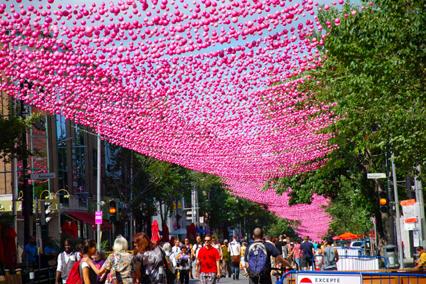
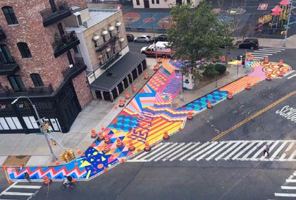
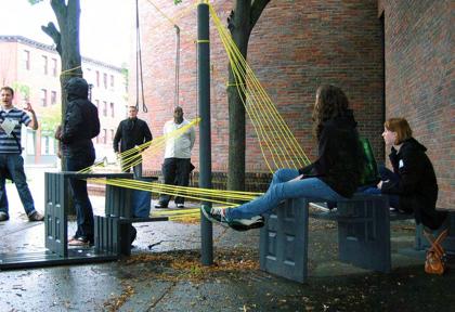
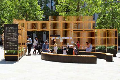
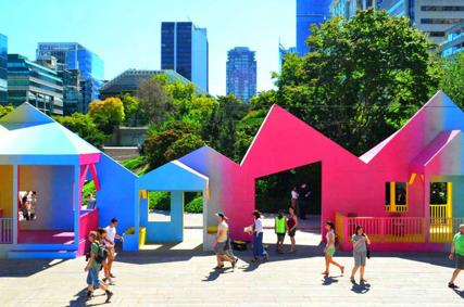
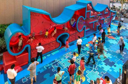
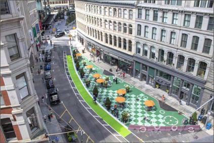
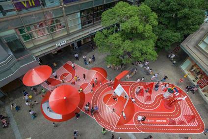
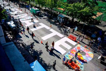
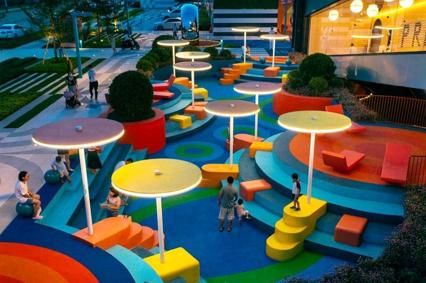
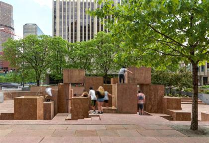
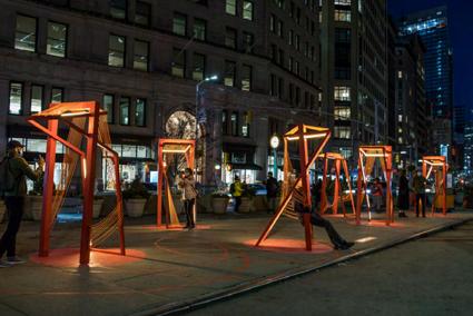
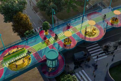
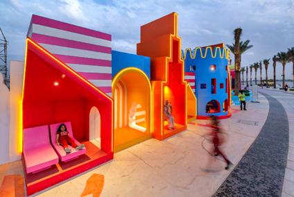
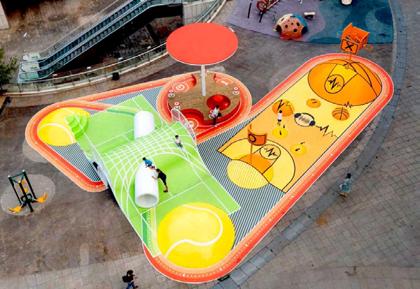
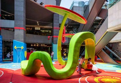
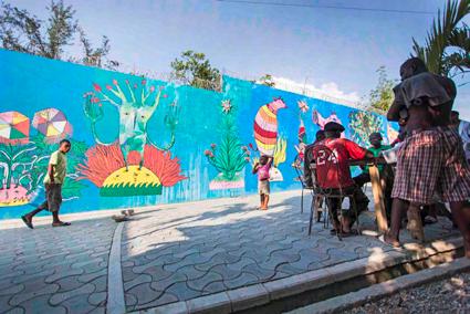
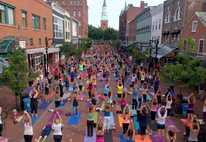
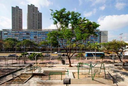
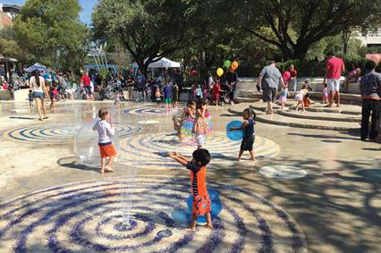
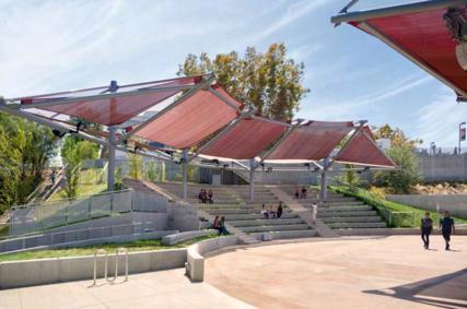
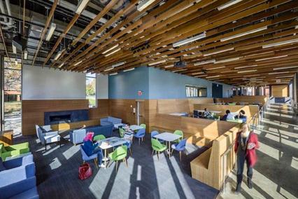
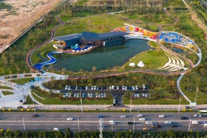
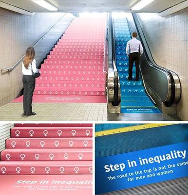
1) Utilize colorful ground murals to enliven and vivify empty spaces of streets, stairs, alleys,...


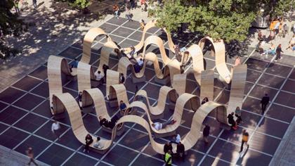
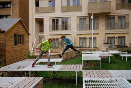
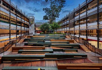
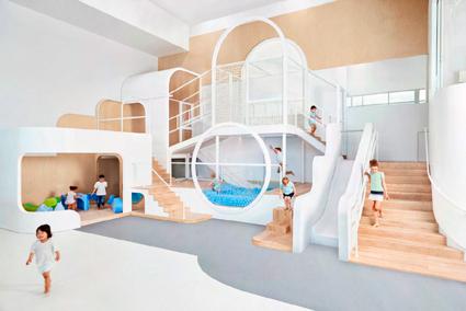
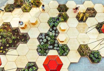
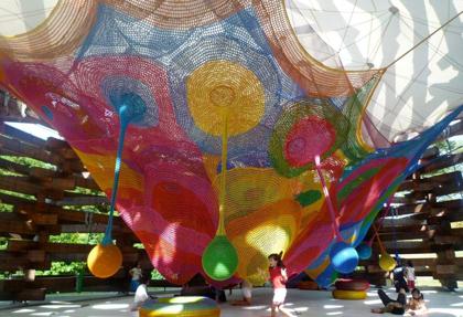
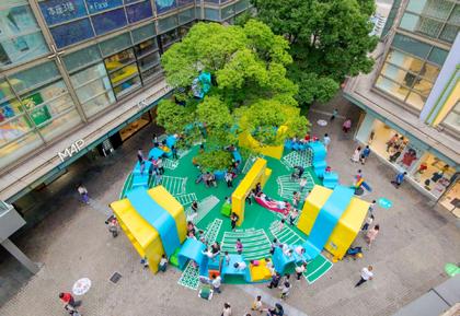
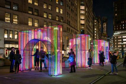
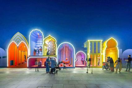
2) Different dynamic compositions of geometrical models to create connections between the users
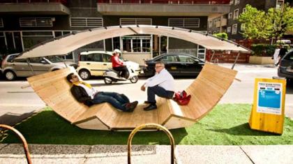
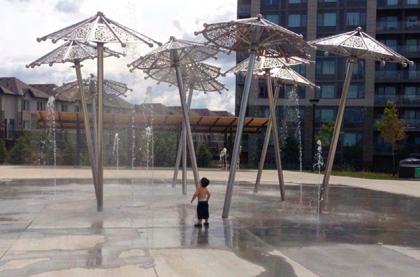
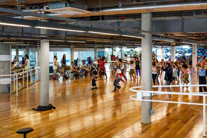
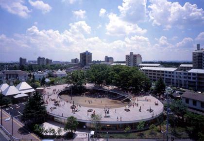
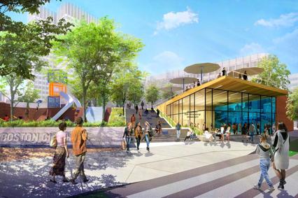
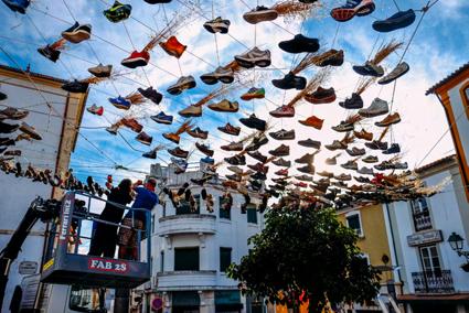
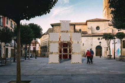
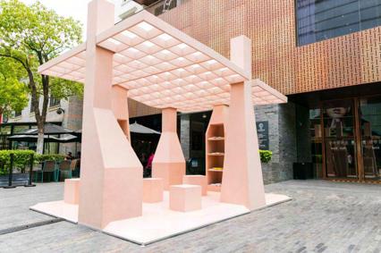
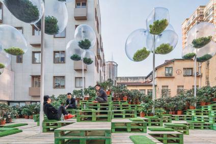
3) Making the spaces feel wider and more spatious by installing mid-air structures such as canopies


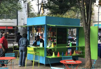
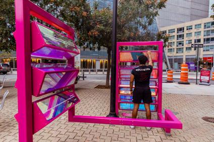
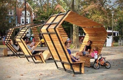
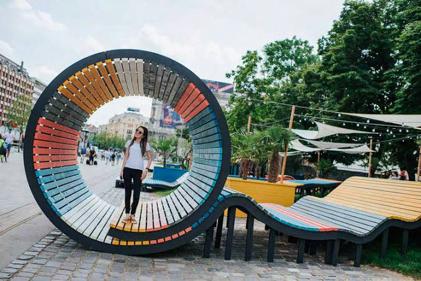
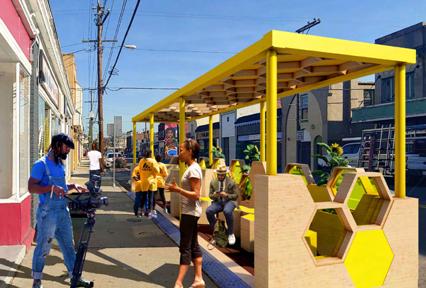
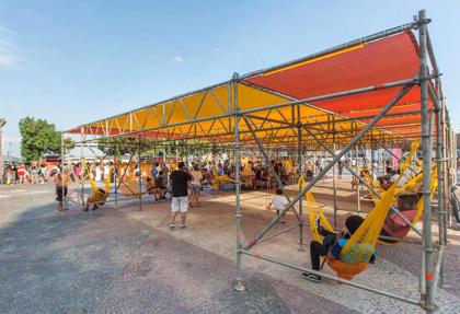
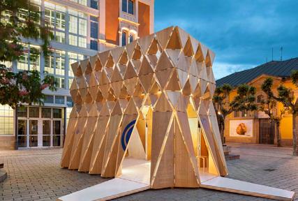
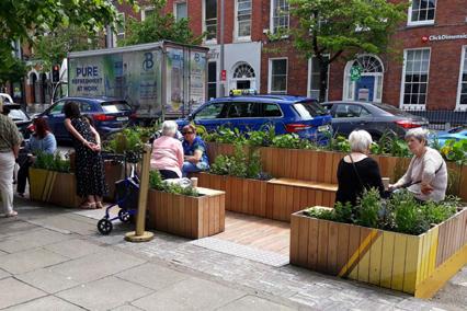
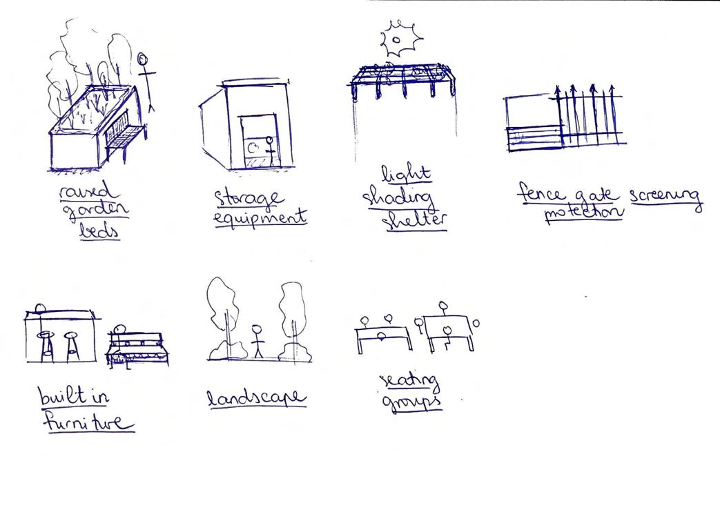
4) Compact structures that function more than just an installation to stare at, such as ones that people can sit, lie on, walk through,...
5) Potential opportunities to incoorporate guerilla marketing technique within the intervention
68


69


70


71


72
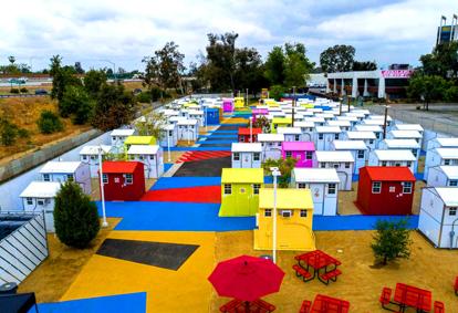
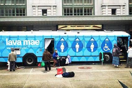
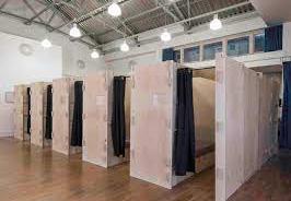
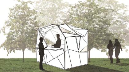
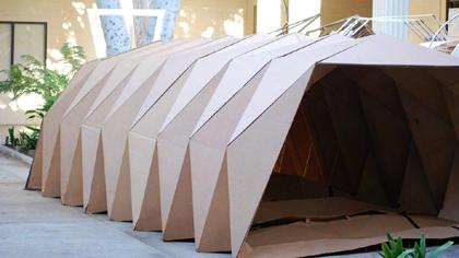
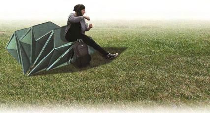
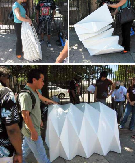
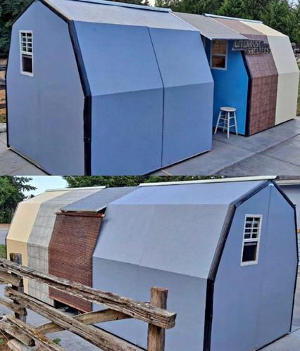
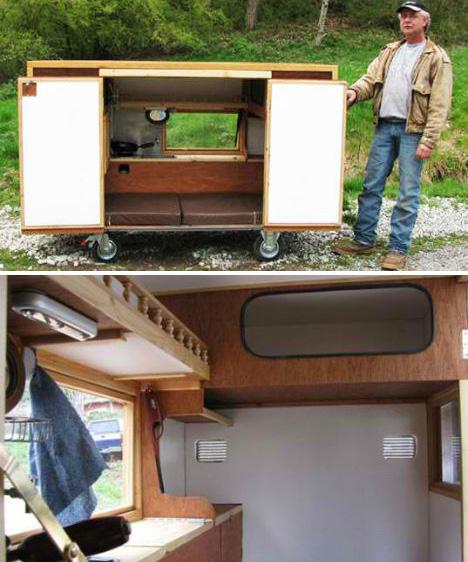
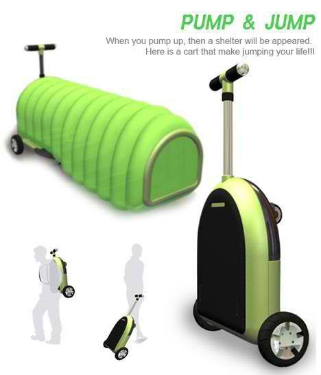
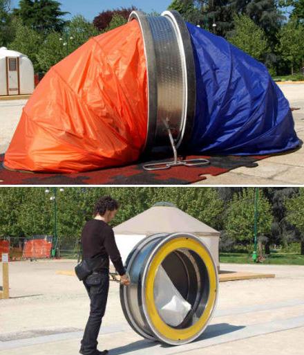
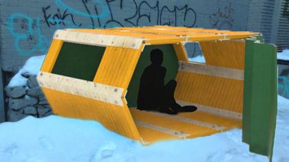
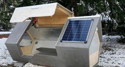
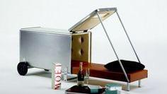
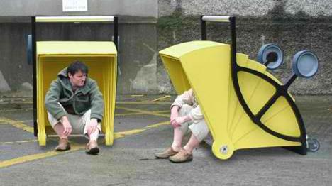
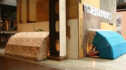
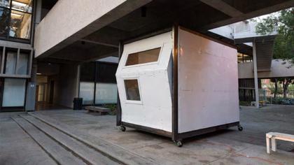
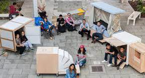
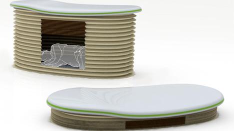
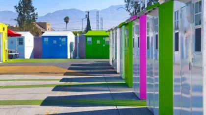
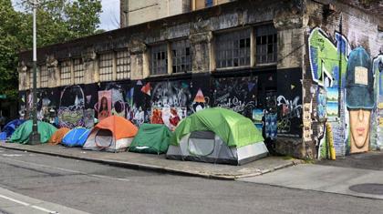
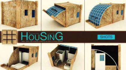
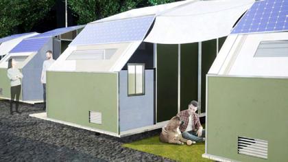
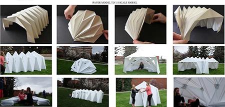
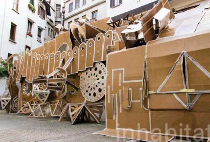
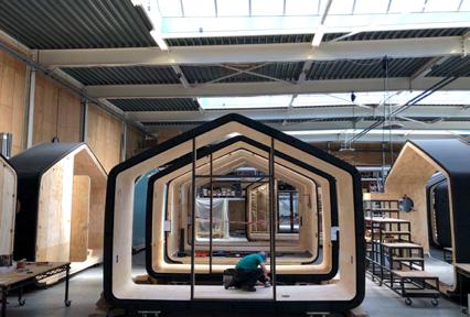
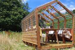
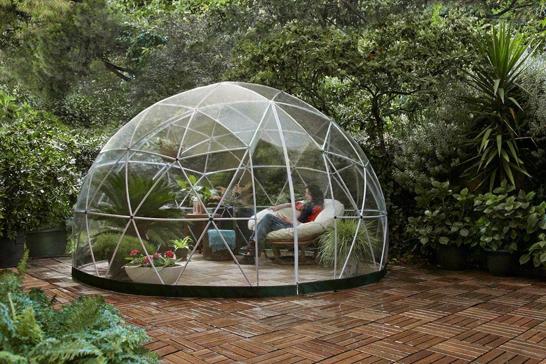
Other than curating a diverse images catalogue of examples of public spaces that are inclusive as well as interactive, upon my proposal for the homeless people as my target that I aim to focus on, I have also been able to find a few great examples of transformable shelters that allow easy compact portability for the users to expand, contract, and carry it around.
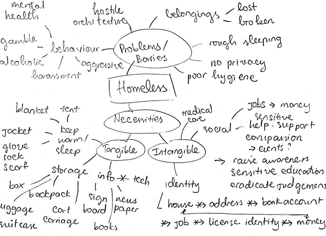
However, later did I realize that these approaches are still too specific. Most of these primarily focus on designing shelters and storages for the homeless to inhabit within, whereas there are a few more other things than just a shelter that the homeless need the most. I have to keep in mind that my design has to also be as inclusive as possible where the homeless can also be welcomed to use it without feeling any sense of division or status differences.

73


74


75


76
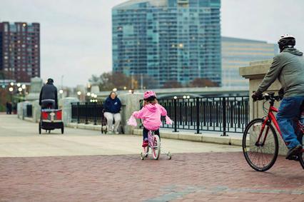
For the next more refined selection of inclusive spaces catalogue, my search aims to look for a more radical urbanism in the following collection of examples, as compared to the previous ones which I feel like they are still quite too general.
However, these findings took me quite a long time to archive into a refined catalogue as there were not many examples of radical urban interventions that mention or include the homeless at all, which is the main point that I aim to focus on for this project.
77
precedents


GUERILLA
MARKETING
78
precedents

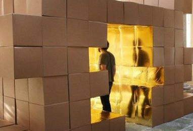
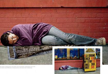
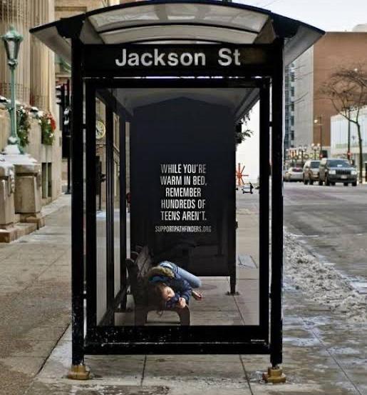
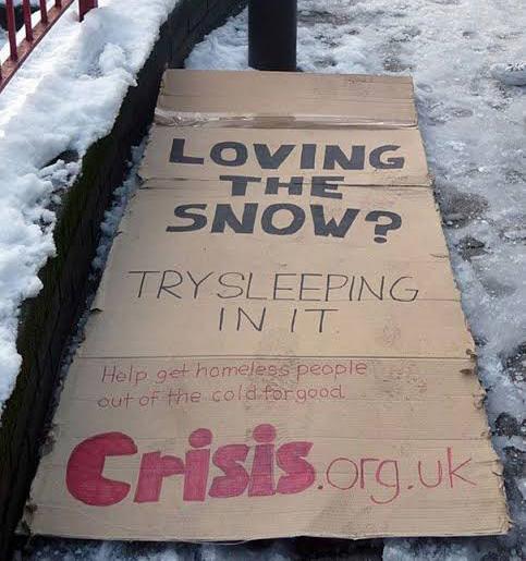
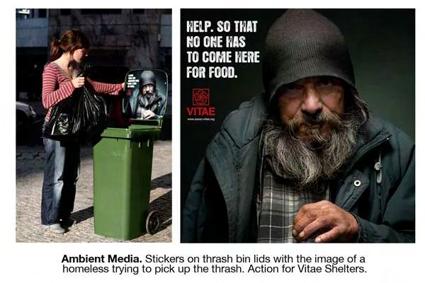
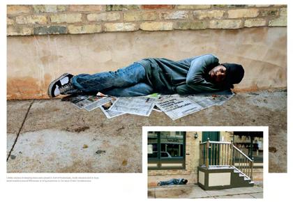
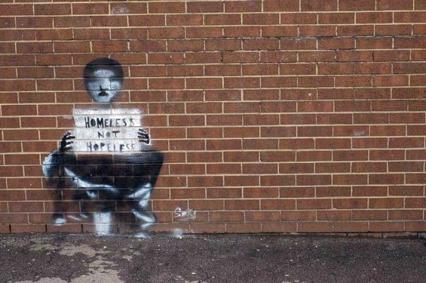
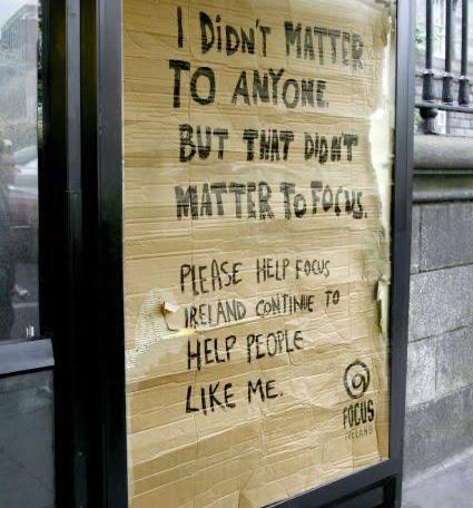
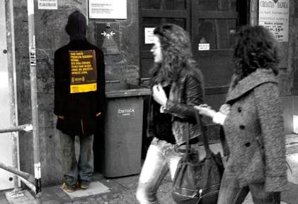
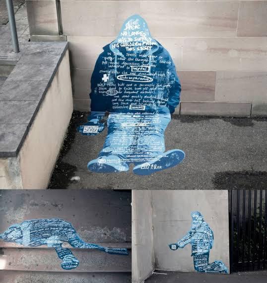
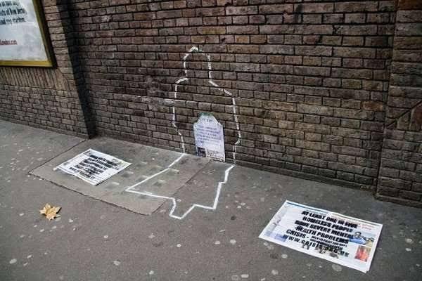
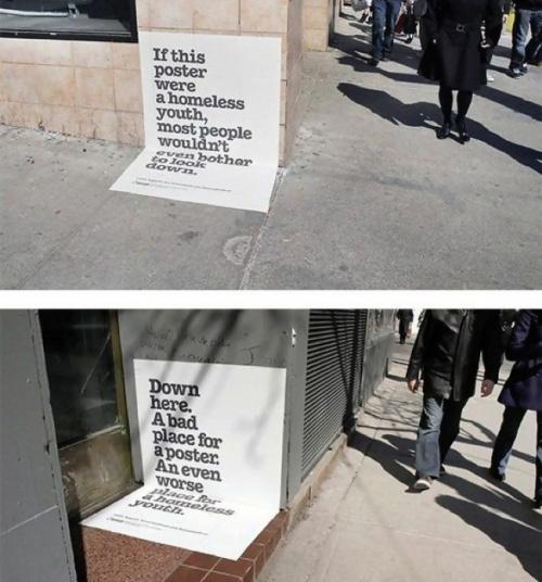
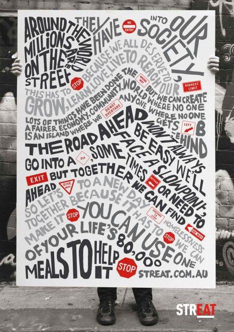
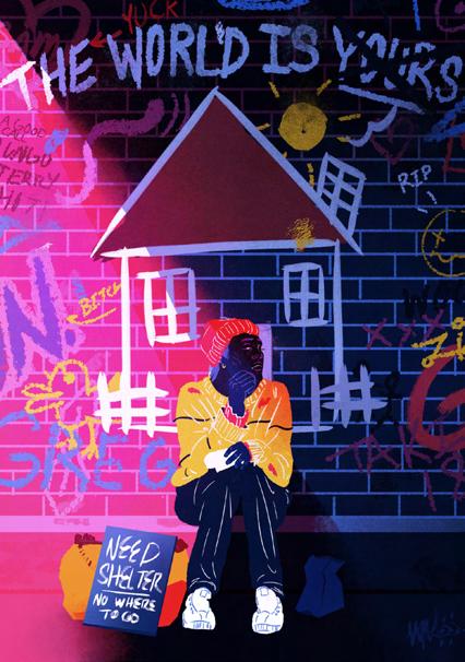
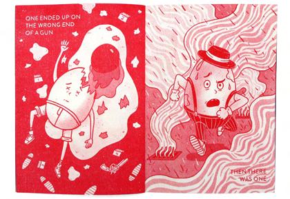
Upon my research on guerilla marketing as well as my target of designing for the homeless, I sought to find specific examples that enlighten and raise awareness of homelessness. These examples emphasizes the notion of homeless people often being ignored by the society by using visual elements that often associate with the homeless such as cardboard, trash bins, chalk outline drawings that resemble their existing yet invisible appearance to the society, telling that what they need more than just a home is the empathy and compassion from us people to help them overcome their difficulties of homelessness.


These examples can be greatly helpful and especially interesting considering these can somehow be implemented into my upcoming design intervention as a way to be radical.

ZINE
79
CONCEPT ITERATION

Week 8 starts with an absent class on Monday due to Anzac Day, hence giving more mid-semester break days to complete the tasks before the Thursday class. To be honest, I still feel quite lost on how to proceed further other than blindly doing notes and brainstorming from online readings as a sake to show that I at least did some research. Regardless of how much I read and find inspiration, what irks me the most is that for some reason I can not implement what I learn into my design intervention at all. The first few iterations come out pretty generic and not radical at all.
IDEA SKETCHES
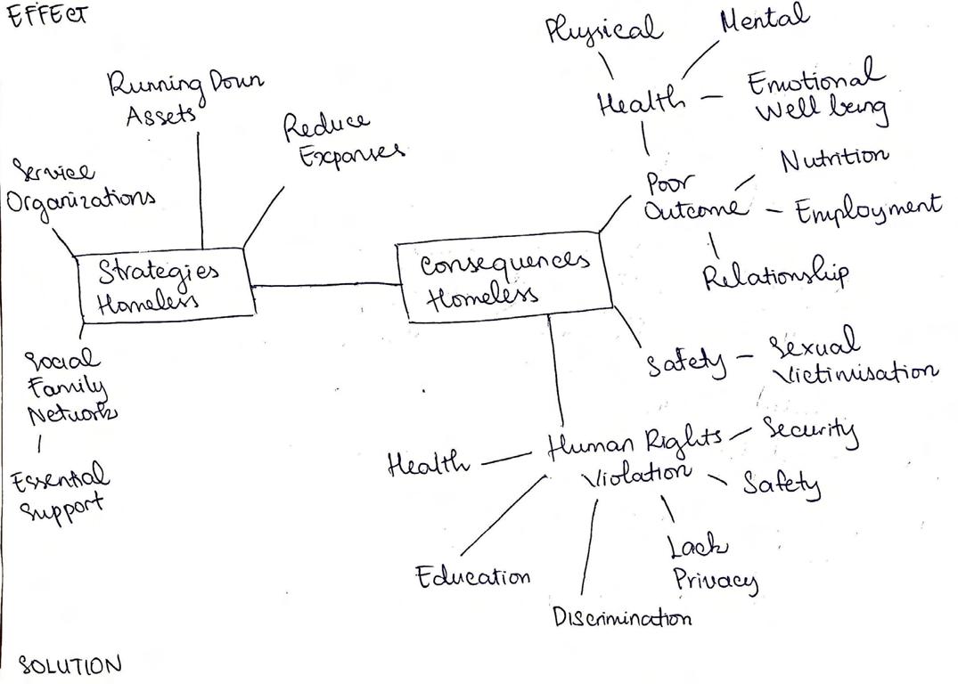
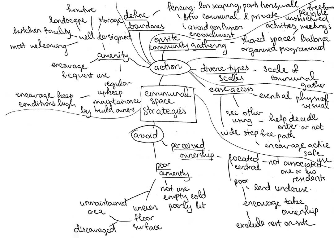
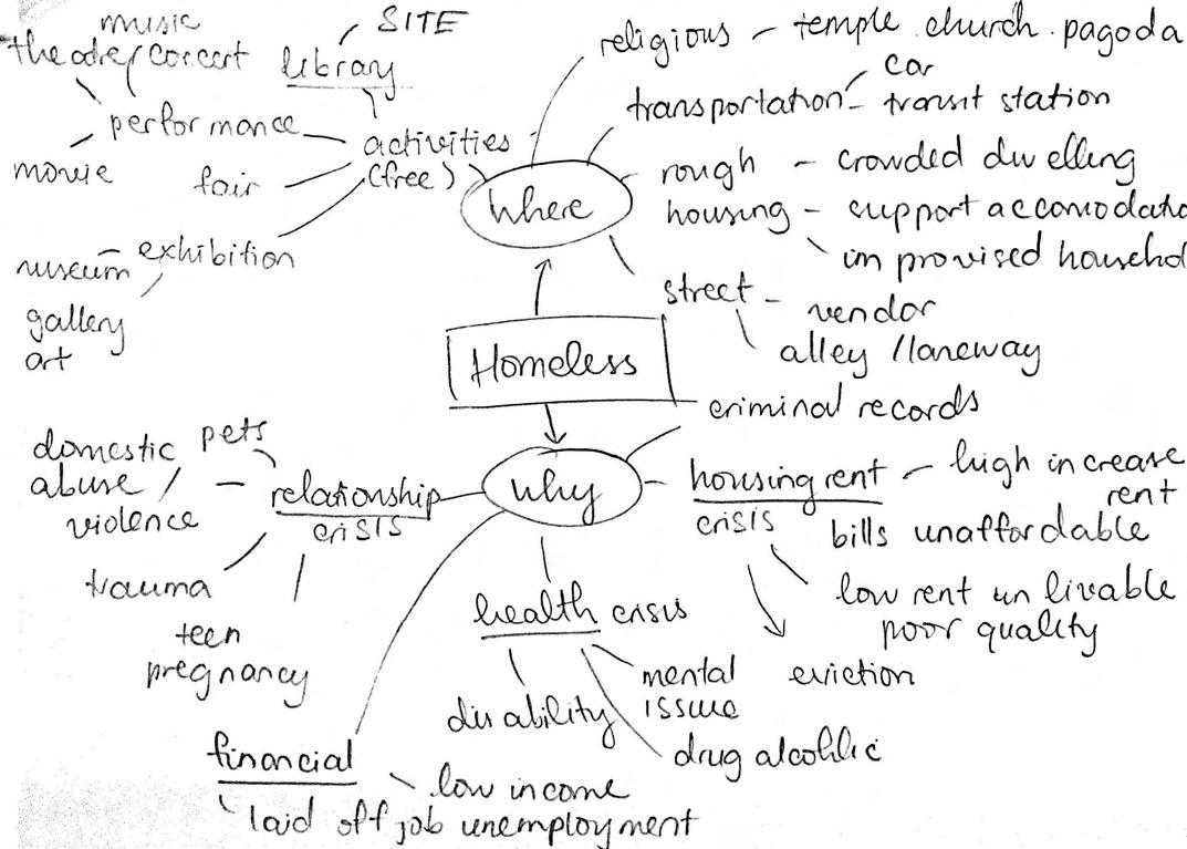
Throughout the mid-semester break, as being advised to do some more research to better solidify a foundation of knowledge about homelessness in Australia, I have been taking lots of notes from multiple readings that I find helpful and relevant for my concept. However, regardless of such, I struggle a lot in terms of how I can use what I learn and implement into my design as there seems not to spark any ideas at all from these notes, other than just learning and knowing about it.


BRAINSTORM &
82


83


84


85


86


MODEL
87
ITERATION
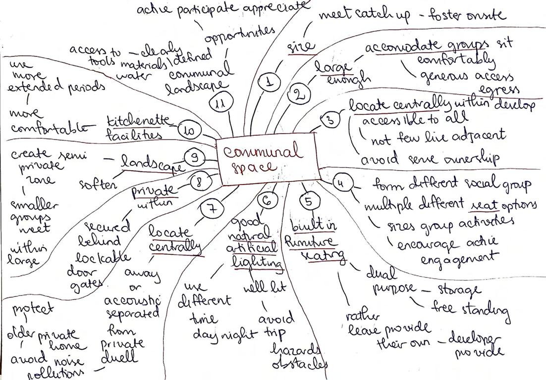
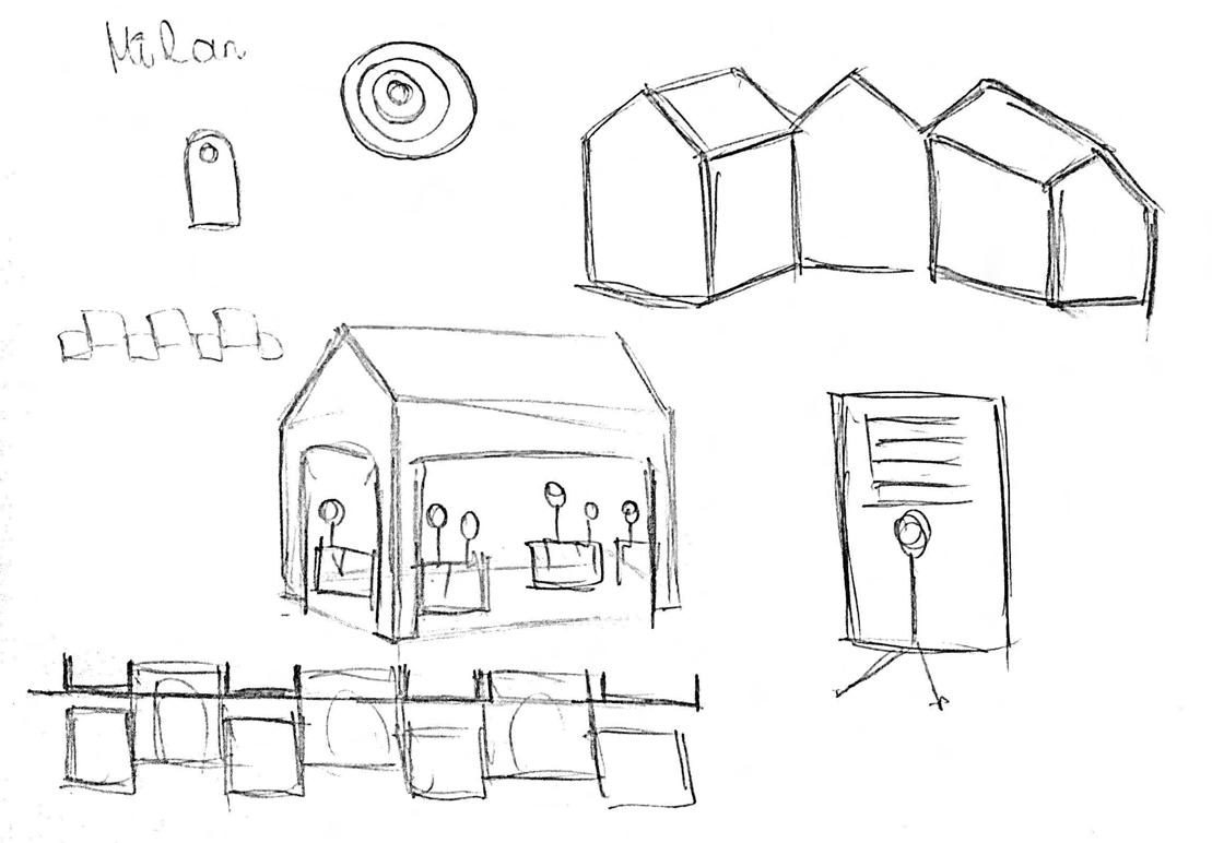
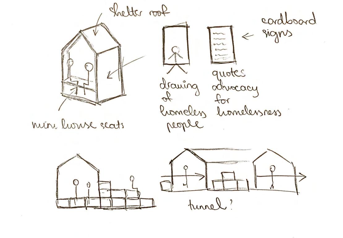
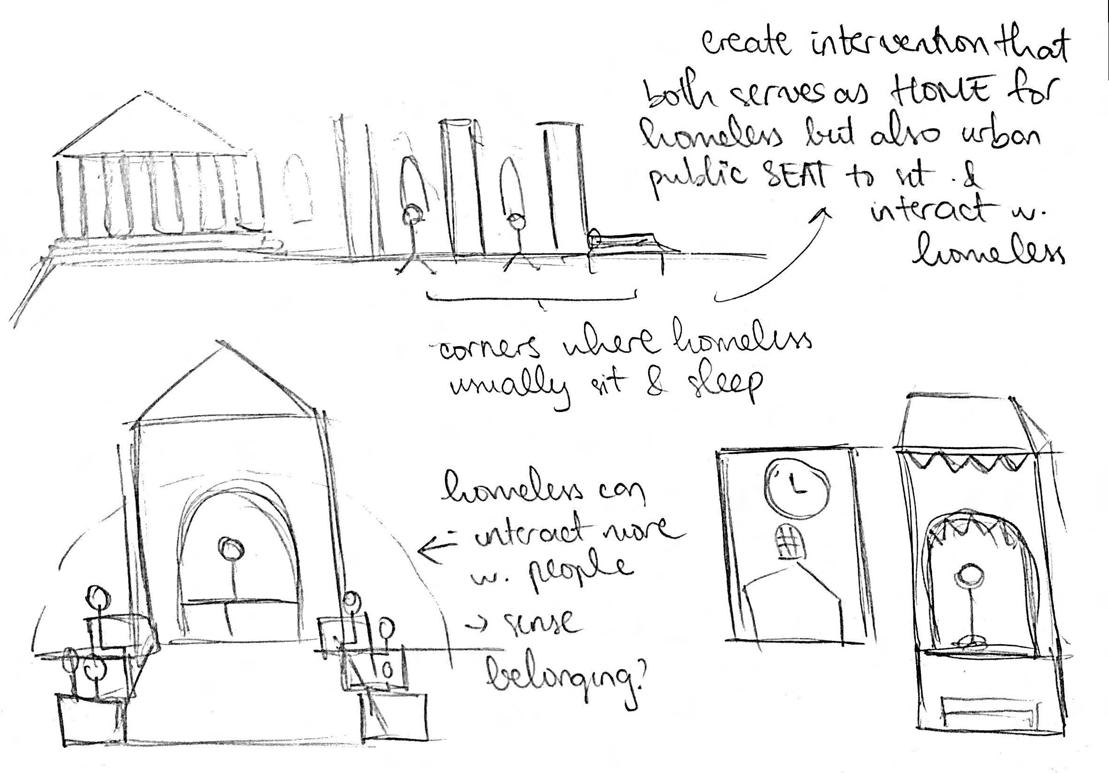
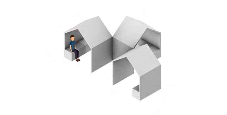
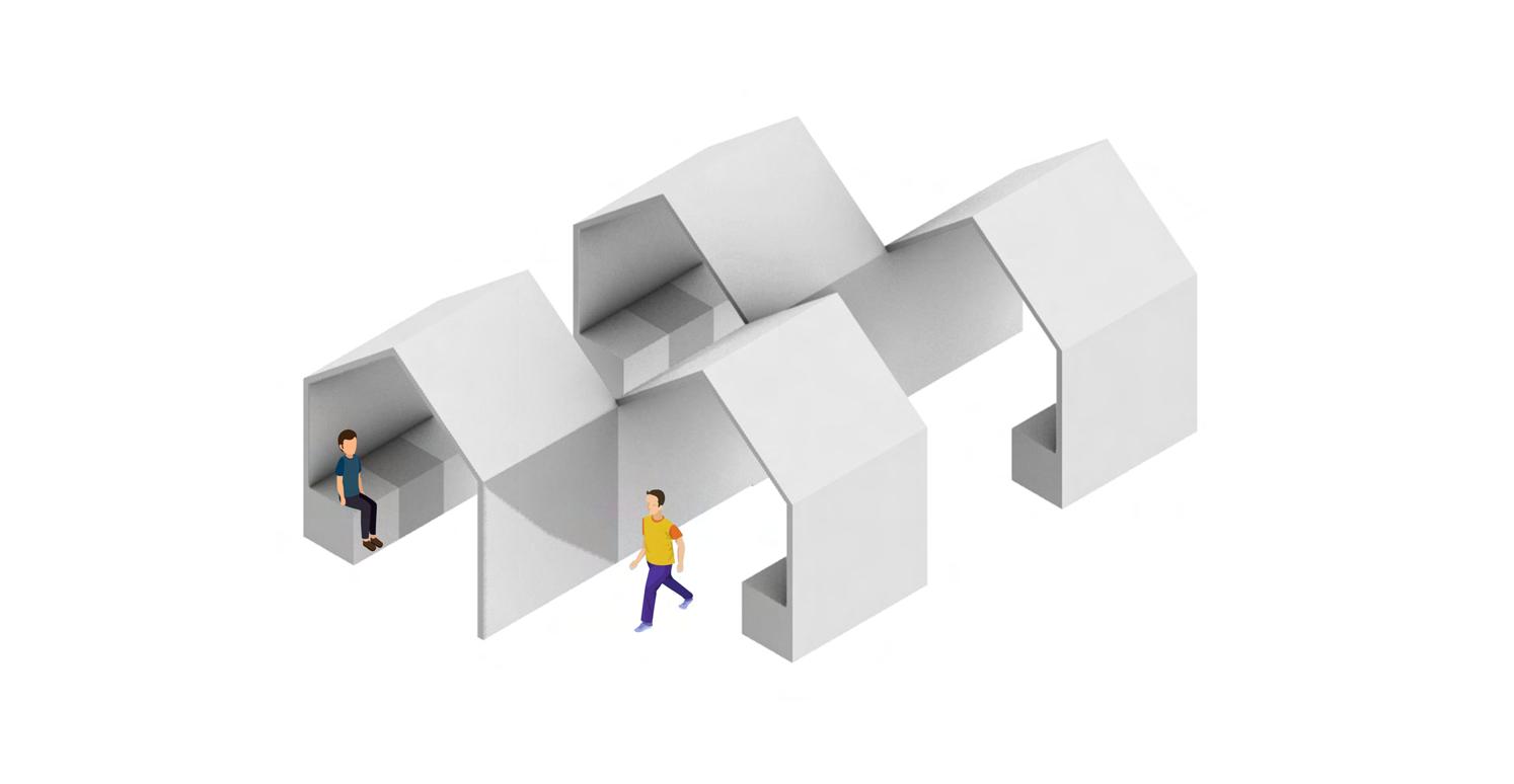
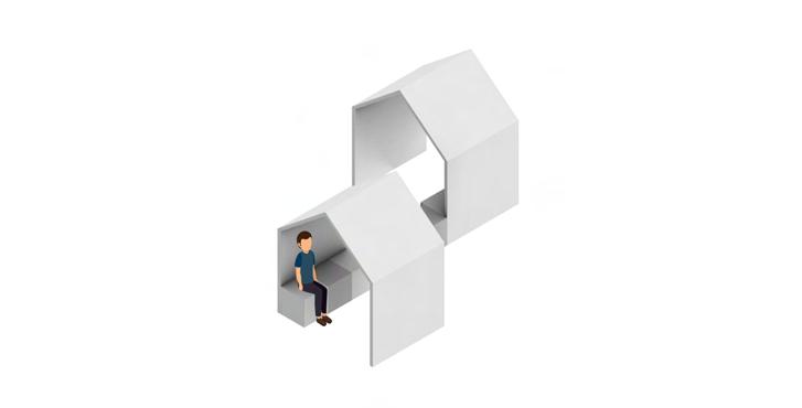
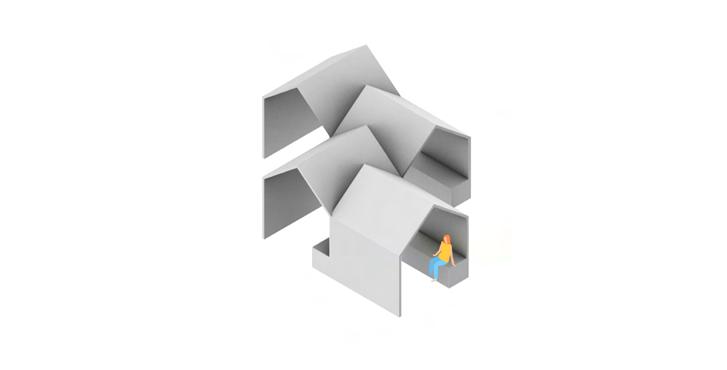
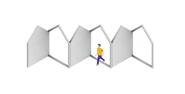
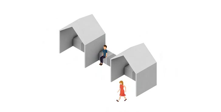
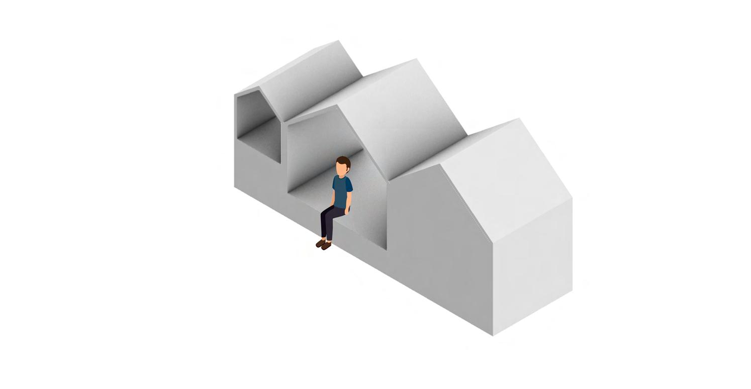
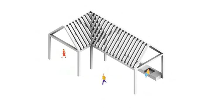
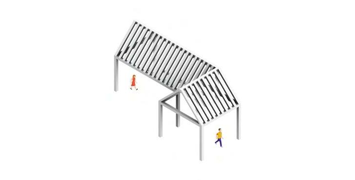
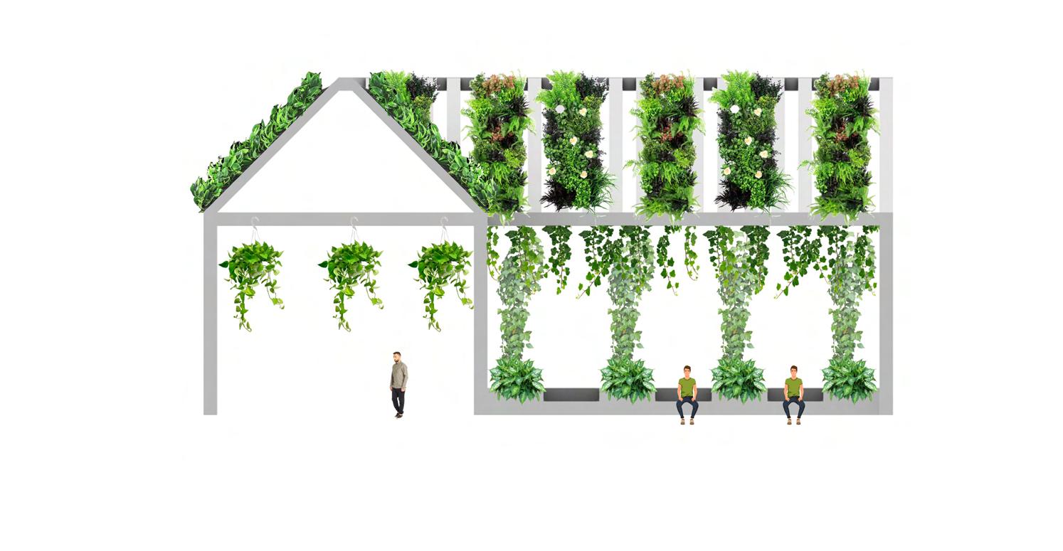
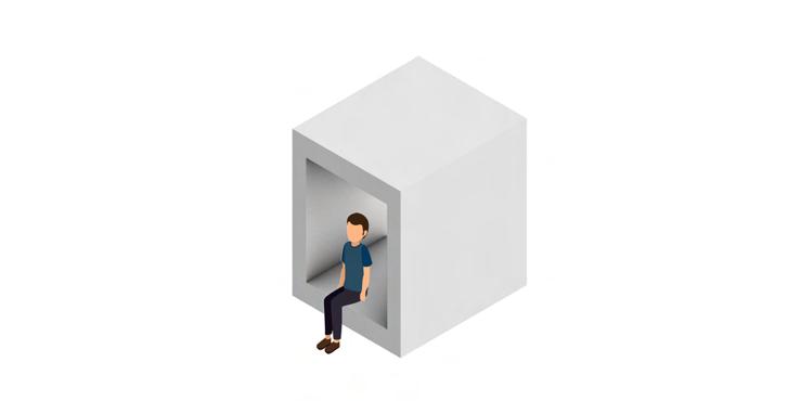
My first iteration seeks to explore about the concept of home and shelter that not only the public but also the homeless can easily access and use it as a place to sleep, sit and relax. As a starter, I choose the symbolic imagery of a typical house to demonstrate this idea, and then further experiment with different compositions and structures. I want my intervention designed to narrow down the gap between the homeless and the public which they can engage and interact more that can help show the support and compassion from the more priviledged to the less fortunate with patterns of seatings and mini roof hubs.


MODEL
1 88
iteration
However, I feel like this idea is still too general, as not all the homeless need shelters; not all of them did not choose to live on the street, and vice versa. Also, the idea of home does not always associate with the image of a triangular roof over a rectangular box. Therefore, I need come up with a more refined version of a home as well as to narrow down my target group of clients as who specifically of the homeless I want to design for; is it the older women, or the younger men, or the women in general?


89
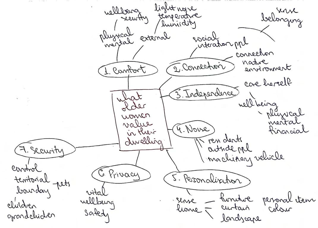
As to strengthen my design after previous initial iteration, I need to narrow down the target group of homeless people that I want to specifically tackle on. It then came to my interest that I might want to work on the older women, since they are the most likely to be at risk of homelessness than any other group of population. Hence, I was suggested with a reading called “A Design Guide For Old Women Housing” by the XYX Lab, which it lists out compact details of different elements that old women might need for their housing.


MODEL iteration 2 90
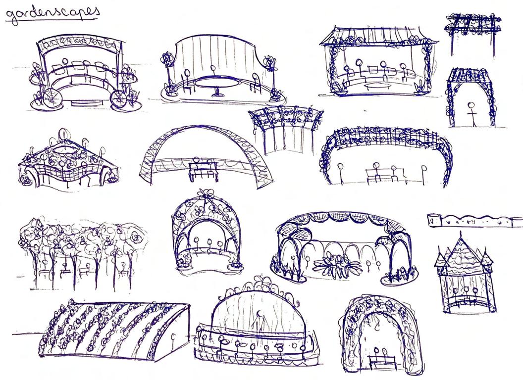
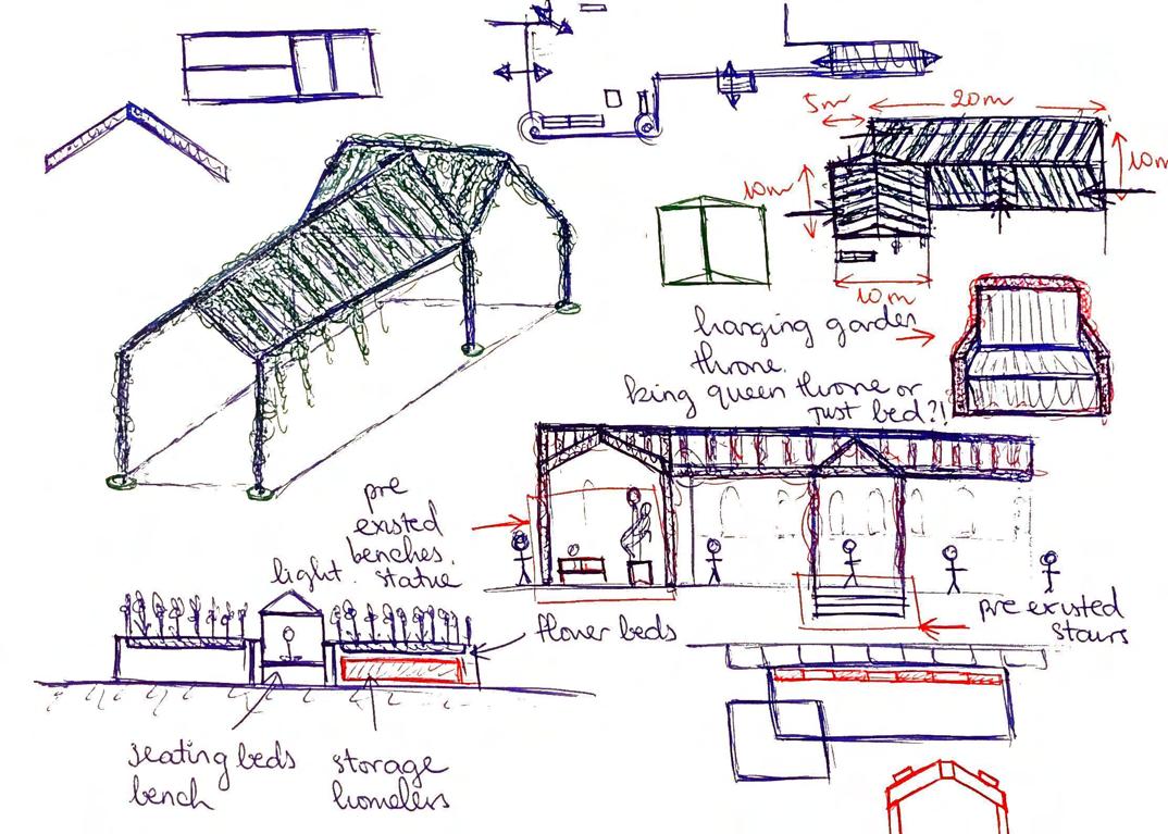
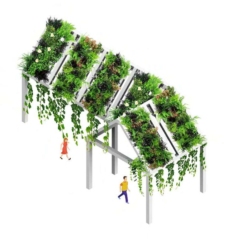
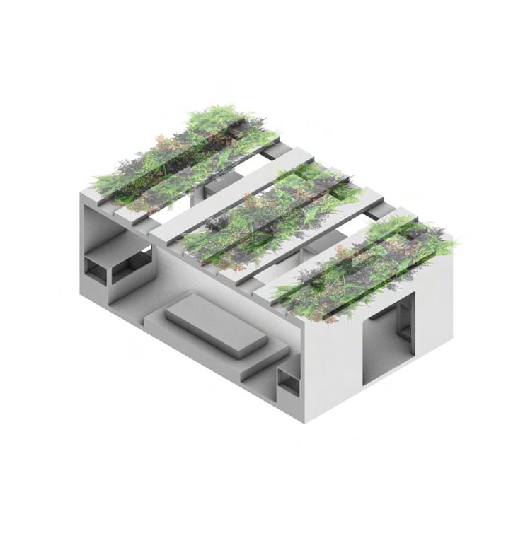
After reading through it, I want to my design to include a space where old women can do their own planting, which I collaged a hanging garden trees and plants all over my 3D model. However, this idea still does not really work since not all of them are keen on gardening, and also this might be too big, which will ruin the overall vibe of the classical structure of the existing library.


91

CONCEPT CUT OFF
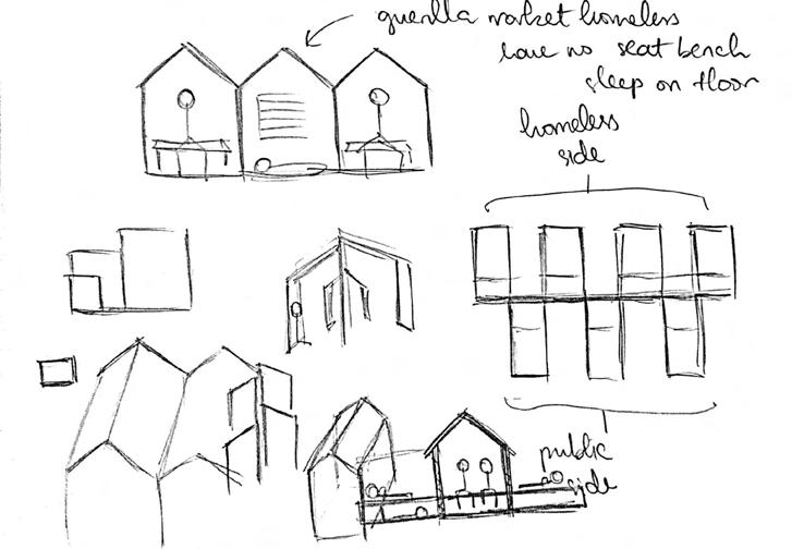
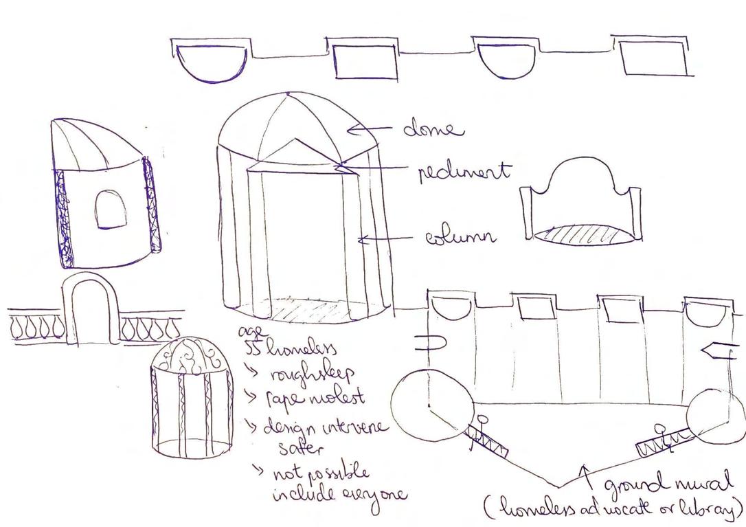
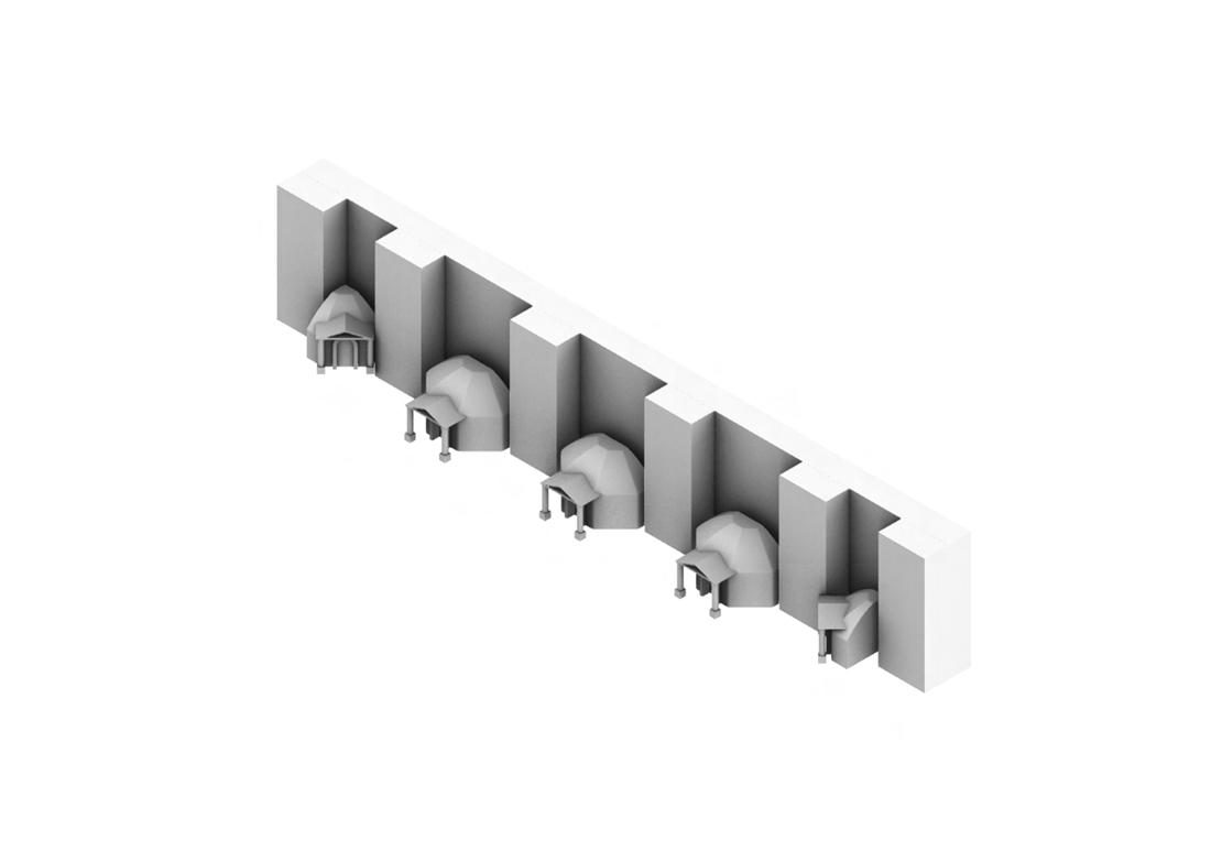
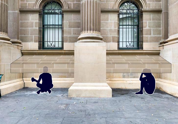
My design iterations have still been progressing yet very sluggishly. There is not much progress updated as they seem very stagnated and not working at all. Given that I want to specifically work with the recess areas or gaps between the facade columns where most homeless people would usually sit and gather, this has inflicted a lot of limitations for me to come up with ‘big-thinking’ or radical design within a very small space. Also, after narrowing it down to the specific group of older women being homeless, I was struggling even more as thinking of how my design can offer safe spaces for them to get away from potential sexual harassment that they have to deal with on a daily basis while keeping a notion of making my design not too obvious or catching too much attention to the public.
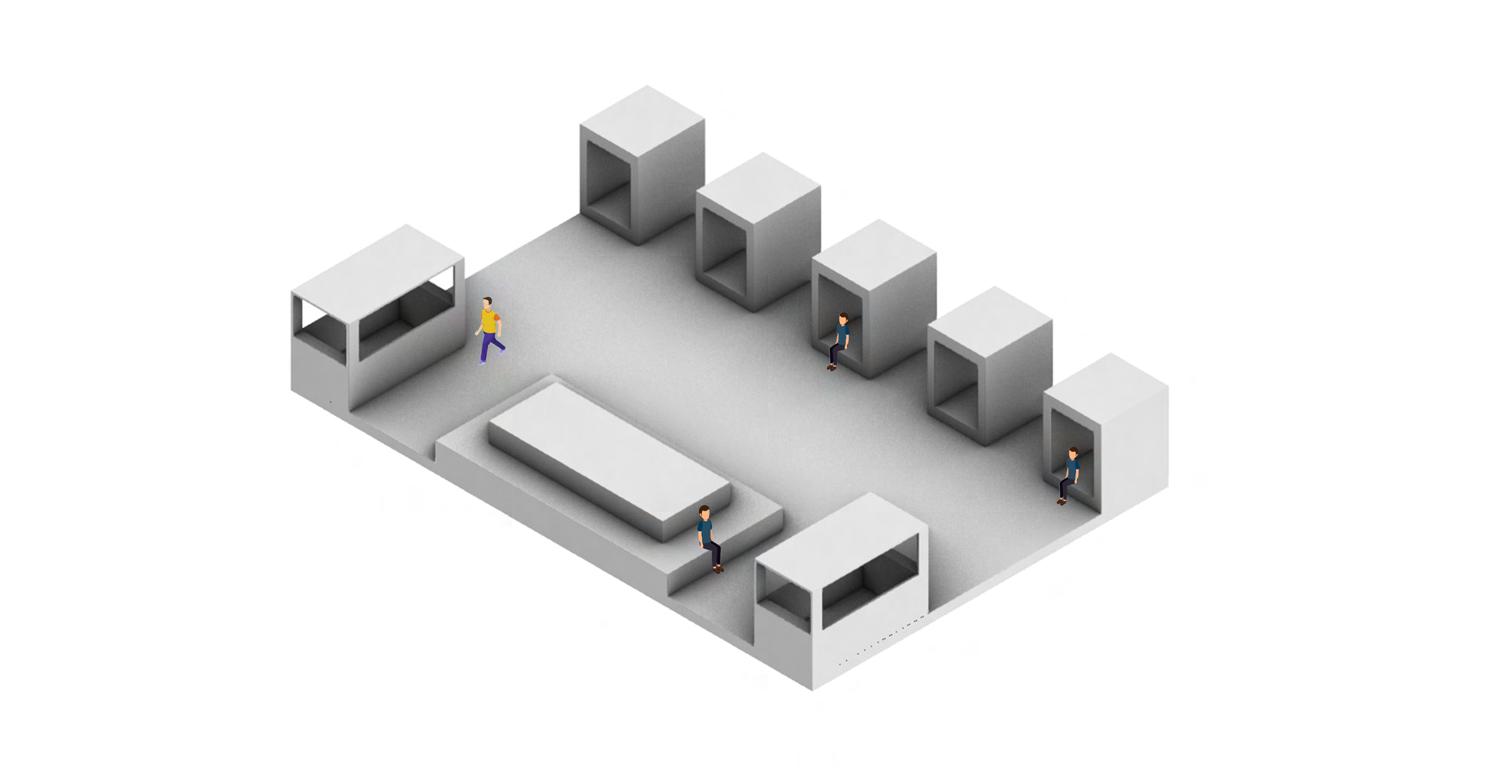
Moving away from the symbolic house imagery, the next third iteration is tackling the homeless older women’s safety by coming up with semi-private spaces for older women to shelter underneath. Noticing that most homeless usually sit between the library columns during the day and sleep on the bench nearby at night as a way to shrink themselves from the public.


MODEL iteration 3 94
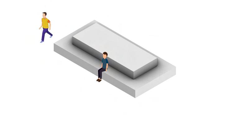
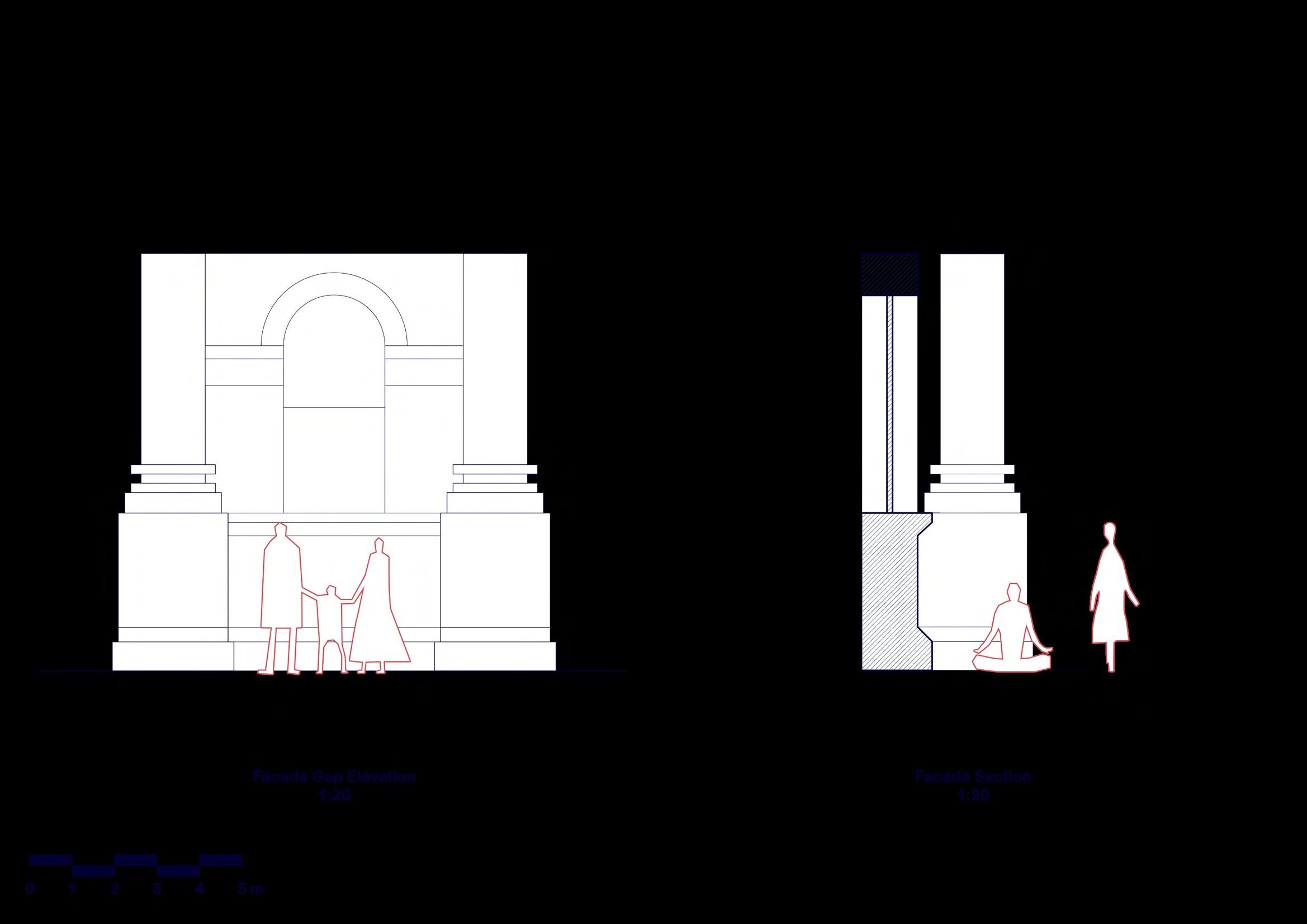
Therefore, I came up with options of booth-like pods which the sizes fit between the columns for the homeless to crawl underneath. However, at the moment, they still look very boxy and basic, yet they stand out too much.


Another important thing that I need to keep in mind for the next iterations was to collage my interventions in situ on my site as a way to see how it would look in terms of size, scale, and atmosphere. At the moment, my models look quite floaty as there is no context of the site whatsoever.

95
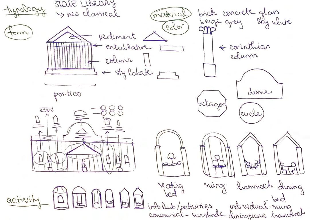
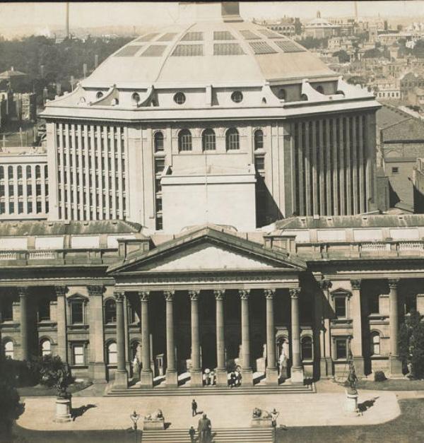
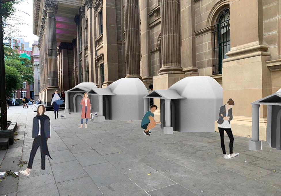
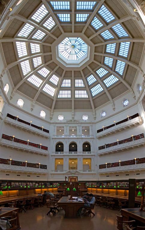
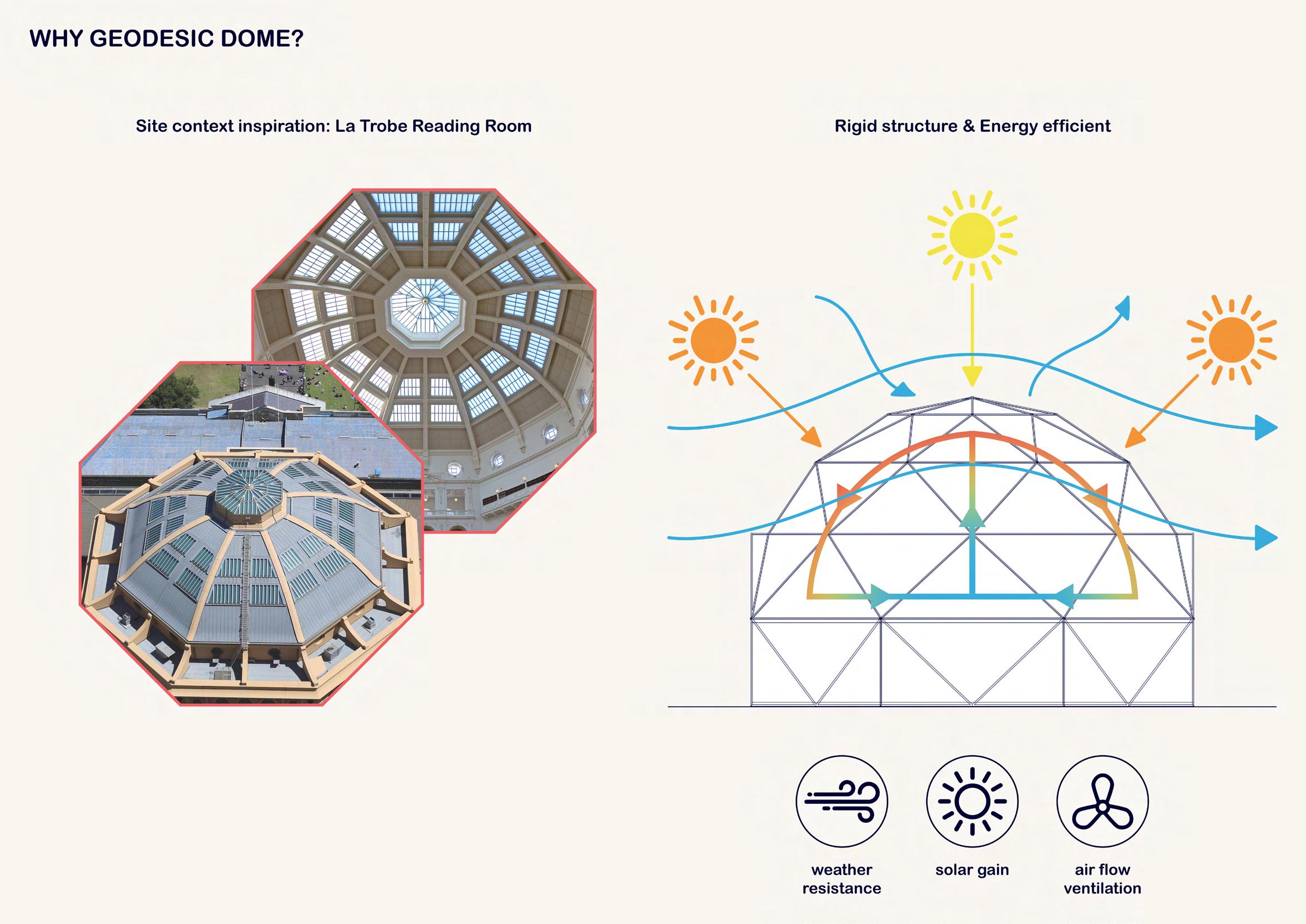
Based on the last iteration’s feedback, my last models were standing out too much and too obvious, hence I was advised to perhaps respond to the architecture of the library as a way to blend in the site context. Learned that the library is built in Neo-Classical style, this intrigues me to implement the architectural visuals of it into my shelter pods using the imageries of the octagon dome from the Reading Room as well as the portico and columns from the front of the library. However, I might have taken this too literally and stretchy, hence my prototype ends up looking quite weird and funny somehow.


MODEL iteration 4 96


97

DOCUMENTATION DOCUMENTATI
As the final week of submission approaching and it is time when we have to document our work for the presentation. My progress has been experiencing a stagnation or a very sluggish development since I honestly am so clueless at the moment.
I feel like my design is too small and simple, given the site area that I choose to tackle with does not offer a lot of freedom for me to ‘think big and crazy’ to create something exciting. At this stage, I even wonder myself in doubt as whether I might have chosen a wrong site to work with at the beginning of the project. I also even question myself if my decision to tackle the homelessness is too much and overwhelming for me as there almost has been no improvement at all from last week. I suppose to have my design finalized or ‘cut off’ since last week, and now at this stage, I am still stuck within this black hole of no hope.


MODEL iteration 5 100
Based on the last iteration’s feedback, my last models were standing out too much and too obvious, hence I was advised to perhaps respond to the architecture of the library as a way to blend in the site context. Learned that the library is built in Neo-Classical style, this intrigues me to implement the architectural visuals of it into my shelter pods using the imageries of the octagon dome from the Reading Room as well as the portico and columns from the front of the library. However, I might have taken this too literally and stretchy, hence my prototype ends up looking quite weird and funny somehow.


101
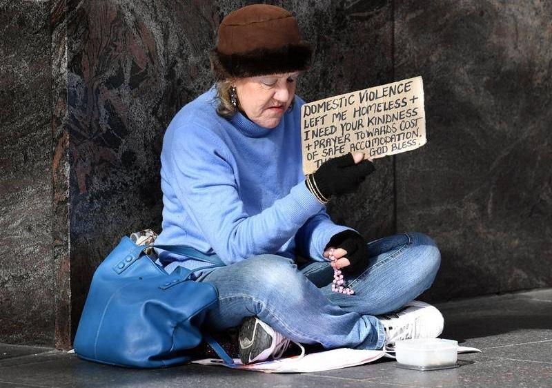
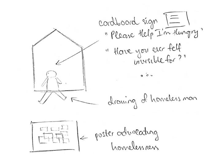
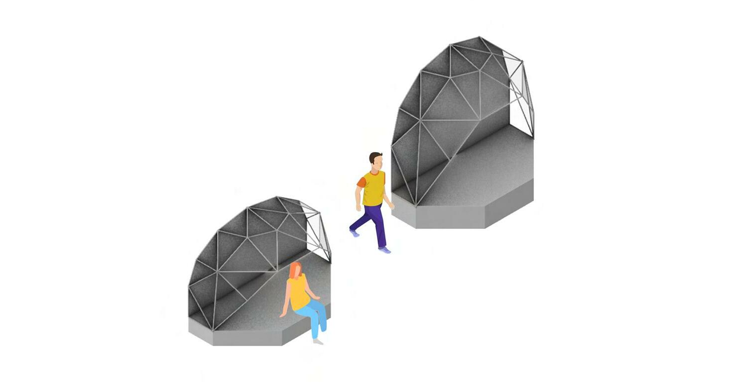
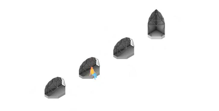
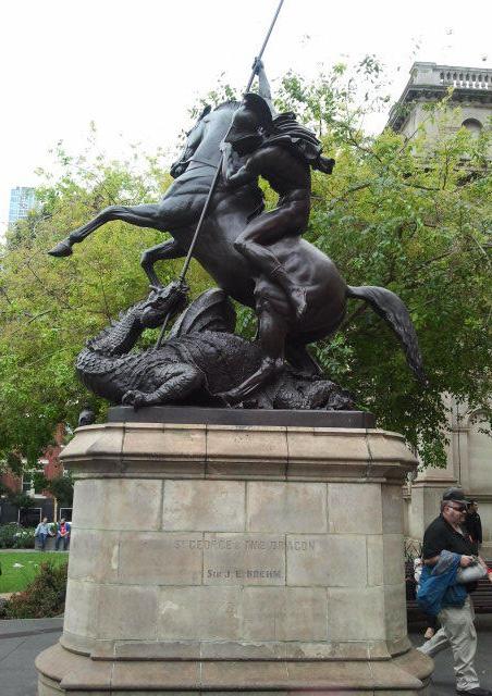
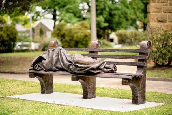
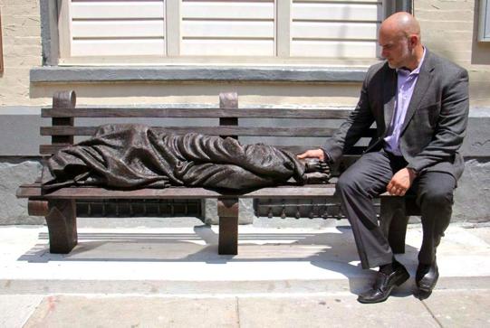
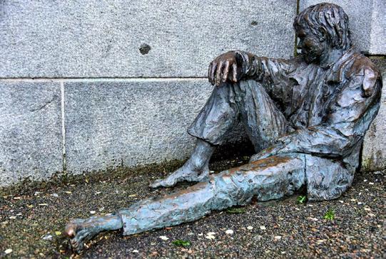
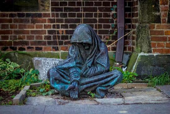
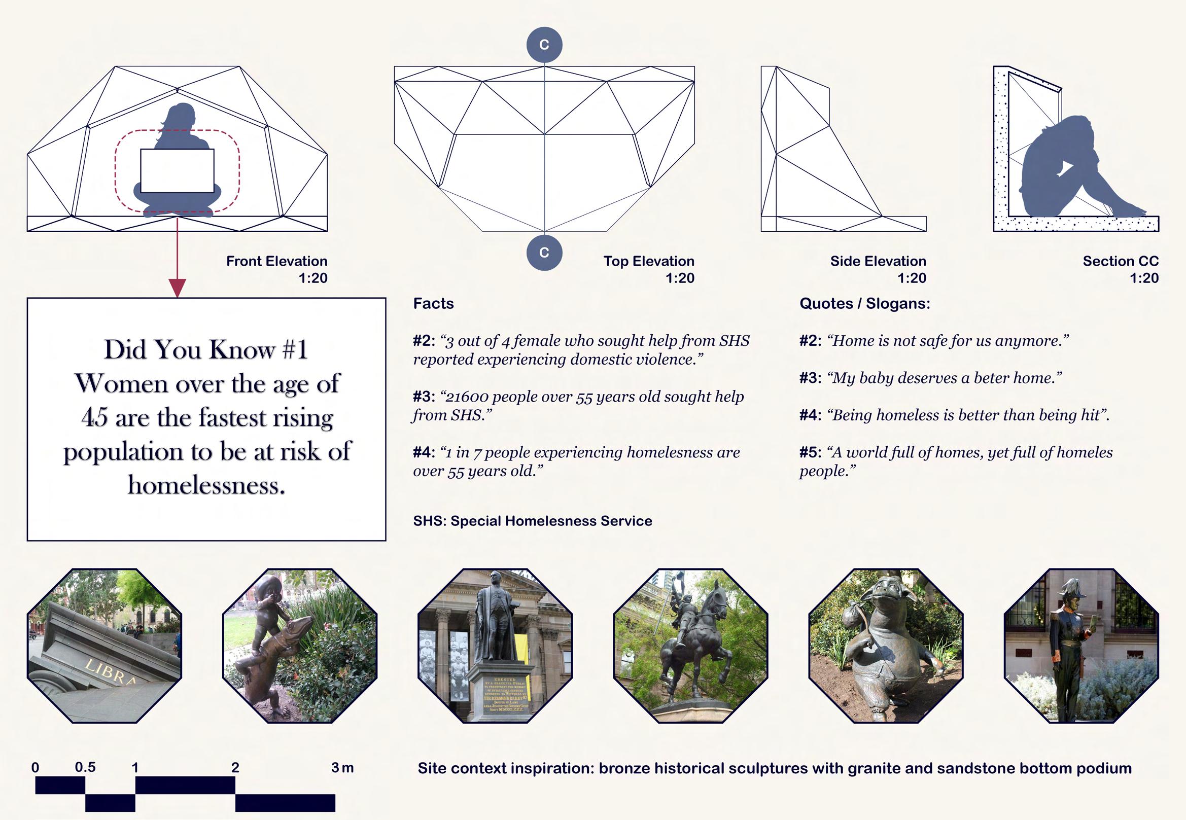
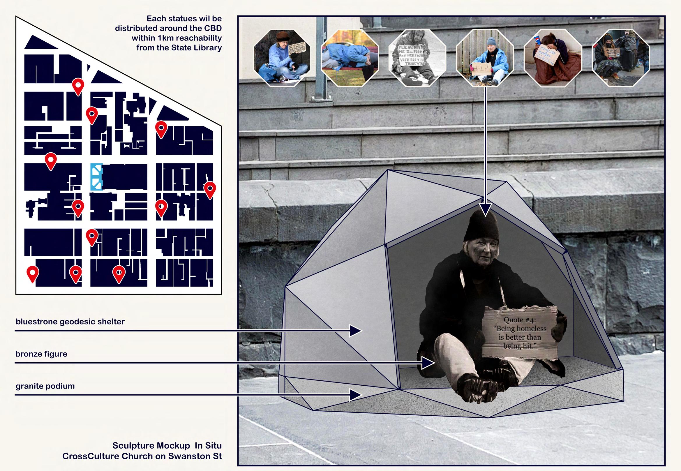
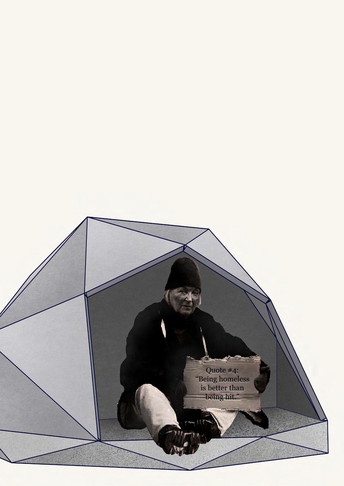
Noting that my chosen site has a few statues placed at different positions with a quick research on guerilla marketing about homeless people, I want to pitch the idea of statues of homeless women for my advocacy. The homeless women sculptures each will be holding a board with a written sentence on it. The sentence could either be facts reporting the statistics of homeless women, or sentimental quotes conveying messages of help and the struggle they have to face with their homelessness resulting from domestic violence or other reasons. Each statue figure will also be placed under a hollow half of a geodesic dome as a way to match my design intervention.


ADVOCACY 102
Regardless my somewhat interesting and raving idea of sculptures, I am still greatly falling behind with my design as it is week 10, and it is still not finalized yet so as to further move on and develop into presentation drawings. Therefore, stressing about that, I have no other choice but to prioritize the advocacy component as the very last thing that I will be doing, which I did not get it done by presentation unfortunately, if not finishing other major ones such as technical drawings or perspective renderings.
103

SITE DRAWINGS (updated) 104
As aforementioned, with a more refined and adjusted site model, I was able to update and add more finishing touches to my presentation drawings, which now look more relevant in scale compared to the last iteration.

105


106
Since I want to go with the analytique style for my presentation poster (an architectural drawing layout style that uses the site plan blending as the background in corresponding to other main drawings), I have done a similar style for my site plan, which I feel like it is time consuming yet not really into any specific uses other than decorative background for my poster.

107

108

109

110

111
PRESENTATION CHOREOGRAPHY

Like many previous semesters, week 11 always happens to be my most stressful week. In fact, whilst most of the time I would always have a clear vision of what to do in preparation for the final, this time around as I said, I had no idea what I was even doing. Hence, by the day when we are supposed to have our draft poster done for presentation practice, I barely have only half the work done, as I still did not have my design drawings done and ready for practice, which was even harder for both of me and the tutor to give feedback based on the very little amount of work I put in. Therefore, all I could do was fasten my working speed and put up as much work as I possibly could.
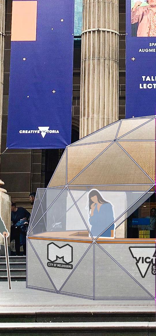
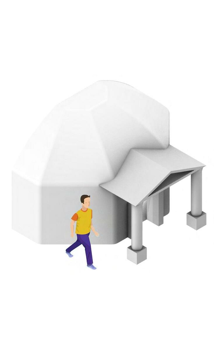
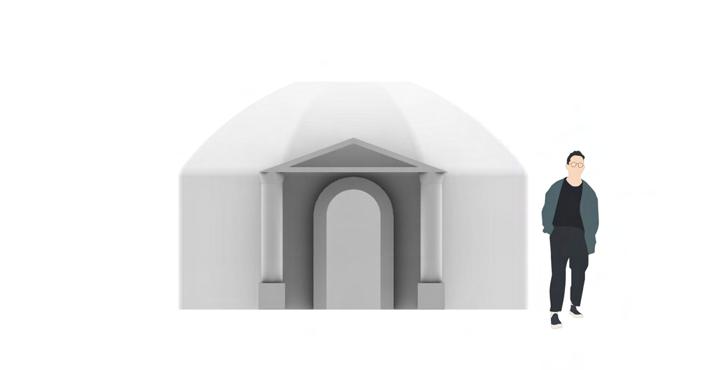
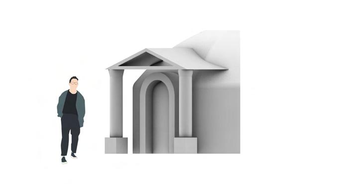
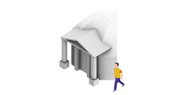
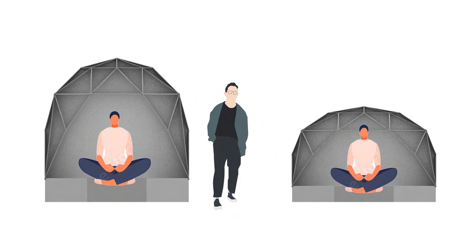
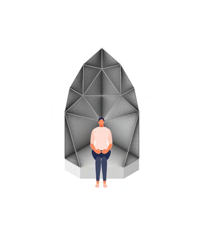
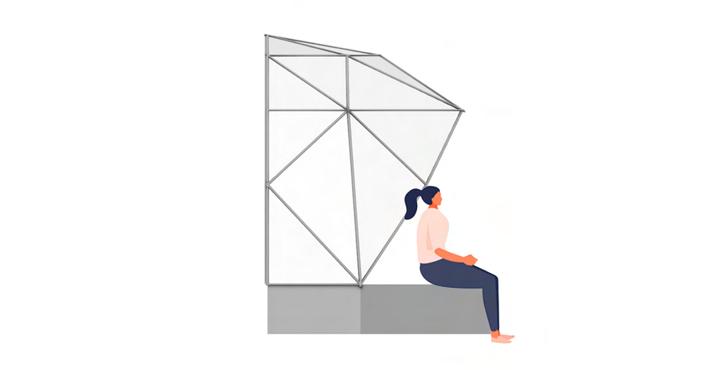
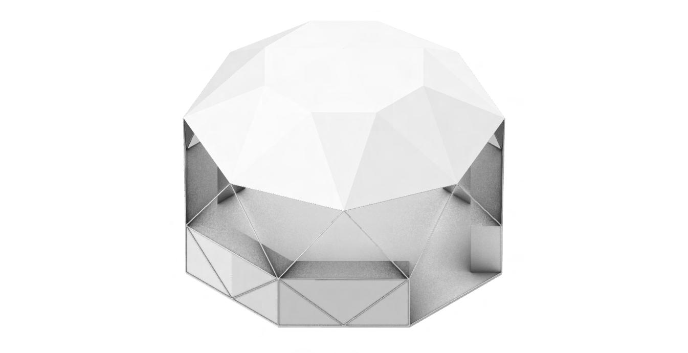
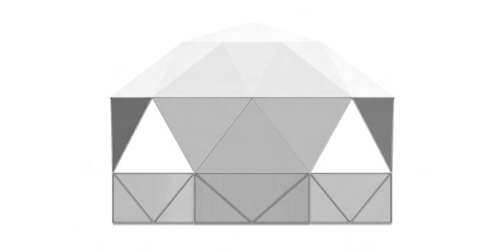
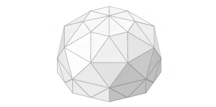
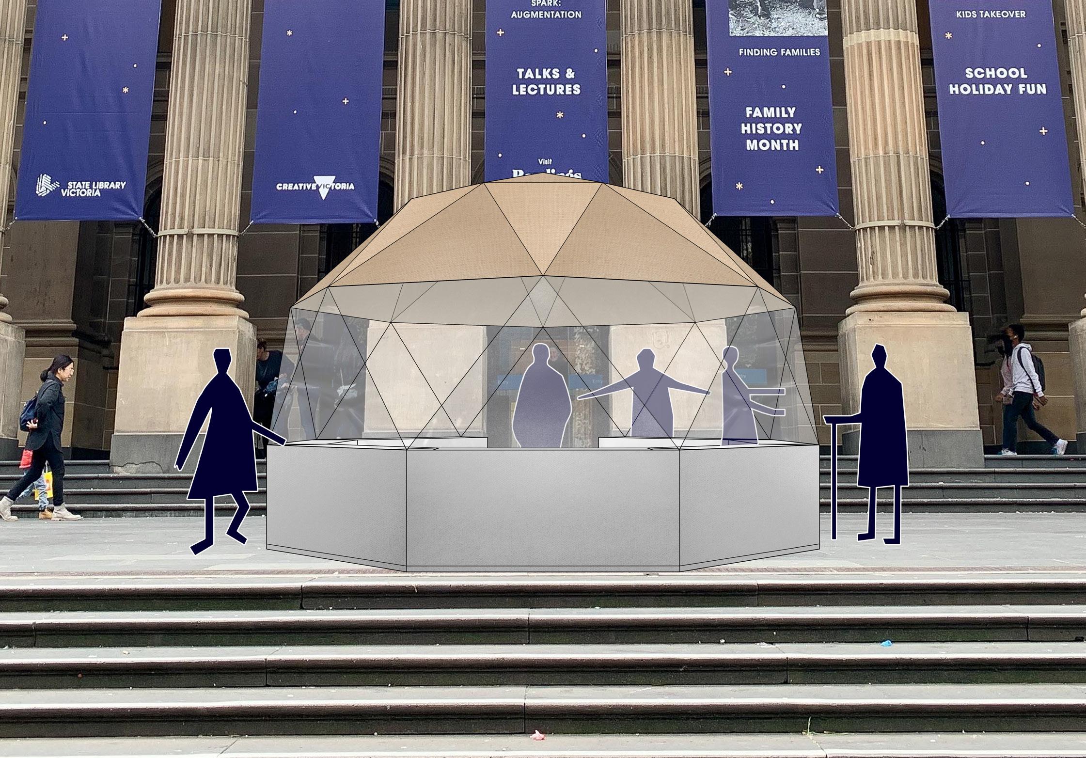
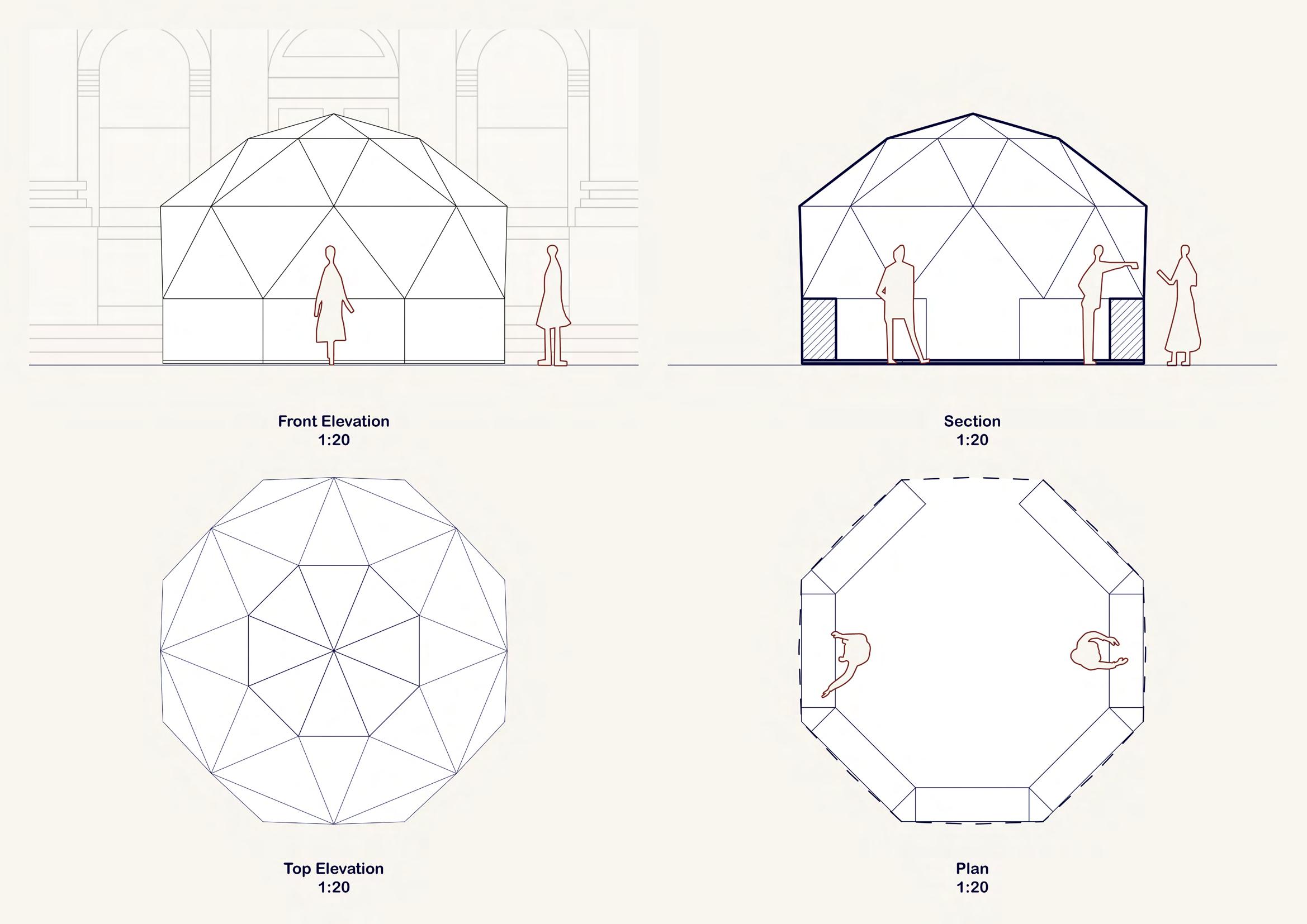
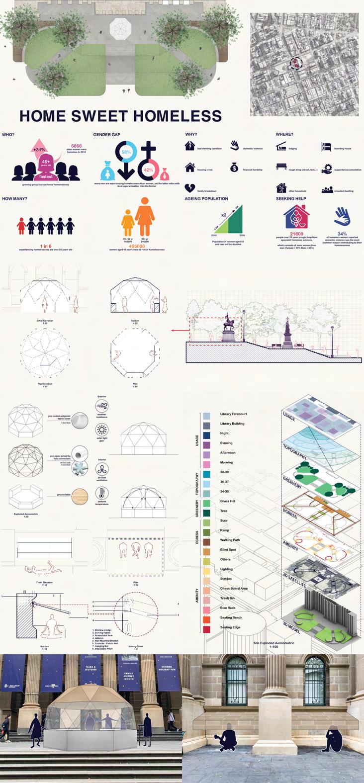
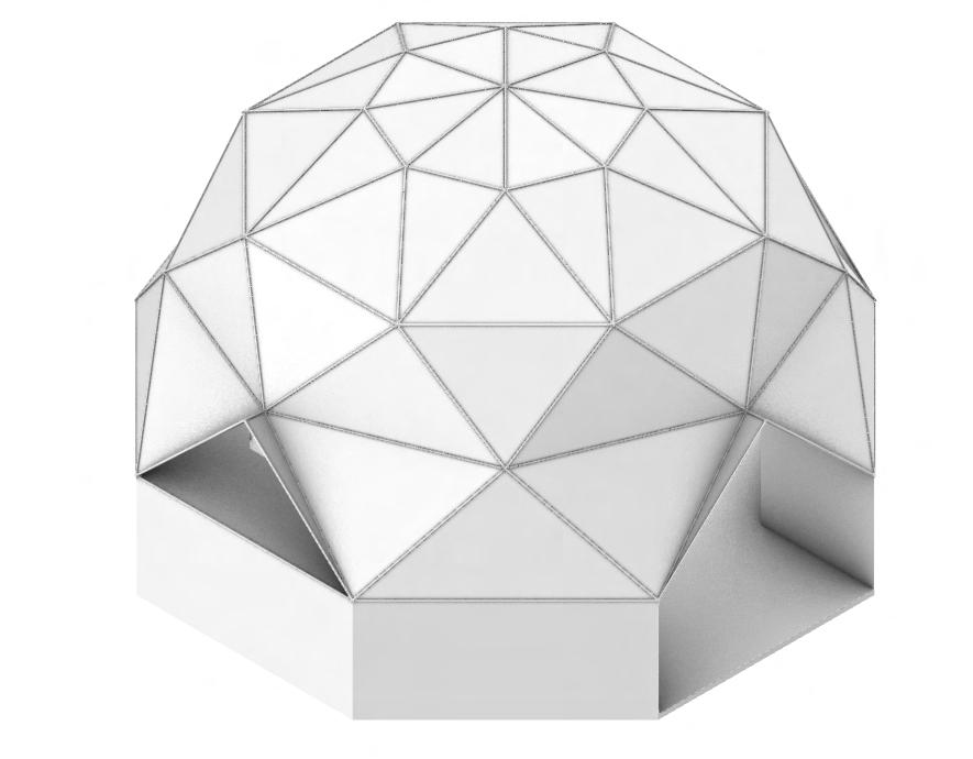
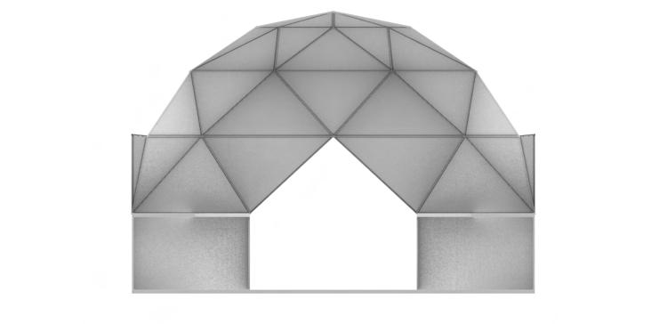
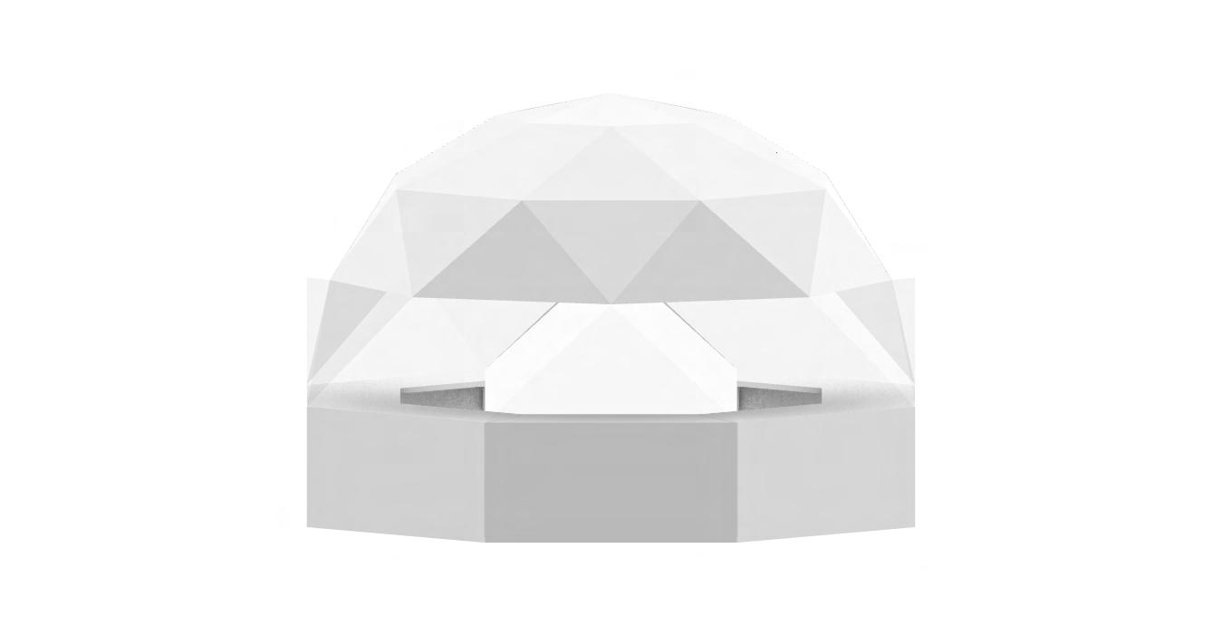
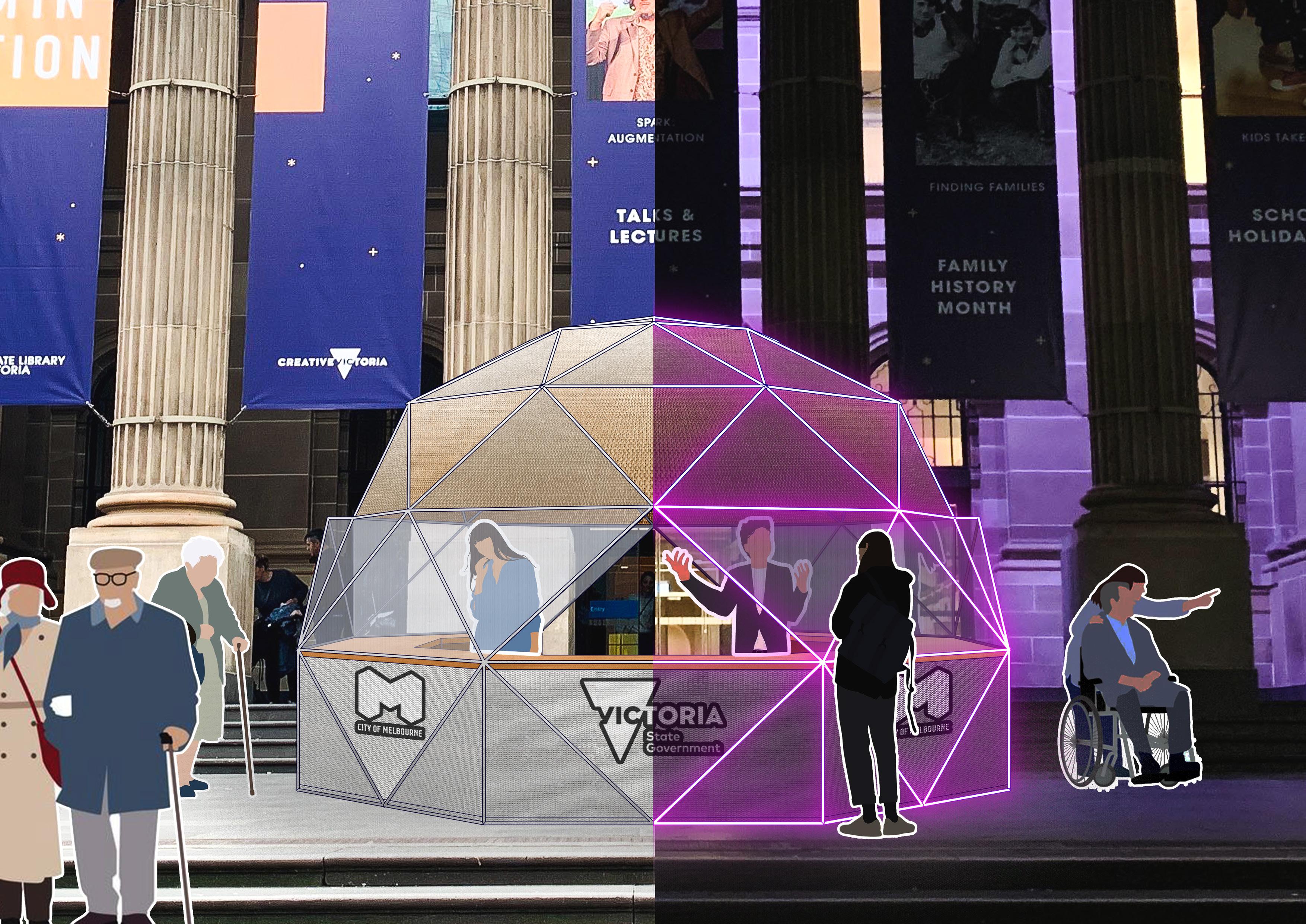
Finalizing my iteration comes with two components. One is a geodesic dome, which I decide to function it as a help center rather than little pods nestled between the facade columns, placed in the middle of the forecourt in front of the library. Rather than simply going with the route of designing just shelters for the homeless to sleep and sit underneath, which I feel like it is too generic and surfacelevel as there has already existed numerous design proposing the same idea. I want to do something where the homeless can easily come seek help and support for free to further tackle and alleviate their crisis of homelessness, since they clearly are disadvantaged at unable to find safer and better homes by themselves. Therefore, a help center would be a perfect answer, solving this idea.

As mentioned before, the dome base shape of the octagon derives from the library dome Reading Room as an inspiration for my design. This will help it blend more into the context of my site whilst still standing out without looking too different given the locale is already an established landmark icon of Melbourne well known by the world.

MODEL iteration 6 114
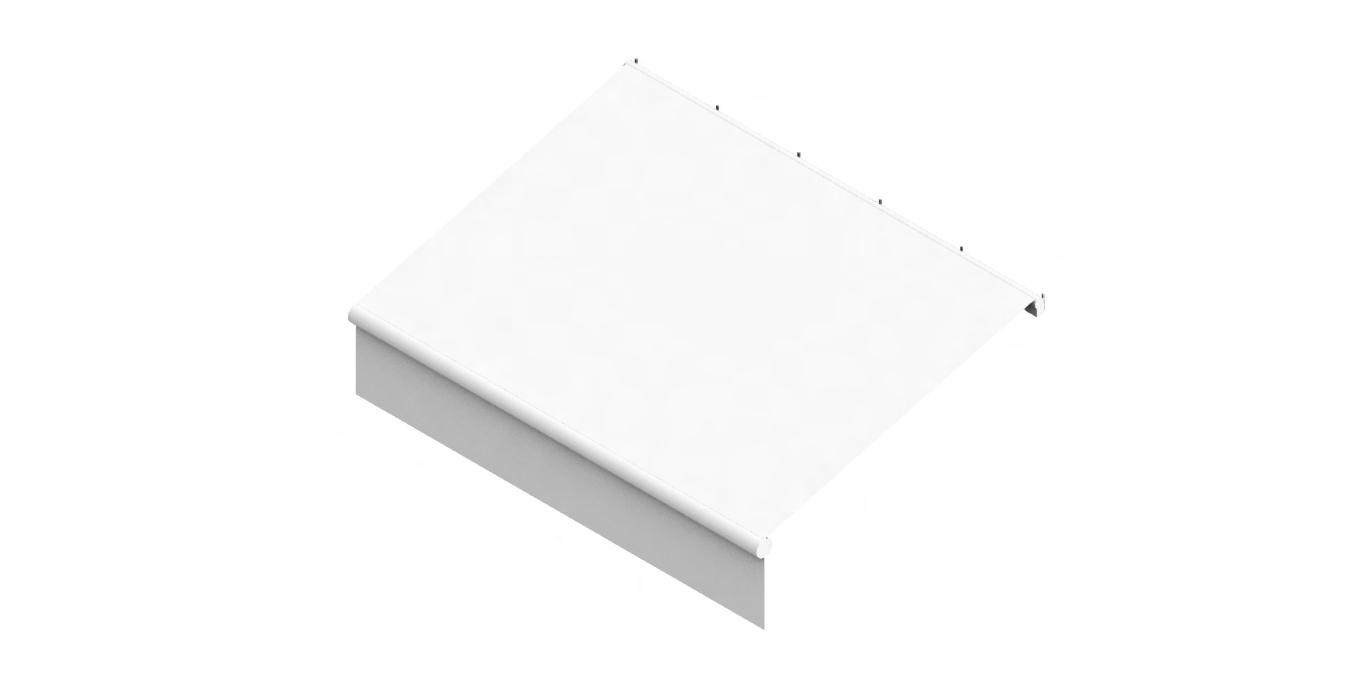
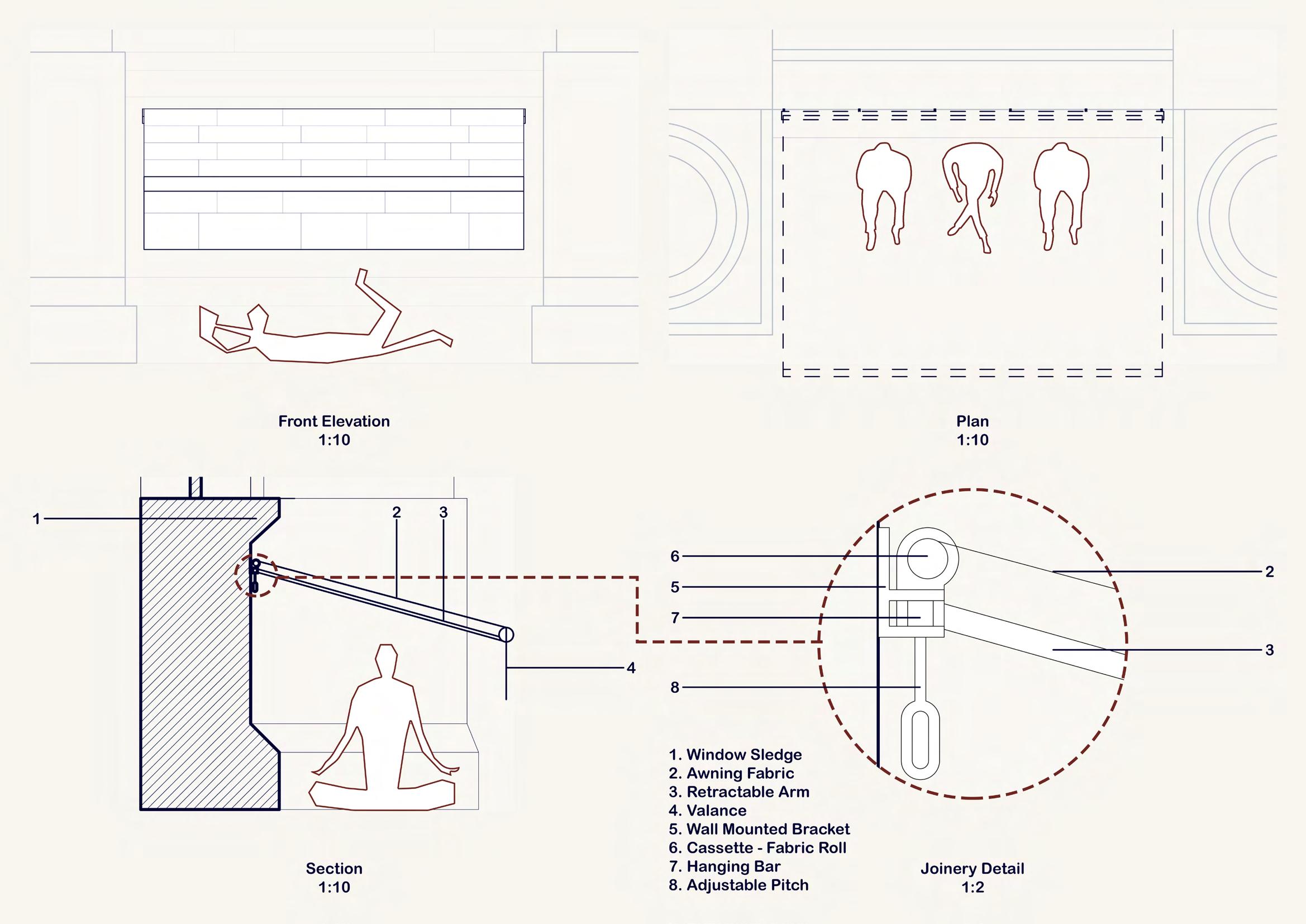
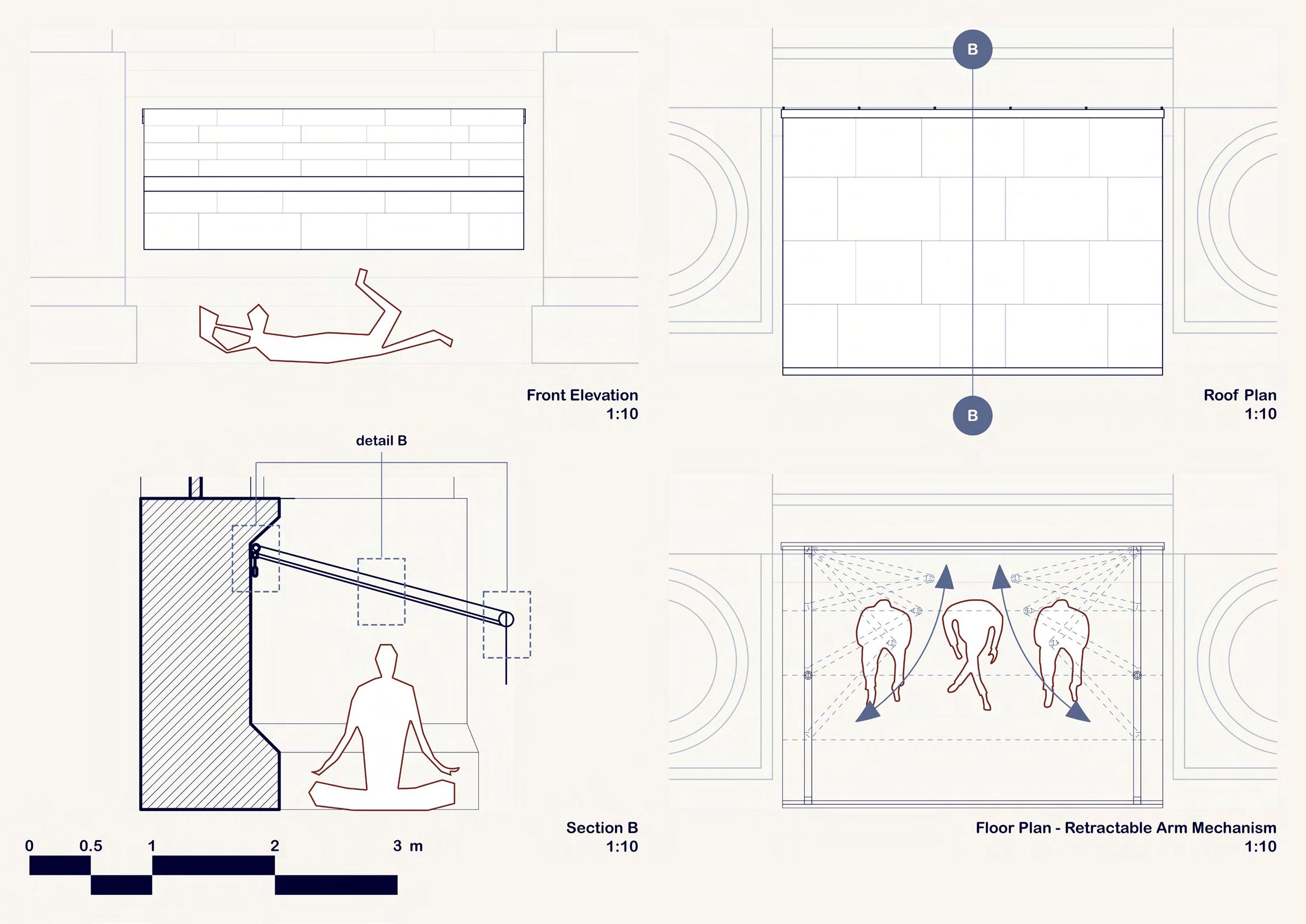
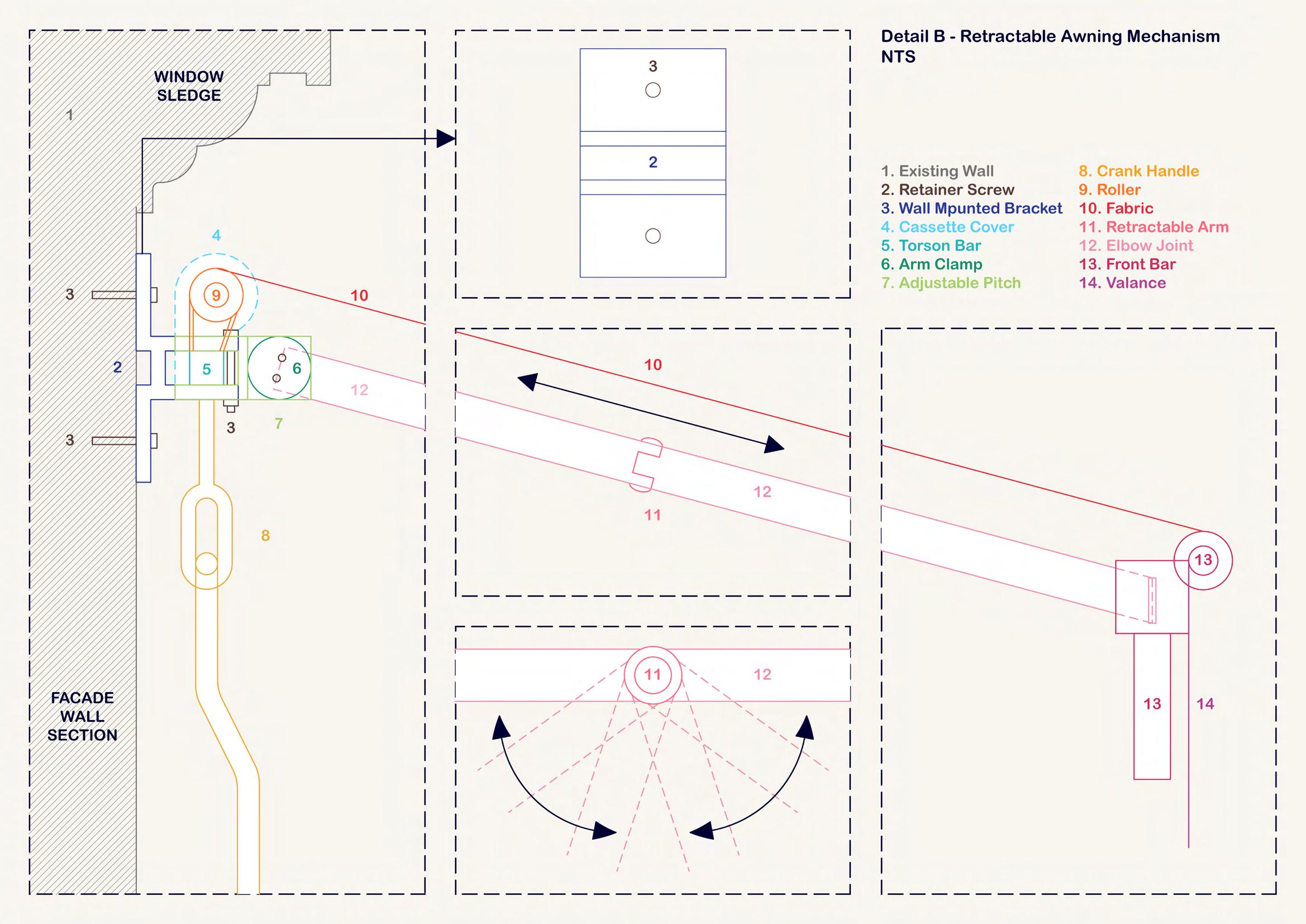
Another component of the intervention is retractable awnings as temporary shelters for the homeless to seek while being under the support of the service. As opposed to the geodesic pods proposed previously, the awning acts as semi-private canopy or miniature sunshade to shelter underneath, which the retractable mechanism of it allows to expand and contract onto the wall as it is. This ideally will not create too much attention to the viewers since most homeless women tend to accommodate themselves shrinking within the small gaps or recess between the columns in order to boost perception of privacy and security.


115
PERSPECTIVE DRAWINGS

Matching the surrounding site context, I aim to mainly use the similar color palette of beige cream from the library building facade for my geodesic top and the awning fabric pattern, and greyish concrete ground flooring for my dome pvc coating at the bottom. This way helps my design to blend into the context of the site yet still subtly pop out in a way that is not too dramatic or detaching.
Regardless, I am still feeling very skeptical and worried about this idea, both the dome and awning, because at the moment, they look really plain and simple, not complex and detailed enough as they should be. Compared to other classmates, I notice that my design has to be the most simple of all, considering me being in the final year of the course already, which poses great concern for my project outcome this time. With so much going on during the last few days and everything right now being a big mess, the lack of ‘maturity’ is unfortunately reflected in how simple and somewhat unfinished my work comes out.

116

117

118

119
PRESENTATION CHOREOGRAPHY
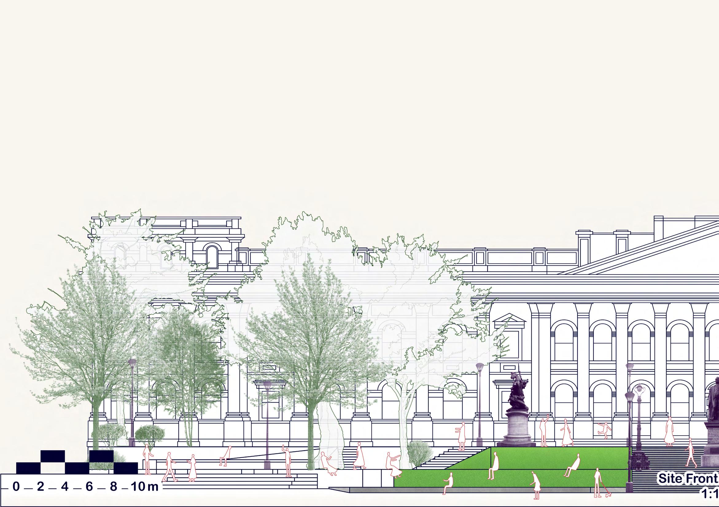
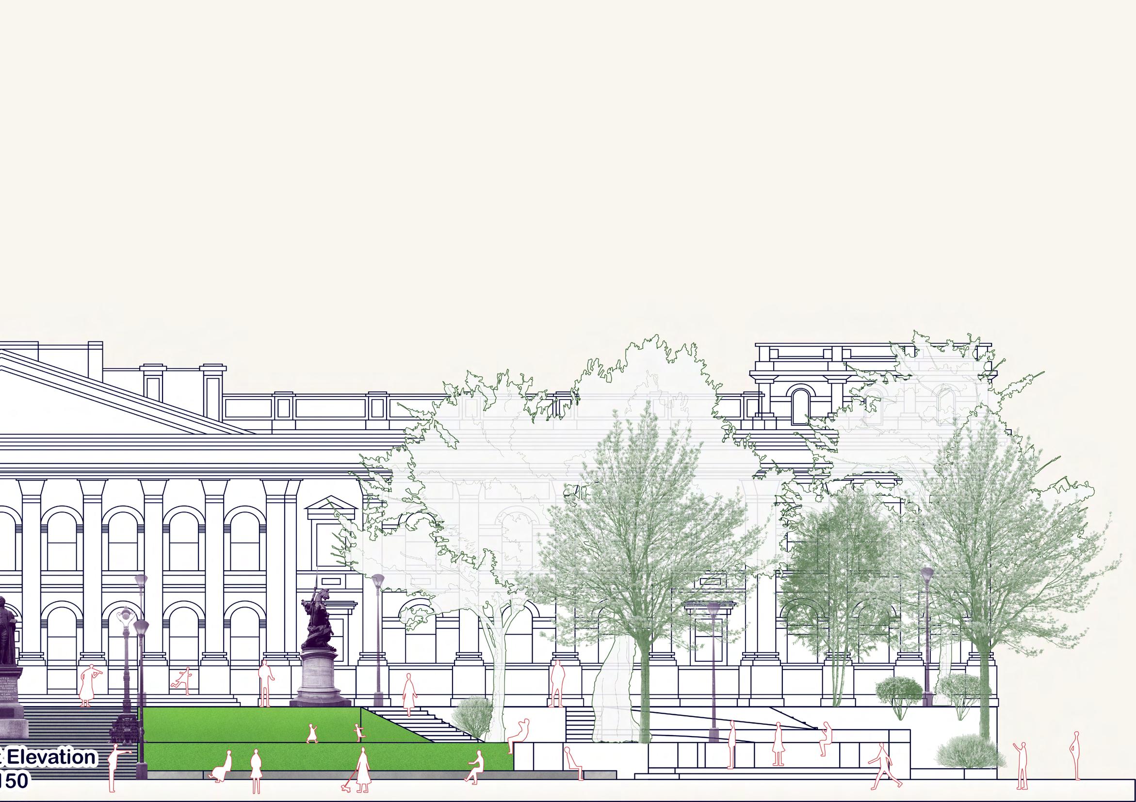
As mentioned in the weekly reflection, since I struggled to get every basic component done before Thursday for practice, I merely had half my poster done. More importantly, my design was not done either, so my tutor was not able to give any feedback on it as well, other than for those site drawings that I barely finished earlier. Regardless, one key thing that I was advised to avoid doing is over-crowding my poster layout, which is exactly what I did in the midterm submission. For instance, the site drawings of elevation and section on the right middle should not be included without the design intervention in-situ if they don’t do anything other than just fill the gap. The poster should be giving just a preview, a glimpse to the beholders of our project using some of the most important key drawings that communicate the gist of our design concept, not showcasing the entire thing.

120
121
FINAL SUBMISSION

With time running out and my work being all over the place, my final outcome is frankly horrendous. All my drawings are too simple and not detailed enough, and my concept is still not well-conceptualized at all. I have been spending so much time redoing my model iterations multiple times, but none of them was convincing and strong enough to proceed further. As always, weeks 11 and 12 always happen to be the worst time period for me as I have to push a lot faster and more workload to be able to finish everything, yet I always fail to do that every semester. Therefore, I feel quite disappointed in myself for progressing too slowly and unproductive, which was reflected in how lackluster my work is. However, I am still very lucky that the final presentation is not going to be graded, rather than a marking point to indicate how work is being progressed.
Therefore, I can still use more time after the presentation, before the final folio submission day, to ‘get a grip’ and catch up on some ‘unfinished business’ that is supposed to be done earlier.
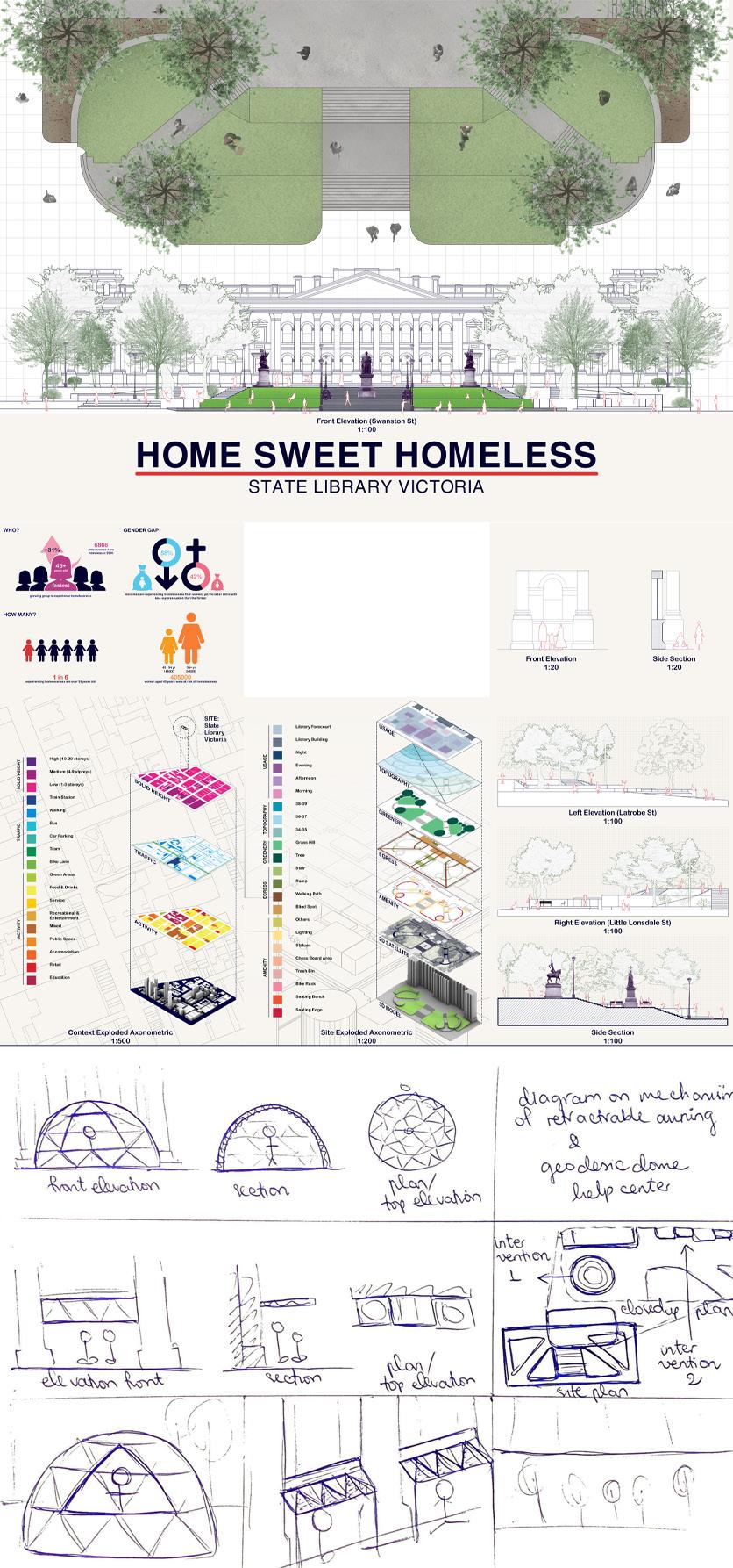
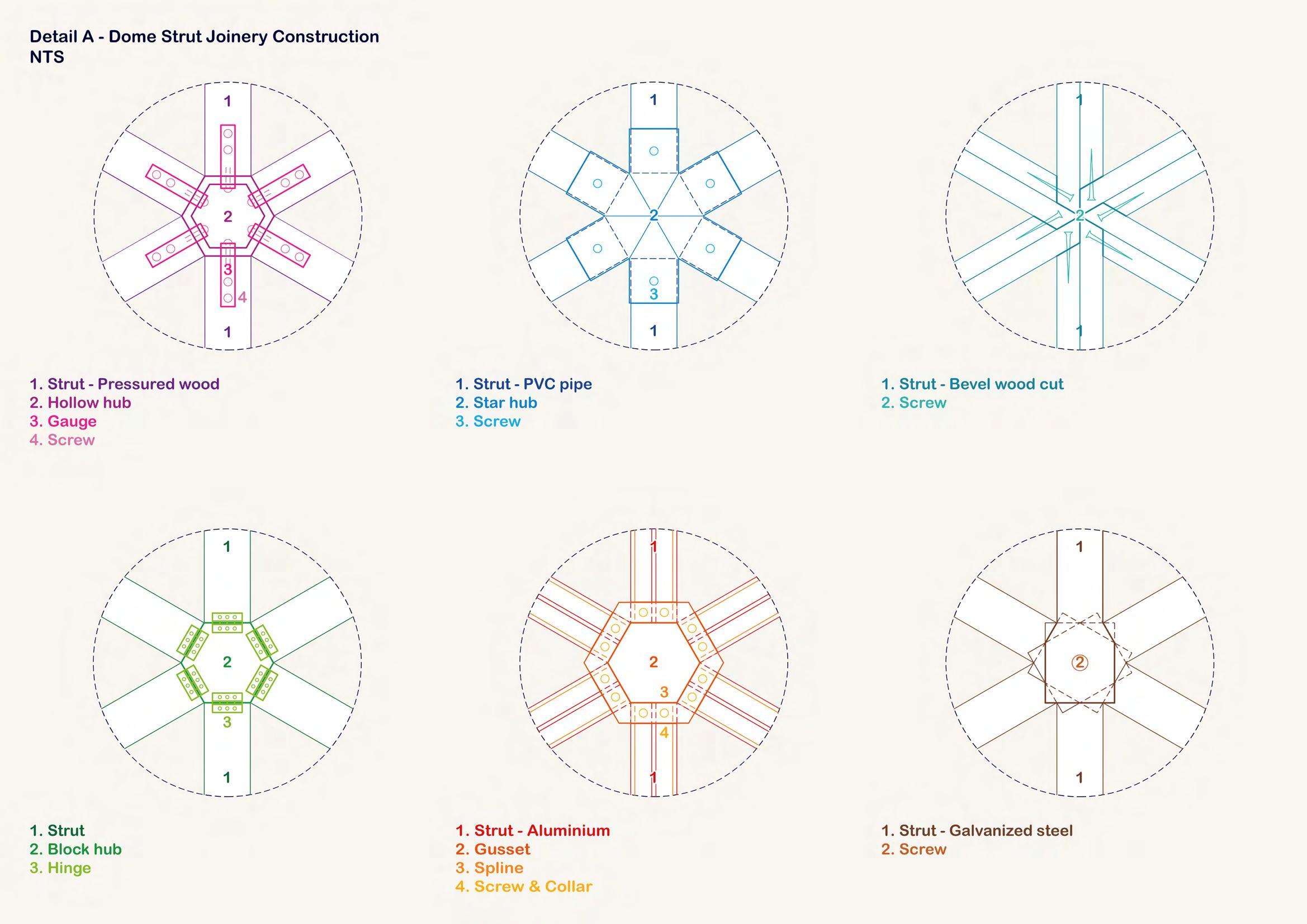
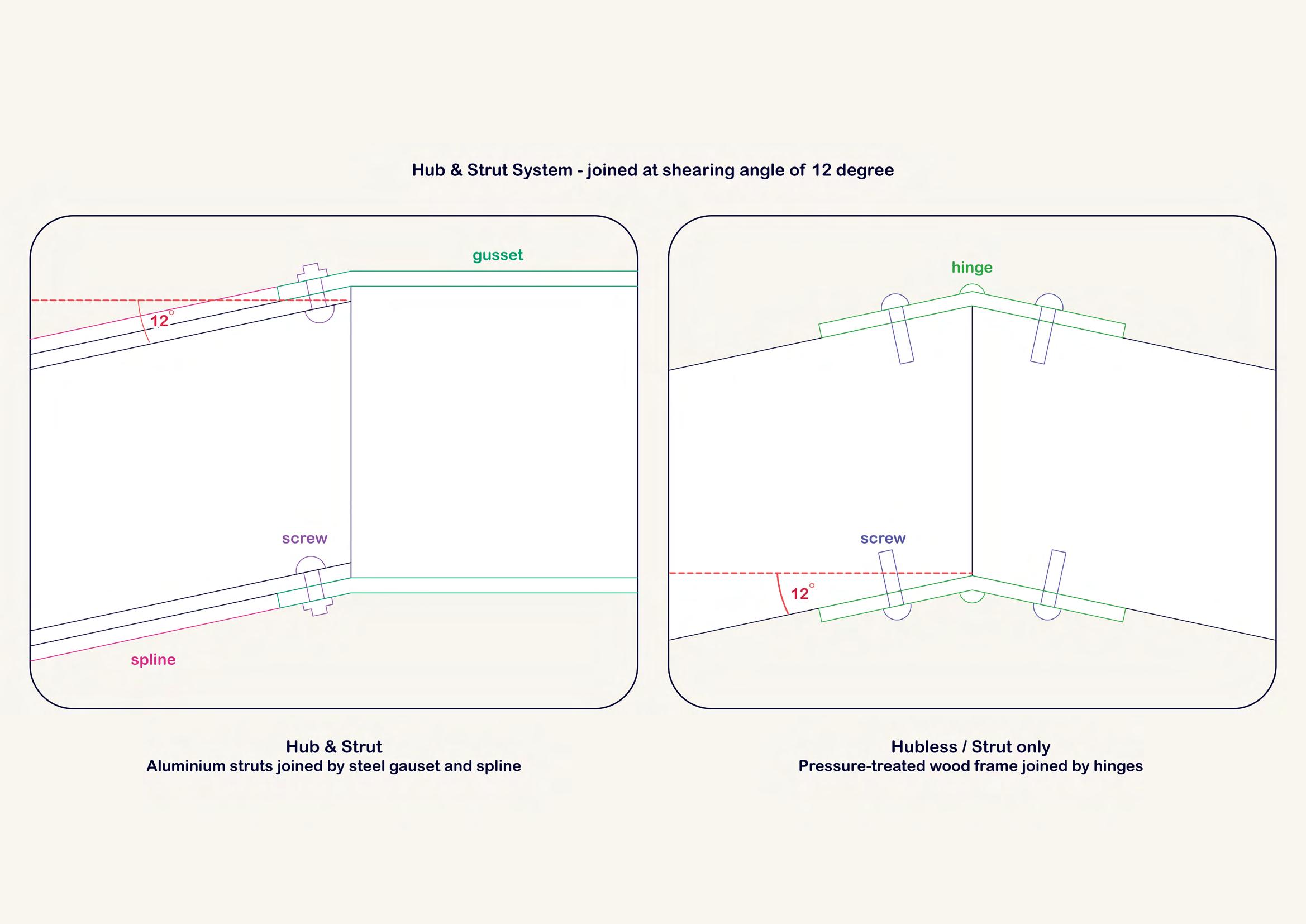
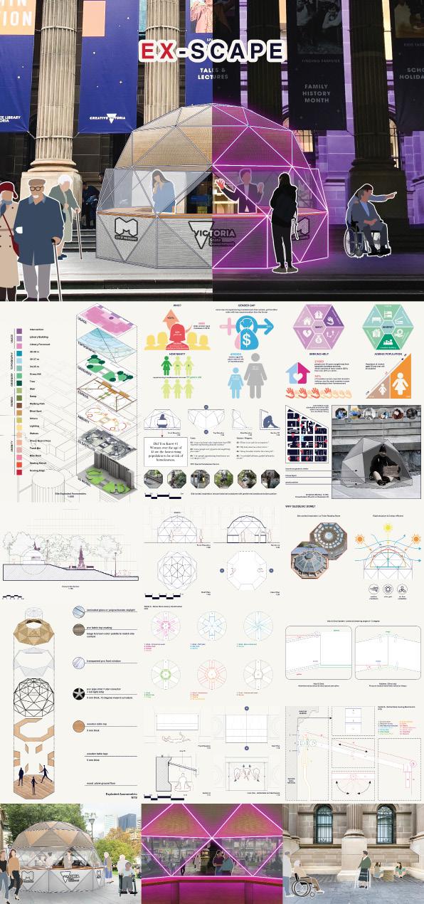
One critical mistake that I make is that I square around a certain area of the site section indicating where my design intervention will be installed, yet I should have ‘legit’ put it in visually, not pointing an arrow to the dome drawings on the left side. Also, as aforementioned, the joinery drawings still need more details, such as materiality or linework differences, as they look quite flat at the moment. Lastly, I need to think of a better heading name that actually conveys a message and narrates my design more; the “Home Sweet Homeless” sounds catchy and interesting, but it does not really ‘do the job’.

FINAL
124
POSTER
FASTLANE...
get a grip and speed up to the finish line.
125
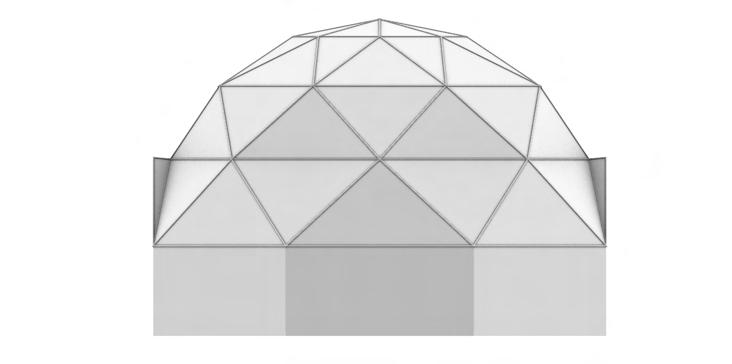
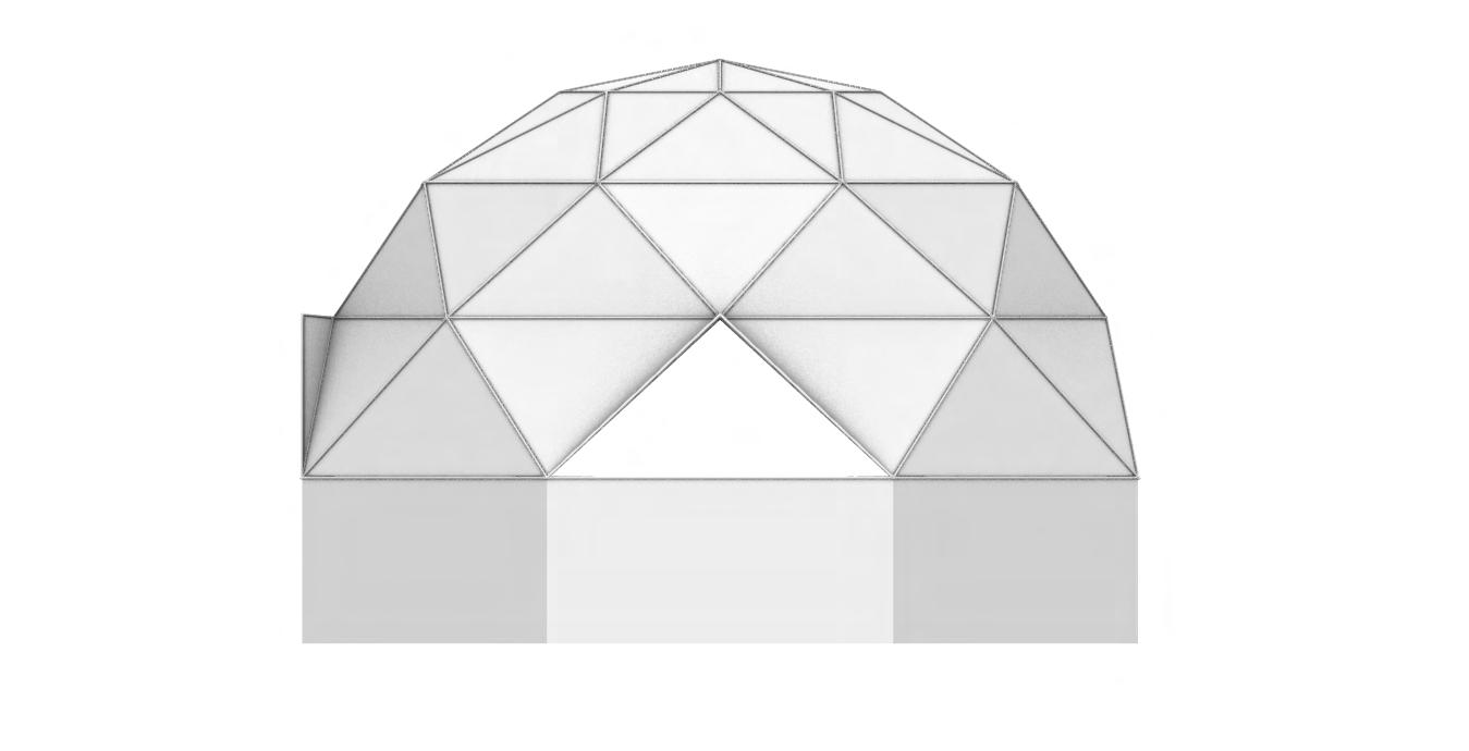
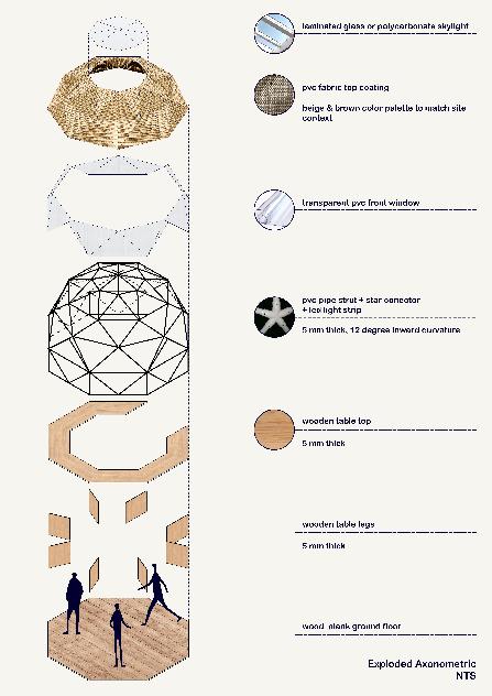
Re-developing my geodesic dome adds more triangular panels on top to add more aesthetic complexity as well as structural rigidity as well. I also add some porch on the window and door as well for some minor aesthetic too. More importantly, the joinery strut or frame this time is transitioning more refined into 10mm thick PVC pipe struts.


MODEL
7 126
iteration


127
PRESENTATION DRAWINGS (updated)
After the final review of presentation and journal, I have been determined to add a lot more refinement into strengthening my work better. Regardless of the simplicity in my work, I try my best to add more detail and craft into every piece of my drawings by creating a lot more diagrams explaining my design better. I think this for sure has had a huge leap of improvement compared to the my latest submission in week 12, which I am quite content and happy of how they come out, despite how insanely lone they take.
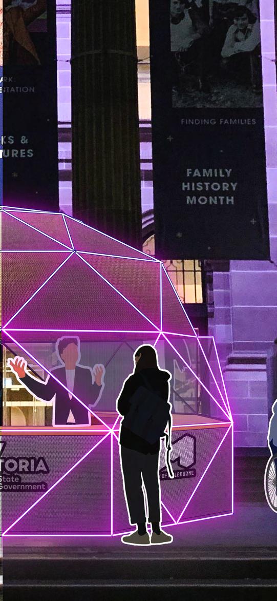
Noting the library facade turning pink at night with light projection hidden somewhere on the wall, I then come up with a tiny twist or addition to the dome - the struts each will be attaching with LED light strip that will brighten luminuous colors around at night, which I think it will help elevate my work a little bit while still subtly responding to the site context as matching inspiration. Surprisingly the drawings come out quite decent.

128

129

130

131

132
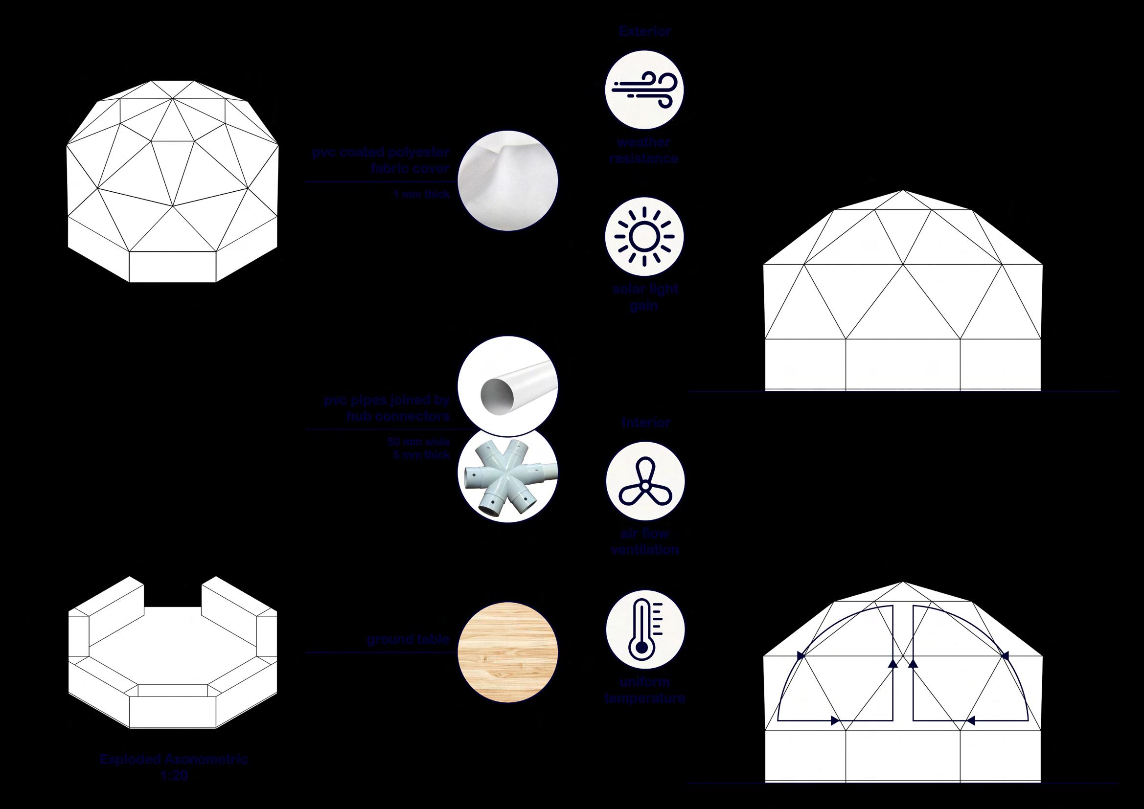
In the sense of detailing materiality choice, I decide to go with PVC as the primary material for geodesic dome, specifically the exterior fabric coating as well as the construction pipe joining together.

Compared to other regular materials for construction such as wood, timber, aluminum,... PVC has greater tensile strength and durability when built together using star-connectors (4-to-6-way connectors depending on the vertex or vertices of the strut joints. PVC also has an upper edge over metal or wood struts in terms of flexibility too. As the dome composes of exterior linear frames joining together and creating a curvilinear form in certain angling measures depending on the frequency and length, only the PVC hub and strut have more variety of sizes.
I feel like the exploded axonometric could have been making these points more clearly had I added more details and information to it too.
133

134

135

136

137

138

139

140

141

142

143
As aforementioned, since I have been so struggling at finalizing my design iteration and getting them done, I have no choice but to leave the advocacy as my very last task to work on. Like I explained earlier in week 10, my advocacy component proposes a bronze statue of a homeless female figure holding a cardboard sign with slogans or facts written on as a way to sensitize and educate everyone, the viewers about homeless women. The figure will be nestled under a geodesic bluestone sculpture as a way to match my design as well as the site too. Rather than placing these artefacts on site, which might probably create unwanted attention to the homeless women who are trying to rest under the awnings, each sculpture will be distributed across the Melbourne CBD within 1 km reachable boundary from the site.
One thing that I fairly struggle while making this is to mimic the bronze texture of the historical statues built at the site library. The statue mockup for me is the weakest part of my project as while it does not resemble well the bronze texture, what concerns more is that I was unable to show this to my tutor during presentation as I completely ran out of time. Therefore, I hope that this very first iteration is still convincing enough for the tutors.

144
I feel like the exploded axonometric could have been making these points more clearly had I added more details and information to it too. My initial plan for my final poster was to create analytique-inspired drawings, with the site plan blending into the background of the main ones, which aims to somehow give an old antique ancient vibe to it, as I notice how historical the architectural style of the State Library looks. However, after many considerations and rearrangements of poster layout, I decide to put the site plan into the midterm poster instead as it does not really serve any much value for the final one on the right when the actual intervention only accommodates a very small main part of the site. Regardless, I am very pleased with how much improvement these two progress from the previous ones that were not really successful.


145
Approaching the third and final year can sound extremely scary for everyone who is still struggling with uni first and second years as they already are, including me. Progressing through the wholesemester worth of projects like this feels so quick as I have been able to enjoy this class very much.
I feel so enlightened during and after this project as it has definitely broadened my horizons about women’s perspectives or perception of unsafety in public spaces as a result of gender discrimination in general, and older women experiencing homelessness, to be specific. I have been able to learn, garner, explore, and unpack so many great new skills that I have never known about before. Meeting and being in the same class with like-minded people who also believe that women should be deserving equal rights as men in public spaces have helped me a lot in terms of developing my sets of knowledge as well as skills attained from reviewing works from other peers.
Regardless, I also have to admit that this has to be the most struggling semester I have ever been through, in terms of both the work-in-progress and the final outcome resolution of my work. It seems like nothing has been going according to my way as I keep tangling myself in so much delay of work only because whatever I design or come up with is just not convincing and strong enough, unlike how well I used to perform last year. In fact, in the sense of time delaying, the past few days after the original submission have been insanely stressful and exhausting for me. Noting that my design looks too simple, I had to redo literally almost everything, which took a lot longer than I expected, so long that I even had to apply for special consideration for 4 times within 10 days, just because of the workload I pushed myself to achieve was unattainable for me. This has to be one of my biggest downfalls and setbacks for this semester. Other than that, I am pretty pleased with how much I have learnt and improved.
146
REFLECTION
147 THANK YOU! Duy Anh Nguyen Nhat SDN3001 30126975
148
