ARTIST BEACH COLONY

Client Research
My assigned practitioner for this project was Ann Veronica Janssens, an artist who works with artificial color light and fog. By doing client research helped me to grasp more about how she uses so minimum and simplified materials to produce such effectively immersive artworks. I was mainly inspired by how she plays with varieties of color schemes that shine and pop out in the dark or fog. At first, during the research, I was a little bit worried and frightened as I had no idea how to depict this idea of neon colored light into my design, but eventually I found a way, which will be shown in my conceptual maquettes in page 10.

Green, Yellow, & Pink, 2017.

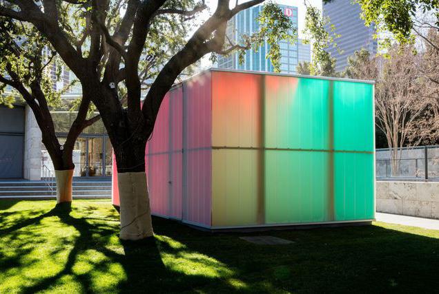
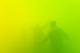


Hot Pink Turquoise, 2020. Bitter, Salty, Acid & Sweet, 2019.
Red Reggae, 2004.
Orange Sea Blue, 2005.
Orange Sea Blue, 2005.
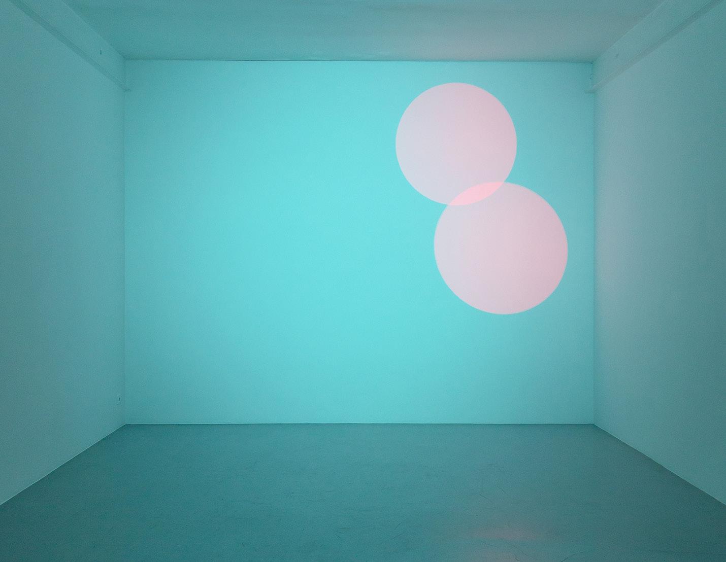


Green Aurora, 2005-2016.
Blue, Red, & Yellow, 2001.
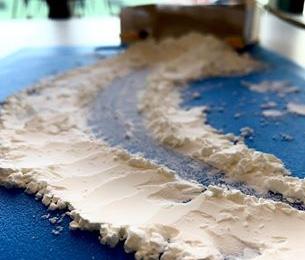
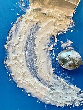
I chose ‘to light’, ‘to spread’ and ‘to simplify’ as my three verbs to describe how Janssens uses only simplified materials such as artificial light and fog to spread out the entire interior space where the viewers can be fully immersed within the artwork. Looking back, I wish I could have known a way to create my own fog like how my practitioner does.
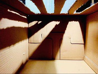
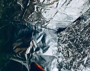
Though these maquettes look quite rough, after experimenting with different materialities to convey my chosen verbs, I decided to use the verb ‘to light’ as my focal idea for my design as I felt that I could explore further by utilizing the reflective quality of foil as well as the contrast of light and dark.

to light
Verbs-based Maquettes to spread to simplify




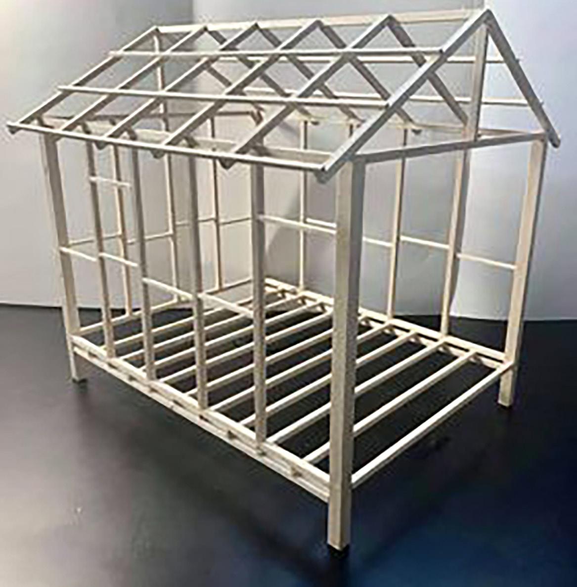
Physical Model

The progress of building this physical bathing box was quite challenging for me since this was my very first time doing this. There were, for sure, a lot of obstacles along the way from finishing this as I kept messing up everything.

I kept making so many silly yet fatal mistakes regardless the instructions given.
I was continuously making wrong measurements as well as not being able to properly cut through the timber that were so tough to do so, which ended up looking torn up and rough, therefore leaving the cut timbers a few millimeters short from the standard measurement.

Even worse, apart from having difficulty setting up and gluing the timber firmly together using the map pins, after the glue dried, I actually could not take the pins out as they were too deeply stuck inside the joints of the timbers.
Conceptual Maquettes
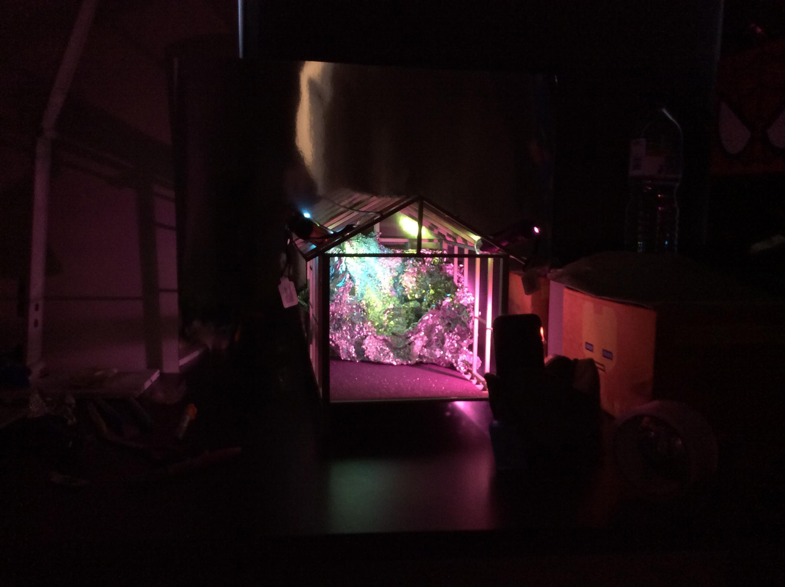
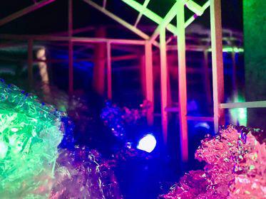
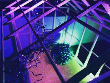
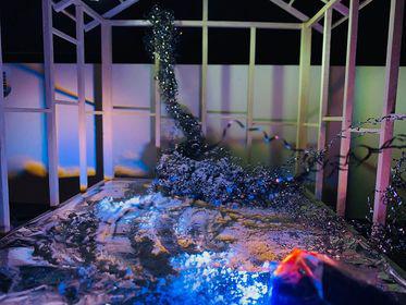
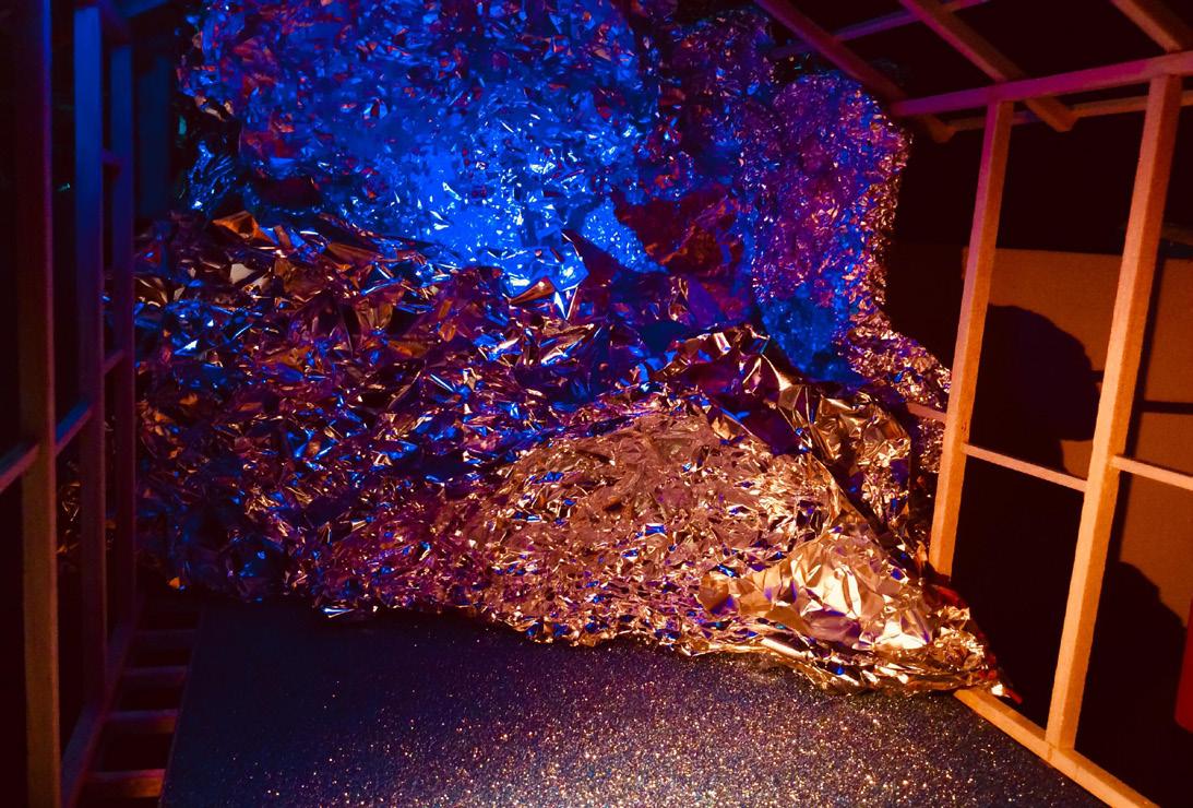
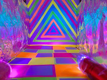
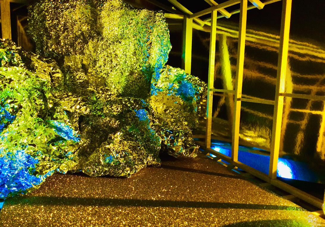
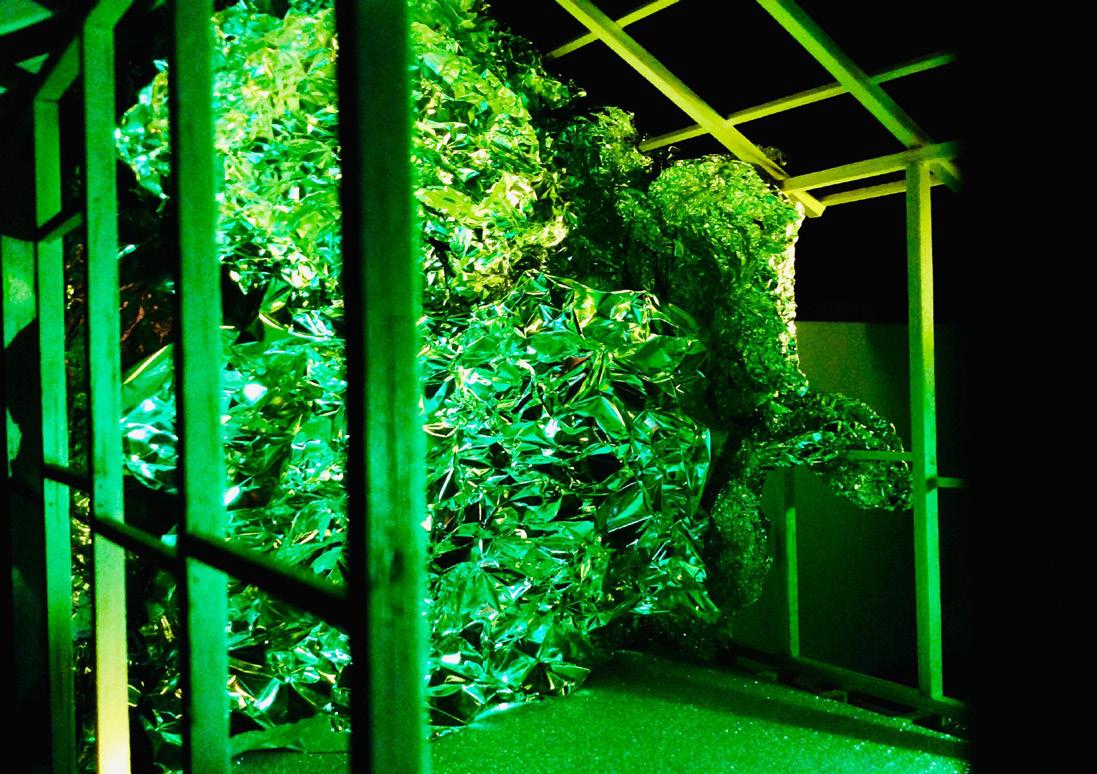
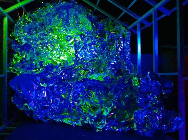
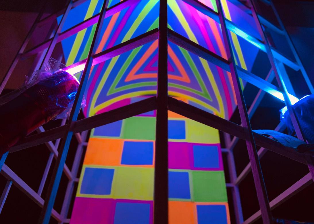
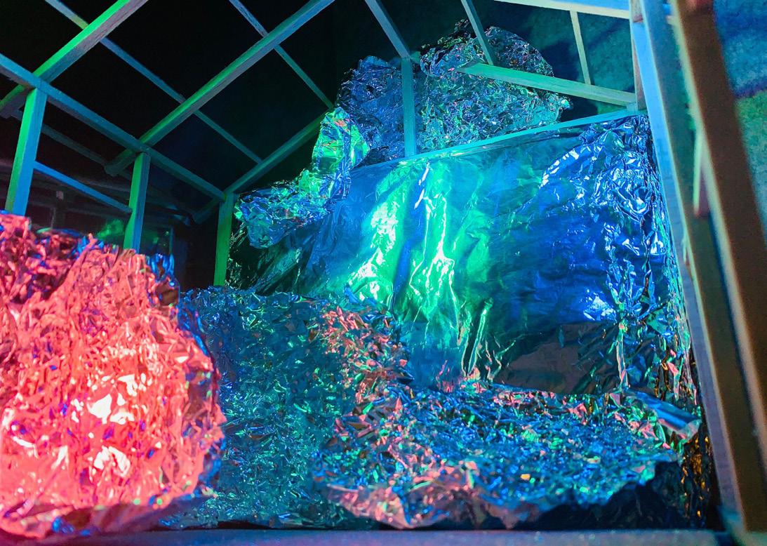
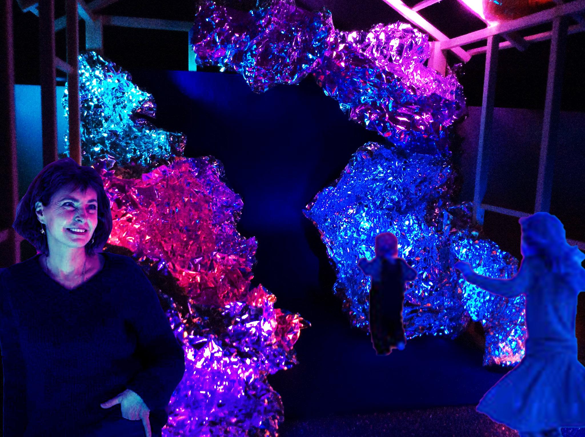
After receiving comments and feedbacks from my peers and tutor regarding ways to do colored light effect, I was able to find one. By using materials that have high reflective, glistening, or shimmering qualities including scrunched foil, plastic bubble wrap, glitter papers, mirror sheets, and most importantly, along with transparent masking tape, mini light torches and colored permanent markers, I was able to create and photograph a series of neon inspired conceptual maquettes that mimic how my practitioner usually does. Overall, I feel really pleased and surprised that they came out a lot better than I expected, though they are not as clean and smooth as Janssens’ light artwork, but I just played and had fun with it.








Design Brief
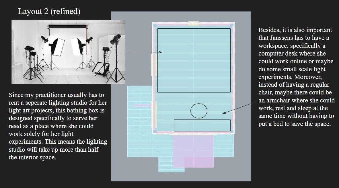
Initially, I had no idea that the interior within the bathing box was a lot smaller than I envisioned since I have never been there. Therefore, when coming up with how the space inside looked like, I was really struggling in terms of composing all the items and components together, thus I ended up putting too much things inside. After my studio tutor helped me out, I learnt that the bathing box was as small as a regular bedroom, so I had to rethink in a more simplified fashion by omitting some unnecessary items.


Digital Modeling
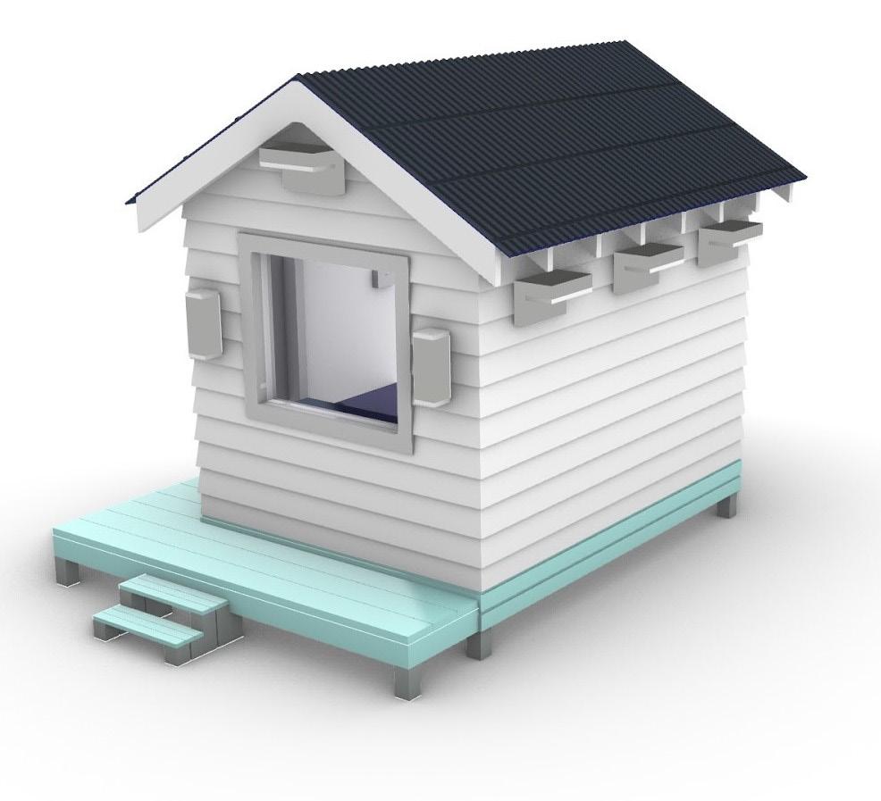
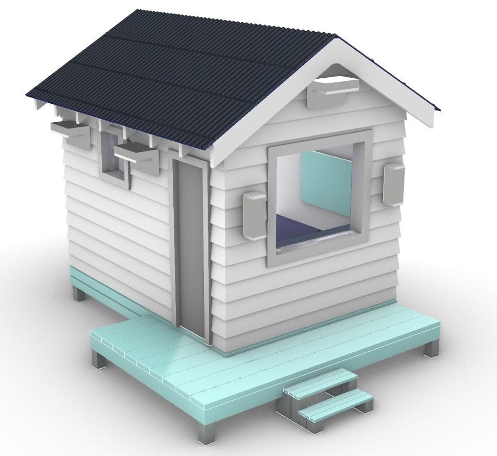

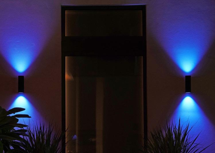
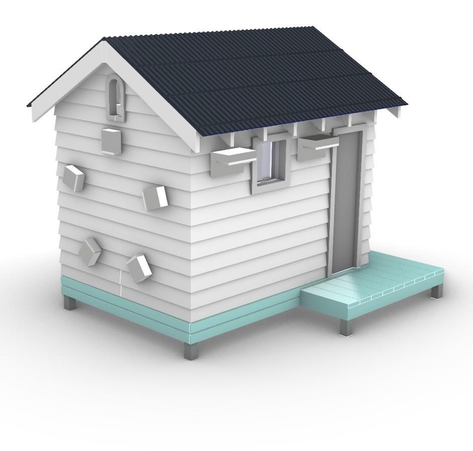
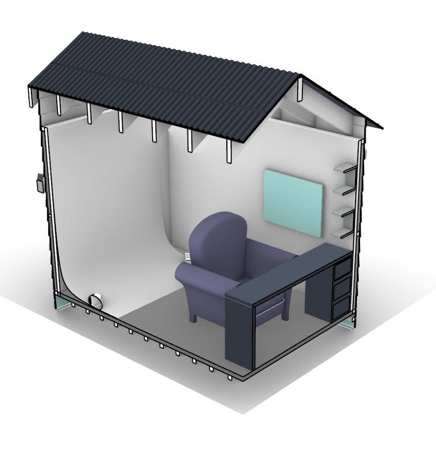
The process of building the bathing box in Rhino was quite challenging for me, especially when it came to constructing the weatherboard of the cladding and the architraves for the door and window frames. Probably because I was so focused on making every component symmetrically and perfectly aligned to each other that I spent more time on building the exterior than the interior.
Initially, I went out the route of having outdoor LED colored light lamps hanging on the claddings. I knew it was not the best idea, but I was stuck with not having any other better ones to go with. Therefore, I talked about this issue to my studio teacher, and he recommended me to do a hidden LED light strip under the roof eaves that would brighten the entire cladding rather than certain surrounding parts.

The overall design appears to be very simple as I wanted to mainly focus on its brightening colored light in the dark which would be technically done in Photoshop. However, I feel that I did not show much creativity in general.

Neon Theme


Inspiration
Two weeks before the poster submission, we were asked to think about how our individual posters would visually look like. Personally, I wanted to do something different and unique that would set myself distinguishably apart from the rest. Therefore, I decided to be creative by doing a neon-themed poster, as this suits my practitioner’s artistic approach really well. I wanted to play and experiment with different color palettes based on these precedents, though it might be risky as I had never done this before.
Technical Drawing
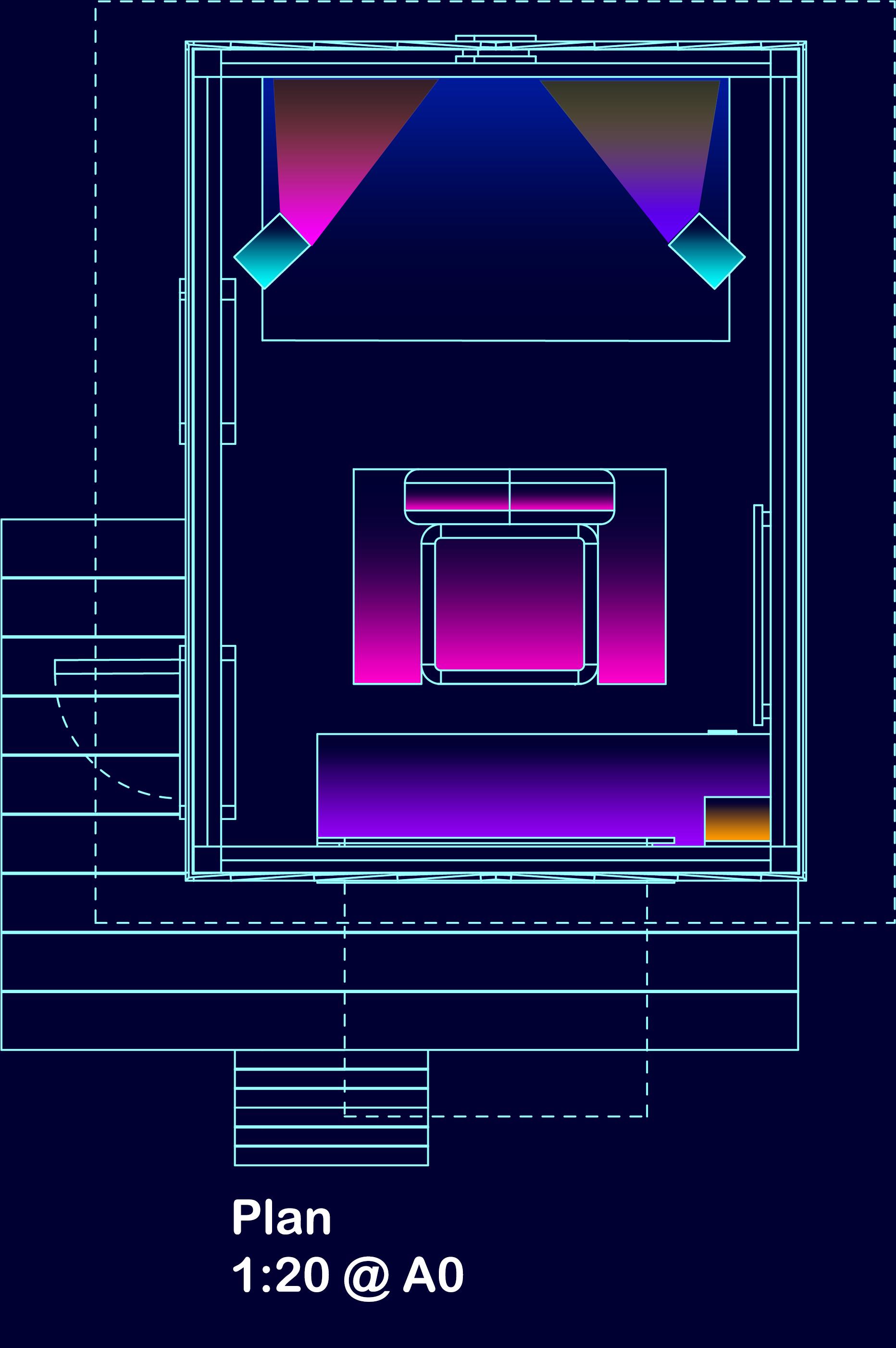
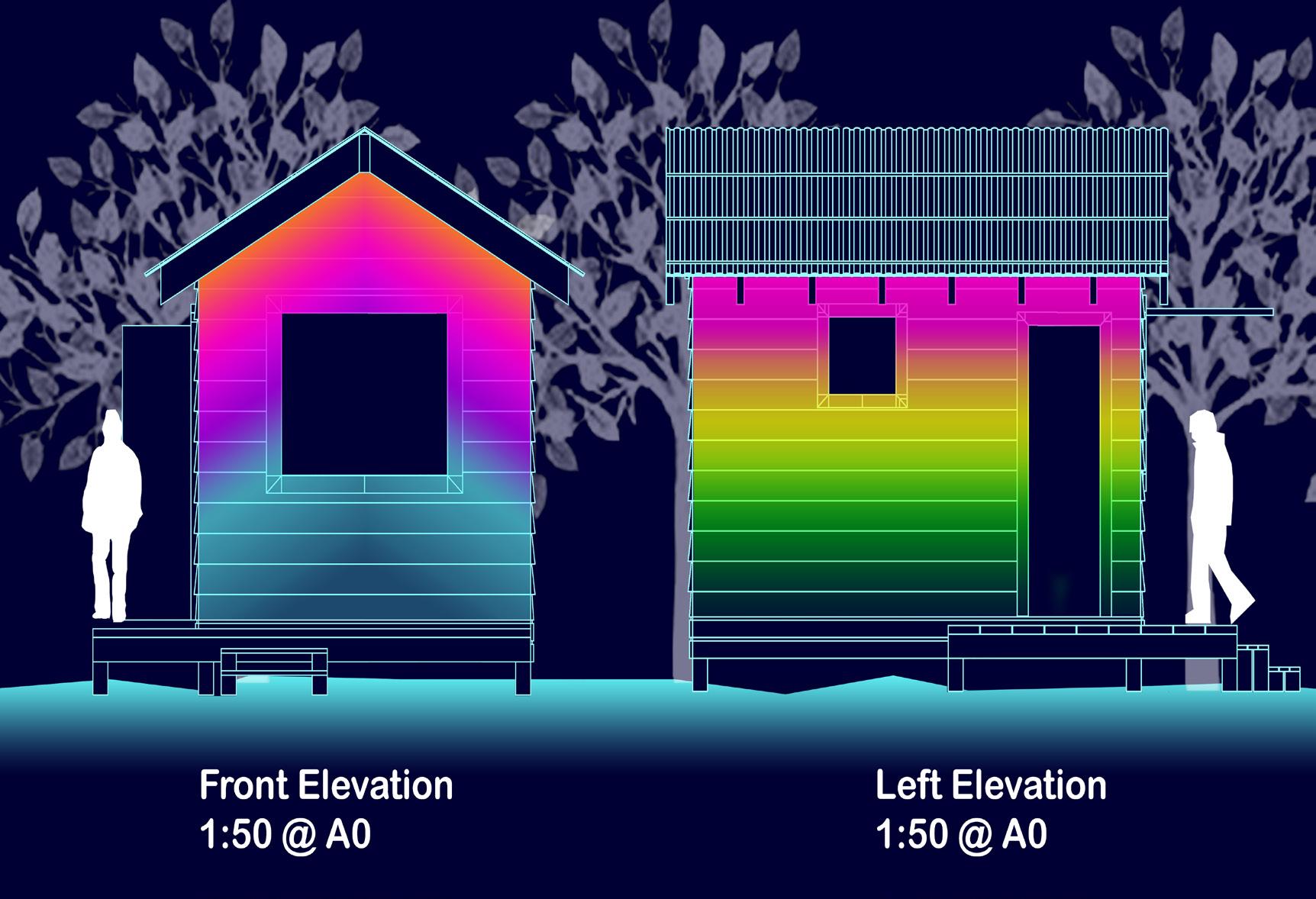
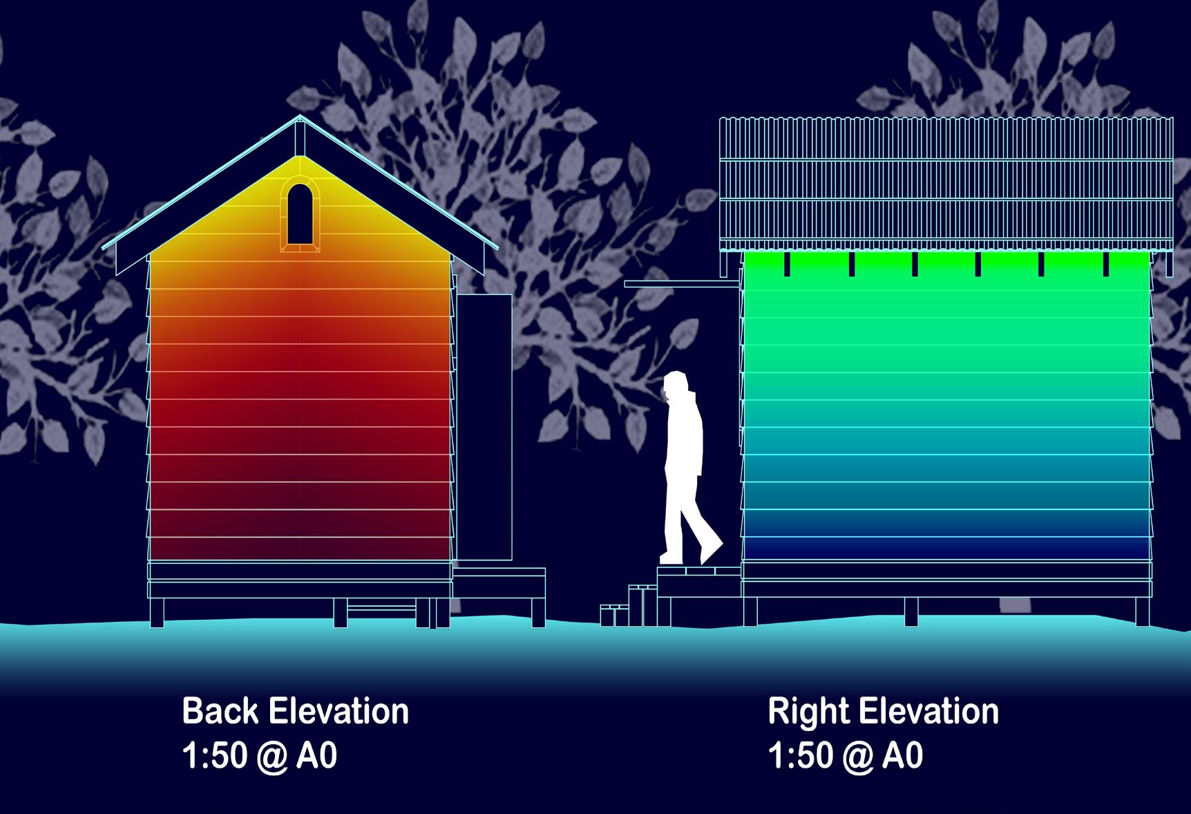
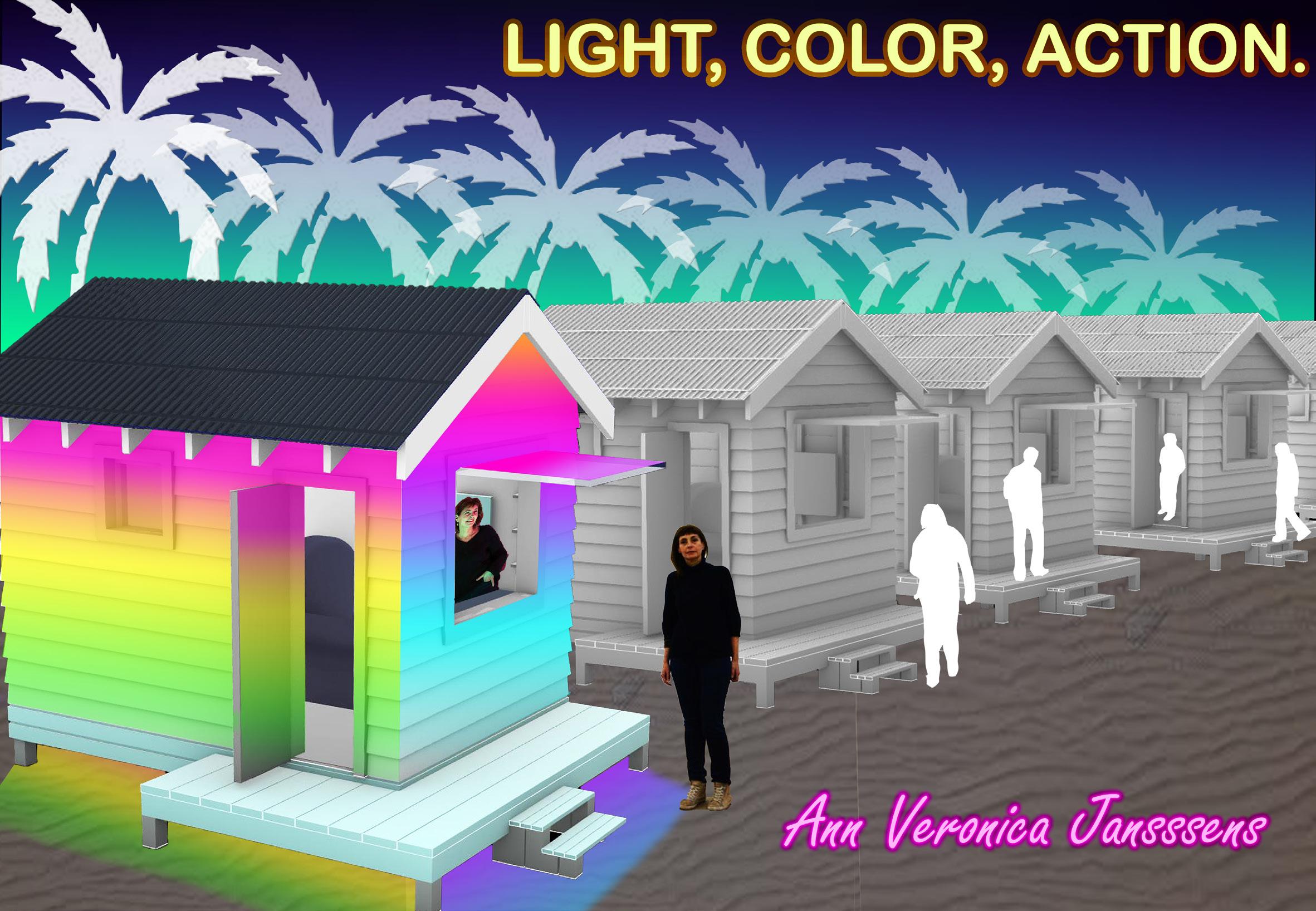
By using the Gradient and Gradient Map Tool in Photoshop, I was able to decorate my orthographic drawings with variety of color combinations that pop out in contrast to the dark blue background inspired by my practitioner and aforementioned precedents above, which they turned out quite nicely considering this was my first time doing this.
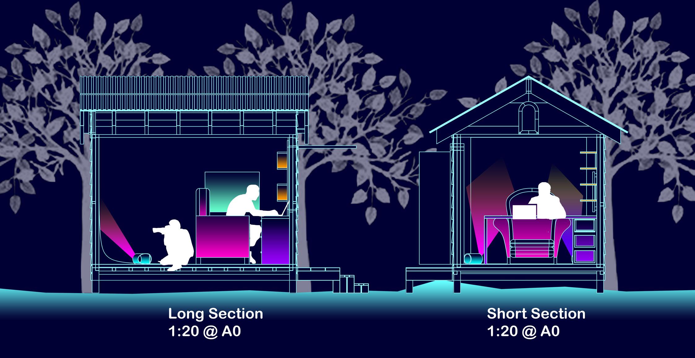
However, after finishing this project, regarding my tutor’s feedback, the working space which consists of the comfy armchair and the computer desk, takes quite a huge space, probably more than half the bathing box interior, which seems impractical. Perhaps I could have replaced something that were more spatially efficient, such as beanbags and foldable table which save a huge space for setting up the light studio.
Overall, looking back, I feel that the hero image and the first perspective are still looking quite stark as there are not much rendering and light going on. Also, for some reason, I could not do the sand ground underneath the bathing box on Rhino, so I had to do it in Photoshop instead, which looks quite flat.

Perspectives
For this project, my studio tutor allowed me to use my previous conceptual maquettes as my perspective imageries rather than from Rhino as I was having difficulties working with colored light digitally.
Despite these two perspectives looking colorful and immersive as I hoped it would, the scale of the human figures are misleading, which is something that I need to pay more attention to yet I still have trouble with even during the second project.


CREATURE SPACE

Creature Research
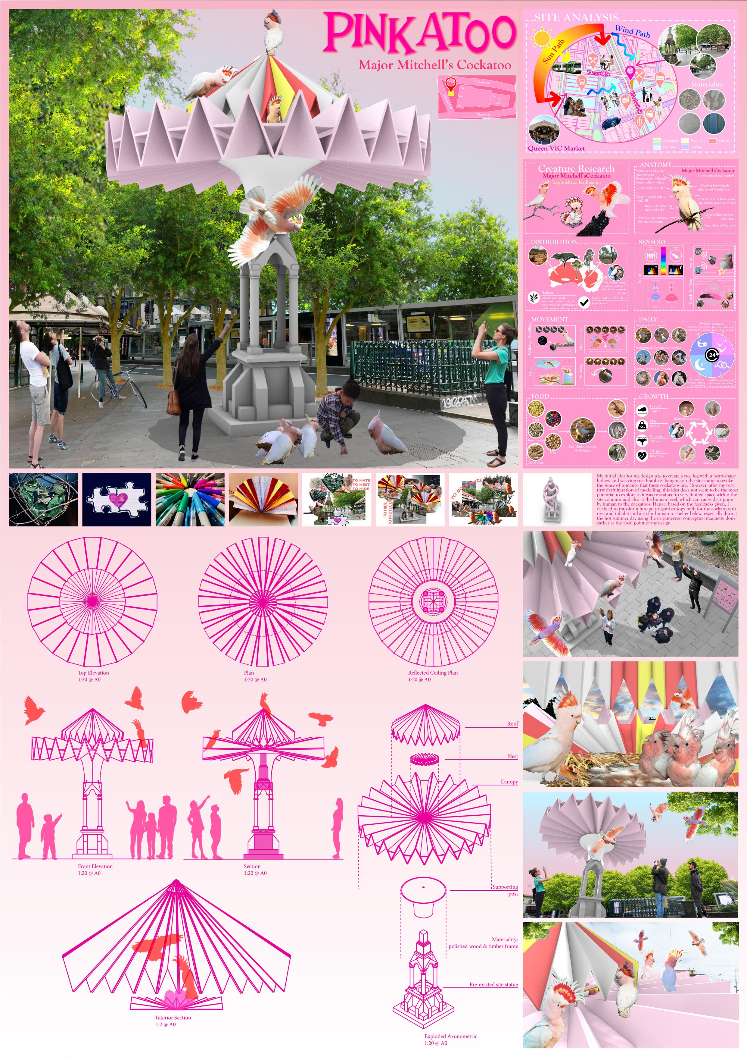
The first phase of the project started with doing creature research and diagramming/mapping. I chose the Major Mitchell’s cockatoos because I was appealed to their unique one-of-a-kind physical appearance, especially their striped crest that resemble like the Aboriginal hat.
Initially, I found it really it hard to do so as there were really insufficient information and details that I need, considering this species is quite rare. It took me a while to both fully understand and visualize what I had read rather than pasting only words; I aslo struggled fairly with finding enough details and imageries of these cockatoos, especially their sensory, movement and daily.
Overall, I think these diagrams could have been more informative as there are still a few informations missing that I have not been able to include, specifically I have not shown enough information regarding their territorial behavior. As a matter of fact, it is the composition and arrangement of imageries and written words that I need to work on more.

Site Visit
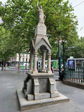
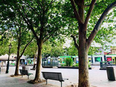
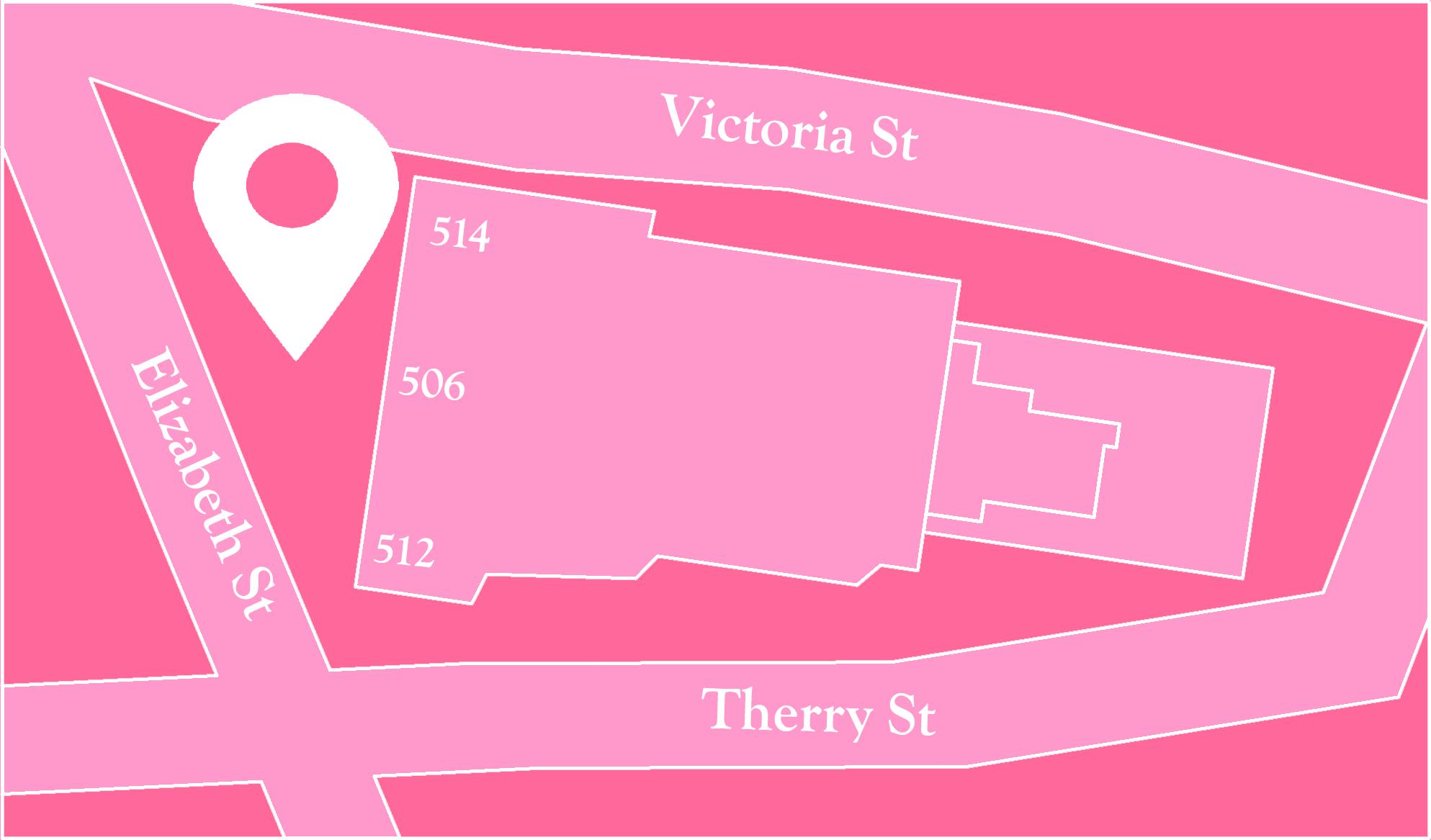
The site selection stage played a crucial role in this project. My chosen site for my creature was a religious statue built on a pedestrian vendor of Elizabeth Street, in front of the Queen Vic Market.
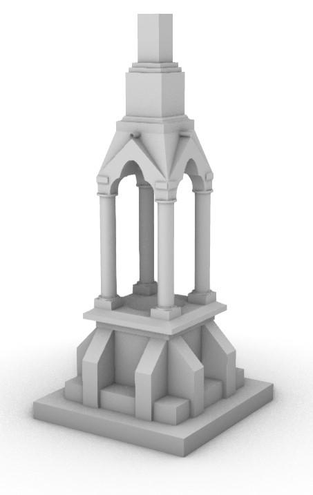
Before being able to choose this, I was really struggling, as I kept confusing and not being able to identify which zones were not parks or ones that did not have too much greenery or vegetation. I did have a few mistaken attempts of site selection before being able to finalize this one.



Site Analysis
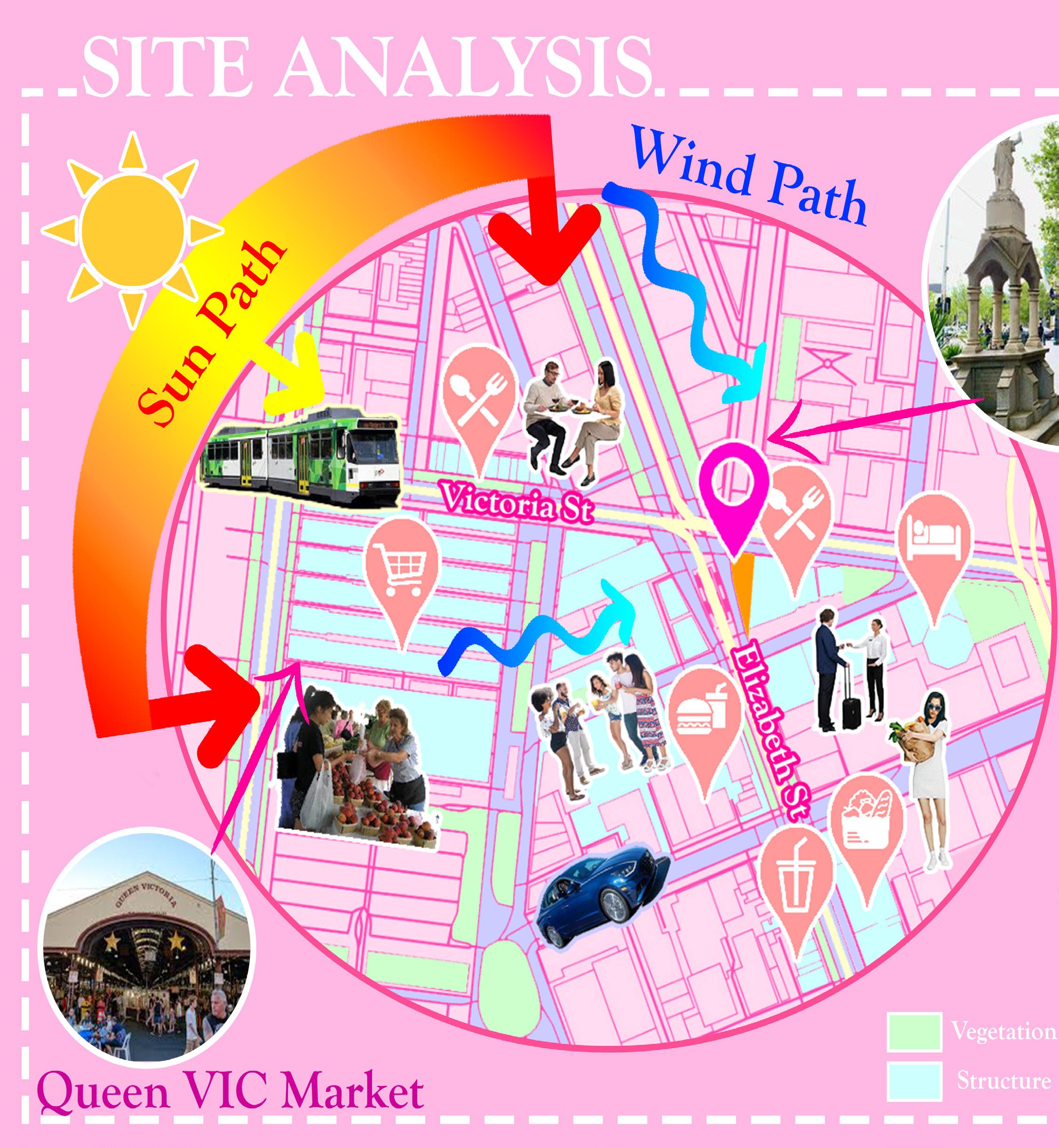
Besides choosing the site, a carefully in-depth site analysis was important as well. Throughout the process, I found it hard to show all the necessary pieces of information needed about the site, especially with showing the surrounding activities and structures, as the site plan limitation was quite broad so it was hard for me to select which ones were the most relevant.
Regardless, my first attempt at site analysis turned out quite decently, despite some technical issues I dealt with in Photoshop. Overall, it could have been less clumsy, more analytical, and informative, specifically pointing out where the creatures’ source of food and water, which I was not able to do so.
Although I like how there are heaps of color going on in this site analysis, it somehow evoked to me a sense of the Candy Crush game or Powerpuff Girls cartoon after I first finished it. I feel that I might need to focus less on the visual appealing aesthetic by toning this down more the next time I do.

Conceptual Maquettes
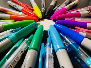
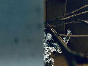
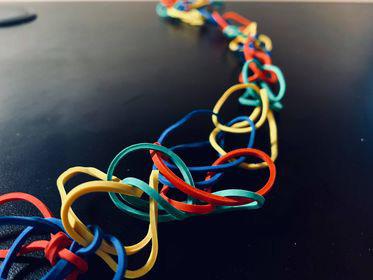
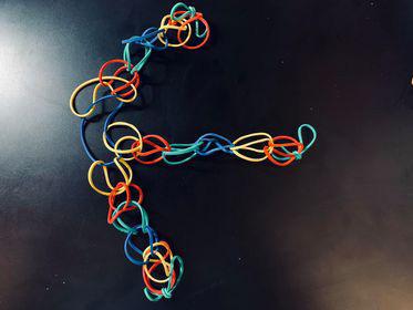
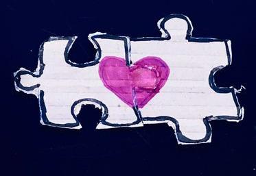
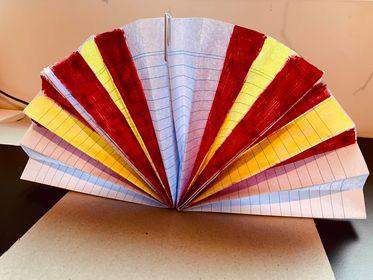
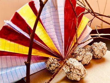
Apart from Major Mitchell’s cockatoos’ unique physical attributes, they are also behaviorally known for their highly monogamous, territorial, sociable, and treedwelling species. Therefore, I chose ‘to mate’, ‘to nest’, ‘to hide’, ‘to protect’, and ‘to socialize’ as my five verbs to translate into my maquettes.
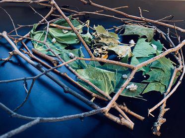
However, for most maquettes using site-collected tree branches and leaves, they are not really maquettes as they are more of the assemblage and rearrangement of materials together rather than roughly hand-making.






Collages
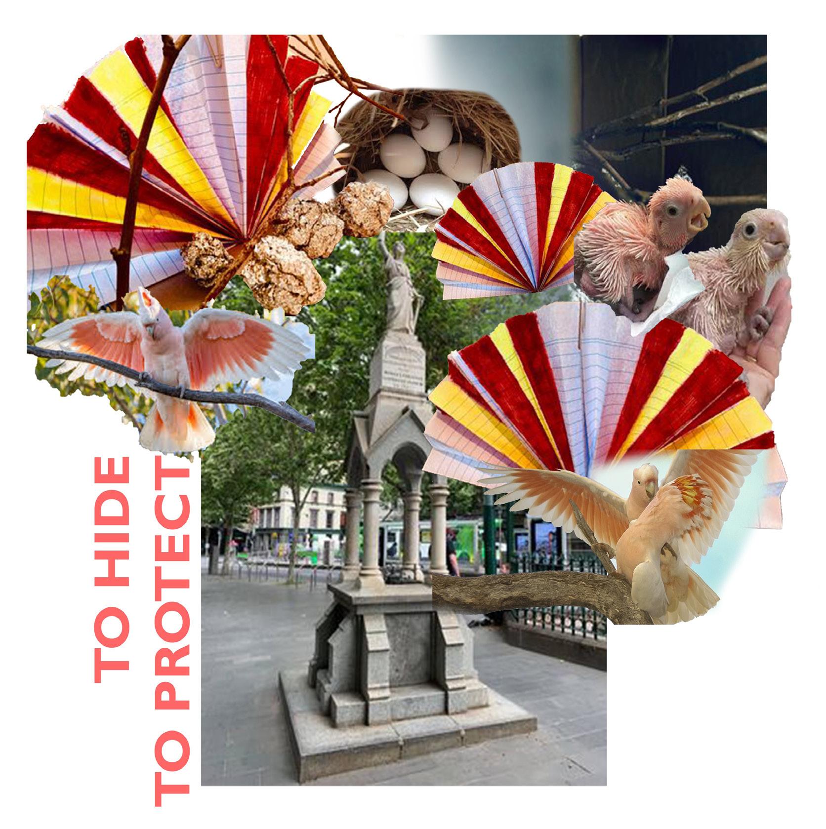
By putting all the imageries of the creature, the site, and the conceptual maquettes together into quick collages helped me to better communicate my chosen verbs into my design and visualize how my design would look like, although these collages look quite rough and not as refined as they suppose to.
Design Proposals

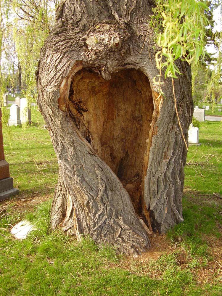
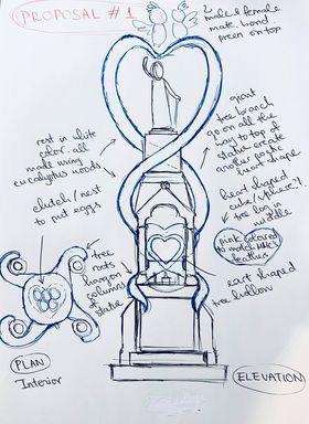
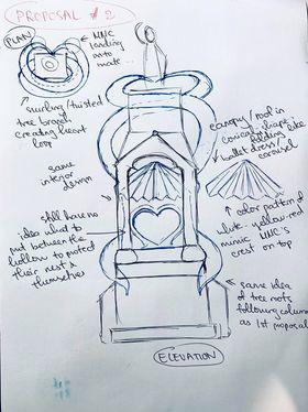
My initial idea was to create an everything heart-shaped tree log with hollow as well as weaving tree branches and roots hanging on the site statue to evoke a sense of romance that the Major Mitchell’s cockatoos usually are.
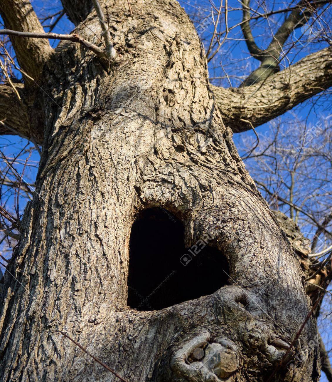
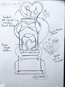
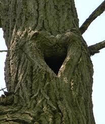
However, it seems that I had taken this monogamous mating idea way too literal to the point it appeared overly dramatic, exaggerated yet unnecessary. Still, I wanted to try out and experiment how this idea came out.

Digital Modeling

After finishing my very first draft iteration of modeling, I realized that this was not the best and most potential idea to explore further for a lot of problematic reasons. The weaving tree branches do not serve any specific functions except adding a seemingly bizarre look to the design. The mini tree log in the center not only constrains the spatial interior but also risks creature safety. As it is situated inside the site columns, above the site fountain, most importantly, at the human level, which might cause illegal disruption and invasion from human to the creature habitations.
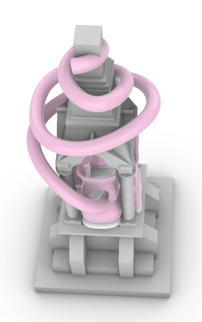
2nd draft iteration

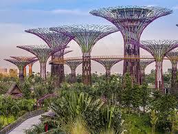
Regarding my studio tutor’s feedbacks and advice, my second new iteration could draw inspiration from the Garden by the Bay in Singapore. I could reinvent the iconic structure and form of this landscape into an origami canopy of my own based on one of my conceptual maquettes previously done.


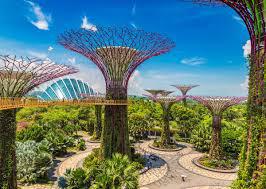

After testing out how it would look like on top of the statue in terms of its scale and function, I found out that the cockatoos collaged on top of the canopy are way too big. This was when I had to rethink and redesign how I could utilize the zigzag gap of the canopy as the hollow entrances that fit these cockatoos.
3rd draft iteration
Before being able to finalize how the canopy would look like, I had to do a few experiments in terms of how to merge the physical attributes of the Major Mitchell’s cockatoos into my design, which was difficult as I could not align the origami corners together, which left floating gaps and holes between.

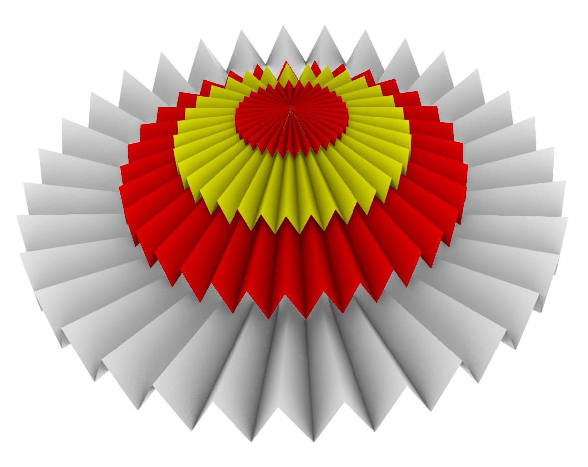
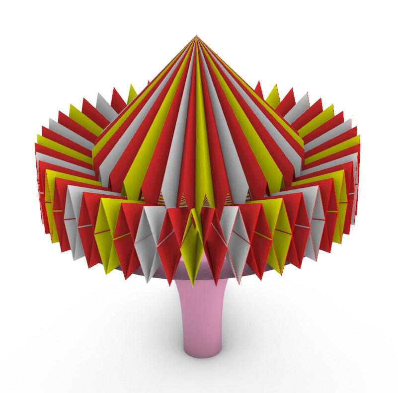
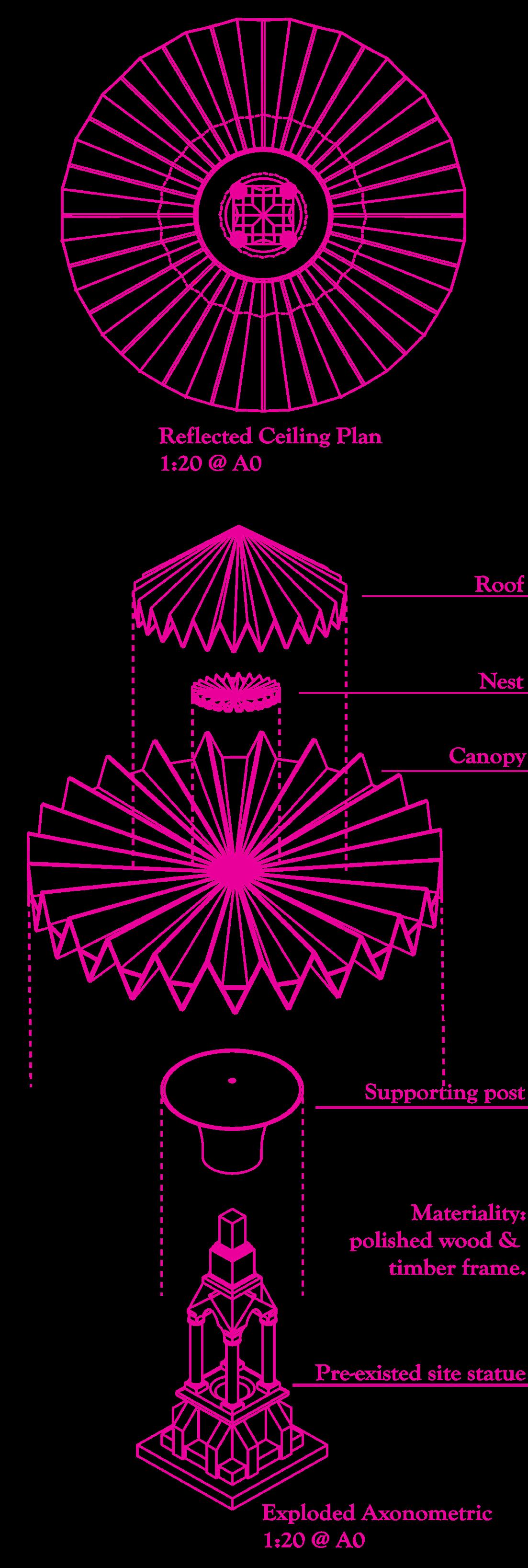
Also, as the origami looking spiky, I had no idea how I could build entrances for the cockatoos to easily walk without worrying about the seemingly narrow space. Hence, I experimentally raised the origami extrusion up and down to see what worked the best. I also inserted a horizontal flat surface between the triangular zigzag before ArrayingPolar and ExtrudingSurfacetoPoint for the cockatoos to walk in my final iteration.

1st final iteration
My seemingly final iteration turned out as micely as I expected. The playfulness in the zigzag origami form of the canopy and the roof really somehow resemble similar imageries of a circus, a carousel or a swing ride, perhaps. However, it came to my realization that this still did not fully operate well as there was no thickness. It almost looked paper-thin, which tended to be impractical and unrealistic.

Since the materiality for this structure was polished wood and timber frame, it had to be at least 20 mm thick.
If I wanted to keep this thin, then I needed to reconsider using metals like stainless steel, which was also unattainable as metals have high abilities of absorbing heat from sunlight, which can cause the exterior to be really hot even if they live in dry arid natural habitat.
Moreover, during heavy rainy days, when water seeks through, it could cause the metal to rust, therefore reducing the overall quality of the design.
2nd final iteration
Another issue that I had was that since this canopy design is circularly symmetrical in every view, every component has to be perfectly aligned to each origin. For some reason, they seemed to be lop-sided, which would affect the technical drawings to appear unsymmetrical as well, so I had to spend another heap of hours to adjust this right.
Perspectives

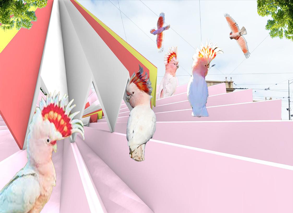
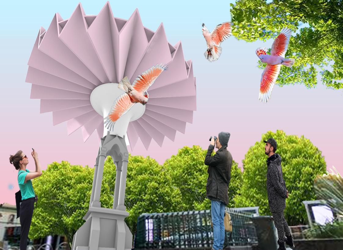
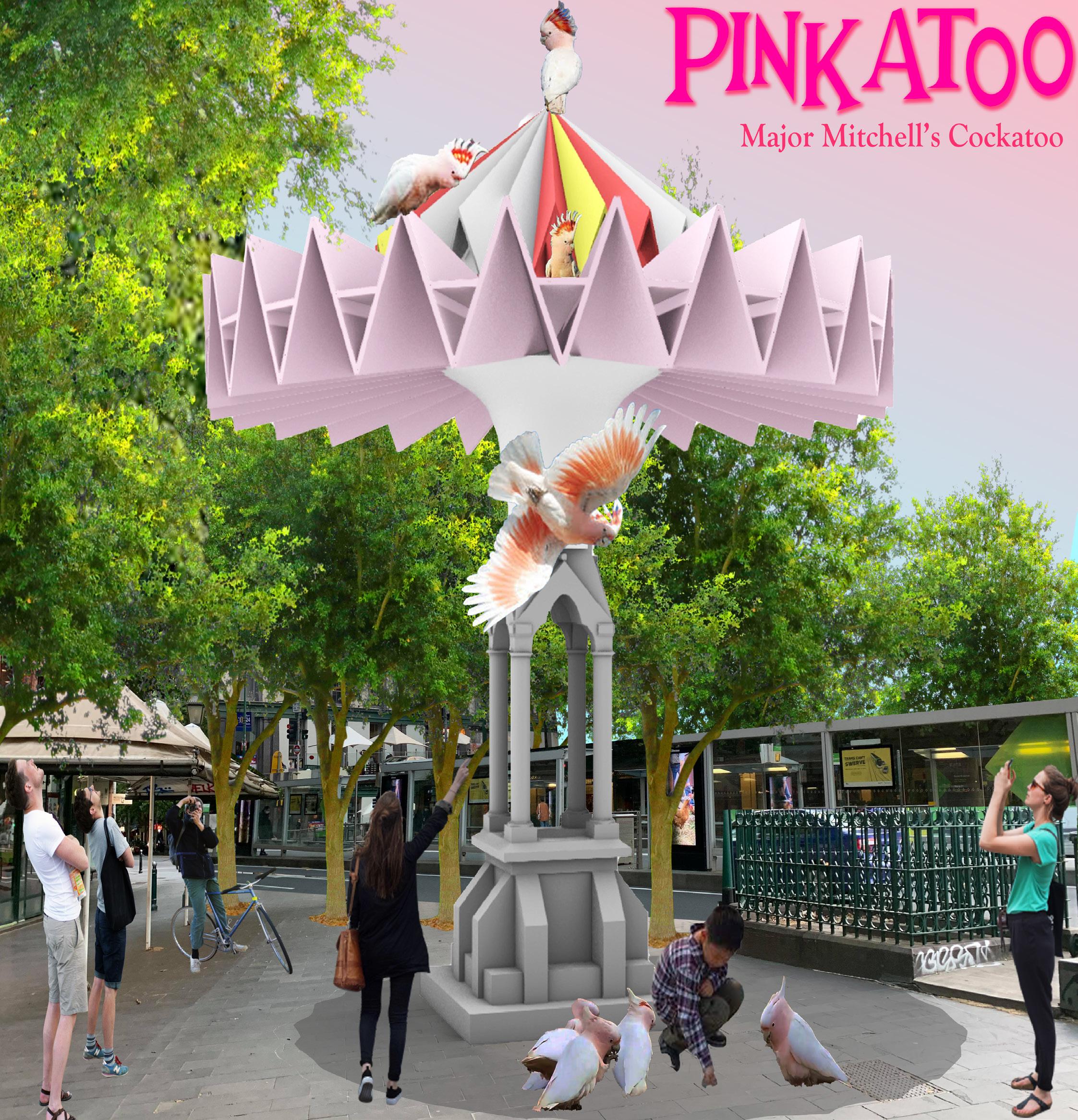
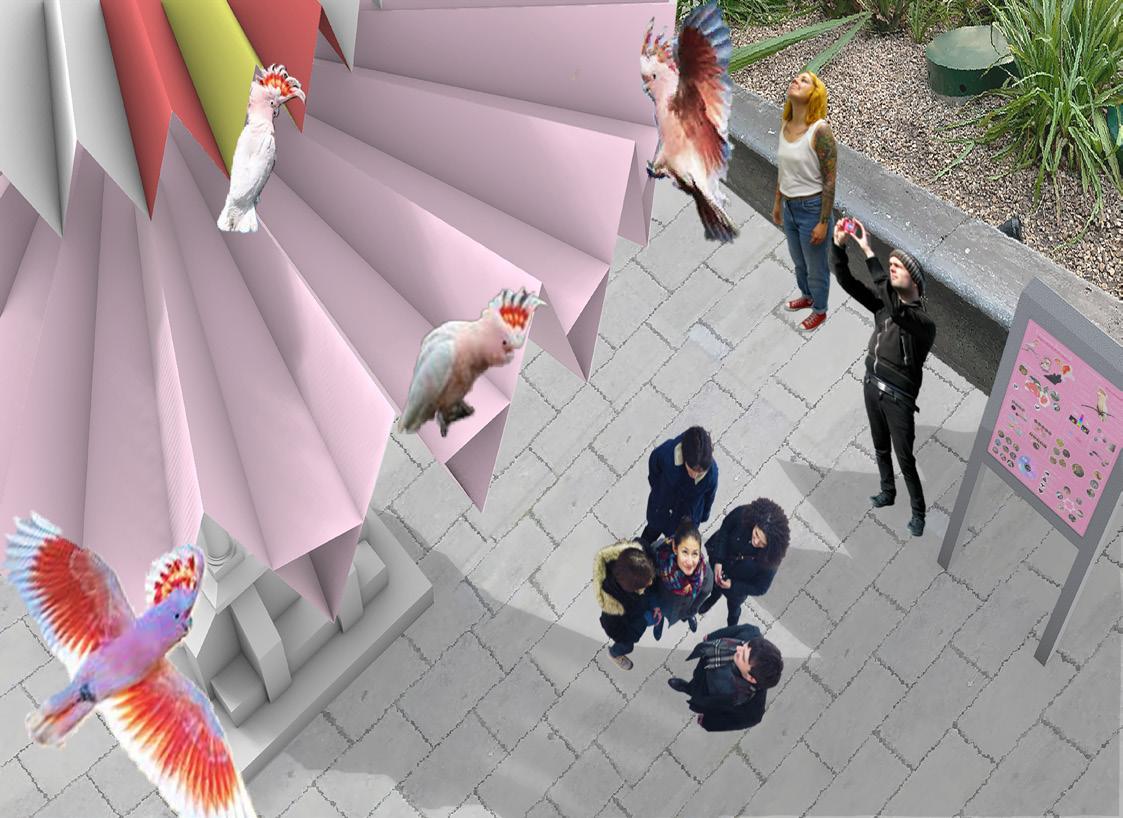
Compared to the last project, I feel that I have done a lot better in terms of creating perspective collages with minor effects of light and shadow, which vivify the imageries a lot, though these could be further improved. By playing with different camera angles and views helped me to create a storyboard that amplifies the design as an origami architecture within an urban context for served for the human to shelter underneath the canopy and for the cockatoos to inhabit and socialize on top.
Technical Drawing
For this project, the technical drawing part was the one I struggled with and spent the most time with. The first time I made2D out of my 3D model, somehow the line work quality was really bad and horrible. Most of the lines were broken, fragmented, and overlapping, especially when taking a much closer look, it was even worse. This happened only after I added some thickness to my model by offsetting the surfaces. Therefore, I had to fix and clean up all these tangled messes by repeatedly trimming and extending excessive and missing lines into finally polished drawings that I could confidently present and submit.

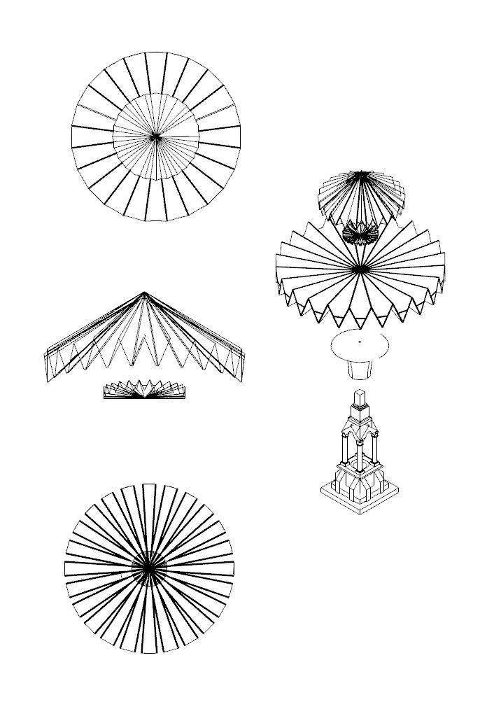

After spending more than 10 hours polishing and tweaking the entire series of technical drawings, I was so happy that this came out a lot better than when it was first made2D. However, there are still a few minor errors regarding the line weights of some areas, specifically the hidden lines of the roof in the Plan and Reflected Ceiling Plan still look really blurry and subtle, almost like solid lines. Also, there was no hatching on the section cut before the final submission as well.
Before starting the Artist Beach Colony project or even this unit, I was really nervous about what was upcoming. When I had a look at other students’ works in the past semesters for a little preview, I was amazed yet intimidated by how complex and how huge the amount of work being put in. However, as weeks passed by, I started to gain more confidence despite numerous mistakes I made throughout the process. Even not being able to visit the site or to have face-to-face lessons on campus like how others did before this year lockdown, 6 weeks of ‘indoor field trip’ to Brighton Beach had been so much fun and enjoyable for me, though I was for sure stressed out and exhausted at times.
Probably because I was luckily assigned to work with Ann Veronica Janssens that I got to explore so many creations of colored light foil maquettes, as well as to experiment with a whole new concept of a neon-themed poster, which I never thought I would be able to do so. Overall, I was really pleased with how my final poster ‘Light, Color, Action’ came out, especially the multi-color technical drawings that pop out in the dark blue background and the conceptual maquettes are my favorites.

Reflection
Emerging the next project Creature Space, I definitely had gained some confidence, yet I was still somehow struggling even more compared to the last project. I did spend quite a lot of time experimenting with what went right and what went wrong before finalizing my 3D model.

Apart from technical issues that I had troubles with, throughout the process, I also found myself really stuck at coming with creative ideas for my design. I kept sticking to the idea of a heart-shaped tree log believing it was unique and different enough, yet I almost forgot that forms had to follow functions. It seemed that I was being ‘brainwashed’ and that I could not think of any better idea than that.
However, thanks to my studio teacher’s aid, I was able to go back on the right track and continue. The final poster ‘Pinkatoo’ came out pretty nicely, especially with a hint of pale cherry blossom pink background that enhances the perspective images and the orthographic drawings really well.
Bibliography
https://www.estherschipper.com/artists/42-ann-veronica-janssens/works/15973/
https://kamelmennour.com/artists/ann-veronica-janssens/exhibition-view-grandpalais-paris-1 https://contemporaryartdaily.com/2019/05/ann-veronica-janssens-at-michelineszwajcer-3/bitter-salty-acid-sweet-2019/
http://www.artnet.com/artists/ann-veronica-janssens/reggae-colourDAKN48hgo02NzliS4FxE_Q2
https://www.artsy.net/show/galleria-studio-g7-ann-veronica-janssens http://www.alfonsoartiaco.com/web/index.cfm?box=gallery&id=5A24B14A0A0E-435B-8CD3A8C935CC1790&azione=dettaglio_ album&idalbum=8DBE36E0-EE27-4343-A3AB083939209681
https://www.artsy.net/artwork/ann-veronica-janssens-green-aurora
https://www.artsy.net/artwork/ann-veronica-janssens-blue-red-and-yellow
