REVISED JANUARY 2021
INTRODUCTION
The Pony Club was founded in 1929. It has influenced many young people’s lives and will continue to do so long into the future.
Membership of The Pony Club gives a sense of belonging, is a source of pride and members, parents, instructors and volunteers collectively treasure and contribute to the evolution of its heritage. As The Pony Club continues to make a difference in the equestrian world today, we need to protect and strengthen its brand.
The Pony Club brand, logo and colours identify Members, Staff, Coaches and Volunteers and promote a sense of belonging and community. They also reflect our values of Togetherness, Empathy, Respect and Learning.
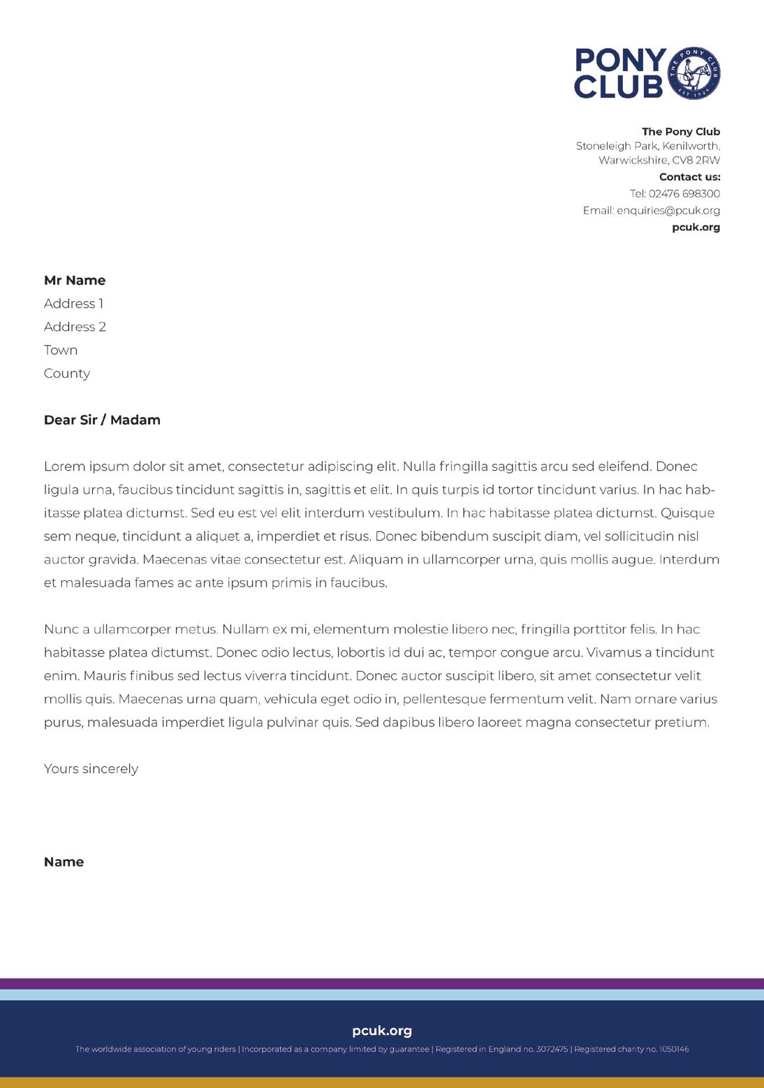
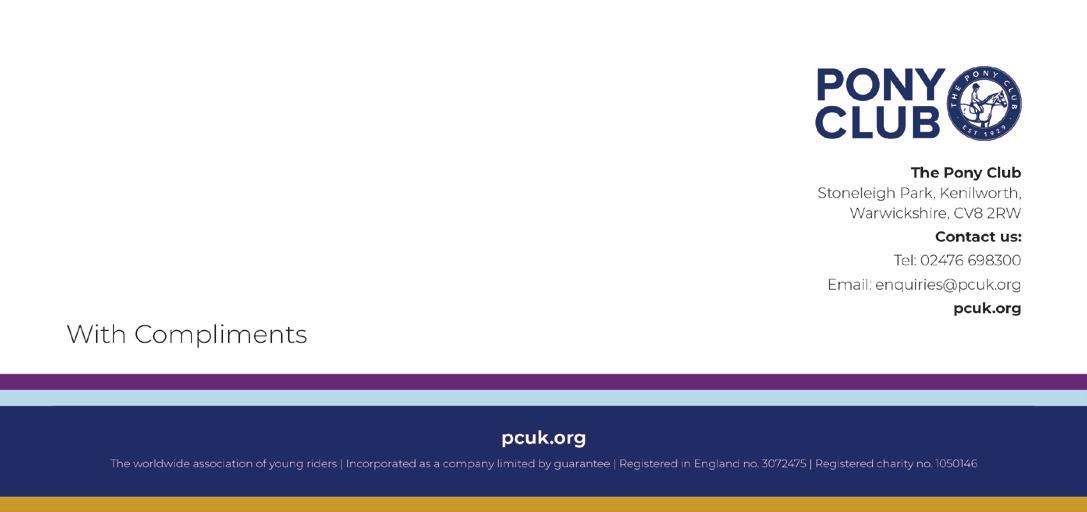
This document offers you guidance on how to use our logo, and where to position it on documents and clothing. We define our preferred font type for Pony Club documents and provide template examples as to how to represent the brand in Word and Powerpoint.
This document is not exhaustive and will evolve, but we ask that all who represent The Pony Club act as guardians of our brand and work within these guidelines to support and strengthen it.
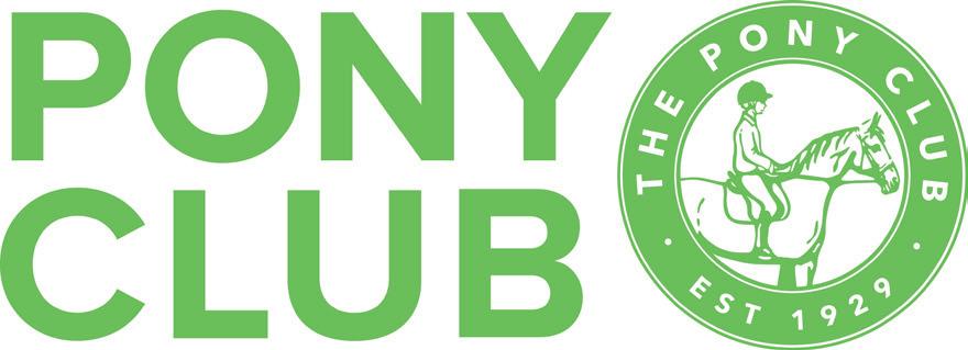
Our logo is a visual symbol of our organisation: it is how people recognise us. When people see our logo it will also evoke feelings, hopefully of pride and belonging. It is important to so many and when used should reflect its importance.
The official logo of The Pony Club is:

The roundel is part of our logo and in some circumstances, identified below, it can be used separately.

Our heritage badge displays the roundel element of the logo. The badge should be worn by members at all activities when a jacket is worn. The heritage badge is also used, with appropriate text, for badges for officials, volunteers and the Cubitt award.

HOW TO USE THE ROUNDEL
The roundel is part of our logo, but in some circumstances, it can be used separately. It should ONLY be used as set out below and if you wish to suggest any other uses, please contact communications@pcuk.org
Social Media Marque
The roundel can be used as a profile graphic on social media sites
Rosettes
If a printed centre disc is being used, the blue or white version of the roundel should be used depending on the background colour. Foil blocking can also be used.
Clothing
The roundel can be placed on the breast or the sleeve, with the branch name printed around it or underneath. The logo can also be used in the centre of the garment.


PRIMARY COLOURS
We have a set of colours that are used with our logo to identify us. These are the traditional Pony Club of Light Blue, Purple and Gold.
Many Branches and Centres have their own heritage colours that they use for sweatshirts and clothing.
PURPLE
Pantone 2613 C
CMYK 73 100 14 4
RGB 105 31 116 #691f74
GOLD
Pantone 117 C
CMYK 18 38 100 8
RGB 203 151 0 #cb9700
LIGHT BLUE
Pantone 290 C
CMYK 32 6 6 0
RGB 184 216 235
#b8d8eb
ALTERNATE COLOURS
These colours can be used to provide contrast.
ALTERNATE PURPLE
Pantone 2572 C
CMYK 23 49 0 0
RGB 201 139 219 #c98bdb
DARK BLUE
Pantone 280 C
CMYK 100 89 34 22
RGB 0 33 106 #002169
ALTERNATE GOLD
Pantone 108 C
CMYK 0 2 99 0
RGB 254 219 0 #fedb00
DESIGN
TYPEFACE
Montserrat is the design typeface and will be used for design and printed clothing.