1
madison lopez
case studies
surreal collage
The expansive beauty of mother nature defined within Photoshop problem
How can the horrors of climate change be beautifully integrated into a collection of images? It’s hard to depict the horrible realities into compelling imagery without seeming disengenious. With this collection of collages, I focused on bringing awareness to real world conflicts in a meaningful yet interesting way.
key considerations
• how can mother nature be conveyed symbolically?
• How can colors influence the emotions within the human mind?
• How will each collage stand apart from one another, but still create a sense of unity?
• How can I design mother nature to be personified in order to empathize with the viewer? solution
For my mother nature collage, I showed blooming flowers in all their glorious colors within the mind of a woman, growing outwards and almost becoming uncontrollable. The earth has not fully decayed yet, but with continued mistreatment and ignorance within society, mother nature’s flowers will soon wilt, and die.

PRINT DESIGN | COLLAGE 2


3
type card deck
a study of typographic anatomy with the English alphabet
problem
aren’t cards so boring? It’s always the king, the queen, the joker, and their aces. What about L,M,N,O,P? Playing cards lack character, the color palettes are always dull, and every element is squeezed into a small space. There’s too much information packed into one side of the card, but it doesn’t have to be this way.
key considerations
• How can I inform the viewer while also creating interest?
• What famous typefaces have impacted the world of graphic design?
• what typeface has versatility to be used on all cards?
• How can I use pattern and shape to create visual flow within a small space? solution
With every card I hammered in knowledge worth knowing about each typeface, and decorated the cards with intricate patterns, created through outlining letter forms. A neutral color palette allowed the cards to be easy on the eyes, and also harness a uniqueness that is unlike other card packs. The comforting warmth emitted from these cards is further amplified through the repetition of shapes and patterns. This shows the versatility of type, and all the ways it can be manipulated to harness creativity.
4 TYPE | EDITORIAL | PATTERN
&&&
Aa Abril Display
thick slab circular dot

Abril Display
Abril Display
high contrast tapered stems
Baskerville Bb
Baskerville Bb
Baskerville Bb
Abril is a serif typeface with 8 different fonts. The multitude of text styles provide distiction and variety across different forms of media.
Abril is a serif typeface with 8 different fonts.
The multitude of text styles provide distiction and variety across different forms of media.
Abril is a serif typeface with 8 different fonts. The multitude of text styles provide distiction and variety across different forms of media.
Coolvetica
Coolvetica
Cc
Cc
Baskerville was designed by typographer John Baskerville in 1750. The typeface was adored by Bejamin Franklin as it mixed modern and old style type.
Baskerville was designed by typographer John Baskerville in 1750. The typeface was adored by Bejamin Franklin as it mixed modern and old style type.
Baskerville was designed by typographer John Baskerville in 1750. The typeface was adored by Bejamin Franklin as it mixed modern and old style type.
Coolvetica, designed by typographer Ray Larabie, recreates that 1970’s custom type look, a san serif font very similar to Helvetica.
Coolvetica, designed by typographer Ray Larabie, recreates that 1970’s custom type look, a san serif font similar to Helvetica.
Coolvetica, Ray Larabie, custom type similar to
Funkydori
Funkydori is a script designed by Laura Worthington, reminiscent of the 1970’s fun and groovy advertisements and TV features.
5
contrast
high
tapered stems
thin, curvy lines horizontal serif
tight curls dense line weight
high contrast tapered stems Aa
thin, curvy lines horizontal serif
tight dense line weight
Ff
short thick, curvy
ligatures
Aa
horizontal serif
thin, curvy lines
weight
JJubilat Jj
dense line
K
Jubilat is a slab serif designed by Joshua Darden. It contains 6 weights with subtle curves and light spacing.
AIGA 2022 vote poster
uniting the political zoo through vector-based design problem
Politics are an absolute disaster, no matter who’s in charge. Right, or left, up or down, I need a poster to incentivize all citizens to vote, regardless of their political standing. I refused to create a poster that was indicative of any certain party, because my goal was to welcoming, yet assertive. No matter what, vote! Every vote counts.
key considerations
• How can I use color to create association with voting?
• How can symbolism portray my message?
• Who is my target audience of voters?
• What typeface can be utilized effectively at large sizes? solution
In order to properly design a political poster, I equally represented both democrats and republicans as their respective animals. I utilized a concise style, drawing each animal with smooth line work and melded them together. I demonstrated a sense of unity by squeezing the elephant and the donkey back to back. These parties don’t want to be associated with one another, but they are two sides of the same coin. To further hammer in my point of patriotism, stars were designed as a symbol of the United States flag, but they also represent the American people. Using smooth lines and careful wording, I promoted a clear message. Vote.

6 VECTOR | BRANDING | TYPE

7
Fur Babies minizine
designing a creative editorial layout with cute puppies problem
Every dog owner knows their dogs have a unique personality of their own. Why is it that all dog magazines focus on people? For the sake of dogs all around the world, I kept the focus on our furry friends, with fun twists.

key considerations
• where can color be utilized to call attention?
• what kind of photography can create visual interest?
• who has the most insight on the behavior of dogs?
• how can typography be utilized to create exciting headers and consistent body copy?
solution
to effectively create an exciting magazine, I used a bright color palette and bold headers to pull in my viewer and incentivze them to read the articles. The focus of my magazine is drastically different than most, as the point of view of dogs are prioritized over owners and so called “dog experts.”
8 PHOTOGRAPHY | EDITORIAL | TYPE


9
GG blog site

encapsulating the diversity in gaming with responsive web design
problem
video game culture is notorious for portraying the same type of characters with little diversity or care about anyone that isn’t a white, buff man. While the representation of different communities has somewhat improved, video game blogs never stand up for these communities, only caring about graphics and basic plot. I set to make a change with GG.
key considerations
• how can I stand against the techy and futuristic blogs that are commonly associated with gamers?
• who will benefit most from my personal opinion in blog posts?
• what kind of imagery will be most effective in engaging an audience?
• what language and graphics can be utilized to express femininity?
solution
GG blog is focused on creating an inclusive space for marginalized groups of gamers who lack representation. I used exciting and bold gradients paired with vector illustrations to portray passion while also setting GG apart from competitors. Bold headlines paired with pops of pink allowed for the development of a website that could show genuine opinions and highlight the key information gamers like me, need the most.
10 WEB DESIGN | VECTOR | BRANDING


11
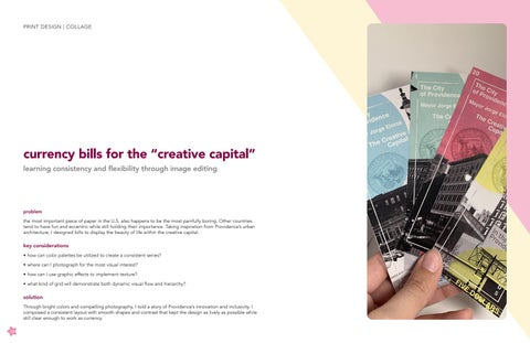
currency bills for the “creative capital”
learning consistency and flexibility through image editing
problem
the most important piece of paper in the U.S. also happens to be the most painfully boring. Other countries tend to have fun and eccentric while still holding their importance. Taking inspiration from Providence’s urban architecture, I designed bills to display the beauty of life within the creative capital.
key considerations
• how can color palettes be utilized to create a consistent series?
• where can I photograph for the most visual interest?
• how can I use graphic effects to implement texture?
• what kind of grid will demonstrate both dynamic visual flow and hierarchy?
solution
Through bright colors and compelling photography, I told a story of Providence’s innovation and inclusivity. I composed a consistent layout with smooth shapes and contrast that kept the design as lively as possible while still clear enough to work as currency.

PRINT DESIGN | COLLAGE 12


13
ink illustrations in Procreate
bringing out my inner child through smooth linework
problem
as a little girl, I loved to draw, paint, and make fun little crafts for the sole purpose of having fun. As I grew and my life became busier, I realized illustration could be more than just suns in the corner of the page with stick figure families.
key considerations
• how can different brushes create texture?
• where can negative space be implemented for maximum impact?
• what kind of line work can show movement?
• how can the use of high contrast make the most impact?
solution
Throughout my series of black and white illustrations, my main goal was to have fun and learn. While studying proportions and human anatomy is important for advanced work, I wanted to mix my two favorite aesthetics of cutesy and horror. Inky brushes and simplified anatomy helped create illustrations unique to my style and personality.

14 ILLUSTRATION | TYPE


15
Six of Crows book cover redesign
combining the personality of characters through bold illustrations
problem
Six of Crows is a fantasy novel that revolves around crime and the importance of family, but the book’s cover lacks emphasis on the dynamic characters . I challenged myself to a redesign with more compelling imagery, while still keeping true to the edgy vibe from the original.
key considerations
• how can I utilize a grid to place each illustration meaningfully?

• what typeface has elegance and depth similar to the original?
• how can symbolism intrigue both new and old readers?
solution
My main goal was to convey each character in the book symbolically, and display their relationship with one another in a natural, yet intriguing manner. Each vector illustration represents key moments from the book and how each situation shapes the characters into who they are. The deep red represents not only love, but also blood shed throughout the story, with the fantastical typeface conveying the magic of the universe.
16 EDITORIAL | TYPE | VECTOR


17
thank you! madisonlopez.co