1 minute read
type card deck


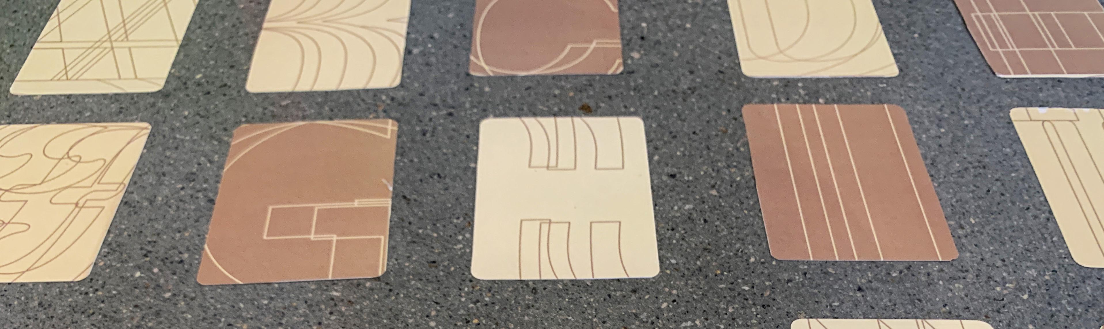
a study of typographic anatomy with the English alphabet problem aren’t cards so boring? It’s always the king, the queen, the joker, and their aces. What about L,M,N,O,P? Playing cards lack character, the color palettes are always dull, and every element is squeezed into a small space. There’s too much information packed into one side of the card, but it doesn’t have to be this way. key considerations
• How can I inform the viewer while also creating interest?
Advertisement
• What famous typefaces have impacted the world of graphic design?
• what typeface has versatility to be used on all cards?
• How can I use pattern and shape to create visual flow within a small space? solution
With every card I hammered in knowledge worth knowing about each typeface, and decorated the cards with intricate patterns, created through outlining letter forms. A neutral color palette allowed the cards to be easy on the eyes, and also harness a uniqueness that is unlike other card packs. The comforting warmth emitted from these cards is further amplified through the repetition of shapes and patterns. This shows the versatility of type, and all the ways it can be manipulated to harness creativity.
Aa Abril Display
thick slab circular dot
Abril Display
Abril Display
high contrast tapered stems
Baskerville Bb
Baskerville Bb
Baskerville Bb
Abril is a serif typeface with 8 different fonts. The multitude of text styles provide distiction and variety across different forms of media.
Abril is a serif typeface with 8 different fonts.
The multitude of text styles provide distiction and variety across different forms of media.
Abril is a serif typeface with 8 different fonts. The multitude of text styles provide distiction and variety across different forms of media.
Coolvetica
Coolvetica
Cc
Cc
Baskerville was designed by typographer John Baskerville in 1750. The typeface was adored by Bejamin Franklin as it mixed modern and old style type.
Baskerville was designed by typographer John Baskerville in 1750. The typeface was adored by Bejamin Franklin as it mixed modern and old style type.
Baskerville was designed by typographer John Baskerville in 1750. The typeface was adored by Bejamin Franklin as it mixed modern and old style type.
Coolvetica, designed by typographer Ray Larabie, recreates that 1970’s custom type look, a san serif font very similar to Helvetica.
Coolvetica, designed by typographer Ray Larabie, recreates that 1970’s custom type look, a san serif font similar to Helvetica.
Coolvetica, Ray Larabie, custom type similar to
Funkydori
Funkydori is a script designed by Laura Worthington, reminiscent of the 1970’s fun and groovy advertisements and TV features.


