1 minute read
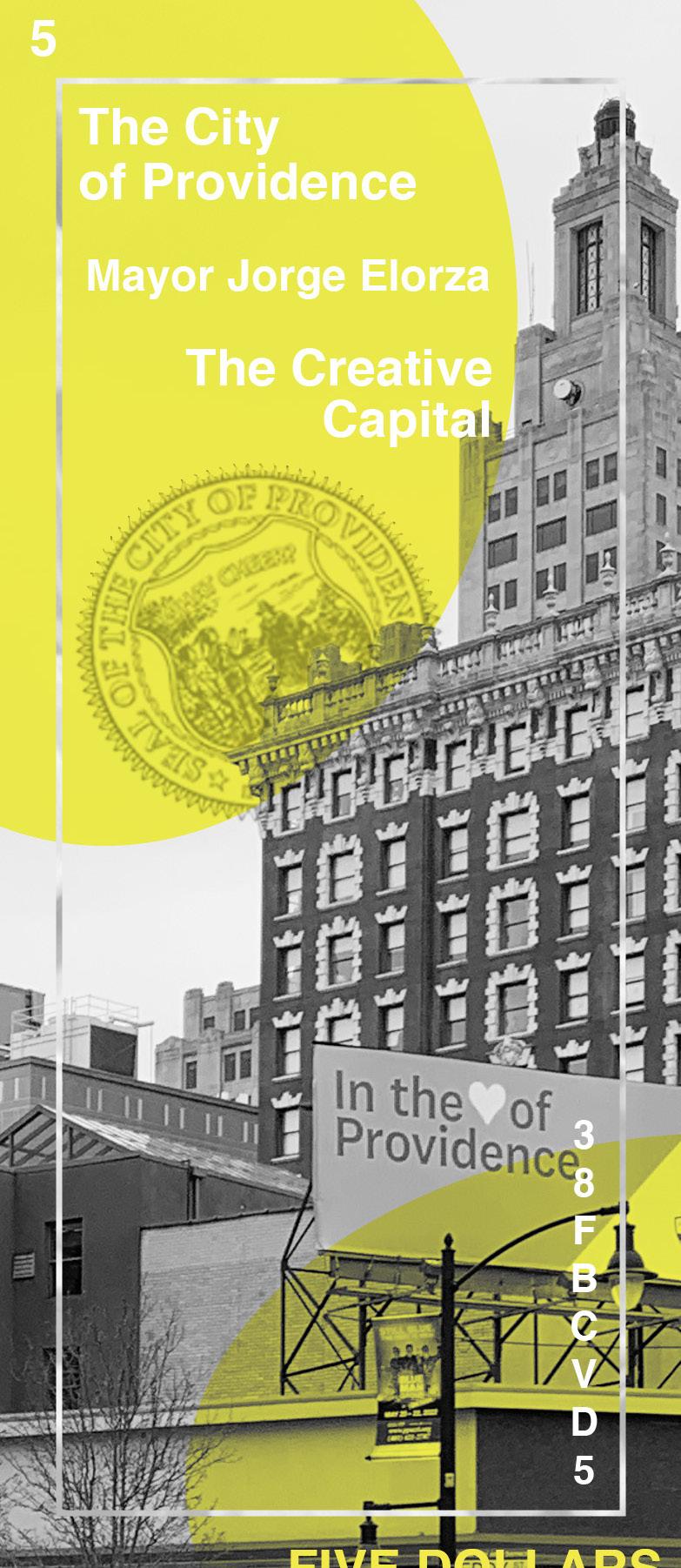
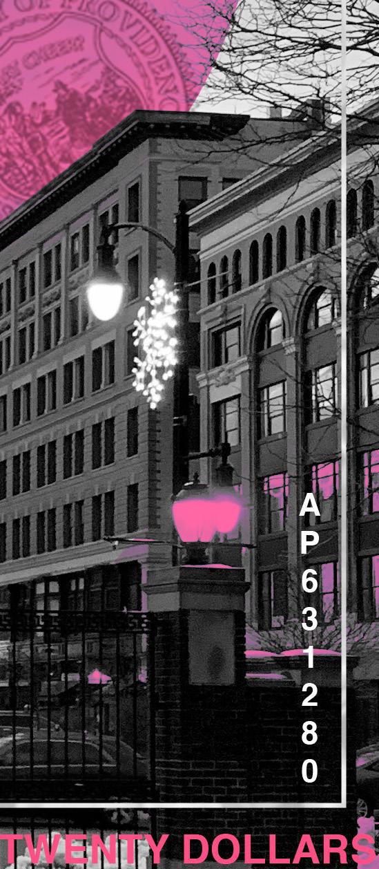
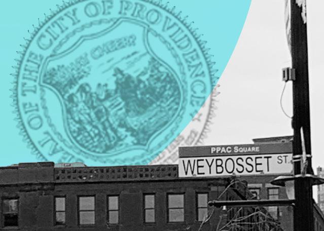
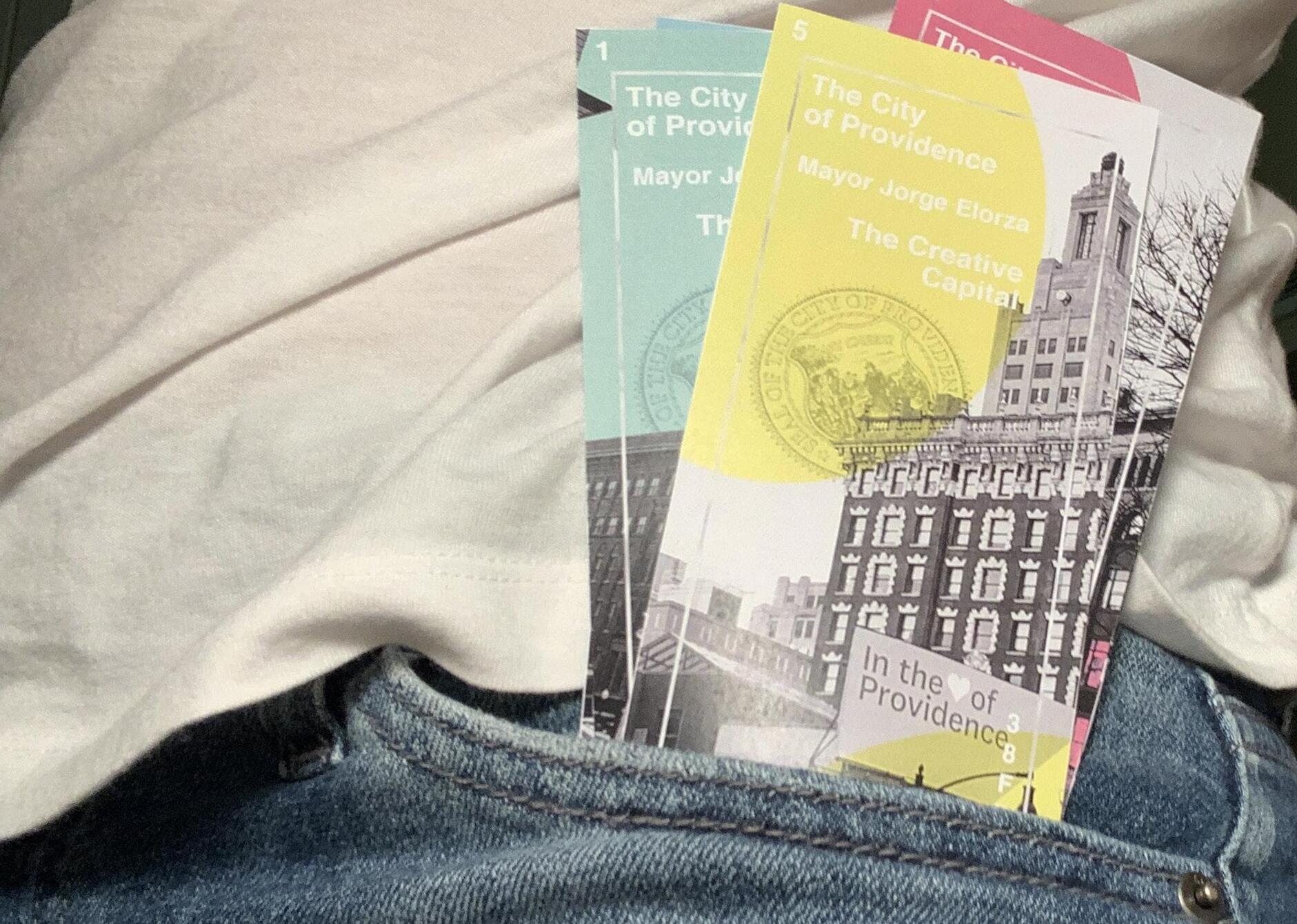
currency bills for the “creative capital”


learning consistency and flexibility through image editing problem the most important piece of paper in the U.S. also happens to be the most painfully boring. Other countries tend to have fun and eccentric while still holding their importance. Taking inspiration from Providence’s urban architecture, I designed bills to display the beauty of life within the creative capital. key considerations solution
• how can color palettes be utilized to create a consistent series?
Advertisement
• where can I photograph for the most visual interest?
• how can I use graphic effects to implement texture?
• what kind of grid will demonstrate both dynamic visual flow and hierarchy?
Through bright colors and compelling photography, I told a story of Providence’s innovation and inclusivity. I composed a consistent layout with smooth shapes and contrast that kept the design as lively as possible while still clear enough to work as currency.
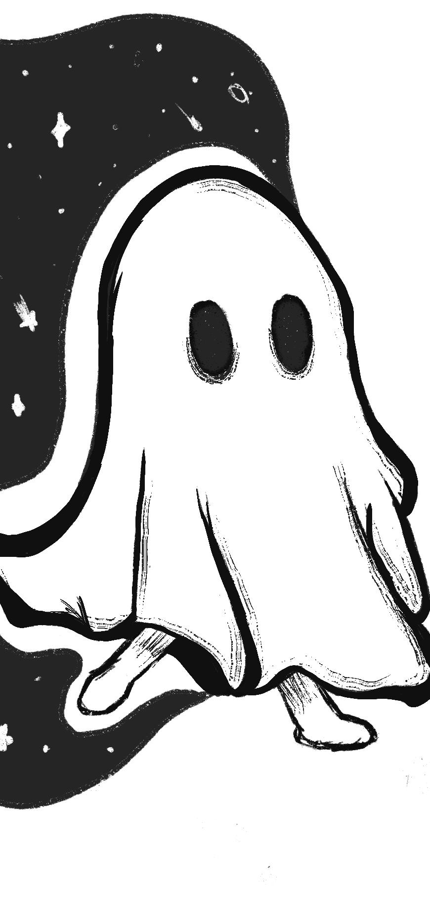
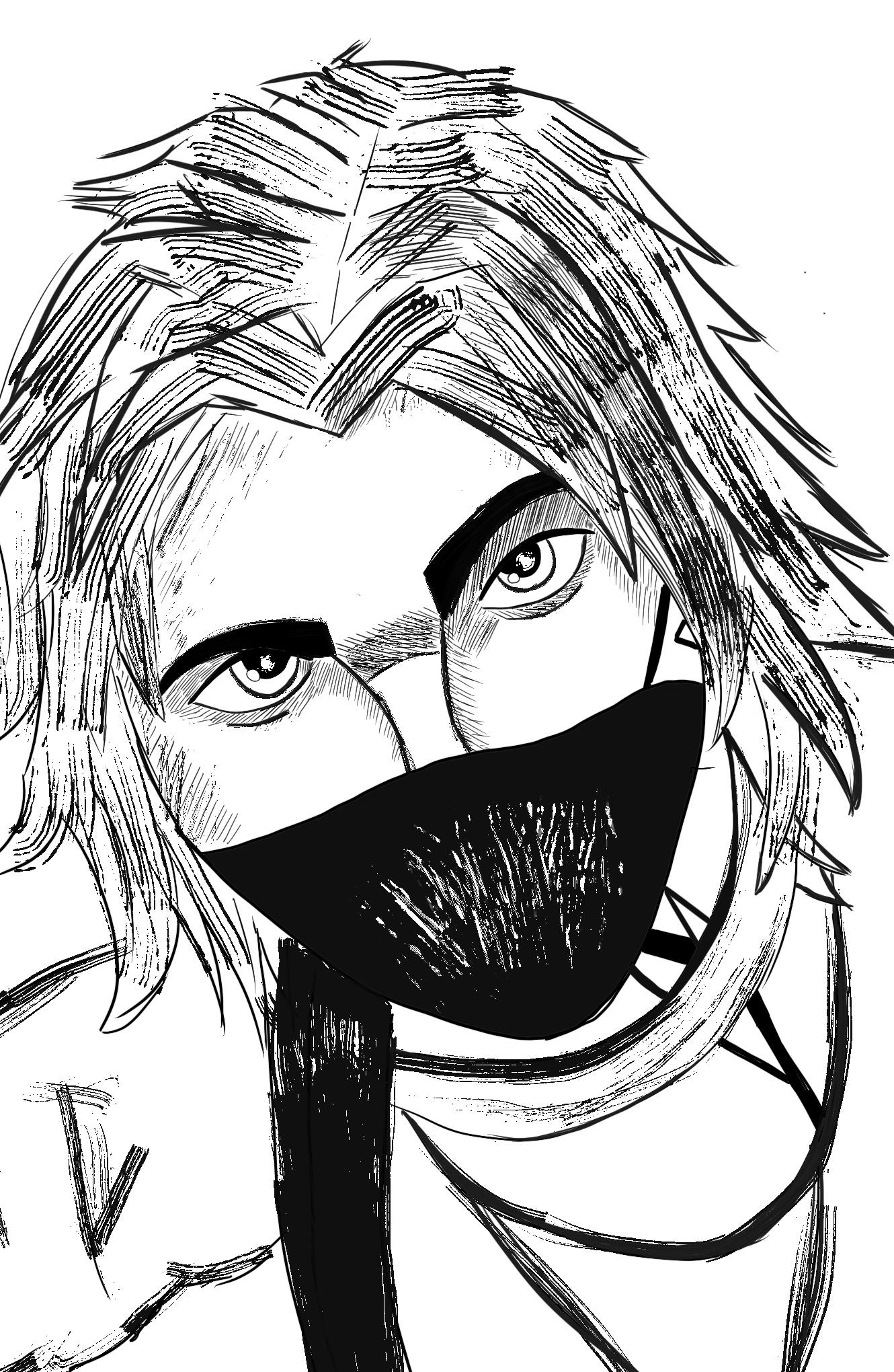
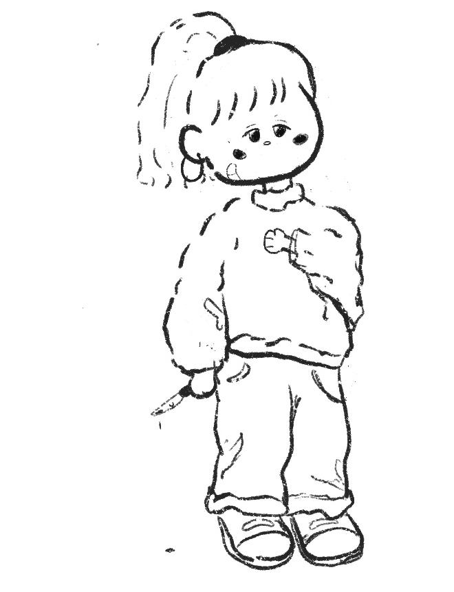
ink illustrations in Procreate
bringing out my inner child through smooth linework problem as a little girl, I loved to draw, paint, and make fun little crafts for the sole purpose of having fun. As I grew and my life became busier, I realized illustration could be more than just suns in the corner of the page with stick figure families. key considerations solution
• how can different brushes create texture?
• where can negative space be implemented for maximum impact?
• what kind of line work can show movement?
• how can the use of high contrast make the most impact?
Throughout my series of black and white illustrations, my main goal was to have fun and learn. While studying proportions and human anatomy is important for advanced work, I wanted to mix my two favorite aesthetics of cutesy and horror. Inky brushes and simplified anatomy helped create illustrations unique to my style and personality.