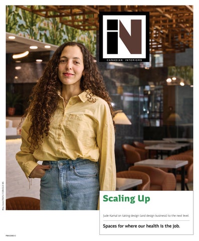
Sansa Interiors started as a pandemic pivot and took off fast, driven by Jude Kamal’s childhood curiosity mixed with grit, ambition, and a lil’ bit of rule-bending along the way. By Ashna Lulla
ORDER OUT OF CHAOS
How Creative Matters turned five years of economic upheaval into a growth opportunity. By Rhys Phillips
“THERE IS NO ALTERNATIVE?” Design education must impart students with the skills to question power, build relational, regenerative futures and confront crises with more than just aesthetics.
By Michael Kaethler
LIGHT, LINE, AND LIFEBLOOD
Two new public healthcare centres take both physical and mental wellness to heart when transforming a clinic into a sanctuary.
By David Lasker
16 22 27 16 22 27
COVER – Jude Kamal, in a brand-new Hale Coffee location, the third one designed for the chain by her firm, Sansa Interiors.
Photo by Stacey Brandford Photography
05/06 2025
10 ARIDO JOURNAL
12 CAUGHT OUR EYE
15 SEEN With shifting demand and supply chain shake-ups, Malaysia’s balance of affordability and craftsmanship keeps its cost-savvy manufacturers on the global radar at MIFF 2025
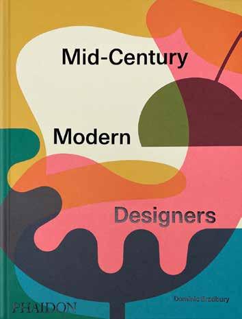
34 GOOD READS A celebration of mid-century modern design; and monograph that explores the evolving role of architecture.
36 OVER & OUT A gallery installation invites visitors to recognize and wear their most vu lnerable emotions for all to see.
CANADIAN INTERIORS
Partner
Editor in Chief Peter Sobchak
Art Director Roy Gaiot
Contributors
Michael Kaethler, David Lasker, Ashna Lulla, Rhys Phillips, Sharon Portelli
Online Editor Lucy Mazzucco
Publisher Faria Ahmed
416-441-2085 x. 5 fahmed@canadianinteriors.com
Vice President / Sales Steve Wilson swilson@canadianinteriors.com
Canadian Interiors publishes six issues, per year. Printed in Canada. The content of this publication is the property of Canadian Interiors and cannot be reproduced without permission from the publisher.
Subscription rates > Canada $38.95 per year (plus taxes) U.S.A. $71.95 USD per year, Overseas $98.95 USD per year.
Back issues > Back copies are available for $15 for delivery in Canada, $20 USD for delivery in U.S.A. and $30 USD overseas.
Please send payment to: Canadian Interiors, 126 Old Sheppard Ave, Toronto, ON M2J 3L9 or order online www.canadianinteriors.com
For subscription and back issues inquiries please call 416-441-2085 x2
e-mail: circulation@canadianinteriors.com, or go to our website at: www.canadianinteriors.com
Walk into any conference session that advertises to be about the evolution of “work,” as I did while attending SxSW 2025 (South by Southwest, or “Southby” in local argot) in Austin, Texas, and the sermons are unified: we are witnessing profound transformations driven by evolving workforce demographics, shifting work behaviours, and emerging technologies — that last point being catnip for congregants of SxSW, who are avowed technologists and futurists.
But what does it mean for the built environment? Their homilies are unified on this topic too: businesses must adapt their interior design strategies to create environments that foster engagement, productivity, and well-being. With Gen Z and Gen Alpha becoming dominant forces in the workforce, organizations must rethink traditional office designs and align them with the values of flexibility, sustainability, inclusivity, and technology integration.
The workforce will be highly diverse and multi-generational, comprising Baby Boomers who choose to remain in the workforce, Gen X leaders in executive positions, and Millennials and Gen Z workers who expect flexibility and purpose-driven work environments. Additionally, the rise of Gen Alpha, the first AI-native generation, will introduce new expectations regarding technology integration and work-life balance.
The choir at SxSW all agree that hybrid work models are here to stay, with employees demanding greater flexibility. Remote work, digital nomadism, and alternative workspaces will become commonplace, requiring offices to serve as collaborative and cultural hubs rather than mandatory daily workstations. That idea of “meaningfulness” was central and takes many forms, particularly sustainability. Younger generation employees expect organizations to commit to environmental responsibility through sustainable materials, energy-efficient lighting, air purification systems, and AI-driven climate control.
Common scripture heard throughout conference sessions was, unsurprisingly, how much AI and smart technologies will play a central role in shaping workplace experiences. AI-powered design tools will enable personalized office environments; predictive analytics will optimize energy use; and generative AI will enhance collaborative work processes. AI-driven wayfinding, digital assistants, and holo-
By Peter Sobchak
graphic communication will create frictionless workplace experiences, making interactions seamless and intuitive. Immersive digital environments will also redefine office spaces. The concept of the “infinite workplace”—where physical and virtual workspaces merge— will become more prevalent, allowing employees to interact with digital elements layered over real-world settings. AI-powered assistants will help employees navigate these hybrid environments, enhancing productivity and engagement.
Of vital importance to the flock in Austin was prioritizing inclusivity and well-being in new workspace design. Safe spaces, or “seen spaces,” will be critical in fostering a sense of belonging. These environments—whether physical or digital—will allow employees to express their identities without fear of judgment. Acoustic pods, flexible workstations, and adaptive lighting will cater to different sensory needs, while AI-driven personalization will enable employees to customize their workspace settings based on their preferences. Mental health and reducing burnout should also take centre stage if employee engagement and retention is important. Wellness-focused features such as meditation rooms, circadian lighting, and ergonomic workspaces to promote holistic employee health are of course a good idea, but so too is joy and play in the workplace, at least to these parishioners. While traditional “fun offices” with slides and bean bag chairs may be outdated, intentional design elements that encourage spontaneity and socialization will be crucial. Themed lounges, creative breakout areas, and multi-sensory workspaces will allow employees to recharge, collaborate, and find inspiration in unexpected ways.
Despite being surrounded by so many hints as to what a near-future workplace could look like, orators at SxSW preached what A+D professionals already know: that successful workplace design hinges on a deep understanding of employer and employee expectations and behaviours. Organizations (and by extension the designers who they hire) must see office design not just as a functional necessity but as a strategic advantage that can attract and retain top talent. Through innovative space planning and fostering a culture of adaptability, inclusivity, and joy, companies can create workplaces that not only meet the demands of a changing workforce but also inspire and empower employees for years to come. And if all else fails, just take the team out for some tacos!
CanadianInteriors.com
Assertive Aesthetic: METRO Distribution Centre
GKC Architecture & Design and Imperatori Design join forces to support the grocery brand’s growth in Québec.
A Thoughtful Rehabilitation: Maison Chevalier
Anne Carrier Architecture’s strategy was to preserve the authenticity, integrity, and richness of the building’s historic elements.
Adaptive Reuse: New Tecumseth
Municipal Offices
+VG Architects repurposed the core structure of a school building in Alliston, Ont. into municipal government spaces.
Designing with Identity
Beyond fulfilling a functional need, design should reflect the identity of those that inhabit
space.
THE GOODS
Kitchenscaping Products by these companies are ideal for those who want an Insta-worthy kitchen.
Acoustic Baffles These acoustic solutions improve sound quality and enhance aesthetics in various spaces.
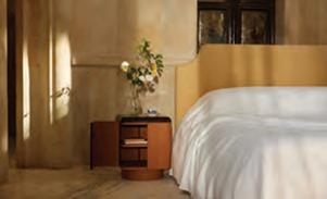
Nightstands These nightstands keep your essentials hidden while enhancing your space.
WELCOME TO THE FUTURE OF WINDOWS
DURABLE AND LOW-MAINTENANCE VINYL AND ALUMINUM CONSTRUCTION
ALUMINUM-CLAD EXTERIOR, OFFERED IN AN ATTRACTIVE SELECTION OF COLOURS
SLEEK, LOW-PROFILE HARDWARE DESIGN
ENERGY-EFFICIENT DUAL-PANE AND TRI-PANE LOW-E GLASS OPTIONS
26% LOWER PROFILE FRAME INCREASES GLASS AREA
UP TO 22% BETTER ENERGY EFFICIENCY
With the unique changes of our Canadian climate, the demand for energy-efficient products that can stand up to the elements is higher than ever. JELD-WEN of Canada proudly introduces the groundbreaking JWC8500 series window —a perfect blend of style, performance, and energy savings, meticulously engineered to exceed expectations.
Our newest JELD-WEN® window, the JWC8500 hybrid option exceeds performance, in all regions of Canada, offering an aluminum-clad exterior finish with an exquisite selection of colours to choose from.
Discover the advantages of JELD-WEN of Canada’s most energy-efficient window. Our 8500 series windows are 2030-rated to meet Canada’s U-Factor 0.14 (U.S./I-P) / 0.82 (Metric/SI) or ER 44 building codes, and are designed to significantly reduce energy costs while ensuring year-round comfort in your home.
Tailored to meet the regional needs of homeowners, our windows are the perfect fit when planning a renovation or new home build, seamlessly blending functionality and style to suit any project.
Discover the JWC8500 series window from JELD-WEN of Canada— and experience the future of home comfort and efficiency.
By Sharon Portelli
Co-Creating a More Inclusive Future
On March 28, 2025, in Ottawa, the Association of Registered Interior Designers of Ontario (ARIDO) and Association professionnelle des designers d’intérieur du Québec (APDIQ), entered into a Mutual Recognition Agreement (MRA) between the two jurisdictions that will ensure reciprocity and recognition of qualified members in both Ontario and Québec, respectively.
The relationship between APDIQ and ARIDO is not new and has been robust and steadily growing over the
past 10 years, with committed leaders ensuring respect and camaraderie every step of the way.
With such political and economic uncertainty currently surrounding Canada, it’s an important time as Canadian leaders to demonstrate unity, respect and cohesion while elevating our internal economy. Our respective members rely on this leadership team to be innovative and forward-thinking, all while ensuring the qualifications process continues to protect public interest.
permits and hold themselves out as Interior Designers. While it continues to plague most provincial jurisdictions in Canada, a defensive, outdated approach won’t solve the issue.
The MRA signed by Ontario and Québec also represents a unified approach to a more inclusive and progressive qualifications journey. Too often, identity crises play into a political approach in response to a lack of understanding and recognition by the public of the profession of interior design. Where regulation of interior design doesn’t exist, unqualified practitioners are enabled to offer services, submit for
The strategy of building awareness and recognition of interior design often leads with the importance of regulation for public protection. This public protection position has long led the communications strategy in educating the public and legislators about the profession because it is felt that this gives us credibility and distinction and sets us apart from the unqualified. Yet while the profession of interior design and its qualified scope is founded in technical expertise and centered on designing safe and compliant spaces, the profession of interior design is more than that.
Interior Designers have always been stewards of interior spaces. They address spatial challenges by identifying human-centered solutions founded in
research, technical expertise and training. Every space is designed with human end-users in mind, including wayfinding, wellness and optimal form and function, to name only a few. This is why identity politics focused around reinforcing professional recognition via health and safety can no longer be the only leading conversation around the future of the profession.
As Québec and Ontario continue to work together via this MRA, the leadership teams have embraced more innovative and modernized approaches to the qualifications process. This requires a commitment to breaking free from outdated patterns while dropping biases that lean heavily towards identity politics or equal recognition to that of architects and engineers. The primary focus has been re-envisioning how competencies-based assessments paired with public protection can evolve to where it mimics and better reflects how one practices interior design.
For leadership to balance the responsibilities of public protection and inclusive pathways, it needs to drop antiquated biases and perspectives around unnecessary qualifications barriers. Gone are the days where restricting access to entry to a profession is overlooked by government bodies. Public protection cannot exist where the public or business owners do not have access to a diverse and robust group of qualified practitioners for hire. It also cannot exist where unqualified practitioners, whether seasoned or internationally trained, feel there is no fair or accessible pathway to become qualified.
Public protection is heightened where relevant qualifications processes and tools are used to determine if someone is ready to enter a profession and practice independently, without ongoing supervision. Entry to practice is assessed following the successful completion of the Education and Supervised Work
Experience requirements. Any entry-to-practice tool must properly assess the knowledge and skills a candidate has in relation to how one practices the profession daily and does so competently.
The MRA represents two provinces sharing parallel perspectives, experiences and hopes for the future of the profession. It also represents actively listening to our members and the barriers which have been experienced in getting qualified. It represents the courage to innovate differently and move against the traditional direction, knowing it may be challenged by those not ready for change. It requires holding your ground even if others disagree or choose to misinterpret, whether intentionally or unintentionally, the proposed approach at hand.
We all know that change can be hard for many, and that continuing on a standard, yet outdated path creates a sense of comfort because it is what we have known and leaned on for decades. But by leaning into the discomfort of change we have been able to modernize practices that better define the competence and value of the interior design profession while assessing individuals via an ap-
proach that is reflective and relevant to the practice of the profession.
Evolution is vital to the future. As we watch the upending of progressive policies occur in bordering countries, it is important now more than ever for Canadian leadership to demonstrate a human-centered and progressive approach that is founded on intelligence, modernized tools and a collective, unified approach where all voices can be heard, ideas considered, and segregation a culture of the past. For where segregation and exclusive practices exist, we remain divided as a country and distracted from the real work ahead on behalf of our members and in the spirit of public protection.
Sharon Portelli is the executive director of ARIDO and has 25 years of experience in regulatory organizations focused on qualifying professions.
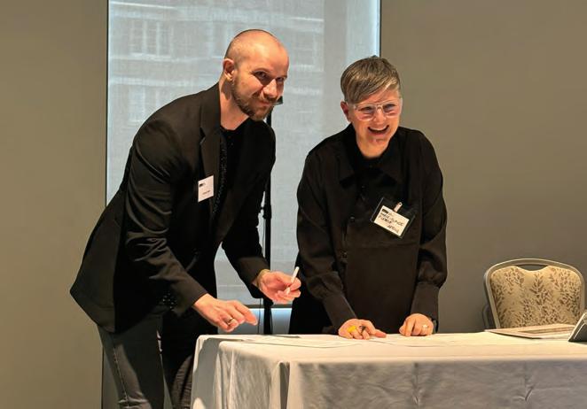
Below: Jeremy Cheff, president, ARIDO, and Marie-Claude Parenteau-Lebeuf, Executive Director, APDIQ, sign a Mutual Recognition Agreement in Ottawa upholding reciprocity recognition of Ontario and Québec qualified members.
Since 1934, ARIDO has been the self-regulatory body for interior design in Ontario, focused on protecting the public and furthering the profession.
CAUGHT OUR EYE
Garcia
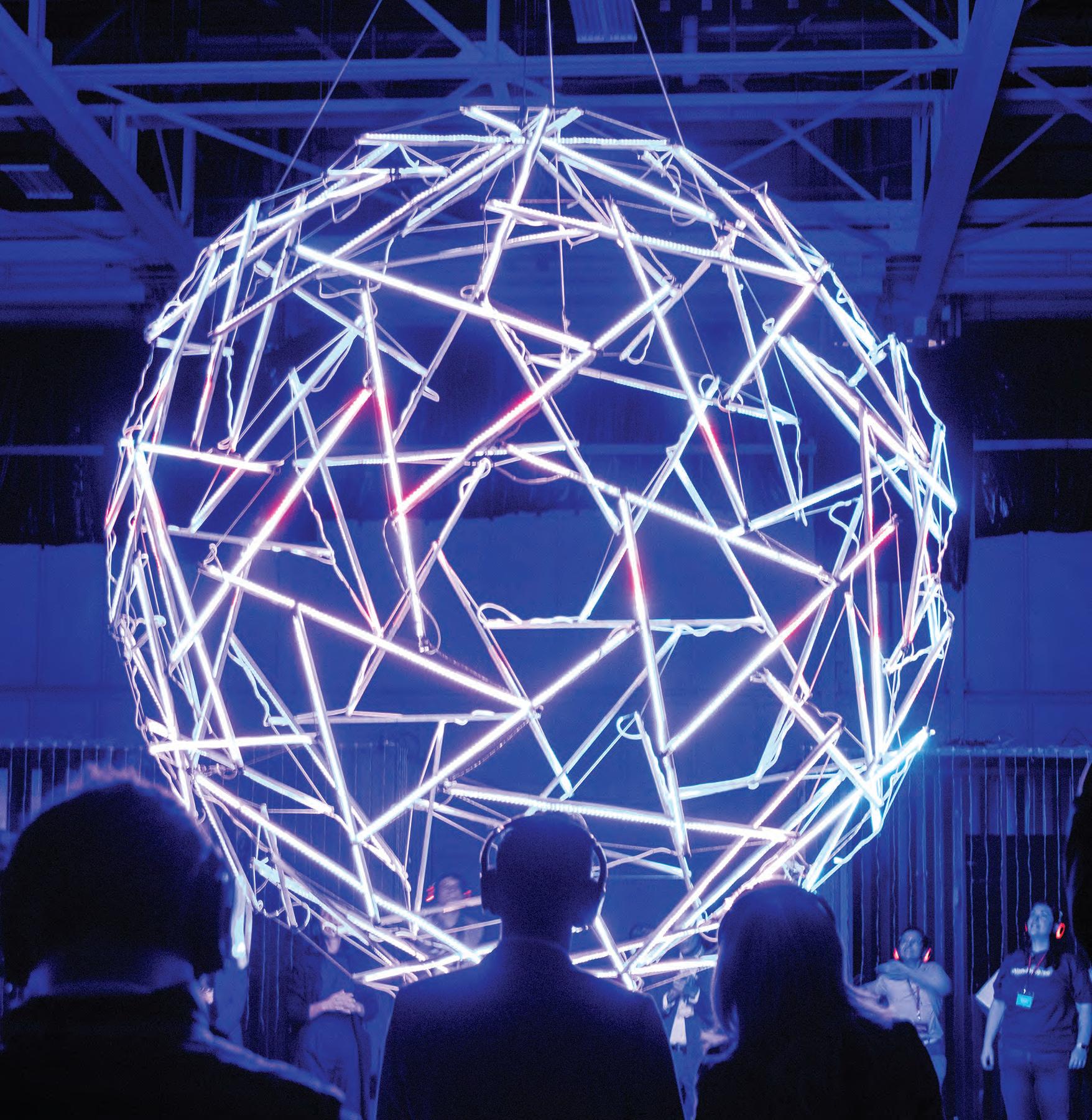
Amenity Kit Selected as one of three winners from Northcrest Developments’ Beyond the Tarmac competition, which sought ideas from artists and design creatives to bring programming to the former Downsview Airport (YZD), Wonderverse ran for one weekend in April and gave visitors silent disco headsets for an audio-driven experience integrating 2D and 3D elements such as The Beacon, an LED light sculpture housed within shipping containers inside at airplane hangar.
Sweet Dreams are Made of Cheez Experiential marketing is everywhere these days, as companies react to consumers growing indifferent to traditional ads and instead want unique ways to interact with brands. Hearing that message, Kellanova, the parent company of food brands such as Pringles, Pop-Tarts, and Eggo, jumped on the brand activation bandwagon with The Cheez-It Escape. For one week in mid-March, people could sign up to stay in rooms at the Drake Motor Inn in Prince Edward County refashioned in colours, décor and actual product of Cheez-It crackers.
Miners Refrain The first institutional solo exhibition in North America by New Mineral Collective (Canadian artist Tanya Busse and Lithuanian artist Emilija Škarnulytė), ran from January to March at Mercer Union in Toronto. Exploring contemporary landscape politics and extractive economies through various media, their exhibition titled The Pleasure Report included a sculptural and sound installation that delved into mineral prospecting processes in Ontario, using speculative tools and textiles to promote non-extractive and restorative practices.
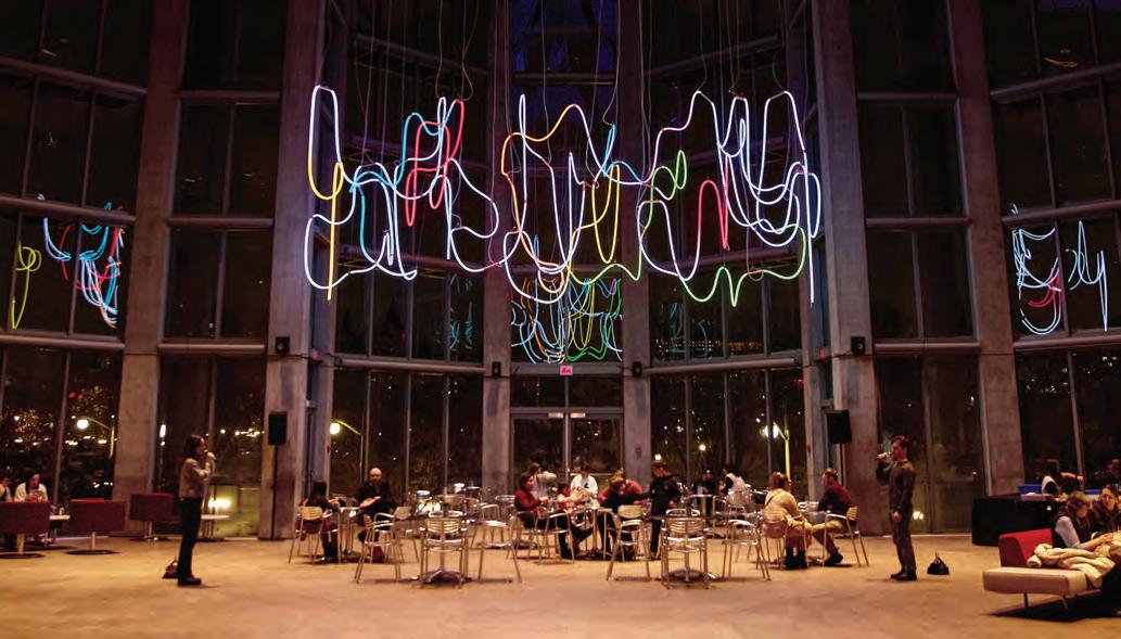
All Mic’d Up From the minds that brought us the Hello series of installations came a new piece tailored to the National Gallery of Canada’s Scotiabank Great Hall. Designed by Montréal-based art and design studio Daily tous les jours, Spaghetti Chorus is a slow communication device that transforms voice messages into music and light. Visitors speak into two mikes connected along 140 metres of intertwined, glowing LED tubes suspended from the vaulted atrium and watch their voices transform into shafts of colour while creating melodic moments.
Maryn
Devine
Vuk
Dragojevic
From Palm Trees to Possibilities
By Peter Sobchak
With shifting demand and supply chain shakeups, Malaysia’s balance of affordability and craftsmanship keeps its cost-savvy manufacturers on the global radar at MIFF 2025.
Post-pandemic shifts have increased demand for home and office furniture, with consumers prioritizing value-for-money products and a strong global demand for affordable, quality furniture. Malaysia has a well-established cost-to-quality balance, making its furniture attractive in both mid-range and premium markets, which is partially why Malaysia ranks among the top 10 global furniture exporters, with key markets in North America and Europe. Given current geopolitical and supply chain disruptions, buyers are becoming more cautious, seeking stable, efficient manufacturers, a reputation Malaysia has been doing well in cultivating through trade shows such as the Malaysian International Furniture Fair (MIFF), a flagship event in the region and the slickest of a growing number of tradeshows in the Asian Furniture Show Circle, which includes neighbouring countries such as Vietnam, Indonesia and China. MIFF has a strong legacy of connecting international buyers and manufacturers, solidifying Malaysia’s position as a central hub for global furniture commerce.
1 Lana Bell | Stephanie Ng Designs Lana means “wool” in Spanish and accurately reflects Stephanie Ng’s approach to her lighting collections: put a comfy sweater on them. Handcrafted sleeves woven from 100 per cent Merino wool stretch over the body of the lamp, much like a pullover, with layers dyed in contrasting horizontal stripes, taking its cue from the classic motif found in vintage wool sweaters. www.stephaniengdesign.com
2 Palm Loop | Panasonic Housing Solutions Oil palm trees, after their oil production is exhausted, are often felled and left to decompose or burned, releasing greenhouse gases. Panasonic developed this technology to recycle these waste palm trunks into wood board, offering a sustainable alternative to traditional wood and reducing emissions. While not new and not much to look at aesthetically, the attention this technology was getting at MIFF sends positive signals about an industry where wood figures prominently in its furnishing lines. https://panasonic.net/phs/
3 DTQ 2700 Dining Set | Inspiwood Furniture A solid wood dining set is the Malaysian furniture industry’s bread and butter, and companies with particular skills in cutting, shaping, carving, sanding, and finishing show them off on an eye-catching set like this one from Inspiwood Furniture, a small outfit based in the coastal city of Penang. www.inspiwood.com
4 Forte | Johann & Joann Concept Every trade show has a few perennial showoffs, and at MIFF one of the regulars is Johann & Joann Concept, winner this year of an Informa Better Stands award. Tweaks and additions to the Ogel series are typically part of the stand’s allure, but this year also saw the launch of the Doppio and Forte (shown) bedroom sets. www.jnjconcept.com
By Ashna Lulla
Luke Cleland
From Sourdough to Site Plans
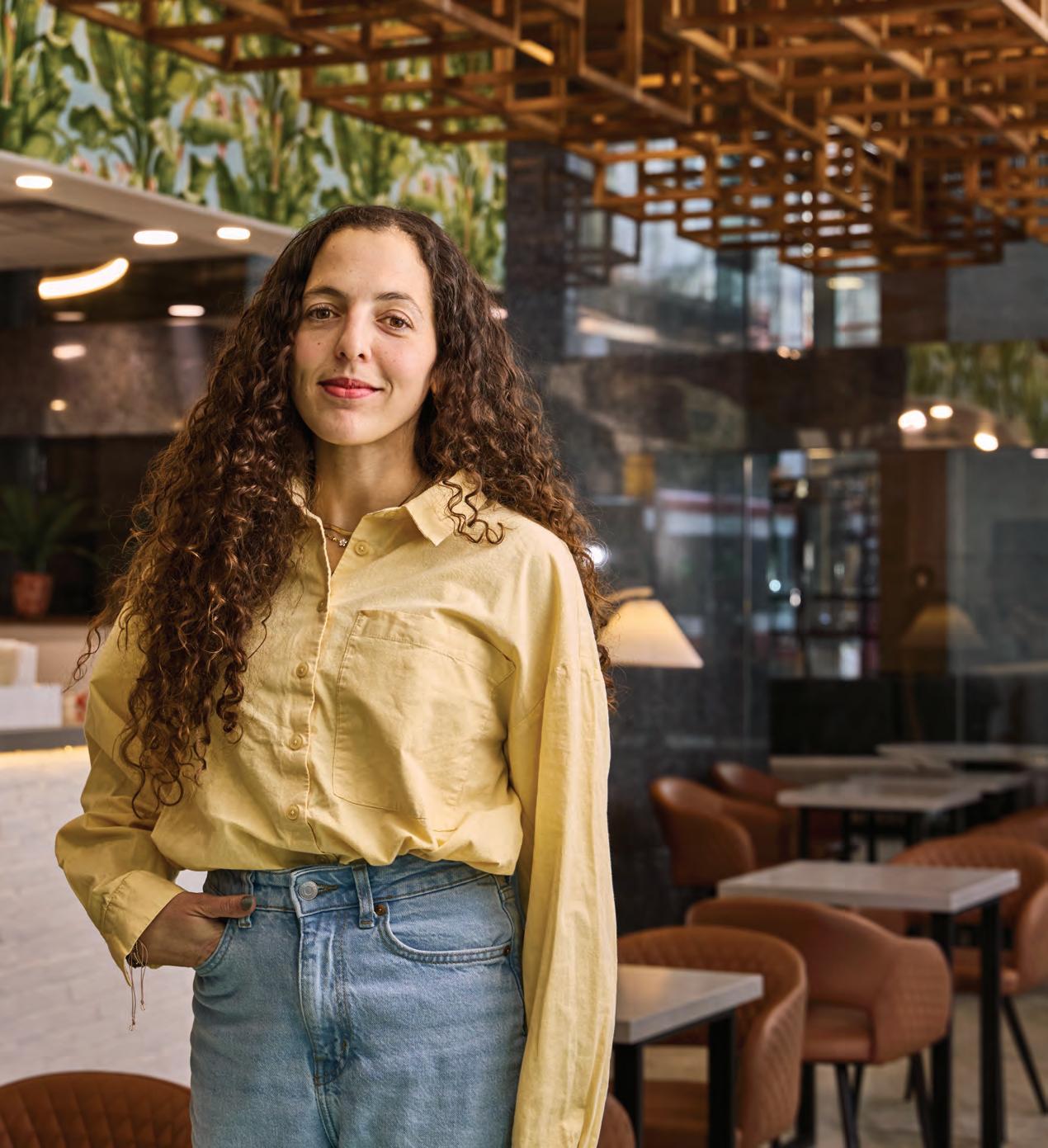
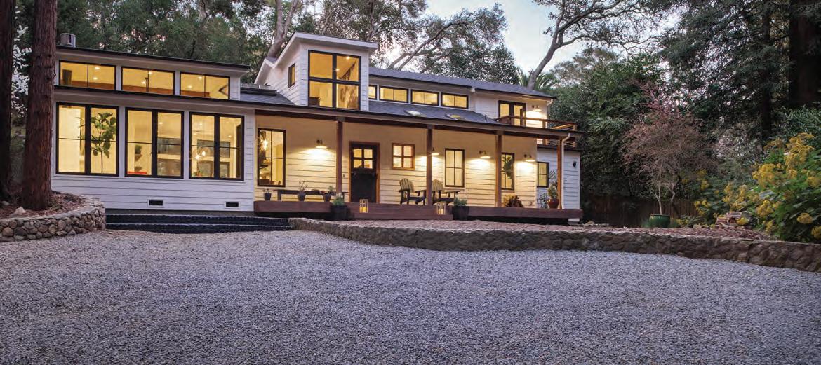
Sansa Interiors started as a pandemic pivot and took off fast, driven by Jude Kamal’s childhood curiosity mixed with grit, ambition, and a lil’ bit of rule-bending along the way.
Jude Kamal’s grand plans to travel the world with her sister came to a screeching halt just days after she resigned from Jump Branding & Design, thanks to a pandemic no one saw coming. As borders closed and the world retreated indoors, Kamal found herself confined to her one-bedroom Toronto apartment, solving puzzles and baking fresh batches of sourdough bread—things she’d never done her entire life.
“I fell into entrepreneurship by chance,” admits Kamal, recounting the unplanned beginnings of Sansa Interiors. By April 2020, “I was beginning to lose my mind,” she confesses, “so I created a website offering freelance design services for people who now needed home offices.” What began as a way to stay creatively engaged swiftly converted to a legitimate business opportunity when projects started to roll in.
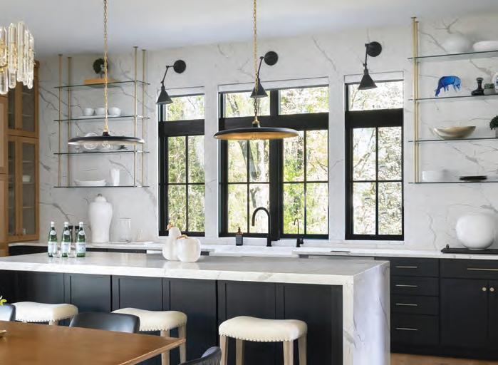
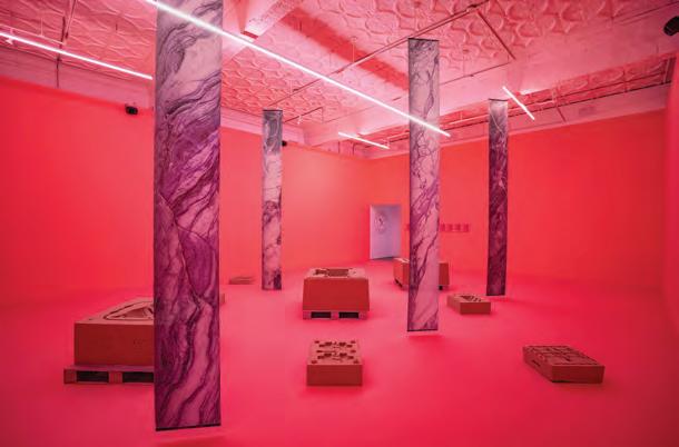
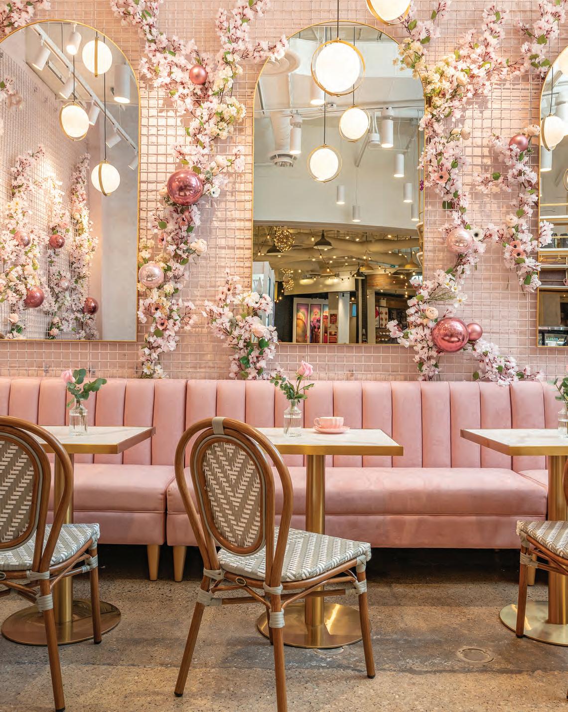
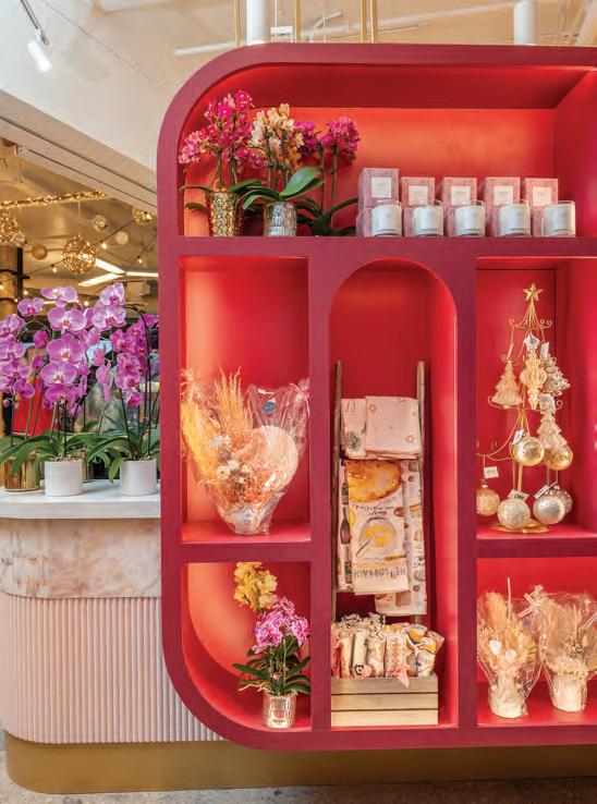
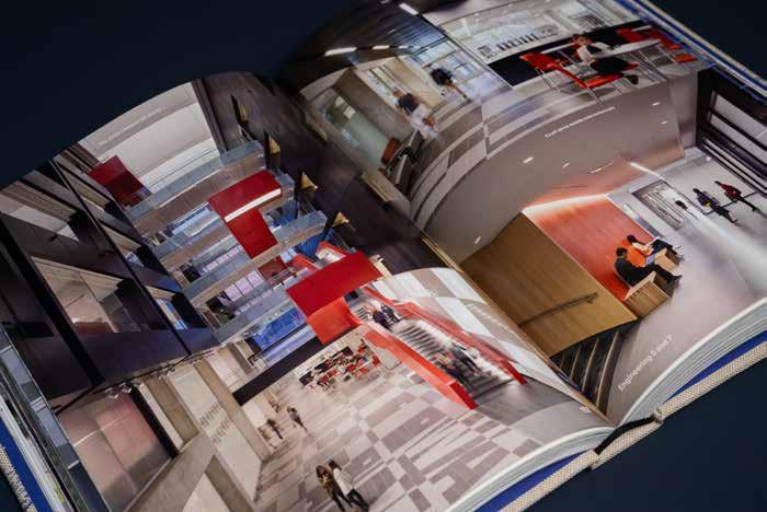
This spread Where blooms meet brews, Blossom Moments Floral Café is a love letter to petals and pour-overs. Sansa Interiors crafted the layout to ensure intuitive flow between the café and flower shop, and this biophilic beauty blends rose pinks, cherry tones, and natural textures into a sleek, functional haven. More than a café, it’s modern romance with a caffeine kick: sophisticated, serene, and Instagram-ready.
Kamal’s entrepreneurial drive and impeccable taste make you wonder about their origins. She grew up with design and business in her pores, learning to do things by eye from watching her maternal grandmother, Mithal, run a successful fashion boutique in Jordan. “I didn’t play with regular toys like other children. I was either painting or fiddling with buttons and fabric scraps at her studio.” This was balanced with time spent outdoors alongside her grandfather. “My grandpa loved gardening, so I helped tend to his plants and developed a deep connection to nature early on.”
Kamal credits the richness of her childhood in Jordan, framed by its dramatic landscapes and historic architecture, as one of the most formative influences on her work. “Jordan is quite westernized compared to other parts of the Middle East,” she shares, describing her hometown of Amman as a close-knit city steeped in heritage. Weekend trips often meant sketching at historic landmarks like Petra or Jerash. “I was fascinated by the architectural layering and the way natural materials were used as a way to build,” she recalls. “That early exposure shaped how I approach materials and processes, without reservation.”
While Amman felt dense and increasingly modern, Jordanian homes prioritized carving out green pockets such as courtyards, gardens, or balconies overflowing with plants. “Even tiny apartments had little green pockets to step into,” she reflects, in stark contrast to the confined backyards she would later encounter after her family moved to Canada.
“When I first moved to Canada at 16, I expected the same warm welcome I would’ve received back home in Jordan,” Kamal recalls. “But no one spoke to me, I felt invisible.” That first day of school was disheartening enough for her to want to stay home for good. But by the next morning, something shifted. Determined not to spend the school year in silence, she decided to take matters into her own hands. “I noticed the more social kids sat toward the back of the class, so that’s where I went and I began introducing myself.” What began as a quiet act of self-preservation slowly evolved into her defining trait: “it’s that blend of guts and faith,” she says, “that has shaped everything since.”
From the Outside In
Kamal stumbled upon Environmental Design at OCAD University during a school fair. “It felt like the perfect middle ground between art and architecture,” she says. At OCAD, she thrived: spending long studio hours shaping metal, bending acrylic, and sanding wood, which unlocked new ways of thinking and helped develop her artistic voice. She describes her career progression as “ant-like,”
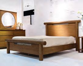
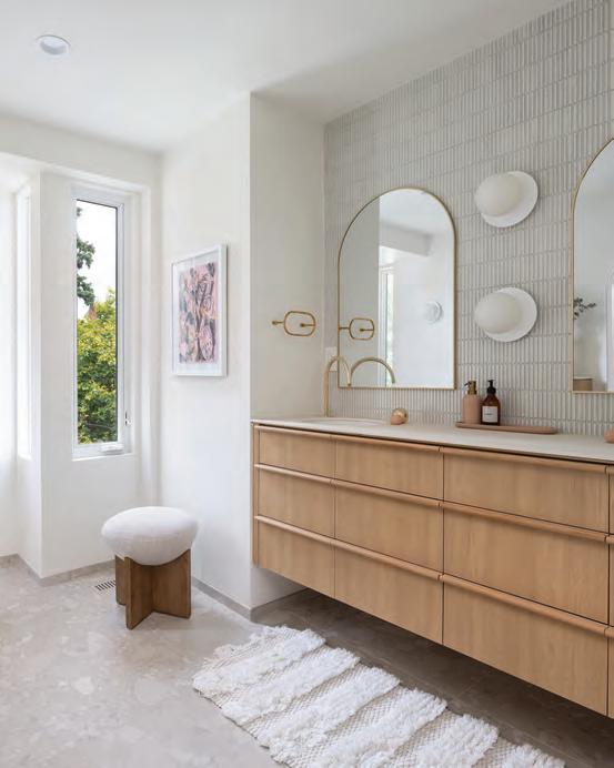
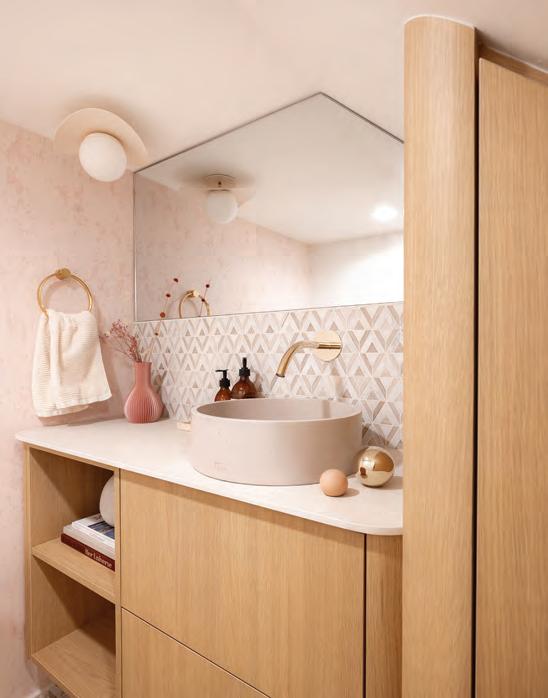
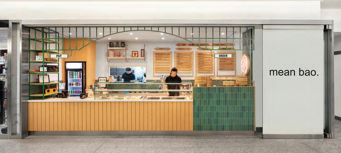
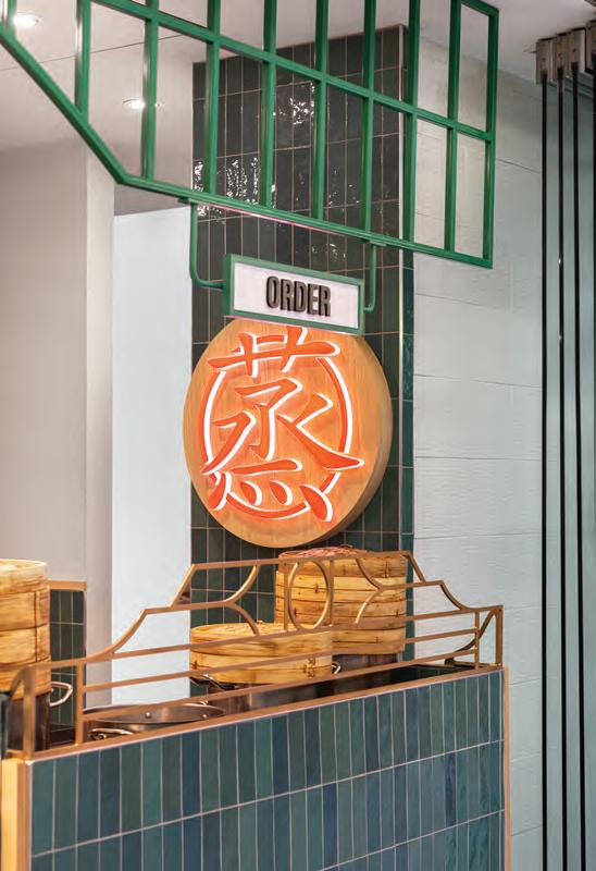
This page Sansa Interiors transformed the primary bathroom, powder room and basement laundry of a classic Toronto row house, balancing oak, stone, and steam into a palette of sand and sea. A sculptural tub and steam room anchor the space, while sleek lines and tactile materials echo throughout. The powder room nestled beneath the stairs pops with rosy wallcovering and marble geometry. Opposite page Mean Bao isn’t just a dumpling stop: it’s a spatial manifesto. This Toronto eatery channels Chinese street-food culture through a lens of raw tactility and chromatic punch. Steaming bao, bamboo textures, concrete slabs, and a red neon snarl craft an experience that’s visceral, fast, and unapologetically urban. Greens and browns nod to tradition; sharp lines and layout whisper efficiency. Jagged Lens
but then there are more “gazelle-like” moments where she took brave and momentous leaps. “Most of my cohort had jobs lined up before graduation,” she states. “I started out designing kitchens at Home Depot.” But it wasn’t long before she landed at Beauparlant, a small residential design firm of just three people where she was thrown into the deep end. “I was drafting custom millwork, managing with clients, and doing site visits, work typically reserved for more senior designers.” she says.
Over time, she moved through roles at firms like Green Tangerine Design Inc. and Jump Branding & Design, honing her skills in commercial interiors. Still, Kamal admits to being inherently restless: “Once I hit my ceiling of learning, I knew it was time to move on.”
That combination of curiosity, grit, and hunger laid the foundation for Sansa Interiors. At its core, Sansa embodies a holistic design philosophy that, to Kamal, means “we honour the original architectural voice, often laced with contemporary elements, creating meaningful conversations between the past, present and future.”
The studio took off quickly, but behind the growth was a scrappy strategy. “In the first year, I sent my website to every single person I knew on Facebook,” she laughs. “I had about 1,200 friends and wrote a personalised message to each one, just asking for honest feedback.” It wasn’t a pitch for work, she emphasizes. “I genuinely wanted to know what people thought.” She then tracked that feedback in a spreadsheet.
That simple outreach rekindled connections with people she hadn’t spoken to in years, and from those conversations alone five projects came through the door. An old high school connection brought her first big break, designing his family’s Mean Bao loca-
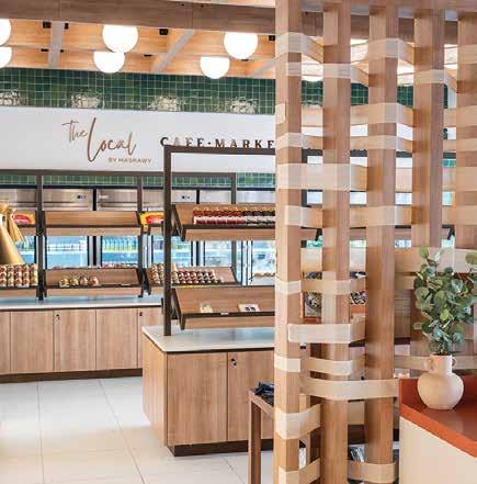
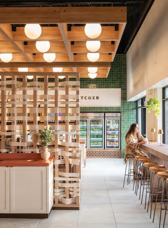
This spread The Local by Masrawy reinvents a Cairo street market with the sharp manners of an architectural lens. It is part café, part butcher, part boutique market, all wrapped in warm textures, earthy tones, and geometric charm. Channeling traditional Egyptian flair without the chaos, a woven screen partition that separates the café from the market and butcher shop, creating intimacy without isolation.
tion. They were so delighted with her work that they brought her back for their next two locations. Kamal completed the project and shared it on LinkedIn, and from there, the momentum quietly built. Her husband’s colleague reached out next, looking to renovate a dated 1970s home that had once been a nunnery.
This transformation drew attention, not just for its scale but for Kamal’s ability to preserve the home’s ecclesiastical soul. While many designers seek a clean slate, she embraces the tension between old and new, a sensibility shaped by her childhood in Jordan. She kept the finishes quiet and contemporary, allowing original details like a stained-glass window to take center stage.
Systems Before Scale
As Sansa Interiors enters 2025, her studio refuses to be boxed into a single niche. Their portfolio spans residences, cafés, restaurants, offices, clinics and even daycares. Yet she admits to a personal sweet spot. “I personally gravitate towards coffee shops,” Kamal confesses, “because I hung out at so many while building this business and first-hand experienced how problematic many were, be they uncomfortable seats to inefficient staff workflows. I knew I could make a real difference.”
Rather than waiting for opportunities, Kamal actively pursued them with refreshing directness, visiting coffee shops and initiating conversations with owners. “Many projects poured in two to three years later as a result of those intentional exchanges,” she notes.
With no formal business background and systems still taking shape, Kamal was learning how to run a company on the fly. “I was working crazy hours, 12 to 14 hours daily, weekends included,” she admits. Yet amid the chaos, she established non-negotiable rituals: morning yoga and mid-day walks regardless of the weather. In quiet moments, she devoted herself to business education. “Even 30 minutes a day gave me something new to try. I’d read, implement, and then get right back to drawing.”
Perhaps the most remarkable aspect of Kamal’s approach was her early focus on systems and scalability. This foresight led her to develop comprehensive systems for every aspect of the business: client communication workflows; file management protocols; drawing standards; and project management frameworks. “I tried every app out there,” she laughs. “One would be missing a feature, so we’d move on and try the next.” By the end of her first year, Kamal had built a fully remote system that continues to support the studio five years later.
“No one tells you when it’s time to hire,” Kamal sighs. Unable to find guidance, clarity finally came through another business book she read that gave her an equation to calculate readiness based on overhead costs and projected revenues. Her first hire was a junior designer about to graduate, a budget-friendly decision that worked well for the fledgling company. Today, Sansa Interiors remains intentionally small, with a tight-knit team of four (five in the summer, when they bring on a co-op student).
Kamal’s hiring philosophy, like everything else in her business, reflects her intentionality. Rather than formal interviews, she begins with an informal call to assess cultural fit. “I just call them and chat with them as a person,” she explains. “I try to vet for things like are they curious about design, seeking new products and new approaches? We have a saying in our studio: if someone provides you with a floor plan, never trust it, do your due diligence, and see how you can make it better.” Only after establishing personal compatibility does she schedule a formal interview to assess technical skills.
“I’m also often asked about our studio culture,” Kamal smiles. “We try to keep everyone’s goals in mind. Each person’s career trajectory takes on a different shape, allowing us to move forward as a collective. I delegate work based on individual strengths and
preferences. The way we’ve grown together, you can’t tell who designed what,” she laughs. “It’s like we’re all wandering around in alignment.”
Kamal’s goal-setting process begins with what she calls a ‘BHG’ (big, hairy, audacious goal), which gets methodically broken down into manageable pieces. As quarterly checkpoints approach, the team assesses progress, makes necessary tweaks, and moves forward. “This year, the team was freaking out from the goals I set. I told them I’d reach out to at least 100 people every month to keep our pipeline going,” she reveals. But her approach balances ambition with realism: “Look, if we break it down by month, we’re going to get there. And if we do everything and still don’t make it, it’s okay. We tried. We’ll try again next year.”
To stay accountable, she keeps goals visible—printed and posted on her wall—and highlights completed tasks as she goes. “Celebrate all the wins,” she emphasizes. As Sansa Interiors continues to transform Toronto’s design landscape, they provide a compelling blueprint for how design studios can be modeled, one often overlooked by traditional firms. In Kamal’s world, business growth becomes another form of design: intentional, sustainable, and deeply connected to the human experience that shapes it.
By Rhys Phillips
Order Out of Chaos
How Creative Matters turned five years of economic upheaval into a growth opportunity.
Canadian businesses have faced a rough five years amid a pandemic, harsh inflation, Donald Trump’s chaotic tariffs, and a looming recession. Yet, Toronto-based Creative Matters Inc., a rug and wall coverings design and manufacture company, refused to take shelter. Instead, it accelerated a structured expansion that is transforming it from a Canadian firm with international clients into a robust global Canadian enterprise with an office in Europe, a design team in Thailand, and a collaborative network of weaving mills worldwide.
Founded in 1988 as a small Toronto studio by Carol Sebert, Donna Hastings, and Luba Huzan, the company has been led since 2017 by current owners Anna Cunningham and Ali McMurter, with an active agenda expanding its market reach. Originally dedicated to honouring traditional artistry, the firm now features bespoke and radical reinterpretations of historical patterns that reflect evolving design sensibilities. By the time COVID-19 hit, Creative Matters had already earned recognition from Canadian, East Coast American and European interior designers and architects for its consistent authenticity backed by sustainability and meticulous craftsmanship.
According to Cunningham, authenticity derives from repeated patterns and specific colour schemes echoing ancestral symbols and cultural narratives but with original artwork. While Turko-Persian, Moroccan, and Pakistani textile motifs influence the firm’s reinterpretations, she notes that pure classical designs are now rare. Instead, an in-house team comprised of designers, illustrators, and cultural specialists, now joined by Brussels- and Thailand-based designers, tailor projects to each unique client and setting.
The firm also draws directly from local references such as Canada’s natural landscapes and indigenous traditions. The Storytelling Collection features Indigenous artists such as Métis artist Christi Belcourt reflecting a strong Canadian sense of place. Limited-edition collections and bespoke pieces may begin with time-honoured textile patterns but are boldly reinterpreted through a contemporary lens and site-specific meaning.
Besides hand-knotting, the firm commissions tufted and woven rugs that blend traditional craftsmanship with machine-assisted tech-
Andrea Gibson Photography (above left); Eliza Georgieva (above right)
niques. For instance, Creative Matters partners with manufacturers employing hand-knotting in India, weaving in Turkey, artisan dyeing in Morocco, and machine-assisted tufting in Pakistan, alongside European, Canadian and U.S. mills.
People in place, places in people
Expansion has been influenced by recent challenges, yet its roots lie in the firm’s consistent core principles including superior quality, action-oriented environmental sustainability, and provision of a comprehensive service. “We really try to establish a workflow and communication level,” Cunningham says of the last, “where we keep everyone involved at every stage... [while] our internal logistics team provides ‘white glove service’ for shipping, customs, logistics, delivery, and installation.” The Thailand office plays a vital on-site role in upholding quality and Creative Matters’ adoption of the Label STEP fair trade standards, which requires strict adherence to social and environmental criteria. Architect-trained Hathairat Suk-lem also works closely with mill artisans to leverage deep technical expertise.
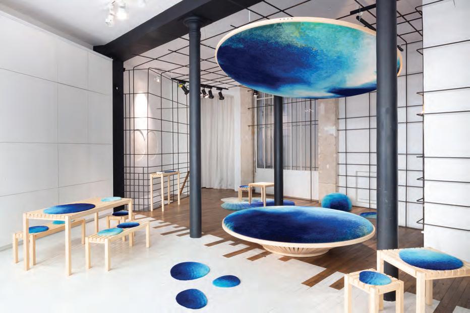
Oppoosite page, left Ana Cunningham and Ali McMurter, who became Creative Matters’ co-owners and managing partners in 2017, spend considerable time visiting farflung mills that are the firm’s major suppliers. Cunningham was in India last year and McMurter toured Thailand mills this past winter. Oppoosite page, right Clémence Hardelay, Director of Design Europe since 2021, heads up the Brussels office. Like Hardelay, Belgium-born designer Laurie Francois is multilingual, but comes from an architecture background with a Master’s degree in architecture from the Université Libre de Bruxelles (Institut Victor Horta). This page Working with Paris firm LOMA, Creative Matters’ plush, snow-like Canadian wool carpets were draped over bespoke furniture at Winter Garden during the 2022 Paris Design Show. The fluffy white wool was sourced from France’s Brun de Vian-Tiran and Canada’s The Campaign for Wool Canada. Post exhibit, the wool and wood were sustainably re-used.
Close collaboration with distant mills and tight coordination of a broad supply chain helps Creative Matters weather post-pandemic inflation and tariff threats. This engaged network has been instrumental in maintaining product excellence under challenging market conditions. Only about two to three per cent of rugs come from Canadian mills hit by Trump’s tariffs. With commissioned rugs ship-
Chris Harrison Photography
ping directly from production countries, most U.S.-bound products have originated from nations that have had low U.S. tariffs. While impacts from Trump’s harsh “Liberation Day” and 90-day hiatus is not yet known, “[our] dynamic structure allows us to stay ahead of changes, minimize disruption and continue delivering the quality our clients expect,” says Cunningham. Market diversification also helps.
Ensuring timely, full-range service mandated a stronger European office, an issue that was intensified by pandemic travel restrictions. Creative Matters first expanded into Europe in 2013 when Paris-based designer Clémence Hardelay was hired, eventually becoming Director of Design Europe in 2021. Born in France, raised in Italy and fluent in four languages, her degrees from ESAA Duperré and Paris’ ANAT (ENSCI-Les Ateliers) provided the firm with a technologically strong, multilingual presence.
A significant increase in European recognition came through a collaboration with Toronto’s Yabu Pushelberg on 19 custom carpets for Paris’ iconic La Samaritaine’s 2021 reopening. This two-year project, led by Cunningham and Hardelay, fused traditional craftsmanship with modern design to enhance the store’s opulent grandeur and served as a showcase for Creative Matters. The project not only highlighted the firm’s ability to blend heritage with innovation but also further reinforced its reputation among leading European interior designers.
Belgium’s central location, with easy train access to Paris, London, and key German cities, prompted the selection of a Brussels office,
opened in 2024. Although the office has not yet engaged local artisans like in Canada, senior textile designer Laurie Francois (also architect trained and multilingual) supports Toronto’s in-house designers through close project collaboration. The new Belgian office positions Creative Matters to expand its European opportunities while strengthening its broader global reach through Europe’s top designers and architects.
Although Cunningham says sustainability has long been part of the firm’s approach, it also resonates with European designers. “It’s a huge conversation that we’re having with top design firms, and there’s an expectation that if we’re going to be leaders in the industry, aggressive commitment to sustainability matters.” Creative Matters released its first sustainability report in January 2024 with an update this April.
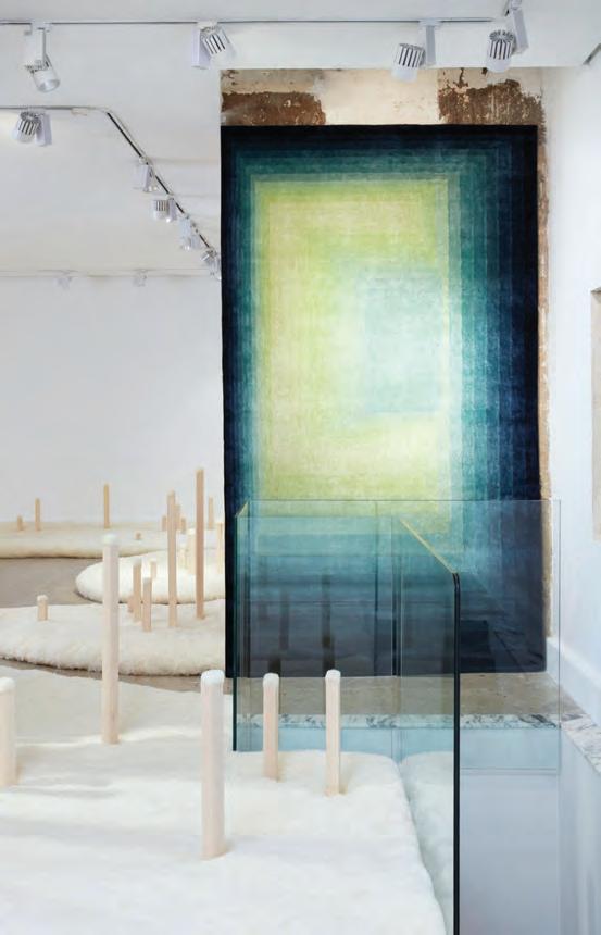
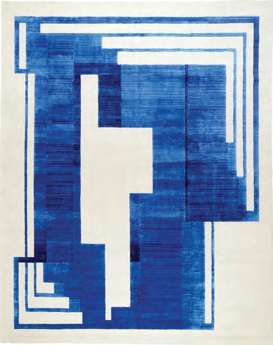
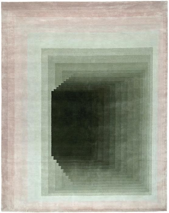
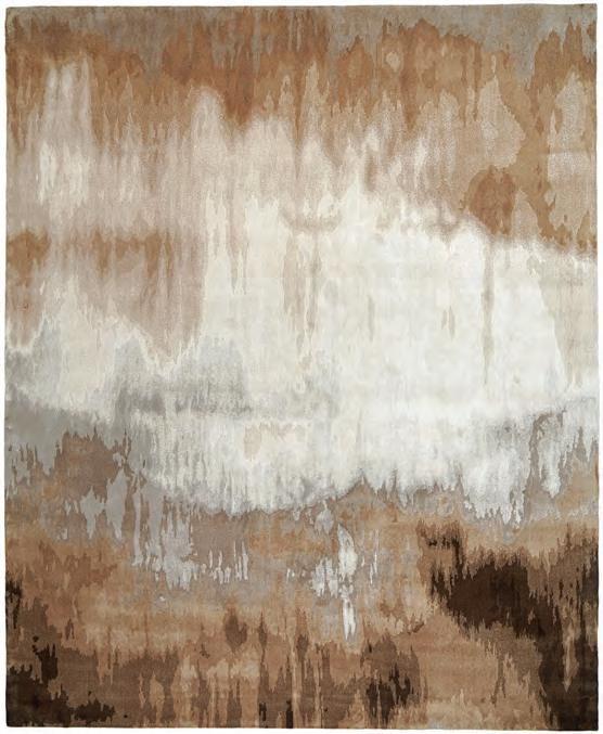
Opposite page A contemporary Art Deco interpretation, Piazza Cobalt (top left) was showcased at Collectible 2024. It is a hand-knotted rug of fine Tibetan wool with pure Chinese silk milled in Nepal. New collections include Aurora (top right) and Cenote (bottom left). Aurora takes its cue from the aurora borealis but reflecting cubism and is hand knotted in Nepal with Tibetan wool and 20 per cent Chinese silk. Named after the “shifting perspectives of water” in natural underground pools, Cenote is 50/50 hand-knitted Tibetan wool and Chinese silk. Métis artist Christi Belcourt’s Four Cedar Waxwing rug (bottom right) is the latest in the Storyline Collection. Through publicly stated Ethical Guidelines, intensive consultations with cultural communities including Elders, and close collaboration and revenue sharing with the artist, Creative Matters works intensely to avoid cultural appropriation. This page The installation Redoux Passenger at the 2023 Paris Design Show showcased sustainability and resonated with European designers. It referenced the originating mill’s new wastewater treatment facility that captures rainwater thus reducing water use by 80 per cent from the public system.
Successful expansion requires appreciating designers’ understanding of “the narrative of the space they are working on and then creating something unique to that vision,” adds Cunningham. This demands sensitivity to regional aesthetics. Although Europe and North America share many preferences, there is a bias in Europe for bold colour although traditional “grey/beige” favoured in Canada is fading.
Working the shows
Trade shows have been key for market penetration, although preferred events have shifted. Before COVID-19, Dometrix and Maison&Object were featured. “But we realized [the latter] wasn’t the kind of show that really explained Creative Matters as we wanted,” says Cunningham. Post-pandemic, the focus shifted to more art-centric events. Consequently, Paris Design Week became central starting in 2022 and again in 2023. “We did really stunning exhibitions for both years,” she says.
The first 2022 installation was Winter Garden, in partnership with Paris furniture designer LOMA. Creative Matters provided plush, snow-like wool carpets draped over bespoke furniture evoking a snowy day. At the 2023 show, a second installation with LOMA titled Redoux Passager showcased a funky circular seating arrangement below a suspended water-blue runner. “It’s [experienced] almost like you’re taking a bath,” Cunningham explains. “People were able to recline and gaze at the suspended piece, almost as if you were immersed in water.” The installation highlighted sustainability by reflecting the originating mill’s new water waste treatment facility that recycles rainwater as part of a circular, sustainable water stewardship program. It was subsequently remounted for Fuorisalone Milan Design Week in 2024.
In March 2024, Brussel’s COLLECTIBLE—more an international art exhibition than a conventional trade show—continued this artistic focus shift. Creative Matters’ contemporary art deco Piazza Cobalt rug was showcased while its colour variation Terra Terracotta later took centre stage at Paris’ Rendez-vous de la Matière, followed by Carpet Diem Paris, where it featured in a 40-piece showcase by scenographer Hervé Sauvage.
Emblematic of its growing European recognition, in June 2024 the firm was invited to Hostys Connect in Nice. This exclusive invitation-only event connects 200 top French and international interior designers with key players in the French luxury hospitality and residential market. “[By] returning, the firm will deepen relationships with European designers [as well as] exploring new markets like Dubai, UAE and Saudi Arabia,” says Cunningham. “In the short term, the focus will be on steadily expanding the London, German and Brussels markets.”
Canadian businesses must now diversify markets while managing complex supply chains amid a persistently chaotic U.S. market. Individual responses will vary, but Creative Matters believes chaos can create significant opportunities.
Above Collaborating with Toronto’s Yabu Pushelberg on 19 custom carpets for Paris’ iconic La Samaritaine’s 2021 reopening fused traditional craftsmanship with modern design to enhance the store’s opulent grandeur.
Stephanie Aboudaram, We Are Contents
By David Lasker
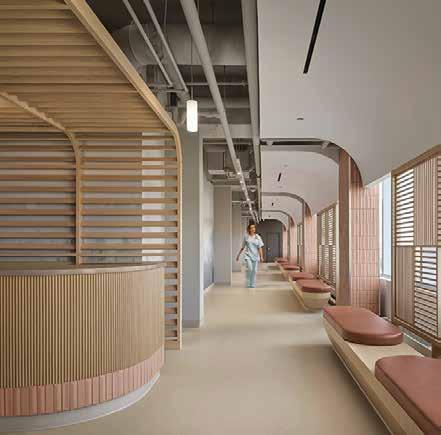
Light, Line, and Lifeblood
Two
new public healthcare centres take both physical and mental wellness to heart when transforming a clinic into a sanctuary.
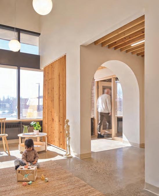
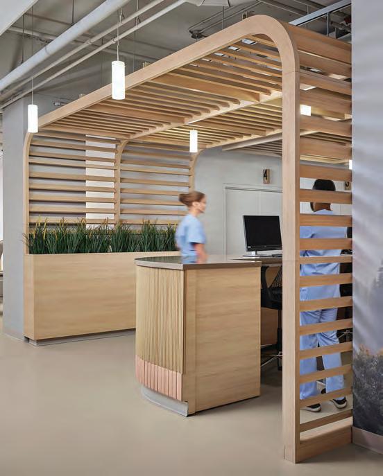
This page At Galt Health, locally sourced timber elements offer warmth and gently guide patients towards a welcoming and intimate reception area. Patient, staff, and doctor pathways are thoughtfully considered to offer privacy and ease of movement for all.
A spacious, light-filled waiting room accented by wood seating elements and screens provides a comforting start to the patient experience. An arched entry provides a quiet and secure threshold into the patient rooms, and natural daylight follows throughout.
There’s no more iconic, lasting symbol of the pandemic than the yellow heart-shaped softly glowing neon “hero” lights that folks in many Toronto neighbourhoods spontaneously put in their front windows during those bleak, early days of COVID-19. The neon hearts “spread joy and positivity in their communities” according to blogto, and paid tribute to those designated-frontline “essential workers” who put themselves at risk in hospitals and nursing homes, often for minimum wage, while the rest of us had the luxury of languorously isolating.
Every cloud has a silver lining and one of the lasting benefits of the pandemic has been for enlightened healthcare operators to give more consideration to the quotidian routines of their staff as manifested in the interior design of those workplaces.
Such is the case with two recently opened Ontario health clinics: Durham Spine & Pain Institute in Ajax by Toronto-based architects Lebel & Bouliane (formerly Architects Luc Bouliane); and Galt Health Centre by Fonseka Studio, both based in Cambridge. These spaces not only support the patients but also the staff as well.
The eponymous Jaliya Fonseka favours adaptive reuse where possible rather than building anew, thereby reducing carbon emissions. He persuaded the client, a group of family doctors, to retrofit space in a charming old brick building, formerly Cambridge city hall, situated in the Galt heritage district overlooking the Grand River. “Their building is woven into the urban fabric of Galt,” he says.
In its as-found state, offices hogged the window-lined perimeter. Fonseka pushed the offices into the centre of the floor plate to form a donut-like floor plan with the offices as donut-hole, wrapped in a continuous, daylight-filled circular corridor without dead ends, allowing patients and staff to enjoy views out as they move through the clinic. Patients are distracted from the vulnerability and stress that often attend medical visits. And when patients are less stressed, staff are less stressed.
Fonseka, an assistant professor at the University of Waterloo’s architecture faculty, has a course reading list that includes Healing Spaces: The Science of Place and Well-Being by Esther Sternberg, which influenced his philosophical approach to the project. “We need to consider from when the patient touches the doorknob and opens the door, and design from that moment onward,” he says. “What can the design detailing do to put the patient in a better state?”
For instance, he elongated the waiting room to allow a pause before reaching the reception desk. With no wall behind the desk, sightlines connect patients in the waiting room to staff at their workstations.
At his design-build boutique, he doubles as general contractor, pondering not just architecture but also fixtures and furnishings. Indeed, he builds them, including the 114-ft.-long bench wrapping around the perimeter of the clinic’s circumambulatory corridor. During construction, he closed off the waiting area and used it as a workshop where he and his team ran their (locally sourced) SPF
lumber through a table saw and planer to sharpen the boards’ edges. “We didn’t want it to feel hyper-processed, but we also didn’t want it to feel like a 2x4 straight out of Home Depot.”
The wood, finished with natural oils and waxes, adds a soothing, tactile warmth to the clinic. Furthermore, given the conspicuous absence of art on the clinic’s white drywall expanses, the lumber’s smorgasbord of exposed grain patterns acts as de facto sculptural objects.
Fonseka exploited the base-building’s generous height to insert a faux pitched roof lined with SPF fins, conjuring the homey, cozy feeling of a wood-beamed cathedral ceiling while bringing daylight into the patient rooms and concealing building services. Arrayed vertically on an angle, the fins form semi-permeable wall screens that blend privacy and openness.
Further softening the base building’s sharp edges, Fonseka hung glass-globe pendant lights at key locations, such as the archway between the public domain of the waiting room and the private realm of the patient rooms. While the globes evoke 1980s home hallway lighting, his context was Galt’s distinctive historic globe streetlights mounted on green copper posts.
As validation of the clinic’s success, patients have taken it upon themselves to water the waiting-room plants. “People get a sense of ownership when they’re in a space where they feel good; they feel it’s theirs,” Fonseka says. Riley Snelling
Where form heals function
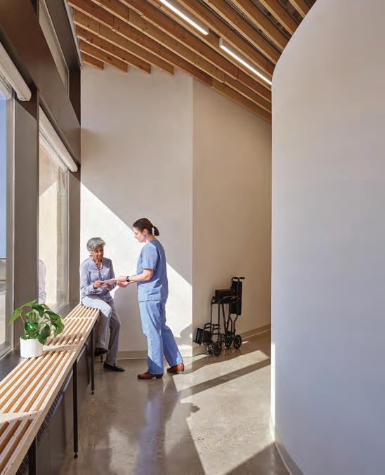
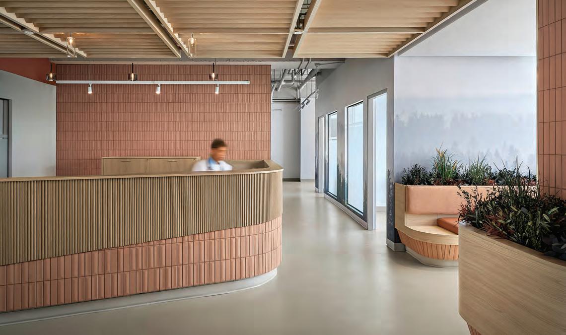
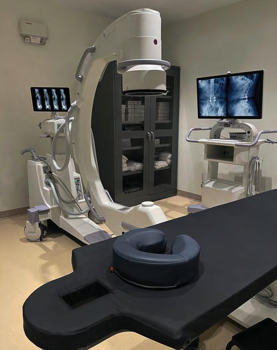
The Durham Spine & Pain Institute comprises anesthetists, spine surgeons and sports and emergency-medicine doctors and allied health professionals. They offer arthritic, orthopedic, sports-injury and chronic-pain management services. Lebel & Bouliane partner Natasha Lebel undertook the full interior fit-out of the clinic on the third floor of a new commercial building. Her program included reception, consultation rooms, procedure and treatment rooms and infusion lounge, all arrayed around the central nursing station in the classic hub-and-spoke healthcare model.
At the nursing station, “nurses have eyes everywhere and know where every doctor and patient is,” says Lebel & Bouliane senior associate Duane Comins. The workstations face the six infusion bays, allowing nurses to remain seated while monitoring patients. The nurses’ desktop screens align back-to-back with outward-facing screens, enabling doctors to share simultaneous displays with nurses and interact with them directly.
Opposite page Patient rooms are characterized by a “pitched-roof” ceiling to resemble the familiar shape of a home. A long wooden bench wraps the perimeter of the clinic, providing informal meeting points and offering a visual connection to the adjacent riverfront. Above Durham Spine & Pain Institute draws inspiration from spa and wellness environments. A soothing experience at reception is created through controlled lighting and acoustics, a restorative colour palette, soft curves, and natural materials. Right A nature-inspired palette is achieved through the integration of stoneware tiles, wood screens, and wood-effect millwork finishes. To meet OHPIP Level 02 standards, materials were selected for their non-porous properties.
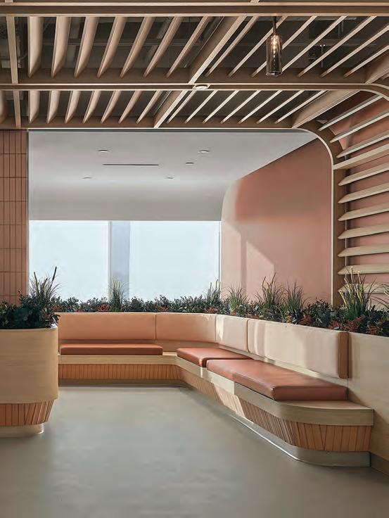
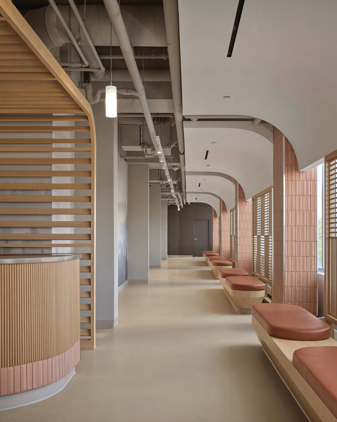
“Our brief at the beginning of the project was to reduce stress levels,” Lebel says. “Patients are already coming in with a chronic level of pain.” She referenced spa environments to convey the clinic’s mission of well-being and compassionate care by deploying warm tones, wood tambour paneling, a slatted acoustic arched maple pergola, and preserved plants. Vinyl-printed murals of calming nature scenes, such as mist-covered mountains, protect the walls, introduce cool tones and add visual depth to the interior.
Along the main corridor, a lattice screen filters natural light to reduce glare while integrated benches provide moments of respite or space for companion assistance. She attributes the gaps between cushions to personal experience. “I spent a lot of time waiting for a family member in chemo, sitting on a continuous cushion where you could never put down your coffee cup.”
Curved detailing at the nurses’ station and tapered bench edges minimizes trip and bump hazards, a particular concern for elderly patients with low mobility. Throughout, the existing concrete slab is finished with a warm, neutral-toned epoxy coating offering durability and a continuous surface. Dimmable, lensed lighting fixtures throughout the treatment and imaging rooms minimize glare on imaging screens and create a calming environment for patients.
A fluoroscope is an X-ray machine that makes a movie, enabling the doctor to look at behaviour as it is happening rather than at a stat-
ic image. While planning the four fluoroscope suites, where bulky C-arm imaging machines move 360 degrees around patients, Lebel hired a radiation scientist to calculate if the floor and ceiling slabs and sheetrock walls would block stray X-rays. As a result, the walls are lined with a 1.5-mm-thick layer of lead. “We put in a hospital-grade environment in a basic commercial midrise,” she says. (The 9,000-sq.-ft. main facility opened last June, while a 2,300-sq.ft. expansion, including a waiting room for patients’ drivers and companions, is currently under construction.)
As for colour palette, everything old is new again. The terracotta stoneware tile in the public areas may evoke 1970s PoMo salmon and 1990s Southwest dusty rose but the hue is actually au courant: Pantone’s 2024 colour of the year was Peach Fuzz. No cigar, but close enough.
Above The nurses’ station is oriented toward the patient infusion area, providing direct oversight of six actively monitored infusion bays. Opposite the four-person station, lead-lined doors and frames define the entrances to four fluoroscopy imaging suites, supporting diagnostic and treatment services. Opposite page Along the main corridor, a finer lattice screen filters natural light to reduce glare, while integrated benches provide moments of respite or space for companion assistance. Throughout, the existing concrete slab is finished with a warm, neutral-toned epoxy coating, offering durability and a cohesive, continuous surface.
By Michael Kaethler
“There
Is No Alternative?”
Design education must impart students with the skills to question power, build relational, regenerative futures and confront crises with more than just aesthetics.
“Can the scenario of Canada becoming the 51st state be considered a design problem?”
O ne of my design students recently asked this, raising a critical question: what is design’s role within the crises we are facing? To what extent is the design community prepared—or even willing—to actively confront troubling global trends, whether the creeping rise of authoritarianism, the steady eradication of the middle class, or the negligent destruction of eco-systems?
As a design educator with a focus on socially-oriented design, I am increasingly confronted by sentiments of helplessness from students who feel that the possibility of any real change is hopeless and naïve and that there is no alternative to our current trajectory of a downward spiral of interlinked and quickening crises.
Design is often heralded as one of the key drivers of innovation, being a fusion of creativity, problem-solving, and knowledge of materiality (bodies, spaces, aesthetics, objects). Yet design innovation today largely sustains the status quo of rendering the current system a bit more functional, a bit more efficient, and ultimately more palatable. What about a design that challenges that system? Where is design as a critical practice that is autonomous—or in the language of our politicians “sovereign”—from the forces that are hell-bent on abandoning sustainable futures for short term gain. To put it simply, what alternatives are designers producing for a world in crisis?
From hope to despair: TINA
It wasn’t long ago when There is No Alternative (TINA) was an expression of hope for the future. TINA was a political slogan initially employed in the 1980s by former Prime Minister of the United King-
dom, Margaret Thatcher, and later by other centre-right neo-liberal politicians across the Western Hemisphere. The slogan implied that economic liberalism / fiscal conservatism was the final stage of our political and economic evolution. We had reached the final plateau, succumbing to “common sense.” From here on out, governance was a matter of technocratic tweaks and fiscal managerialism.
TINA’s validity was “confirmed” by the fall of the Iron Curtain and dissolution of the Soviet Union, a purported proof to doubters that we had entered the final stage of our ideological evolution. In the (in)famous words of Francis Fukuyama, this was the “end of history,” the end of the ideological evolution of humans and the production of the last and final stage of humankind.
TINA became self-congratulatory, embodying the spirit of post-Cold War victory, the banishing of the Marxist spectre and the self-interested delight as new markets opened up across the globe. A new kind of liberal order was emerging and with it, politics and culture was being continuously stripped of overt ideological positions, preferring the clever, satirical and mischievous over the dry, critical and argumentative. These were the days of Bill Clinton’s saxophone, Tony Blair’s Cool Britannia, and the reverberating echoes of postmodern design complete with the ambiguities and messy ornamentations that epitomised Venturi’s “less is bore” design aesthetic. Design, like so many other fields, favoured irony over ideological engagement, swapping grand social visions for playful contradictions.
Fast forward to the present and my students view the 1980s, 1990s and early 2000s as wasted decades of haughty excess, myopic selfaggrandisement and vacuous politics. What I remember as a time of optimism, freedom to experiment, and an era of stability and prosperity, they see as the root of our current social and ecological decline.
First, we foreground relationality as the guiding framework for design. This is a perspective that sees humans, other species, objects and other forces as deeply entwined. With such a perspective, design is inherently a social, ecological and political practice because it is a practice that alters and intervenes in this meshwork of relations. Designers love the quote “Objects have agency too” by French philosopher Bruno Latour, because this is something we’ve always known: that objects interfere, stabilize, influence, shape and disrupt the many relations, processes, practices and ideas that hold together our world. If we take Latour and other new materialist philosophers seriously, then design has an oversized capacity for shaping the world, not limited to producing the non-critical innovations that keep systems functioning but more importantly in directly challenging the status quo and in producing new visions, relations and realities.
Secondly, we see design as an autonomous practice. For too long design has been co-opted by different economic interests and political forces as a means for whitewashing, greenwashing or soulwashing. With this in mind, we ensure that students understand the complex role design plays within the functioning of power and ideology within our society. As Canada is currently witnessing, to be ambivalent about one’s values, position, intentions and allies is to risk being absorbed or co-opted by others who are clear and confident about theirs, regardless of how misguided these may be.
Today, TINA is no longer a slogan of hope but of menace, the resignation to a tragic inevitability. “No Alternative” has come to mean that we are bound to our fates, including the massive impoverishment of society; the widespread eradication of species (including humans); and loss of viable democratic participation. Such a view transforms “the end of history” not as a celebration of the stability of the liberal order as praised by Fukuyama, but rather the end of history as in the quick and inevitable decline of civilization.
And where is design in all of this? Where are the alternatives being produced and cultivated? Certainly not within industry or at design fairs. Most disheartening of all is the lack of meaningful discourse in design education, which remains a fulcrum for design culture. Instead of fostering critical inquiry, most design programs continue to perpetuate and reinforce the values of external forces—whether the market or status-quo politics—while neglecting society’s most urgent questions. At best, they offer uncritical solutions to poorly examined problems.
Critical design education: Moving beyond apathy
Which is why my colleagues—Anna Maria Orrù; Zeno Franchini; Adrian Vickery Hill; and Francesca Gattello—and I are on a mission to alter this slide into the apathy of TINA through reconceiving design education. To do this, we have developed a Masters’ program where students are embedded within marginalized communities and ecological contexts. They work from the ground up, learning to identify needs, interpret power dynamics and navigate the politics and ideologies that vie for control. We see this as a crucial foundation for a new generation of designers who will actively engage in wider social, political, ecological and economic crises.
A key problem we address is how design education and the broader design culture has been oriented towards fulfilling a brief or commission, not questioning the brief or commission. For example, it appears (at face value) that designers today prefer to satisfy the design brief of hostile-architecture such as anti-homeless spikes or slanted and divided benches than they are to seek out ways to engage (creatively or otherwise) with the debate around social housing and rough sleeping. The reason is that it’s increasingly difficult to conceive of design as a politically engaged practice, one that is autonomous from market logics and the authority of the design brief.
Lastly, we focus on resituating design, to return to the local scale, to be embedded and engage with communities (human or otherwise). I am a firm believer that in bringing design into the real world and out of the siloed classrooms and insulated studios, we resist the facile tendencies to project user personas, experiences and realities and instead begin to live in these communities, being both designer and user, empathic and critical. This shifts design away from technicians and experts, resituating it as a regenerative practice of everyday life.
The major crises of today, whether they be related to poverty, migration, ecology or Canada’s sovereignty, are certainly design problems: dealing with them demands the creativity and capacities of designers who are able to demonstrate that there is an alternative. It is time to shift design education away from fulfilling insular briefs, producing superfluous objects, and attending to market demands, and instead orient it towards contributing to the greater good.
Michael Kaethler is co-head of the Master’s Program Social Ecological Design at the European Institute of Design (IED). He is the author of multiple design-oriented publications including the books Social Matter, Social Design (2020); The Auto-Ethnographic Turn in Design (2021) and the forthcoming In-Hospitable Times: Design and Otherness (2025) and Imaginative Ethnographies: A User’s Guide (2025).
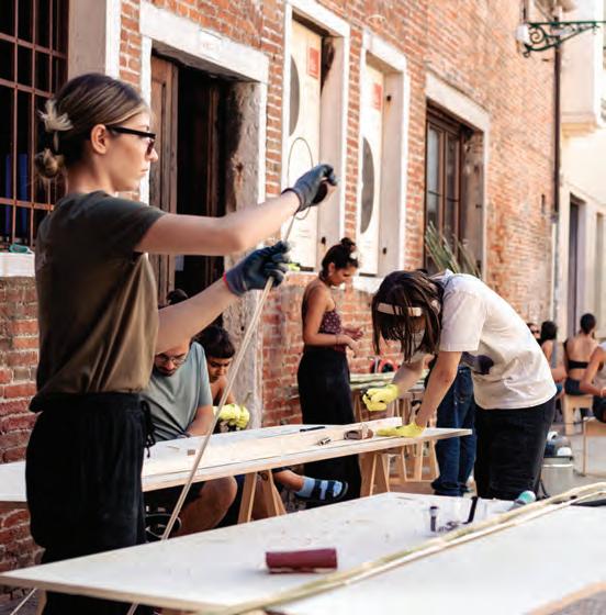
Left Workshop by Marginal Studio for Padiglione della Repubblica di San Marino at La Biennale di Venezia. Above Marginal Studio: Veronicas, icons, values and migrations in the contemporaneity. Contesting the representation of victimhood within contexts of far-right policy making in Italy.
By Peter Sobchak
GOOD READS
Happy Days
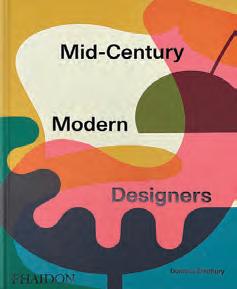
A celebration of mid-century modern design, its legacy, and the visionaries who helped shaped it.
The newest title in Phaidon’s ongoing and impressive cataloguing of the “greatest hits” from a period many consider the golden era of design, Mid-Century Modern Designers by Dominic Bradbury pays tribute to the pioneering designers who shaped the mid-century modern aesthetic across disciplines such as furniture, glassware, ceramics, and textiles. Highlighting 300 designers from around the world, the book explores how postwar optimism and economic expansion fueled a movement that sought to democratize design, making it both functional and accessible while remaining joyful and inspirational.
Key figures such as Alvar Aalto, Charles and Ray Eames, and Arne Jacobsen embraced the principle that good design could improve everyday life. The book features an A-Z format, presenting both renowned and lesser-known designers, and offers insight into iconic works such as Hans Wegner’s Butterfly Chair, Anni Albers’ textiles, and Mario Bellini’s Camaleonda sofa. While not exactly an industrial design deep dive, Bradbury does expand the scope to include some interesting pieces that could fall within the “consumer goods” spectrum and reflect changing attitudes toward style and taste, such as automotives, tableware, appliances, and so on (a contingent of obvious polymath architects and designers are included, but the book focuses on product design and not their buildings. Those can be seen in other Bradbury titles for Phaidon such as Atlas of Mid-Century Modern Masterpieces and the Atlas of Mid-Century Modern Houses).
One of the book’s strengths is its commitment to presenting mid-century modernism as a global phenomenon rather than a Euro -American movement, and showcasing pieces from further afield
such as Japan, Australia, Brazil and Mexico. However, what is aggravating is a complete lack of Canadian offerings: no Robin Bush, Peter Cotton or Walter Nugent? Disappointing. Additionally, while the tome celebrates the optimism of democratized design, a light sprinkling of critical commentary on its limitations, such as the movement’s reliance on industrial production, which often led to economic constraints on true affordability. Moreover, while emphasizing aesthetics and accessibility, the book could have also explored a bit more of the socio-political dimensions of mid-century design, particularly its intersection with gender and labour.
Nevertheless, Mid-Century Modern Designers is a valuable and visually engaging resource, reaffirming the enduring appeal of a design movement rooted in optimism and innovation. Beyond a mere catalog of design pieces, the book contextualizes mid-century modernism’s enduring influence, cementing its place in contemporary interiors and consumer culture. It serves as both an inspirational and practical resource for collectors, creatives, and enthusiasts.
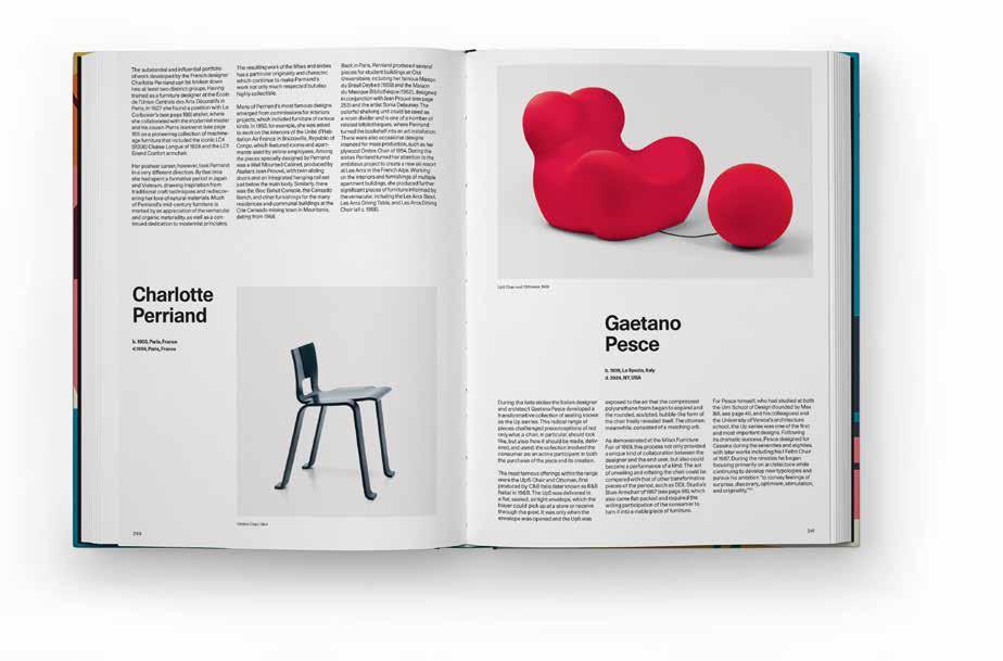
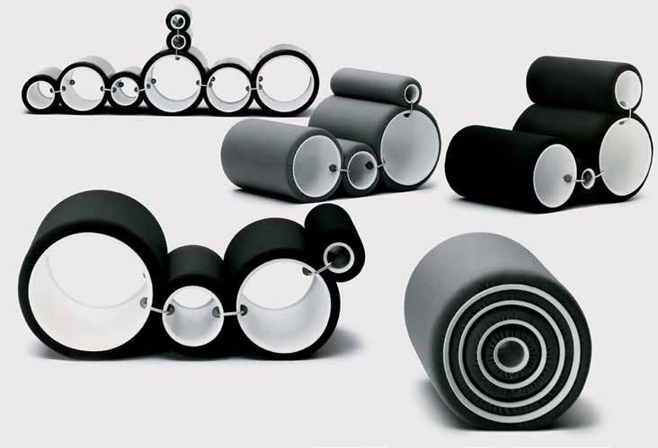
Top A spread showing: Ombre Chair, 1954, by Charlotte Perriand; and Up5 Chair and Ottoman, 1969, by Geatano Pesce. Above Tube Chairs, 1969, by Joe Colombo.
Studio Joe Colombo
Enter Stage Right
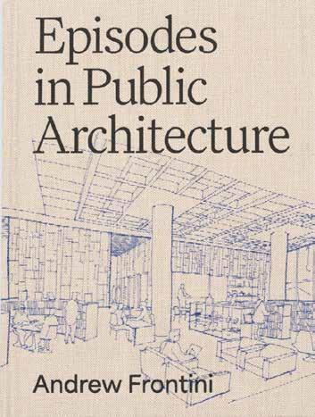
Andrew Frontini’s career at the Toronto branch of Perkins&Will, as seen through 11 projects.
In Episodes in Public Architecture, Andrew Frontini offers more than a monograph; he creates a reflective, richly annotated journey through a design career shaped by humility, theatre, and the pursuit of public meaning. Equal parts architectural autobiography and operational case study, the book delivers a necessary argument for the architect as both cultural protagonist and civic steward—a stance particularly resonant in today’s age of ethical ESG mandates and urban regeneration imperatives.
Published by ORO Editions with a clever production design and some typographic elegance, the book maps 11 significant projects over Frontini’s 30-year career with Perkins&Will, offering not just visual documentation but narrative essays, each a discreet “episode” revealing the personal, procedural, and philosophical layers beneath the built form. It’s a dual-format strategy that serves both the analytical executive and the design-savvy flâneur. The integration of hand sketches, construction anecdotes, and even moments of failure (“Fail Forward” being a chapter unto itself) creates an interestingly transparent architecture of ideas.
What distinguishes Frontini’s work—or at least how he presents them in this tome—is his framing of architecture as public theatre. Projects like the Nathan Phillips Square revitalization or the UTM campus master plan are not just civic spaces; they are stages of
democracy, calibrated for participation, confrontation, and human exchange. These are not performative in the pejorative sense but are performance-ready: open, flexible, and attuned to the unpredictable choreography of public life.
From a business leadership standpoint, the book can be read as a blueprint for adaptive practice. Frontini confronts the institutional inertia of legacy firms, the politics of client relations, and the generational shifts in architectural culture with welcome self-awareness and candour. His emphasis on mentorship, collaborative authorship, and the “slow absorption” of complexity should resonate with firm principals navigating change in a knowledgeintensive, stakeholder-driven environment.
For the reader interested in urban civility, design diplomacy, and the slow craft of place-making, Episodes is a tactile, intelligent companion. For those in the C-suite, it’s a reminder that great buildings aren’t just made of concrete and glass, but of narrative, empathy, and an ability to listen—qualities that define enduring institutions, not just architecture.
Above Episodes in Public Architecture by Andrew Frontini (ORO Editions, 2025)
By Lucy Mazzucco
Diving Deep
Installation invites visitors to recognize and wear their most vulnerable emotions for all to see.
For over 25 years, Toronto-based Blok Design has taken on projects that blend cultural awareness, the studio’s love of art, and its deep-rooted belief in humanity to advance society and business alike. “We believe design at its most potent should leave a lasting resonance that continues long after the initial encounter,” says Vanessa Eckstein, founder and creative director of Blok Design.
An example of the resonance she describes can be found in Feel Me, an exhibition at the Trapholt Museum for Modern Art and Design in Denmark, currently on display until December 31, that consists of artworks by 27 Danish and international artists and designers attempting to take audiences on a sensory and bodily journey into the realm of emotions. Blok’s contribution is a large-scale installation titled RÅW, and explores the ways in which emotion, technology and physiology intersect within contemporary art. According to Eckstein, RÅW is set against the backdrop of excessive exposure to overstimulation and demands on mental energy. Comprised of 24,840 individual pins with over 30 different emotions in both English and Danish, the installation encourages individuals to select a
pin that represents how they’re feeling. “It is an invitation to pause, and wear our most vulnerable emotions inside out,” says Eckstein. “Through the many interactions with the participants, the installation slowly deconstructs, as the pins are pulled off the walls, revealing the true emotional cartography through the spaces in-between.”
According to Eckstein, the installation exists as a passage between two spaces, which for Blok was the “perfect metaphor” for the concept of transformation. She explains that visitors’ first impressions are often overwhelmed by colour that overtakes all of one’s senses. Upon looking closer, however, what audiences discover is a much more nuanced experience with the pins highlighting an array of human emotions. “The feelings reflected in each pin create a dialogue between the colours themselves, as many emotions are those that we are often uncomfortable saying out loud. The words themselves are normally related to darker, duller tones,” says Eckstein. “We wanted the installation to reflect the fact that all of us can hold complex, even seemingly contradictory emotions simultaneously, and that in its essence, is the human experience.”
Kenneth Stjernegaard
SUMA COLLECTION
KITCHEN - PERSIAN WHITE
Architectural Shading, Engineered to Perfection since 1979
OUR SERVICES
Since 1979, Brading Specialty Shades has been the trusted partner for architects, designers, and luxury home builders across the GTA and cottage country. We specify, design, supply and install precision shading systems for both residential and commercial projects.
SIGNATURE PROJECTS
•50’ motorized curtain tracks for Massey Hall
•40’ x 23‘ motorized curtains at the Schwartz Reisman Auditorium, U of T
•300’ span of interior motorized shades for OLG Theatre, Niagara Falls
•Custom digitally imprinted motorized shades for the Ismaili Centre and Aga Khan Museum
• A significant number of luxury custom projects through a trusted network of home builders
•Customized shading design and engineering
•Precision supply and install of motorized and manual shading systems
•Expert installation for complex window applications
•Seamless integration with home automation and lighting systems
WHY CHOOSE BRADING
•46 years of industry-leading expertise
•Consistently ranked as Canada's top Lutron residential shade dealer