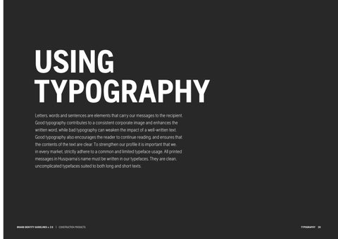
USING TYPOGRAPHY Letters, words and sentences are elements that carry our messages to the recipient. Good typography contributes to a consistent corporate image and enhances the written word, while bad typography can weaken the impact of a well-written text. Good typography also encourages the reader to continue reading, and ensures that the contents of the text are clear. To strengthen our profile it is important that we, in every market, strictly adhere to a common and limited typeface usage. All printed messages in Husqvarna’s name must be written in our typefaces. They are clean, uncomplicated typefaces suited to both long and short texts.
BRAND IDENTITY GUIDELINES v. 2.0 | CONSTRUCTION PRODUCTS
TYPOGRAPHY 26