6 minute read
LOGOTYPES

WORKING WITH THE LOGOTYPE
The logotype is the graphic image of our brand. It functions as a signature or a quality stamp, and guarantees that we meet our customers’ expectations. Therefore the logotype must be treated with the utmost respect and responsibility and have the same appearance throughout the world. The relationship between the size of the logotype and the surrounding area should be characterized by a balance between the demands of legibility and harmony. The logotype must never be used in body copy, nor in any way not shown in this manual.
LOGOTYPE VERSIONS
PORTRAIT LOGOTYPE
The primary logotype is the portrait version. It is used in all types of ads and on the front of printed materials and brochures. It is also used on store material, flags, vehicles, giveaways, etc.
LANDSCAPE LOGOTYPE
The landscape logotype should be used as a sender on the back cover of brochures and catalogues. It should also be used for narrow spaces where there is not enough space for the portrait logotype as well as on our website, vehicles, giveaways, etc.
BLUE AND WHITE
The Husqvarna logotype should be presented in blue on a white background or white on a blue background. The blue logotype should never appear on any other plain single-colour background than white. If exception is needed please contact global marketing for approval.
SILVER OR GREY
The Husqvarna logotype should be presented in blue on a silver or grey background.
BLACK AND WHITE
When colour printing isn’t possible, the logotype can also be shown as white on black or in black on white.
To ensure good reproduction, please observe the minimum reproduction size for the logotype, which is 10 mm for vertical and 23 mm for horizontal (in width).
Image bank
support.husqvarnacp.com
LOGOTYPE VERSIONS
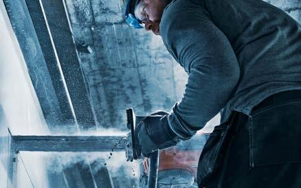
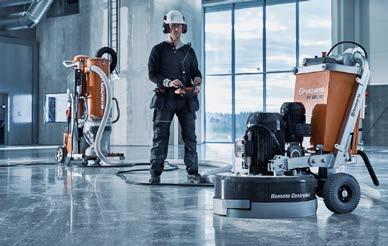
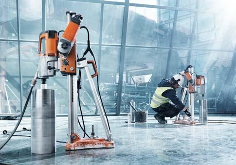
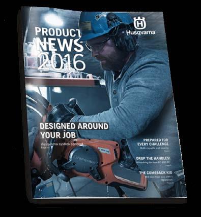
ACTION IMAGES
The logotype may also appear on action images, such as the examples shown. It is important not to place the logotype on too cluttered backgrounds. The Husqvarna logotype should be presented in white on a dark background.
ICON
In all digital units we use the logotype according to the guidelines, but in some cases that is impossible. That is when an avatar is used. An a vatar is a graphical representation of the brand in a digital context.
The most common use of the a vatar is as an icon. Either as a favicon on websites, or as an app icon. Since the avatar appears in very small sizes, the crown is used without the word “Husqvarna”.
Only in exceptional cases and only with the authorization of Central Marketing Communications may the crown be separated from the word “Husqvarna”.


LOGOTYPE FREE SPACE
To ensure readability and clarity of the logotype, it is always surrounded by free space. No text or other graphical elements may be placed within the logotype’s free space. The minimum free space is in direct proportion to the height of the letters in the logotype. Note that this is only the minimum free space; there is usually more free space around the logotype, as shown in the applications later on in this manual.
A REGISTERED TRADEMARK
The logotype is the graphic image of the Husqvarna brand. It is also a registered brand mark and to mark this, the use of the registration symbol ® is important. It provides notice of the owner’s registration of the mark. It entitles the owner to claim certain types of damages in lawsuits against infringers and it is a requirement in various countries.
EXCEPTIONS TO THE ® SYMBOL RULES:
–Where the symbol is molded or cast on the product (= not printed) –3D-logotypes –On buildings –Where the symbol is embroidered
PORTRAIT LOGOTYPE
Use the H in the crown (as shown) to define the free space around the logotype.
LANDSCAPE LOGOTYPE
Use the capital “H” in the name Husqvarna to define the free space around the logotype.
LANDSCAPE LOGOTYPE WITH WEB ADDRESS
Centre the web address and use Husqvarna Gothic Bold in 95% black. Use the height of the lower case letters in the logotype to set the free space.
BRAND, IDENTITY AND SENDER
THE HUSQVARNA BRAND
Husqvarna is a product brand for the construction business as well as the forest and garden business. In all communication regarding products and services, the brand should be referred to as Husqvarna. This applies for both text and logotype.
HUSQVARNA CONSTRUCTION PRODUCTS
When referring to our identity as business unit, in the absence of the logotype or when needed to avoid confusion, use the full expression “Husqvarna Construction Products” in text. Never write the shorter “HCP” in official material.
CONSTRUCTION PRODUCTS
The shorter expression “Construction Products” can be used when the logotype is visible so it will not be a repetition of Husqvarna. Or to clarify when the business is not obvious, as on a car for example.
husqvarnacp.com

husqvarnacp.com

INCORRECT USAGE
A logotype is a unique entity and should never be changed or recreated. The Husqvarna logotype is not only typed letters, but also a word mark, tailor-made for Husqvarna. The composition, appearance and proportions of the logotype shown in this manual are the only ones allowed.
It is essential that we always conduct ourselves uniformly and that our logotype always looks the same. Accordingly, never try to change or make your own version of the logotype.
Do not stretch or alter the proportions of the Husqvarna logotype in any way. Combining the logotype with another graphic element, such as a photo or an illustration, is not permissible. Never attempt to create the Husqvarna logotype by yourself. Always use an original.
*Only in exceptional cases and only with the authorization of Central Marketing Communications may the crown be separated from the word “Husqvarna”.
EXAMPLES OF INCORRECT LOGOTYPE USAGE:
Never use coloured backgrounds for the blue logotype. If necessary, use the black logotype. Do not use shadows or any other graphic techniques.
The white logotype should never be used on silver/grey.
Never change the design of the logotype. Never change the type design in the logotype. It is an entity.
Never separate the crown from the word “Husqvarna”.*
OTHER LOGOTYPES
Creating logotypes for different features, projects, units or departments is not permissible. If there is a need to create a logotype, it must be approved by Central Marketing Communications.
But there are a few logotypes for product features, as shown here. These are used together with products to enhance communication of the feature. They can be used in ads, catalogues and display material, as well as on labels and packaging.
FREE SPACE
To ensure readability and clarity of a logotype, it is always surrounded by free space. Respect the logotype and don’t place text or other graphical elements too close to it.
BLUE AND WHITE
The logotypes should be presented in blue on a white background or white on a blue background. The logotypes should never appear on any other plain single-colour background than the blue. However they can appear on an action image.
SILVER
The logotypes should be presented in blue on a silver background.
Image bank
support.husqvarnacp.com
UPSERVICES LOGOTYPES
Husqvarna UpServices is a collection of soft offers and services that’s under development. One part of UpServices is Husqvarna UpTool, which is a suite of mobile applications targeting different users ranging from service mechanics to operators.
UPSERVICES LOGO WITH HUSQVARNA LOGO LOGOTYPES WITH ICONS