CONCEPT TWO DWELLING CONSTRUCTION, INC.

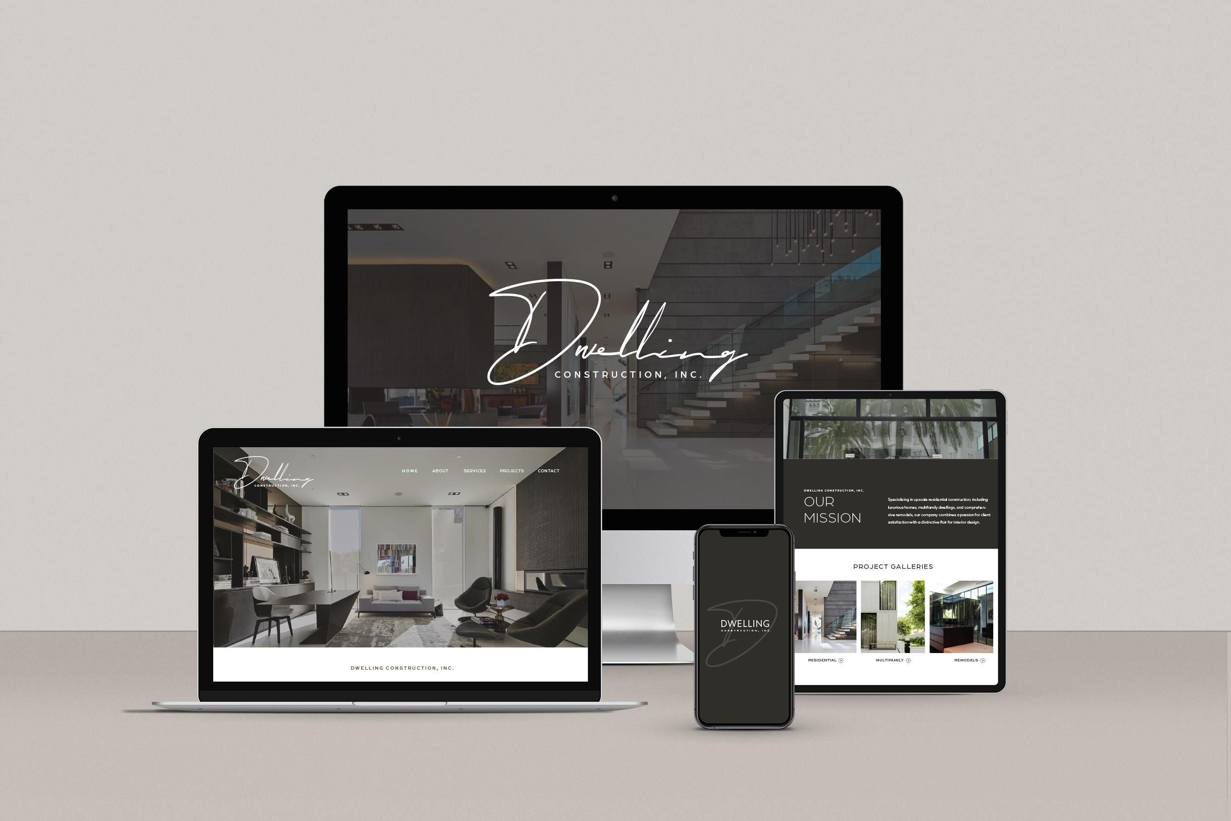


CONCEPT TWO DWELLING CONSTRUCTION, INC.



Dark background
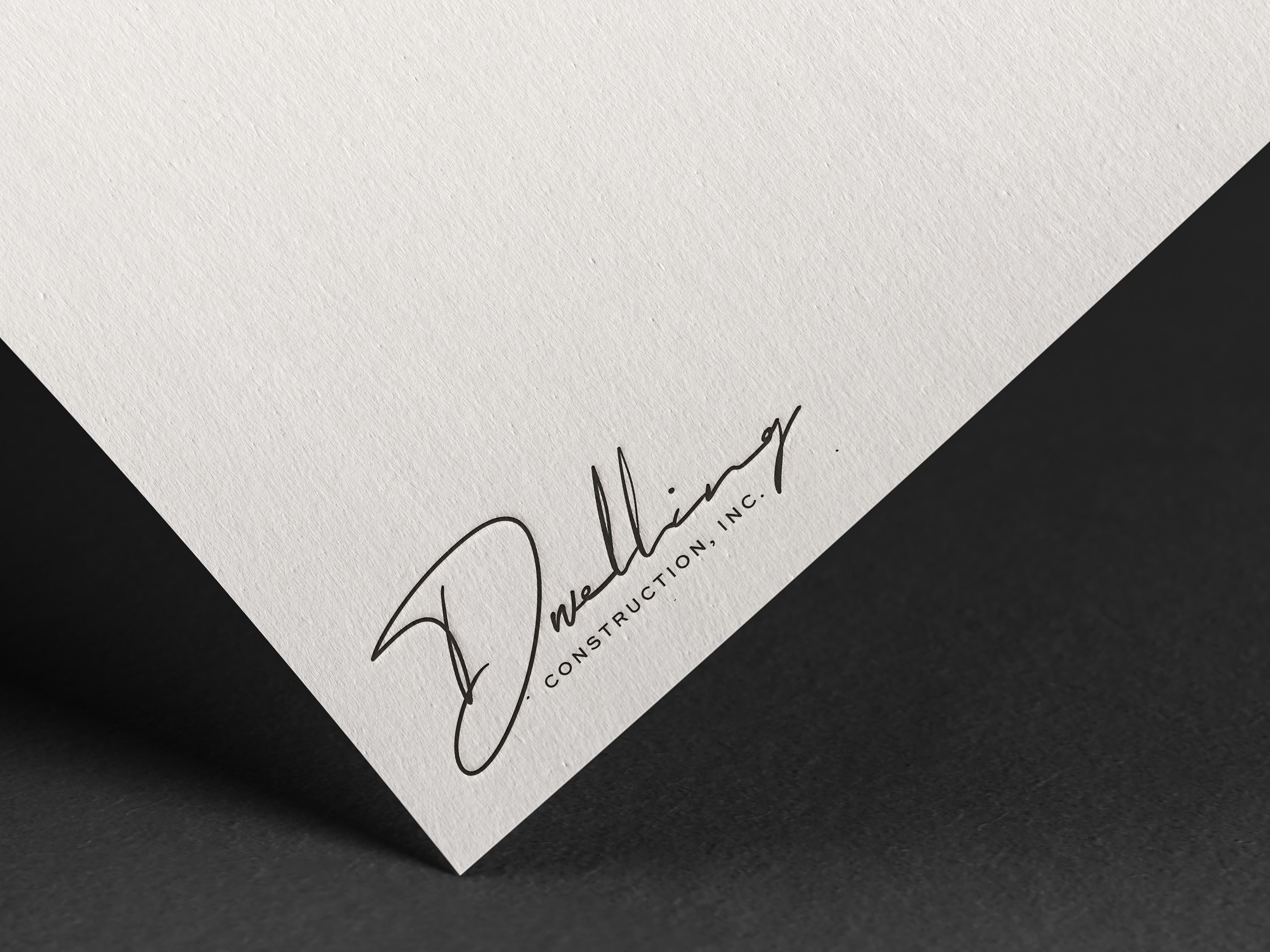
Inspired by the personal journey of the founder, Dwelling Construction’sv logo suite features a unique, hand-lettered signature, communicating the elevated, unique, and synergistic build and design principles of the business.
Designed to lean masculine, providing an edgy while refined feel, paired with a timeless all-caps secondary typeface, our logo suite exudes luxury and professionalism.
Communicating the bespoke and rare experience that sets Dwelling apart, approaching construction with both the build and the design in mind, our signature logotype serves as a symbolic quality stamp, reminiscent of how an artist signs their work.
Our script mark may be used as our primary logo, or alternatively be used at 10% opactity as a background element with a minimalist, sans-serif wordmark treatment as a secondary logo.
A refined, edgy, while personalized presence has been developed that captures the journey of Dwelling and its founder, providing a nod to the past while representing the journey and growth into the future.
SECONDARY
CONSTRUCTION, INC.
WORDMARK - SIGNATURE
CONSTRUCTION, INC.
BRAND MARK
CONSTRUCTION, INC.
Inspired by the personal journey of the founder, Dwelling Construction’s logo suite features a unique, hand-lettered signature, communicating the elevated, unique, and synergistic build and design principles of the business.
Designed to lean masculine, providing an edgy while refined feel, paired with a timeless all-caps secondary typeface, our logo suite exudes luxury and professionalism.
Communicating the bespoke and rare experience that sets Dwelling apart, approaching construction with both the build and the design in mind, our signature logotype serves as a symbolic quality stamp, reminiscent of how an artist signs their work.
Our script mark may be used as our primary logo, or alternatively be used at 10% opactity as a background element with a minimalist, sans-serif wordmark treatment as a secondary logo.
A refined, edgy, while personalized presence has been developed that captures the journey of Dwelling and its founder, providing a nod to the past while representing the journey and growth into the future.

SECONDARY
CONSTRUCTION, INC.
WORDMARK - SIGNATURE
CONSTRUCTION, INC.
BRAND MARK
CONSTRUCTION, INC.
TYPOGRAPHY
The primary headline font family that should be used in all marketing and communication materials for Dwelling Construction is Montserrat, providing a clean, minimalist, elevated feel, balancing the script elements of the brand. The subheadline font family that should be used is Montserrat, a clean, professional, and timeless sans-serif. The Paragraph font family that should be used in materials for Dwelling is Mulish. Bespoke script elements may be utilzed occasionally to act as a signature element (ie, to sign founders name, perhaps to title a project, etc.) These families used in combination present Dwelling Construction in a professional, elevated, and innovative light.
TITLE CHARACTER STYLES:
Montserrat
TYPOGRAPHY IN USE EXAMPLE:
HEADLINE TWO
Lorem ipsum dolor sit amet, consectetuer adipiscing elit, sed diam nonummy nibh euismod tincidunt ut laoreet dolorev magna aliquam erat volutpat. Ut wisi enim ad minim veniam, quis nostrud exerci tation ullamcorper suscipit lobortis nisl ut aliquip ex ea commodo consequat. Duis autem vel eum iriure dolor in hendrerit in vulputate velit esse
H1
ABCDEFGHIJKLMNOPQRSTUVWXYZ
abcdefghijklmnopqrstuvwxyz
123456890
Montserrat Light or Regular, All Caps Tracking should be set to 0
H2 SUBHEADLINE
Montserrat medium - semi-bold. All caps. Tracking should be set between +150 and +250.
ABCDEFGHIJKLMNOPQRSTUVWXYZ
123456890
BODY CHARACTER STYLE:
AaMulish
ABCDEFGHIJKLMNOPQRSTUVWXYZ
abcdefghijklmnopqrstuvwxyz
123456890
Paragraph
Mulish - Regular
Tracking should be set to 0 and no more than +35.
The color palette of Dwelling Construction has been inspired by the foundation of the building and design elements of the business, creating a balanced color palette of deep complimnetary color to Dwelling’s core red. Our brand red, Oxblood, provides an elevated nod to the orignal color palette of dwelling contruction, balanced by deep neutrals. These colors should be used for all communication to ensure a consistent design scheme is maintained. Our deep while desaturated palette provides a bold, powerful, edgy while luxurious presence.
The Dwelling Construction brand and background elements have been developed from our brand mark, creating cohesion and depth throughout brand materials. Our brand signature mark may be used throughout brand materials as a background and overlay element, creating depth and cohesion without distraction through its watermark effect. Our brand elements should alwy may be used between 7%-12% opacity as background element or overlay, creating a signture effect overlaid over photos. Pattern and background elements should always be complementary within a design system, and never the primary focus of print or digital collateral. Avoid using signature overlay and primary signature logo on the same page.


