BRAND GUIDELINES
PRIMARY - VERTICAL
WORDMARK - VERTICAL
WORDMARK - ALT
ESTATE
ESTATE
PRIMARY - HORIZONTAL
WORDMARK - HORIZONTAL
ESTATE
BRAND MARK
ESTATE
The primary headline font family that should be used in all marketing and communication materials for Chase Pope Real Estate is Arsenal, providing a minimalist while masculine, elevated feel. The subheadline font family that should be used is Wix Madefor Display, a clean, minimalist stucture, providing balance when paired with the headline font family. The Paragraph font family that should be used in materials for Chase Pope Real Estate is Jost. These families used in combination present Chase Pope Real Estate in a professional, elevated, and minimalist light.
TITLE CHARACTER STYLES:
Arsenal
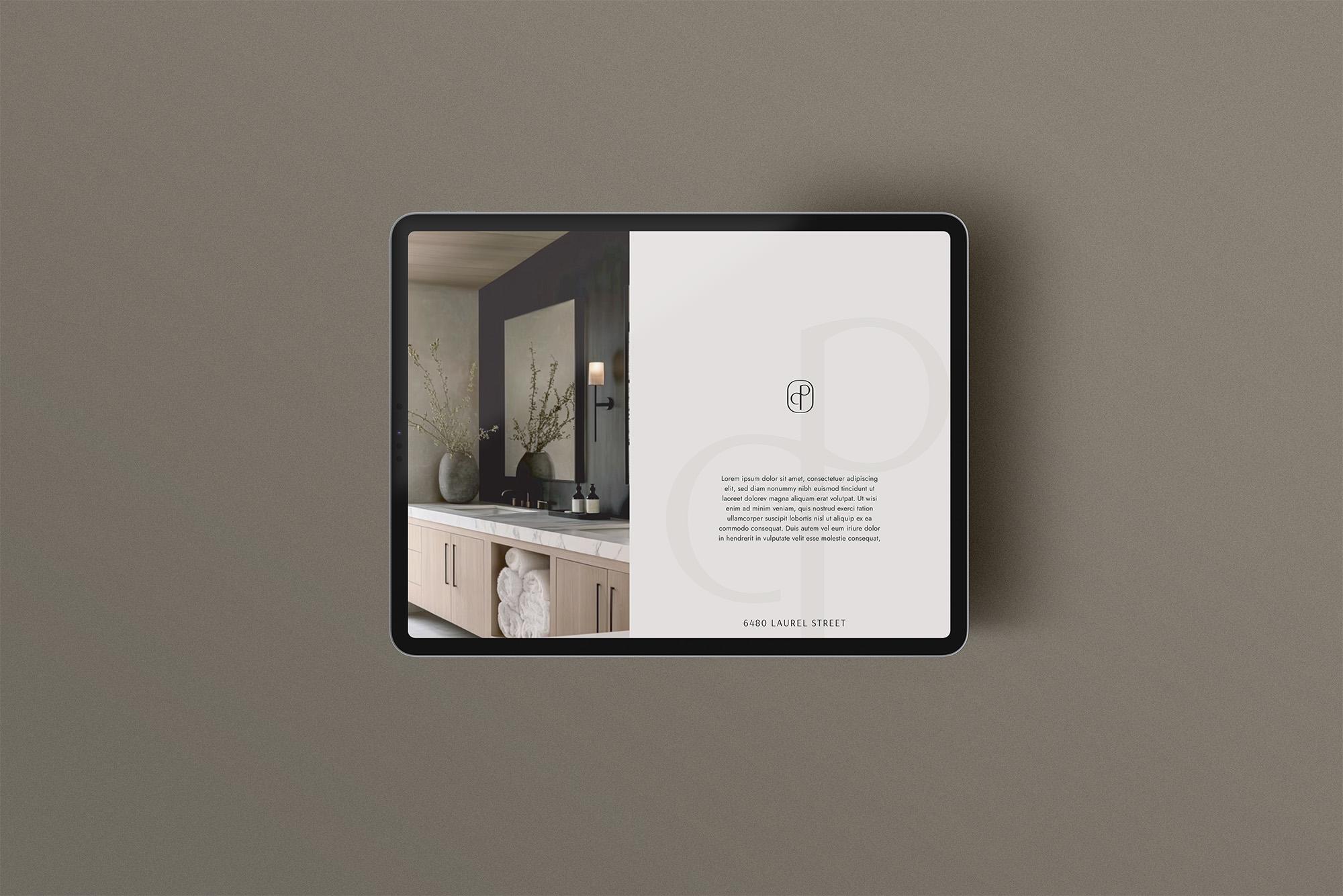
TYPOGRAPHY IN USE EXAMPLE:
HEADLINE TWO
PRIMARY HEADLINE
Lorem ipsum dolor sit amet, consectetuer adipiscing elit, sed diam nonummy nibh euismod tincidunt ut laoreet dolorev magna aliquam erat volutpat. Ut wisi enim ad minim veniam, quis nostrud exerci tation ullamcorper suscipit lobortis nisl ut aliquip ex ea commodo consequat. Duis autem vel eum iriure dolor in hendrerit in vulputate velit esse molestie consequat,
AaABCDEFGHIJKLMNOPQRSTUVWXYZ
abcdefghijklmnopqrstuvwxyz
123456890
HEADLINE ONE
Arsenal, Title Case
Tracking should be set between 75-150pt
SUBHEADLINE
Wix Madefor Display - medium - semi-bold. All caps. Tracking should be set between +150 and +250.
ABCDEFGHIJKLMNOPQRSTUVWXYZ
123456890
BODY CHARACTER STYLE:
AaParagraph
Jost
ABCDEFGHIJKLMNOPQRSTUVWXYZ
abcdefghijklmnopqrstuvwxyz
123456890
Jost Regular
Tracking should be set to 0 and no more than +35.


