

Light background
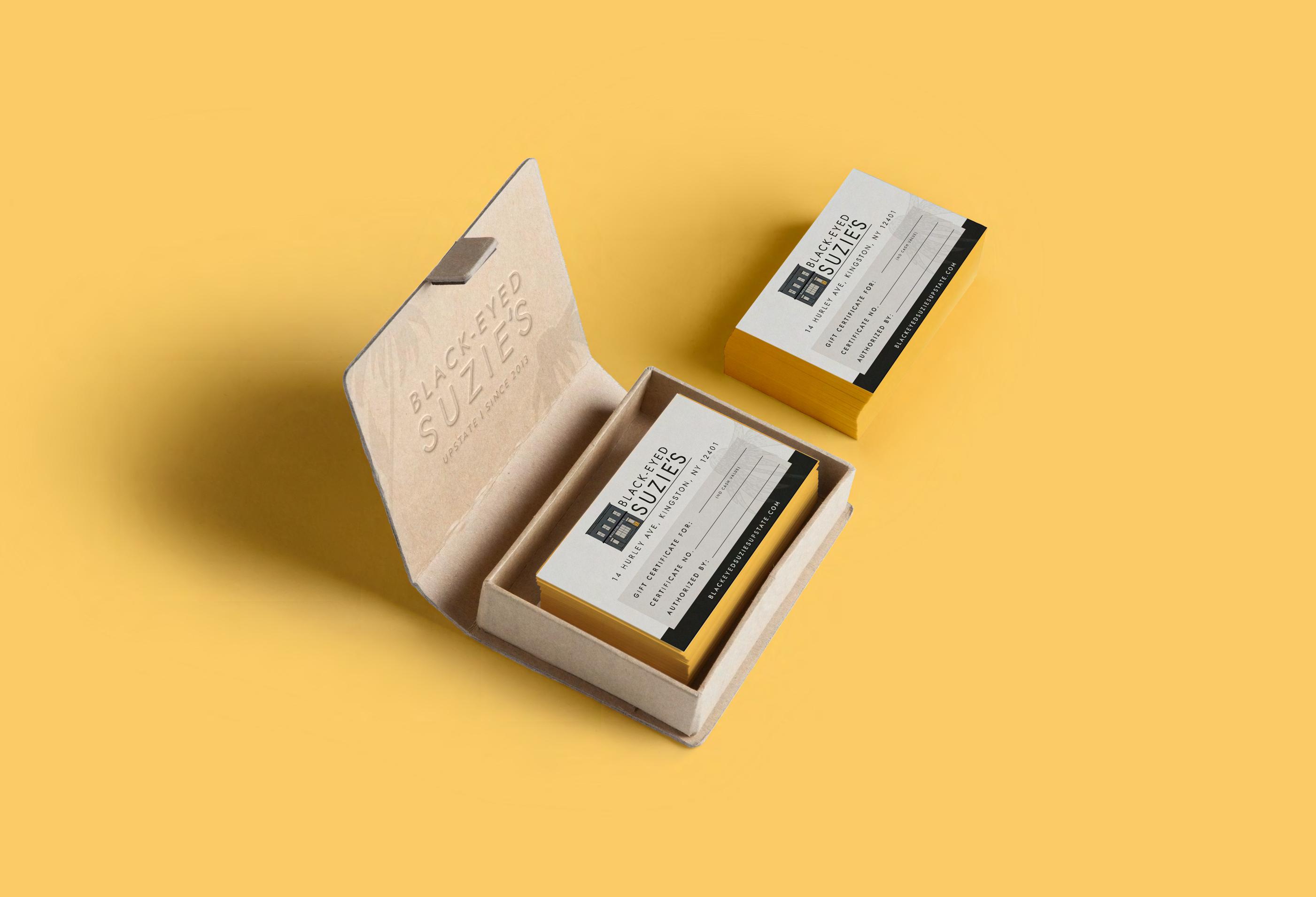
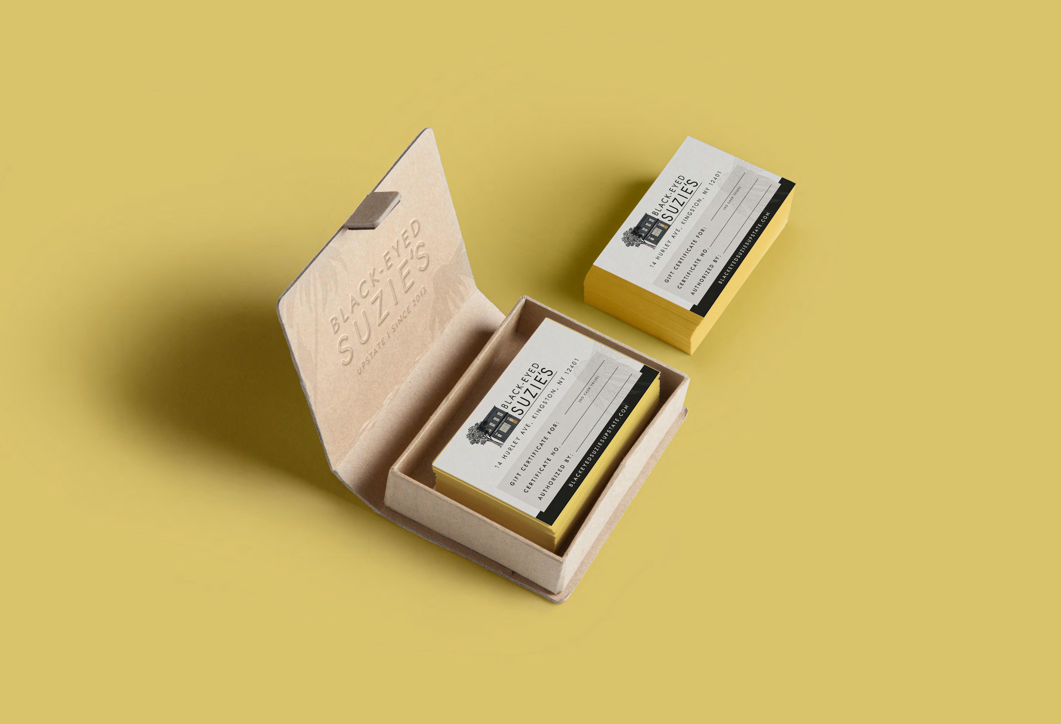
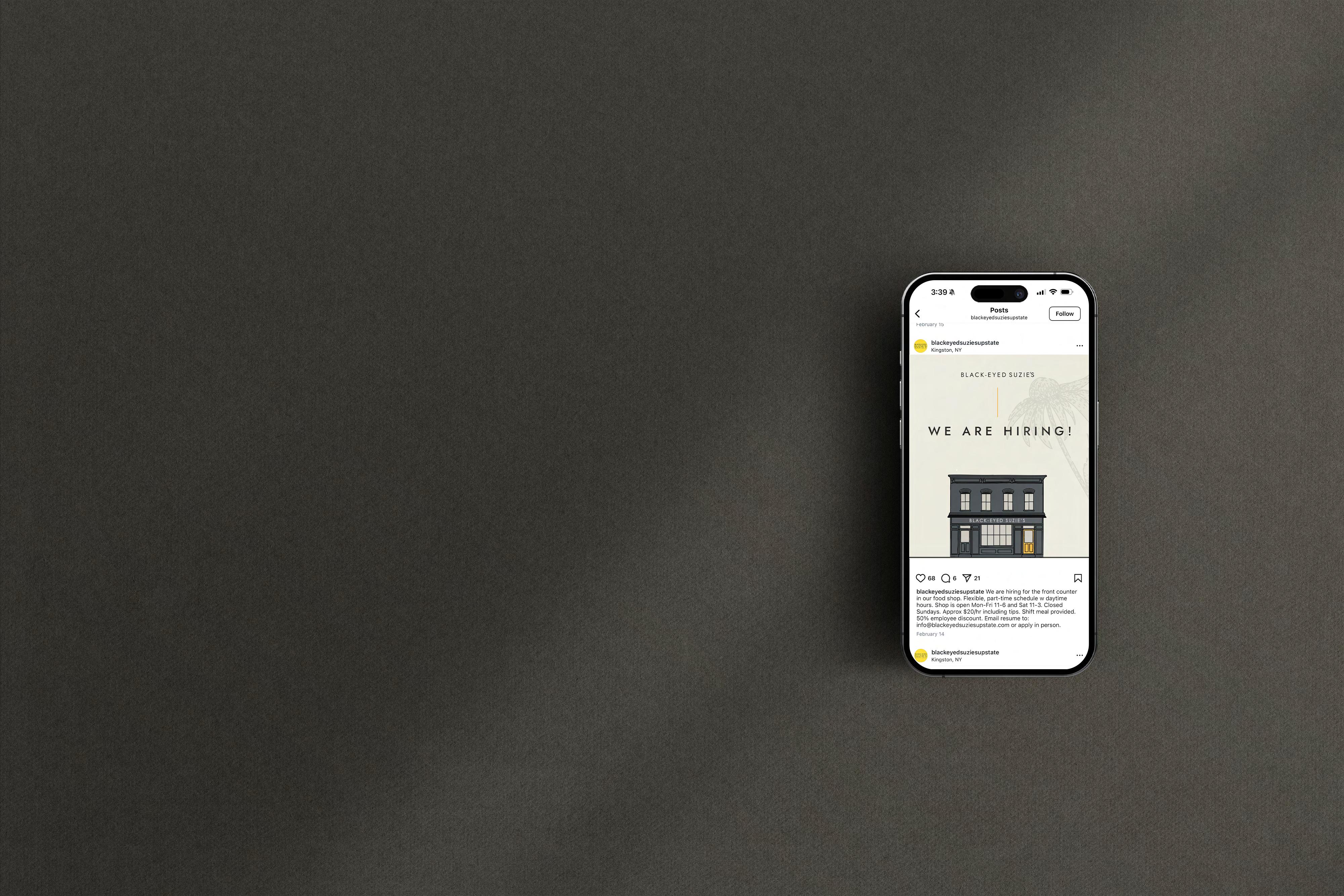
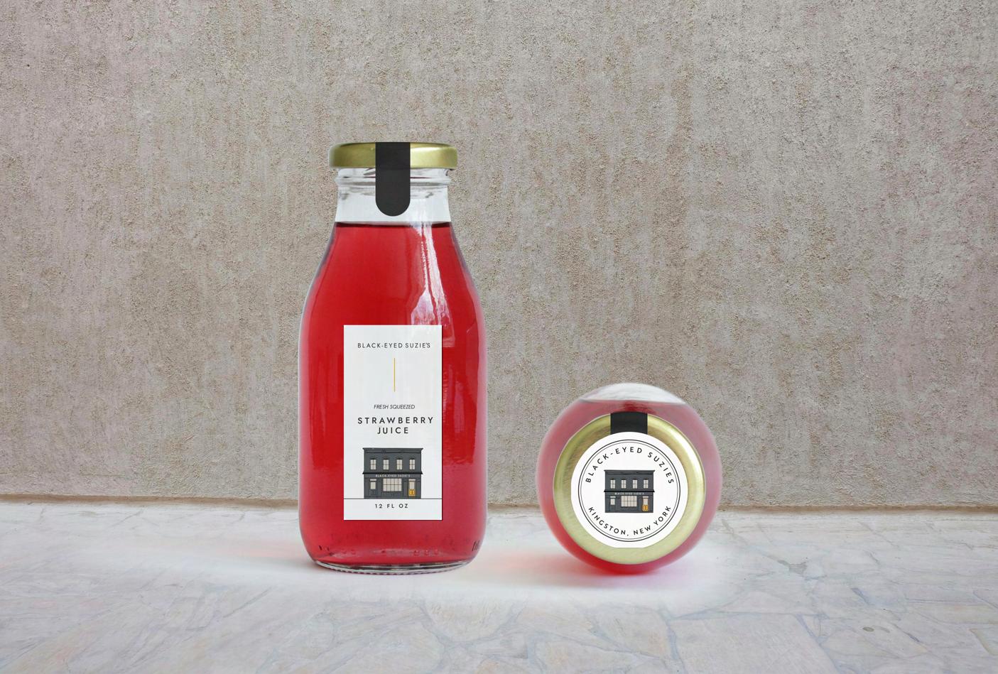
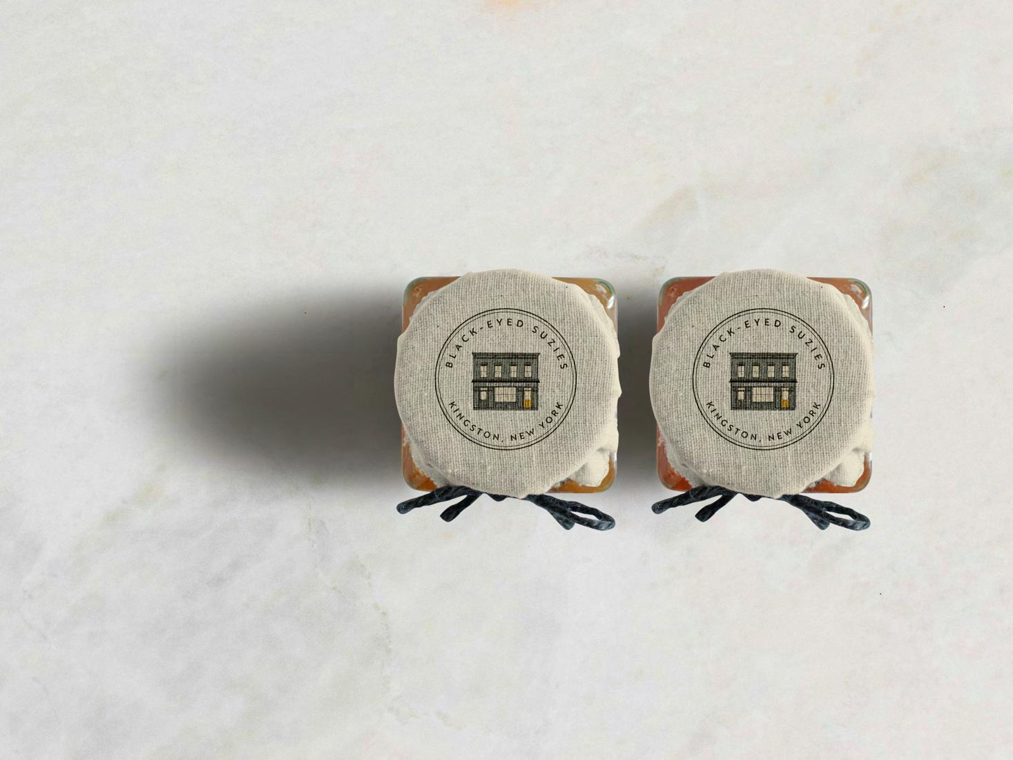
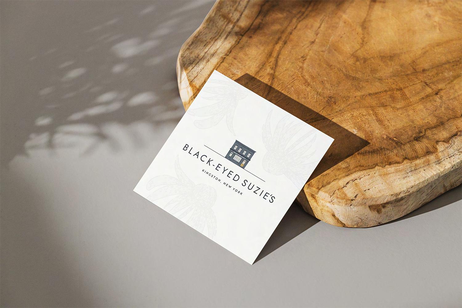
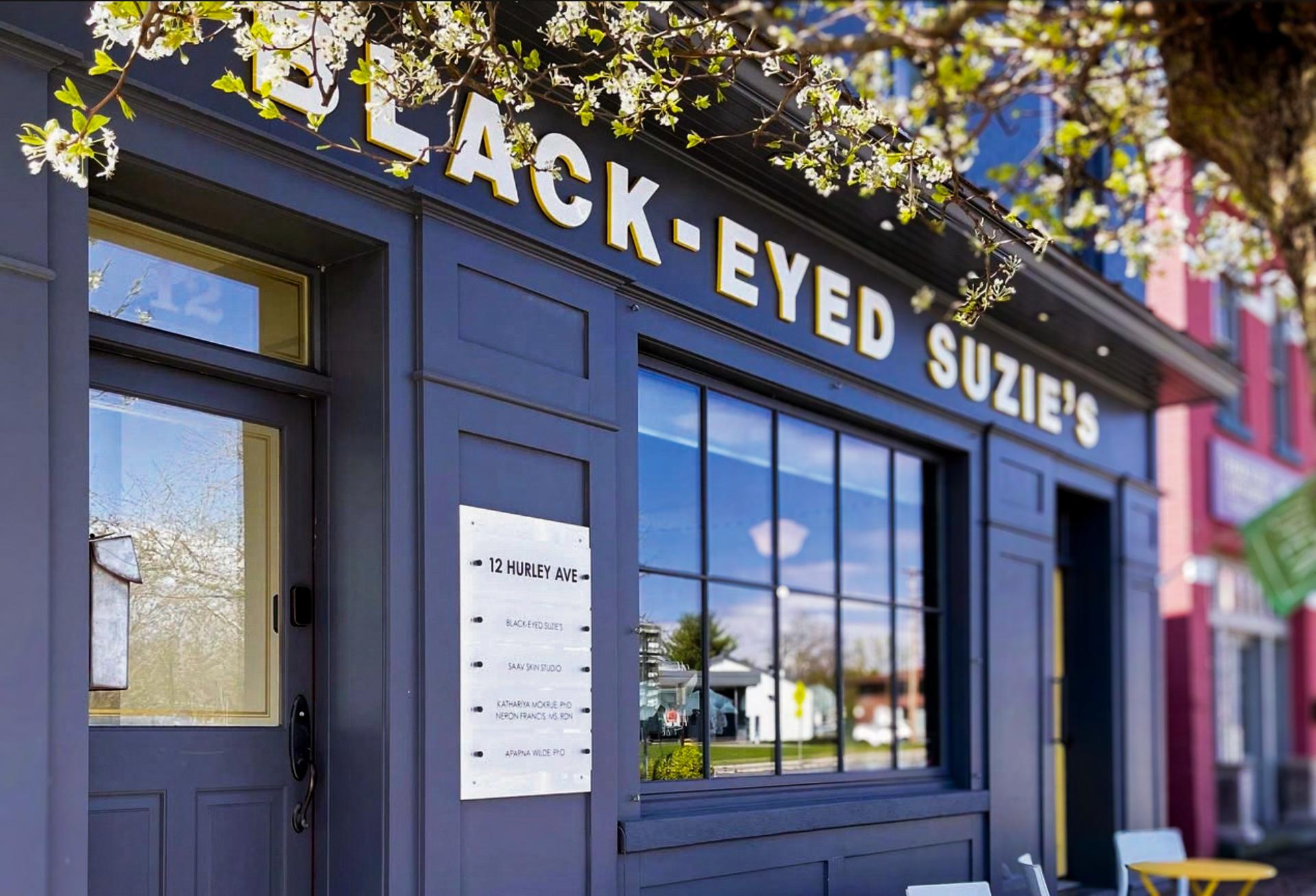
Drawing inspiration from the original footprint of Black-Eyed Susie’s, our refreshed logo suite honors its architectural origins while introducing a renewed sense of identity. The illustrative building mark remains central— slight adjustments have been made to the building itself, such as less contrast between the building and windows for a softer, more realistic feel, combined with updated sign typeface to create cohesion with the wordmark.
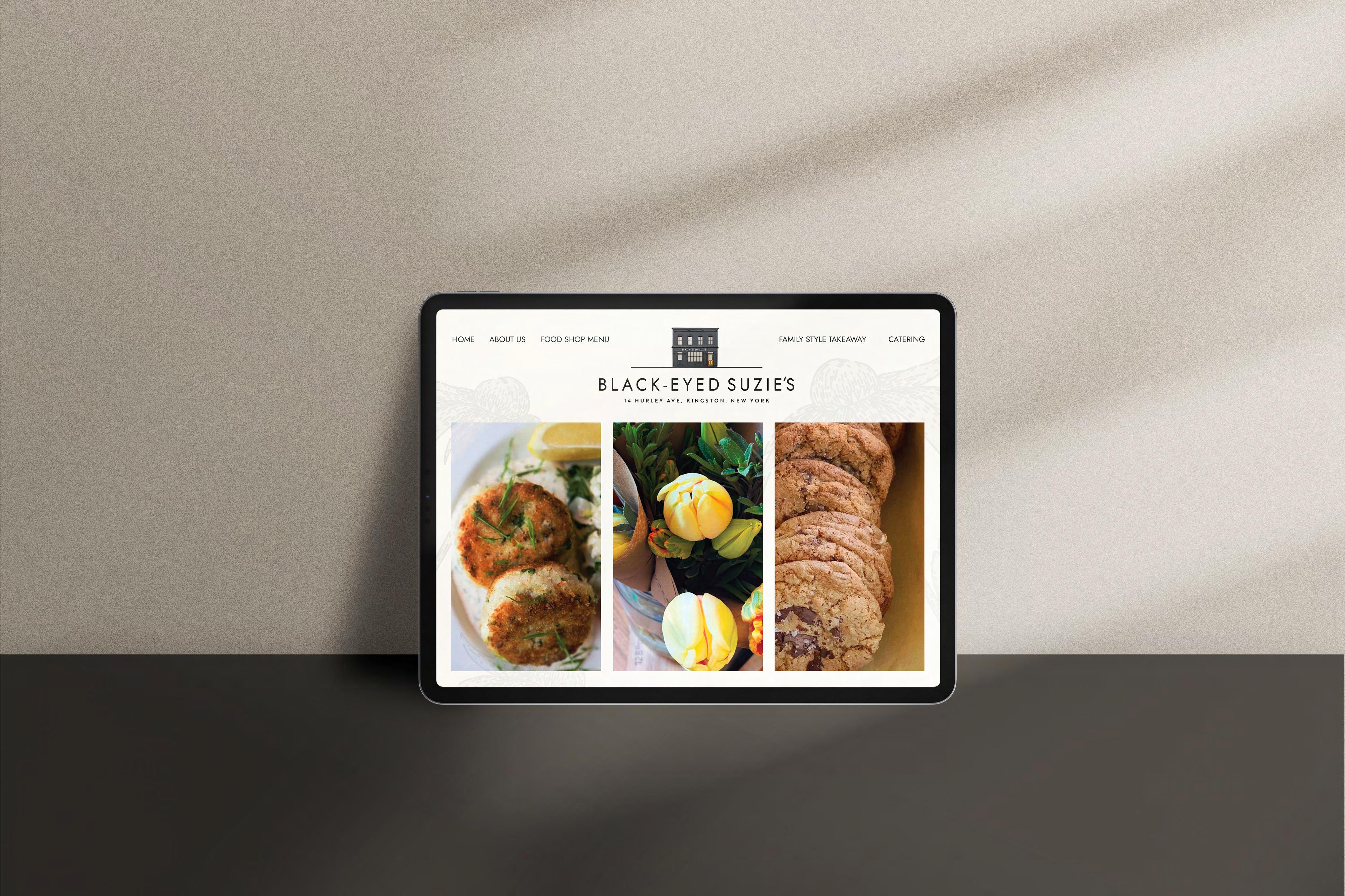
Further evolving the brand's presence, we’ve introduced multiple compositions—ranging from primary, secondary, and vertical compositions, as well as brand marks— offering versatility across digital and print. The simple yellow brand mark may be used with, or without, the flower background element for depth. Typography has been thoughtfully recomposed to a modern, all-caps typeface, customized with subtly rounded edges, softening the tone while preserving sophistication.
The history of the brand has been preserved through its original flower illustration logo, while refining with updated typography and color palette.
These elements collectively provide a contemporary, welcoming, and enduring expression that supports the brand, now and into the future.
Dark background
A line-drawn variation of the building mark has been developed for use on dark backgrounds, allowing the original black structure to remain visible through the light illustration lines—offering both visual clarity, continuity, and an elevated, artful touch.
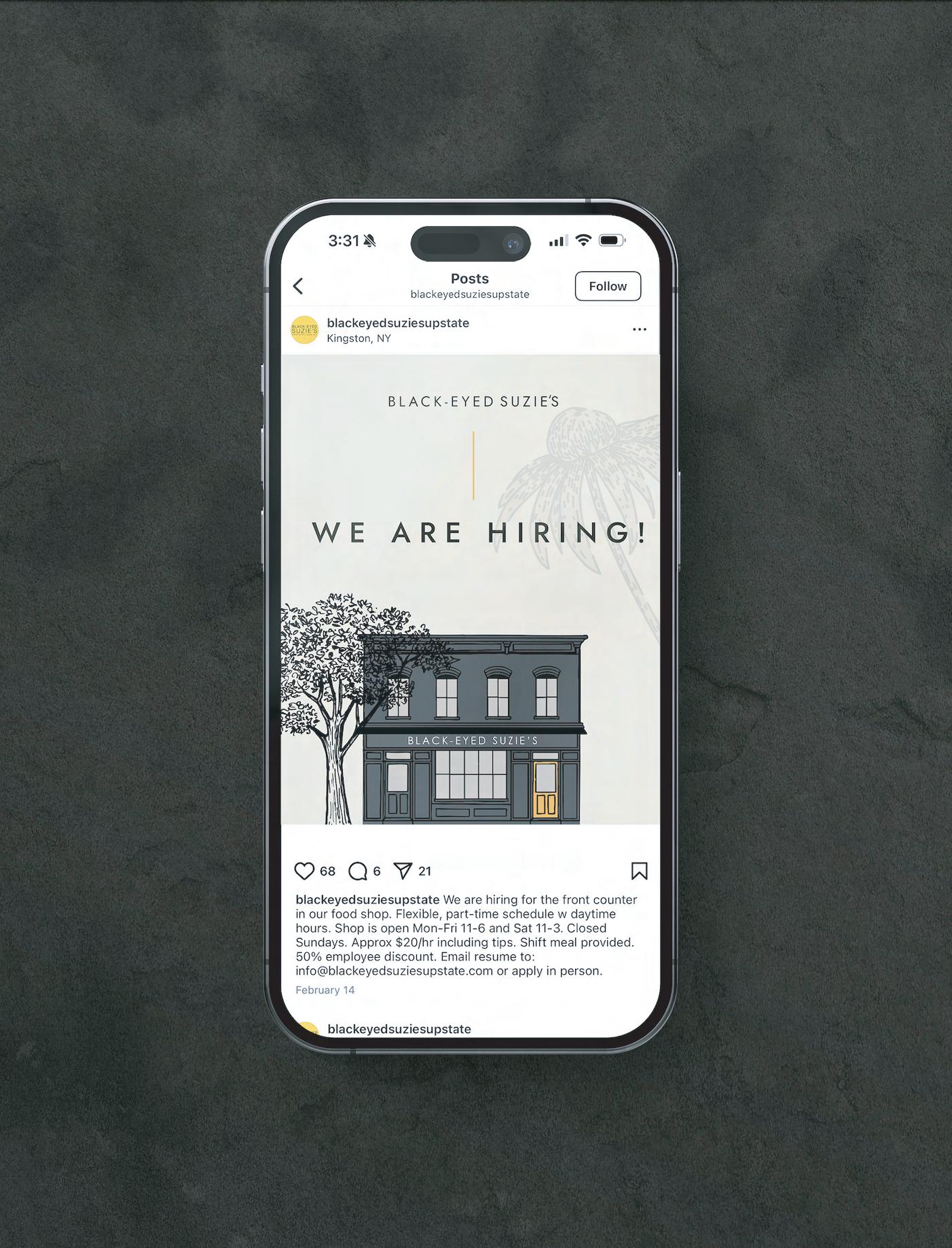
The headline font family that should be used in all marketing and communication materials for Black-Eyed Susie’s is Jost; clean and modern, providing a well-balanced presence combined with the artisitic elements of the brand. All-caps usage and thoughtful character spacing provide breath and personality to brand collateral. The Paragraph font family that should be used in materials for Black-Eyed Susie’s is Mulish. These families used in combination create a modern, clean, while inviting presence throughout Black-Eyed Susie’s brand materials.
TYPOGRAPHY IN USE EXAMPLE:
HEADLINE TWO
Lorem ipsum dolor sit amet, consectetuer adipiscing elit, sed diam nonummy nibh euismod tincidunt ut laoreet dolorev magna aliquam erat volutpat. Ut wisi enim ad minim veniam, quis nostrud exerci tation ullamcorper suscipit lobortis nisl ut aliquip ex ea commodo consequat. Duis autem vel eum iriure dolor in hendrerit in vulputate velit esse
TITLE CHARACTER STYLES:
Jost
ABCDEFGHIJKLMNOPQRSTUVWXYZ
abcdefghijklmnopqrstuvwxyz
123456890
Jost, Title Case Tracking should be set to 0
SUBHEADLINE
Jost Regular - semi-bold. All caps. Tracking should be set between +150 and +250.
BODY CHARACTER STYLE:
Mulish
ABCDEFGHIJKLMNOPQRSTUVWXYZ
123456890 abcdefghijklmnopqrstuvwxyz
Paragraph
Mulish - Regular Tracking should be set to 0 and no more than +35.
The Black-Eyed Susie’s color palette is rooted in the warm earth tones of its namesake ower, drawing inspiration from its natural richness and warmth. These hues are complemented by grounded neutrals, creating a balanced and uplifting visual language. The palette re ects the brand’s approachable yet elevated spirit, and should be used consistently across all communications to ensure a cohesive and recognizable identity.
HEX: f9f8f7
R: 249 G: 248 B: 247
C:2 M:1 Y:2 K:0
HEX: eae7dd
R: 234 G: 231 B: 221 C:7 M:6 Y:12 K:0
HEX: f0b847
R: 240 G: 184 B: 71
C:5 M:29 Y:83 K:0
HEX: be7e2a
R: 190 G: 126 B: 42 C:23 M:53 Y:100 K:6
HEX: 733617
R: 115 G: 54 B: 23
C:34 M:79 Y:100 K:42
HEX: 3b7458
R: 59 G: 116 B: 88 C:78 M:34 Y:72 K:19
HEX: 4e5552
R: 78 G: 85 B: 82 C:67 M:54 Y:58 K:33
HEX: 302e2b
R: 48 G: 46 B: 43
C:67 M:63 Y:66 K:64
As a subtle homage to the original Black-Eyed Susie’s bouquet logo, illustrated black-eyed susan motifs are woven throughout brand materials to add cohesion, depth, and visual interest—without overwhelming the core design. These oral elements are intended to function as supportive accents, often used as soft background textures or overlays to create a light, watermark-like e ect. To maintain balance within the overall visual system, these illustrations should appear at 7%–12% opacity, implementing the illustrations without competing with primary brand elements. Flower element may be used behind wordmark to provide depth and visual interest. Pattern and background elements should always complement the design, reinforcing brand identity while allowing the lead components to shine.

UPSTATE | SINCE 2013