A Milanese Penthouse Channels an Old-World European Hotel · Simone
Milan Design Week
Salone del Mobile.Milano
Conversations with Studio KO, Lazzarini Pickering Architetti, Oki Sato, Benjamin Hubert, Eny Lee Parker and Ross Gardam
Haag Marks a Decade of Artemest
Milan Design Week 2025
Milanese Modernism P 88
Design Voices
Ross Gardam
116
Design Voices Benjamin Hubert
Design Voices
Lee Parker
Lazzarini Pickering
Architetti P 178
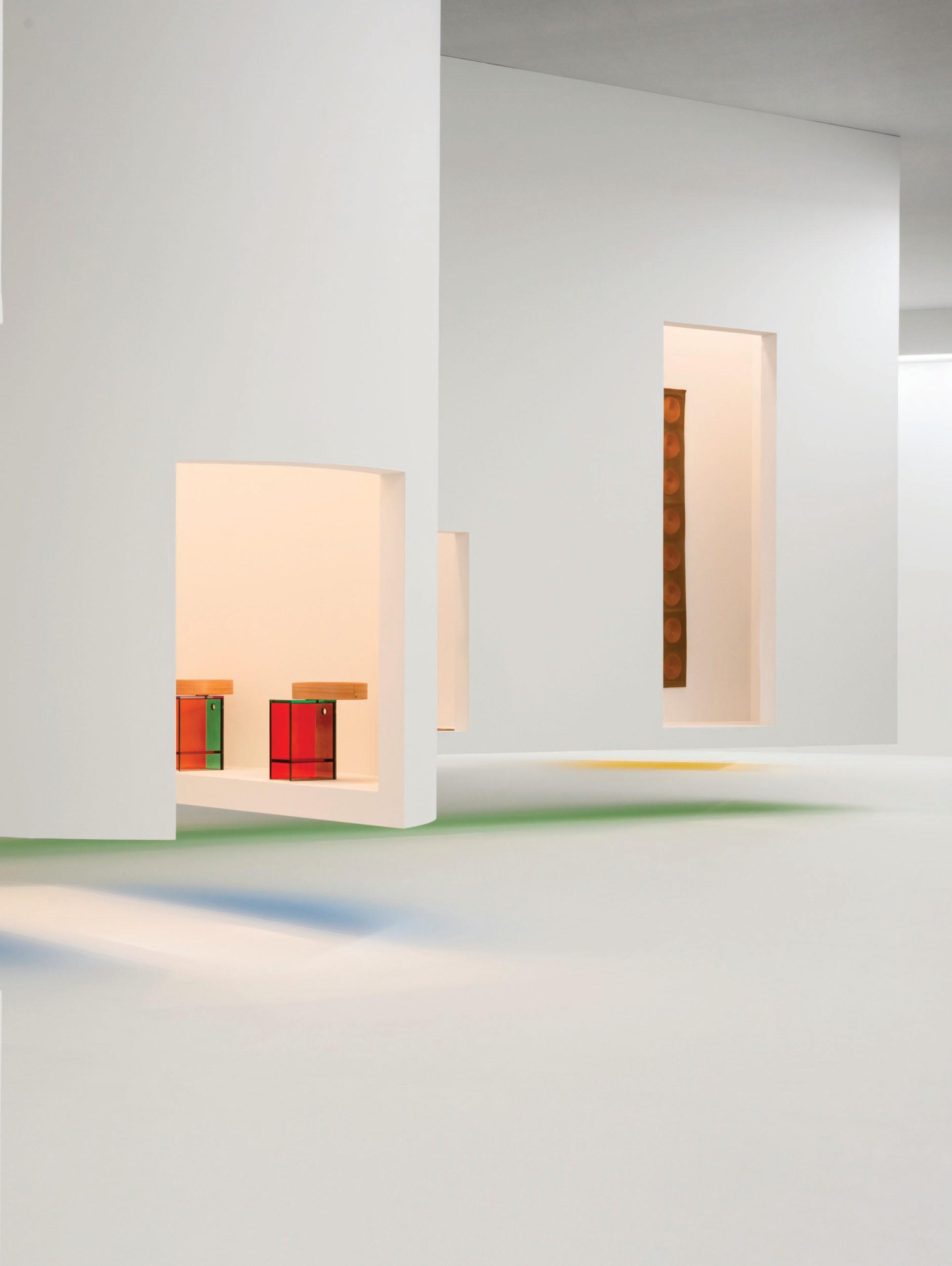
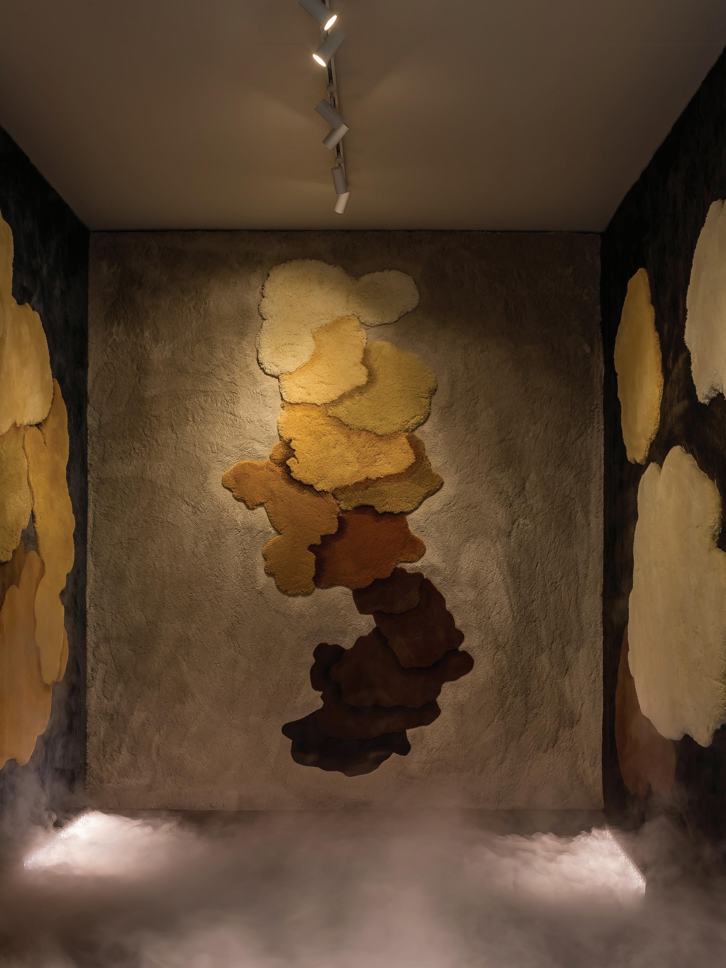
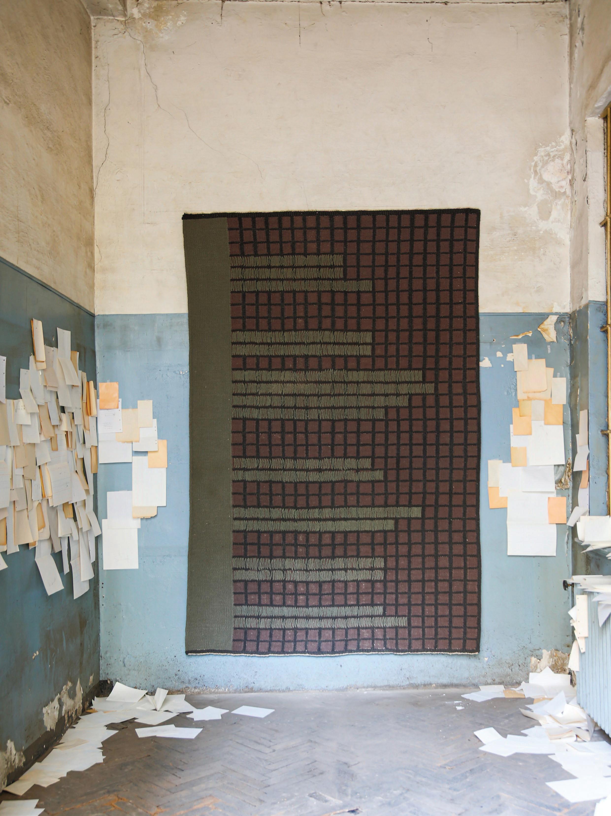
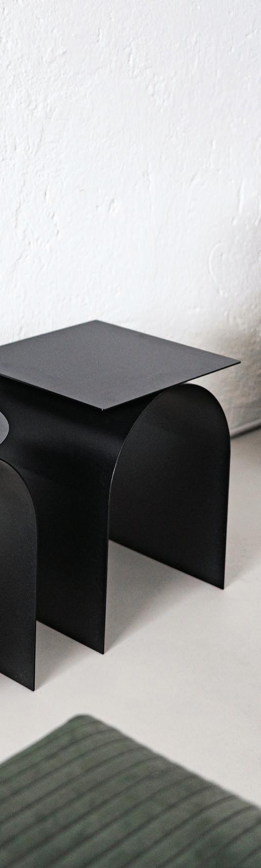
The Corridor Effect
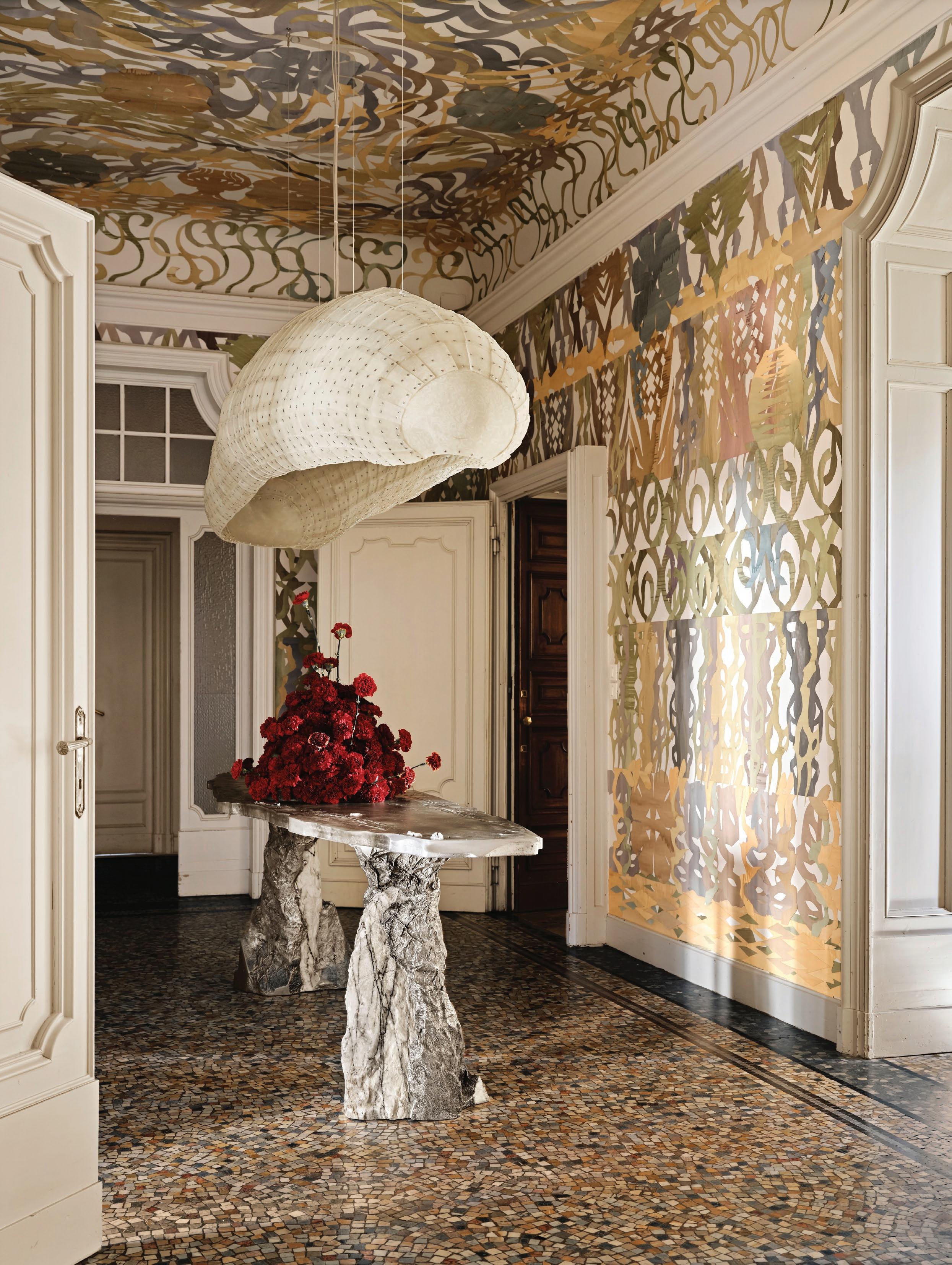
Reflections
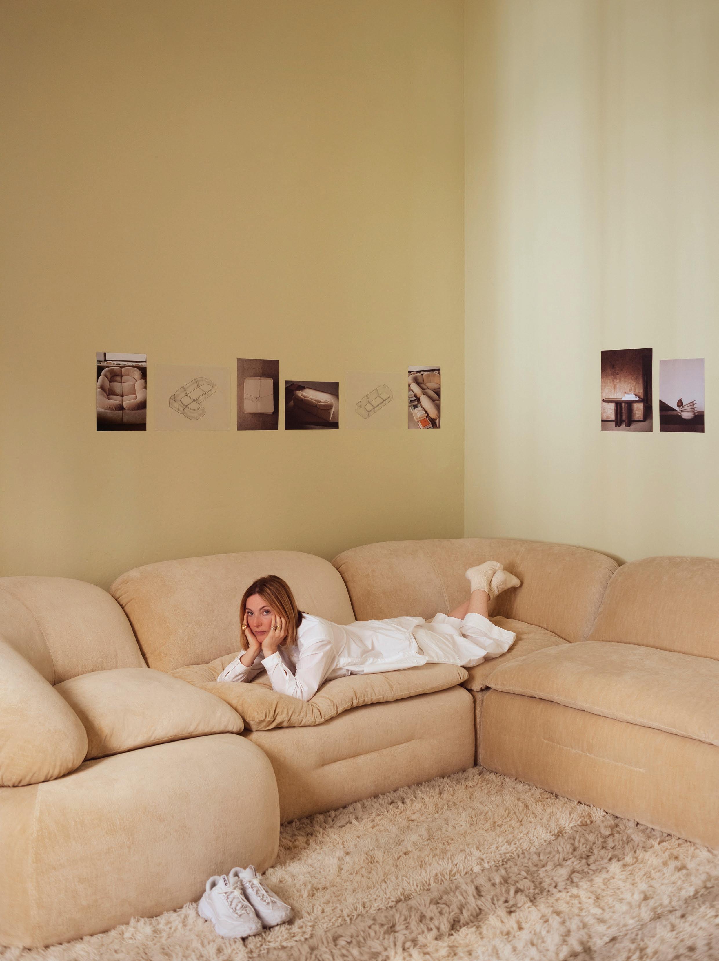
My Space
Tommaso Spinzi P 166
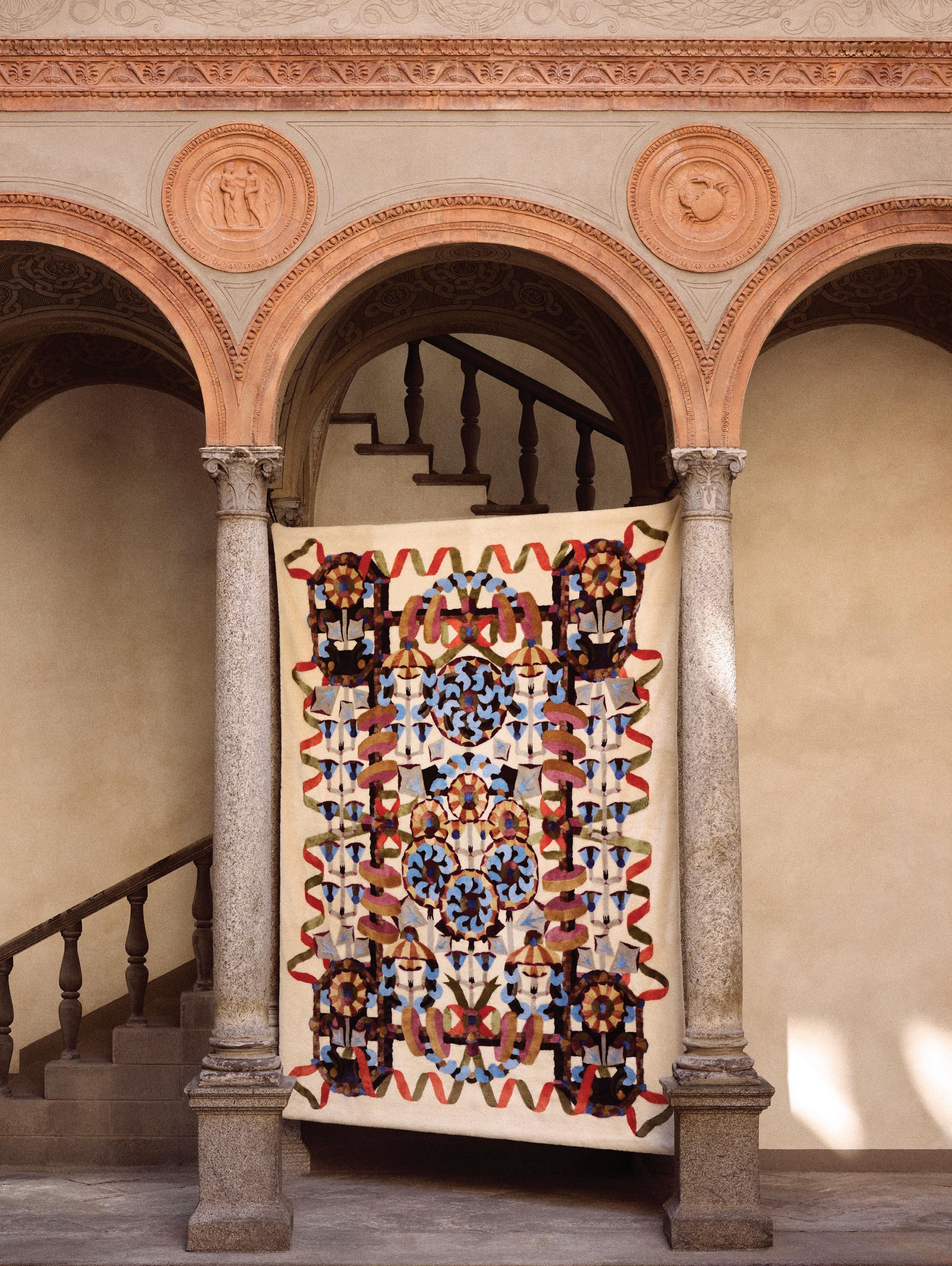
First Impressions
Editor's Letter
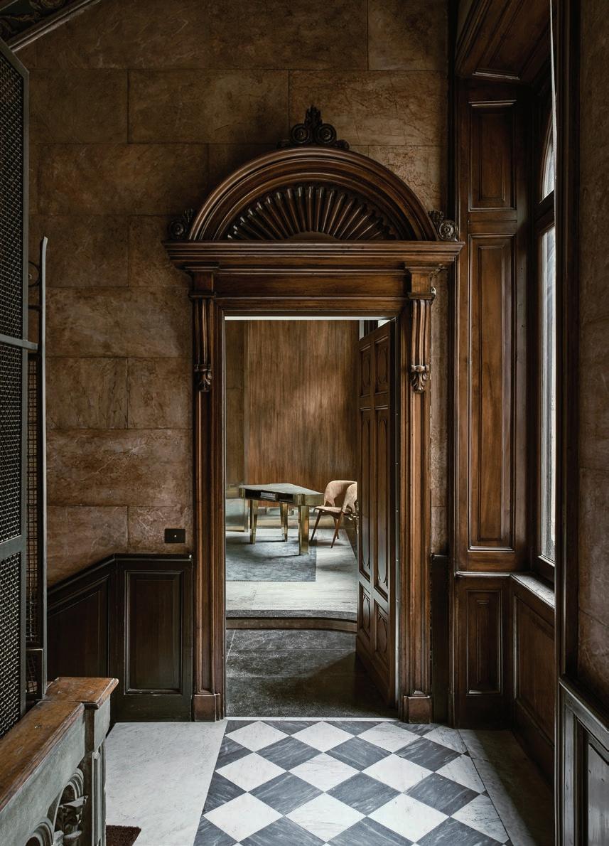
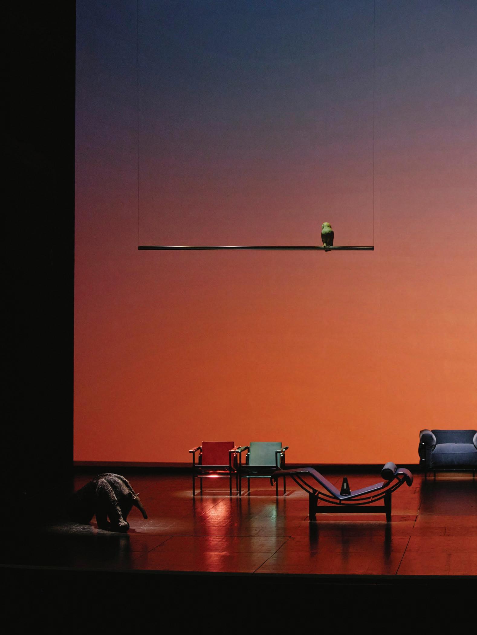
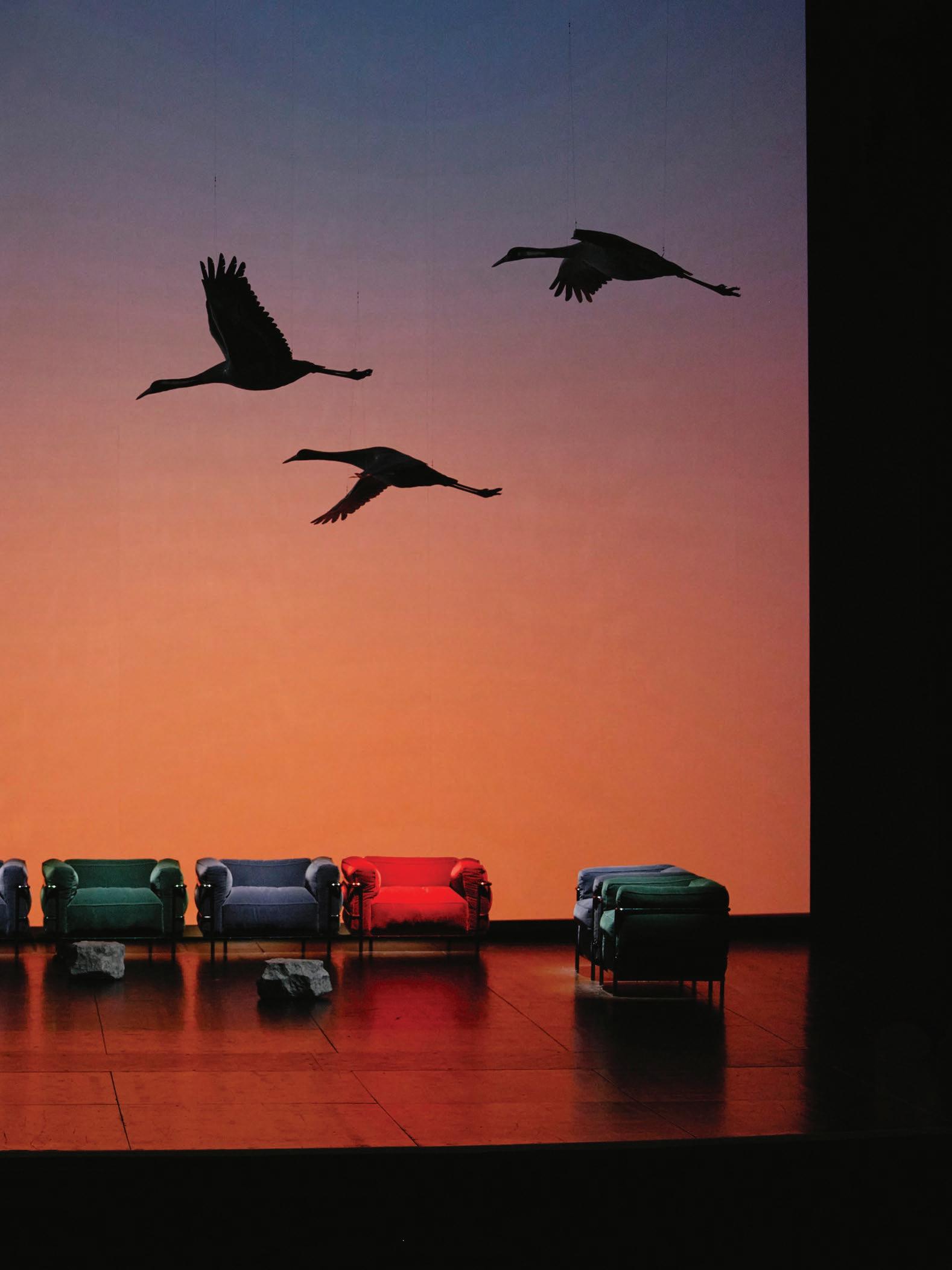
Stepping into Milan’s Teatro Lirico theatre, there was little indication of what to expect from Staging Modernity the 60th anniversary exhibition of Cassina’s Le Corbusier, Pierre Jeanneret and Charlotte Perriand collection, led by Milan-based research studio FormaFantasma. What began as a display of furniture and model animals unfolded into a performance directed by Fabio Cherstich across multiple stages.
This struck the first note of Milan Design Week 2025—a week where immersive exhibitions and experiential design defined the conversation. Design commentators Karen McCartney and David Harrison crystallise this in their 65-page report, covering the most memorable palazzos, private apartments, installations and showrooms.
The entire issue brings the people behind these pieces and shows to the fore. To coincide with new collections for Luxence Luxury Living and a decade of collaboration with Marta Sala Éditions, Karen sat down with Rome-based architecture studio Lazzarini Pickering Architetti, exploring how architecture and furniture are inseparable in their practice. Meanwhile, David spoke to British designer Benjamin Hubert about the need for design discourse to engage with both emotional resonance and environmental responsibility.
We also caught up with interior decorator and stylist Simone Haag—the first Australian invited to be part of Artemest’s L’Appartamento for the Italian decor brand’s 10th anniversary—inside the historic Palazzo Donizetti. Other exclusive interviews in this issue include Paris-based Studio KO founders Karl Fournier and Olivier Marty on the centrality of handicraft in their work; New York designer Eny Lee Parker on translating clay into textile design; and Australian lighting designer Ross Gardam on light as both medium and metaphor.
Manifesting the city’s enduring design legacy, we visit four Milanese homes, including Palazzo Bonacossa, where architect Vincenzo De Cotiis has orchestrated an ambitious heritage intervention.
As this was the year of Euroluce at Salone del Mobile.Milano, we’ve saved our lighting edit for our June issue— live next month. Ciao for now!
Contributors
Karen McCartney and David Harrison
As est living’s editorial advisor, Karen McCartney is renowned for her work in the world of interiors and architecture, with an impressive career spanning both print and digital media. David Harrison has worked as a design journalist since 1999, when he relocated from London to Sydney and transitioned from film and television to interior styling and design writing. Partners in both life and work, the design commentators hit the streets of Milan to uncover the best of Design Week 2025, sharing their perspective across 65 pages in this issue.
@mccartneyk @designdaily
Martin Morrell
Martin Morrell is a British-born photographer whose background in architecture informs his refined, cinematic approach to interiors, fashion, and portraiture. He first gained recognition with a commission from The Independent at age 26, and his award-winning work has since appeared in The New York Times T Magazine, Seed, and more. In this issue, Morrell captures an intuitive approach to a spatial dialogue in a heritage intervention by architect Vincenzo De Cotiis.
@_martin_morrell
Helenio Barbetta
Helenio Barbetta is an interiors and lifestyle photographer based in Milan, originally from Pescara, Italy. A graduate of the Riccardo Bauer photography school, Barbetta captures the intimate dialogue between people and the spaces they inhabit. His evocative reportages appear regularly in leading international design publications. When not travelling for work, he returns to Abruzzo, Italy—a place of family, sea, and stillness. In this issue, he captures the moody, mid-century nostalgia of a Milanese apartment, home to creative duo Christian Frascaro and Francesco Cristiano.
@helenio_barbetta
Alexia Petsinis
Alexia Petsinis is a journalist and features writer from Melbourne, now based in Milan. With over a decade of experience across the design, arts, culture and fashion sectors, her work spans editorial projects including monographs, exhibition catalogues and curatorial content. In this issue, Petsinis writes on Palazzo Bonacossa by architect Vincenzo De Cotiis, exploring the design’s intricate balance between historical legacy and contemporary life.
Anna Bisazza, Aleesha Callahan, Alexia Petsinis, David Harrison, Karen McCartney, Sophie Lewis, Yvette Caprioglio
Photography
Playlist
Billal Baruk Taright
Milan Design Week 2025
Specified in feature
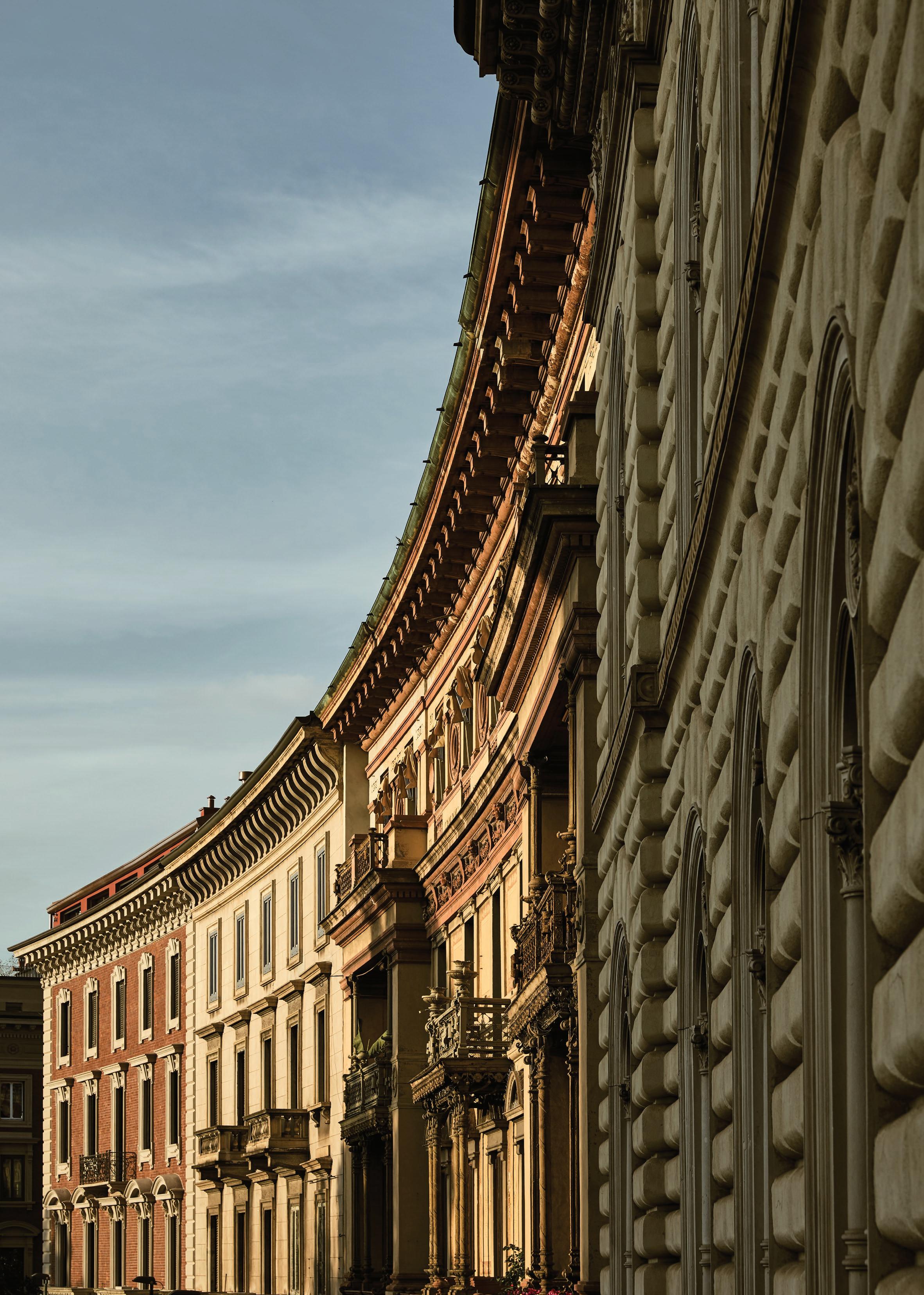
Milanese Modernism
Billal Baruk Taright
Design Voices
Simon171, Alejandro Ramírez Orozco, DePasquale+Maffini, Noel Manalili, courtesy of Van Rossum, courtesy of LAYER
The Corridor Effect
Helenio Barbetta
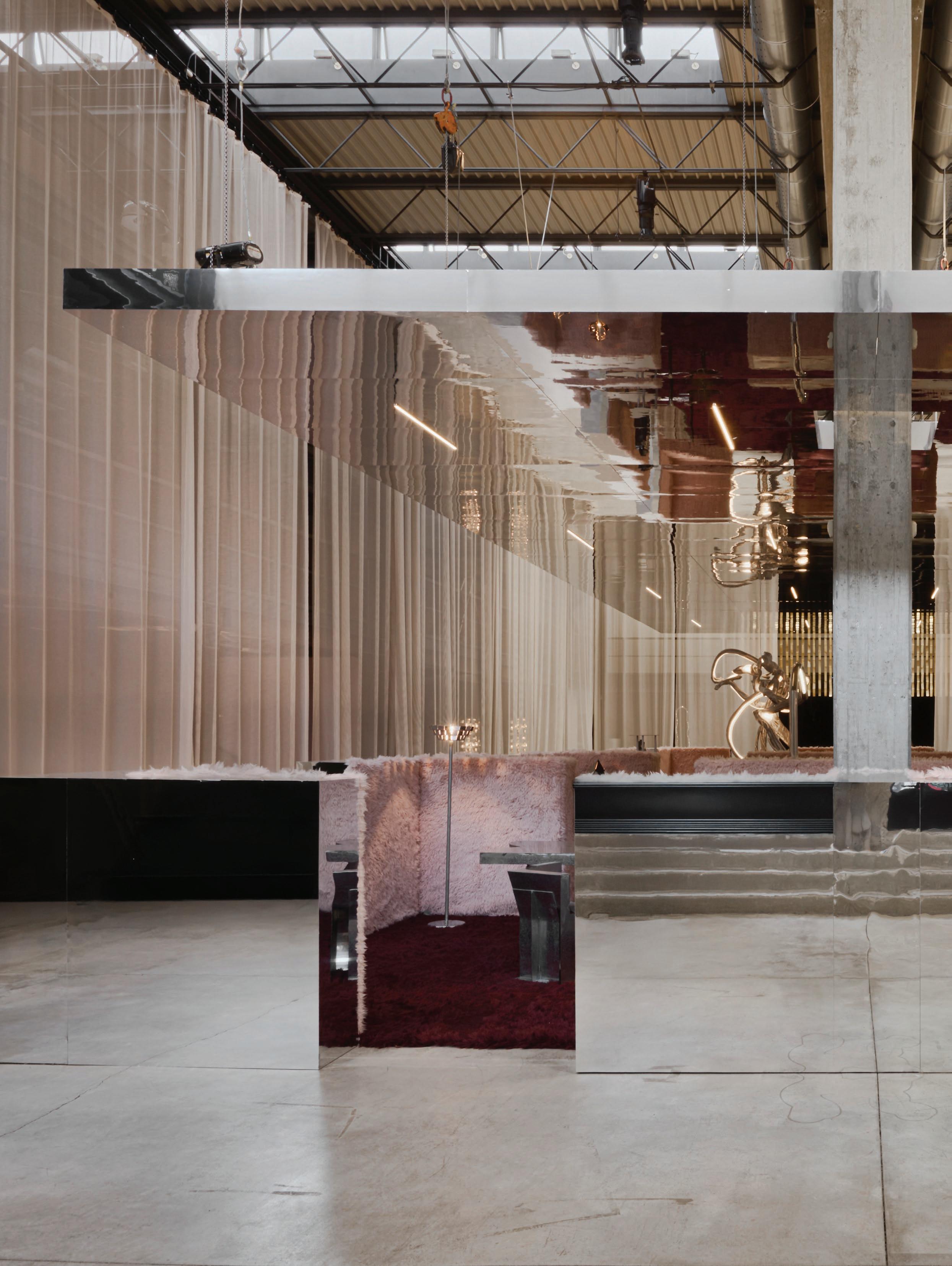
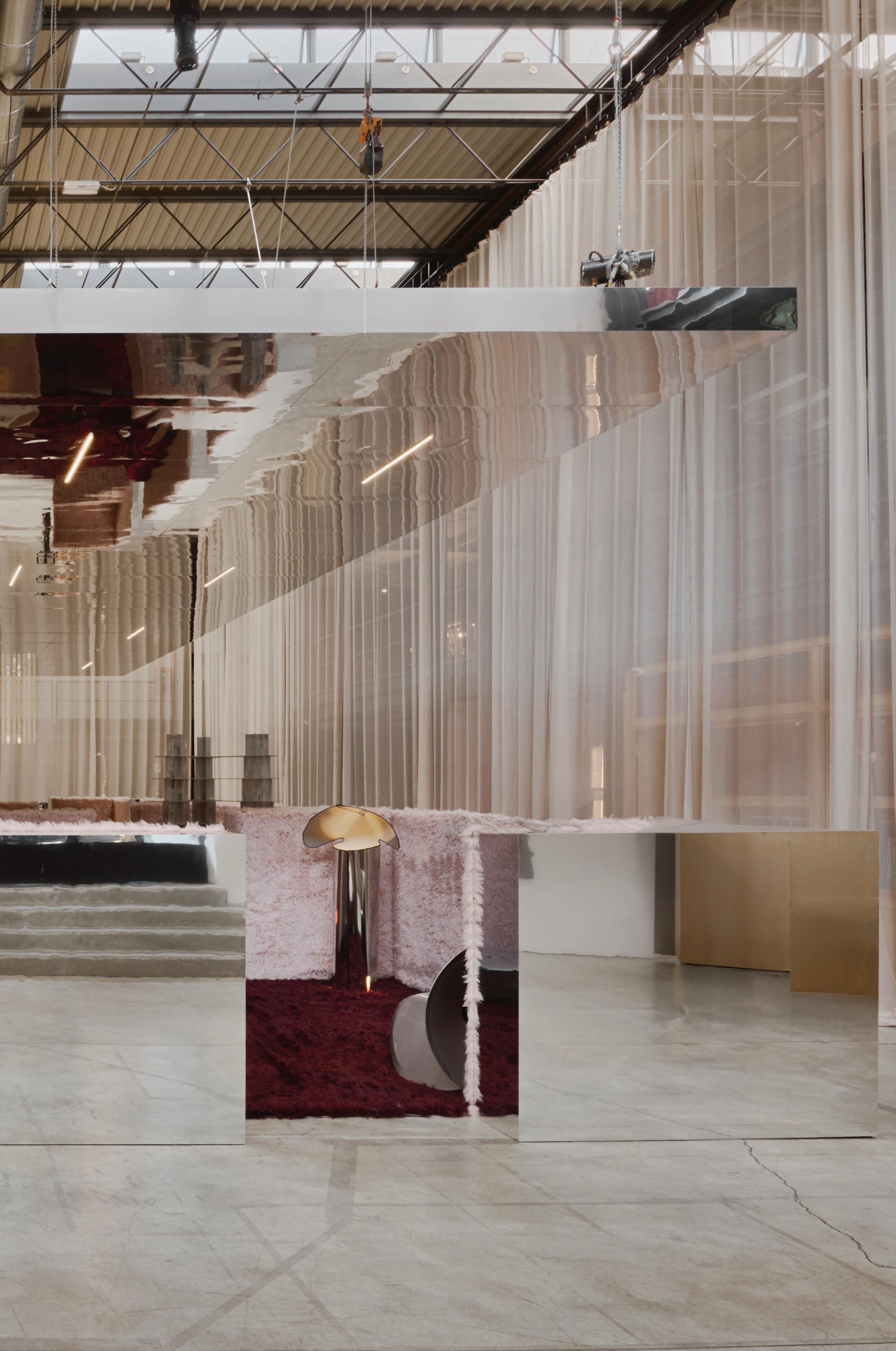
Reflections of Time
Martin Morrell
First Impressions
Tomaso Lisca and Luca Argenton, courtesy of Artemest
My Space: Tommaso Spinzi
Antonio Mocchetti
Lazzarini Pickering Architetti
Alessio Ammannati, Michael Wee
est living acknowledges the Traditional Owners of the land on which we work, the Wurundjeri Woi Wurrung of the East Kulin Nation. We pay respect to their Elders past, present and emerging.
Connect
LA MUSICA
LISTEN TO VOLUMES ONE AND TWO NOW >
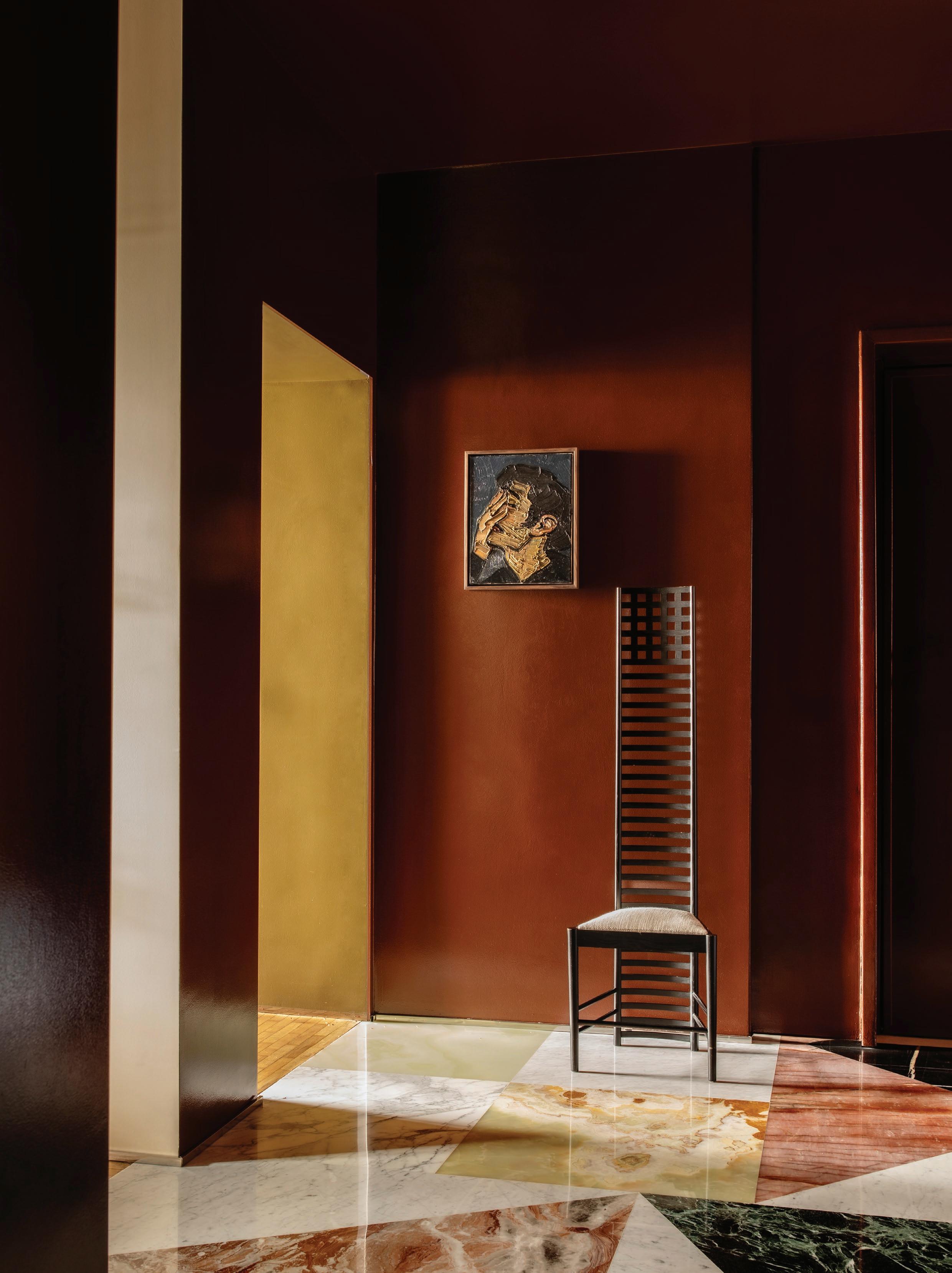
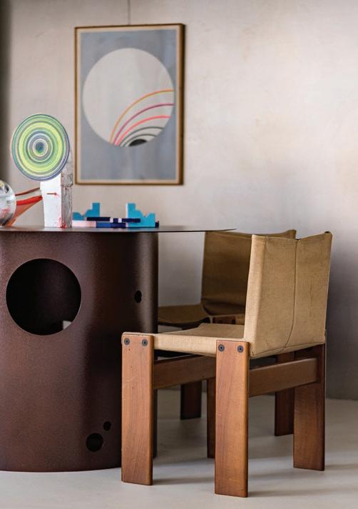
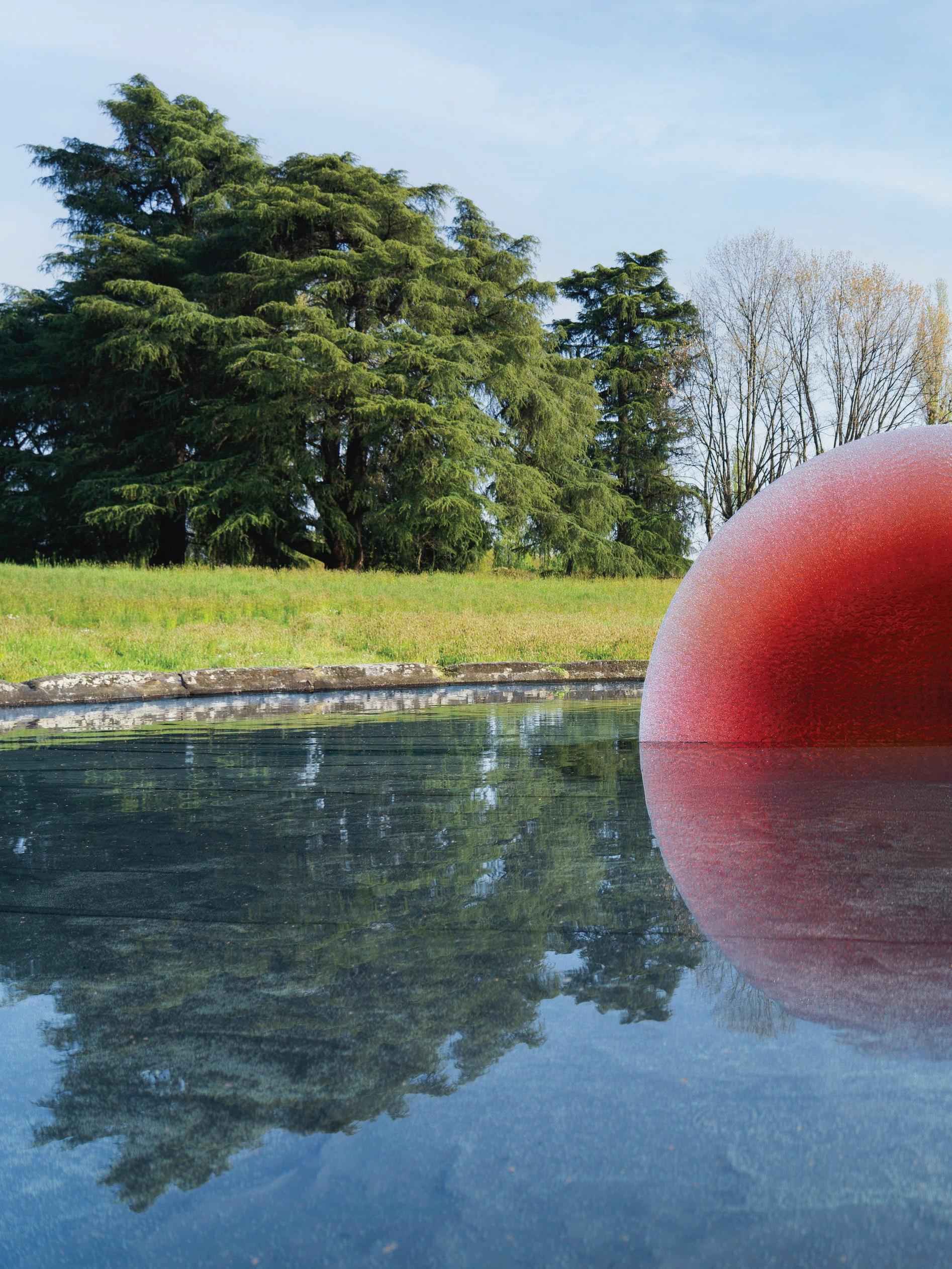
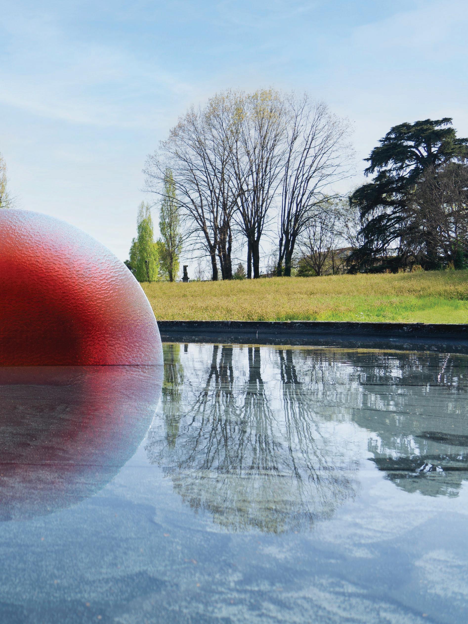
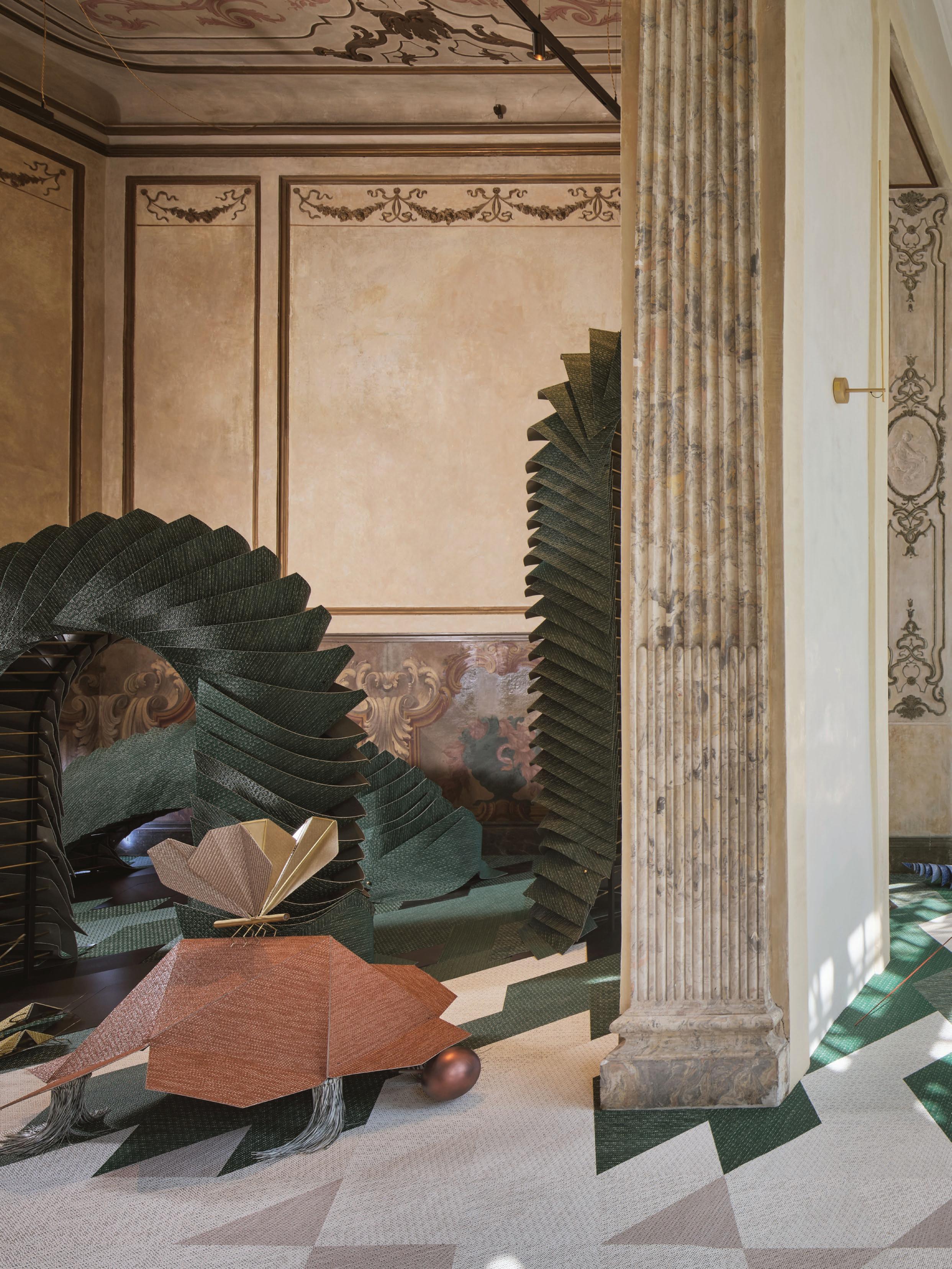
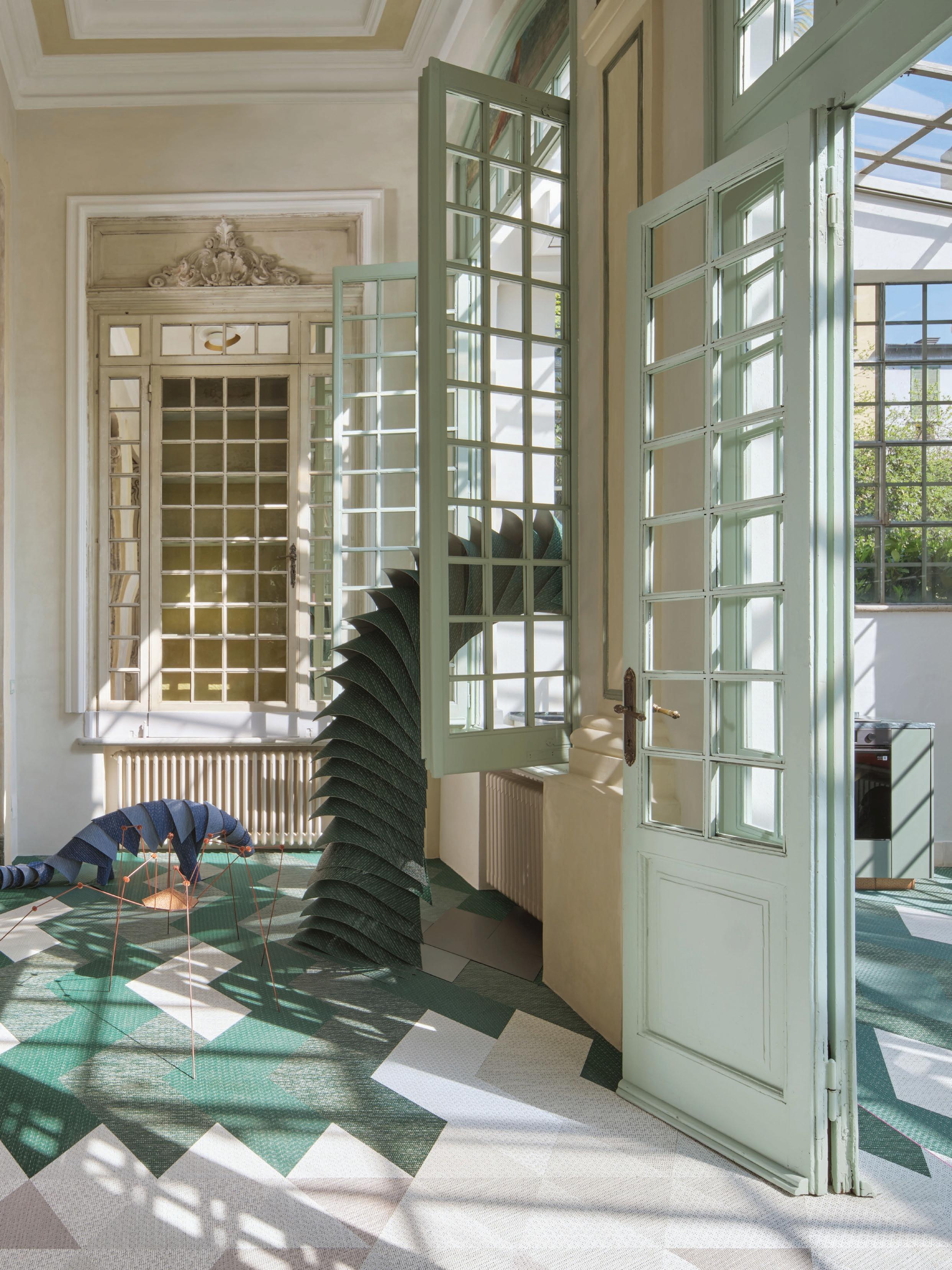
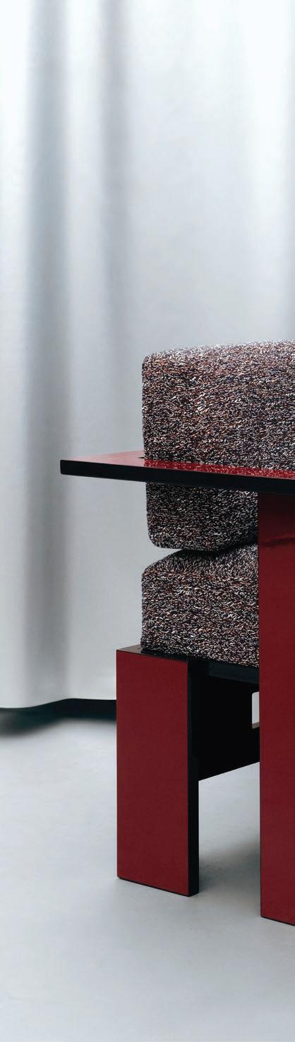
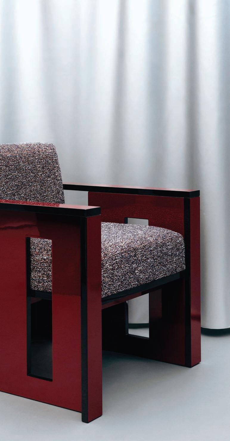
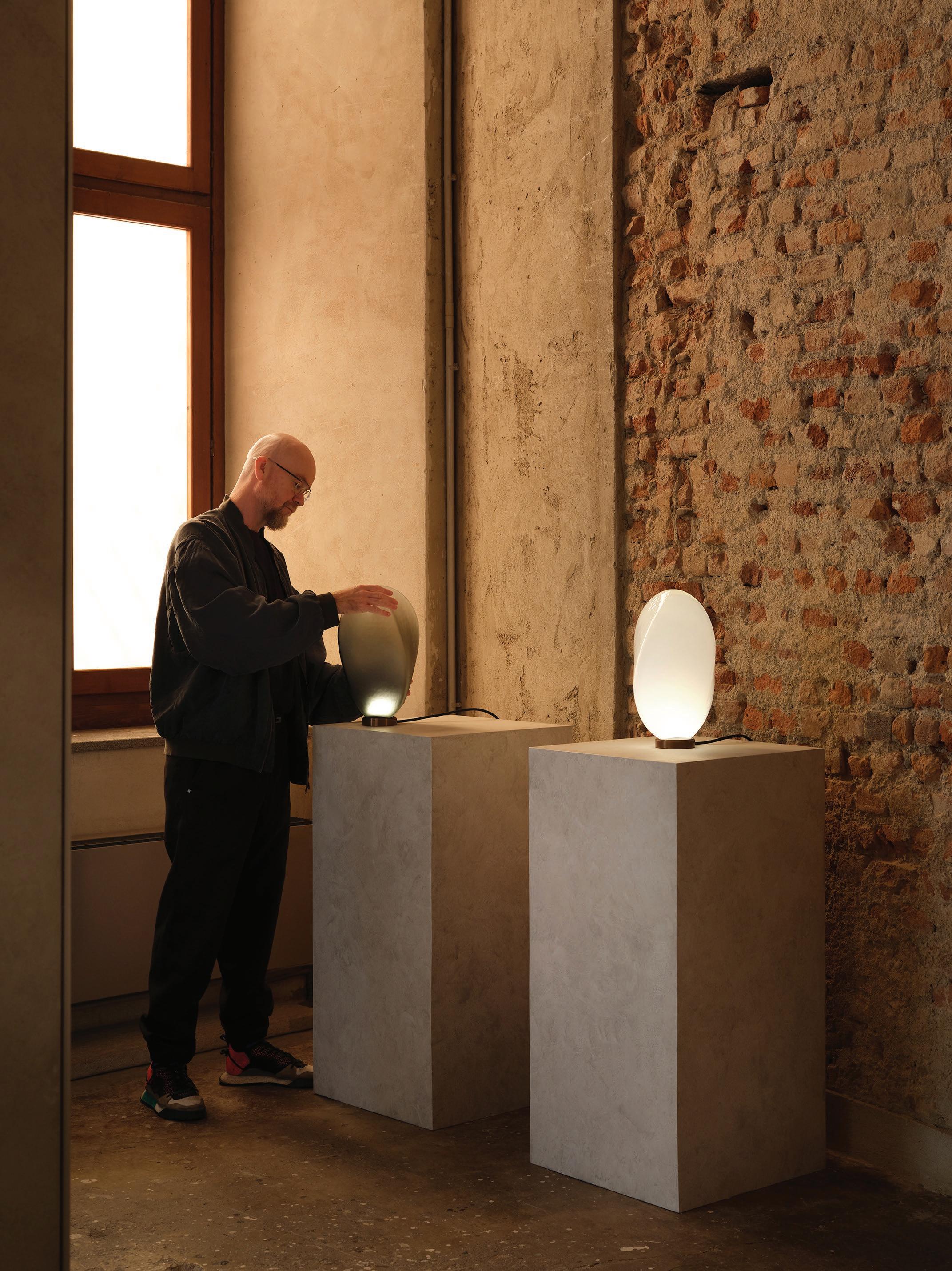
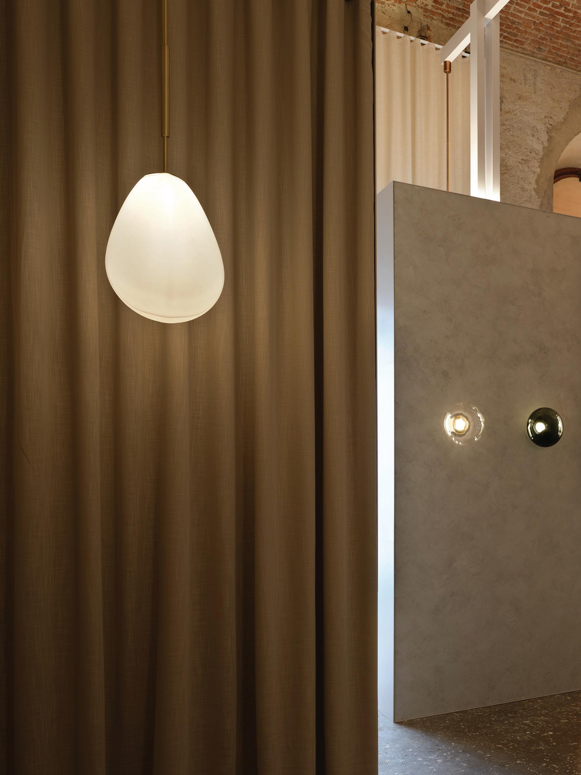
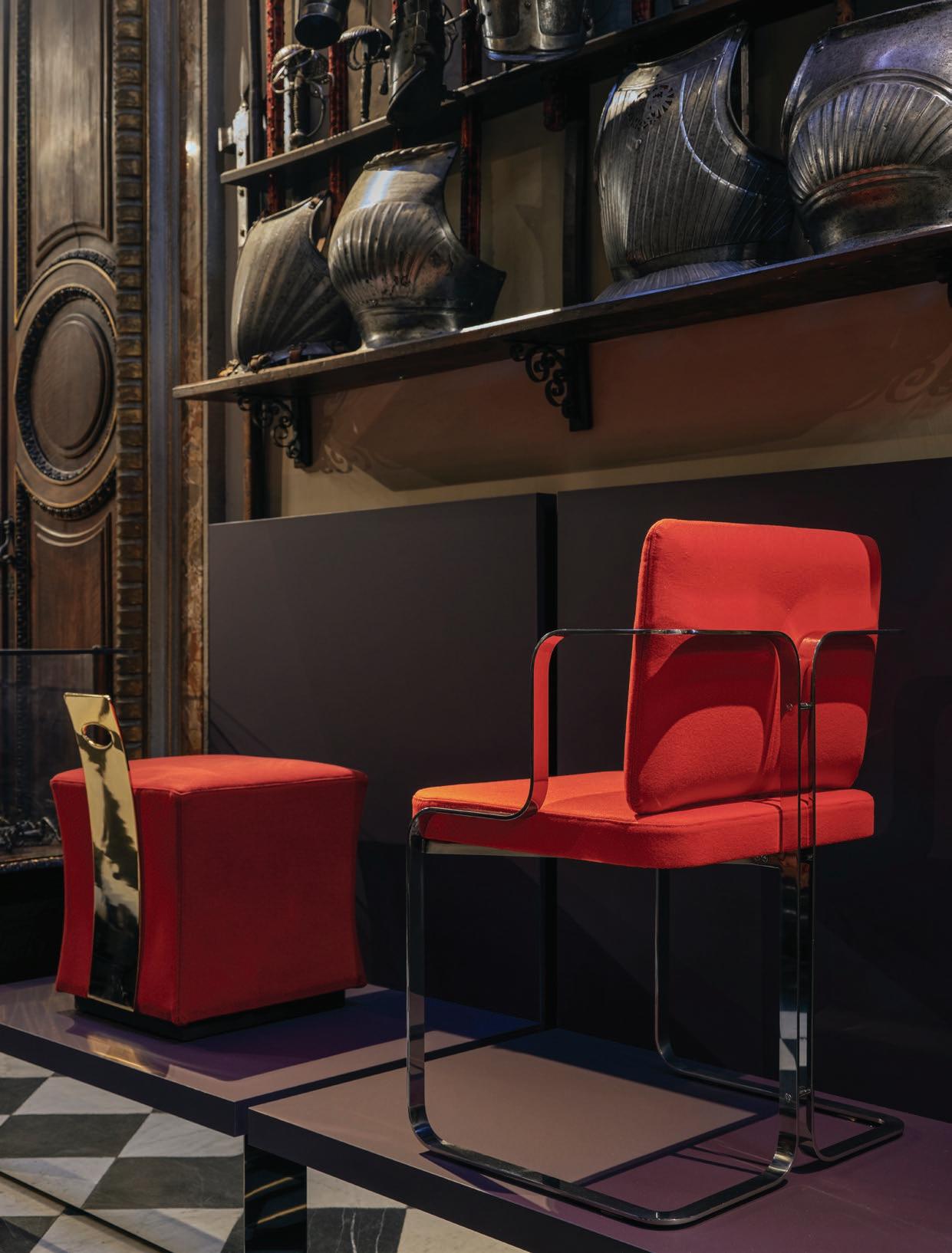
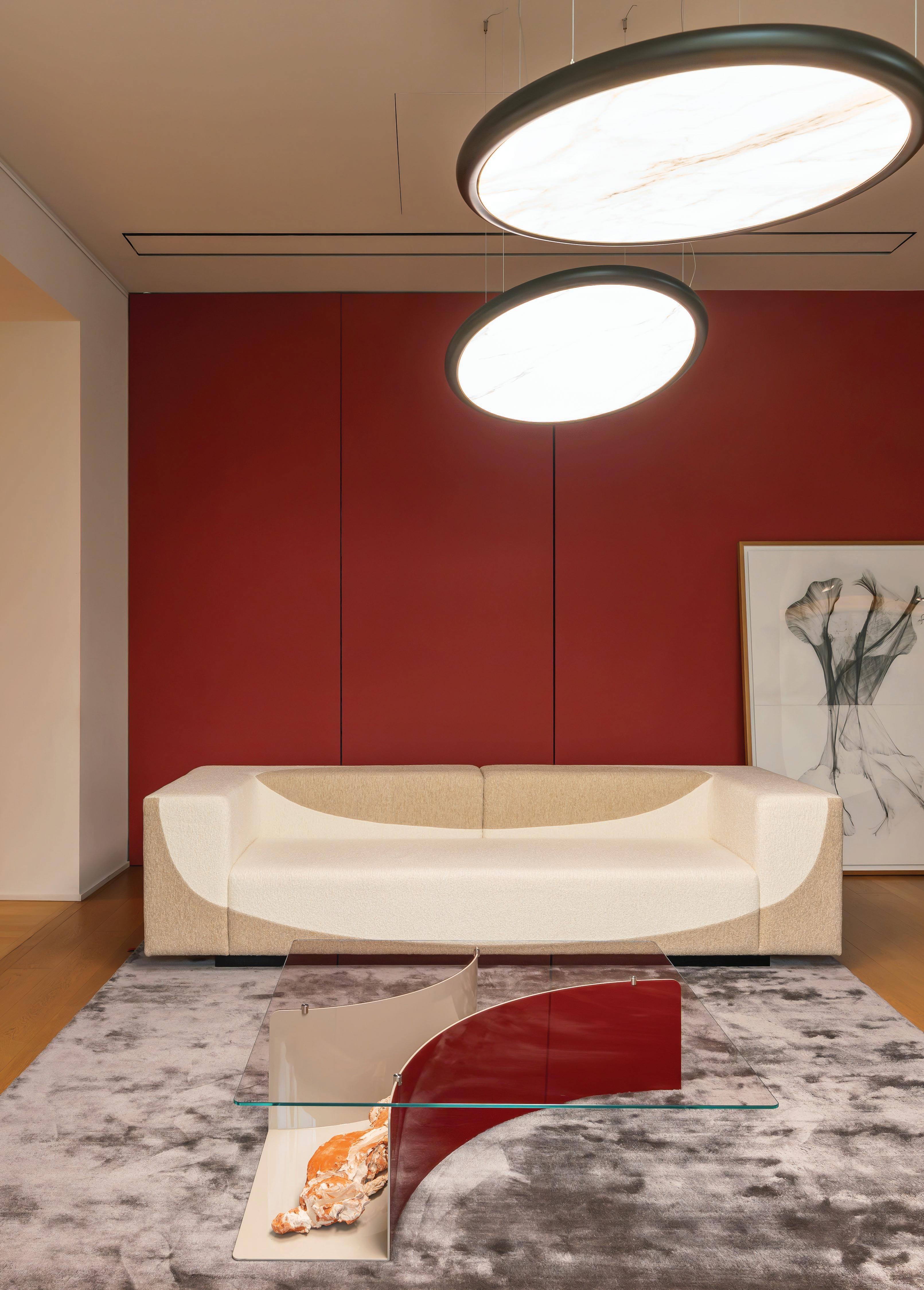
Project Milan Penthouse Design Giampiero Tagliaferri Photography Billal Baruk Taright
This page: Designer Giuseppe Porcelli transformed a Milanese apartment to create an immersive installation. More on page 36. Previous spread: Returning to their regular venue, the Istituto dei Ciechi (Institute of the Deaf), London-based company WonderGlass exhibited POETICA, an installation with new work Vetrofuso Spazio by Ronan Bouroullec and Vincent Van Duysen’s Opto (shown) in collaboration with Calico Wallpaper and Officine Saffi Lab.
Photography Silvia Rivoltella
Charting a course through palazzos, private apartments, installations, showrooms and forgotten corners of the city, design commentators Karen McCartney and David Harrison present their perspective on
Milan Design Week 2025.
WORDS David Harrison and Karen McCartney
Hermès
La Pelota
Via Palermo, 10, 20121 Milano MI, Italy
‘What makes an object?’ Hermès presented their ethereal show at La Pelota, featuring vast white suspended volumes that showcased Hermès' creations across textiles, ceramics, glass, and timber. The exhibition was an ode to presence and absence as light leaked from sculptural openings, creating evocative blurs of colour on the ground. The scenography transformed objects by giving them the status of art pieces.
Photography Courtesy of Hermès
Nilufar Depot x Fosbury Architecture
Nilufar Depot
Viale Vincenzo Lancetti, 34, 20158
Milano MI, Italy
Nilufar celebrated its 10th anniversary at the Depot space with Silver Lining, a labyrinthine metal-themed exhibition curated by Nina Yashar and designed by Fosbury Architecture, chosen for their innovative and avant-garde approach. Featuring vintage and contemporary works, with a particular focus on the 1970s, the display showcased metal's versatility, blending history, innovation, and artistry into a striking sensory experience.
Photography Alejandro Ramírez Orozco
Christophe Delcourt
Fondazione Mudima
Via Alessandro Tadino, 26, 20124 Milano MI, Italy
Marking 30 years of his eponymous studio, Christophe Delcourt presented Time Stretched, a snapshot of past products, new designs and collection extensions interwoven with artworks from the Mudima Foundation. Shown here are the OST low chest of drawers, the YOL coffee table in walnut and Black Fusion marble, and the YUG armchair in smoked oak. In the background is Delcourt’s YOA screen in ash and perforated metal.
6:AM
Photography Francis Amiand
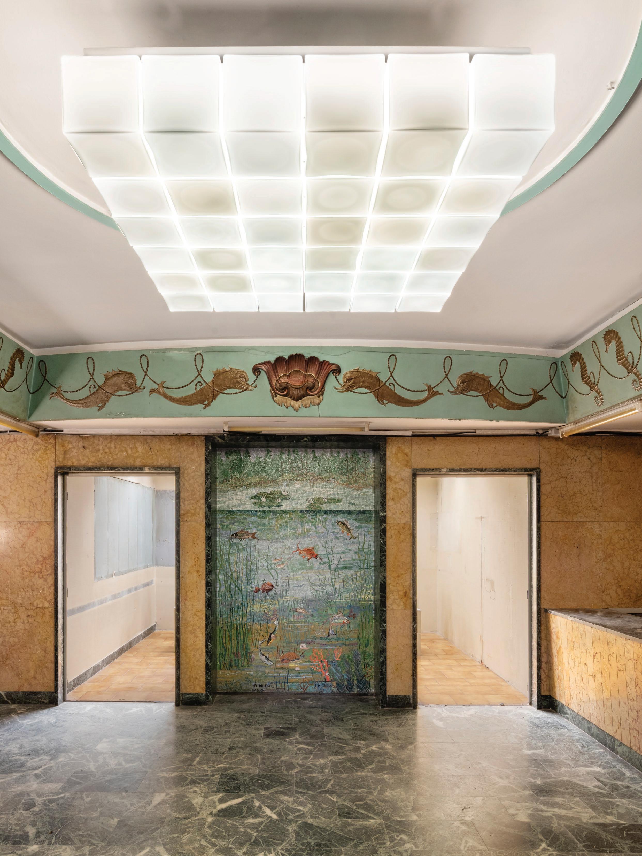
Piscina Viale
Set within from the 6:AM Glassworks into the prototypes of glass-making glass mosaics underwater by 6:AM Quadrato
6:AM Glassworks
Piscina Cozzi
Tunisia, 35, 20124 Milano MI, Italy
within Piscina Cozzi, imposing public baths the 1930s in Milan’s Porta Venezia district, Glassworks delivered a highly dramatic look the studio’s work, from finished products to prototypes and experiments exhibiting a wide variety glass-making techniques in the process. Original mosaics in the basement foyer delivered an underwater theme, which was matched beautifully 6:AM Glassworks’ modular glass ceiling fitting, Quadrato 36.
Photography Melania Dalle Grave
Cassina Lighting Collection
Cassina Store Milano
Via Durini, 16, 20122 Milano MI, Italy
Building on their recent forays into lighting, Cassina presented four lights: two new experimental designs and two historical pieces. Polyshape by designer Ferréol Babin is a complex sculptural form available in both table and floor variants. Designer Mario Tsai’s Tsai light is configured from blocks of tumbled cast alloy, while Ico Parisi’s Iride (1970) column-style floor lamp, shown in red, has a futuristic edge. The Dot Pattern pendant light by Charles and Ray Eames was translated from drawings created in 1947 and had never been previously produced. The Eames’ Galaxy pendant is shown in the image.
Photography Simone Barberis
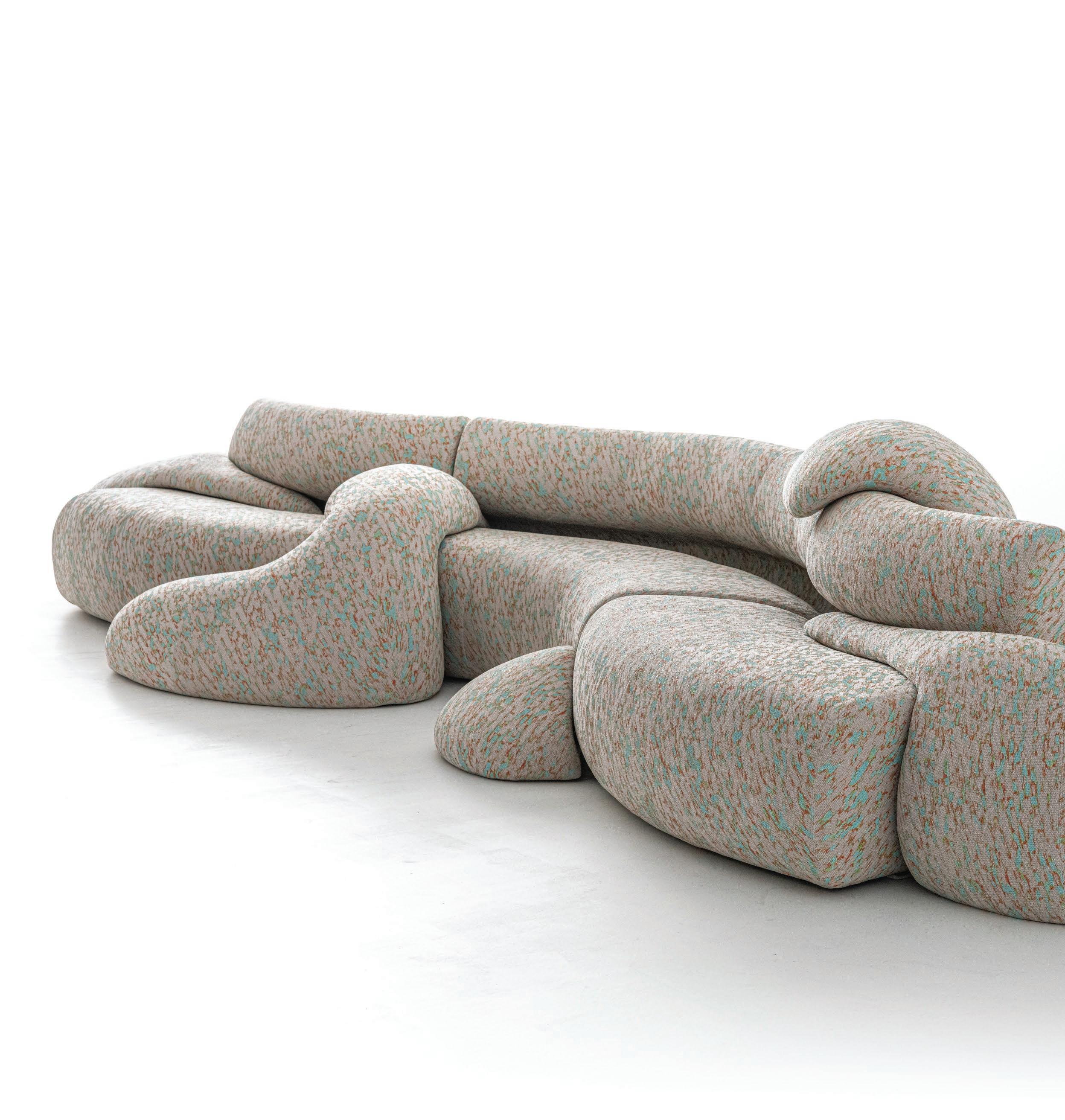
Moroso
Moroso Flagship Milano Via Pontaccio, 8/10, 20121 Milano MI, Italy
Moroso has often reinvented seating typologies, and the brand’s installation Normal Non-Normal showed this once again. Patricia Urquiola’s new Gruuvelot sofa was the showstopper with its extreme take on seating as landscape. Freeform modular elements writhe around and through the sofa like snakes.
Photography Studio Eye
Rive Roshan x SOL-R&D
Alcova, Villa Bagatti Valsecchi Via Vittorio Emanuele II, 48, 20814 Varedo MB, Italy
At Alcova’s Villa Bagatti Valsecchi, Sun Catcher reactivated a historic fountain with a radiant solar arch. This poetic, sitespecific work captures and reflects sunlight by day, storing energy to glow by night—playing with colour-shifting layers and mesmerising reflections. SOL-R&D is a startup specialising in aesthetic photovoltaics to harness the innovative material’s selective light reflection, while also generating solar energy.
Photography Courtesy of Design & Practice
Photography Luca A. Caizzi
Portrait Simon 171
Moroso x Zanellato/Bortotto
Moroso Flagship Milano
Via Pontaccio, 8/10, 20121 Milano MI, Italy
New for 2025 were Zanellato/Bortotto’s Clay lounge chairs created in the historic ceramic region of Nove, Italy. Each has the unexpected charm of an artwork set in a textile frame as these colourful ombre back panels
cc-tapis x Kwangho
Lee
cc-tapis Showroom
Piazza Santo Stefano, 10, 20122 Milano MI, Italy
Translating materiality through textile design was a recurring theme in cc-tapis’ Ways of Seeing exhibition. The Colour of Copper by Korean designer Kwangho Lee comprises four hand-knotted rugs that reinterpret copper’s natural oxidation through geometric pattern and nostalgic hues. “I’ve worked with copper for nearly two decades,” Lee says. “It’s a very sensitive material—always changing—and I like how it absorbs its surroundings, much like the human body or the way we think.”
Photography Studio Eye
BOCCI
Bocci Milan
Via Giuseppe Rovani, 20, 20123 Milano MI, Italy
Visual artist Omer Arbel founded Vancouver-based Bocci 20 years ago. He celebrated this milestone by inviting The Future Perfect's David Alhadeff to curate a new interior for the brand’s permanent showroom in Milan. Hanging in the lounge and dining rooms were two large-scale examples of Bocci’s new 141 series slumped glass lights. The 141 is shown in conjunction with furniture by Irish brand Orior and rugs from Christopher Farr.
Photography Paola Pansini
Photography Silvia Rivoltella
Giuseppe Porcelli
Via Attilio Deffenu 7, 20133 Milano
MI, Italy
In his debut furniture collection, Giuseppe Porcelli transformed a Milanese Garçonnière (a hideaway for an affair) into a homoerotic mise-en-scène. In this immersive installation, the GP 01 armchair, in gold-plated metal, bamboo, and cotton bourette anchors this space rich in theatrical dualities: masculine/ feminine, classical/modern. Other pieces include a console table, wall mirror and table lamp using materials such as faux tortoiseshell plexiglass, glossy lacquered wood and dupion silk.
Hannes Peer Architecture x
Margraf
Spazio BIG Santa Marta
Via Santa Marta, 10, 20123 Milano MI, Italy
CRASH was an impactful marble installation that defied traditional perceptions of the material by exploring rupture and transformation. It was a celebration of creative collisions, which seamlessly blended art, architecture, and innovation.
“Every mistake and unexpected event is not a flaw, but a vital part of the creative process,” Hannes Peer says.
Photography Danilo Pasquali
Portrait Alexander D’Hiet
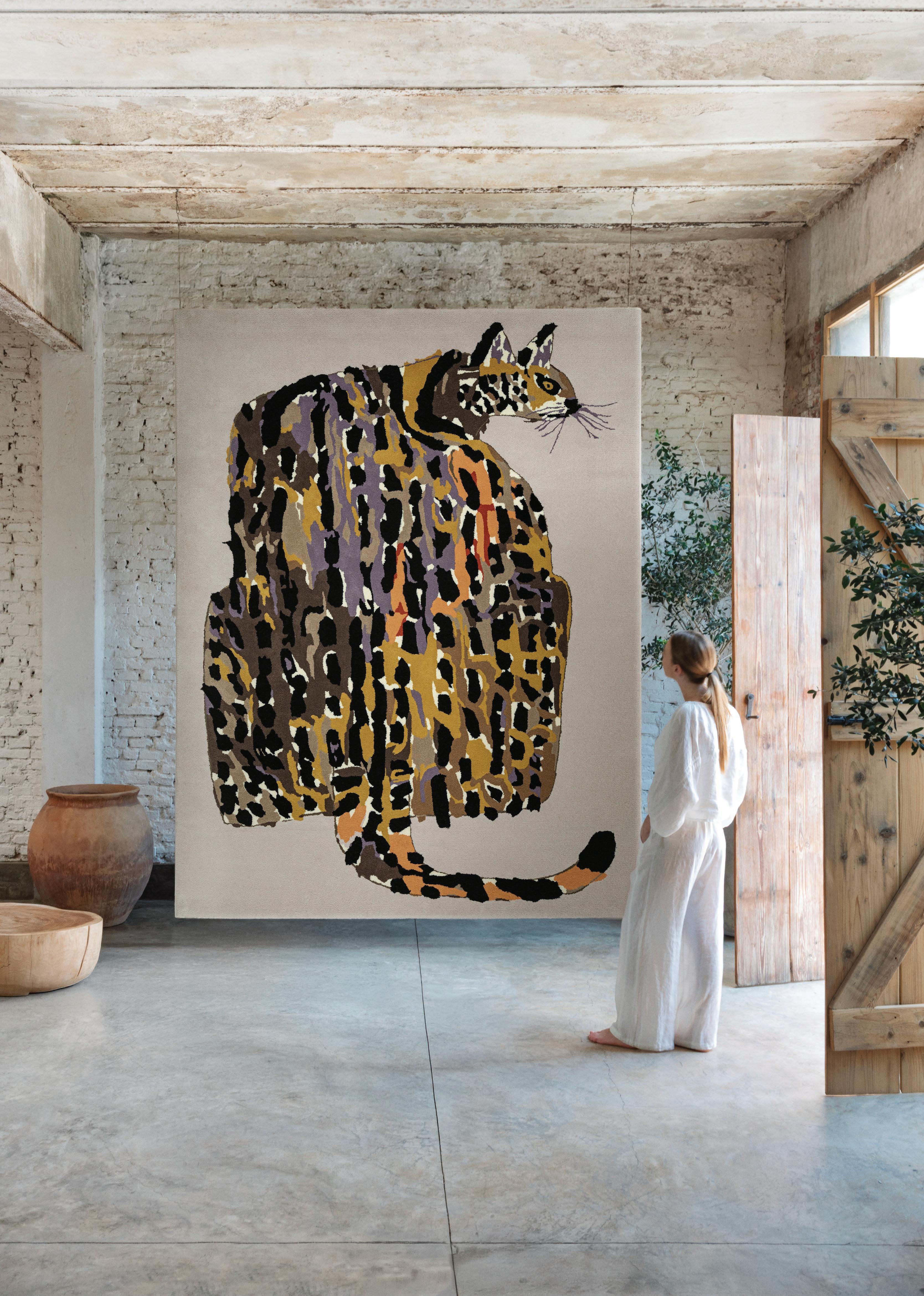
Lidewij Edelkoort x El Espartano
Rossana Orlandi Galleria
Via Matteo Bandello, 14, 20123 Milano MI, Italy
Dutch critic, educator, and tastemaker Lidewij Edelkoort curated Instinct, an exhibition of rugs inspired by the drawings of animals by Japanese illustrator Miroco Machiko. The rug shown is Haughty Cat, one of the five animal-focused rugs in the collection. El Espartano is an 83-year-old Argentinian rug company that regularly collaborates with artists and creatives from around the world.
Photography Pompi Gutnisky
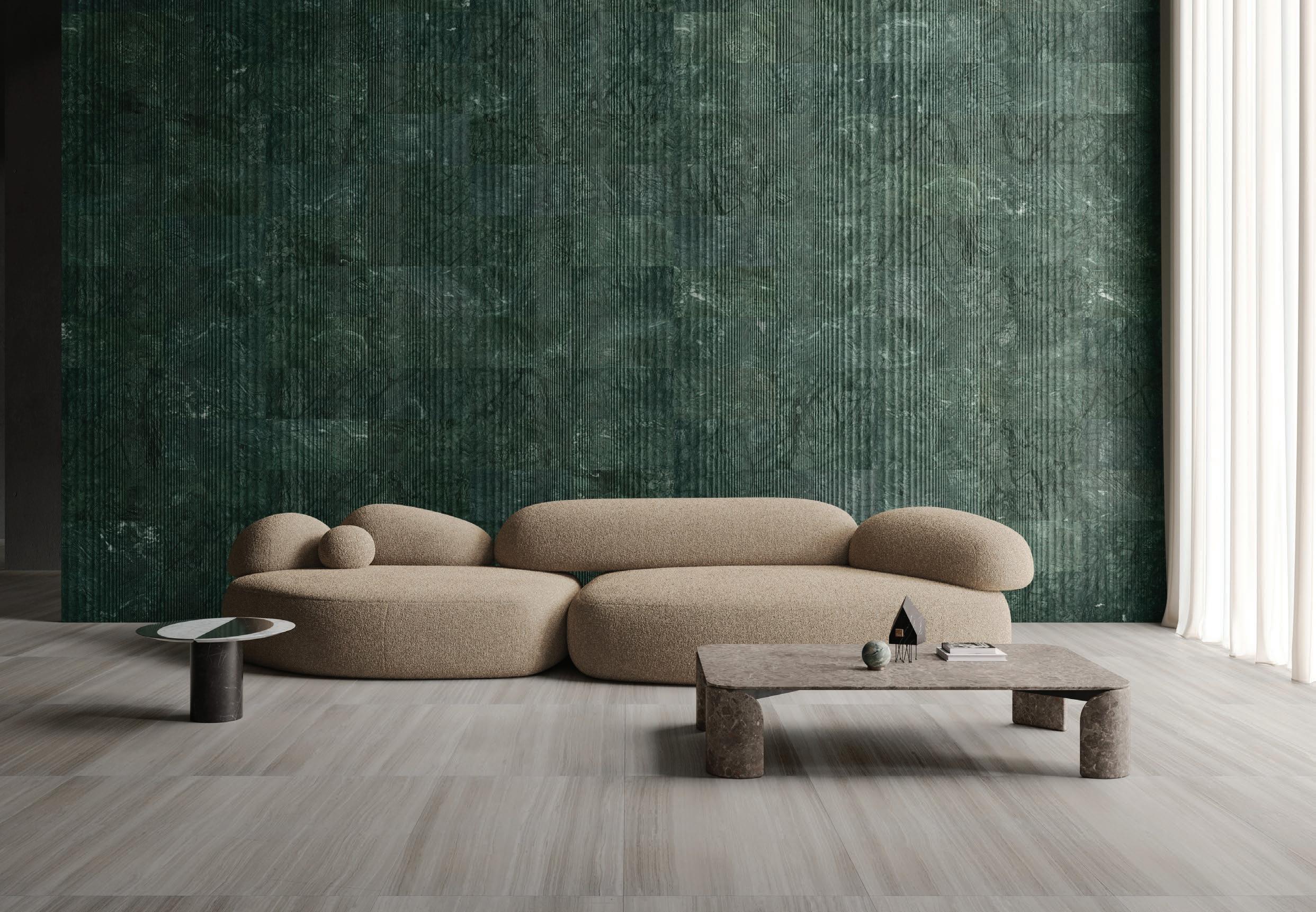
Salvatori x Yabu Pushelberg
Salvatori Showroom Milano
Via Solferino, 11, 20121 Milano MI, Italy
By pushing the technical and artistic boundaries of what a stone surface can achieve, the Nagi wall texture by Yabu Pushelberg for Salvatori is inspired by the gentle rhythm of water, as delicate ripples radiate across rectangular tiles. The resulting tactile effect unites notions of movement and stillness, reflecting the changing light throughout the day in a three-dimensional interplay of wavy lines.
Photography Courtesy of Salvatori
studioutte
Via Volturno, 45, 20127 Milano MI, Italy
Multidisciplinary designers studioutte christened their new atelier in Milan's Isola district with a spatial exploration called ATOLLO The monochromatic modular concept involved pale plywood panels connected by metal studs to form walls, while cubes and squares formed the furniture elements within. Exceedingly calm with soft off-white tones, the room suggested ritual and contemplation.
Photography Romain Laprade
MycoWorks x Studio Tooj & Fanny Perrier
LABÒ
Via Biella, 6, 20143 Milano MI, Italy
Mushrooms and furniture generally don’t mix well, but as part of the French design showcase LABÒ, the biotechnology company MycoWorks invited Studio TOOJ and interior designer Fanny Perrier to design objects using the patented material Reishi—a groundbreaking material grown from mycelium. Showcasing its beauty, strength, and versatility, Studio TOOJ has designed a collection of objects that express the lovely drape commonly associated with fine leather. Meanwhile, Perrier’s six-panel screen, inspired by Jean-Michel Frank, demonstrates how Reishi can replace leather or parchment as a stretched surface.
Photography Felix Speller
Soft Witness
Alcova, Villa Borsani
Via Umberto I, 148, 20814 Varedo MB, Italy
Florence-based interior designer Whitney Krieger launched a number of limited-edition furniture pieces, lighting fixtures, and objects in her show at Alcova’s Villa Borsani, titled In Repose. Centre stage was the Cono chair, which melds sculptural form with sumptuous tactility. Upholstered in camel-hued baby alpaca mohair, its spiralling silhouette evokes the organic geometry of a romanesco cauliflower. It reflects Krieger’s poetic design sensibility with memory and personal relationship folded into the work.
Photography Neige Thebault
Rossana Orlandi Gallery x Aline Asmar d’Amman
Rossana Orlandi Galleria
Via Matteo Bandello, 14, 20123 Milano MI, Italy
Architect Aline Asmar d’Amman’s Gent chair and sculptural lighting pieces embody her philosophy of material poetry, where tenderness meets strength. At Rossana Orlandi Gallery, soft upholstery contrasts with glass silhouettes and luminous forms. Each piece evokes couture craftsmanship, for which she is renowned, and draws on cultural memory and storytelling in design.
Photography Giulio Ghirardi studio
LRNCE
Cadogan Gallery
Via Bramante, 5, 20154 Milano MI, Italy
The title of LRNCE’s exhibition, Slow Roads, is a reminder that good things take time. The Marrakesh-based lifestyle brand, founded by Belgian designer Laurence Leenaert in 2013, initially dealt in leather goods but now collaborates with more than 40 Moroccan artisans to produce pieces in wood, ceramics, metal, wool, and plaster.
Shown with their Mudafar rug is Ayoub Boualam (left) and Laurence Leenaert (right).
Photography Alejandro Ramírez Orozco
Dainelli Studio
Dainelli Studio Atelier Via Fatebenefratelli, 4, 20121 Milano MI, Italy
Interior and product design studio Dainelli opened its atelier to the public this year to showcase its various new works in carved stone, polished brass, and form-fitting upholstery. Shown are the Bali chair, Calmapiatta coffee and side tables, Sipario bar cabinet, Frank and Wally sculptures. Artworks are by studio co-founder Leonardo Dainelli.
Photography Courtesy of Dainelli Studio
JOV x Laurids Gallée
Appearing like layered cloud formations in the sky or an aerial view of islands in the sea, the rug collection Sussurro by Laurids Gallée for Belgian rug manufacturer JOV features tufted wool set against a silk background to provide textural and visual complexity. The colours were specially chosen for their connection to nature and the shifting tones of sunrise and sunset.
Via Pontaccio 5-7, 20121 Milano MI, Italy
Photography Thomas De Bruyne
Tacchini x Toogood
Tacchini Showroom
Largo Treves, 5, 20121 Milano MI, Italy
Tacchini debuted its first Milan showroom in Milan's Brera district, unveiling serene, domestic settings styled by Charlotte de La Grandière. The launch highlighted the Butter sofa—as part of the Bread and Butter collection by Toogood—a sculptural, squashy modular piece inspired by Cornish butter, blending playful form with tactile comfort to reflect Tacchini’s soulful approach to contemporary living.
Photography Andrea Ferrari
Yves Salomon Éditions x Pierre Marie
Via Santo Spirito, 7, 20121 Milano MI, Italy
Shown in the covered medieval courtyard of Via Santo Spirito 7 in the heart of Milan, Yves Salomon Éditions unveiled a whimsical 17-piece collection by artist and designer Pierre Marie. Crafted entirely in the brand’s Paris ateliers, the intricate shearling works fuse ornamental storytelling with couture-level savoirfaire, bringing Art Nouveau flair and Memphis spirit to life through meticulous intarsia techniques that honour both material heritage and artisanal excellence.
Photography Laora Queyras
Photography Ludovic Balay
Romantic Brutalism
Viale di Porta Vercellina, 11, 20123, Milano MI, Italy
The newly launched Visteria Foundation, led by Katarzyna Jordan, champions the global visibility of Polish design, unveiling Romantic Brutalism: A Journey into Polish Craft and Design—a fascinating show curated by Federica Sala, designed by Paradowski Studio, and featuring the work of 23 designers. Showcasing contemporary interpretations of national nostalgia to highlight Poland’s rich craftsmanship and cultural evolution, the show opened in the foyer with a console by formsophy, pendant light by Marek Bimer, and graphic mural by Mikolaj Moskal and Kaja Gliwa.
Bolon x JoAnn Tan & Luca Nichetto
Viale Lombardia, 56, 20131
Milano MI, Italy
Climate-neutral Swedish flooring company Bolon unveiled Exodus, a fantastical installation created in collaboration with designers Luca Nichetto and JoAnn Tan. Set in a historic former textile house, the scenography featured ethereal woven landscapes and anthropomorphic creatures. Merging Bolon’s sustainable flooring with dreamlike storytelling, Exodus explored transformation through past and future, artfully blending innovation, heritage, and ecological imagination.
Photography Max Rommel
Foscarini x Dordoni Studio
Foscarini Spazio Monforte
Corso Monforte, 19, 20122 Milano MI, Italy
Etoile by Dordoni Studio distils the grandeur of Murano chandeliers into a contemporary play of volume and light. Etched glass diffusers orbit a nearly invisible Pyrex core, creating luminous balance without visible structure. This subtractive design mutes the sense of ornament while channelling a 1970s vibe. The design was led by Dordoni Studio’s Giuseppe Mauro and Mattia Cimadoro, who said that the objective was to conserve the rich allure of this type of lamp while expressing it in a contemporary language constructed through the play of volumes.
Photography Courtesy of Foscarini
Portrait Giuliano Koren
Amini Carpets
Amini Showroom
Via Borgogna, 7, 20122 Milano MI, Italy
Bruno Munari was a very inventive thinker and playful designer. In tandem with an exhibition curated by David Dolcini featuring rare Munari sculptures, drawings and furniture pieces, Amini has launched a new collection of rugs inspired by Munari’s book, Flight of Fancy, and his sculptural works, Useless Machines. The collection is divided into two parts: one based on 21 dots in monochrome, the other involves six floating rectangles in joyful colours.
Photography Valentina Sommariva
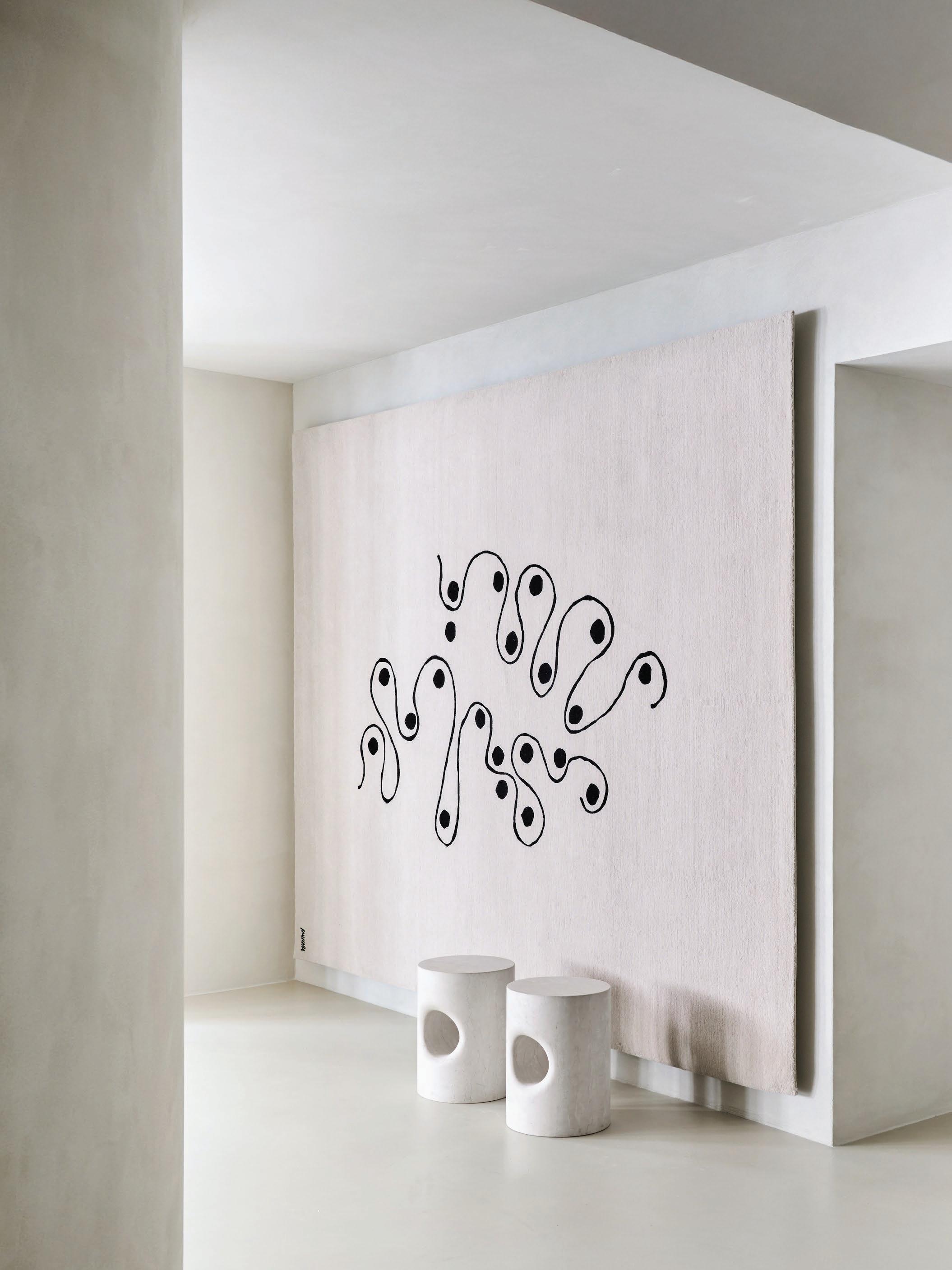
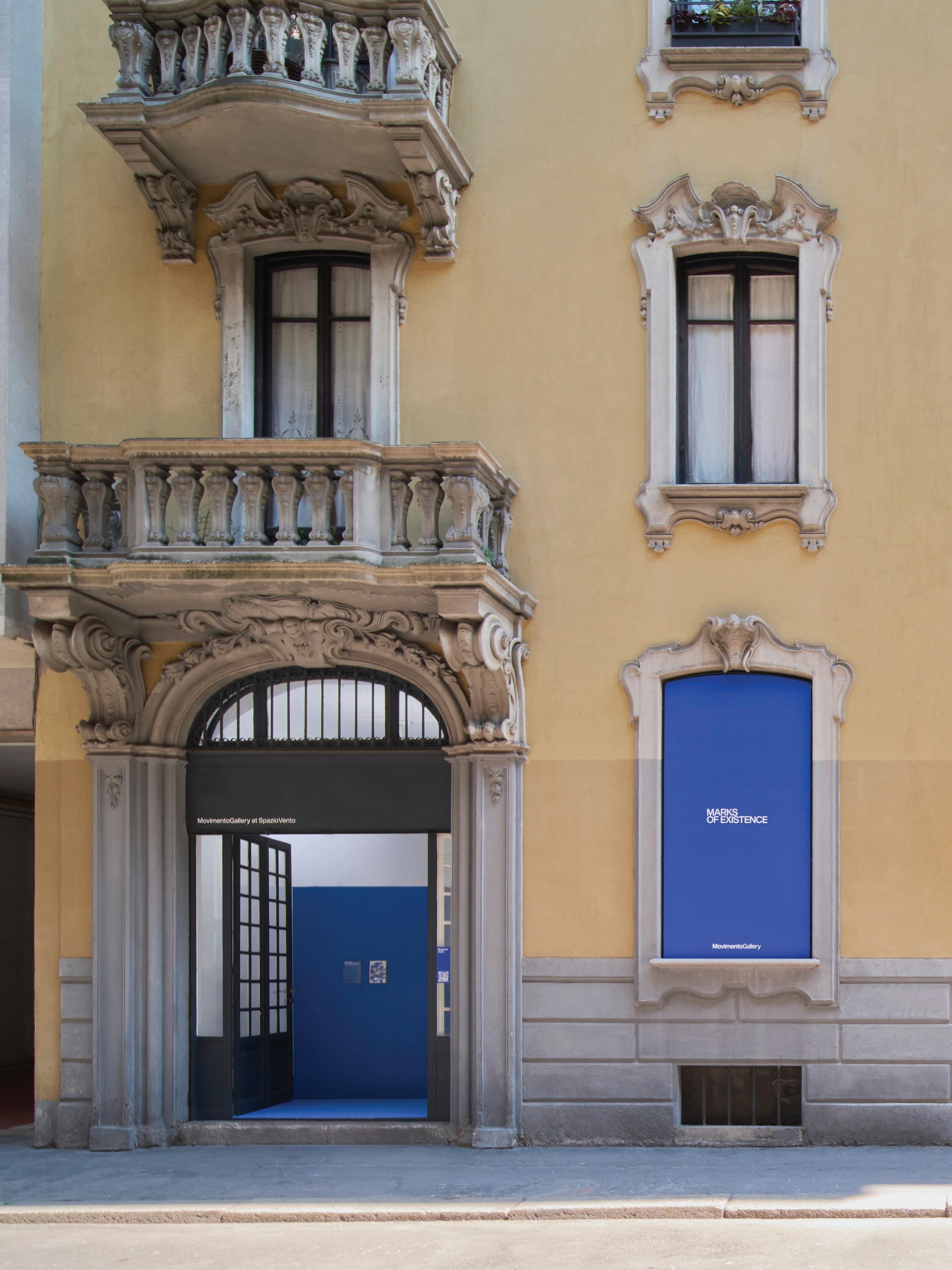
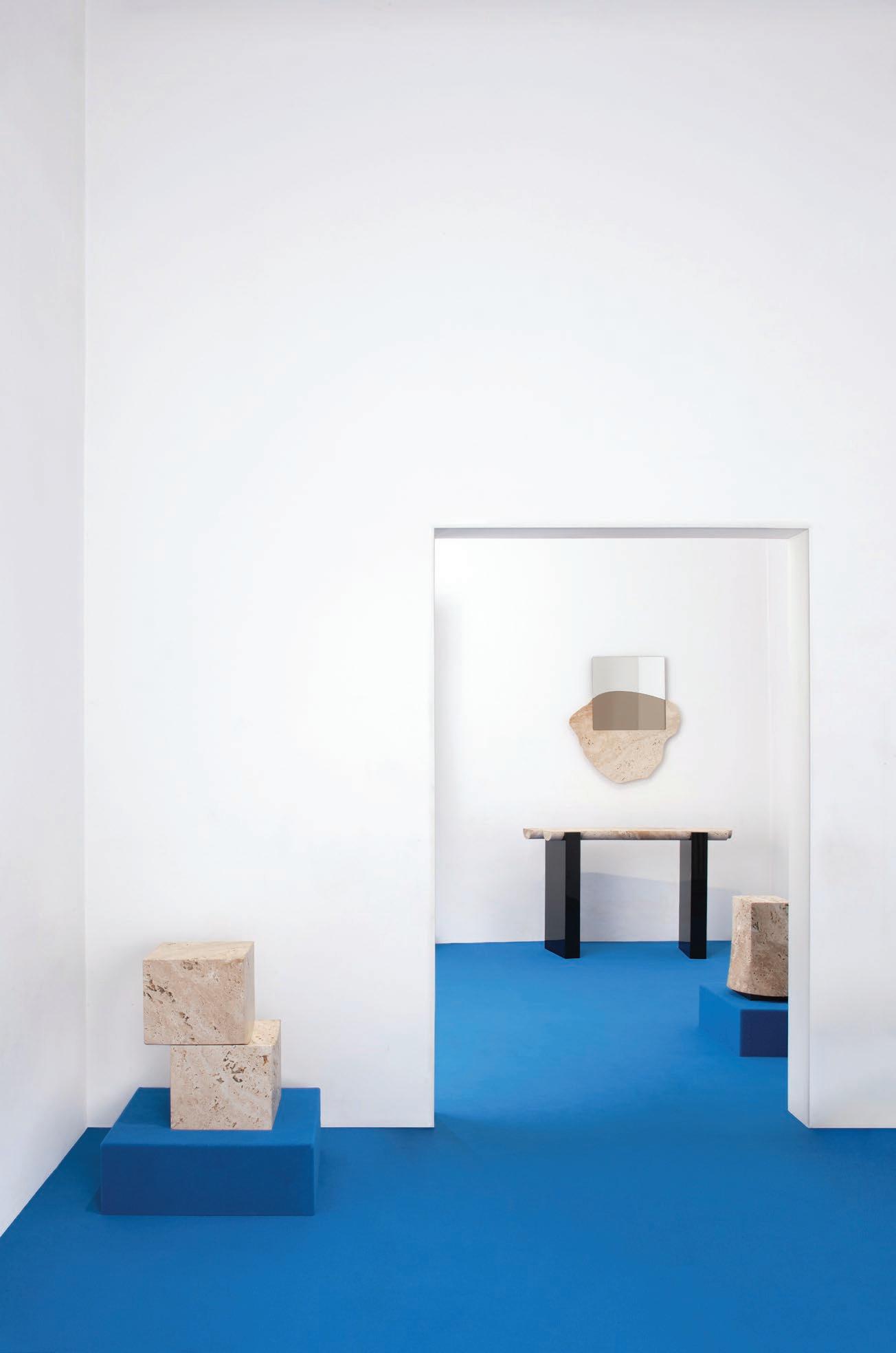
Movimento Gallery
Spazio Vento
Via Pinamonte da Vimercate, 4, 20121 Milan MI, Italy
In an extension of their exhibition, Marks of Existence, at PAD London late last year, Movimento Gallery commissioned additional designers to create limited-edition objects using only two materials: Travertino Ascolano and a specific ALPI wood veneer. The beauty found in the inherent imperfection of travertine challenges our modern need for technology-led perfection, contrasting with the high gloss veneer. Moreno Vannini and the design duo CARA\DAVIDE joined the original nine designers.
Photography Marcello Maranzan
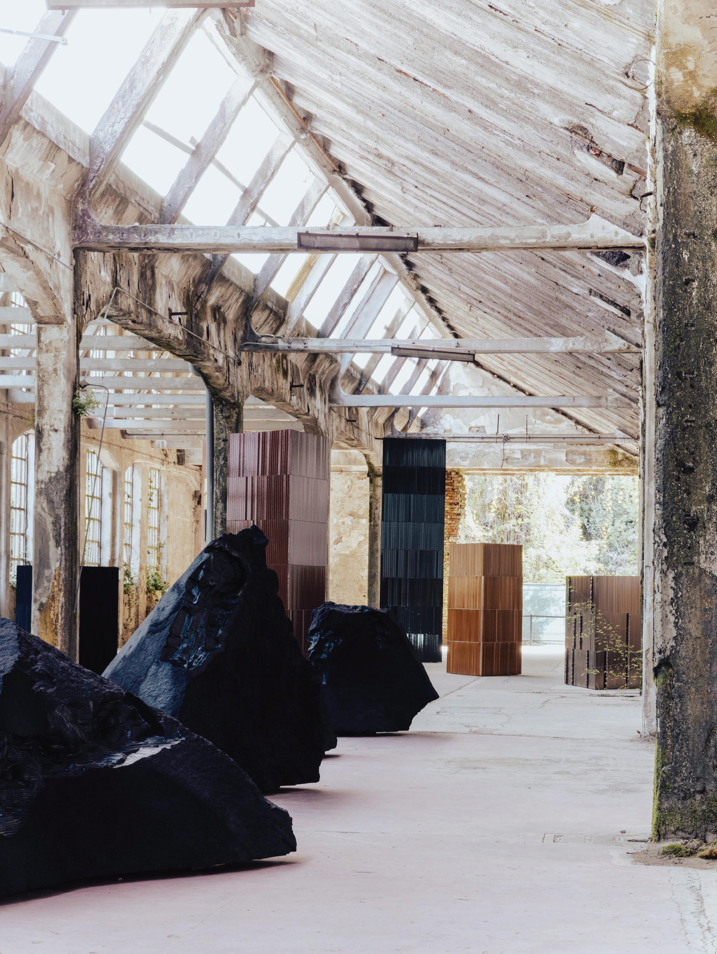
Ranieri
Alcova, Former SNIA Factory 20814 Varedo, Province of Monza and Brianza, Italy
Italian Lava stone company Ranieri launched Under the Volcano at a new Alcova site—the disused SNIA Factory—as a powerful fusion of art and nature in an awe-inspiring, site-specific vision of transformation. Sculptural raw lava blocks by digital artist Quayola, an immersive soundscape by Rodrigo D'Erasmo, and architectural towers by Francesco Meda and David Lopez Quincoces united in a multisensory experience. The towers, inspired by Barragan, were clad in lava stone tiles to reveal the material’s aesthetic and functional qualities.
Photography Piergiorgio Sorgetti
BOON_EDITIONS x A-N-D
Via San Vittore al Teatro, 3, 20123 Milano MI, Italy
BOON_EDITIONS and A-N-D presented a shared vision of craftsmanship, innovation, and timeless design within a labyrinthine former bank building. BOON_EDITIONS offers collectable furniture editions that merge avant-garde aesthetics with artisanal mastery. In a dialogue, Canadian company A-N-D unveiled luminous works that explore light’s poetic potential, including the Contour pendant and the Tier, featured at the back of the image.
Photography Studio Brinth
Ryuichi Kozeki
Alcova, Villa Borsani
Via Umberto I, 148, 20814 Varedo MB, Italy
Deconstructed minimalism finds new expression in Tokyo-based designer Ryuichi Kozeki’s Frame
Structured low chair. Here, minimal elements are reconfigured into an interplay that balances the spare and restrained with solidity and an enduring aesthetic. Approaching the craft of design with an architectural and spatial mindset, a central frame supports the chair; its floating, angled boards recall the works of Gerrit Rietveld.
Photography Piergiorgio Sorgetti
Tim Vranken
Via Rutilia 10/9, 20141 Milano MI, Italy
With a deep appreciation for the raw beauty of wood, Belgian designer Tim Vranken has chosen to apply geometric configurations to the structure of his new furniture pieces, enhancing a sense of depth and perspective. Shown as part of STRATA, a Belgian design exhibition, Vranken builds every piece himself, generally using massive sections of solid woods like oak or walnut. In his latest work, he has combined this with the intricate swirls of burl wood veneers.
Photography Alejandro Ramírez Orozco
Photography Nino Bartuccio
Lithea
Salone del Mobile.Milano Hall 18, Stand B10
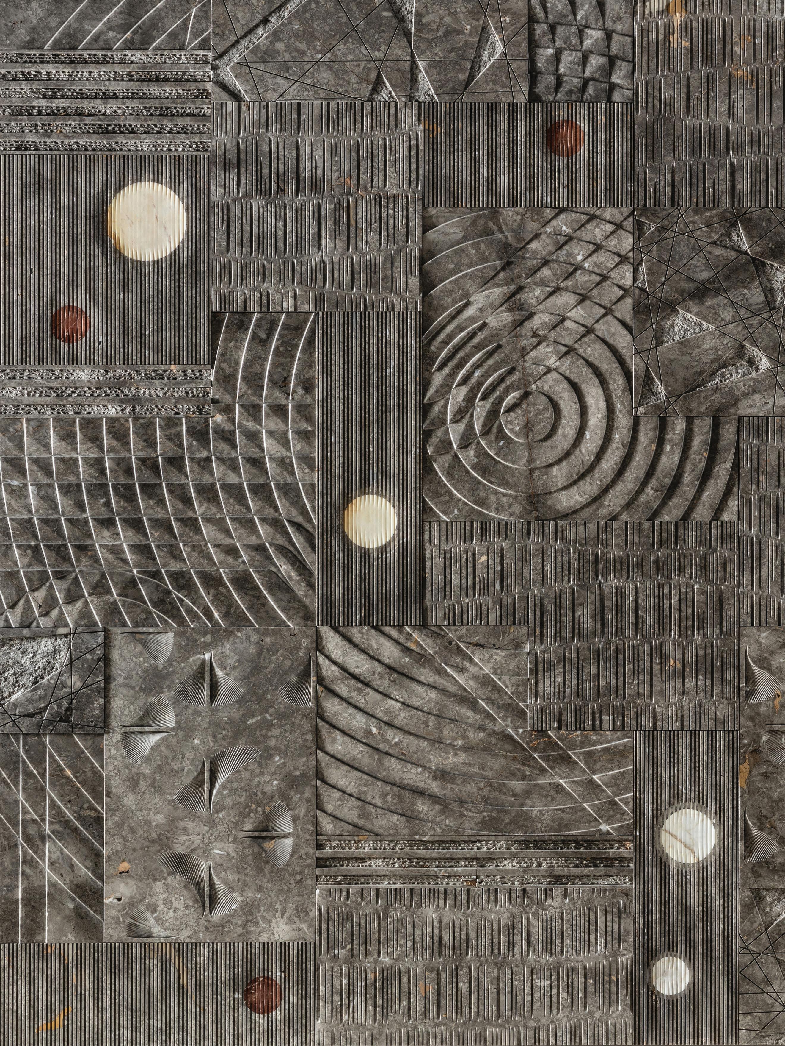
On the north coast of Sicily, Lithea constantly develop new and imaginative ways of working with stone. One of eight new collections presented this year, Motus Animi by Egidio Panzera is made from Grigio Billiemi with inlays in Giallo Siena, Rosso Diaspro and Calacatta. The panels are a patchwork of markings in precise circles and fine lines with sections of rough chiselling. The incredibly complex interplay of textures and toneon-tone colour variations is mesmerising.
Linde Freya Tangelder
Via Rutilia 10/9, 20141 Milano MI, Italy
Much is said about the exploration of materials in design. Still, few designers are as hands-on as Linde Freya Tangelder, founder of the Belgian-based Dutch design studio Destroyers/ Builders. Her exhibition at the Belgian group show STRATA revealed her current fascination with lacquered cotton as an upholstery material, where she applied the lacquer herself to bring out colour variations and sheen. New pieces incorporating mould-blown glass, patinated aluminium, white bronze, and her signature deep carving of wood were also shown.
Photography Alejandro Ramírez Orozco
Mingardo
Galleria Mingardo
Corso di Porta Nuova, 42, 20124 Milano MI, Italy
Since its foundation in 1970, Mingardo has pushed the envelope in metal production. This year, the Italian company released eight new designs by Gregory Beson, Joffrey Dappe, Andy Hillman, Andrea Tognon, and Riccardo Villa Fabbiati. The Pina chair by Gregory Beson was inspired by the choreographer Pina Bausch. Its single arm opens up the cylindrical form in an inviting gesture.
Photography Courtesy of Mingardo
Completedworks
Alcova, Villa Borsani
Via Umberto I, 148, 20814 Varedo MB, Ital
Completedworks debuted its first furniture collection at Alcova’s Villa Borsani with a show that transformed functional forms into sculptural statements, blurring the line between object and ornament. Led by Anna Jewsbury, the Londonbased jewellery brand presented polystyrene forms coated in clay and finished with a silver nitrate mirror. “I love the idea that a piece is beautiful but has a slight strangeness to it,” Jewsbury says.
Photography Piergiorgio Sorgetti
Lost Profile Studio
Via Ciovasso, 6, 20121 Milano MI, Italy
Carapace is a collection of lighting products—both flame-source and electric— inspired by the dual influences of antique candle reflectors and the form of a turtle's shell. “The turtle’s shell, as nature’s armour, symbolises security, resilience, and the delicate balance between form and function,” Melbourne-based Lost Profile Studio founder Oliver Wilcox says of his show in Milan's Brera district.
Photography Cathy Marshall
Atelier de Troupe x studioutte
Foro Buonaparte, 69, 20121 Milano MI, Italy
Atelier de Troupe and studioutte’s Intermezzo blurred the line between design and cinema through curated objects, textured materials, and sculptural lighting. Light becomes a narrative tool, animating an otherworldly domain where form and feeling converge. Shown here is the ODEON sofa and PIANO stool by studioutte, and CANALE sconces by Atelier de Troupe, accompanied by curated artworks by Truls Blaasmo, which add historical weight.
Photography Giulio Ghirardi studio
Saint Laurent x Charlotte Perriand
Padiglione Visconti
Via Tortona, 58, 20144 Milano MI, Italy
Four one-off pieces—a coffee table, chair, sofa, and bookcase—dating from 1943 to 1967 by the great modernist designer Charlotte Perriand were reintroduced by the French fashion house Saint Laurent. Perhaps the most remarkable piece is the seven-metre-long sofa designed for the Japanese Ambassador’s residence in Paris. Rosewood plays a big role across all four pieces, but Vienna cane and tubular steel also feature. Available in editions of eight to 30.
Photography Courtesy of Saint Laurent
Beni Rugs x Studio KO
5VIE
Via Cesare Correnti, 14, 20123 Milano MI, Italy
In the artfully decaying headquarters of the 5vie design precinct, New York’s Beni Rugs collaborated with Parisian architects Studio KO in an installation involving thousands of pieces of carefully arranged invoices, notes and envelopes. Within this intriguing mess were ten thoroughly modern designs created by Studio KO. All handmade in Morocco, the details and colours offer a lovely counterpoint to traditional Moroccan designs.
Photography Sara Soldano
Molteni&C x Gamfratesi
Palazzo Molteni
Via Alessandro Manzoni, 9, 20121
Milano MI, Italy
With its sweeping, solid-wood arms and open structure, the Lia armchair by Gamfratesi offers a lightweight expression of what is a very generously proportioned design. Made from solid oak, the chair perfectly represents the marriage of its designer’s nationalities: Danish and Italian.
Photography Courtesy of Molteni&C
Mutina x Brigitte Niedermair
Casa Mutina Milano Via Cernaia, 1A, 20121 Milano MI, Italy
Celebrating its twentieth anniversary, leading ceramic tile manufacturer Mutina presented Being Mutina, created in collaboration with artist and photographer Brigitte Niedermair and curated by Helen Nonini. Room sets designed by Niedermair were built using a singular tile pattern from the Mutina range and displayed alongside a photograph of the set taken by Niedermair. The magic that light and a talented photographer bring to real-world objects and architecture is there for all to see.
Photography Matteo Tranchellini Studio
British-Canadian
brings sculptural Acerbis with Trench, of sofas and armchairs an elemental, ancestral surprising comfort. minimal legs, the float, echoing Acerbis’ innovation and craftsmanship contemporary, purposeful
Acerbis x Malouin
Salone del Mobile.Milano Hall 24,
Malouin
x Philippe Malouin
Mobile.Milano C14-D19
designer Philippe sculptural clarity to Trench, a collection armchairs that fuse ancestral form with comfort. Elevated on pieces appear to Acerbis’ commitment to craftsmanship through a purposeful design lens.
Photography Alberto Strada
De Castelli
Salone del Mobile.Milano
Hall 22, BO4
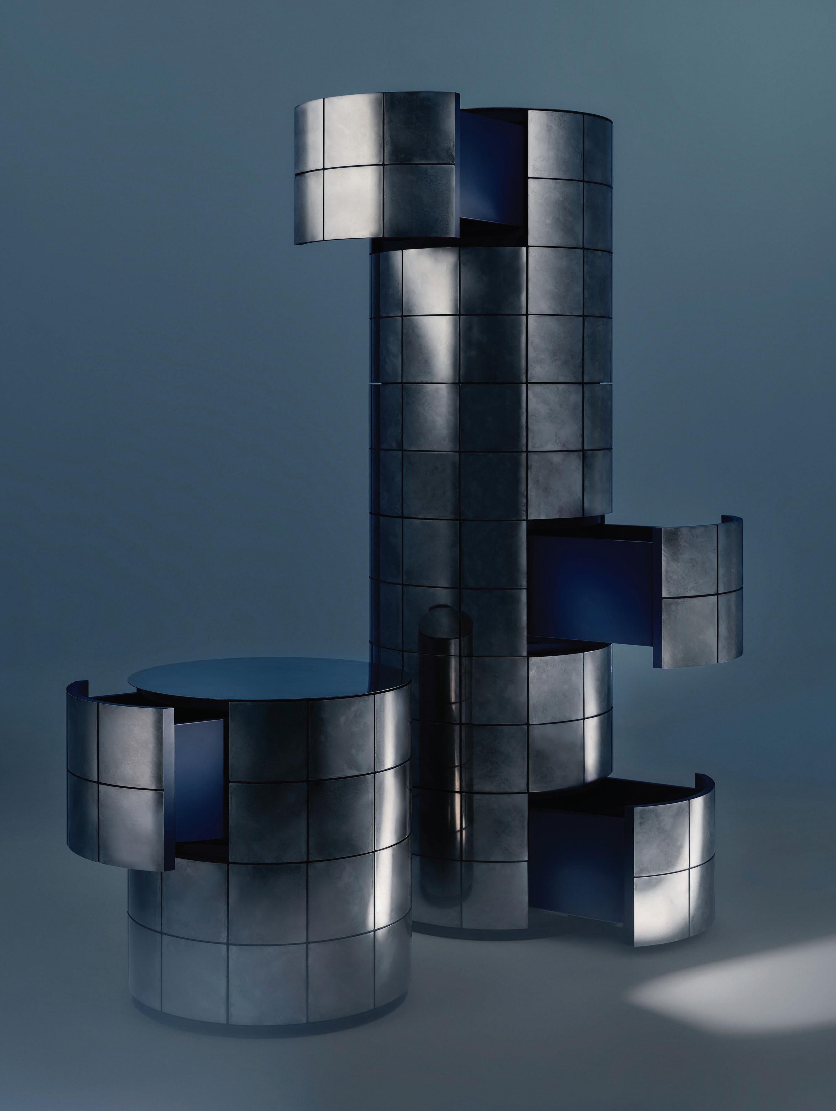
Fourth-generation metal finishing specialist De Castelli presented their Iridium Edition: hand-worked stainless steel versions of several of their wellknown furniture pieces. The DeIridium finish is designed to capture the depth and mirror-like reflection of a still body of water. Shown here is Pandora with vivid blue drawer interiors.
Photography Mattia Balsamini
Loro Piana x Dimorestudio
Via della Moscova, 33, 20121 Milano MI, Italy
La Prima Notte di Quiete enveloped visitors in a cinematic dreamscape, featuring a velvet-draped entrance to a surreal domestic reverie that is signature of Dimorestudio. During the four-minute viewing, slices of theatrical light exposed areas of the home, while sounds, such as a phone ringing, a piano, and the patter of rain on the windows, alongside an ambient soundtrack by composer Nicola Guiducci, created a heightened tension. The collaboratively created rooms blend furniture designed by Dimorestudio founders Emiliano Salci and Britt Moran for Loro Piana, alongside antiques and Dimoremilano furniture pieces upholstered with Loro Piana Interiors fabrics.
Photography Andrea Ferrari
Acerbis x Francesco Meda and David Lopez Quincoces
Salone del Mobile.Milano Hall 24, C14-D19
Acerbis creative directors Francesco Meda and David Lopez Quincoces illustrate their partnership with Le Cupole, melding geometric purity and sculptural panache. This marble table, anchored by three domed bases, balances architectural precision with material sensuality, capturing the brand’s ethos of formal experimentation, refined detail, and a dialogue between design and structure.
Photography Alberto Strada
AtMa
Alcova
Villa Borsani
Via Umberto 1, 148, 20814 Varedo, MB, Italy
Sparked by the number of broken or damaged Børge Mogensen J39 chairs in Japan’s vintage markets, creative studio AtMa, founded by Makoto Suzuki and Ayumi Koyama, designed a collection that recycles the chair in an inventive way. Creating new designs from the constituent parts, the collection of unusual seating archetypes was shown in the moody basement of Villa Borsani as part of Alcova.
Photography Piergiorgio Sorgetti
Grôpk ceramics
Alcova, Villa Bagatti Valsecchi
Via Vittorio Emanuele II, 48, 20814 Varedo MB, Italy
Showing at Villa Bagatti Valsecchi in a room marked by history, Karst, a show by Grôpk founder, Polish ceramacist Marcin Kuberna, is a meditation on geological time. Ceramics, inspired by karst landscapes, where bedrock dissolves to create caves and sinkholes, are envisioned not as final forms but as mutable bodies—awaiting transformation through the elements they usually resist: water, minerals, and slow decay.
Photography Piergiorgio Sorgetti
Bohinc Studio x StudioTwentySeven
Alcova, Villa Bagatti Valsecchi
Via Vittorio Emanuele II, 48, 20814 Varedo MB, Italy
Debuting at Villa Bagatti Valsecchi with StudioTwentySeven, ANIMA by Lara Bohinc continues her love of the super-sized with a sculptural collection inspired by the peaks and troughs found in the landscape. With crafted upholstery by Maison Philippeau, the collection comprises a sofa, armchair, and occasional chair, paired with a mahogany coffee table shaped by laser and chisel in Portugal, evoking rock-like formations.
Photography Piergiorgio Sorgetti
Amber Echoes x Nilufar Depot
Nilufar Depot
Viale Vincenzo Lancetti, 34, 20158
Milano MI, Italy
Amber Echoes at Nilufar Depot showcases Nina Yashar’s signature curatorial blend of contemporary and vintage pieces. Inspired by the hallucinogenic qualities of the Ergot plant, these ethereal Murano glass forms by Christian Pellizzari have otherworldly fragility. Combined with a pair of 1950s armchairs by Brazilian artist Giuseppe Scapinelli, with a Jacaranda wood frame and copper-coloured satin upholstery, Yashar creates dialogues across time and place.
Photography Alejandro Ramírez Orozco
Nina contemporary hallucinogenic Murano an 1950s Scapinelli, copper-coloured across
Monde Singulier x Garance Vallée
In conjunction with the high-end French design platform Monde Singulier, architect, artist, and designer Garance Vallée presented a tightly controlled collection of interior objects: a bed, console, floor lamp, and chair, all shown in a simple, grey-curtained room. Geometric voids break the chair’s glossy exterior in a contemporary take on De Stijl.
Via Montebello, 30, 20121 Milano MI, Italy
Photography Ludovic Balay
Cassina x Formafantasma
Teatro Lirico Giorgio Gaber Via Larga, 14, 20122 Milano MI, Italy
Celebrating 60 years of Cassina’s manufacture of the iconic Le Corbusier, Pierre Jeanneret and Charlotte Perriand collection, influential research and design studio Formafantasma were engaged to mark the anniversary. In response, the studio, in collaboration with theatre and opera director Fabio Cherstich, created one of the events of this year’s design week. Staging Modernity, a dramatic performance featuring songs, modern dance, model animals, and, of course, a selection of the aforementioned furniture, was presented at Teatro Lirico and performed four times a day for the duration of Milan Design Week.
Photography Omar Sartor
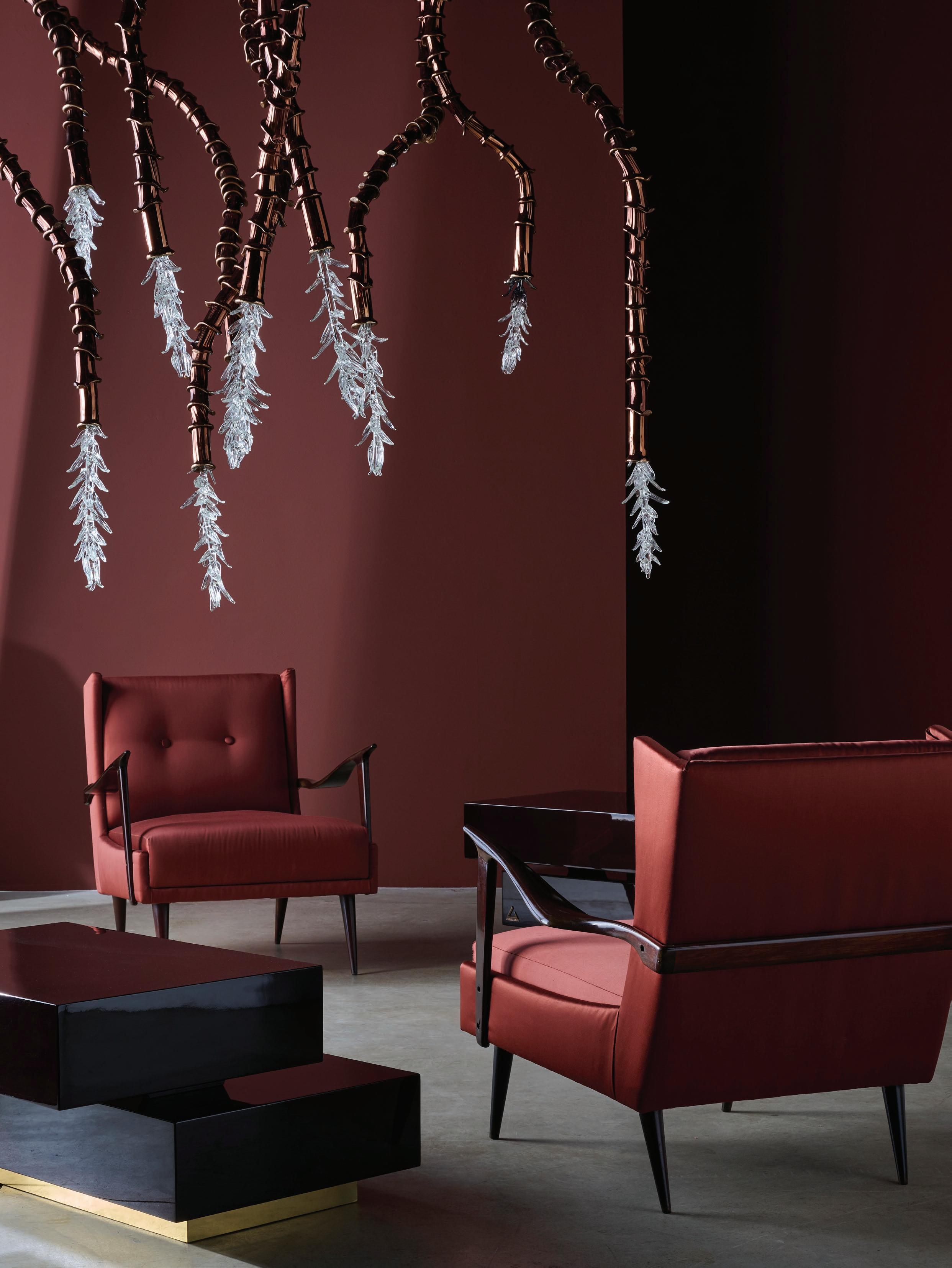
A TRIBUTE TO CALIFORNIAN MODERNISM
This Page: The jewel-toned Marilyn chair by Draga & Aurel, in muted purple leather, makes a bold, sculptural statement with a nod to 1960s design. Previous Spread: The Fluid mirror by Federico Peri reflects the ochre-toned walls, while the softly hued aquamarine Inga chair by Roberto Lazzeroni and the textured Nepal chair by Paola Navone — upholstered in hand-finished Mongolian fur — pair elegantly with Lazzeroni’s Isamu Stone table in the dining space.
Italian furniture house Baxter unveiled its new collection, West Coast Aesthetics—a refined exploration of 1960s Californian design.
Blending modernist elegance with bold materiality, the latest furniture collection from Baxter pays homage to the free-spirited yet sophisticated sensibility of the American West Coast, reinterpreting mid-century forms through sculptural silhouettes, flowing geometries, and innovative finishes.
Key highlights included sculpted tables, detailed leather seating, and chrome-framed lighting, all designed to echo the effortless harmony between interior and exterior found in Californian homes of the era. The collection was underpinned by three distinctive colour palettes—earthy browns and lush greens evocative of the desert, a soft blend of sandy tones and muted purples, and a retroinspired mix of ochre and soft magenta inspired by coastal sunset and the creative energy of the 1960s.
The narrative unfolded simultaneously across Baxter’s Milan experiences including an immersive redesign of the Baxter Cinema. A decade after its original transformation, the space was reimagined with Venetian-finished floors, suspended architectural elements, and delicate partitions inspired by Carlo Scarpa’s poetic materiality. Visitors were invited to move through a light-filled environment where surfaces and shadows shaped a renewed spatial rhythm.
Housed in the same building, the iconic Baxter Bar in Largo Augusto became a living installation, celebrating the evolution of the brand’s outdoor collection. Reflective of the city’s rhythm, pieces crafted from natural stone, leather, and technical fabrics mirrored Baxter’s commitment to craftsmanship, comfort, and atmosphere—all in an open-air setting.
WORDS Megan Rawson
Across town, Baxter reimagined Ristorante Alto as a temporary design installation suspended above Milan. Taking in views of the famed Duomo, the space featured sculptural forms, rich textures, and a palette that moved between refined neutrals and soft, moody tones. Baxter invited guests to experience design—not only as an aesthetic offering, but as a sensorial journey grounded in connection, memory, and material innovation.
Set along the serene shores of Lake Como, La Casa sul Lago reinterpreted Baxter’s latest collection within the iconic villa’s curated interiors and against a backdrop of the three distinctive colour palettes. Roberto Lazzeroni’s INGA chairs bring sculptural clarity and tactile refinement, while Paola Navone’s NEPAL chair introduces bold, textural contrast in hand-finished Mongolian fur. At the centre of the study, the AEGATES desk in mustard lacquer stands as a focal point. The modular LLOYD bookcase by Baxter P. blurs the line between storage and sculpture, while the abstract NOOR A rug grounds the space in tonal depth and geometric rhythm.
Produced in partnership with SPACE Furniture. Discover the Baxter range >
This page: A study in bold forms and rich finishes, the high-gloss mustard lacquered Aegates desk by Baxter P is complemented by the low-slung So Soft ottoman with tubular chrome detailing. Opposite page: Cast from polished antique steel, the Y25 table by Pietro Russo introduces a striking architectural presence, while the Marilyn dining chairs by Draga & Aurel provide a contrasting softness with their sculptural curves. Overhead, the Nube Blanca pendant by Studiopepe evokes the ethereal and ever-shifting nature of clouds.
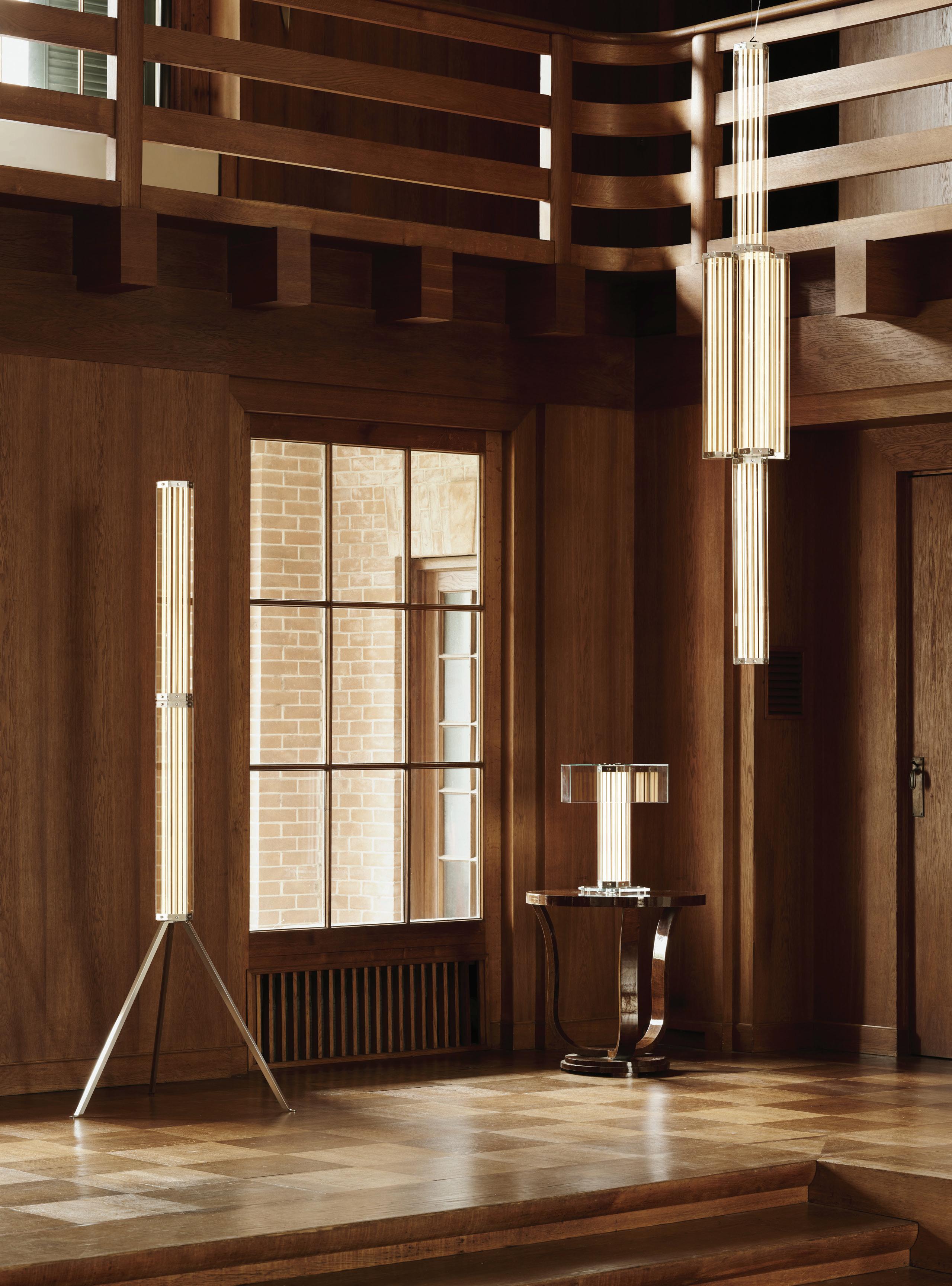
LOCATION Milan, Italy DESIGN Giampiero
PHOTOGRAPHY
Tagliaferri
Billal Baruk
Taright WORDS Aleesha Callahan
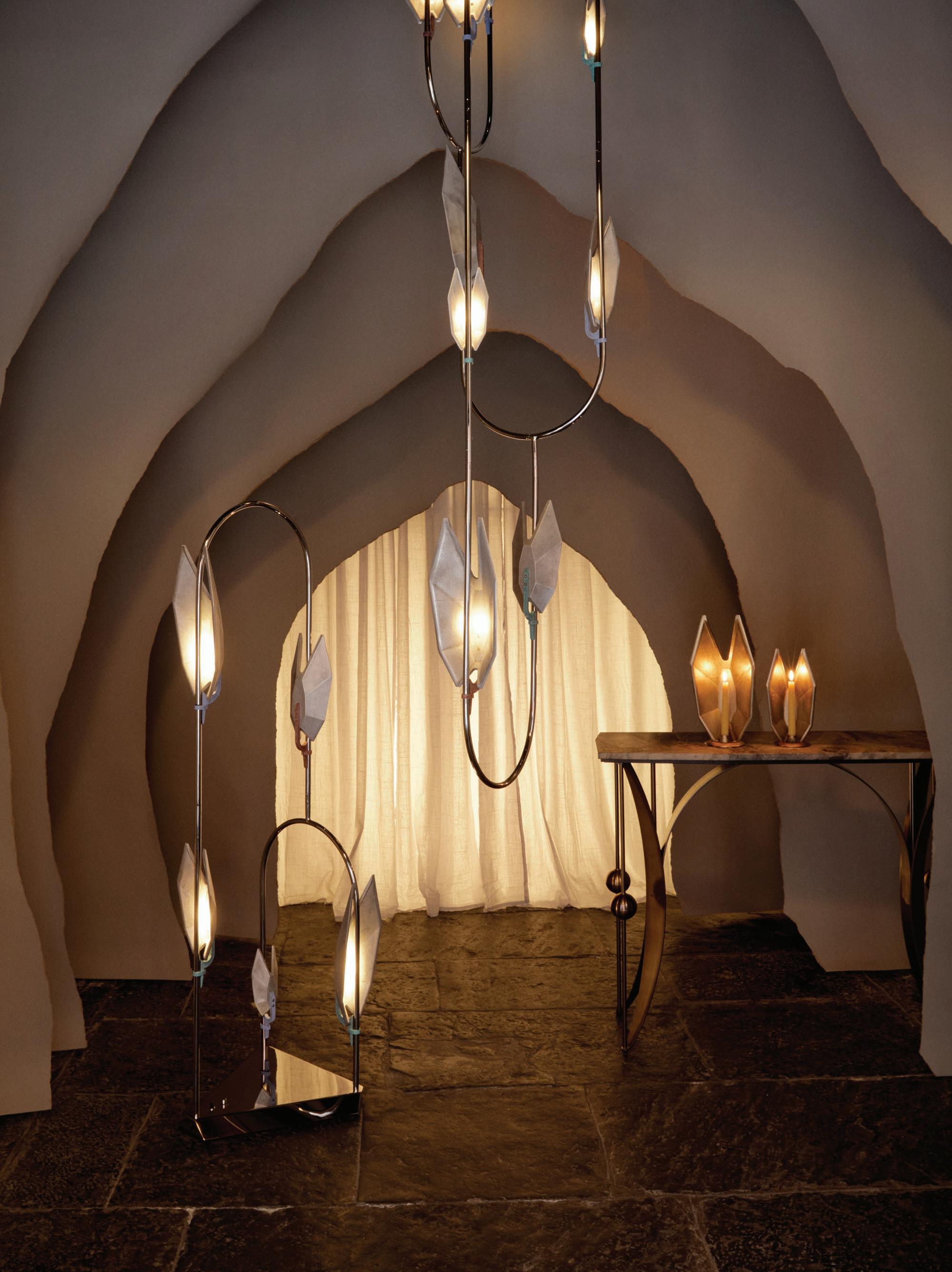
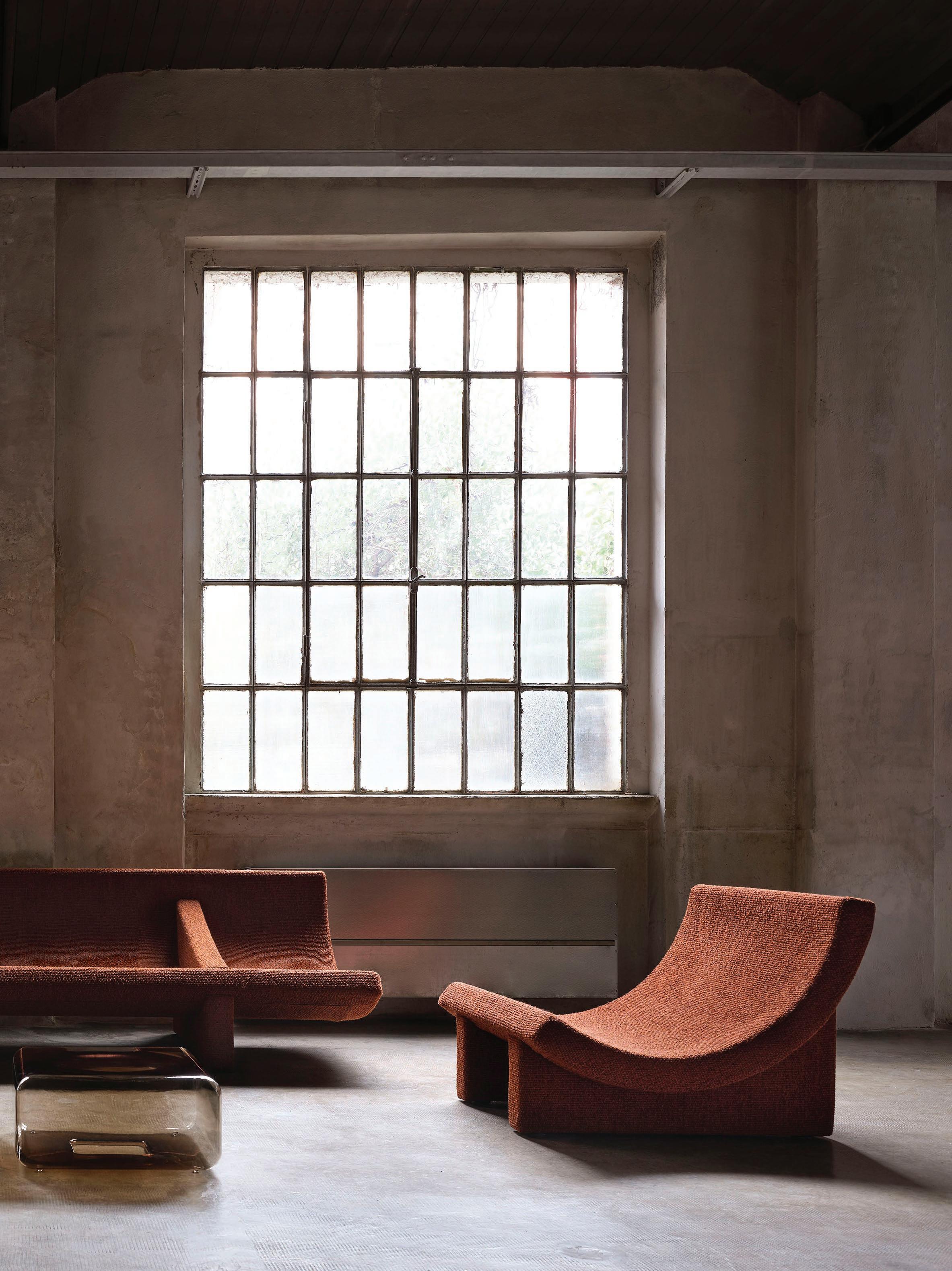
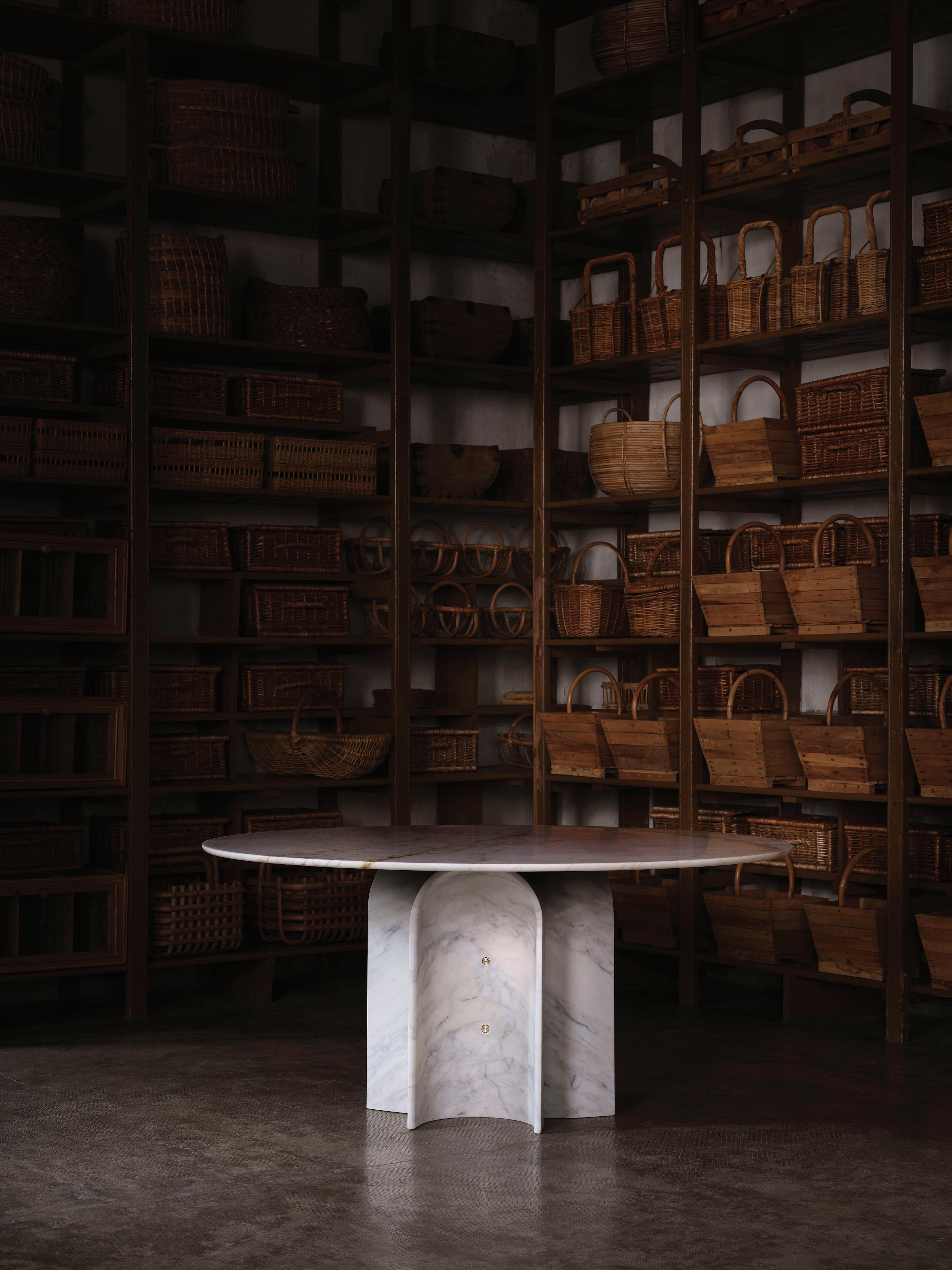
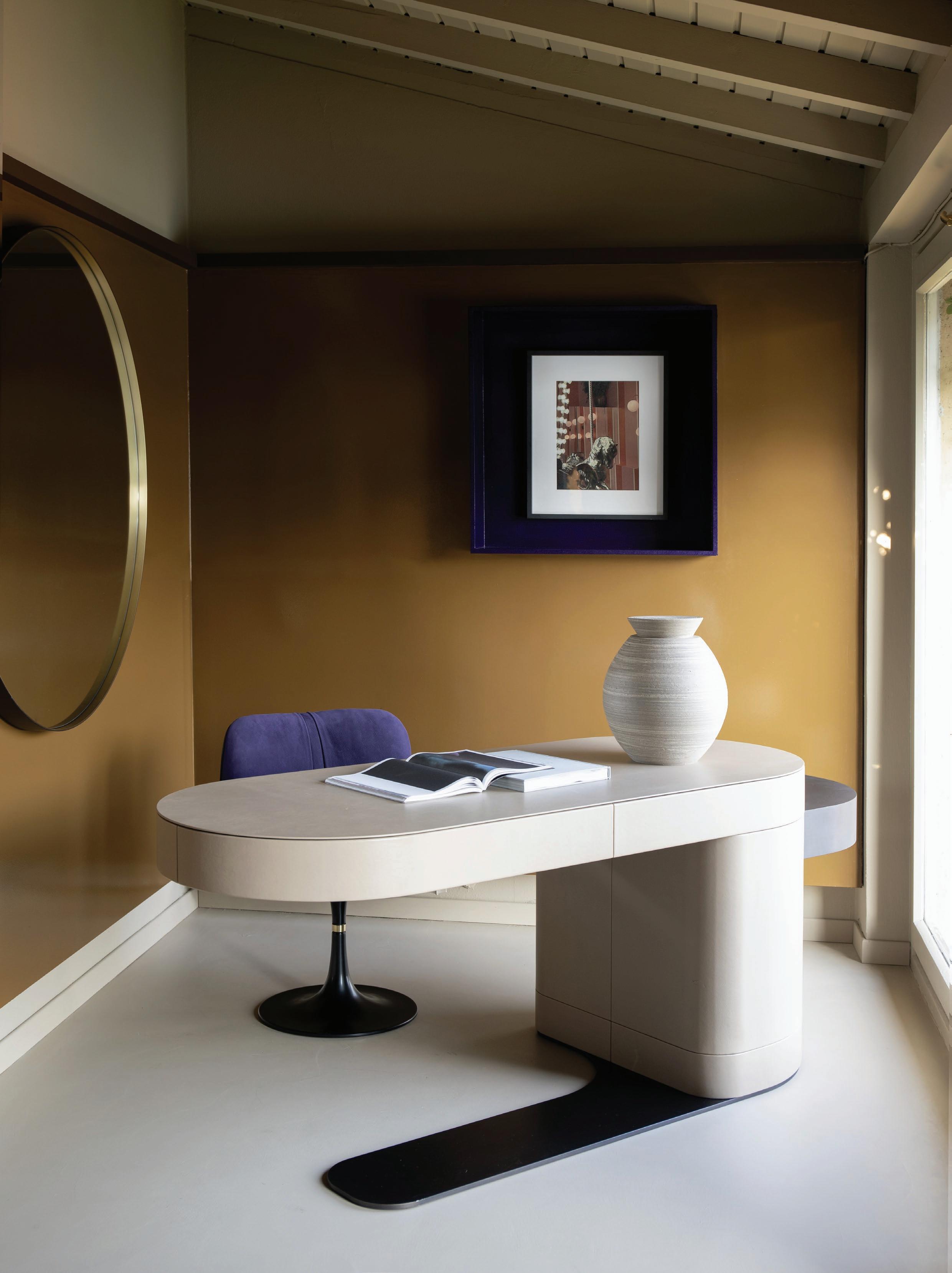
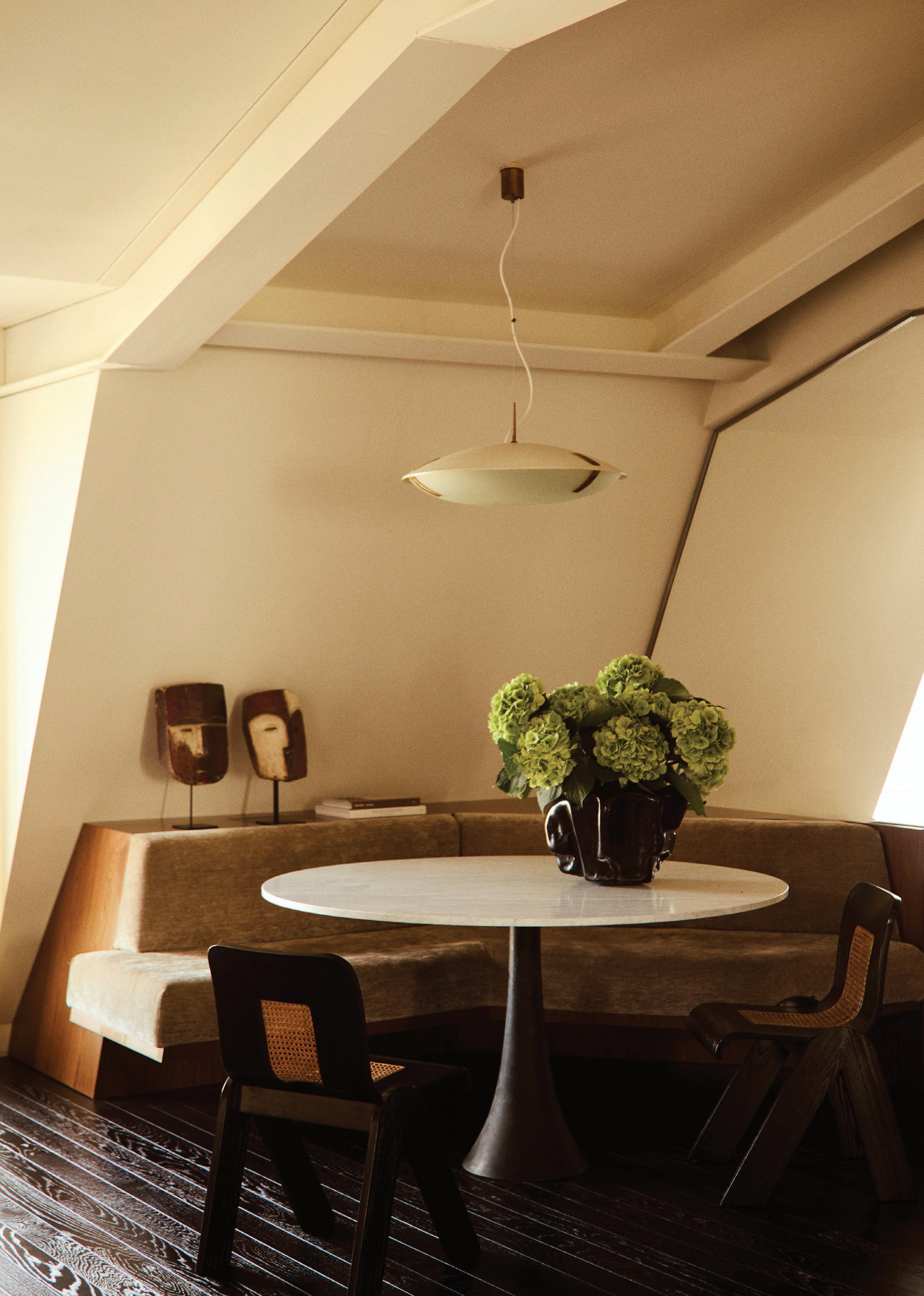
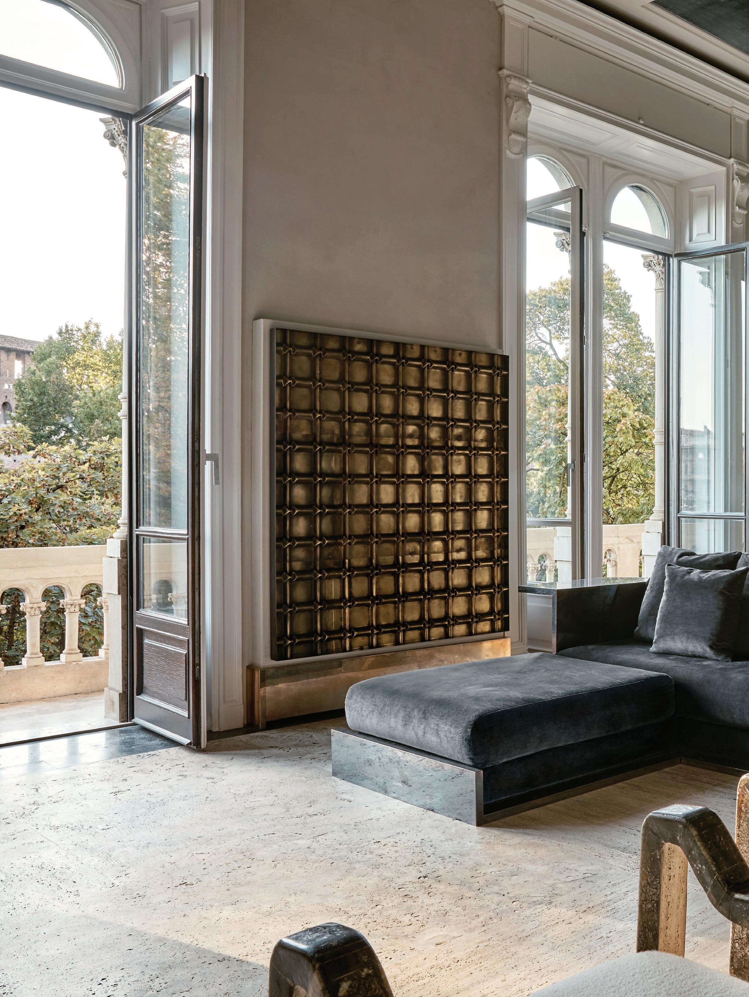
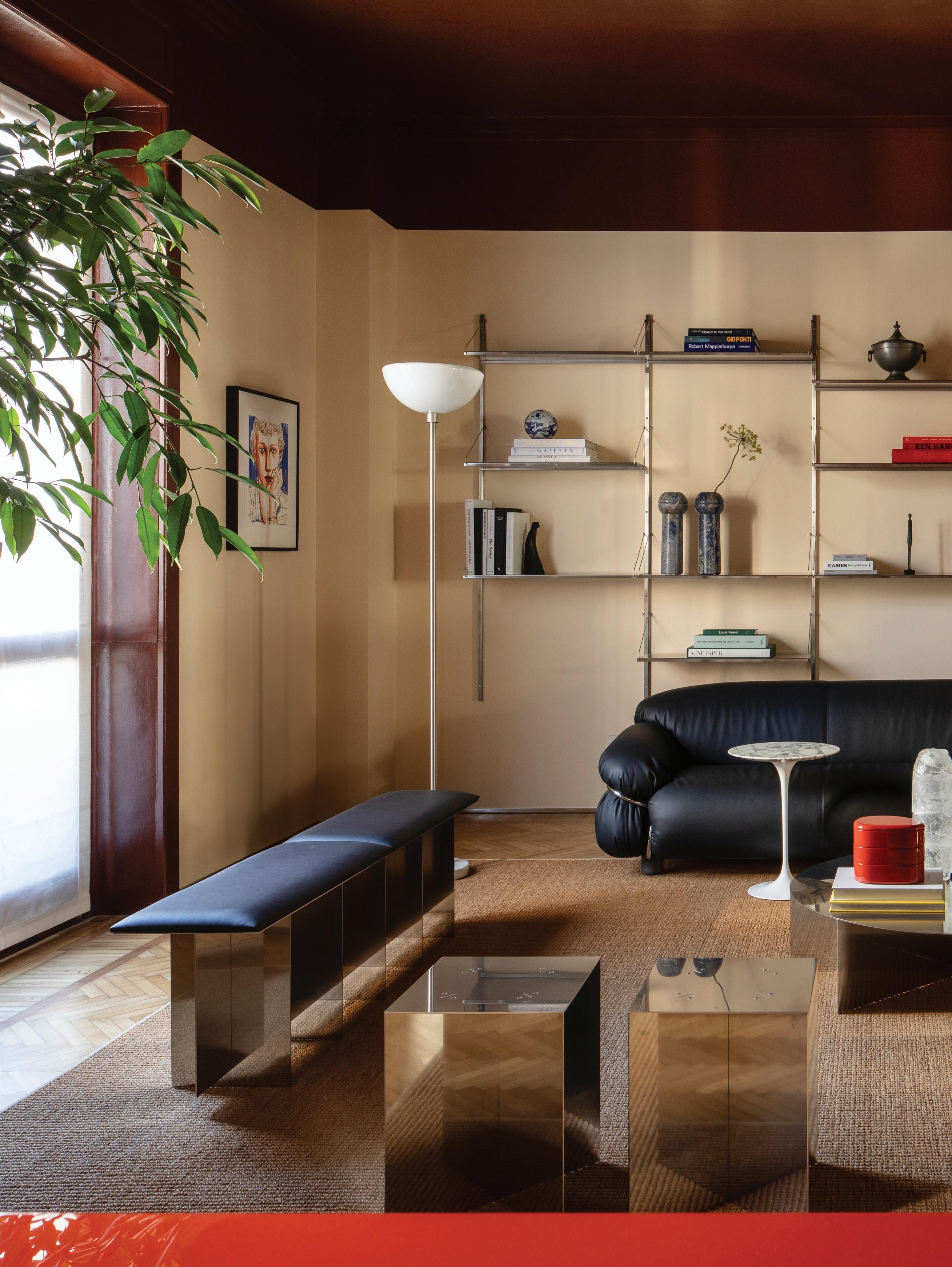
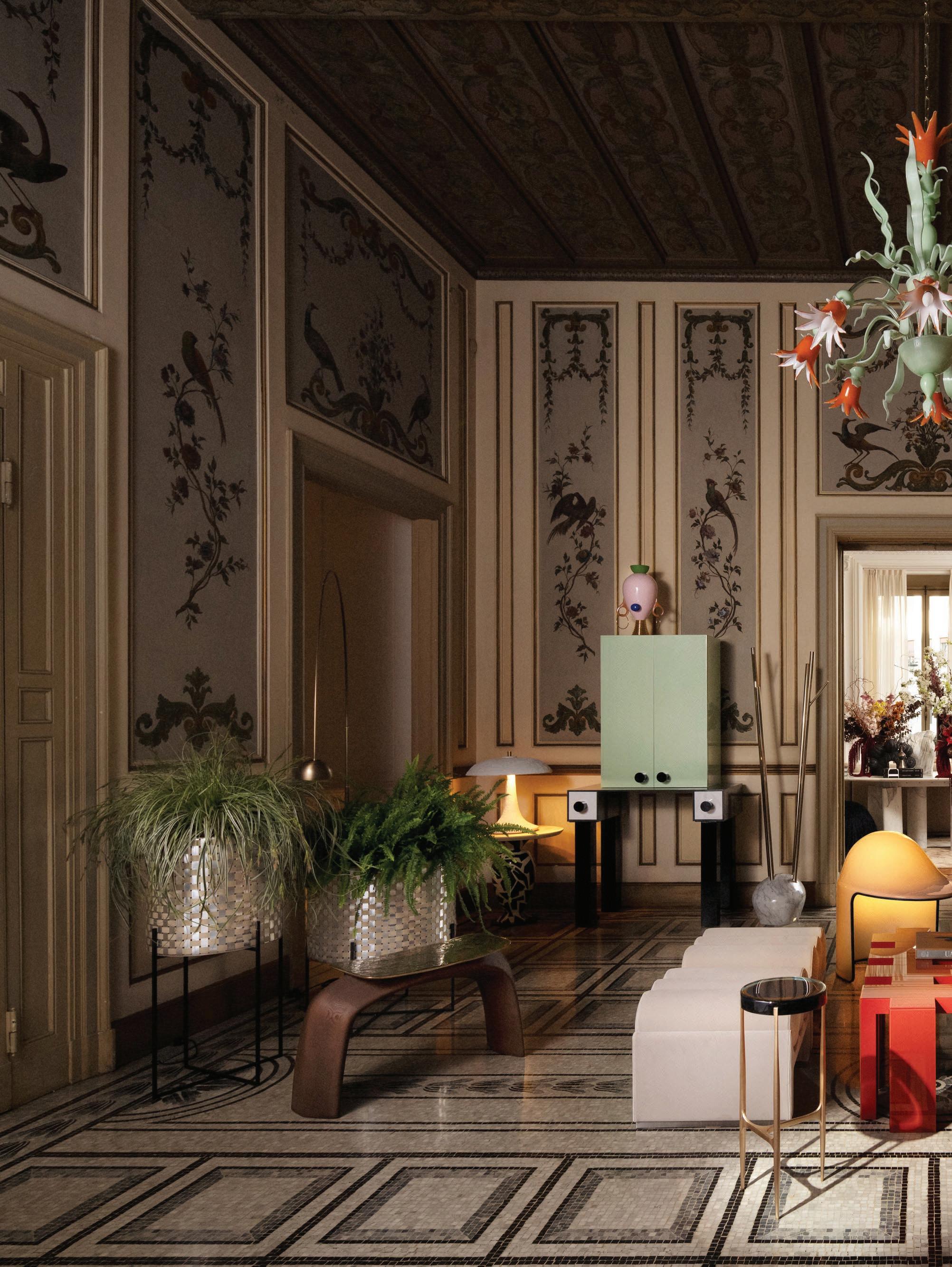
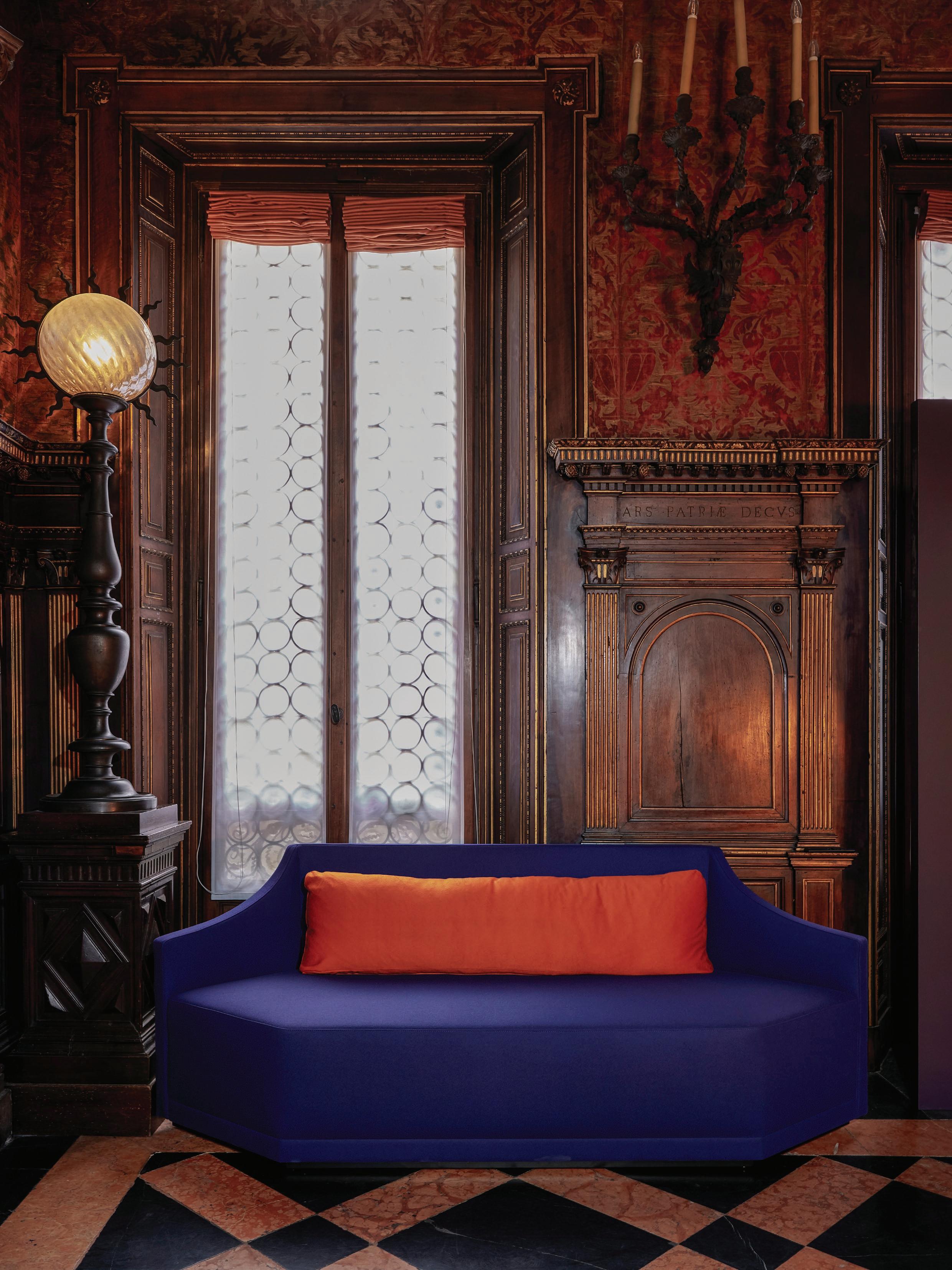
Inspired by the old-world charm of luxury European hotels, this Milan penthouse is skilfully layered with diverse design influences and eras, perfect for an art-collecting couple.
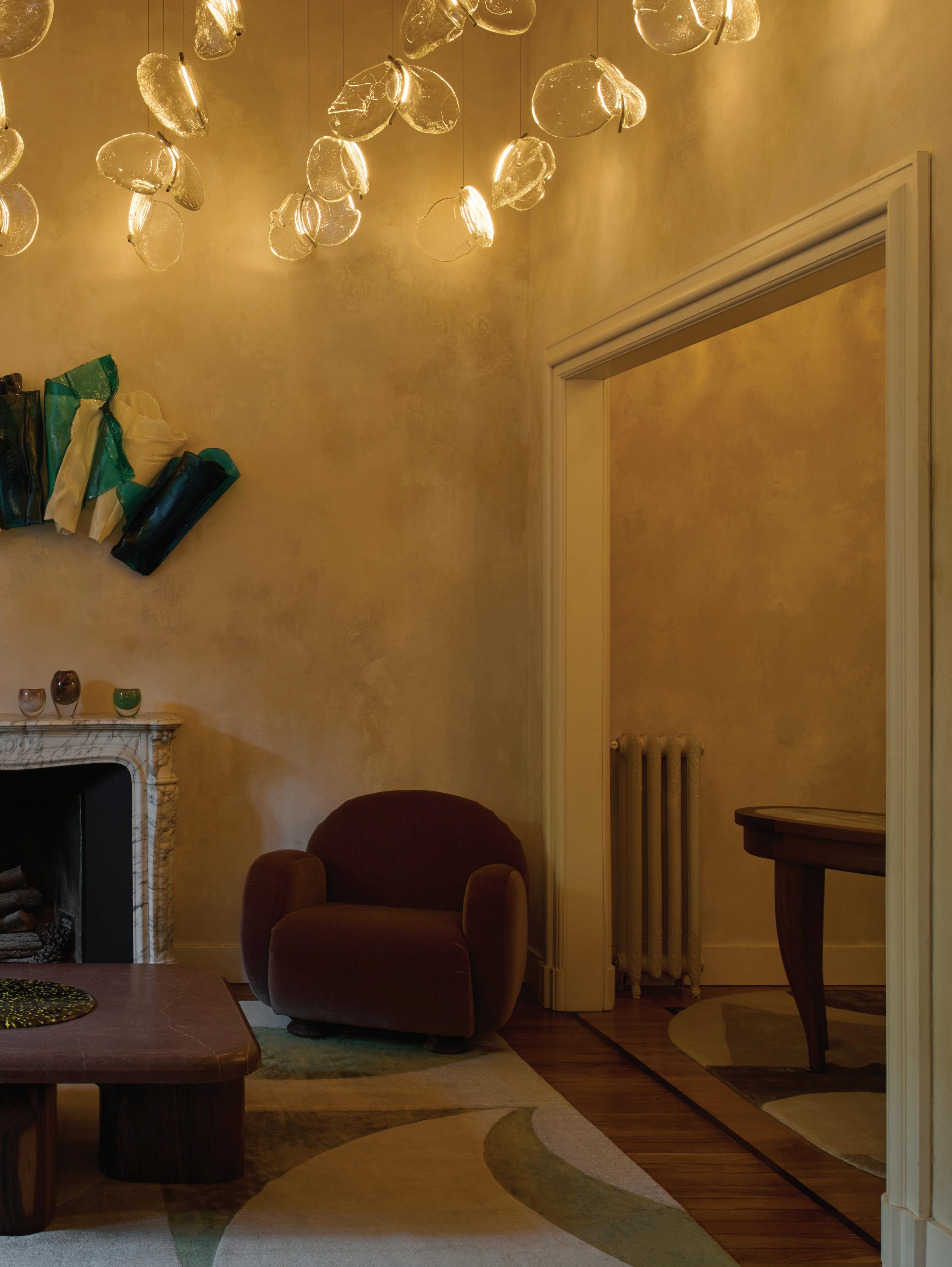
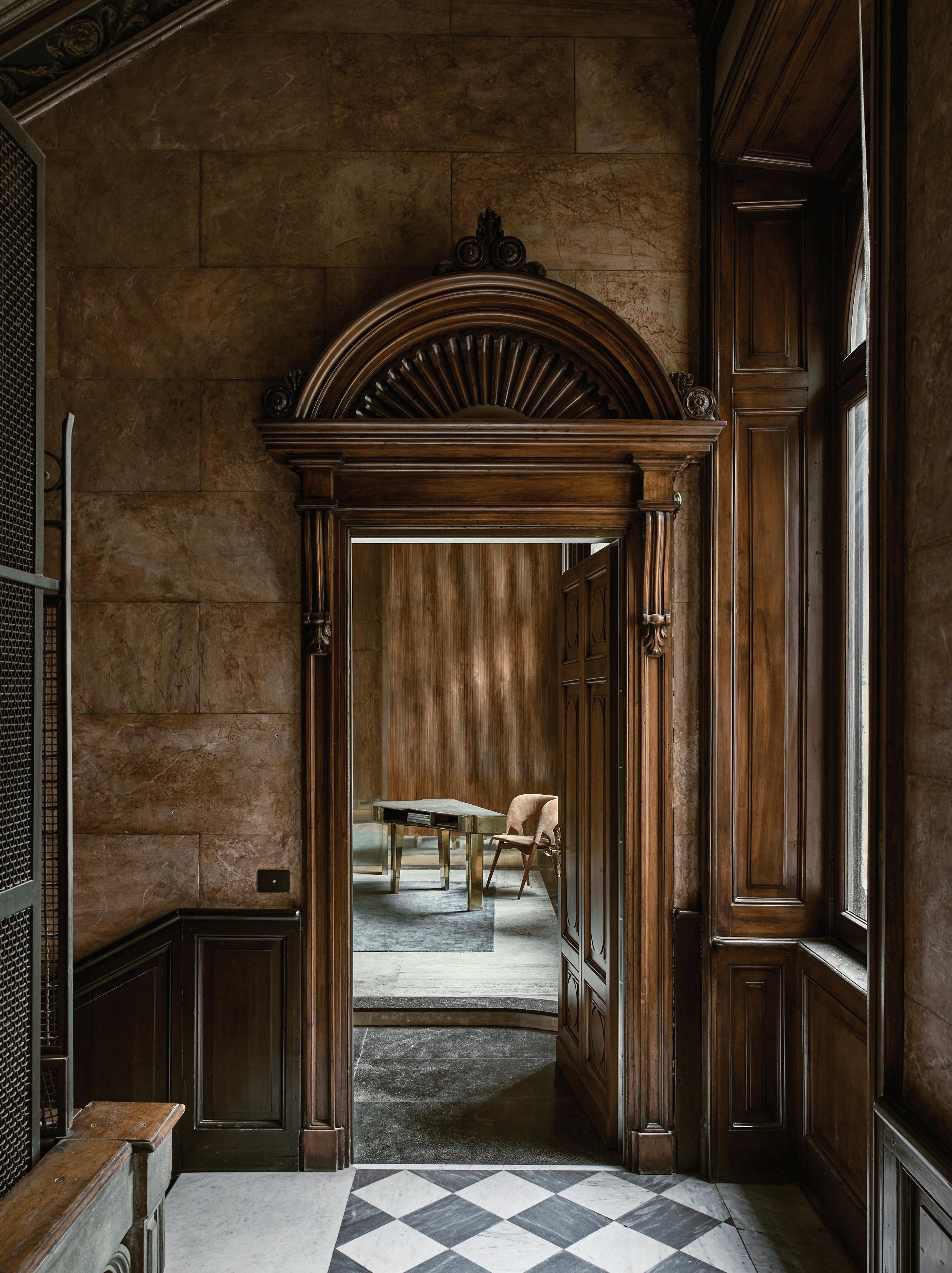
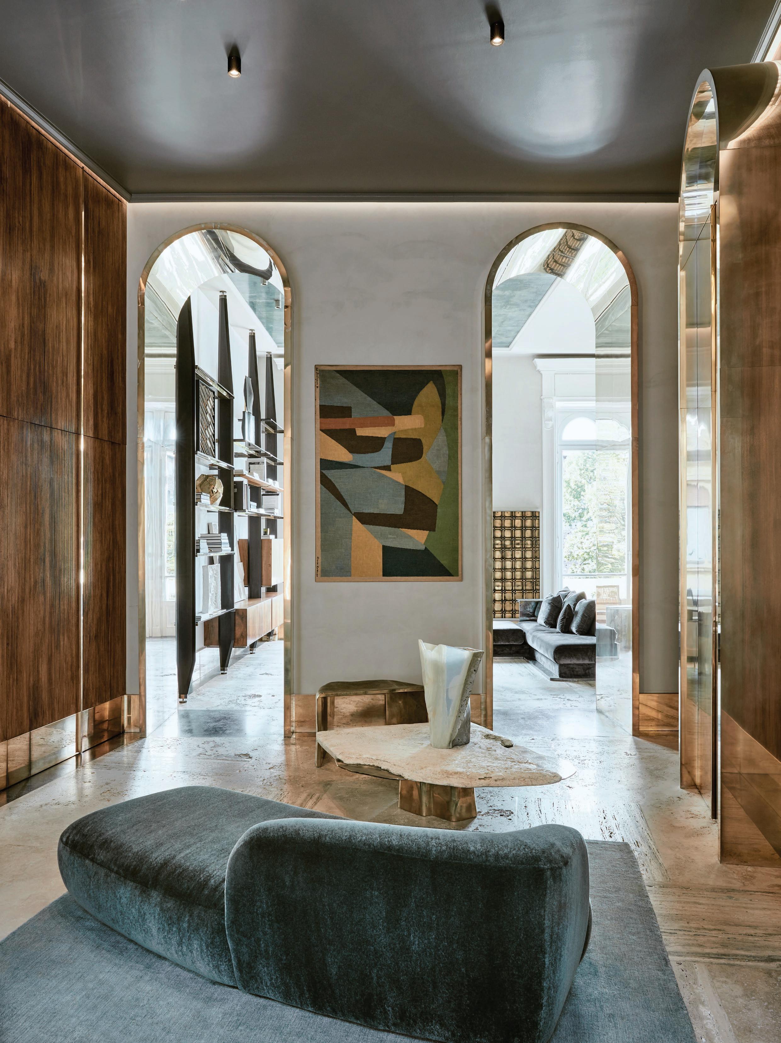
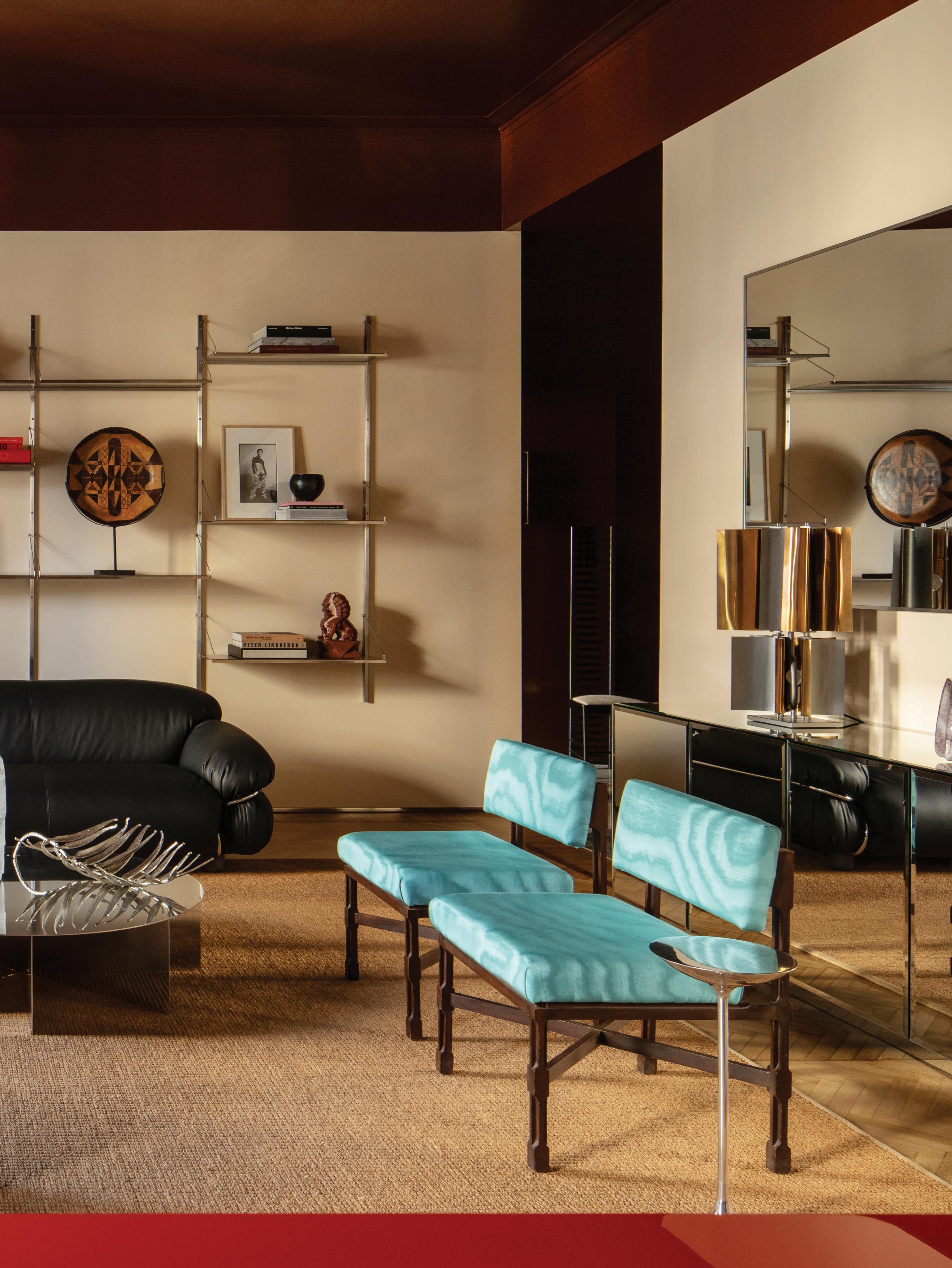
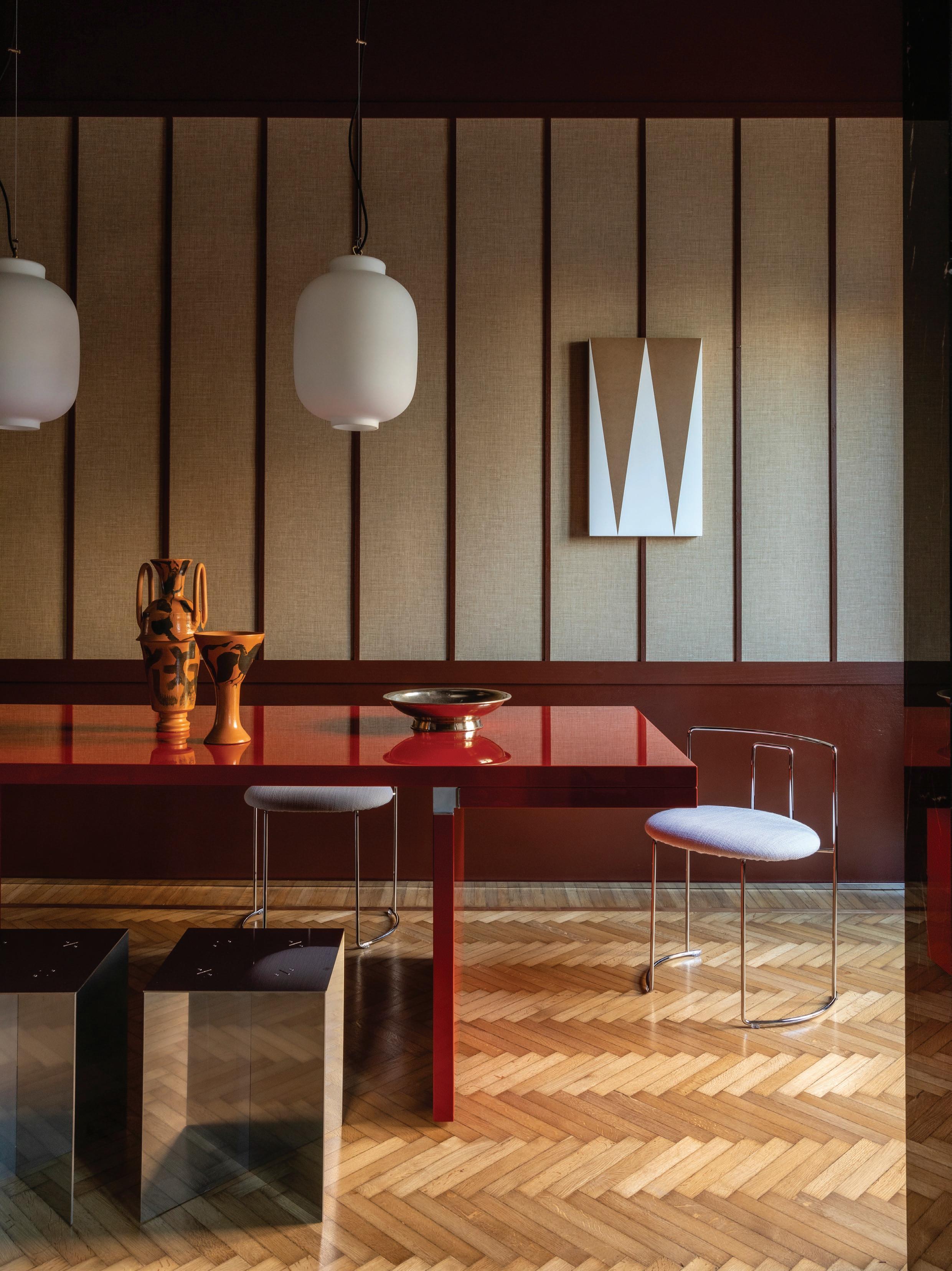
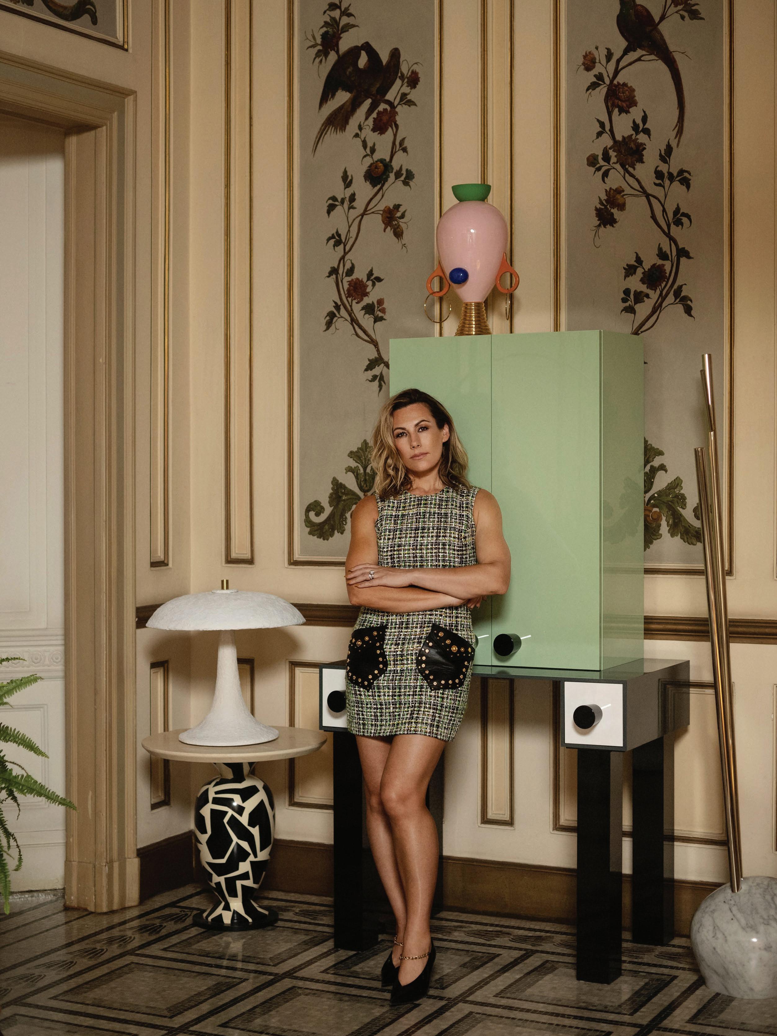
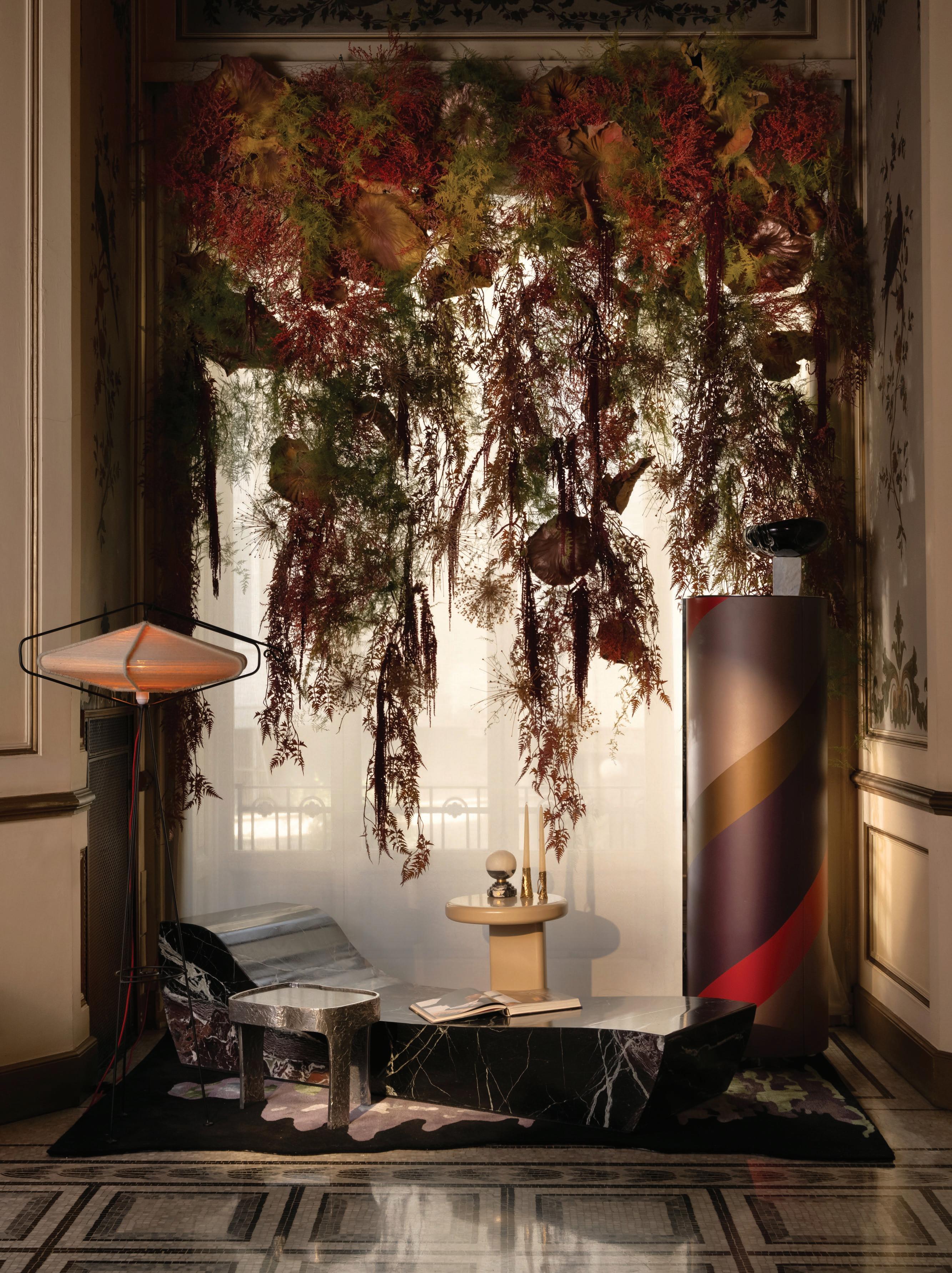
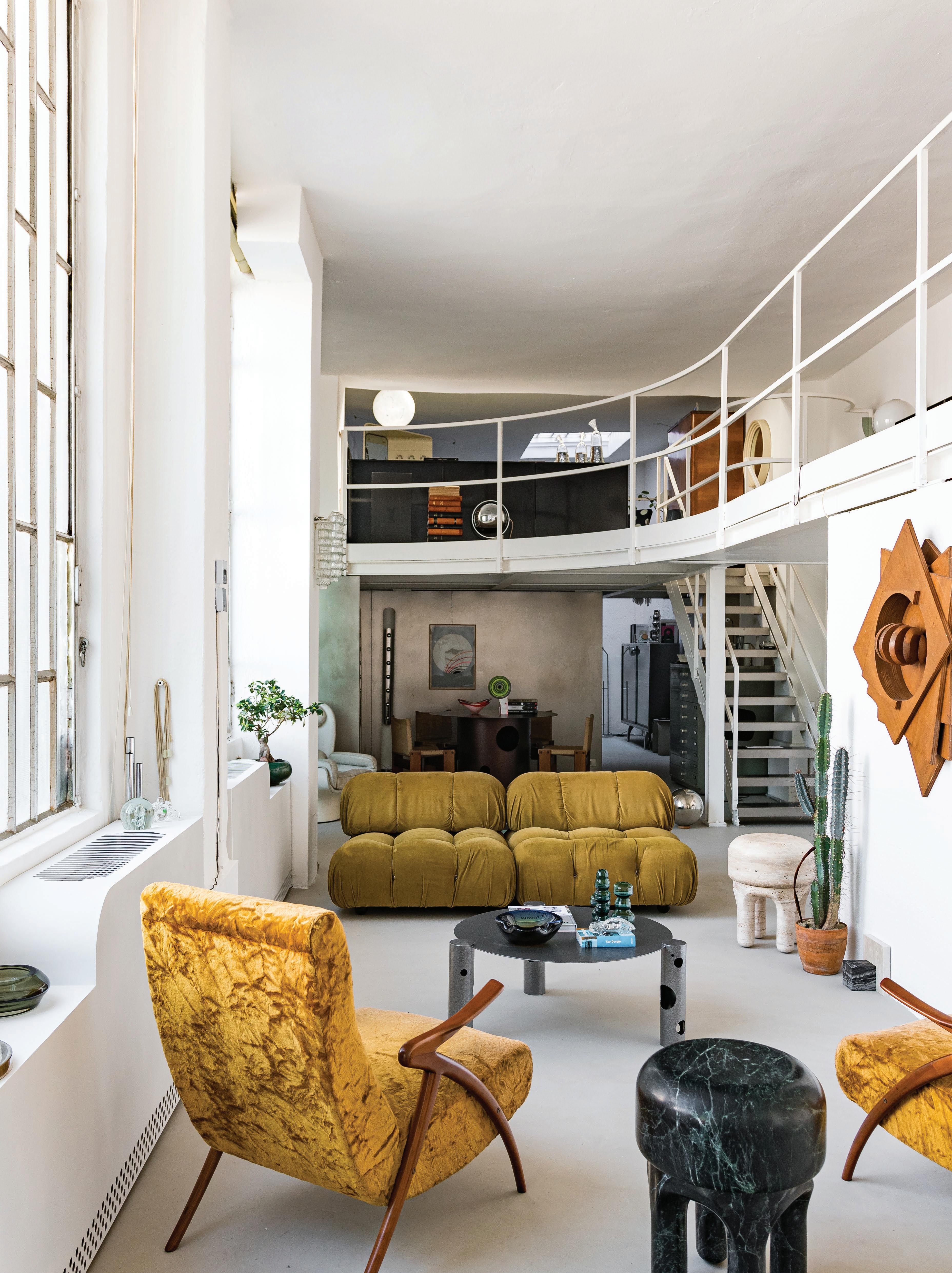
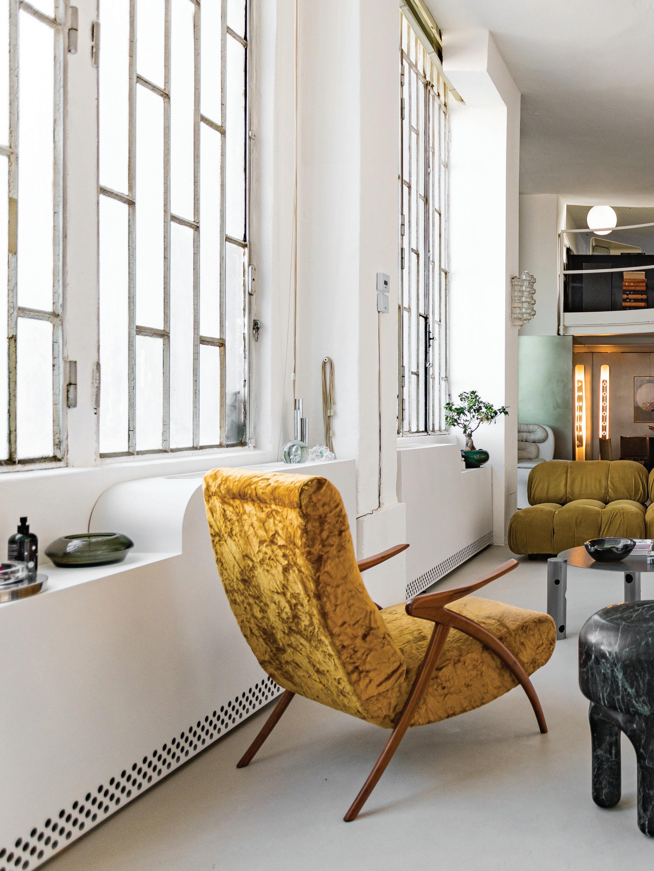
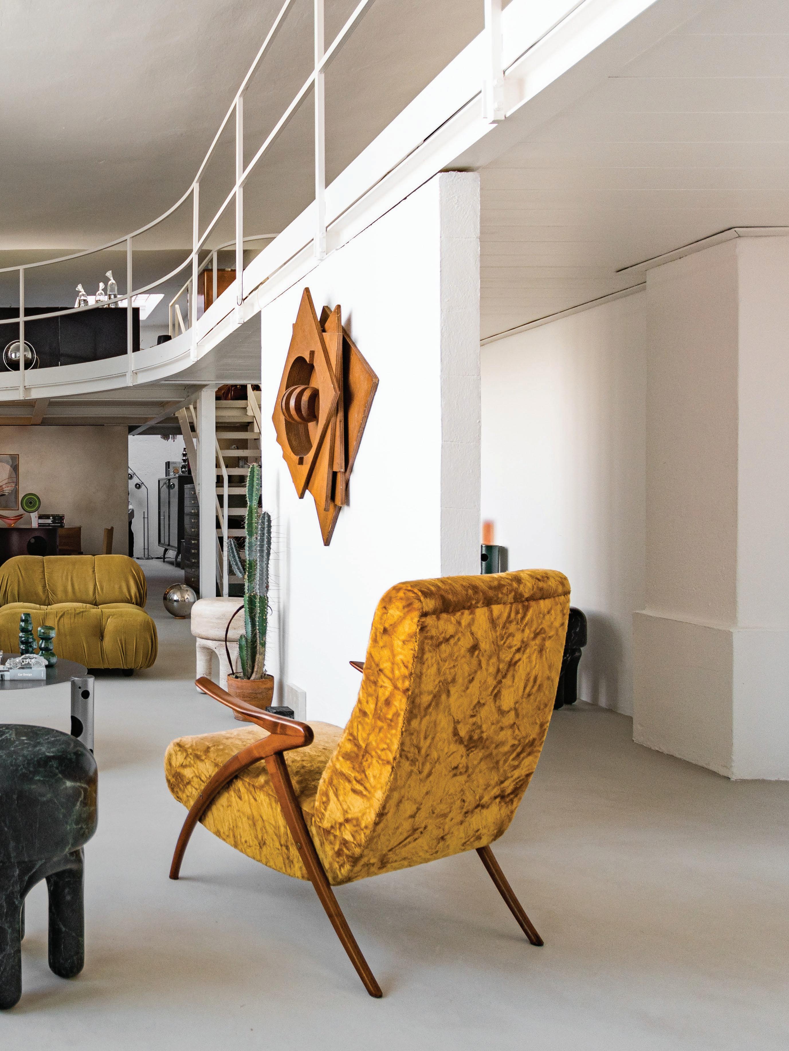
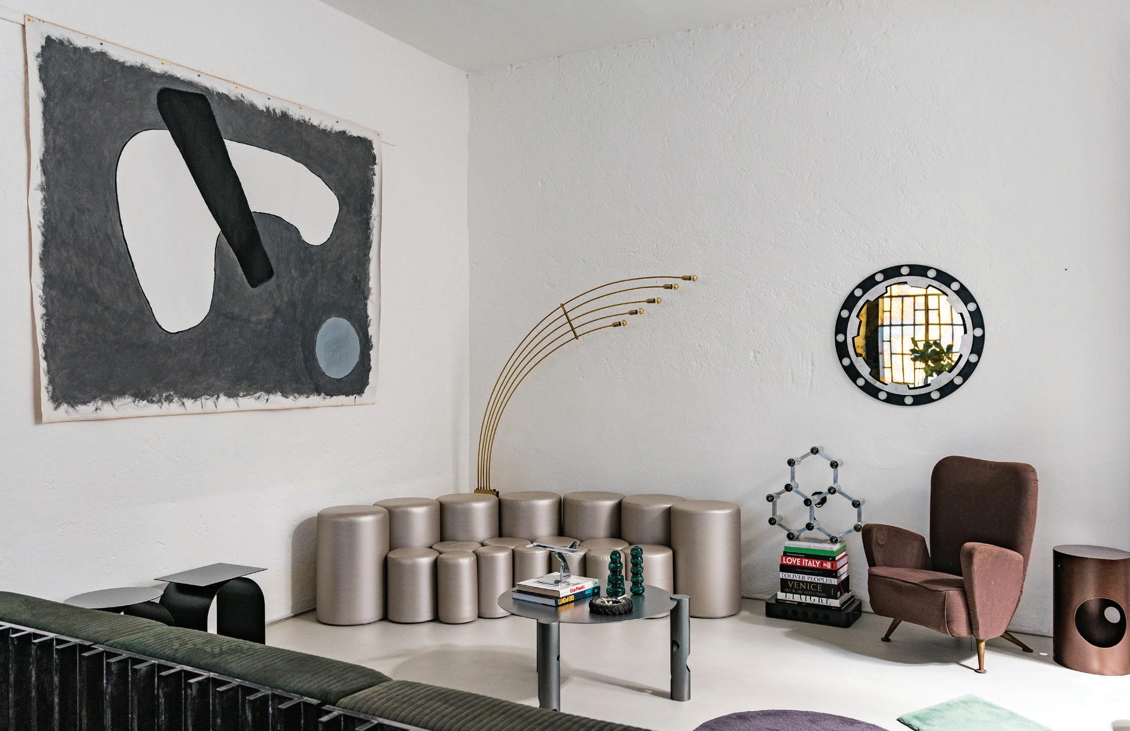
Embracing the cross-continental lifestyle of its owners, this Milan penthouse by Italian designer Giampiero Tagliaferri is a richly-layered sanctuary that merges art, architecture and personal expression. Designed for a young art-collecting couple who, like Tagliaferri himself, divide their time between Milan and Los Angeles, the apartment reflects a deeply idiosyncratic vision—an elegant blend of play and personality.
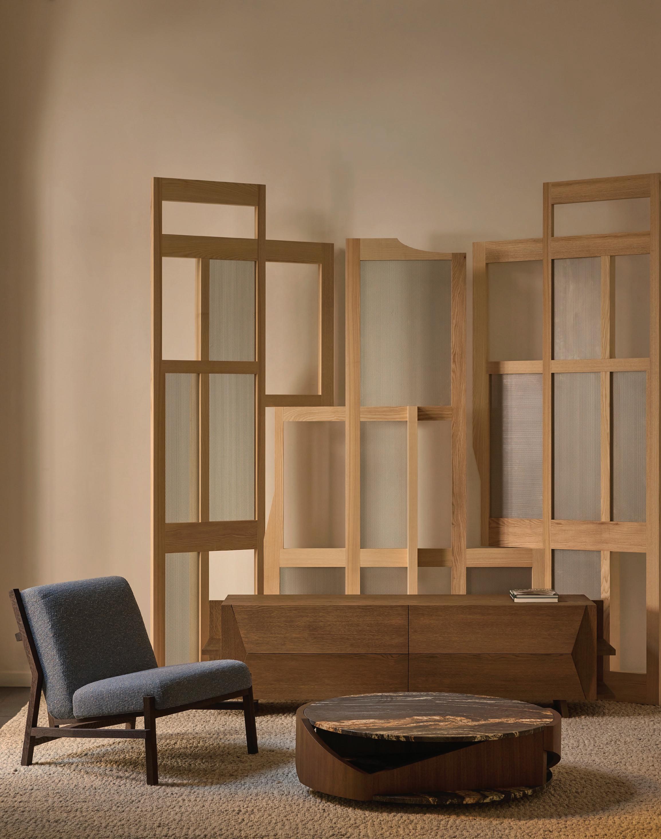
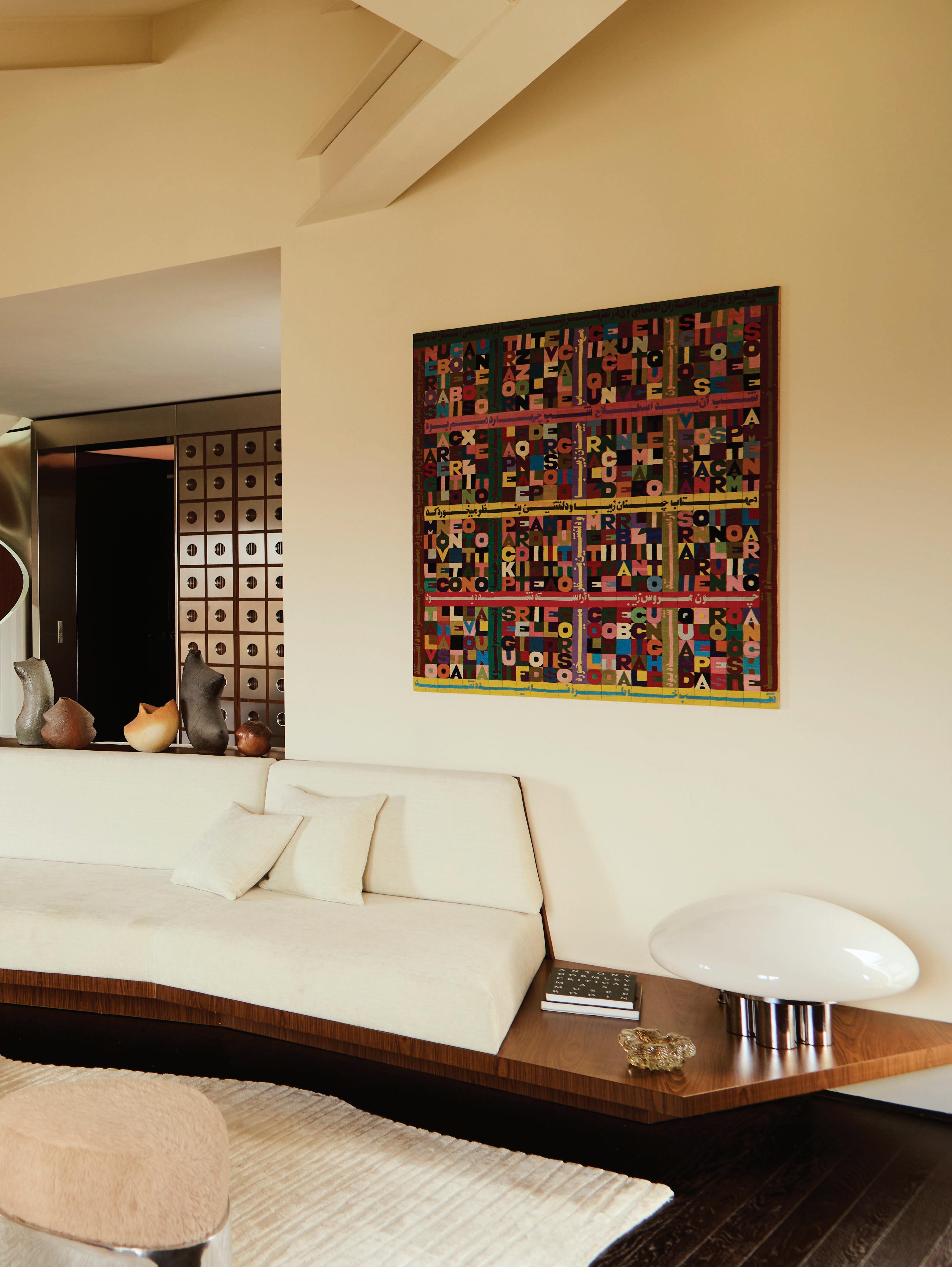
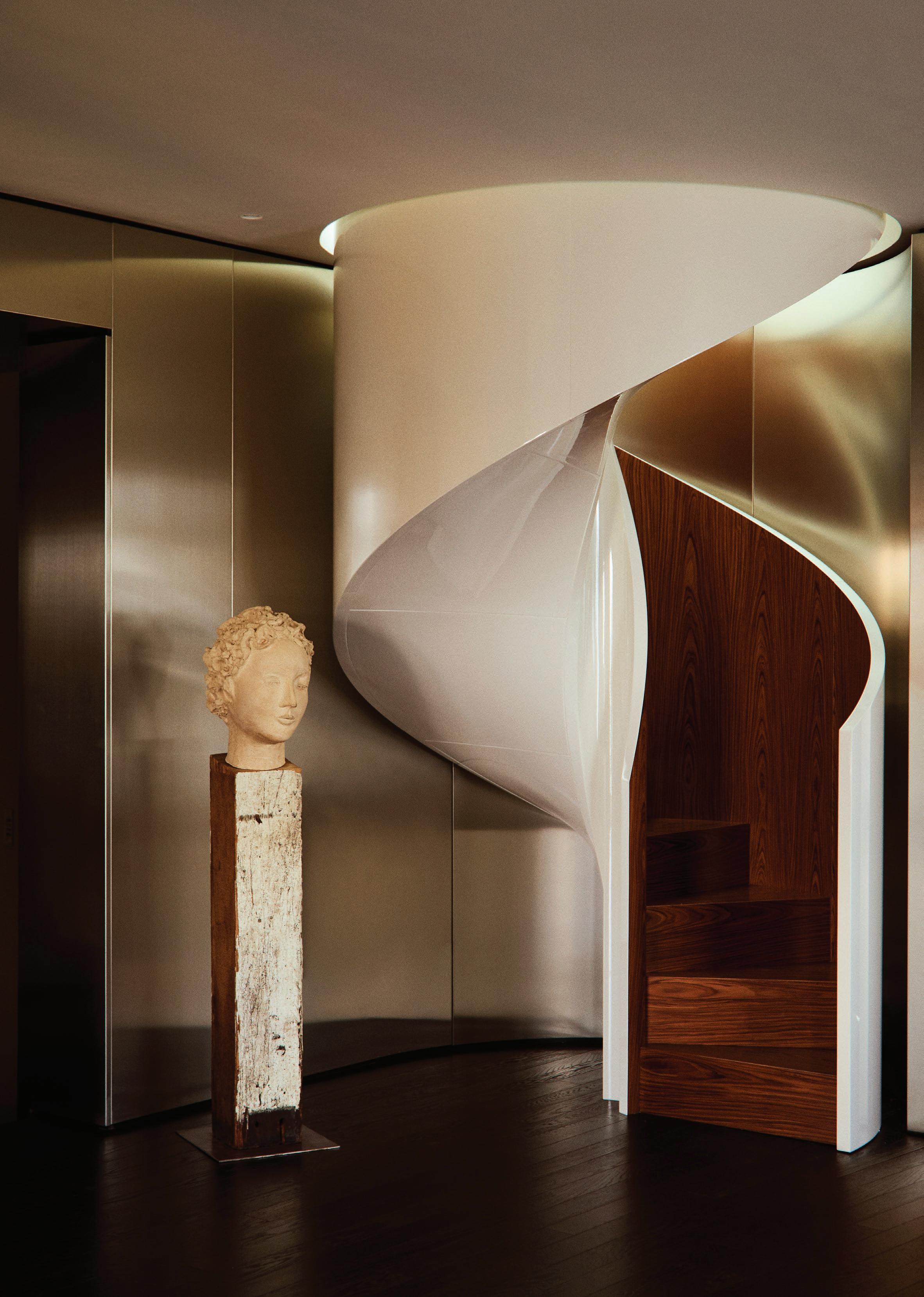
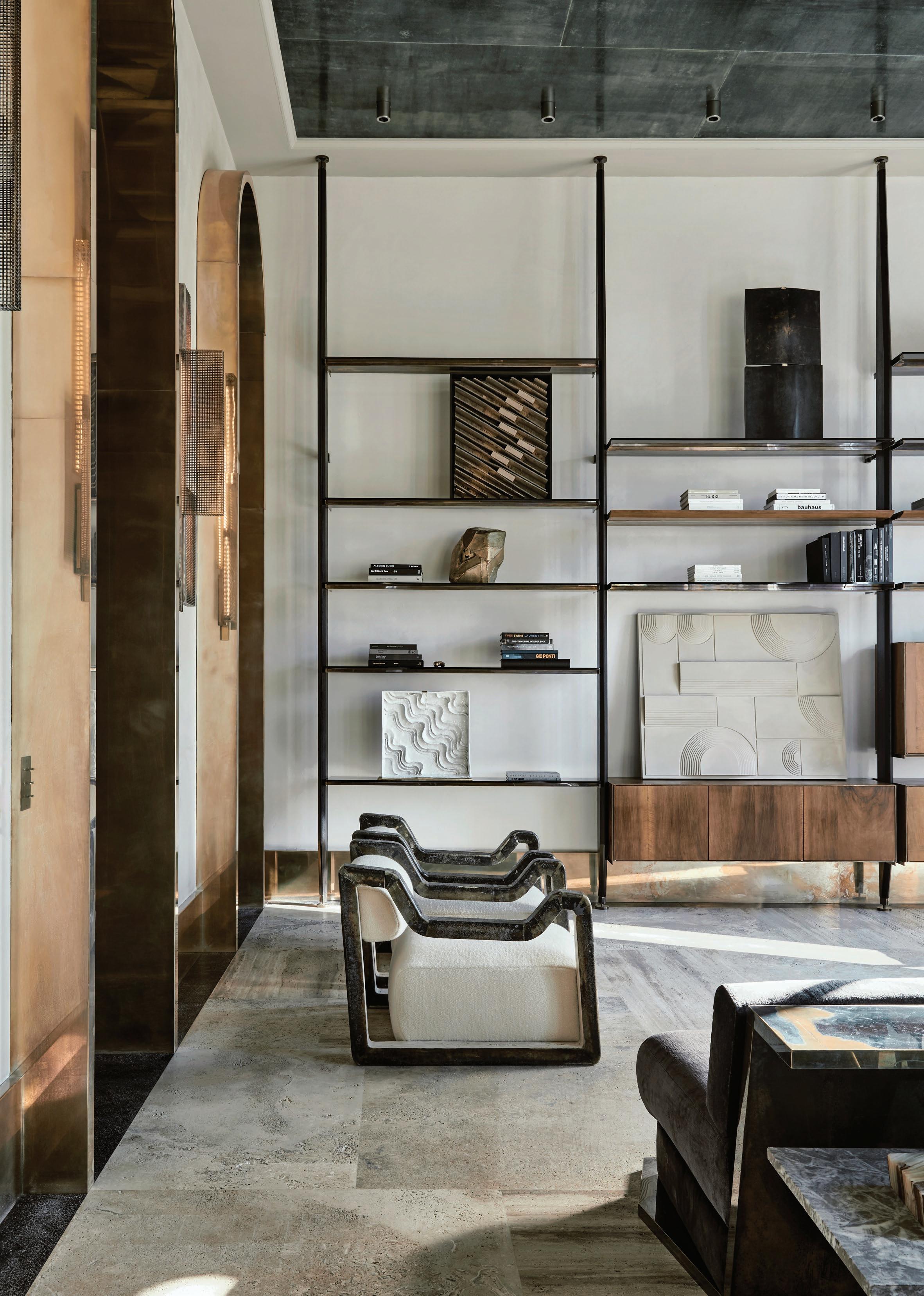
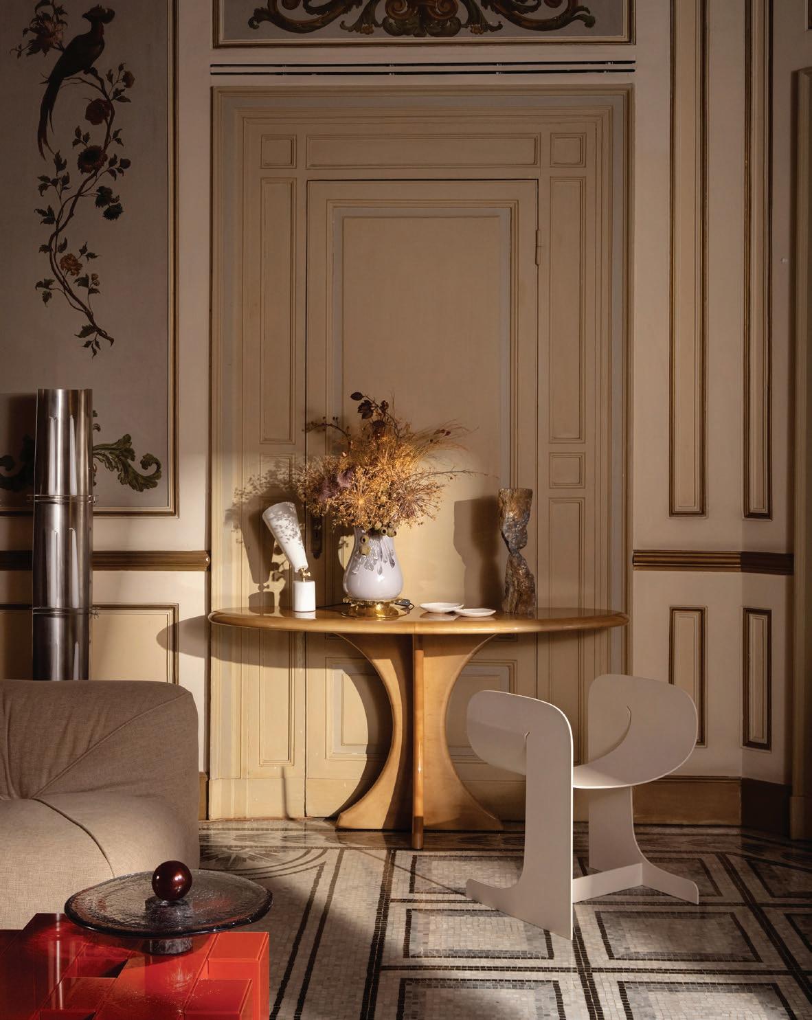
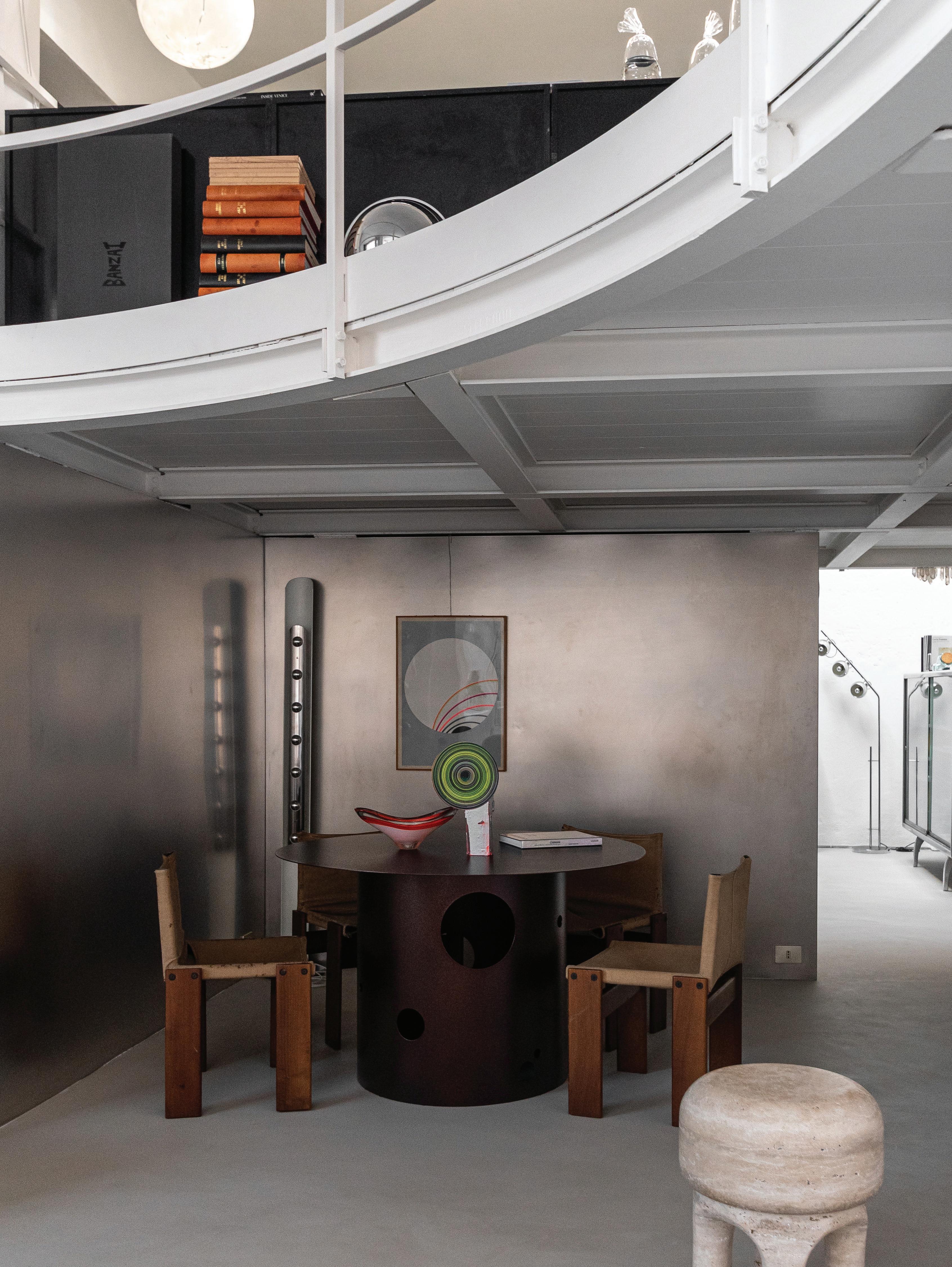
Tagliaferri approaches interiors like curated compositions, folding together eras, textures and design languages into an evocative whole. “The aspect of layering is one of the most important concepts in my work, where I love to mix eras and influences while maintaining aesthetic consistency,” he explains. That ethos is brought to life in this penthouse, where a vintage Stilnovo pendant floats above an Angelo Mangiarotti dining table, surrounded by Gigi Sabadin chairs. A new rosewood and lacquer stair nods to 1970s Milanese elegance, while a folding screen, crafted from rosewood, stainless steel, and fluted glass, artfully conceals the television, turning function into statement.
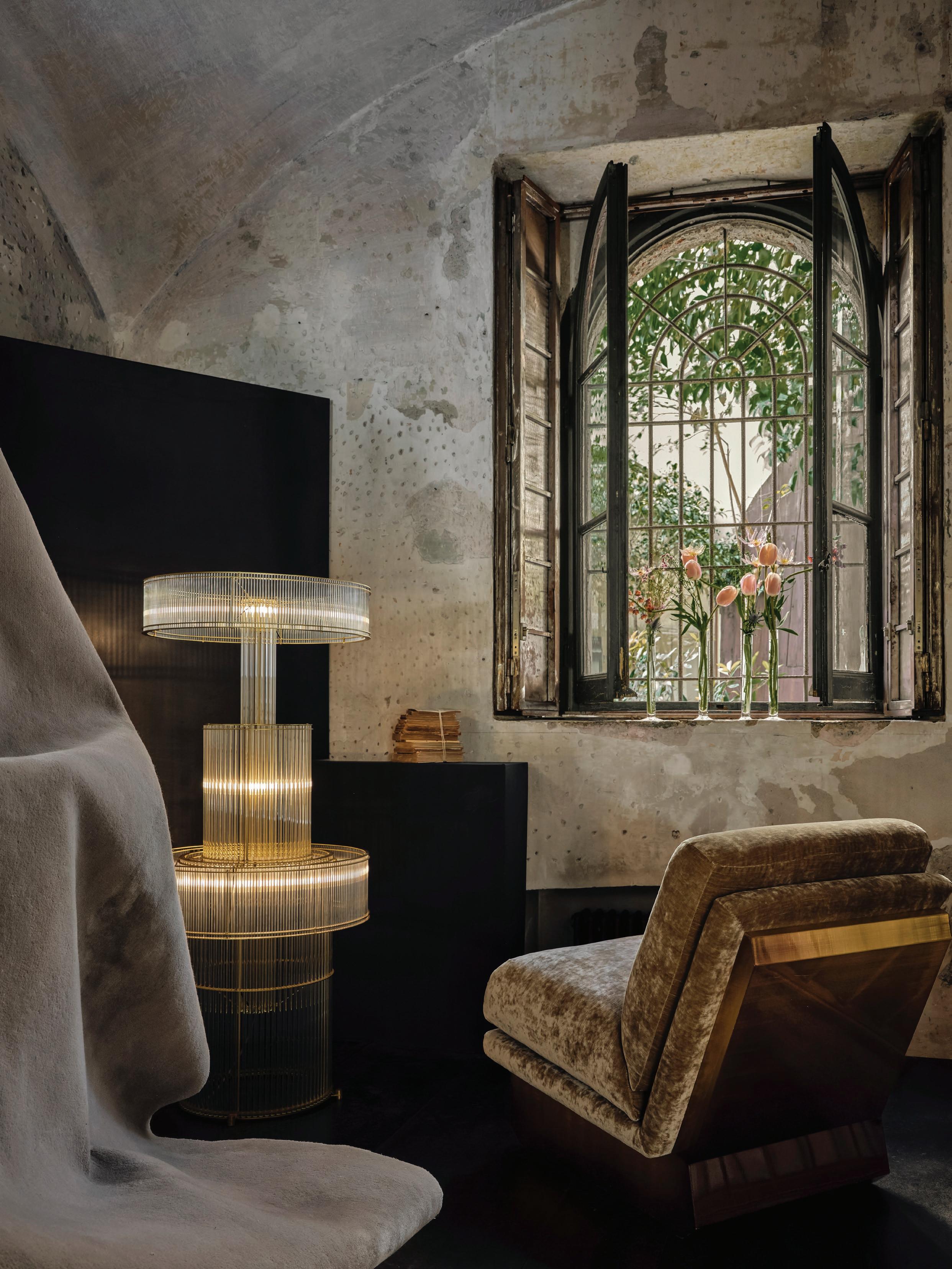
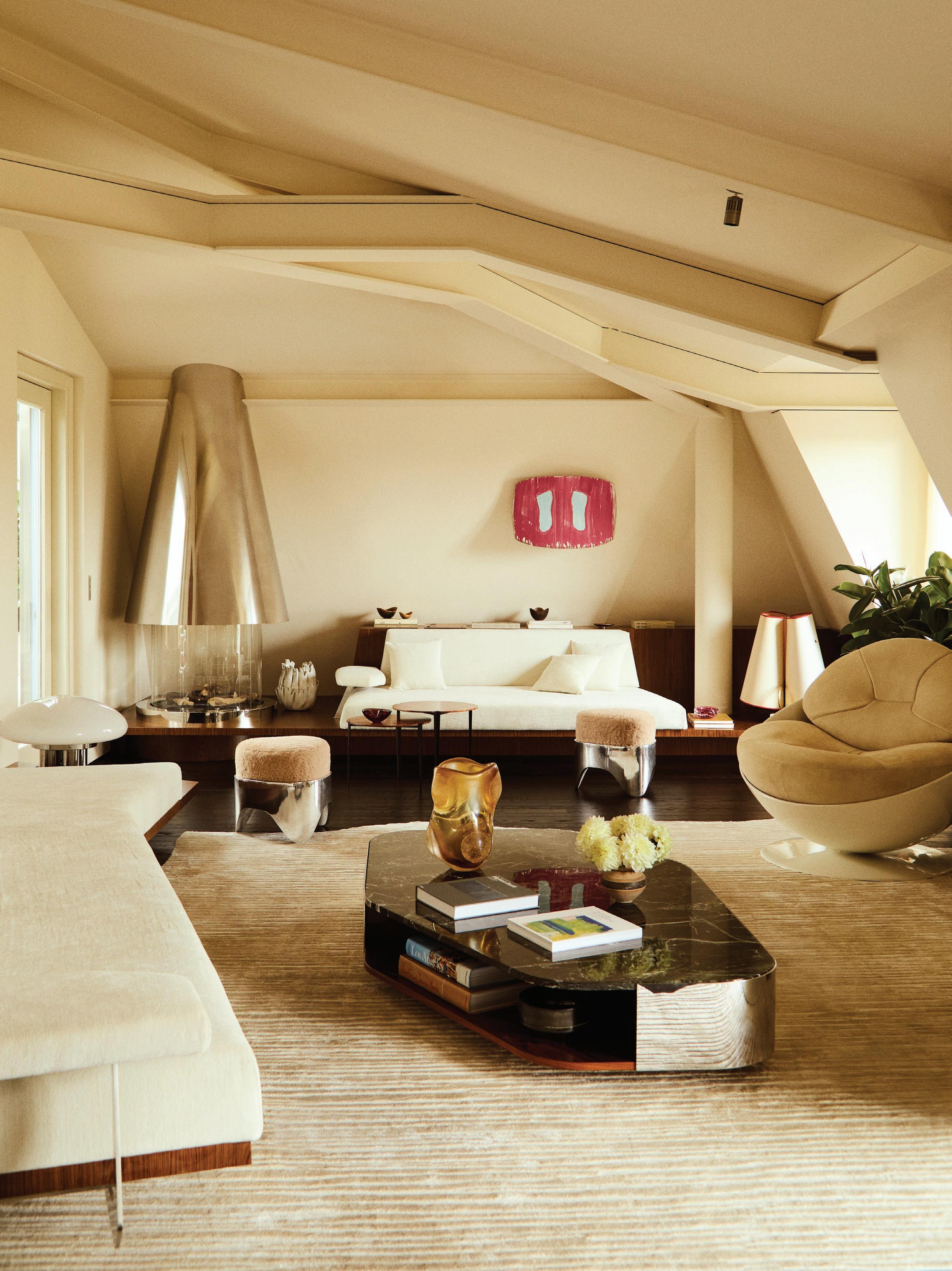
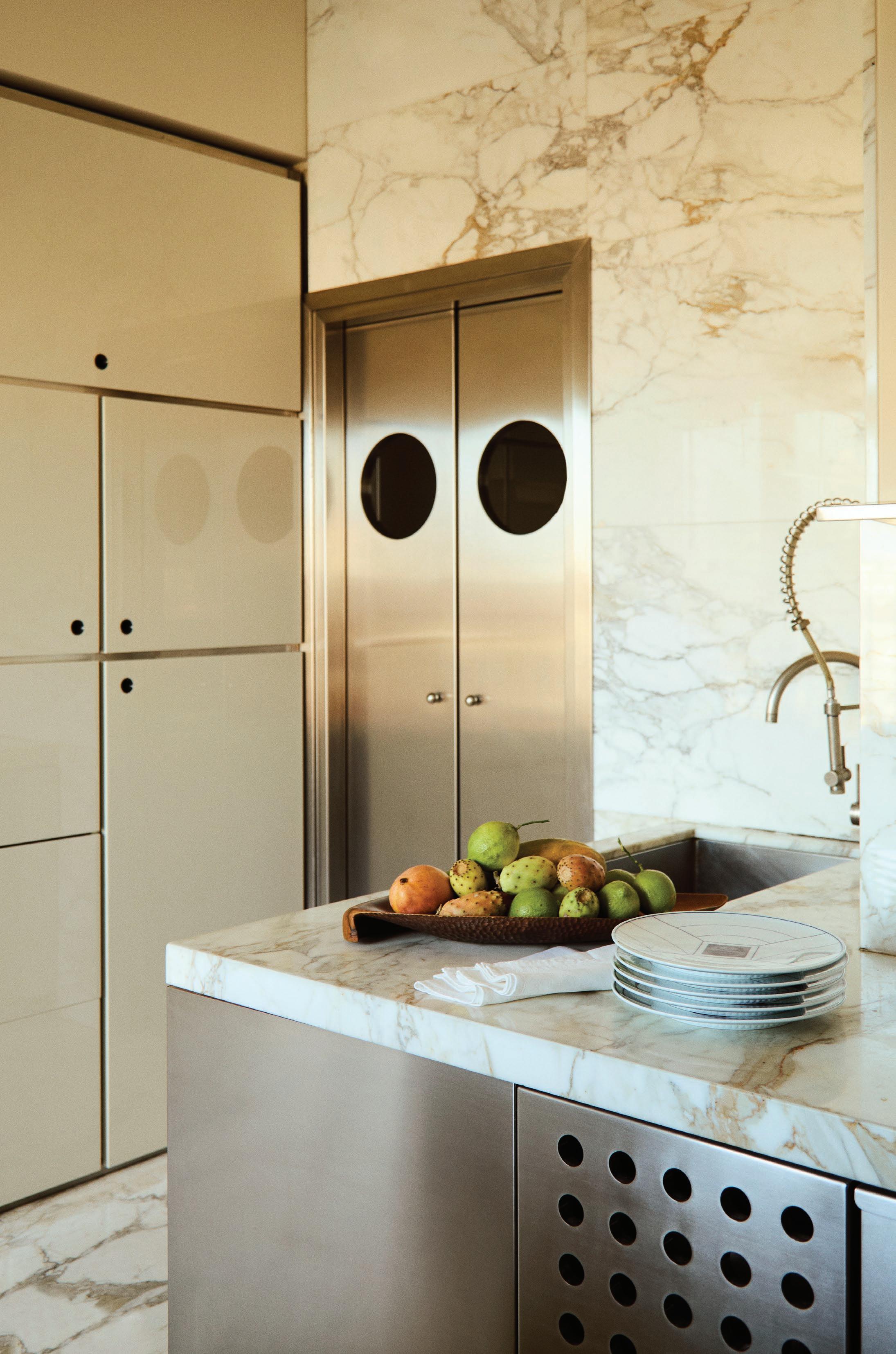
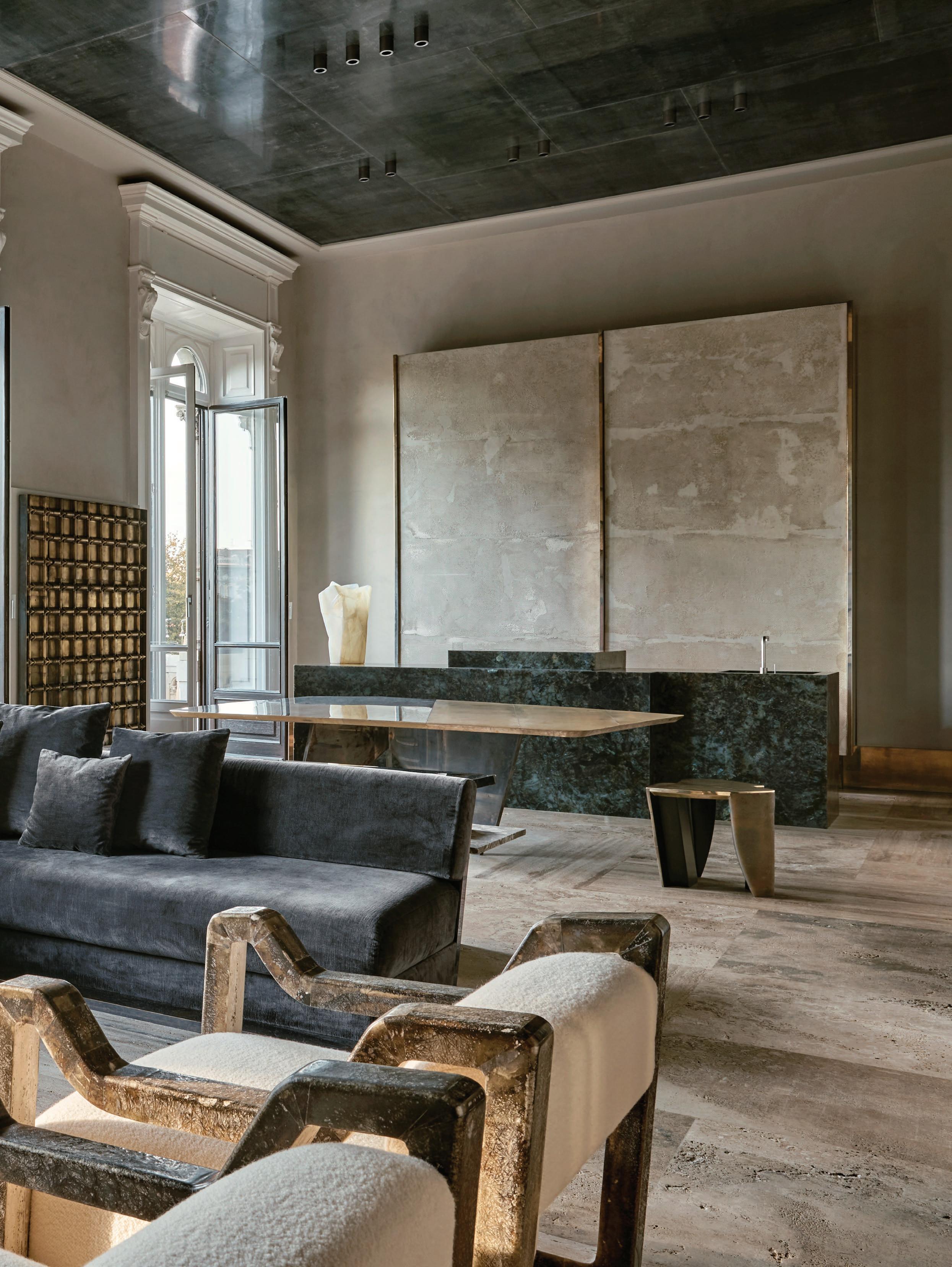
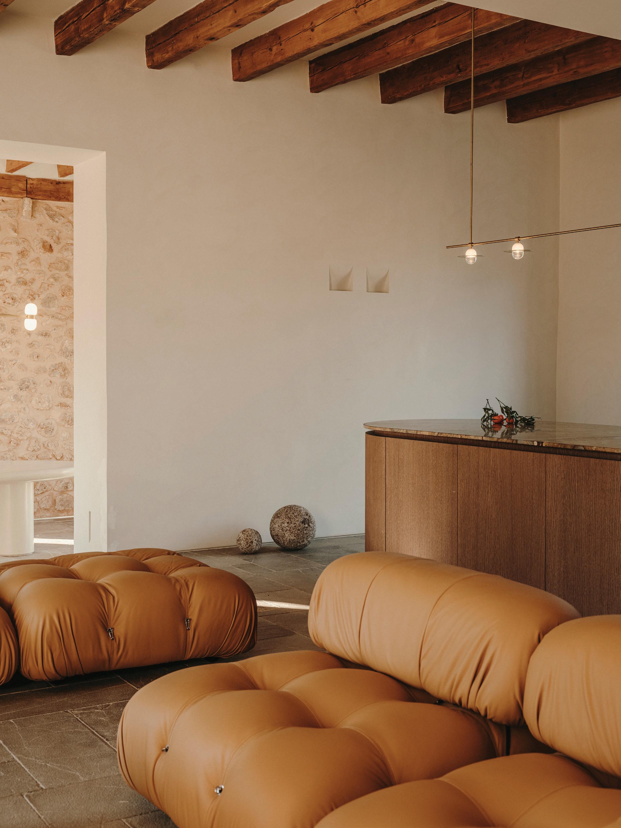
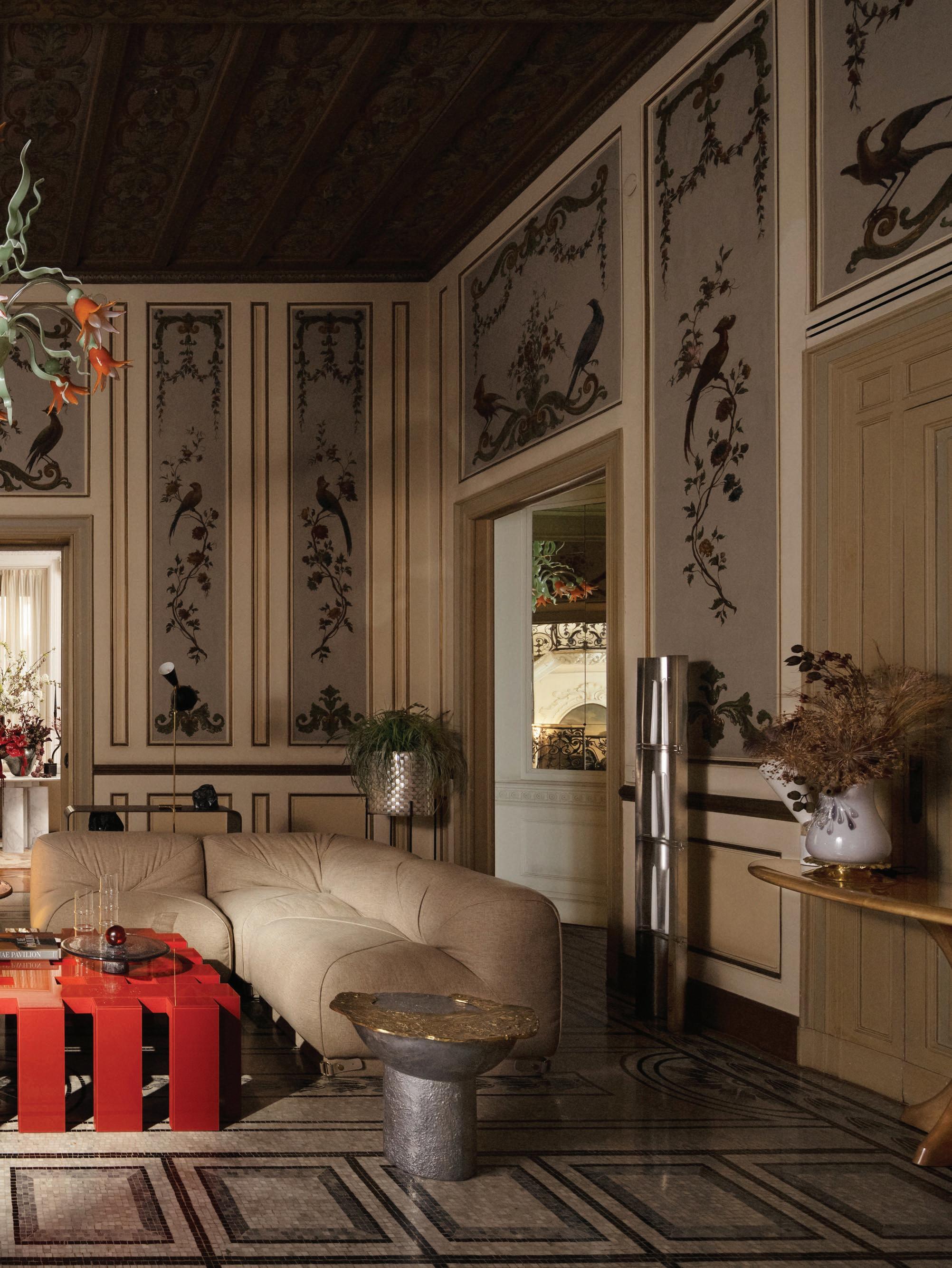
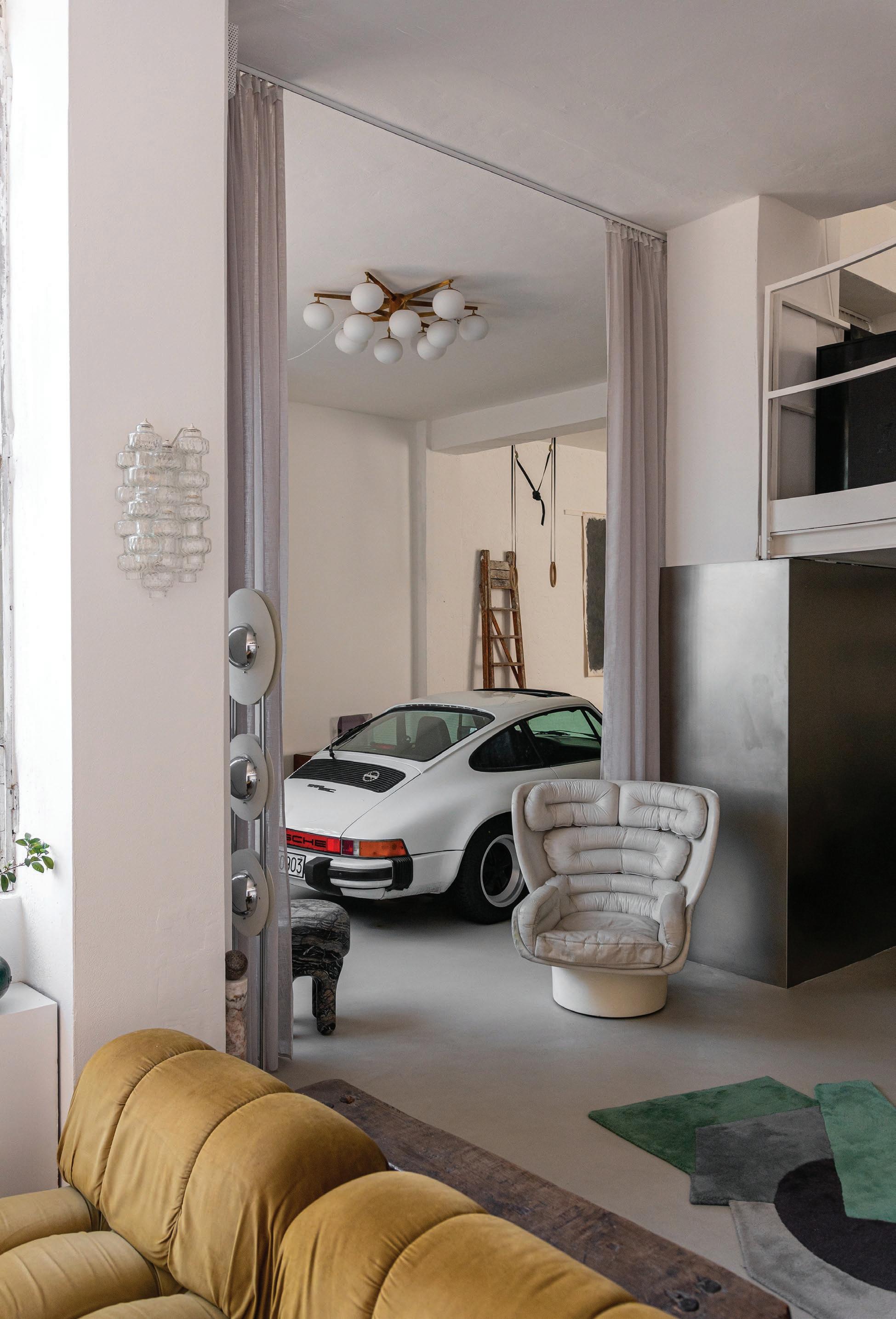
The apartment is structured like “the perfect Suite,” Tagliaferri says, echoing the logic of a luxury hotel. The public zones unfold as an open-plan living space complete with built-in cabinetry, multiple seating zones, and access to a terrace overlooking Milan’s skyline.
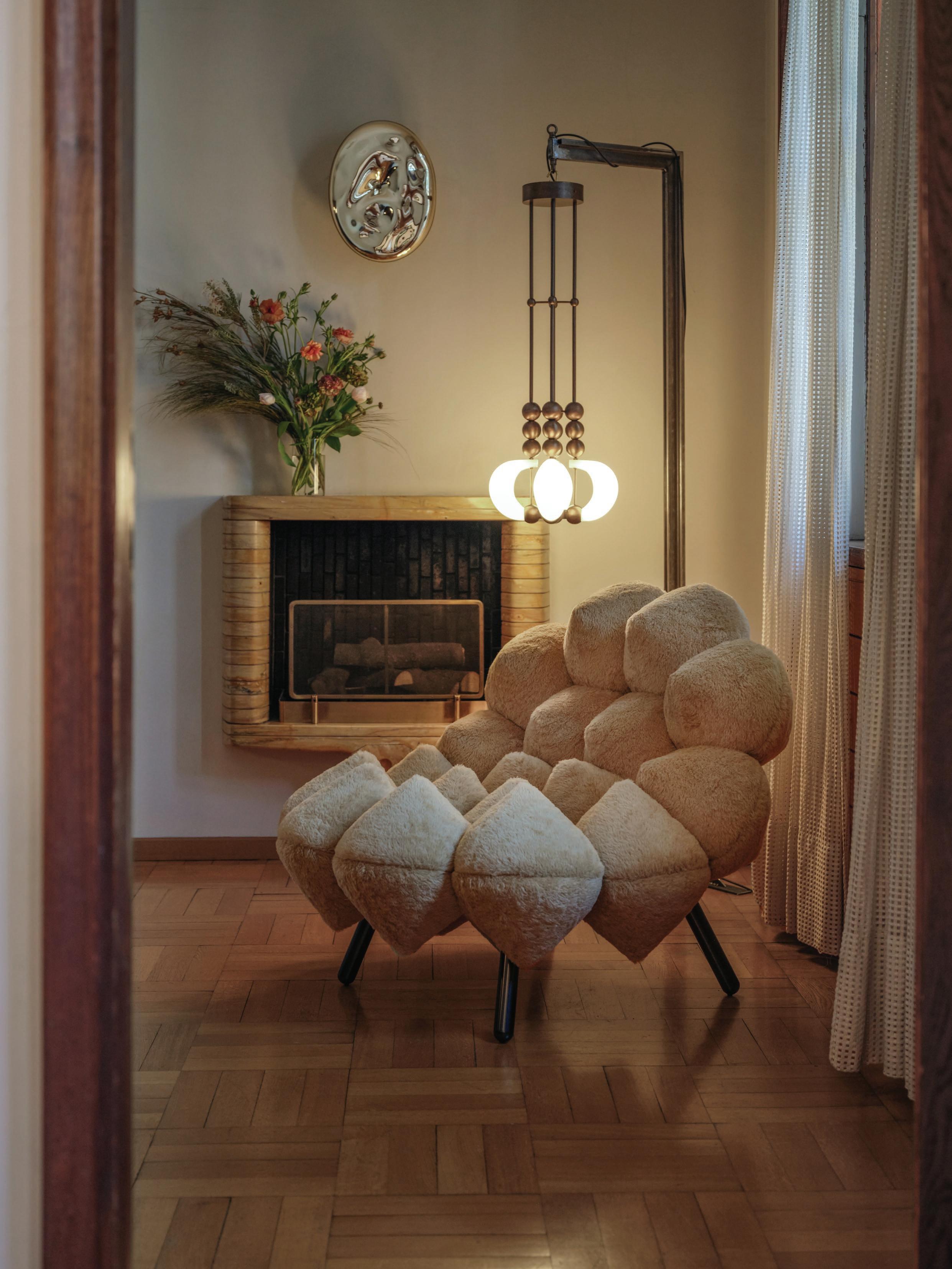
Anchoring the apartment is a sculptural fireplace, quietly commanding with avant-garde form and materiality. A Mario Bellini music system adds a soulful note, underscoring the couple’s passion for collecting both design and art.
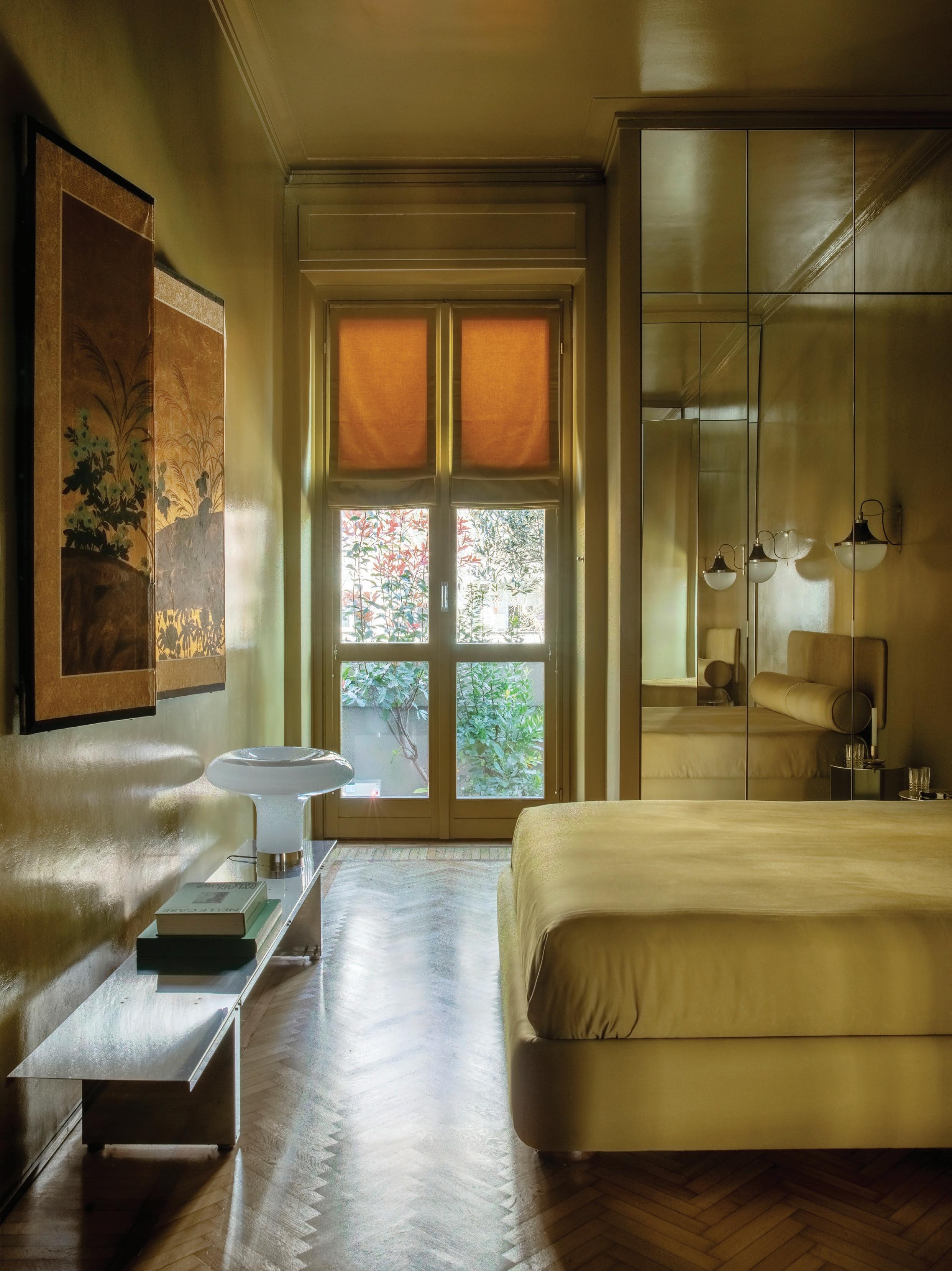
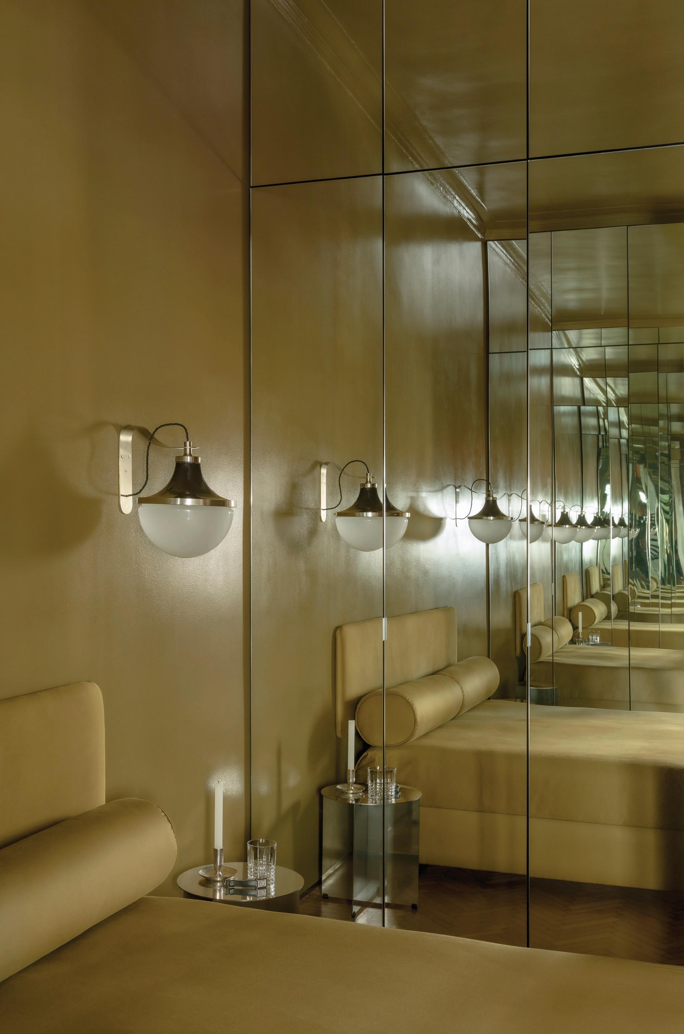
The private wing is conceived as a small wellness sanctuary holding the bedroom, gym and sauna. Here, a custom bed in brushed stainless steel and chrome nods to the glamorous era of 1970s Italian design, while a peek-a-boo shower—made from clear and fluted glass—references the lightbending work of Nanda Vigo. This apartment showcases the potential of integrating design into every corner, detail and material—where each element works together to create the perfect mood.
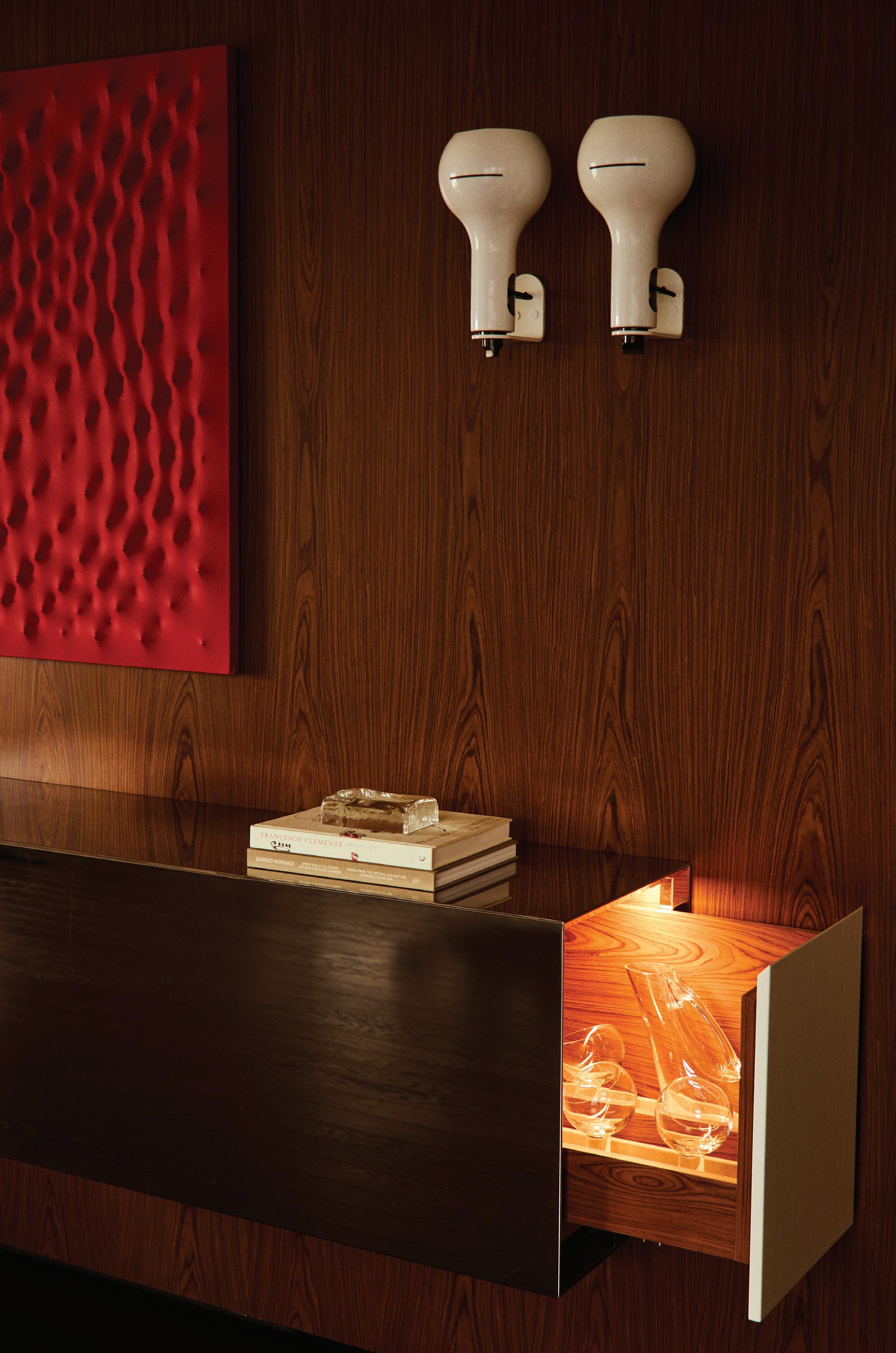
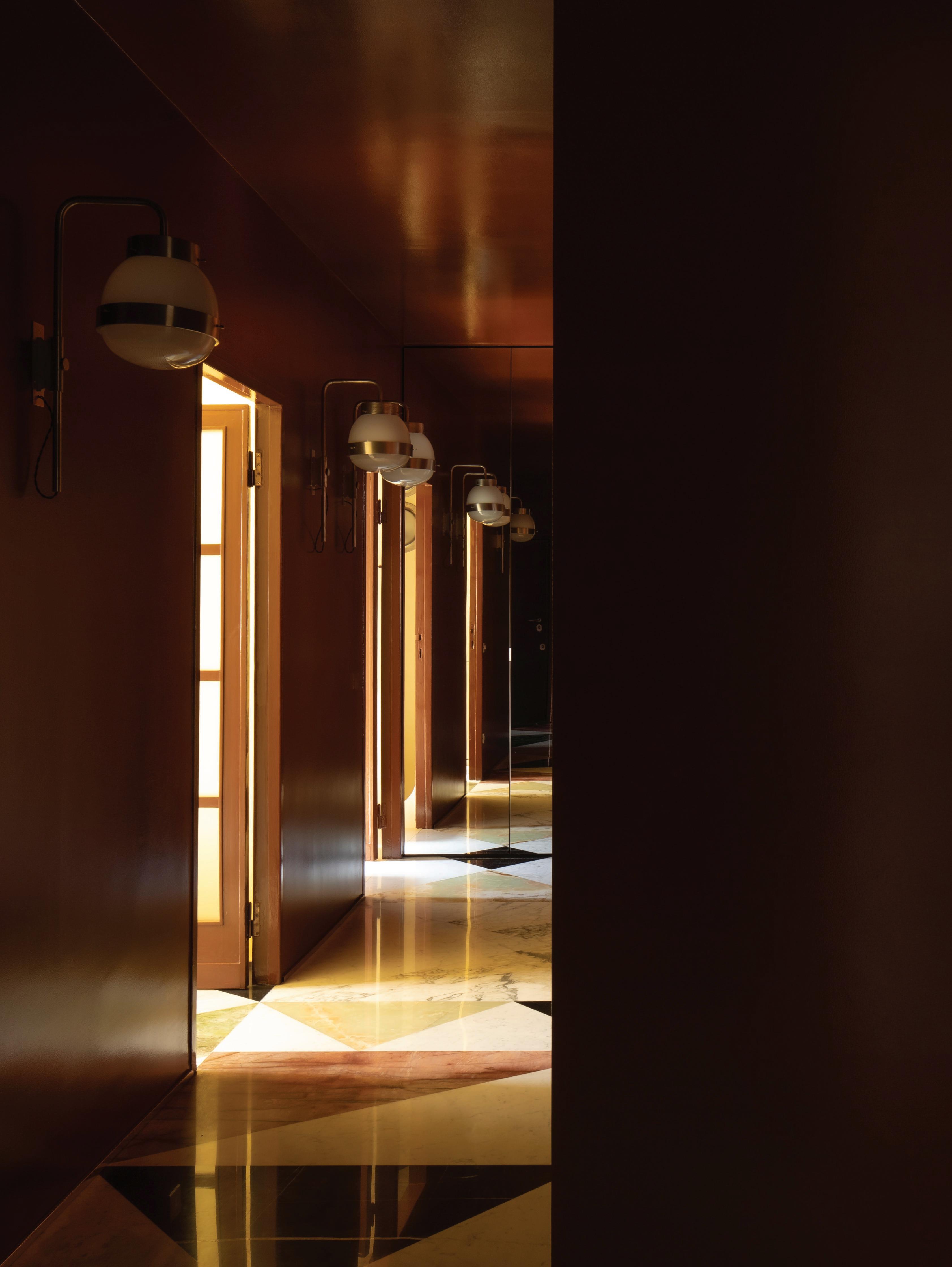
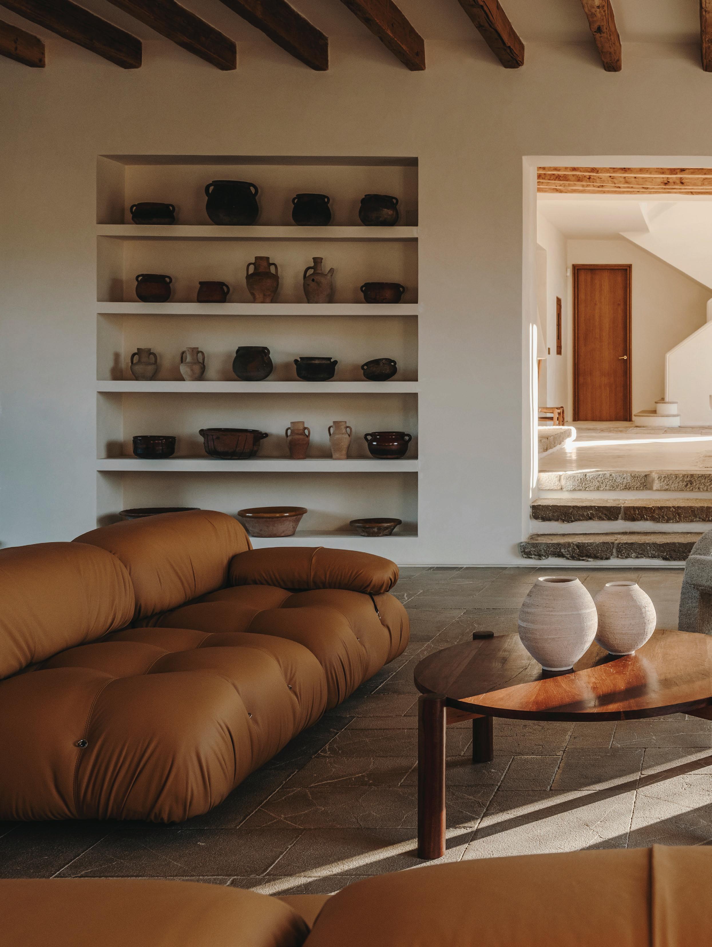
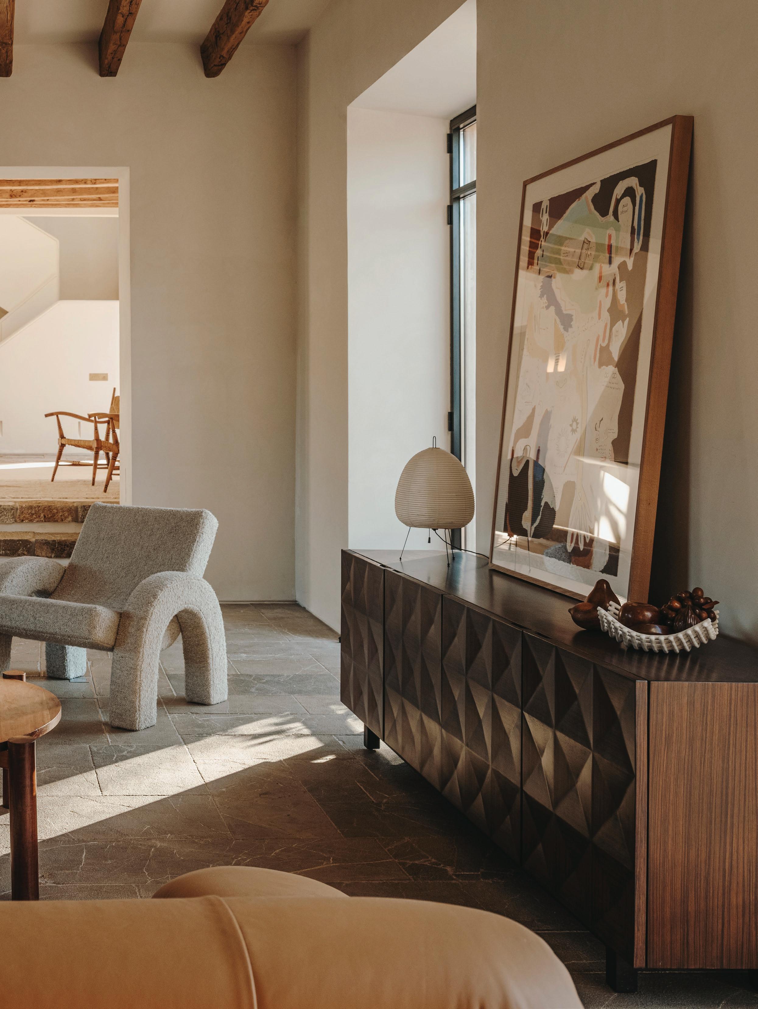
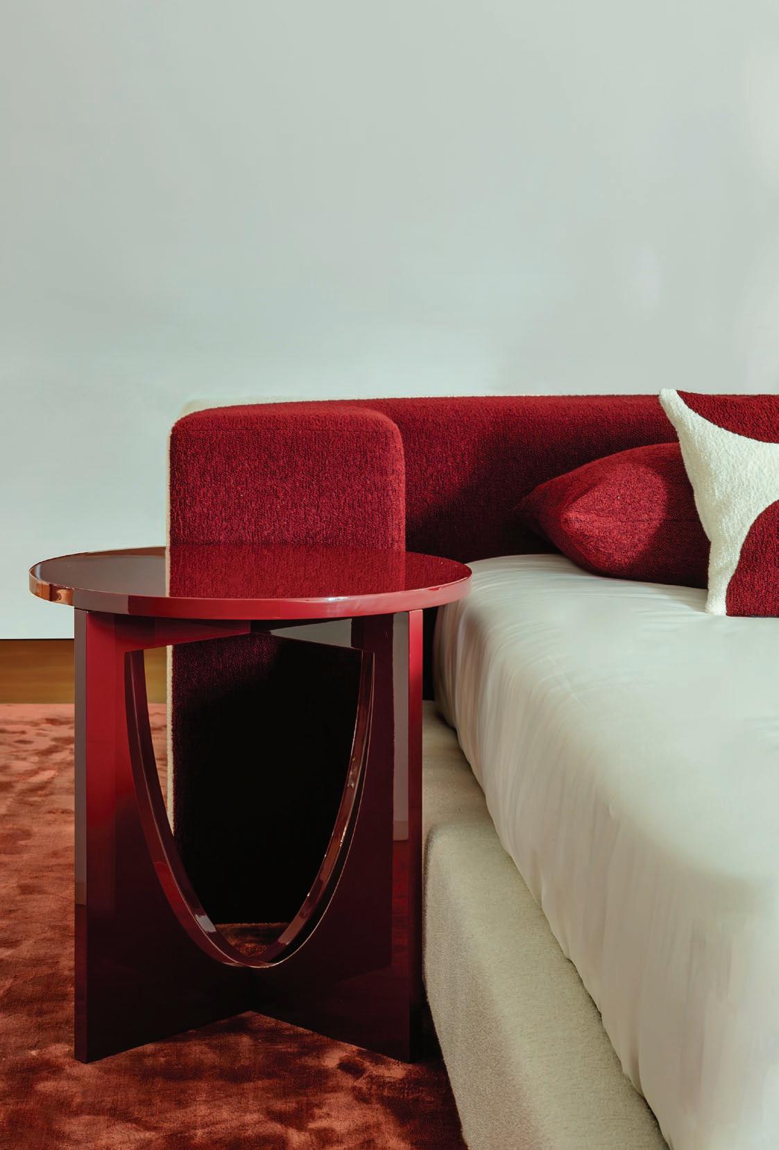
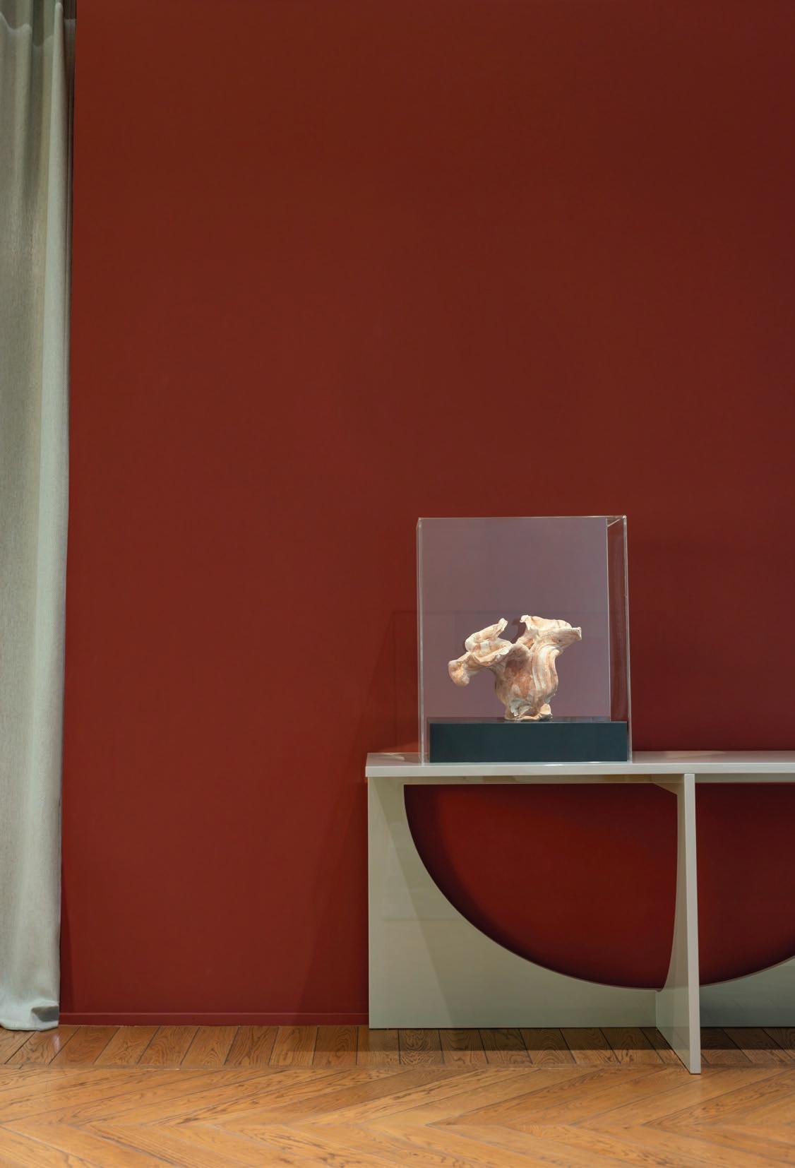
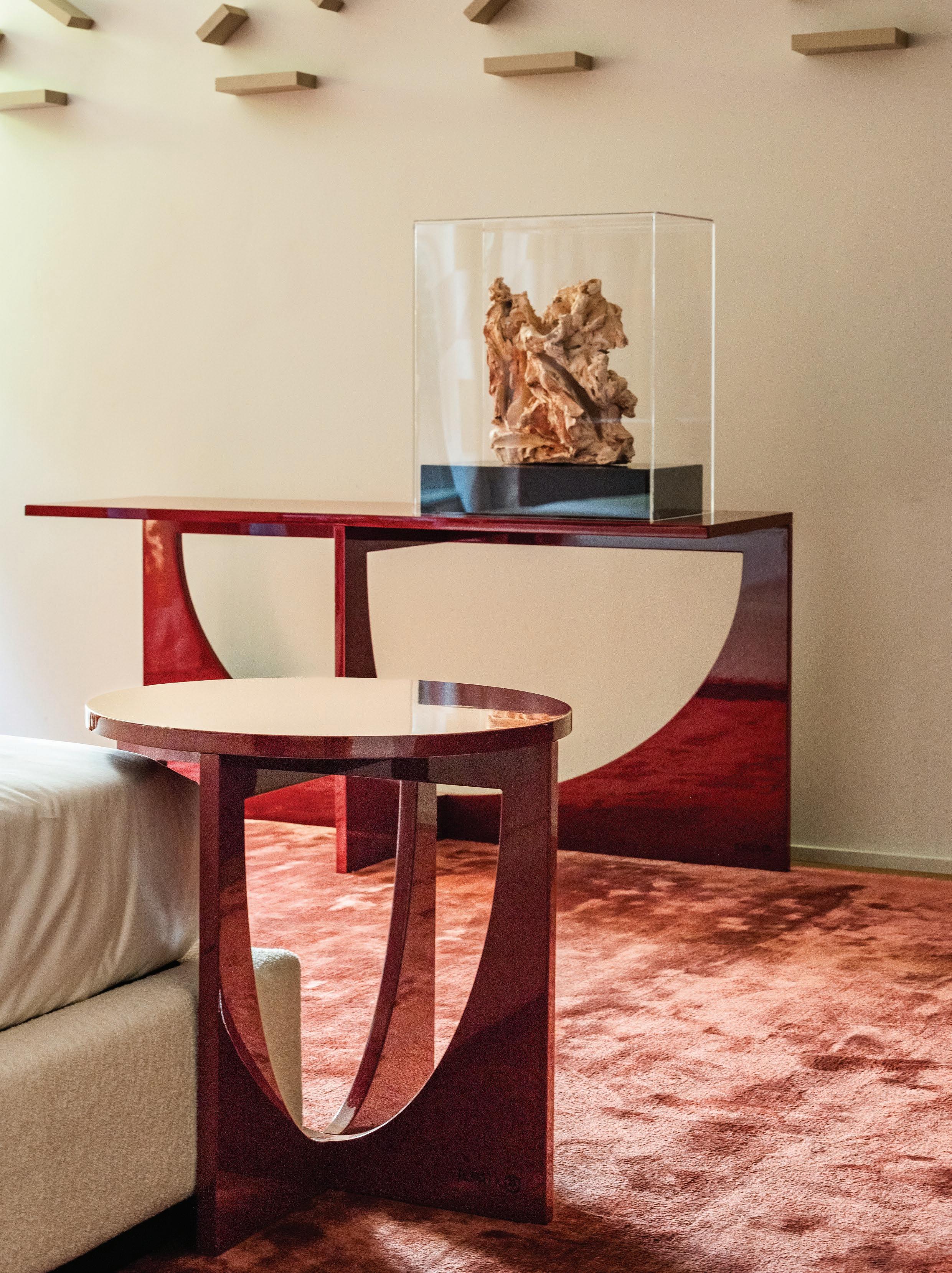
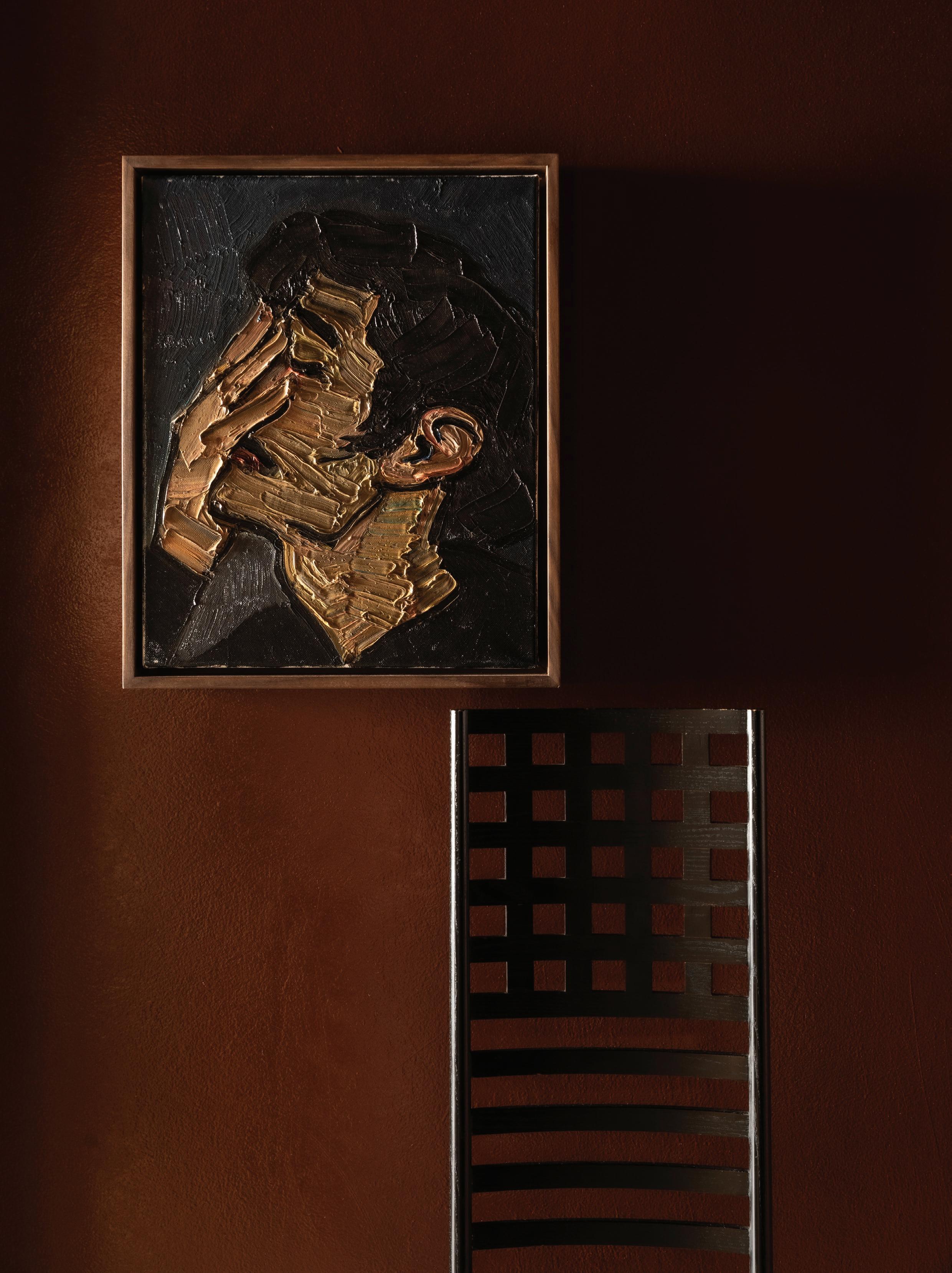
This page: An attention-grabbing central corkscrew stair with rosewood steps wrapped in a shiny lacquer finish exudes a 70s Milanese modernism. A bust by Vanessa Beecroft sits on a plinth alongside the staircase. Opposite page: A mirrored stainless cabinet with rosewood interior. Artwork by Enrico Castellani and a pair of vintage Flash wall lights by Joe Colombo for Oluce. Previous spread: While the apartment is small, space has been expertly economised with a mix of built-in pieces and standout design pieces from Minotti and Osvaldo Borsani side tables. A statement fireplace in the corner anchors the entire living area. Artworks (L-R), Alighiero Boetti and Ron Gorchov.
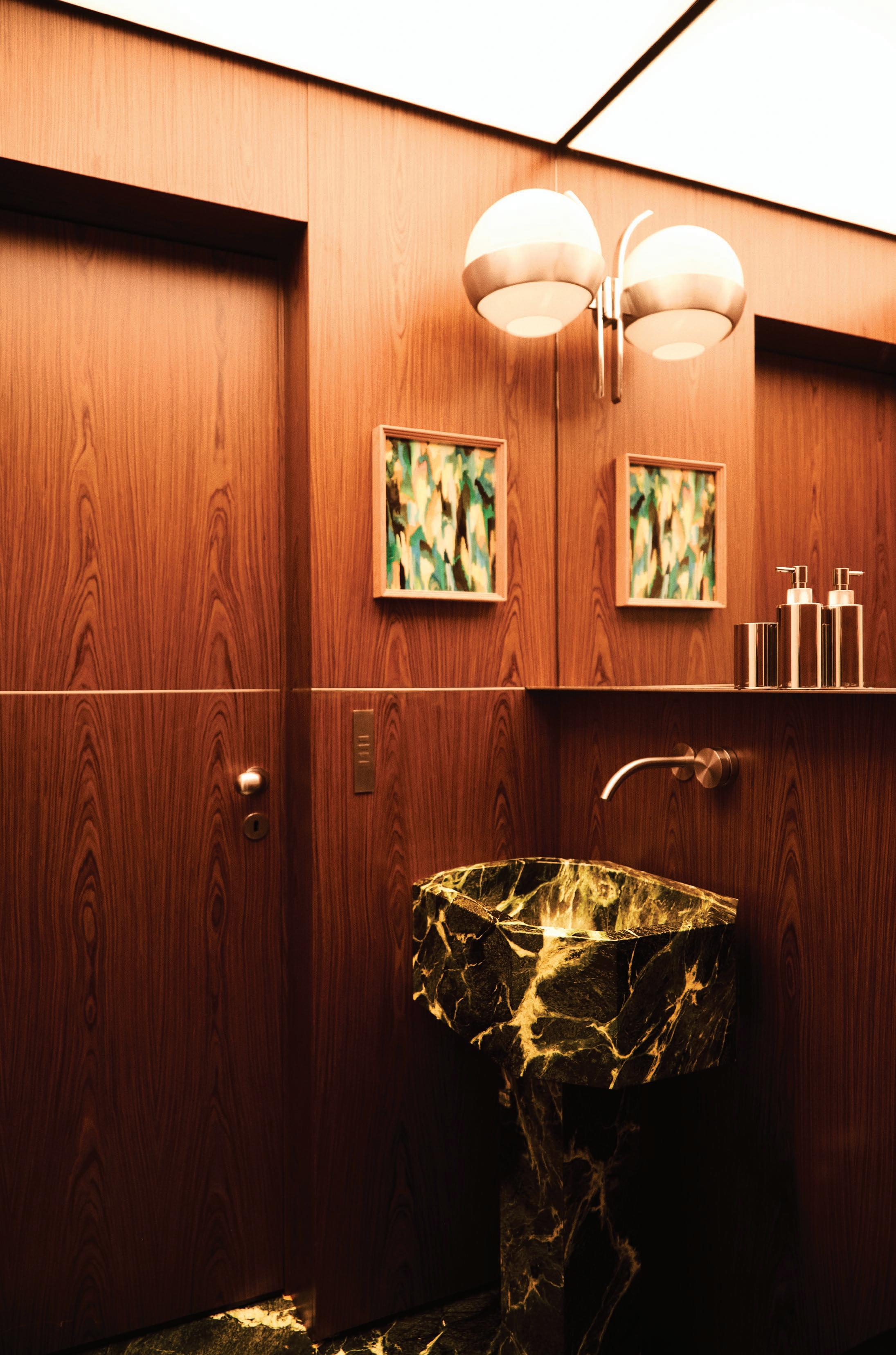
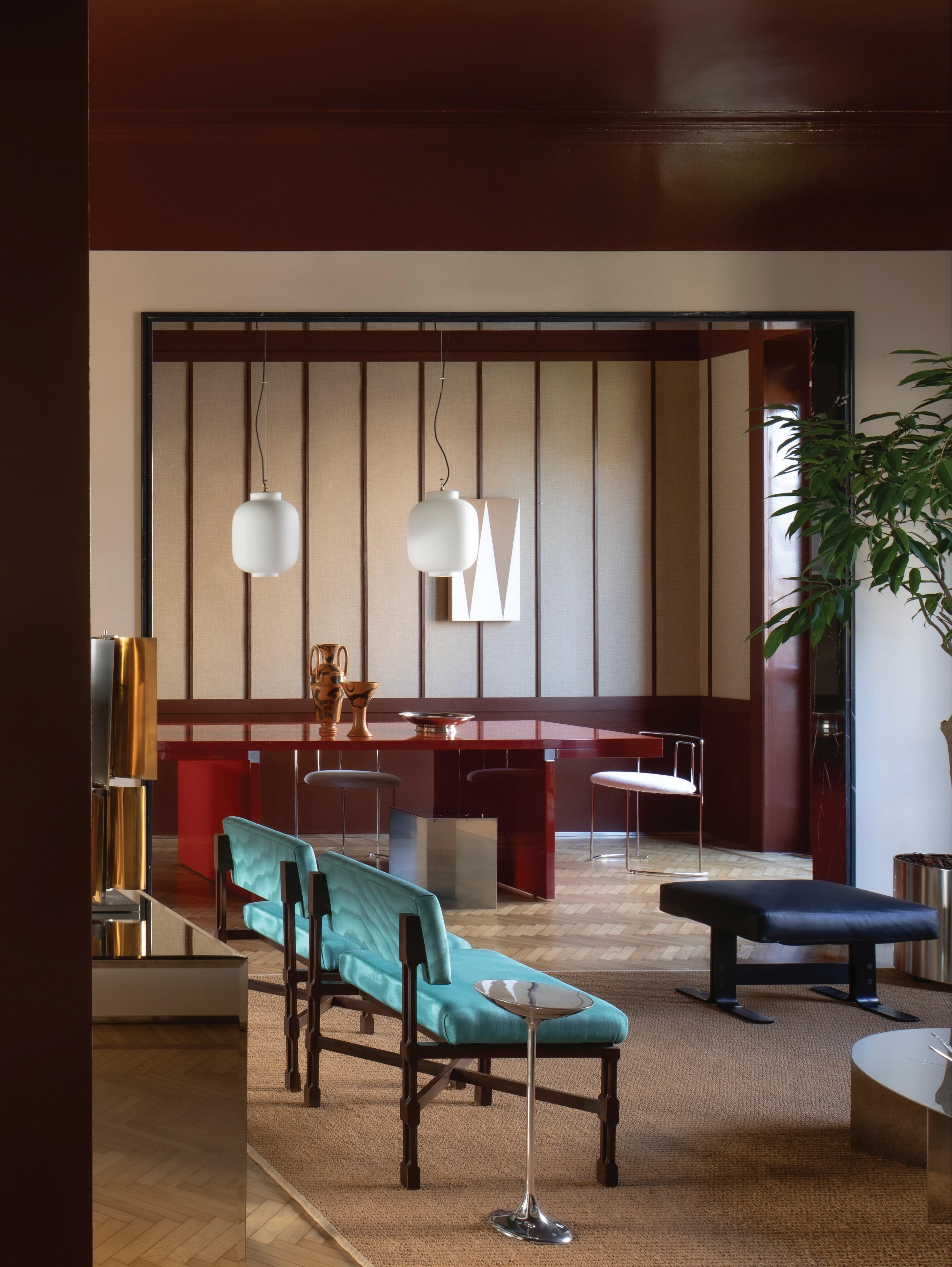
This page: In the den, an Acerbis Free System sofa by Claudio Salocchi sits against rosewood joinery. Opposite page: The powder room, wrapped in rosewood timber, features an illuminated ceiling and custom marble vanity. Previous spread: Tagliaferri is adept at mixing design styles and eras. In the dining area a vintage Stilnovo pendant light hangs above an Angelo Mangiarotti table and chunky Gigi Sabadin chairs.
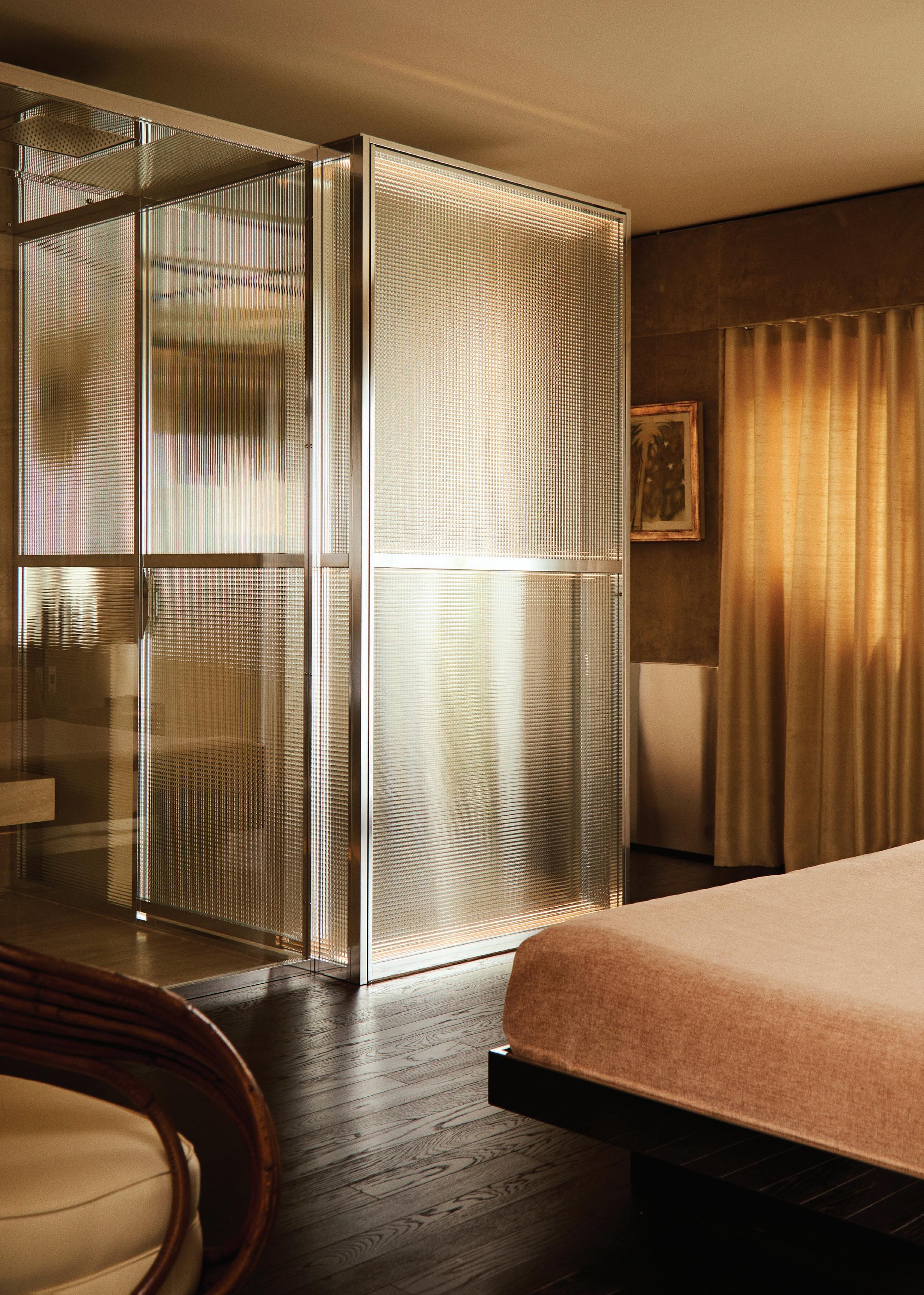
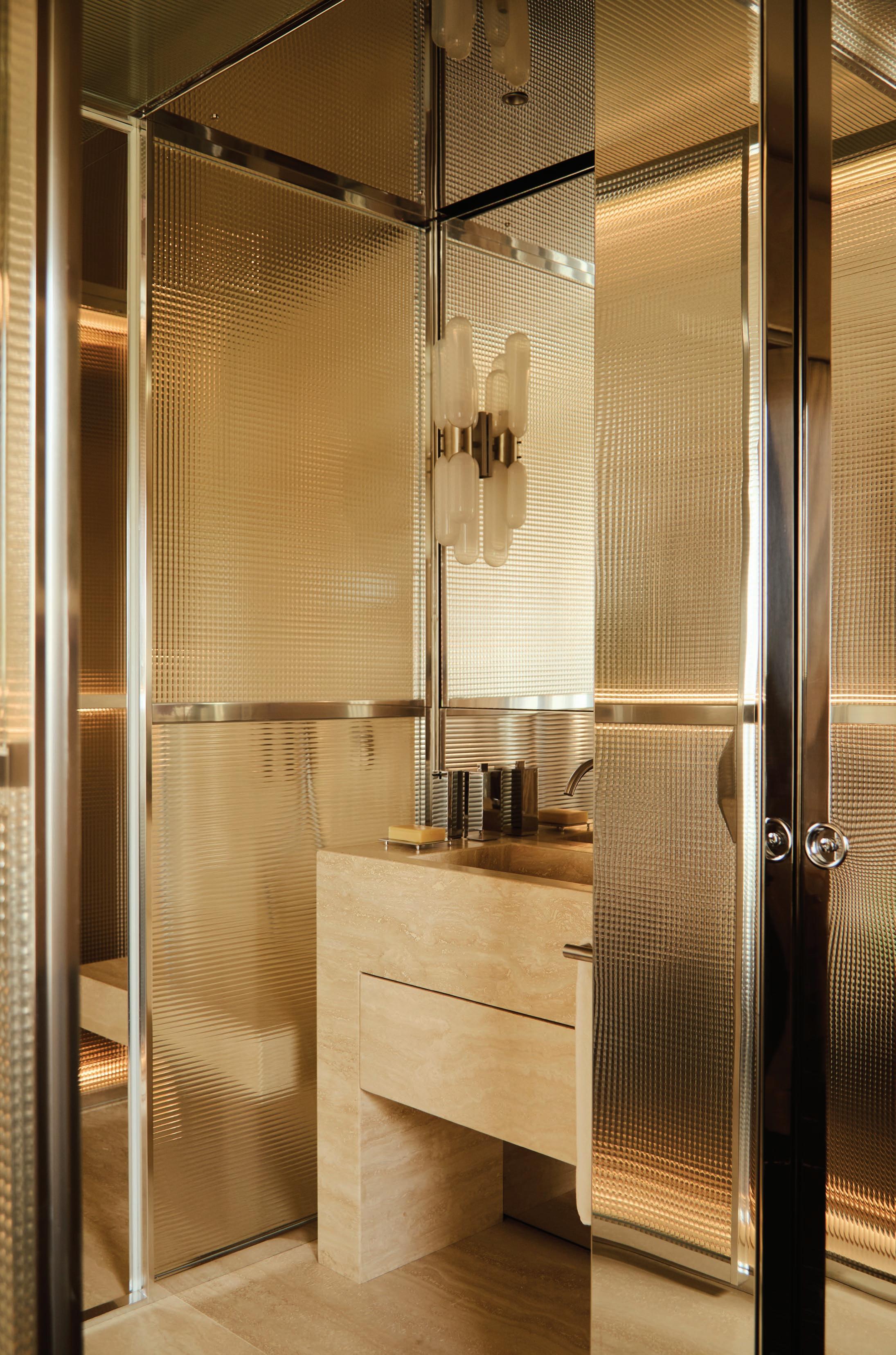
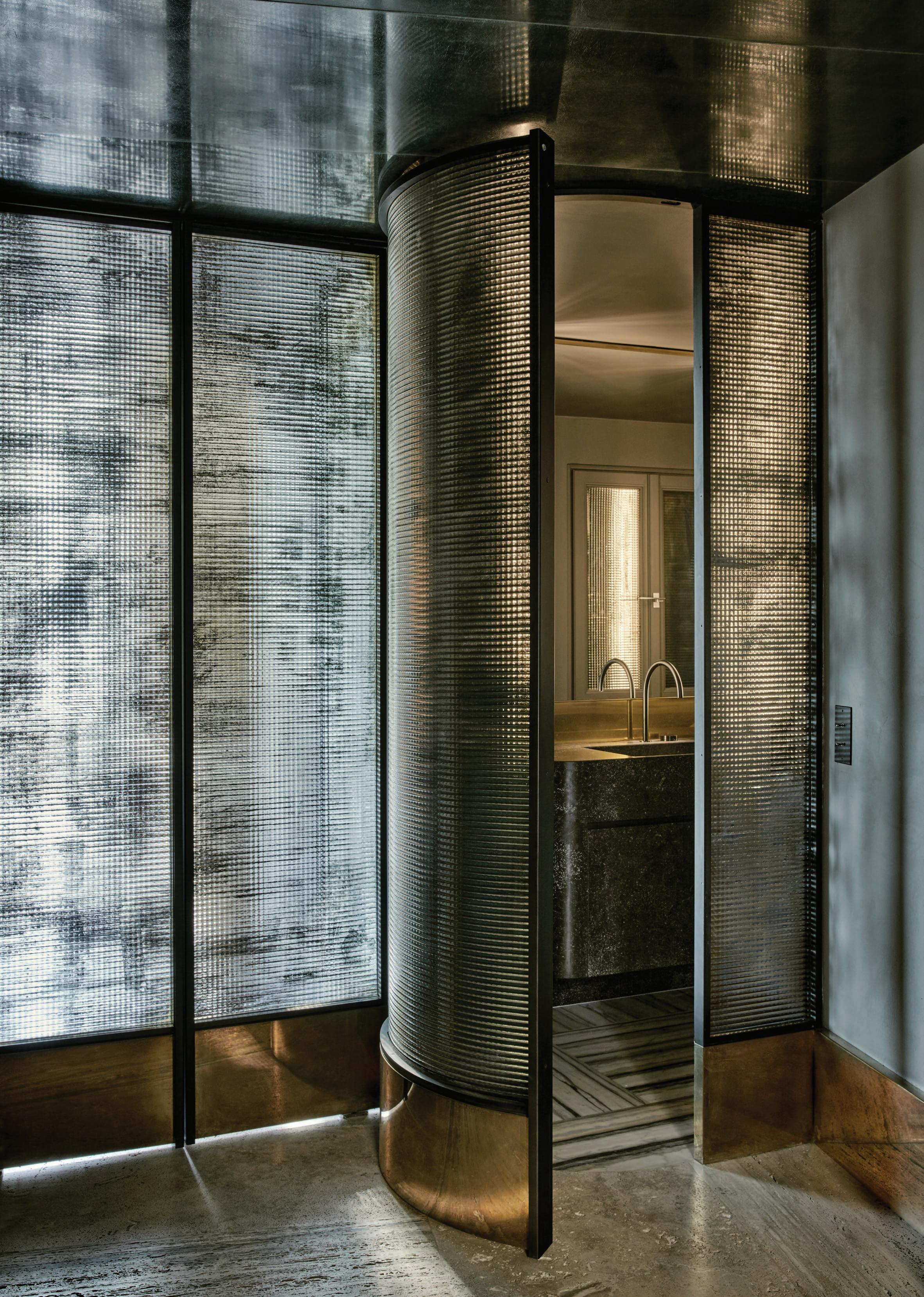
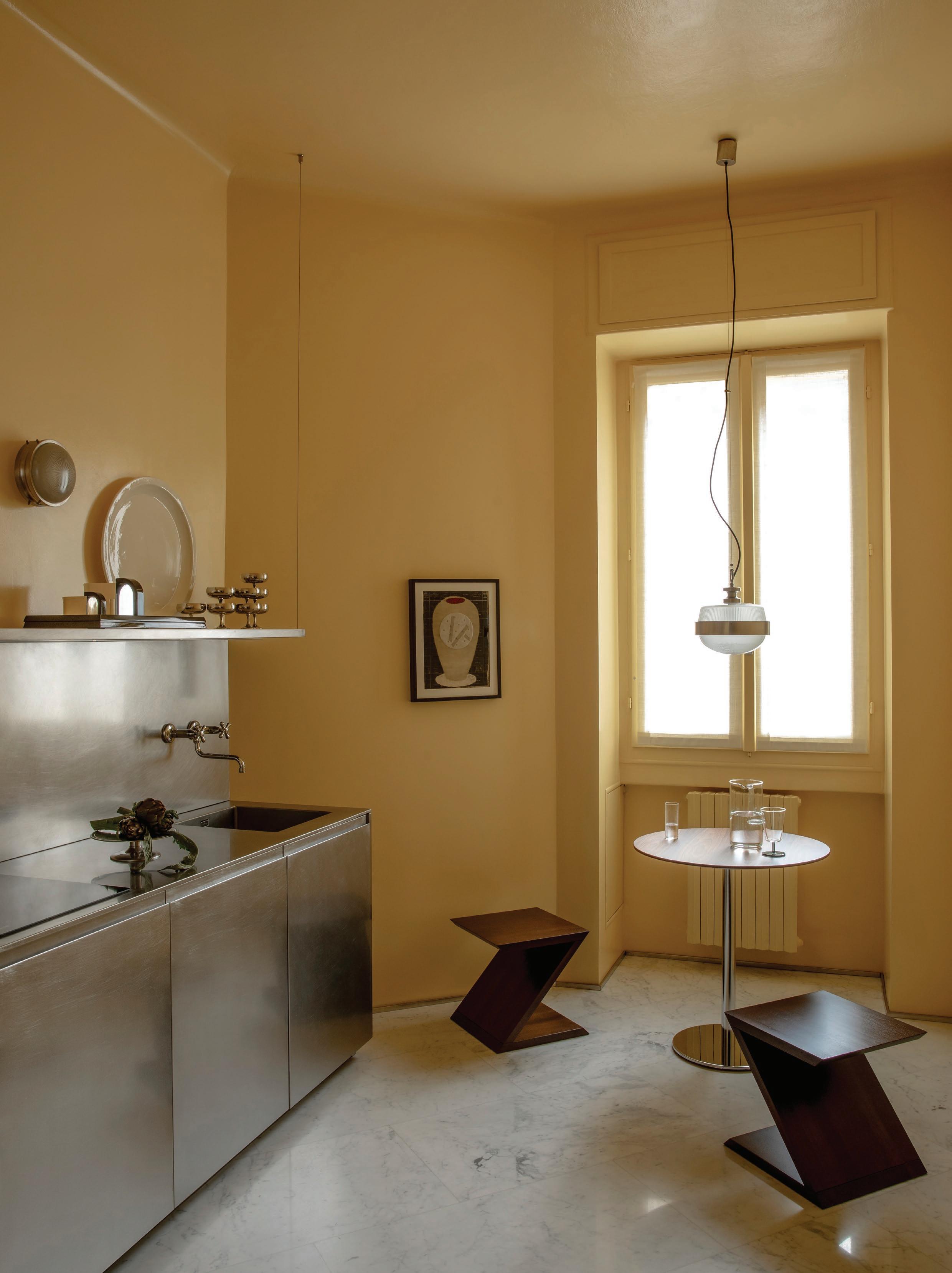
This page: The bedroom area is a secluded space away from the open and public living zone. A custom stainless steel and chrome bed echoes the home’s mid-century Italian stairs, with an Eva chair by Giovanni Travasa for Bonacina. Opposite page: Drawing on luxury hotels as a reference point, the main ensuite is an ode to the late Nanda Vigo, a little-known Italian artist, designer and architect whose experiments in chrome and glass can be seen in the bathing capsule.
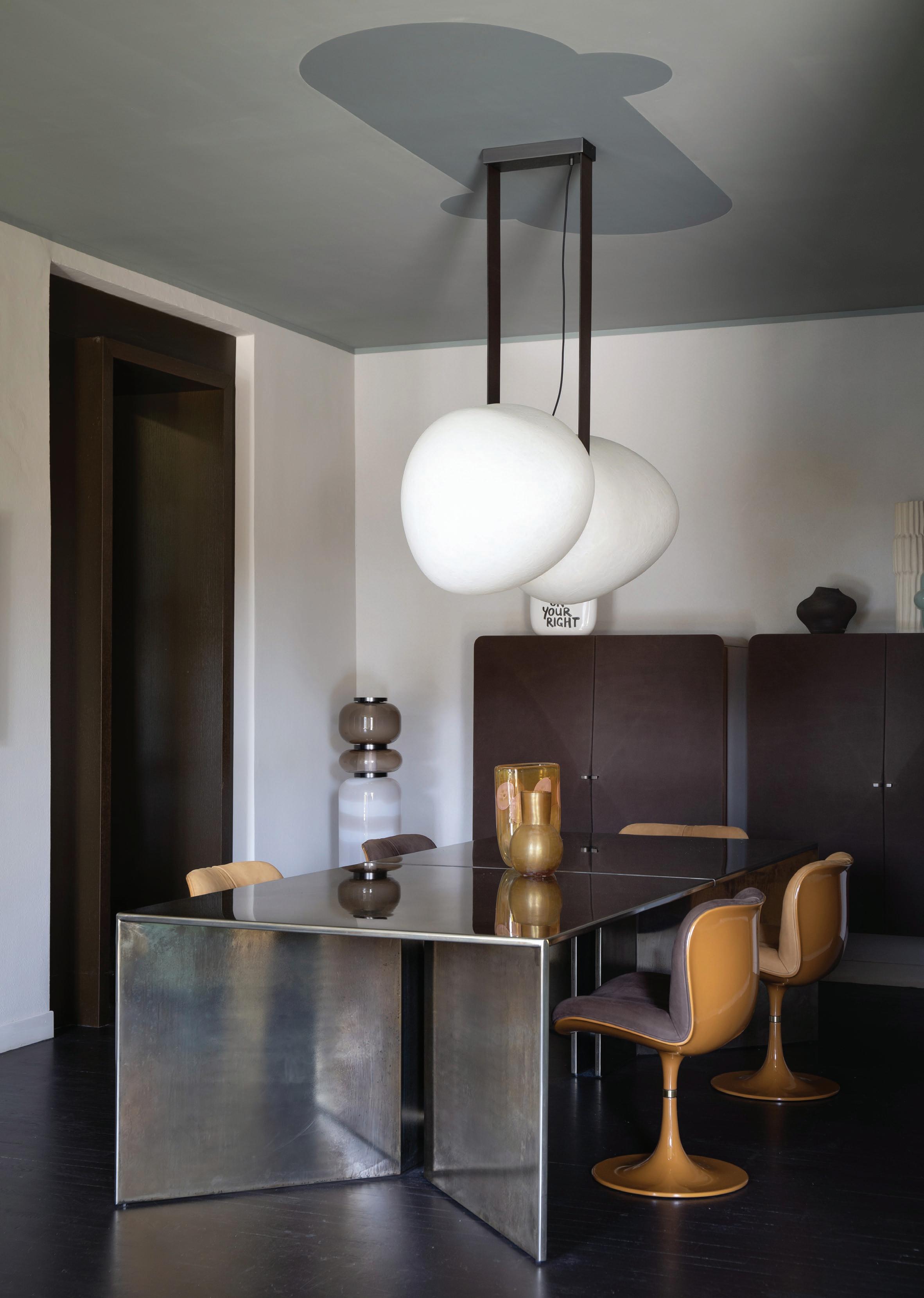
Five New + Noteworthy Pieces Shaping the Future of Design
Discover five standout brands from Milan Design Week, each presenting a distinct vision for the future of design. Whether drawing from the past, celebrating enduring craftsmanship, or boldly challenging convention, these pieces push the boundaries of possibility and reimagine how we live with design.
1.
BD Barcelona unveiled Eclipso, designed by Jaime Hayon—a playful yet refined collection inspired by the quiet drama of a lunar eclipse. Marked by soft forms, rounded edges, and an earthy retro palette, Eclipso reflects Hayon’s signature blend of emotion, artistry, and contemporary comfort.
Lambert & Fils captivated audiences at Milan Design Week with Bolda—a striking new lighting collection created in collaboration with Korean designer Kwangho Lee. Merging sculptural form with delicate luminosity, the collection underscores the studio’s poetic approach to design.
e15 launched the Alde Club chair by David Thulstrup, part of a new seating collection originally created for Copenhagen’s Michelin-starred restaurant Alouette. With a solid European oak frame, deep upholstery, and a swivelling base, Alde delivers refined comfort with minimalist elegance, suited to both residential and hospitality settings.
Produced in partnership with Living Edge.
Established & Sons introduced the Gelato portable lamp by Carlo Nason, a playful reimagining of a 1960s Murano glass design. Featuring a colourful, mouth-blown glass base and a dimmable, rechargeable frosted orb, Gelato marries nostalgic charm with modern functionality and is available in four finishes.
debuted the Pied-à-terre table by Brogliato Traverso—a sculptural reinterpretation of the classic round table, defined by its soft-touch finish and discreet extendability. Compact yet expressive, it invites conviviality through fluid geometry and thoughtful functionality, reimagining the circle as a contemporary social centrepiece.
Explore the Living Edge range >
DESIGN VOICES DESIGN VOICES
Explore design in the present tense through three leading voices from this year’s Milan Design Week and Salone del Mobile.Milano.
CLAY SHAPES
Known for her hand-sculpted clay furniture and lighting, Brooklynbased designer Eny Lee Parker collaborated with contemporary Milan rug company cc-tapis to explore the material
in a new light.
The ensuing Clay Scan collection articulates the tactile nature of clay through a series of handwoven rugs, debuting at Mexico Art Week in Casa-Estudio Max Cetto before Milan Design Week 2025.
Congratulations on your Clay Scan collection. Can you share how your collaboration with cc-tapis first started and what the early beginnings of the project looked like?
Thank you. It actually all started quite casually—cc-tapis reached out to me via Instagram, which was such a nice surprise. I’ve admired their work for a long time, so getting that message felt really exciting. Once we connected and started talking, the process progressed more quickly than I expected. I’m used to a lot of back and forth with design development, but with them, the concept came together quite naturally.
The idea for Clay Scan had been sitting with me for a while. I wanted to translate the tactile, imperfect qualities of handsculpted clay into something textile-based. So I created physical compositions using clay—pressing, slicing, and shaping by hand—and then had those forms 3D-scanned to preserve their natural irregularities. From there, I developed three distinct patterns. One is more minimal, almost monolithic, with a strong corner detail. Another is divided horizontally—a kind of horizon line—and the third is a looser composition made up of small clay gestures that feel almost like a language or rhythm.
We explored two earthy colourways, both drawing from natural clay pigments, and experimented with different weaving techniques to give each section its own texture—some areas are more raised or cut, others looped—to mimic the depth and tactility of the original sculptures. It was important to me that they didn’t feel too flat or graphic—they had to retain that sense of hand and materiality.
Clay is central to your practice, and you've now translated its qualities into textile design. How does each rug capture the transformative nature of clay?
That’s really the heart of the project. When I was working with the clay, I rolled out long, flat sheets and began folding the ends, which created these natural variations in depth and surface texture. When we scanned the compositions, those subtle shifts were captured: raised areas, softer folds, even the imprint of the wood board I was working on. You can see it in the rugs—the grain of the wood, the way the clay darkens where it folds or overlaps—it’s all there, but it’s incredibly subtle.
Design Voices
107 Portrait Simon171
Photography Alejandro Ramírez Orozco
Interview Sophie Lewis
“I gravitate towards shapes that feel like parts of the body, not in a literal way, but more in how the skin curves, folds, and stretches.”
– Eny Lee Parker
Your appreciation for handcrafted and natural materials aligns with cc-tapis’ approach to hand-knotted and handwoven rugs. How do your shared design values come through in this collection?
What I really connect with cc-tapis on is their ability to bring a playful spirit into design—they don’t take themselves too seriously, and there’s a real joy in that. Their work is contemporary, but there’s always this organic, artistic language that feels intuitive and expressive. I love that they collaborate with a range of incredible artists and designers while still allowing each piece to retain that hand-crafted, almost sculptural quality.
With Clay Scan, those shared values really came through. cc-tapis has this amazing ability to translate very tactile, physical ideas into textiles. They’re incredibly dynamic in what they can create, and that opens up so many creative possibilities—it’s inspiring as a designer to work with a partner like that.
Beyond material translation, Clay Scan shares the soft, organic language of your furniture and lighting. Why is it essential for your work to embrace comforting, animalistic forms and evoke warmth?
I gravitate towards shapes that feel like parts of the body, not in a literal way, but more in how the skin curves, folds, and stretches. There’s something very instinctive and comforting about those imperfect forms. You can see that in a lot of my work—in ceramics, we hand-build everything, so the surfaces are never completely smooth. There are dimples, edges, little scratches—all these textural moments that come from the hand and the process itself.
It’s important to me to preserve that intimacy. I love that hand-building carries the imprint of the maker—it feels personal, almost emotional.
The rugs debuted at Mexico Art Week, photographed in the historic Casa-Estudio Max Cetto and curated by Studio 84. What made this setting the ideal backdrop to launching the collection?
cc-tapis chose the location—Casa-Estudio Max Cetto—which was the perfect space, as the rugs felt at home with the
natural elements and colours, particularly the limestone ceiling.
There’s this beautiful tension in the house between modernist rigour and volcanic materiality. The Clay Scan pieces are very much about process—the scanning of hand-sculpted clay forms, the textures, the subtle imperfections—and Max Cetto’s home, with its stone walls and exposed concrete, felt like it was in dialogue with those ideas.
Each rug in the collection plays with organic shapes and tonal shifts, almost like geological layers. Placing them on volcanic stone floors, next to classic Mexican modernist furniture, gave the work context and weight. The Terracotta Arc rug, for example, has these soft edges and warm earth tones that picked up on the patina of the space. Studio 84 did a fantastic job curating it all in a way that was quiet but deeply considered. It felt less like a launch and more like a conversation between place, process, and material.
How did the experience differ from designing and producing your own rug collection?
Working with cc-tapis was definitely a different level—their rugs are almost like art pieces, they’re collectable. There's such a high level of craftsmanship and artistry involved. With pieces like these, it sometimes takes people a little time to fully understand or get comfortable with them because they’re not just functional.
I enjoy doing both when I can: pushing boundaries with more playful, sculptural designs that challenge people a little, while also creating pieces that feel familiar and relatable. Having that balance is important to me—it keeps the work both exciting and approachable.
How did you hope people would interact with and experience the rugs during Milan Design Week?
I hope people took the time to get close to them—to experience the materiality, the texture, the subtle shifts in colour. Up close, you can appreciate how the natural dyes create layers of tone and how the shading plays across the surface. Even though each rug is technically a single colourway, there are nuanced variations when you look closely.
Brooklyn-based designer Eny Lee Parker reconceived folded clay in a new rug series Clay Scan with Milan rug company cc-tapis. The collection debuted during Mexico Art Week at Casa-Estudio Max Cetto and was presented shortly after at Milan Design Week 2025.
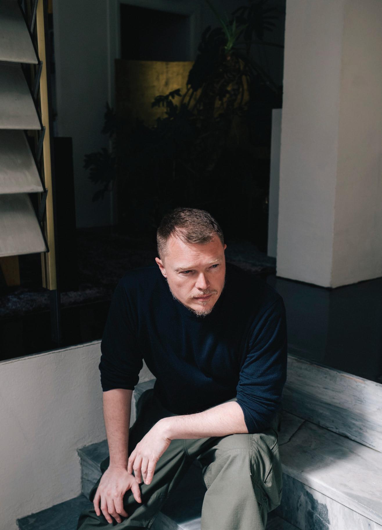
HAND FIRST
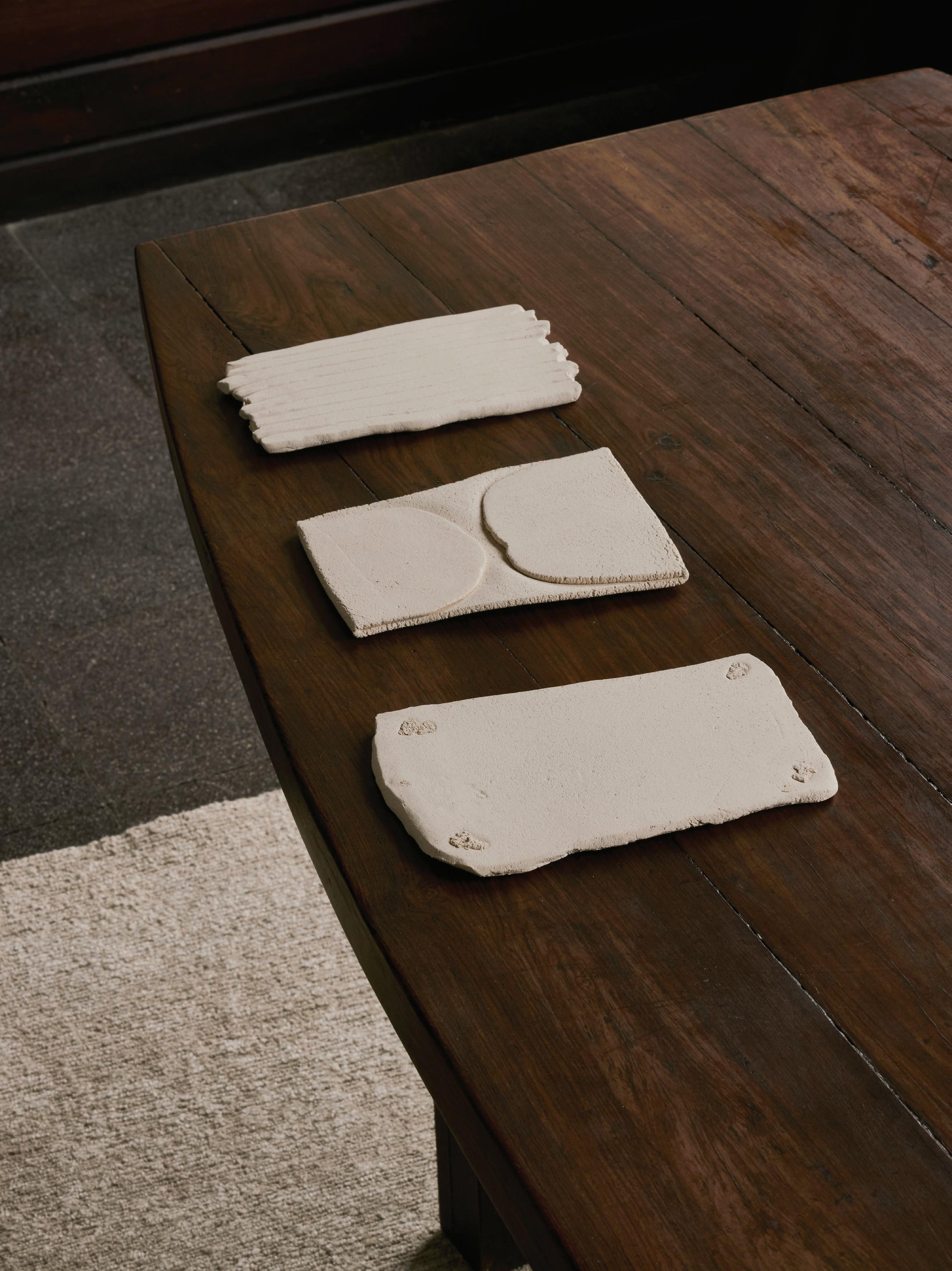
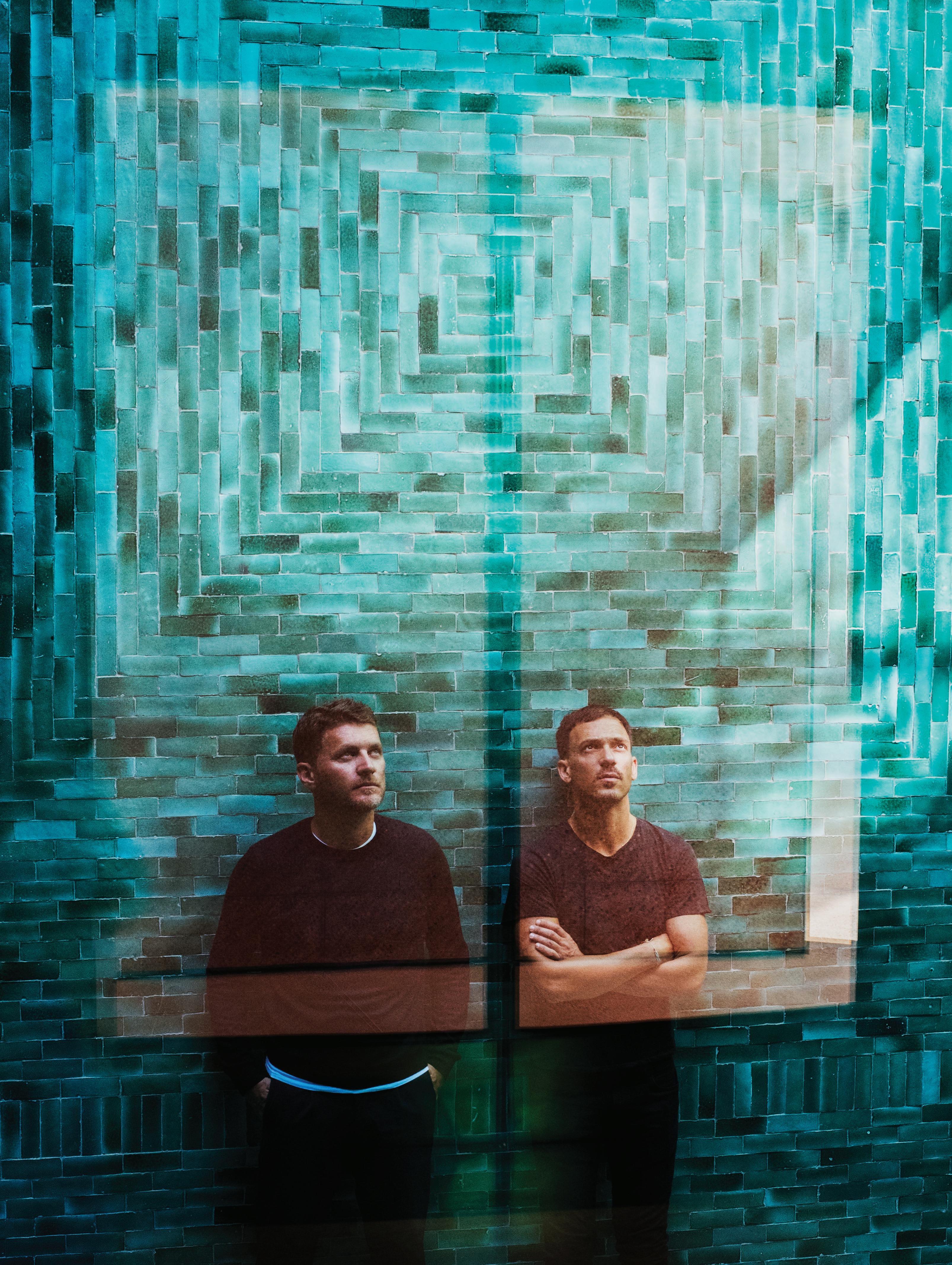
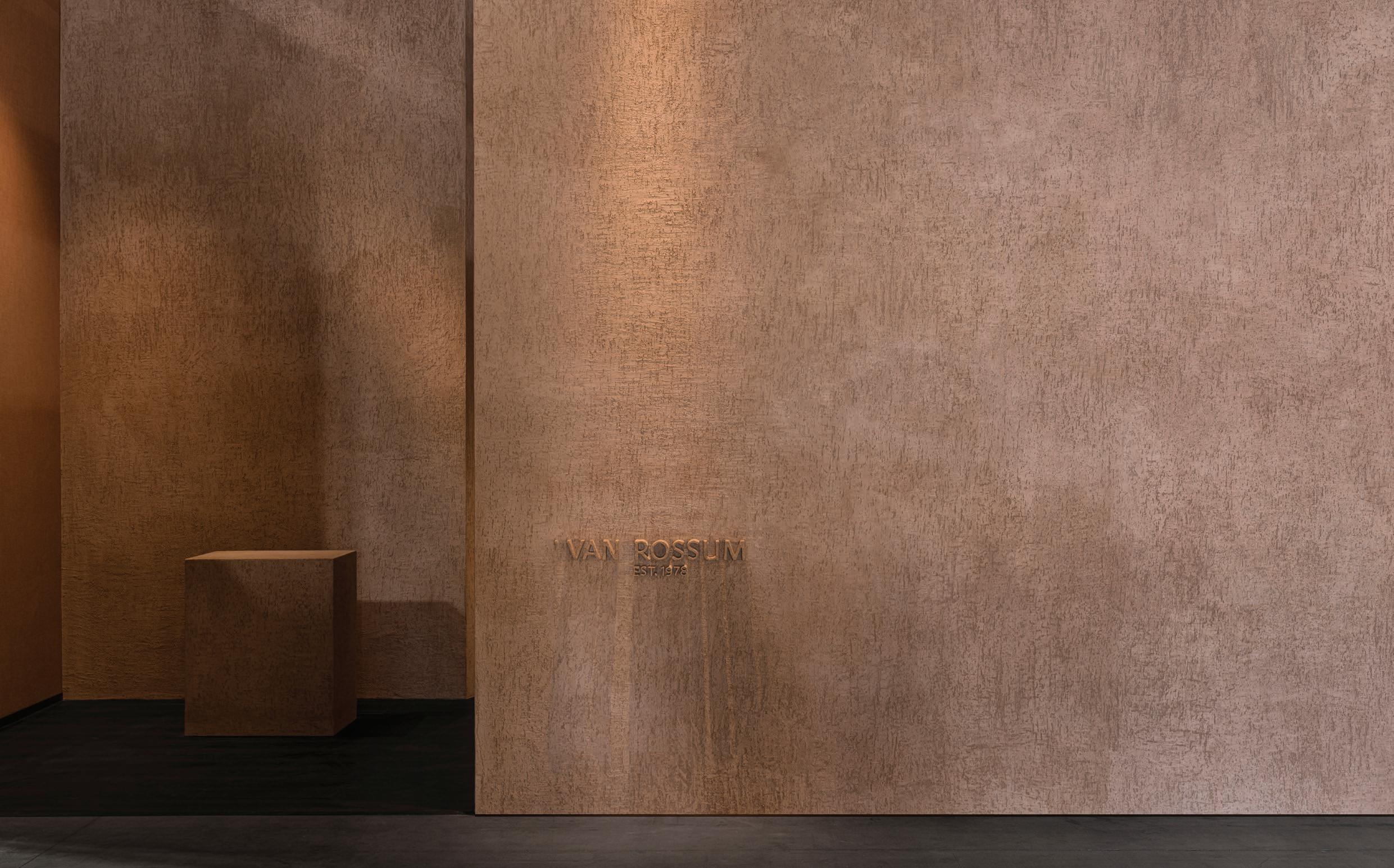
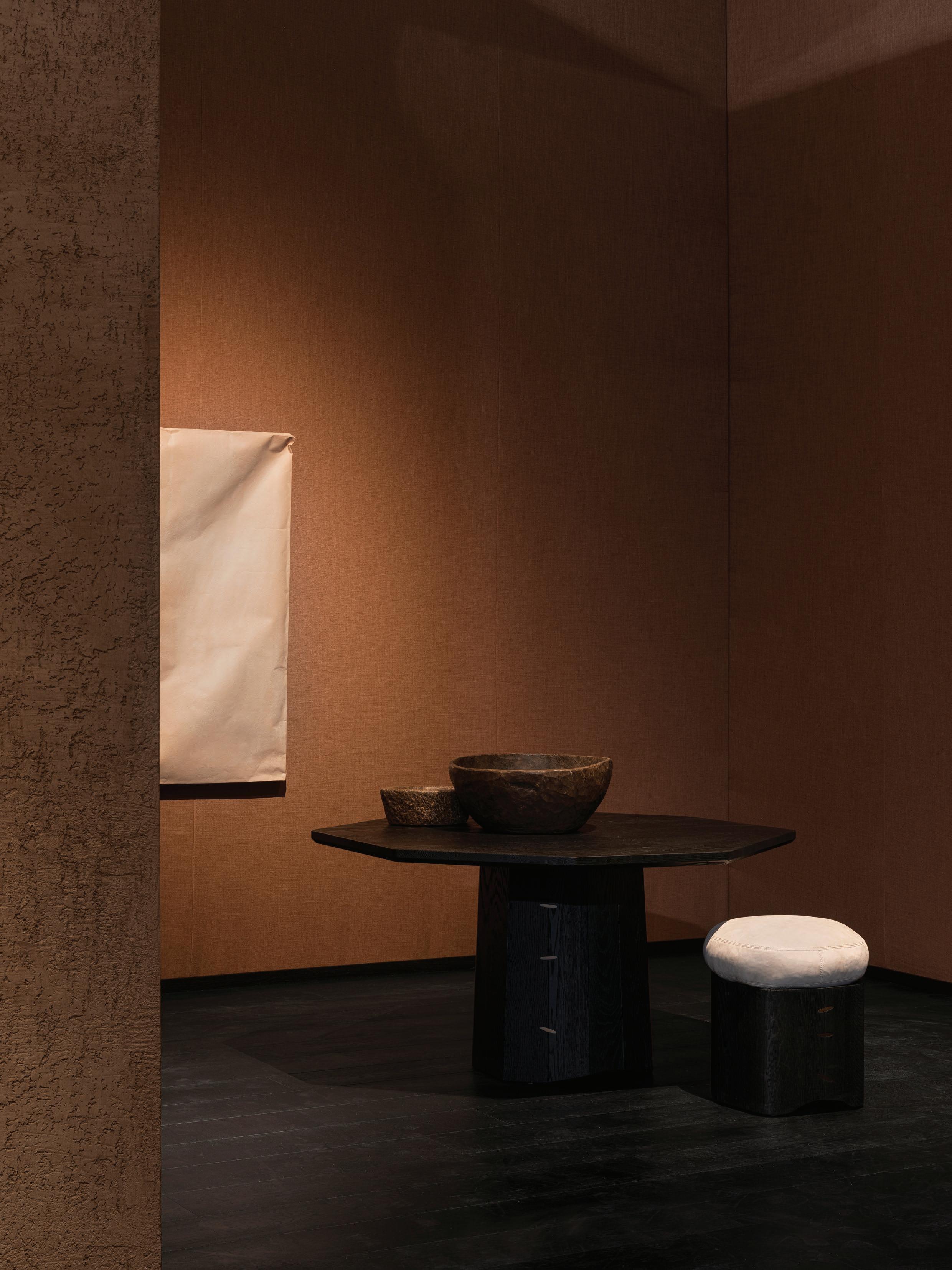
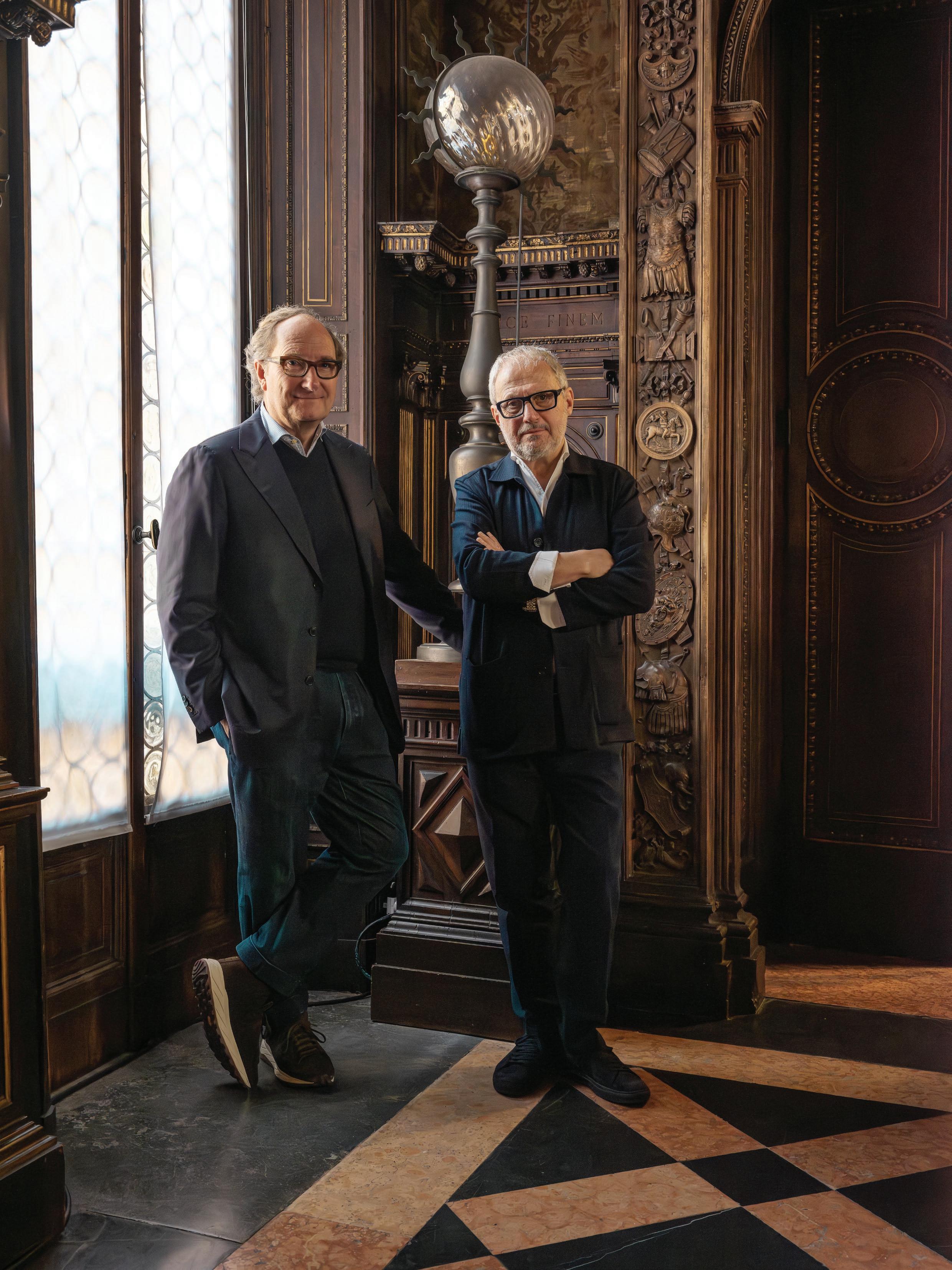
The need for human touch in architecture, landscape and product design has guided the work of Paris-based Studio KO founders and architects Karl Fournier and Olivier Marty for the past 25 years. In a meeting of the minds, Dutch furniture company Van Rossum collaborated with the studio for their latest collection that seeks to master the beauty of imperfection, launched at Salone del Mobile.Milano 2025.
Congratulations on the Cairn collection—your first collaboration with Van Rossum. What sparked this partnership, and how familiar were you with Van Rossum’s dedication to handcrafting furniture?
Karl Fournier: We had already worked with Van Rossum's artistic director, Thomas Haarmann, who introduced us to the brand. We were immediately convinced by the quality of craftsmanship that emanated from their product, and the discussion then turned to a potential collaboration.
Human touch is central to your design approach, aligning with Van Rossum’s 40-year commitment to craftsmanship in their Dutch workshop. Could you expand on your shared design values and how they are reflected in this collection?
Olivier Marty: Local craftsmanship is very important to us. It's often what gets us started on a project, even in architecture: the materials, the culture, the traditions of the place in which we're setting up. Van Rossum is a company with extraordinary expertise, mastering the craft of woodworking to perfection. What binds us together is our love of fine materials and highquality furniture.
Your work shows a deep respect for history, often reinterpreting it through what you call ‘resurgences’ to
create a fresh perspective. Were there specific cultural or historical influences that shaped the Cairn collection?
Karl Fournier: This collection is inspired by a desire to incorporate irregular shapes, as found in nature. Nature constantly offers a perfect imperfection, which is more about irregularities than real defects, and which adds soul to an object. Another of our references was Kintsugi, the Japanese art of repairing broken objects by filling the cracks with gold. This poetic approach adds refinement to a rougher or simpler material. We express this reference to this ancestral technique by using the brass staples.
How did the design process embrace and highlight Van Rossum’s approach to furniture making?
Olivier Marty: Through this collaboration, we agreed to challenge them a bit by introducing the imperfections we mentioned earlier into their semi-industrial production. In this way, this collection offers a new facet to the brand. The collection stems from a shared interest in handicraft, which we aim to make more visible and accessible. Van Rossum's excellent expertise is the best way to achieve that “perfect imperfection” we were looking for.
Portrait Noel Manalili
Photography Courtesy of Van Rossum
Interview Sophie Lewis
“This collection is inspired by a desire to incorporate irregular shapes, as found in nature. Nature constantly offers a perfect imperfection, which is more about irregularities than real defects, and which adds soul to an object.”
– Karl Fournier
Texture is a hallmark of your work. How does the collection’s materiality reflect this?
Karl Fournier: Van Rossum has developed a sublime range of materials, including wood, metal and textile, which we worked with to create this collection. We used a dark brushed oak to create this irregular appearance structure with no right angles, embellished with brass staples that join the wooden planks together in the way of traditional joinery. We played with contrasts to achieve the vibrancy we desired, striking a balance between brutality and refinement.
However, we envisioned the collection with other finishes in mind, such as natural clear oak. It will depend on the context.
Your architecture embodies a sense of solidity, anchoring itself within the landscape. How does this architectural language translate into your product design?
Olivier Marty: Our creative approach is the same, whether it's a question of architecture or objects. For us, it's a whole that must imperatively interact. When we design a piece of furniture, we first think of its use and the details that make its relationship with the user fluid. The longevity of the pieces is also of prime importance, which is why we work as much as possible with high-quality materials and craftspeople who have mastered these materials. As for architecture, we strive to create timeless objects.
Your work is defined more by a conceptual framework than a signature aesthetic. How does this collection align with and expand on your broader portfolio?
Karl Fournier: We try not to repeat ourselves too much. Each project is different in its location, the client, the period, and your own taste evolution. For a furniture collection, it’s a little bit different. We can imagine these objects in several contexts, as long as you can adjust the finishes. We are not the kind of designers who only use our own designs in projects; on the contrary, we always love different mixtures and provenances. However, why not, from time to time and when it is appropriate, use furniture designed by us?
As you celebrate 25 years in practice, how has your creative partnership—both in life and work—evolved, and in what ways do you complement each other?
Olivier Marty: We are still getting to know each other twentyfive years later! We’re both full of surprises, and we have not finished yet! It saves us the trouble of boredom.
But to be more precise, I’m the serious guy who works like a monk/soldier, and Karl is more inspired, looking at things from further away. It is not immediately obvious to separate our roles, as we are both creatives. It would have been so much easier if one of us were a businessman!
Introducing Cairn, the first collaboration between Van Rossum and Studio KO. Inspired by nature’s imperfection and the poetry of Kintsugi, the collection embraces irregular forms and visible repair, expressed through brass staples. Pictured: the Cairn round dining table and stool.
DUAL FORCES
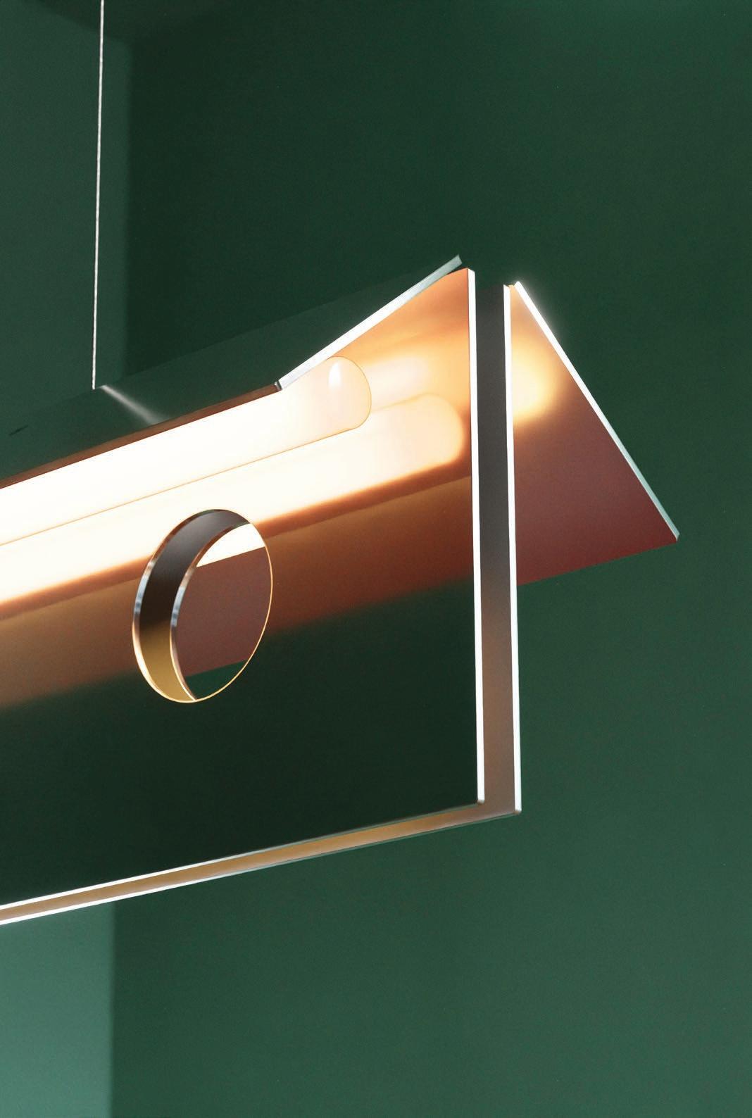
Based in Melbourne, lighting designer Ross Gardam
is known
for his innovative approach to glass. For Milan Design Week 2025, the designer presented
LUMINESCENT DUALITY within an old icehouse in the city’s Brera district. The exhibition explored the theme of light as a medium and metaphor, as Gardam unveiled new handcrafted and limited edition pieces.
Congratulations on LUMINESCENT DUALITY, presented at Milan Design Week 2025. How did French philosopher, scientist, and mathematician René Descartes’ opening appeal in Meditations Métaphysiques shape your approach to the show?
Duality within perception was the overarching theme of the show. Descartes frames the physical and emotional aspects of perception so poetically that I was drawn to the text: “I will now close my eyes, stop my ears, and withdraw all my senses. I will consider these ideas purely within myself.”
Why did you choose the space in Milan’s Brera district for LUMINESCENT DUALITY?
The space was initially used as an icehouse before the advent of refrigeration, and I had attended many great exhibitions in this space over the years. Via Palermo has always felt like the centre of Brera, since I first travelled for design week in 2010.
Given the historic nature of the space, how did its atmosphere or past influence the design of your freestanding installation?
The architecture framed the work perfectly, and the golden light from the arched windows created a dream-like feel to the experience. The heritage nature of the space also offered us the opportunity to create a skeleton within, as we could not touch the original walls or ceiling. Initially, I aimed to create the ambience of a pavilion space; however, this was
softened over time with the addition of curtains and soft tones. The physicality of the installation was designed to be sympathetic to the new collections launched, using dual connection points throughout.
The exhibition featured both new and limited-edition pieces. How do the showcased works, particularly the debut of Aeris and Solace and the international debut of Volant, reflect the evolution of your relationship with glass?
All of the new collections build on what has come before. Solace is a particularly complex form to create in mouth-blown glass. Fortunately, we had the privilege of working with our long-time collaborator, Liam Fleming, on the pieces.
I have been working with mouth-blown glass since my first lighting piece, Silhouette, and I have not found a material that pairs better with light. My relationship with glass is defined by a curiosity to explore new ground, in form and process.
In Aeris, you translate the ephemeral nature of clouds into sculptural light. How did you capture that sense of softness and suspension through the interaction between mouth-blown glass and brass?
The white glass especially has such a literal translation to billowing clouds. It's also the close-up view of each pearlescent piece of glass, which has an amazing depth that mimics clouds. The other glass finishes have a subtleness to them, with the light reflecting internally, which talks to the sky.
Photography DePasquale+Maffini
Interview Sophie Lewis
“Many visitors froze on entry and then travelled through in hushed tones. We created a moment, separate from the chaotic streets and the hectic nature of Milan Design Week. I wanted the experience to push people out of their place, just for a small moment in time.”
– Ross Gardam
In Solace, you push the boundaries of traditional glassblowing through innovative engineering. How did this affect the collection’s intricate, textured forms?
Unlike other glass we produce, Solace is blown into a static mould, so the glass comes into contact with the cast iron mould and chills immediately. This creates the beautiful rippling effect on the surface of each piece.
Both collections are handcrafted in Australia and assembled in your Melbourne studio. What is the importance of this local, hands-on process to the character and integrity of each piece?
This is something we have been focused on since the business's inception, allowing our small studio to consistently deliver the highest quality possible.
You also launched Relic, your second collaboration with glass sculptor Peter Kovacsy. How did working together impact the way glass and light come across in the piece?
I will not lie, Relic was laboured over; it was challenging to create a second piece to sit alongside Vestige. The material in this scale has such a mesmerising effect on people, and I had a better understanding of how I wanted to use this within
Relic. Relic is not a singular form, it has layers upon layers. When illuminated, it draws you into the open front of the piece.
How did you navigate the complexity of cast crystal glass while maintaining the purity of its geometric silhouette?
Relic intentionally bears the mark of the making process. As the crystals melt in the kiln, they form ghosting and air bubbles as they kiss together. Each piece is delicately excavated from the sacrificial mould after 14 days of annealing, releasing a form scarred by the process. The face is then polished to a high-gloss finish. The geometric silhouette was designed to be elegant as a singular object, while also being accessible and allowing for a more detailed view of the contrasting surfaces.
LUMINESCENT DUALITY invited reflection on light as both a medium and a metaphor for life’s contrasts. What did you hope visitors would take away from the show?
Many visitors froze on entry and then travelled through in hushed tones. We created a moment, separate from the chaotic streets and the hectic nature of Milan Design Week. I wanted the experience to push people out of their place, just for a small moment in time.
This page: Melbourne-based lighting designer Ross Gardam’s LUMINESCENT DUALITY exhibition explored the delicate balance of opposing forces through innovative glass lighting design. The exhibition debuted Aeris and Solace—new mouth-blown glass collections framed in brass—alongside the Volant wall light, which was shown internationally for the first time. Previous spread: Solace pendants and table lamps, Aeris wall lights, and the Volant wall light.
RETRO FUTURE
In a perfect alignment of the stars, British designer Benjamin Hubert presented a 10-year retrospective of his multidisciplinary design studio LAYER at Milan’s renowned fashion and design destination, 10 Corso Como. Titled 101010, the exhibition celebrated LAYER’s diverse range of projects while previewing six prototypes
that address serious issues facing humanity over the next decade.
What brought about the change from your eponymous studio to LAYER in 2015, and the shift from furniture design to more technology-driven projects?
I come from an industrial design background and had some success with furniture and home products early in my career. However, after about five years, it felt a bit one-dimensional. I needed a platform to broaden the practice and pursue more meaningful design outcomes.
How does LAYER serve to expand your design language?
LAYER draws on my consultancy background but also champions high-quality craftsmanship. That’s why the 101010 exhibition encompasses everything from beautiful timberwork to tech-driven wearables. LAYER isn’t about my taste—it’s about solutions for how we live now and in the future. I love furniture, and you can see traces of that in the work we do at LAYER. However, each item we create has an insight, a reason to exist, and a challenge to solve.
Have you retained a connection with your past clients?
Only about two per cent of our output over the past decade has been furniture, but we have maintained relationships with brands such as Muuto, Andreu World, and Fritz Hansen. I
enjoy reflecting on craft and passing it back to people—that’s something the industry risks losing sight of as technology becomes embedded in every aspect of life.
How do you approach technology in design?
We work extensively with technology and AI, but they are not the end goal—they are enablers. Ideally, they work in the background. If there’s one word that captures our approach, it’s intersection—the meeting point of the technical and the human.
How do you find the sweet spot between tech and people?
We design for people. That means things should be softer, warmer, and more welcoming. I appreciate minimalism and precision, but we always temper that with tactility and a sense of humanity. That combination is what makes design connect.
Why do companies like Bang & Olufsen, who already have design teams, come to LAYER?
They came to us because LAYER straddles furniture and technology, which in the case of B&O is their niche. By working with an external studio, they gain variation, inspiration, and marketable assets. Brands like B&O bring deep technical knowledge; we offer new approaches and fresh storytelling.
Photography Courtesy of LAYER
Interview David Harrison
“With today’s rapid change, there is a risk of devaluing design. We need deeper conversations—beyond mere appearances or practicality—to encompass emotional responses and environmental impacts."
– Benjamin Hubert
Despite Brexit, your studio remains based in London. Why?
Britain is known for engineering, and we benefit daily from that problem-solving mindset. Most of our work is conducted in the US, Asia, and parts of Europe, but London remains a key part of our identity. It’s multicultural, alive with music, fashion, and the arts—and it attracts global talent, which helps our studio thrive.
Your studio is also involved in brand building and in some cases fundraising—why branch into those areas?
It’s a cliché that design is purely a creative endeavour. In reality, design links creativity with commerce. Clients want beautiful outcomes, but they also want financial success. I’m deeply interested in both the business of design and the design of business. We conduct financial modelling, market
mapping, and strategic analysis before beginning the design process. That’s how you create a lasting impact.
Where is the industry heading, and do you have any concerns?
With today’s rapid change, there is a risk of devaluing design. We need deeper conversations—beyond mere appearances or practicality—to encompass emotional responses and environmental impacts. At Milan Design Week, brands often use designer names to garner publicity. In 101010 , we reversed that by showing the brands we’ve collaborated with. The old model—designer as stylist—needs to evolve. The world has undergone significant changes since the 1960s and 1970s. To us, design should be useful and better than what came before. It’s a tool for change, not just more stuff for the sake of it.
Exploring new materials, pushing creative concepts and emphasising the human experience are all key elements in LAYER’s design philosophy. Dissecting the studio’s ten years of working, British designer Benjamin Hubert’s 101010 exhibition showed a diverse range of projects from simple household objects to a radically reinvented carbon fibre wheelchair and hi-tech audio and digital wearables.
Introducing the Fedrigo Sofa System by Vincent Van Duysen for Zanotta
Within the design week landscape—where bold gestures and experimental design often dominate—the quiet confidence of Fedrigo, designed in collaboration with celebrated Belgian designer Vincent Van Duysen stood apart.
Marking Van Duysen’s first partnership with the iconic Italian brand, the modular seating series draws from his restrained design language while embracing Zanotta’s legacy of innovation and craftsmanship. Rooted in principles of comfort, durability and sustainability, the Fedrigo sofa system is designed to offer a sense of physical and visual wellbeing.
Its sculptural form gently cocoons the user with its generous scale and balance of clean, architectural lines. The backrest seamlessly merges into the armrests in a soft gesture of continuity, creating an enveloping embrace. Cushions are structured to provide ergonomic support without interrupting the fluid silhouette, while the wide modules invite relaxed, informal lounging.
Produced in partnership with Cult.
Though the system appears effortlessly composed, every element is intentionally crafted to support long-term durability and environmental integrity. The sofa’s inner structure comprises plywood and expanded polyurethane made with recycled polyols, while its upholstery is constructed from recycled PET. Fastened with Velcro rather than adhesives, each part of Fedrigo is fully disassemblable—facilitating reuse or recycling at the end of its lifecycle.
Zanotta has long been a touchstone for progressive Italian design, known for pioneering furniture that blends art and utility. With Fedrigo, the brand continues this legacy; for Van Duysen, the project presented an opportunity to merge his architectural clarity with material sensitivity to craft a sofa system that is as considered as it is comfortable. Fedrigo is a reaffirmation of the brand’s commitment to meaningful design, made to endure and evolve with the spaces and people it serves.
Explore the Zanotta collection at Cult >
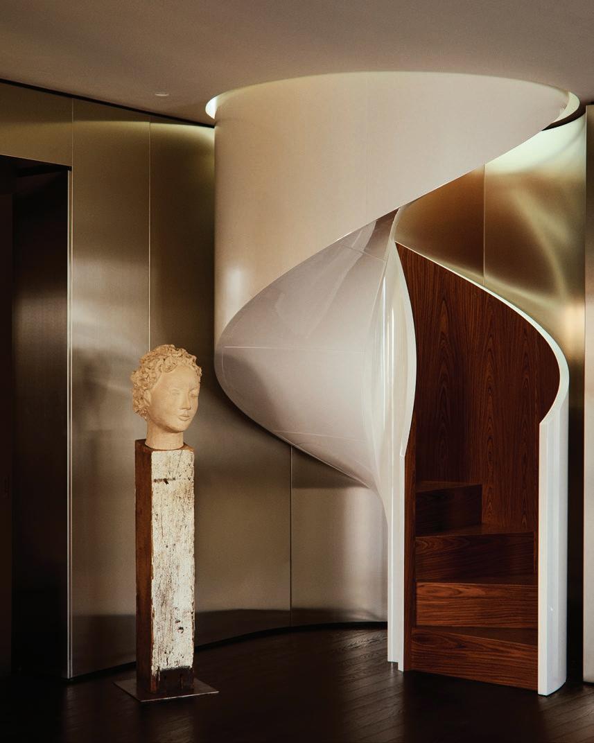
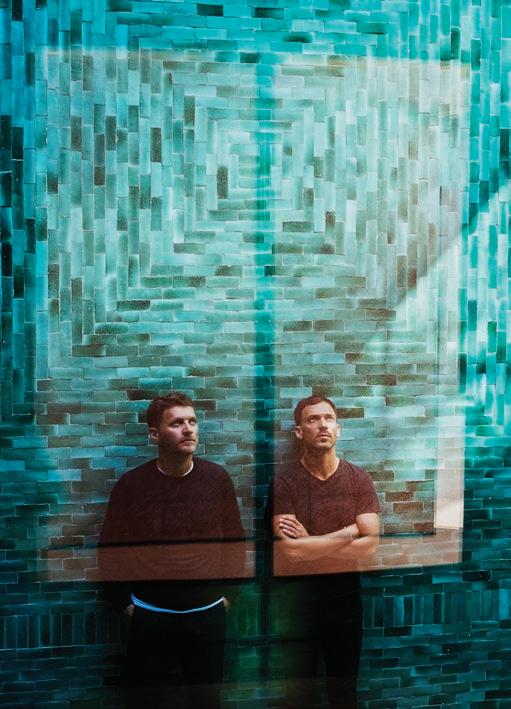
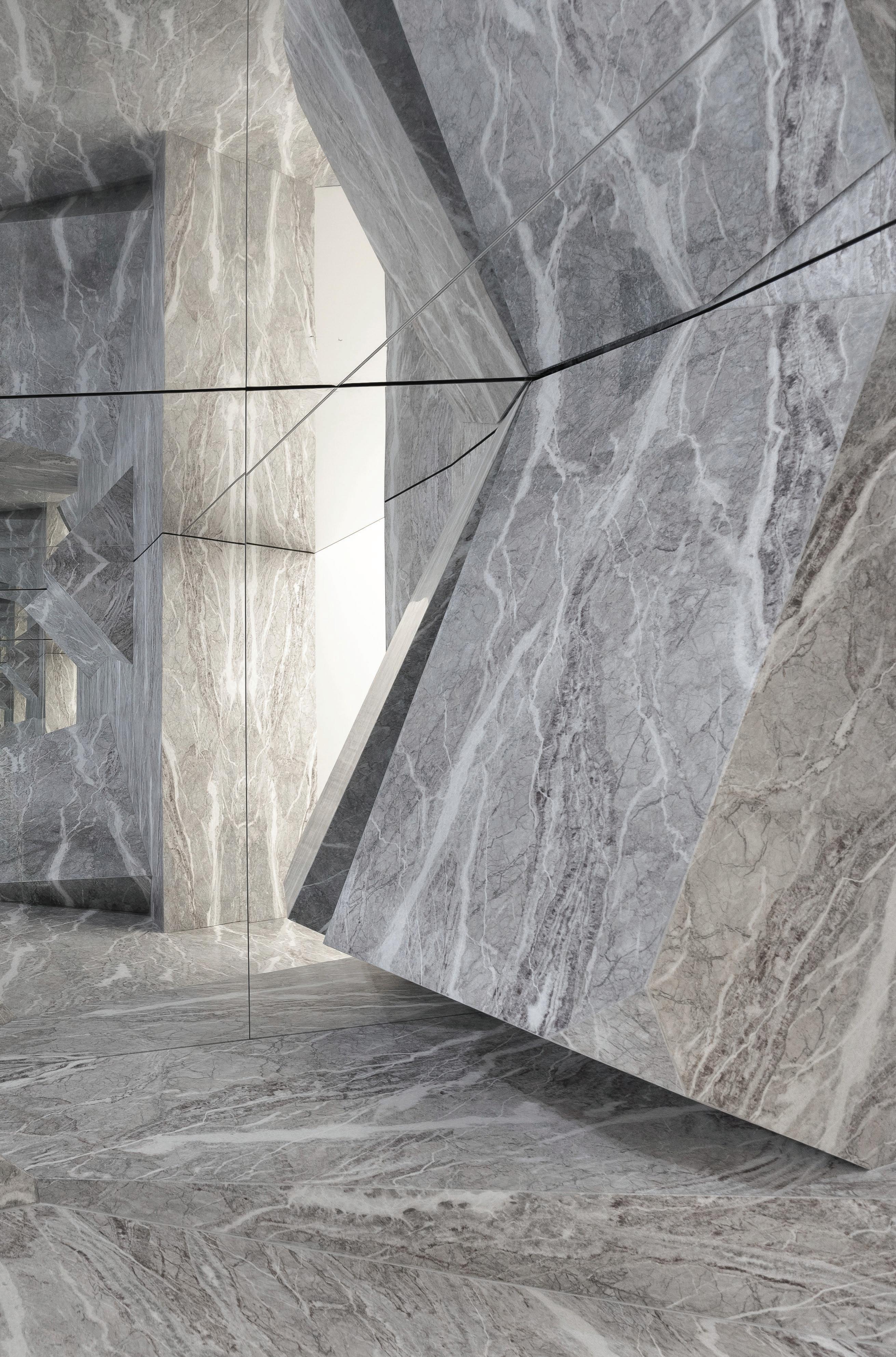
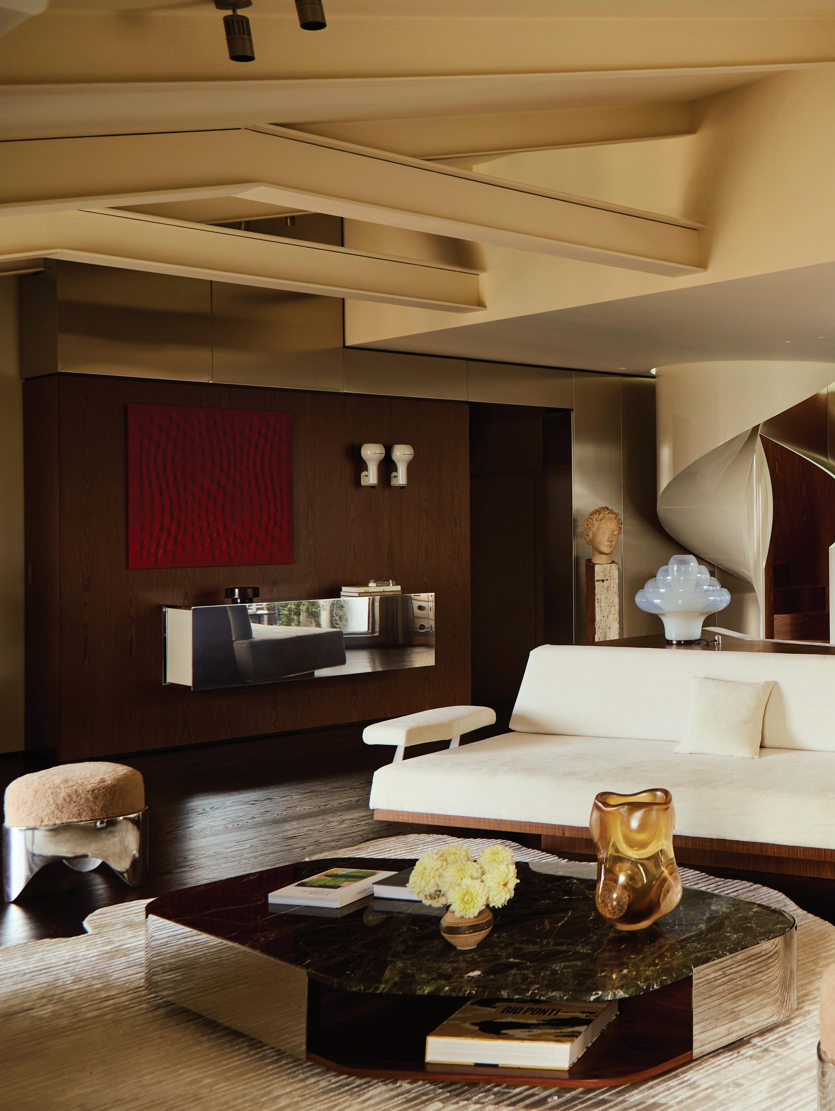
OF TIME REFLECTIONS
LOCATION Milan, Italy DESIGN Vincenzo De Cotiis
PHOTOGRAPHY Martin Morrell WORDS Alexia Petsinis
A 19th-century palazzo restoration reflects a balance between historical legacy and contemporary life, showcasing an intuitive approach to a spatial dialogue between form and materiality.
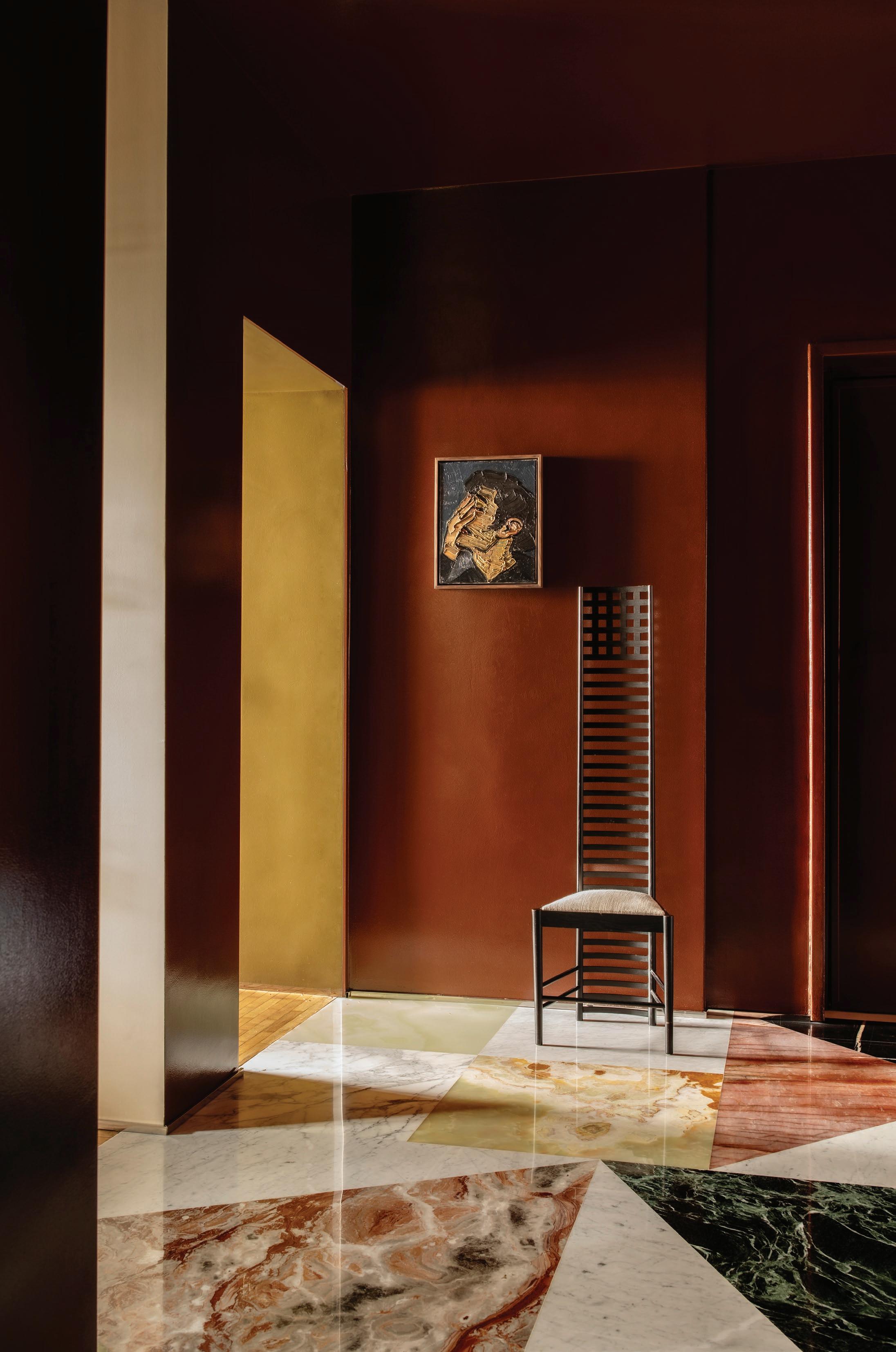
As an ambitious heritage intervention project by architect and designer Vincenzo De Cotiis, Palazzo Bonacossa echoes a sophisticated yet understated Milanese design legacy through the preservation of a historical architectural spirit. “The past was not overwritten, but rather refracted through a new lens,” De Cotiis says about the project. Fibreglass archways echo the building’s original forms, repurposed antique mirrors are now glass windows, hand-painted ceilings are invigorated with new textures; the interventions seamlessly permeate every aspect of the home, elevating its historical grandeur in a sleek, contemporary dimension.
“Each decision had to mediate between respect for historical integrity and the desire to express a contemporary vision. Innovation was introduced not through contrast, but through resonance, a silent dialogue with the architecture’s past.”
“The most complex challenge in this project was preserving the emotional patina of the palazzo without falling into nostalgia. We were not interested in simply restoring, but in creating a meaningful coexistence between eras,” De Cotiis says.
The colour and material palette creates a lustrous visual rhythm through the spaces, where evocative yet refined hues inspired by the 20th century, including deep greys and muted greens, add a theatrical undertone to the home. The architect’s signature application of weathered metals and fibreglass also creates an interplay between light and form, departing from ideas of nostalgia. From velvet seating to natural stone accents and feature walls with fluted oak panelling, Palazzo Bonacossa’s textural narrative evokes a sense of domestic warmth, while echoing a definitively Milanese design culture.
“The spaces were composed to invite observation, not spectacle. Elements such as hand-brushed brass, textured hand-painted ceilings, and calibrated asymmetries create a cadence that reflects the Milanese tradition of elegance without ostentation,” he shares.
Bespoke furniture pieces by the architect bring an element of sculptural intrigue to the spaces, including the hand-painted fibreglass armchairs and a dining table in aged silver-plated brass. Conversing with reflective glass finishes and metallic accents, these elements immerse the occupants in the poetic ambience of the spaces, evoking a dialogue between intimacy and openness, historical legacy and contemporary innovation.
Deeply intuitive to the site’s historical context, De Cotiis has reimagined the heritage grandeur of Palazzo Bonacossa in a contemporary dimension, exploring a “sacred” dialogue between form and materiality with his inimitable architectural signature.
This page: Inspired by the “monumental” presence of Castello Sforzesco in front, De Cotiis’s restoration of Palazzo Bonacossa reflects a poetic dialogue between materials and forms, and past and present. Following spread: Bespoke furniture designed by De Cotiis adds a layer of sculptural intrigue in the residence’s living spaces.
This page: Reflective surfaces and hand-painted ceilings enhance the “visual rhythm” throughout the home. Opposite page: A sophisticated material palette, including textured glass and weathered metals, creates an interplay between light and form.
Oki Sato
In Conversation
PRODUCT PHOTOGRAPHY Federico Cedrone INSTALLATION
PHOTOGRAPHY Thomas Pagani PORTRAIT Courtesy of nendo INTERVIEW Megan Rawson
In collaboration with Italian timber surface innovators ALPI, Japanese design studio nendo— led by Oki Sato—explores the boundary between nature and crafted through two wood surfaces: Kasumi and Futae. Oki Sato reflects on the challenge of designing wood that feels familiar yet unexpected, the poetic potential of ALPI’s veneer process, and how subtle storytelling lies at the heart of nendo’s practice.
Kasumi and Futae explore the boundary between natural and man-made—what drew you to this idea, and how did it shape the design process?
The brief from ALPI was precisely to explore the boundary between the natural and the man-made. If the design became too deliberate, it risked looking like a printed graphic, failing to communicate ALPI's technical expertise. Conversely, if it mimicked natural wood grain too closely, it would be indistinguishable from conventional veneer. The challenge was to find a design that balanced precisely between these two extremes.
ALPI’s unique veneer layering and slicing technique offers a lot of creative freedom. How did you approach working with such an innovative material process?
Designing the material itself was a novel yet complex challenge. In the initial stages, we ran numerous digital simulations using 3D modeling. However, the actual prototypes often yielded results different from our digital predictions. Consequently, the latter part of the process involved intensely iterating through prototypes and dialogue to refine the design. Discovering unexpected expressions emerge through this process—ones not originally intended—was both surprising and deeply rewarding.
Kasumi’s soft, blurred grain and Futae’s rugged, bark-like texture each tell a different story. What kind of feeling did you hope to evoke through these contrasting designs?
For Kasumi, the aim was a subtle, delicate expression. From a distance, it resembles the uneven texture of plaster more than typical wood grain. Upon closer inspection, however, one realises it is indeed genuine wood, composed of extremely fine, randomly arranged grains. Futae, in contrast, features wood grains of varying scales, large and small, allowing us to emphasise the inherent boldness and strength of wood. In a way, these two designs could be said to evoke contrasting feelings in the observer.
The subtle use of both warm and cool tones adds depth to the veneer veneer sheets—how did colour influence your interpretation of natural elements?
ALPI's veneers are versatile, used for everything from small furniture pieces to large-scale applications like architectural fittings and wall surfaces. Considering this wide range of potential uses, we chose a restrained colour palette that doesn't stray far from the impression of natural wood, ensuring adaptability across diverse settings.
This page: Curved yet minimal, the new ALPI x nendo shelving highlights the expressive grain of wood—reimagining material not just as surface, but as sculptural form. Opposite page: Inside the ALPI showroom in Brera, Milan.
The shelving is intentionally minimal, yet the form draws attention to the finish—how important was it for the furniture to act as a kind of frame for the material?
That's precisely the intention. Despite the minimal concept, the curved surfaces, oriented in various directions, were consciously designed to highlight the appeal of the wood grain. I find ALPI's ongoing approach very interesting for a material manufacturer: inviting designers not just to create materials, but to reinterpret them through objects, thereby enhancing the material's allure and revealing new facets.
Your work often blurs the line between functional design and poetic expression. How does this collaboration with ALPI continue that exploration?
In this context, I perceive 'function' as achieving a balance where the material integrates seamlessly into various spaces while maintaining a subtle design presence. The 'poetic'
Produced in partnership with Elton Group. x
element lies in another delicate balance: being derived from natural materials, yet possessing patterns that don't exist in nature. This approach to creation—navigating the ambiguous space between function and emotion with a distinct sense of balance—is perhaps characteristic of nendo.
Finally, how does this project reflect your broader philosophy at nendo—of designing moments of quiet surprise and subtle storytelling?
It might not be apparent at first glance. But that sudden moment of realisation—the '!'—when one notices it's 'designed wood,' coupled with the surprise of understanding the technology behind its creation. I feel this experience is unmistakably representative of the kind of expression nendo aims for.
Explore the ALPI range at Elton Group > @eltongroup eltongroup.com
Italy
LOCATION Milan,
DESIGN Christian Frascaro and Francesco Cristiano PHOTOGRAPHY Helenio Barbetta/Living Inside WORDS Anna Bisazza
In the kitchen, brushed stainless steel cabinetry custom-designed by Spotti Kitchen Studio is paired with Remy stools in canaletto walnut by Armani/Casa and a 1960s suspension lamp by Sergio Mazza for Artemide. The space also features a USM Haller serving cart and the Baindoles tea set by Armani/Casa and ‘L’altro Vaso’ (2019) by Lucia Pescador, courtesy of APALAZZOGALLERY.
A 1930s Milanese apartment infuses
mid-century nostalgia and contemporary details in a series of immersive spaces, with a nod to the distinctive geometry of Milanese rationalism.
Stepping into Christian Frascaro and Francesco Cristiano’s Milan home is a study in considered contrasts: soft yet structured, eclectic yet cohesive. Here, diffused vintage lighting glints off a patchwork floor of marble and onyx, creating a mood that hints at old-world glamour, without feeling overt.
Frascaro and Cristiano, creative consultants in fashion and design restyling, both approached the home as a personal project, opting not to engage an architect or interior designer. “We’d already created a beautiful first apartment, just on a smaller scale,” Cristiano explains. “This was about proving to ourselves we could do it again—but bigger.”
Their new apartment sits within a 1930s building by architect Giuseppe Martinenghi, overlooking Milan’s Stazione Centrale. Frascaro had mapped out the home’s layout before they’d even signed the lease, including the distinctive flooring, inspired by Gio Ponti and the geometry of Milanese rationalism. “The corridor often gets overlooked, but we wanted it to be a surprise—it’s what we call the ‘wow effect’,” he says.
The corridor leads to a series of immersive spaces, each with its own atmosphere. Mid-century lighting by Sergio Mazza casts a soft glow over dark chocolate walls, which spill into the living room ceiling through an expanded archway. The palette references Wes Anderson’s cinematic tones, while the forms nod to the surreal sensuality of Italian architect Carlo Mollino.
In the living room, a Sesann sofa by Gianfranco Frattini for Tacchini is featured alongside 1950s armchairs attributed to Ico Parisi, upholstered in Amoir Libre by Dedar, and paired with the Ping II table by Giuseppe Chigiotti for Driade. Anchoring the space are the NM02 coffee table and NM01 leather bench by NM3, alongside the Saarinen side table by Eero Saarinen in arabesque marble for Knoll. A custom mirrored cabinet by Christian Frascaro and Francesco Cristiano reflects a distinct curation of pieces including the Papavero floor lamp by Achille Castiglioni, Clio wall light by Sergio Mazza for Artemide, and a SEM Milano table lamp by Hannes Peer. Above, FRAMA’s Shelf Library frames ‘BOY EARLY 80S’ by Larry Stanton, punctuated by Murano glass accents from 6:AM Glassworks and Armani/Casa accessories.
Furnishings span the 1930s to 1970s—a deliberate decision to stay true to the building’s era. “We weren’t interested in trends,” Cristiano says. “This is about creating something enduring.” With every element considered, electronics and clutter are hidden away. Even the kitchen, in creamy yellow tones with brushed stainless-steel cabinetry and minimal walnut stools, maintains its pristine appearance. “You’ll never see a moka on the bench,” Frascaro adds. “Everything is stored after use.” The marble flooring from the corridor continues into the kitchen before giving way to honed Carrara beneath the work zone.
One of the key structural moves the pair made was removing a wall between the living and second bedrooms, which opened up the entertaining space. The remaining threshold is framed in black Marquina marble. In the dining zone, walls are clad in raffia and linen—a nod to the Asian restaurant where the couple first met—and anchored by a red Carlo Scarpa dining table, purchased after a brief debate over budget priorities.
Behind a concealed door in the hallway lies the bedroom, swathed in a custom-matched olive green from the bed linen to the walls and curtains. Mirrored wardrobes on either side of the bed create layered reflections, that are amplified at night by atmospheric wall lights.
At the corridor’s end, a butter-toned resin bathroom showcases 1960s caramel-striped ceramicware by Antonia Campi—a flea market find, the couple had long admired. “Each room was treated as its own world,” Frascaro says. “But together, they tell one story. Like curating an outfit—something old, something new, nothing off the rack.”
This page: The Hill House 1 chair by Charles Rennie Mackintosh for Cassina and oil painting ‘I Don’t Know’ (2023) by Nicolae Prisac. Opposite page: Custom marble and onyx flooring designed by Christian Frascaro and Francesco Cristiano sets a cinematic tone in the entrance corridor.
This page: In the dining area, the Orseolo table by Carlo Scarpa for Cassina is surrounded by Gaja chairs by Kazuhide Takahama, also for Cassina. A terracotta Cnosso cup and Ganimede chalice by Damiano Groppi are featured on the table, while ‘Geisha’s Painting’ (2014) by Paolo Gonzato, courtesy of APALAZZOGALLERY sits behind. Opposite page: Creative consultants Christian Frascaro and Francesco Cristiano in their Milan home they designed.
The bedroom features a 1960s Pi applique wall light by Sergio Mazza for Artemide, NM06 bedside tables, NMSP_00 bench by NM3, 1967 Lesbo lamp by Angelo Mangiarotti for Artemide, and a hand-painted Chinese screen with gold leaf on rice paper from the 1960s.
THE ENDURING ALLURE OF MARIO BELLINI'S CAMALEONDA SOFA
PROJECT Son Serra DESIGN BonVivant Concept ARCHITECTURE Bernado Oliver Javier Marquez Concept PHOTOGRAPHY Salva Lopez WORDS Megan Rawson
Blending countryside charm with Art Nouveau details through a minimalist lens, the open living space of this home is anchored by the iconic Camaleonda sofa.
Beyond their environmental value, vintage pieces are often selected by architects and interior designers to imbue a space with character, depth and a sense of nostalgia. Celebrating its 10-year anniversary in 2025, Design Consigned—the Australian-based online platform founded by Melissa de Campo—has spent the past decade curating design objects with provenance and story. “These authentic objects carry design history – they speak to the era in which they were conceived, offering a sense of connection while sparking memory and intrigue,” de Campo says. A deep appreciation for the intent behind exceptional design continues to inform de Campo’s curatorial eye and enduring passion for pieces of lasting relevance.
Few pieces capture the spirit of innovation quite like Mario Bellini’s Camaleonda sofa. Designed in 1970, this iconic modular sofa remains one of the world’s most coveted seating designs—a symbol of flexibility, comfort and 1970s expression. Its low, voluminous form, modular construction and signature
hook-and-cable tufting marked a radical departure from traditional seating design. With its unmistakable presence, the Camaleonda brings sculptural impact and function to any interior.
In Bellini’s own words, the Camaleonda sofa was created to “liberate sofas from the tyranny of rigidity”—a philosophy that remains as compelling today as it was over five decades ago. This playful, reconfigurable design invites interaction and personalisation, evolving with its owner over time. Today, the Camaleonda stands not only as a cultural icon but as a true investment in design.
Design Consigned is currently offering a beautifully maintained original B&B Italia Camaleonda sofa in tactile tan leather, complete with authentic branding. Whether you're a seasoned collector or new to the world of vintage design, Design Consigned's curated, verified collection brings lasting character and authenticity into the home.
Explore a vintage Camaleonda Sofa >
FIRST IMPRESSIONS
INTERVIEW
Sophie Lewis PHOTOGRAPHY Tomaso Lisca & Luca Argenton, courtesy of Artemest
IMPRESSIONS
This page: Simone Haag pictured in The Foyer at Palazzo Donizetti, a space she curated for Artemest's 10th-anniversary L’Appartamento Previous page: The Foyer is an evocative ensemble of collectable pieces, including the Leisure Terminal beige modular sofa by Ghidini 1961, the Cleo chandelier by Bottega Veneziana, the Mooncrate coffee table by Wanderart, the Bayou brown wood and cast bronze stool by Simone Fanciullacci for Edizione Limitata, the 1971 white table lamp by Cini Boeri for Codiceicona Papero, the Mama vase by Andrea Maestri, the Agatha high coffee table by Draga & Aurel, the Nexum Optical 60 gold cachepot by Splot Design, the Equilibrista brass table lamp by Silvio Piattelli, the Take 75cl carafe by Kanz Architetti, and the Agment metal console with obsidian stone elements by CTRLZAK for JCP Universe.
As the first Australian invited to exhibit, interior decorator and stylist Simone Haag designed TheFoyerat Artemest’s 10th-anniversary
L’Appartamento
Milan Design Week 2025.
for
Joining five other studios, she reflects on how she worked within the historic Palazzo Donizetti to create a ‘landing page’ for the experience.
Congratulations on The Foyer at L’Appartamento by Artemest for this year’s Milan Design Week 2025. You were the first Australian designer to be featured in the group exhibition. How did the opportunity to participate in this landmark 10th anniversary edition come about?
Thank you—it's truly an honour to be part of The Foyer at L’Appartamento for Milan Design Week 2025, especially as the first Australian designer to be featured in Artemest’s group exhibition, and for their 10th-anniversary celebration.
To be able to interpret The Foyer—a space that traditionally sets the tone for everything that follows—felt like the perfect metaphor for this moment in my practice. On more than one occasion, a fellow Australian thanked me for ‘flying the flag’, which was special.
The opportunity came about quite organically through my long-standing relationship with Artemest. I've specified their collections for years—not just because of their craftsmanship, but also because of the way they honour Italy’s design heritage while embracing contemporary sensibilities. Over time, that relationship naturally evolved into deeper conversations around collaboration, and when the team approached me about participating, I couldn’t say yes fast enough.
You were tasked with designing the first space visitors
encounter. How did the role of The Foyer as a point of arrival shape your vision for the room?
Designing The Foyer as the first space visitors encounter came with both a sense of responsibility and creative opportunity. As the point of arrival, it needed to set the tone immediately, not just aesthetically, but emotionally as well. I saw it as the ‘landing page’ of the entire L’Appartamento experience; that critical first impression where you begin to sense the rhythm and narrative of what’s to come.
What made this room particularly unique—and a creative challenge—was that it was the most richly detailed in terms of its existing architecture. The walls were completely untouchable, which meant I had to work with, rather than over, the existing beauty of the space. That constraint became a guiding force in my design thinking. I leaned into the idea of welcome—how to create intrigue, and a feeling of being simultaneously grounded and transported, without altering the canvas itself.
Instead of treating the room as a static entryway, I envisioned it as a moment of pause and curiosity. It’s an introduction, yes, but also an invitation. Hence the collection of pieces that invite you to stay a while—a sofa, a chess table, a drinks cabinet.
Set within Palazzo Donizetti, how did the building’s history and ornate detailing inform your design response?
Stepping into Palazzo Donizetti as an Australian designer was both awe-inspiring and humbling. We simply don’t have architecture like this back home. It was an environment that felt quite foreign in the best possible way.
I was drawn to the idea of contrast: marrying the grandeur of the architecture with lightness and play, creating a space that respected its past while still feeling fresh and alive. Of course, practical considerations were also significant. The room had six door openings, a window, and was expected to accommodate a constant flow of thousands of people throughout the week. So it needed to function almost like a stage set—visually engaging from every angle, but also allowing for seamless movement. Every element was designed with intention: to frame the architecture rather than obscure it and to gently nudge visitors into the experience.
How did you find a balance between the grandeur of the space and your own design language?
Once I was briefed on my space, I began selecting pieces. Certain furniture pieces and objects immediately stood out. They spoke the same language. As a collective, they would have looked great anywhere, but having them live within a space of such incredible history, with frescoes and marble mosaic flooring, was a beautiful bonus.
I was drawn to pieces that had an inherent sense of character— objects that carried their own quiet narrative, yet also felt open-ended, as if they were waiting to be interpreted. The vignettes weren’t overly styled or static; instead, they were composed to feel slightly in motion, as though someone had just walked through or was about to enter. That sense of movement was important—it brought a vitality to the space, especially in contrast to the permanence and stillness of the architectural shell.
If you were to highlight one standout piece or designer featured within The Foyer, which would it be?
That’s like asking me to pick a favourite child! But if I had to highlight one, the Terry red glass coffee table would be it. It was the first piece I selected and captured the spirit I was after. There’s something about its boldness—the form, the colour, the way the gridded detail matched the floor—that resonated with me.
Closely behind it was the Ernest bar cabinet, with its Memphisinspired detailing and a tone of green that lies somewhere between pistachio and chinois green. Both of these pieces felt like anchors within the room. Because of their strength, other elements, like the Almond console table, needed to take a quieter, supportive role.
This page: The Milestone lacquered wood and Travertino marble side table by Carpanese Home, the Onda lightweight marble chaise longue by Dimarmo, the Sumatra V1 side table by Simone Fanciullacci for Edizione Limitata, the Tango Round storage unit #2 by Laura Meroni, the Stravedamento burgundy Murano glass and Palissandro marble decorative vase by Aina Kari, and the Honeycomb floor lamp with wool lampshade by AV Metal. Opposite page, left: The Ernest bar cabinet by Elena Cutolo for Altreforme, the Mama vase by Andrea Maestri, the white encaustic and gold majolica lamp by Sigma L2, the Optical small table by Giannella Ventura for Extroverso, the Kyl beige pouf by DalMoto, the Donghi Terry red glass coffee table by Giannella Ventura, the Full Moon Over High Water in Venice Murano glass table lamp by Aina Kari, and the Tree Unnatural Gold coat stand by Giorgio Ragazzini for VGnewtrend. Right: The Charlie White chair by Da A, the Almond console table by Oscar Torlasco for Extroverso, the Marte Collection stainless steel floor candelabra by StudioNotte, the Stravedamento white Murano glass and hammered brass decorative vase by Aina Kari, the Bassa table lamp by Tato Vox, the set of two Eclissi decorative centrepieces by ClaireLune, and the Upsidedown sculpture by Pietre Trovanti.
In celebration of its 10th anniversary, Artemest presented the third edition of L’Appartamento in Palazzo Donizetti. Located in Milan’s historic heart, the 19th-century landmark features ornate façades, grand staircases, and frescoed interiors—indicative of Renaissance, Baroque, and Liberty styles. Each of the six designers and studios inhabited a different space within the building to present a distinctive curation of Italian craftsmanship and design.
How did you see your space in dialogue with the rest of L’Appartamento?
Even though the six studios came from totally different corners of the world, the palazzo itself—and Artemest’s sharp-eyed curation of artists and makers—gave us a shared 'grammar.' Soaring ceilings and period detailing were the common backdrop, while the furniture, lighting and objects were all drawn from the same pool of Italian craftsmanship.
From there, each of us tuned that language to our own accent. Some rooms were quiet and restrained, while others went full volume with colour and pattern. The Foyer sat more in the eclectic space. Walking through the apartment felt like a curated playlist—the tracks were different, but the soundtrack was smooth.
An additional parameter was Artemest’s 'no duplicates' rule: once a piece was claimed by a studio, it was off the table for everyone else. The selection process became a refined form of speed-dating the catalogue: you had to trust your instincts, commit quickly, and then pivot gracefully if a favourite was spoken for. I did lose a handful of pieces to faster selectors, yet those near-misses proved serendipitous. The items I eventually chose suited The Foyer perfectly, while the ones that slipped through found their ideal context in neighbouring rooms.
Did you have any favourite discoveries from the other rooms in the exhibition?
One of the rare luxuries of L’Appartamento was the chance to walk through five 'private residences' conceived by one’s peers. As designers, we seldom step inside a finished home by another studio. I came away with a handful of 'why didn’t I think of that?' moments; those discoveries reinforced what I enjoy most about collaborative exhibitions: you witness six completely different design responses, and you leave with a whole new set of tools in your visual vocabulary.
How was The Foyer received during Milan Design Week?
I’m still processing the week, yet a few moments are etched in my mind. For six straight days a queue snaked around the block. I loved the quiet nod and smile from visitors who realised I was the designer—the Italian saying ‘complimenti’ meant as much as any headline. Then came the formal feedback: editors from the international design press called the curation fresh, and future clients said, 'We felt instantly at home—can we talk?' Hearing that confirmed the emotional brief had resonated with them.
What touched me most, though, was the contingent of Australians who visited Palazzo Donizetti. Their pride was palpable, reminding me of how special it is to represent home on the Milan stage.
Designer Tommaso Spinzi talks to us about his fascination with brutalism and the history of design, and how this manifests in his Milan loft. In an ever-evolving space where work, passions, and lifestyle come together, he is surrounded by mid-century Italian pieces, vinyl records, and limited-edition pieces from his creative atelier, Spinzi.
Where is your loft located?
The loft is located in Milan, in the northern part of the city’s Affori district, which was once an independent village and is now part of Milan. I like it here because it is very different from everywhere else in Milan. I can easily reach a great park nearby and also travel easily to Lake Como, where I’m originally from, or to the airport. It’s my hidden spot.
I live here from time to time, when I’m not staying in my apartment, or Lake Como. It is also a space where I host friends from around the world on weekends when I’m not working.
What did you set out to create in the interior spaces?
My vision was to create an always-evolving interior space that reflects an always-evolving interior taste; a space where I can enjoy, collect and study interesting pieces of furniture, as well as create.
At the same time, it’s a space where I can conduct research, study, and work on various projects—a sort of sanctuary for me.
What were your main reference points?
The Italian lifestyle, especially in the 70s and 80s, fused with brutalism, sophistication, a passion for vintage cars and motorbikes, mid-century furniture craftsmanship, and cool hunting. Everything is done with an artistic approach and an international vision.
Your loft is also your workspace, Spinzi Creative Atelier. How do you delineate between the two, or do your work and living spaces cohesively inform each other?
This is the modern concept of living, where work, passions, and lifestyle come together. We are working on similar projects for our clients, and that’s why I always suggest this modern concept to them as a direction, so they can build something that lasts for a long time.
You’ve transformed a raw, industrial space into a gallery-like home. What was your process for blending the raw and refined materials?
I’m fascinated by brutalism and industrial spaces. When I had the opportunity to take ownership of this space, I decided to preserve most of its character and make only simple adjustments to the structure, leaving it a bit unrefined. Then, I began adding mid-century Italian pieces from my collection and experimenting with some of my prototype and limited-edition pieces, created by my studio, Spinzi.
There are books, vinyl records, design objects, and a Porsche, among other notable pieces. How does your design eye influence the way you curate things?
I’m fascinated by the history of design, which is also why I collect, trade, and curate a selection of vintage mid-century furniture for clients and architects. I currently have almost 50 vintage lamps in stock. It’s my wonderland! On top of that, I love cars and motorbikes, which are a great addition to my lifestyle and one of man’s favourite passions. Let’s put some music on!
How does materiality inform the space?
Materiality plays an important role in the space. I have decided to use a microcement for the floor from Innovative Surface. The raw, unrefined walls are simply painted without being plastered, and the addition of metal and stainless steel is an important signature of Spinzi.
Does living and working among your designs inspire your design process and creativity?
It boosts my creativity. Since I travel frequently, returning here brings me a sense of peace. It’s my sanctuary, where my research, beliefs, and experimentation come together. Some of my objects come from dreams, like the Medusa (jellyfish) stool, which is connected to my time in Australia. It takes me back there every time I see it here.
How does your childhood growing up on the shores of Lake Como influence the way you live now?
I grew up surrounded by beauty, and it has shaped the way I perceive things now. I love the fact that it is very close to Milan, so I can escape there from time to time. This is also why I chose to live in Milan almost seven years ago, after living in Australia, the United States, and Japan.
This page: The Silös dining table and Medusa stool by Spinzi in the dining area. Opposite page: A Medusa stool by Spinzi separates a pair of mid-century modern armchairs in the living area, that includes a Palladium coffee table by Spinzi and a B&B Italia Camaleonda sofa by Mario Bellini.
This page: An Abstraction 03 rug by Spinzi on the floor of the living space with a leather Elda armchair by Joe Colombo. The space also includes two Palladium stools by Spinzi. Opposite page: A custom metal door by Spinzi and his Medusa stool set a modern tone for the loft’s industrial aesthetic.
Global Threads
Exploring the intersection of European design culture and Australian craftsmanship, we uncover how Abode Living’s firsthand experience at Milan Design Week informs the creative direction of the Melbourne-based company.
As design week unfolded across Milan’s courtyards, galleries, and showrooms, Abode Living creative director Amelia Marasco Adair and her team took in the streetscape with a discerning eye—seeking not just inspiration, but connection. The Melbourne-based luxury textile company has long maintained a collaborative partnership with Italian textile mill Kohro, and this year’s visit to Italy reaffirmed the strength of that global thread.
“Everywhere I turned, there was evidence of outdoor living being treated with the same reverence as indoor spaces,” Marasco Adair says. “Oversized, comfortable cushions, boucle in every imaginable shade, and richly coloured marbles—especially deep burgundy and green—set the tone.” These tactile and tonal cues will shape Abode Living’s new winter collection, with dual-sided boucle throws, new yarns, and a deeper exploration of textural luxury.
WORDS Megan Rawson
At the Kohro showroom in Brera—and at the Bergamo mill forty minutes outside the city centre—Marasco Adair and her team viewed new textile collections and watched the earliest stages of yarn spinning and loom weaving. “Seeing our fabrics begin their journey in Italy, and knowing they’ll be finished in our Melbourne factory to suit the exact dimensions of a designer’s project—it really reinforces what makes our process so unique,” she says.
This connection between European innovation and Australian craftsmanship allows Abode Living to respond to global design movements with timeliness and authenticity. Whether it’s a jacquard weave inspired by 1960s Italian interiors or a bedding palette informed by ochre-toned marble and brushed bronze—each Abode piece feels both ‘of-the-moment’ and enduring.
For the team at Abode Living, what matters most is bringing home not just the fabric—but the philosophy. “We don’t just import textiles. We translate the spirit of global design into products that are considered, tactile, and made to last.”
Produced in partnership with Abode Living.
@abode_living
Portrait Photography Michael Wee
LAZZARINI PICKERING ARCHITETTI
Rome-based architecture studio Lazzarini Pickering Architetti (LPA), founded by Claudio Lazzarini and Carl Pickering, has long designed furniture and lighting for their projects. A decade ago, they collaborated with the Milanese atelier Marta Sala Éditions. To mark the 10th anniversary, an exhibition curated by Federica Sala and designed by LPA was held in the historic Arms Gallery and Grand Salon of the Bagatti Valsecchi Museum. During Fuorisalone, they also launched a new collection in collaboration with Luxence, part of the Luxury Living Group, which explores modular design and contemporary living. In conversation with Karen McCartney and Marta Sala, the Australian-Italian duo explains their philosophy and why they adopt the term ‘omnivorous minimalist’ to describe their style.
INTERVIEW Karen McCartney
“For us, architecture and furniture are inseparable... it’s always a hybrid process; design lives within architecture, not apart from it.”
– Claudio Lazzarini
The exhibition, The Secret Soul of Useful Things, echoes the title of your first show with Carl and Claudio. Why does it still feel relevant?
Marta Sala: It speaks to the brand’s consistency but also has a poetic quality—an intimacy between objects and those who live with them. The pieces speak two languages: cultivated and distinctly Italian, yet timeless and international.
What led you to start Marta Sala Éditions in 2015?
Marta Sala: After years at Azucena, a brand co-founded by my uncle, renowned architect Luigi Caccia Dominioni, I felt a strong urge to embrace the contemporary and follow my intuition.
How did your collaboration begin?
Carl Pickering: Marta performed a miracle. We handed over our archive—furniture designed for private commissions—and in the first year, she launched 16 pieces.
Can you give an example of how a design originates?
Claudio Lazzarini: Take the Elizabeth sofa—born from a client’s request for varying seat depths to accommodate everyone from herself (relatively short) to her tall guests. That inspired a modular approach and introduced the ottoman as a key design element.
The craftsmanship is evident in every piece. How do you maintain such high standards?
Marta Sala: When I saw Carl and Claudio’s pieces, the only people I showed them to were my craftspeople because they are so knowledgeable. The strength of the brand stems from the dialogue between me, the architects, and the artisans— each offering a distinct knowledge base and perspective.
Marta Sala Éditions now includes around 80 of your pieces. Are most designed to meet specific needs?
Claudio Lazzarini: Absolutely. We design 'real furniture for
real people in real homes.' Many clients present unique challenges, which inspire inventive and purposeful design solutions.
With so many strong designs, how did you narrow the selection for this exhibition?
Carl Pickering : It was incredibly hard—we love them all! Curator Frederica Sala’s themes of modularity, open-ended configurations, and the different families created with the same elements guided the selection, reflecting a new domestic landscape.
Marta Sala: Each piece has its own personality, and together they create a dialogue. The show highlights the design continuity from rugs to mirrors, from tables to lights.
As architects, do you approach furniture design differently?
Claudio Lazzarini: Definitely. Architecture instils a long-term view, not tied to trends. We follow the post-war Italian tradition, always returning to first principles instead of chasing fashion.
Your work embraces decorative layering. Where does that come from?
Carl Pickering: Many Italian post-war architects layered antiques and family heirlooms with contemporary pieces. That contrast adds softness and soul. We call it “omnivorous minimalism”—a rich, eclectic minimalism.
How does it feel to mark this milestone year, celebrating a decade together while embracing new projects with others and injecting fresh energy into your respective worlds?
Marta Sala: Very energising. I’m collaborating with Swiss architecture practice Herzog & de Meuron—a new perspective entirely—and working with wood, which is teaching me a great deal about material behaviour and craftsmanship. I am also delighted that Carl and Claudio have a new collaboration with Luxence because we all have more learnings to share.
Designed by Lazzarini Pickering in 2017 for Marta Sala Éditions’ Collection III 'Déclinaisons', the Inge sofa comes in two to four seat versions with customisable options. A long feather-filled back cushion adds comfort, while its clean lines contrast strikingly with the historic woodwork of the Museo Bagatti Valsecchi.
Photography at Bagatti Valsecchi Museum Alessio Ammannati
Portrait of Marta Sala Alessio Ammannati
This page: The Duda and Dudina armchairs (2015, 2017) explore modularity, a key theme in Frederica Sala’s exhibition on the evolving domestic landscape. Opposite page: Marta sits in the Pier Fausto, a new design inspired by the medieval Savonarola 'X' frame, also featured in the show.
“Each piece has its own personality, and together they create a dialogue. The show highlights the design continuity from rugs to mirrors, from tables to lights.”
– Marta Sala
Photography at Luxence at On House Michael Wee
The Luxence Capsule collection, Otreblà, showcased at On House Milano, explores modularity. What inspired it?
Carl Pickering: We explored arches and vaults, and how spatial systems emerge from them. Simultaneously, clients wanted more flexible living arrangements: two smaller tables instead of one large one, for eating, working, and reading. So we created a system where consoles become part of a larger table, adaptable to different scenarios, both functional and emotionally resonant.
How did the naming of the collection come about?
Carl Pickering: The collection is a homage to Alberto Vignatelli, who started Luxury Living many years ago. We were responsible for Fendi’s international image, so Claudio worked on creating Fendi Casa—their first brand. ‘Alberto’ seemed a bit too obvious as a dedication, so we reversed it. What we love about it is that Otreblà is similar to Oltreblà, which could be translated as “beyond blurb” or “beyond blah”.
Do you have a strict palette for the collection?
Claudio Lazzarini: No, quite the opposite—there is a wide variety of colours to choose from, but for this exhibition we
selected the ones we love. This particular red is Caccia Rosso—an homage to architect Caccia Dominioni. This was originally the Azucena storeroom and workshop where we spent a lot of time in the 1990s, so the colour connects us to that heritage.
The pieces have sculptural qualities through shape and shadow. How do you see them being used in the home?
Carl Pickering: We’ve always investigated typology and the melding of form and function. Furniture can become a room divider, a bookshelf, a sofa can incorporate a perch, or a coffee table can house a sculpture, and a dining table can expand for a Christmas dinner. These are dynamic objects, responsive to how people live.
Tell us about the collaboration with artist Emanuele Becheri:
Carl Pickering: We’re long-time collectors of his work, and placing his sculpture on a coffee table sparked something. Now, buyers can choose a version with a unique artwork made to complement it. It’s no longer just furniture and a homage to the long, fertile collaboration between Lucio Fontana and Osvaldo Borsani.
You've described this collection as a ‘family’. How does that manifest in a space?
Carl Pickering: The pieces aren’t identical, but they speak the same language. There’s serenity in seeing them repeated throughout a house without it looking like a showroom; it’s cohesive but avoids the ‘matchy-matchy.’
How do the iterations of the sofa design, paired with the clever use of fabric, contribute to a sense of endless possibility and permutation?
Claudio Lazzarini: You see the work on the curves and how it shifts perception of the volumes. We enjoy working with super graphics, but equally, through different fabric choices, they can be serene. For example, you can flip a fabric, and suddenly it evokes a 19th-century French Empire boat bed. Same form, different reading. And over time, it will be fascinating to see how people use it—how fabrics, configurations, and colours change the tone and atmosphere of the pieces.
What about the sculptural room divider?
Carl Pickering: It’s a strong, elementary form that supports play. You can fill it or leave it minimal—it holds up visually
either way. That’s the beauty of geometry: it’s consistent, yet open to endless interpretation.
There’s a sense of challenging convention—is that intentional?
Claudio Lazzarini: Very much. It’s about rethinking daily life in apartments and hotels. Furniture must accommodate eating, working, and relaxing fluidly. However, the spaces, such as our ‘love seat’ design, also work well in large, public areas— hotel lobbies and foyers. It is a range with infinite possibilities. It sounds like production moved quickly?
Carl Pickering: We presented concepts in November, had a prototype by February, and the response was immediate. Luxence went straight into full production.
How does your architectural background shape your design process?
Claudio Lazzarini: For us, architecture and furniture are inseparable. We sketch both big and small figures interacting with buildings and objects. It’s always a hybrid process; design lives within architecture, not apart from it.
Previous and this spread: Launched at Milan Design Week at On House, Lazzarini Pickering’s new collection with Luxence explores arches, vaults, and the spatial systems they generate. Designed with flexibility in mind, the pieces respond to how clients live and connect—both with each other and their architectural context—as illustrated in the accompanying studio drawings.