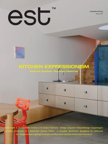
Bold Ideas & Handcrafted Details in 10 Global Kitchens · Design Dispatch 3daysofdesign Copenhagen Creative Continuity in a Bohemian Sydney Home · A Sociable Stockholm Residence by Halleroed 30+ Pages on New Lighting Concepts and Revisited Classics at this year’s Euroluce
Pictured: Fhiaba X-Pro Series 75cm Column Fridge, Freezer and Wine Cellar in Satin Steel
Redefining Preservation.
Designed for seamless integration and lasting performance, Fhiaba offers precision refrigeration with elegant design flexibility. Smart-touch controls, EvenLift™ shelving, and ProVent ventilation are just some of the features that will ensure flawless functionality—perfectly suited for the most refined kitchen designs. Made in Italy.
Erica design Antonio Citterio
P
Conversation with The Garden Social By Will Dangar P 198
Lake House
Tactile Terrace P 164
Leading Light
134
Editor's Letter
I’m writing this letter from Copenhagen, fresh off the back of the city’s design festival, 3daysofdesign. For the three light-filled days, I visited the city’s different design districts to see how the theme Keep it Real was interpreted, most notably through the reissue of era-defining furniture.
One such rerelease is the modular Elogia sofa, one of the first designs by the husband-and-wife studio of Tobia and Afra Scarpa, created in 1974. Set to be relaunched by GUBI later this year, I had the rare privilege of hearing from Tobia Scarpa firsthand about how the design pays tribute—Elogia, meaning to honour or praise in Italian—to the beauty of everyday domestic life.
The festival’s call for individual expression finds new relevance in this kitchen issue, particularly through the ten global projects that balance abstraction with resonant materials in our special feature, Kitchen Compendium.
That same spirit of self-expression defines Babylon—the bohemian home of creatives Fiona Spence and Morris Lyda, revived over eight years in close collaboration with Casey Brown Architecture's founder, Rob Brown. It also surfaces in the naturally sociable Stockholm residence of Acne Studios brand manager Pontus Björkman, designed by Halleroed.
We see nonconformity cultivated in Living Monument, a home by GOLDEN, J. Kidman and Tali Roth, while architect Clare Cousins considers how her newly completed Melbourne Home speaks to her almost 20 years of practice in our latest podcast.
I’m excited to kick off garden editor Will Dangar’s series of design talks for est magazine, who sits down with Asher Cole, director of Sydney-based landscape architecture practice The Garden Social. There’s no shortage of product inspiration in this issue, as you’ll find, my lighting edit from Euroluce and Milan Design Week 2025, and in this year’s kitchen-focused Definitive Design Products.
I believe each project, space and product in this issue holds true to a singular vision—but nowhere more so than in the authentic expression of exceptional kitchen design.
Contributors
Dan Preston
Dan Preston is an Australian photographer and videographer drawn to documenting the built environment and art objects. He aims to tell authentic visual stories that capture artists and architects’ aspirations and final forms, revealing their intentions in his photographic process and cinematic aesthetic. For this issue, Preston films Babylon in Sydney’s Avalon—the home of creatives Fiona Spence and Morris Lyda, designed in close collaboration with Casey Brown Architecture.
@danpreston_1
Pauline Gouablin
Pauline Gouablin is a photographer based in Paris. After studying Art History and Philosophy, and graduating from ENS Louis-Lumière, she developed a documentary and portrait practice centred on people who think and make. She collaborates with contemporary artists, creative craftsmen, and musicians to capture a spontaneous dialogue between people and their work. In this issue, she captures American architect and artist Johanna Grawunder as part of our Euroluce special feature.
@paulinegouablin
Tom Ross
Tom Ross is a Melbourne-based photographer known for his sensitive documentation of architecture and place. Trained at the Victorian College of the Arts and Massachusetts College of Art, he collaborates closely with architects, writers and editors, with work published internationally. In this issue, Tom photographs the yolo Kitchen by Sydney studio Pattern, featured in the Kitchen Compendium and on the cover.
@tomross.xyz
Will Dangar
Will Dangar is one of Australia’s pre-eminent landscape creatives. As the founder of Dangar Barin Smith and creative director of Robert Plumb Collective, he is recognised for designing iconic residential landscapes that prioritise high-quality materials and meticulous construction. This issue debuts his column as est living’s garden editor, beginning with a conversation with The Garden Social director Asher Cole.
@dangarbarinsmith
Credits
Team Editor
Sophie Lewis
Head of Creative
Jack Seedsman
Copy Editor
Yvette Caprioglio
Editor, Content Strategy & Partnerships
Megan Rawson
Marketing Manager
Madeleine Murdoch
Editorial Coordinator
Livia Toscano
Sales Executive
Chloe Rogerson
Product Coordinator
Annabelle Conron
Commercial Director
Kim Carollo
Editorial Advisor
Karen McCartney
Managing Director
Miffy Coady
On the Cover Design
Pattern
Photography
Tom Ross
Location
Gadigal Country/Sydney, Australia
Contact
editorial@estliving.com
advertising@estliving.com
Words
Aleesha Callahan, Alexandra Gordon, Alexia Petsinis, Carli Philips, Holly Beadle, Karen McCartney, Nicole Toma, Sophie Lewis, Will Dangar, Yvette Caprioglio
Photography
Playlist
Ludovic Balay
The Entertainer
Henrik Lundell
Kitchen Compendium
Tom Ross, Claire Israel, Jack Lovel, Ludovic Balay, Anson Smart, Alexandre TABASTE, Matthieu Salvaing, Wim Martens, Tom Ferguson
Babylon
Prue Ruscoe
Living Monument
Sean Fennessy
Podcast
Jessica Lindsay, Tom Ross
Lake House
William Jess Laird
Leading Light
Arseni Khamzin, Josh Robenstone, Nicolò Panzera, Studio Brinth, Pauline Gouablin, Gregori Civera, courtesy of Oluce, Foscarini, Vibia, Flos, Santa & Cole, studio davidpompa, Lladró, Henge, Marset, Lladró
est living acknowledges the Traditional Owners of the land on which we work, the Wurundjeri Woi-Wurrung of the East Kulin Nation. We pay respect to their Elders past, present and emerging.
Connect
Fatto a Mano in Italia
With the Steel Cucine Ascot Series, your cooker becomes more than an appliance— it becomes a personalised design statement. Choose from 9 elegant standard colours and 4 luxurious metal styling finishes, including polished chrome, brass, bronze, and nickel, to complement your kitchen’s aesthetic. Looking for something truly unique? Ascot also offers the option to customise your cooker with over 213 RAL colours, allowing you to match your cabinetry, accent a bold interior palette, or create a one-of-a-kind centrepiece. Each finish is applied using premium powder coating technology, ensuring durability, vibrancy, and a flawless finish that stands the test of time. Whether you prefer a soft matte tone or a high-gloss pop of colour, the Ascot Series offers unmatched flexibility in design. It’s the perfect blend of style, performance, and personal expression— crafted in Italy for those who appreciate timeless beauty with a contemporary edge.
Means bringing the refinement, craftsmanship and passion of Italian design into homes across the globe. For the consumer, it represents a promise of timeless style, innovative performance and world-class quality — transforming everyday cooking into an experience of elegance, precision, and pride in the kitchen.
THE ENTERTAINER
ENTERTAINER
LOCATION Stockholm, Sweden ARCHITECTURE
Halleroed PHOTOGRAPHY Henrik Lundell WORDS
Alexia Petsinis
A warm character and engaging interior dynamics create a haven for interaction in this Stockholm residence, designed to reflect its owners’ personalities and refined vision.
What does a home with a naturally ‘social’ character look like? Stockholm-based design studio Halleroed has created an exemplar for Acne Studios Brand Manager, Pontus Björkman and his family. Reflecting the clients’ outgoing personalities and love for entertaining family and friends, the project embodies a balance of domestic functionality and engaging spatial dynamics. Located in a nature reserve ten minutes out of Stockholm’s city centre, the home echoes the natural grace of its Nordic surroundings, while inspiring personal creative expression throughout its interior spaces.
A sense of effortless sophistication is a hallmark of Halleroed’s architectural projects. Integrating harmoniously into the surrounding landscape of natural rocks and native pine trees, its façade features rough-sawn pine planks treated with natural pine tar and defined by a uniform warm brown tone.
“We didn’t want the home to feel brand new, nor a pastiche of an old house. Nothing existed on this site before, so everything was created new,” Halleroed founder and architect Christian Halleroed explains. “However, many people think the house is actually old, and it has been renovated. This is the best compliment for us,” Christian adds.
“The interior follows the same idea, but of course, you can see influences from different periods, without it being too obvious,” Halleroed founder and architect Ruxandra Halleroed says.
This page: Designed for entertaining and social interaction, the home’s main light-filled living spaces exude a warm ambience. The living room features high wooden ceilings and a statement concrete fireplace, forming part of an interplay between light, materiality, and texture. A Cassina Utrecht armchair by Gerrit Thomas Rietveld sits alongside a Knoll Platner coffee table by Warren Platner, a PP Møbler PP225 Flag Halyard chair by Hans J. Wegner, and a Muuto In Situ Modular sofa. Opposite page: The entrance features a curved ceiling that channels natural light into the home, showcasing a collection of art—including a marble sculpture by artist Jesper Sundberg Örtegren.
Luminous spaces where guests can dine, chat and relax comprise the core of the home’s layout. Its main social areas are defined by a contrasting structural and material elements such as sandstone door framing, high wooden ceilings and a concrete fireplace in the living room, wooden cabinetry in the kitchen, and a basement guest room connected to a private outdoor sunken garden. Halleroed also created a series of dedicated display areas, including a wooden wall inside the master bathroom—visible through a feature stone frame, where the residents rotate pieces from their eclectic art and design collection, which includes works by Polish artists Wojciech Fangor and Teresa Pągowska.
Esteemed among the fashion, art and architecture spheres for designing a series of Acne Studios boutiques worldwide, Halleroed is synonymous with an architectural signature based on a subtle interplay between light, colour and texture. A palette of warm off-white tones is enlivened by accents of burgundy, marble and a uniform cognac-toned wood that continues throughout the home. These tones and textures converse with a curated collection of furniture pieces, including the Utrecht armchair by Gerrit Thomas Rietveld for Cassina, Hans Wegner's iconic Flag Halyard chair, and a glass and steel coffee table by Warren Platner for Knoll.
Designed to enhance the social aspects of domestic life, this home is a generous sanctuary where residents delight in hosting family for a meal, chatting with friends around the fireplace, and even inviting guests to stay the night if they become so comfortable that they don’t want to leave.
This page: Glass and tile elements form part of the kitchen’s material palette, enhancing the home’s tactile narrative. Opposite page: Custom timber cabinetry in the kitchen and dining areas echoes a warm natural character and nuanced colour palette, featuring vibrant pops of burgundy.
This page: Structural elements such as sandstone doorframes create a sense of effortless sophistication throughout the home. Opposite page: Cognac-toned timber cabinets and custom furnishings unify the spaces, complementing warm off-white tones applied on walls.
This page: Dedicated display spaces throughout the home enable residents to curate a rotating display of eclectic artworks and design objects from their collection. The primary en suite and walk-in robe are lined in leather toned Douglas fir timber panelling with bold quartzite flooring seamlessly connecting the spaces.
This page: Rough sawn pine planks define the home’s façade, creating a sense of contextual authenticity with its surrounding natural environment. Opposite page: Structural stone elements integrate seamlessly with the landscape’s imposing natural rock formations. In the sunken atrium—designed to bring natural light into the home’s lower levels—a grouping of Montana Pantonova Concave chairs by Verner Panton sit alongside a marble sculpture by artist Jesper Sundberg Örtegren.
HOUSE OF BRANDS
Kitchen Compendium
From sculptural statements to quiet rituals, these kitchens distil bold ideas into beautifully crafted, deeply personal spaces.
WORDS Aleesha Callahan
Infused with a hint towards Post Modernism, yolo is a refreshing update to living big with less in the city. A Skupa Breadstick table features in the foreground with the Studio Alm Chubby chair and a Vitra Potence wall lamp by Jean Prouve above. Appliances in the kitchen include the V-ZUG Combair V4000 Pyrolytic oven, while the island features a Zip HydroTap G5.
yolo by Pattern
Gadigal Country/Sydney, Australia
“Petite home, grand life!” is the energy, Pattern director Lily Goodwin says, who, alongside director Josh Cain, has infused the interiors with colour, tactility and delightful forms that elevate the everyday.
Aptly titled yolo, the designers have reimagined an inner-city Sydney terrace as a vibrant, joy-filled home that embraces spatial freedom over suburban sprawl. At its heart is a thoughtfully reconfigured kitchen and living zone that challenges expectations of scale and form, creating a liberated space that is compact yet expressive.
A floating stainless steel island bench sits atop a cylindrical timber burl leg. Pops of colour, youthful curves, and a timber “runway” plinth for storage all speak to a radical redesign. This home is a manifesto for living differently, proving that great design isn’t about size, but about spirit, clarity and, unapologetically, big yolo energy.
PHOTOGRAPHY Tom Ross
Schuman’s Project by Rodolphe Parente
Paris, France
Domestic rituals converge with art and design at Schuman’s Project by designer Rodolphe Parente. At the centre is a pastel pink kitchen, an unexpected and expressive gesture inspired by Parente’s 2022 installation Contre Soirée.
Built around a balance of industrial and sensual elements, the kitchen pairs brushed stainless steel cabinetry with cork flooring and a soft peach-toned ceiling, landing on a graphic yet inviting tone. A curved partition folds into the corner, giving structure to the space while softening its edges. An industrial-esque Castiglioni Stilnovo pendant light asserts the room’s cross-disciplinary sensibility. Every surface has been custom crafted in close collaboration with artisans, reflecting a deep dialogue between concept and craft.
PHOTOGRAPHY Claire Israel
This Christophe up the
page: A peach-toned ceiling and cork floors bring a warmth and tactility to the space, while the Jesper Stähl table and Slow Love chair by Christophe Pillet from Remix Gallery add a level of craft. Opposite page: A curving partition in the kitchen corner allows for a seating nook, breaking the space, featuring a Saliscendi pendant by Achille and Pier Giacomo Castiglioni.
Curves on curves—from the sweeping island bench to the custom joinery and soft Miele integrated rangehood with induction cooktop; everything in this kitchen has a handmade quality. The space also features an Abey Piazza 720 Square Single Bowl sink.
Onda by State of Kin
Boorloo Country/Perth, Australia
Named for the Italian word for ‘wave’—Onda by State of Kin brings sculptural softness and crafted precision to the heart of the home. The kitchen’s defining gesture is its curving island bench: a flowing form that floats through the space with ease, echoing the residence’s broader architectural rhythm of movement and grace.
Clad in hand-applied render with a custom steel base, the island is a functional but beautiful object—a place for gathering. “Its soft, serpentine edge feels at once grounded and fluid, echoing the home’s namesake,” State of Kin director Ara Salomone notes. A palette of natural timber, finely veined stone and tonal finishes deepens the sense of warmth and tactility, inviting touch as much as admiration. Behind a seamless form lies extraordinary craftsmanship including the expertly-radiused joinery.
PHOTOGRAPHY
Jack Lovel
Highlighting beautiful artisanal craft, the kitchen joinery is meticulously layered with square silver leaf tiles.
Milan Pied-à-Terre by Tutto Bene
Milan, Italy
In their own Milan pied-à-terre, design studio Tutto Bene crafts a quiet meditation on form, ritual and time. The jewel of the space is a compact kitchen cube, layered with square silver leaf details. An object within the bones of the palazzo architecture, the kitchen joinery was created through a painstaking artisanal process. This luminous volume is a sculptural focal point, where preparation becomes performance and everyday rituals are elevated to ceremony.
“The light itself becomes the storyteller,” Tutto Bene co-founder Felizia Berchtold notes, “catching the silver surfaces and transforming them throughout the day.”
A visual counterpoint to the silver box is a black square cabinet that divides and demarcates the other zones. Together, these twin forms oppose the original architecture, inciting a dialogue between modernist purity and historic depth. Subtle, symbolic and exquisitely crafted, this kitchen glimmers with restrained opulence.
PHOTOGRAPHY Ludovic Balay
On a bed of Tongue & Groove Hekke flooring, a rippled green stone is paired with oak joinery and a bas-relief sculpted island bench with Miyazaki bar stools by Inoda + Sveje tucked underneath. Behind, the floor plan was redesigned to accommodate a walk-in pantry and scullery.
Dancing on the Ceiling by Decus
Gadigal Country/Sydney, Australia
In this home by Decus, a sculptural kitchen sets an inviting tone while expressing a confident presence. The centrepiece is the rippling contours of the green natural stone wrapping the bench and splashback—its luminous and ever-changing surface offering a meditative moment. This tactility is echoed in the richly-grained timber joinery and the organic form of the island bench, bringing a dynamic rhythm to the kitchen.
As a renovation project, the design team reworked the plan to introduce a walk-in pantry, scullery and laundry-meets-mudroom. Thoughtfully layered and materially rich, this space transcends the typical kitchen brief. It’s a setting for gathering and lingering, encapsulating a breezy, ocean-side personality.
PHOTOGRAPHY Anson Smart
Deauville by Atelier Baptiste Legué
Deauville,
France
Elevated from the ground and wrapped in a refined palette of tactile materials, this Normandy kitchen by Atelier Baptiste Legué quietly distils its coastal setting into form. “We aimed to create a minimal atmosphere in this kitchen, with a desire to make it feel light and airy,” Baptiste Legué explains. Raised cabinetry in brushed stainless steel introduces a sculptural, architectural presence, while bleached timber and polished off-white concrete nod to the shifting tones of the nearby shoreline.
The materiality is deliberately subtle yet expressive, balancing the softness of concrete with the crispness of metal, and allowing light to play across each surface. “We drew inspiration from the Normandy coast—its sandy tones, its warm grey skies, and its ever-changing, tumultuous ocean.” It makes for a serene and highly crafted space that reframes the kitchen as a place of quiet contemplation, exquisitely attuned to its context.
The brushed stainless steel kitchen joinery is elevated off the ground, a deliberate choice to evoke a light, airy living space. Working within the architectural shell, the joinery seamlessly converges into a banquette seat, where off-white polished concrete and timber furniture, including a vintage S34 dining chair by Pierre Chapo, introduce subtle notes of modern coastal. Above the stainless steel bench, a pair of Noailles sconces by Kalou Dubus provide ambient light to the worktop.
STYLING Lisa Sicignano & Studio Cøllecte PHOTOGRAPHY Ludovic Balay
Peach-toned elements and exaggerated edge details add a touch of whimsy to this Parisian apartment. A pair of vintage timber stools sit around the custom kitchen table designed by Batiik
where a
for glassware.
artwork by
Studio. An
Etienne François hangs above the kitchen bench,
sculptural mirror by Benjamin Foucaud sits alongside a nook designed
Joséphine Apartment by Batiik Studio
Paris, France
In this Parisian pied-à-terre designed by Batiik Studio, the kitchen is an expression of artistry. Wrapped in a soft, pastel-toned palette of peach, cream and blush, the space blends Haussmannian elegance with a whimsical, romantic modernity. Intricate detailing is found in the sweeping curves of joinery handles, delicate cornicing and custom inlaid flooring. Each of these detailed elements contribute to the sense of sculptural finesse.
A playful arched doorway frames the kitchen like a vignette. Textured elements bring tactile warmth, while a dappled sky-blue shelf in the adjacent dining area creates the effect of a dreamy painting. Feminine in feel, this kitchen is a place where domestic rituals are softened, celebrated and made beautiful.
PHOTOGRAPHY Alexandre Tabaste
“Each material finds an echo in other parts of the apartment. For instance, the metal used for the custom island is also present in our Timeless sofa,” Lacroix shares about the material selections.
Saint Germain Apartment by Pierre Lacroix
Paris, France
Untouched for nearly a century, this apartment by Pierre Lacroix has been delicately renewed, not by erasing history, but by reinstating its spirit with a contemporary hand. Set within a listed 18th-century building in Paris’ SaintGermain-des-Prés, Lacroix has reinvigorated the whole space, positioning the kitchen in the heart of the action. The central island, crafted in brushed metal with brass detailing, shapes the room with its sculptural confidence, while a palette of greens, browns and golds give a nod to the classical surrounds.
“We redesigned the rectangular arch using mouldings from the old fireplace mirror,” Lacroix shares, “to connect the apartment’s historical past with its contemporary interpretation.”
Bespoke cabinetry conceals appliances to maintain an elegant rhythm, with artisanal metalwork throughout lending durability and refinement. The result is a space that feels cohesive, genial and quietly grand—a kitchen where French tradition is not replicated but reimagined for the present.
STYLING Sarah de Beaumont PHOTOGRAPHY Matthieu Salvaing
A porthole window filters natural light through to the staircase behind, adding a playful touch to the industrial aesthetic. Custom and built-in elements work double-time—banquette seating adjoins the island bench, allowing for outward views while cooking and dining. A precisely detailed concrete seamlessly with the seafoam-coloured joinery, completing the space’s thoughtful design.
Project Amerika by Contekst
Antwerp, Belgium
Calm and contemporary with a clean architectural language, this kitchen in a period townhouse in Antwerp is an exercise in doing more with less. Contekst has reconfigured and reoriented the kitchen to face the view. The new layout opens up the space and improves flow, while a compact footprint is maximised through sleek, built-in storage. A restrained palette of soft grey and oak joinery is coupled with a deep blue floor—striking a balance between cool minimalism and inviting warmth.
The hob blends seamlessly into the stone benchtop, with a custom-designed banquette tucked neatly off the island allowing cooking and dining to unfold in close proximity. Industrial-style elements—a concrete sink and black wall sconces—are offset by unexpected details, such as a circular porthole window that filters natural light into the staircase behind. This is a kitchen with a pared back design sensibility, and just the right amount of quirk.
elements make the space
concrete sink integrates
PHOTOGRAPHY Wim Martens
The small footprint is negated by the introduction of reflective materials—ostensibly opening up the space with a lightness, and durability. The kitchen features a Lacanche oven in Marron Glacé with stainless steel and gold hardware, along with more classical elements such as a Perrin & Rowe Ionian two hole bench-mounted sink mixer in polished nickel and cork flooring.
Bardia by AP Design House
Gadigal Country/Sydney, Australia
Bardia by AP Design House reimagines a compact Art Deco apartment with a precise yet poetic touch. Here, the kitchen is anchored as the stage of the home, where materiality plays the leading role—with stainless steel, aged brass, cork, timber and obscure glass layered for continuity and clarity. At once practical and luminous, the palette was designed with cooking and conviviality in mind. For AP Design House founder Alexandra Ponting, the space is defined by “repetition and commitment to materiality,” with stainless steel giving the room a sense of expanse despite its modest footprint.
A standout detail is the custom stainless steel handles, which Ponting notes are “considered, solid and architectural." These crafted elements elevate kitchen joinery, showcasing the tactile refinement that defines the project. With its custom sink, Lacanche oven and thoughtful detailing, Bardia is a mastery of spatial choreography.
PHOTOGRAPHY Tom Ferguson
MODERN UTILITY
KITCHEN SINK DESIGN
The ideal kitchen sink is more than a practical necessity; it serves as a central design element that enhances both functionality and elevates the overarching design language of a space, making it a key kitchen and butler’s pantry design decision.
Studio 11:11 selected a Schock double bowl sink in a concrete finish, chosen for its soft, matte texture and ability to blend seamlessly with the travertine benchtop. A complementary Schock Typos single bowl features in the adjoining butler’s pantry.
"We selected the Schock sinks for their unique nonmetallic finish. We were looking for a product to blend and compliment the natural tones of the travertine benchtop rather than contrast."
- Marijne
Vogel, Studio 11:11 Founder and Director
Crafted from durable granite composite, Schock sinks are designed to meet the demands of modern living, combining resilience with refined aesthetic appeal. In Melbourne-based Studio 11:11’s Nareeb House, each element is thoughtfully curated to support a warm, understated palette—including the kitchen and pantry sinks.
Designed to blend seamlessly with the travertine benchtop, the design team chose Schock’s granite composite sinks for their tonal harmony and tactile presence. “We selected the Schock sinks for their unique non-metallic finish,” says Studio 11:11 co-founder and director Marijne Vogel. “We were looking for a product to complement the natural tones of the travertine benchtop rather than contrast.”
Highly durable and beautifully textural, the Schock double bowl in concrete was selected for the main kitchen, while the Typos single bowl with drainer features in the butler’s pantry. Designed in Germany and trusted by leading architects and designers, Schock sinks offer a quiet sophistication and functional longevity to contemporary kitchens around the world.
LOCATION Garigal and Caregal Country/Avalon, Sydney ARCHITECTURE
Babylon is a tour de force, reviving a bohemian spirit born over 70 years ago, reigniting its essence through creativity, continuity, and a deeper connection to nature.
Accessing Babylon involves two routes—one for the energetic, which is to climb over a hundred sandstone steps guided by the ebb and flow of a balustrade fashioned from ribbons of steel. The other, for the lazy or the heavily burdened, is a slow cable car ride, swaying over native vegetation, which provides the opportunity to marvel at the building during the ascent.
Sometimes a house is protected by a series of difficult factors. In this instance, not only was access challenging, but the general state of disrepair of the house itself would have daunted most prospective buyers. Built between 1952 and 1958, the original house was designed by architect Edwin Kingsbury and named Götterdämmerung, in reference to the final cycle of Wagner's Ring Cycle Opera, and recently termed, more prosaically, The Castle and now rechristened Babylon. With walls constructed in Hawkesbury sandstone and roofs engineered with experimental metal bow trusses, the original architect Edwin Kingsbury recognised the site’s power with its views to the west over Pittwater and east to the ocean, as well as the substantial rocky outcrops and the majestic angophoras that form the natural landscape.
Current owners Fiona Spence and Morris Lyda had visited the house many years ago as a potential wedding venue and again when it first came up for sale; “You would be insane to buy this,” her brother said. As time passed and circumstances changed, the house simply waited, and in 2014, they bought it. “It had magic,” Spence recalls, “and magic is really hard to find.” Not everyone is equipped to allow the elusive notion of ‘magic’ to trump the formidable logistical, practical and financial requirements to restore and reimagine a house of this calibre. But with Spence’s background in textiles, design and retailing and Lyda's in the staging of massive music concerts, they took up the challenge, which began to seem less like folly and more like fate.
Aware they couldn’t do it alone, they engaged Casey Brown Architecture founder Rob Brown, a perfect match in terms of background, skills and sensibility. “Most of our buildings are in spectacular sites where the only way in is by helicopter or water, or they're in the bush: the more difficult the site, the better the project, the more exciting the solution,” he says. Living locally and able to lean into a slow and iterative creative process, they worked collectively through the tension of how to enhance without erasing, how to draw further on the landscape and ultimately tune in to the building itself.
The signature room of Babylon showcases raw sandstone walls married with the precision of fine timber windows. The central feature, painstakingly maintained, is the bow-truss beam treatment in the ceiling, celebrated both for its complexity and ingenuity. Taking charge of the interior spaces, Fiona Spence was initially inspired by a pair of 1970s bronze door handles that seemed to embody something of the crafted, bohemian spirit of the house. The original B&B Italia Camaleonda sofa by Mario Bellini purchased from Holland anchors the room. The artwork on the left was purchased 35 years ago in Los Angeles (artist unknown), and on the right is a work by Matjangka
Nyukana Norris.
“Rob and I, having vested interests in our own abilities, initially really wanted to impose our will upon the house, whereas Morris reacted to it viscerally. He stood his ground, and in the end, it was very, very clear what the house wanted; we just had to learn to listen,” Spence says.
The first phase of the renovation was necessary groundwork to preserve the house's integrity. The lower tower’s stone foundations were shored up, and every inch of the original structure—inside and out—was painstakingly repointed. “It was not glamorous work: scaffolding climbed across the stonework like vines, and there were acres of wall to tackle,” Spence says.
Inside, an existing apartment used during the rebuild was reworked, the bathroom clarified and renovated, and a new kitchen installed. The main roof was overhauled and re-engineered to support the grand room’s original expressive bow-truss ceiling. Outdoor levels were re-laid to improve access between the kitchen and patio, and the aforementioned cable lift—imported from Seattle—was installed to ferry people and materials up the site’s steep incline without damaging the native garden.
Early on, the concept of ‘hero rocks’ emerged; these distinctive stones within the site were celebrated, and as more were identified, they became not just anchors of the design but symbols of its philosophical underpinning. This was particularly apt when it came to the second construction phase, in mid-2023, with a new wing designed by Rob Brown. The new wing steps up and around the existing trees, encompassing a study, main bedroom, and bathroom. Interiors for this new volume, led by Spence, followed the same design language—natural materials, handcrafted finishes, and an insistence on cohesion with the landscape. The interior embraces rocks, coaxed and shaped so that doors can slide into them, infilled with coloured tiles for slices of decoration; they are revealed and revered.
After eight years of collaboration, Spence acknowledges, “It was the most satisfying extended project I’ve ever experienced, and the result is beyond anything Morris and I could have imagined. And to that end, I really can't overstate the extraordinary nature of Rob as a human and as an architect.”
Part of that satisfaction comes from navigating past and present in a way that is seamless, not pastiche, not copy, but as Brown points out; “Babylon today is both a relic and a renewal, alive to the surrounding landscape and open once more to light, weather, and the poetic ascent through space. You want to be inspired by the original and do a variation that is subtle, sympathetic and in harmony—as if it nearly could have been done at the same time.”
This page: “I think this building shows how you can still have quite dark interiors with black ceilings that are punctuated by these freeform skylights, which create a sort of theatrical shaft of light exposing the terrazzo floor and the joinery,” Brown says of the generous, monochromatic kitchen. Opposite page: Spence's skill and understanding of textiles serve to soften the monumental nature of the interior. Through her brand Innate, she has honed an ability to create a mood through fabrics that resonate with one another in terms of tone and pattern.
This page: “When we started to excavate for the balance of the build, which is the study, bedroom and the bathroom, we discovered that this whole shelf ended at the rock that's in the study (pictured). And it became really exciting to actually have it come into the room and be part of the interiors,” Spence says. The vintage Osvaldo Borsani P40 reclining chair is from 506070 in Sydney. Opposite page: So much of the sensibility of the house is embodied in this jewel of a guest bathroom. The exposed rock serves as a counterpoint to the copper tiles, the patina of which is the result of countless hours of polishing and waxing to achieve the desired finish. The mirror is by Ella Saddington, and the artwork (just seen) is by Zella Casey Brown.
Brown describes the new rooms as “subtly located so that they don't take away from the original, they just drift off from what existed." The morning view to the east, watching the light plays as the sun rises over Pittwater, is ‘an absolute joy’ for Spence. Wood panelling in Tasmanian Blackwood has been pickled with a solution of household vinegar and steel wool to create iron acetate, which reacts with the tannins in the wood to darken it. It is then tung-oiled and waxed. The bedroom is another opportunity for creative expression through a mix of playful Innate fabrics and the display of art and objects collected over many years.
This page and opposite: The new en suite sums up much of what was joyful about the project. “It's interesting the way idiosyncratic solutions to interiors develop,” Spence admits. One artisan, Jon Whittey, initially engaged to rehabilitate the stone, gradually revealed an impressive skill set, working with steel and creatively with the rocks in the form of exquisite stone inserts. In addition, he assisted Fiona with the expressive terrazzo flooring in the en suite. “Interestingly, I'm most engaged with the things where I actually was able to manifest myself in the space. And so huge amounts of energy and time were put into getting that floor to where it is, and it gives me joy every shower.”
At the 2025 NSW Architecture Awards, Babylon House won the John Verge Award for Interior Architecture and an Alterations and Additions Award.
Sydney,
Australia Babylon
Architecture by Casey Brown
The Home of Fiona Spence & Morris Lyda
Living Monument
This page: In the
including
and
An eclectic mix of
and
pieces in the
is
living space, the B&B Italia Camaleonda sofa by Mario Bellini in alternating olive-green velvet and leather served as an anchor around which GOLDEN, together with interior stylist Tali Roth, built the rest of the furniture curation around.
shag pile carpets. Also featured is a painting by Michael Georgetti. Previous spread: “One of the most striking
home
a gold rotating sculpture by Jonny Niesche, located in the foyer. It seems to float effortlessly in the space, immediately capturing attention upon entry,” GOLDEN co-founder Alicia McKimm says. Also featured in the space is a painting by Juan Ford.
Designed as its own private world, this Melbourne home invites expression, contemplation and a feeling of release.
An expertly-designed home for modern living often combines seemingly opposing qualities— functional and refined, contemporary and timeless, open and private. This nonconformist approach is exactly what J.Kidman Architecture and interior design firm GOLDEN embraced while designing ‘Temple House’.
J.Kidman Architecture founder James Reid leant into the idea of a domestic temple, focusing on how a home might invite deep contemplation without ever overstating itself. This meant striking a balance between intimacy. “Wherever monumentality was established, the subsequent step was always to rewind by eroding it, delaminating it, introducing fissures and slippages—unbuilding it almost—so as to soften it into something more flawed and relatable,” he says.
This approach informed every design decision, starting with materiality. To maintain a sense of wonder for what lies within, materials were kept visually clean through the use of bagged masonry, ribbed limestone and unfilled travertine flooring. When viewed up close, however, Reid describes these materials as having a satisfying haptic quality. Representing this, the front door has been carved into a wall made of ribbed limestone tiles, which possess a “tactility that further feeds a natural gravitation toward the building,” Reid says.
However, as the architect underscores, the front door isn’t really a front door, but rather a centre door. “In most suburban homes, the front door’s visibility from the street diminishes the significance of crossing from public to private,” Reid says. “For Temple House, I placed the door at the centre of the property so as to create a more protracted journey through the landscaping, deepening the visitor’s awareness and appreciation of this crossing.” In this way, the garden becomes a kind of passage between the two realms, gently dissolving any outside worries before stepping inside. “This sense of separation was central in creating a private world within, entirely its own,” GOLDEN co-director Alicia McKimm says.
McKimm likens the journey of moving through the house to a sense of release. “The first thing you notice is how the home expands as you move through it,” she says. “You begin in a more intimate setting, which then opens into a dramatic seven-metre-high volume where the kitchen, meals and living spaces are located.”
Materials were chosen for their ability to blend durability with aesthetics. These qualities are showcased in the home’s
main living space, which features a kitchen clad almost entirely in brilliant Verde Alpi stone, and alongside it, a table made of composite resin, designed to withstand accidental paint spills and marker accidents. On the garden side, a perforated bronze bar, each panel individually dipped for a unique patina, talks to a custom dining table made of brushed stainless steel. “Each room varies tonally and materially, yet the entire home feels seamless,” GOLDEN co-founder Kylie Buhagiar says.
Temple House also plays host to the family’s bold, varied and highly-individual art collection. “The interiors and architecture had to meet the artwork’s energy, which meant designing with a certain boldness and confidence, ensuring the spaces stood firm alongside such unique selections,” she says.
“The home is designed as a flexible canvas, and we see its evolution playing out most notably through the family’s growing art collection,” Buhagiar says. “There’s a lot of room for expression, and the architecture supports that. As the family’s needs shift, the home will adapt, remaining relevant, personal and layered with meaning.”
This page: Materials were chosen for their ability to blend durability with aesthetics; this is showcased in the kitchen, where the Verde Alpi stone benchtops contrast the raw texture of the unfilled travertine floors. To the right, more texture play: a custom resin table paired with a stainless steel chair. Opposite page: A perforated bronze bar, each panel individually dipped for a unique patina, talks to a custom dining table made of brushed stainless steel. Stylist Tali Roth says the chocolate-brown velvet dining chairs were chosen to “cut through the cold” of the metals.
This page: “With its generous proportions and layered palette, the main living area allowed us to explore form, texture, and spatial drama in a really satisfying way,” GOLDEN co-founder Kylie Buhagiar says. Opposite page: "We had a lot of fun designing the kids’ bathrooms," Buhagiar reveals, noting that they embraced playful tile selections like teal-blue and dusty-pink mosaics. "They gave us the chance to experiment more with colour, layout, and unexpected material combinations," she adds.
This page: The vibrant blue sculpture by
in the master bedroom introduces an “unexpected, almost whimsical energy to an otherwise calming space”,
says. The space also features a custom upholstered headboard complete with Apparatus Studio Tassel 1 sconces. Opposite page: The primary en suite features a cylindrical vanity made of Tadelakt surrounded by smoked glass partitions, as well as a leathered-finish marble bathtub.
Nabilah Nordin
Buhagiar
This page: Temple House is set against the meditative backdrop of Plume Studio’s landscape design, which the interiors eagerly embrace wherever they can. The external palette of soft, sandy-white tones was intended to be quiet yet compelling. Opposite page: “For Temple House, we placed the door at the centre of the property so as to extend the journey through the landscaping,” McKimm says.
Clockwise from top left: L Chair by Ford Bostwick, Hong Kong Trilogy by Michael Wolf, Destroyers/Builders Horn variations, Slice me up coffee table for Studiotwentyseven by Pietro Franceschini, Dy pendant light by Studiokhachatryan, Tassel 1 Sconce by Apparatus, Milos Chess set Olivine from the The Conran Shop, Fish Design Medusa Vase by Gaetano Pesce, Longton light by Volker Haug, Single Tier Ruffle Side Table by BZippy, Hali Ajmer Wattle rug by Hali Rugs, Pale Oak boards by WOODCUT, Saturnia Light Travertine from Signorino, Verde Alpi from CDK Stone, Eveneer Prefinished Moka Oak and a Camaleonda sofa for B&B Italia by Mario Bellini.
CLARE COUSINS PODCAST
THIS MUCH I KNOW A DESIGN CONVERSATION WITH KAREN M C CARTNEY
BROUGHT TO YOU BY
Architect and founder of her namesake studio, Clare Cousins, welcomes Karen McCartney into her newly completed Melbourne home, where she explores her affinity for honest materials and integrated garden rooms, while considering architecture’s responsibility to the community, through urban and rural housing, workplace, cultural, and social projects.
Clare Cousins PORTRAIT Jessica Lindsay PHOTOGRAPHY Tom Ross
Off-white timber-grain joinery, travertine work surfaces, and a brushed steel elements form a calming palette in this family kitchen—subtly elevated by the bold red knobs of the Wolf 76cm M series professional built-in single oven.
Malvern House by Studio Ceravolo
Kitchen Closeup
In the kitchen of Malvern House, Melbourne-based Studio Ceravolo has created a space where quiet beauty and everyday ritual intersect. Not just a zone for cooking but a considered extension of the home’s communal living space—shaped by a respect for spatial clarity, visual cohesion, and functional elegance.
The client brief called for an immersive experience, one where sightlines to the surrounding garden were maintained, and the kitchen didn’t feel like an enclosed or separate entity. Instead of traditional partitions, Studio Ceravolo introduced sculptural island “nodes” that define the kitchen without enclosing it—open, fluid, and practical. These central islands serve as flexible touchpoints for preparation and gathering, while all core appliances and storage recede seamlessly into the wall and scullery.
Materiality grounds the design. The kitchen’s classic travertine stone floor flows uninterrupted through the home, creating a unifying base while tonal, timber-grain joinery brings warmth, texture, and consistency, and a brushed stainless steel splashback adds subtle polish. While the majority of materials are muted and cohesive, the island bench makes an intentional design statement—a sculptural centrepiece that subtly signals the importance of this space within the home.
Key to the kitchen’s performance is the Wolf appliances, chosen for their precision, aesthetic alignment, and intuitive functionality. “The kitchen needed to feel effortless,” says
Founder and Architect Rosanna Ceravolo, “Wolf allowed us to deliver this spatially, visually, and in terms of performance.”
The Wolf 76cm M series professional built-in single oven, was essential in supporting the clients’ regular hosting of extended family—its generous capacity and reliability aligning perfectly with the home’s functional demands. The iconic red knobs bring a small yet impactful moment of contrast—a signature touch that feels right at home in a palette of soft, warm tones.
Studio Ceravolo champions a sense of ease—a kitchen that flows, supports, and complements its surroundings without dominating them. “There’s both ceremony and simplicity here,” they reflect. “It’s a space that invites use, but never shouts for attention.” As a reflection of the studio’s approach to spatial storytelling and the client’s desire for calm, grounded living, this kitchen quietly asserts itself as the heart of the home—powered by thoughtful planning, enduring materials, and the kind of design where performance and poetry go hand in hand.
Explore the Wolf range of kitchen appliances >
Lake House
LOCATION Austin, Texas, North America
ARCHITECTURE Michael G. Imber Architects DESIGN Alexander Design
PHOTOGRAPHY William Jess Laird WORDS Alexandra Gordon
Two leading designers are brought together to create a family home with a nuanced blend of grandeur and effortlessness.
When two creatives collaborate, there’s always an element of the unknown. A new build in Lake Austin flung together Texas-based architect Michael Imber with Alexander Design principal and founder Vanessa Alexander. “The client brought us in to work with Michael to integrate modern and relaxed energy into his traditionally grounded design,” Alexander says, who’s interior design firm has offices in New York and LA.
A spectacular setting created the perfect springboard for the project. “The owners were familiar with Austin and specifically wanted to build their forever home in the Lake Austin area,” Alexander recalls of the young family returning to Texas after a long stint in New York. The expansive property is ideally located, looking out over the city, but in close proximity to downtown, sitting on the Bluffs above the lake.
The family wanted a home that suited them. “Their brief called for understated luxury, elegance grounded in warmth and comfort, which is exactly who the clients are, and a home that reflects their approach to living,” the designer says. Located on a 6,000 square metre block, the two-storey house is arranged around a central courtyard. The layout creates an easy flow between inside and out and strikes the balance between sheltered spaces and those with sweeping views.
The dramatic ceiling height of the dining room is grounded by a custom oiled walnut and brass dining table, vintage Dan Johnson Viscount chairs from DEN and 'Spell Me, Bleed Me, Be Me' by Claire Osw. Decorative elements such as the Paul Matter Tryst 3 chandelier from Garde, custom curtains in Designs of the Times Ehbirra and the Suzu ceramic bowl from Rembaum Hanau complete the picture.
Within the Mediterranean home with terracotta-tiled roofs and arched windows is a youthful, elegant and light-filled interior complete with custom stainedglass details and hand-hewn locally made timber carpentry. “We leaned into the Spanish Colonial aesthetic but pared it back with an edited amount of detailing and materials that created a strong and beautiful but more minimalist approach to that form of architecture and therefore the interior detailing as well,” Alexander explains. This is evident in the simple curves and lack of ornamentation throughout.
The interiors feel effortless despite being a carefully considered mix of custom and vintage pieces juxtaposed with modern elements. The selection was also embedded in the locale where appropriate. “We tried to use as many local galleries and artisans as possible for the custom items as there is a great talent pool from Texas,” Alexander explains.
Layered finishes, fixtures and furniture add interest to the generous spaces. “The home is large, but it has a strong sense of intimacy,” Alexander says, who has artfully combined wire-brushed oak millwork and aged steel with polished finishes. “There is a level of quality and detail and thoughtfulness that went into everything from the hand-formed stair rail to the beams,” the designer says. The dramatic twostorey living room with an overscale fireplace is a good example of this. “It really is a special space because it's quite big yet feels unbelievably inviting,” Alexander says.
“I think we helped bring a new energy and perspective to Michael’s work and the collaboration was really stellar and enjoyable,” Alexander says. The result speaks for itself—a gracious family home that is grand but intimate, classic yet modern with a seamless transition between inside and out.
This page: In the kitchen is a casual eating area made up of a 19th-century
Danish cigar factory stool from Gallery Rath, Stahl + Band Eight table and Nickey Kehoe Spindle dining chairs. Above the table hangs a RH Guild Oscar pendant while over the kitchen are a trio of Rose Uniacke Plaster Cone hanging lights.
This page: The powder room combines a slick custom travertine vanity with textured reclaimed terracotta hex tiles from Country Floors. Decorative elements such as the McEwen Egg suspension lamp and Italian brass and Murano glass sconces from 1st Dibs add interest to the soulful space. Opposite page: The study combines an eclectic mix of furniture including a custom burlwood desk, contemporary chair from 1st Dibs and a Charlotte Perriand stool from Gallery Rath. An Aramis XL suspension light hangs above and on the floor is a La Manufacture Cogolin rug in Jardin Intérieur.
This page: The main bedroom features a vintage Mama Bear chair and a custom headboard and bench. A mix of ambient lighting is created by Danish Studio pottery lamps from Lucca Antiques, Louis Poulsen VL Ring Crown chandelier from Rewire Gallery Inc and a Zac Library light. The art is by Tyler Guinn. Opposite page: A custom oak vanity, Apaiser Haven bath and Calacatta Vagli marble are artfully combined in the expansive ensuite. It is suitably layered with a vintage Moroccan runner from Atlantica Organica, a vintage stool from Gallery Rath and a Libeco linen towel. Rose Uniacke Frosted Lantern pendants and Apparatus Studio Tassel 1 sconces softly light the space.
This page: The outdoor living space is well appointed with a custom reclaimed Douglas fir dining table, Phantom Hands dining chairs and Thomas Hayes Pepe stools. The space moves from day and night thanks to the Lumfard brass pendants that hang above the island bench and a pair of vintage Mexican iron candlesticks from Casita Amada on the dining table. Unique finds are scattered throughout such as an antique Swedish vessel from Galerie Provenance, vintage stump table from Gallery Rath and antique olive jars from Olive Ateliers. Opposite page: The belvedere stairs are as equally highly detailed as the interior with custom brass light fixtures and handrail and an antique olive jar from Olive Atelier.
MATERIAL DEPTH IN THE KITCHEN
This kitchen reflects the shared design principles of both Laminex and Tom Mark Henry— where material integrity meets functional beauty and everyday rituals are elevated through considered design—culminating in Laminex’s most sculptural design collaboration to date.
Produced in partnerhsip with Laminex.
DESIGN Tom Mark Henry PHOTOGRAPHY Lillie Thompson WORDS Megan Rawson
For over nine decades, Laminex has been a driving force in Australian design—innovating through material advancement and a lasting commitment to enduring expression. The brand’s collaborative legacy, spanning visionaries like Adam Goodrum, Kennedy Nolan, Studio Doherty, and YSG, continues in its latest partnership with interior design studio Tom Mark Henry—a creative union that captures both technical performance and the emotional cadence of contemporary family life.
Recognised for their intuitive, tactile design sensibility, Tom Mark Henry brings a human-centric lens to their collaboration with Laminex, realised through the True to Nature: Next Generation Woodgrains collection. Crafted for a dynamic Australian family, the kitchen is imagined as a sculptural centrepiece of daily life.
“We always aim to create spaces that are both intuitive and highly experiential,” says Cushla McFadden, Co-Founder and Director at Tom Mark Henry. “The Laminex Next Generation Woodgrains range gave us the freedom to explore timber in a contemporary way, one that supports functionality while still creating something sculptural and soulful.”
Victorian Ash and Blackbutt from Laminex’s TrueScale range ground the space with rhythmic grain patterns, applied in alternating directions across joinery to amplify visual depth and movement. The dual island bench, rendered in surfaces from the broader Laminex Colour Collection, introduces a spatial configuration that accommodates cooking, connection, and conversation in equal measure.
Tonal cues drawn from the expressive Australian landscapes of Brett Whiteley underpin the material palette—warm neutrals and grounded, earthy hues such as Outback Clay and Bluestone layer the space with quiet, grounded elegance.
“Laminex True to Nature: Next Generation Woodgrains are a step forward in how we think about surface design,” says Rachel Oakley, Head of Marketing at Laminex. “It captures the authenticity of timber in a way that’s both beautiful and incredibly durable. Collaborating with a design practice like Tom Mark Henry, who brings such a rich, layered design lens, allows us to show the collection in a way that feels deeply Australian and deeply personal.” @laminexau laminex.com.au
LEADING
LEADING LIGHT
Discover new lighting concepts, reworked classics and the visionary designers behind them at this year’s Salone del Mobile. Milano’s biennale event, Euroluce, and Milan Design Week.
WORDS Sophie Lewis
Oluce Mini Spider
Joe Colombo
Italian industrial furniture designer Joe Colombo first designed the Spider table and floor lamp in 1965 for Milan-founded lighting brand Oluce. At the time, the lamp struck a chord with its rectangular unit that deliberately exposed the bulb. Six decades on, Oluce has re-engineered the famed lamp into a scaled-down version: the Mini Spider. The Mini Spider features the same fire-painted metal ‘hammer head’ shape, a lacquered metal base, and a chromed vertical stem, available in new colours: black, red, and blue.
PHOTOGRAPHY Courtesy of Oluce
Lambert&Fils Bolda
Kwangho Lee
South Korean designer Kwangho Lee is known for working almost exclusively with copper, applying coloured glass powder to the metal in a technique called ‘chilbo’—traditionally seen in smaller decorative objects. He brought his copper enamelling expertise to Montreal, collaborating with Canadian lighting design studio Lambert & Fils on the new Bolda pendant. A luminous tube is hidden behind the polished aluminium ‘cover fold’—a signature material of the brand.
PHOTOGRAPHY Arseni Khamzin
Rakumba Big Glow
Australian-born, Netherlands-based duo Joel and Kate Booy, founders of Studio Truly Truly, have channelled their longing for the Australian sun into Big Glow—a new lighting collection for Melbourne brand Rakumba. Debuting at Euroluce, Big Glow is crafted from a blend of Australian wool and plant-derived compostable fibre, developed in collaboration with The Woolmark Company to enhance both acoustic performance and light diffusion.
“We missed the sun, but also desired the gentle, comforting glow of soft light,” Joel Booy says. “We wanted to achieve this with a sustainable focus.” The result is a light that radiates warmth, both visually and conceptually. “Big Glow captures the very essence of light itself—a beacon of comfort, a testament to ingenuity, and a glowing tribute to the culture of light,” Kate Booy adds.
PHOTOGRAPHY Josh Robenstone
Studio Truly Truly
Foscarini Allumette
Francesca Lanzavecchia
Milanese designer Francesca Lanzavecchia is the name behind the new Allumette chandelier for Italian lighting company Foscarini. The chandelier’s design highlights the interplay of technology and tradition through soft cables and exposed bulbs. Lanzavecchia describes the chandelier as “built on the idea of the original light sources, namely the candle,” adding that Allumette is all about balancing opposites: “full and empty, presence and transparency.”
PHOTOGRAPHY Courtesy of Foscarini
Vibia Duna
Cecilie Manz
The Duna collection is a 2025 release by Danish industrial designer Cecilie Manz for Barcelona-based lighting brand Vibia. Manz says the collection is all about honouring the qualities of natural washi paper. “I wanted the washi shade to be the main character in the design,” Manz notes. “The rest of the design—the lightweight stems, pendant cords and opal glass bases—are all wished to be 'almost ’nothing’ visually, just lifting and holding the lightweight paper shade.”
The collection’s name takes meaning from the subtle curves of dune landscapes, captured through the shape and softness of the washi shade, with a light source positioned as a direct downlight. “The best light is, in my opinion, where you sense the atmosphere the light creates, more than the actual lamp itself,” Manz adds.
PHOTOGRAPHY Courtesy of Vibia
PHOTOGRAPHY Nicolò Panzera
MICHAEL ANASTASSIADES
Michael Anastassiades, designer and founder of his eponymous brand, cut a non-traditional path to design. In this interview, he discusses how this non-linear approach enabled him to stay true to his brand, the importance of living with his designs, and the launch of his new modular lighting collection during Milan Design Week 2025.
Before studying industrial design, you were a trained engineer, studied medicine and taught Ashtanga yoga for 15 years. Why do you believe your life experience is so important to how you approach your designs?
I always wanted to do something creative. Growing up in Cyprus, it was quite isolated—there was no internet and not many opportunities to travel, so I had limited exposure. No one in my family was creative, so I followed my instincts. When I told my parents I wanted to be an artist, they said, “You can be an artist later in life, but not straight away—who will pay your living?” That anxiety made sense to me, so I chose engineering as a more stable path and studied at Imperial College in London.
But I always felt the pull toward creativity. One day, I walked into the Royal College of Art—it was overwhelming, so inspiring—and I knew I had to be there. I enrolled in industrial design engineering. I didn’t love the course, but it put me in a creative environment. I graduated, still unsure of what design meant to me, but I knew I needed to explore it on my own terms.
Yoga, which I’d discovered and loved, became a way to support myself. The two practices—yoga and design—fed each other without competing. I was making very experimental, conceptual pieces that raised questions about design’s role in our lives. Museums acquired my work, but big brands weren’t interested—it didn’t speak their language.
Eventually, I realised if I want to explore my ideas in their purest form, I have to do it myself. I established my own brand in 2007. I launched with a small collection of lighting and tabletop objects. The response was incredible. It was a risk,
no investors, just my savings—but that potential kept me going.
What do you see as a pivotal design or moment in your career?
A pivotal moment in my career was in 2011, when I did my first Milan show at Euroluce. I had shown my work the year before at Maison&Objet, but left thinking this is not really a place to show lights. I knew I had to be where all the big brands were, so I took the smallest stand I could afford at the Salone del Mobile.Milano. It was life-changing. People finally saw the full potential of what I was doing.
That same year, Piero Gandini, the then-owner of Flos, visited my stand. A relationship began, and by 2013, my first collection with Flos launched. That changed everything. From there, I started working with one major brand after another, but it’s really only been just over 10 years of this more accelerated engagement with the industry.
My brand, though, has always remained an experimental platform to explore my ideas in their purest form. Honestly, I’ve had the least straightforward path from any living designer I know. Many of my peers were already working with brands in the 1990s. I didn’t really start until 20 years after graduating. But perhaps because of that, I approached this opportunity with deep curiosity and maturity.
I felt privileged, not greedy. I didn’t want to do everything—only the projects I truly had ideas for. That’s helped with longevity. I don’t believe in trends. I follow my vision. It’s about designing a product that lasts, that is timeless; something that helps you grow your appreciation for it over time. Not something that shocks at first and quickly fades.
“That’s the beauty of design—letting a product live its own life. If it can’t survive outside a controlled setting, it’s not a good product.”
–
Michael Anastassiades
How do you decide which collaborations to pursue; what do you look for in a collaborator?
I look at culture, history and human relationships. I only collaborate with people who genuinely appreciate my ideas, where there’s trust, transparency and a meaningful, ongoing dialogue. That’s fundamental for me.
If you look at the brands I’ve worked with, many are historical. I’m drawn to them because there's so much to learn from their legacy. Designing for a brand with history is far more challenging—you can’t just drop in a new idea without understanding the context. You have to study their DNA, their design language, and then carefully insert something meaningful. You can create noise, but it won't last. A timeless piece has to speak to what came before while pushing it forward.
That said, I also enjoy working with younger brands—it can be refreshing. After all, I’m a young brand too. But I choose carefully. If I feel I don’t belong, I decline. I’ve turned down many offers, even from beautiful and credible brands, because I knew I wasn’t the right fit.
Some companies just want to collect names—designer A, B, C—so they can say they've worked with everyone. Especially in Milan, that becomes a pattern: a designer of the year, then move on. I’m not interested in being another name on a list. I prefer working with brands that are serious about what they do. We live in a startup culture where everyone wants to move fast, turn around ideas quickly, and then sell out. That’s not what I’m looking for. I want to be part of something lasting— something that has meaning beyond the moment.
Do you live with many of your designs?
Yes, I live with all the lights I produce. My home has become a kind of laboratory—a place to truly experience what I create. Early on, I shared that common resistance many creatives have to living with their own work, but over time, I realised it’s actually irresponsible not to. As a designer with a brand, I need to understand what it means to live with my pieces over time.
Longevity is at the heart of what I do. If I design something and grow tired of it after two years, then something’s wrong. Interestingly, nothing I’ve installed in my home has ever been replaced because I didn’t like it. I live with very few objects, and once something is chosen for a particular spot, it tends to stay there.
That said, I do have limited space. If I want to test a new dining light, for example, I have to swap it out in the one place I can hang it—above my own table. The studio is different—more fluid and informal. Things are constantly changing there. But at home, it’s about living with the work in a real, long-term way.
How do you feel about seeing copies of your designs—does it impact your creative process?
You have to be open to the many ways people interpret your work. That’s the only way a product truly becomes meaningful. I’m fortunate to have designed light fixtures that you see everywhere, even copied. It’s not about the money for me. I see copies as looking in the mirror and seeing an imperfect reflection of yourself. They always change something, because they don’t fully understand the details or the intention behind the design. My language may seem simple—a stick and a sphere—but it’s far more sophisticated.
It’s tough to see copies that aren’t quite right, but ultimately, it’s a compliment. When your design language becomes culturally important, you start seeing it echoed around you. I smile when I see something inspired by my work, even if it’s not the real thing. You have to embrace it—otherwise, you’ll go crazy. I’m not here to be the design police. My role is to push new ideas, to open a new vocabulary for people to live with. If others copy that vocabulary, there’s nothing I can do.
Copies have always existed, and I don’t believe anyone can claim ownership over ideas. Ideas exist before us, in different times and forms—they’re always influenced by what came before.
Michael Anastassiades presented the new Cygnet, Frame and Floor Mobile Chandelier lamps at the Jacqueline Vodoz and Bruno Danese Foundation during Milan Design Week 2025.
What role do social media platforms such as Instagram play in how you connect and share your work?
When I do post, it’s usually to capture that magical way light exists in nature or my fascination with materials, especially stones. I also like sharing stories because, as a designer, I feel responsible to share what people enthusiastically post about my work. I’m not a snob; I don’t only post carefully curated, filtered, or beautiful images. I believe designers must accept that once a product is out there, we lose control over how it’s used. We design products, not sets. If I were a set designer, I’d control everything, but with product design, the user decides how to use it.
That’s the beauty of design—letting a product live its own life. If it can’t survive outside a controlled setting, it’s not a good product. Trying to protect it by only showing it in perfect ways makes you an elitist, and I think that’s a dangerous mindset for designers. So, I embrace showing my work in real life, imperfect moments, because design should be accessible and alive.
This year was the first time you didn’t exhibit at Euroluce.
Why the change, and what was the significance of the new location where you launched your three new collections?
I’ve exhibited at every Euroluce since 2011—excluding the Covid years—so it was a big decision not to show there this year. Initially, the fair was crucial for me to establish myself not only as a designer but also as a lighting brand. I wanted to be among the major names—Flos, Artemide, all the big players—to make it clear I wasn’t just a designer-maker but a serious brand with an eclectic, evolving body of work.
But I’ve reached a point where I no longer need to prove that. This year, I wanted to do something more personal and meaningful. I chose to show in the city, at the Danese Foundation, founded by Bruno Danese and Jacqueline Vodoz in the '90s after they sold their brand, Danese. It was a deeply sentimental choice. I had visited the space as a young graduate and met the founders back then. Returning with my brand and exhibiting in that same space felt full circle.
The foundation had been closed for about 20 years, so it was special that they agreed to host the show. Because it’s a historical we Cygnet, Japanese kite Outside during We Alessi—a of a Alessi, bringing Alessi last Beyond Alberto have and as well,
historical palazzo, we couldn’t touch the walls or ceilings, so created custom bamboo scaffolding to suspend the new Cygnet, Frame, and Floor Mobile chandelier, made from Japanese washi paper, which were inspired by memories of kite flying as a child.
Outside of this installation, what else did you present during Milan Design Week 2025?
launched a new collaboration between my brand and Alessi—a portable table lamp called Halesia, that’s the result a true partnership. It’s not just Michael Anastassiades for Alessi, but rather a dialogue between two brands, each bringing their own identity to the table. I’ve been working with Alessi for a couple of years now—we launched a coffee pot year, and there are more projects underway.
Beyond that, I also worked on a very special project for Alberto Alessi called The Last Pot, where several designers have been invited to design an urn—something deeply spiritual and personal. I also continued work on new pieces for Flos well, including the modular Linked collection.
Flos Maap
Erwan Bouroullec
Walking the line between wall art and sculptural lighting, Maap by Erwan Bouroullec for Italian lighting brand Flos is a wall-mounted lamp that emulates the softness of a pillowy cloud. Initially conceived in paper, the material proved too delicate, prompting Bouroullec to turn to Tyvek—a lightweight, non-woven fabric known for its durability and flexibility.
The Tyvek casing features a cross-striped pattern in yellow, red, blue and green, overlaid with a loose grid or additional stripes. “The Tyvek envelope must be crumpled to form a microstructure that brings it to life and provides stability,” Bouroullec explains.
To secure the form to the wall, Bouroullec devised ‘The Dots’—functional elements that not only fix the piece in place but also allow for endless reshaping. “Maap is the realisation of a longheld desire to create expansive light sources that diffuse illumination across a broad surface,” he says. “This results in a subtle, immersive glow that surrounds you, spreading softly and evenly.”
PHOTOGRAPHY Courtesy of Flos
Santa & Cole
La Bella Durmiente
Nino Maso and Gabriel Ordeig Cole
Translating to ‘Sleeping Beauty’, La Bella Durmiente was designed in 1986 by Spanish lighting company Santa & Cole’s founders, Nino Masó and Gabriel Ordeig Cole. The totem-like floor lamp features a patchwork of warm and cool hues, paying homage to the geometric abstraction of Piet Mondrian and Theo van Doesburg. At this year’s Euroluce, Santa & Cole unveiled a re-edition of the lamp, now printed with pigmented inks on paper and finished with a transparent laminate that preserves the piece while maintaining its original scale and proportions.
studio davidpompa Cilia
For Mexican brand studio davidpompa’s first Euroluce, they presented Materia México, celebrating the country’s traditional craftsmanship techniques and their own material research. Known for their use of volcanic stone, new materials such as palm and recycled glass were sculpted into four new collections, including the Cilia table lamp. Combining a movable handwoven palm shade and a handcrafted aluminium base, the Cilia lamp explores the duality of natural warmth and industrial precision.
PHOTOGRAPHY Courtesy of studio davidpompa
Giopato & Coombes Scarabei
The Scarabei collection was presented as an immersive display of rock-like formations suspended from the vaulted ceilings of the Giopato & Coombes Gallery. The 2025 project explored the concept of the ‘metamorphosis of matter through light’, with organic and metallic forms evoking natural propagation, designed to appear as if alive within the space. Light activated the material, casting shadows and reflections that revealed its tactile intricacies.
PHOTOGRAPHY Studio Brinth
“This is the first time I’ve designed lighting in porcelain, and it’s also quite rare for me to do collaborations,” British designer Lee Broom says on his new collection for Spanish porcelain house Lladró. “It reminded me of rice paper or traditional paper lanterns,” he says. “That became the starting point—to create something that appeared delicate and ephemeral but was heavy and solid, with that biscuity matte finish.”
Working with porcelain, Broom explains, comes with distinct challenges. “It’s a slow, traditional process. The material shrinks in the kiln—around 10 per cent—but not consistently, which makes precision and repetition incredibly difficult.” Restrictions in scale, form, and surface detail required constant adjustments. “But that’s also what made the project exciting." Broom’s paredback, contemporary aesthetic marks a bold departure for Lladró, whose artisanal collections are often rich in colour and decoration. “For them, it was quite a different direction. For me, it was more about shifting the material and process rather than the style,” he says.
Lladró Cascade
Lee Broom
PHOTOGRAPHY Courtesy of Lladró
PHOTOGRAPHY Courtesy of Henge
PORTRAIT Pauline Gouablin
JOHANNA GRAWUNDER
American architect and artist Johanna Grawunder is known for her diverse exploration of technology and colour. Debuting new collaborations with Italian brands Glas Italia, Ghidini1961, and Henge at Milan Design Week 2025, Grawunder reflects on the new direction of her studio, her ongoing investigation of light as a material and why creating ‘little architectures’ lies at the heart of everything she does.
While you're primarily known for your work in collectable design, Milan Design Week 2025 saw you unveil new collaborations with Glas Italia, Ghidini1961 and Henge. What inspired this shift?
Collectable design is very much about research and the proposition that each piece we put out into the world can be quite “difficult” in that it only needs to be liked by the specific client it is designed for, or in the case of editions, a few people.
It allows for numerous idiosyncratic decisions, which can also serve as a basis for design. With products like those for Glas Italia, Ghidini1961, and Henge this year, the research is expanded to a wider audience, a specific brand, and a specific set of production capabilities, providing design parameters to work with, which I love.
This year, you designed Dash with Ghidini1961. What inspired its shape and use of smoke-colored acrylic, and how does it fit into your work with light as a material?
The Dash light for Ghidini1961 and the Bouquet for Glas Italia are quite different forms, but still have the same goal: to introduce colour—or even white and light into spaces in a different way. The Dash and Bouquet were also designed around the same time, so the guiding hand of the brands and production specialties of these fine companies was an inspirational pivot point.
The light from Dash feels warm and soft on top but clear underneath. What kind of mood or atmosphere did you want to create with this?
Exactly how you described it! A warm visual presence or, in the case of the white light/clear acrylic version, a crisp feeling, and in all cases, a nice light on the table, bar, or wherever it is placed. The warmth of the metal base crafted by Ghidini1961,
is a crucial component of the composition and they excel in this material.
You also debuted Go-go-go and Stalagmite with Henge. What ideas shaped their sculptural form?
Go-go-go is a very architectural light which produces very unique patterns of light projections onto the surfaces below. It is quite sculptural in the lighting effects as well. Stalagmite is also very sculptural, but in a light and airy way that seeks to bring light up and down, diminishing the volume of the glass through the light. In both pieces, the design philosophy of Henge serves as a driving force behind the design.
What do the names Go-go-go and Stalagmite reveal about each piece?
Go-go-go is energy and pattern. The three hanging cubes direct the light downward onto the surface below, with each glass cube contributing to the overall pattern. Stalagmite comes directly from the pyramid-shaped form and the crystalline effect of the glass. Next up, maybe a Stalactite version, from the ceiling down.
What was the starting point for Bouquet Specchio with Glas Italia, and how did the mirrored composition take shape over time?
The Bouquet mirror started with a fun zoom with Lorenzo Arosio, and we asked ourselves, what can we make together? We decided on mirrors. I then sent a few different designs in the form of models and sketches, and Glas Italia liked the organic shapes of the Bouquet. We worked together to refine the design, ensuring that the overlapping colours and mirrors were structural and balanced. But it is a very sculptural design, and I think it works well in Glas Italia's collection, balancing out their very architectural tendencies.
How does this latest collaboration build on your previous work with Glas Italia, particularly the XX console and XXX low table?
The Bouquet is quite different in that it resembles wall art more than furniture. But it still introduces colour and light and transparency into the space, same as XXX and my other pieces for Glas Italia.
Glass has long played a central role in your practice. How did you work with the material here to extend its reflective and expressive potential?
I liked the idea of using coloured mirrors in a sculptural way, to layer the pieces one on top of the other and to also create coloured reflections, which is unusual in a functional mirror. These kinds of unexpected effects are a main hallmark of my work with all materials.
Your work often draws from the visual language of technology, like digital tones and reflective surfaces. How did these elements come through in your designs this year?
The language of technology, although constantly evolving, remains a significant inspiration in my work and the new
pieces this year are true to form. The Bouquet presents a colourful and almost figurative design, but in coloured mirrors, layers and reflections, colours not normally seen in everyday bathroom mirrors. Dash is almost literally a technological light, with dashes of light creating the effect of light and pattern on the surface below.
The Go-go-go and Stalagmite pieces are little architectural constructions in high-performance steel, coloured and treated glass and light effects.
Finally, how do your dual roles as architect and artist inform your approach to designing lighting and objects?
Architecture is the soul of everything I do. I was trained and worked as an architect for so long, and that is the way I think, no matter what! But making mini architectural pieces using light, glass, and other special materials is the direction my work has led me. I started creating ‘little architectures’ as a small child, using blocks and scraps of wood or cardboard, and now I’m doing basically the same thing with glass, steel, light, and colour! I am still playing and trying to see the world fresh, every time, in every project.
Johanna Grawunder designed the Go-go-go and Stalagmite for Italian furniture and lighting brand Henge, debuted at Milan Design Week 2025.
A-N-D Studio Pace
Caine Heintzman
The Pace series by Vancouver lighting studio A-N-D exemplifies the brand’s ongoing exploration of fluidity and transparency. Designed by cofounder Caine Heintzman, Pace features layered glass forms arranged in rhythmic, stacked configurations. The collection spans pendant, ceiling and wall lights, as well as table and floor lamps—each iteration with its own tempo within a cohesive visual language.
Marset Lauro
P. Aragay and J. Pérez Mateo
Spanish lighting brand Marset’s stand at this year’s Euroluce was designed by Barcelona-based multidisciplinary studio Mesura. The stand presented as a series of veneer totems of varying scales, creating different spaces and atmospheres to experience each collection.
Headlining Marset’s offering was the re-release of the Lauro lamp by P. Aragay and J. Pérez Mateo, first designed in 1973. The lamp’s tubular steel base and stem, available in chrome or charcoal, echoes the ‘70s fascination with bending steel. The methacrylate shade in translucent opal projects a diffused light, while a two-layer black version creates direct illumination.
PHOTOGRAPHY Gregori Civera and courtesy of Marset
PHOTOGRAPHY Timothy Kaye ADDITIONAL WORDS Megan Rawson
A DECADE OF ARTICOLO
The story of Articolo spans far beyond its decade in design, rooted in founder and creative director Nicci Kavals’ formative years in food, styling, and publishing. These experiences sharpened her eye for detail and form, ultimately culminating in the creation of Articolo Studios. In this conversation, Kavals shares insights into Articolo’s evolution, the inspiration behind new collections Cubo and Swivel, and how the studio continues to blur the line between function and poetry as it enters its next chapter.
Produced in partnership with Articolo Studios
A decade of Articolo—how do you reflect on this milestone?
Marking ten years, Articolo celebrates a decade of growth, maturity, and clarity in its creative direction. While this milestone is a significant achievement, it also marks the beginning of a greater vision—one that aspires to endure beyond its founders.
To celebrate this milestone, Articolo is unveiling three collections that pay homage to its first decade, embodying ten years of maturity and dedication to refinement and artistry. From technologically driven task lights to textured cast glass pendants and hand-crafted leather lounge seats, these collections mark our progression from decorative lighting to furniture design and now performance-driven lighting. The journey has been one of continual learning and adaptation, shaped by diverse experiences and the resilience to overcome adversity—remaining dedicated to excellence and innovation to ensure the next decade is just as significant.
How did your collaboration with Studio Goss shape the new Melbourne showroom?
Our partnership with Studio Goss is a natural evolution of a longstanding collaboration. His sensitivity to contemporary, timeless architecture complements Articolo’s spatial identity perfectly. This new showroom builds on a decade of spaces we've created together. It’s composed as a series of interconnected volumes, varying in scale to showcase our full collection.
A restrained material palette—textured render, oak flooring, bold curves, and stone accents—creates a quiet yet confident backdrop for our lighting. Travertine, hand-rubbed brass, and
bronze bring warmth and character while maintaining an understated elegance. Larger architectural moments are anchored by statement pieces, while skylights draw attention to volume and texture. Sculptural joinery and seamlessly integrated staff workstations add further depth and functionality.
Tell us about Cubo and Swivel—what inspired these new collections?
Both Cubo and Swivel mark a new era for Articolo, expanding from decorative lighting to include adjustable and performancefocused pieces. Swivel is our first adjustable task light and a true reflection of our growth—combining performance, technical sophistication, and decorative intent. It rotates at 15° intervals in a full 360° cycle, offering flexibility for ambient, task, or accent lighting.
Cubo explores contrasts—precision-machined elements paired with handcrafted glass, transparency with solidity. The eight sconces and pendants offer diverse configurations but share a purity of form. Cubo Swing adds a playful, dynamic energy to the range, bringing movement and drama through shadow play.
What emotions or qualities were you hoping to evoke through these designs?
Decorative lighting should evoke feeling—it invites pause, stirs emotion, and adds soul to a space. With Cubo and Swivel, we wanted to create that sense of awe and intimacy. They’re sculptural in presence—refined yet quietly confident. Each piece balances artisanal expression with engineering precision, becoming more than lighting—they’re objects of art, jewellery for the wall and ceiling.
How do you continue to balance sculptural form with utility?
The lighting industry evolves rapidly, and we embrace that. We launched our first tunable white fixture in 2023—combining wellness benefits with beautifully designed form. At the same time, we remain deeply committed to traditional craftsmanship. We challenge materials and push our artisans to refine and explore. Every piece reflects the hands behind it—there’s no substitute for the human touch. That’s something mass production can’t replicate.
Has your understanding of light changed in the past decade?
Absolutely. Light transforms how we experience space—it brings soul and atmosphere. Whether through shadows, reflections, or calibrated output, light animates interiors in powerful ways. Clients are increasingly seeking bespoke designs—pieces that are personal and intentional. That bespoke nature allows each fixture to be both functional and emotionally resonant, enhancing the entire spatial experience.
What’s next for Articolo?
The past decade was about establishing our identity and laying the groundwork. Now, we’re ready to expand the brand and bring the ‘World of Articolo’ to life—beyond just lighting.
Tactile Terrace
A custom concrete mantel runs the length of the kitchen and dining area, where the floors are lined with Fabe Re 108N ceramic tiles. A Lamp De Marseille Mini designed by Le Corbusier for Nemo Lighting hangs above the built-in sofa, while a pair of Eco Outdoor Utzon(s) Collection stools sit alongside the custom concrete bench. The new courtyard features a HAY Palissade bench, table and chair.
A
design studio’s modification of a Sydney terrace for contemporary living is celebrated for its original handcrafted features and artisanal idiosyncrasies.
The classic period façade of the Riley Street House in Sydney’s Surry Hills shields its unlikely and unexpected interiors. While charming and historic, the house had been subject to a series of ad hoc modifications over the years and the owners inherited an unconventional layout. Designers Akin Atelier proposed leaning into the home’s quirks, making changes necessary for modern living without sacrificing its eccentricities.
“The house was in a state of limbo,” architect and founder of Akin Atelier Kelvin Ho reflects. “It was rundown and rickety but the loss of its original character over the years provided an opportunity to approach the design in a novel way.”
Channeling a pre-gentrification era, Akin Atelier sought inspiration from the ceramicists, artists, writers, students and musicians that had once lived in the area. "We imagined what each speculative occupant could have left behind—a collection of details and materials, artworks and furniture pieces that spoke to the home's creative and craft-filled past, each imbued with a story," says Akin Atelier lead architect on the project Ben Feher says. This narrative informed the tight-knit palette of materials: solid timbers, masonry and aged brass. Together, they evoke a lived-in, hand-crafted sensibility.
Ho embraced a more inwards-looking floorplan, using a series of windows with different overlays— block-out timber shutters, sliding screens, roman blinds and curtains—that would allow the inhabitants the flexibility to alter the quality of light and privacy throughout the day.
Although the house was full of character, rational changes to the floorplan were necessary for functionality and improved amenity. The street-facing living room at the front of the home has a spotted gum sliding door with a pattern of square cutouts so that the occupants could mediate the level of privacy and openness between the communal areas. The cosy space has been outfitted with a Le Bambole sofa by Mario Bellini. Ettore Sottsass Planula armchair and washi paper Akari floor lamp for moody luminosity.
Towards the rear, the hallway floorboards intersect with concrete steps that drop down to a hybrid kitchen-dining wrapped in a sunken leather lounge. The exposed timber battens on the ceiling and brick-look floor tiles contrast with the minimalist stainless steel kitchen workbench while a floor-to-ceiling glazed door unfurls onto a newly landscaped courtyard. The first floor and second floor are reserved for the bedrooms, ensuites, study and laundry.
Evocative of the Arts and Crafts period, a curved spotted gum staircase weaves through the heart of the house. The ribbon of treads composed of individual lengths of timber, each milled into a fluted profile, unfurls through all three levels, with an aperture pouring natural light all the way through. “We chose native spotted gum for its stability, consistent grain and warm colour that complements the broader palette,” Ho says.
Tucked underneath the staircase is the powder room, a compact jewel box drenched in dusty pink microcement. Ho embraced elements like the bathroom’s sloped ceiling, turning unconventional details such as the original niches, level changes and internal arches into features. “There’s a duality to this home,” Ho says. “It’s a terrace that’s in conversation with a nostalgic embrace of the past married with the spatial priorities of today’s contemporary, inner-city living.”
A leather banquette and Nau Sia chairs designed by Tom Fereday frame the custom Cranbrook Workshop round table, anchored by a Vitra Akari 75A pendant light designed by Isamu Noguchi. The space is accented with small artworks by Damion Downey and 'Sequins Landscape I' by Bec Smith, while timber battens introduce depth and texture. In the hallway, a USM Haller credenza displays a Lana Launay 1948 table lamp and Hein Studio Ammonit vase, also featuring an artwork by Ash Leslie.
This page: The jewel box powder room is finished in Dulux Dusty Pink microcement, colour-drenched with a Rosa Nuvola marble sink from Granite Marble Works. Tapware is by Astra Walker, complemented by the Volker Haug Anton Mini sconce that softly illuminates the space. Opposite page: In the front living room, a ZouZou Rudbeckia rug anchors the cosy space, while the Vitra Akari BB3-33S floor lamp adds warmth and moodiness. At the centre, a Fleur Studios Paris stainless steel coffee table is paired with the Le Bambole sofa by Mario Bellini and artwork by Lucy Anderson. A Zachary Frankel Fold table sits beside an Ettore Sottsass Planula armchair.
Opposite page: The staircase references David Chipperfield's timber staircase in his West Village townhouse. The design, executed by Cranbrook Workshop, weaves from the ground floor to the attic. This page: The bedroom floor was raised, lowering the position of the window. The space is accented with artwork by Ash Leslie, the Cultiver Collide linen bedcover, and a Flos Parentesi floor lamp by by Achille Castiglioni that extends from floor to ceiling.
This page: The Astra Walker tapware, crafted with red handles, playfully contrasts the Calacatta Gold stone. Opposite page: In the bedroom, a vintage Lumina Daphine table lamp rests within the built-in niche, while a Dampier Lantern 70 from The Society Inc hangs above the bed. The Cultiver Mira Lumbar cushion cover and artwork by Stephen Skinner soften the space.
Tradition Reimagined
More than two decades ago, Royal Oak Floors redefined the Australian flooring landscape by introducing engineered oak floors—a pioneering move that brought the warmth, texture, and enduring appeal of European oak into modern interiors. Today, the brand continues to lead, unveiling a new brand identity that honours its legacy while looking to the future.
At the heart of Royal Oak Floors is an unwavering respect for material and craft. Founder Kim Harper’s background in antique furniture restoration instilled a deep appreciation for heritage and longevity—values that continue to inform every aspect of production. Like the antiques that Harper once revived, each plank is treated with reverence, crafted from oak that takes up to sixty years to grow.
This commitment to craftsmanship sets Royal Oak Floors apart. In a world dominated by speed and uniformity, they embrace the natural qualities of the timber—the knots, tonal shifts, and grain patterns that make each floor so distinct. Designed to age beautifully over time, these floors help inform a home’s narrative.
Through close collaboration with the design community, Royal Oak Floors continues to evolve in step with contemporary interior movements—offering products that support architectural vision while remaining grounded in tactile authenticity. Each floor invites a sensory connection to nature, history, and the feeling of home.
As the brand enters this next chapter, its new identity reflects both legacy and leadership. Royal Oak Floors remains a trusted partner to Australian designers, offering materials that are as considered and enduring as the spaces they help shape.
Produced in partnership with Royal Oak Floors.
3daysofdesign
3daysofdesign
Editor Sophie Lewis reports on revisited icons, emerging brands, and cross-disciplinary collaborations that put people at the heart of this year’s 3daysofdesign.
Svenskt Tenn Noah’s Ark Nesting Table
Nils Fougstedt, 1929
It was the first time that Swedish interior design company Svenskt Tenn exhibited Copenhagen, choosing a private residence the city’s Christianshavn district as its setting. Founded in 1924 by designer and entrepreneur Estrid Ericson, the company was initially known for producing pewter—Svenskt Tenn meaning 'Swedish pewter'.
The apartment staged Svenskt Tenn’s iconic furniture, textiles and objects, celebrating 140th anniversary of designer Josef Frank’s birth, who joined Svenskt Tenn in the 1930s. The interiors were also shaped by pieces that marked the brand’s centenary last year, including the Noah’s Ark Nesting table by Nils Fougstedt, comprising three wooden tables with a pewter tabletop engraved by hand. The table was styled as part of a living space and was one of the first furniture pieces the brand produced in 1924.
PHOTOGRAPHY Courtesy of Svenskt Tenn
Fredericia Bench for Two
Nanna Ditzel,
1989 interior in in setting. entrepreneur known meaning iconic the Frank’s 1930s. that including Fougstedt, pewter styled first
Family-owned Danish furniture company Fredericia relaunched Bench for Two, a piece first designed by famed Danish industrial and product designer Nanna Ditzel in 1989. Inspired by the symmetry of butterflies, the seat is crafted from solid maple and veneer. The graphic pattern originated from a spontaneous sketch, where Ditzel drew directly on the prototype with a marker. While the original design featured a black stripe, Fredericia has honoured Ditzel’s colourful universe with three new colours: red, yellow and pink.
“The piece is called Bench for Two, because Ditzel’s idea was that you would sit, angled towards each other, and if it was a good conversation, you could move to something softer and closer,” Fredericia second-generation owner Thomas Graversen says. “It’s a sculptural conversation piece—it reflects Nanna’s fascination with pushing the boundaries on how furniture can be made.”
PHOTOGRAPHY Courtesy of Fredericia
HAY Amanta Sofa
Mario Bellini, 1966
Contemporary Danish furniture brand HAY unveiled its reissue of the era-defining Amanta sofa by Italian architect and designer Mario Bellini. Modular and low-slung, the sofa speaks to Bellini’s view that design should serve behaviour, as much as aesthetics, seeking to bring people together in an informal and communal way. Initially designed with a fibreglass shell, the sofa is now encased in 99 per cent post-consumer recycled ABS, with cushions crafted from 94 per cent biobalanced foam. It’s also available in new shell colours, fabric and leather upholstery options.
HAY co-founder and creative director of furniture and lighting Rolf Hay, reflects on Bellini’s design impact during the late sixties when the sofa was originally created. “After the great achievements of the 1950s and 60s, Danish and Scandinavian design entered a time of uncertainty,” Hay says. “In that period, Italian design stepped forward, offering new energy and a fresh understanding of modern life. Mario Bellino was one of the figures who defined that shift.”
PHOTOGRAPHY Courtesy of HAY
GUBI Tavolo a Dischi
Carlo De Carli, 1963
Danish furniture and lighting brand GUBI reintroduced the work of Italian architect and designer Carlo De Carli, with the Tavolo a Dischi table. De Carli believed there should be no distinction between a building and an object, expressed through the mid-century dining table’s precise series of stacked birch plywood and wood discs that conceal a cylindrical metal core. “Its distinctive layered curves beautifully express the rich tones and textures of the wood, revealing the natural depth and dynamic character of the material,” GUBI
CEO Marie Kristine Schmidt says. The plywood creates a striped effect on the discs, all three centimetres thick, that widen at the base and taper at the centre, before expanding again at the top. A band of brasstoned steel features at the base for protection.
PHOTOGRAPHY Courtesy of GUBI
VERPAN Series 270 F Armchair
Verner Panton, 1965/ 1966
Danish furniture and lighting brand VERPAN, which manufactures the designs of influential Danish designer Verner Panton, revived the Series 270 F armchair as part of its Living with Our Senses exhibition. The armchair was first developed in the mid-sixties, denoting the designer’s fixation with modularity and modernism. The chair is made from bent and lacquered plywood and is available in blue, red, orange, black, and honey-stained finishes, with Kvadrat Hallingdal textile or Sørensens leather cushions. The Series 270 F was designed as a modular system comprising three unique components, allowing for numerous configurations, including chairs, armchairs, tables, and stools.
PHOTOGRAPHY Courtesy of Verpan
Royal Kontur 2025 Heritage Copenhagen with Waves showcase of Royal Fluted collection
Royal Toron a new and porcelain. technology including Underglaze the
Royal Copenhagen Kontur
Heritage Danish porcelain brand Royal Copenhagen celebrated its 250th anniversary with an immersive exhibition titled Still Making Waves at its flagship Copenhagen showroom. The showcase included demonstrations of the artistry Royal Copenhagen’s Flora Danica and Blue Fluted Plain patterns, while introducing a new collection of four interior objects, Kontur.
Royal Copenhagen creative director Jasper Toron Nielsen says the collection represents new creative expression beyond tableware, and a more organic approach to working with porcelain. “Centuries-old techniques and modern technology were used to create this collection, including Royal Copenhagen’s signature Underglaze spray-painting technique, creating rich depth in the design,” Toron Nielsen says.
PHOTOGRAPHY Courtesy of Royal Copenhagen
Time & Style Kouryu Stool
OEO Studio, 2025
Japanese furniture brand Time & Style collaborated with Copenhagen-based OEO Studio on their installation design, housed within a historic harbour warehouse. Several new pieces were on display, including the Kouryu stool, also developed in partnership with OEO Studio. Following the design of the Kouryu chair created for Noma Kyoto in 2024, the stool is crafted from Zelkova hardwood, traditionally used in temples and shrines, and features a Tatami seat.
PHOTOGRAPHY Stefania Zanetti
De La Espada Chair One
Manuel Aires Mateus, 2025
Deltag, meaning “participate” in Danish, was an exhibition held at Danish kitchen cabinetry brand Garde Hvalsøe’s showroom.
Curated by Danish stylist Pernille Vest, the ‘living installation’ invited visitors to feel as though they were stepping into a boutique hotel or hospitality space, through a tactile material dialogue with De La Espada’s latest Portugal-made furniture designs.
De La Espada also used the occasion to launch a new chair by Lisbon-based architect Manuel Aires Mateus. Crafted from solid wood, the chair is described as being “designed at the limit, where comfort appears as a surprise.”
PHOTOGRAPHY Heidi Lerkenfeldt
BassamFellows Philip Johnson and Richard Kelly Floor Lamp
Philip Johnson and Richard Kelly, 1953
For this year’s 3daysofdesign, furniture and design house BassamFellows, founded by Australian architect Craig Bassam and American creative director Scott Fellows, reissued the 1953 Philip Johnson and Richard Kelly floor lamp, which had been out of production since 1967.
The lamp was designed for architect Philip Johnson’s iconic mid-century residence, The Glass House Connecticut. To illuminate his living space, Johnson collaborated with lighting designer Richard Kelly, creating ‘a small piece of architecture within larger structure’.
The Glass House now belongs to the BassamFellows founders, who, after moving in, wanted to explore reintroducing the Philip Johnson and Richard Kelly floor lamp into production. BassamFellows designed a transparent, pavilion-like structure to present the lamp, as part of the group exhibition Design/ Dialogue on the harbour.
PHOTOGRAPHY Courtesy of BassamFellows
design Australian creative Philip had Johnson’s House in Johnson Kelly, the BassamFellows explore Kelly designed present Design/
FORMAKIVET
Cubio Coffee Table 2025
Danish multidisciplinary design house Formarkivet made its debut, opening the doors to its newly opened showroom in the city’s Nordhavn district.
The collection of lighting and furniture was displayed under the banner of Sense of Form, reflecting their philosophy that contemporary objects are not only functional but also sculptural forms. This included the brand’s Cubio collection, a series of tables—coffee, side, dining and console— distinguished by their chubby legs and rounded tabletop. The Cubio collection is available in either a raw aluminium finish or a semi-gloss light beige.
PHOTOGRAPHY Courtesy of FORMAKIVET
Bankston The Streaks
YSG, 2025
Australian hardware firm Bankston brought its latest collaboration to Copenhagen; The Streaks by YSG director Yasmine Ghoniem. The collection features timber and bronze door levers, joinery pieces and pulls with names such as The Headliners, Opening Tracks and Supporting Acts that reference Ghoniem’s background in music. Old school rock posters lined the walls of the industrial exhibition space, while the designer even produced a record to support the collection’s release.
The Streaks references the contrasting timbers found in the collection, including the Light Band, which pairs American White Ash with Australian Blackbutt; the Dark Band, featuring American Walnut with Australian Red Cedar; and the Colour Band, combining New Zealand Purpleheart and African Padauk.
PHOTOGRAPHY Courtesy of Bankston
Kvadrat Frequency
Isa Glink, Studio Meyers & Fügmann and Studio Greiling, 2025
Danish textiles company Kvadrat offered a first look at its Frequency collection during 3daysofdesign, which contemplates life as a constant state of flux, through light, colour and movement. The collection is the result of a collaboration between Kvadrat creative director Isa Glink, Berlin and Luxembourg-based Studio Meyers & Fügmann, and Berlinbased Studio Greiling. The designers wanted to emphasise that the perception of frequency is both deeply individual and widely shared, explored through advanced spinning, weaving, printing and dyeing techniques. "We use colour to reveal the properties of textiles by mixing hues through the loom, layering transparent inks, or even exposing the fabric to sunlight,” Studio Meyers & Fügmann founder Sarah Meyers says. “This way, we create palettes based on how colours change gradually."
PHOTOGRAPHY Courtesy of Kvadrat
Muuto Dream View Bench
Lise Vester, 2025
Scandinavian design company Muuto created a space of escape on the showroom’s rooftop, with its landscape installation Grounded in Nature, in collaboration with Kinda Studios.
The new outdoor Dream View bench by Danish designer Lise Vester was dotted throughout the installation, made in Denmark from brushed stainless steel. Mirroring the natural curves of the body to draw the viewer’s gaze upward, Vester explains the bench is designed for taking time out to pause, and simply look up. “The sky remains ever-present—limitless and available to most, as long as we remember to look up. When we do, natural daylight, shifting colours, the moon, passing clouds, and birds suddenly feel within reach,” Vester says. She began the design process by the sea, modelling the natural curve of her own posture in the sand.
PHOTOGRAPHY Courtesy of Muuto
LAYERED x Heather Chontos 2025
Swedish rug and furniture brand LAYERED drew from the country’s ritual of fika to an installation Fiket in the city’s Kismet Café, where the brand shared its latest collaboration with American self-taught multidisciplinary artist Heather Chontos.
The artist, based on a horse farm in Portugal, collaborated with LAYERED on the handtufted rugs Kaleidoscope, Collage and Blue Lake—two of which were exhibited in the space. The cafe installation offered a glimpse into Chontos’ studio and creative practice, featuring buckets of paint, sketches pinned to the wall and canvases propped up on easels. The dialogue between Chontos’ works and the final rug designs hinted at the intricacy of translating her distinct shapes and vibrant use of colour.
PHOTOGRAPHY Courtesy of LAYERED
Källemo GA-2 Armchair
Gunnar Asplund, 1931
Originating from a small town in southern Sweden in the seventies, Källemo is a brand renowned for producing furniture that pushes the envelope through playful, experimental concepts. Exhibiting alongside Swedish lighting brand Örsjö, Källemo brought together a series of recent reissues, including the GA-2 armchair by Swedish architect Gunnar Asplund.
A prominent figure in modernist design, Asplund originally created the GA-2 in 1931 for the boardroom of the Swedish Society of Crafts and Design. The armchair features a chrome or matte chrome steel frame, with a birch base and seat upholstered in vegetable-tanned leather.
PHOTOGRAPHY Courtesy of Källemo
BNE MEL PER SYD
IN CONVERSATION WITH THE GARDEN SOCIAL
By Will Dangar
Welcome to the first in our series of design talks, where our new garden editor, Will Dangar, interviews key talents within the gardening world.
LOCATION Gadigal Country/Sydney, Australia LANDSCAPE DESIGN The Garden
Social PHOTOGRAPHY Anson Smart, Prue Ruscoe INTERVIEW Will Dangar
I first became aware of The Garden Social director Asher Cole’s work when I was researching pool fencing references for a project of my own. I landed on her Newtown project, and I couldn't help but feel envious of how wellcrafted the compact space appeared. A common mistake many emerging designers make is overworking a design and asking a space to do too much. Upon reviewing more of her work and after speaking with her for this interview, it is clear that she and her small team are well-positioned to deliver considered and enduring outcomes for their clients for many years to come.
How did you get into landscape architecture?
Like a lot of people, I wasn’t quite sure what direction I wanted to go as I headed into my final year of school. The career advisor sat me down and asked me what I love; it was a fascination with people and a love for nature that I had inherited from my dad. I had a grandiose idea that I wanted to change the world and leave a lasting mark. The career advisor suggested I look into landscape architecture, which was the first time I had heard of it. I enrolled at the University of Canberra and completed my degree in 2006. It was a brilliant course.
Did you manage to get any practical experience while studying?
Yes, I worked in residential landscape design in my final year and transitioned to commercial design. I received a great job offer on the night of my graduation ceremony. Still, I couldn’t quite make the connection between the landscape and its role in the bigger picture, so I declined and took up a philanthropic role in Tanzania.
That feels like a major pivot. What influenced that move?
I was a little lost, to be honest. I think going straight into such a specialised degree before knowing who I was wasn’t the right move for me at the time. I saw a feature on Australian Story about The School of St Jude, which an Australian woman, Gemma Sisia, established. I called her to express how inspiring I found her, and when I asked how I could get involved, she offered me a volunteer role.
How did this time abroad inform the trajectory of your creative practice?
It definitely had an impact on my career. My role was to
manage large groups of short-term volunteers who would stay at the school for a few weeks. There were many confronting aspects for people to come to terms with, and I learnt very quickly how to manage people who were vulnerable.
This ability to take the time to understand people and identify their vulnerabilities has become key for me in working with clients; they’re investing a lot into a build that they often know little about.
Once I returned, I went on to work for a large commercial firm that trained me in the discipline required for big-scale projects and planning. However, this didn’t feel like the right fit after my experience, so I transitioned to residential design for ten years. I decided to start my practice in The Garden Social in 2020.
How has your horticultural training evolved?
There was a decent amount of horticulture in the degree, but the biggest learnings have been on the job and through a personal love for plants. I am obsessed with how they combine as a palette.
I go plant sourcing every month, driving around to different growers to see what’s available. We encourage clients not to finalise planting plans until the structure of the garden comes together, as we often make last-minute changes as the site develops.
I have been lucky to work alongside great horticulturists, and one particular consultant, who is a dear friend, advises on our more complex projects. We love to talk through new combinations and how they may perform. When we’re experimenting with new things, it’s great to have a second opinion from a horticultural perspective. It’s exciting.
First page: The Inherited Garden project. Previous spread: (left) Warren Road project, (right) The Bakery project.
This page: View St project. Next page: Oyster Catcher.
We’re fortunate in landscape design that we can gain all this knowledge from a variety of talented architects. How do you find this in the work you’re doing?
We’ve formed strong relationships with architects where there is this very mutual respect for what we bring to a project. We collaborate in the early stages, where there is still space to share ideas as a team and resolve key project elements. We often try to take a simplified approach to the hardscape elements and work with the plant life and shadow play to bring a space to life. The landscape is so intertwined with the architecture and the way it feels. This relationship should always be considered from the outset.
The most trusted consultants are known for pairing the right talent with the right client. Which architects are you currently collaborating with?
We’re working with a great range of architects who are aligned to our approach, and they’ve been pivotal in helping us develop the business. including some amazing talents like MCK Architects, Akin Atelier, Alexander&CO., Luke Moloney Architecture, Gong Architects and many others. We recently completed a large project on the South Coast with Atelier Andy Carson.
Good outcomes are often the result of great client relationships. How do you determine the fit between the client and your practice?
We’ve been lucky to date to attract clients that are aligned with what we are trying to achieve and that are good people. Our initial meetings are crucial for determining whether we’re a good fit for the client and vice versa. It has to be mutually beneficial for both parties. It’s a fabulous relationship when it’s a great pairing, and it always results in the best outcome.
I love what I do creatively, but I sometimes have a hard time with the bureaucracy that comes with it. How do you find the process?
I agree. Some of the checklist items required to get projects approved often feel like a waste of time and come at a significant expense to both the client and their resources. I think the approval process from a landscape perspective could be simplified and made more effective. We’re huge advocates for new builds that have as much green space as possible; the greener the better.
How do you work in the implementation phase?
It’s taken a while for us to get this right. We now have a great pool of contractors who understand the level of detail that is
important to us. Forming those relationships, where we can explain what we want to achieve and lean into their expertise, brings projects to life in the best possible way. This requires both parties to be heavily invested. We’re constantly asking, 'Could it be done better?’
Do you have a garden of your own?
Yes, I do, and I adore it. We’re on a 600 square-metre block just south of the city. It's a ’60s fibro shack that we purchased because of the enormous Jacarandas and Cabbage Tree Palms that hover over the house. It’s the core of our home.
How do you see the practice developing over the next five to ten years?
I’d love to keep on a similar trajectory. We’re an intimate firm and I would love to stay that way. A small studio with a small team of creatives who push each other to perfect our skills, alongside continuing to strengthen our relationships with other creatives, where we can explore and try ideas and hone in on select projects that align.
What are your favourite types of plants? Do you have a particular one?
Not really, there are so many I love. We’re obsessed with plants. I love understanding plants that are native to the site and looking at how they can be better integrated into our gardens. Our selection of plants varies with every project. It’s very driven by the context of the site, the architecture, as well as plants that may hold value for the client. We love it when a client says, ‘There was this plant from my childhood,’ and finding a way to integrate that in.
Where do you think your work will lead you—Australia-wide and internationally?
We would love to be up there on the international stage. A project in a rural and rugged area of Southern Italy would be fantastic, as I would love to be thrown into a challenging environment where we needed to study the natural landscape and take our lead from that.
We do that now with our rural projects, but I would welcome the opportunity to do something similar somewhere overseas; anywhere we could touch the earth lightly.
You’re an emerging practice, but you have an innate sense of calm. You’re not in a hurry—so it is nice to be able to highlight the work of people who are keen but modest. Thank you, that means a lot.
“We often try to take a simplified approach to the hardscape elements and work with the plant life and shadow play to bring a space to life. The landscape is so intertwined with the architecture and the way it feels. This relationship should always be considered from the outset.”
– Asher Cole
Next Generation Woodgrains:
with
Celebrating the beauty of our natural landscape, Laminex has collaborated with leading Australian interior design studio, Tom Mark Henry, to explore the possibilities of our True to Nature: Next Generation Woodgrains.
Crafted with décors from the Australian Natives Collection, The Family Kitchen combines our premium AbsoluteGrain® finish with our innovative TrueScale technology, to create a warm, functional space that balances the needs of family life, with the organic shapes, textures and colours of nature.
DEFINITIVE DESIGN PRODUCTS FOR 2025
Earlier in the year, we asked 50 notable Australian architects and designers to vote for their definitive list of products for 2025. From materials to appliances and tapware, we reveal the products and brands that resonate most, and why.
V-ZUG
“V-ZUG. Love. My husband is the cook in the house, and he swears by them! Enough said!”
– Adam Haddow, SJB
Château Series
La Cornue
1964
“La Cornue Grand Palais 1800. This is unashamedly a covetable statement piece, and with the appropriate colour and detailing finish selections, it can straddle both contemporary and traditional aesthetics. It declares your love of cooking and entertaining. Being able to have both gas and electric oven options is also a bonus.”
– Andrew Piva, B.E. Architecture
“A Gaggenau oven with the rotisserie feature is my go-to at home and for our clients’ homes. A timeless, highquality piece that is as beautiful as it is functional.”
– Eva-Marie Prineas, Prineas Studio
&
Opposite page
previous page: 19 Waterloo St by SJB Architects, photography by Anson Smart.
Bird Whistle Kettle 9093
Michael Graves
Alessi, 1985
“I like the ritual of making tea, not quickly, so I’m happy to wait for an Alessi Bird Whistle 9093 kettle to boil.”
– Brahman Perera
Linea Mini
Stefano Della Pietra
La Marzocco, 2015
“The La Marzocco Linea Mini (stainless steel) is a thing of beauty and an absolute essential in any home.”
– Adam Kane, Adam Kane Architects
Rocket Espresso Bicocca
Rocket, 2023
“Rocket Espresso Bicocca. It’s goodlooking and does the job properly.”
– Rosa Coy, Coy Yiontis Architects
Opposite page: Terra House by Brahman Perera, photography by Lillie Thompson.
“Carrara Marble from G-LUX is a timeless stone that holds so much cultural currency. But I mostly love the way it holds light.”
– Robert Davidov, Davidov Architects
This page: Toorak House by Davidov Architects, styling by Swee Design, photography by Veerel Patel. Opposite page: Somers House by Kennedy Nolan, photography by Derek Swalwell.
Taj Mahal Quartzite
CDK Stone
“CDK Stone Taj Mahal quartzite is robust, easy to maintain and has a beautiful warm tone and soft veining which works beautifully in a neutral kitchen or paired with warm timbers. I have this in my own kitchen and never tire of it. I love spotting new veining characteristics I haven’t noticed before.”
– Sarah Cosentino, Studio Esteta
Icon Range
Astra Walker, 2001
“The Astra Walker Icon + Stainless Steel range is locally made in Australia and has a timeless quality that will stand the test of time.”
– Chris Welsh, Welsh + Major
Vola KV1
Arne Jacobsen
Vola, 1968
“Vola tapware in stainless steel. It’s classic and always works. I think I have been using these for about 25 years now, they just don't date.”
– Jo Lawless, lawless&meyerson
Manhattan
Brodware, 2017
“Brodware Manhattan—classic but not old-fashioned, great variety of metal finishes which can easily match with all the bathroom accessories.”
– Sally Knibbs, Sally Caroline
Opposite page: Mornington Peninsula House by Studio Esteta, photography by Sharyn Cairns.
Series 11 Integrated Fisher & Paykel
“Fisher & Paykel. The integrated column fridge and freezer have great capacity, and we like the fact that Fisher & Paykel is a local New Zealand brand.”
– Mardi Doherty, Studio Doherty
Designer Series Sub-Zero
“Sub Zero is definitely a favourite. I love the fully integrated modules as you can line them with your choice of finish. The technology in keeping food fresh, along with the exquisite craftsmanship, is what sets this brand apart.”
– David Hicks
ECBNh 9972 BioFresh NoFrost
Liebherr
“Liebherr refrigerator—they are hard to beat in terms of functionality.”
– Williams Smart, Smart Design Studio
Opposite page: Mews House by Nord Studio, image courtesy of Dinesen.
Dinesen Oak
France & Southern
Germany
“Dinesen floorboards are so beautiful—their colour and width provide a gentle but earthy base. Also, I love the fact that these boards are the result of a family’s sustainable foresting and dedication to respecting Mother Nature.”
– Susi Leeton, Susi Leeton Architects + Interiors
THE LIBRARY
LIBRARY
Clockwise from top left: Missoni Family Cookbook by Francesco Maccapani Missoni, The Spanish Mediterranean Islands Cookbook by Jeff Koehler, The Book of Pasta by Academia Barilla and Dalcò Edizioni, Mangia: How to Eat Your Way Through Italy by Maria Pasquale, The Regional Italian Cookbook: Recipes from the Silver Spoon by The Silver Spoon Kitchen and Enrique Cillero, Pranzo: Sicilian(ish) Recipes & Stories by Guy Mirabella