Bernard Tournemenne · Bilbo Garcia-Conde · Nick Kent
· Michał Korkosz
bauwerkcolour.com
Bauwerk Imagined by Christoph Neumann
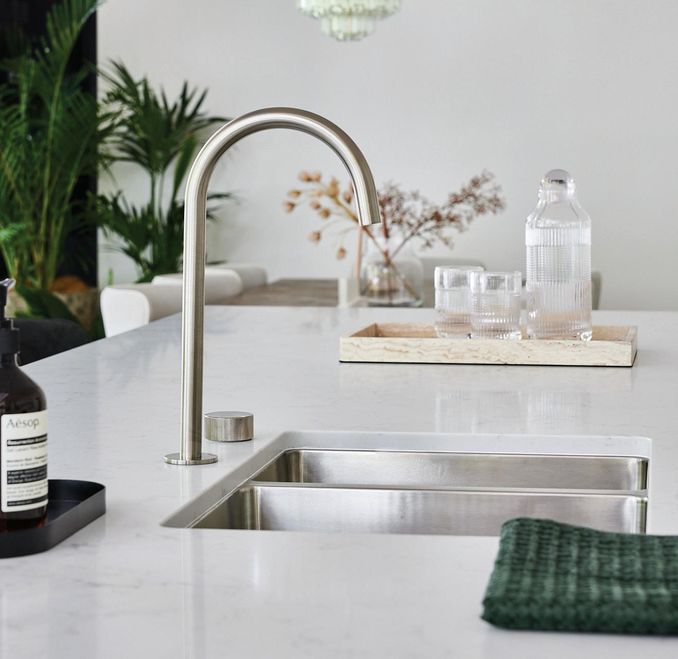
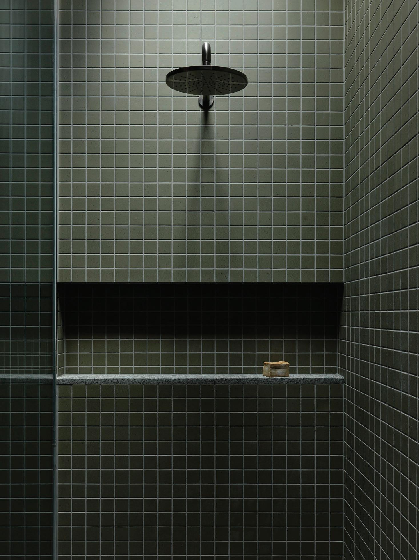
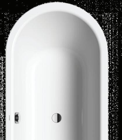
POCO P HOME COLLECTION
Experience a refined, intuitive way to control water flow and temperature in one rotation with our Poco P Progressive tapware.
Unlike traditional mixers that require multiple rotations to adjust temperature or separate motions for flow control, the Poco P handle features a single dial movement for effortless precision. This design not only ensures accurate temperature control but also reduces unnecessary hot water consumption, making it a more energy-efficient choice.
Complete your kitchen/bathroom oasis further with our range of toilets, basins, and showers.
Visit an Abey Showroom to explore the possibilities.
BNE MEL PER SYD
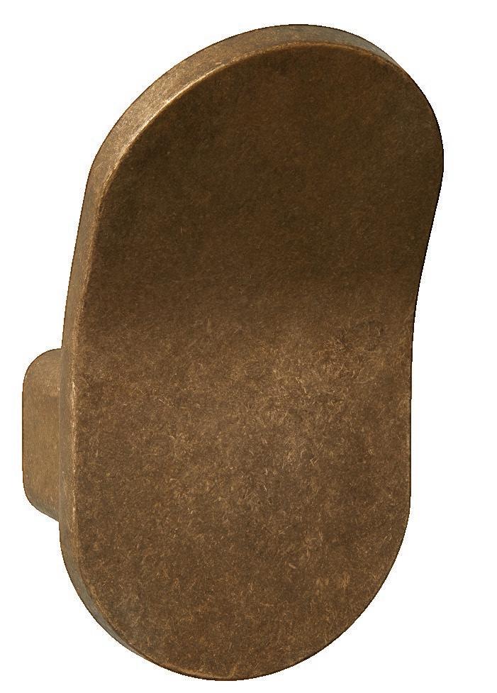
Poco P Gooseneck Pullout Hob Kitchen Set
The Bathroom Remix P 50
The Rinse List
Casey Brown Architecture & Fiona Spence
Halcyon Days
Vertical Grotto By Will Dangar P 146
Bondi Muse P 90
Editor's Letter
From Copenhagen to London, this letter comes on the heels of another design festival and an extended European summer. Taking this time away from my desk has meant that this magazine, more than most, is a credit to our advisor, Karen McCartney; publisher, Miffy Coady; head of creative, Jack Seedsman; and the editorial team.
While in this part of the world, I travelled to Belgium, where I had the rare privilege of stepping inside Vincent Van Duysen’s Antwerp home, greeted at the door by his three dachshunds, Flora, Pablo and Vesta. In Ghent, I caught up with long-time contributor Thomas De Bruyne, who has photographed the Sestig Pavilion—architect Glenn Sestig’s 1970s home—for our latest edition, Creative Minds at Home.
This issue enters the spaces where creatives live to see how they’ve moulded them into their own. Starting with our cover story, we explore the idiosyncrasies of architect Luis Laplace and Christophe Comoy's 19th-century Paris apartment, and architect Bilbo Garcia-Conde’s sheet metal-clad addition in Madrid.
I speak with fashion designer Shona Thatcher on how her Bondi home expresses her love for the Mediterranean, and nearby, we visit designer Nick Kent’s home and studio to understand how it adapts to work and family life. In Warsaw, Poland, a culinary blogger and author’s apartment incarnates his light-hearted persona. An excerpt from garden editor Will Dangar’s new book, Natural Order, takes us to SJB architect Adam Haddow’s inner-city home to learn more about its integrated urban gardens.
In our latest podcast episode, we return to Babylon, the Avalon home of Fiona Spence and Morris Lyda, where Karen McCartney joins architect Rob Brown and Fiona to discuss their eight-year collaboration and preserving the home’s original magic.
An adventurous attitude and clever planning bind our global cross-section of bathrooms in The Bathroom Remix. At the same time, we discover what bathroom products resonate most and why, according to 50 Australian architects and designers. Wherever you turn in this issue, there are personalised lessons on reinventing a place to call home, straight from the curious minds that inhabit them.
– Sophie Lewis, editor
Contributors
Thomas De Bruyne
As an architecture and interior design photographer, Thomas De Bruyne describes his style as abstract and graphic but not cold. His training as a graphic artist is consistently evident in his portfolio of work, which spans Belgium, as well as abroad, including Paris, London, Amsterdam, and the South of France. In this issue, De Bruyne photographs the Sestig pavilion, near Ghent, for our series on iconic architecture, The Greats.
@cafeine
Anson Smart
Sydney-based photographer Anson Smart captures beautiful food, spaces and places. Studying at San Francisco’s College of Fine Arts, he returned to Australia to begin his photography career in Sydney. Twenty years later, Anson has established a portfolio shaped by the work of the world’s best creatives across editorial, advertising and published books. Smart captures fashion designer Shona Thatcher’s home in Bondi, Sydney, as part of this issue.
@smartanson
Maciek Jeżyk and Justyna Kuska
ONI Studio, founded by photographers Maciek Jeżyk and Justyna Kuska in Poland, works on design-focused commissions worldwide. Kuska’s art history background creates evocative scenes, while Jeżyk’s technical expertise explores the effects of composition and light on spaces and objects. In this issue, they photograph culinary blogger Michal Korkosz’s Warsaw apartment by Mistovia.
@onistories
Aleesha Callahan
Aleesha Callahan is a Melbourne-based design journalist, editor and communications strategist. With more than a decade of experience in media and design, Callahan has honed a distinct voice and innate ability to craft compelling narratives. Callahan writes on eight bathroom designs that challenge convention in The Bathroom Remix, in this issue.
est living acknowledges the Traditional Owners of the land on which we work, the Wurundjeri Woi-Wurrung of the East Kulin Nation. We pay respect to their Elders past, present and emerging.
Connect
Timeless Gifting
THE RINSE
LISTEN
Photography Lynn Goldsmith Playlist Curation
RINSE LIST
NOW > Goldsmith via Getty Images
Curation Lidia Boniwell
HOUSE OF BRANDS
SPACE
AGE
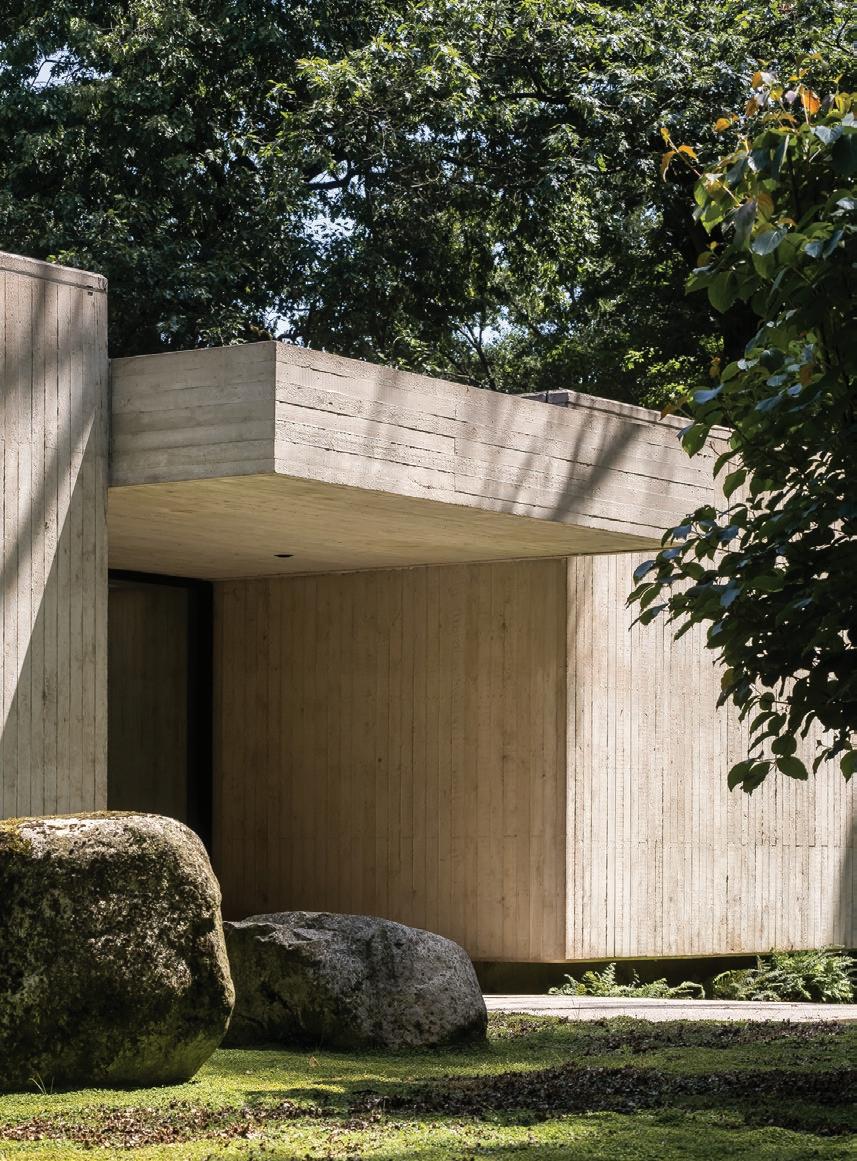
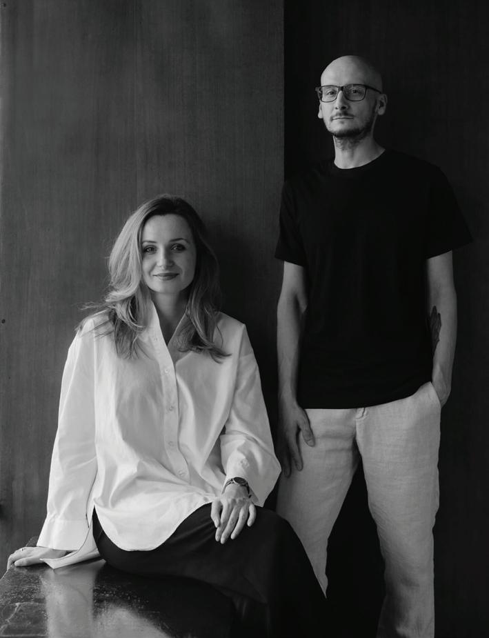
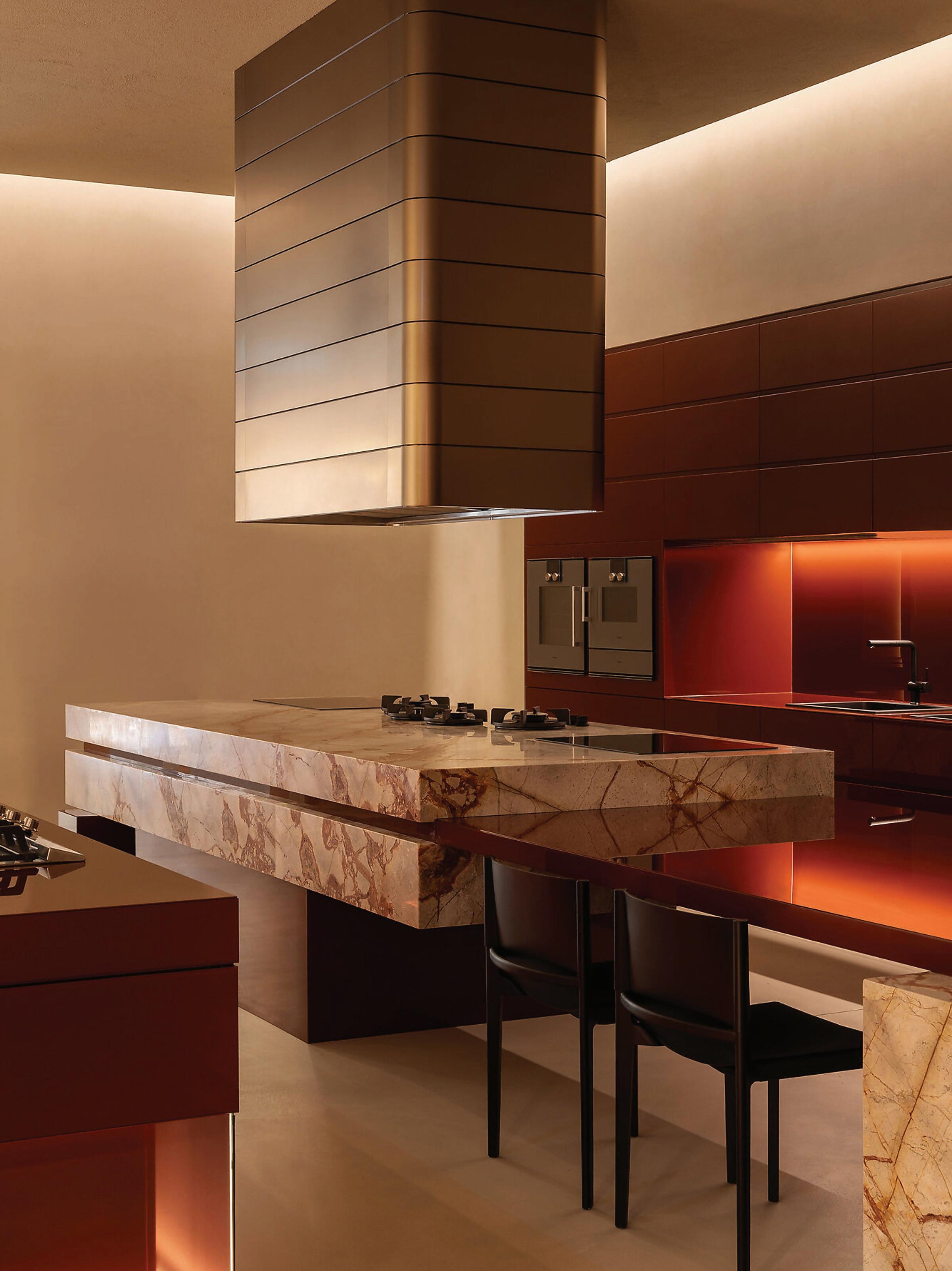
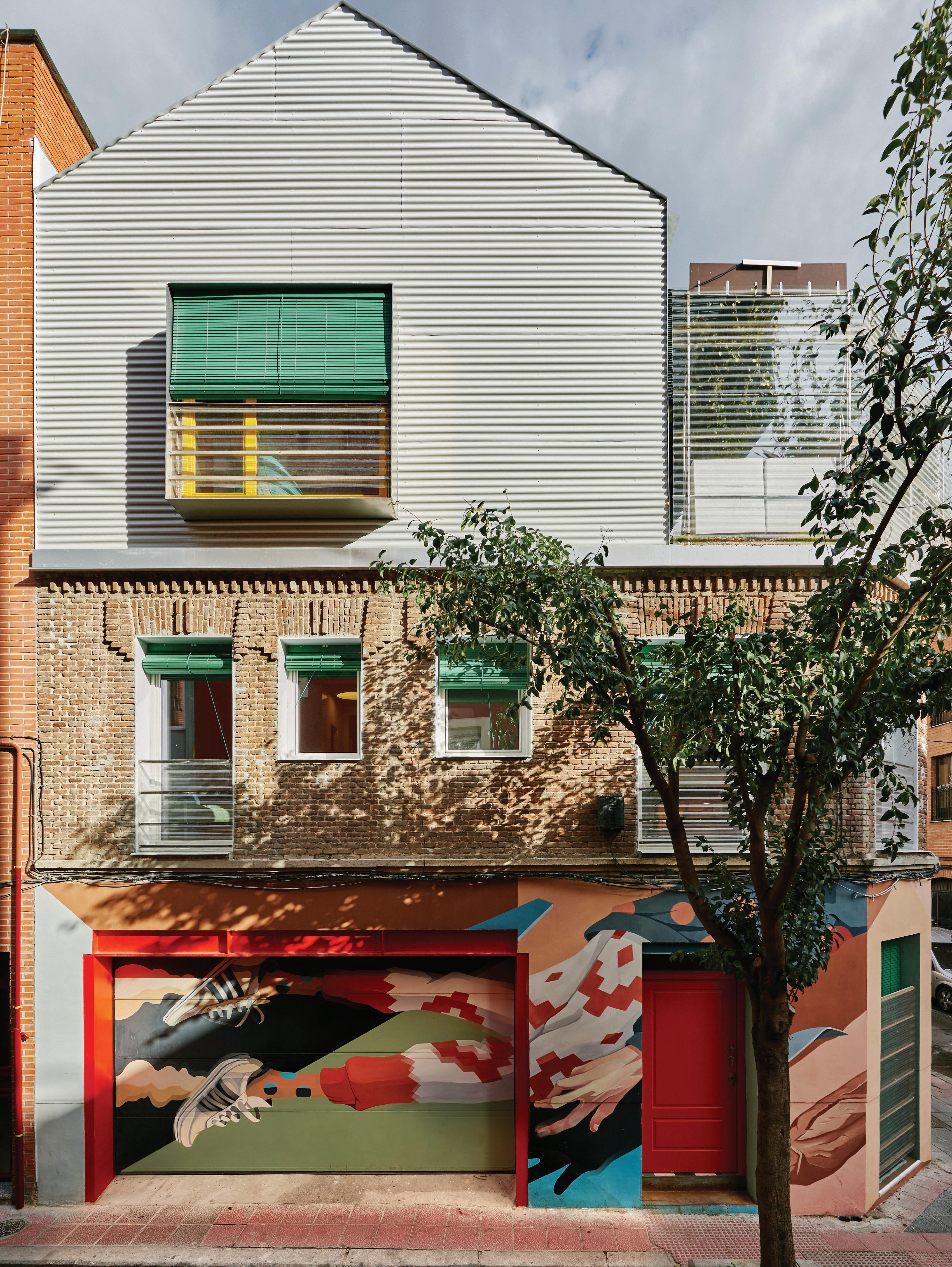
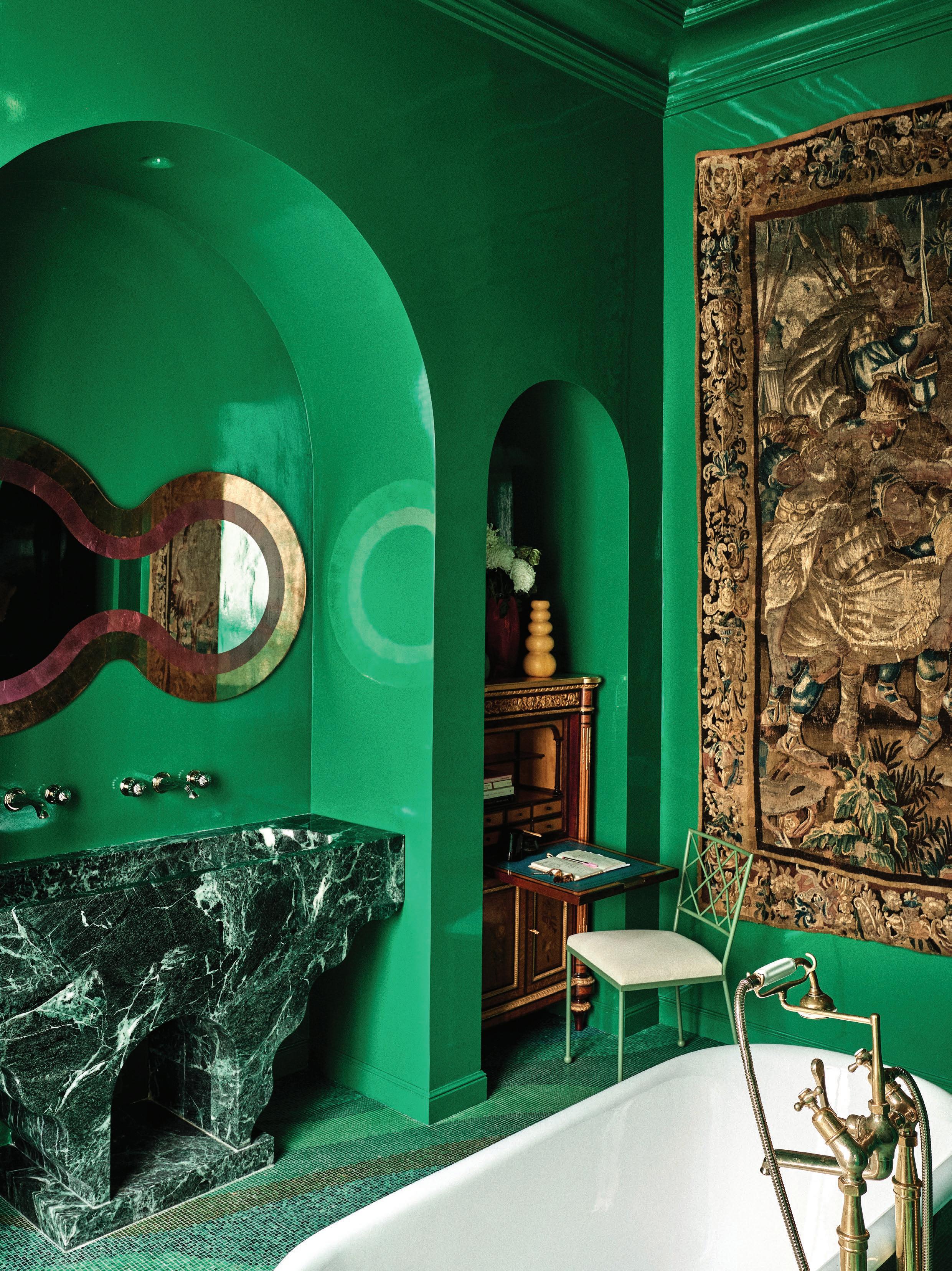
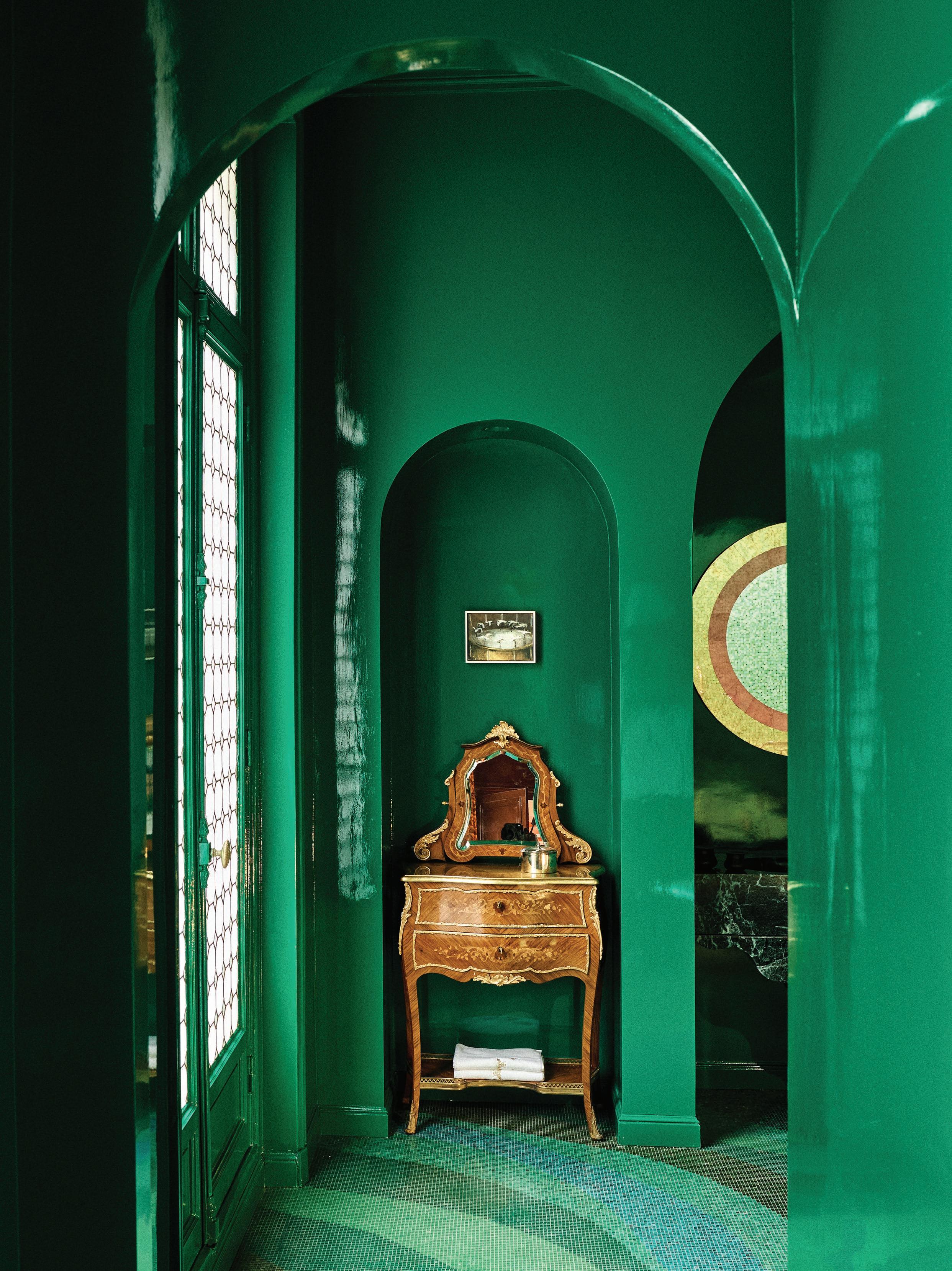
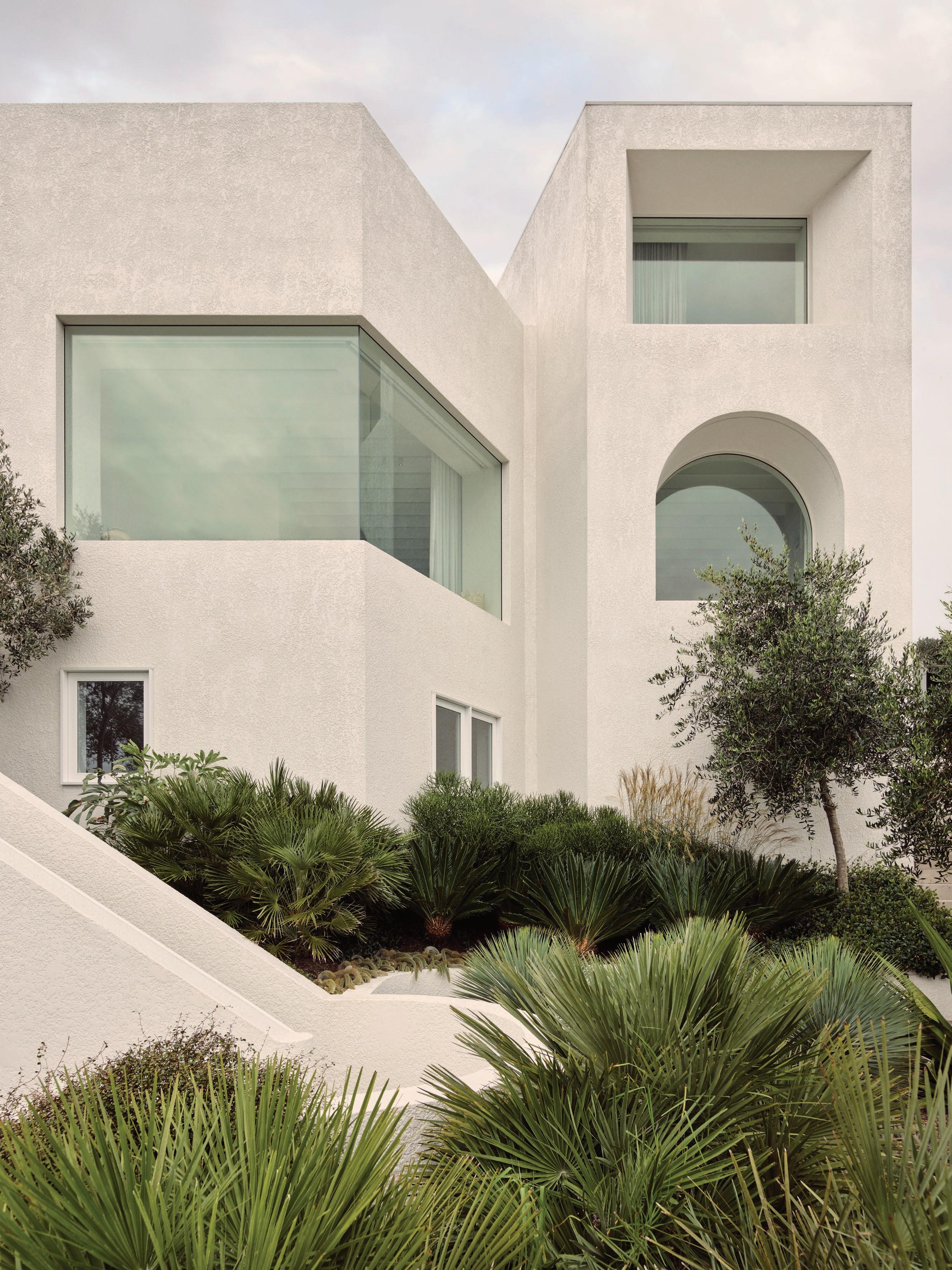
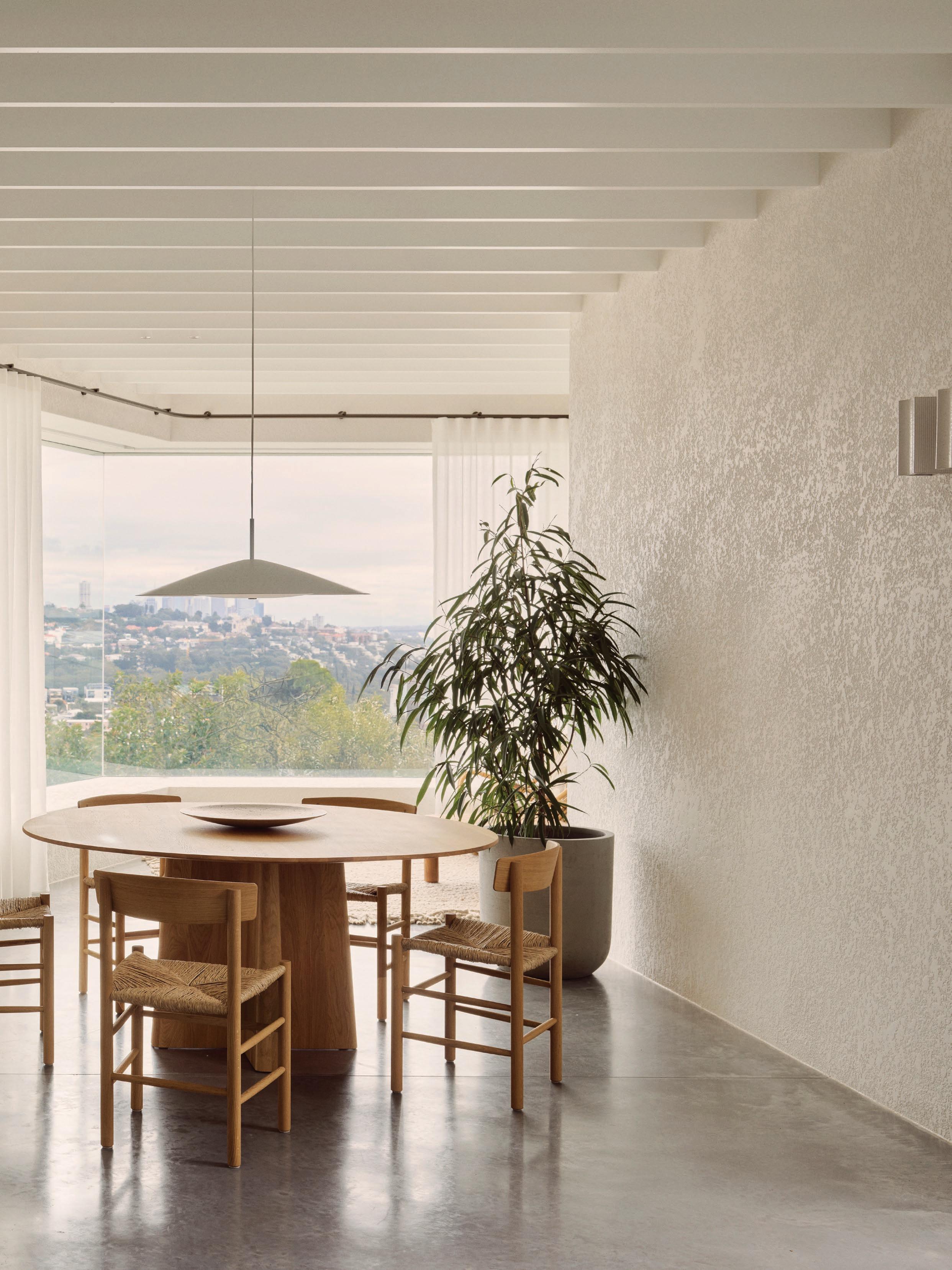
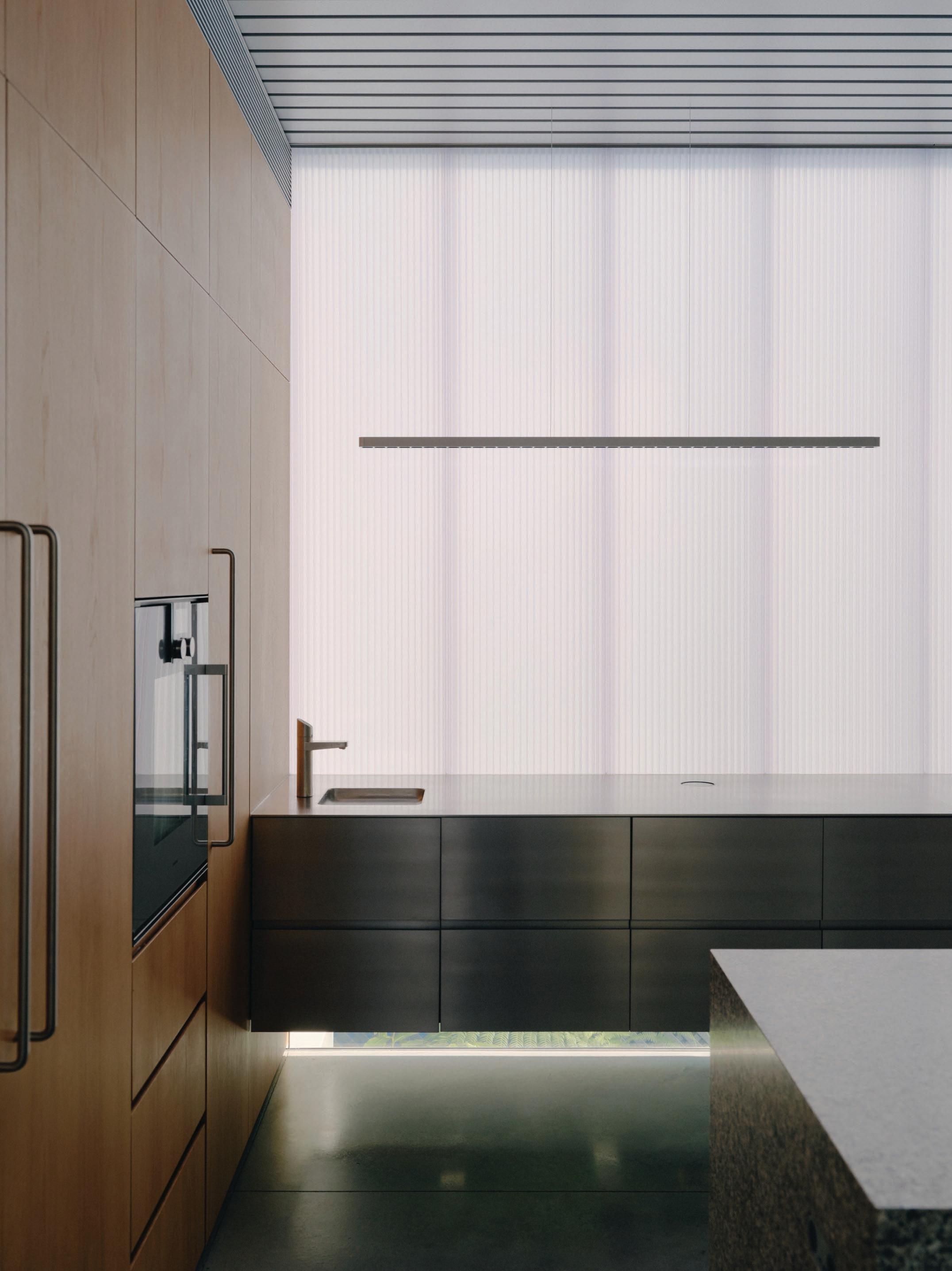
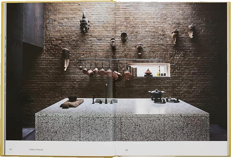
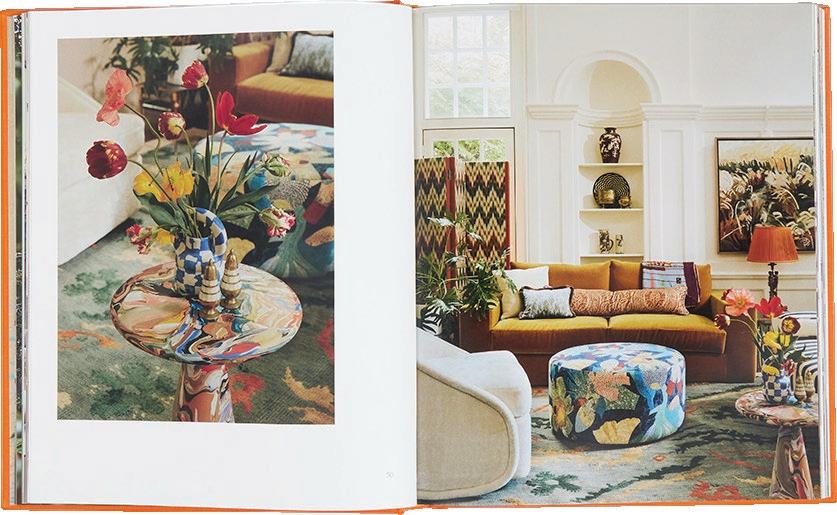
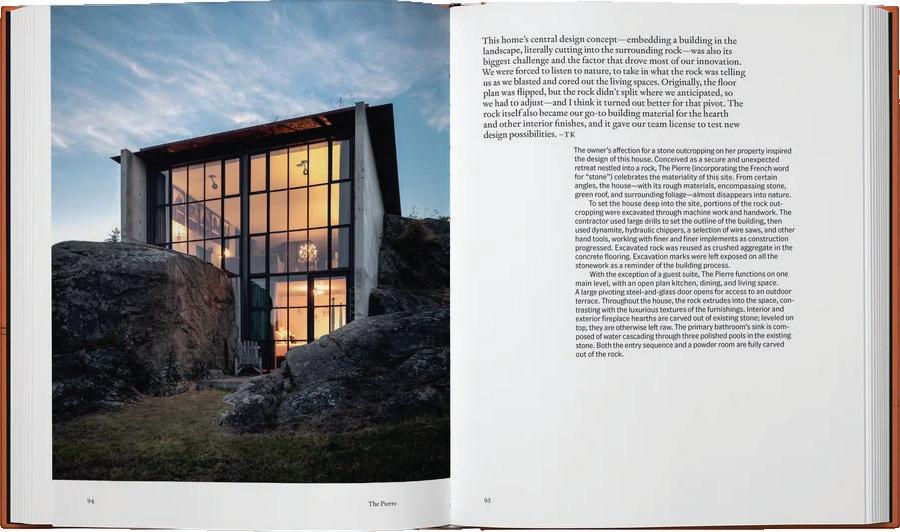
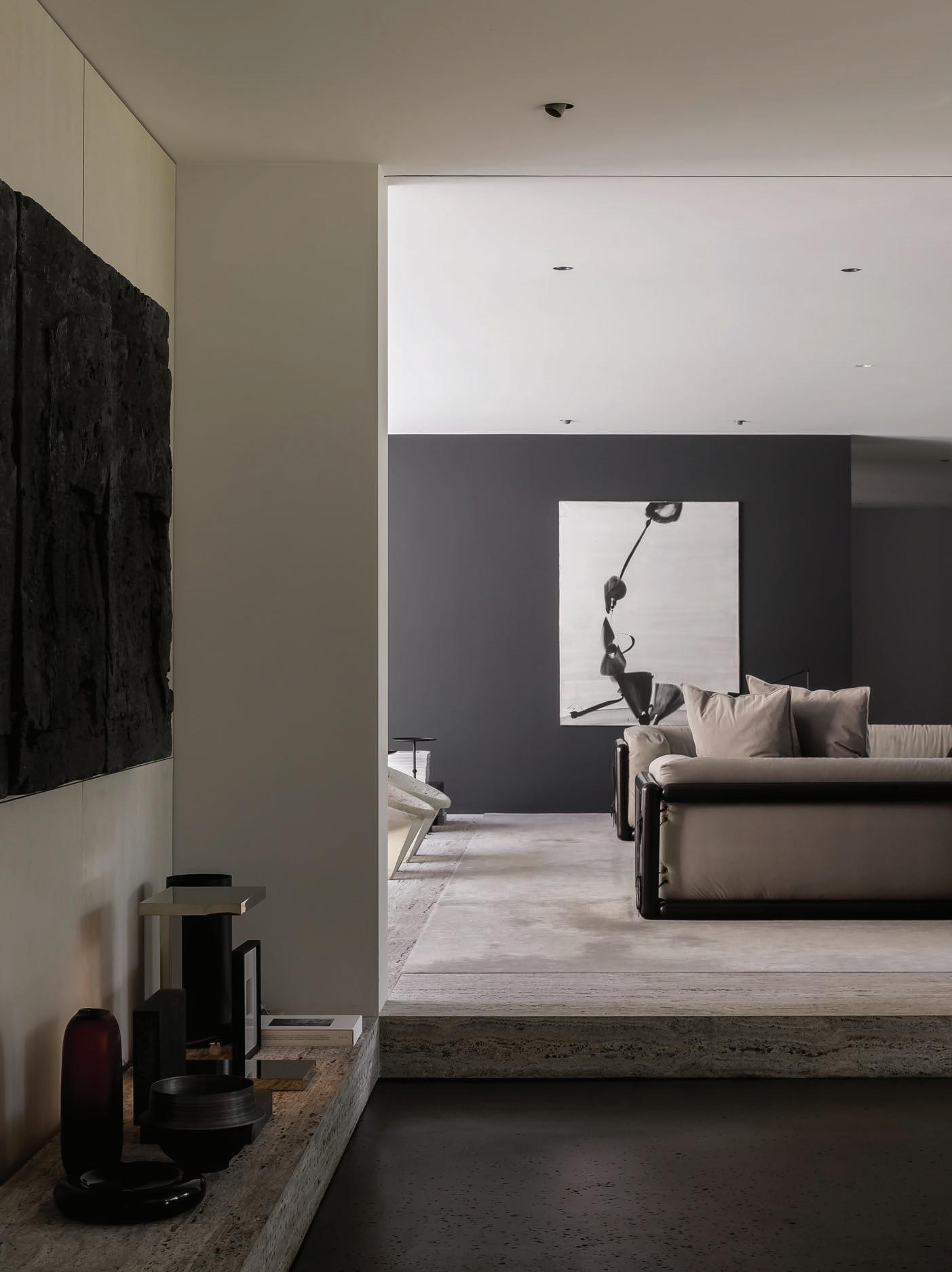
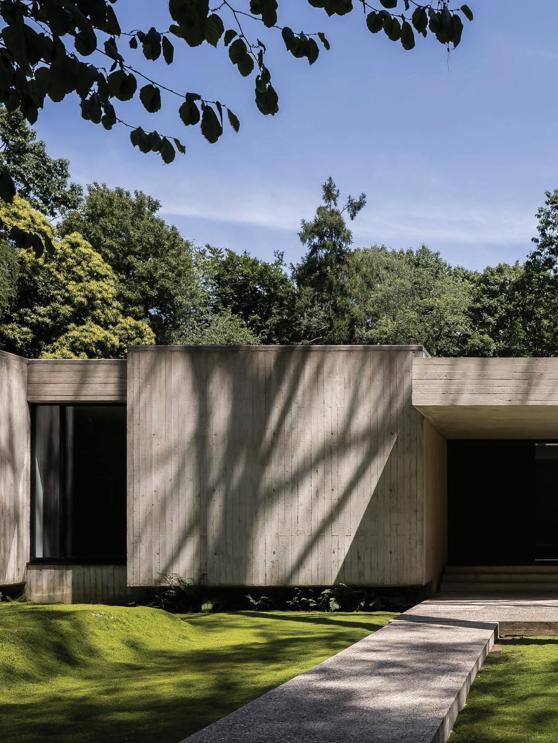
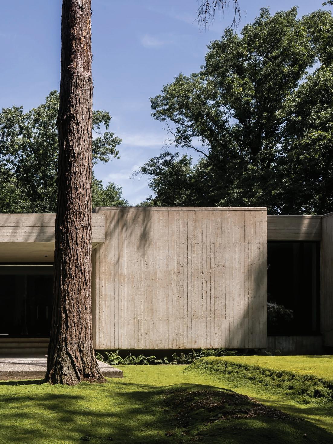
LOCATION Madrid, Spain ARCHITECTURE CDP
Arquitectos PHOTOGRAPHY Daniel Schäfer
WORDS Alexandra Gordon
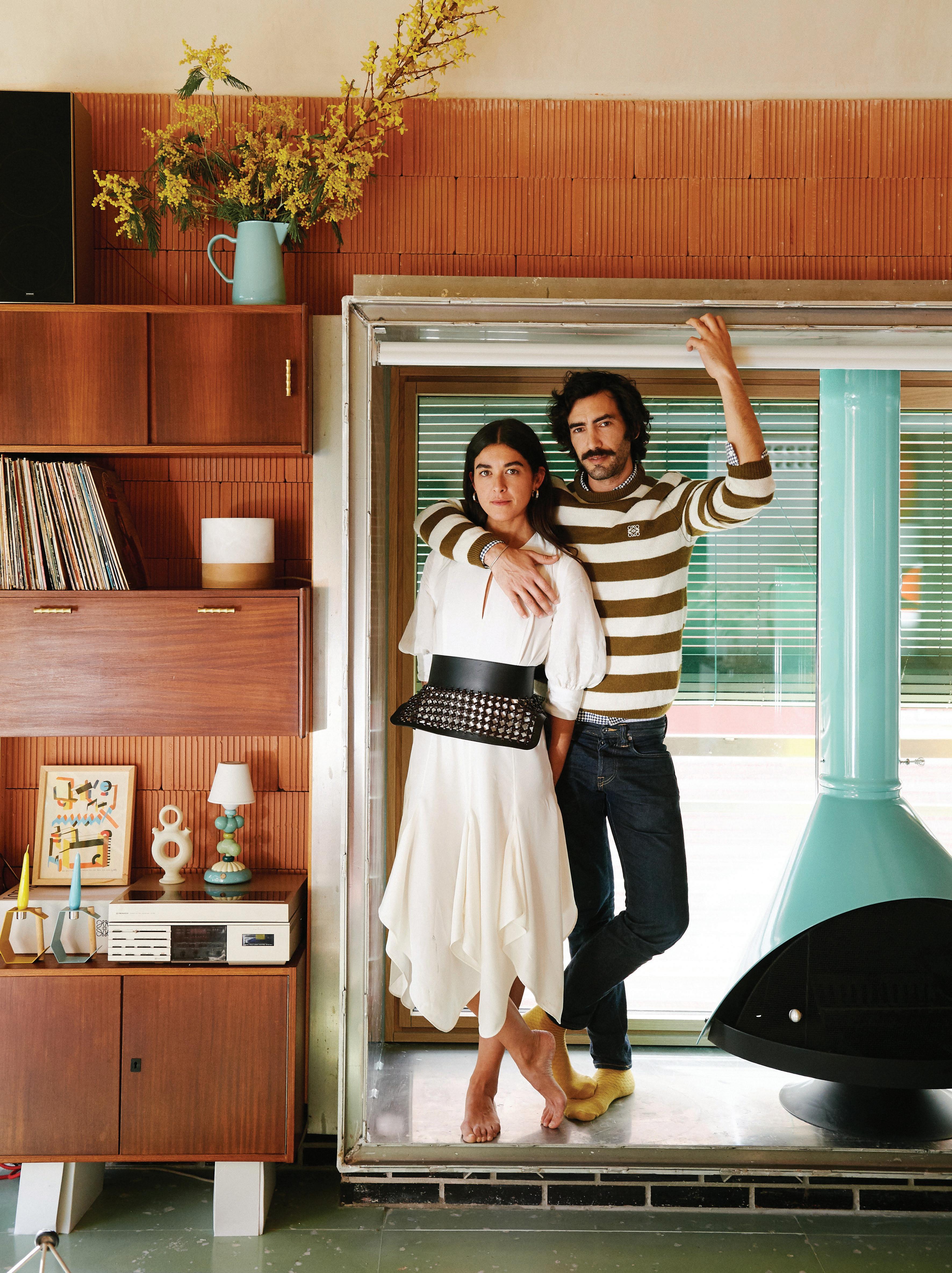
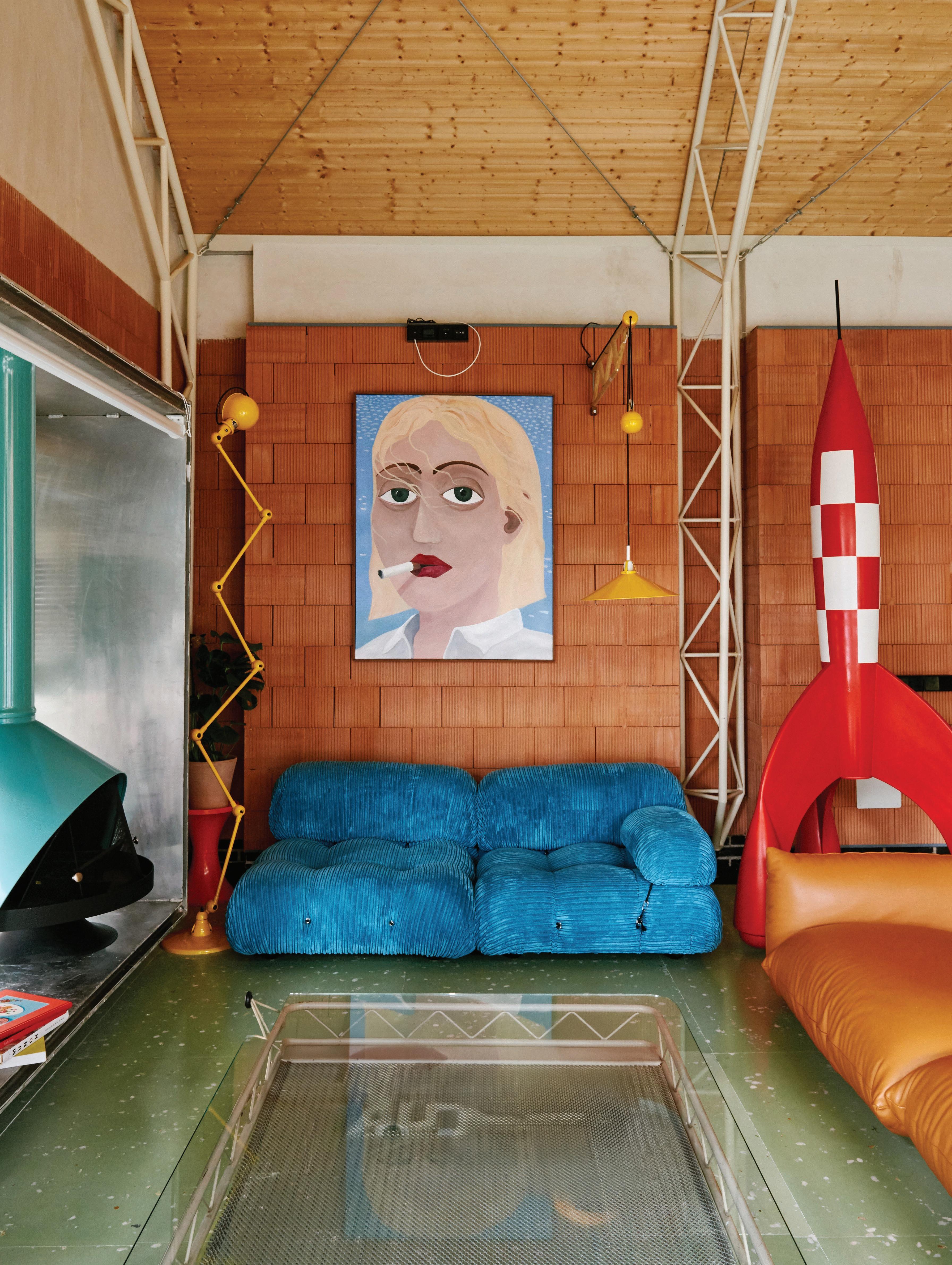
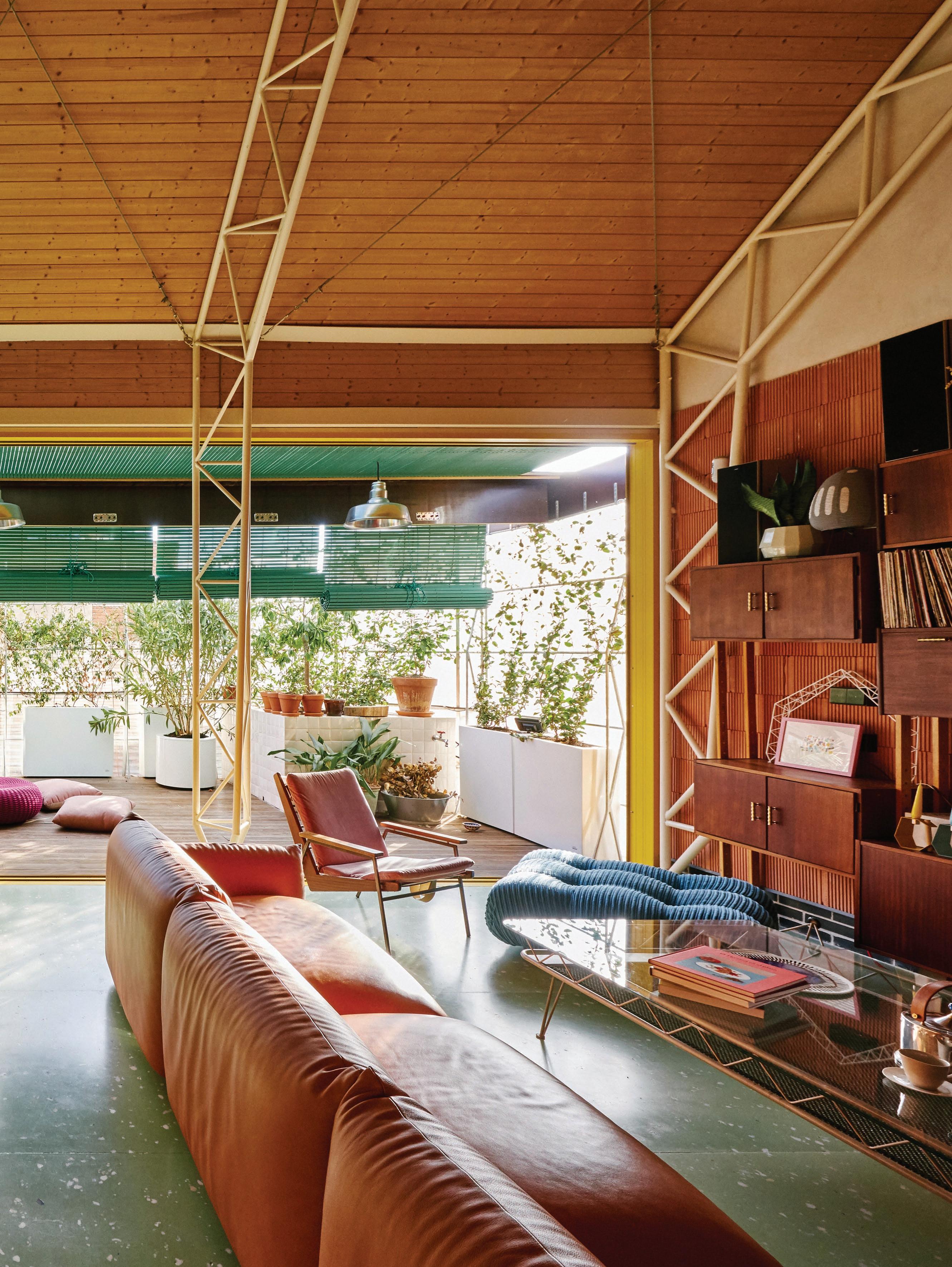
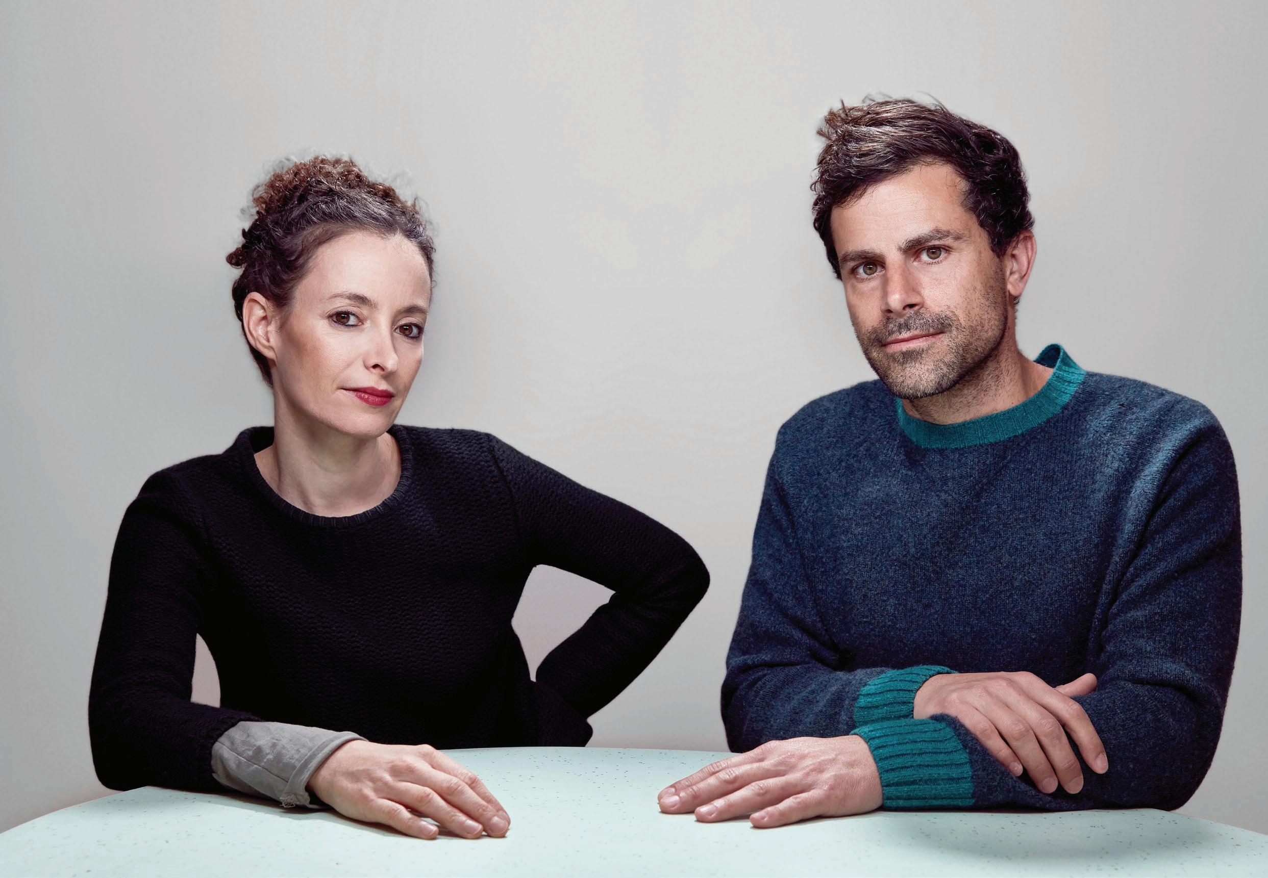
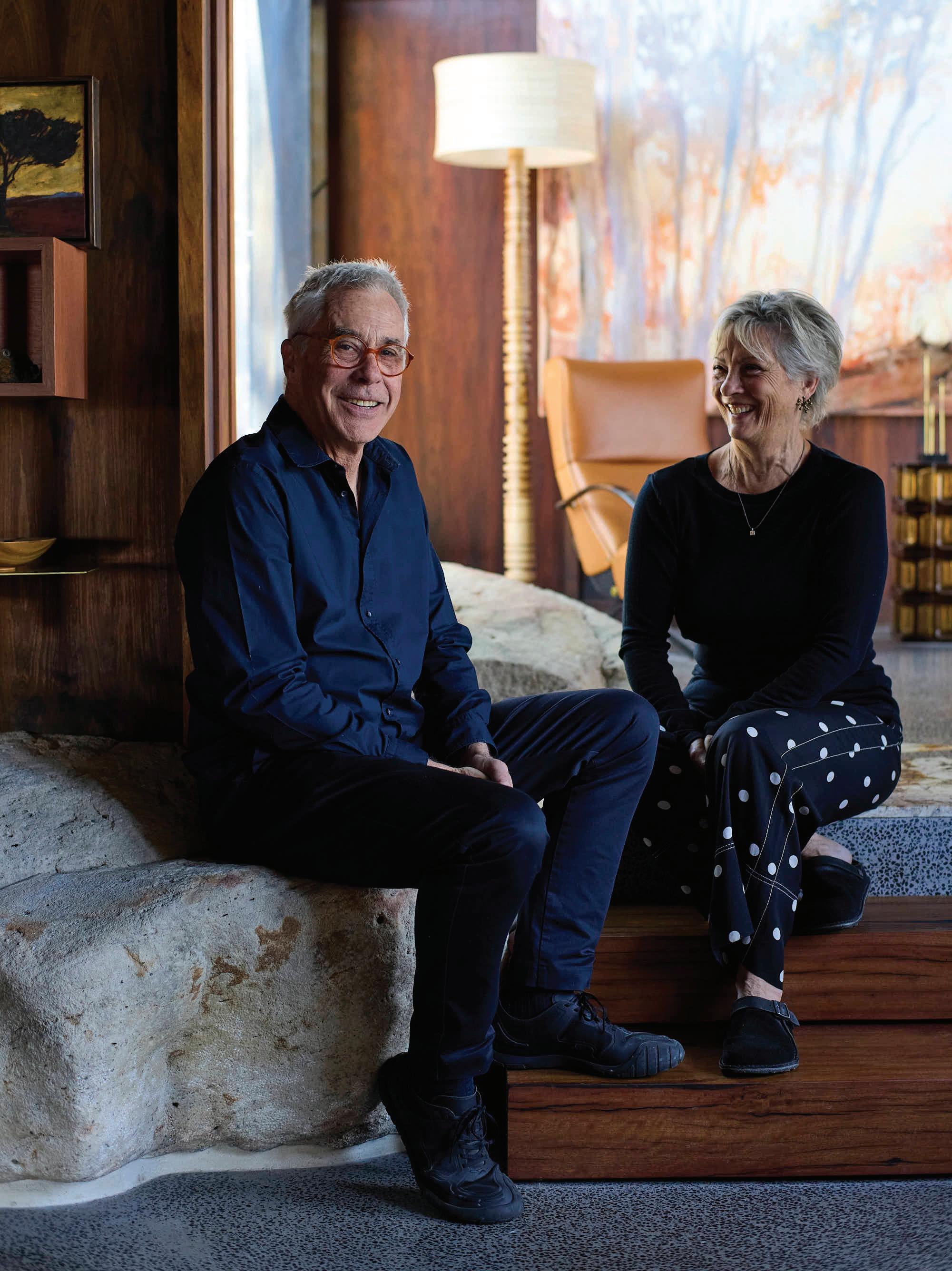
Pictured: Architect Bilbo Garcia-Conde and wife Itziar Garcia-Conde.
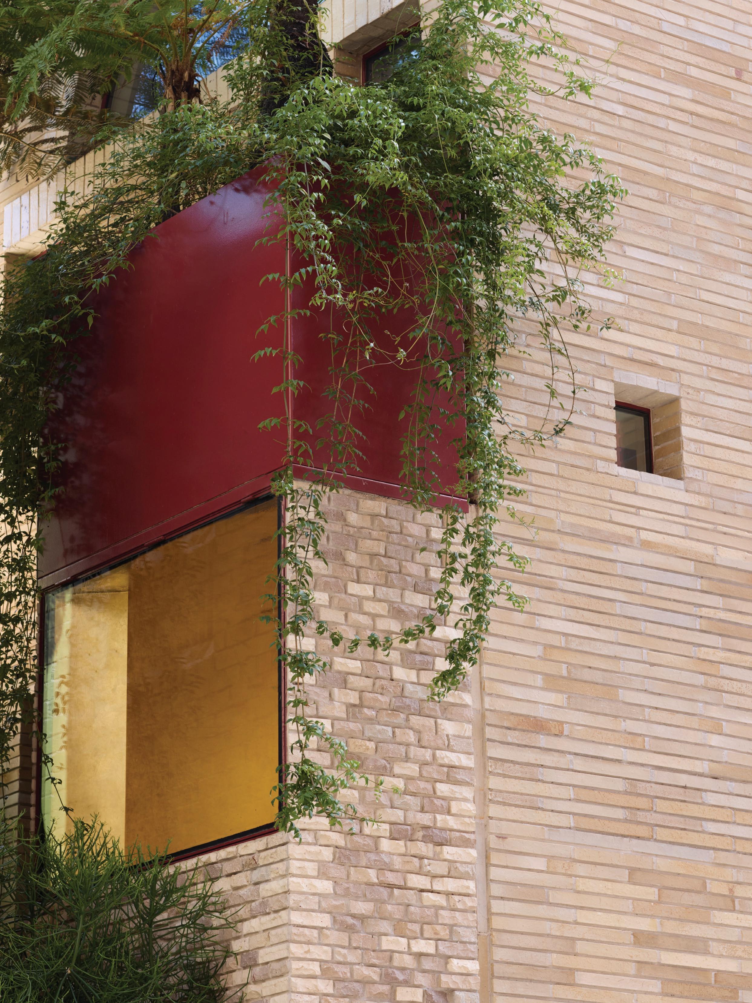
A playful rooftop addition transforms a corner building in Madrid into an architect’s unconventional home.
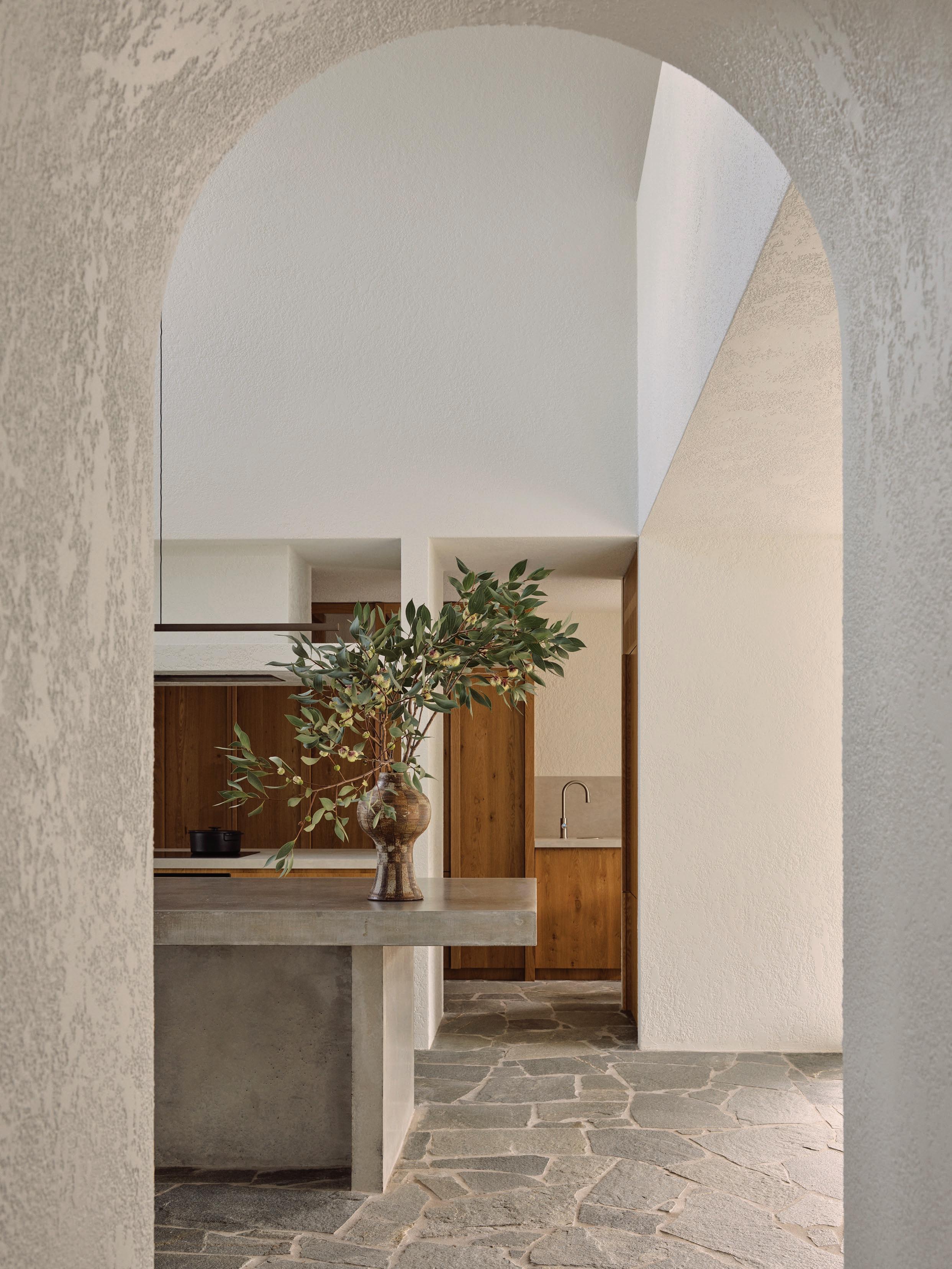
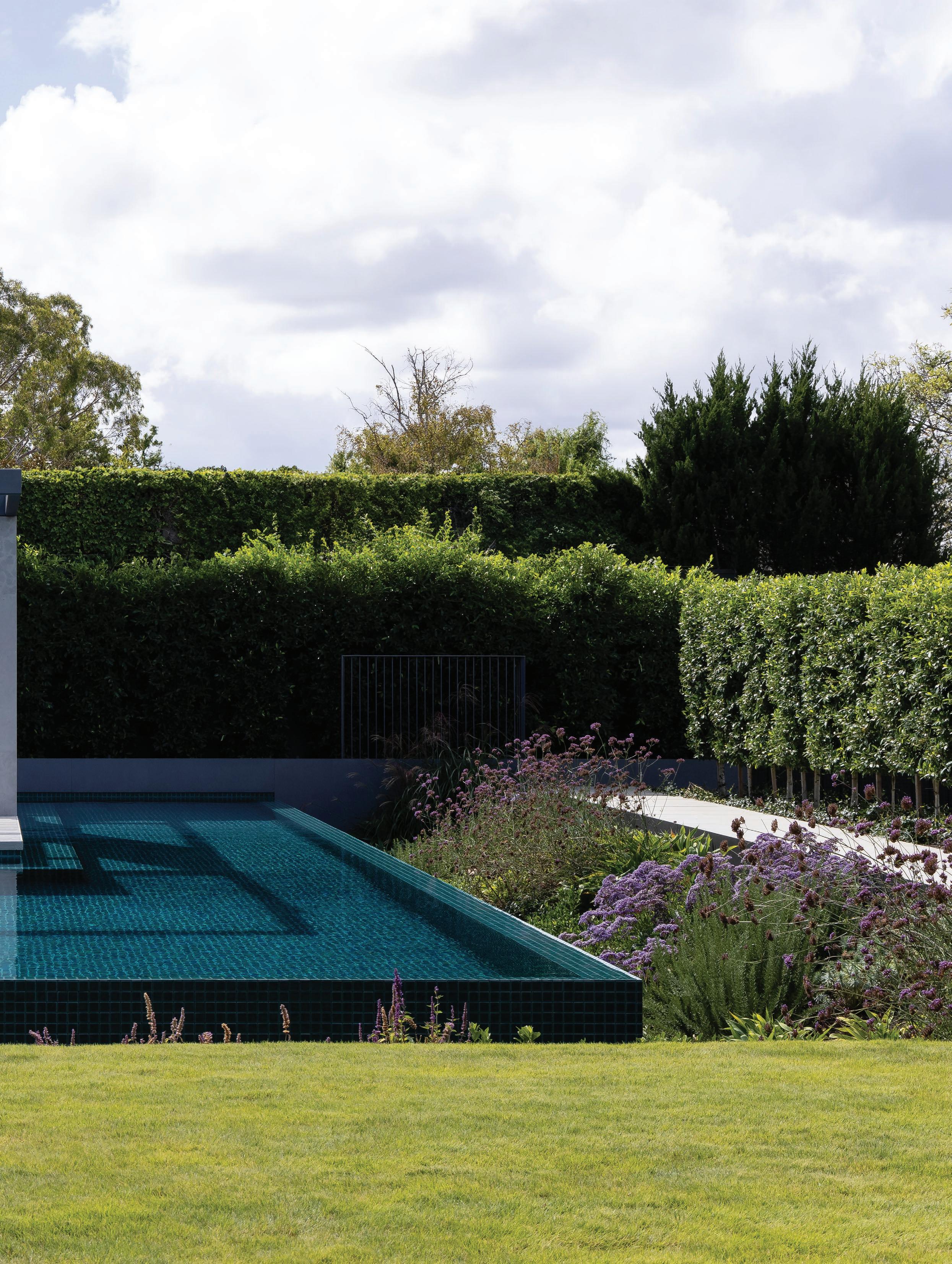
A 1930s building in Madrid’s San Diego neighbourhood of Puente de Vallecas provided the perfect springboard for architect Bilbo Garcia-Conde to create his home. While the Spanish architect had envisioned a warehouse for his wife, Itziar, and three dachshunds, Lio, Gilda and Pipa, the unassuming two-storey brick structure had a lot going for it. “What attracted me was that it was a corner property with metres of façade, and very close to the centre of Madrid,” recalls one of the founding trio behind CDP Arquitectos.
His approach shifted given the different set of parameters. “I was looking for a warehouse to build a loft, but here in Madrid, the transition from commercial to residential use is complicated,” GarciaConde explains. His unorthodox solution was to buy a building and put a warehouse on top. “The process was ruled by not looking at how much I was spending, but by just doing whatever I wanted,” the architect of the two-year renovation laughs.
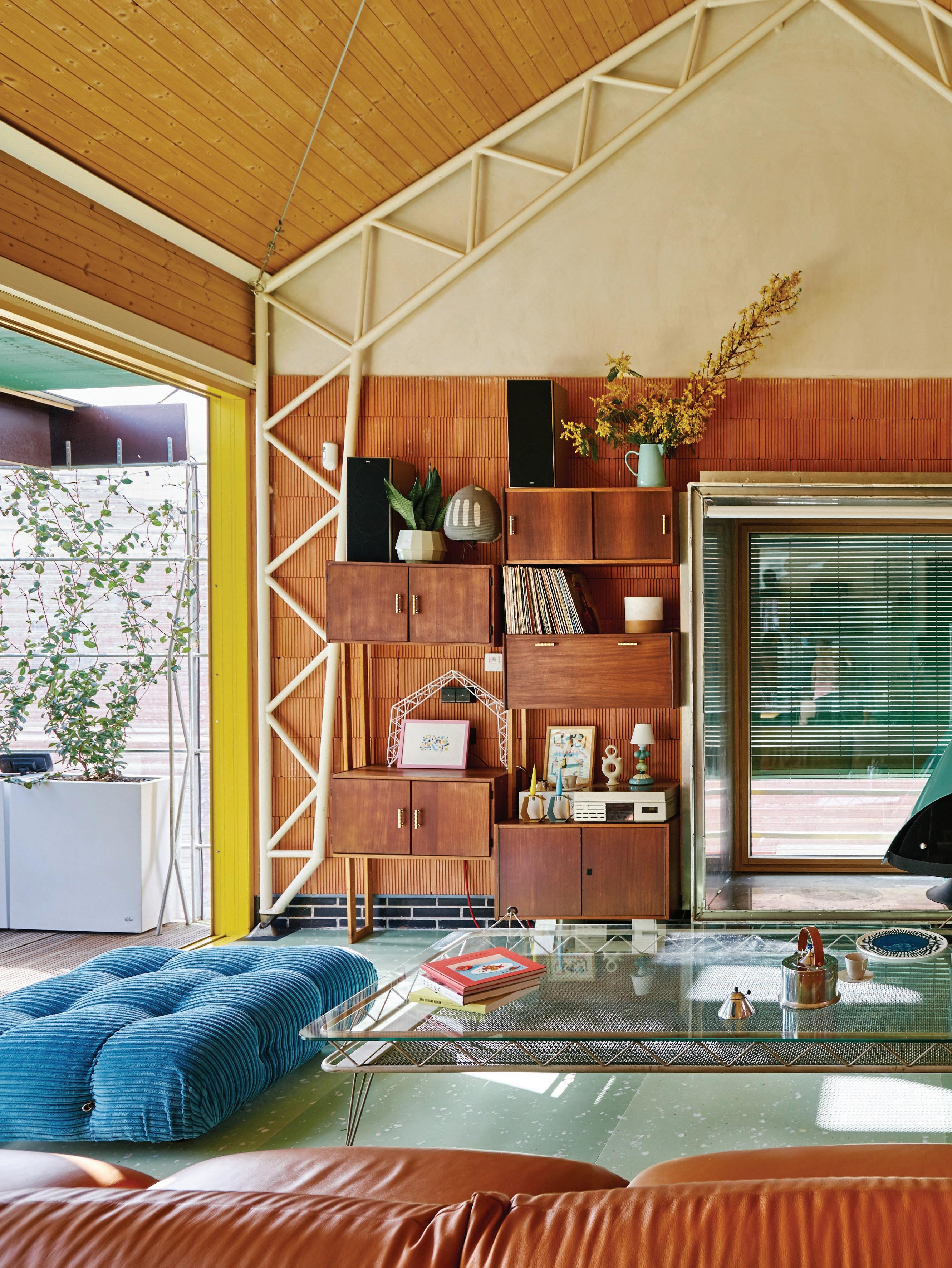
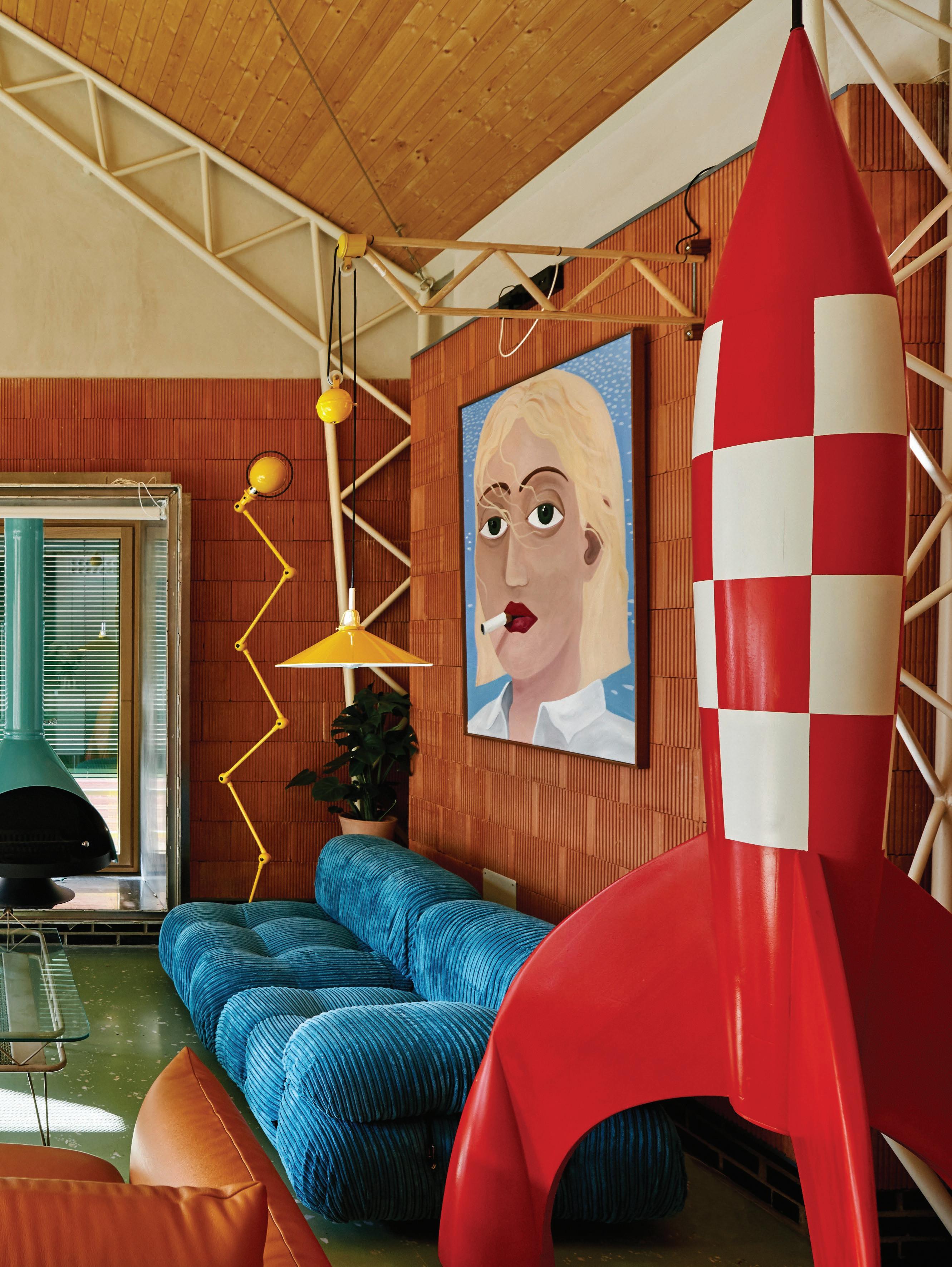
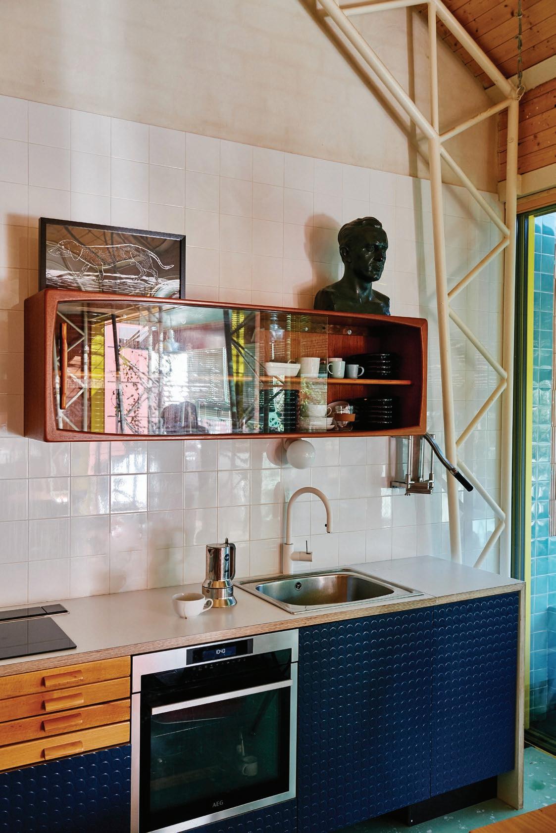
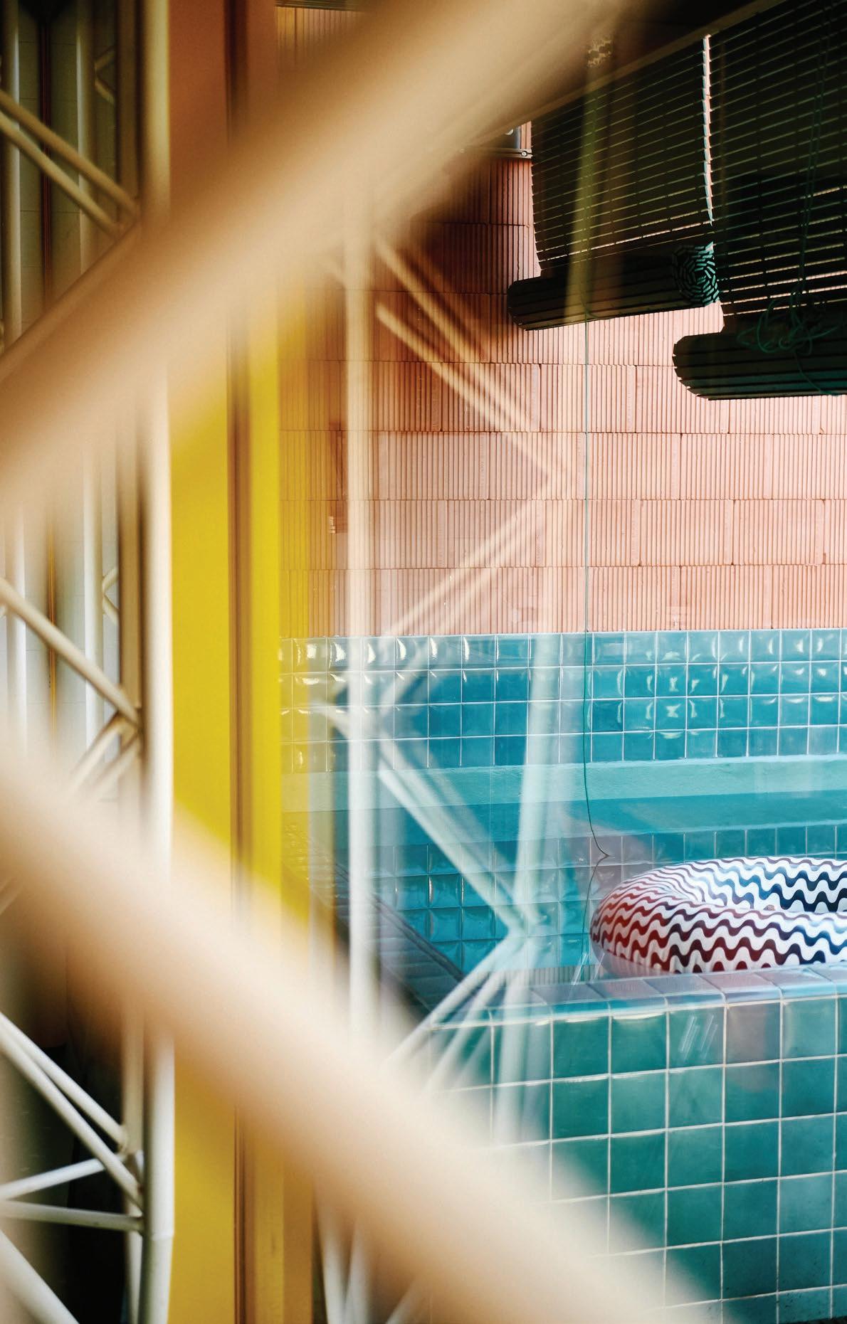
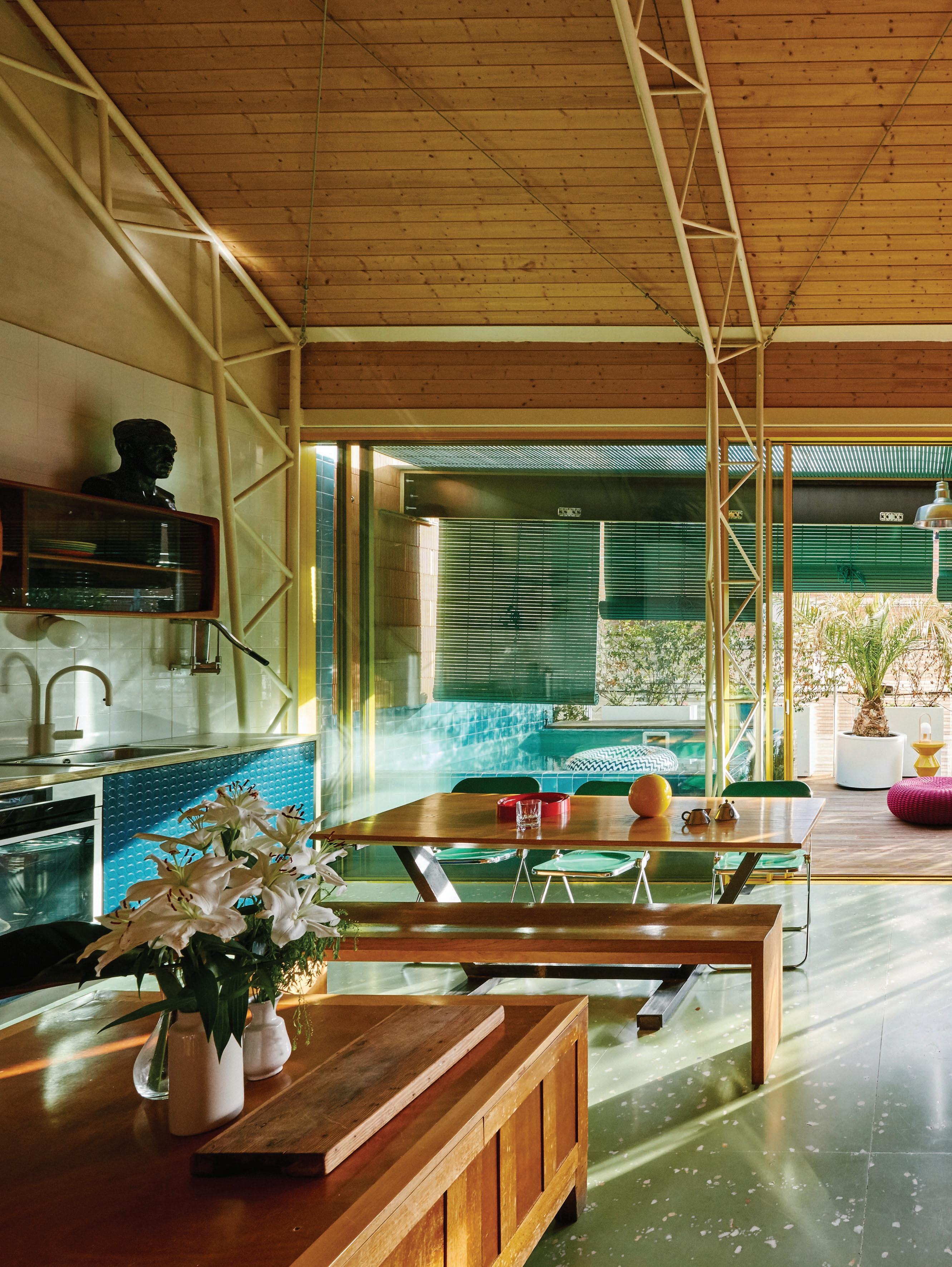
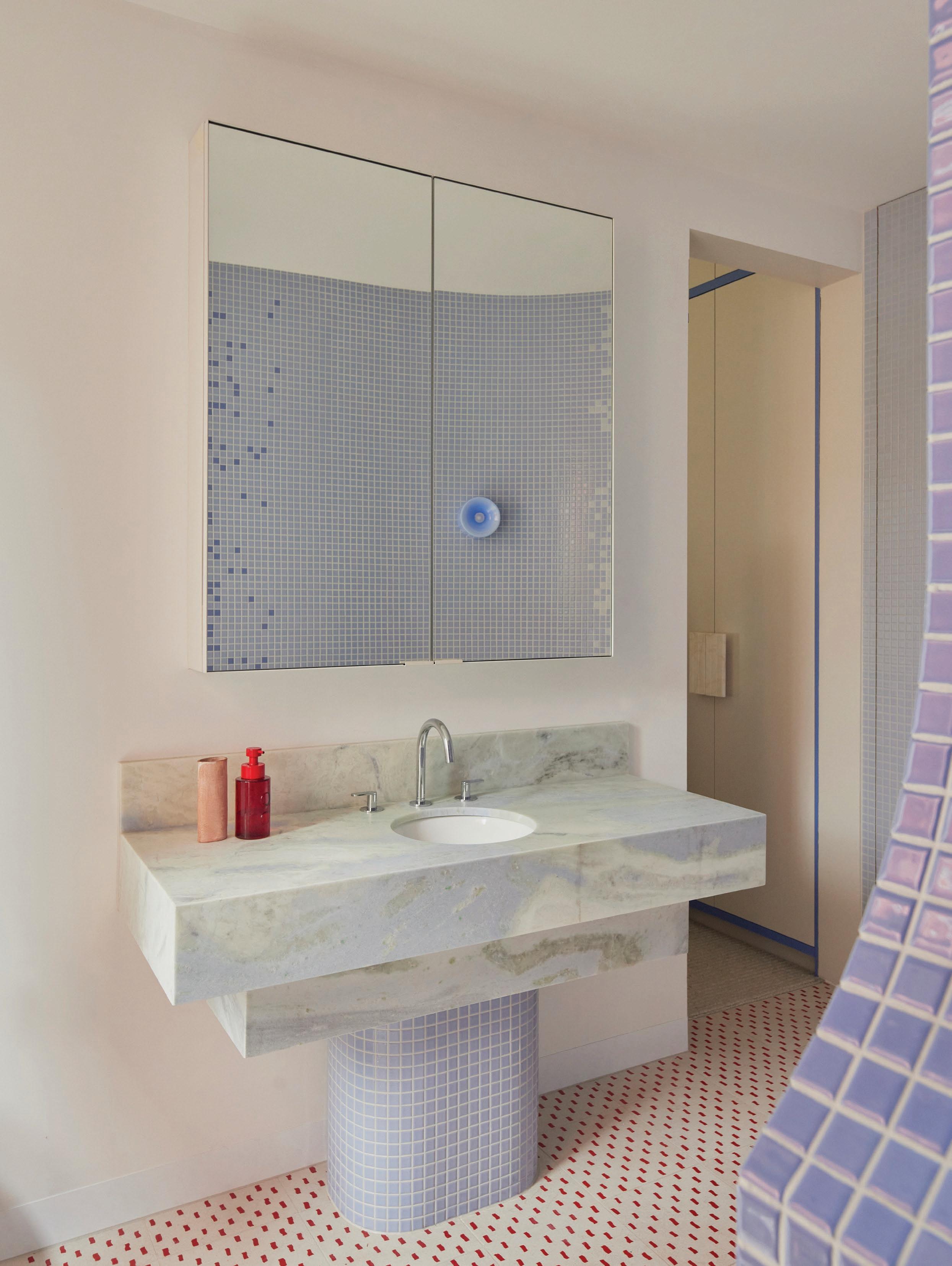
Within a sheet metal-clad addition is a combined kitchen, living and dining room, and a powder room, which opens onto a terrace with a pool. These spaces are defined by five-metre-high ceilings enclosed by a gable roof. “I modified the structure of the house several times until I liked the multitubular structure of the living room roof and the colour scheme. I wanted to avoid repetition and for everything to blend seamlessly,” Garcia-Conde admits.
In the living space, Tintin's rocket brings a sense of fun to the colourful living room that features Huguet Mallorca terrazzo floors and a fireplace bought from Los Angeles by Palm. A Camaleonda sofa by Mario Bellini, Arflex Marenco sofa by Mario Marenco and a Jieldé LOFT D9406 floor lamp are positioned around a glass coffee table that’s actually a bed by Dutch industrial designer Wim Rietveld. The painting is by Nacho Torra.
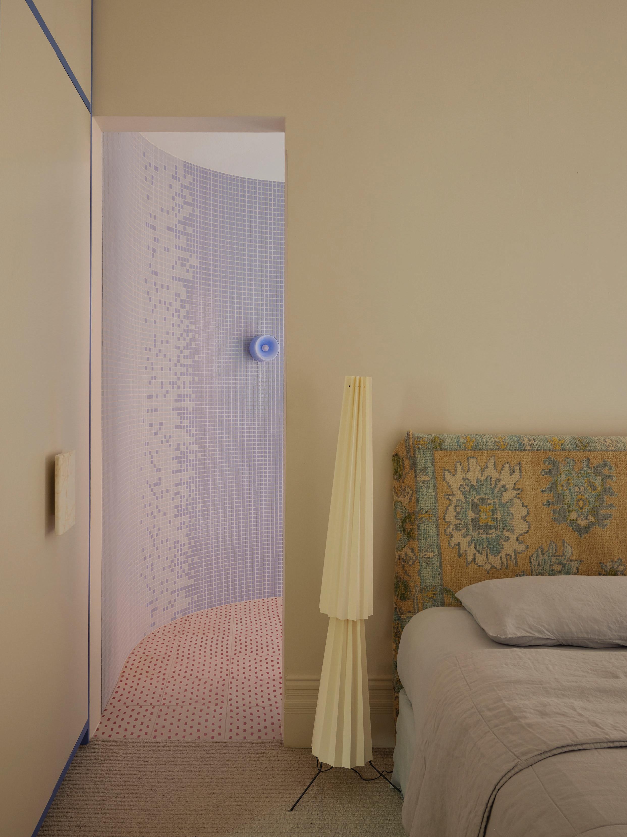
The original part of the building houses three bedrooms, each with a corresponding bathroom and dressing room. “We kept the original façade, retaining and improving the doors and some details,” the architect says. Below is a rental apartment with an exterior entrance, the foyer, a two-car garage and a laundry. A colourful mural adorns the walls at ground level. “I asked some friends, Twee Muizen, to paint something to do with each street,” he explains.
The interiors are equally playful and nostalgic. “The style is space-age, as the original two-storey house was built in the year Neil Armstrong was born,” Garcia-Conde says, adding, “and it was renovated in 2019, which coincided with the 50th anniversary of the moon landing.” And indeed, a three-metre rocket ship takes pride of place in the main space. “One of my fondest memories is a Tintin rocket my father made for my brother and me as a Christmas present,” he recalls. “Since I couldn't bring it home, I ordered a much larger one from a carpenter friend in the Canary Islands, where my parents live.”
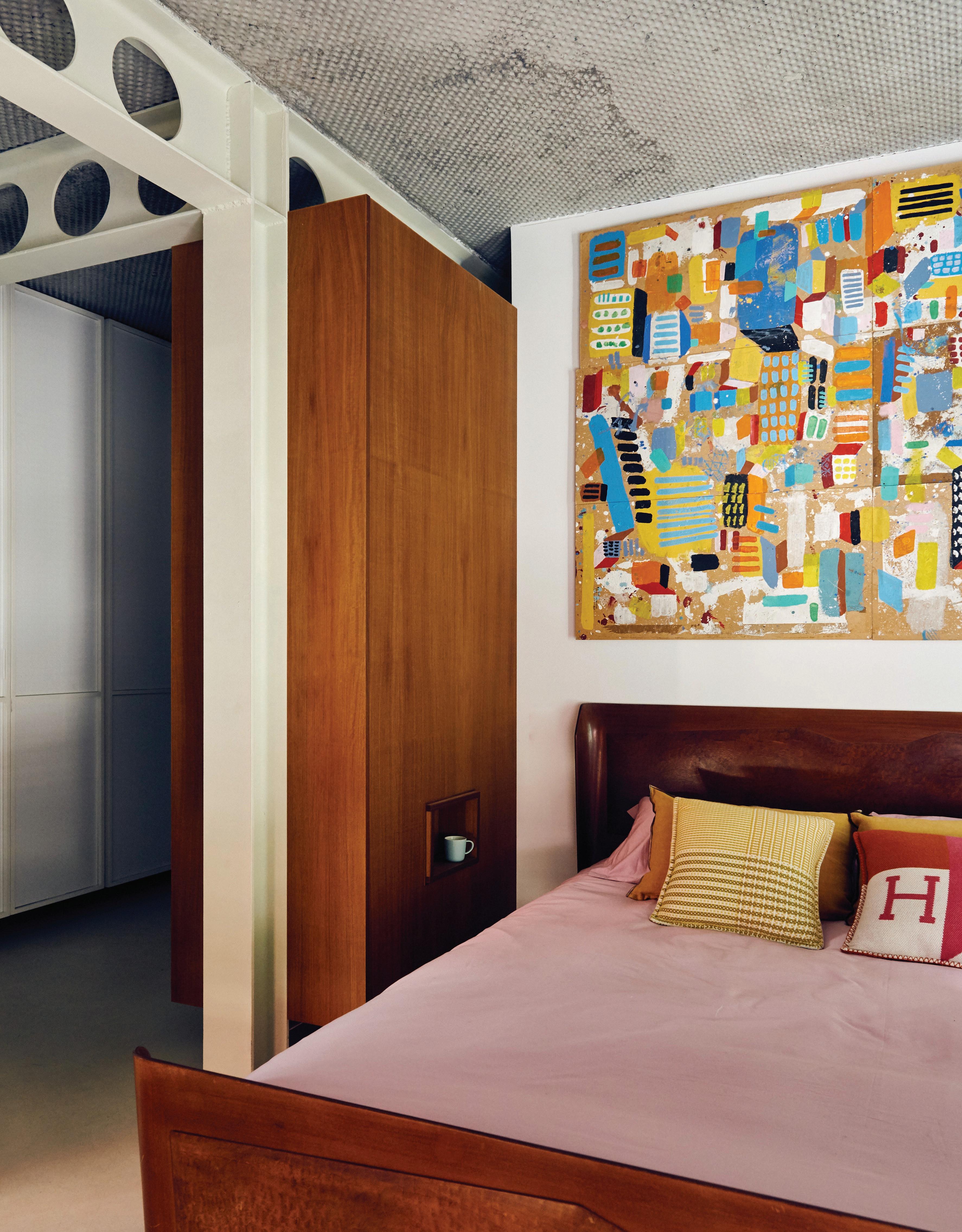
The house allowed Garcia-Conde the opportunity to truly express himself. “I wanted this house to be a reminder of my childhood memories, with lots of colour,” the architect says. He has curated an unexpected mix of materials with vintage furniture, both found and collected. The bedrooms feature beds made by his father, Koto, an architect and sometime carpenter, while his great-uncle’s plan drawers are utilised in the living room. “My influences are my childhood, hence my mother's colour and the happiness she naturally exudes,” Garcia-Conde explains.
The result is unique to Garcia-Conde and the surrounding area. “A project that’s original stands the test of time; if not, as soon as it goes out of style, it’s completely out of fashion,” the architect says. Both inside and out, this bold clash of colour, materials and styles layered with personal flourishes is anything but derivative. “If I had done it in another neighbourhood, it would be totally different,” Garcia-Conde says. It simultaneously references the working-class suburb within which it’s located and his favourite era to deliver a refreshingly individual home.
“The style is space-age, as the original twostorey house was built in the year Neil Armstrong was born, and it was renovated in 2019, which coincided with the 50th anniversary of the moon landing.”
– Bilbo Garcia-Conde
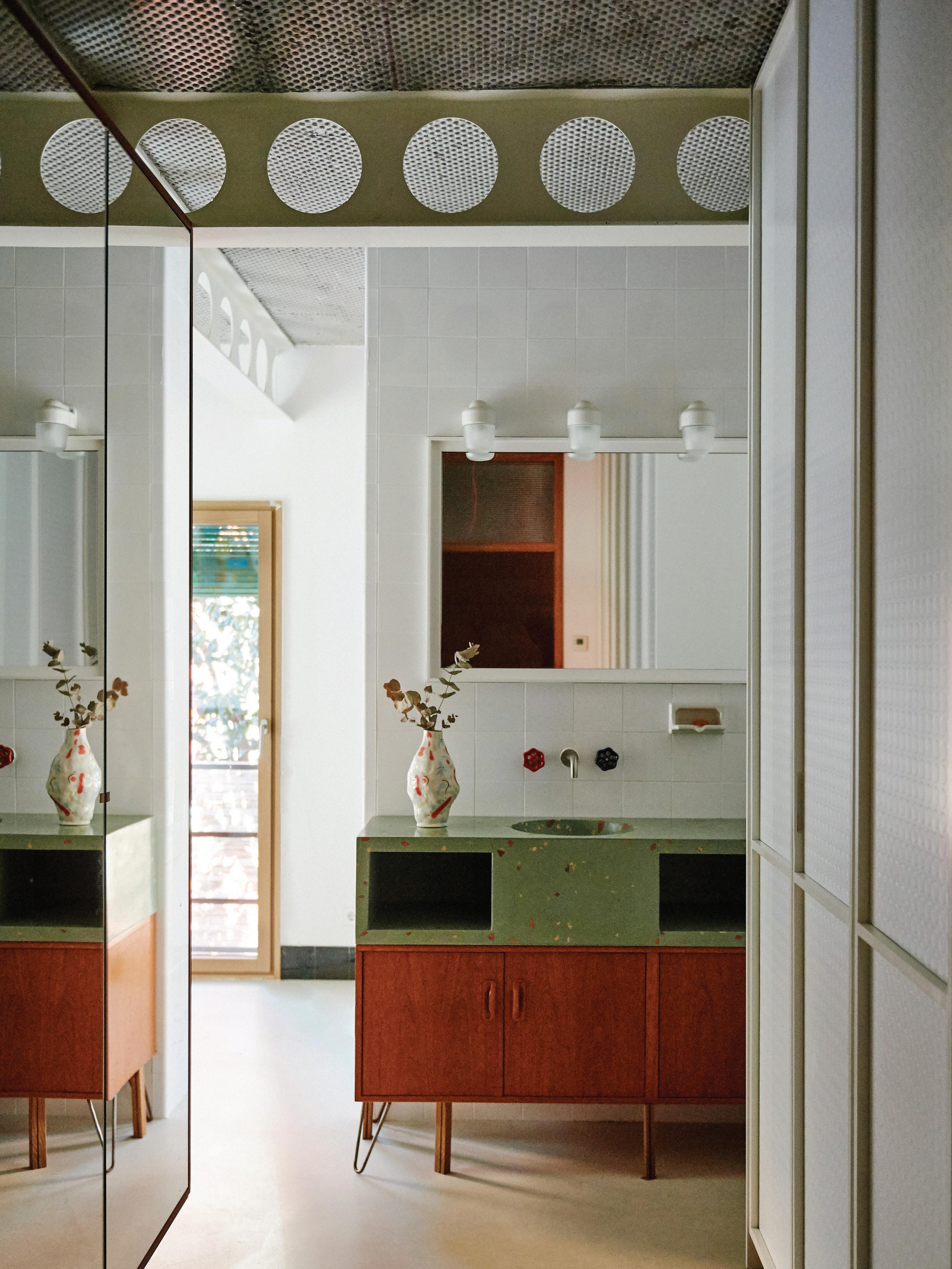
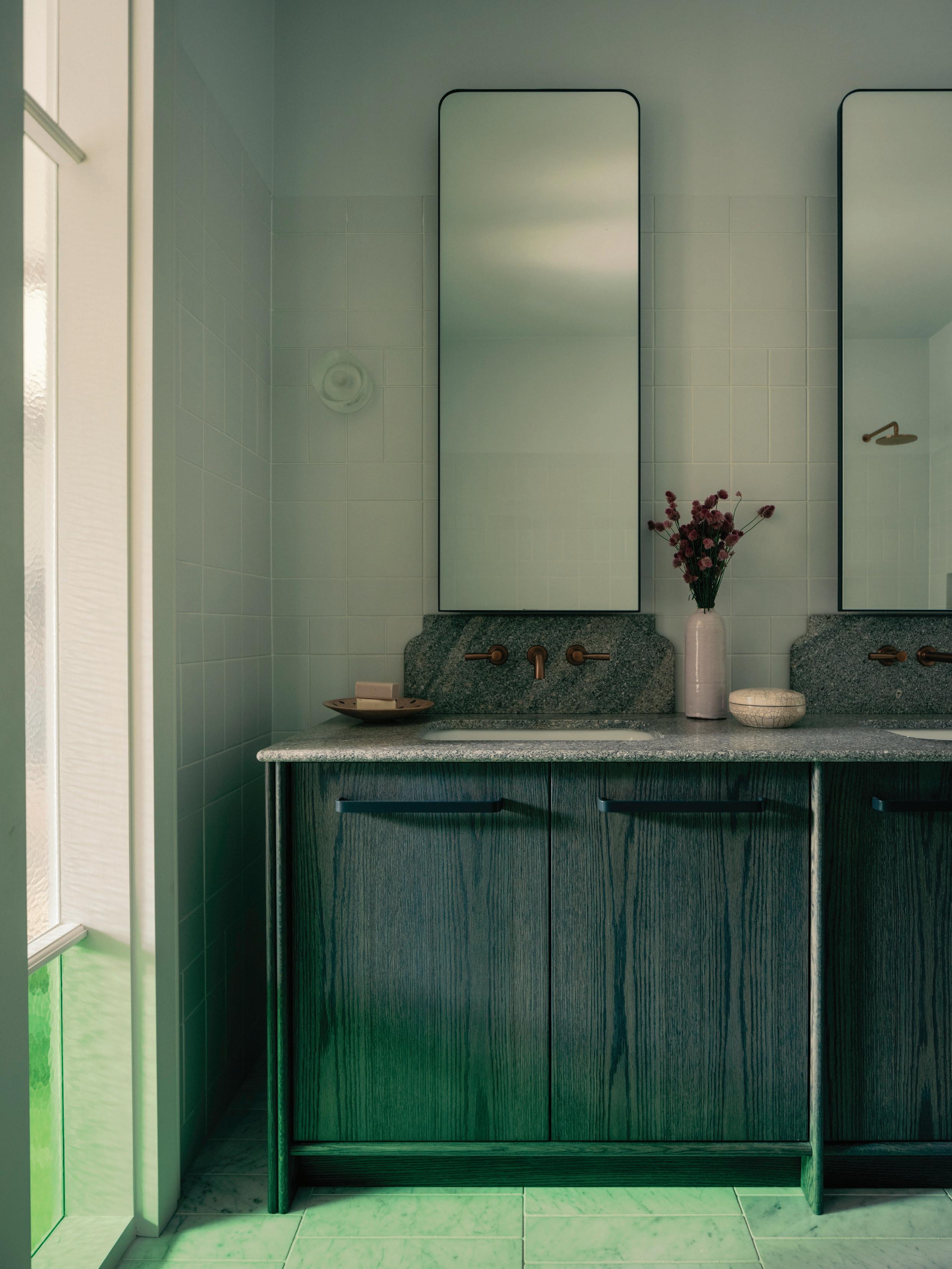
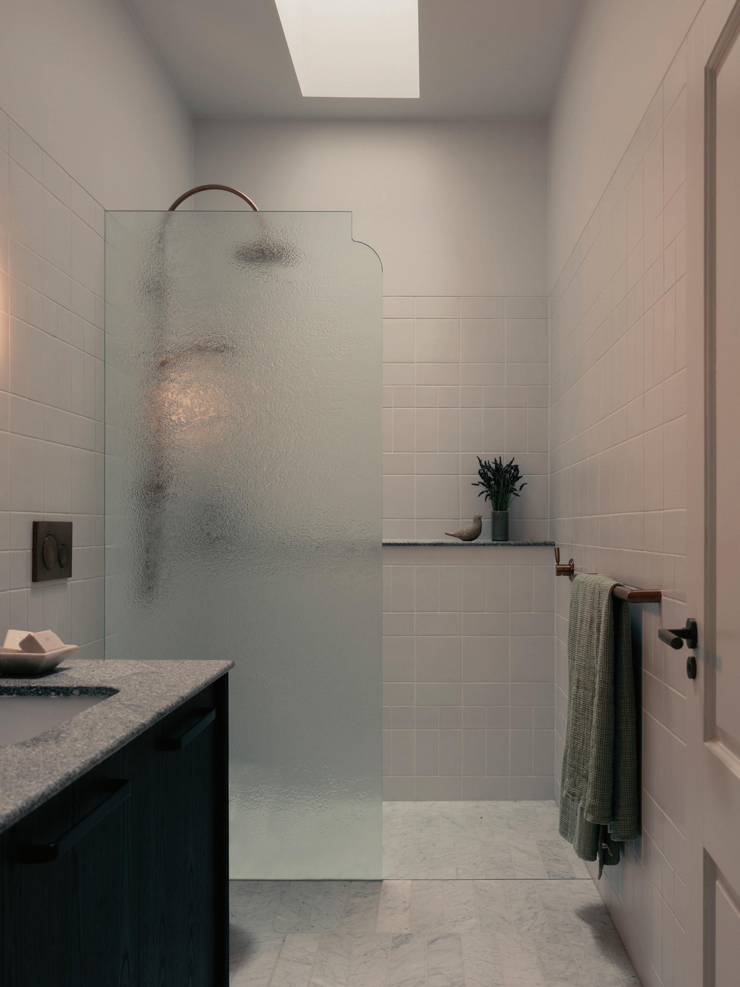
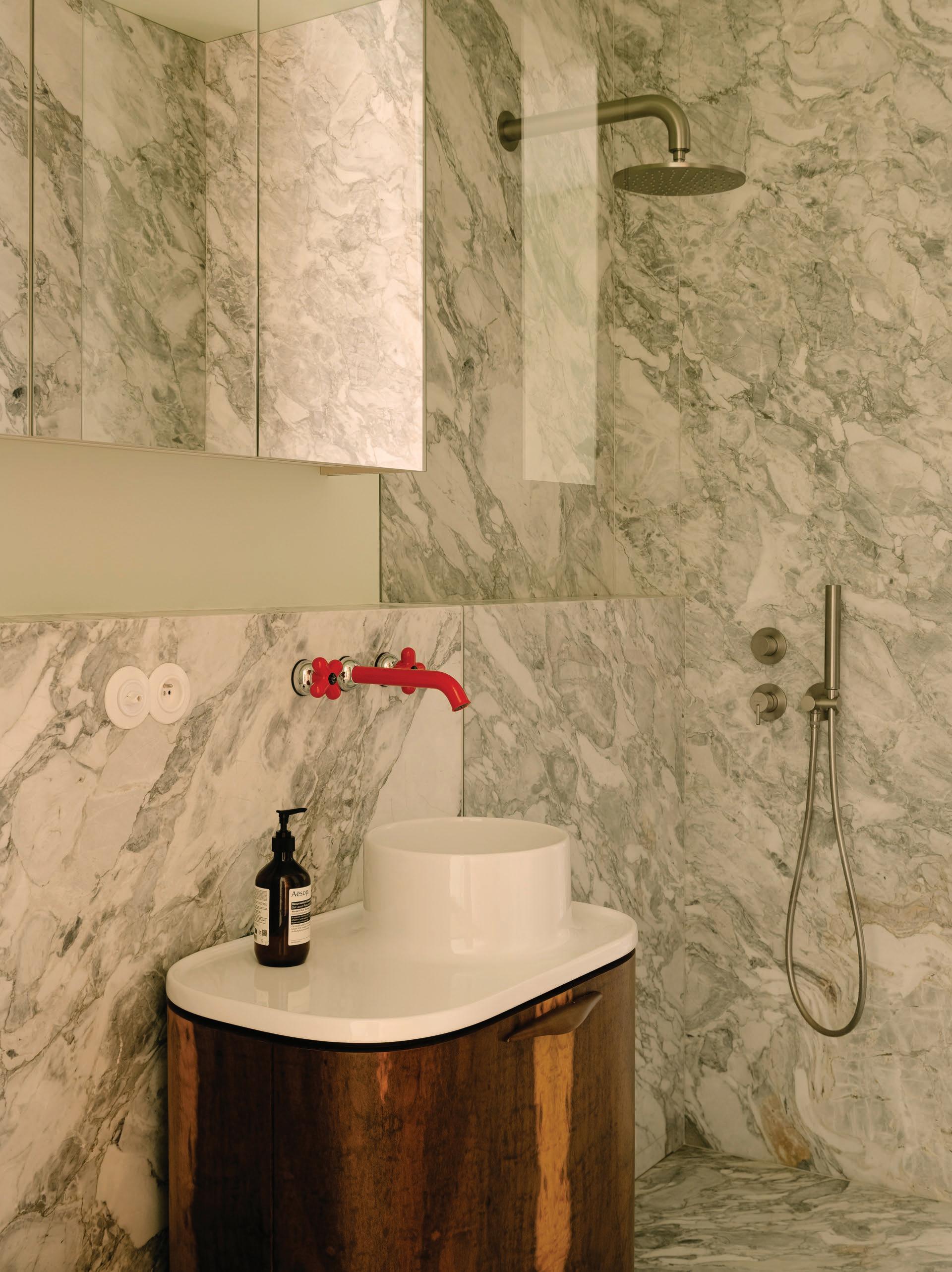
This page: In the bedroom, the painting by Cayetana H. Cuyas hangs above a bed made by Garcia-Conde’s father. Opposite page: In the bathroom, a HAY vase sits atop a G-Plan cabinet and countertop with Huguet Mallorca terrazzo basins.
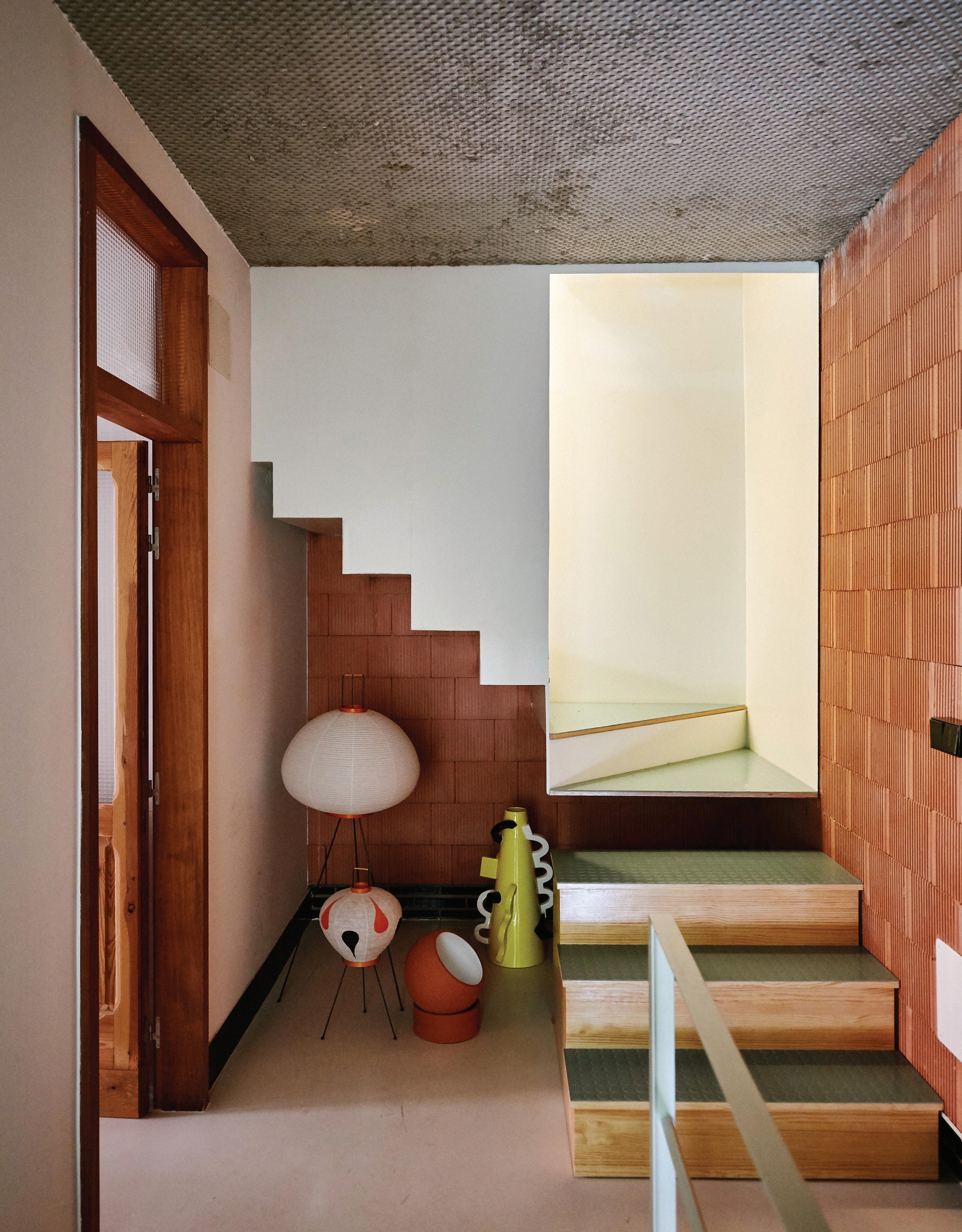
A cluster of objects, including Noguchi lamps, makes an interesting vignette in the entry. The back elevation combines graffiti by Twee Muizen with San Pedro thermo-clay bricks and metal sheeting.
Experience it
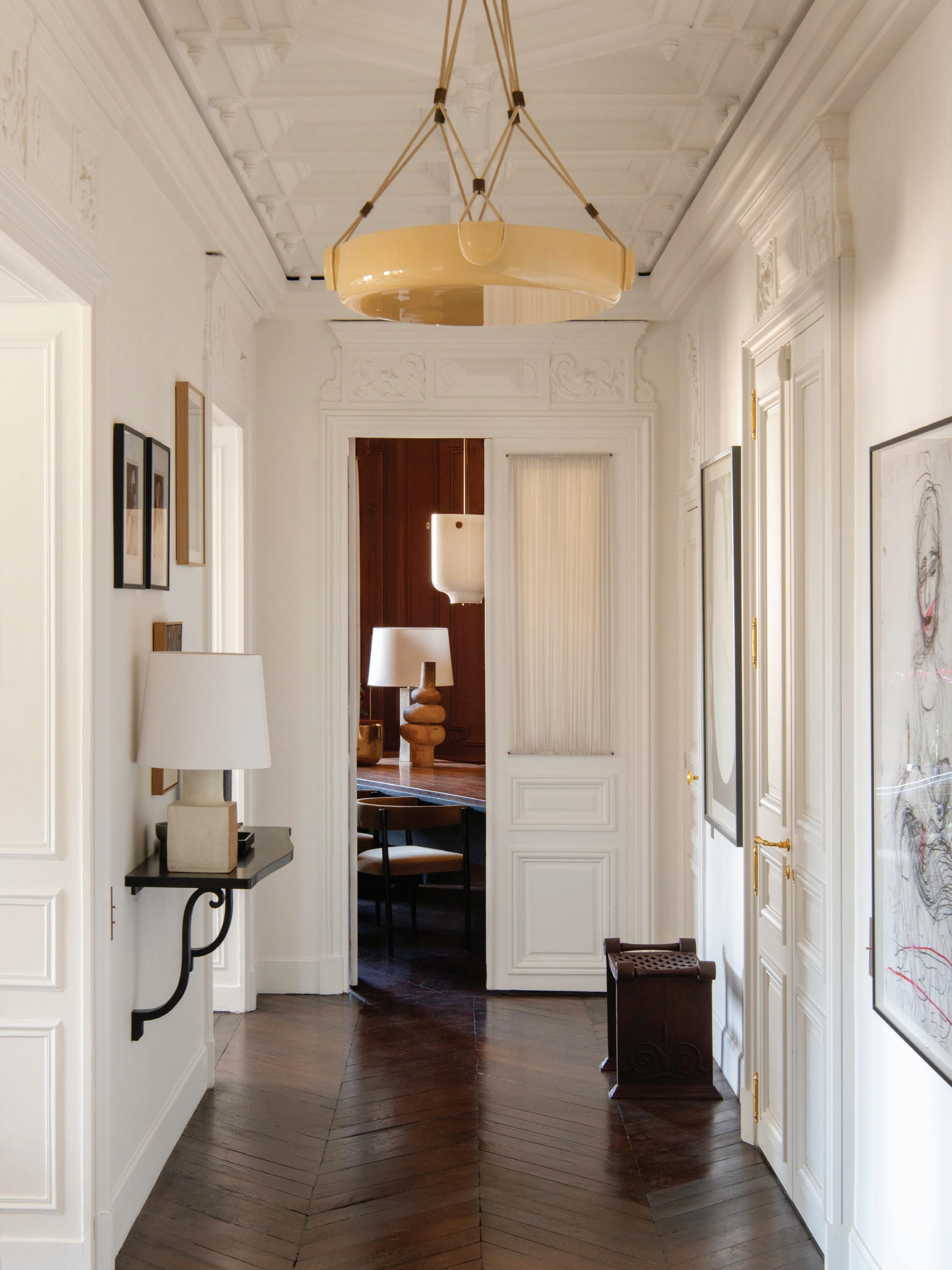
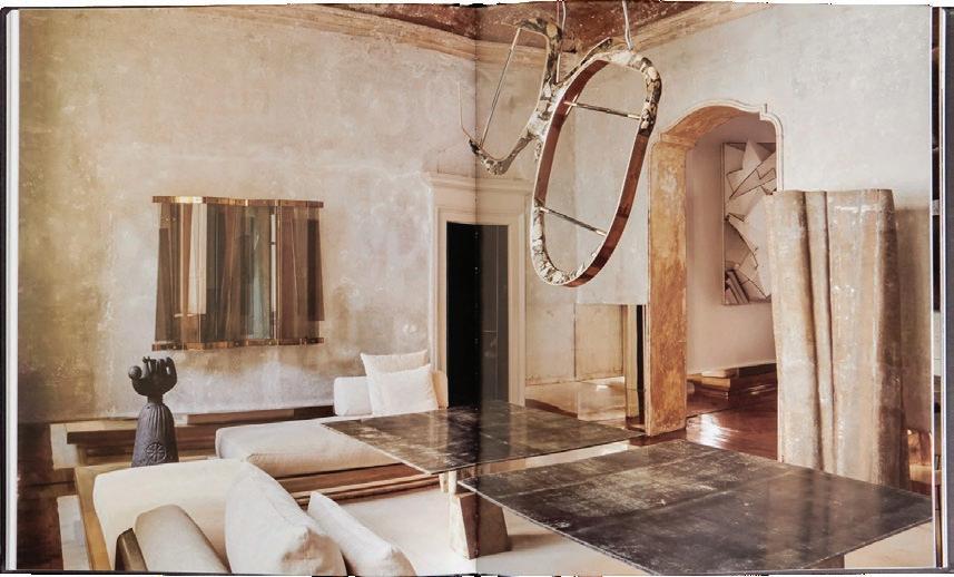
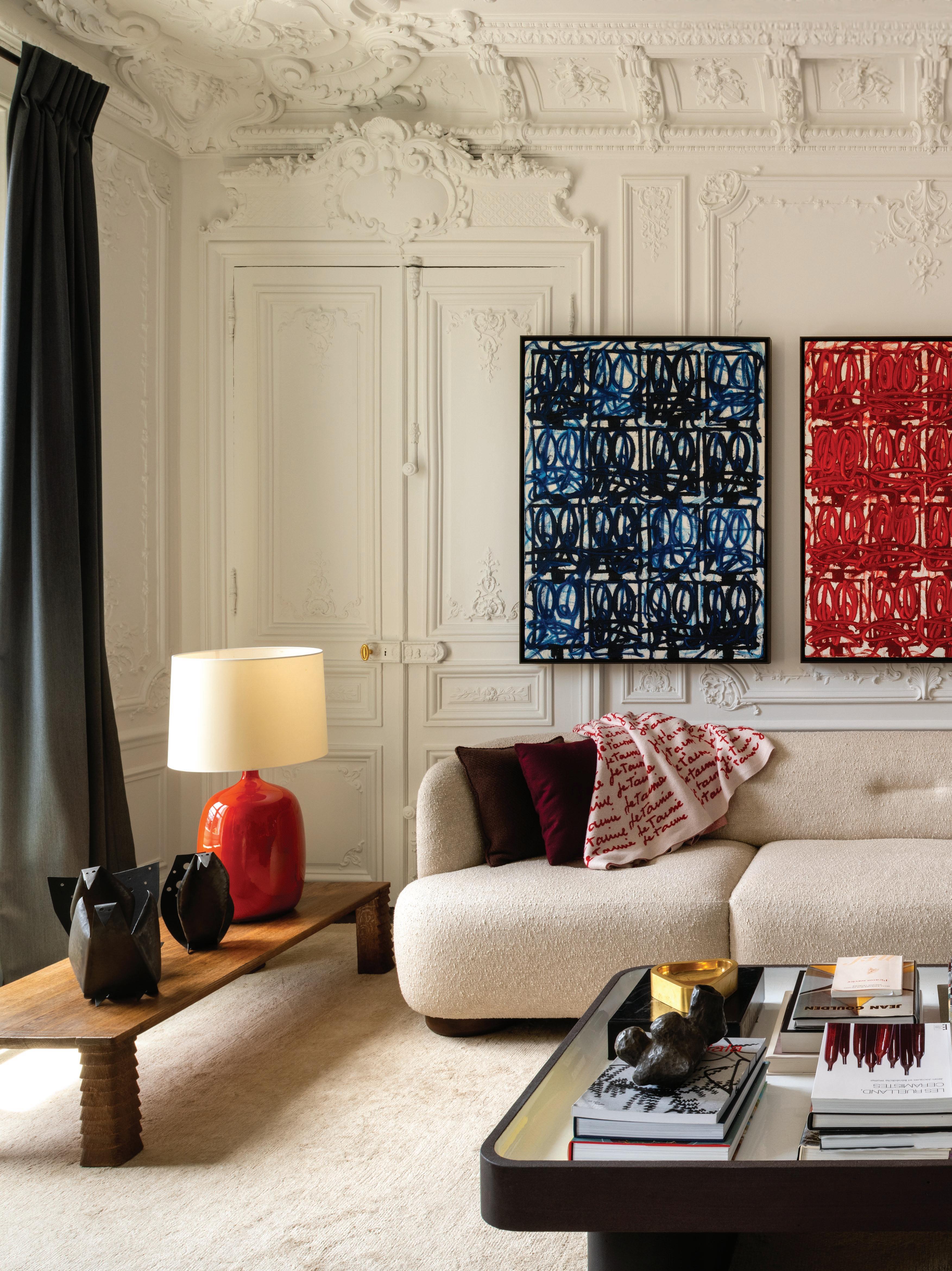
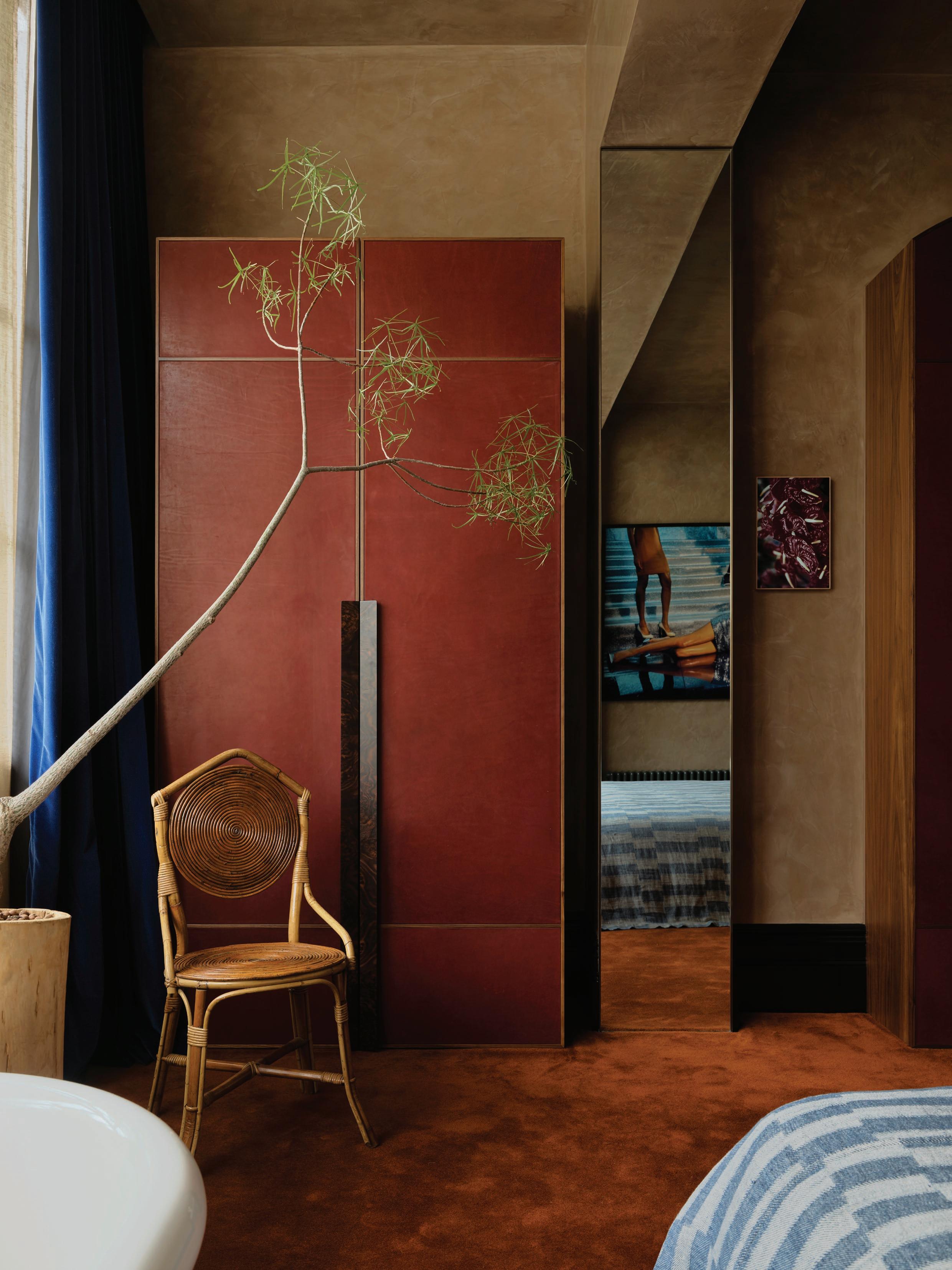
LOCATION Paris, France ARCHITECTURE Laplace
PHOTOGRAPHY Ambroise Tézenas INTERVIEW
Alexia Petsinis
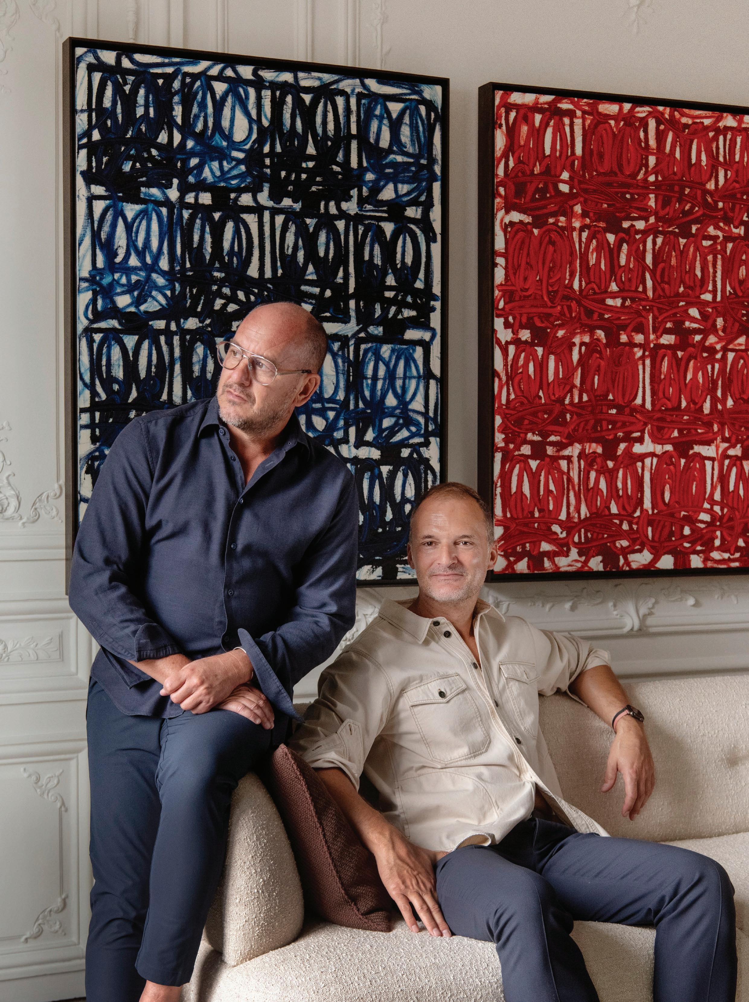
Pictured: Luis Laplace and Christophe Comoy
Respect for heritage and irreverent creativity mingle inside this restored 19thcentury Paris apartment.
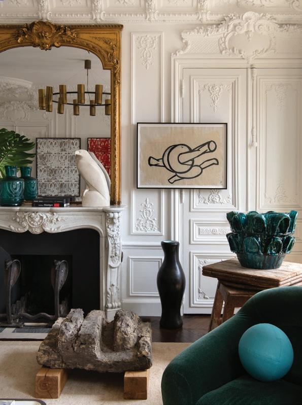
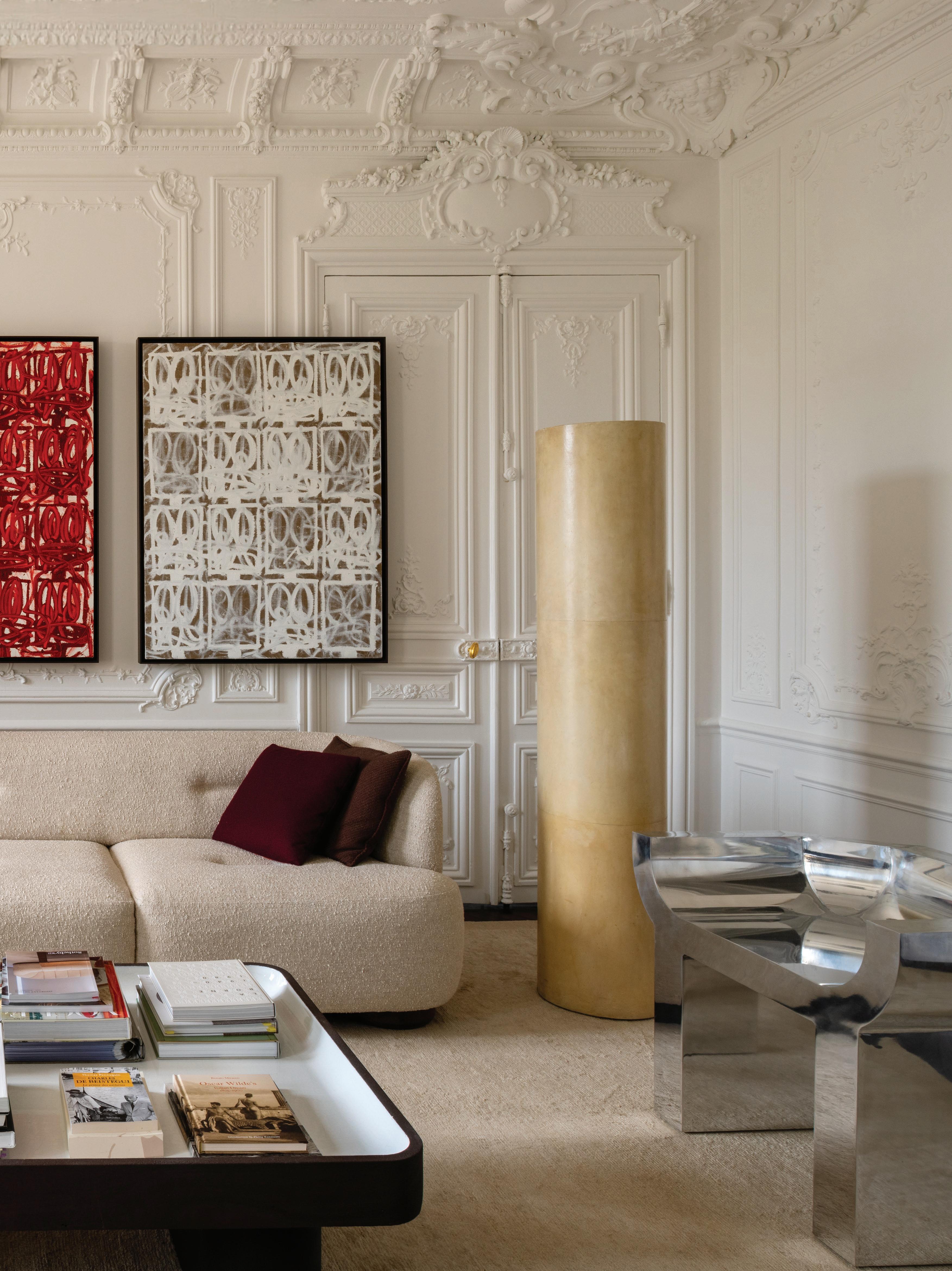
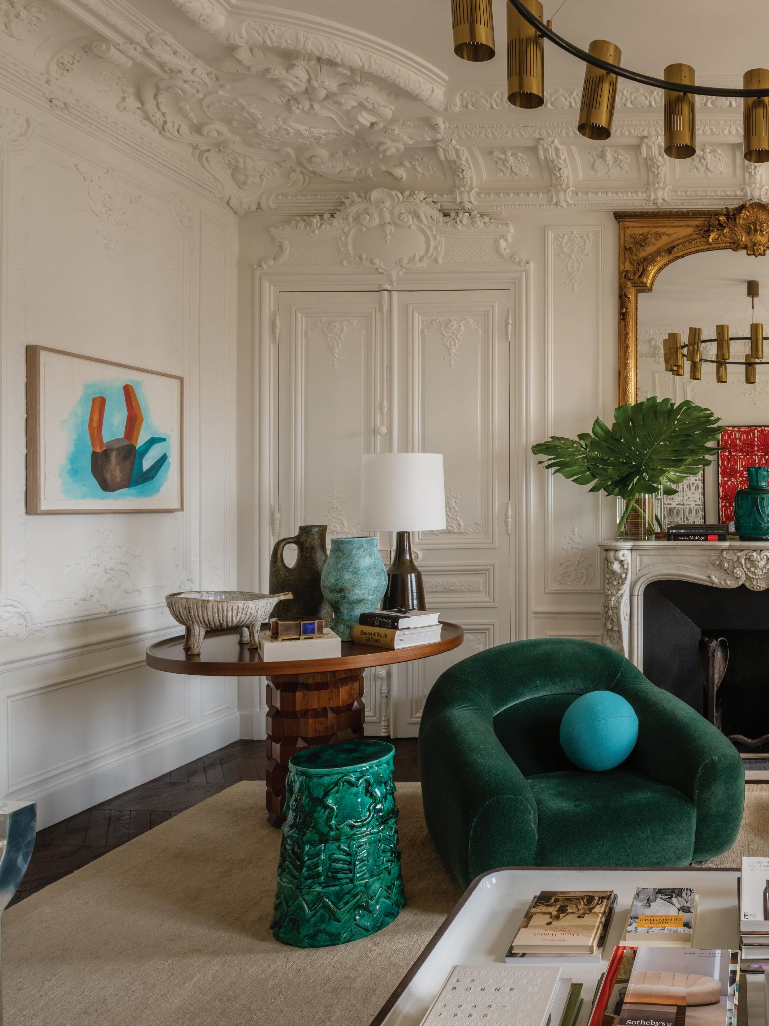
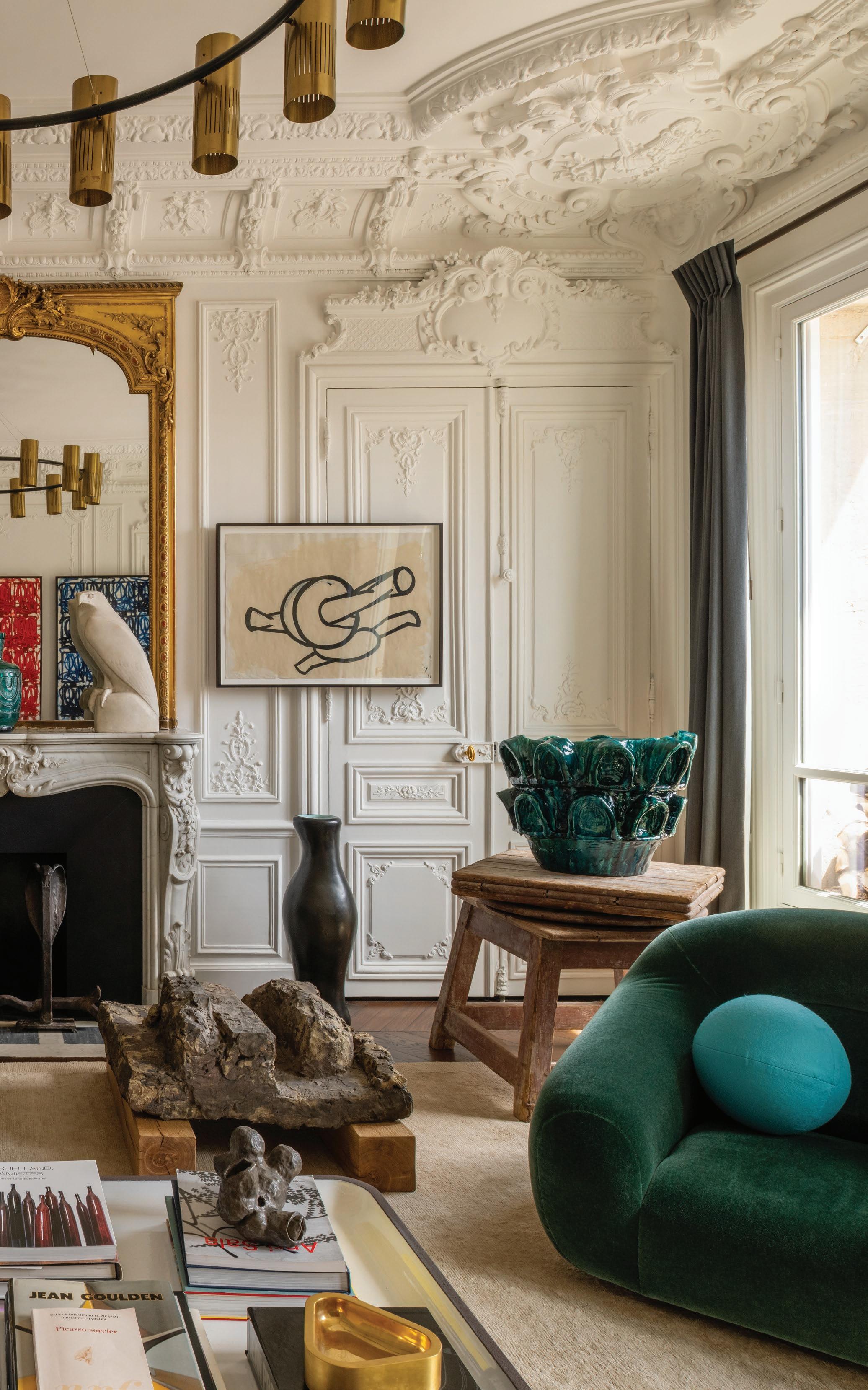
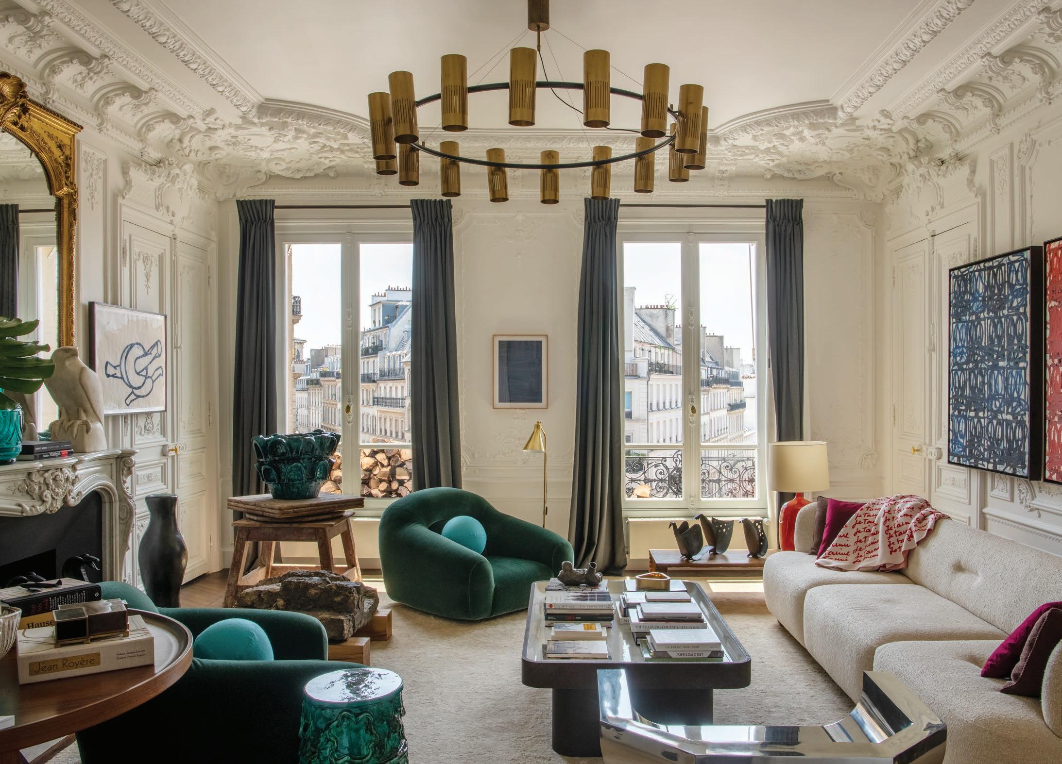
A touch of eccentricity is the natural order inside the private apartment of architect Luis Laplace and his partner Christophe Comoy, co-founders of the international architecture firm Laplace. Following a years-long renovation process, the Haussmannian residence in Paris’s Place Saint-Georges reimagines heritage through unapologetic texture, décor and ornamentation. Despite being a trove of collectable art and design, Laplace and Comoy maintain that their home is, above all, to be lived in casually and comfortably.
From an architectural perspective, how did you achieve an “eclectic heritage revival” in this project?
Luis Laplace: We approached it as a dialogue with history. The Haussmannian structure, with its high ceilings and mouldings, was never meant to be concealed. Rather, we adapted the flow by closing some of the enfilade doors to create a sense of intimacy and give each room its own character. It remains a 19th-century apartment, but one that accommodates the way we live today.
How do you describe the personality of your home?
Christophe Comoy: The apartment has a strong presence, but it is also generous. The architecture is expressive, and we have allowed it to remain so. We simply introduced pieces that feel like companions—a Jean-Michel Frank cocktail table and the Jacques Adnet light that once belonged to Andy Warhol, alongside bespoke pieces we created, such as our sofa and a coffee table in lava stone. Together, they form an atmosphere that is elegant, a little eccentric and always alive.
From a decorative and stylistic perspective, how is the evolution of heritage expressed?
Luis Laplace: Through layers. We live with antiques and vintage pieces, such as a 1940s Georges Jouve vase and an Armand-Albert Rateau chandelier with a remarkable history, alongside contemporary works, including a custom-designed marble dining table and a Rashid Johnson triptych. These juxtapositions do not compete—they converse. That is what gives the apartment its coherence, even when it brings together very different eras.
A triptych from Untitled Anxious Red Drawings by Rashid Johnson hangs above the custom sofa. A vintage oak table by Jean-Michel Frank and a lava stone cocktail table by Laplace sit beneath a 1950s lacquered metal and brass light fixture sourced from Sweden. Opposite, a pair of 1970s Emilio Guarnacci armchairs from Laplace Antiques sit alongside a tall 1940s ceramic vase by Georges Jouve, positioned under a painting by Phyllida Barlow. On the mantel, above a pair of 1920s Cobra Andirons by Edgar Brandt, rest a Daum vase and a plaster eagle by Marcel Lémar, both dating to the 1930s.
How is a sense of eccentricity expressed through the assortment of design objects and artworks curated across the spaces?
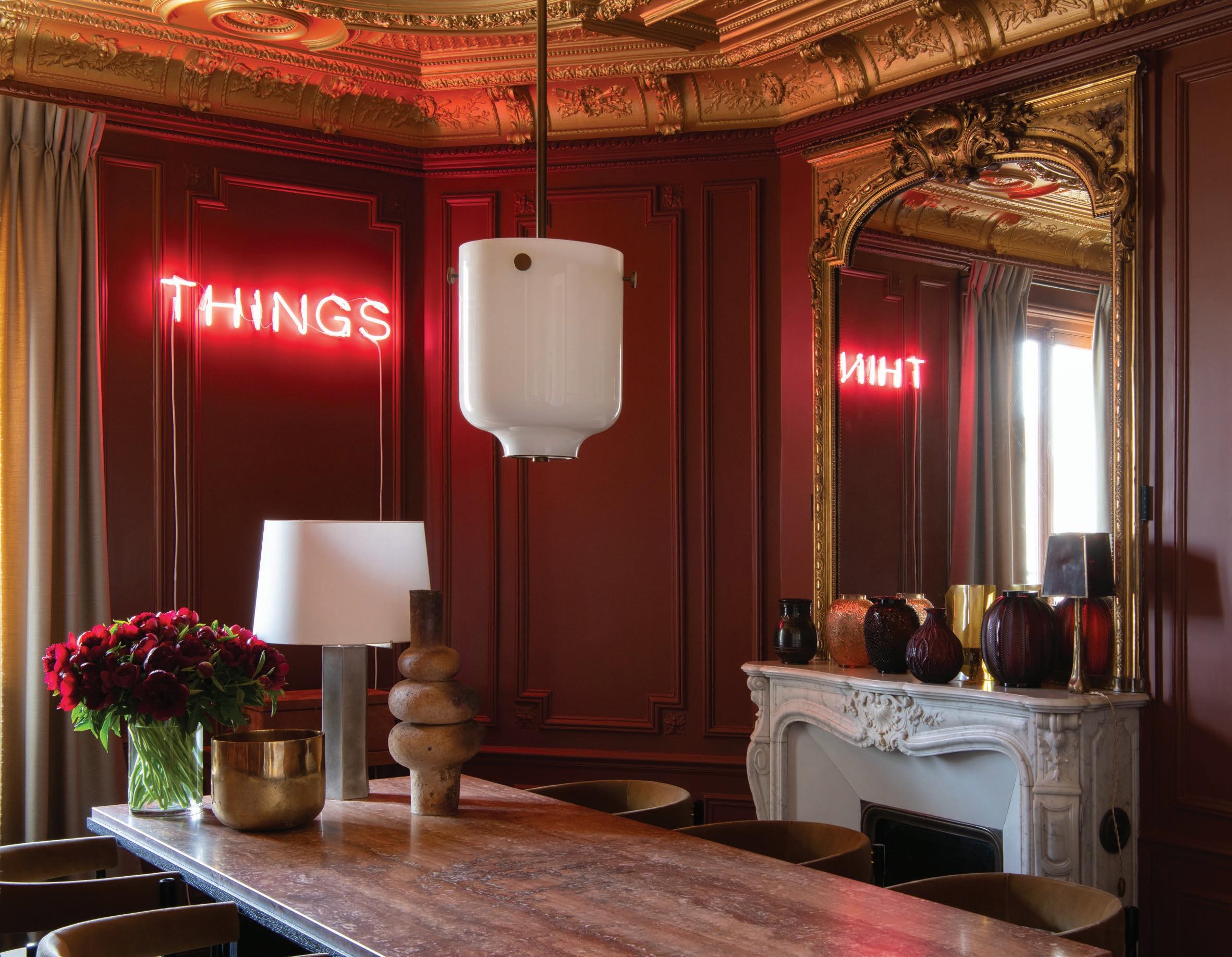
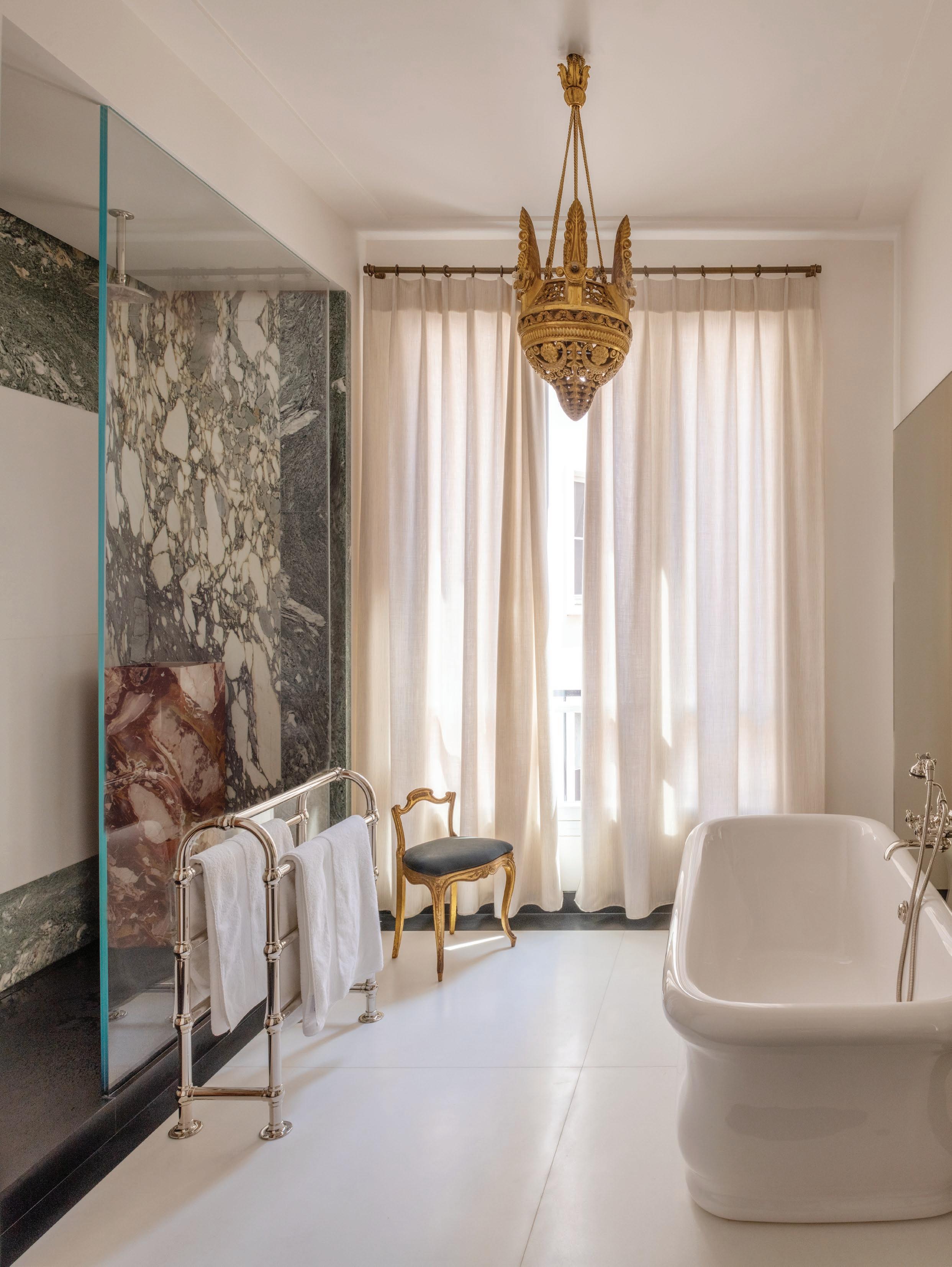
Christophe Comoy: Eccentricity arises naturally when objects have strong personalities. In the dining room, for example, a flashing pink neon work by Martin Creed illuminates a red marble table of our own design. In the bathroom, there is a chandelier by Armand-Albert Rateau, first created for Jeanne Lanvin and later owned by Karl Lagerfeld. These objects have stories. Placing them in everyday life gives the spaces a sense of freedom, even of humour.
What role do materiality and texture play in defining the apartment’s various spaces?
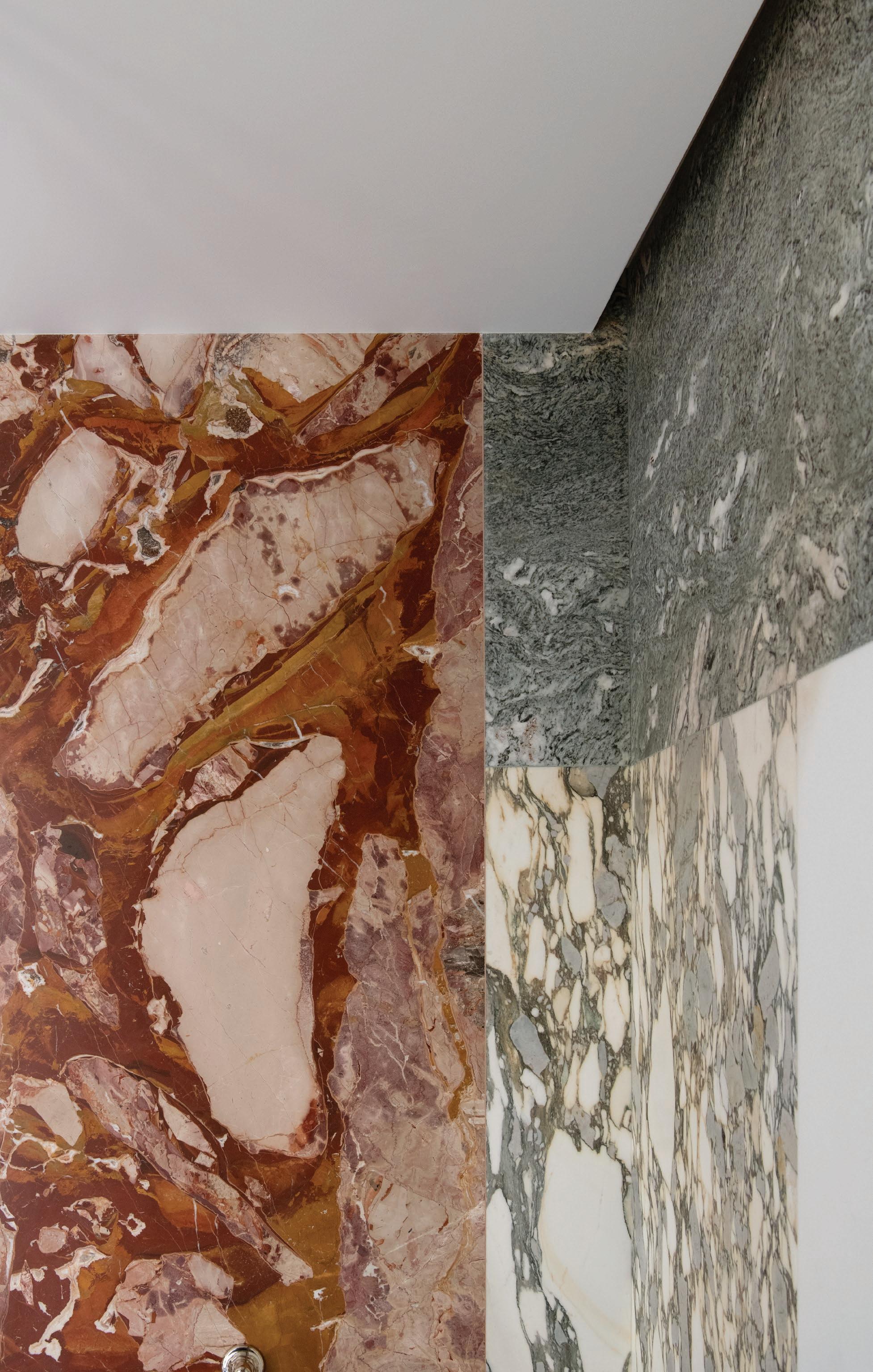
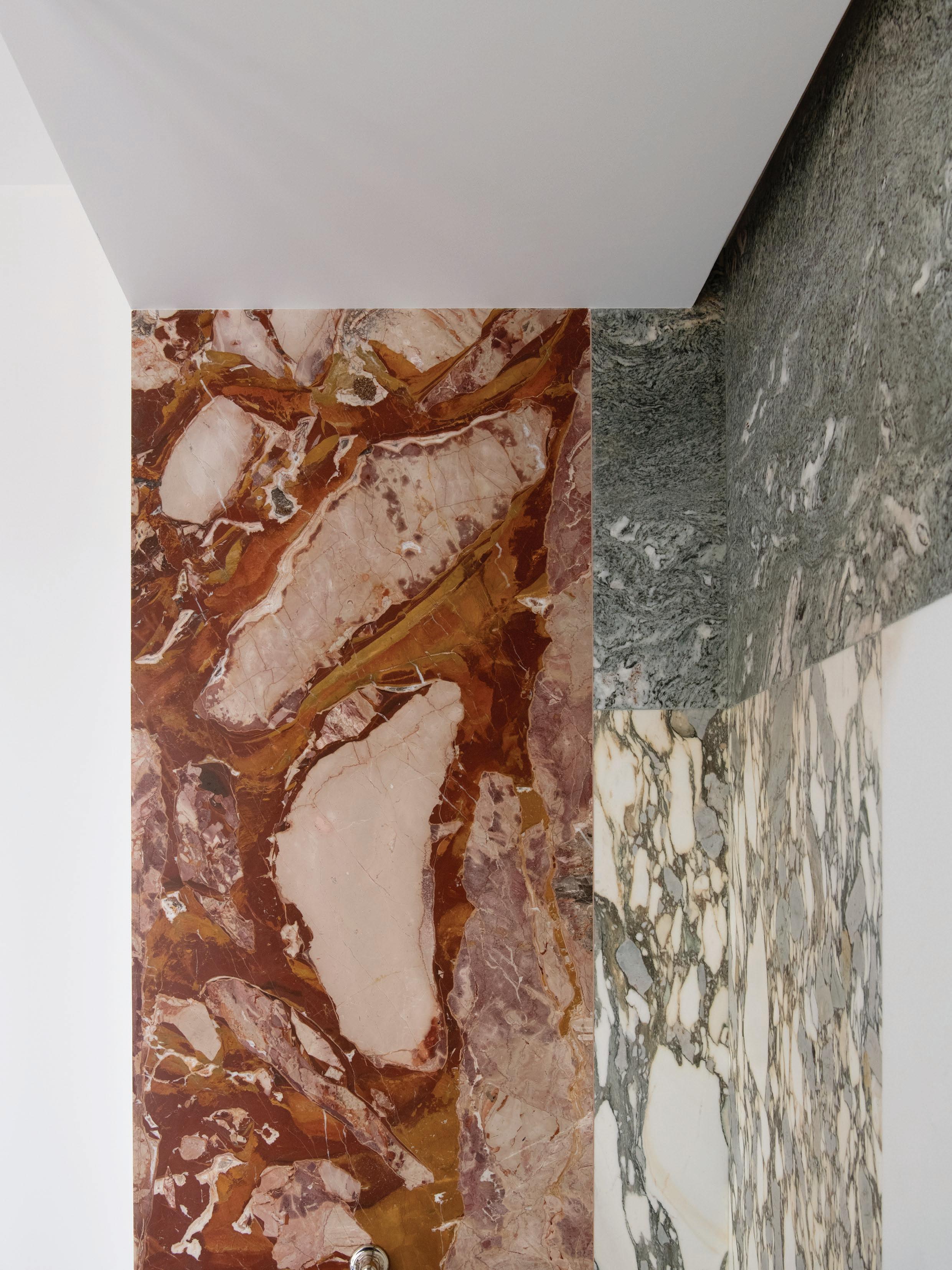
Christophe Comoy: Texture makes the apartment human. A patchwork of marbles in the bathroom, Pierre Frey velvet on 1960s chairs, glazed ceramics on the floor, wool curtains. It is these tactile layers that bring the spaces to life—inviting people to touch, sit and feel at ease.
You often collaborate with artists in your projects. How do these collaborations influence the creative process and its outcomes?
Luis Laplace: Collaborating with artists is at the heart of our work. These exchanges bring new perspectives and often compel us to see space differently, not only as architects but as storytellers. Artists challenge conventions and encourage us to take risks, which keeps our practice alive and evolving. The result is always richer; architecture becomes more than a backdrop—it becomes a dialogue in which the spaces and artworks resonate together, creating experiences that feel unique and authentic.
You have described the reception rooms as “almost vulgar” in their ornamentation. Do you think visitors share this perception?
Luis Laplace: The rooms are exuberant—the mouldings, the scale, the detailing are almost excessive. But instead of resisting, we embraced the exaggeration. Visitors often smile when they hear us describe them this way, because they sense the playfulness. It is not about irony, but about taking pleasure in what already exists.
“The rooms are exuberant—the mouldings, the scale, the detailing are almost excessive. But instead of resisting, we embraced the exaggeration.”
– Luis Laplace
19th-century Haussmannian structural elements, including high ceilings and mouldings, were revived during the apartment’s years-long renovation, as Laplace and Comoy have ensured the home is still in “dialogue with history”. Next to the custom Laplace sofa sits an aluminium Curial chair by Rick Owens and a 1934 Jacques Adnet column light, which once held pride of place in Andy Warhol’s Left Bank Paris home.
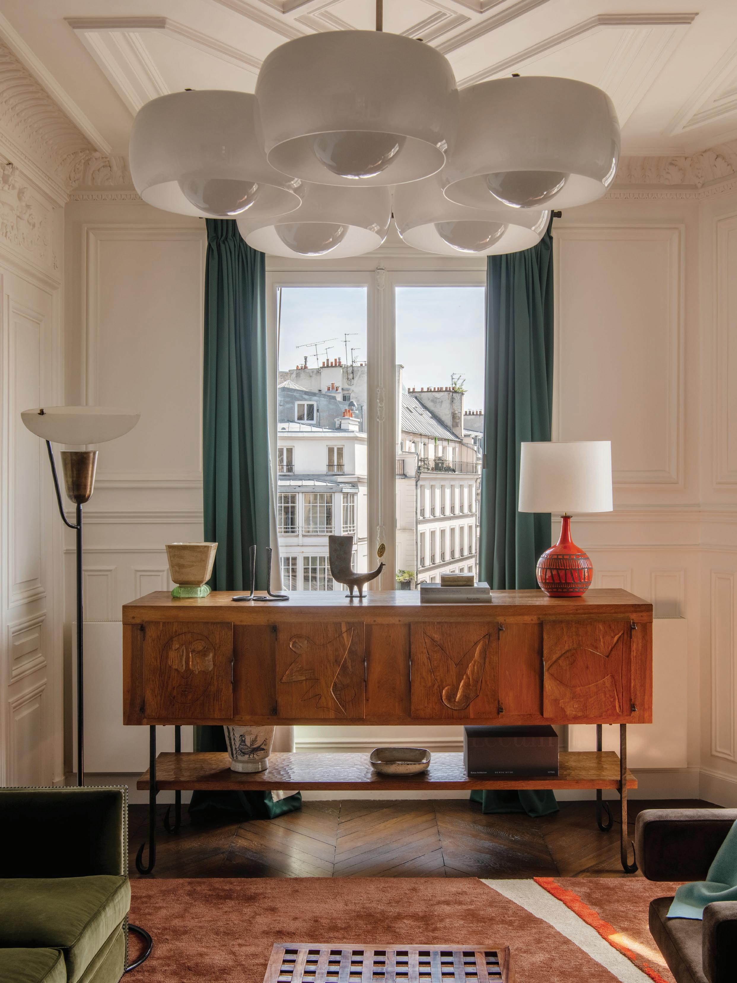
This page: In the study, a 1950s Jean Touret carved oak sideboard sits alongside a 1955 Mathieu Matégot floor lamp, while a 1967 Vico Magistretti Pentaclinio hanging light illuminates the space. Opposite page: The dining room showcases a red marble dining table designed by Laplace and Comoy, complemented by a flashing pink neon work by Martin Creed. A set of vintage 1960s chairs, re-upholstered in a Pierre Frey velvet, surround the table.
What do you consider to be the most surprising or revelatory element in your home?
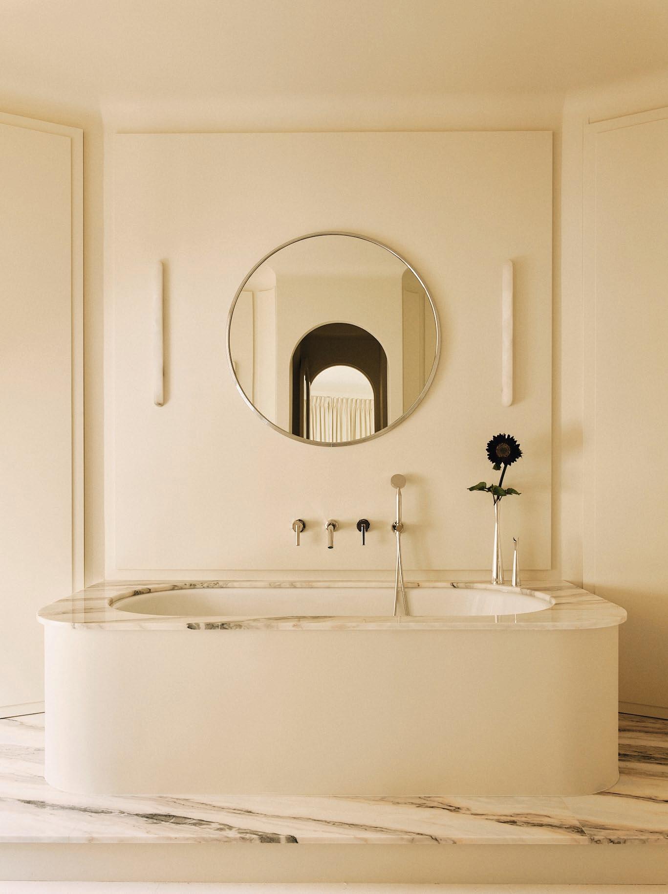
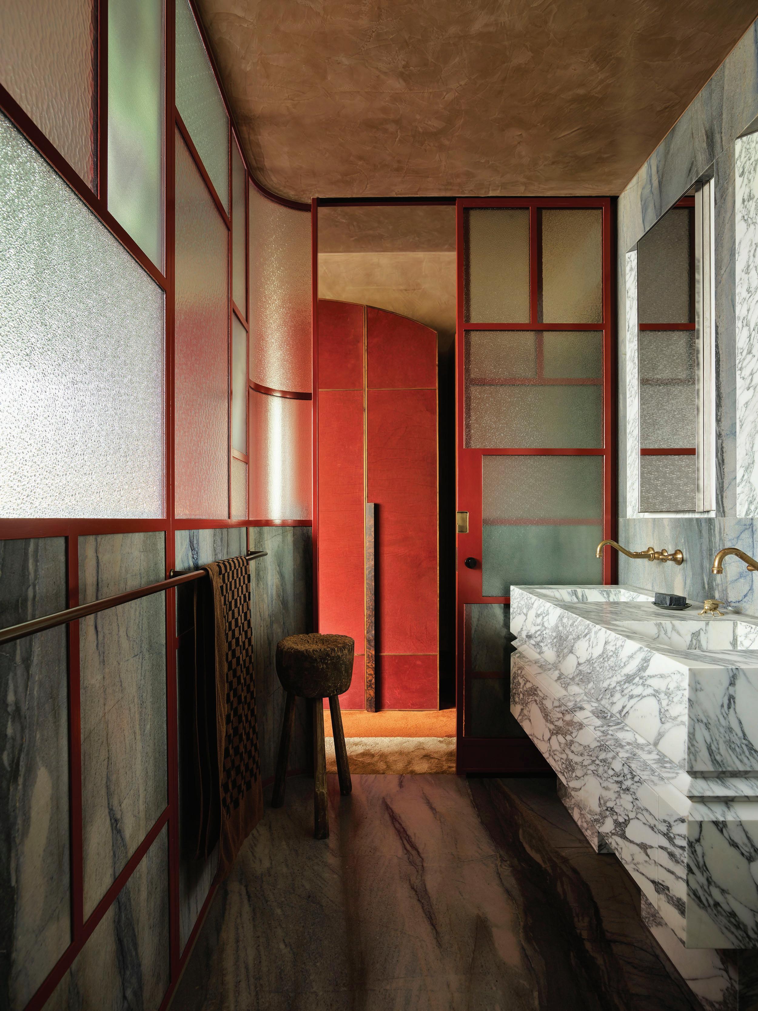
Luis Laplace: Perhaps the bathroom. People expect something discreet, but instead they find a Mondrian-like marble shower and the extraordinary Rateau chandelier. It is extravagant, yes, but also deeply personal. For us, it is a room of joy. You have previously described living with objects as being “surrounded by friends”. If you had to leave your home suddenly and could take only one object with you, which would it be and why?
Luis Laplace: I would take the small Sainte-Thérèse statue my mother gave me before I left Argentina. It has followed me everywhere.
Christophe Comoy: I would bring the Rateau chandelier, because it embodies the spirit of collecting—its history is remarkable. Together, we would choose one of Phyllida Barlow’s drawings, because it represents both friendship and artistic dialogue.
In what ways does the apartment reflect your identity as people, and not just as designers?
Christophe Comoy: It reflects our contradictions—we are rigorous and respectful of heritage, yet we also love to be irreverent and curious. It shows our friendships, our travels and the things we fall in love with. It is not a project—it is our daily life, shaped over time.
Despite its elaborate ornamentation, how have you made this residence feel like a home, and not a museum or gallery?
Luis Laplace: By living with everything casually. Ceramics and books often sit on the floor, art is hung in unconventional ways, and sofas are made to be used. Nothing is staged. The apartment may be filled with objects of value, but they are part of our everyday gestures. That is what makes it a home.
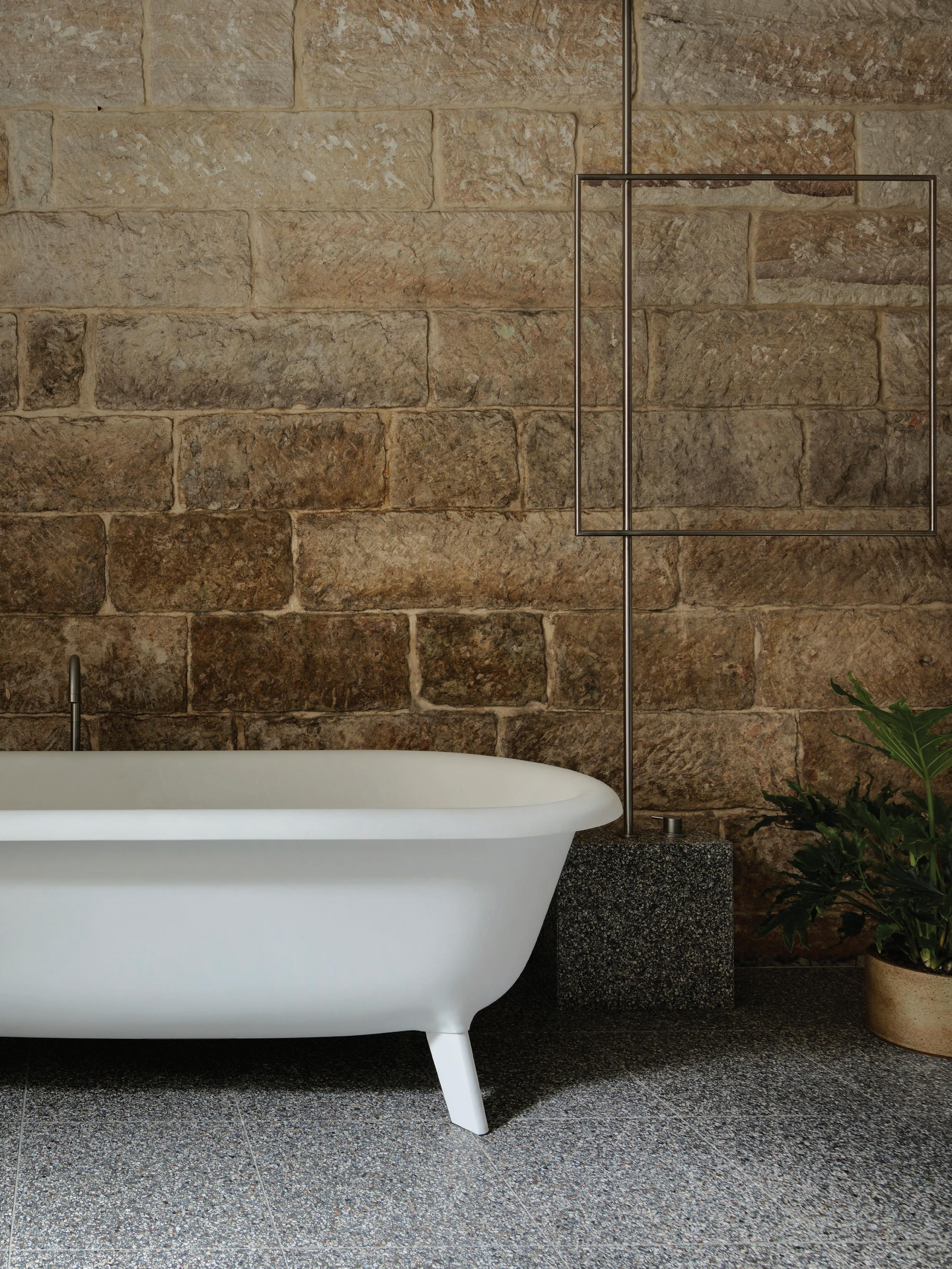
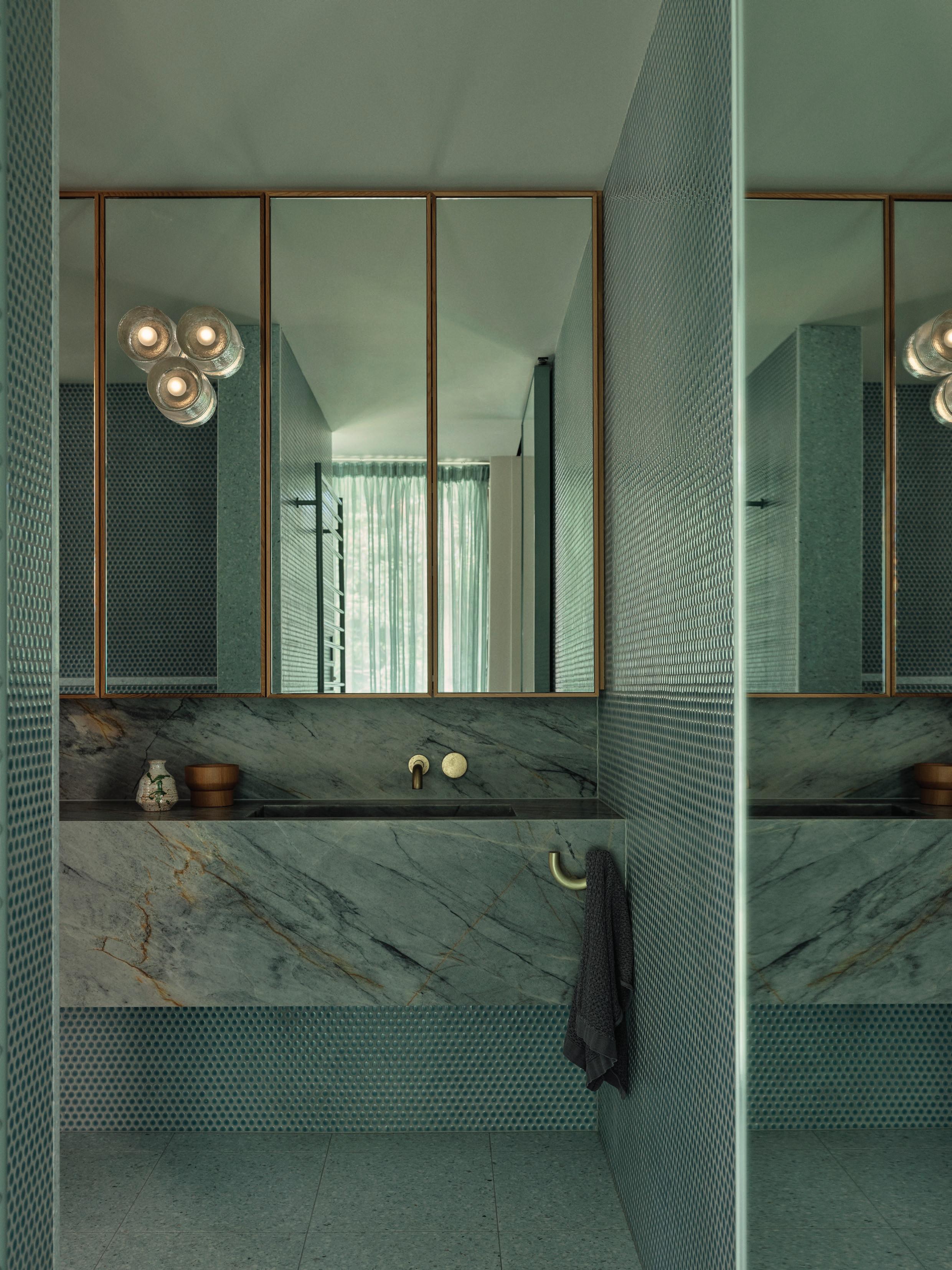
This page: A custom bed sits in the centre of the bedroom, with a series of pieces by Phyllida Barlow hanging beside a 1950s Fulvio Bianconi floor lamp for Venini. Above, a 1960s Vico Magistretti ceiling light illuminates the space. Following spread: In the bathroom, a 1925 Armand-Albert Rateau giltwood pendant light, originally created for Jeanne Lanvin and later owned by Karl Lagerfeld, hangs in the centre of the room. Below, a bathtub by The Water Monopoly with Volevatch fittings sits opposite a bespoke patchwork marble-clad shower designed by Laplace in ‘Mondrian style’.
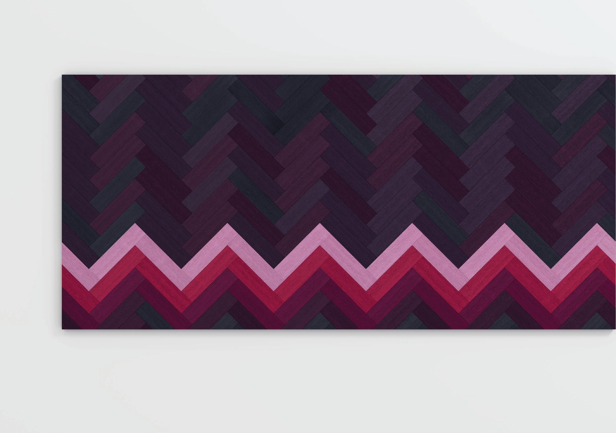
Tongue & Groove’s Wall to Wall collection turns European oak flooring into a playful, modular canvas, where colour, pattern and form shape the mood of a space. Crafted with hand-stained panels in 22 shades, it invites designers to experiment and create floors that are as sculptural as they are functional.
REIMAGINING HERRINGBONE
Wall to Wall by Raw Edges for Tongue & Groove x Established & Sons
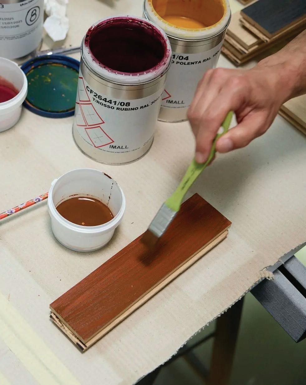
Australia’s leading producer of European oak flooring, Tongue & Groove, presents the second collaboration in its Co.Lab series: Wall to Wall. Developed with London-based design studio Raw Edges and British design brand Established & Sons, the collection transforms traditional herringbone parquet into a canvas for colour, pattern, and craftsmanship.
Launched in March 2025, Tongue & Groove’s Co.Lab series provides a platform where precision craftsmanship meets the artistry of leading creatives, rethinking timber flooring not just as a surface but as a defining element of space. Following the inaugural Bosco Collection by Australian designer Greg Natale, the series continues to explore colour, pattern and form as tools for transformation.
“It’s about pushing the boundaries of what flooring can be and giving visionary talents a platform to bring their artistry to life,” CEO of Tongue & Groove, Richard Karsay, says.
For its second collaboration, Wall to Wall is being introduced to the Australian market for the first time. Originally created in 2009 for Design Miami/Basel, the collection reinterprets traditional herringbone parquet as modular, hand-stained oak blocks, enabling designers to form patterns that are both functional and sculptural. Following its American debut, the collection joined long-time collaborator Established & Sons’ Signature Collection.
“The design scene in Australia is so dynamic and adventurous, and that really aligns with what Wall to Wall is about,”
Established & Sons Creative Lead Pol Mauri says. “With Wall to Wall, the only limit is your skill and imagination.”Produced in Manzano, Italy, each board is built from three layers of European oak and hand-stained in a palette of 22 colours. The hand-applied finish penetrates the timber, enhancing its natural grain while ensuring durability.
While a single shade can create a uniform look, Raw Edges encourages mixing colours to form expressive, site-specific patterns. “There was such an instant reaction to the floor when we first showed it,” co-founder Shay Alkala says. “You can use it to create a bold statement or more subtle patterns— there are so many possibilities, and that’s really exciting.” For the London-based studio, the project continues a fascination with spatial storytelling, using colour and geometry to challenge how we perceive and inhabit a space.
Wall to Wall’s seven suspended panels, on display across Tongue & Groove’s Sydney, Melbourne, and Brisbane showrooms, showcase how timber flooring can shape atmosphere, texture, and spatial rhythm—cementing this collaboration with Established & Sons and Raw Edges as one to watch.
PHOTOGRAPHY: Courtesy of Tongue & Groove
WORDS: Nicole Toma
@tonguengrooveau tongueandgroove.com.au
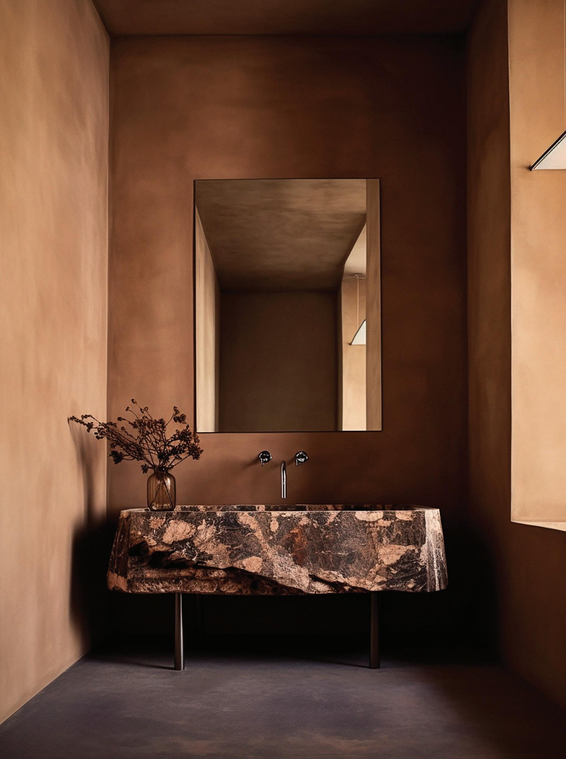
This collection of global bathrooms prove that an adventurous spirit and clever planning are the ingredients needed to elevate the bathing experience. Whether a site of ritual and soothing wind-down, or an amplified zone of sensory overload, one thing is sure: it’s time to throw out the rulebook.
WORDS Aleesha Callahan
The Bathroom Remix
PHOTOGRAPHY Alice Mesguich
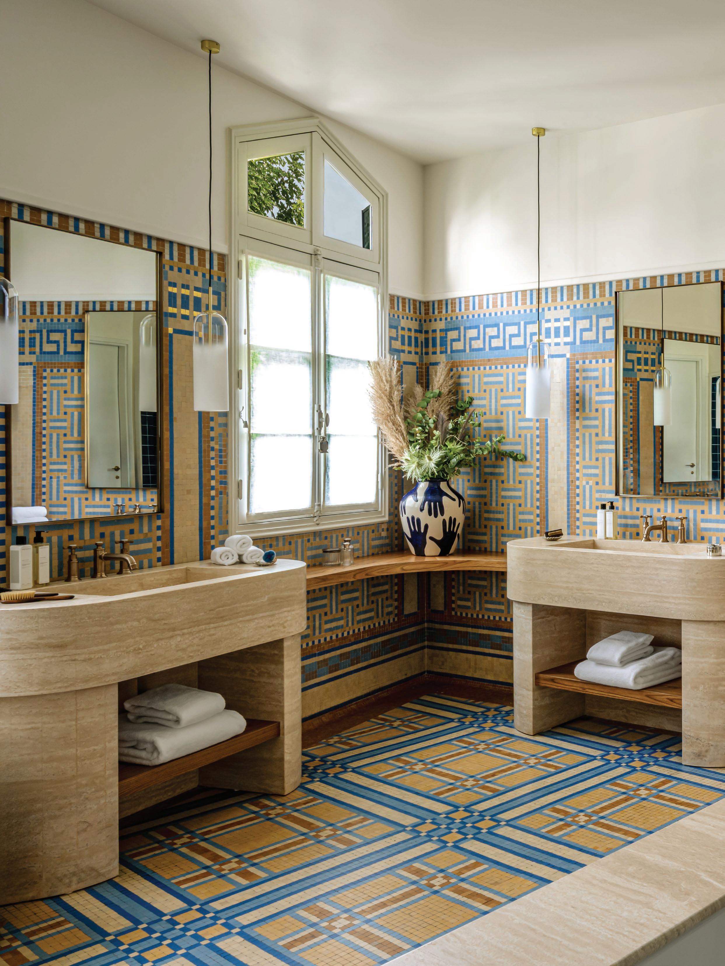
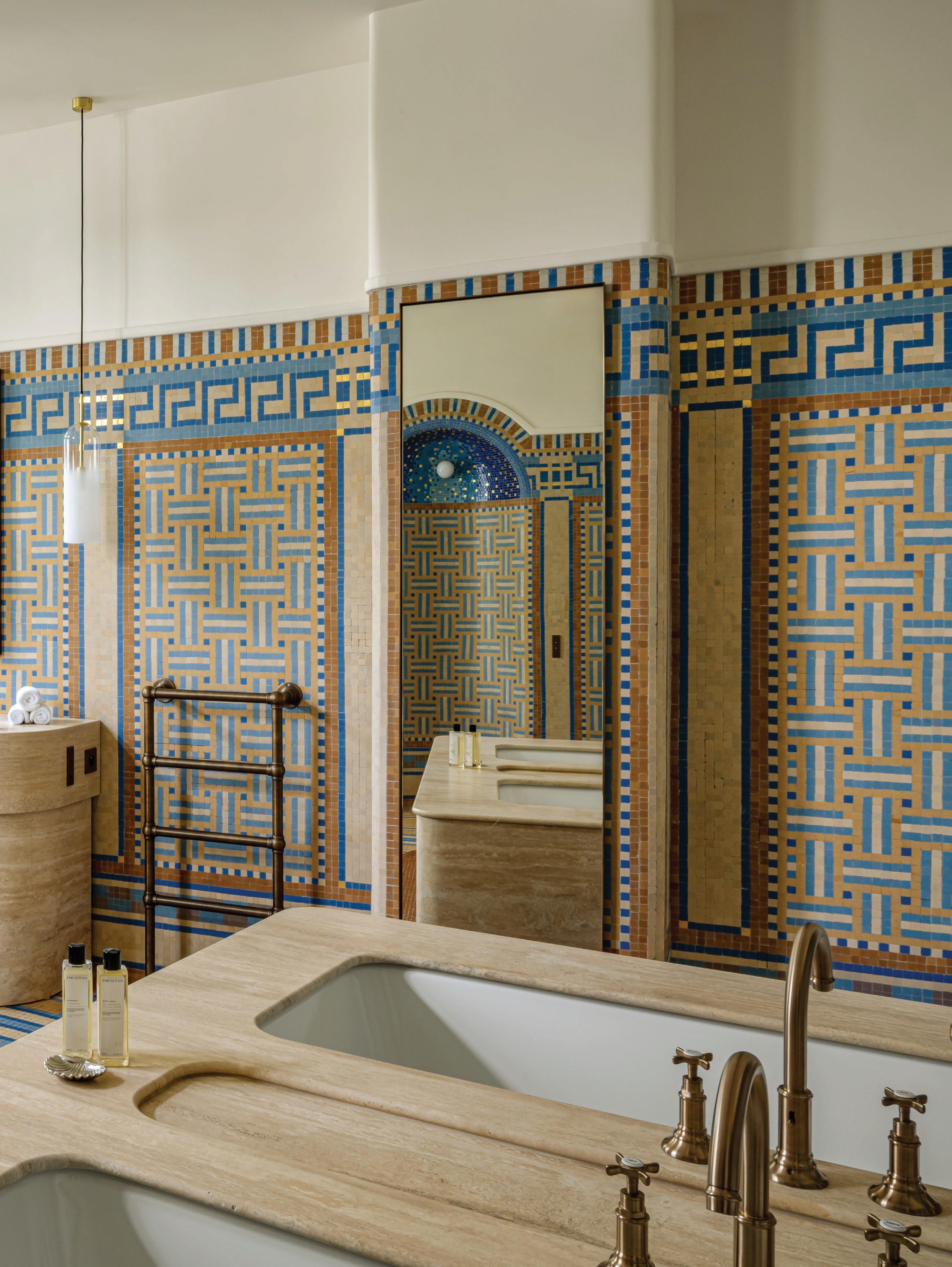
Intricately detailed and grand in scale, the original mosaics in the bathroom have been restored, with Claves introducing recessive elements such as travertine basins to allow the tiling to read as the hero. Axor tapware, Illus mirrors, and Humanhome pendants act as jewellery within the space, while a Broste Copenhagen vase and Ferm Living stool provide additional decoration.
Paris, France
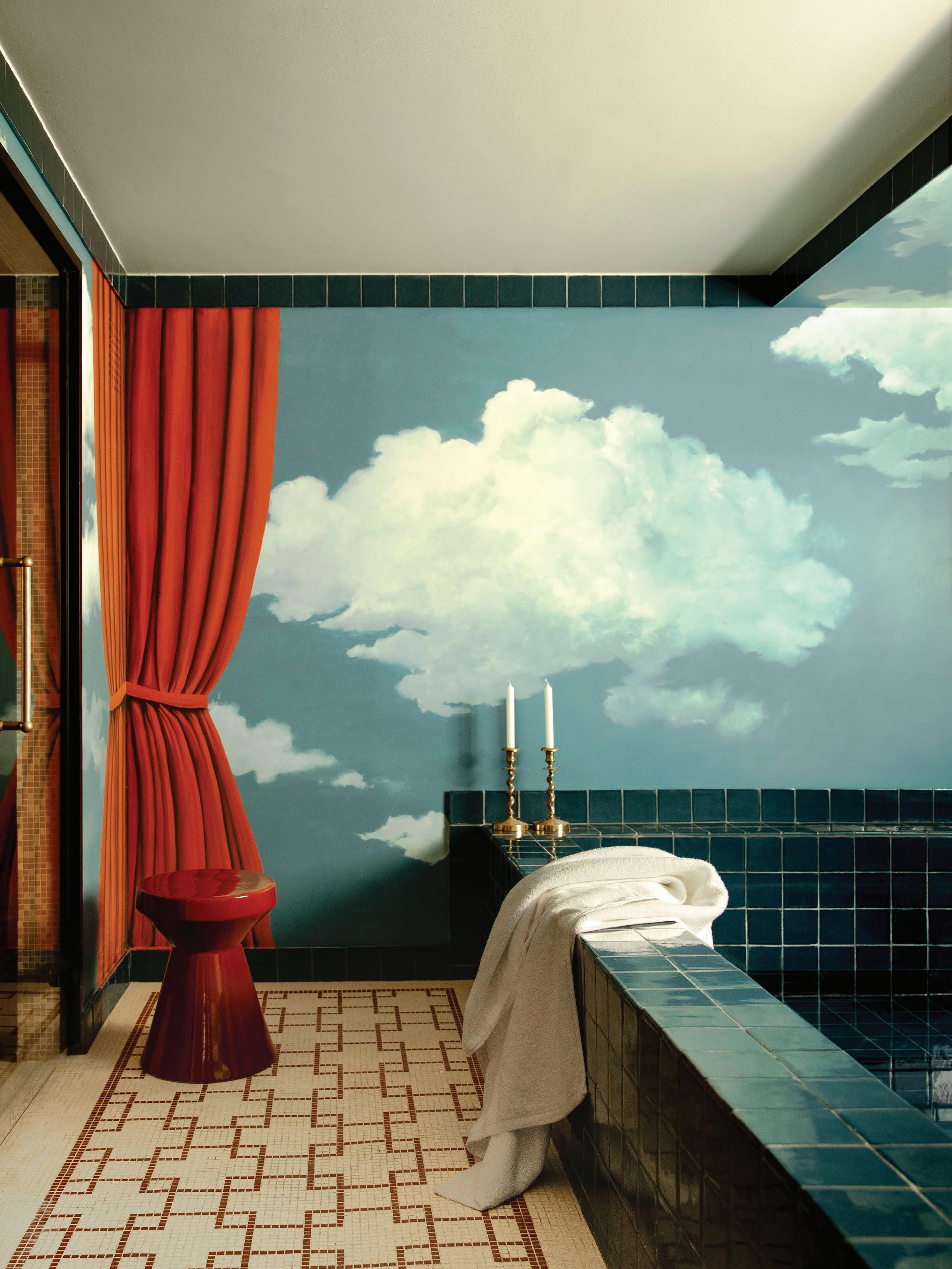
The perfect expression of Parisian Art Deco, the main bathroom at Villa Junot evokes the glamour of ancient bathing traditions. Spearheading the project, Claves approached the monumental bathroom with a spirit of restoration rather than reinvention. Dating back to 1926, the volumes and tiling have been maintained, with the original mosaics painstakingly restored by master mosaicist Delphine Messmer.
Contemporary insertions have been kept deliberately discreet: travertine vanities with rounded profiles, ecru upholstery, patinated brass and oak joinery, all chosen to frame rather than compete with the mosaics. “We wanted this bathroom to retain its grand, cinematic aura while also feeling like an inviting space to linger,” Claves co-founder Laure Gravier explains. The restored mosaic fountain wall, depicting cascading water, cements this bathroom as a rare and singular architectural treasure.
PHOTOGRAPHY Mr. TRIPPER
Villa Junot by Claves
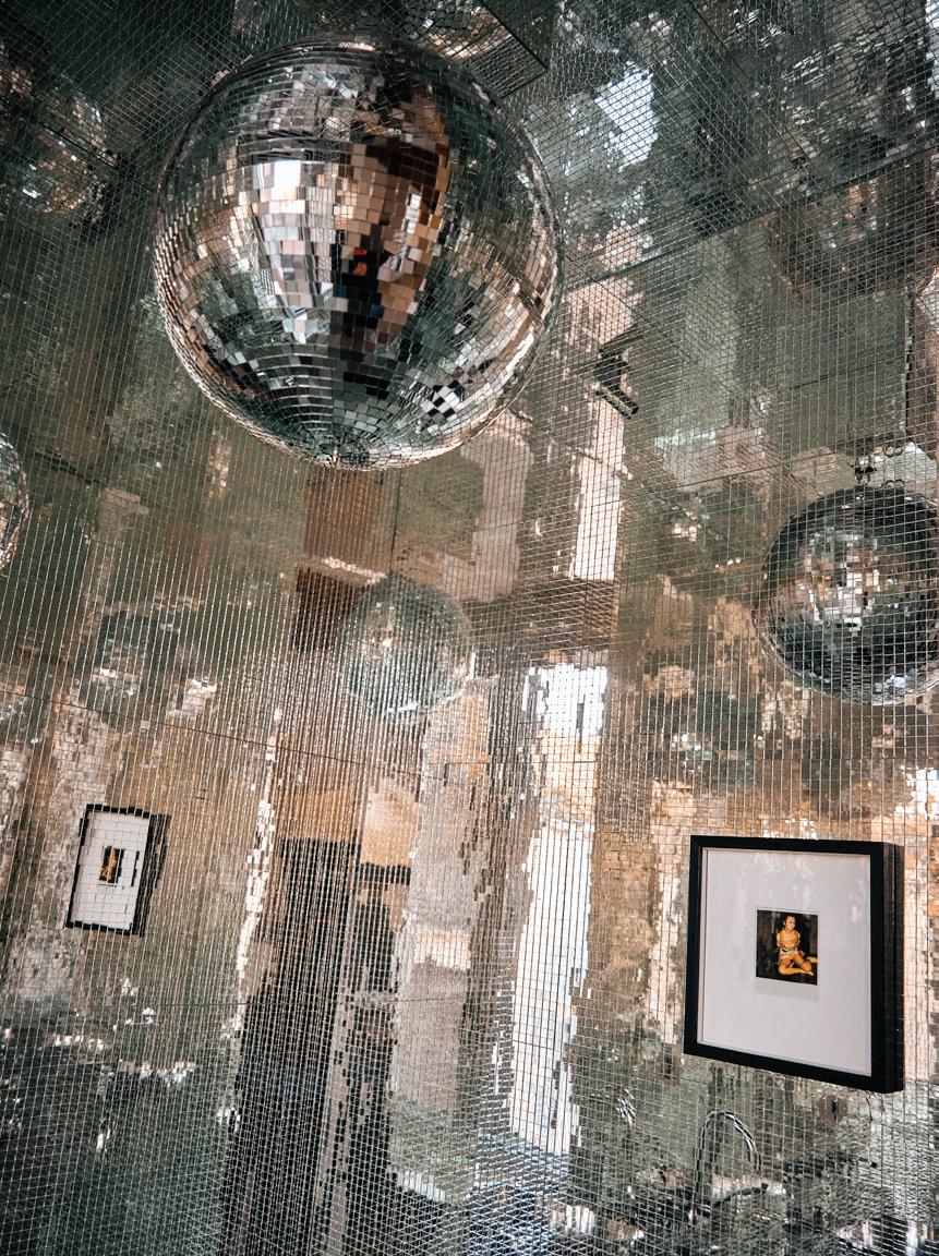
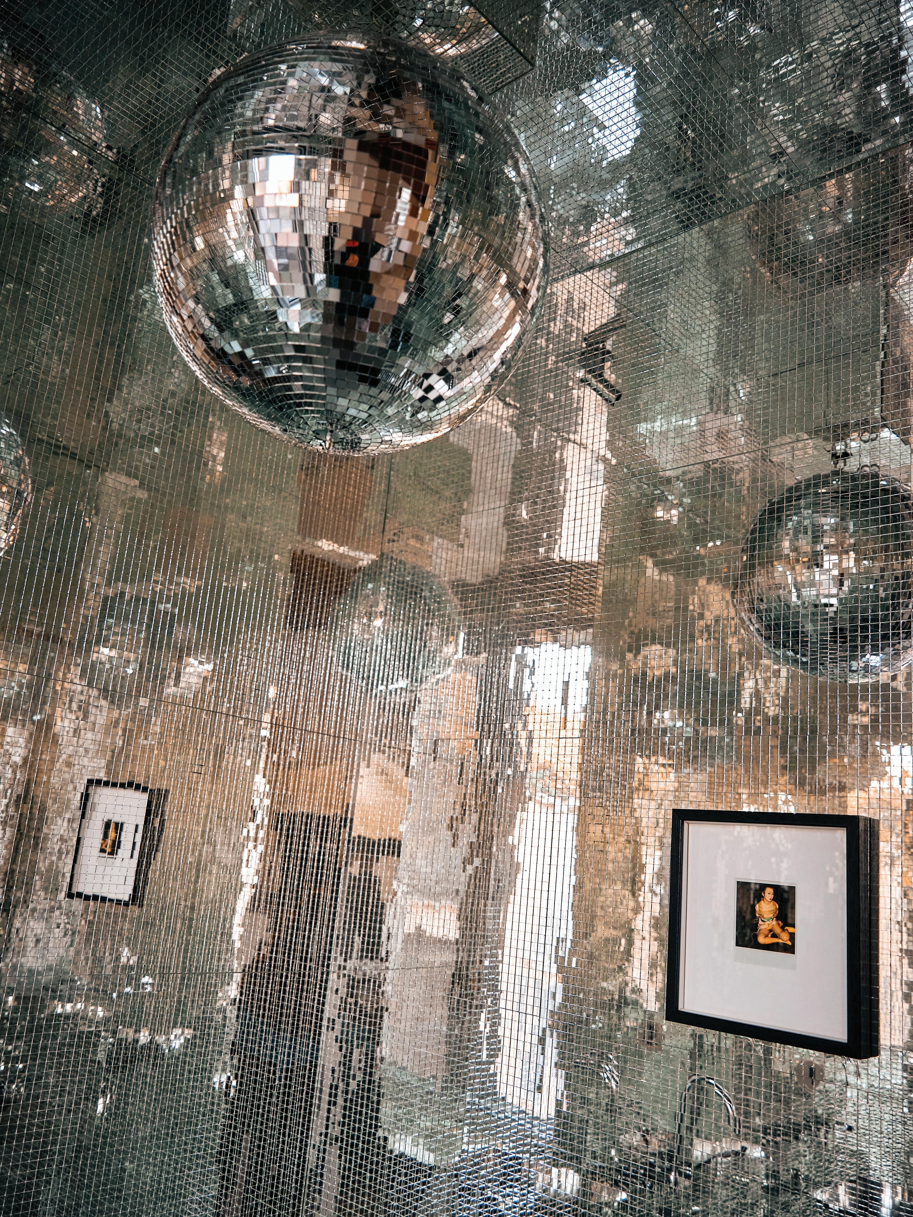
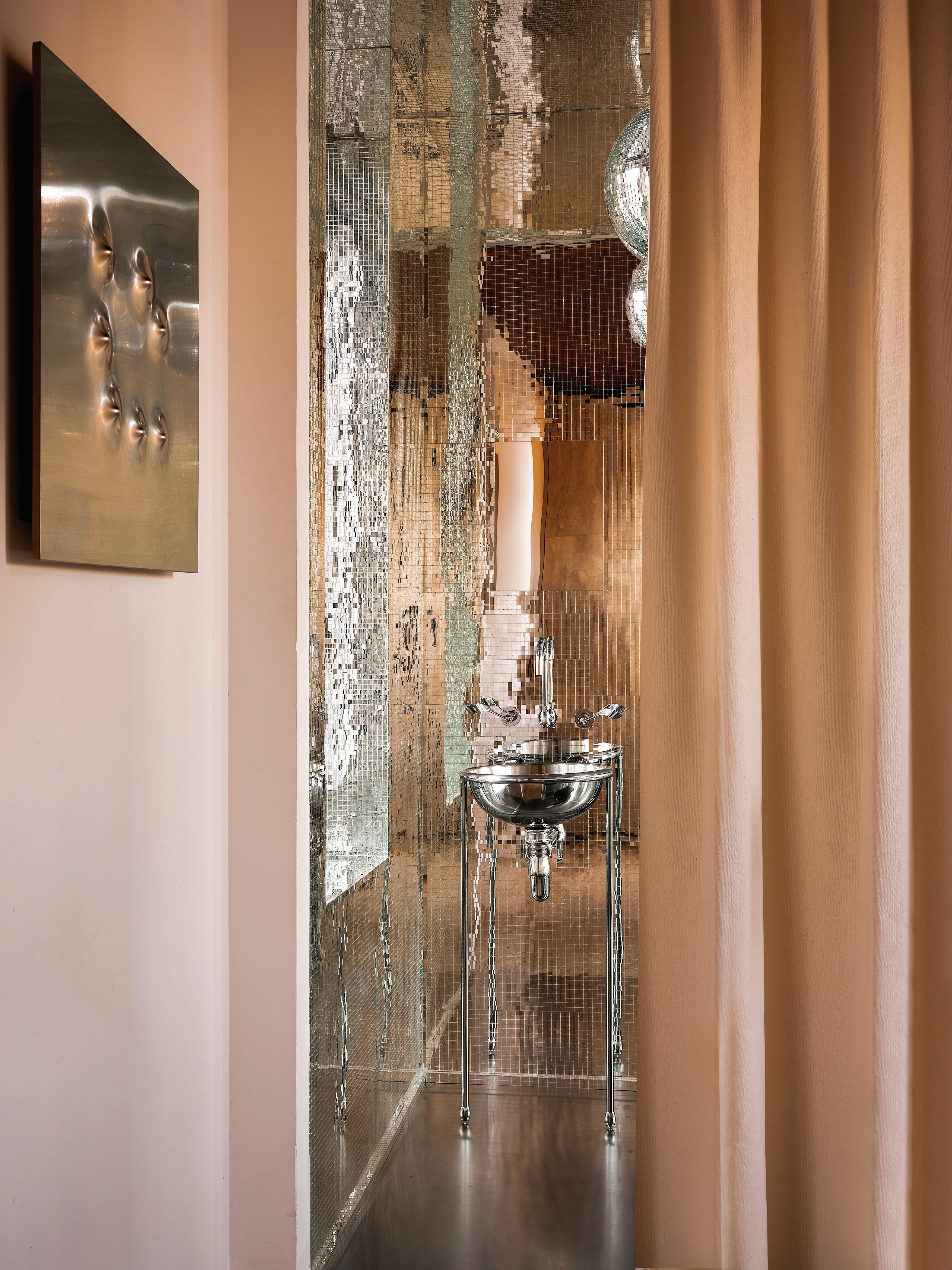
Milan Apartment
by Thomas Zangaro
Milan, Italy
The bathroom in Thomas Zangaro’s Milan apartment is a showstopping incarnation of a disco ball. This kaleidoscopic space transforms the everyday into spectacle. Inspired by the clients’ love for 1960s and ’70s disco culture, Zangaro sought to create a “non-bathroom” that could merge into the living area like an installation. The entire space is clad in a hand-cut mirrored mosaic, turning light and reflection into the room’s main character. “The mirrored mosaic tells the story best—it embodies the spirit of a disco ball while dissolving the boundaries of the room,” Zangaro explains.
A single stainless steel floor slab enhances the reflective quality underfoot, complemented by iconic Rapsel fixtures designed by Andrée Putman. Artwork also adds a playfully seductive quality—a Polaroid by Nobuyoshi Araki, and a steel panel by Angelo Brescianini just outside, reinforcing the dialogue between intimacy and raw materiality. A glittering installation and veritable showpiece—this space proves bathrooms should be a celebrated stage for design.
PHOTOGRAPHY Giulio Ghirardi
This page: The steel panel artwork by Angelo Brescianini outside the bathroom and the stainless steel Rapsel basin and tapware by Andrée Putman have been specifically chosen to complement the chosen atmosphere. Opposite page: The powder room in this Milan Apartment is the living embodiment of being inside a disco ball.
Inserted behind the main bedroom, glass-panelled doors with lower green panes filter into the space, casting a glow. Details such as double bullnose and matching grey-green joinery create a cohesive look throughout.
Jacaranda House by Richards Stanisich
Sydney, Australia
Bathed in a green glow, the main en suite at Jacaranda House transforms a subterranean corner into a garden retreat. Tucked beneath the house and behind the main bedroom, a glass partition with a green pane draws in light and the jacaranda outside, casting a soft wash of colour through the space. “The clients can lie back in the bathtub and see the trees outside,” Kirsten Stanisich explains, reinforcing the home’s connection to its leafy site.
Balancing function with ritual, the en suite is designed as a place to ground and calm. A granite benchtop with subtle grains and Carrara floor tiles brings lightness to the underground setting, while a marble splashback carries a delicate flourish— an abstracted motif drawn from the Federation-era detailing of the original house. Dark blue-grey veneer joinery, echoing the home’s external cladding, adds depth and communicates a subtle Japanese aesthetic.
PHOTOGRAPHY Felix Forest
Foch by Atelier MKD
Paris, France
“The main en suite is the showpiece of the apartment. It became the inspiration for the entire project,” states interior designer Marika Dru on the approach to this home. Anchored by a “majestic” bathtub and tall, narrow, arched doors, the space conjures the romanticism of historic bathing salons.
Throughout the entire apartment, curves are embraced as a way to soften and welcome, with Roman plaster sweeping across walls and feathering out the line up to the ceiling. The same technique extends into the bathroom, providing a waterproof surface that reflects light in a distinctive manner. Paired with understated stones in muted tones, the palette preserves a calming atmosphere. Details are tailored, from the rounded walls to the arched cornices—the eyes never rest on rigid lines. This fluid, enveloping detailing sets the framework for the apartment’s refined, cocoon-like interiors.
PHOTOGRAPHY Clément Gérard
Set up on a platform, the large bathtub is shrouded in natural stone. As a counterpoint to the matt finishes and warm minimalist aesthetic, the tapware is highly polished, adding a touch of glamour.
A high-gloss green drenches the walls, setting a vibrant backdrop for the furniture and finishes, including a Peanut mirror by Univers Uchronia, a 17th-century Flemish tapestry on the wall, a custom marble vanity in Verde Alpi by Uchronia, faucets by THG and a bathtub by Drummonds.
Monot by Uchronia
Paris, France
In Uchronia’s Paris apartment, the bathroom becomes an audacious fusion of theatrical colour, sculptural form and antique charm. Wrapped entirely in a brilliant, saturated green, the walls, arches and ceiling are designed for “total immersion through an enveloping colour,” Uchronia founder Julien Sebban says. Alpi Green marble sweeps across the custom basin and mosaic floor in undulating wave patterns, amplifying a sense of movement and fluidity.
The mood is playful yet precise: a lion’s foot bathtub converses with antique Louis XV pieces, notably François Linke’s secretary desk and chest of drawers, while 1960s-inspired wave motifs ripple throughout. The designers admit the greatest challenge lay in balancing such a vibrant palette with period pieces, which is solved by the chromatic consistency that “highlights the marble and antique furniture rather than overwhelming them.” It’s a kaleidoscopic space that oxymoronically captures ‘refined eccentricity’.
PHOTOGRAPHY Felix Dol Maillot
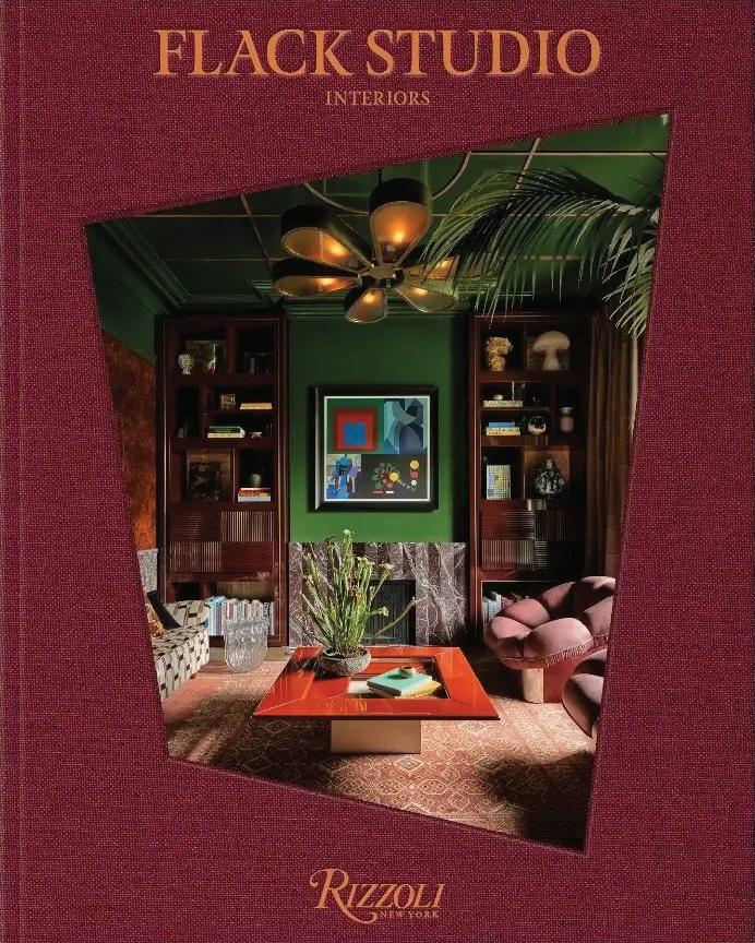
Terrace by Flack Studio
Melbourne, Australia
A ‘room within a room’, the main en suite at Flack Studio’s Terrace shifts its focus from hidden utility to central character. Enclosed by a hand painted red steel partition inset with a patchwork of textured glass, the bathroom is both intimate and transparent, filtering light while maintaining privacy. The steel frame is fabricated to mimic the walnut and leather bedhead, tying the en suite back to the primary bedroom with deliberate repetition.
Inside, Azul Boquira quartzite stone wraps the floor and partitioned panels in painterly striations, grounding the palette with an organic tactility. “The glass-enclosed bathroom within the bedroom showcases the project’s inventive planning,” David Flack notes, reframing privacy through material play. Cocooning in its ambience, this space balances contemporaneity with function.
The debut book—Flack Studio: Interiors—is out now. Published by Rizzoli, the weighty tome captures the definitive creative flair of this Melbourne studio.
PHOTOGRAPHY Anson Smart
Inserting a sense of privacy, the main en suite is tucked within a patchwork of glass and Artedomus Azul Boquira quartzite, allowing light in, while still inciting intimacy. Astra Walker tapware features above the Artedomus Arrabescato Vagli custom vanity, and a vintage Tall Primitive side table from Galerie Half sits by the entrance, next to the BAINA ROMAN Organic cotton towel in Tabac + Noir.
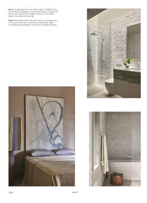
This page: A free-standing vanity adds another sculptural dimension to the space, while the Calcite stone with its sea foam, cloud-like plumes softens the palette. Unusual forms play out elsewhere in the space, including the threshold into the shower room. Opposite page: “Achieving such a subtle colour transition required extensive coordination with our supplier and painstaking adjustments to the mosaic sheets,” Mardi Doherty shares about the tiled wall gradient.
Gable House by Studio Doherty Melbourne, Australia
A curved mosaic wall beckons from an opening in the main bedroom, where pixelated tiles shift in tone as the eye draws deeper into the space. According to Mardi Doherty, director at Studio Doherty, this design flourish “is the clearest expression of the project. It grew out of a practical need but became the sculptural anchor of the space that is always visible from the main bedroom.”
Doherty confirms that achieving the subtle colour transition on the immersive surface was one of the most challenging. But the final impact is well worth the effort as it perfectly captures the client’s desire to feel like he was at the bottom of a pool while showering.
To complement the aquatic theme is a red-flecked mosaic floor, and a free-standing vanity forged from thick, slablike chunks of Calcite stone, its dreamy, cloud-patterned design tempering the intensity of the primary colours.
Bonheiden by Contekst
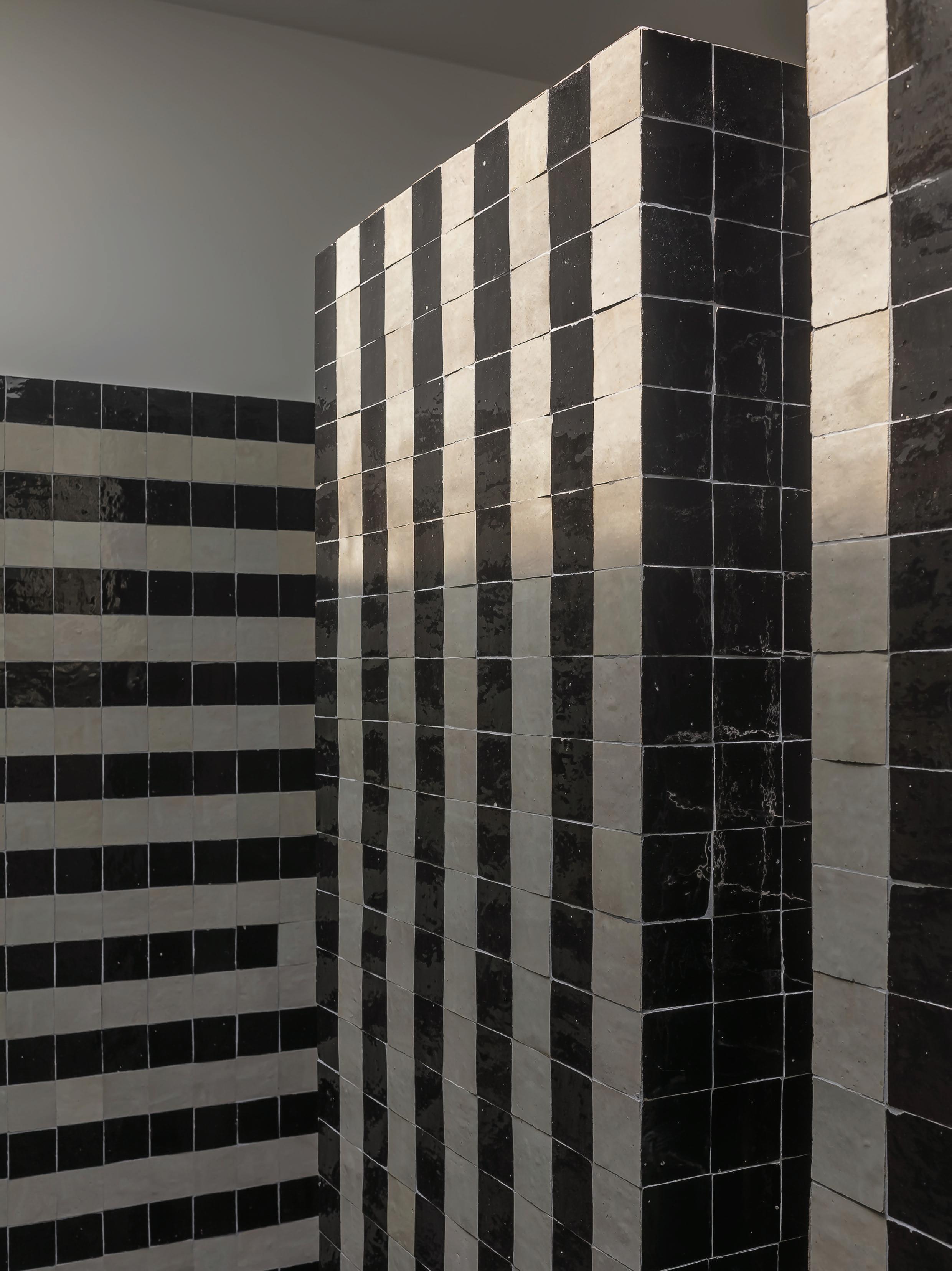
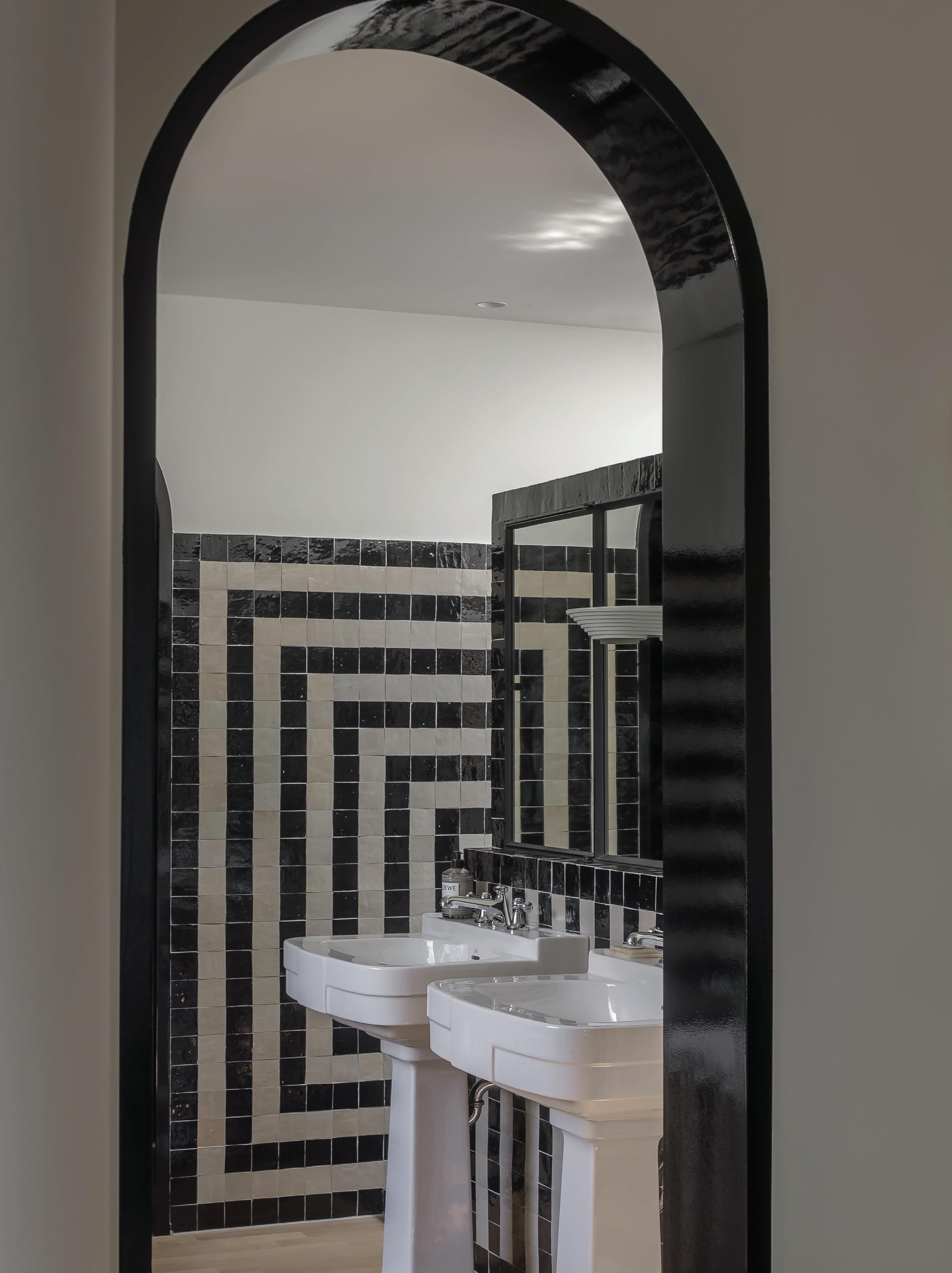
Bonheiden, Belgium
The geometries of Sol LeWitt are the jumping off point for this monochromatic bathroom by Contekst. An exercise in rhythm and symmetry, black-and-white Moroccan zellige tiles march in line across every surface—from walls to bath and shower. The hypnotically striped grid recasts what is typically just a functional space into a living artwork. Pushing the idea of craft to its limits, each tile has been mitre-cut to add a dimensional quality across the rippling surface.
Archways and doors are coated with high-gloss black, reflecting light and depth throughout. The fixtures, especially the pedestal basins, add to the Art Deco aesthetic. Both orderly and exuberant, this bathroom presents a case for artled design.
PHOTOGRAPHY Thomas De Bruyne
The main bathroom is accessed through a series of arched thresholds, where the black and white tiling brings a hypnotic touch. Geometries are played against one another, circular motifs, archways and gridded lines repeat throughout. Fixtures by Devon&Devon bring a touch of Art Deco, accompanied by a salvaged vintage light fitting.
Where stone, tiles and timber define luxury.
www.signorino.com.au
www.wooduct.com.au
HALCYON DAYS
LOCATION Gadigal Country/Sydney, Australia
ARCHITECTURE Andrew Burges Architects BUILD
Robert Plumb Build LANDSCAPE DESIGN Dangar Barin
Smith INTERIOR FURNISHING & STYLING Design Daily
PHOTOGRAPHY Anson Smart WORDS Sophie Lewis
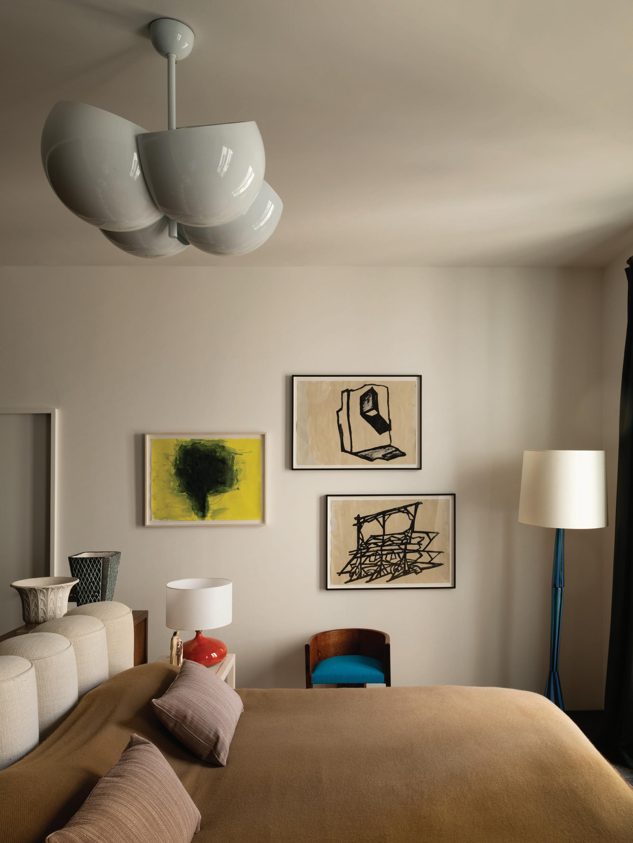
This page: Fashion designer and Shona Joy founder, Shona Thatcher on the custom sofa, with a Pinch Soren Globe Light 700 above. Previous spread: Andrew Burges Architects designed a new white-washed, textured street façade within the existing envelope. The garage, utility room, cellar and storage space are located on the street level, with the living areas above. External stairs and landscaped terraces guide to the main living level, and a lift was incorporated into the design.
Halcyon
summer
days and
1970s
nostalgia converge in a fashion designer’s clifftop home.
Australian fashion designer and Shona Joy founder Shona Thatcher wishes she’d been born in the 1970s. Her romanticism for the era and Mediterranean summers is the through-line for her label, which she started 25 years ago at Sydney’s Bondi and Paddington markets.
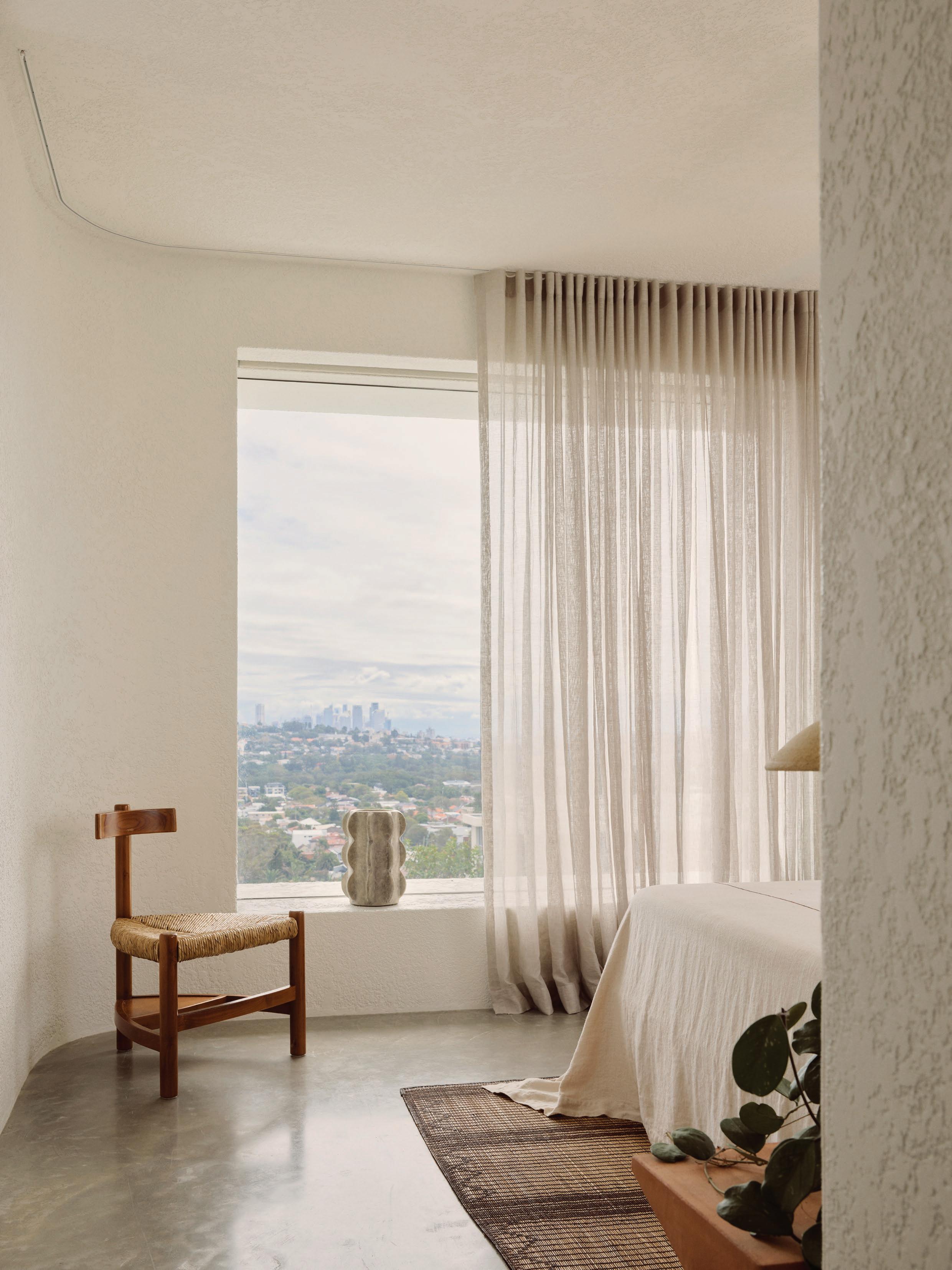
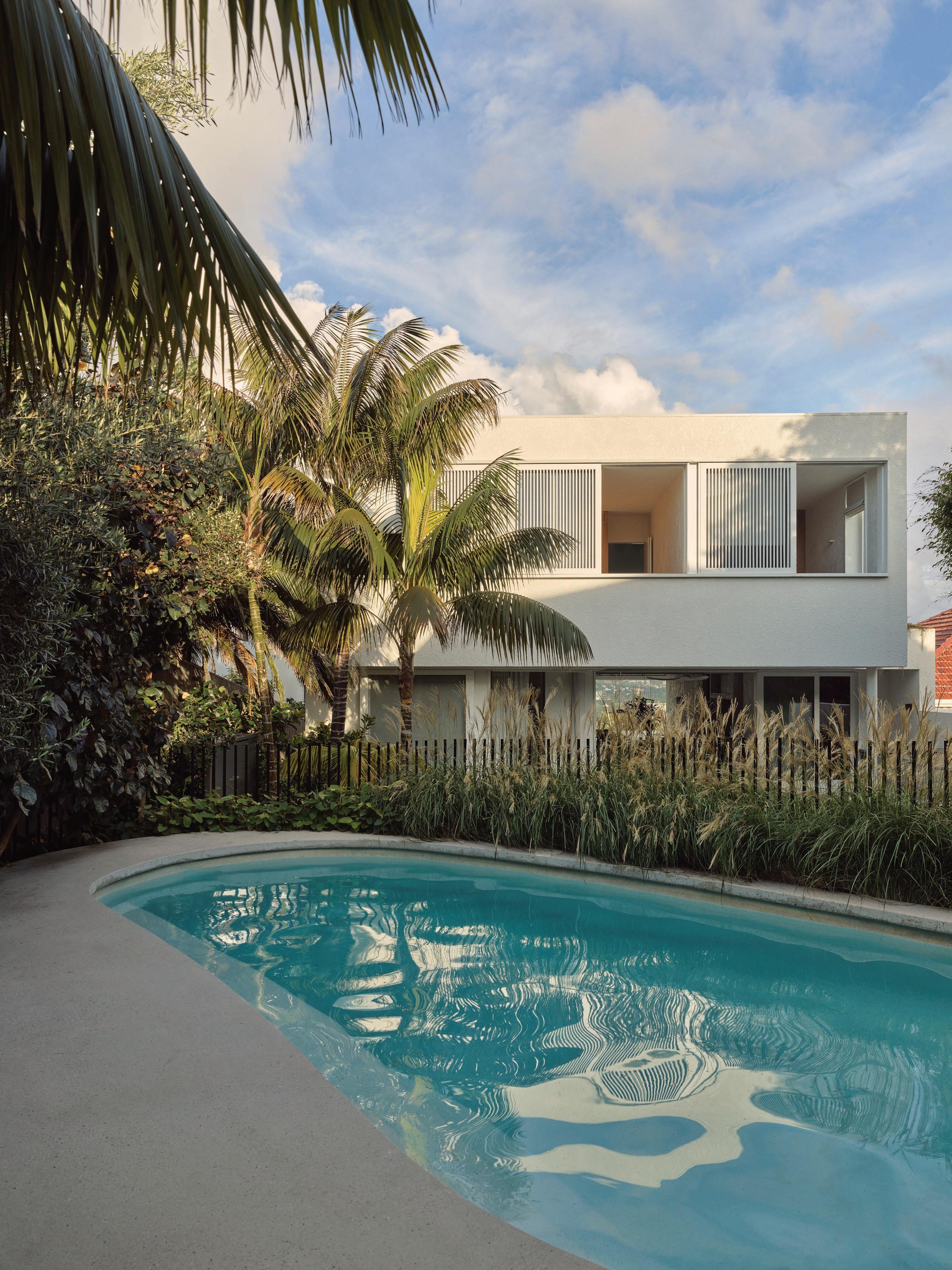
“We’ve always needed to be close to the beach,” Thatcher says, who splits her time living between Byron Bay and Bondi alongside her husband and boys—all keen surfers. A few years ago, Thatcher and her husband stumbled on their clifftop home, just a five-minute walk from North Bondi, and were taken by the size of the steep, rock-formed site. “It had a big backyard, city and harbour views—everything we wanted.” They lived in the 1940s home for four years before engaging Andrew Burges Architects to maximise the rear garden, light and views, while making space for family, guests and downtime.
Working within the existing footprint, Andrew Burges Architects designed a home that unfolds across multiple levels behind a newly formed street façade. “It’s on a busy street, but being doublebrick and rendered, it’s quiet and cocooning inside,” Thatcher notes.
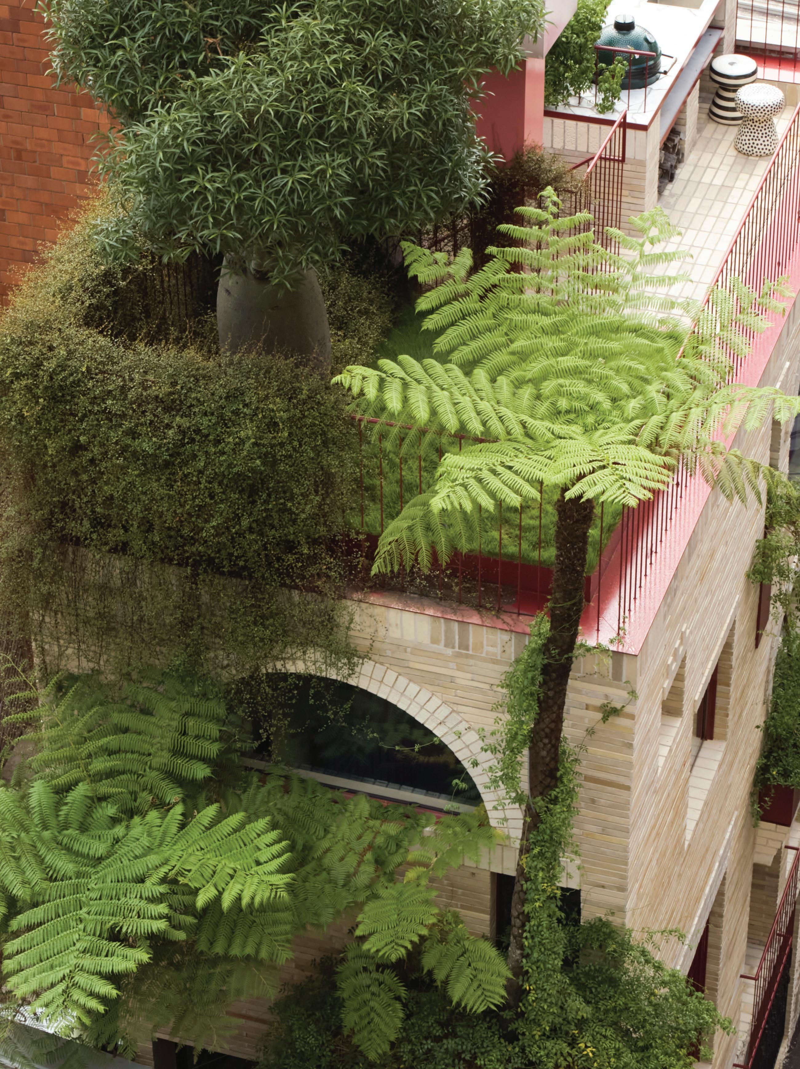
Entry is through the courtyard, which includes an outdoor shower to wash off beach sand. External stairs and landscaped terraces, designed by Dangar Barin Smith, connect the street and main living level, with a self-contained studio apartment in between. The shared spaces open up to a terrace with a garden and pool, where the family spends most of their time entertaining, and private spaces are housed above, including the primary suite with its own terrace.
Looking out to city views, the dining table was sourced from Javorina, a Slovakian timber business, which partnered with designer Lucie Koldová—pictured with the Fredericia J39 Mogensen dining chairs and a Nau Broad large pendant. The adjacent living space features a vintage Cassina 925 lounge chair by Afra & Tobia Scarpa and Vaga table lamp by Franco Mirenzi from 506070. Also pictured: The Quiet Corners and A Curved Line vessels by Astrid Salomon from Studio Gardner.
This page: Endicott crazy-paved flagstones line the kitchen floors and extend out to the terrace, with a concrete island and solid oak veneer joinery. A double-height void connects the kitchen to the children’s bedrooms and study above. Opposite page: A sunken media room enhances the ’70s vibe with custom concrete seating and upholstery wrapping around a limestone Fredericia Tableau coffee table by Space Copenhagen.
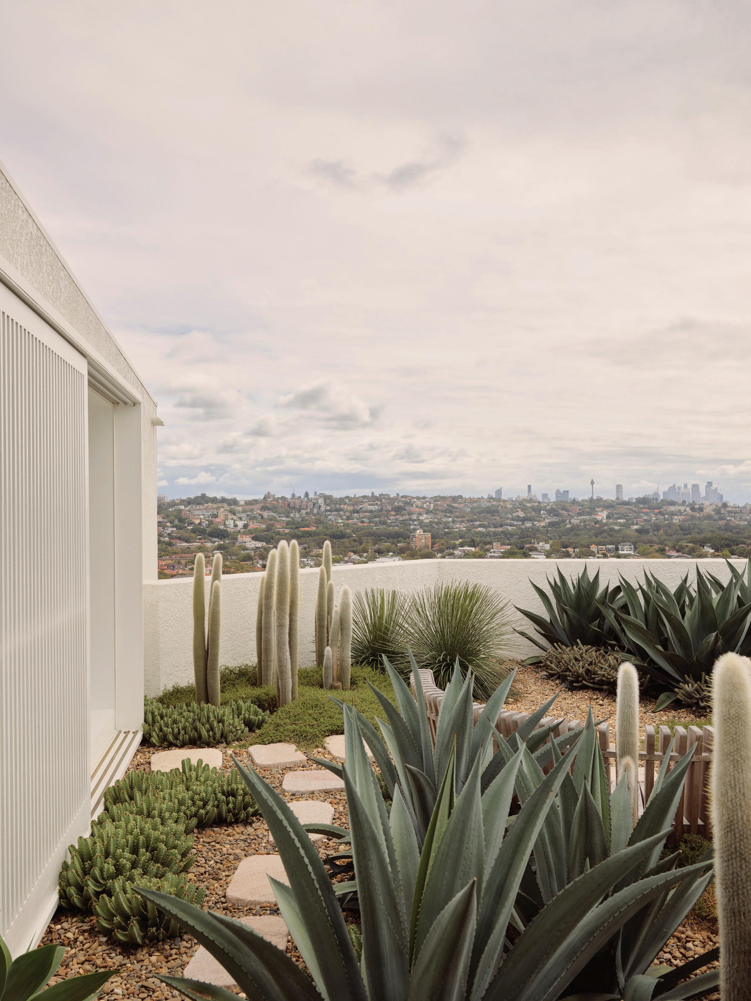
The home opens from front to back through “disappearing sliding doors” that frame city views from the pool. “We knew we’d have that connection when we renovated, but living it every day is so satisfying,” Thatcher adds. She credits Dangar Barin Smith’s mature planting of natives, Mediterranean and tropical species for “making it feel like home straight away”, and one of her favourite viewpoints is of the cactus garden from the picture window on the top of the stairs. “Every time I walk past, it looks different,” she says. “You see the cacti flowering by day and the glittering lights of Bondi and the city at night.”
The fashion designer wanted her home to “feel like the places we love to travel” within a Bondi context, conjuring summer holidays reuniting with friends in rented villas in Greece and Spain’s Balearic Islands. “We love those humble, off-the-beatentrack places,” she says, reinterpreted by Andrew Burges Architects through rough-textured Venetian rendered walls, which “light dapples beautifully across”, Endicott stone crazy paving and subtle-aggregate concrete floors. Painted timber ceiling beams, doors and windows, and oak joinery all further contribute to creating an atmosphere of ease.
Thatcher worked closely with Design Daily’s David Harrison and Karen McCartney to source furniture, lighting and accessories that had a distinct presence and complemented the scale of the architecture. “I’m always drawn to vintage, and they helped me balance this with contemporary Australian lighting and custom pieces,” Thatcher says, pointing to the vintage 1970s Confidential sofa from Vienna, designed by Alberto Rosselli for Saporiti, and the Italian Dodecagonal mirror in Rosewood, attributed to Dino Cavalli for Tredici. “The house has almost no artwork—the lighting is the art,” she adds, likening the Continuum light by Lost Profile in the living space to a brooch.
The fabric selection, such as the moss Kvadrat fabric on the custom sunken lounge, also reflects the natural tones and textures Shona Joy is known for. “I love looking back in time and bringing a sense of modernity to it,” Thatcher says—an approach her fashion label now shares with her North Bondi home.
This page: The bedrooms and main living space feature painted timber ceilings and concrete floors. The primary bedroom includes a private roof terrace oriented to the sun and city views that features a cactus garden by Dangar Barin Smith. Pictured: a Tuareg rug and a timber and rush chair in the style of Wim Den Boon sourced by Thatcher. Opposite page: A cactus garden features off the primary suite. The garden is one of Shona’s favourite viewpoints, looking out from the picture window at the top of the stairs.
This page: The rear garden, with lush tropical planting, is designed for hosting friends poolside. The home now opens up completely from front to back, creating a sightline from the pool to the city. Opposite page: Greenery enhances the building in various ways throughout the diverse garden spaces, just as the rendered walls reflect the changing light throughout the day. A
inside and out.
Studio Henry Wilson Conical wall light features by the arch—a motif used
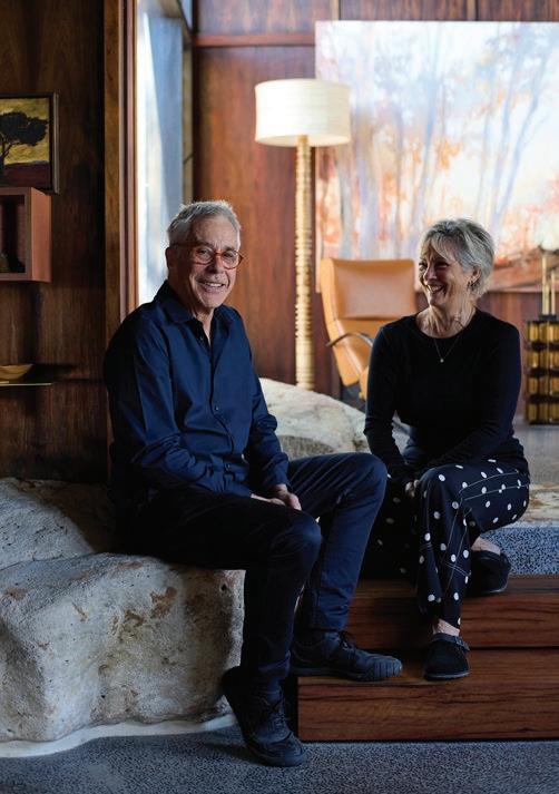
CASEY BROWN ARCHITECTURE & FIONA SPENCE PODCAST
THIS MUCH I KNOW A DESIGN CONVERSATION WITH KAREN M C CARTNEY
BROUGHT TO YOU BY
In this episode we revisit Babylon, the home of Fiona Spence and Morris Lyda. Here, Karen McCartney speaks with Casey Brown Architecture director Rob Brown and Spence about their eight-year collaboration to revive the 1960s house and honour its dramatic sandstone site.
PICTURED Architect Rob Brown and Fiona Spence
PHOTOGRAPHY Prue Ruscoe PORTRAIT Zella Casey Brown
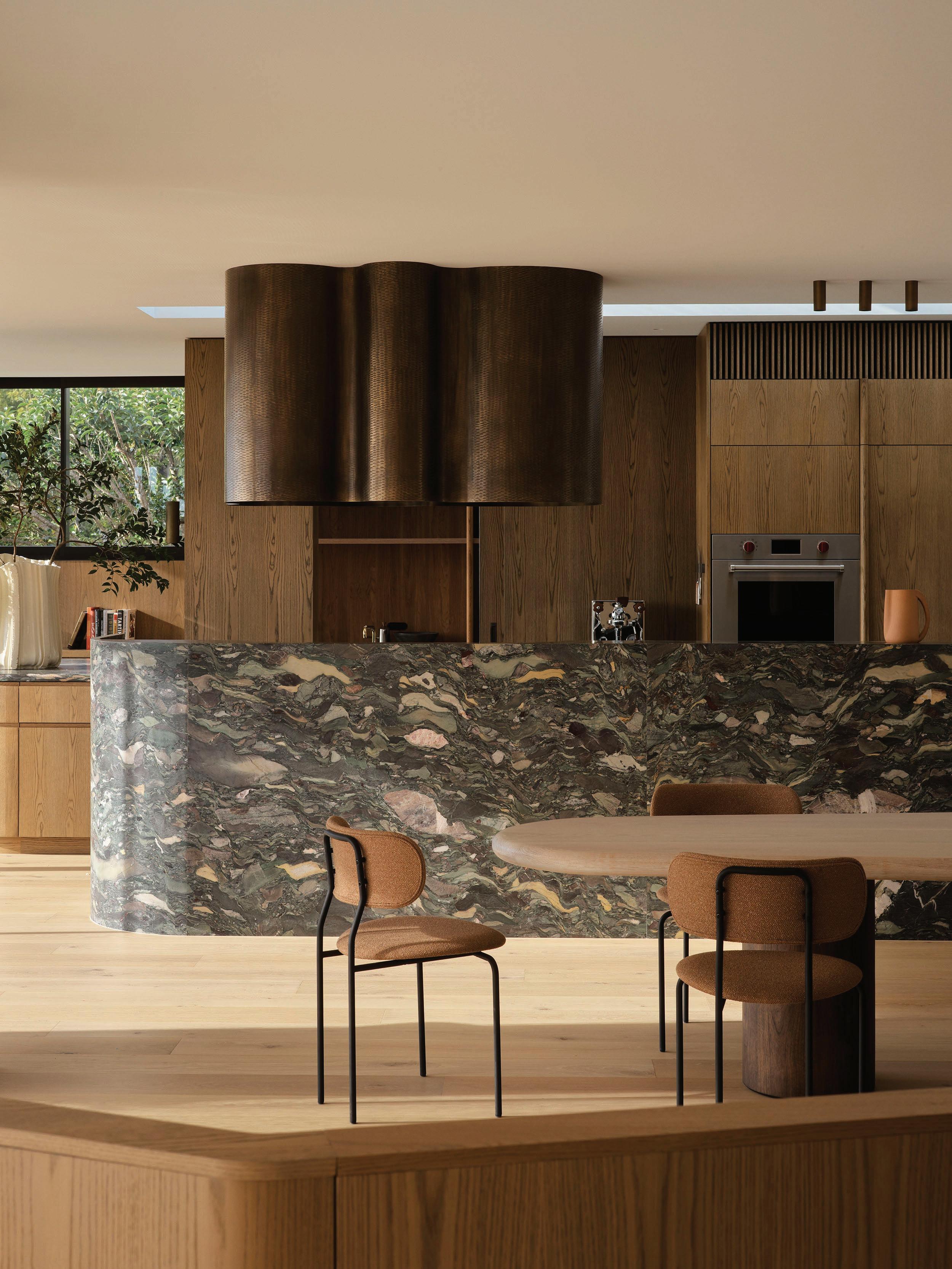
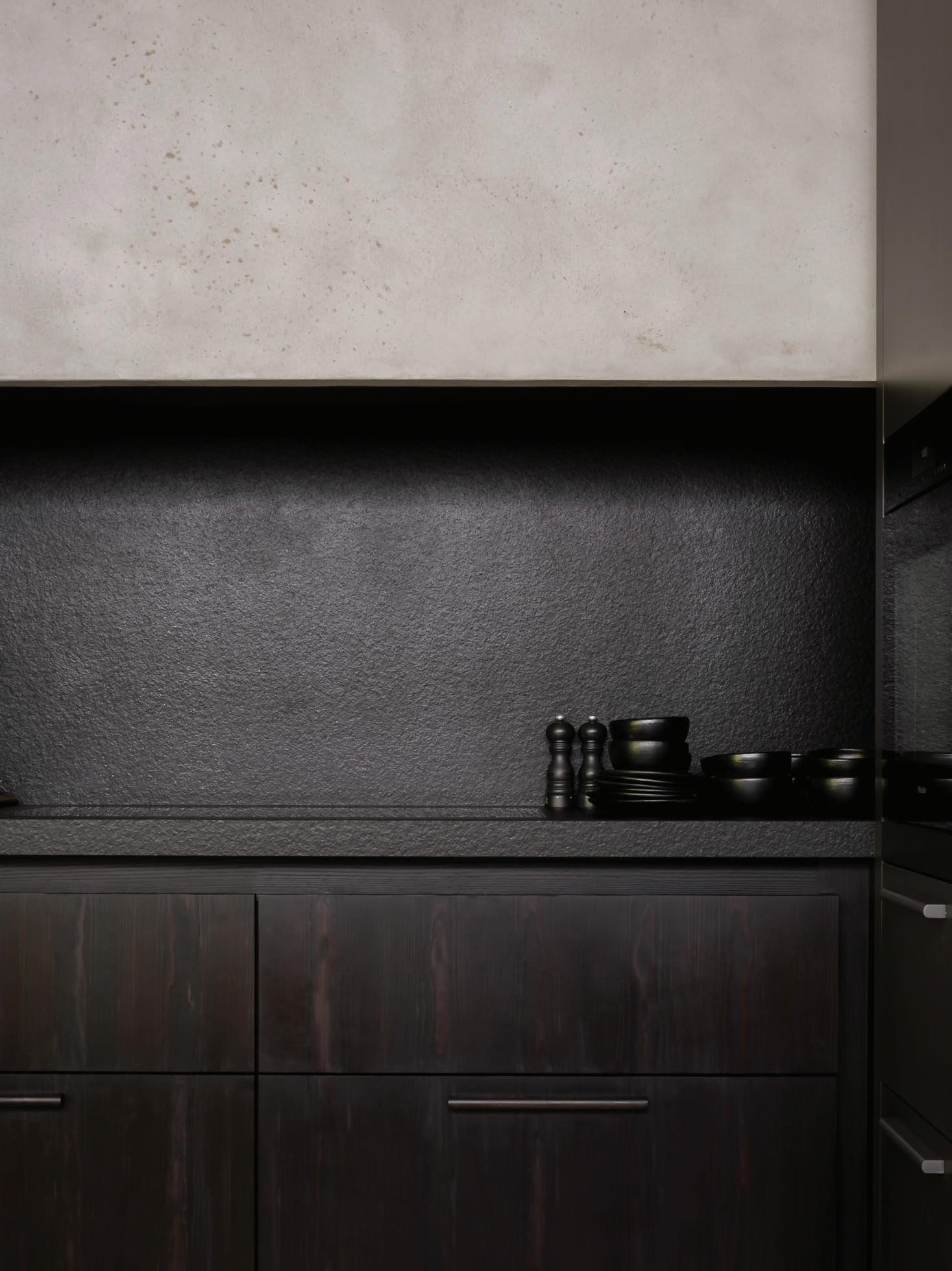
In Patchwork House, Decus pairs a gouged-brass rangehood with figured stone benches and oak cabinetry, integrating a Wolf natural gas cooktop, two Wolf M Series ovens—the Professional Series Built-In oven and Convection Steam oven—and a Sub-Zero Designer Series integrated refrigerator with internal water dispenser, all with effortless refinement.
Patchwork House by Decus
Kitchen Closeup
In the kitchen of Patchwork House, Sydney-based interior design studio Decus has crafted a space where ritual, function and gathering converge. More than a place to cook, it reads as a considered extension of the home’s multigenerational rhythm— layered with tactile finishes, sculptural joinery, and appliances that balance performance with refinement.
Positioned at the heart of the home’s primary entertaining level, oak-lined cabinetry and a bespoke gouged-brass rangehood frame the stage for both quiet family mornings and milestone gatherings. With a passionate cook as the client, the brief went beyond traditional utility, evolving into a design that embraces the theatre of cooking and entertaining. Expansive benches encourage shared preparation, a central island becomes a gathering point, and generous circulation supports the natural ebb and flow of guests.
Materiality drives the character of the kitchen, echoing the home’s broader themes of texture and play. Figured natural stone benchtops infuse the space with permanence, while hand-trowelled plaster softens vertical surfaces with tactility. The custom brass rangehood—inspired by the work of Neoromantic functional artist William Guillon and refined in collaboration with local artisan JN Custom Metal—transforms a professional-grade appliance into a sculptural centrepiece.
Given the home’s emphasis on entertaining, appliances that could offer precision and reliability were non-negotiable. “Performance was the starting point; we needed appliances that could keep pace with the scale of entertaining and daily family meals,” Decus creative director and founder Alexandra
Donohoe Church says. “Sub-Zero & Wolf delivers consistently high-quality results, and their sleek, timeless design integrated effortlessly with the home’s elevated finishes,” she continues.
A Wolf natural gas cooktop paired with two Wolf M Series ovens—the Professional Series Built-In oven and Convection Steam oven—ensures culinary precision, while a Sub-Zero Designer Series integrated refrigerator with internal water dispenser keeps ingredients at their freshest, integral to multigenerational living. Each piece blends seamlessly within the oak and stone palette, allowing the brass rangehood to command attention without competition. “Sub-Zero & Wolf delivered the rare combination of enduring style and uncompromising functionality, making them feel like an inherent part of the home’s design,” Donohoe Church says.
Patchwork House’s kitchen is less a space and more the home’s hub—a place where cooking becomes performance, conversation flows naturally, and material richness elevates everyday rituals. From morning coffee to birthday celebrations that spill into adjoining spaces, Decus has crafted a kitchen where function, elegance and connection meet.
Explore the Sub-Zero Wolf range of kitchen appliances >
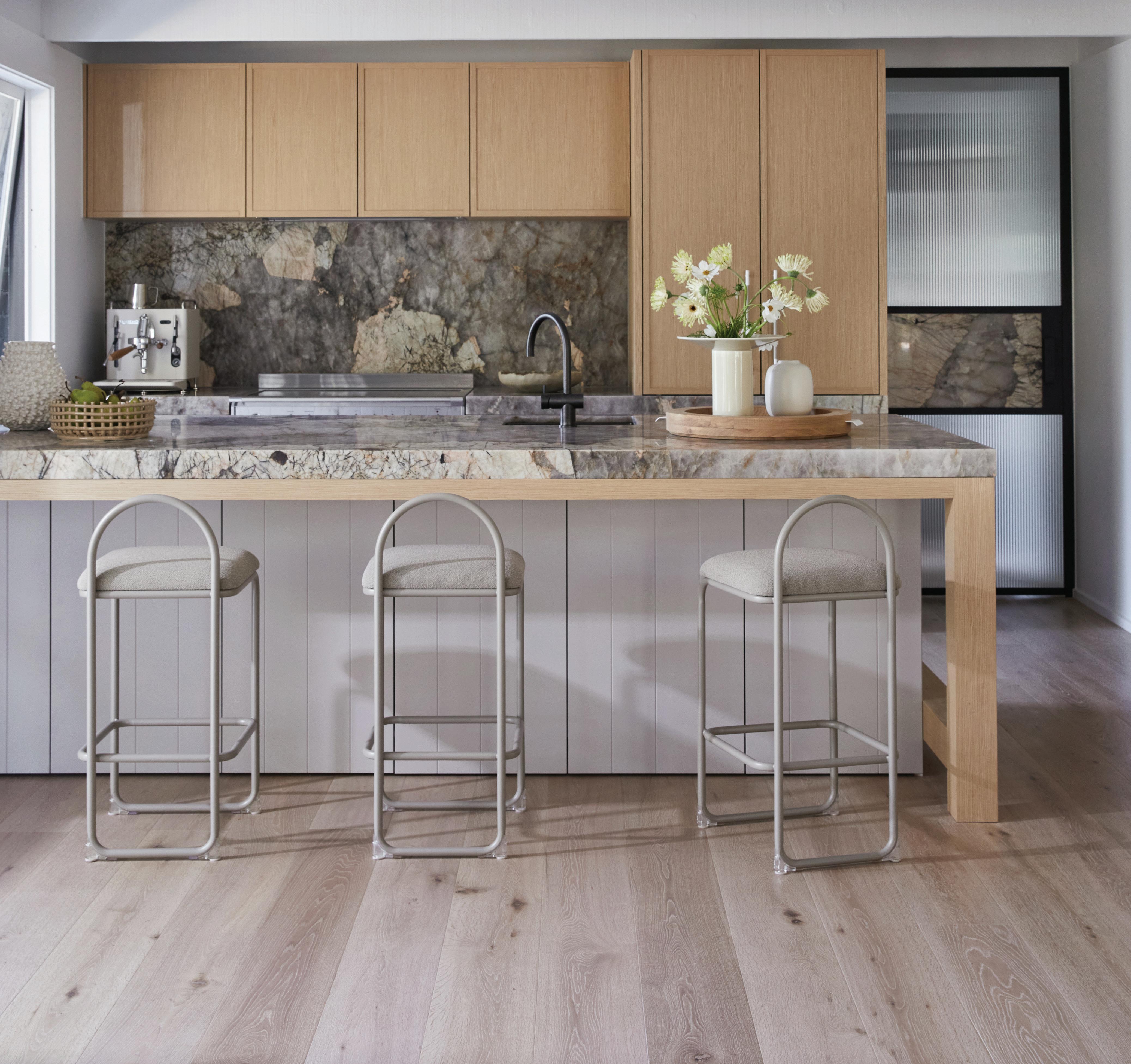
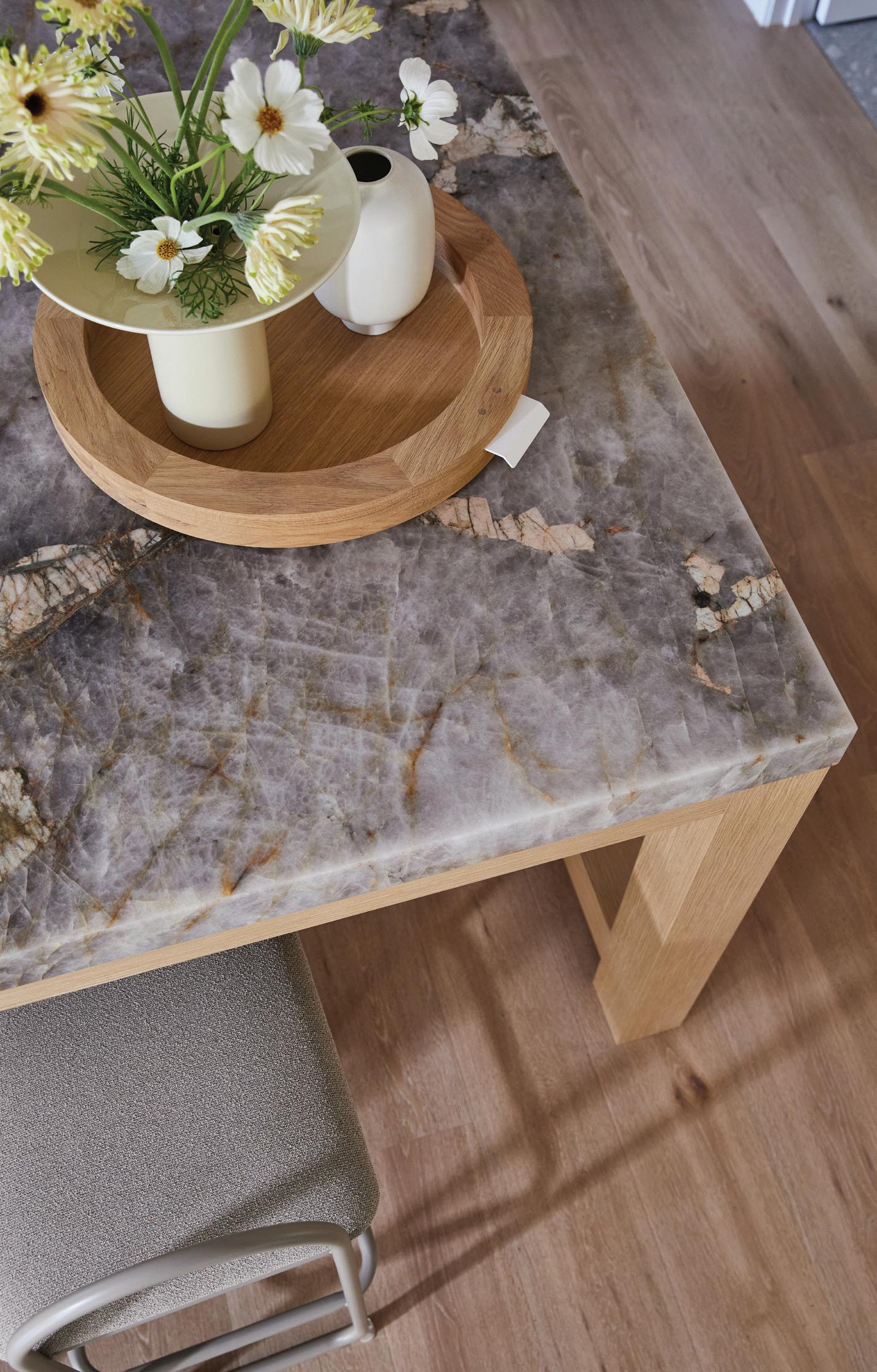
Bondi Muse
LOCATION Bidjigal, Birrabirragal and Gadigal Country/Bondi, Australia
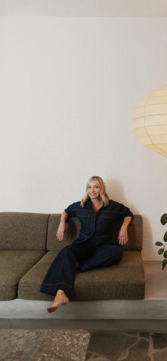
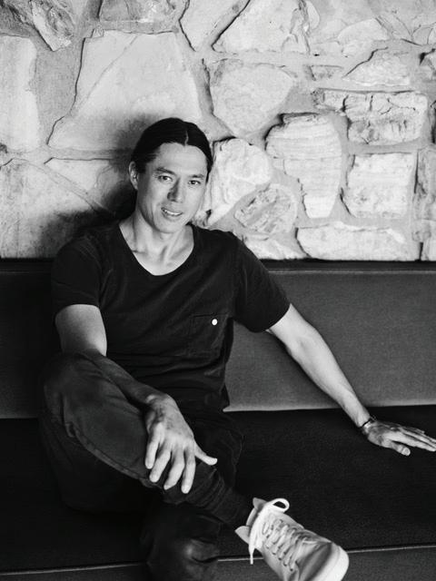
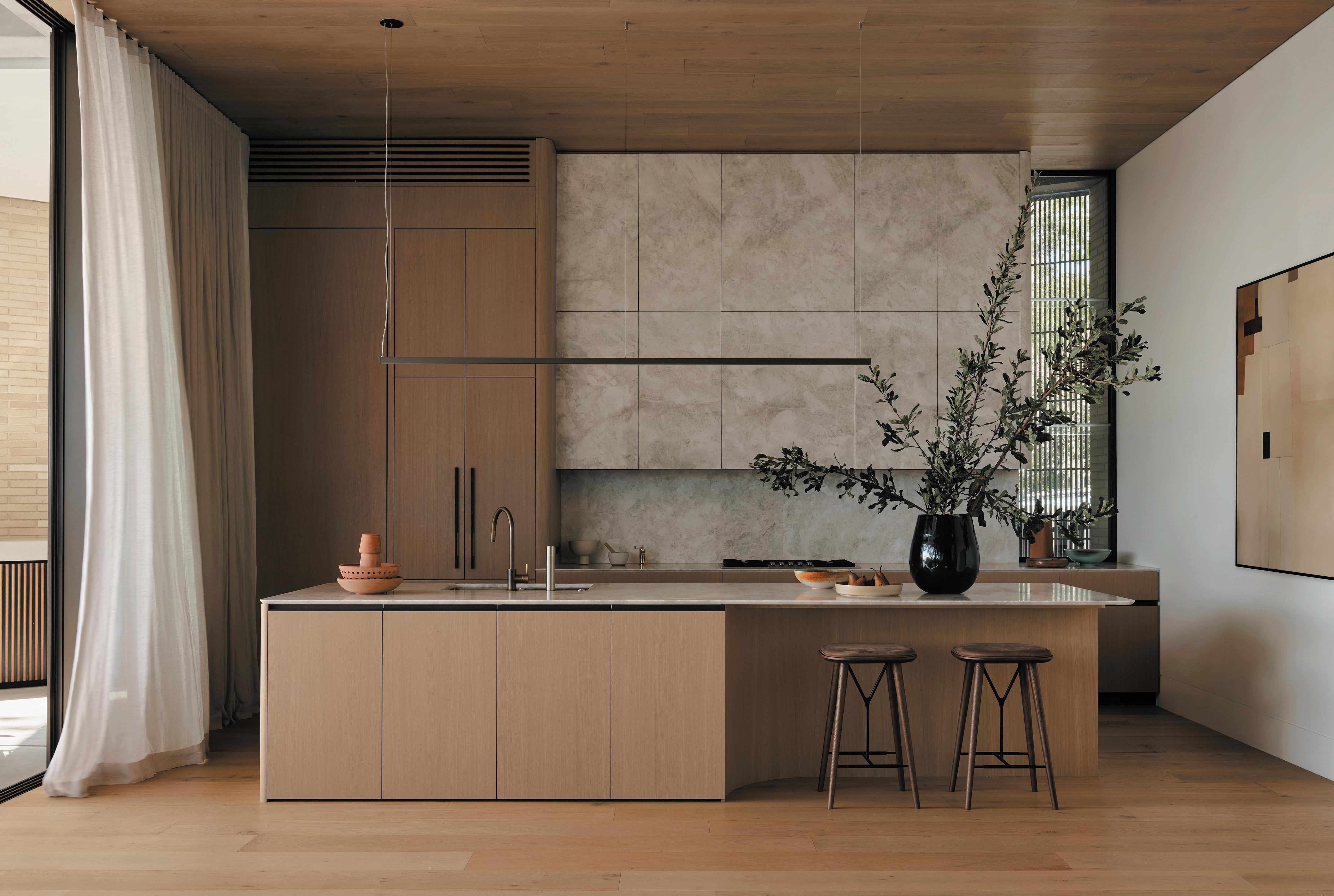
ARCHITECTURE & INTERIOR DESIGN Nick Kent Design STYLING Jess Kneebone PHOTOGRAPHY Tom Ross WORDS Emma Adams
Inside
a designer’s experimental home and studio that adapts to the needs of family and work life in a beachside neighbourhood.
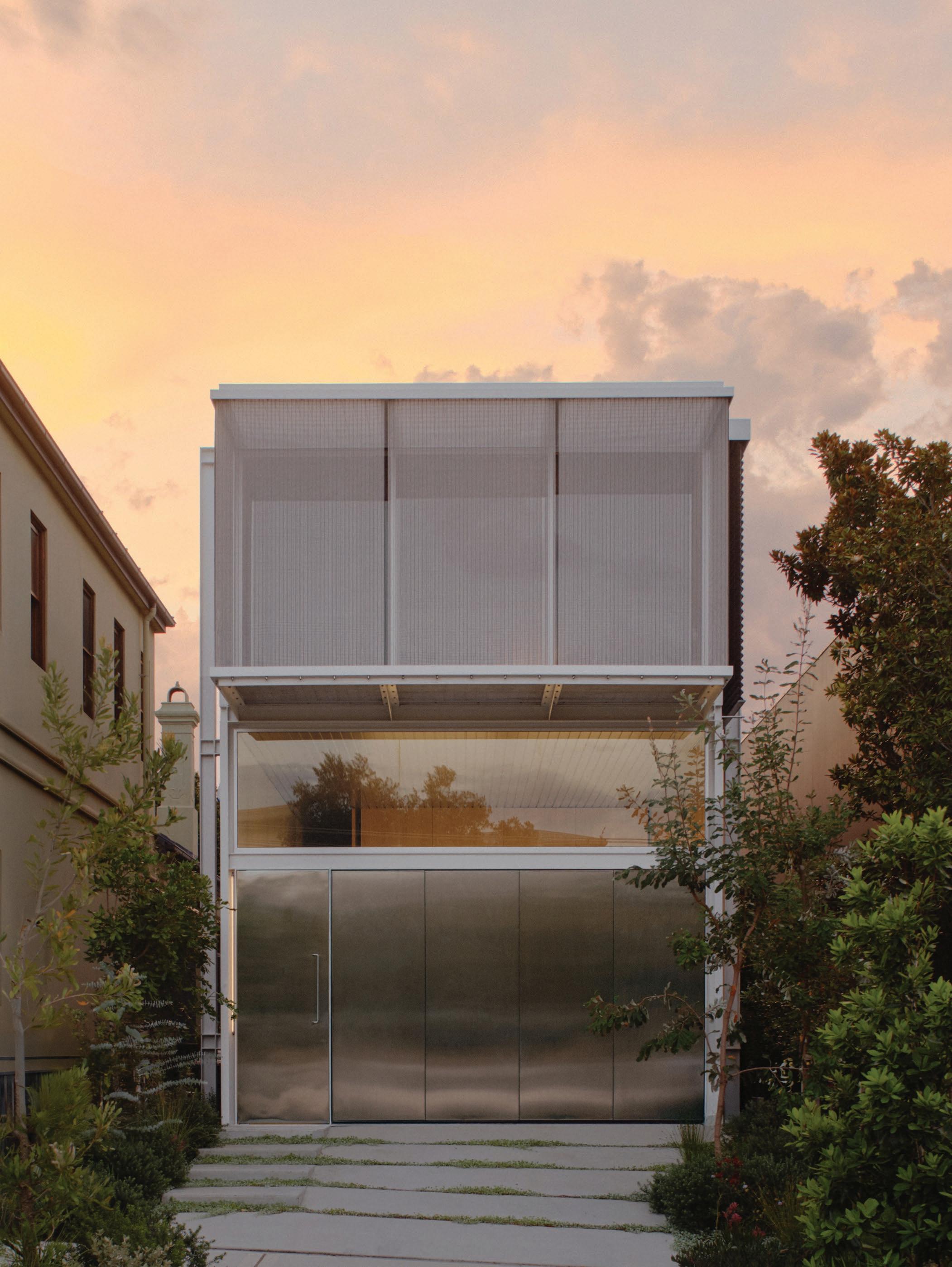
Home for Sydney-based architecture practice director Nick Kent, his partner and their two boys needed to be many things, with flexible, multi-use spaces at the top of their wishlist. On a tight budget, the new two-storey residence in Bondi was an opportunity to be less conventional with materials while allowing for an expansive floor plan within a remarkably time-efficient 12-month build.
Kent explains that to enable a faster-than-usual program, a complete structural steel framing system and “pre-finished off-the-shelf materials were selected for cladding and interior linings, with the structural steel and concrete left exposed as finished surfaces and trims,” making it “significantly quicker” than typical projects undertaken by the practice. No skirtings or architraves were required.
As both the client and designer, Kent notes that the process was more streamlined, especially once it entered construction, but also had its challenges. “Clients bring ideas and energy to the table, and help carry the design along as it develops. They also tell you when to move on. I probably spent too much time testing various concepts and overthinking them. Having an accurate costing led to another re-design, though from that point on, it moved quickly—driven by necessity more than anything else.”
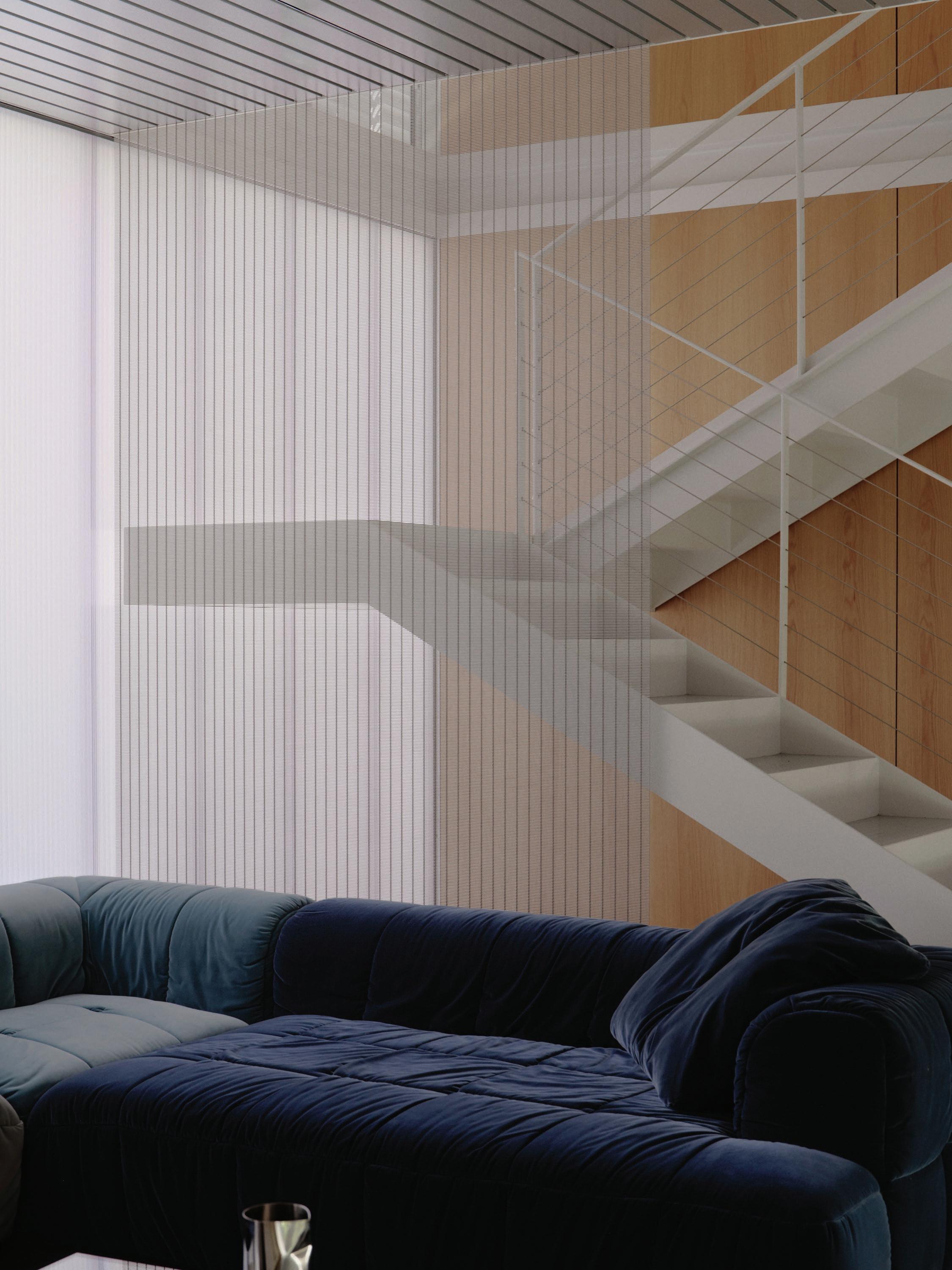
Kent says there was also a broader, almost abstract influence on the interplay between built forms and their surroundings. Expressed steel, translucent polycarbonate, clear glazing and reflective materials were chosen to interact with one another, the surrounding garden and sunlight. “The scored concrete slabs were beautifully finished and are lovely to sit or lie on, being warm in winter and cool in summer. The polycarbonate wall panels and steel mesh screens are a constant source of fascination as their quality changes with the light hitting them,” he says. These elements are multifunctional—for instance, addressing solar control and privacy while shaping the internal atmosphere.
Set over two levels, a screened terrace on the upper floor opens outward from the studio space behind, which is used as a workspace during the week and a flex area on the weekends. “The intent is for it to double up as a secondary weekend area for the kids, with the verandah for them to look out onto the street,” Kent explains. The rest of the level consists of bedrooms and bathrooms, “elevated to make the most of northern sun”. The main bedroom is a generous size overlooking the back garden, “which is sort of our retreat when we need to escape the noise of the main living area,” he continues.
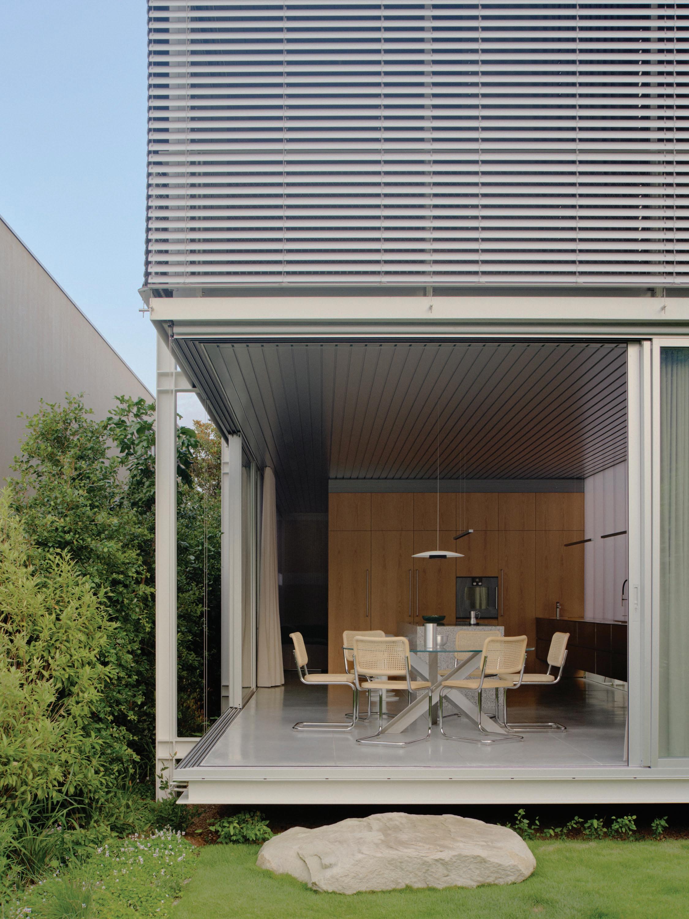
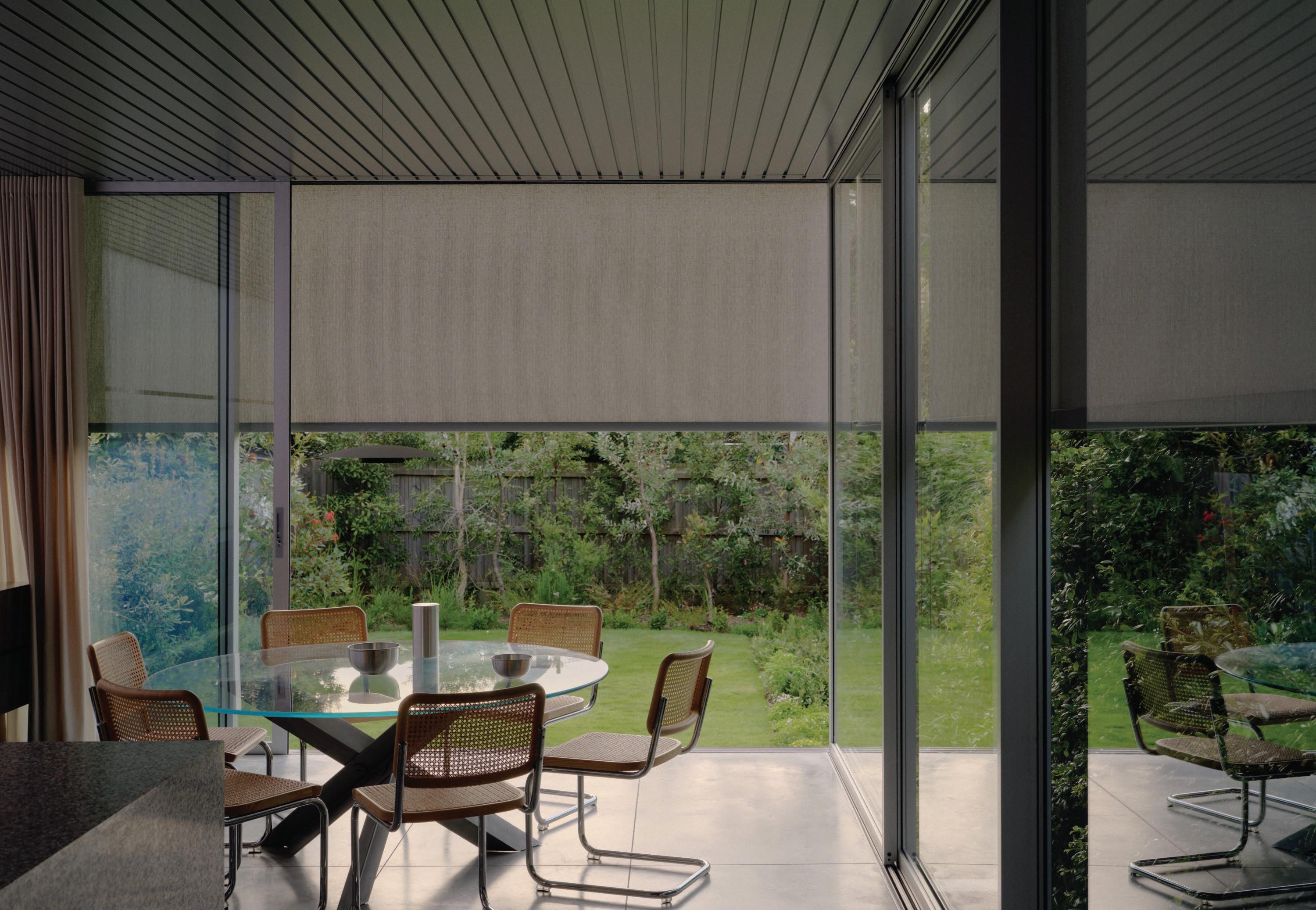
Open-plan shared areas on the floor below, with louvred windows and retractable doors, connect directly to the garden. Spatially, the house is programmed to be adaptable, guided by modernist design principles and influenced by Sydney architect Bruce Rickard, who Kent worked with before starting his own practice. “The kitchen is the heart of the home, and ours opens onto the rear garden, so I'll sometimes work at the table for a change of scenery when the kids are at school,” Kent says.
Here, a long steel island bench, with pots and pans stored underneath at one end, transitions to storage for stationery and crafts at the other. “We live and work here along with our two boys, so there's a bit going on,” Kent says. The house is designed to be flexible, with most rooms serving multiple purposes. Designed without any load-bearing walls, the internal spaces can be re-configured over time as future needs change.
With an efficient floor plan, extensive soft landscaping, rainwater reuse, a heat pump hot water system and the removal of a gas line, the design minimises upkeep. It’s also economical to run—and to build. It’s a form that could be adapted to off-site prefabrication or remote sites within a more natural landscape setting, Kent imagines, something the studio hopes to explore in the future.
This page: Polycarbonate panels were chosen for their translucent qualities. The custom American oak kitchen features a Gaggenau cooktop and oven, which sit alongside Liebherr refrigerators, a Fisher & Paykel dishdrawer, and Blum hinges and box systems. Above a floating bench, the Flos pendant is a quiet and purposeful addition. Opposite page: The dining room, situated off the kitchen, opens directly to views of the landscaped garden beyond, where horizontal floor slabs appear to hover above a newly planted native landscape, supported by the home’s exposed steel structure. Thonet S 32 V dining chairs from Anibou are arranged around the B&B Italia Bolt table, their sculptural form balancing the room’s airy openness.
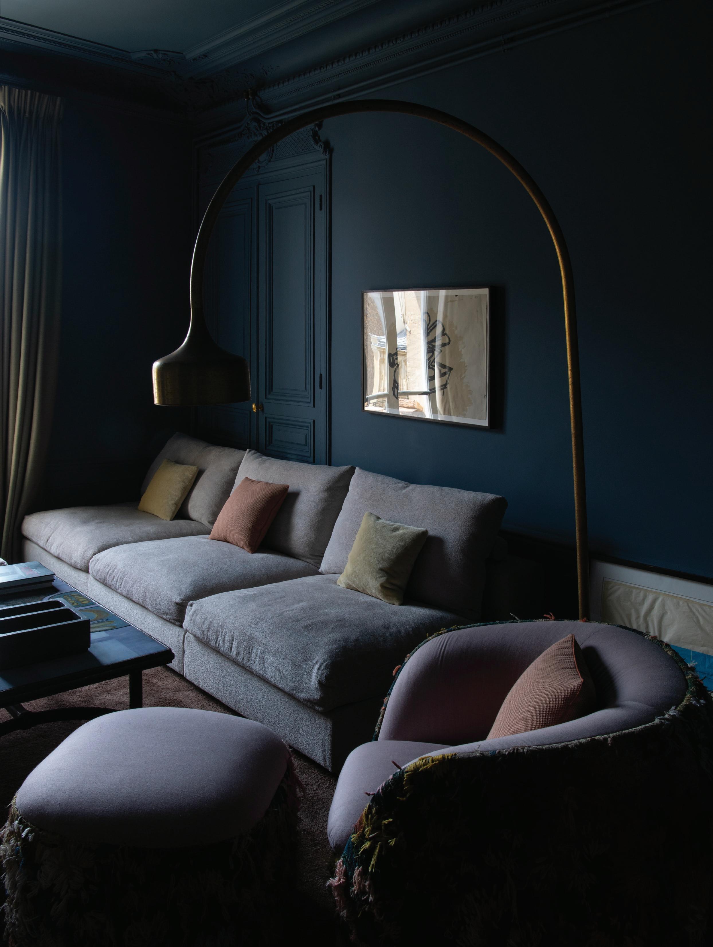
The living space features an Arflex Strips sofa by Cini Boeri in Mistral cotton fabric. With mirrored surfaces, the Glas Italia Deep Sea table by Nendo complements the reflective qualities of the room’s translucent polycarbonate. A Paola Lenti Crown wool rug introduces depth and texture.
Screens address solar control and privacy while shaping the internal atmosphere. In the bedroom, sliding panels and adjustable louvres reveal a corner of the room to the outdoors, allowing light, airflow and discreet views to permeate the space. A B&B Italia Tufty bed designed by Patricia Urquiola, paired with a rug from Armadillo in the same blush hues as the bed linen by Tekla, adds softness to the space.
This page: In the bathroom, Vola tapware complements a Villeroy & Boch Memento basin and Oberon bath. The space is anchored by Ceramica Vogue tiles from Classic Ceramics. Opposite page: A Flos Toio floor light designed by Achille and Pier Giacomo Castiglioni and a Paola Lenti Shell on the verandah continue the vibrant colour palette of the upstairs rooms.
THE LIBRARY
LIBRARY
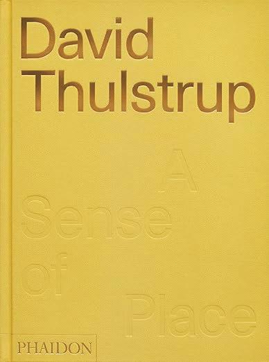
1985–2014 / Vol.2: 2015–2024 by Rik Nys; A Sense of Place: David Thulstrup by Sophie Lovell; Tom Kundig: Complete Houses by Tom Kundig.
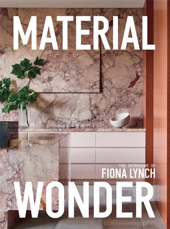
Clockwise from top left: Vincenzo De Cotiis: Interiors by Sarah Medford & Adrian Madlener; Luis Bustamante: Modern Classic by Luis Bustamante; Studio Ashby: Home Art Soul by Sophie Ashby; Flack Studio: Interiors by David Flack; Material Wonder: The Interiors of Fiona Lynch by Fiona Lynch; David Chipperfield Architects. Vol.1:
A home entertainer’s best friend
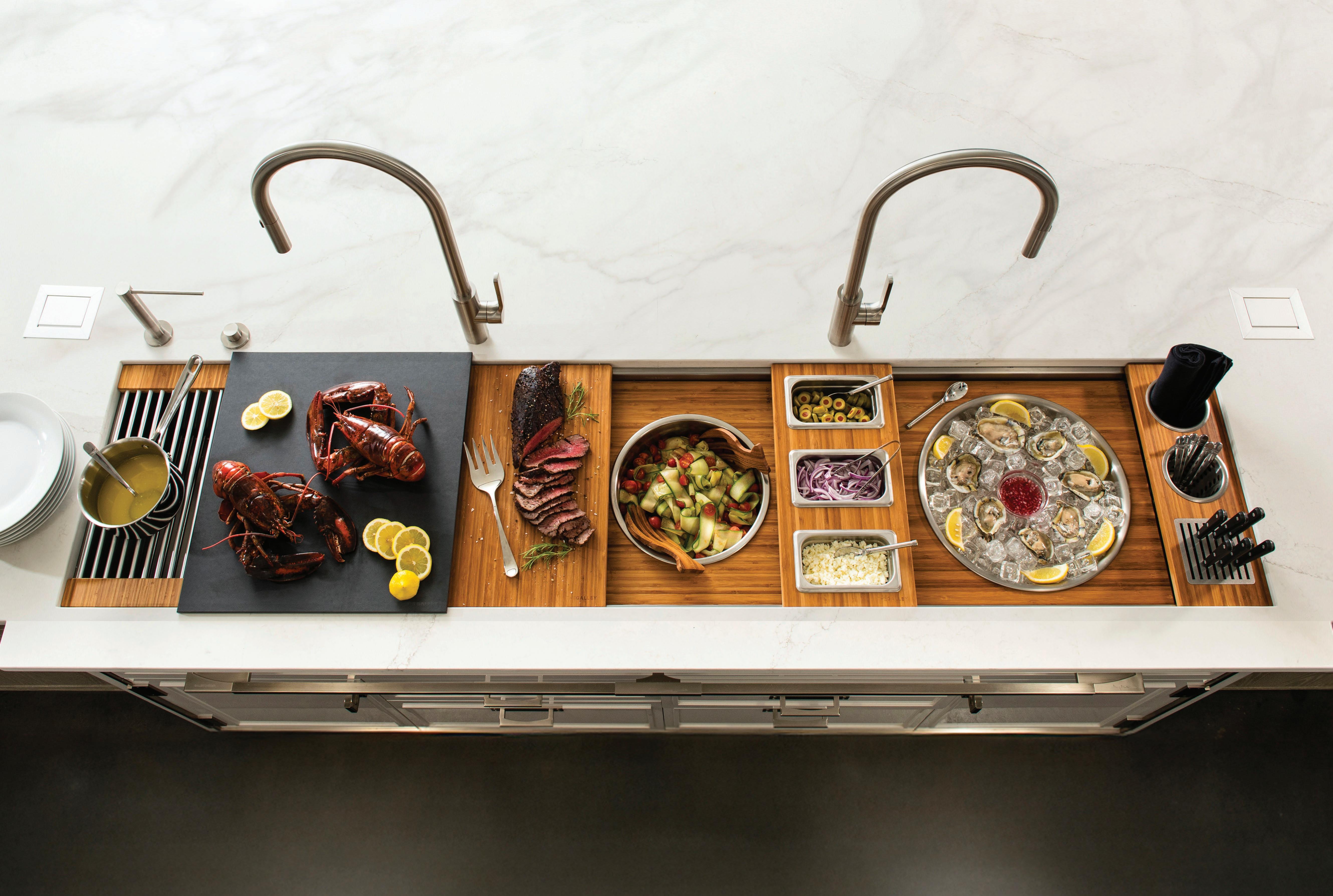
Effortlessly serve plates, ice, drinks, and more with style and ease. Designed for seamless food service and presentation, The Galley transforms any gathering into a memorable experience.
Modern Modularity
Folk Studio’s Mariah Burton
Sydney-based interior design practice Folk Studio’s profile is defined by people-centred design. Favouring Australian brands valued for their craftsmanship and modularity, the practice’s interiors balance function with longevity.
In conversation with co-founder and director Mariah Burton, we explore Folk Studio’s design language, highlighting selected projects where King Living pieces are integrated as anchors.
Folk Studio is recognised for its considered, textural interiors. How would you describe your broader design philosophy and what underpins the way you approach a new project?
Mariah Burton: Our design philosophy is about creating interiors that feel tactile and deeply personal. Texture and materiality are central to our design aesthetic, focusing on what each material contributes, rather than solely focuses on layering.
Each project we take on has to resonate with me personally and so do the people we collaborate with, which, in turn, always brings a positive and aligned outcome. We draw all our inspiration from our clients—who they are, how they live, and how they want to live. This allows us to create spaces that are not only functional but also reflective of the people who live in them. Ultimately, what underpins our work is a commitment to designing interiors that are considered and quietly enrich our clients day-to-day.
When shaping a space, what design elements do you instinctively return to, and how do they help create the atmosphere you’re seeking?
Mariah Burton: We instinctively select pieces that are wellmade and enhance the way we feel within a space. Lighting, in particular, plays a pivotal role in our design process for this very reason. We also gravitate towards styling elements that carry a lasting quality—items that can evolve with you over time, rather than trend-driven pieces that serve only the moment.
Your projects often feel deeply connected to both the client and the context. How do you balance personal expression with timeless design?
Mariah Burton: For me, it’s about working with clients who truly value the craft of good design. That shared respect makes the process of shaping their spaces and getting to know them so much easier. In turn, it leads to spaces that feel fully resolved and successful.
Timeless design looks different for everyone. It has to be highly personal, customised, and curated to suit the individual client, their lifestyle, their needs, and the way they move through their home. That’s why our approach is centred on truly understanding our clients—not only by listening to what they say but also by observing what remains unsaid.
This page: The King Living Aura Sofa mirrors Folk Studio’s dynamic approach to design. Previous page: Mariah Burton, co-founder and director of Folk Studio, sitting on the King Living 1977 Sofa.
You’ve specified King Living across several projects—could you share a particular example and explain how their design language reflects Folk Studio’s approach?
Mariah Burton: By the time we reach the styling phase of a project, we’ve usually developed a strong understanding of our clients and how they live. Typically because styling comes later in the design process, it means we’re able to carefully curate pieces that we know will truly serve them, from furniture to products and decorative details.
Many of our clients are growing families, so we tend to source furniture that is flexible, durable, and well-made to evolve alongside them. For example, we began specifying the King Living 1977 Sofa a few years ago, and the feedback from families has been overwhelmingly positive. We continue to choose King Living pieces for their craftsmanship and quality— they’re beautifully made and align with our philosophy of creating spaces that are enduring.
Are there particular pieces from the King Living collection that have become anchor points within your projects? What qualities drew you to those designs?
Mariah Burton: Modular sofas are my personal favourite type of sofa for families, which is why we gravitate towards the Aura Sofa and the 1977 Sofa from King Living. A lot of our clients want a sofa that is low maintenance as well as flexible, and both of these sofas tick those boxes for so many of our clients.
The 1977 Sofa is celebrated for its adaptability and modularity. How does this flexibility resonate with the way you think about spaces evolving over time?
Mariah Burton: The adaptability of the 1977 Sofa really reflects the way we approach design as a whole. We believe that a space should evolve with the people that live in them, their routines, their families, and even their tastes and approach to trends as they change over time. A sofa like this allows our clients to reconfigure, expand, or adapt it as their lives change, without needing to replace the sofa entirely
Looking back across your work, how do King Living’s shapes, materials and textures reflect your wider approach to styling interiors?
Mariah Burton: We usually gravitate towards solid, bold colours, and the breadth of King’s colour range gives us the flexibility to choose the right fit for each project. Our team is often drawn to pieces that carry subtle nods to the ’70s with soft curves, distinctive forms, and a sense of character. Having a sofa that combines colour, texture and sculptural curves really ticks all the boxes for us.
If you could define the legacy you hope your projects—and the furniture within them—leave behind, what would it be?
Mariah Burton: I would hope that Folk Studio’s legacy is carried through each client we’ve worked with, and even by those who may have simply been inspired by our work, that in some way, we’ve made a subtle but meaningful difference to the way they live, for the better.
That has always been my driving force, even since I was seven years old, offering ‘design consults’ to kids on my street. At my core, I’ve always wanted people to wake up each day feeling that their space genuinely reflects who they are.
“We continue to choose King Living pieces for their craftsmanship and quality—they’re beautifully made and align with our philosophy of creating spaces that are enduring.”
— Mariah Burton
INTERIOR DESIGN & STYLING: Folk Studio
PHOTOGRAPHY: Courtesy of King Living & Jacqui Turk
ADDITIONAL WORDS: Nicole Toma
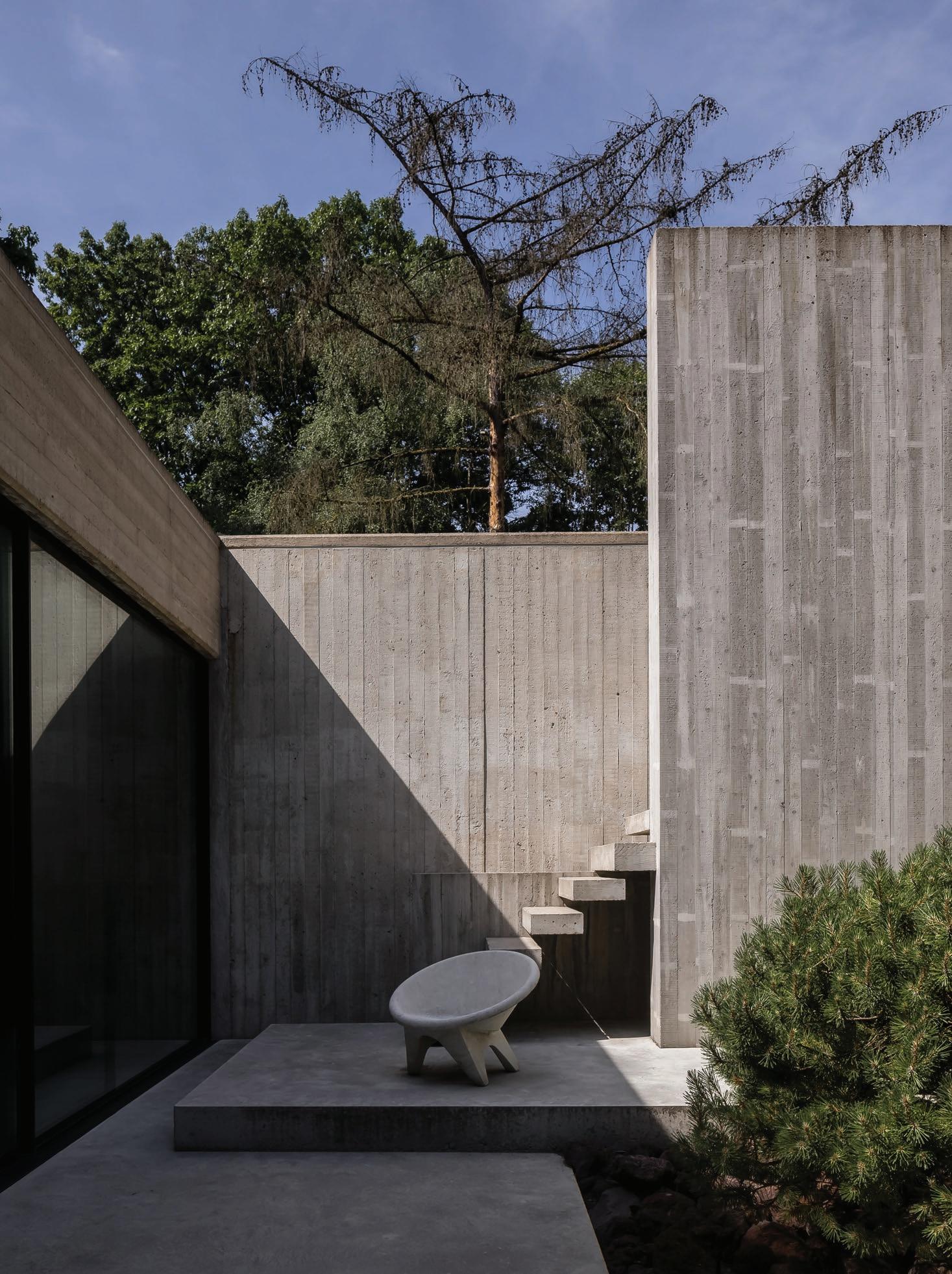
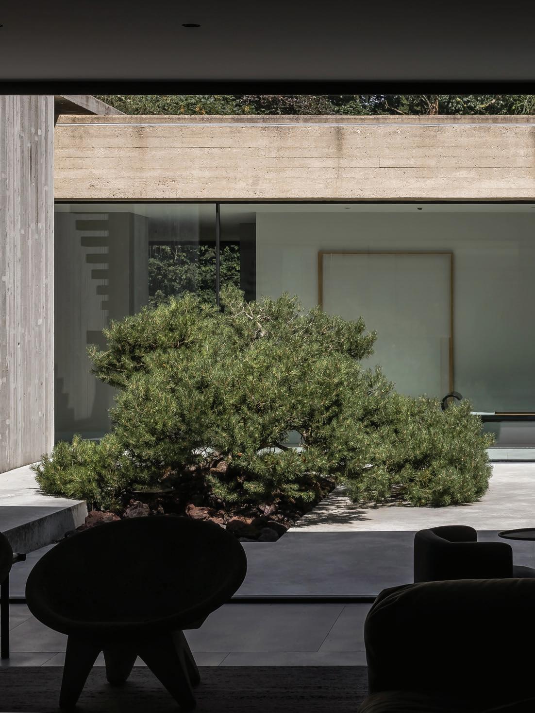
THE GREATS
GREATS
PROJECT Sestig Pavilion LOCATION
Sint-Martens-Latem, Belgium
ARCHITECTURE
Ivan Van Mossevelde & Glenn Sestig Architects
PHOTOGRAPHY Thomas De Bruyne WORDS
Sophie Lewis
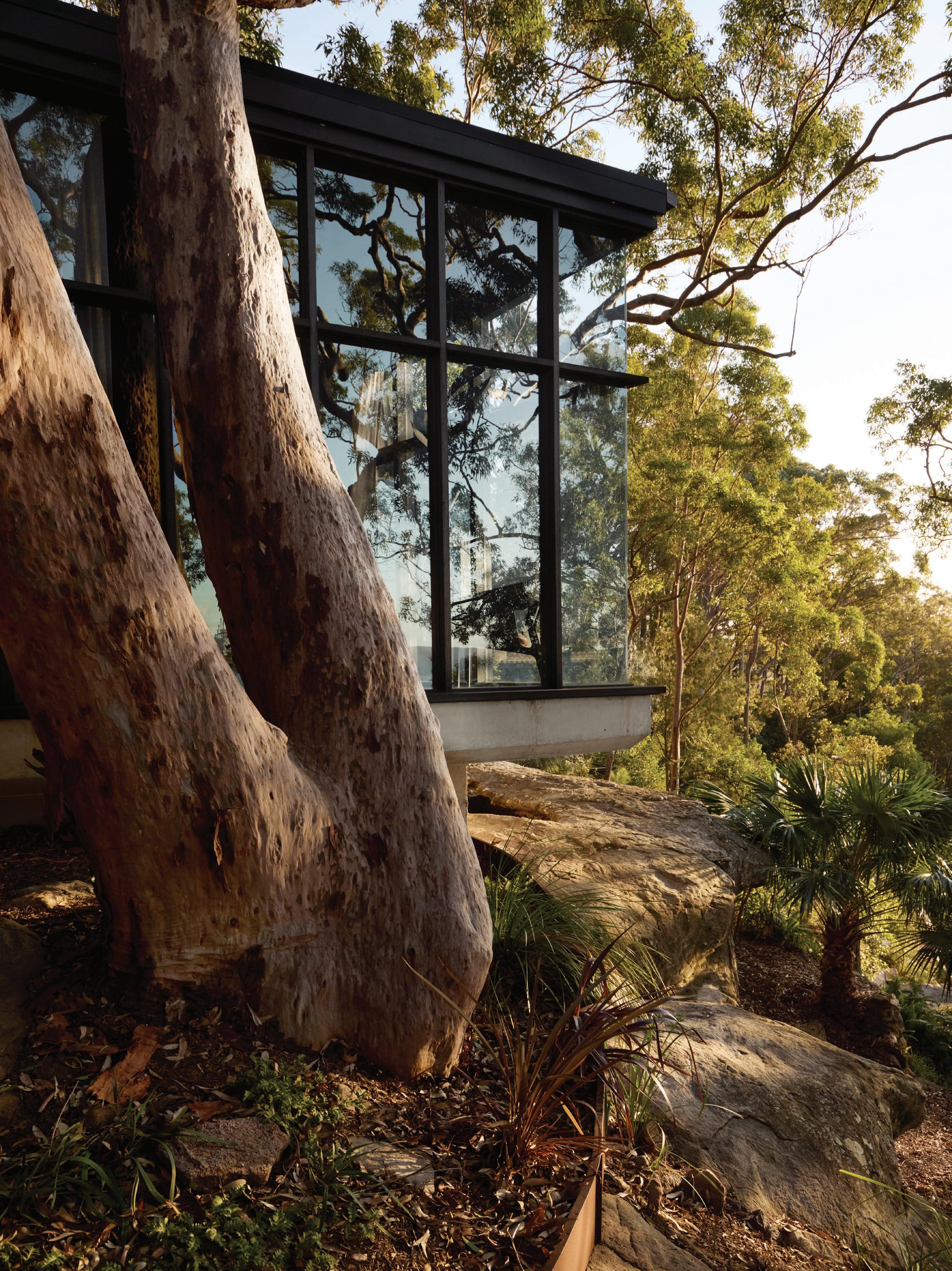
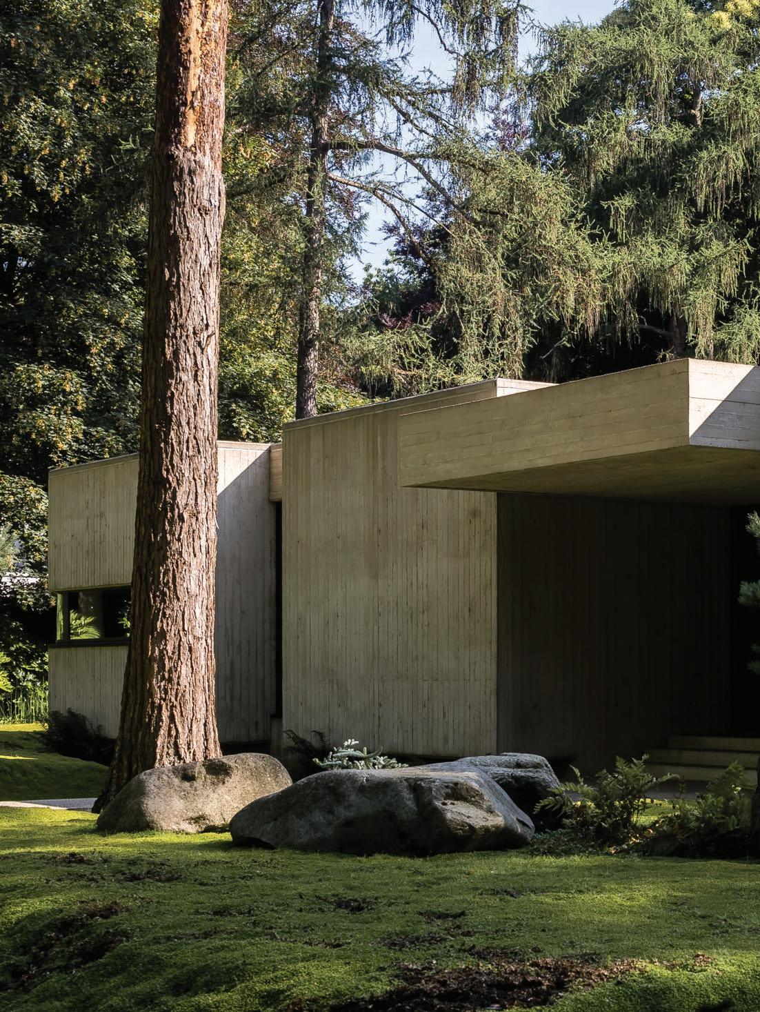
Belgian photographer Thomas De Bruyne captures a meeting of the minds between two of the country’s pre-eminent architects: one who first designed the 1970s concrete pavilion, and the other who now calls it home.
Ghent-based architect Glenn Sestig recalls the moment when architect Ivan Van Mossevelde first visited his home in Sint-Martens-Latem, Belgium. “He had tears in his eyes,” Sestig says, entrusted with restoring the concrete pavilion—one of Van Mossevelde’s earliest projects—alongside his partner Bernard Tournemenne, artist and creative director of Glenn Sestig Architects.
Sestig first came across the brutalist villa by accident as a young architect while walking through the forest. Asking the owner to explore the house from the outside, to which they declined, he took a few photographs of the nameplate and street, and promised himself he would write a letter if it were ever to be sold.
“I kept those pictures for years, but eventually I threw them away,” Sestig says, before a local journalist called him to let him know the home was quietly for sale. “I couldn’t believe it—20 years later someone was calling me about the house I had fallen in love with.”
Writing to the owners’ grandson with the intention of preserving and “bringing art back into the home” led Sestig to secure it in just under 48 hours—aided by the architect’s internationally recognised oeuvre, which includes collaborations with the likes of Belgian fashion designers Raf Simons and Ann Demeulemeester.
Sestig acknowledges it’s incredibly rare to find a house of this size—1,000 square metres on 4,600 square metres of land. The home’s size also wasn’t typical for the area in 1972, when the thenowners had to request permission from 40 neighbours for the flat-roofted, modern design. The brief was to create a living gallery for the art-collecting owners, who, upon seeing the first drawings, had only one concern: that the home would be too small for their collection. This prompted the request to double its size.
“We added our own touch, but for me, it’s very important to preserve as much as possible when working with significant architecture.”
– Glenn Sestig
page:
not to change the visual architecture. One structural change made was the addition of a floating staircase in the internal courtyard, which appears as though it has always been there, without altering the original concrete. A vintage concrete Sphere chair by an unknown designer is featured in the foreground.
This
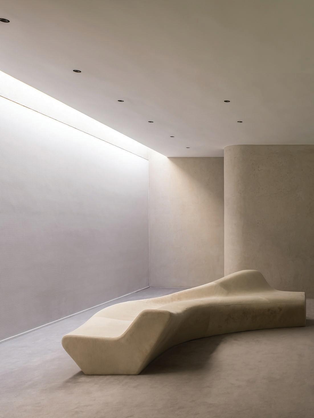
A Zaha Hadid Moraine sofa and works by Sol LeWitt, Thomas Houseago and Bosco Sodi. Previous page: Glenn Sestig and partner Bernard Tournemenne spent two years restoring the pavilion, careful
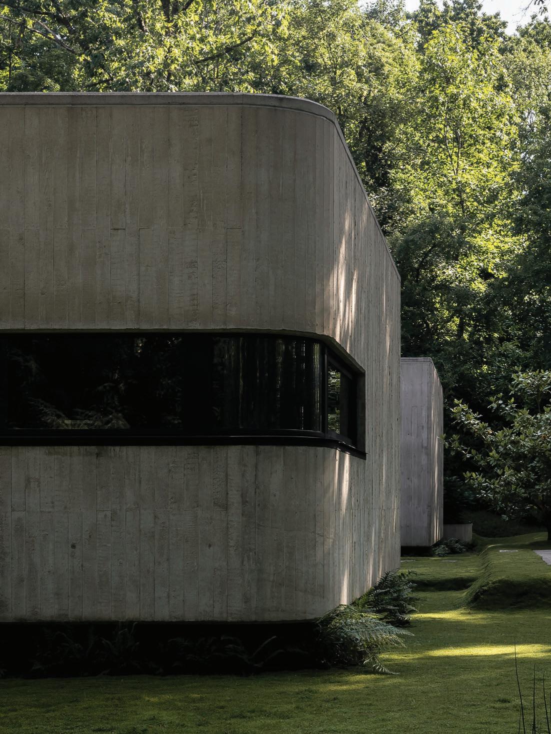
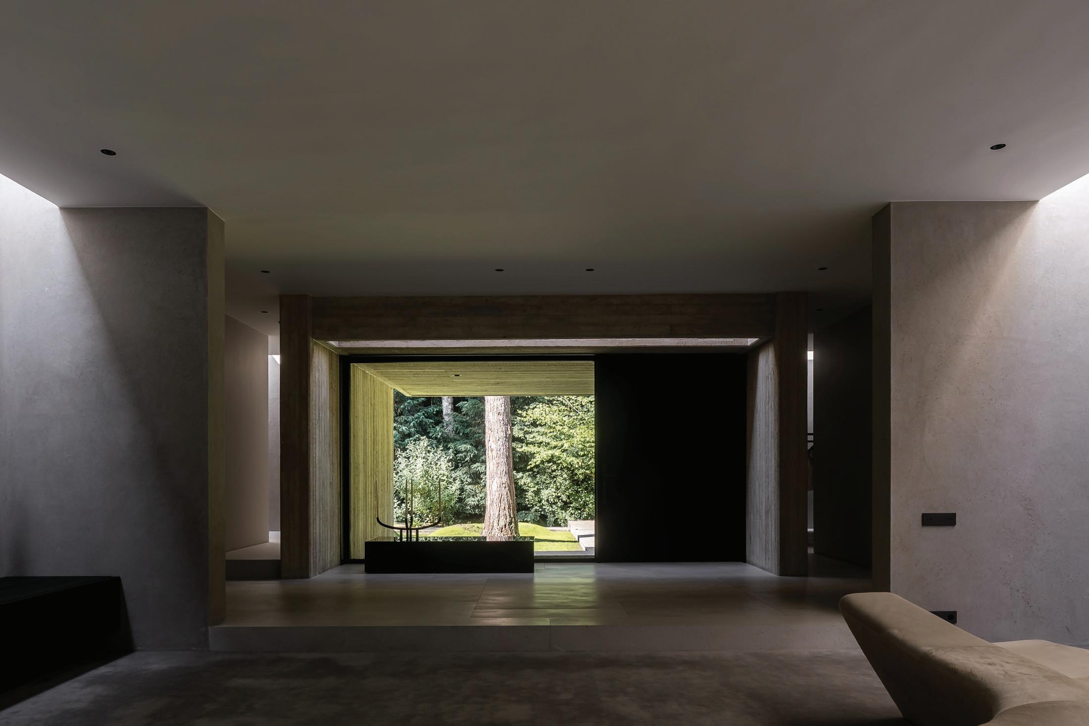
Sestig’s renovations took place over two years, but the architect was steadfast on not altering any of the concrete openings or the visual architecture. “Inside, we stripped everything—plasterwork, flooring, ceilings, plumbing, electricity—and rebuilt with today’s technical standards while always following the original design,” he says.
One of the few structural changes was the addition of a floating staircase in the patio, which deliberately avoids touching the original concrete, so “it can be removed without leaving any marks”. Resonating with the intuitive plan, Sestig reconfigured the three bedrooms into a primary suite and two private office spaces, but “designed it to be flexible, so it could easily be reverted”.
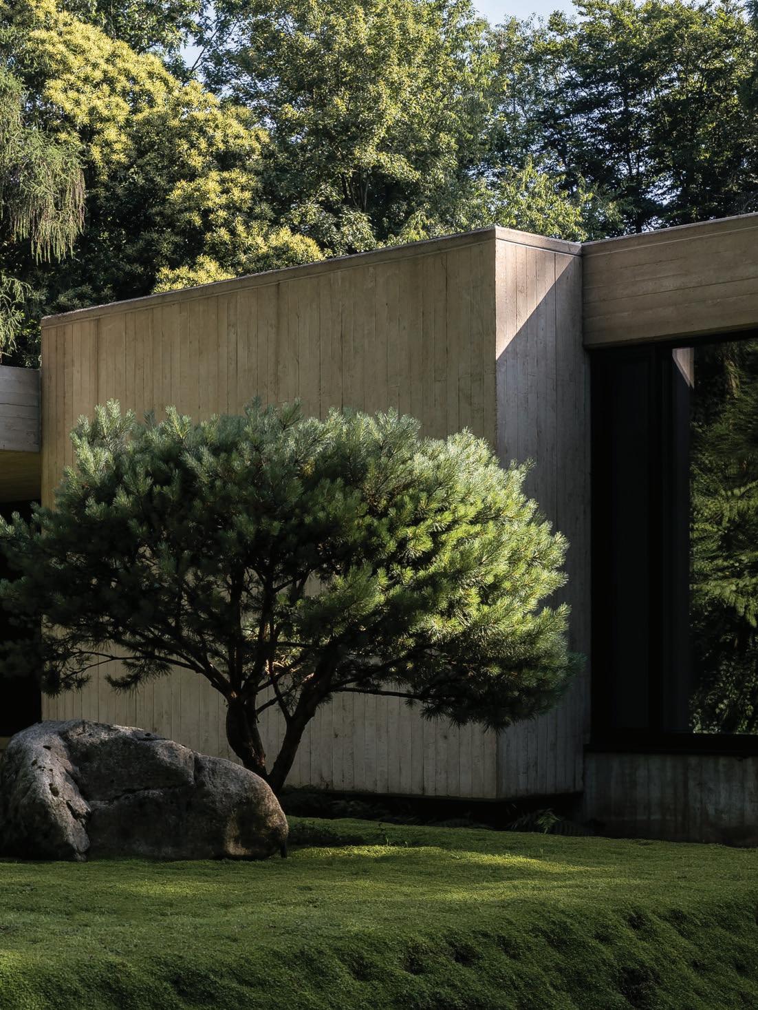
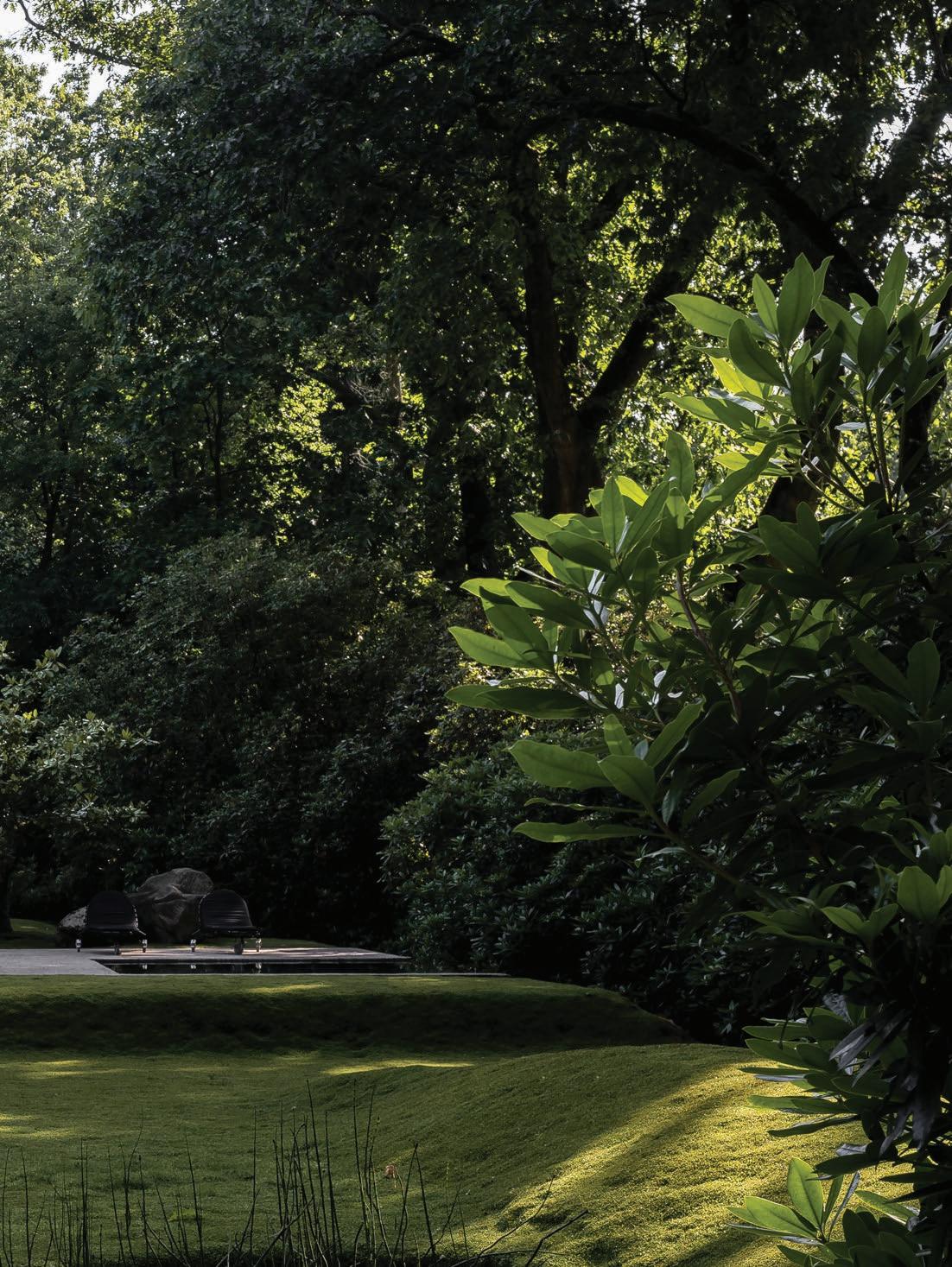
The 50-year-old windows, made of dark glass to protect artwork from sunlight, were replaced, “opening up the house to nature, so the views feel like artworks themselves,” Sestig adds. Together, Sestig and Tournemenne designed the Japaneseinfluenced garden, raising the previously flat lawn and adding a small pool to cool off in summer. “It now has a floating quality, and by creating movement in the garden, we made the house feel even more connected to its surroundings.”
A hallmark of its 70s era, the house was lined with carpet, which Sestig replaced with grey travertine to accentuate the architectural forms, combined with new carpet inlays. The new kitchen is more generous than its predecessor, and one that the architect designed for Belgian kitchen company Obumex.
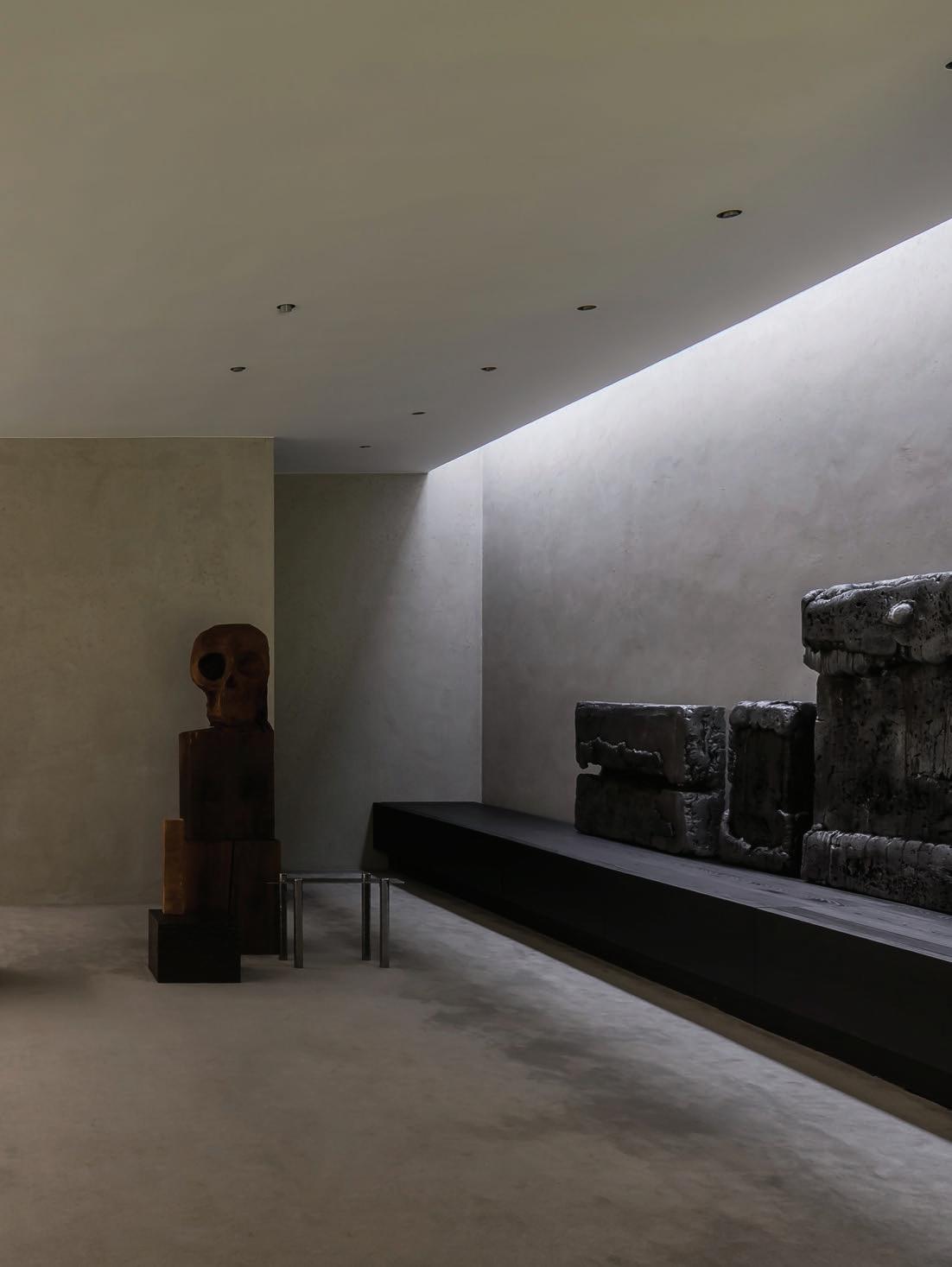
The home features pieces Sestig and Tournemenne have collected over the 33 years they’ve been together, and some purchased specifically for the house, such as the Oscar Niemeyer La Marquesa bench, the Carlo Scarpa sofas, and, most recently, a bench by Belgian creative Sofie Middernacht. “The hardest part is knowing when to stop,” Sestig admits. “I don’t like homes that are overflowing with art; I think the architecture needs space to breathe.”
The architect is still surprised by how the home hides certain functional elements, such as the garage ramp. “Van Mossevelde designed a bridge one metre from the window, with a concrete wall and planting, so when you sit inside, you don’t see the ramp at all. It’s such a clever solution—even I might not have thought of that,” he laughs.
Living in the house has also inspired Sestig to use skylights more in his own work, appreciating that “the house continues to teach [him] things about architecture”, and the opportunity to not only learn from, but contribute to the legacy of another.
The interiors previously featured carpet everywhere, Sestig says, even covering the stairs “like an old cinema”. The architect stripped the carpet out to refocus on the architectural forms, introducing carpet as inlays, combined with travertine to make the space “feel more structured”. Most of the furniture and objects Sestig and Tournemenne have collected over the 33 years they’ve been together, but the Cornaro sofas by Carlo Scarpa were among a few pieces purchased for the house. In the foreground, a work by Bernard T. Sestig, and behind the sofas, a piece by Hugo De Clercq.
This page: Glenn Sestig’s kitchen concept for Obumex. “We enlarged the kitchen, combined smaller bathrooms into one large primary suite, and created a proper dressing room,” Sestig explains how he modified the home’s layout. Previous spread: The Oscar Niemeyer La Marquesa bench, pictured across the courtyard, was purchased specifically for the home. Replacing the darkened 50-year-old windows, the home now opens completely up to the outdoors. “The openings are so beautiful that we don’t need a lot of art in the house—the views are the art,” Sestig says.
This page: Silver travertine is one of Sestig’s favourite materials. In the reworked bathroom, the architect introduced a skylight, inspired by others Van Mossevelde had used to draw light into specific spaces. Opposite page: While Sestig consolidated the number of bedrooms and bathrooms in the home, the layout can easily be reverted due to the flexible elements. Pictured:
Artwork by Dirk Braeckman and stool by Sabine Marcelis.
When guests visit the home, Sestig says they are often surprised by how warm the interiors are behind its concrete exterior. “We added our own touch, but for me, it’s very important to preserve as much as possible when working with significant architecture.” Following spread: Sestig and Tournemenne introduced a Japanese-inspired garden, but retained the 50-year-old rhododendrons and trees.
A different way to do walls.
Designed and made in Australia, Laminex Architectural Panels seamlessly integrate walls, ceilings and joinery.
Introducing our Classic Flat profile, delivering a clean, modern, reversible panel, allowing the choice between a subtle pencil line or bold expressed joint within one panel. The collection includes eleven woodgrain décors, including rich Australian natives from the Next Generations Woodgrains range and premium AbsoluteGrain® finish to authentically replicate the look and feel of natural timber.
making places elegant
Test Kitchen
Kitchen
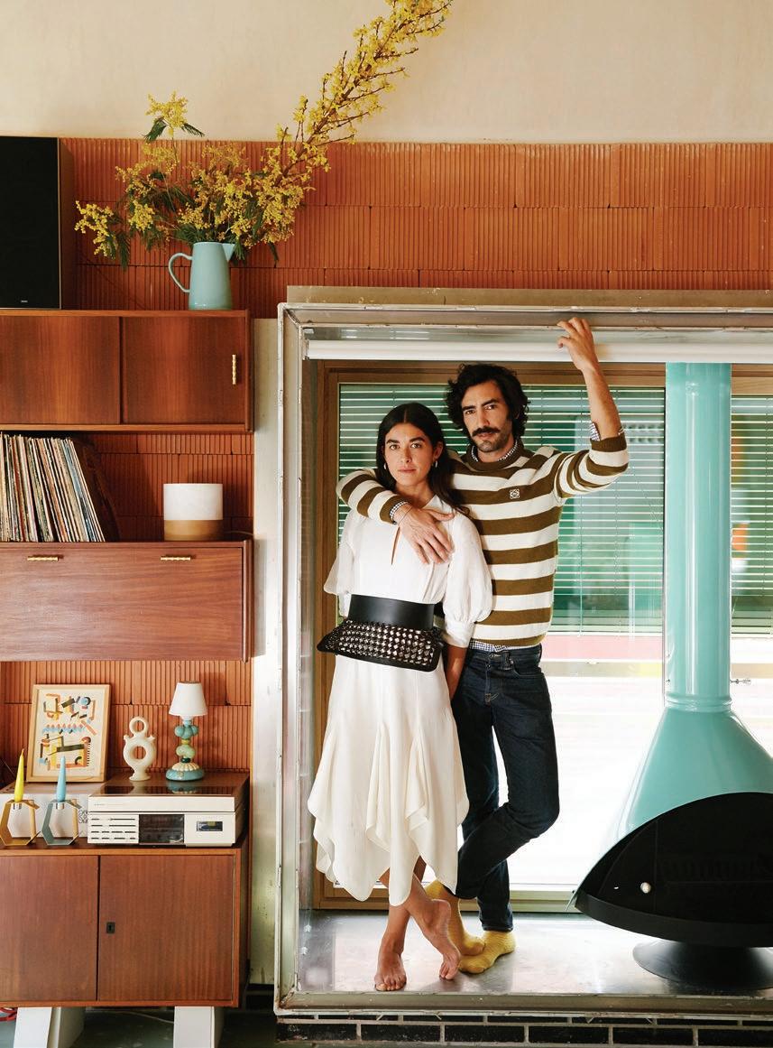
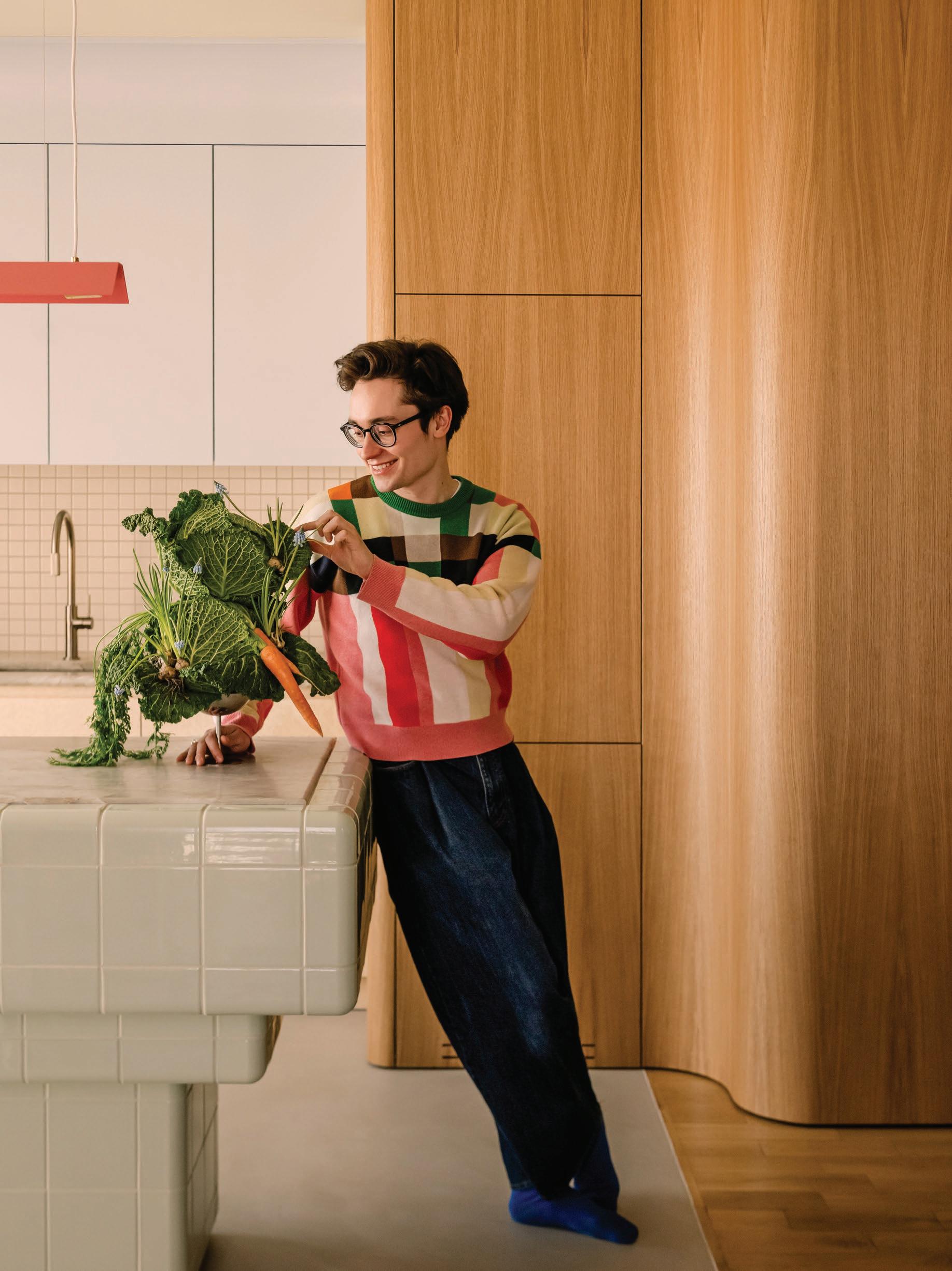
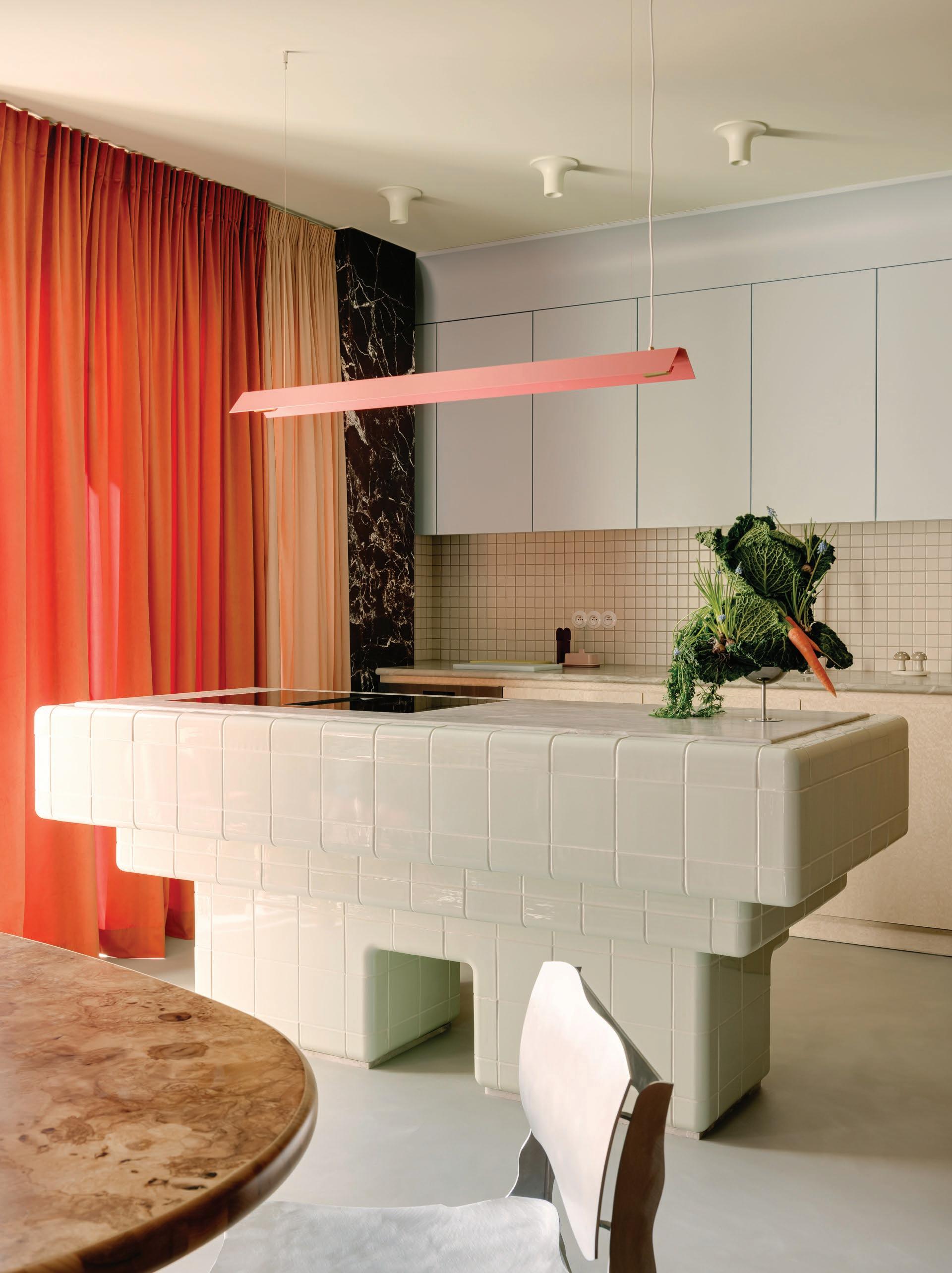
LOCATION Warsaw, Poland DESIGN Mistovia PHOTOGRAPHY ONI Studio WORDS Sophie Lewis
Previous page: Michał Korkosz, one of Poland’s most celebrated food bloggers and the author of bestselling cookbooks, in his kitchen. This page: All of the home’s design elements unfold around the D-Tile kitchen island, with a Cosentino Brazilian Sensa Vancouver quartzite benchtop and induction cooktop. A strip of Rosso Levanto is adjacent to the pastel-toned cabinetry, which is repeated in the living room cabinet, and the floors are microcement.
A Polish apartment is designed as a creative miseenplace for a culinary blogger.
Warsaw-based food blogger and bestselling author Michał Korkosz has amassed more than 800,000 followers under the name ‘Rozkoszny’, which means ‘delightful’ in Polish. Rozkoszny isn’t just about the dishes Korkosz creates with a plant-based bent, but the cultural experiences, memories and vivid aesthetic that render his entire culinary universe so popular.
Korkosz contacted Marcin Czopek, founder of interior design studio Mistovia, based in Katowice, Poland, to design his apartment. He wanted to translate his uplifting-the-everyday approach to cooking into a home that would also double as his recording studio.
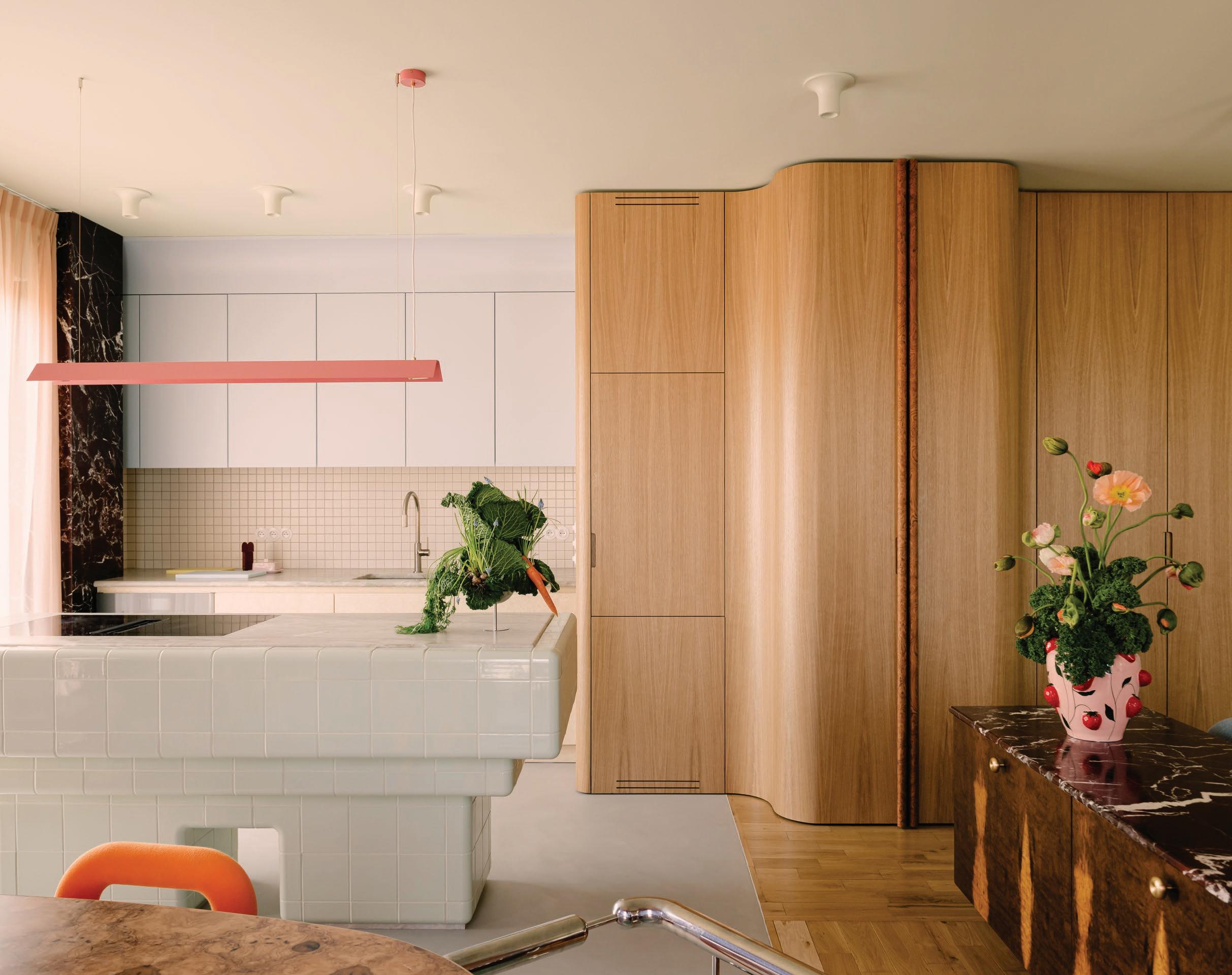
The 65-square-metre apartment sits opposite a former factory in Warsaw’s Praga-Północ district, an area Korkosz gravitated towards for its local markets, cafes, and confluence of modern developments and tenement homes. “Korkosz deliberately chose this location because it combines tradition and modernity, inspiration and comfort,” Czopek says, adding that the opportunity to work in a new building offered a lot of design freedom. “We demolished most of the walls, creating a cohesive space, excluding the bathroom and bedroom,” he says. “We weren't looking for any references here.”
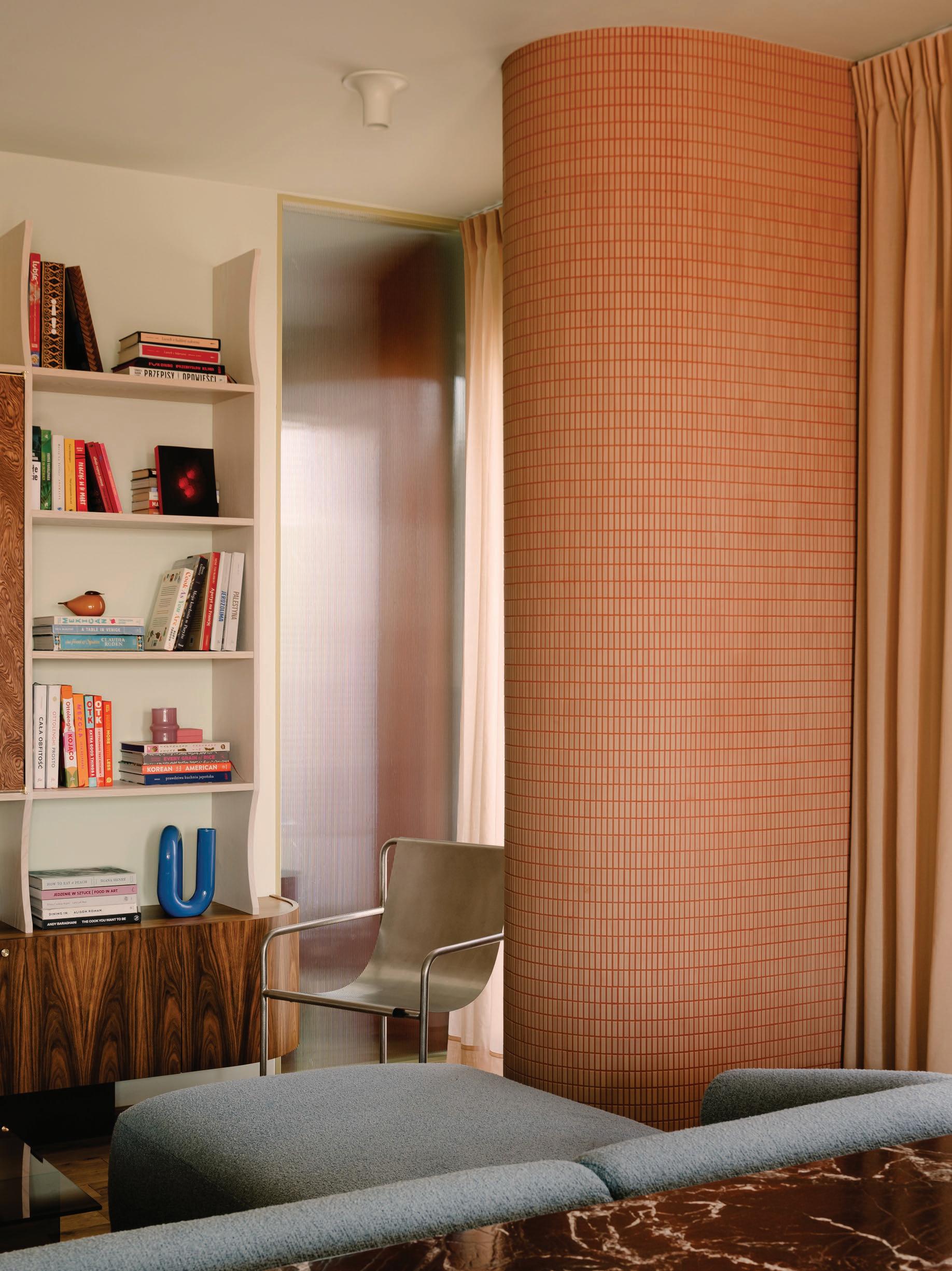
The apartment is entirely open plan, with just the bedroom and bathroom separate. Curved edges soften transitions, designed to conceal uneven walls and awkwardly positioned chimney flues, such as the wavy line of joinery in the kitchen. Curtains in shades of peach, tangerine and burnt orange—each with a different opacity—temper natural light.
Experimental materials and unexpected combinations are the flavour du jour. “We weren't afraid to combine several types of wood within a square metre,” Czopek notes, working closely with Korkosz to select a palette based on association with particular foods. “The underbench kitchen cabinetry is the colour of butter, and the shade of the kitchen island reminds us of Caesar salad.”
Naturally, the kitchen required the most design consideration, centred around the tiered island, clad in Dutch D-tiles that were custom-made over four months. The engineered stone worktop features an induction cooktop, and the ventilation was routed from the hood through the floor to facilitate taking photos and recordings. “Photogenicity—right after functionality—became the criterion for selecting details,” Czopek explains. “We selected the colours of the walls, tiles and cabinets by analysing how they would complement the food—and conducted numerous trials for this.”
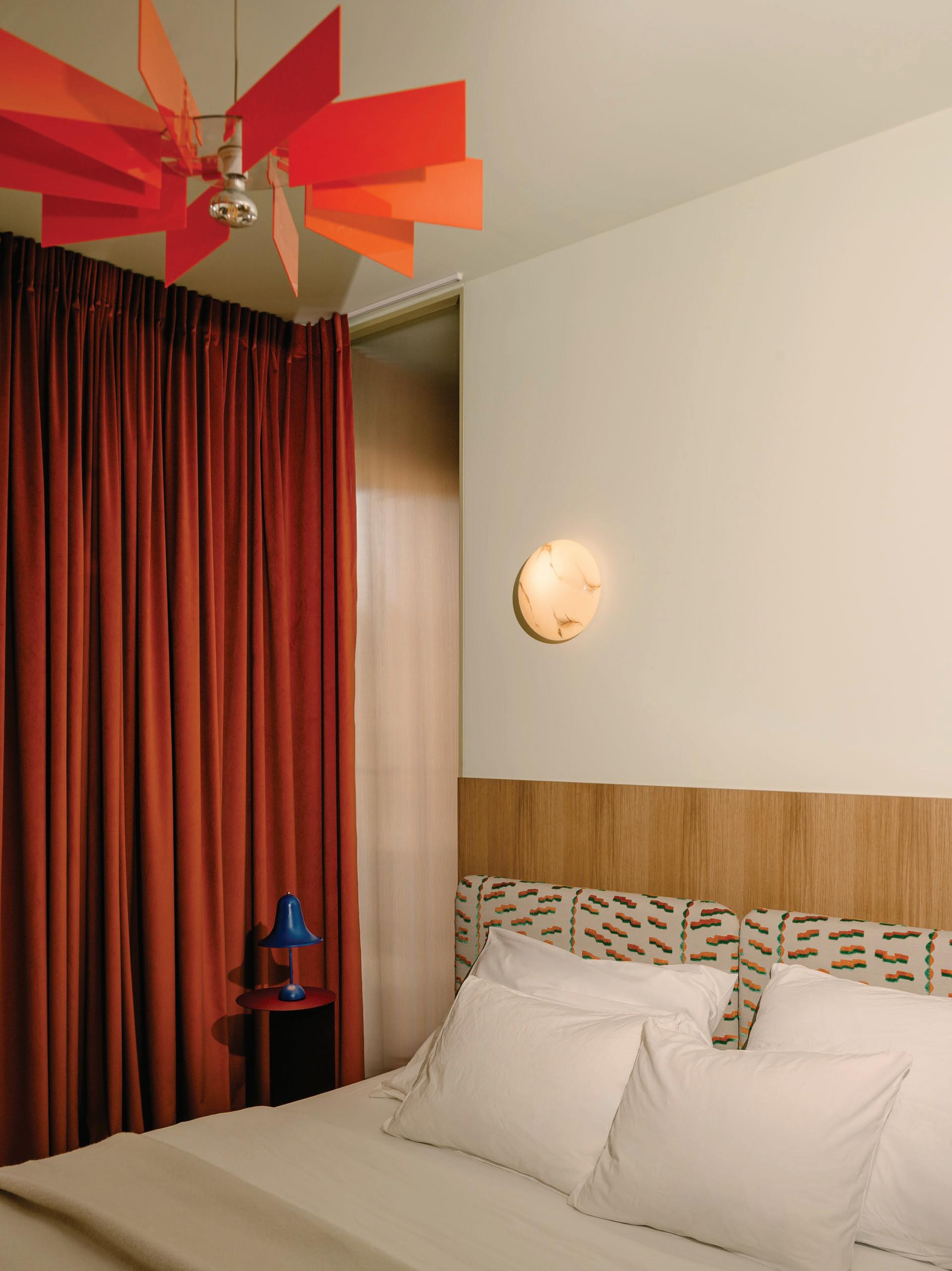
Korkosz’s effervescent online persona can be seen in the home’s furniture and lighting. The dining area spotlights homegrown design talent, in particular, the Szyszka Design handcrafted burl and metal dining table and the Poodle armchair by Mati Sipiora, inspired by the breed. The Moustache chair by BIG-GAME and the Contemporary Vanity V2 chair by British makers Six Dots Design add to the playful conversation, alongside the metallic Verpan Hive pendant above, and the bell-like Verpan Pantop Ø23 table lamp in the bedroom.
Korkosz has built Rozkoszny on delighting the senses through Polish cuisine and sharing in this pleasure with his audience. As both a stage and a place for Korkosz to call home, Mistovia’s colourful, concentrated apartment achieves the same effect.
This page: Mistovia’s unexpected material combinations can be seen in the Rosso Levanto marble and burl custom cabinet behind the sofa.
Opposite page: An animated curation of dining chairs includes the Poodle armchair by Mati Sipora, the Moustache chair by BIG-GAME and the Vanity V2 chair by British makers Six Dots Design.
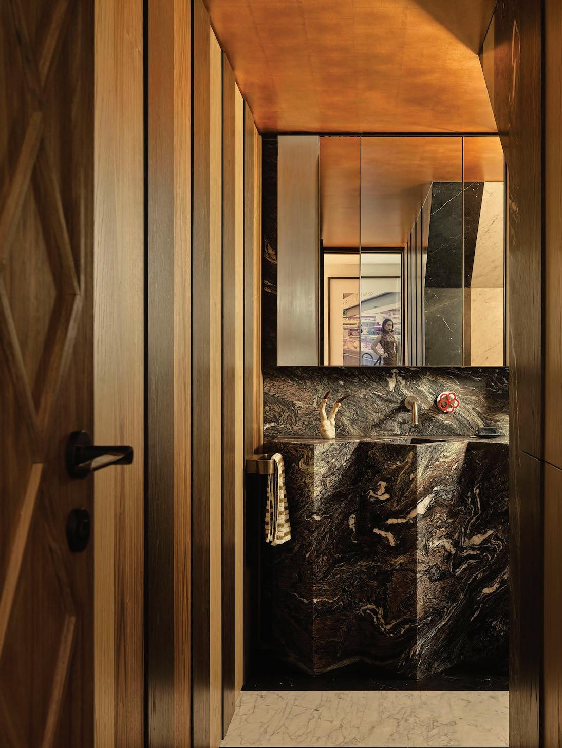
This page: Fantini tapware creates a bolt of colour against the Ceppo di Vagli marble-clad walls in the bathroom. Opposite page: A custom Dedar fabric bedhead and Kafti Design pendant play to the orange tones throughout. A Verpan Pantop Ø23 table lamp sits in the corner.
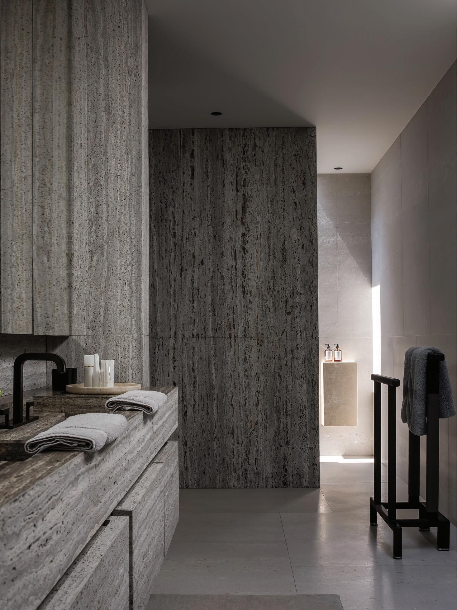
Odyssey Architecture paired several ABI Interiors pieces in the bathrooms, including the Tezra Cabinetry T-Pull 50 mm and Milani Assembly Taps & Spout set, chosen for their understated elegance and tactile quality. Set against a crisp, white palette, they contribute to the calm, composed atmosphere of the space.
Bathrooms in Balance
Located in Melbourne’s inner suburb of Prahran, a considered collaboration between multi-disciplinary studio Odyssey Architecture and Australian fixture brand ABI Interiors elevates a classic double-fronted Victorian home’s bathrooms beyond expectation.
In conversation with Odyssey Architecture principal Michael Nguyen, we explore the project’s design evolution and how a sense of calm, clarity and connection was achieved behind the heritage façade.
Prahran House is defined by its calm, refined material palette and rebalanced sense of flow. How did you strike that same balance in the more intimate, enclosed spaces like the bathrooms?
Michael Nguyen: Natural daylight is key to creating a sense of calm. We always try to introduce natural light into bathrooms through carefully placed windows or skylights. There’s a quiet beauty in simplicity, so the material palette is intentionally restrained to reinforce that sense of serenity. In the master en suite and walk-in robe, we designed the spaces to feel like a seamless extension of one another, which in turn gave the en suite a more generous, connected feel.
What were the key spatial or experimental qualities you aimed to achieve within the bathrooms? How do they support the daily rituals of the young family that lives here?
Michael Nguyen: Storage was a key consideration in the design of each bathroom. We incorporated ample vanity and mirrored cabinet storage to ensure that every member of the household had space for their daily essentials. The master en suite and walk-in robe were conceived as a seamless extension of one another, allowing a couple to use both spaces efficiently during busy mornings.
The location of the shared bathroom was also carefully considered. By positioning it close to the secondary bedrooms, we ensured easy access for the rest of the family, while still maintaining a sense of separation from the main living areas. Double basins in the shared bathroom support the family’s evening routines, allowing multiple users to get ready at the same time with ease.
The material palette in the bathrooms feels both restrained and richly layered. Can you share more about the finishes
and tonal decisions, and how they contribute to the overall mood?
Michael Nguyen: Our approach to these types of projects is to be sensitive to the heritage character of the existing home, while layering in contemporary elements to create a calm and refined atmosphere.
Bianco Carrara marble is a timeless material. Elegant and understated, it grounds the palette with a sense of classic permanence. Brushed nickel tapware was chosen for similar reasons; it’s subtle, enduring and quietly luxurious. The reeded glass is a nod to traditional detailing, but we’ve reinterpreted it in a more contemporary way. The matt timber laminate adds warmth and texture, preventing the space from feeling too clinical while reinforcing the sense of calm.
ABI Interiors tapware and hardware have been integrated seamlessly. What made these selections a natural fit for the project—functionally or aesthetically?
Michael Nguyen: We were drawn to ABI Interiors for their simple, elegant and timeless designs. We thought they were a natural fit for the aesthetic we were aiming to achieve. Their fixtures align beautifully with the calm and enduring character of the home, offering both functional quality and a refined presence that integrates seamlessly into the overall design.
Lastly, how do you see the bathrooms in Prahran House as reflecting broader values of Odyssey Architecture?
Michael Nguyen: The bathrooms in Prahran House reflect several of our core values at Odyssey Architecture which include restraint, efficiency and spatial generosity. The design balances clean, refined detailing with a focus on flow, optimal storage and a calm, composed atmosphere. Throughout, we’ve aimed to celebrate the home’s heritage character while expressing material honesty and timeless simplicity.
VERTICAL
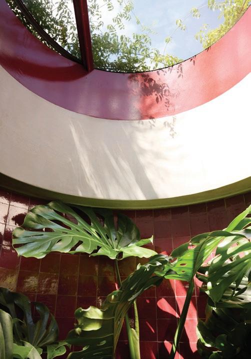
VERTICAL GROTTO
LOCATION Gadigal Country/Sydney, Australia
ARCHITECTURE & INTERIORS SJB LANDSCAPE
DESIGN Dangar Barin Smith BUILD Promena Projects
PHOTOGRAPHY Prue Ruscoe INTERVIEW Karen McCartney
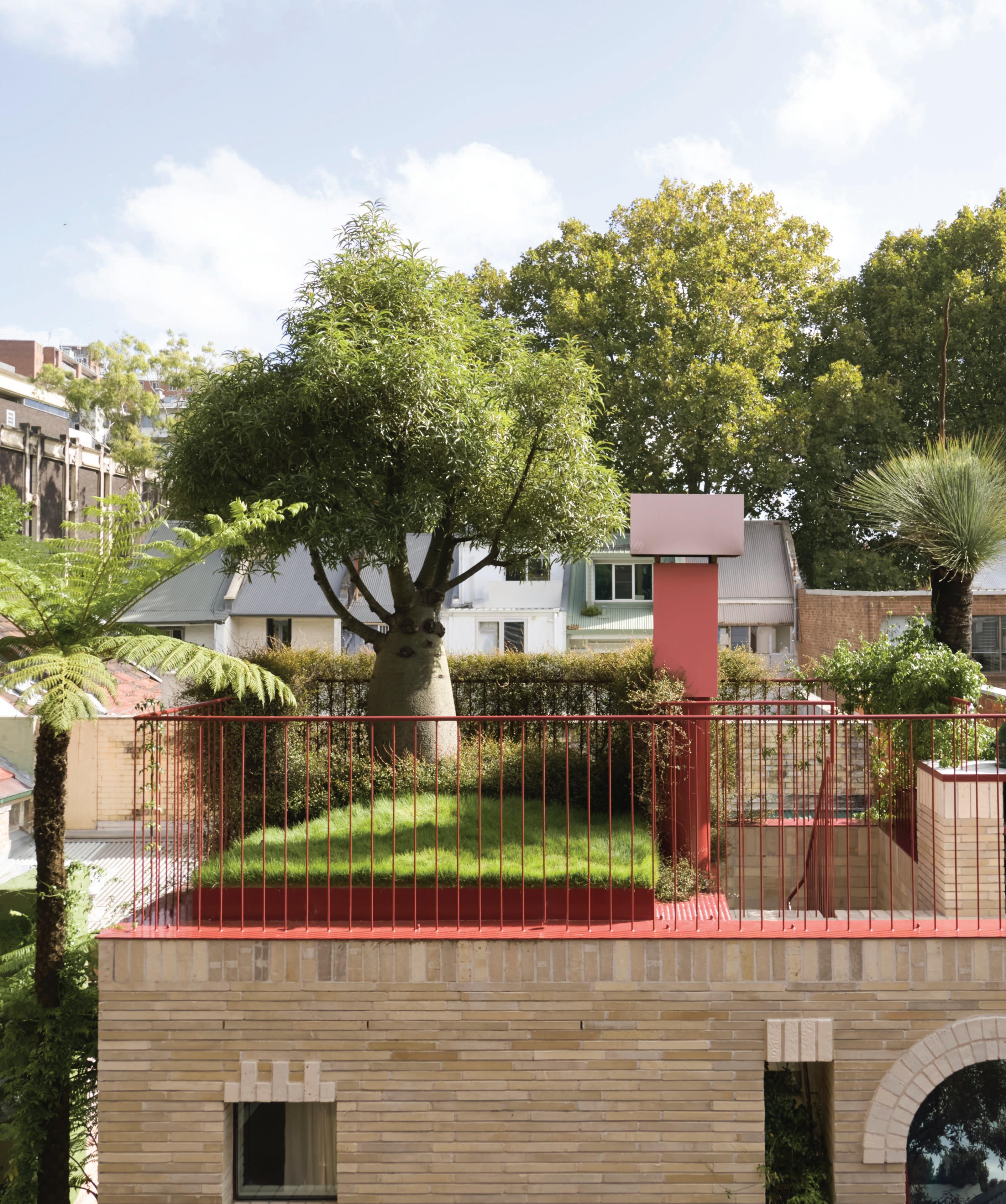
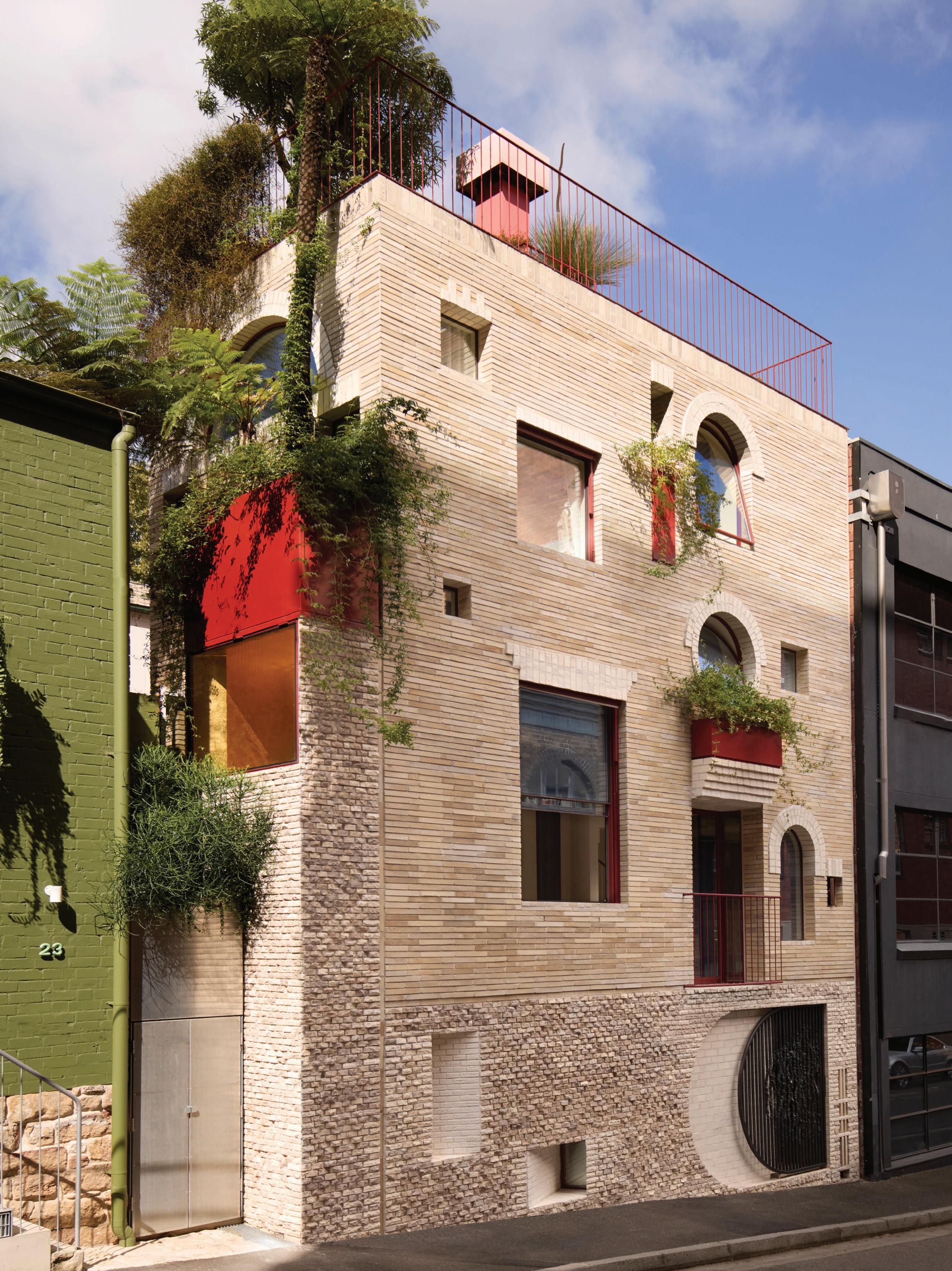
The rooftop garden was carefully engineered to provide sufficient soil depth for this sculptural Queensland bottle tree, which soars above a lush lawn of Sir Grange zoysia grass. Japanese red painted railing is gradually disappearing under a cloak of muehlenbeckia.
In an exclusive extract from our garden editor Will Dangar’s latest book, Natural Order, we showcase a personal project from SJB’s Adam Haddow. Speaking with Dangar Barin Smith co-director Tom Smith, we see how the home takes urban gardening to a whole new level.
Conceived with the intent of exploring the future of urban spaces, this small inner-city terrace has adopted mixed-use principles. The multi-award-winning home of SJB architect Adam Haddow and partner Michael Combs uses planting to challenge norms and subvert traditional expectations, resulting in a series of spaces that constantly surprise and delight, while reframing the concept of the city garden.
Architect Adam Haddow has created an experimental space packed with charm and personality. What were the key inspirations for the landscaping?
Tom Smith: Adam and Michael have a beautiful, lush landscape painting in their living room, nearly four metres long, called Eora by artist Nicholas Harding, who won the Wynne Prize in 2022. The painting depicts native bushland with dense tree ferns and cabbage palms. It was such an important piece that they wanted to celebrate by riffing off the work’s native planting for their own garden scheme.
Were there learnings from previous projects you could apply here?
Tom Smith: We had worked with Adam before on his rooftop garden in Cleveland Street, Redfern, so key principles surrounding the demands and requirements of this type of site had already been established. But here, with the smaller footprint, the opportunity was different, and we worked hard to do more with less—finding simple ideas that could make generous, impactful gestures, as well as those that could provide quirky, intimate moments.
There is a playfulness to the building in terms of window shapes, materials and coloured forms, which are enhanced by the plants. Were you able to be equally offbeat in the planting selections?
Tom Smith: We strove to support the architecture and soften its geometry with plants spilling from the toybox-style planters integrated into the façade—haphazard growth at different levels brings its own energy. We also defied logic with a large tree fern growing from a suspended position on the second storey. It was planted as a six-metre stick and has since flourished, now forming part of the canopy at the top of the house alongside the roof garden. At one point, we even sought a 15-metre palm tree, imagining the contrast of the biggest palm with the smallest house, but the result we achieved is unique and certainly noticed by passers-by.
But this isn’t the only large tree in the project, is it?
Tom Smith: Adam and Michael were keen to include a sizeable Queensland bottle tree in the roof garden, which required substantial engineering to provide the necessary soil depth for both stability and healthy growth. It acts as a natural sculpture and a visual anchor for the roof garden, around which everything else pivots.
The roof garden is a tiny oasis, an exercise in reductive thinking. Was it hard to design the landscaping when there were so few moves to make?
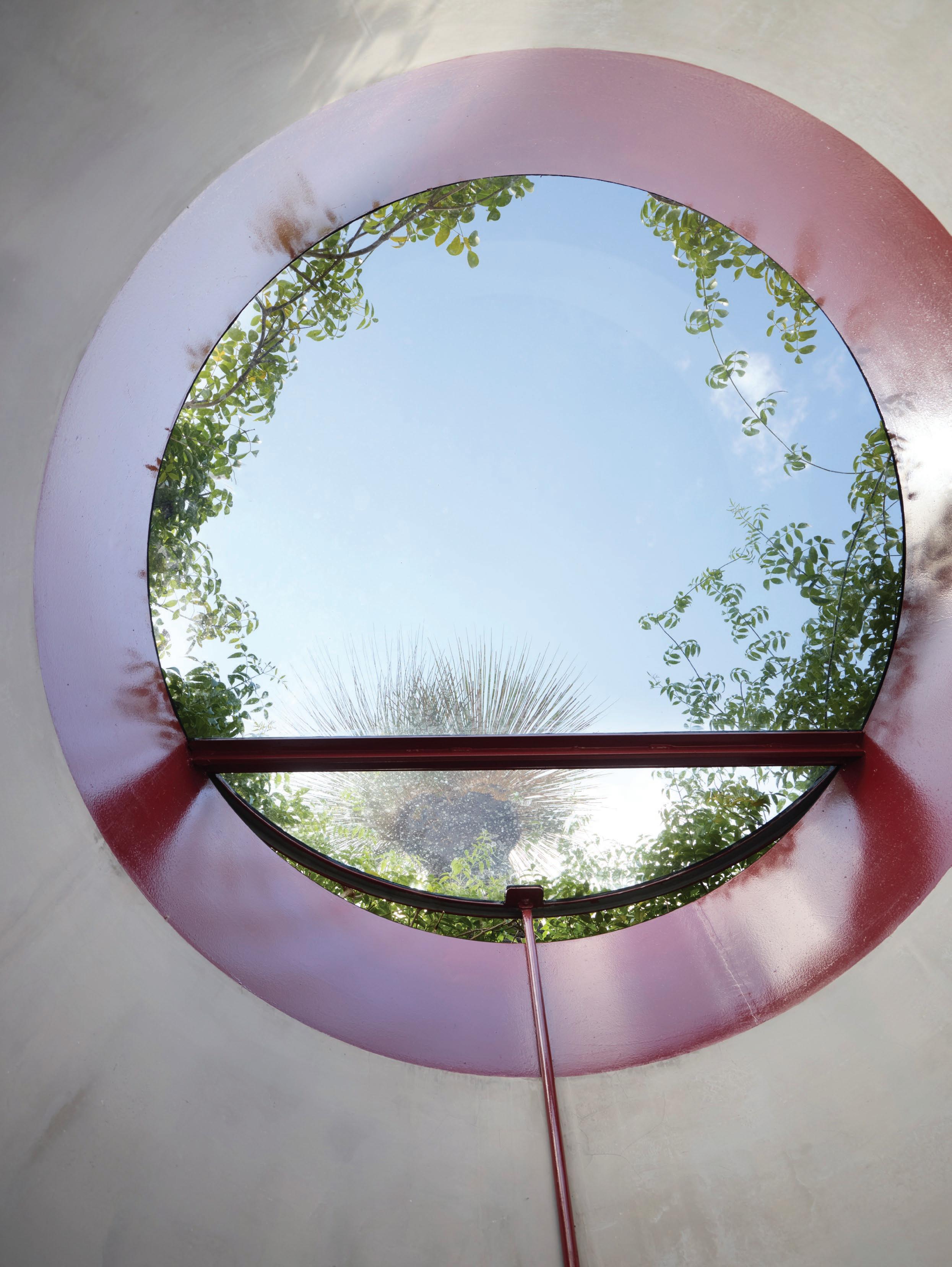
Tom Smith: The 30-square-metre space was cleverly planned by Adam to include a BBQ and bench, an outdoor sink and some seating. The massive skylight, which brings light into the shower room below, is feathered with bower vine. A small section of lawn provides a subtle gesture, while generous swathes of Muehlenbeckia drape over the Japanese redpainted railings and weave around the sculptural exhaust
stacks. Everything is highly intentional and condensed, and, as a result, makes a powerful statement.
How does this garden relate to the broader cityscape?
Tom Smith: The house is in Surry Hills, an area of mixed retail, commercial and residential buildings. This garden, with its mature trees and extensive native planting, introduces a certain wildness in an urban setting and demonstrates what can be achieved when there is the will to do so. With planting at every level, the building contributes positively to the streetscape, which is something Adam strives to do in every aspect of his work.
From inside, the house provides views through to garden pockets, and there is the sense that greenery pops up and weaves its way into and around the building. Is the planting behaving as you imagined as it grows and expands?
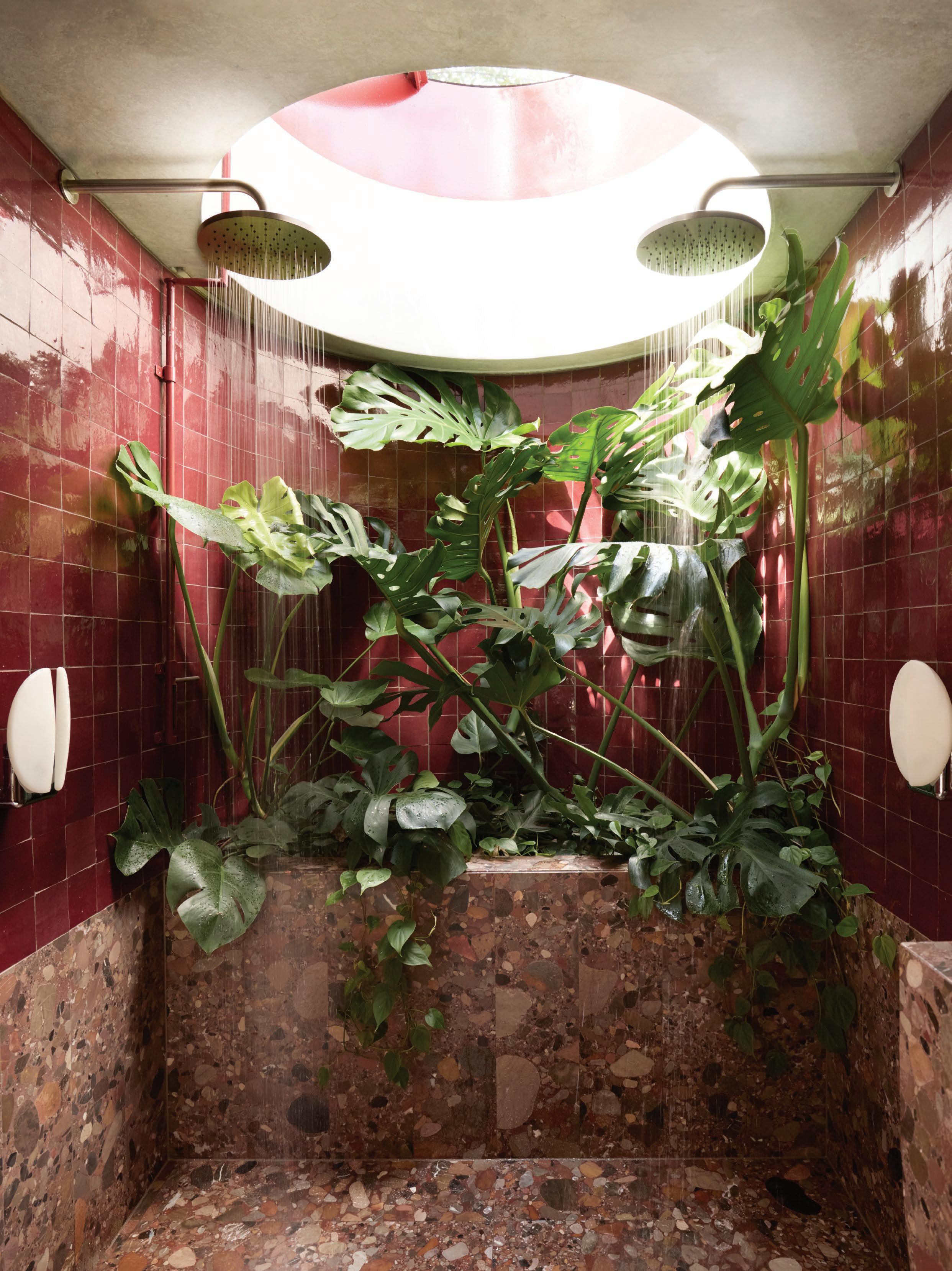
Tom Smith: Very much so. The view of a palm from the bedroom window, a small garden of greenery accessed from the living room, and plant tendrils curling around the windows and skylight edges all give the sense that the house is wrapped in nature. Even the circular shower room is filled with lush foliage—so while the house is undeniably urban in context, the natural world plays a key role.
Was this a hard project to conceive as a scheme that’s more three-dimensional in nature than most traditional gardens?
Tom Smith: The project required a lot of trust and collaborative effort, with a shared understanding of a contemporary approach to native planting and a desire to innovate and push the boundaries of what garden spaces can be. It was challenging to plan as we normally do, but the many lessons learned along the way made the outcome a real joy.
Monstera and devil’s ivy bring a jungle vibe to the shower room, where both plants and people can luxuriate in abundant natural light.
Opposite page: The skylight above the shower gives an unexpected vista of the garden with a glimpse of bower vine and a grass tree.
Argyle Well by Welsh + Major, photography by Anson Smart.
Definitive Design Products for 2025
Earlier this year, we asked 50 of Australia’s leading architects and designers to vote on their definitive list of products for 2025.
In this instalment, we spotlight the bathroom—from tiles to bathware and tapware—revealing the products and brands that resonate most, and why.
Terrace House by Flack Studio, photography by Anson Smart.
City Stik
Brodware
“Brodware has such good quality products in a wide range of finishes and profiles that suit any project type—be they modern or period.”
– Felicity Slattery, Studio Esteta
Pipe Mixer
Marcel Wanders
Aboutwater Boffi Fantini
“Boffi Pipe mixer. The red handle always makes a great statement in powder rooms.”
– David Flack, Flack Studio
Scala Range
Sussex
“Classic and timeless, and Australian-made.”
– Emily Watson, Studio Bright
Murowash Natural White Murobond
“I love the hand-applied finish and softness Murobond Murowash adds to spaces.”
“All natural, eco-friendly and a really beautiful selection of colour.”
– David Goss, Studio Goss
Bluefin
Porter’s Paints
“Porter’s Paints colours are my personal favourite—their colours have real depth and feeling. I love ‘Bluefin’ or as we call it ‘Brem blue’.”
– Brahman Perera
Holbrook House by Brahman Perera, photography by Timothy Kaye.
Coastal House by Rob Kennon Architects, build by Bartlett Architectural Construction, photography by Derek Swalwell.
Moroccan Zellige Collection
Glazed Cotto Zellige Range
Eco Outdoor
“The Glazed Cotto Zellige range by Eco Outdoor. This range creates a unique and imperfect environment through colour, texture and scale.”
– Rob Mills, Rob Mills Architecture
“The handmade Moroccan Zellige collection from Tiento. The colour hues are varied and add a gentle dimension to the surface they’re installed on. My favourite colours are Moss and Denim.”
– Miriam Fanning, Mim Design
INAX Sugie Series
Sonja Kritzler
“The INAX Sugie Series from Artedomus. You can use them as wall tiles, feature tiles, and floor tiles thanks to their textured repetition.”
– Monique Woods, Rob Kennon Architects Artedomus
Tiento
Rockwell Bath
The Water Monopoly, 2020
“The Water Monopoly Rockwell Bath. It’s classic, nostalgic, inviting, and adaptable through colour choice and footed options.”
– Sophia Leopardi, Williams Burton Leopardi
Ottocento Bath
Benedini Associati
Agape, 1975
“The Agape Ottocento bath is the perfect combination of classic and contemporary.”
– Chris Major, Welsh + Major
Kaldewei, 2025
“Kaldewei Classic Duo Oval— simple, elegant, clean lines.”
– Rosa Coy, Coy Yiontis Architects
Classic Duo Oval
Balaclava House by Hecker Guthrie, photography by Shannon McGrath.
Rosherville House by Kennedy Nolan, build by Calibre Custom Builds, photography by Anson Smart.
Ned Vernon
“Individual and refined—proper door jewellery!”
– Patrick Kennedy, Kennedy Nolan
“The Como Pull from Pittella—a beautiful simple bronze handle in the shape of Lake Como.”
– Susi Leeton, Susi Leeton Architects
Designer Doorware
“The Niki on Round Rose from Designer Doorware. The simplicity of these knobs allow us to pair them with so many other fixtures and accessories.”