Reflective Journal


Ella Lissauer - s5222307
2656QCA Introduction to Spatial Design

Week 1
Week 2
Week 3
Week 4
Assessment 1 Feedback

Week 5
Week 6
Week 7
Assessment 2 Feedback

Week 8
Week 9
Week 10 Week 11 Week 12 Assessment 3
2 Contents 2 3 4 6 8 10 11 12 14 16 17 18 20 21 22 24 25 26 Content Reflection
Conclusion
Reflection
Taking Introduction to Spatial Design this trimester has helped evolve my understanding of interior design, aiding in differentiating between decoration and design and clarifying that interior design is about solving a problem not solely creating an aesthetic. With this new understanding, I struggled with the assessments this trimester. My decision to become an interior designer was based around creating personalised spaces where people can feel safe being themselves and exploring their individuality, this is an aesthetic undertaking. The problem solving aspect of spatial design, in all honesty, hurt my head a little bit. Having to think speculatively was not a skill I’ve had to use before and I found it very difficult to be open minded and create a floor-plan and joinery pieces that could be utilised by 4 people, while also allowing them to have privacy. While I’m happy with the work my partner and I did, I can’t help but feel like we failed in creating an innovative design.
As someone that lives on campus at Griffith Nathan, I understand first hand how to live with people I don’t know and use communal spaces, such as the bathroom, kitchen and living space. With this perspective in mind, speculative design was difficult as the main objective of our design was functionality and privacy. After the
lecture on interiority, I became more comfortable with our design. I realised that with our understanding that the apartment will be for students, there will always be new occupants, and creating a personalised space for 4 people wasn’t, in reality, a functional idea. The space we created is neutral and usable for all people, grounding our design in reality.
This course has helped open my mind to our national and global living crises, it will also push me to reflect on how a design can be innovative and affect human behaviour. While designing speculatively was not a success in my opinion, I want to work on that skill over the rest of my degree and career and combine that with my innate desire to create practical and personal spaces.
3
Week 1
Smaller Living - An Introduction
Settlement Patterns Affect:

• Urban sprawl
• Urban decay
• Increasing social segregation
• Political and economical displacement of the disadvantaged
Changing Demographics
• Blended families
• Single parent
• Single dweller
• Same sex couples
These demographics highlights the opportunity to downsize to multiple unit housing are low maintenance solutions
Climate Change
• Challenges infrastructure and livelihoods
• Housing and infrastructure should be climate defensive where appropriate responses include attention to preventative, adaptive, social and economic solutions
High Density Cities
• Increase human interaction
• Reduced energy consumption

Understanding the effects of larger living on our environmental and social climates contextualises the current housing crisis. As someone who lives in student accommodation, I didn’t fully grasp how detrimental our national housing crisis was to health and climate. With this context, understanding why we are redesigning a 2 bedroom apartment into 2, 2-bedroom apartments makes sense. With the climate issues in mind, biophilic design might be an interesting avenue to research and include in the redesign.
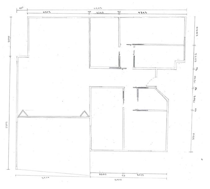
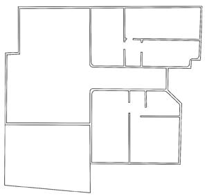
Site Measure
Determining where to take the site measure was an ordeal, however, after finding a home that was too large for our purpose, we decided to cut off 2 bedrooms, leaving us with an 89m2 space.

4
Towards a Smaller Housing Paradigm

 By Thomas Geffner
In doing further research on the topic of smaller living, I came across an article, ‘towards a smaller housing paradigm’. Discussing how smaller apartments are more affordable for developers by reducing per-unit construction costs and therefore charging less for occupants, Geffner makes a point of how these smaller spaces can also lower average operating costs, like heating and electricity, for dwellers.
Geffner also points out further positives for higher density cities, whereby denser cities require less cars, or car trips are likely to be shorter, supporting the idea of a walkable city, somewhere like New York. Higher density cities, he says, also increase productivity due to close proximity to other workers.
These higher density dwellings ease pressure on larger family unit by creating an alternative for single dwellers.
Week 1 as an introduction helped me to understand how design is influenced by social and political issue, I had never considered this influence before.
With the challenge of turning a 2 bedroom space into a 4 bedroom apartment, I’ll have to consider to best utilise space and ensure the space is functional and affordable.
5
Week 2
Housing And The Need To Go Smaller - Part 1

Having heard this phrase before, this week’s lecture has clarified something for me. Designers have a responsibility to create for people, and innovate with people in mind. Everything we design evolves through trial and error and through innovating to make people’s lives easier.
Everything we design goes on designing

I guess this is related to the idea of human centered design where people design for people. As designers, having empathy and a care to understand others can help create designs that are both innovative, functional, and considered. This understating of humanity allows us to assume human behaviour and design a space around specific scenarios and interactions. Referring back to the lecture, Henry Ford understood this. By seeing the toll it took on his skilled workers to be doing menial tasks, he increased their wage to convince them to continue working. This act of empathy changed the way people worked and lived.
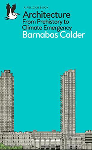
Barnabas Calder - Architecture From Prehistory to Climate Emergency
Barnabas Calder’s book, ‘Architecture From Prehistory to Climate Emergency’ details how humanity’s architecture, which has historically been dependent on fossil fuels, has changed throughout history and how it has affected our environment and catalysed our climate emergency. It is Calder’s opinion, with which I concur, that human conservatism poses the greatest threat to sustainable architecture, whereby new designs that look and function like older designs really are just old designs. He poses the view that our reliance on fossil fuels is merely a bad habit, an indulgence where social changes and public support will be needed to implement solutions to fossil-fuel dependent buildings.
6
Speculative Design Brainstorm

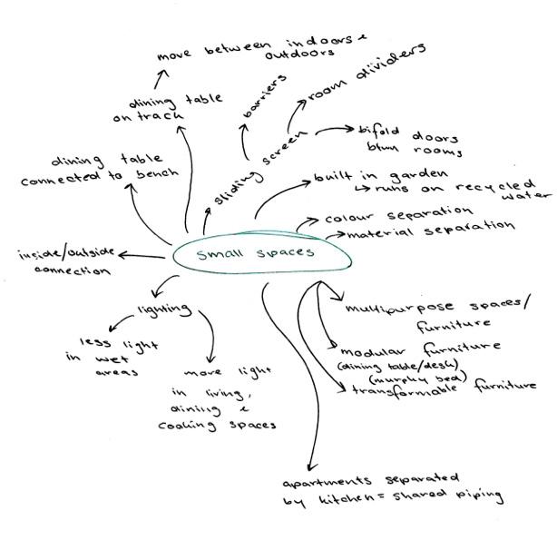
This week’s focus was the scale plan and redesigning the floorplan. With key focuses on privacy and open communal spaces, the apartment has been split in half, the west side for living, the east for personal use. Our next objective was to determine our room designs and how we could create a functional space using speculative design. I brainstormed ways that we can incorporate modular and multifunction furniture and join the indoor and outdoor space cohesively.
7
Week 3
Housing And The Need To Go Smaller - Part 2
• What is building churn?
The rate at which buildings and their fit-outs are replaced. As part of lease arrangements in shopping centers, retail spaces must renovate every few years, using up valuable new resources and discarding the ‘old’
• What is high embodied energy?

Embodied energy is the total amount of energy used to create a material. High embodied energy is when a material has used a large amount of energy to be formed, like steel.
• What is product stewardship?
Everyone in the lifespan of the product is responsible for reducing its environmental impact. This means that manufacturers sometimes pay to ensure recycling at the end of its life.
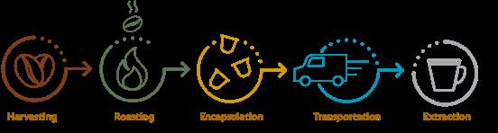
A Case Study Of Product Stewardship
The idea of product stewardship reminds me of Nespresso’s sustainability agenda. In 2018, Nespresso became the first company to use responsibly-sourced aluminium, supplied by Rio Tinto with these two companies signing a memorandum with a commitment of sourcing 100 per cent sustainable aluminium by 2020.
Nespresso has a well established recycling program and due to aluminium being infinitely recyclable there ‘is potential for a second life within every capsule’.
The recovered coffee grounds are sent to a local composting facility where they are combined with dirt and organic matter, creating nutritious compost which is distributed to many hardware and gardening stores. The aluminium is compacted and sent for smelting and refining in the Rio Tinto Quebec factory. The refined metal can then be used in a variety of different products, such as cars, bikes or homewares
Nespresso and Swedish start-up Vélosophy partnered to design a bicycle that would represent aluminium’s potential to be refashioned into a functional and stylish product. This means working with recycled aluminium to design and produce high-quality bicycles that balance sustainability and style.

8
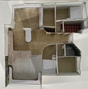
Furniture Plan


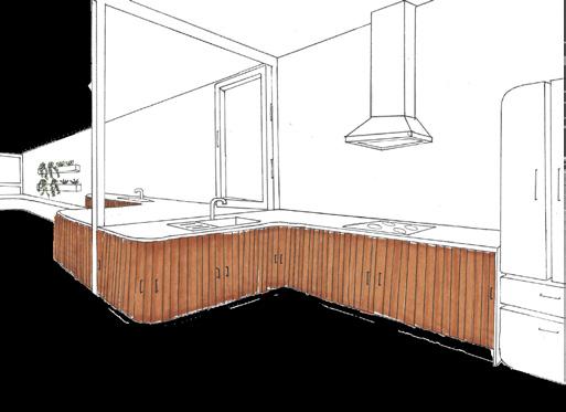
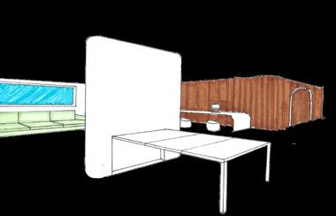
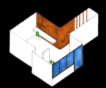
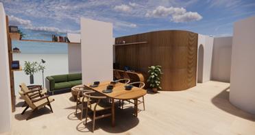
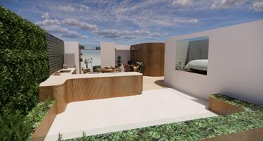
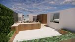
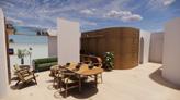
Due to the size of our space, 89m2, we were able to create an open plan living, dining, kitchen and garden. Our key design feature is the indoor outdoor kitchen which shares a bench, connected to a garden bed that follows the perimeter of the balcony. In this way, the occupants are able to grow their own produce, reducing cost and cost of living pressures.

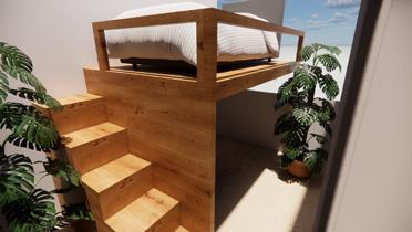
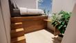
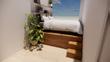
The bedrooms feature custom built joinery which include storage, wardrobe space and raised beds, utilising vertical space.
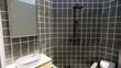
As both bathrooms have awkwardly shaped walls, determining the arrangement of those rooms was a struggle.
9
Week 4
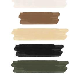
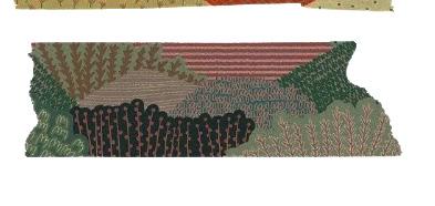
Ambiance Board


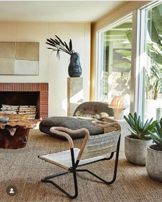
When discussing the ambiance board, my partner Rhianna and I wanted to ensure the spacer felt inspired by nature. Our main interest lies in using soft, organic shapes and shades of brown, green and beige that felt taken straight from our natural environment. Because our key design feature is the indoor outdoor kitchen, it only feels natural for us to take this aesthetic route.

10
Sketches
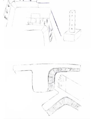
This week also marks when we start bringing our ideas to life, through sketches, inspiration images and technological decisions.
ASSESSMENT 1 FEEDBACK


In our outdoor garden, we wanted to ensure there was a way to easily feed the plants. In my research I came across the Subpod, which is an in-garden compost system and worm farm. I also came across a hydroponic lettuce tower which uses less water than in soil systems.


The key feedback from assessment 1 was that we needed to improve our hand-drawn renders to make them more professional. This also includes the layout of these renders as it wasn’t clear if some sketches were part of the main image or not.
For the future, I’ll do my best to ensure that the layout is clear, logical and professional.
11
Final Ambiance Board
Week 5
Elements and Principles of Design
Elements
Negative Space


• Understanding
• Feeling of comfort - being able to breathe
Line

• Creates visual interest
• Movement and direction
• Manipulation
Form/Shape
• Drama
• Focal point
Colour
• Mood
• Contrast
• Tint (white), hue and shade (black)

Texture
Visual interest
Contrast
Complexity Pattern


Drama
• Understand spaces
• Movement
• Texture
• Pattern
• Zones and boundaries
12
Principles
Scale and Proportion
Comfort and behaviour
Groups of 3x3 are more natural than 2x4

Balance
Symmetry and asymmetry
Vertical and horizontal
Radial balance


Harmony/ Unity
Consistency
Belonging
Rhythm and Repetition


Movement Dynamics
Emphasis and Focal Point
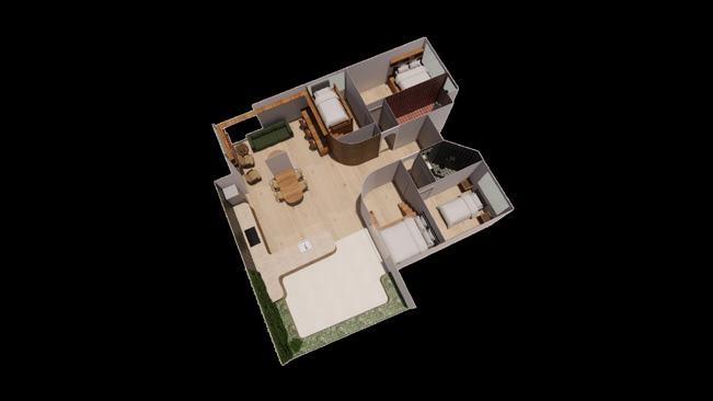
Bubble Diagram In Reference To Floor Plan
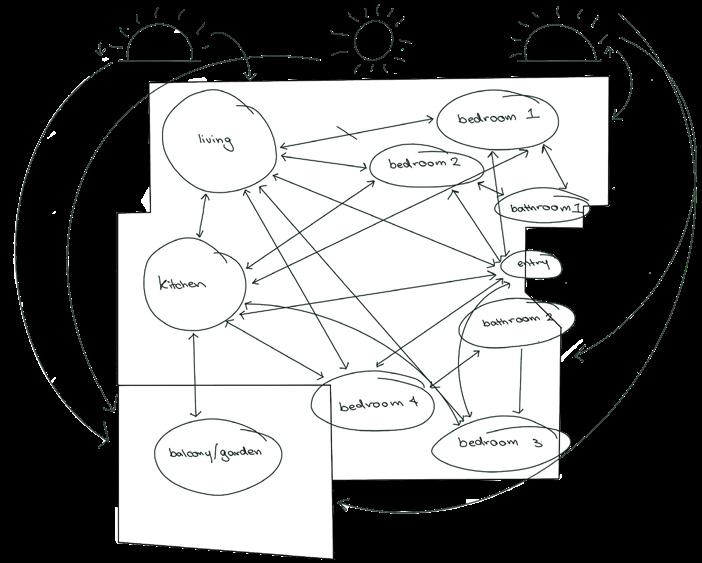
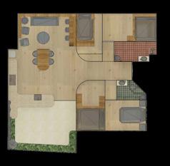
With an understanding of the traffic flow of our space and our intention to create private spaces for the residents’, the main points of focus became the west side, with the kitchen, dining room, living room and garden. This also supported the idea to use natural light to influence the residents’ behaviour. With the bedrooms on the east side, the residents’ are able to wake up to the sun rising and have easy access to the front door to leave and return from university. The west side where evening activities such as making dinner and watching TV means that with the setting sun it influences the occupants to wind down and go to bed. The garden has access to the all day southern sun to support plant growth.
Contrast
Visual impact
Black and white
Light and shadow
13
Week 6
Presentation Techniques
Preliminary/ Exploratory Sketches
• Initial ideation on paper
• Schematic design phase where work is mainly creative
• As much for the designer as it is for the client
• Helps to understand the clients needs and requirements and provides an opportunity to understand the problems and devise solutions
Design Drawings
• Combination of drawings, plans, elevations and axonometric sketches presented to show the design intent
• Orthogonal views
• Parallel drawings at scale depict objects directly in front, above or underneath
Presentation Plan
• No dimensions, legends, notations or referencing
• Often coloured
• Include loose furniture, people, cars and vegetation
Presentation Elevations
• Right angled view looking at each wall
• Includes loose furniture, sculpted pieces, colours and people
• Helps to get a sense of the scale and texture
Presentation Sections
• Cuts through the structure of the space
• Colours and shading have been added
• No technical hatching as its a design drawing
Axonometric and Isometric Drawings
• Right angle projected that convey the 3d space
• Axonometric
• 45 degree angle with walls and joinery that are vertical to scale
• Isometric
• 30 degrees or 60 degrees
One-Point Perspective
• One vanishing point
Two-Point Perspective
• Two vanishing points
Sectional Perspective
• Cuts through the building
Exploded Views
• Perspective, axonometric or isometric
• Deconstruct to see multiple views, like separate walls
14
Isometric Axonometric

Presentation Layouts
• Hand and computer drawings
• Display drawings to show design intent
• Hierarchy is important
• Colour contrast to highlight certain areas
• Include a design statement
Presentation Grids
• Background image should not be overpowering
• Develop a structured grid
One-Point Perspective
• Use negative space
• Tonal contrasts, layering and wire frames
Material Board
• Finishes, textures and colour palette One-Point Perspective
Model
• Show scale and proportions
• Help clients understand the space if they don’t understand drawings and elevations
Two-Point Perspective

15
Week 7
Crit Day
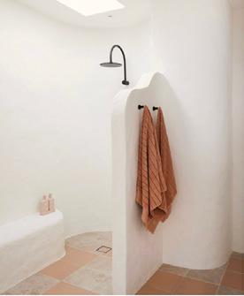
Week 7 was crit week and I was incredibly nervous. Public speaking is one of my biggest fears but I was proud of myself after completing the presentation. For the presentation, the focus was on elaborating on elements and principles and discussing design basics, enhancing the viability of the design.
Script
Intention of Space
• Sustainability
• Inner city and nature
• Separation of bedroom and common spaces - Privacy Safety
• Openness in common spaces
Shape/ Form
• Curved wall in the hallway prompt movement into common spaces
• Make hallway feel less cramped
• Curved walls in bathrooms remove awkward, staggered, angled walls
Texture and rhythm and repetition
• Timber slatting creates visual interest
• Operable timber slatted sliding doors to hide European laundry
• Gradient into hallway creates visual interest and an easy transition
Balance
• Timber slatting on diagonal walls connects both ends of the space
Innovation
• Operable timber slatted sliding doors in the kitchen save space in walking path between dining table
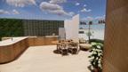
• Single partition is a wall mount and a home for folding dining table
Lighting
• Key concept is interaction with nature
• Use of natural lighting
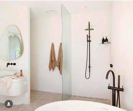
• Shower skylight borders showers with the main ceiling becoming a bulkhead
• Using the sun to affect mood and productivity
Garden
• Indoor/outdoor kitchen to prompt use of garden and ease cleaning of produce
• Promotes healthier living and makes people spend time outside
• Cultivate a new hobby
• Growing produce is cheaper so even in a cost of living crisis people have access to nutritious food
• Less waste due to composting
Recycled materials
• Wood is a key material in the design
• Recycled and reclaimed wood will be used for beds, slatting and dining table
16


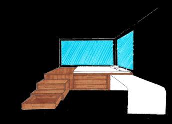


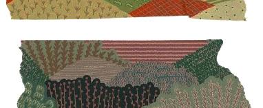
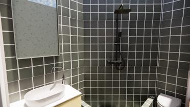
17 Day Of Crit • Specify door type • Add joinery and furniture to floor-plan • Add more nature • Connect to biophilic design? • Specify material origins (recycled?) • Curves are expensive - make the most out of them • Continuity in renders Final Feedback - In Addition to Crit Day • Consistency in visuals • Floor Plan adds to context of project • Add greenery to poster to align with concept ASSESSMENT 2 FEEDBACK INNER CITY NATURE RETREAT Garden Section Kitchen Section Bedroom 1 Section Bathroom 1 Section Scale Floor Plan 1:50 Bathroom 2 Isometric Sketch Living Room & Indoor Kitchen Isometric Sketch Living Room & Dining Room Perspective Bedroom 3 Perspective Indoor/ Outdoor Kitchen Perspective Night Midday Morning N The design focus of this inner-city dwelling is to create a sustainably build and sustainably operational space that aids in the current housing crisis. With the assistance of a personal organic vegetable garden with compost and recyclable materials to construct joinery and finishes, this apartment will emphasise sustainable living. The implementation of communal spaces creates the feeling of community and sociability while in contrast, the private bedrooms provide a safe and comfortable notion. The utilisation of all these spaces provides the occupants with a dwelling that encourages the employment of sustainable practices and reducing cost of living. Skylight to border shower height 2700mm Uses natural light Main ceiling has been lowered Kitchen Balcony/ Garden Dining Room Living Room Bedroom 3 Bedroom 4 Bathroom 2 Entry Bathroom Bedroom 2 Bedroom Utilising natural light to affect mood and behaviour Cooking and relaxing are prioritised at night East facing sun to prompt waking up North and south facing sun provides light for the garden all day Fold out dining table to save space when not required Ella Lissauer & Rhianna Meehan Project Concept Poster 2656QCA Introduction to Spatial Design Final Poster for Assessment 2
Week 8
Interiority
Interiority is the quality of being focused on one’s inner life and identity. It relates to interior design through the way people actively live in and experience a space.
It’s constrained by the constructed space and the engagement with the space, a spatial practice.
Professional Responsibility
• Fail to make connections of social and environmental issues
• Protection and safety
Indigenous Culture
• Cosmological interiority
• Harmony and balance
• Connected to the land - spirituality
WST

• Industrialisation and commercialisation of labour
• Division of class
• Home became a refuge and a happy place
WW2
• Consumption
50s and 60s
• Education
• Growth in white collar
• Consumption becomes a social obligation

60s and 70s
• Youth culture
Contemporary Individualism

• Construct identity
Technology
• Work and consumption integrate in the home
In the class exercise I was the interviewee. After discussing my values, goals, emotional experiences, strengths and weaknesses and putting them on paper through visuals, I felt like I understood myself a bit better than previously. It’s not often that you look at all of those parts of yourself and dissect them.
18
This class in particular helped me find words to explain why I want to be an interior designer and how I can accomplish it. I want to go into residential design so I can help create safe and personal spaces for people. Having done it as a kid in my room when I moved house, I understand how being in a space that feels like an embodiment of who you are can feel like a cocoon. There’s no judgment, no concern for your safety or feeling like a fake version of yourself. The world is a more interesting place when we can be ourselves instead of just clones and not everyone feels comfortable doing that in front of others. Designing a space for people to need somewhere to feel like themselves is my goal and the concept of interiority will help me do that.
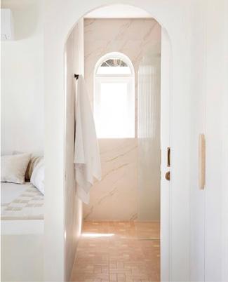
This week, the floor-plan was finalised. The curved walls in the wall way are now more dramatic and open the hallway to the rest of the space. The curved walls in the bathroom are no longer there as it seemed like an unnecessary hassle.
The materials have also been decided, however they might change depending on what can be found in store when collecting samples.


The Revit model, at this stage, only has the walls and the elevations can be printed and cut without interference from furniture and joinery. These elevations with be cut out to make the model next week.
19
1 01.04 4 01.04 3 01.04 2 2 01.03 1 3 01.02 5 6 7 5 4 01.02 2 4 3 01.02 1 DRAWING NO. SCALE. 1 : 50@ A3 PLAN Interior Technology 01.01 EL & RM Final Floor-Plan - Excluding Joinery Final Elevations - Excluding Joinery 1 50@ A3 NORTH, SOUTH & WEST ELEVATIONS Interior Technology 01.04 EL & RM 1 50 01.01 NORTH OUTER ALL ELEVATION 1 1 50 01.01 SOUTH OUTER WALL ELEVATION (G) 2 1 50 01.01 WEST OUTER WALL ELEVATION (K,DR,G) 3 1 50 01.01 WEST OUTER WALL ELEVATION (LR) 4 50@ A3 INTERNAL ELEVATIONS Interior Technology 01.02 Author 50 01.01 BATHROOM 1 ELEVATION (W) 1 1 50 01.01 BATHROOM 2 ELEVATION (W) 2 50 01.01 BEDROOM 1 ELEVATION (E) 3 50 01.01 BEDROOM 2 ELEVATION (S) 4 1 50 01.01 BEDROOM 3 ELEVATION (E) 5 50 01.01 BEDROOM 3 ELEVATION (W) 6 1 50 01.01 BEDROOM 4 ELEVATION (N) 7 50@ A3 EAST AND HALLWAY ELEVATIONS Interior Technology 01.03 EL & RM 50 01.01 EAST OUTER WALL ELEVATION (ENTRY) 1 50 01.01 EAST OUTER WALL ELEVATION (LOWER) 2 50 01.01 EAST OUTER WALL ELEVATION (UPPER) 3 1 50 01.01 HALLWAY ELEVATION (N) 4 50 01.01 HALLWAY ELEVATION (S) 5
Week 9

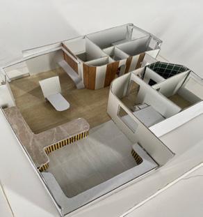
This week’s task was to start building the model. While I cut out the elevations, Rhianna cut out our floor materials and started work on our foam base.
Cutting these parts for the model was very tedious and I found myself getting a bit frustrated at how long it was taking. Cutting out the windows was also difficult as the corners were difficult to get perfect.
We decided to add wall finishes to the model to help cover up the join of the acetate used for the windows. It also meant that we could tie the paint colour into the mock timber slatting we created for the northern hallway wall.
Adding these wall finishes also helped to cover up a few mistakes in cutting the windows but also covered the scored lines used to round out the walls. They looked quite messy and ruined the overall look of the model.
20
Week 10
In week 10 I finalised the revit model with the joinery pieces so I’d be able to cut them out and add them to the model, ensuring each joinery item was to scale. The biggest struggle I had was creating the steps to the elevated beds. These ended up not being to scale because they were so small at 1:50 scale. The other joinery items included the kitchen and garden. These pieces were hard to make due to all the curves. They didn’t end up perfect, however they do still give the same effect regardless.
Final Floor-Plan

Final Elevations
21
DRAWING NO. SCALE. 1 50@ A3 INTERNAL ELEVATIONS Interior Technology 01.02 Author 50 01.01 BATHROOM 1 ELEVATION (W) 1 50 01.01 BATHROOM 2 ELEVATION (W) 2 1 50 01.01 BEDROOM 1 ELEVATION (E) 3 50 01.01 BEDROOM 2 ELEVATION (S) 4 50 01.01 BEDROOM 3 ELEVATION (E) 5 1 50 01.01 BEDROOM 3 ELEVATION (W) 6 50 01.01 BEDROOM 4 ELEVATION (N) 7 1 50@ A3 NORTH, SOUTH & WEST ELEVATIONS Interior Technology 01.04 EL & RM 1 50 01.01 NORTH OUTER ALL ELEVATION 1 1 50 01.01 SOUTH OUTER WALL ELEVATION (G) 2 1 50 01.01 WEST OUTER WALL ELEVATION (K,DR,G) 3 1 50 01.01 WEST OUTER WALL ELEVATION (LR) 4 50@ A3 EAST AND HALLWAY ELEVATIONS Interior Technology 01.03 EL & RM 50 01.01 EAST OUTER WALL ELEVATION (ENTRY) 1 50 01.01 EAST OUTER WALL ELEVATION (LOWER) 2 50 01.01 EAST OUTER WALL ELEVATION (UPPER) 3 1 50 01.01 HALLWAY ELEVATION (N) 4 50 01.01 HALLWAY ELEVATION (S) 5
DRAWING NO. SCALE. 50@ A3 JOINERY Interior Technology 01.05 Author 50 01.01 BEDROOM 3 1 50 01.01 BEDROOM 4 2 50 01.01 BEDROOM 1 3 50 01.01 BEDROOM 2 4 50 01.01 BEDROOM 2 EAST 5 50 01.01 DINING TABLE 6 1 01.04 4 01.04 3 01.04 2 2 01.03 1 3 5 6 7 5 4 01.02 2 4 3 01.02 1 1 2 3 4 01.05 5 01.05 6
Over the course of my career I have no doubt that I’ll get better at creating models and making them neater. I’ll also likely learn new techniques to make them look more professional.
Week 11

Industry Visit - ThomsonAdsett

This week we had our industry visit to ThomsonAdsett in Fortitude Valley. ThomsonAdsett is an architecture and design firm that has been operating for half a century located on Australia’s eastern seaboard.
ThomsonAdsett has a care ethos and does work mainly in aged care, retail, education, health, resorts and multi residential, including student accommodation.
Their Brisbane/ Meanjin office has multiple break out spaces and meeting spaces with exceptional attention to private spaces for new mothers and prayer.


Their open boardroom used many acoustic treatments, such as acoustic paneling on the walls, and acoustic ceiling, lights and curtains, something I didn’t know existed. They have placed the boardroom more internally due to the services in the ceiling. This left space for what’s known as the veranda. This space allows for the morning sun to come in and illuminate the boardroom, but also provide an alternate breakout space for employees. With a keen understanding of how the space will be used by staff, the floor to ceiling windows next to the desks are manual, and can be rolled up and down depending on personal preference, while in the communal space, the blinds are electronic.
Accommodating new mothers, people from all faiths and physical ability is a key value of the company. The quiet room has been designed with new mothers in mind to pump, but also provide space for prayer and yoga. The kitchen has accessible space below the island sink to accommodate a wheelchair if necessary.

22
In talking to Shireen about graduate skills, she defined the use of Revit to be the most important, it’s a skill I definitely need to work on. She also mentioned that creating a portfolio, whether a website, Behance or Instagram and can show out work, design knowledge and personal flair to be important as well.
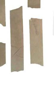
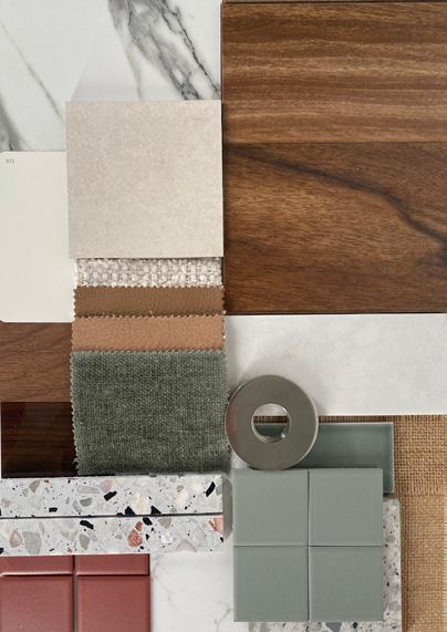
Materials Board


Because my group partner Rhianna was unwell, I took on the responsibility of collecting the materials for our materials board. This was my main objective for the week. I went to Beaumont Tiles, Highgrove Bathrooms, King Furniture and Bunnings to collect the materials. My biggest struggle was finding a sample for a stone counter-top. As our main objective for the space was to use as many natural materials as possible, our goal was to use an authentic piece of stone. Because it just didn’t seem in the cards, I found a piece of laminate that looked pretty similar to the pattern we wanted.
Material Selection

23
Final Material Board
Week 12


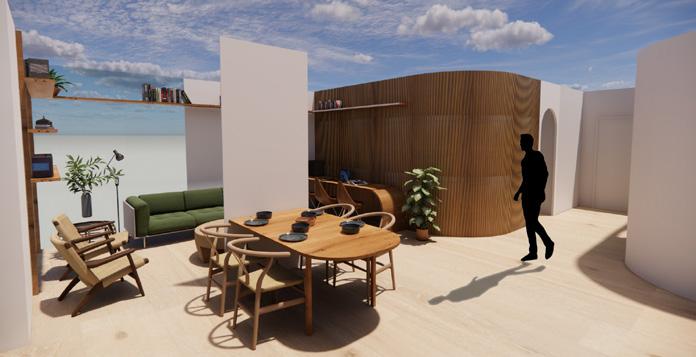
Early this week I finished the Revit model, including assets from Enscape to try to create renders that were as realistic as possible. It was a really rewarding process working on the Revit model from start to finish. I felt a great sense of pride seeing the final renders and knowing that in the process I worked on my Revit skills as I had never added materials before.


24
Rhianna did the work on the poster, which came out looking simple and beautiful in my opinion. Helping with a few small tweaks, like typos and adjusting a few of the images, the final project poster conveys the simplicity and interaction with nature we aimed for in this project.
ASSESSMENT 3


Final Poster for Assessment 3
g n o c u s o f t h s n n e - c y n a u r e e r e a s o c e a e a s u s a n a b y b u d a n d u t a n a b y o p e a t o n a s p a c e h a a d s n h e c u r e n t h o u s n g c r s T h s 8 9 s q u a r e m e t e r W e s t E n d b a e d a p a m e n a r g e t s h e d e m o g r a p h c o y o u n g s n g e w o k n g a n d s t u d y n g n t h e c y P o r t z n g h e s e p a r a o n b e w e e n c o m m o n a n d p r v a t e s p a c e s a s s t h e o c c u p a n s n c e a n g a s o c a b e a n d c o m m u n t y k e s p a c e a s w e a s c o m f o a b e a n d s a e T h r o u g h h e n d o o r a n d o u d o o b e n d e d k c h e n a r e a h e r e d e n s h a v e a c c e s s o a u y f u n c o n n g p e r s o n a o r g a n c v e g e a b e g a r d e n w h c o m p o s e n c o u r a g n g h e m o m a n t a n a h e a h y a n d s u s a n a b e f e y e n a d d o n p e c a y o n e r y m a d e f r o m s u s t a n a b y r e o u r c e d r e c y c e d m a t e a s w b e n s t a e d n t h e a p a r t m e n t o m a x m z e o a g e s p a c e f o r c o h n g a n d u e s T h e u t z a o n o e a h o h e s e s p a e s p o v d e s h e o c c u p a n t s w h a d w e n g t h a t e n c o u a g e s h e e m p o y m e n o s u s a n a b e p a c t c e s p o m o e h e a t h y v n g a n d r e d u c n g h e c o s o v n g n t h e c u e n h o u s n g c L w b v h d h v g An b o m wa op m g p Lo e w pu o de a

s K T C H E N - W T W A L L E L V A O N B E D O O M 2 - E A S W A L E V A O N B E D O O M 3 - W E S W A E V A O N O N
d m o u v a n d h e o h o u s a d a b e n n g a b e a w n a e S k y h b h R e d u e h a m o u a r g e d d


R h i a n n a M e e h a n a n d E a L s s a u e r 2 6 5 6 Q C A L O U N G E R O O M N D O O R K T C H E N D N N G O U T D O O R K T C H E N G A R D E N B E D R O O M 2 B E D R O O M 3 B A T H R O O M 2 T h e d e
-
INNER-CITY NATURE RETREAT S H A P E F O R M T E X T U R E / R H Y T H M R E P T T O N B A L A N C E N N O V A T O N L G H T
L p w h h w w p h Op b d g d d y d g O b g p C v d w a p m p m v m d h e e m e a n d n v C v d w a m a g g d a T g O p e a b e m b e d n g s h d h e E u p a n y - y h G a d T m a g o n d a g o n a a n h p e O p e a b e d d o o n k a n w p h S n p a w a
This class was a great tool in helping me better understand day-today design practice. Having the knowledge and ability to complete these tasks makes me feel more confident going into my career later on. At the beginning of the trimester finding out about the crit presentations, I was incredibly nervous, however, after completing 2 of them, I feel reassured that this is a career that I can be excited about.
Going forward, I’ll take the skills I’ve learnt, such as spatial planning, presentation poster layout, presentation techniques and model making skills, and employ them during the rest of my university life and further career.

26