

Denver Public Schools Brand Guidelines
Revised August 2025
Our DPS Brand
We are all one DPS — and we want to ensure that our students, families, community members and teammates always make the important connection between the work happening across the district. To help our community understand that all our work is connected, these DPS Brand Guidelines should be followed in all materials. In addition to this document, our brand guidelines are also available online at dps.intelligencebank.com. We also have a DPS Brand Snapshot available, which is an abbreviated version of these guidelines, and is handy for everyday use. Visit dps.intelligencebank.com
Download the Brand Snapshot
If you have questions, please email communications@dpsk12.org.
Determine Your Audience
External Audience: Students, Families and Community
Materials that primarily target our external audiences like families, students and our community should always prioritize the overall DPS brand. Our external audience receives a lot of districtwide messages — as well as messages from their individual schools — and at times, it can be overwhelming. A unified brand builds credibility and reassures our community that DPS is behind all of our efforts. To help our external audiences make the connection back to DPS as a whole, please follow the DPS brand guidelines outlined in this document.
Internal Audience: Team DPS
We encourage departments and teams to develop an internal brand for projects where the primary audience is other members of team DPS, including teachers, school leaders, support staff and central office teammates. Building awareness of your department or team helps team members understand our organizational structure and find resources available within DPS. We honor the unique visions, missions and contributions of individual departments and teams, however, DPS department branding aligns with the overall DPS brand in order to maintain the integrity of our overarching brand.
NEED DEPARTMENT BRANDING?
Please first check with your department supervisor, then email us at communications@dpsk12.org.
External and Internal: Serving Both Audiences
Sometimes your materials serve both external and internal audiences. Some examples may include the DPS District Map, or large department-sponsored publications such as our sustainability team’s Climate Action Report or our career development team’s Annual Report. For materials that are primarily targeted toward external audiences, the DPS logo and colors should be prioritized over department logos and colors in most cases. However, there are some situations where it may make sense to lead with your department logo and colors. These situations can be approved on a caseby-case basis, however you must always use either the DPS logo or your department logo on your materials, and DPSapproved colors and fonts. If you need support deciding which branding to use or determining your primary audience, please email us at communications@dpsk12.org.
DPS Brand and Accessibility Requirements
At DPS, we believe that equity is our collective responsibility. Adhering to accessibility standards ensures that our district creates conditions where every member of our community has equal access to our materials.
In compliance with Colorado House Bill 21-1110, all DPS digital content, communications and materials are designed to meet or exceed the most recent web content accessibility guidelines, providing equitable access to individuals with disabilities. This commitment reflects our value of equity, fostering a community where everyone can engage fully and without barriers.
This version of our district brand guidelines leads with accessibility at the forefront. Our colors have been audited for accessibility compliance. This means that there are more restrictions in place around how colors and typefaces can be used, however, the end result is that our materials are accessible for everyone. We have also identified new typefaces that are more widely available in both print and digital applications, and allow us to create compliant documents in the district’s most common languages.
Learn more about our accessibility commitments and accessibility resources on our accessibility webpage. If you have a question about branding and how it relates to accessibility, please email us at communications@dpsk12.org.

Logo Standards
The Denver Public Schools logo is a reflection of who we are and our vision for our district’s future.
These logo standards are your guide to using the DPS logo correctly and effectively. They provide simple, easy-to-follow directions on logo usage, colors and sizing.
If you have any questions about logo use, please contact us at communications@dpsk12.org.
History and Significance of the DPS Logo
While we have modernized our logo over the past century, our logo remains inspired by the original DPS logo from 1902! The lamp of knowledge is a symbol from ancient Greek philosophy and symbolizes light, learning and the search for truth. Here is a video that tells the story of the lamp of knowledge.
Orientation
There are two different orientations of the Denver Public Schools logo — horizontal and vertical. The horizontal orientation of the logo is the primary version and should be used when possible. The vertical logo should be used on vertical applications and when spacing does not allow for the primary horizontal version of the logo.

PRIMARY
SECONDARY
ORIGINAL DPS LOGO
Clear Space
Always surround the Denver Public Schools logo with an open area to maximize its clarity and impact. Follow the minimum clear space (defined by the height of the “P” in the Denver Public Schools logo) to ensure that other graphic elements do not interfere with the logo.
Digital Usage
For digital usage, please always use RGB colors, always scale the logo proportionally and never make the logo larger than 1 inch, 72 pixels or 1.375 rem in width. Remember to add alternative text that says “Denver Public Schools logo” when uploading the logo image to a webpage, allowing those who use screen readers to identify the logo.
Minimum Size
When using the primary logo, it should not be used smaller than 1 inch, 72 pixels or 1.375 rem in width. When using the secondary logo, it should not be smaller than 1/2 inch or 36 pixels or 2.25 rem in height.
PRIMARY LOGO: HORIZONTAL
PRIMARY LOGO: VERTICAL
Tagline Usage
To keep our brand simple and legible across all materials, we no longer recommend using a DPS logo with the tagline in most cases. A version of the logo with the Every Learner Thrives vision as a tagline is available and can be used on materials where discussion of our vision is a primary goal of the communication.
White Logo
When the white logo is used, be careful to ensure that the logo is inverted correctly.
An easy trick is to look at the mountains in the logo icon. If the snowcaps on the mountains are white, the logo is correct!

LOGO WITH TAGLINE
Logo Versions
Both the primary and secondary logos are available in DPS Blue, white and black.
Download the DPS Logos.
Logos in Additional Languages
To ensure effective communication with our diverse community, the DPS logo is available in the nine most common languages spoken in DPS. For communications in Amharic, Arabic, Eastern Farsi/Dari, French, Nepali, Somali, Spanish and Vietnamese, please include the logo of the corresponding language on those materials. For communications in all other languages, use the English logo.
Download the DPS Logos in Other Languages.
Logo Background Colors
Our logo guidelines include standards for background color usage to ensure legibility and accessibility.
DPS Blue logo is to be used only on white backgrounds.
The white logo is to be used on color backgrounds from our primary, secondary and tertiary color palettes. You may not overlay the white logo on a color from our accent color palette.
The black logo is to be used only when printing in black and white. It should not be used digitally.
LOGO IN SPANISH
LOGO BACKGROUND COLOR EXAMPLES
Incorrect Logo Use
To ensure the consistency and professionalism of our brand identity, the DPS logo must never be altered or improperly reproduced. Please help us maintain the proper use of our logo by adhering to these standards. Some examples of prohibited reproductions of the DPS logo are shown below.
stretch or distor t the logo
Don’t use the logo in colors except black, white and DP S blue
redr aw or ret ype the logo t ypogr aphy
Don’t add tex t or gr aphic elements to the logo Students First
Don t alter individual logo components Don’t outline the logo
Don’t add effects to the logo
Don’t sandwich the logo or stack it with other elements
Don’t use the logo version with the archived “Discover a World of Opportunity” tagline.
Don’t
Don’t place the logo on low contr ast backgrounds, images or patterns
Don’t

Department Branding
DPS has adopted an internal branding model similar to higher-education institutions and other large school districts across the nation.
Department logos include components from the DPS logo — our main identifying element that represents our brand at the highest level. However, departments are able to customize their identity by including your department name, choosing colors for your department materials, and including an optional tagline that provides additional information about the services your department offers.
While the traditional department logo should be used in most cases, departments also have the option to create a swag graphic for use on apparel or swag for your team.
Department Branding Guidelines
In most cases, no acronyms or ampersands are permitted. Please spell out the entire department name and use the word “and” instead of “&”.
We encourage you to remove the words “Office”, “Department” or “Team” in your department logo name for simplicity, to reduce character count and to eliminate redundancy.
Consider aligning your team’s brand with your overarching department. For example, the Communications department uses the light purple color so the Marketing team — a team that is a part of the Communications department — would also use light purple for their logo. You may also consider keeping the department name as the primary text in your logo lockup and using the tagline space for your team name. This creates a clear hierarchy of where your team falls underneath our organizational structure.
CREATE DEPARTMENT BRANDING
If you would like to create branding for your department, please first check with your department supervisor, then contact us at communications@dpsk12.org.
DEPARTMENT LOGO
TEAM LOGO
“and” instead of an ampersand
Department Logo Lockup
Each logo lockup uses the same icon, typeface and colors as the DPS organizational logo. The department name is in the Zilla Slab font, a typeface from the DPS brand guidelines.
There are three possible configurations for a primary department logo. The color used for the department name can be chosen from the options on page 16, giving departments individuality while still aligning with the overall DPS branding. The optional department tagline uses Zilla Slab in navy blue from the DPS color palette.
OPTION 1
Department name with tagline. The maximum character count for your team or department name is 20 characters when including a tagline. The tagline length is required to be 36 characters or less, and taglines should be in title case. In most cases, taglines should not have a period at the end.
OPTION 2
Long department name, made into two lines, no tagline. Any department name over 20 characters will need to be made into two lines and can not include a tagline for spacing purposes. The maximum character count is 40 characters.
Download Department Logos.
Is your department not listed? Email communications@dpsk12.org to get started!
OPTION 3
Department name, without tagline. The maximum character count is 20 characters.
Department Logo Colors
There are seven colors to choose from for the name in the logo lockup. The chosen color will determine a department’s customized color palette, which is shown on page 23.
Dark Purple
Light Purple
Dark Green
Dark Pink
Light Pink
Dark Red
Light Red
These new color options are designed to meet or exceed the most recent web content accessibility guidelines, providing equitable access to individuals with disabilities in compliance with Colorado accessibility laws. If you have questions or need to update your department colors, please email us at communications@dpsk12.org.
Department Swag Graphics
In alignment with our Shared Core Value of Fun, we have introduced department swag graphics as an option available for departments for use on apparel and team swag such as shirts, sweatshirts, coffee mugs, water bottles and more.
Department swag graphics should never be used as a replacement for your department logo lockup and are predominately catered to internal audiences. Department swag graphics are a tool to build team culture, celebrate your team or to further demonstrate your department’s offerings. For external audiences, the traditional department logo should be used in most cases.
Department Swag Graphic Options
You have two options available for department swag graphics.
Option 1 uses our district iconography style, with clean lines and simplistic illustrations. This option can be used on a variety of printed apparel and swag. The maximum character count is 20 characters per line, for a total of 40 characters.



Option 2 removes the line between the DPS logo icon and the department name and creates a stacked version of your vertical logo that will fit on printed apparel on the left pocket space. The maximum character count is 14 characters per line across a maximum of three lines, for a total of 40 characters.
Graphics must use the same color palette as your overall department and also use the Zilla Slab typeface. Email us at communications@dpsk12.org to create a swag graphic for your department.
EXAMPLES OF SWAG GRAPHICS IN USE
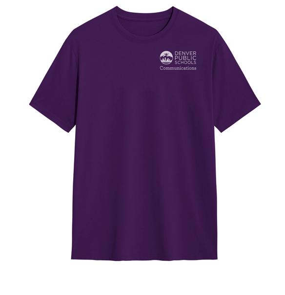
Department
Secondary Logos
The horizontal orientation of the logo is the primary version and should be used whenever possible. The vertical logo should be used only when spacing does not allow for the primary, horizontal version of the logo. The maximum character count is 14 characters per line across a maximum of three lines, with a maximum of 40 characters total. If you need a secondary version of your logo created, please email us at communications@dpsk12.org.
Strategic Operations
Department White Logo
When the white logo is used, be careful to ensure that the logo is inverted correctly. See page 9 for more details.

Strategic Operations Assessment Administration
Don’t change the tagline color or font.
Department Background Colors
Department background color guidelines follow the same requirements as the DPS logo to ensure legibility and accessibility. These guidelines are listed on page 11.
Incorrect Use
At right please find some common ways that department logos are misused.
Don’t change the department name font.
Career and College Success
Career and College Success
Don’t place the logo on accent colors or colors outside our color palette.
Career and College Success
Don’t add or replace graphics within the logo.

Color Palette
The approved DPS color palette is a dynamic, vibrant mix of colors centered around the DPS Blue color.
The DPS color palette provides many creative possibilities for your materials. Our color palette was developed with equity in mind, considering accessibility and legibility for the entire DPS community. The DPS color palette meets or exceeds the contrast requirements as detailed in the most recent web content accessibility guidelines.
Download the DPS Color Swatches.
Primary Color
DPS Blue is a true representation of the brand. DPS Blue should be used as the main color in most materials, however DPS Blue should never be used as a font color for body copy with font sizes 18 point or less (24 pixels or 1.5 rem for web applications) for accessibility purposes.
Secondary Colors
Our secondary colors are commonly used across DPS materials.
Navy blue is a great choice for color bars, callout boxes and headlines on DPS materials. Navy blue is also used to identify links.
Gray should be used for body copy when the background is white.
Primary Color
Secondary Colors
DPS Blue
Navy
Gray
Tertiary Colors
Our tertiary colors bring vibrancy and fun to our materials and demonstrate the diversity of our organization. Tertiary colors are available for use on district materials in headlines and accent boxes. Departments can also use our tertiary colors for their department branding. Please see pages 16 for more details.
HEX
RGB
CMYK
PANTONE COATED
#51286C
R81 G40 B08
C82 M100 Y25 K13
PMS 2607C
PANTONE COATED
#782F92
R120 G47 B146
C65 M98 Y0 K0
PMS 527C
HEX
RGB
CMYK
PANTONE COATED
#058141
R5 G129 B65
C86 M19 Y99 K5
PMS 347C
PANTONE COATED
#A32063
R163 G32 B99
C28 M100 Y18 K0
PMS 227C
HEX
RGB
CMYK
PANTONE COATED
#DA2479
R18 G36 B121
C0 M100 Y5 K0
PMS RHODAMINE RED C
PANTONE COATED
#A51D34
R165 G29 B52
C18 M100 Y80 K7
PMS 206C
PANTONE COATED
#DA392B
R218 G57 B43
C2 M91 Y90 K0
PMS 2034C
Dark Purple
Dark Green
Light Pink
Light Red
Light Purple Dark Pink
Dark Red
Accent Colors
There may be times when additional colors outside of the secondary and tertiary colors are needed for large or complex projects. Our accent colors are available for use in graphics or as accents in design. You may never use accent colors for text colors or as a background color for white text. HEX
COATED
#DD6826
R221 G104 B38
C9 M72 Y100 K1
1595C
#F89D23
R248 G157 B35
PANTONE COATED
C0 M41 Y100 K0 PMS 1375C HEX
#14A1DC R20 G161 B220
COATED
C74 M14 Y0 K0 PMS 299C
PANTONE COATED
#83BC41
R131 G188 B65
C50 M0 Y100 K0 PMS 376C
Dark Orange
Light Orange
Light Blue
Light Green
DPS Color Palette Guidelines
The required use of the DPS color palette in DPS collateral is outlined in the below guidelines.
• DPS Blue is the primary color and should always have the largest representation.
• Navy blue is a secondary color that can be used for color bars, call-out boxes and headlines, icons, and call-to-action buttons.
• Tertiary colors can also be used for these elements, but in fewer instances. Tertiary colors can also be used to differentiate sections in a large document or in charts.
• Headline fonts can be in DPS Blue, or any of our tertiary colors. Headline fonts should never be in one of our accent colors.
• Body copy fonts should be in gray if the background color is white, or white if the background color is DPS Blue, navy or any of our tertiary colors. Black body copy can be used digitally and for black and white printing.
• White font should never be used on an accent color, and body copy should never be in one of our accent colors.
• When the background color is white, links should be identified by using navy blue font that is bold and underlined. When the background color is a tertiary color, links should be identified using white text that is bold and underlined.
• When printing materials professionally, we recommend printing on coated paper whenever possible to maintain color integrity.
DPS Color Palette in Use
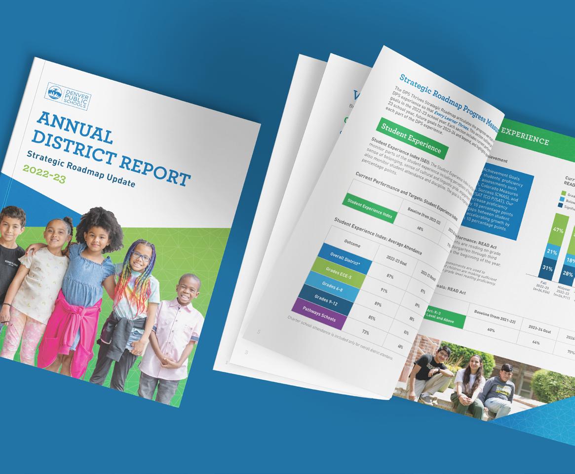
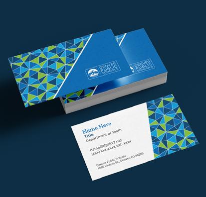
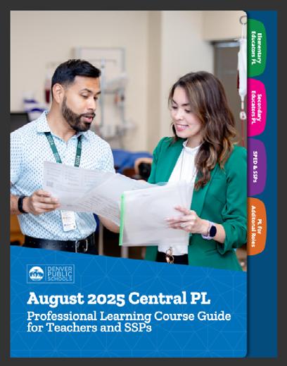
Here are some examples of our colors in use.

Typography
Our typographic style is strong, clear and professional.
Our approved typefaces have been updated with accessibility in mind. We have chosen new typefaces that are widely available, work in both print and digital applications, pair well together, are available in our district’s most common languages and remain legible when used in small formats. Other typefaces are not allowed for district use because they may not be accessible to all members of our community.
If you have any questions about DPS typeface guidelines, please contact us at communications@dpsk12.org.
Primary Typefaces
DPS has two primary typefaces: Zilla Slab and Noto Sans. The primary typeface for titles and headlines is Zilla Slab, while Noto Sans is used mainly for body copy. Both typefaces can be used for subheadlines.
Zilla Slab
Titles, headlines and subheadlines
Noto Sans
Subheadlines and body copy
Limited-Use Typefaces
Secondary Typefaces
Our secondary font option is Playpen Sans. Playpen Sans can be used sparingly, for callouts, or on materials that require a more playful style.
Playpen Sans Regular
One limited-use typeface is Alkaline. Alkaline can be used rarely, on sophisticated or academic materials such as graduation announcements or certificates. It is also used for some web graphics and logo lockups. Email communications@dpsk12.org to discuss using the Alkaline font. A second limited-use typeface is Roboto. Roboto can be used for digital graphs across Google Workspace because Noto Sans is not currently available for use in graphs in these
use (digital graphs, other web use)
Typeface Guidelines
Our primary and secondary typefaces have been selected because they are widely available for free download on Google Fonts, and can be used in both print and digital applications. We no longer have different typefaces for print and digital formats.
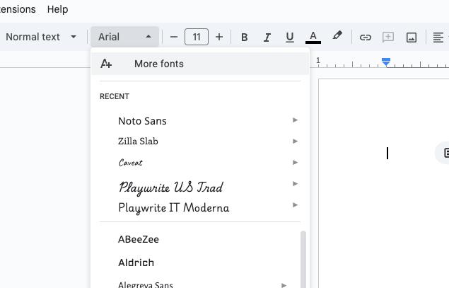
To use these typefaces in Google applications, open a file (Google Doc, Google Slides, etc.), navigate to the font name in the menu bar and select “More Fonts” from the dropdown menu. Search for the desired font using the search bar in the top left and then select the font you’d like to use. You should see it added to the “My Fonts” list on the right. Click “OK” to finish.



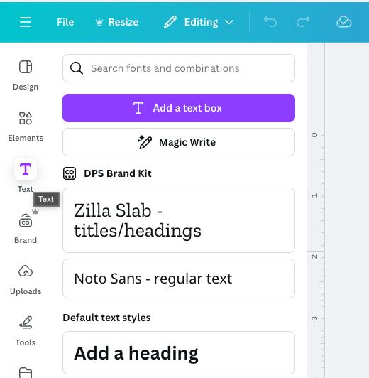
To use these typefaces on Canva, navigate to the Brand section in the lefthand column. From there you will find templates with your fonts loaded in, as well as font boxes already created in the appropriate fonts.
Font Weight and Size Guidelines
We recommend the following font weights and sizes for use in your materials.
• Use Zilla Slab Semibold for headlines and titles. Main headlines and titles should be sized 30 point (40 pixels or 2.45 rem for web applications).
• You may use Noto Sans Regular, Normal or Light for body copy depending on the desired design effect. Body copy should be sized 12 point (16 pixels or 1 rem for web applications).
• Noto Sans Semibold or Zilla Slab Semibold for subheadlines. Subheadlines should be sized 14 point (19 pixels or 1.2 rem for web applications) to 18 point (24 pixels or 1.5 rem) depending on the desired design effect.
• Use Noto Sans Bold and underlined for links.
Refer to page 25 for guidelines around color use for fonts.
Language Typeface Guidelines
Noto Sans is a global font collection that is available in all modern and ancient languages. Zilla Slab, Playpen Sans and Alkaline are available in some but not all of our district’s most common languages. For materials in scripted languages such as Nepali, Dari, Amharic, Arabic and Vietnamese, please use Noto Sans throughout the document.
Typeface Hierarchy
Samples
Here are examples of how fonts and font sizes can be used together within a single piece of collateral.
Zilla Slab Zilla Slab
Zilla Slab
Zilla Slab
Zilla Slab
Zilla Slab
Sans
Sans
Sans
Sans

Graphic Elements
Throughout DPS communications, you may see the use of a graphic, triangular pattern. This gives our work a dynamic, unique look and is a good way to break up space or provide a graphic element when photos may not be available.
There are many variations of the pattern included throughout our templates. You may also download the triangular pattern. If you download the triangular pattern for use in your materials, please follow the following guidelines.
Graphic Element Guidelines
• The size of the triangular pattern must be between 1.5 and two times the size of the clipping object.
• The triangular pattern must be tilted at a 15-degree angle.
• The opacity of the white pattern should be 20-25% opacity.
• When an opacity gradient (overlay) is used, the opaque side slider should be set to 100% while the transparent side is set to 40-60% opacity depending on the darkness of the base color.
In this example, the full triangle pattern is placed inside a clipping object (the rectangle). The full pattern is between 1.5 to two times the size of the object it is going into. This keeps the size of the triangles to brand standard. It’s also rotated to 15º and set to 20% opacity.

If placing a logo over a gradient, please adjust the gradient so that the right side is set to 40-60% opacity and the left side stays at the default 100% (the logo will go on the left side).

Headers, Footers and Corner Elements
We have a variety of premade corner elements, headers, and footers featuring our triangle pattern in white and our accessible colors. Here are some examples of these in use.

Benefits Enrollment
as a member of the Denver Public Schools community
Have Questions on Your Current Benefits? Denver Public Schools (DPS) now offers benefits counseling services to support our students and families navigate Social Security and their personal benefits plans. A Certified Work Incentive Practitioner (WIP-C) employed by DPS is here to help you plan through your employment and personal goals!
Contact us to learn more about:
• Supplemental Security Insurance (SSI) and Social Security Disability Insurance (SSDI).
• Work incentives.
• Subsidies, such as:
- Supplemental Nutrition Assistance Program (SNAP).
- Temporary Assistance for Needy Families (TANF).
- Housing and Urban Development (HUD).
- Colorado Program Eligibility and Application Kit (PEAK).
- Colorado Low-income Energy Assistance Program (LEAP).
• Navigating and reporting to Social Security.
How to work and manage your benefits.
• Medicaid and Medicare.
• Your age 18 redetermination with the Social Security Administration (SSA).
• Connecting with your community and DPS agency partners.

Learn More
Contact Joseph Tabano at joseph_tabano@dpsk12.net or scan the QR code to access the Benefits Counseling Google Form
Refer Great Talent, Earn a Bonus!
At Denver Public Schools, we know that great talent recognizes great talent. That’s why we’re rewarding you for helping us grow Team DPS!
Earn a bonus when your referral joins in one of the following roles:
• Teachers and Specialized Service Providers
• Substitutes and Paraprofessionals
• Facilities staff
• Transportation staff
How it works Refer a qualified candidate. If they’re hired, you receive a bonus! Let’s build an even stronger DPS community, together.
Learn more about the referral process and eligibility:


Additional Branding Guidelines
There are a few additional branding guidelines that we must adhere to in order to maintain the integrity of our brand throughout our materials.
Transparency and Gradient Use
Do not use transparency in our brand colors. Only use full-color gradients. Do not use gradients as an overlay on photos.
Drop Shadow
Do not add a drop shadow to fonts, photos, or graphic elements.



Shared Core Values
Our district’s Shared Core Values are Students First, Integrity, Equity, Collaboration, Accountability and Fun.
In order to ensure our values achieve ultimate impact, consistency in how we share our values is necessary. Please follow the defined order for the values, and do not list them out of order.
Values Branding Guidelines
Each value is associated with a color, as outlined below. In order to meet or exceed the most recent web content accessibility guidelines, the values should either be written in their text color, or written in white with the background color in their associated color.
Students First: Dark Green Integrity: Navy
Equity: Light Purple
Collaboration: Dark Pink
Accountability: Dark Purple Fun: Dark Red
For color codes and more information on color usage, please visit page 20.
VALUES PATTERNS
Students First Integrity Equity Collaboration

Photography
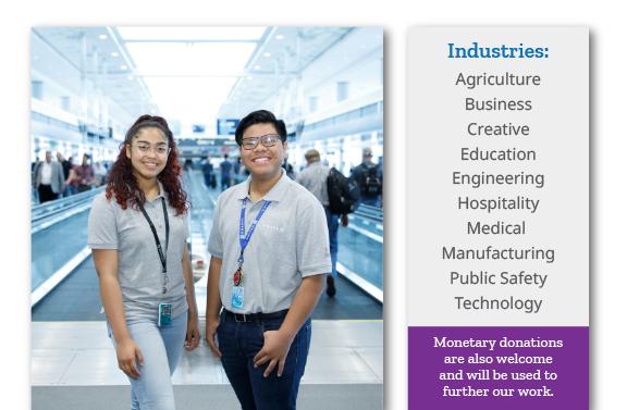
Photography is a powerful way to express our identity and is one of our most widely used assets.
We have thousands of photos of DPS students, educators and families available for you to use on your materials. Because all of our photos feature actual DPS community members, we want to ensure they are used in a way that reflects our Shared Core Values. The following guidelines can help.
If you have any questions about these guidelines, please contact us at communications@dpsk12.org.
Photography Principles
Photography in DPS collateral should have a distinct style that emphasizes color and evokes emotion. Photographers should look for color opportunities that give images a “standout” quality and provide a sense of depth. It is preferred to have a variety of both wide- and close-framed shots. Subjects, which may be candid or posed, should project a positive, engaging feeling. Overall, images should feel fresh, vibrant and energetic.
It is important that photos highlight the diversity of our DPS community. All students pictured have approved media releases on file. Adults have verbally consented to have their photo taken at the time of the photoshoot. However, if you are using an image of an adult, the best practice is to ensure that the person featured is still a part of Team DPS before using the image.
If you find an image of someone in our photo library who no longer works at DPS, please email communications@dpsk12.org so we can remove them from our library.

Photography Principles
Continued
In most cases, people should be the focus of DPS photography. We also have galleries for objects, imagery, and anonymous photo galleries, for use with materials where we may not want to use an individual’s face.
The communications team is regularly adding approved photos to our photo library, and we archive photos after they are more than three years old.
Accessibility Tip
Remember to add alternative text (also known as alt text) to describe the image when using an image in digitally created assets, allowing those who use screen readers to identify the content in the photo. Some examples of where alt text is required include your PDFs, Google Slides and your department webpages.


To add alternative text to an image or design element in Canva, right click on it and select “Alternartive text” in the popup menu.
DPS Photo Library
Our photo library is a helpful tool that allows users to search, share and download photos for their projects. Images are for official use only in DPS publications, websites, presentations and other materials.
Search our photo galleries at dps.intelligencebank.com. This library is a helpful tool that allows users to search, share and download photos for their projects. Images are for official use only in DPS publications, websites, presentations and other materials.
We do not recommend that you use photos outside the DPS photo library on your materials. However, if you must use your own photos on your materials, students featured in the images must have media release forms turned in before being shown on DPS collateral.

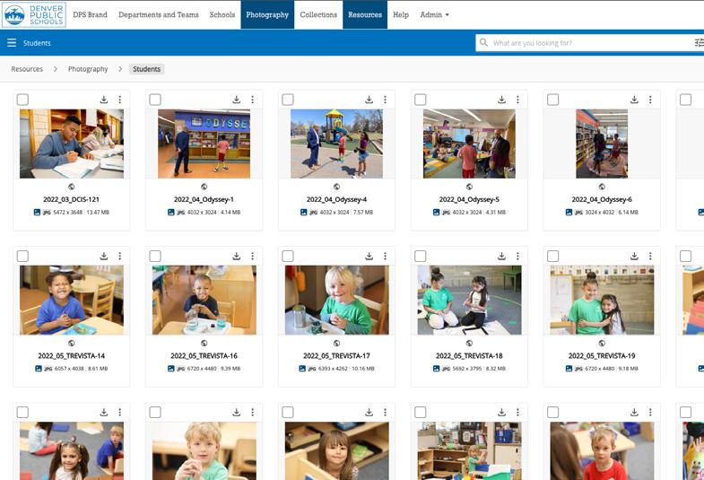
Download Photos.

Resources Available
A unified brand builds credibility and gives families the reassurance that DPS is behind all of our efforts.
One of the easiest ways to align with DPS brand guidelines is to utilize the resources on the following pages. Choose one of our many templates and quickly customize to fit your needs.
If you have any questions about DPS branding resources, please contact us at communications@dpsk12.org.
DPS Brand Portal
The DPS Brand Portal is a one-stop shop for everything you need to create DPS-branded content. Visit dps.intelligencebank.com to download logo files, fonts, colors, icons and more. If you are logging in for the first time, log in with your dpsk12.net email address.
Visit the Brand Portal.


Google Docs
Google Docs templates have been created for you to easily create your own branded materials for sharing digitally or in print. All come with pre-set colors, fonts and placeholder photos. There are multiple options to choose from including multipage docs and event flyers.
We also have Google Doc templates available in each of the department colors. If you need a custom Google Doc template for your department, please email us at communications@dpsk12.org.
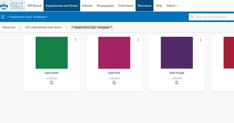
Download Google Doc Templates for DPS.
Download Google Doc Templates for your Department.

Google Slides
Our Google Slides template is available for use districtwide. The template was created with a variety of premade template layouts, placeholder photos and text boxes, allowing you to fully customize your presentation.
We also have Google Slide templates available in each of the department colors. If you need a custom Google Slide template for your department, please email us at communications@dpsk12.org.
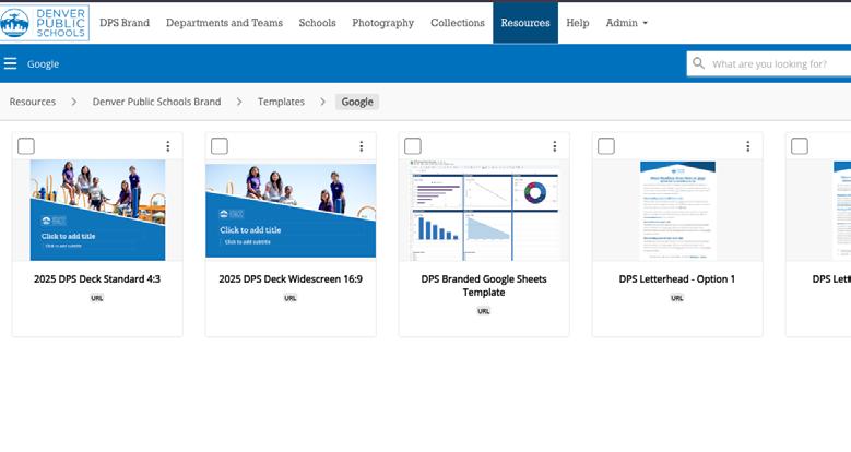
Download Google Slides Templates for DPS.
Download Google Slides Templates for your Department.

Google Sheets
Our Google Sheets template is available for use districtwide. The template was created with our brand colors and fonts.
We also have Google Sheet templates available in each of the department colors. If you need a custom Google Sheet template for your department, please email us at communications@dpsk12.org.
Download the Google Sheet Template.

Email Signatures
DPS email signatures are easy to customize. Choose from one of five options, based on your preferences.
All email signature options include your name, title and contact information, as well as the DPS logo, social media icons and Shared Core Values.
You can customize your signature by choosing to add your department name, pronouns and an additional line, such as a quote or an important message. You can delete any elements that aren’t relevant to you, such as a cell phone number or desk number.
In order to meet or exceed the contrast requirements as detailed in the most recent web content accessibility guidelines and in order to maintain brand consistency across the organization, you may not change the font color in your email signature. The provided template includes the required colors for each part of your signature.

Download Email Signatures.
Business Cards
Double-sided branded business cards can be ordered through All Copy Products (ACP).
Visit acpservices.dpsk12.org/internal for more information.
Download Business Cards.
Department Resources
The goal of these department resources is to provide teams with the tools needed to achieve a unified DPS look and feel. We have templates available in all of the department colors.
Upon request, custom department letterheads, email signatures and other resources such as one-pager templates, can also be provided. Please email us at communications@dpsk12.org for support.

Download Department Resources.

DPS Canva for Education
As a DPS employee, you have easy access to DPS branding in Canva! All central office employees have the DPS Brand Kit loaded into their Canva account, and all school employees have access to their school’s Brand Kit.
When you are in a Canva project, you can access the official DPS logos, colors and fonts in the Brand tab on the left side.
If you work at a school and would like access to the DPS Brand Kit, please contact communications@dpsk12.org to have the DPS brand kit added to your school’s team. Remember to log in to Canva using your dpsk12.net email address.
When you build materials in Canva, please refer to canva.com/accessibility to ensure that your materials are accessible.
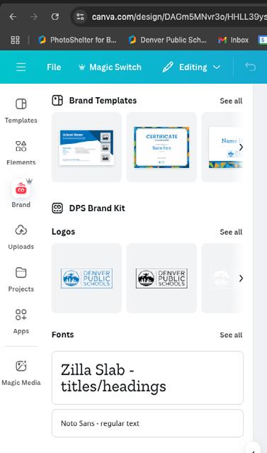
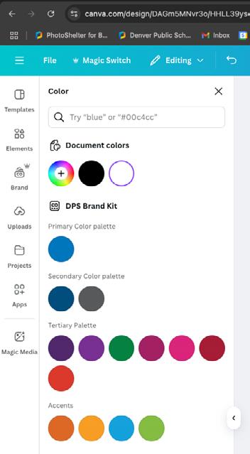
Branded Canva templates will be added to our Brand Kit in fall 2025.
Iconography
Icons – also known as images or symbols – are a great way to communicate your message. They draw attention, quickly sum up an idea and increase readability by breaking up content. As part of our efforts to strengthen and unify the DPS brand, we’ve developed an icon library where you can view and download dozens of icons in multiple colors that fit the DPS style. Icons are available in DPS Blue and white. They will be available in our tertiary colors in fall 2025.


We continually add new icons to the library. If you need a specific icon we have not yet created, please email us at communications@dpsk12.org.
Download Icons.


