brand standards
updated spring 2018


The Hop is Milwaukee’s new streetcar—a modern, fixed transit network that’s quite literally moving Brew City forward.
Not only is The Hop a fun, easy way to get from A to B, it connects riders to destinations, investors to opportunities, and our city to a reimagined vision of what the future may hold.
This document outlines the elements of The Hop brand—the graphics, fonts, colors and messaging that represent the brand’s personality and key attributes. By communicating this story clearly and consistently, we can each play a part in ensuring the streetcar delivers on its promise to keep our city moving. Let’s hop to it!
The Hop logo is clean, crisp and modern, yet also reflects a bit of the romance associated with streetcar travel in its heyday. The logo consists of The Hop name along with the MKE icon, representing the city of Milwaukee in shorthand form.
The primary logo for The Hop is in Brew City Gold, Steel Gray and Sky Blue on a white background. This version should be used whenever possible.
Vertical
Horizontal
When color is not an option, the 1-color (black) version of the logo can be used instead.
When a reverse logo is needed, either the 1- or 2-color versions may be used, depending on the background color. Sky Blue or Brew City Gold are the preferred colors for backgrounds.
Keep adequate space around the logo. Use the (H) from the logo as a guide to create an area of isolation around the logo. Do not allow type or graphics to violate this area.
Please do not use The Hop logo or icons at sizes smaller than the minimums shown here.
1.25" minimum size horizontal
1" minimum size vertical
.625” minimum size
.625” minimum size
Incorrect use of the logo compromises its integrity and effectiveness. These examples of incorrect use are a small sampling. To ensure accurate reproduction of the logo, always use the approved digital artwork.
Don’t change the proportions of the logo elements
Don’t stretch the logo
Don’t distort the logo
Don’t add a gradient to the logo
Don’t use a different font for the logo
Don’t use non-brand colors for the logo
Don’t change the spacing of the logo
Don’t rotate the logo
Don’t place the logo on a busy back ground
Potawatomi Hotel and Casino is The Hop’s primary sponsor and their logo must appear with The Hop logo in nearly all instances. The Potawatomi logo must appear underneath or to the left of The Hop logo at the proportions and positions defined here.
Potawatomi horizontal logo should align, left to right, with the “—streetcar—” portion of The Hop logo
The Potawatomi vertical logo should align with the bottom of The Hop horizontal logo, and with the top of the word “HOP”
The Potawatomi vertical logo should align with the bottom of The Hop vertical logo, and with the bottom of the MKE icon
Potawatomi horizontal logo should align, left to right, with the “—streetcar—” portion of The Hop vertical logo
When appearing with either of The Hop icons, the Potawatomi horizontal logo should appear at the same width as the icon.
The horizontal Potawatomi logo and MKE icon should be same width
The horizontal Potawatomi logo and The Hop flower icon should be same width
At the first mention of the streetcar name in advertising or marketing copy, it should always be paired with the sponsor name as follows:
The Hop, presented by Potawatomi Hotel & Casino
After the first mention, the streetcar can simply be referred to as The Hop.
The illustrations for The Hop are simple and friendly—just like the streetcar.
milwaukee skyline illustration icons speech bubble hop on!
thEhop
The Hop patterns can be used to add texture and visual interest to ads, posters and other materials. These patterns are to be used as backgrounds and layered on top of any of the approved HOP colors at an opacity of 5-15%. If type is placed on top of these backgrounds, use care that the background does not interfere with legibility.

The primary palette colors can be used on any branded material.
Brew City gold is the color of the hop plant— the inspiration for our streetcar’s name and a key ingredient in our city’s favorite beverage.
Steel Gray is representative of the material the streetcar is made of and a nod to Milwaukee’s hardworking, industrial roots.
Sky Blue
Sky blue represents the limitless opportunity the streetcar brings with it—the sky’s the limit!
These colors should be used to grab attention, create hierarchy, separate information, or add emphasis.
BREW CITY GOLD
PMS 110 C
CMYK: 2/22/100/8 RGB: 218/170/0 HEX#: DAAA00
STEEL GRAY
PMS 425 C
CMYK: 48/29/26/76 RGB: 84/88/90 HEX#: 54585A
SKY BLUE
PMS 279 C
CMYK: 68/34/0/0 RGB: 65/143/222 HEX#: 418FDE
PMS 456 C
CMYK: 10/23/100/43 RGB: 162/142/42
HEX#: A28E2A
PMS 1245 C
CMYK: 6/35/99/18 RGB: 198/146/20 HEX#: C69214
PMS 7489 C
CMYK: 56/2/78/5 RGB: 116/170/80 HEX#: 74AA50
PMS 3298 C
CMYK: 99/11/72/35 RGB: 0/106/82 HEX#: 006A52
PMS 7462 C
CMYK: 48/29/26/76 RGB: 84/88/90 HEX#: 54585A
PMS Cool Gray 4 C
CMYK: 12/8/9/23 RGB: 187/188/188
HEX#: BBBCBC
look & feel
Typography is how we express The Hop’s unique personality with every word. The fonts are clean, friendly, and modern—yet also evoke some of the elegance and romance associated with streetcar travel of days gone by.
ABCDEFGHIJKLMNOPQRSTUVWXYZ 01234567890
With its wide strokes and rounded edges, Cubano Sharp is sturdy, friendly and chock full of personality, just like the city of Milwaukee.
ABCDEFGHIJKLM NOPQRSTUVWXYZ abcdefghijklmnopqrstuvwxyz 0123456789
Grand Hotel is another headline font. It should be used sparingly and only for shorter headlines.
blanch caps
abcdefghijklmnopqrstuvwxyz 01234567890
Blanch Caps is a subhead font that can be used for short subheads.
ABCDEFGHIJKLMNOPQRSTUVWXYZ abcdefghijklmnopqrstvwxyz 01234567890
In instances when Blanch Caps is too limiting, Nobel Regular Condensed can be used as a subhead.
look & feel
Nobel is the body copy font. To maintain consistency, only use this typeface for body copy and smaller call-outs.
Body copy
Nobel Book
Nobel Book Italic
ABCDEFGHIJKLM
NOPQRSTUVWXYZ abcdefghijklmnopqrstuvwxyz 01234567890
Nobel Bold
ABCDEFGHIJKLM NOPQRSTUVWXYZ abcdefghijklmnopqrstuvwxyz 01234567890
ABCDEFGHIJKLM
NOPQRSTUVWXYZ abcdefghijklmnopqrstuvwxyz 01234567890
Nobel Bold Italic
ABCDEFGHIJKLM NOPQRSTUVWXYZ abcdefghijklmnopqrstuvwxyz 01234567890
For station signage and other unique circumstances, Arvo is used as the body font. This font may ONLY be used with approval of the City and/or the marketing agency of record.
body copy (special use only)
Arvo
Arvo Italic
ABCDEFGHIJKLM
NOPQRSTUVWXYZ abcdefghijklm nopqrstuvwxyz 01234567890
ABCDEFGHIJKLM
NOPQRSTUVWXYZ abcdefghijklm nopqrstuvwxyz 01234567890
look & feel

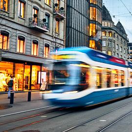
The Hop photography depicts events, places and people both on and just-off the route, as well as everyday streetlife. Whenever possible, blurred motion and/or a shorter depth-of-field should be used to communicate the movement and energy of the city. All photography should be full color, depict real life and never look staged or contrived.


› Milwaukee is undergoing a renaissance. Billions of dollars of development projects dot the landscape of a city that is enjoying an influx of talent and investment. A modern, fixed transit system can be a catalyst in accelerating that growth and ensuring that the benefits positively impact all corners of the city.
› We do this by providing an efficient means to a more connected city, providing a framework to attract future investment , business and talent, and reshaping the image of Milwaukee as a forwardthinking city on the rise.
› The initial route passes within ¼ mile of nearly every major downtown hotel, employer and attraction.
› The route connects the Intermodal Station (and its 1.4 million annual users), the Third Ward (the fastest-growing neighborhood in the city), East Town (the area with the largest concentration of jobs in the state), and the Lower East Side (the highest-density residential neighborhood in the state).
› The route has been designed to accommodate future expansion , including possible connections to Bronzeville, Walkers Point and other adjacent neighborhoods.
› The initial route complements existing bus routes , including the major bus corridor along Wisconsin Avenue.
› Fixed-rail transit offers a sense of permanence and security to prospective developers, with the route serving as a framework to inform future investment decisions.
› The Hop will expand the city’s tax base by encouraging new development and generating new business and higher occupancy rates throughout downtown.
› The Hop will increase overall economic activity in the downtown corridor, serving as a demand generator for hotels, retail, office and residential properties.
› Modern streetcars are sleek and stylish, portraying an image of a forward-thinking city building a more vibrant future for its residents and visitors.
› The Hop will be easy to navigate, making it particularly attractive to tourists. Tourism numbers continue to rise in the city, and The Hop will further cement our status as a world-class city with top-notch attractions that are easily accessible.
› Fixed-rail transit is particularly popular among millennials. Attracting and retaining young talent is critical to the future growth of our city.
› The Hop is an environmentally responsible alternative to traditional public transportation. The vehicles are energyefficient, quiet, clean and comfortable, and have the potential to use renewable, locally-created energy sources.
TheHopisamodern,fixed-rail transitsystemthatdoesn’tjust getusfromAtoB,itmovesthe entirecityforward.
voice & tone
Forward-thinking ”Milwaukee is looking for ways to grow, evolve and thrive and the streetcar is part of that vision.”
Inclusive ”The Hop connects us to all the places we want to go—and to each other!
Milwaukee-Proud “The streetcar is just the latest in a long list of things that make Milwaukee great.”
CONVERSATIONAL “Help keep downtown hoppin’ — ride the streetcar.”
Fun-loving “Buy your ticket, find your stop, climb on board and hop, hop, hop!”
› Do use a conversational tone—we’re talking to friends and neighbors
› Do be succinct and to-the-point
› Do use the word “streetcar” when talking about The Hop
› Do inject fun where possible—don’t be afraid to make them smile
Don’t
› Don’t use language that sounds governmental or stiff
› Don’t overcomplicate—keep it simple
› Don’t use the words “trolley,” “street car,” or “Streetcar”
› Don’t be sarcastic or silly