Visual Development Guide
STUDENT PROJECT
Assignment 2 / Chen Wenxuan / Spring 2024
GR_604_02 The Nature of Identity Table of Contents Initial Research Round One
Two REBRANDING OBJECTIVE KEY WORDS ROUGH SKETCH REFINED ROUND TWO ROUGH SKETCH REFINED DIGITAL 4 10 6 18 22 24 28 30
Round
Assignment 2 / Chen Wenxuan / Spring 2024 1 Visual
RESEARCH LOOK LIKE LOGO ROUGH SKETCH REFINED LOOKUPS ROUGH SKETCH LOGO 52 44 34 60 48 38 40
Research Round Three Round Four
GR_604_02 The Nature of Identity 01 2
INITIAL RESEARCH
Assignment 2 / Chen Wenxuan / Spring 2024
3
Rebranding Objective
Regarding the reinvention of the DeLorean, we will position it as an international brand and establish its influence as a luxury car. We can borrow the influence of DeLorean in the Back to the Future movie, establish clubs around the world, and offer a high level of customization and limited car sales.
GR_604_02 The Nature of Identity 4

Assignment 2 / Chen Wenxuan / Spring 2024 5
Key Words
Groundbreaking: Delorean is a man who does not want to be left behind, and he will now choose to make DeLorean a pioneering enterprise. And the competition for vehicles is so fierce that it takes something groundbreaking to get DeLorean into the picture and become an international player.
Revolutionary : DeLorean is an old brand, but at the same time one of its main ideas is to create the future. The combination of nostalgia and futuristic creativity makes DeLorean revolutionary.
Ambitious: DeLorean aims to be an international company and to have an impact in a wide range of industries.
GR_604_02 The Nature of Identity 6

"Live the dream, don't dream your life."
—John DeLorean
Assignment 2 / Chen Wenxuan / Spring 2024 7
GR_604_02 The Nature of Identity 8 02
ROUND ONE
Assignment 2 / Chen Wenxuan / Spring 2024 9
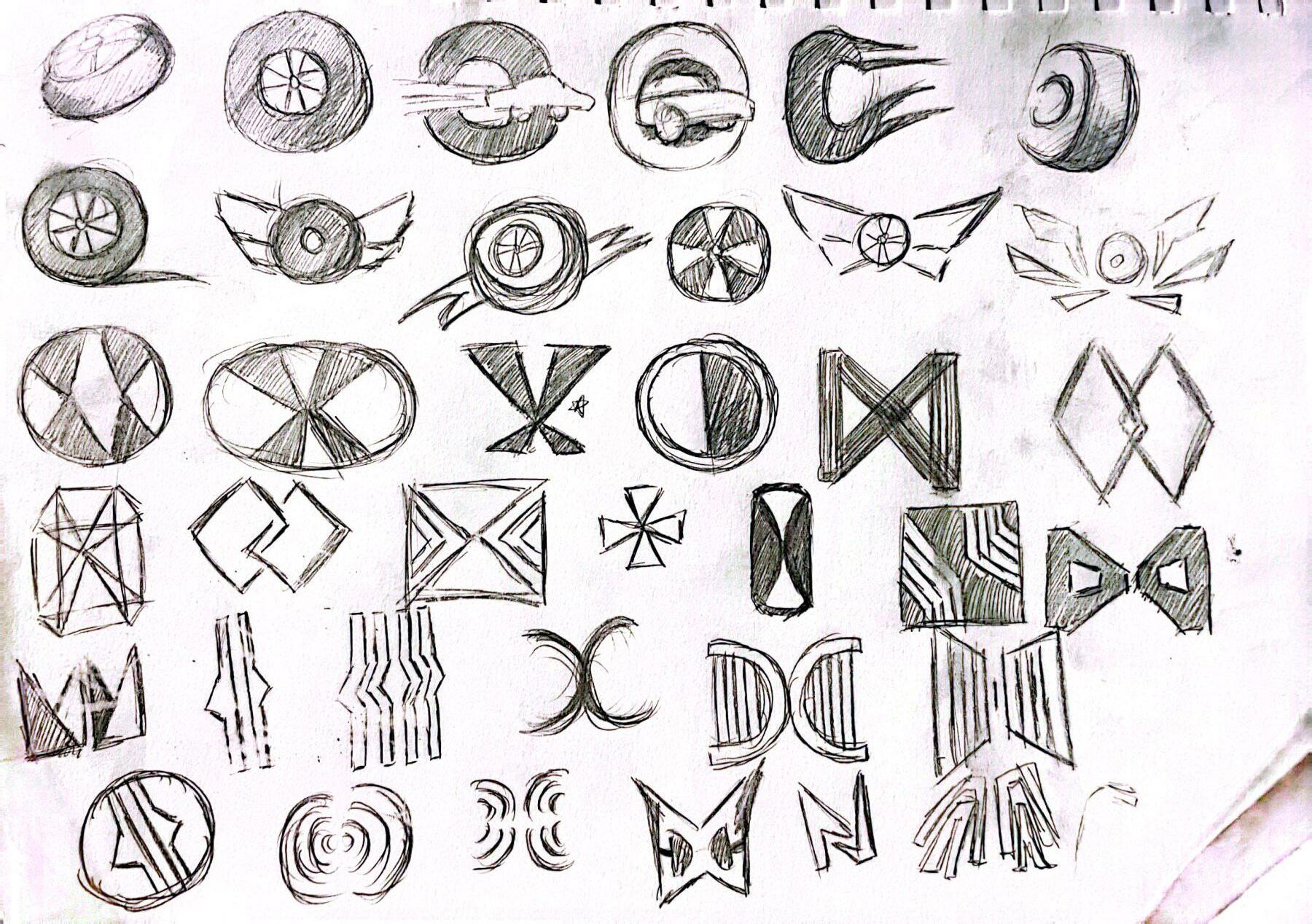
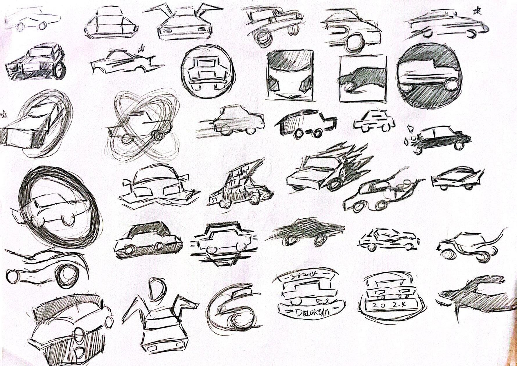
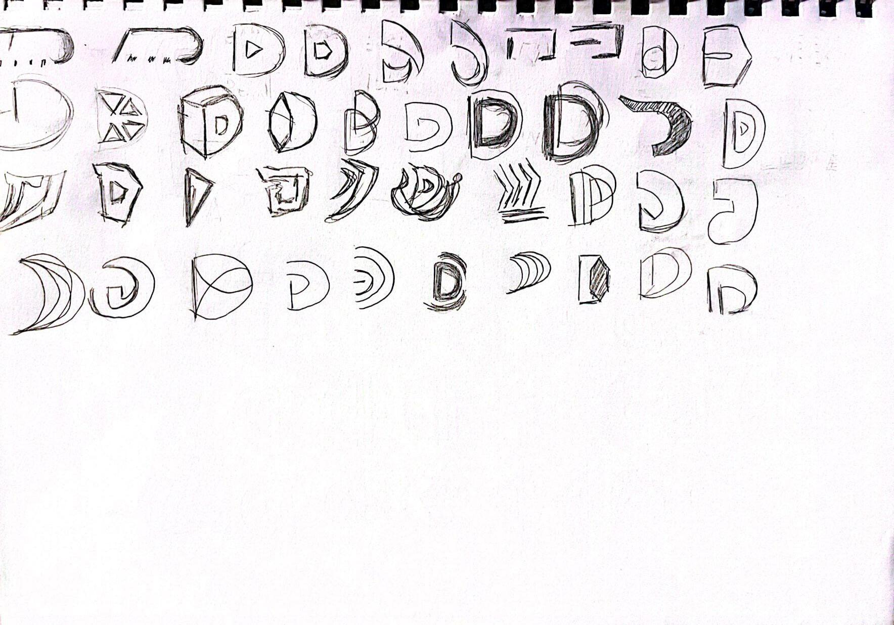
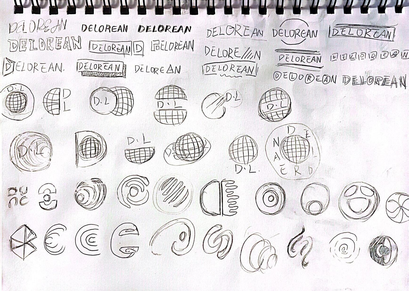
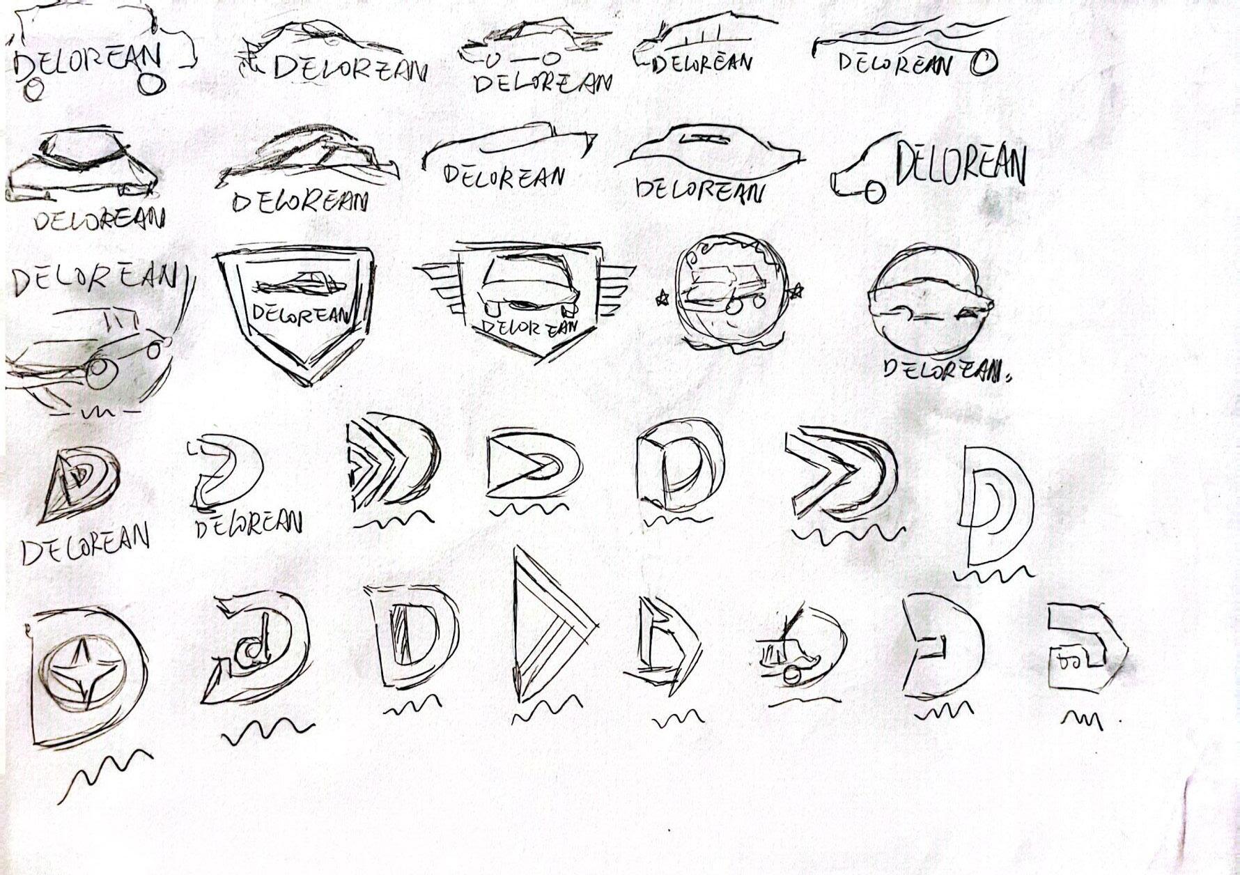
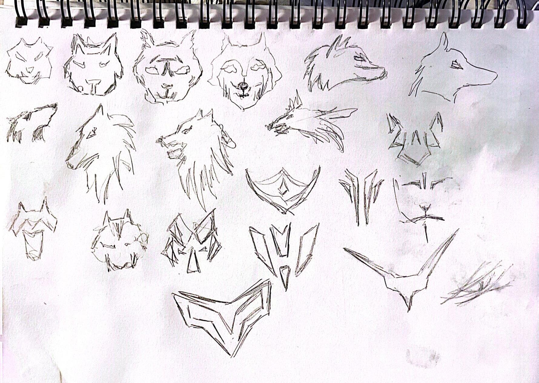
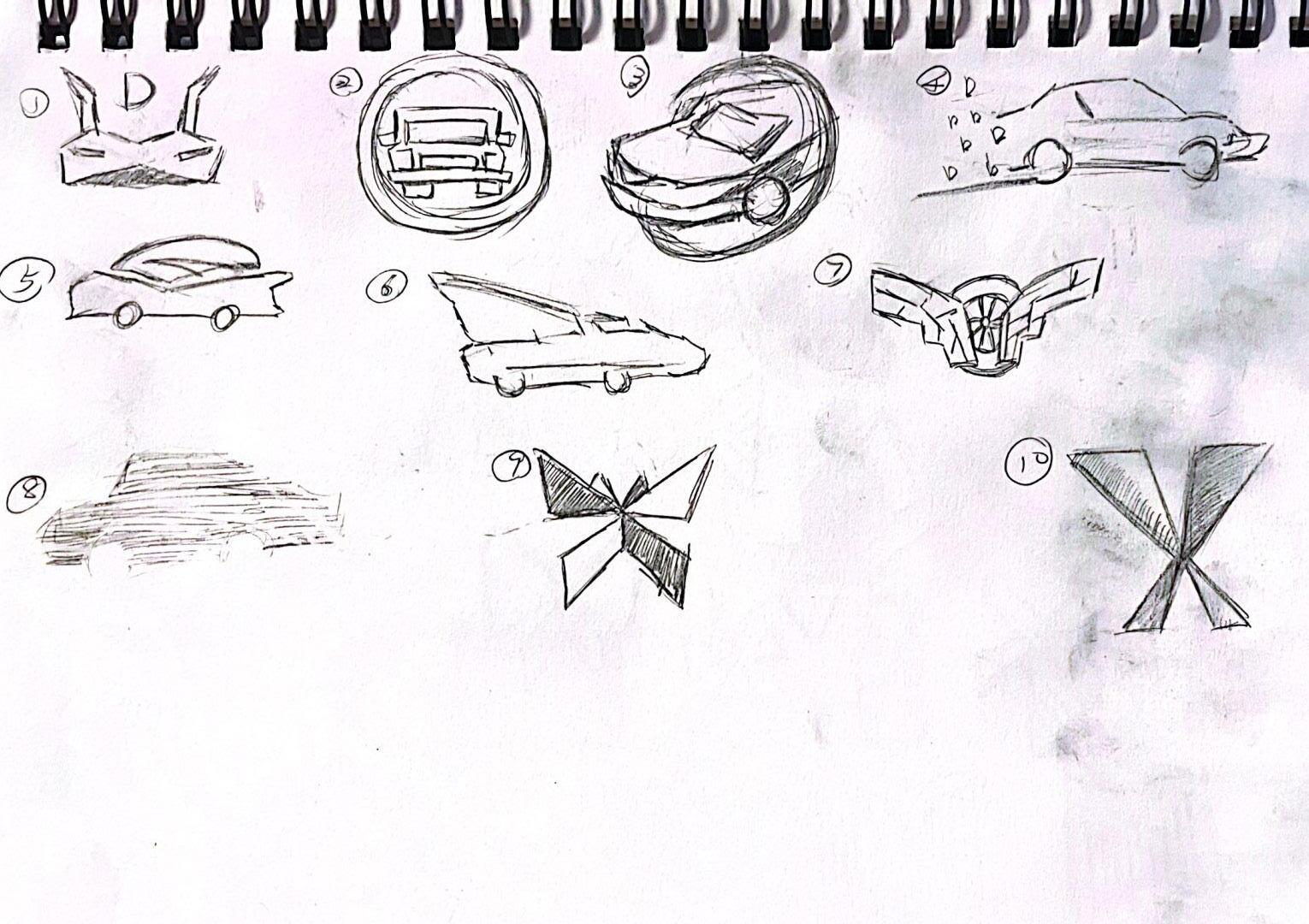
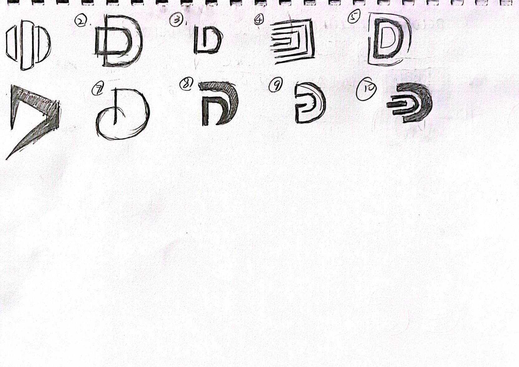
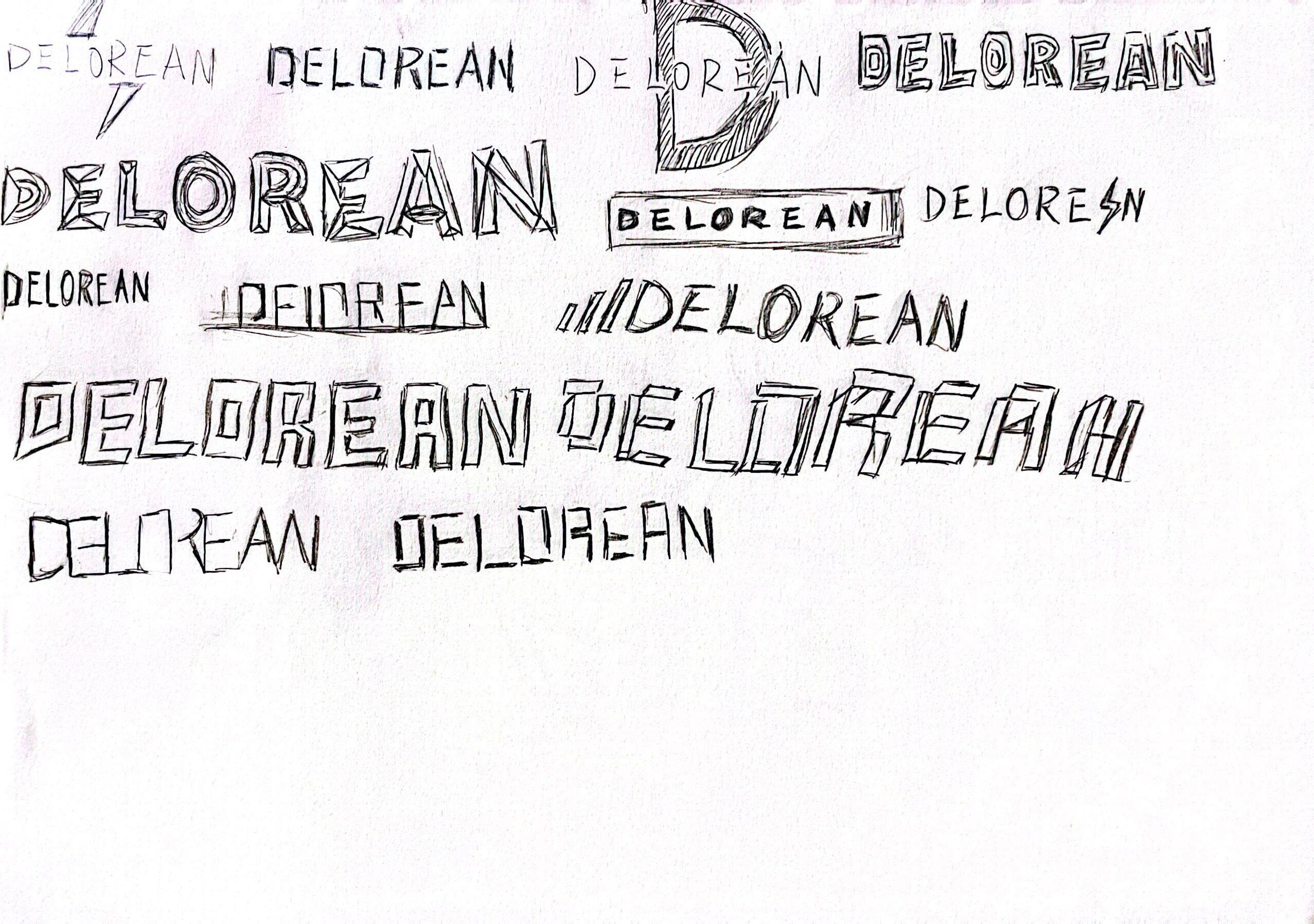
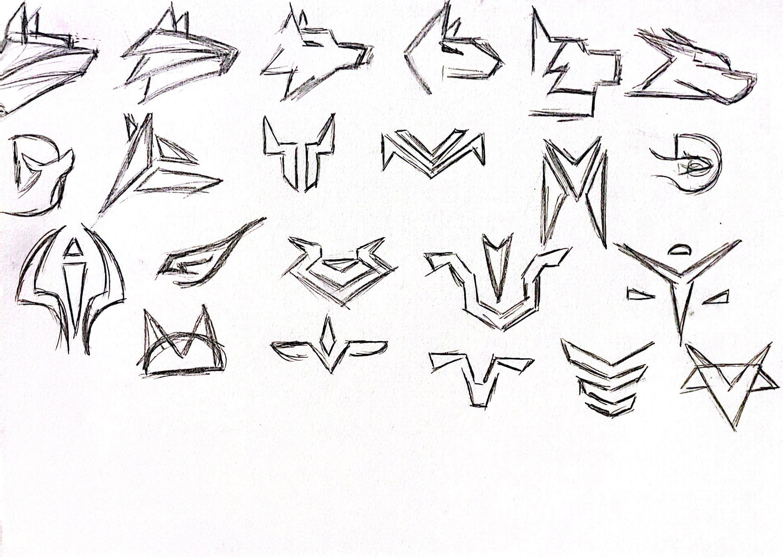
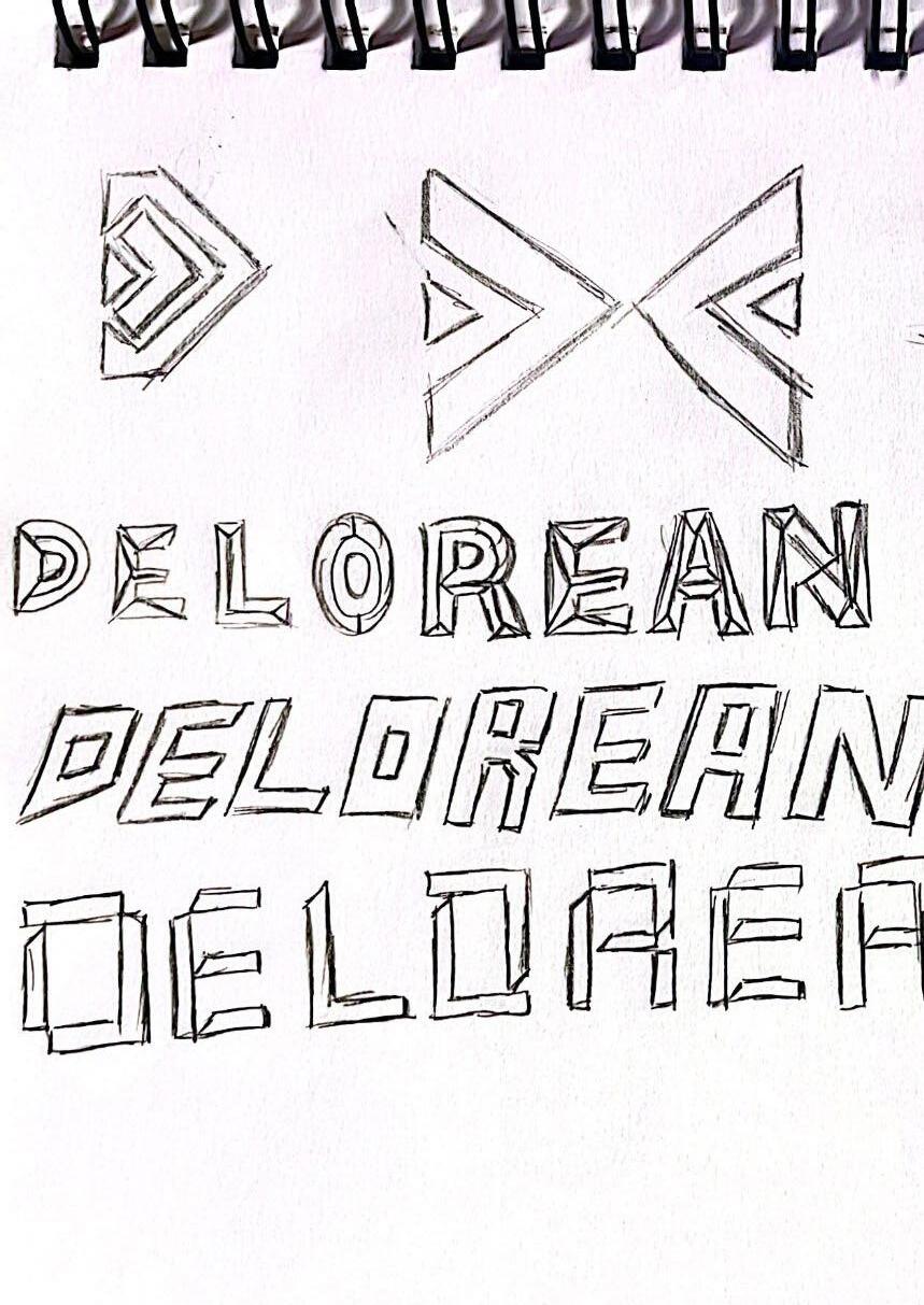
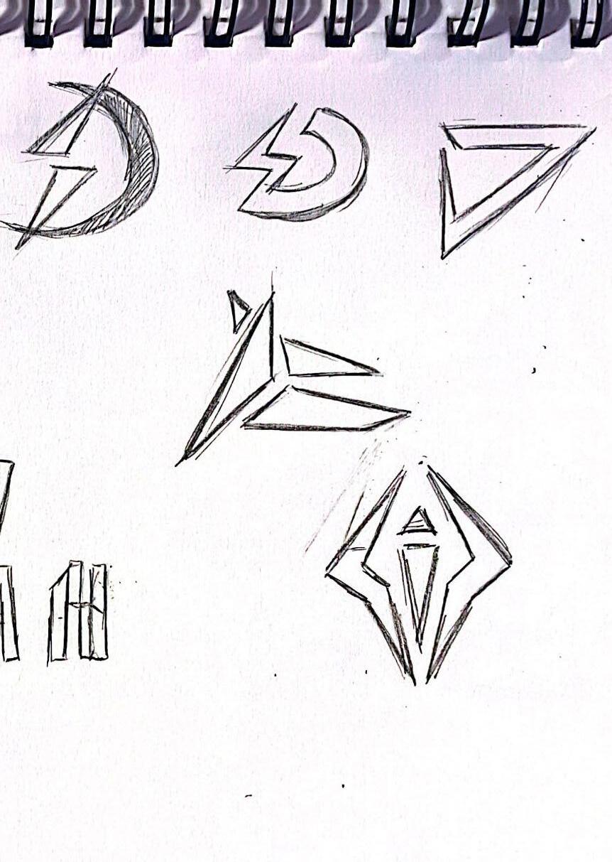
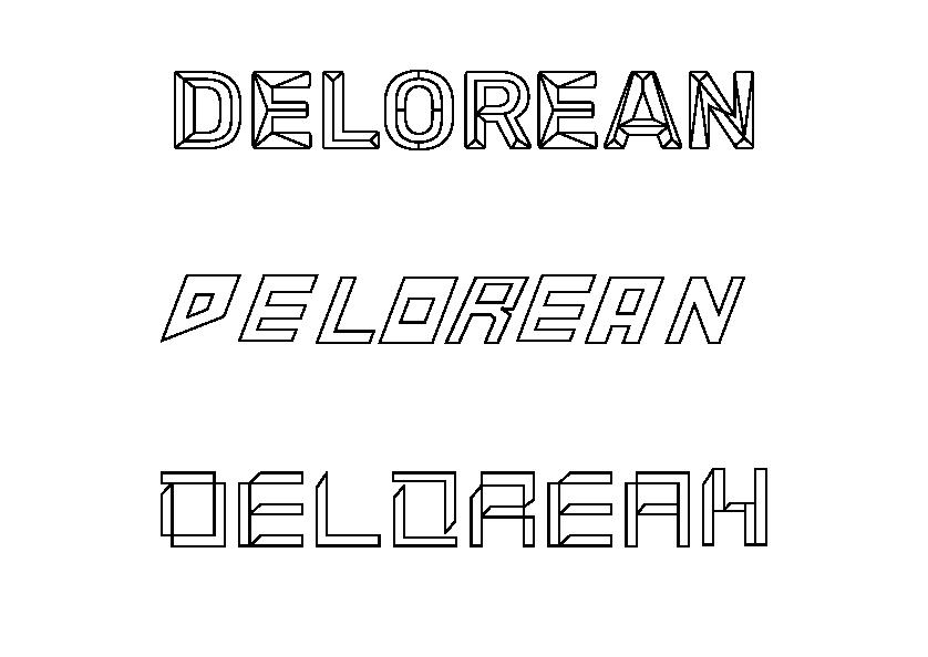
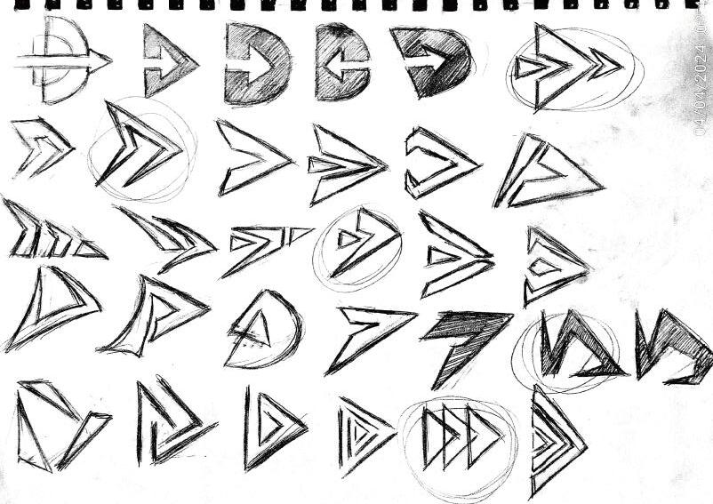
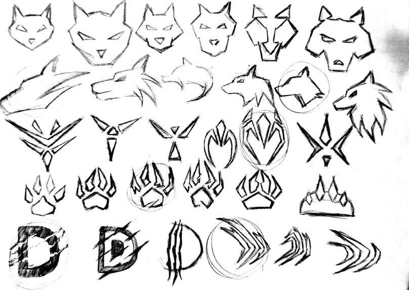
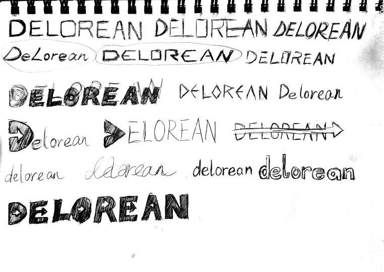
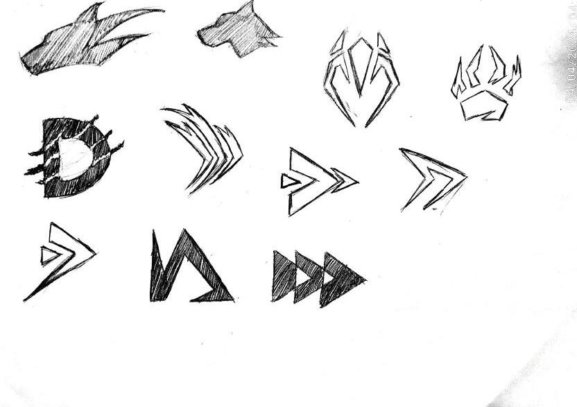
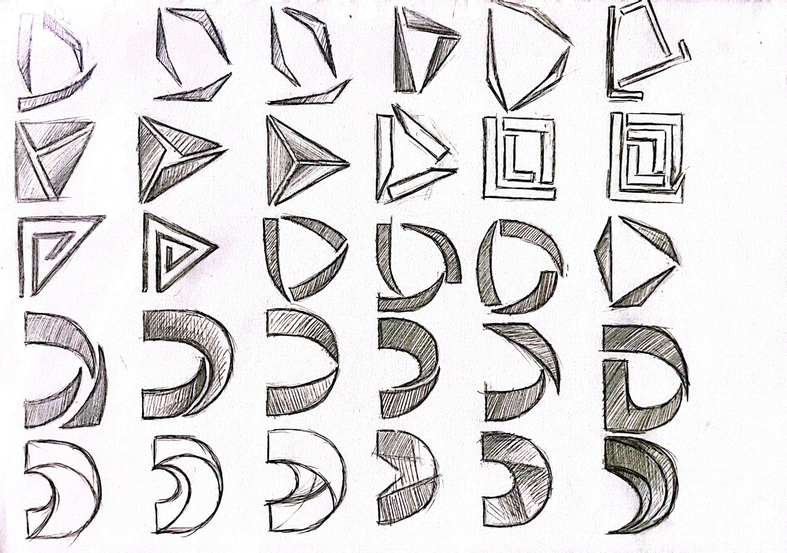
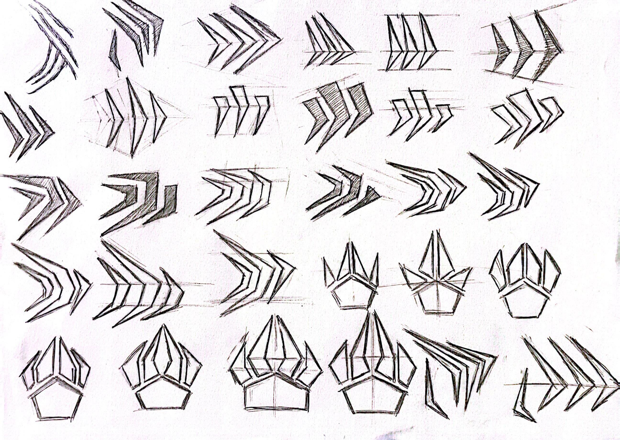
Rough Sketch 01
GR_604_02 The Nature of Identity 10
Assignment 2 / Chen Wenxuan / Spring 2024 11
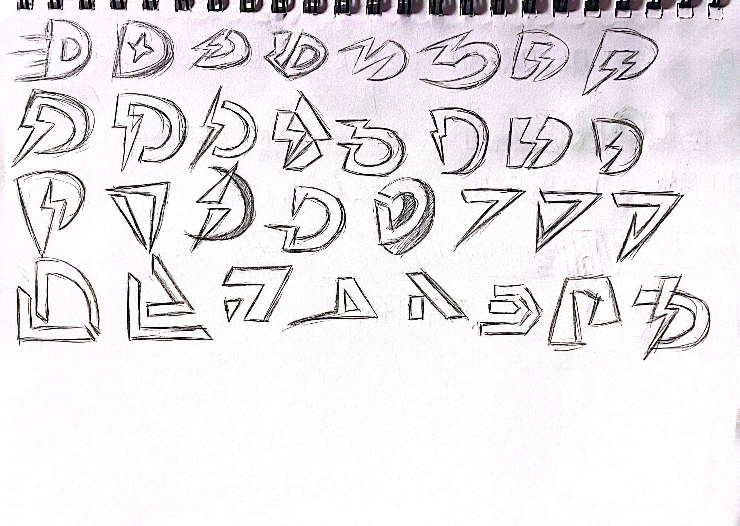
Rough Sketch 01
GR_604_02 The Nature of Identity 12
Assignment 2 / Chen Wenxuan / Spring 2024 13
Rough Sketch 01
GR_604_02 The Nature of Identity 14
Assignment 2 / Chen Wenxuan / Spring 2024 15
Rough Sketch 01
GR_604_02 The Nature of Identity 16
Assignment 2 / Chen Wenxuan / Spring 2024 17
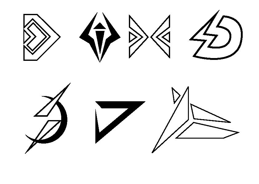
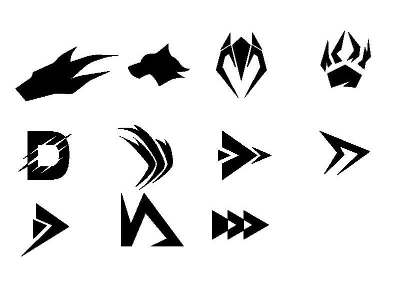
Refined 01
GR_604_02 The Nature of Identity 18
Assignment 2 / Chen Wenxuan / Spring 2024 19
Refined 01

GR_604_02 The Nature of Identity 20
Assignment 2 / Chen Wenxuan / Spring 2024 21
GR_604_02 The Nature of Identity 22 03
ROUND TWO
Assignment 2 / Chen Wenxuan / Spring 2024 23
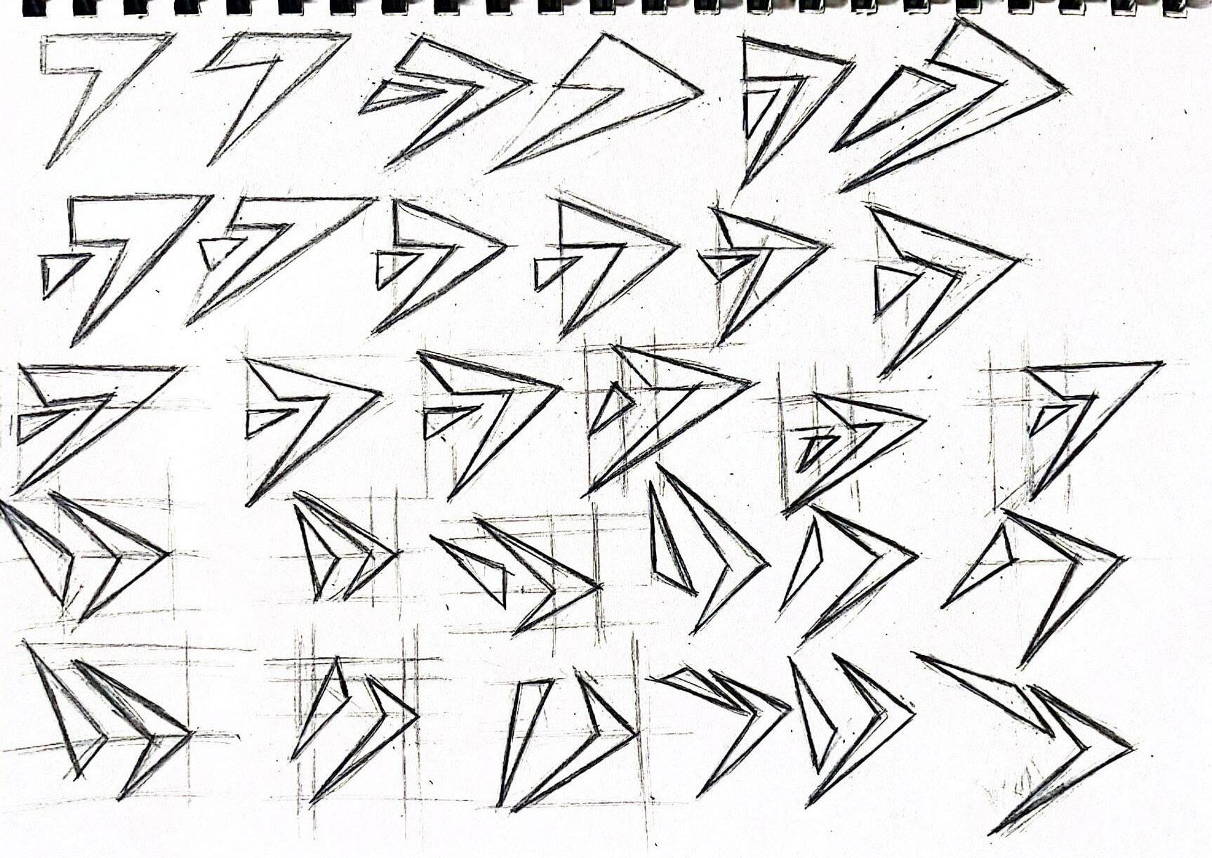
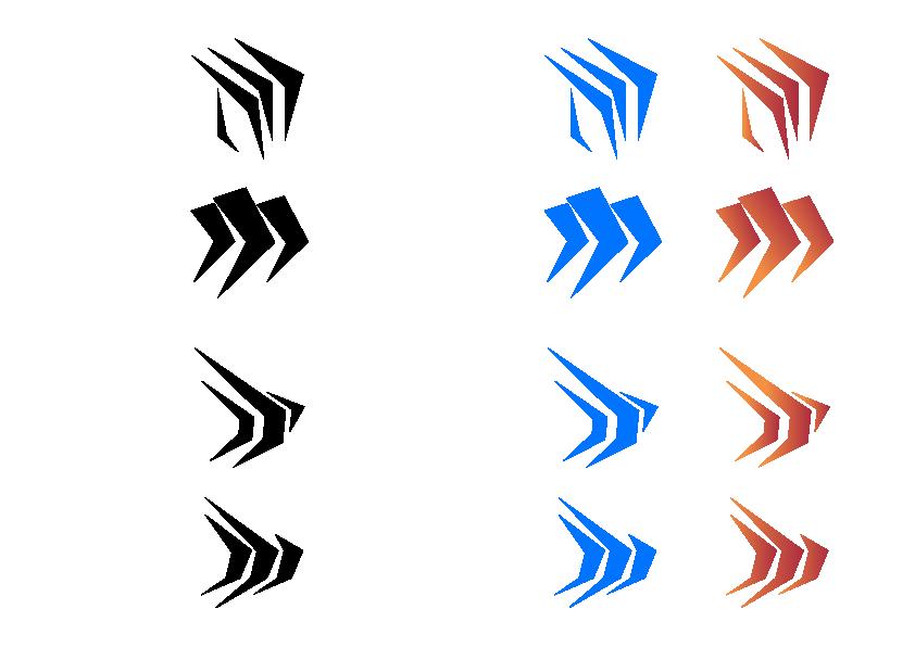
Rough Sketch 02

GR_604_02 The Nature of Identity 24
Assignment 2 / Chen Wenxuan / Spring 2024 25
Rough Sketch 02
GR_604_02 The Nature of Identity 26
Assignment 2 / Chen Wenxuan / Spring 2024 27
Refined 02
GR_604_02 The Nature of Identity 28
Assignment 2 / Chen Wenxuan / Spring 2024 29
GR_604_02 The Nature of Identity 30
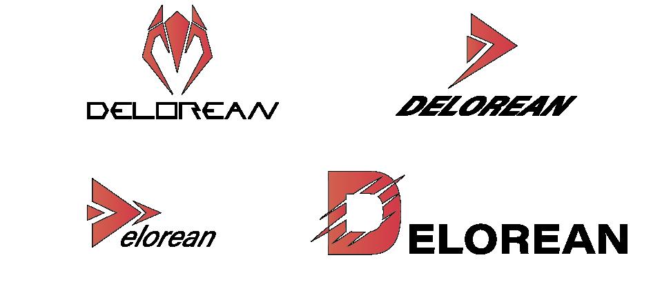
Digital
Assignment 2 / Chen Wenxuan / Spring 2024 31
ROUND THREE
GR_604_02 The Nature of Identity 33
Assignment 2 / Chen Wenxuan / Spring 2024 32 04
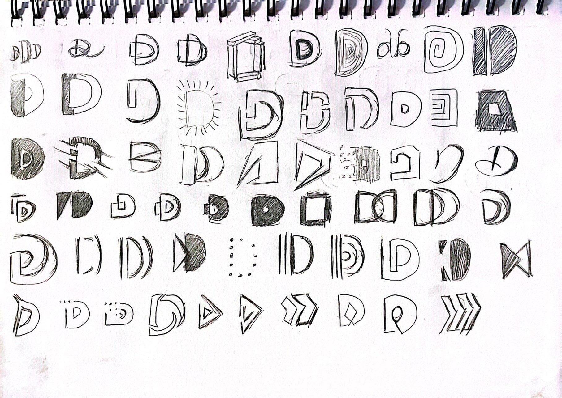
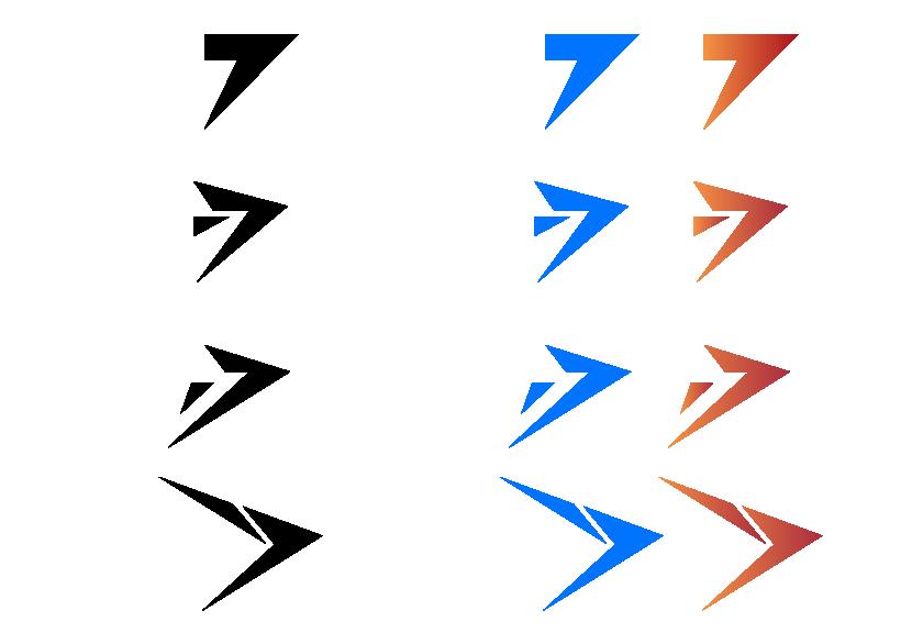
Rough Sketch 03
GR_604_02 The Nature of Identity 34
Assignment 2 / Chen Wenxuan / Spring 2024 35
Rough Sketch 03
GR_604_02 The Nature of Identity 36
Assignment 2 / Chen Wenxuan / Spring 2024 37
Refined 03
GR_604_02 The Nature of Identity 38
Assignment 2 / Chen Wenxuan / Spring 2024 39
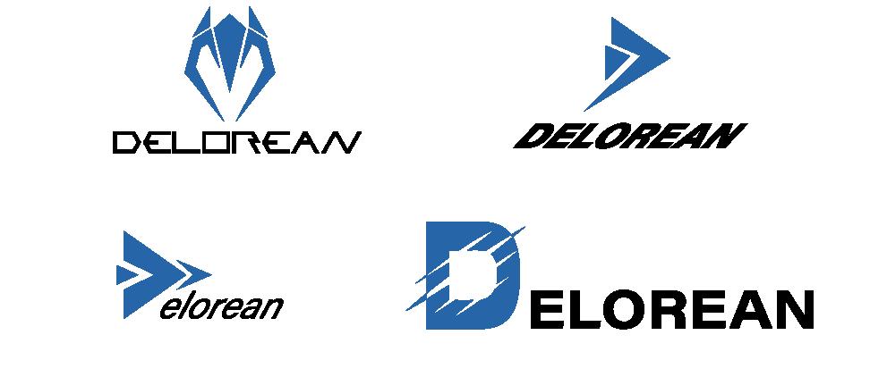
Digital
Lockups in Color
GR_604_02 The Nature of Identity 40
Assignment 2 / Chen Wenxuan / Spring 2024 41
GR_604_02 The Nature of Identity 42 05
ROUND FOUR
Assignment 2 / Chen Wenxuan / Spring 2024 43
Rough Sketch 04
GR_604_02 The Nature of Identity
44
Assignment 2 / Chen Wenxuan / Spring 2024 45
Rough Sketch 04
GR_604_02 The Nature of Identity
46
Assignment 2 / Chen Wenxuan / Spring 2024 47
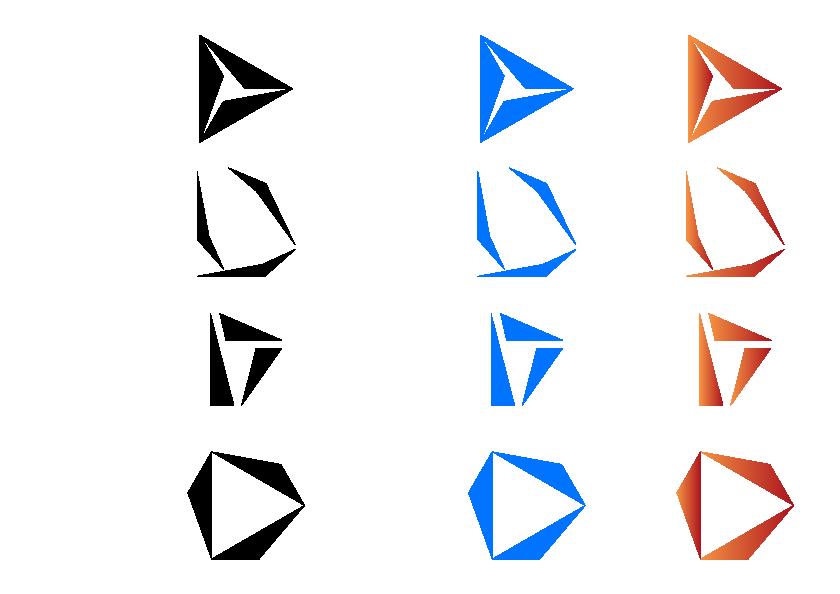
Final Logo
GR_604_02 The Nature of Identity
48
Assignment 2 / Chen Wenxuan / Spring 2024 49
Final Logo
GR_604_02 The Nature of Identity 50

Assignment 2 / Chen Wenxuan / Spring 2024 51
GR_604_02 The Nature of Identity 52 06
VISUAL RESEARCH
Assignment 2 / Chen Wenxuan / Spring 2024 53
1 New Identity Introduction
The term "New Identity Introduction" usually refers to the creation and redesign of a new logo. This process is designed to allow the broader strategy of the company and product reinvention to signal a shift in direction, values, product, or target audience. The introduction of a new logo is a key and important one for the brand as it communicates to people the change in brand image and missio,
GR_604_02 The Nature of Identity 54
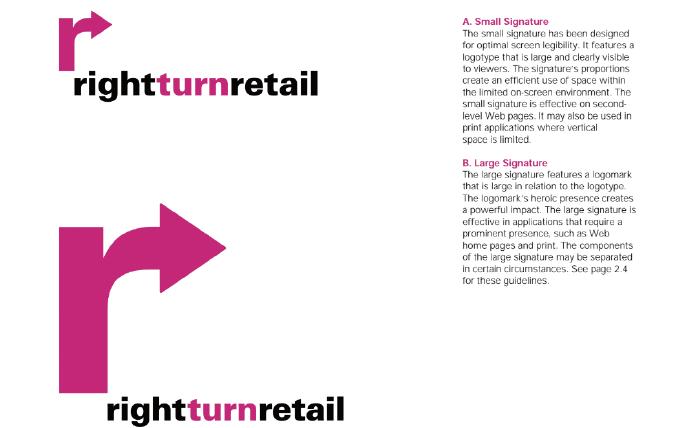
2 Logo Anatomy
Logo Anatomy tells us the standard of using Logo. This tells us about the various components of logo design, each of which has the integrity, consistency and brand image of presenting the logo. The structure of a logo is crucial to a brand because it helps people effectively understand and relate to the spirit of the brand.
Assignment 2 / Chen Wenxuan / Spring 2024 55
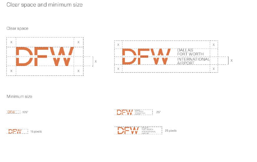
3 Type Specs
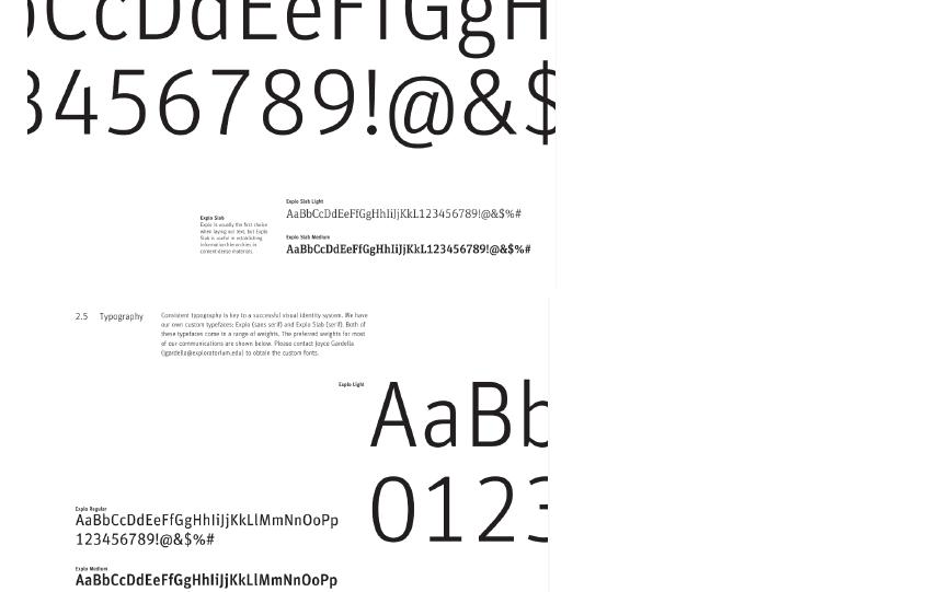
Type Specs refer to detailed instructions and guidelines for the use of typography in design projects. These specifications are useful for ensuring that text is on a variety of media. This includes print and websites. Consistent presentation is crucial. Type Specs are usually part of the design system. It provides references to ensure consistent use of typography across all branded materials and platforms. By adhering to these norms, we as designers can create easy-to-understand and creative designs that effectively communicate the brand message.
GR_604_02 The Nature of Identity 56
4 Main ID colors
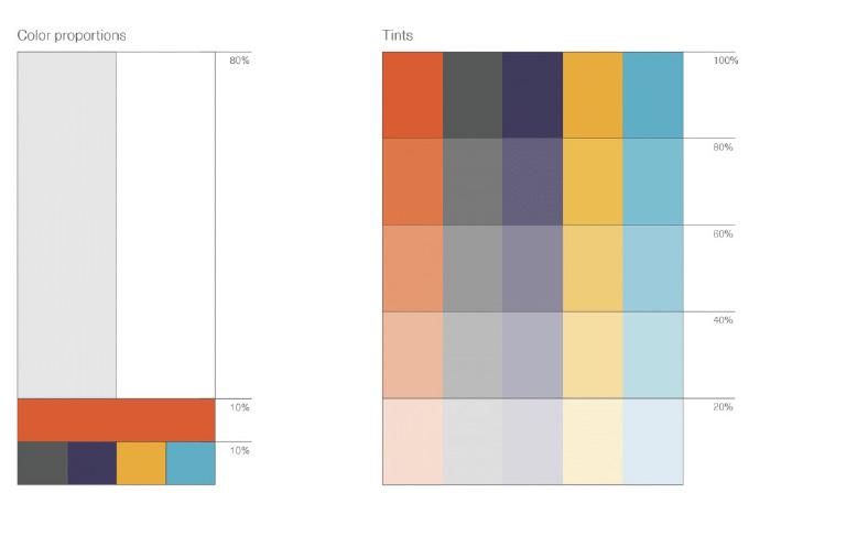
"Main ID Colors" means the color specified in the brand identity system. These colors are a fundamental part of the brand identity and were chosen to represent the brand visually across all media and applications and to impress people. The main ID colors were selected for their psychological impact on the audience, cultural significance, and relevance to the brand. In general, there are two types of data to consider: CYMK and RGB.
Assignment 2 / Chen Wenxuan / Spring 2024 57
5 Logo Don’t
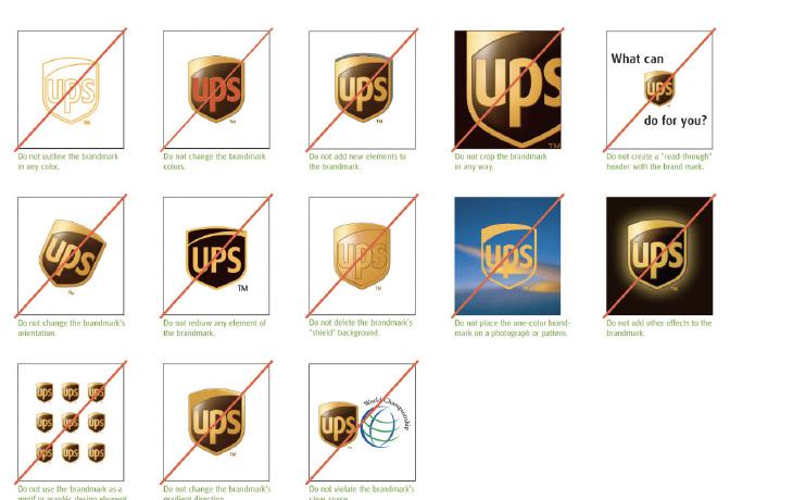
This section says that when designing a logo, designers should be aware of some scenarios that cannot be used to ensure that the logo effectively represents the brand and communicates its values. Don't use messy colors, using too many colors can make the logo look cluttered and reduce its impact. Readability is very important, avoid using fonts that are too stylized or difficult to read or mix with backgrounds.
GR_604_02 The Nature of Identity 58
6 Alternate versions of the logo
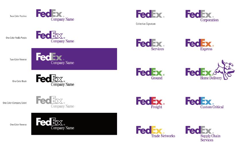
An alternative version of a logo is a variation of the logo used by a brand in different contexts, which is to ensure consistency and recognisability across different platforms, while maintaining flexibility. These changes are specific to adapt to different Spaces and backgrounds without losing the foundation of the brand's visual identity. These alternatives must adhere to the brand's overall style and guidelines to ensure that the logo continues to convey its message effectively, even if it takes a different form.
Assignment 2 / Chen Wenxuan / Spring 2024 59
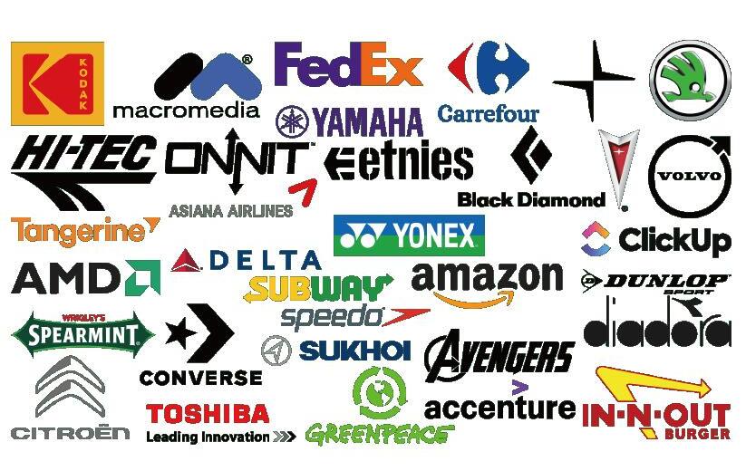
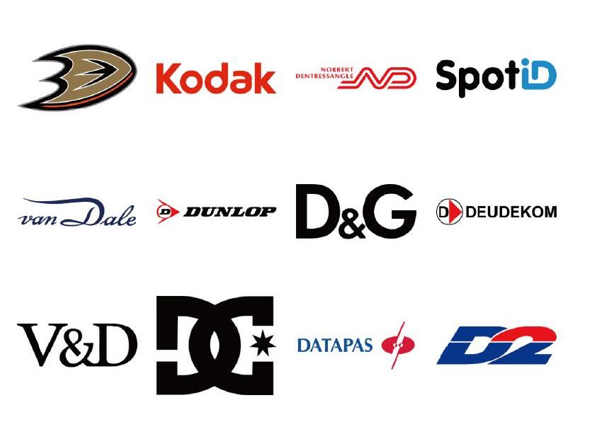
Look-a-Like Logos
GR_604_02 The Nature of Identity GR_604_02 The Nature of Identity 60
Assignment 2 / Chen Wenxuan / Spring 2024 61
DISCLAIMER
This is just a homework exercise for students and will not be used in the field of business. This theme does not replace the original branded content.
TYPOGRAPHY
TIMES
PT Sans
PHOTOGRAPHY
www.pexels.com/ www.pinterest
www.midjourney.com/
GR_604_02 The Nature of Identity 62
Assignment 2 / Chen Wenxuan / Spring 2024 63
Assignment 2 / Chen Wenxuan / Spring 2024 GR_604_02: The Nature of Identity
