Welcome to my portfolio! Camille Hart 2023
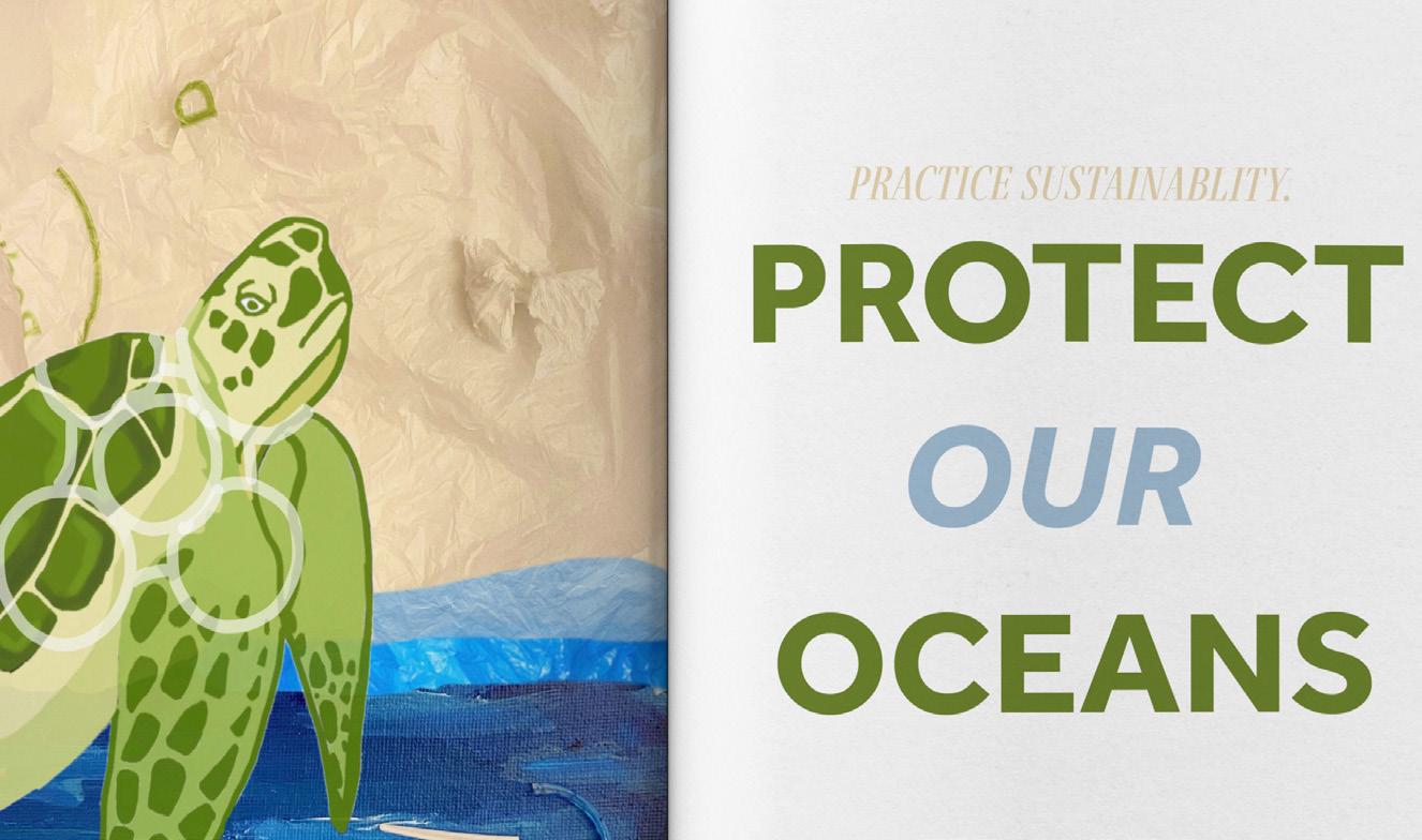
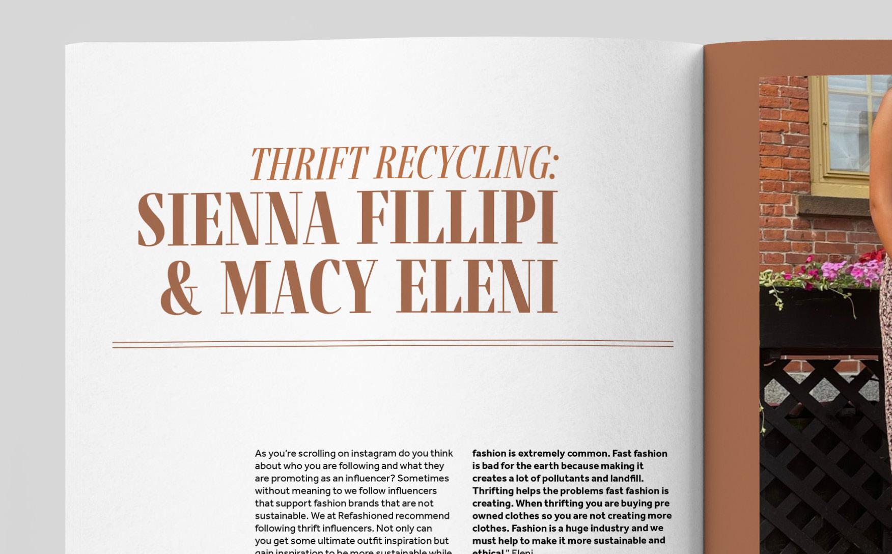
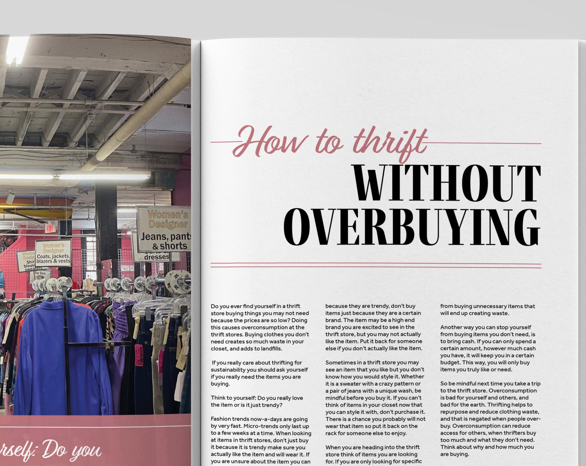
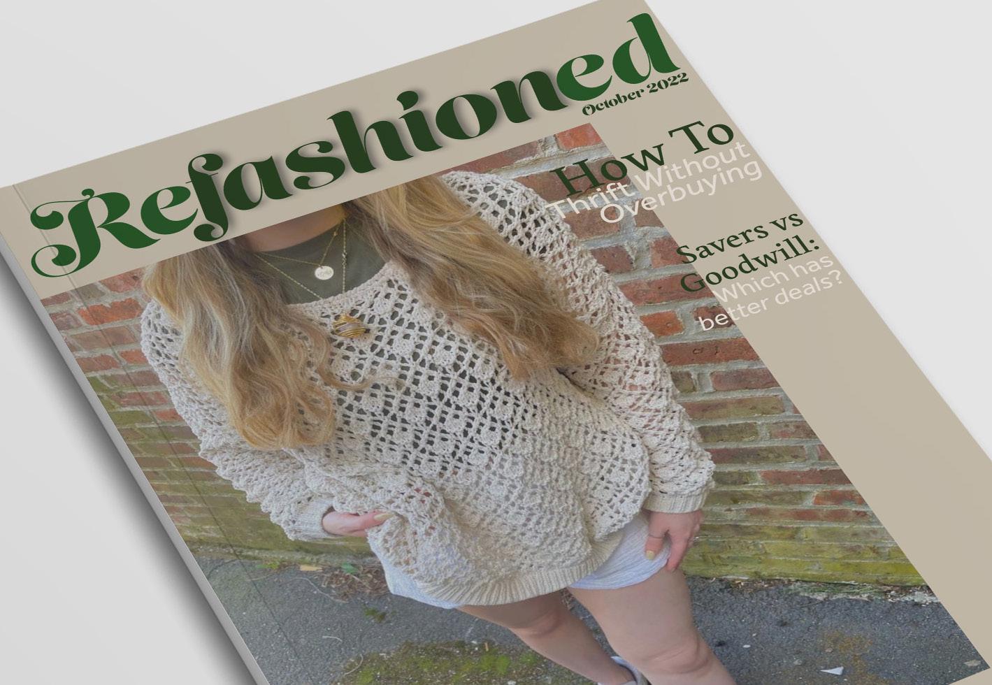
Refashioned Mini Magazine: A New Approach to Fashion Publication
Concept
In my Editorial and Publication Design Class I was challenged to create a fictitious miniature magazine. Different from typical high fashion magazines, I created a fashion magazine dedicated to thrifty, sustainable fashion. My main inspiration for my design came from 1960’s and 1970’s vintage Vogue magazines. I enjoyed their use of boldness and how majority of the layouts matched the color palettes of the images.
Outcome
I was inspired by pantone postcards. I took inspiration from the simplicity and placement of the text on the postcards. I used a neutral color palette on the cards to keep with the simplicity of the cards. The top right of the cards also feature color samples of the colors used on each card. It includes the name and date of each font, with the fun fact about the font on the bottom of the card.
02 layout
Camille hart
Camille hart

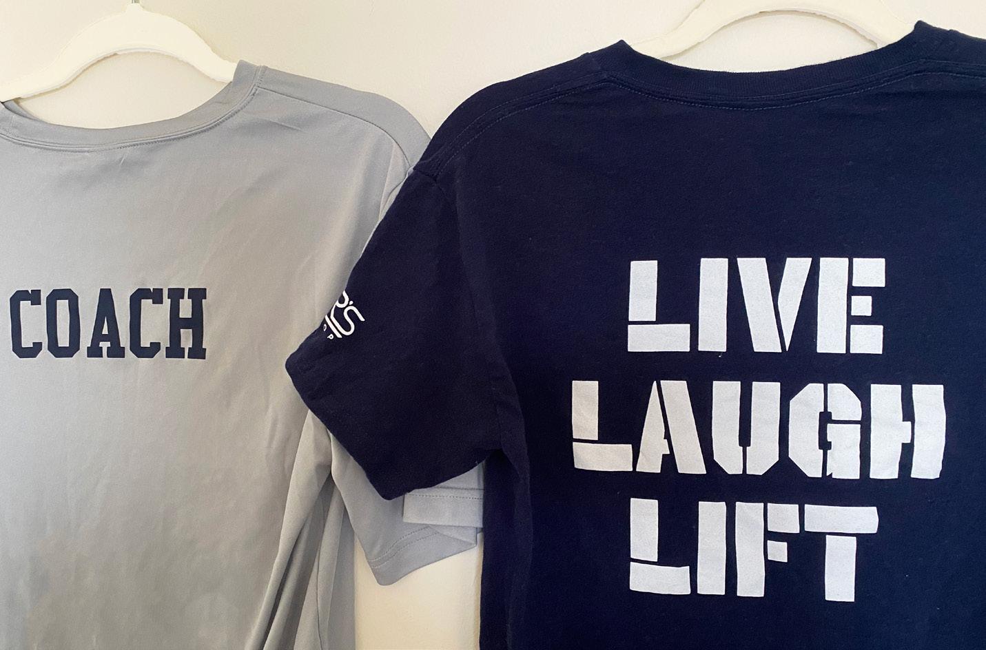
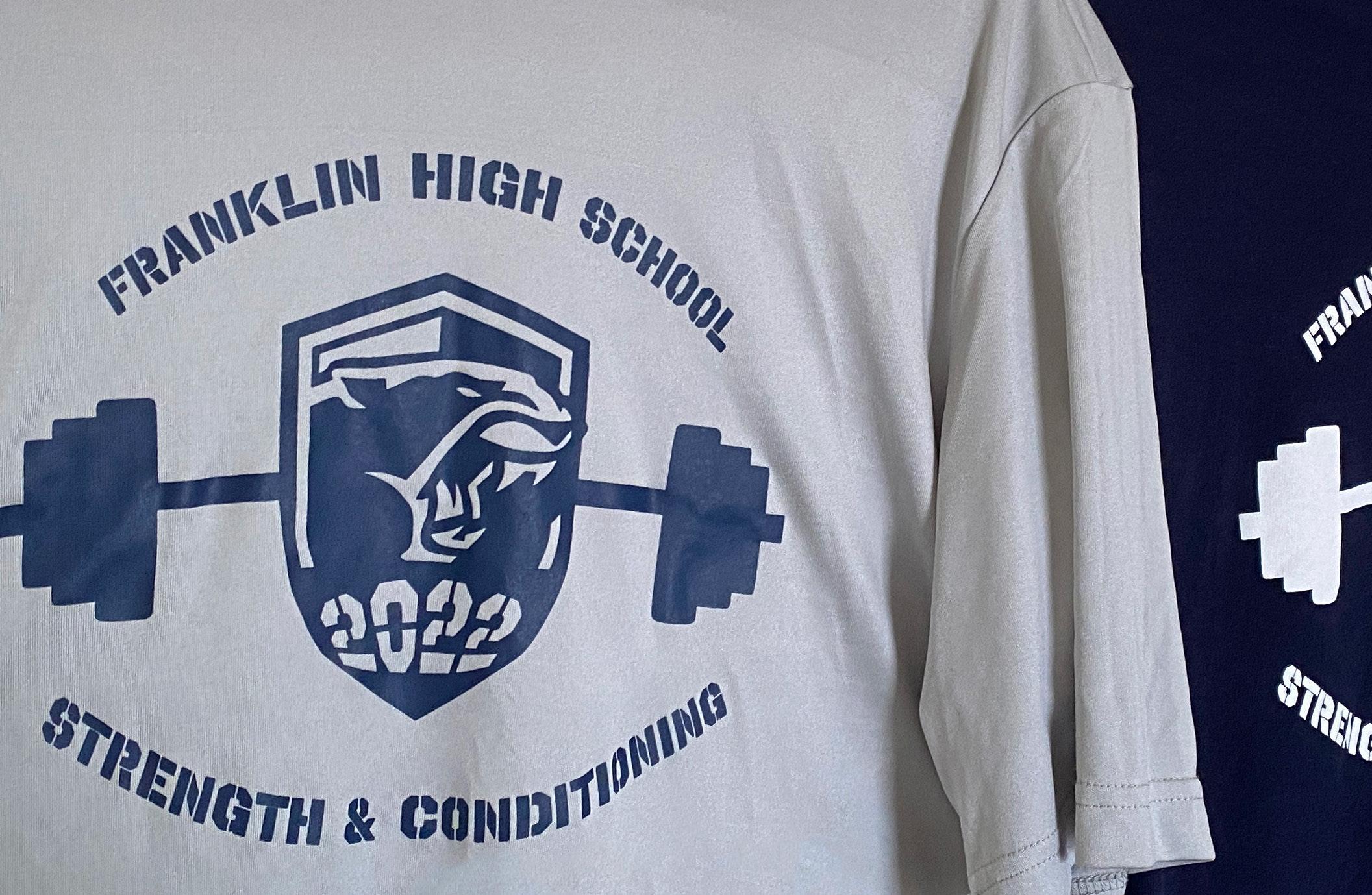
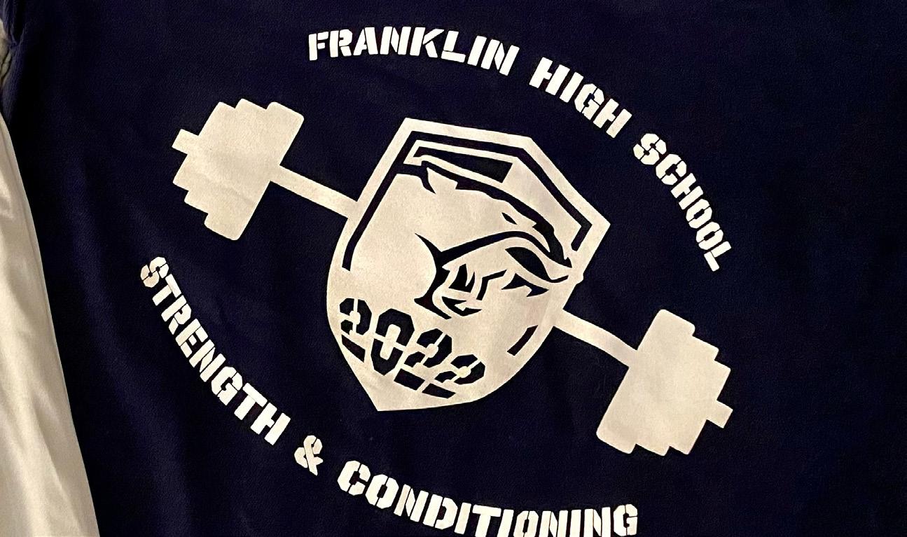
Franklin High Strength and Conditioning: T-shirt Design
Concept
For my summer job at Franklin High School Summer Strength and Conditioning in Franklin, MA I serve the position of Social Media and Graphic Design specialist. I was tasked to create the design for the student and staff t-shirts. The camp did not have any set branding or logo, so I was able to create this based off of the schools branding and past t-shirt designs. I created the design with intent to create a simple design that communicated what the camp is about.
Outcome
Franklin High School’s colors are blue and white with a panther mascot. In the middle of the design is the schools crest, and I added which year of the camp this is into the bottom of the crest. I created a barbell silhoutte behind the logo to highlight the camp’s focus on weightlifting. The font used is an athletic font you would see on a sport’s jersey. My design’s colors follow the school’s branding with the dark blue and white.
t-shirt design 05
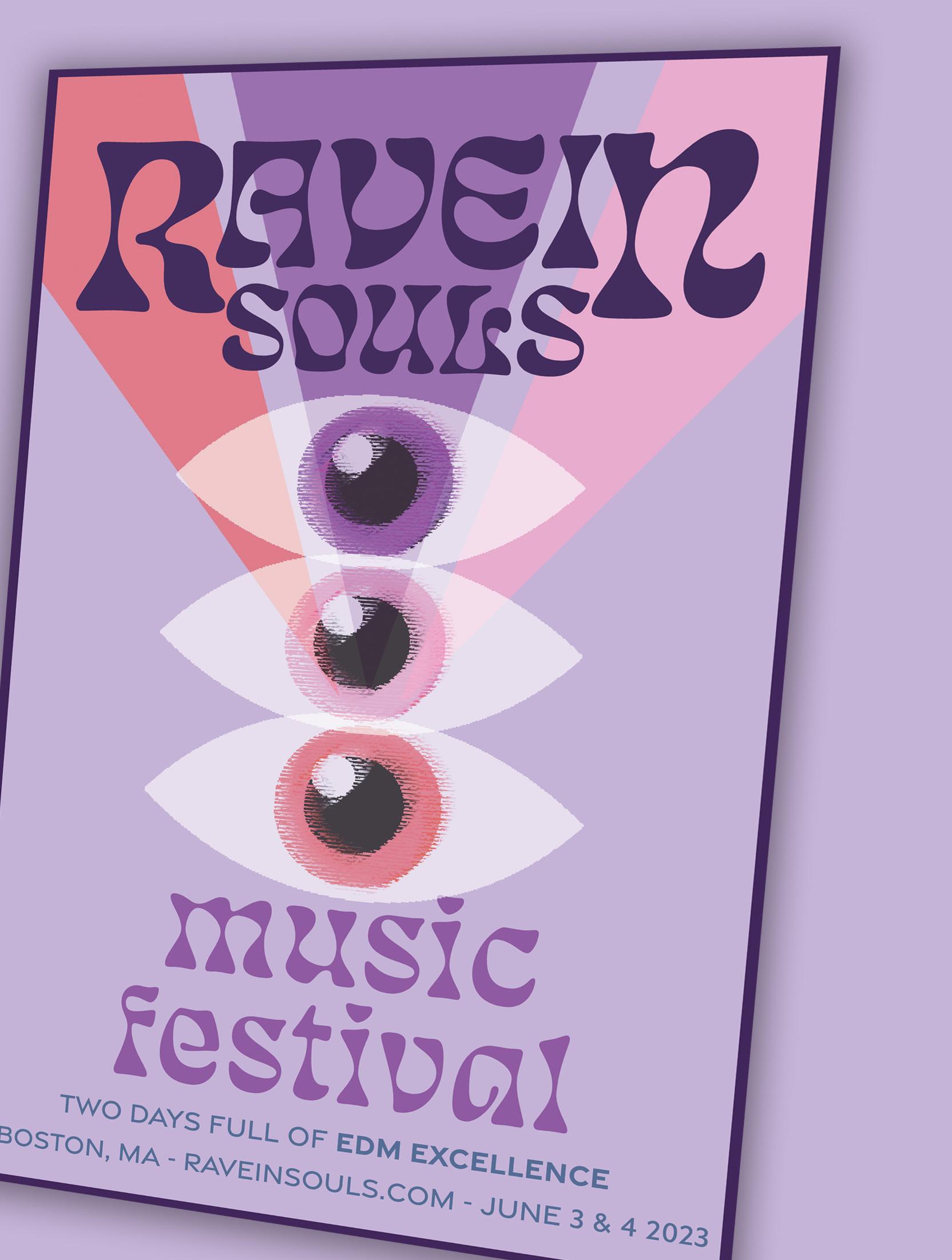
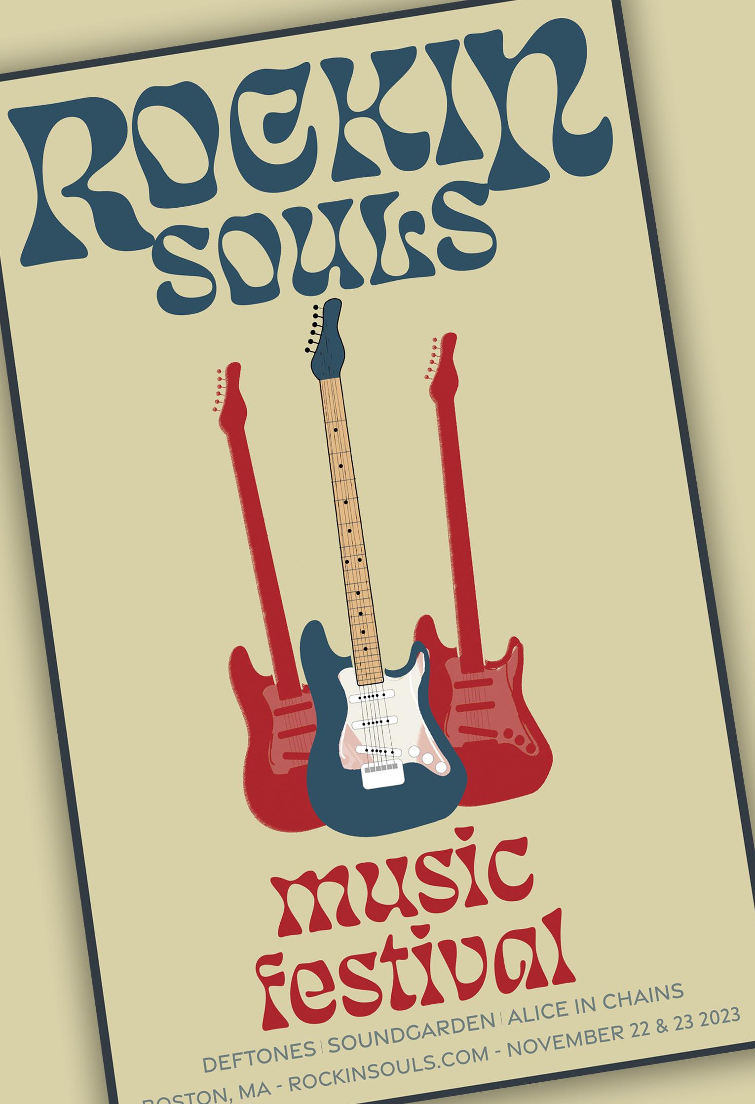
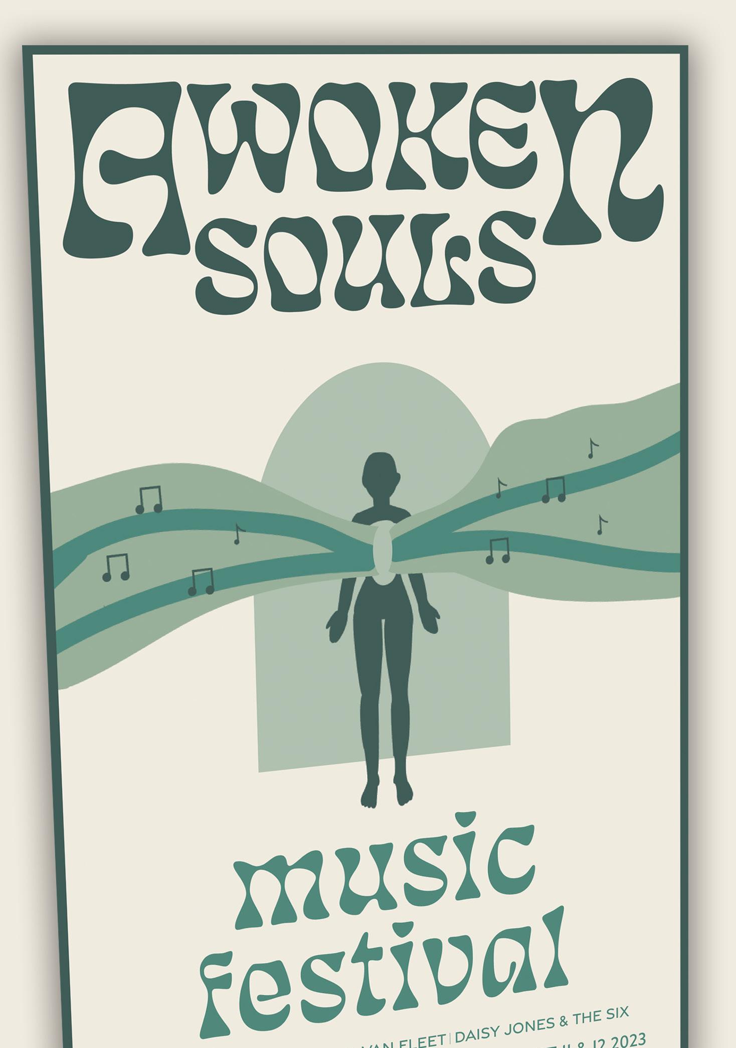
Music Souls: A Music Festival Series
Concept
In my Editorial and Publication class we were tasked with the challenge of creating a poster for any event of our choice. I have always found inspiration through music festival posters, so I created a poster for a fictitious festival I made up myself called “Awoken Souls”. Upon revising this project I decided to create a series of posters for different “Souls” festivals, each themed with a different style of music.
Outcome
Heavily inspired by 1970’s rock festival posters, I created Awoken Souls a festival for hippie rock music lovers. Keeping with the same font, and typographic hierarchy, I created “Rockin Souls” a festival of rock music. For my last poster of the series I created “Ravein Souls” an EDM festival.
layout 06
Camille hart
Camille hart
Shavasana Retreat
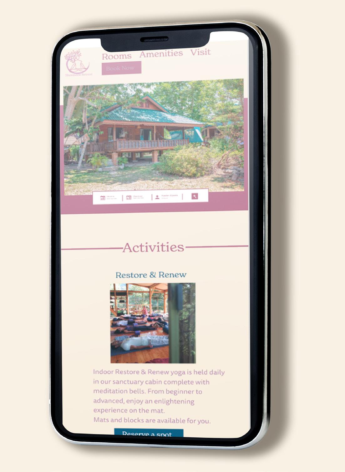
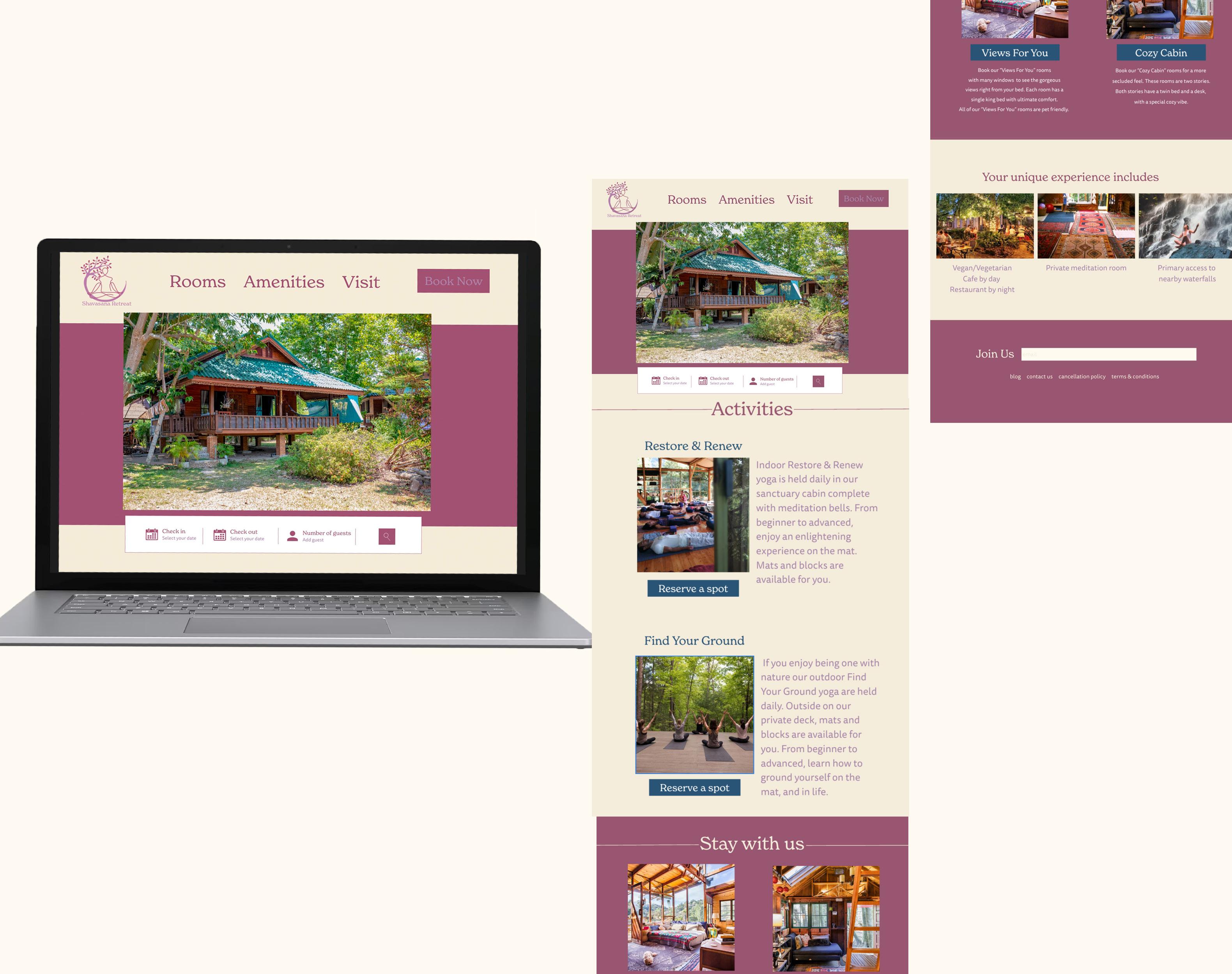
Shavasana Retreat: Boutique Website Design
Concept
In my User Experience and Content Design class we were directed to create a fictional idea of a unique boutique hotel and a website to follow. I created the fictitious Shavasana Retreat, a hotel dedicated to practicing yoga and relaxation. I made the design of the site to fit the fun and relaxing vibe of yoga.
Outcome
The design is only a home page featuring a usable “book now” button, activities, rooms available, and experiences at the hotel. The footer features a section for people to put their email, more information, and links to social media pages. For anyone accessing the site it is clear what is available at this boutique hotel.
website design 09
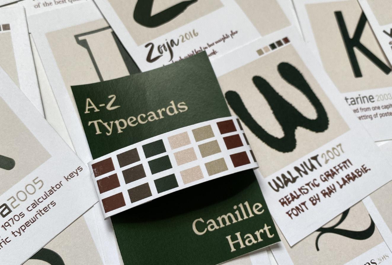
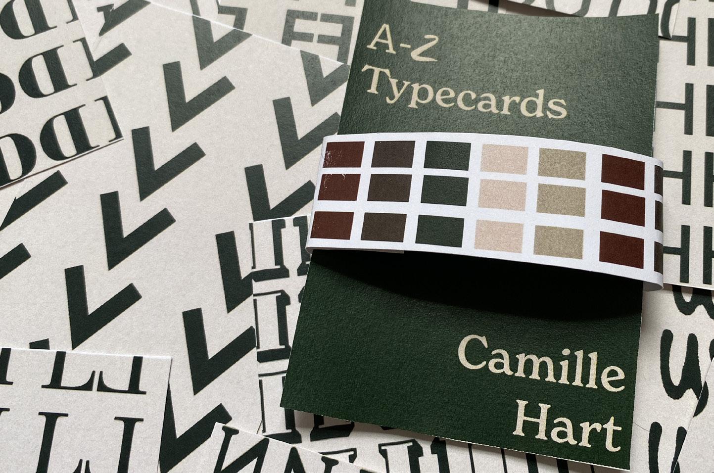
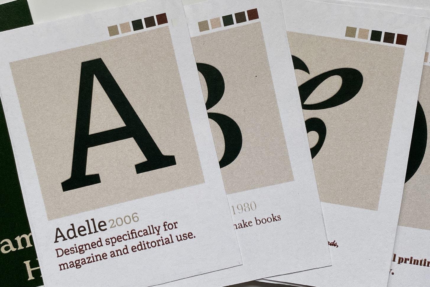
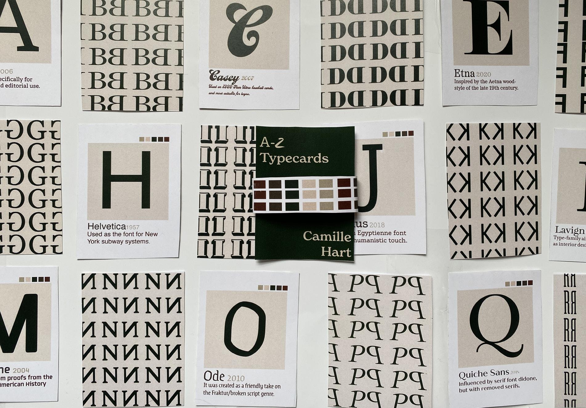
Typography Cards: 26 Font Cards From A to Z
Concept
In my typography class, we were challenged to create 26 cards for each letter of the alphabet. Each card would showcase a font of our choosing. With the font on one side of the card we were also assigned to create a unique pattern on the other side of the card. Each card showcases the name of the font, the letter, year it was created, a fun fact about the font, and the unique pattern and design.
Outcome
I was inspired by pantone postcards. I took inspiration from the simplicity and placement of the text on the postcards. I used a neutral color palette on the cards to keep with the simplicity of the cards. The top right of the cards also feature color samples of the colors used on each card. I decided to make the letter like how the color is showed on the pantone postcards; To do this, I put a tan square with the letter on top of it. This also created a graphic for each card. Below the letter is the name and date of each font, with the fun fact about the font on the bottom of the card.
layout 10
Camille hart
Camille hart
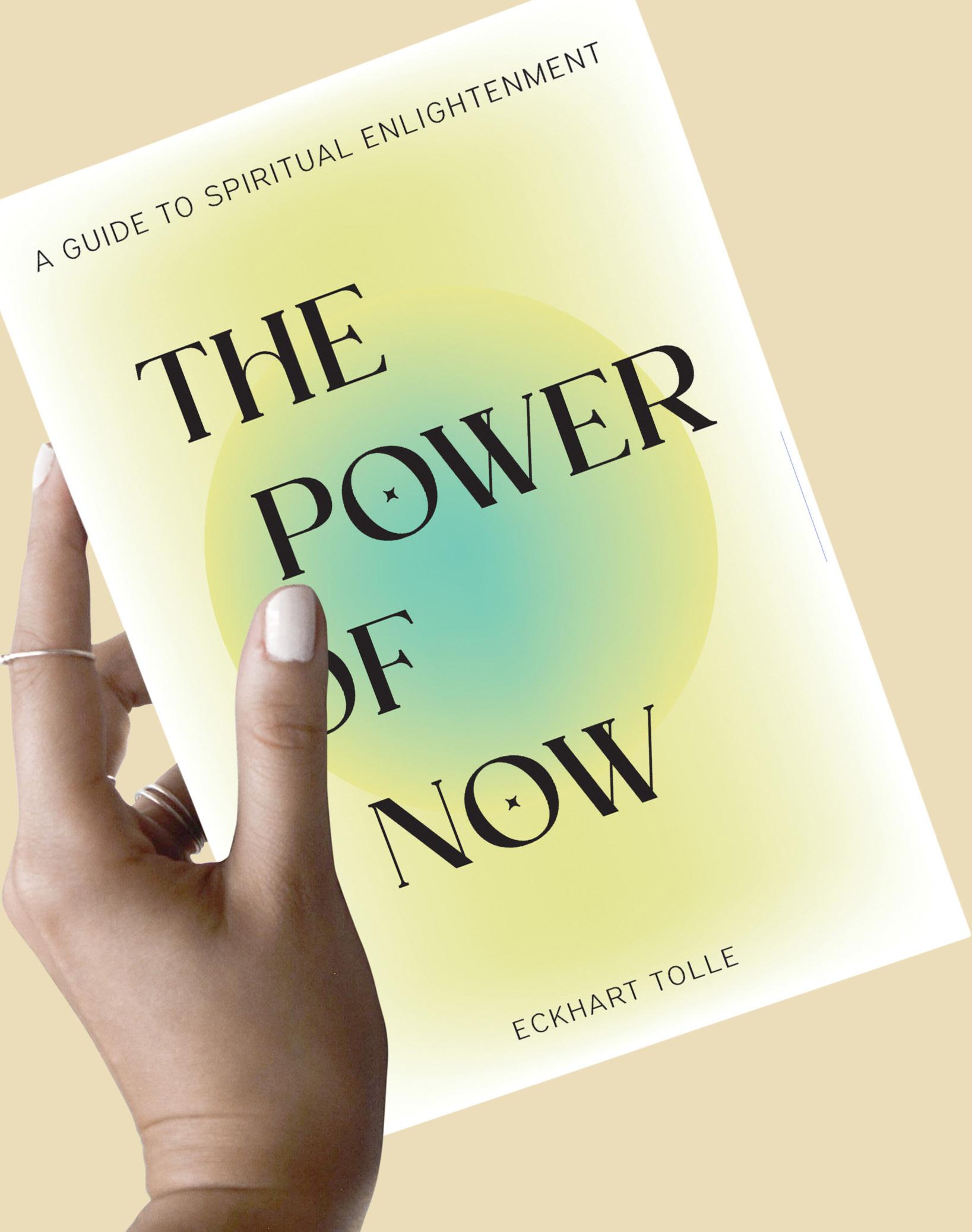
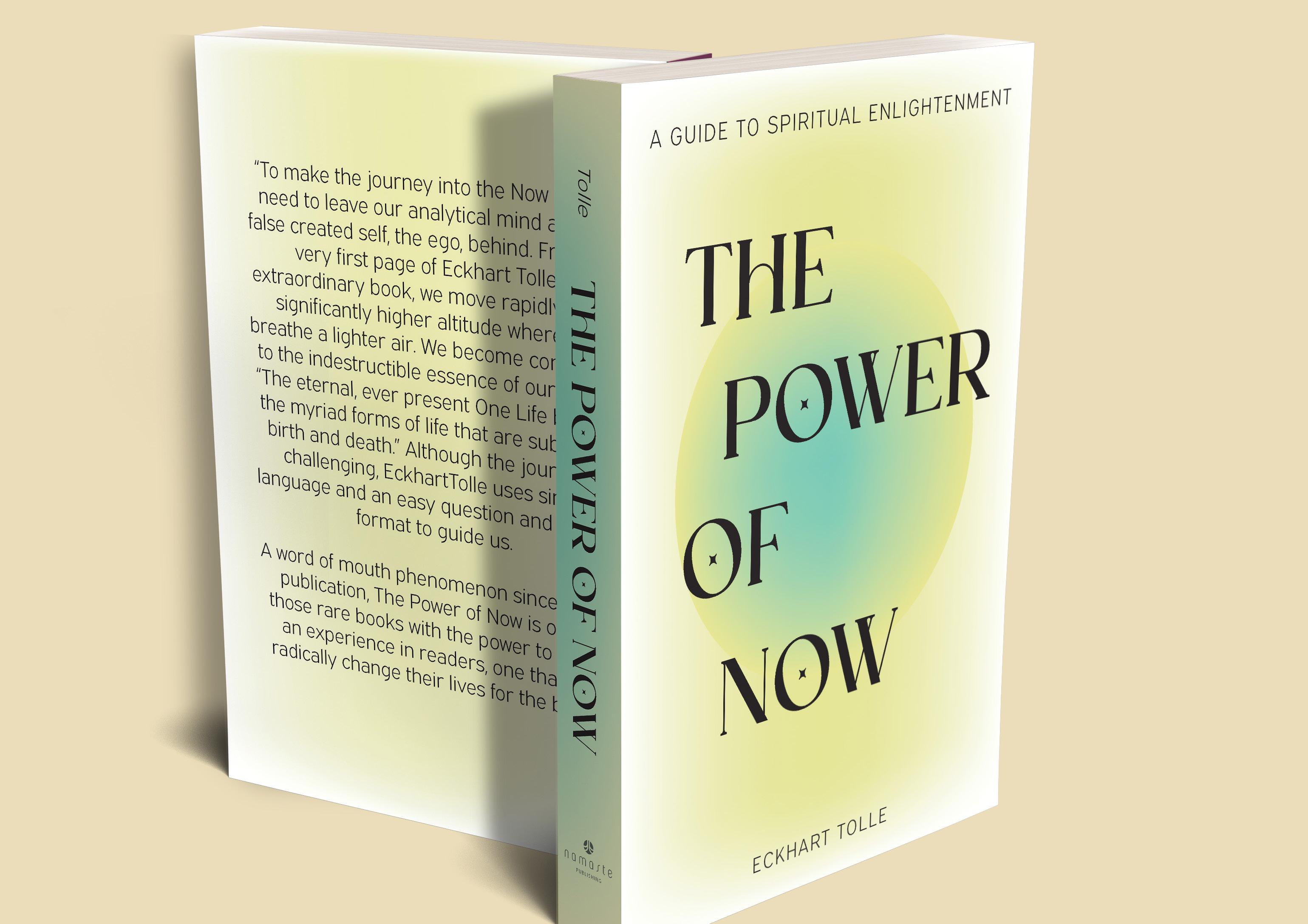
The Power of Now: Book Cover Modernized
Concept
In my vector based design class, we were assigned to redesign the front cover, back cover, and spine of any book of our choosing. We could not change any of the text information on the book. I chose to redesign The Power Of Now, a spiritual self help guide.
Outcome
The font I chose for the title of the book is a stylized serif typeface. The font is very modern and I was drawn to the star shape in the O’s and the high contrast. Then, to pair with this font I chose a simple sans serif to contrast with the bold serif and create a visual hierarchy. I think my final design is very modern and will attract more readers with its new look.
book cover design 13
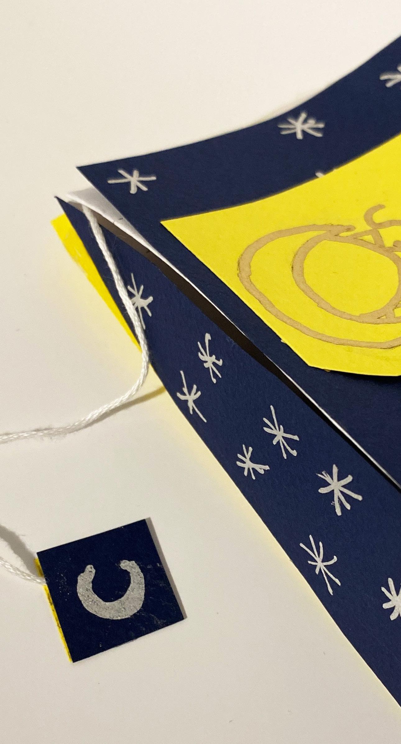
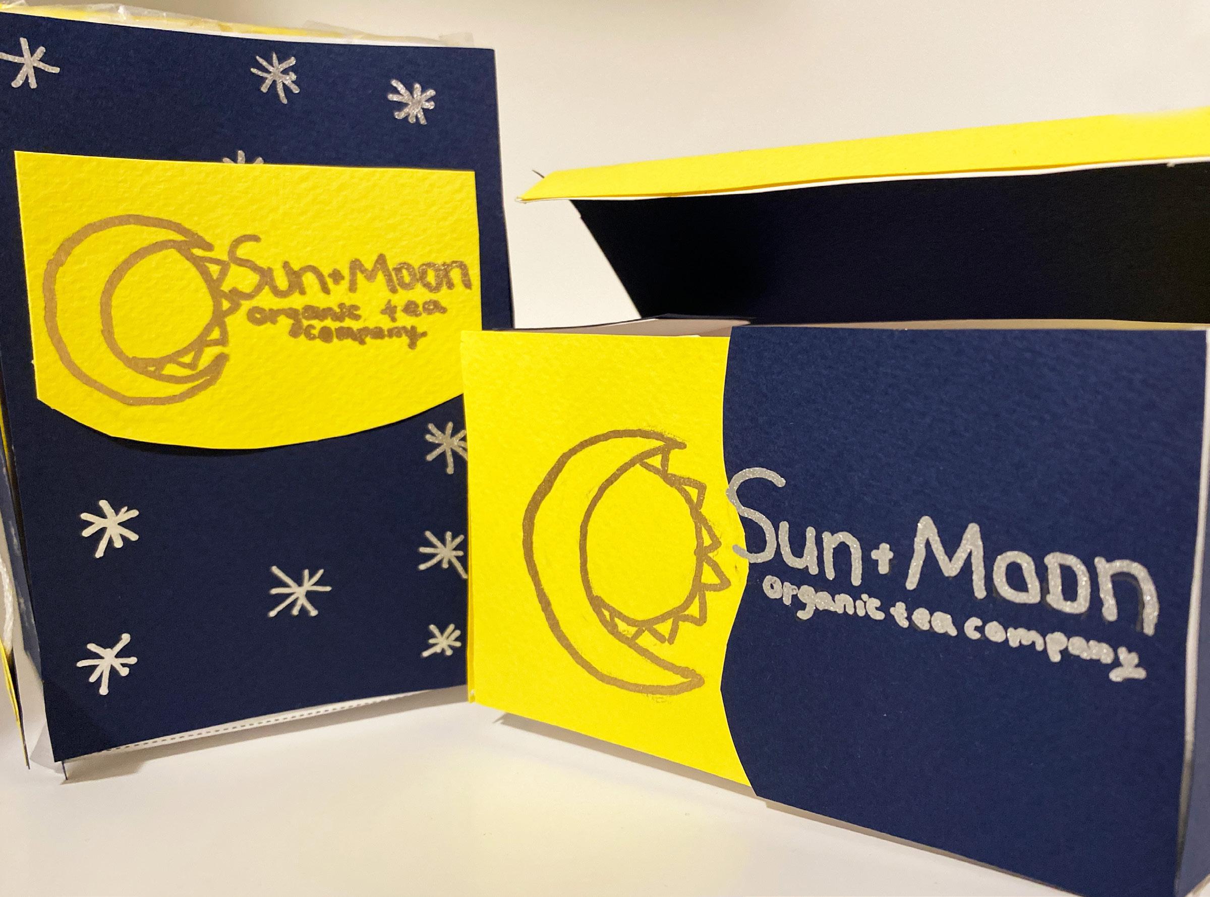
Sun + Moon Tea: A Unique Take on Tea Packaging
Concept
In my Design Theory & Practice class the assignment was to create packaging for a brand created by ourselves. I have always loved the unique packaging of tea. I created Sun + Moon, an organic tea company. The brand includes two flavors, a lemon sun tea with caffeine and a lavender moon tea with melatonin. The Sun + Moon title represents that each flavor is meant for certain times of the day.
Outcome
I created the box and the loose leaf tea bags by hand. I handcrafted these using cardboard, colored card stock, paint markers, string, glue, and a Xacto knife. My design sets apart from other tea company designs due to its unique theme of a company for a day and night tea. The contrast of a bright yellow and a dark blue makes my design stand out.
package design 14
Camille hart
Camille hart
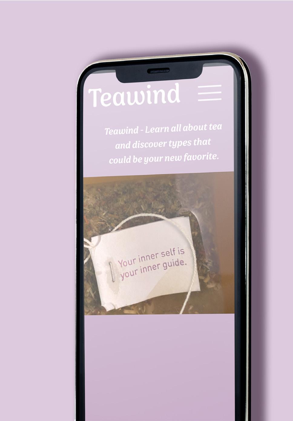

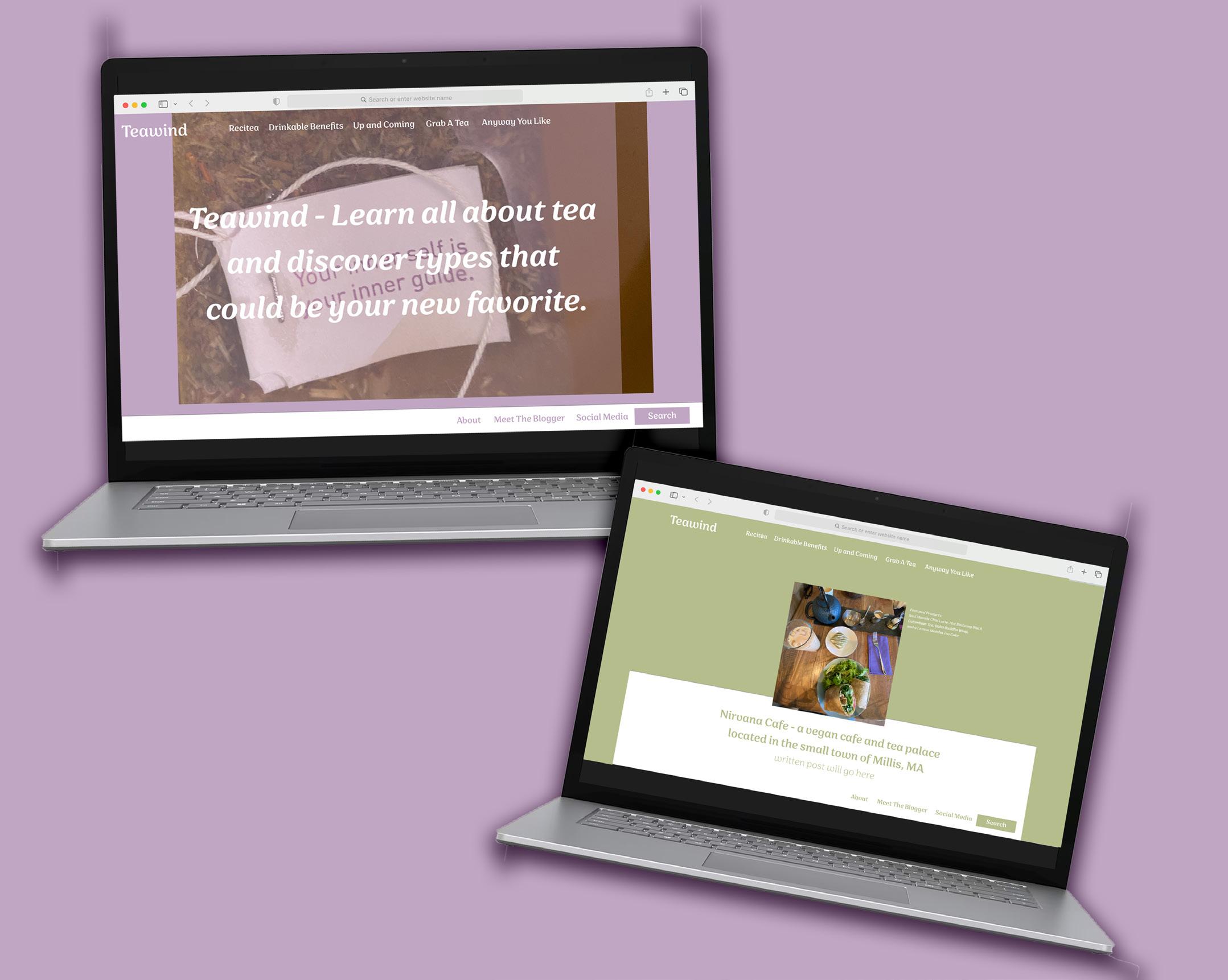
Teawind: A Guide to Tea
Concept
For my Content Management class we were tasked to create a blog surrounding any topic of our choice designed on WordPress. Following, we had to follow a WordPress theme and align our design to the theme.The blog is for people to unwind with a cup of tea and read about the tea they love.
Outcome
The content is organized into five posts, an about page, and a contact page on the blog. I had to keep my design fairly simple, due to the WordPress theme constraints. Each blog posts follow one design with a featured image to match the post.
website design 17
