BRAND IDENTITY GUIDELINES
These guidelines explain how to use the visual identity with confidence and clarity.
To ensure consistency within our brand, adhering to these guidelines will help maintain our identity across all platforms.

2 UPWARDLY GLOBAL

3 BRAND GUIDELINES
The Upwardly Global (UpGlo) logo mark is the face of the organization. It is the most significant feature of the UpGlo brand and should be used on all forms of branded communications. Do not use any other mark or graphic when creating Upwardly Global communications material, either for internal or external use. THE LOGO THE ICON UPGLO ORANGE Pantone: 166 C=0, M=75, Y=100, K=0 R=243, G=112, B=33 HEX: #F26522 4 UPWARDLY GLOBAL
THE LOGO
Clear Space & Minimum Size 0.5”
The UpGlo logo is an important asset to the organization and should serve as a foundation for all visual communications. To maintain a strong brand image, it is important that the logo is always applied consistently wherever it appears. It should never be manipulated or distorted. Its color, position, and size are all specified within this document.
In order for the logo to remain legible at all times, below is the minimum height the logo can be set at – 0.5”. Below this measurement the tagline becomes illegible and the arrowhead begins to lose it’s inner details.
For web-based content, the logo should not be displayed smaller than 50 pixels in height at 72dpi.
Dotted lines are a white space indicator. Visually the logo should not be in close proximity to any other design elements for maximum legibility.
5 BRAND GUIDELINES
THE LOGO
Application & Contrast
When placing the logo on top of a background color, always place the proper color logo based on legibility.
Using maximum contrast is the best option to display the UpGlo logomark. This also applies to the UpGlo Icon.
6 UPWARDLY GLOBAL
THE LOGO
Application: On Image Backgrounds

Only full-color and white versions of the logo may be used when placing the logo on top of color textures or background imagery. When using on top of background imagery, ensure the background is not too busy and has sufficient contrast to the logo to preserve its presence and authority.

7 BRAND GUIDELINES
PRIMARY FONT Aa MONTSERRAT Headers | Subheaders | Body Text This font can be used in Bold, Regular, and italic. Typography. Primary Typeface AaBbCcDdEeFfGg 0123456789 +;%@* 8 UPWARDLY GLOBAL
Primary Typeface Weights
AaBbCcDdEeFfGgHhIiJjKkLlMmNnOo PpQqRrSsTtUuVvWwXxYyZz 0123456789 (&?!/,:;-_*”)
0123456789
AaBbCcDdEeFfGgHhIiJjKkLlMmNnOo PpQqRrSsTtUuVvWwXxYyZz 0123456789 (&?!/,:;-_*”) Context Text. and Headlines Caption Text Subtitle Text Write Your Text Right Here 9 BRAND GUIDELINES
Typography.
Regular. Italic. Bold.
AaBbCcDdEeFfGgHhIiJjKkLlMmNnOo PpQqRrSsTtUuVvWwXxYyZz
(&?!/,:;-_*”)
SECONDARY FONT Aa Open Sans Headers | Subheaders | Body Text This font can be used in Bold, Regular, and italic. Typography. Secondary Typeface AaBbCcDd EeFfGg HhIi0123456789 +;%@* 10 UPWARDLY GLOBAL
AaBbCcDdEeFfGgHhIiJjKkLlMmNnOo PpQqRrSsTtUuVvWwXxYyZz 0123456789 (&?!/,:;-_*”) AaBbCcDdEeFfGgHhIiJjKkLlMmNnOo PpQqRrSsTtUuVvWwXxYyZz 0123456789 (&?!/,:;-_*”) AaBbCcDdEeFfGgHhIiJjKkLlMmNnOo PpQqRrSsTtUuVvWwXxYyZz 0123456789 (&?!/,:;-_*”) Context Text. and Headlines Caption Text Subtitle Text Write Your Text Right Here Typography. Secondary Typeface Weights Regular. Italic. Bold. 11 BRAND GUIDELINES
ALTERNATE FONT A a Avenir Headers | Subheaders | Body Text This font can be used in Heavy, Medium Book, and oblique. Avenir has been chosen for it’s legibility and it is universally accessible . Typography. Alternate Typeface AaBbCcDd EeFfGg HhIi0123456789 +;%@* 12 UPWARDLY GLOBAL
AaBbCcDdEeFfGgHhIiJjKkLlMmNnOo PpQqRrSsTtUuVvWwXxYyZz 0123456789 (&?!/,:;-_*”) AaBbCcDdEeFfGgHhIiJjKkLlMmNnOo PpQqRrSsTtUuVvWwXxYyZz 0123456789 (&?!/,:;-_*”) AaBbCcDdEeFfGgHhIiJjKkLlMmNnOo PpQqRrSsTtUuVvWwXxYyZz 0123456789 (&?!/,:;-_*”) Context Text. and Headlines Caption Text Subtitle Text Write Your Text Right Here Typography. Alternate Typeface Weights Medium. Oblique. Heavy. 13 BRAND GUIDELINES
COLOR PALETTE
UpGlo Orange, UpGlo Gray, and white are the primary Upwardly Global colors. They are used in the Upwardly Global logo and throughout all materials. In addition, navy and black can be used as supporting or complementary colors.
• Orange is the dominant brand color, followed by gray/white.
• Navy can be used as a complementary color, but it should not overpower UpGlo Orange.
• The alternate colors are to be used sparingly, mostly in supporting infographics
PRIMARY COLOR PALETTE
UPGLO ORANGE
Pantone: 166
C=0, M=75, Y=100, K=0
R=243, G=112, B=33
HEX: #F26522
UPGLO GRAY
Pantone: Cool Gray 10
C=0, M=0, Y=0, K=60
R=130, G=130, B=130
HEX: #666666
WHITE
C=0, M=0, Y=0,K=0
R=255, G=255, B=255
Hex: #FFFFFF
14 UPWARDLY GLOBAL
SECONDARY COLOR PALETTE
NAVY DARK
LIGHT NAVY
BLACK
Pantone 539
C=100, M=65, Y=22, K=80
R=15, G=41, B=61
HEX: #0F293D
Pantone 7691 C
C:100 M:43 Y:0 K:30
R:0 G:98 B:152
HTML: 006298
ALTERNATE COLOR PALETTE
FUCHSIA
TEAL
Pantone: 7648
C=36, M=100, Y=28, K=0
R=166, G=33, B=110
HEX: #A6216E
C=0, M=0, Y=0, K=100
R=0, G=0, B=0
HEX: #000000
Pantone: 7716
C=78, M=23, Y=41, K=0
R=46, G=150, B=153
HEX: #2E9699
15 BRAND GUIDELINES
These brand guidelines represent the foundation of the Jobversity brand. Like any foundation, myriad elements will be placed on top.
These guidelines aren’t meant to limit creativity or variety, but rather to ensure each new creation is cohesive and true to the heart of your brand.
16 01 ‘empower logo of that but
Jobversity is born out of Upwardly Global’s passion to help refugees and immigrants reach their career aspirations and achieve their personal American Dream. This product builds upon the foundation of Upwardly Global’s rich knowledge and understanding of the needs of this target population, and the positive impacts we uniquely know make a difference in their job search and their lives.
Mission
To break the cultural glass ceiling and accelerate job readiness across all professional industries. Promise
Illuminating the path to dreams.
Jobversity’s customer experience delivers a personal, digital mentor that educates job seeker professionals on the core basics, illuminating the cultural nuances necessary to reach their career goals. Jobversity complements and enhances service providers with a tool that collaboratively supports personalized learning paths for job seekers. We believe this one-to-one approach can manifest in accelerating successful career outcomes and creating hope and dignity for immigrant and refugee job seekers.
Aspiration
6
To transform the landscape of opportunity for immigrants and refugees.
17 BRAND GUIDELINES
Personality
Tone
Assured, credible, mentoring, stimulating
Feel
Modern, leader, user-centered
The new brand is an approachable, knowledgeable and forward-thinking advisor who can always offer words of wisdom and thoughtful mentoring. It is one who stays on top of market needs and trends, and stalwartly shares back with the community. The brand digs deep into the individual, cares about their hopes and motivations, and tries to instill self-confidence to help people reach their potential.
18 01 ‘empower logo of that but
Primary Logo
Jobversity’s brand promise is to ‘empower individuals to shine’. The Jobversity logo emphasizes the most important part of that promise: the individuals.
A single, curved line creates a subtle but universally familiar icon, allowing individuals to see themselves in the mark, and instantly highlighting the compassion, respect, and humanity on which the brand is built.
Color
Whenever possible, our logo should appear in color. Though reverse (white) and black versions are both acceptable.
To connect Jobversity to the Upwardly Global name use the logomark with the by Upwardly Global eyebrow.
When the logo needs to be scaled down in size, use the logomark without the eyebrow to avoid legibility issues.
6
19 BRAND GUIDELINES
Secondary Logo
A strong brand logo has the flexibility to adjust to best fit the deliverable. If one of the primary logos does not work, a secondary logo should be applied. Black
For applications where color is not available, an all black logo can be used. Reversed
When the logo must appear on dark backgrounds or photography, a reversed version of the logo can be used.
7 02 01
20 01 ‘empower logo of that but
PRIMARY
Jobversity Blue
Black
RGB 23, 166, 249
CMYK 67, 24, 0, 0
HEX #17A6F9
6
RGB 0, 0, 0
CMYK 0, 0, 0, 100
HEX #000000
COLOR PALETTE SUPPLEMENTARY COLOR PALETTE
UpGlo Gray
UpGlo Orange
Pantone: Cool Gray 10
C=0, M=0, Y=0, K=60
R=130, G=130, B=130
HEX: #666666
Pantone: 166
C=0, M=75, Y=100, K=0
R=243, G=112, B=33
HEX: #F26522
This color palette should be used whenever color is necessary to create a consistent brand experience. Additional colors can always be used, but this palette should be the primary color story in any brand creation.
Jobversity Blue serves as a foundation for the Jobversity color palette. It’s primary use is within the logo, action items and photography to add visual interest.
Black also serves as the foundation for the Jobversity brand color palette. Its primary use is within the logo, headlines, body copy and iconography.
Upglo Gray & UpGlo Orange are supplementary colors to the brand. Use sparingly to tie Jobversity back to the Upwardly Global palette.
21 BRAND GUIDELINES
Fonts
The Jobversity logo is set in Hero, a rounded, sans-serif typeface.
The headline, subhead, and body copy is Source Sans Pro, a web-friendly, sans-serif typeface.
Source Sans Pro is a Google Font, meaning it is free and open source. You can find and download
Source Sans Pro on fonts.google.com..
Logo
The logo is set in Hero. Hero is also accepted as a display font in print materials.
Headline & Body
Headlines and body copy appear in sentence case, Source Sans Pro Light. Color is black. In print materials, headlines can appear in Jobversity blue.
Subhead
Subheads appear in Source Sans Pro Regular. Color is Black.
AaBbCcDdEeFfGgHhIiJj KkLlMmNnOoPpQqRrSs TtUuVvWwXxYyZz 0123456789 (&?!/,:;-_*”) AaBbCcDdEeFfGgHhIiJj KkLlMmNnOoPpQqRrSs TtUuVvWwXxYyZz 0123456789 (&?!/,:;-_*”) AaBbCcDdEeFfGgHhIiJj KkLlMmNnOoPpQqRrSs TtUuVvWwXxYyZz 0123456789 (&?!/,:;-_*”) Hero Regular Source Sans Pro Light Source Sans Pro Regular Aa Aa Aa 22 01 ‘empower logo of that but
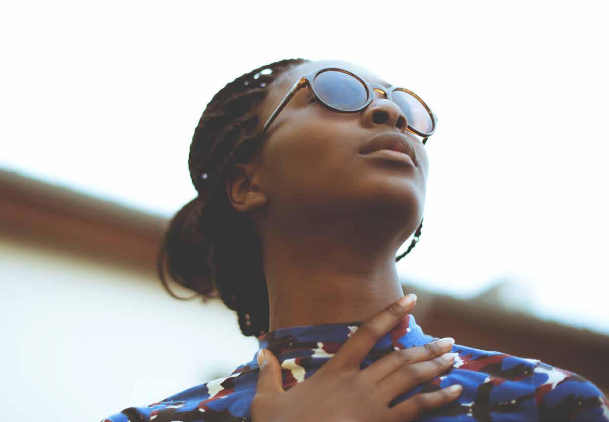
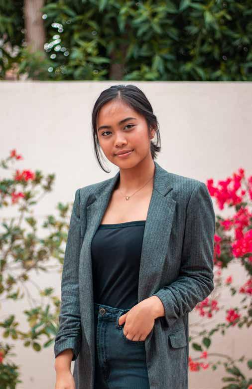
Photography
The individual and their success is the focus of Jobversity. The photography you select should highlight the notion of the individual and human interaction. The imagery should be candid and natural to highlight the individual.


When sourcing imagery, Unsplash (www.unsplash.com) is an online resource for high-resolution, free-to-use, photography.
Attribution is not required, but can be added to give credit to the author.
10 23 BRAND GUIDELINES
Iconography
Icons can be used to reinforce messaging concepts across a variety of deliverables and mediums.
The iconography is a stroke style design with rounded corners that mimics and compliments the logo.
11
UPWARDLYGLOBAL.ORG
