 carolina de alba. PORTFOLIO
FEELING: A TOUCH OF ART pg.1
THE TELL-TALE HEART pg.19
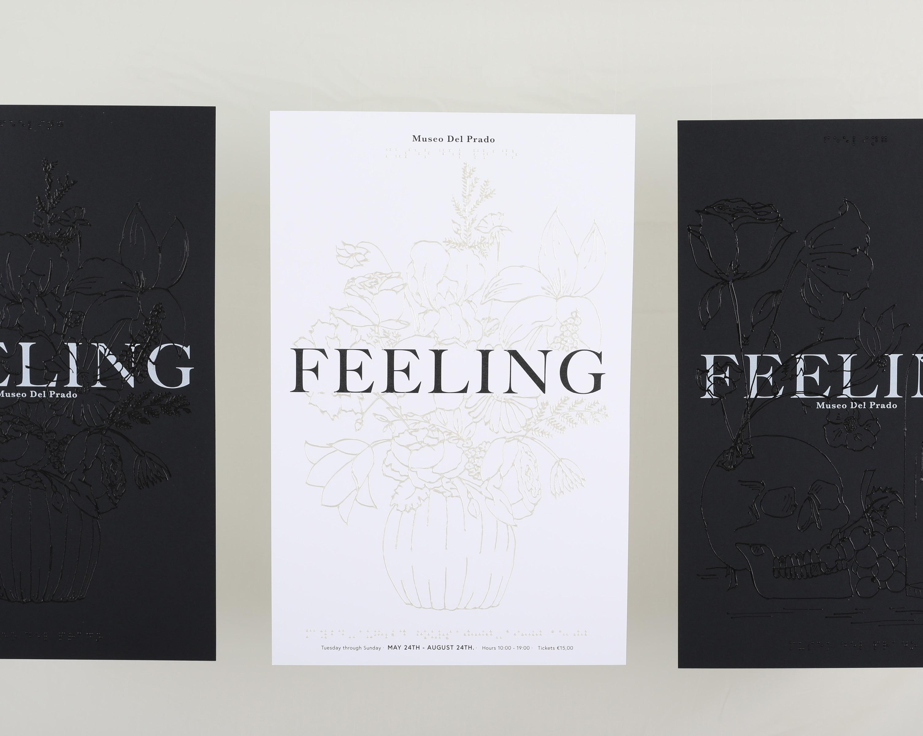
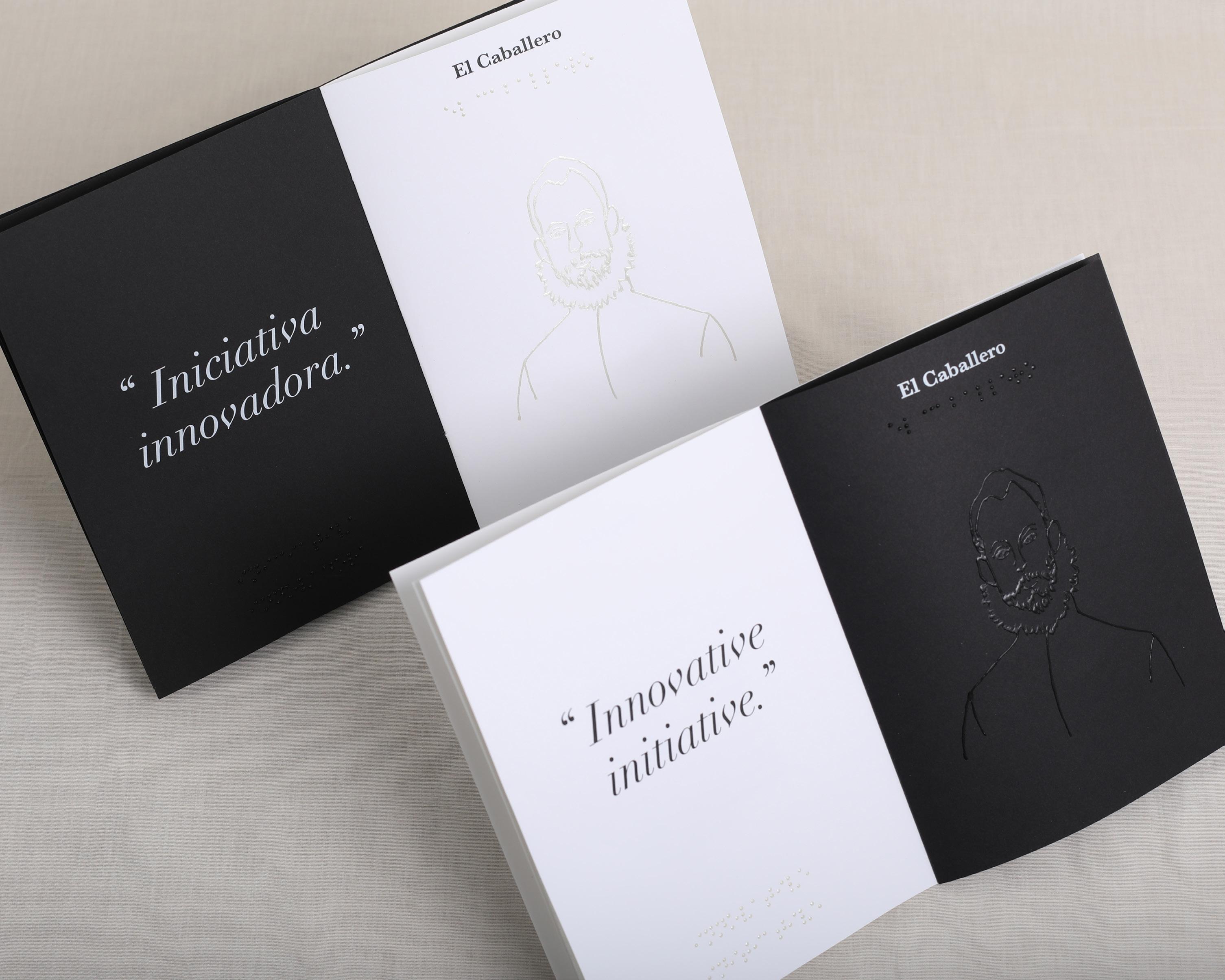
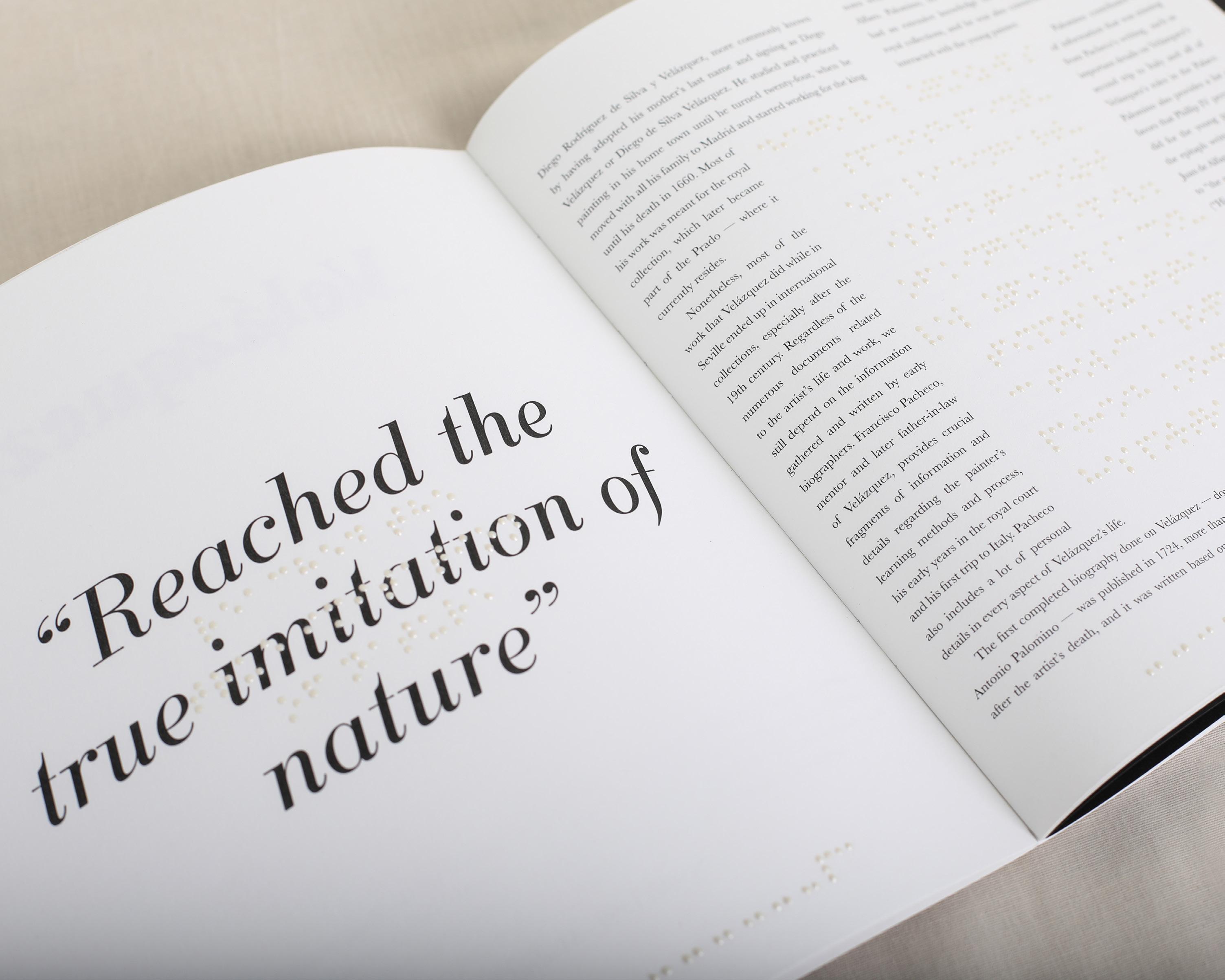
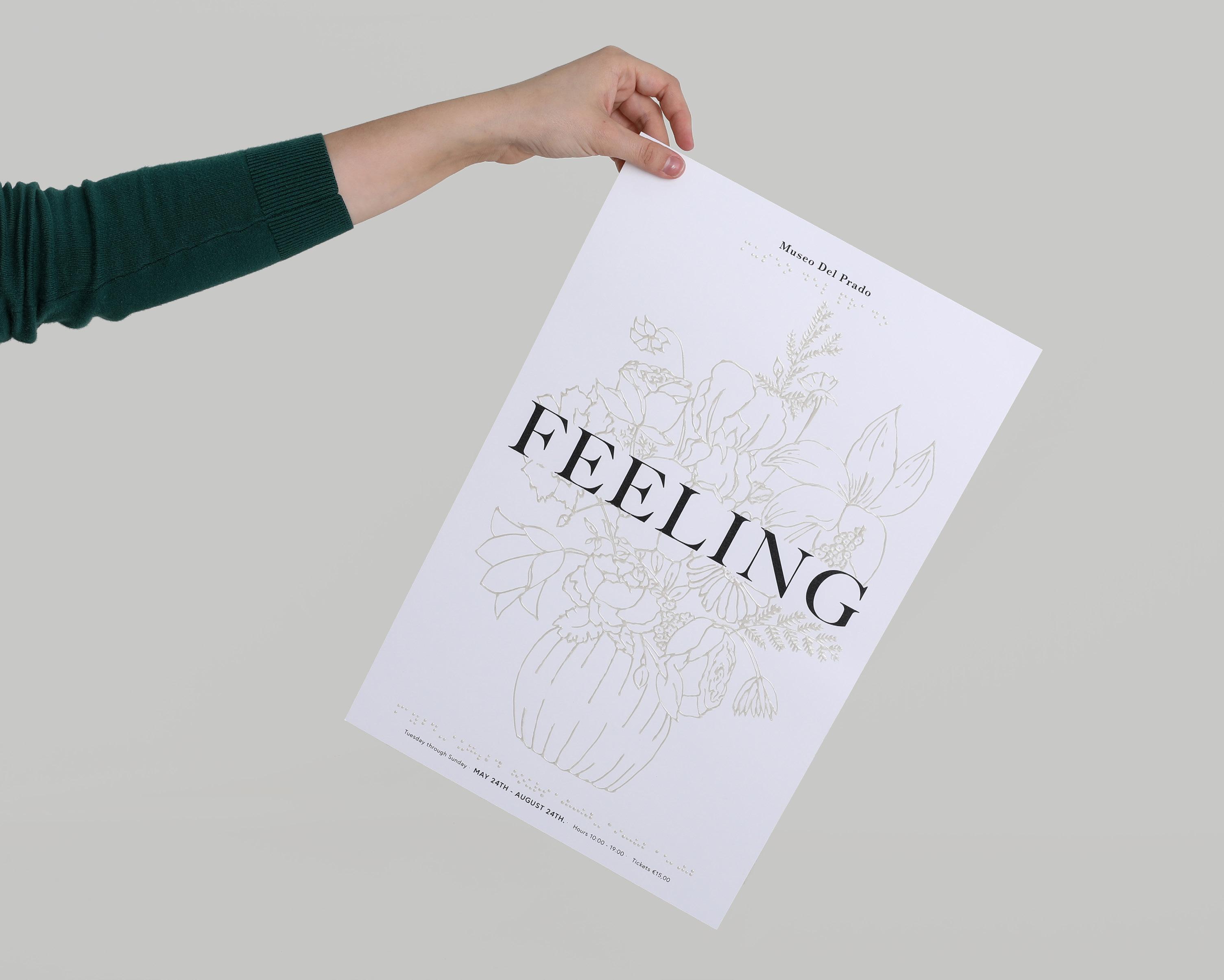
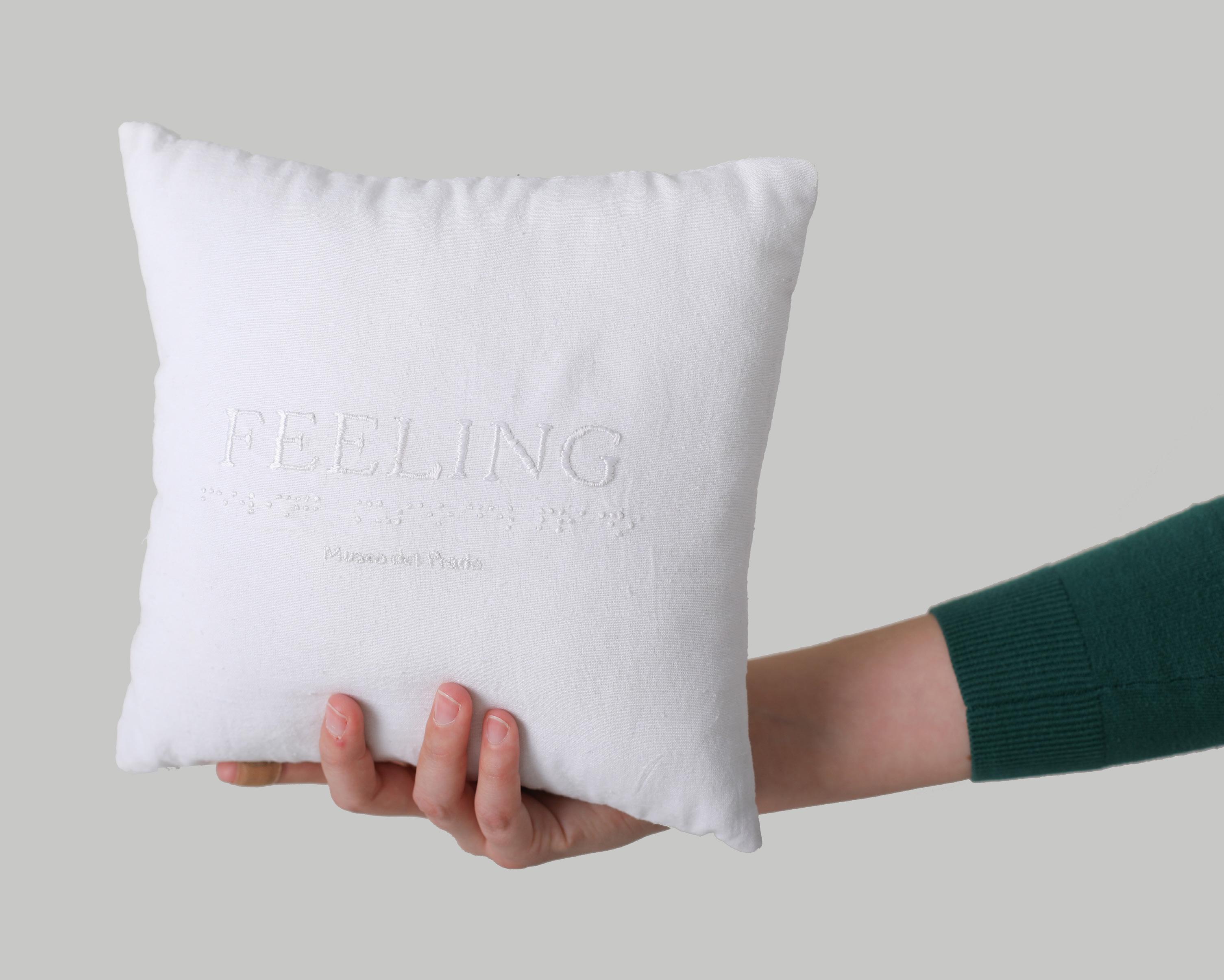
Publication design inspired by Museo del Prado’s initiative. All the components are done with braille and it is a perfect combination between aesthetics and functionality.
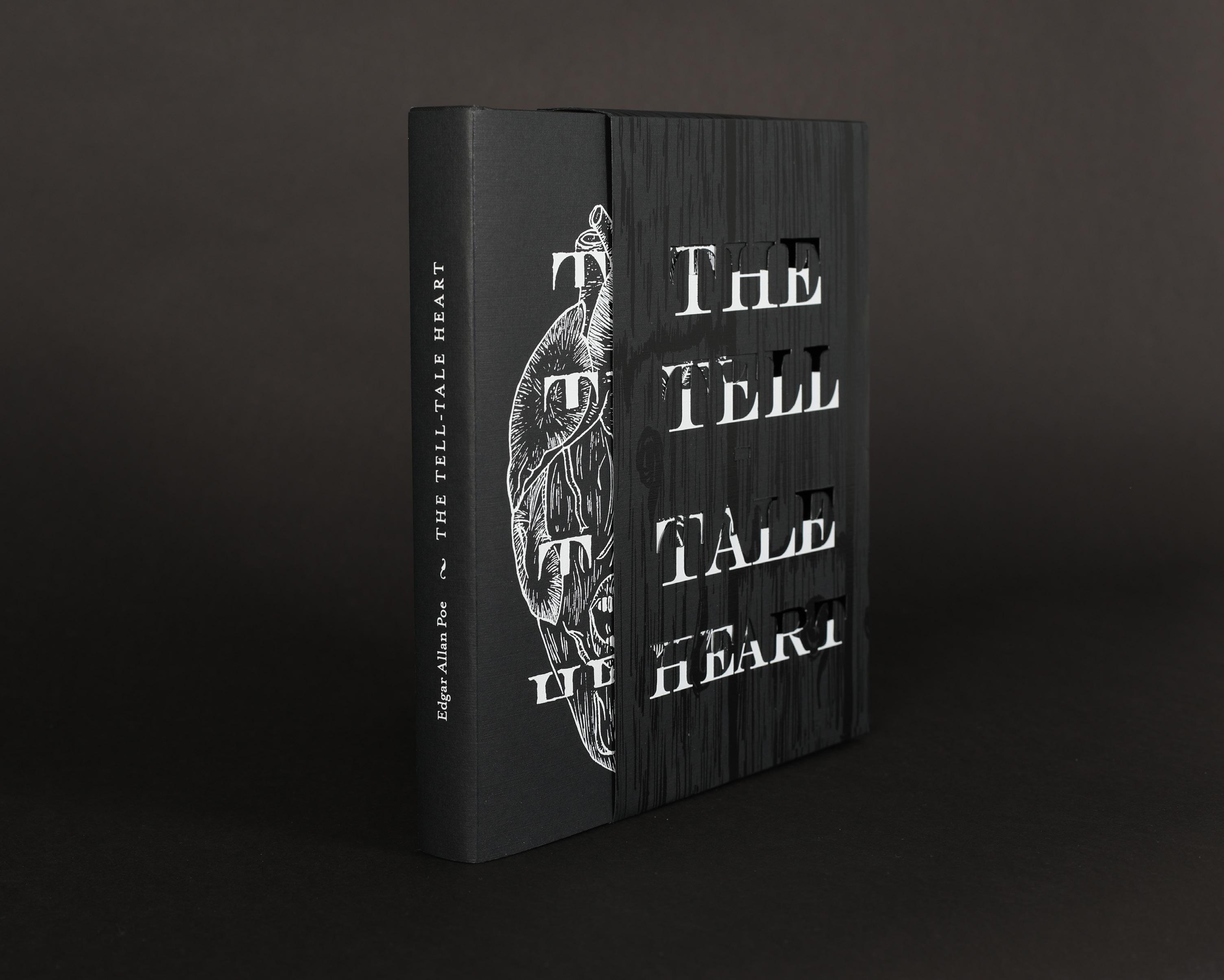
Book jacket design for Edgar Allan Poe’s “The Tell-Tale Heart”. The jacket’s main illustration was carved in a linoleum plate, and it captures the feeling of the main character of the story.
ARABELLA pg.7
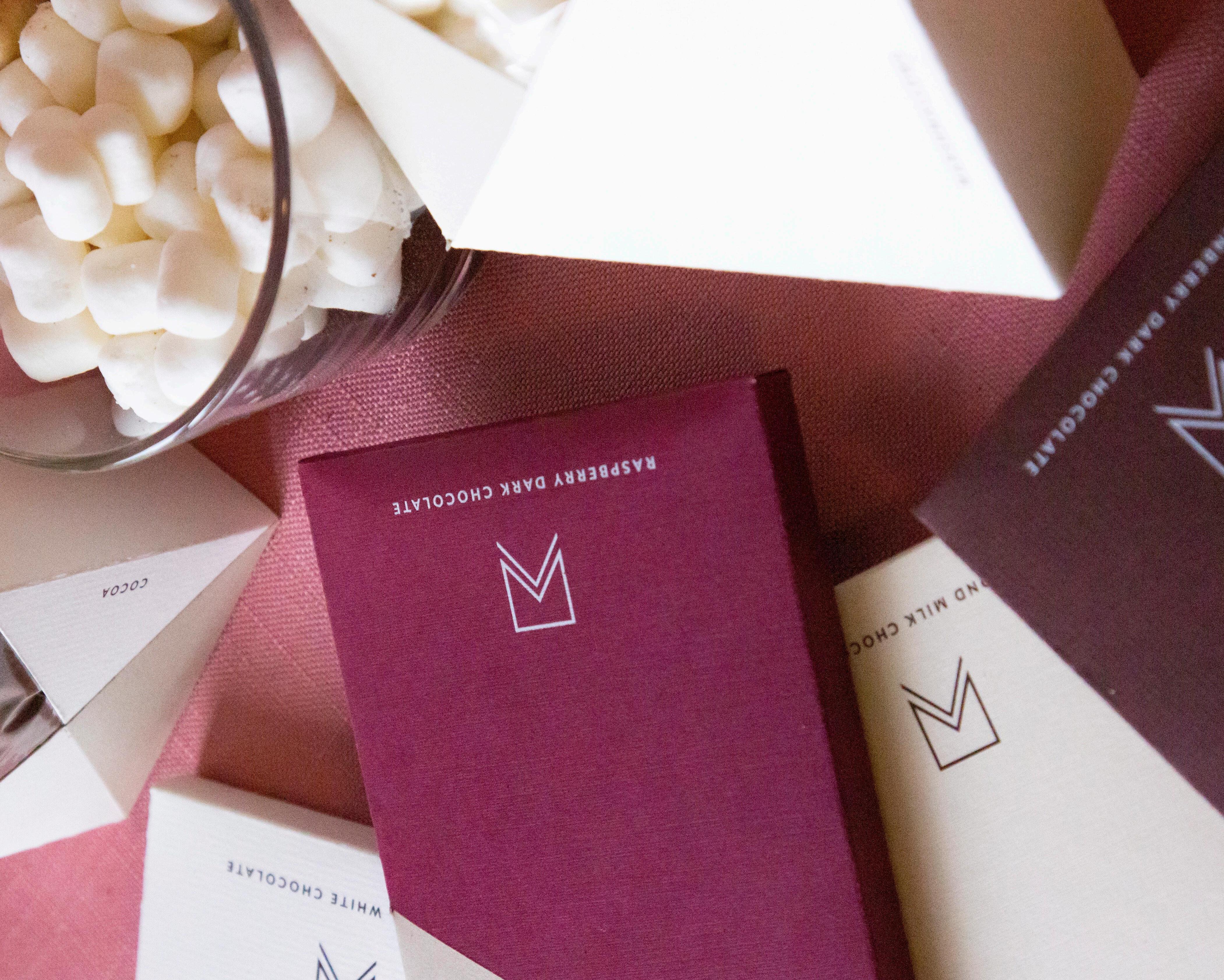
Hot chocolate packaging set for a modern brand that emphasizes shape, form and elegance. The design is simple and plays more with the way color is arranged.
LINEAGE BRANDING pg.23
Branding design for Lineage, a concept for a store that focuses on blending cultures from a person’s own ascendancy into pieces of furniture.
MUGA WINE pg.11
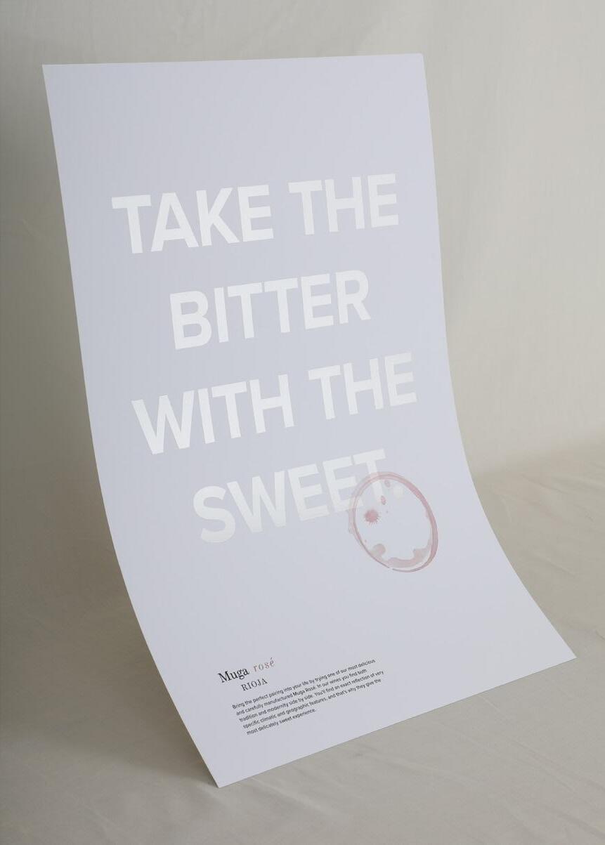
Advertising and packaging design for Rioja’s Muga wine. The execution emphasized the brand’s keen attention to details the consumer is not even aware of.
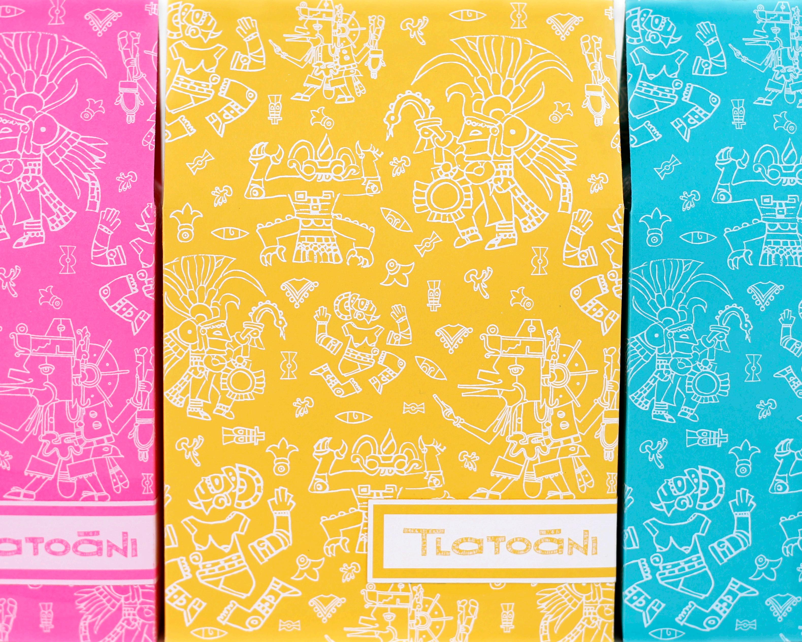
TLATOANI pg. 31
Packaging design for a fictitious Mexican cafe. The design fully embraces Aztec culture, starting with the business’ name, “Tlatoani (ruler)”, which is a Náhuatl word.
U.S. TRIBUNE WEBSITE pg.15
content.
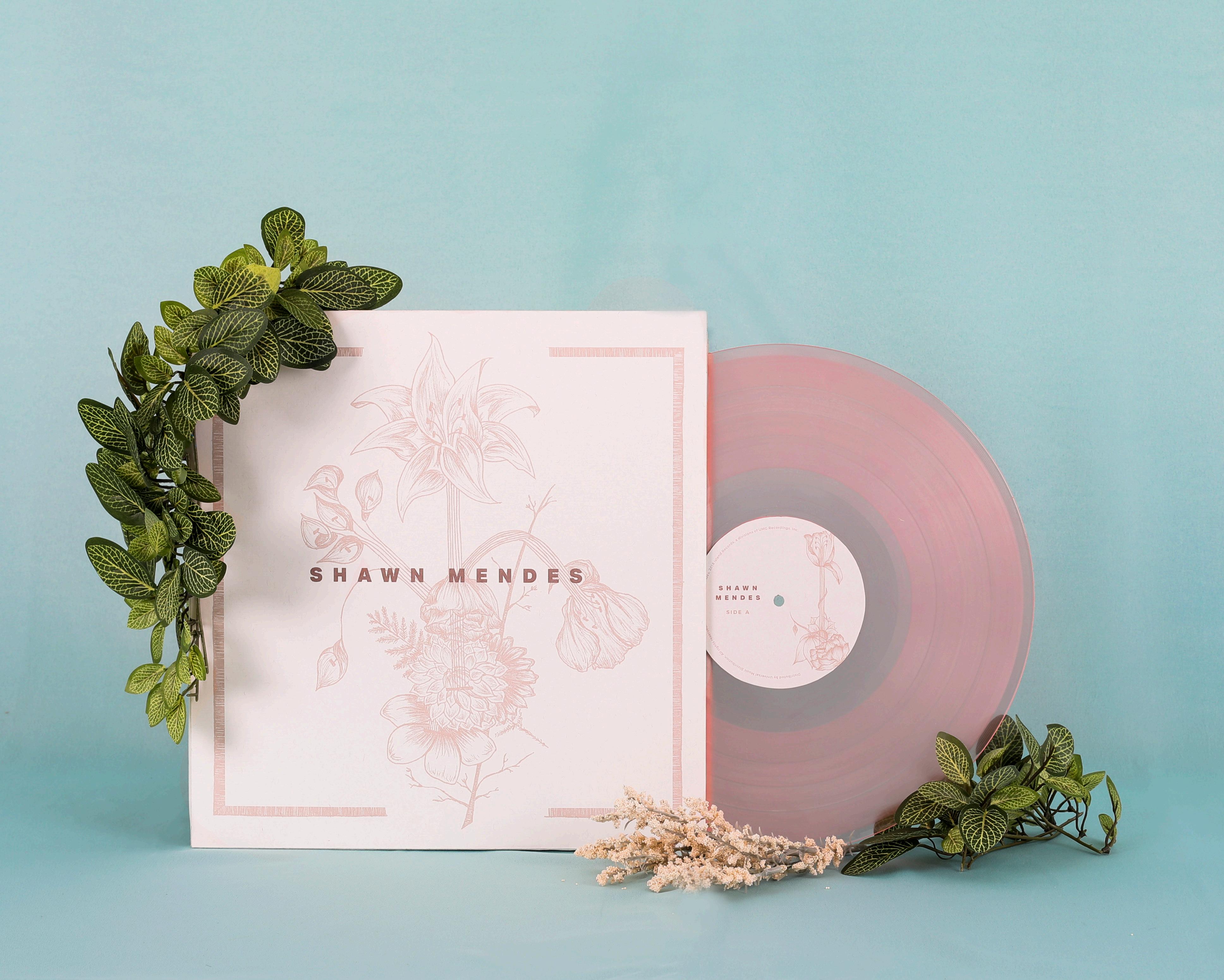
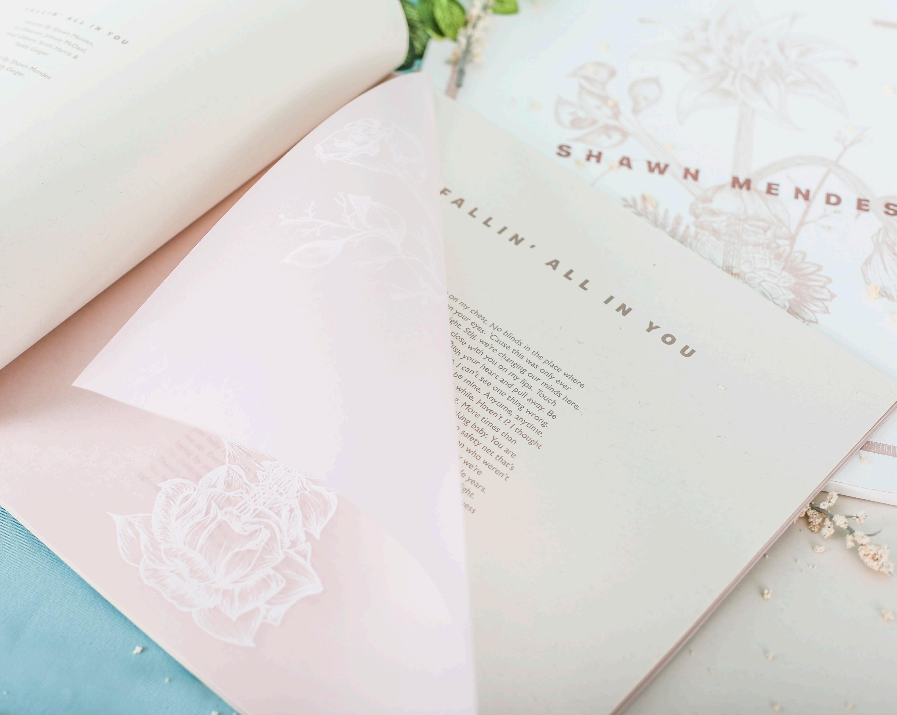
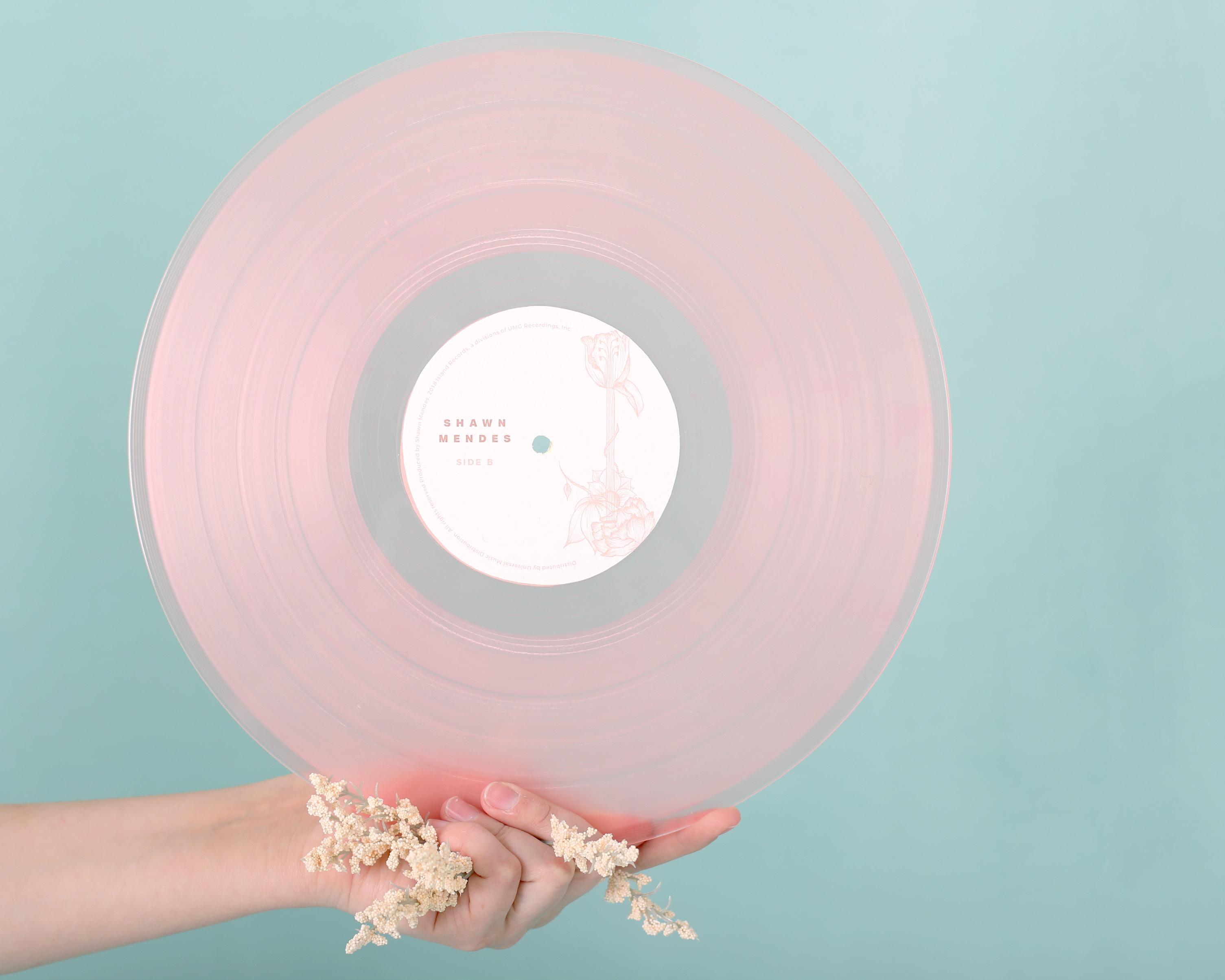
SHAWN MENDES pg.35
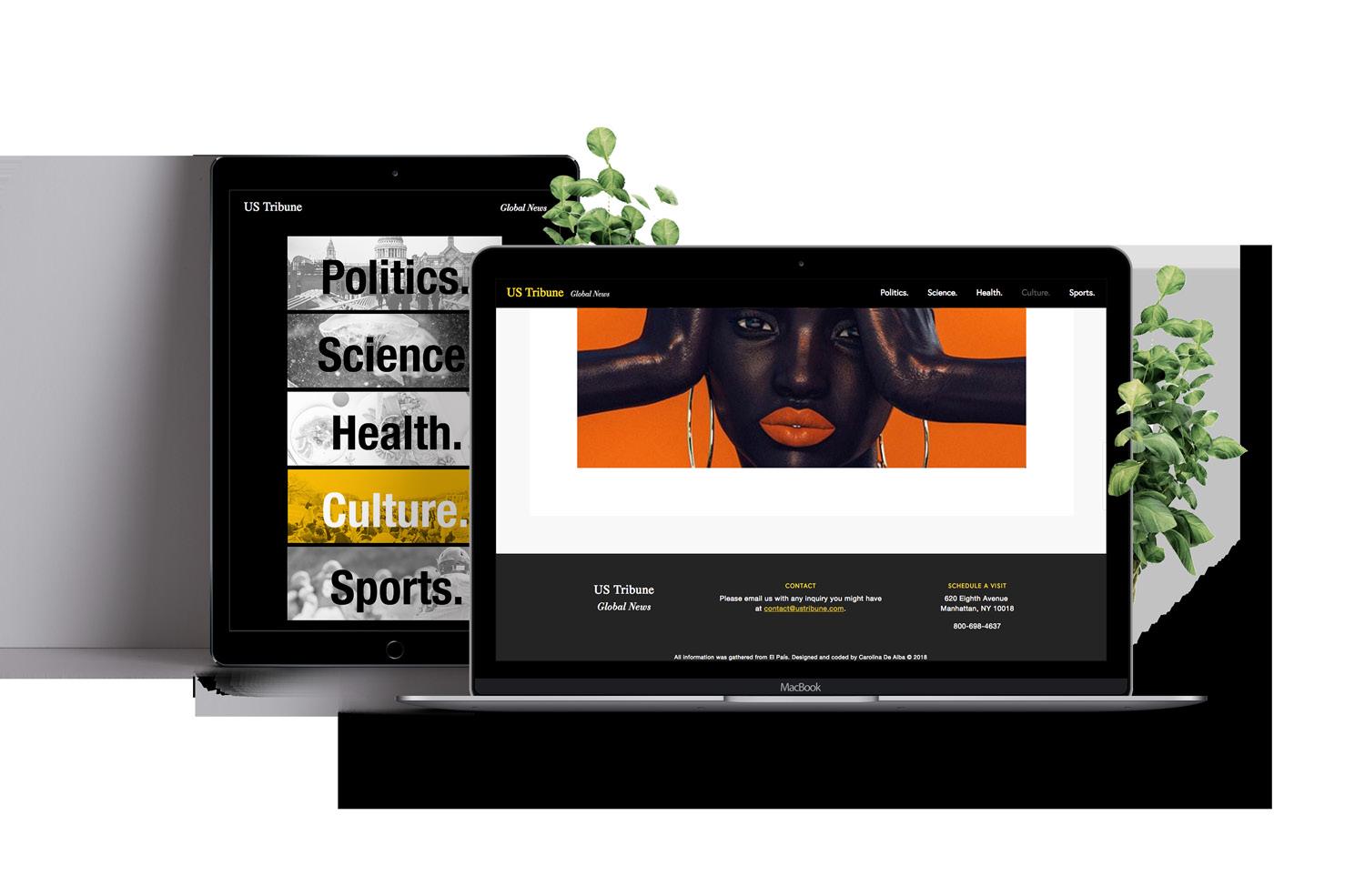
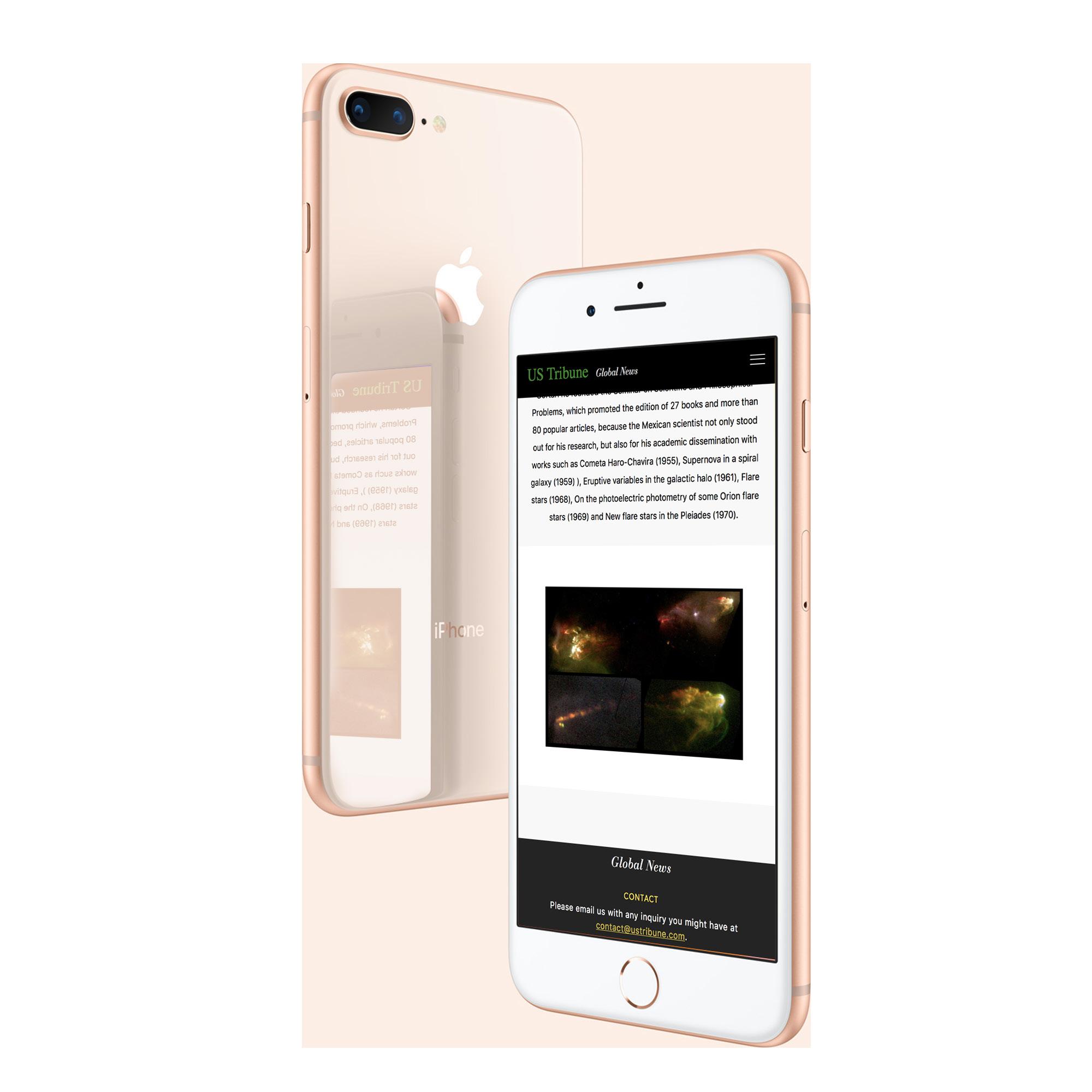
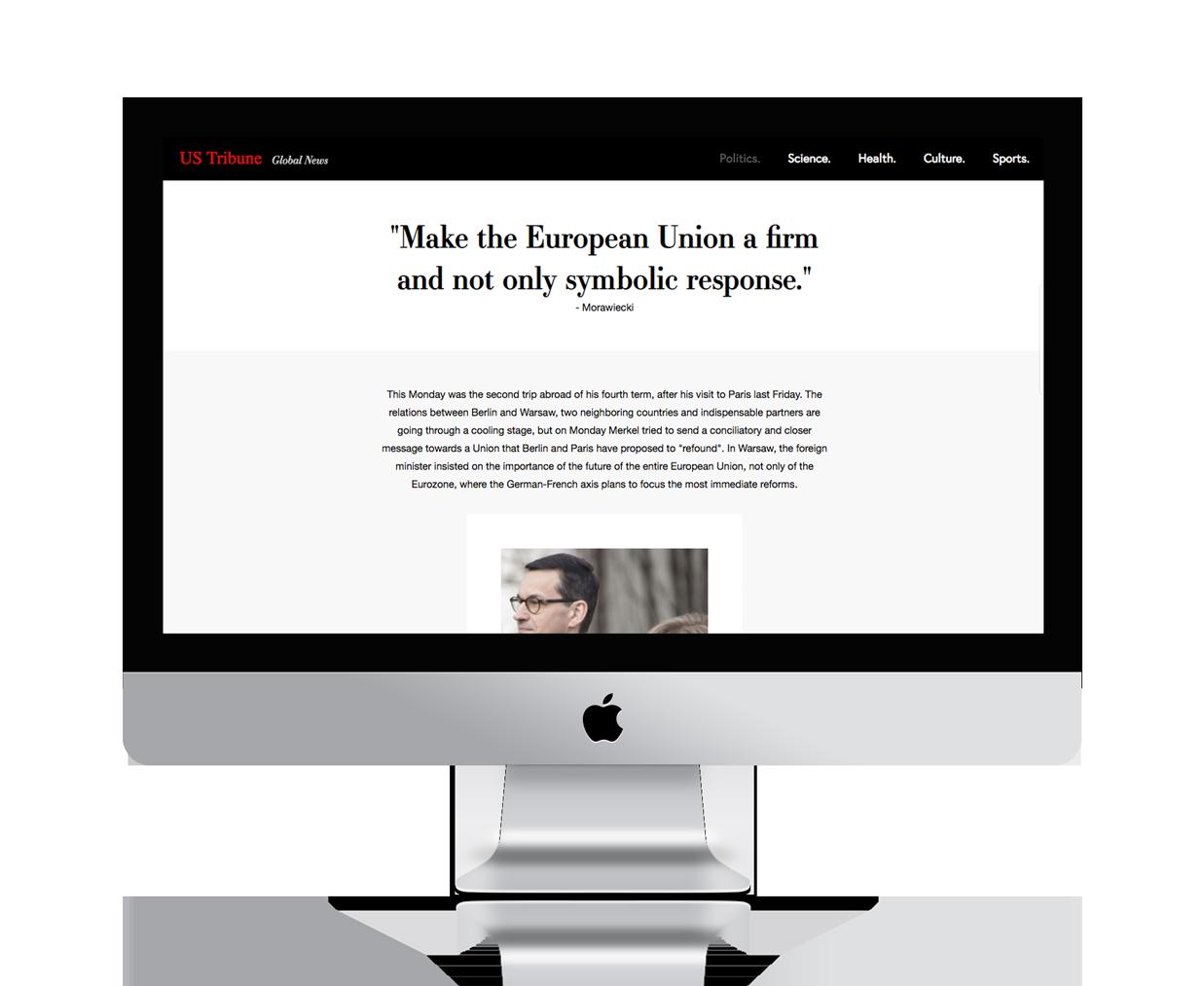
Website design for an imaginary newspaper. The purpose of this website was to create a site that served its communication purpose without being overloaded with information.
Album design for Shawn Mendes’ third album. This project focuses on bringing the warmth and delicacy of the songs into visual aesthetics.
feeling: a touch of art.
This project includthe different elements of a museum exhibition for visually impaired people. Inspired by the Museo del Prado’s initiative, I decided to create a design that would be visually interesting and functional for all audiences. The braille and illustrations are done by hand with special 3D paint, and the design is limited to black and white in order to not have color be a defining element to the work itself. The book and brochure are translated to Spanish and they follow the guidelines of the National Braille Association.
TYPEFACES
Primary: Ratio Modern
Secondary: Baskerville URW
COMPONENTS
Exhibition Book
Spanish Exhibition Brochure
English Exhibition Brochure
Official Exhibition Poster
Three Souvenir Posters
Souvenir Pillow & Gift Bag
Exhibition Website
HEX
#000000 HEX #FFFFFF
pg. 1 Photography by Amy Miller
pg. 2
pg. 3 pg. 4
pg. 5 pg. 6
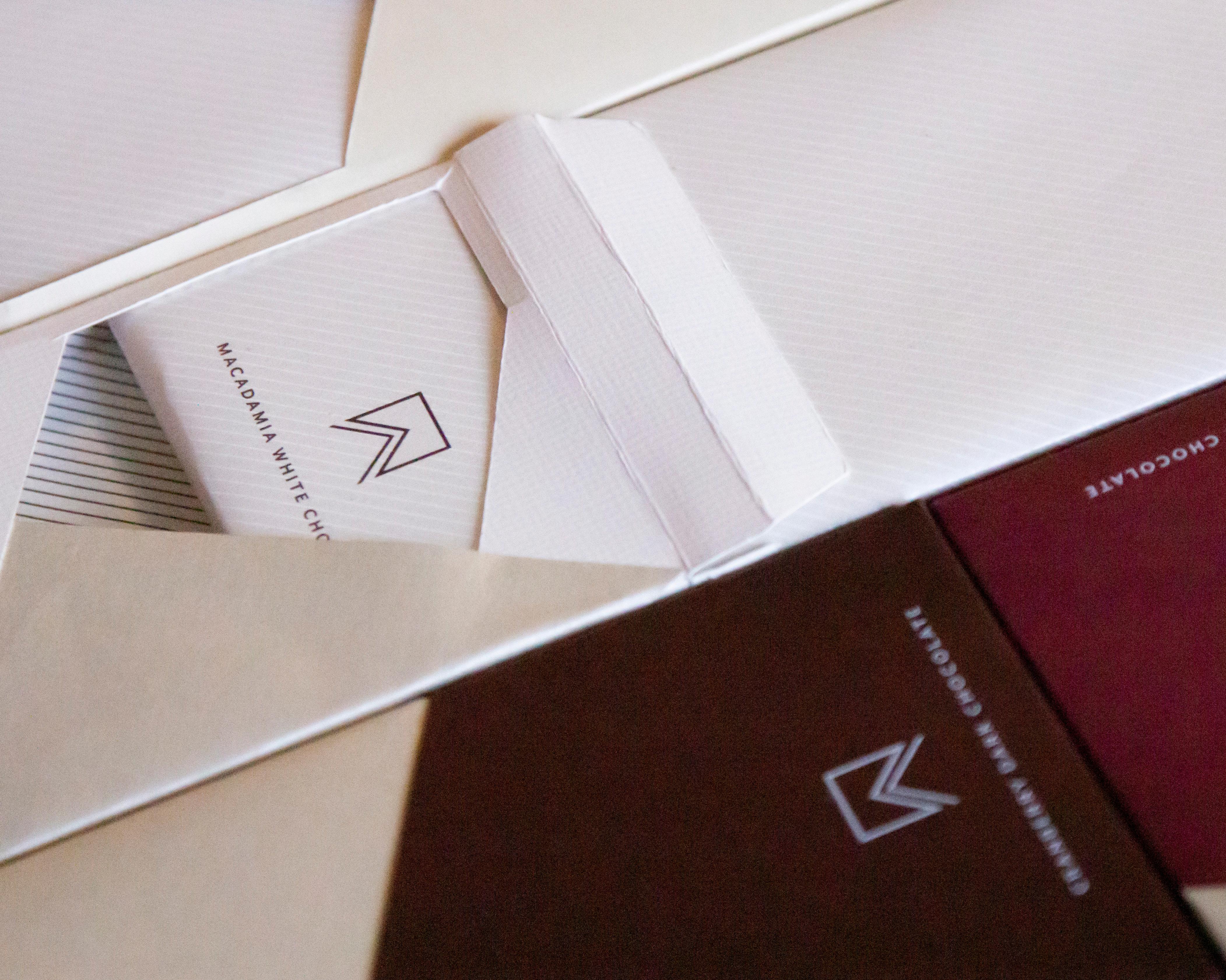
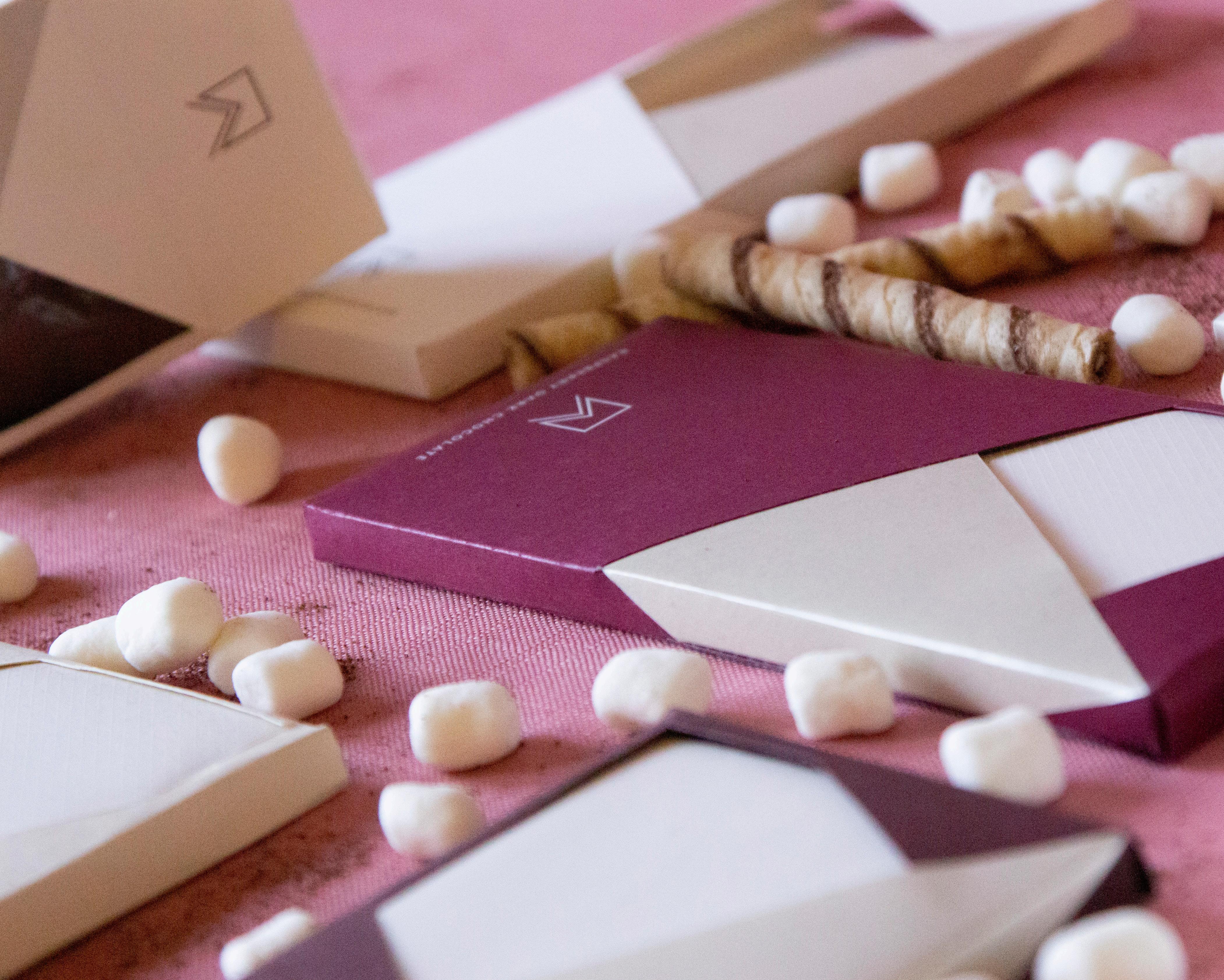
Packaging design for a fabricated Swiss chocolatier named Arabella. The image of the company is modern, clean and elegant. Mimicking the logo design, all the packaging elements play with geometric angles and diagonal lines. This packaging set contains the design for the box, four chocolate bars with its chocolate wrap, a box of marshmallows, and a cocoa powder box. The color palette reflects the tender process of chocolate making and the flavors of each product.
TYPEFACES
Primary: Mr. Eaves Sans
Secondary: Georgia
COMPONENTS
Logo Desi
Chocolate Bars’ Boxes
Chocolate Wraps
Cocoa Box
Marshmallow Box
HEX #7B2F3D HEX #EAE5CE
HEX #5F3C30
arabella.
pg. 7 Photography by Carolina De Alba pg. 8
pg. 9 pg. 10
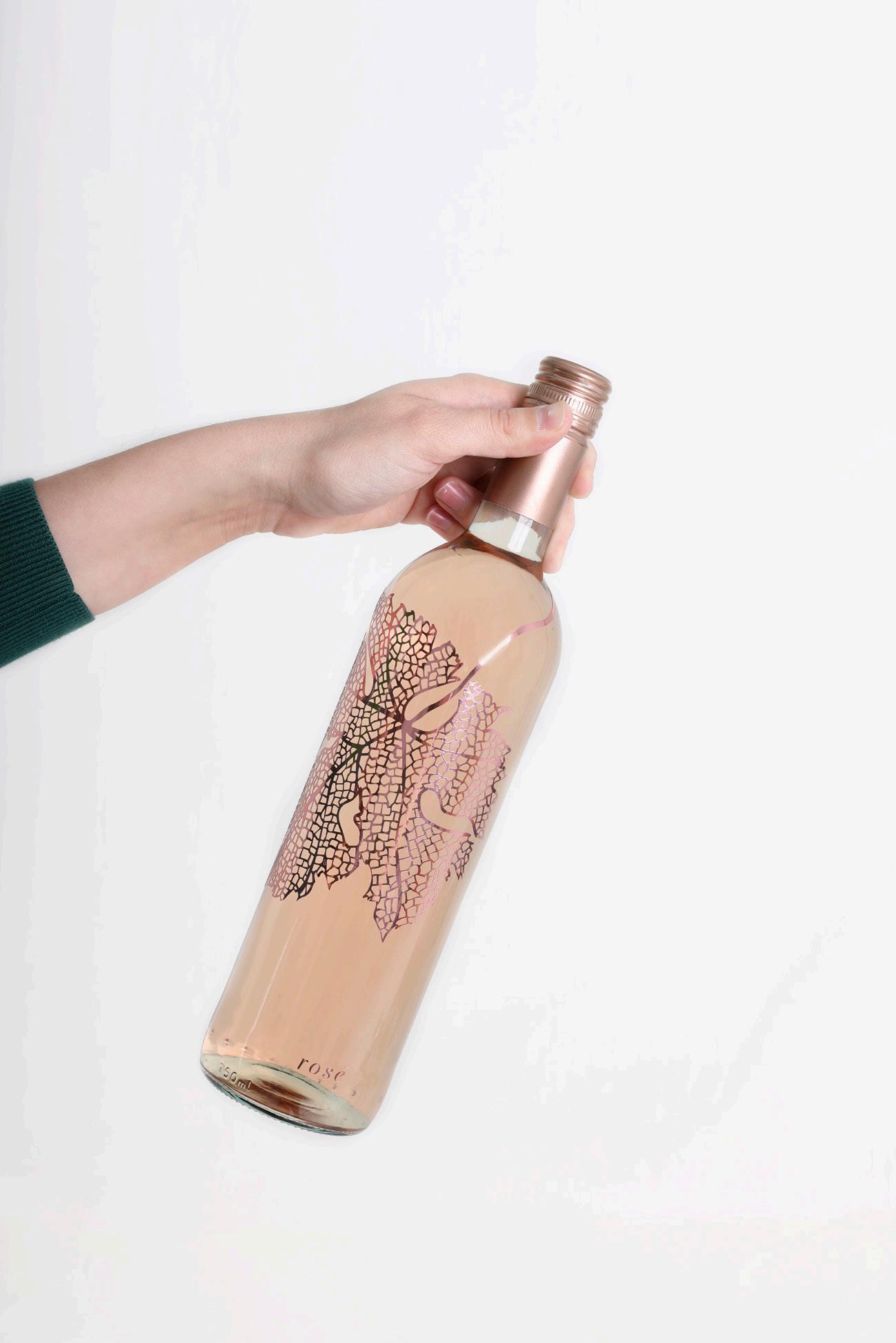
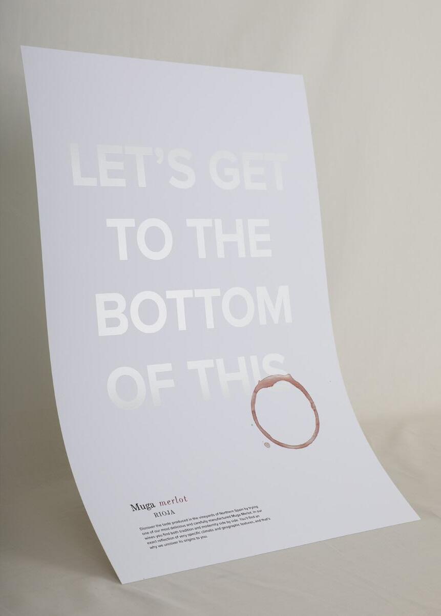
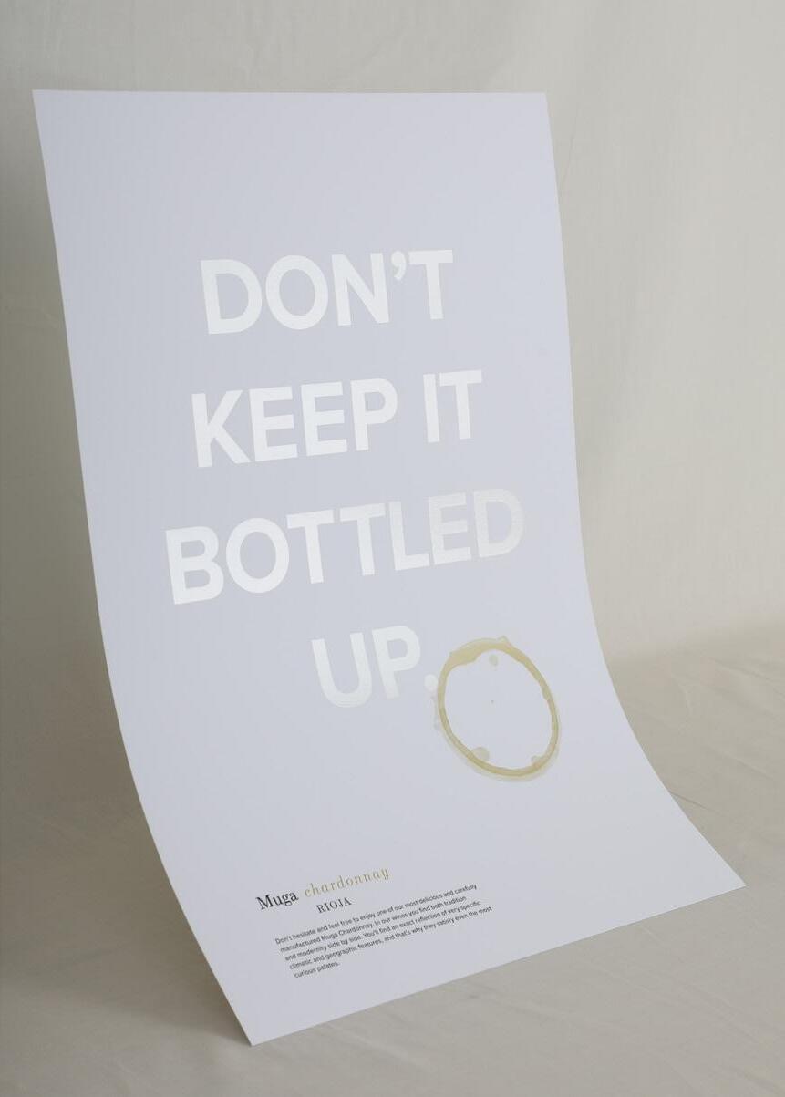
muga wine.
Packaging design for Rioja’s Muga wine. A combination of tradition and modernity, Muga has a keen attention to detail when it comes to the refinement of their wines and it is portrayed in the delicate line work illustrations of the bottles and boxes. The brand always goes the extra mile for their consumers and only the attentive ones notice; therefore, the color palette includes metallic colors and white on white with a lot of detail that is only noticeable to those who pay close attention.
TYPEFACES
Primary: Escrow
Secondary: Proxima Nova
COMPONENTS
Three Wine Bottles Wine Boxes
Ad Series
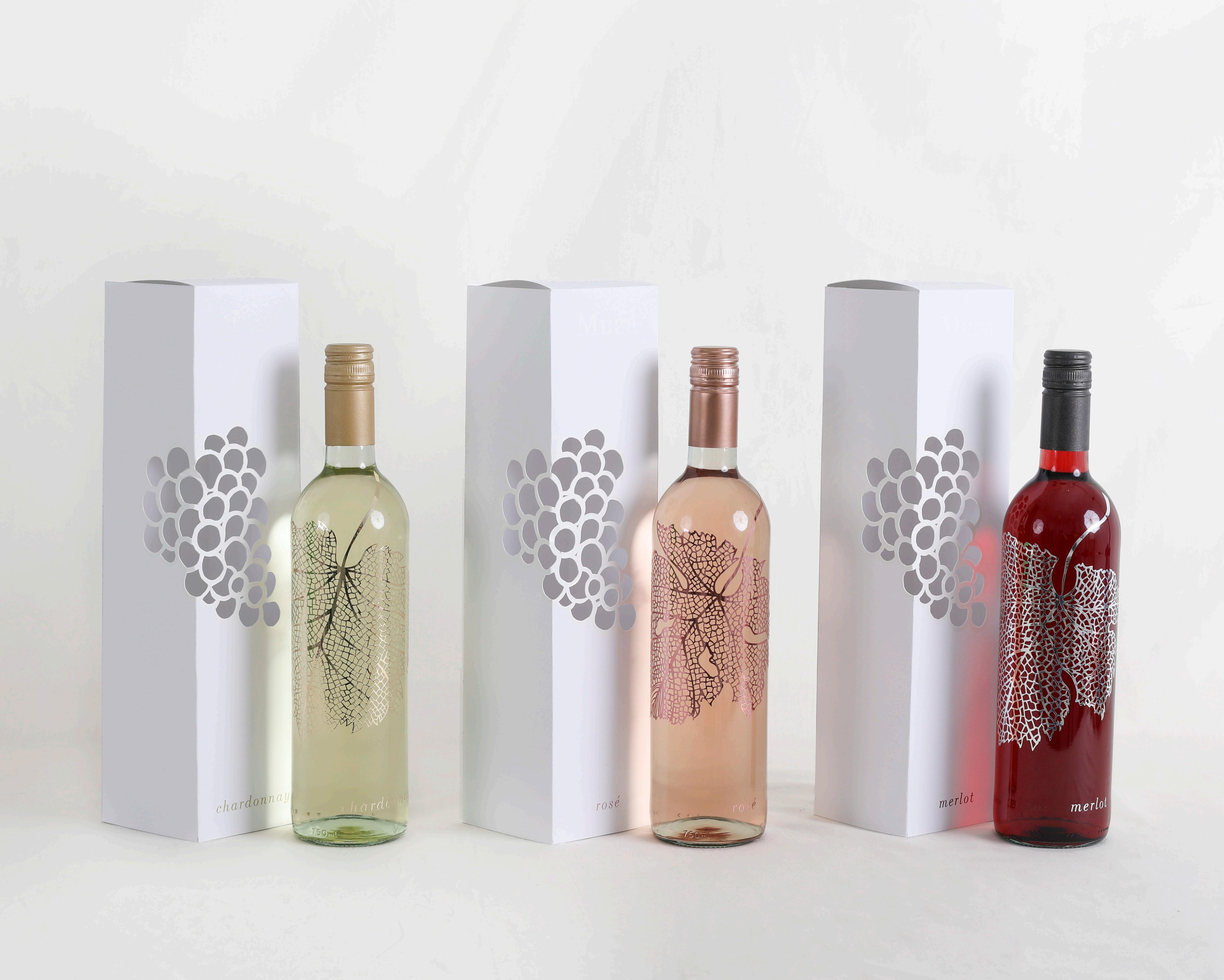
HEX #8F2A2B HEX #C78590 HEX #CBB54C
pg. 11 Photography by Amy Miller pg. 12
pg. 13 pg. 14
u.s. tribune.
Designed and coded fully responsive website using Bootstrap, CSS, JavaScript and HTML for a fictitious newspaper. Looking at different online newspapers for reference, I noticed that they all had extensive amount of information with no room for it to breathe. The goal was to create an innovating menu that will cover the homepage in order to make it more compelling for people to look into each different section. Each page is simplified with a bigger visual focus.
TYPEFACES
Primary: Essonnes
Secondary: Neutraface
COMPONENTS
HEX #000000 HEX #C02D22 HEX #458833 HEX #75BEDB HEX #EFD656 HEX #A027A9
Homepage Politics Section Science Section Health Section Culture Section Sports Section pg. 15 pg. 16
pg. 17 pg. 18
the tell-tale heart.
Book jacket design for Edgar Allan Poe’s “The Tell-Tale Heart”. The main illustration is meant to represent my interpretation of the leading character’s struggle towards the end of the story. The illustration was carved on a linoleum block and the typographic treatment emphasizes the beat of a heart by the way one reads each word on a different line. The color palette remained black and white to keep true to the traditional style and look of linocut printing.
TYPEFACES
Primary: Mrs. Eaves
Secondary: Skolar Sans Latin
COMPONENTS
Book Jacket
Packaging Box
Linoleum Block
pg. 19 Photography by Amy Miller HEX #000000 HEX #FFFFFF pg. 20


pg. 21 pg. 22
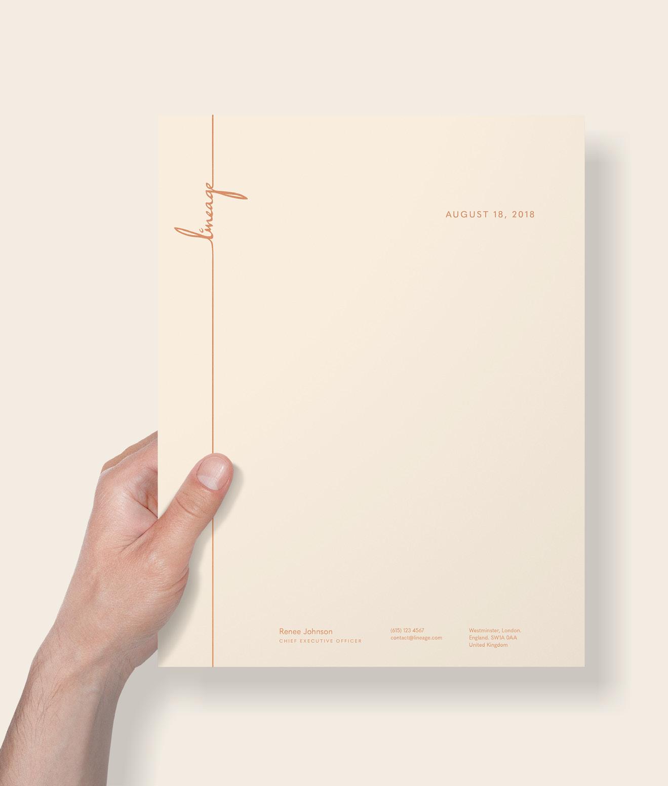
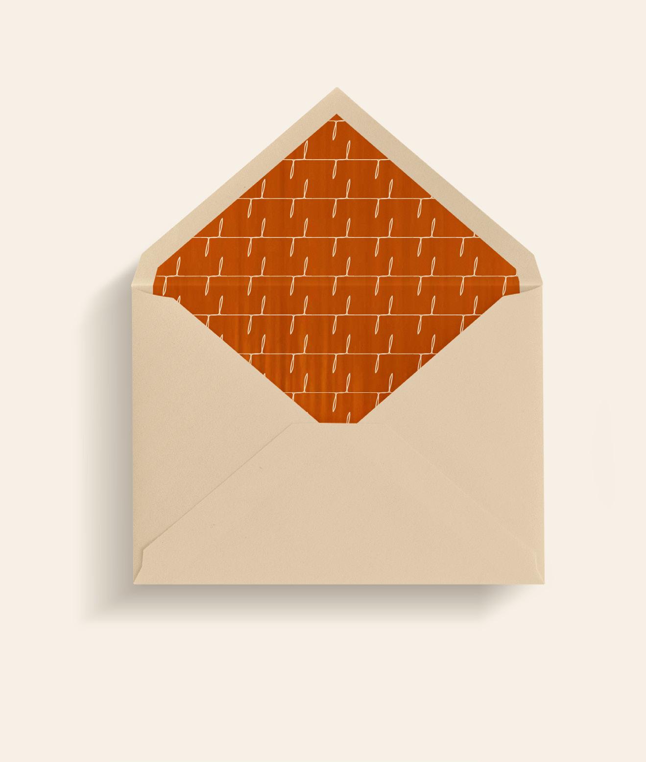
lineage branding.
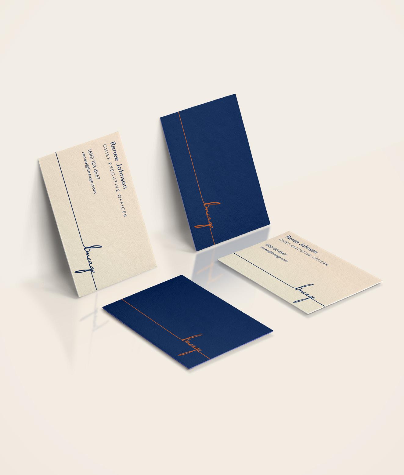
Complete branding project for Lineage, a business concept created by Renee Johnson. Her project celebrates passed ancestors through a store that offers custom furniture, home accessories, assistance in DNA background research, and provides library resources for client’s needs. The image of the brand emphasizes the connection to our roots with elongated, thin strokes. The color palette was chosen to reflect a level of affordable sophistication and the warmth that should come from family.
TYPEFACES
Primary: Quasimoda
Secondary: Le Monde Livre
COMPONENTS
Logo Design
Business Cards
Stationary
Brand Guidelines Booklet
FAMILY NOT FORGOTTEN.
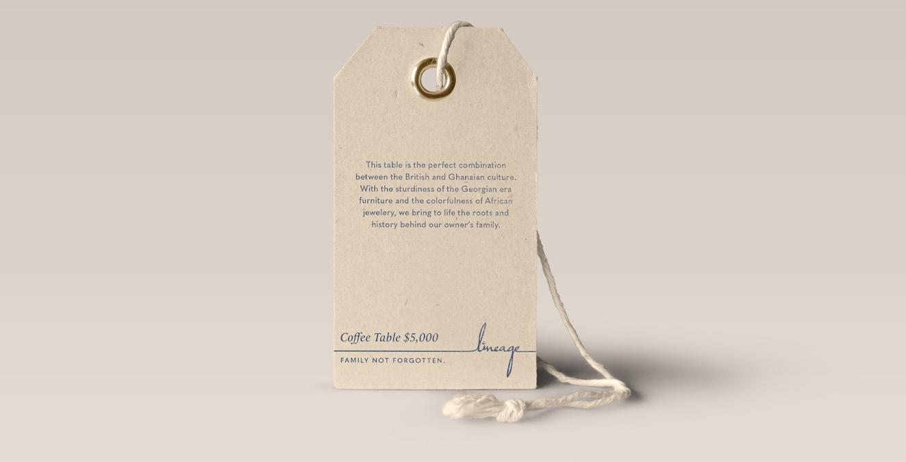
A business that understands the importance of being cognizant to family history and helping relatives commemorate their ancestors. We celebrate passed ancestors through a store that offers custom furniture, home accessories, assistance in DNA background research, and library resources for client’s needs. The store’s process explores the client’s ancestral DNA background from both the maternal and paternal line, culture, family photos, oral traditions, and any heirlooms that the client may have to create the design. As a result of the store, each person will gain a graspable understanding of their family and themselves while creating a custom designed item for the family to pass down to future generations.
HEX #A3512F HEX #2A375D HEX #EBDEC0
pg. 23 pg. 24
Quasimoda
Quasimoda is the primary typeface of the brand. It is used for body copy as well as for the slogan. The point size should never be smaller than 8pt and there should only be tracking when All Caps are being used.
Le Monde Livre
Le Monde Livre is the secondary typeface of the brand. It is used for titles and prices. The point size should never be smaller than 9pt, never to be used with any tracking and on body copy, and always italicized.
PANTONE Solid Coated 7586 PANTONE Solid Coated 534 PANTONE Solid Coated 7500 pg. 25 FAMILY
Coffee Table $5,000
Family
Family
Family
Coffee Table $5,000 Coffee Table $5,000 Coffee Table $5,000
NOT FORGOTTEN.
Family Not Forgotten.
Not Forgotten.
Not Forgotten.
Not Forgotten.
pg. 26 DO NOT use any of the brand’s typefaces to replace the logo. DO NOT overlap information or slogan on top of the logo. DO NOT rotate logo in directions not specified in these guidelines. DO NOT make logo smaller than 0.75”x 0.4”. Lineage Lineage FAMILY NOT FORGOTTEN.
LOGO VARIATIONS & APPLICATIONS
& APPLICATIONS
PATTERN DESIGN pg. 27
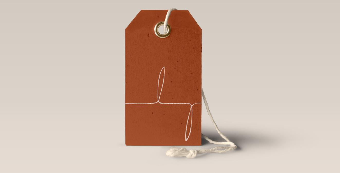
PRICE TAGS pg. 28 BUSINESS CARDS
SECONDARY MARK LOGO VARIATIONS
SECONDARY MARK
“ ”
Contributing insight to family history can help bring an understanding to a person's characteristics, genetic health conditions, historical understanding, and admiration for passed tribulations deriving from family members.
Renee Johnson CHIEF EXECUTIVE OFFICER
pg. 29 STATIONERY LETTER STATIONERY ENVELOPE pg. 30
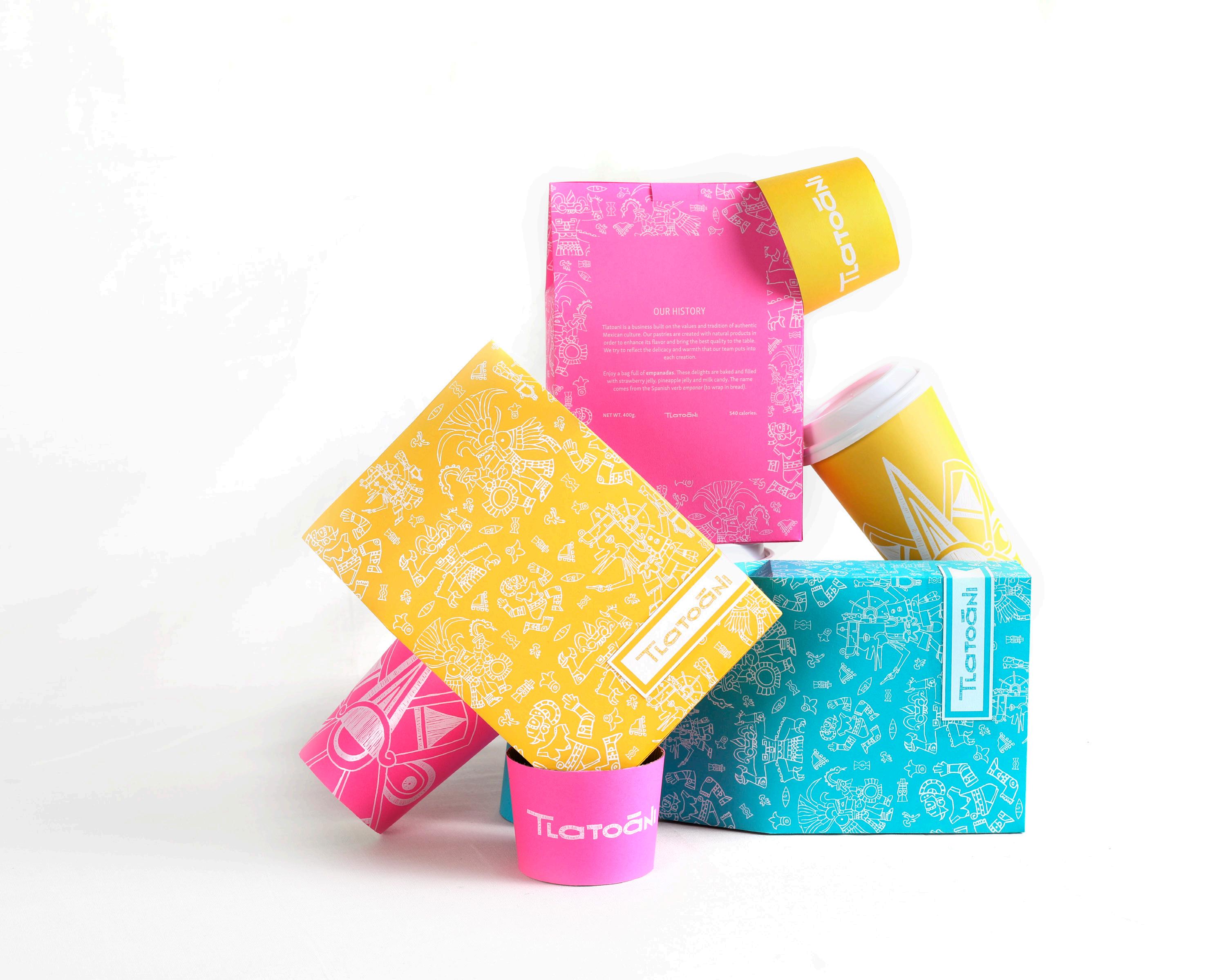
tlatoani.
Packaging design for a Mexican pastry store. Tlatoani is envisioned as a business that is built on the values and tradition of authentic ancient Mexican culture. The work embraces Aztec culture and its name is taken from Nahuatl, which means “ruler”. The illustrations in the packaging are Aztec’s imagery and Gods. Instead of keeping a traditional color palette that could be found in codices, there was a liberty to make the hues richer and brighter to bring lightheartedness and the fun side to the brand.
TYPEFACES
Primary: Skolar Sans Condensed
Secondary: Skolar Sans Latin
COMPONENTS
Logo Design
To-go bags
Coffee cups
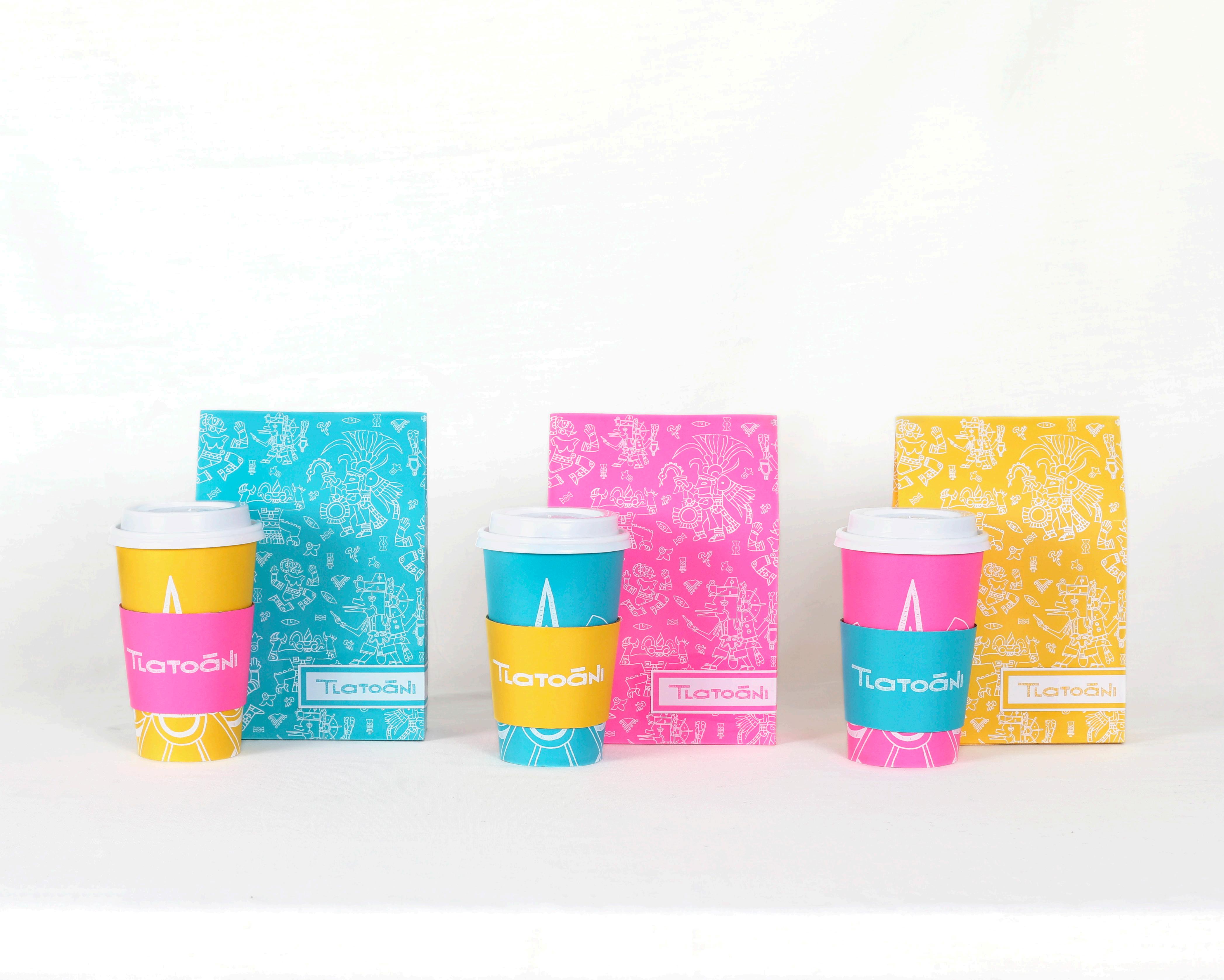
HEX #6FC1D9 HEX #FA2298 HEX #FFCE09
pg. 31 Photography by Amy Miller pg. 32
pg. 33 pg. 34
Redesigned artwork for Shawn Mendes' third album. The concept was based on representing the same feeling from the music into the artwork. The guitar is the most prominent instrument on the album and there is a reference to it within the illustrations. The presence of an acoustic sound unifies and establishes the style of the album and, therefore, the design approach. The illustrations created for the project were intended to create a balance through the combination of two aspects: simplicity and feeling.
TYPEFACES
Primary: Aktiv Grotesk
Secondary: Gill Sans Nova
COMPONENTS
Outside Packaging
Record Sleeve
Record Label Design
Lyric Book
HEX #C3AFA0 HEX #F0C8C2 HEX #F1E6DC
shawn mendes.
pg. 35 Photography by Amy Miller pg. 36
pg. 37 pg. 38

www.carolinadealba.com
