
About the brand
About
An overview of our history, brand messaging and key facts and figures, describing what we may communicate about Azets. Our tone of voice describes how we communicate Azets in a correct and consistent fashion.
The story
A new company with a proud history.
Azets saw the light of day in 2016, as a result of bringing leading-edge UK and Nordic business services companies together. For decades, we have provided business-critical support to thousands of clients throughout the UK and the Nordic region.
Today, we are an international accounting, tax, advisory and business services company that delivers a personal experience, both digitally and at your door.
We are on a mission to help organisations of all shapes and sizes achieve their ambitions, saving them precious time to focus on what they do best.
An eye-catching brand
Azets is an easily recognisable brand supported by two distinct visual expressions.
The triangle
The triangle is the primary design element on all Azets designs.
The triangle element makes Azets easy to recognize across different channels.
The triangle is reflected in the logo and represents strength, stability, power, symmetry and perfection.
Green for growth
Green is the primary colour on all Azets designs.
Our brand promise is strongly related to the colour green: Azets deliver business advice that saves your time and makes it easier for you to grow your business and focus on achieving your ambitions.
Green is generally associated with positive values, such as growth, prosperity, new beginnings and moving forward. Green adds visibility and vitality to the brand and supports the idea of differentiating Azets from the crowd.
Brand promise and services
We are an accounting, tax, audit, advisory and businesses services group that delivers a personal experience both digitally and at your door.
Positioning Statement
We are an accounting, advisory and business services company that believes in delivers a personal experience, both digitally and at your door.
We are better able to do this because of the breadth and depth of our competencies across 175+ offices and because our culture is built around our people and this gives our brand our highly collaborative and personal reputation.
Tone of voice
Straightforward, approachable and personal.
Our general brand messaging describes what to communicate, while our tone of voice describes how we communicate Azets. It is all about how we speak and write about our brand.
Straightforward
We are clear and concise in our communications, with the aim of helping people understand complex issues. We are honest and trustworthy in how we deal with people and we like to simplify things for our clients to make all we do more easy to understand.
Approachable
We should be perceived as friendly, approachable, and not too technical. This is summarized in our finaltone of voice for Azets:
We are always down-to-earth and human in our approach. We understand that people come to us from all different backgrounds and outlooks and we are focused on always making them feel welcome. There is no issue too big or small.
Personal
We always see the people behind the business and think about their aims and ambitions. We put ourselves in their shoes and go above and beyond, so they feel they are seen and served as individuals, either digitally or in person.
Mission, vision and values
Vision
We will reach our mission by achieving our vision to make our services smarter, more effective and more personal for our clients, every day.
Mission
We are on a mission to help organisations of all shapes and sizes, achieve their ambitions by delivering audit, accounting, tax, advisory and business services both digitally and at their door, saving them precious time to focus on what they do best.
Authentic Collaborative Dynamic
We constantly ask ourselves what is the right thing to do for our people, our clients and our business, acting with integrity at all times. We are stronger together. We share knowledge, ask for help and empower each other to achieve collectively.
Respectful
We are open-minded and value everyone’s contribution, embracing our di erences and fostering a culture of trust and inclusion.
We adapt quickly to change, finding smart ways to deliver the best results and remain one step ahead.
180+ offices
United Kingdom
120,000 clients
7100+ colleagues
Revenue of £500m
Visual elements
About
A thorough look into our key visual elements supporting and strengthening the brand, including rules and guidelines on how to use the elements correctly.
Azets logo
Main logo and extensions
Azets logo design contruction
Azets logo
Icon and wordmark
A combination of an symbol and a simple and modern wordmark. The symbol is both a graph and the letters A and Z from the wordmark. The icon stands for a lot of things – growth of course, but also knowledge and insight, as well as control and overview.
Line measurement
Abbreviations
Space between icon and wordmark
The space between the symbol and the wordmark is equal to two times the thickness of the stroke in the symbol.
The vertical logo should be used only in situations where the visibility is poor or there is not enough space for the horizontal logo.
t
The Azets logo can only be combined with concept names after approval by the brand owners.
A bi l i t y A bi l i t y
Example for Ability extension for light and dark backgrounds.
Color options
Primary logo
The primary logo is the main logo and should be used in most cases. It works well with white backgrounds and light colors. In case of dark backgrounds use the inverted primary logo.
Secondary logo (one color version)
The secondary logo is used in cases where the primary logo does not work well - its complexity can sometimes make the logo less visible. The secondary logo performs well in these cases because of it s simplicity.
Never use the primary logo on detailed images, vibrant colored backgrounds or graphics that can reduce its visibility.
We use secondary logo in special cases for web and print.
Primary logo
Horizontal logo
Vertical logo Symbol
Horizontal logo
Vertical logo Symbol
Secondary logo
This color version of the logo can by adjusted to fit the requirements using our neutral color paletter ‘Liliac grey’.
Horizontal logo
Vertical logo Symbol
This color version of the logo can by adjusted to fit the requirements using our neutral color paletter ‘Liliac grey’.
Horizontal logo
Vertical logo Symbol
Using our endorsement
Proportions - Blick Rothenberg
A minimum width of 22mm is recommended for the Azets endorsement. x 1/2x x 1/2x 1/2x 1/2x Minimum 22mm
Key, knock out and reverse
Example - Blick Rothenberg
Can be placed on white colour backgrounds from our neutral colour palette.
Key Use for black and white print only.
Knock out
For placement on block colour backgrounds from primary colour palette or images (where sufficient contrast provides adequate visibility).
Reverse
For placement on block colour backgrounds from primary colour palette and retaining the Blick Rothennberg colour ident.
Endorsement placement
Company logo Company logo
Company logo
Left alignment
Our endorsement can be placed on the left side if the company logo is on a wide format only. The two logos should be well balanced and have a good harmony.
Centre alignment
Our endorsement should always be centre aligned when the company logo is centre aligned, in a square or circle format. Keep both logos in the same alignnment for a better composition.
Right alignment
Our endorsement is used on the right side only in cases where the company logo has a symbol on the left side and our endorsement doesn’t fit well and creates a unbalanced composition.
Logo placements
The exclusion zone
Safe areas
This page illustrates why the clear space is so important. The top two examples show the correct usage of the logo and the exclusion zone. By respecting the exclusion zone we ensure the logo stands out and looks its best.
Yes
The content has just enough room. Remember the exclusion zone is the minimum space given to the logo. Both the Azets and Olympic logos have enough room that they do not compete with each other.
We simplify and support businesses in their growth
In the bottom two examples, other elements come much too close to the Azets logo, creating a cramped and messy visual.
No
This text line is too close to the Logo. The Olympic logo is too close to the Logo. Color Options
We simplify and support businesses in their growth
Minimum sizes
For print and digital
Establishing a minimum size ensures that the impact and legibility of the lLogo is not compromised in application. Due to the higher resolution available in print versus that of screen based media (300dpi vs 72dpi respectively), we are able to reproduce the logo at a fractionally smaller size in print without any graphic deterioration.
Digital
To ensure legibility and impact, the Azets logo should never be reproduced smaller than 70px in any digital communication.
To ensure legibility and impact, the primary Azets logo should never be reproduced smaller than 20mm in any print communication. The minimum size is 12mm for the secondary Azets logo.
Logo misuse
Bad logo usage
It is important that the appearance of the logo remains consistent.
Its orientation, color and composition should remain as indicated in this document — there are no exceptions.
The logo should not be misinterpreted, modified, or added to. No attempt should be made to alter the logo in any way.
To illustrate this point, some of the more common mistakes are shown on this page.
Do not apply gradients to the icon or Wordmark
Do not resolve the logo in all green
Do not change the Logo color keyline around the Logo. or tone outside those colors specified in the color section of this guide
Do not rotate the Logo
Do not manipulate the relationship between the Wordmark and the Icon. Use one for the two version
Do not distort or warp the Logo in any way
Do not change the typeface or otherwise recreate the Wordmark. Use only the provided files
Do not use the Wordmark without the Icon
Do not outline or create a border Do not change the Logo color keyline around the Logo
Do not manipulate or draw your own icon
Do not remove the black stroke Do not crop photos or your own Icon from the letter A in the icon

Do not crop photos or patterns through the Logo
Logo placement
Regardless of communication size or dimension, the logo can only be placed in five locations. This keeps logo placement simple and consistent, while allowing enough flexibility to accommodate a dynamic graphic system.
Top left corner
Base color palette
Mulberry-600 / Visual
Extended color palette
Amber Deep Purple
Blue Navy
Mulberry
Liliac Grey Orange Light Blue
Ritch Blue
Liliac Grey & White
Color usage
Primary
Secondary
Azets brand colours. Used for graphics, UI and patterns. Works well with light and dark themes.
- #FCB315
Themes
Azets light and dark theme backgrounds used for everything related to marketing materials.
600 - #7321B7
Accessible with Lilac Grey-900 - 7.43 contrast ratio. It is used in special cases like data visualization. Accessible with white - 7.98 contrast ratio. It is used for visited links.
Neutral
Accessible with white - 13.47 contrast ratio and light colours. It is used for titles and body text color.
Accessible with Blue Navy-600 - 8.14 contrast ratio and dark colours. It is used for text buttons, links and text menu on dark background.
600 - #991F76
Accessible with white - 7.46 contrast ratio.
It is used in special cases like data visualization.
Green
Blue Navy Amber
500
Liliac Grey
Dark Blue Navy
Deep Purple
Mulberry
Liliac Grey
900 - #2C2E3A White #FFFFFF
500 - #D53D4F
600 - #C34F00
Accessible with white - 4.55 contrast ratio. It is used for status danger and errors in special cases like alert, text and form validation.
General color combinations to avoid
Avoid overlaying text on backgrounds with similar color values like light colors on a light background.
700 - #007FA9
Accessible with white - 4.73 contrast ratio. It is used for status warning in special cases like alert, text and form validation.
Avoid overlaying text on backgrounds with similar color values like light colors on a light background.
Accessible with white - 4.55 contrast ratio. It is used for status info in special cases like alert, text and form validation.
Avoid pairing two vibrant colors together.
Ritch Blue used only for links.
500 - #2962FF
Avoid pairing green and red together. These combinations present an accessibility problem, as they are indecipherable by people with color blindness.
Orange
Light Blue
Ritch Blue
Logo colour codes
Azets green
The Azets green colour is a custom colour which works best on screen. On screen RGB or Hex colour should be used. We also recommend using RGB color for PDFs that will mainly be viewed on screen. e.g. sending a PDF to a customer client. If a client does print the document the quality would still be good, but it is more important it looks good on screen. For important printed materials, you should ideally use the Pantone colour as often as possible.
“Pantone 7479 C” is for printing on coated paper. “Pantone 7479 U” is for uncoated paper.
CMYK colours should only to be used when Pantone is not available, e.g. when printing on an ordinary inkjet printer. Azets black
This is a standard black. HEX and RGB are used for display and CMYK for print.
Web colours
Print with spot colour for coated paper
Pantone 7479 C Print with spot colour for uncoated paper
Pantone 7479 U
Print colours
Iconography
Telling a story without words
Icons
The story line is easy to follow especialy when the icons are in good use.
Standard icons
They comes in two colors. Mostly used for presentations, lists, diagrams and infographics.
Usage
Icons help users quickly identify what they need. The use of icons also provides a more appealing visual representation.
Line thickness
The general thickness of the line is set to 1.5px for an icon size of 60x60px.
One color icons
The icons in one color are only for infographics and diagrams where there are certain ramifications and/or multiple explanations. In this case, the icons listed will be all of the same color.
When the icon has the functionality of a button, we use 1.25px thickness for 20x20px.
Web icons
They have a fixed size and it comes in one color. There is one exception for dark backgrounds, the icons are used in white.
Backgrounds
Background colours
Standard icons are only used in green and deep purpe with a few exceptions for colored backgrounds while keeping in mind the colour contrast background.
There are other exceptions for one color icons used for web and when they are used for infographics and diagrams.
Standard icons
One color icons
Web icons
Infographics
General guidelines
Typography
Data visualisation, large numerics, large titles
Data visualisation, large numerics, medium titles
Pattern colors
As with all Azets designs, the triangular patterns should not deviate from the standard color pallette. Enhance the visuals by adding the triangle grid where it is needed.
Overlapping with images Dark backgrounds

Light backgrounds
C5C9D3
#EBEBEF #FFFFFF
C5C9D3
#EBEBEF #FFFFFF
C5C9D3
#1143BE #1143BE
#1143BE
#26D07C
#26D07C
#26D07C
Icons
2 colours
Green and purple icons are to be used most often. Used for bullet points, lists, timelines, paragraph points. Usage on white or navy backgrounds.

For more details on how to use icons, check the icon pages.
1 colour
Used when there is a lot of information needed as one color simplifies the graphic. Blue icons used when on a white or light grey background, off-white when on a colored background.

Color hierarchy
#26CF76 #3DC7F3 #7321B7 #BB3684 #1143BF
Secondary
Only used when additional data requires visual representation.
#C34F00
1. februar
03 Marts
1. marts frist kvartalsmoms
1. marts frist: ha vårsmoms
Medio marts: årsopgø else 2022
Medio marts: oplysningsskema
20. marts: frist indbetaling frivillig
31. marts: frist regnskab 09 Spetember
1. september: frist kvartalsmoms
Negative space
For background elements..
#ECECF0 #DADCE2
Background colors
80% of the time
Charts and graphs should only be used on white or light grey. Text and icons can be used on white, liliac grey or dark blue navy.
20% of the time
For backgrounds of text and icons only
Used to seperate or highlight sections.


Types of chart
Pie charts
Flat 2D using primary and secondary colours, the segments may be extended for visual effect.
Bar charts
Can be horizontal or vertical using block primary and secondary colours. The end of the bars are rounded.
Donut charts
Can include one or multiple sets of data by adding extra rings to the chart.

Try and make the charts as accurate as possible with representative data.
Comparison
Used for comparing two options/sets of data.
Title
Cilis alicae nus eat velesequia volo quis modi nus sincte nim doloreped quam
Title
Cilis alicae nus eat velesequia volo quis modi nus sincte nim doloreped quam
Title
Cilis alicae nus eat velesequia volo quis modi nus sincte nim doloreped quam
Title
Cilis alicae nus eat velesequia volo quis modi nus sincte nim doloreped quam
Idea One Ehent quos voluptame cusaper isquia porrore mo quam qui
Idea Two Harumque sam, conecul luptis comnis et anditassi que a sim que
Title
Cilis alicae nus eat velesequia volo quis modi nus sincte nim doloreped quam
Title
Cilis alicae nus eat velesequia volo quis modi nus sincte nim doloreped quam
Title
Cilis alicae nus eat velesequia volo quis modi nus sincte nim doloreped quam
Title
Cilis alicae nus eat velesequia volo quis modi nus sincte nim doloreped quam
Expectation
Expectation
Process
Used to show step-by-step processes, top-to-bottom or left-to-right flow chart.
They can be created using icons and lines, or boxes and lines.
All boxes should have rounded corners.
Busdanis nullorum, ulparitia sum ipsam nosa rehendel
#0090C8 1px
#26D07C 1px Calibre Semibold text same colour as background. 3
Ulpa consecaecae. Ostis facientiunt Bus veliquiam as si
Aximet ut optam nis eriatemodi as quo cor as excere
#26D07C 1px
#0090C8 1px
#F3F7F9 Fill No Fill
#BED3E0 Stroke
#26D07C 1px
#26D07C Fill
Timeline
Used for giving an overview of events or to highlight important dates.
Boxes on a navy background should be #FFFFFF at 5%
The timeline can be horizontal or vertical.
Blue or green lines, points can be seperated by circles or triangles
Boxes on a white background should be
#F3F7F9 Fill
#BED3E0 Stroke or No Fill
#26D07C Stroke
All boxes should have rounded corners

Et aut fuga
#0090C8
#26D07C
Accuptistent Ecusdae. It , simaxim
Ihiliquo il, totatios esciis dolupta
Ectestiis veniscia dolorei cimpore, Is escideb
Ihilla del
Obit aut autectorit accaerro verum
Ehent vent
Fugit re Ut poreprorese aut lam quam facea
Busdanis nullorum, ulparitia sum ipsam nosa im rehendel
2022 2021
Ectestiis
Is escideb
Busdanis nullorum, ulparitia sum ipsam nosa im rehendel
veniscia dolorei cimpore,
Illustrations
An informational infographic is best for expounding on a topic or educating people about a new concept.
Our main set of characters may be used if they help with the explanation.
Reduce errors
Less repetitive tasks done by humans aided by powerful validations and logic controls.
Learn from others
Built-in automation that learns across customers. No need for RPA.
Save time and cost
Automation will free time to other tasks and save cost.
Using photographs
Photographs can be added to infographics, most often in clipping masks that follow the triangular grid. They may be overlapped with patterns.


Shapes
Grid and patterns
Kaleidoscope
Creating movement inside a shape, multiply it by 10 and you get a beautiful kaleidoscope.
The grid
Level of complexity
Enhance the visuals by adding the triangle grid where it is needed. This is useful for making things look better just like an blossoming flower in spring!
Simple shape To a Complex Grid
Gradient patterns
Usage
Use a triangle shape to highlight or use it as a symbol or create a grid for graphical use or just create patterns for different presentations.


“ Det er pa alle mader et godt og smidigt samarbejde, vi har med Azets
”

Nielsen
I’ve just joined Azets
#TogetherWeAreAzets
Examples of digital materials
Early business succession planning helps maximise value, retain and reward talent, and minimise tax liabilities.
Our specialists are here to explore the best options for your business.


Lösningar för O entlig Sektor och e-hälsa 2022
Vi ställer ut på mässan. Kom och trä a oss!

Charles
Nationschef Denmark


Dos and don’ts


Using patterns
All compositions using the patterns should be put into a grid. It is important to be aligned and well positioned to create a flow. Never rotate, scale or distort.
Typeface
Azets typography
Calibre is the Azets identity font. It is used on all print and digital publications. Used on the websites, catalogues, flags, flyers, fact sheets etc.
Calibre font - 14 styles

Glyphs preview


Primary font - Calibre
Regular, medium and bold
In general, we use three font weights – regular, medium and bold. This includes also the italic versions. Italic is used to highlight a word/words in text.
Contrast
Use big fonts where you can and let it do its magic.
Calibre Regular
ABCDEFGHIJKLMNOPQ
RSTUVWXYZ
abcdefghijklmnopqrstuvwxyz
Calibre Regular Italic
ABCDEFGHIJKLMNOPQ
RSTUVWXYZ
abcdefghijklmnopqrstuvwxyz
Simple
The style is simple and contemporary. We use few but strong tools to create our look/style. Be precise and clear in your message and reflect it in the style with bold and big fonts together with small and normal text. Make it clean and simple. Don´t exaggerate it.
Don’t exaggerate. Don’t make everything big and bold. Use it together with small and regular typo.
1234567890 ,.?;’’!%$&@
1234567890 ,.?;’’!%$&@
Calibre Medium
ABCDEFGHIJKLMNOPQ
RSTUVWXYZ
abcdefghijklmnopqrstuvwxyz
1234567890 ,.?;’’!%$&@
Calibre Bold
ABCDEFGHIJKLMNOPQ
RSTUVWXYZ
abcdefghijklmnopqrstuvwxyz
1234567890 ,.?;’’!%$&@
System Font
It is not possible for everyone to have the primary font. So Arial is the fallback font, which can be used by everyone.
Arial will be used in presentations, emails and letters and some applications as well.
Secondary font - Arial Arial is more than a system font
Arial Regular
1234567890 ,.?;’’!%$&@
Arial Bold ABCDEFGHIJKLMNOPQ
,.?;’’!%$&@
Aditional fonts
Events with specific fonts
Bringing multiple fonts to our brand is as important as our visual comunication.
Mainly used for titles and short texts to help visuals to stand out more.
Usage
Can be used for infographics, stickers, e-cards, local events, office events, internal communication and on smaller digital web projects.


Dos and don’ts
zzzzzzzzzzzzzzzzzzzzzzzzzzzzzzzzzzzzzzzzzzzzzzzzzzz
ttttttttttttttttttttttttttttttttttttttttttttttttttttttttttttttttttttt
SSSSSSSSSSSSSSSSSSSSSSSSSSSSSSSSSSSSSSSSSSS
sssssssssssssssssssssssssssssssssssssssssssssssssssss
SSSSSSSSSSSSSSSSSSSSSSSSSSSSSSSSSSSSSSSSSSS sssssssssssssssssssssssssssssssssssssssssssssssssssss
Lorem ipsum dolor sit amet, consectetur adipiscing elit, sed do eiusmod tempor incididunt ut labore et dolore magna aliqua.
Lorem ipsum dolor sit amet, consectetur adipiscing elit, sed do eiusmod tempor incididunt ut labore et dolore magna aliqua.
White space / Negative space
The space between elements in a composition. The space between major elements in a composition is “micro whitespace.” Micro whitespace is the space between smaller elements: between list items, between a caption and an image, or between words and letters. Whitespace create a balanced, harmonious layout. It improves legibility and increases attention.
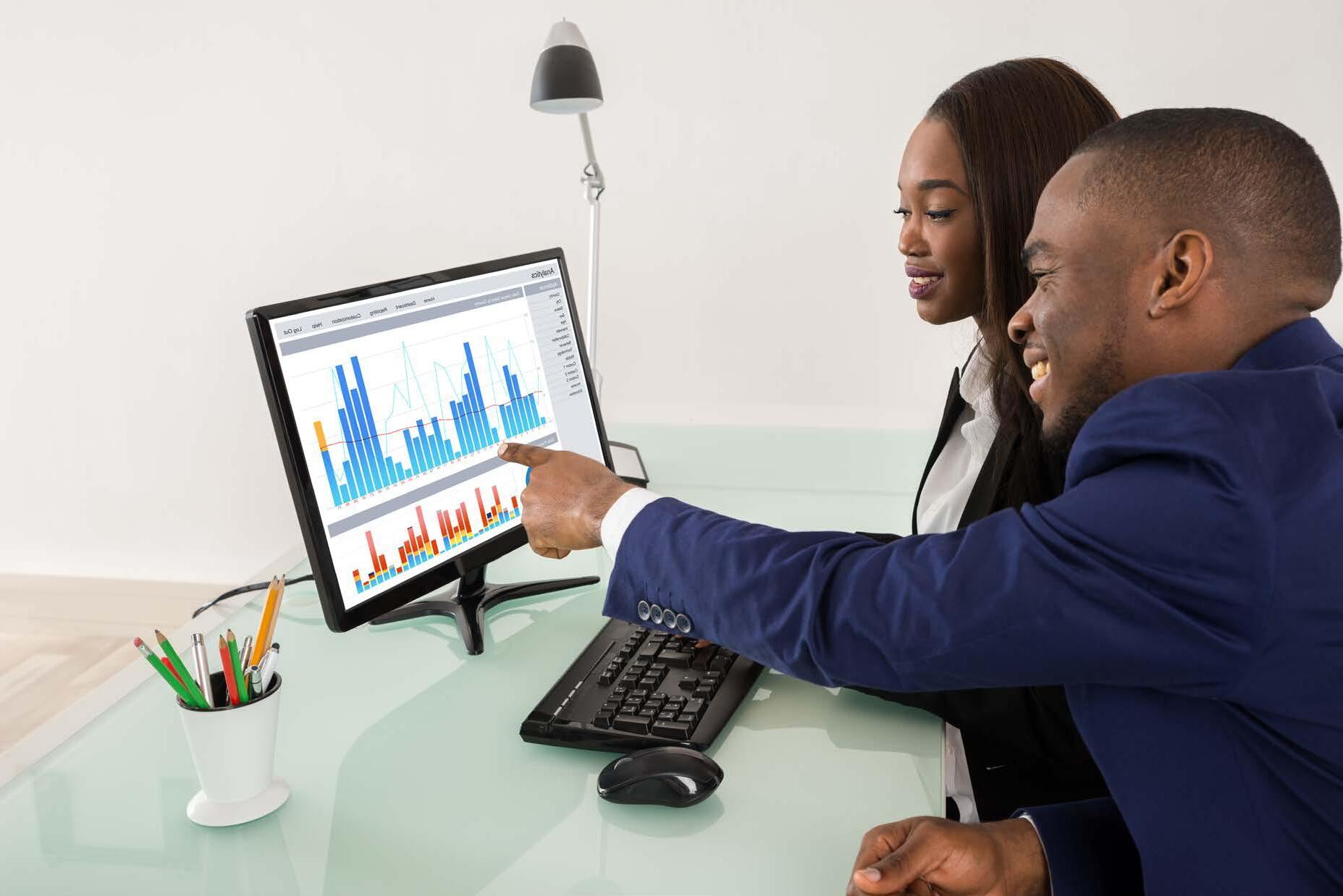
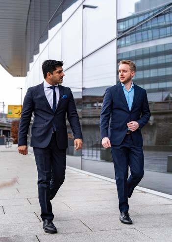
Photography
Photos based on colours and more


Photo source - Shutterstock
Image concept
The people
The Azets imagery shows people in real working life situations, focusing on their task and not the camera. The people are technological. By using contemporary tools despite an ‘analogue’ profession, they show the emphasis on being updated.
The moments
Azets wants to show the small but significant moments in everyday work-life. For both Azets employees and our clients. For example, the moment a genius idea occurs, when good news is shared, or good decisions are made. Portraits of focused and reflexive people, using insight and knowledge.
Natural colours
Photos used in Azets marketing should look natural and real, emphasising a documentary focus. Look for textures and colours with a subtle and natural look, not too bright and intense. The colour tone should be more blue than red. The lighting should be as natural as possible. The use of natural light is preferred, but lighting can be used if the room or location is too dark.
Focus
Azets images should not be too ‘busy’, -make sure there is one main focus and not too many distracting objects. Images with an unfocused foreground strengthen the impression of getting an authentic and real glimpse of people’s everyday working life.
Usage
All cover images should be accompanied with the graphical patterns and never to be used as standalone.
Our library of photos include all Racial and Ethnic Categories.
Exceptions
Presentations and documents
can have stand alone images, no patterns needed.


Portraits
Colour usage
Portraits should not be black/white, as this is inconsistent with our use of colour.
Consistency
The shot and angle used should be consistent.
Natural and bright colours
Natural, bright colours, preferably the same, but can differ when natural.
Smile
“Comfortably smiling” - people should not be too serious, but no forced smiles either.
Environment
People should be shown in their natural environment so the images look dynamic.
General look
The person should feel (and) look comfortable in the picture.

Dos and don’ts
Here are some examples of what you can do and can not do.
It is important to use common sense and an eye for visual experience. The image should always fit the context.

The people are focused on the task not the camera.
The people are focused on the camera, not the task .


The image has textures and colors with a subtle and natural look .

The image is too corporate and lacks subtle natural colors and textures.

The situation looks natural and relaxed. The colors are subtle and dimmed.

The situation looks arranged and unnatural. The colors are too intense.
If the context does not work with the image or you cannot find a suitable image it is possible to use a large illustration instead.
See ‘Illustrations’ in this guide.


Sunset or image towards the sun gets the wrong focus.
Everything is unfocused and distant . The color tone is more red than blue.
Natural light sunlight from the side. Foreground and background are unfocused, the person is in focus.
The color tone is more blue- grey than red.


Using Images
All cover images should be used only within a triangle, or a section of a triangle resulting a diagonal section of an image.
Images should be accompanied by the patterns and all elements should be arranged on the grid layout for a better composition.
Exceptions
Only use large images on content pages.
Illustrations
Icons used as illustrations
Do not use illustrations as icons. When using illustrations they should be large and the main focus on a page or a topic. Preferably only use one or two illustrations per page/topic.
For situations where there are multiple icons, or the icon has a function beside being decorative, you should use icons in one colour and in a smaller size.
Print and digital
Illustrations, photos and patterns can be used together in a layout.
Illustrations work in multiple situations and are good for: infographics, articles, blogs, flyers, posters, banners, roll-ups, Google slides, brochure, and other type of materials.
When creating infographics we make an exception. We can replace the standard character backgrounds with a decorated scene to make it even more alive.
Building your financial plan
Illustrations should not replace patterns and brand identity should be visible at all times.
Templates vs custom
Templates using adaptive patterns for multiple canvas sizes
Custom illustrations for a better story telling
Dos and don’ts
Using Illustrations
Illustrations are more complex, they have an extra element that sets them apart. Illustrations can replace images, used in infographics or for presentations. Never replace icons with illustrations or vice-versa.
Collateral materials
About
A collection of relevant and widely used templates to promote the Azets brand, ensuring a consistent expression in our official communications.
95
Marketing Literature means any sales and marketing literature and materials used, produced, published, displayed, issued, distributed, and/or made available electronically on any website by the Agent in relation to the Insurance.
The
Pathway
The Azets Pathway is our group five year strategy, our plan for becoming a stronger and better company by supporting our colleagues and clients and the communities in which we operate.
Our purpose is to improve the lives of our colleagues, our clients and our communities, in a sustainable way.


SME barometer reports
SME leaders and business owners across Europe demonstrate strength and resilience in the latest version of the Azets SME Barometer.


business
Meanwhile it is no surprise o see digi alisation p ominent on SMEs’ ada The pandemic has accelera ed digi alisation or many businesses, la ge and small, as emo e working and conducting business online became the norm. SMEs increasingly ecognise tha

Chris Horne Aze s G oup CEO
White papers
We have created templates for white papers that reflect the brand guidelines, featuring the correct logos, colors, patterns and fonts. White papers are used to attract digital attention and provide relevant insights.


Covers
Charts and tables


Text and images


Presentations
We have created a presentation template for all employees to use. The template ensures that we communicate Azets clearly and consistently, and in accordance with the brand guidelines. The template is available in Google Slides and Microsoft Powerpoint.
Covers


Text pages


Illustrations
Icons
Charts


Tables Photos Maps
Letterhead
Structure
Letterheads adhere to the same horizontal margins as our documents; 15mm.
Content should be positioned below the 99mm fold line.
The vertical 15mm left-hand margin is used to align our logo to our address and contact details. The footer sits below a horizontal 22mm margin.
Format
Content is aligned to a left-hand margin of 28mm to accommodate DL, C5 and C4 envelope windows.
Letters should incorporate the standard sign-off, page numbers these can be positioned horizontally across the page.
If required, page numbers should be placed bottom left of any continuing pages, in line with the 28mm margin and formatted accordingly;
Envelope
‘Azets’ logo is to be printed with the Pantone color as often as possible. This ensures that the colour pops well.
Paper
For this we use the standard envelope paper.
Business cards
‘Azets’ logo is to be printed with the Pantone colour as often as possible. This ensures that the colour pops well.
Size
85x55mm
www.azets.com
Paper
Scandia 2000 Natural 300 grams.
This is a natural paper with a nice feel to it. This type of paper is common and accessible.
James Andreassen
Managing Director
+40 12 34 56 78 james.andreassen@azets.com www.azets.com
P.O. 342 , Sentrum 0101 Oslo, Drammensveien 151 027 7, Oslo, Norway
Account covers
azets.co.uk
The accounts covers are to be utilised across the UK for packaging of completed client accounts and audit reports.
Internal document


Charts
Icons
Back cover
Mail signature
The Azets logo will be used in RGB color. This ensures that the color pops well. It is not allowed to add additional information in the signature. This should only contain vital information, arranged with clean spaces that let information to breathe. Cramped text will be perceived negatively as noise. Think simple! Logo size

The brand book
Azets brand identity standards 2024
Brand created by
Erik
Erdokozi - Lead Designer
Azets Group
Shaun Staff - Group Director of Communications shaun.staff@azets.co.uk erik.erdokozi@azets.com