
7 minute read
My Learnings


From the Main Graduation Project
This project was the first big project of my life that I did as a service. Being a design student, often there comes a gap between what we wish to create and what the clients want from us. This project was successfully able to bridge the gap. I am thoroughly happy with my first attempt at working on a real website. This project helped me learn the following things as a designer:
Advertisement
1. Being an artsy student, I learnt how to cater my skills to other people. This was an achievement as I did not know how to coordinate with non- designer human beings and still create decent designs.
2. This project taught me how to improve constantly and take harsh criticism as feedback. The feedbacks are usually not straight to the point and oblivious when coming from a clients perspective. I learnt how to comprehend a long story of a client and turn it into an acceptable design.
3. This project played a crucial role in fixing my design bugs and made me more functional as a designer. Mostly we as designers forget the function as we get carried away by aesthetics. This project helped me to use my creativity in a righteous proportion. 4. I learnt how to work with the business team, marketing team, developers, while I single handedly handled the project. As an output when I look back, Quantitatively I just created a brand guideline and two versions of a website for the product. But with a qualitative perspective I can easily feel how much I grew throughout the process. Hence process brings learning, not output.
5. To myself and other designers: we should always take feedback constructively and never forget to raise questions and prove our points as designers. It is important to place yourself in the clients shoes and see how he is looking at the service.
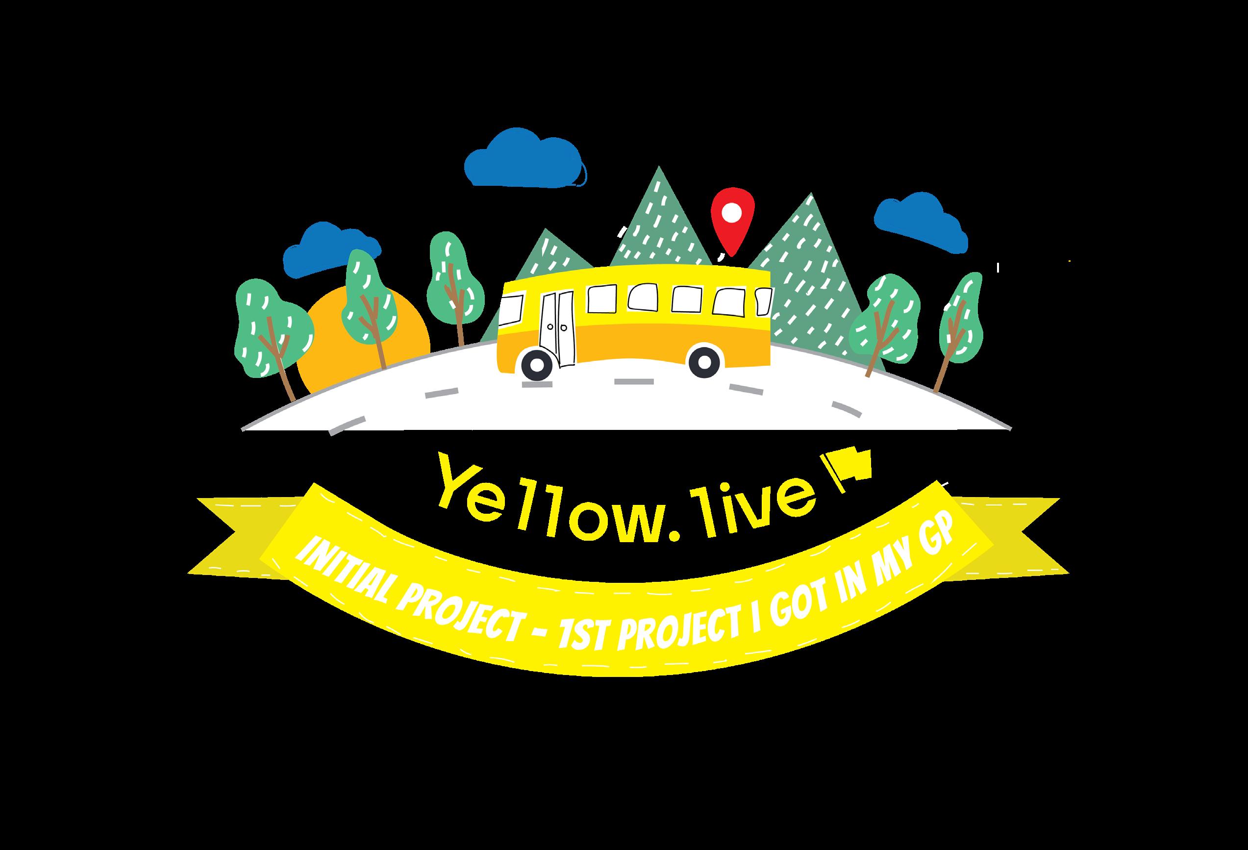
1. Introduction to Yellow.live
About
Yellow.live is a software-based solution for tracking students while they are on the bus. As unthinkable focuses on solving real-life problems and making an effort to study the user’s pain points to deliver what they need. Before creating the product it understood the need for both teacher and student.
Parents
Keep track of your school buses in real-time with a comprehensive transport management solution. With features like speed alerts, geo-fencing of vehicles, and security notifications, you can secure the safety of your students outside the school as well..
Schools
Keep your dear ones at arm’s length with real-time tracking of their school buses. Instant pickup and drop-off notifications with updated driver information will ensure your peace of mind when your kids are on the road.
Design Brief
Study the UX flow of Parent app
Design Process
The process of design for each and every brief has to be molded according to the needs of the approach. In this, I started with studying the user journey map and the prototype created by an employee. As a UI designer it is very crucial to study the user flow and understand how the product is going to behave when it reaches the final hands. So For the same I went through the whole UX process. It included Presentations on the product and competitors analysis for the same. To understand the product’s proposed personality, one has to go through the assumptions or hypothesis on the basis of which a UX designer creates a mental image of a product. I would use the most common example, think of Apple as a product in your hand. The whole user experience has personality to it. A strong trait that you find throughout any product or application designed by apple. So to match the mental image created by UX designers, it becomes important for a UI designer to Go through the same road. As a UI designer is later responsible to create the design language for the product. The visuals and screens that the user sees.
What is a User Flow?
As designing pages for websites and applications doesn’t always produce the best results. To accomplish the needs to the user, it is important to study how will user use the product. User flows focus on what the user needs to get done and how to deliver that in the most effective manner possible. This leads to better user experiences as it places the user at the heart of the design process.
I will add questions to make it more informative, where i want to explain some terms

Proposed Design Language
The design system I proposed was completely based on material design. Before jumping into my conclusion. I did a thorough research of different design guidelines. Namely, Material design, Apple design, Firefox design guidelines and inVision design system, I found out material design is the most ubiquitous and subjectively favourable design system for me. So for Yellow.live i choose to pick material design as the foundation of my design guidelines.
Color Palette
#290421 #e94c60 #7070e6 (In order)
Iconography

Typography

Header Body
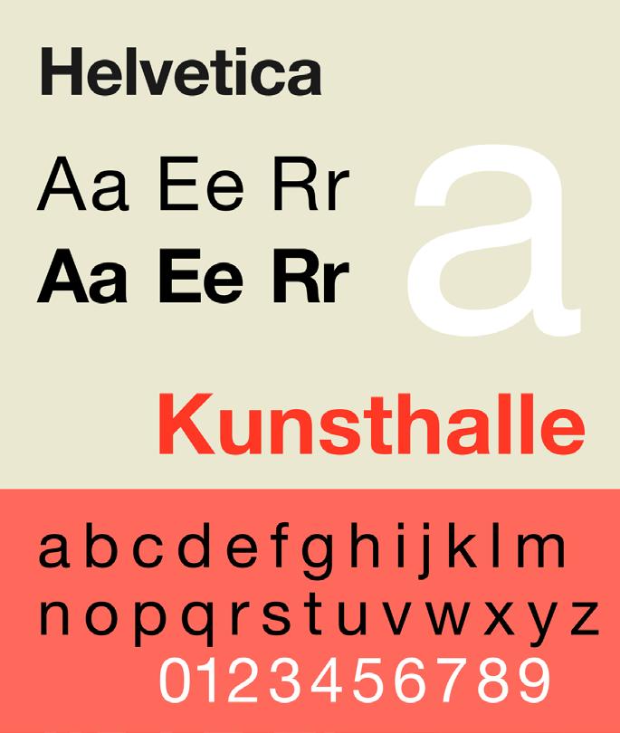
Why did i chose generic fonts?
As designers, we are the epitome of expression and experimentation. But when it comes to delivering something for masses. Ubiquity often is the right thing to do. Plus both the fonts are enormously clean and readable. I learnt these fonts create the minimum amount of visual noise when used in the write place. As designers we should love fonts, preach them because once one fine Faculty said “font badlo, duniya badlegi”
Header: Helvetica
Helvetica is a precise font. It has been used by many corporates in their visual identity. It is a font that stands high and has the quality of becoming a header. Moreover Helvetica is a font easily available. It comes with a font family, this makes it very versatile
Body: Open Sans
Open Sans is widely accepted as a body font. Personally I compared it to some fonts like lato, roboto, futura, monstraat etc but somehow it creates the minimum noise. Open Sans is comes with a large font family, versatility becomes important if we talk about body. It is a save choice since the target isn’t a niche.
Illustration Style
Illustration style is very crucial to create engaging User Interface. In Today’s design world, illustrations have taken a big seat. With the mega boom of illustrations in books, websites, mobile applications, It becomes important to have a consistent illustration style.
Illustrations are often used for various purposes. According to my understanding of current trends, illustrations have become a strong way of representing one’s aesthetics. These days illustrations have become a medium of catching user’s attention. We can also day illustrations are like physical window displays, their main purpose is to grab as much attention as they can. But apart from this aesthetic value in a design, illustrations are also a good medium of representation of an idea to the user. They are very useful to explain things step by step. Illustrations somehow adds life to a design can speaks a lot about the subject the user is dealing with. It gives an overall overview to the users, if analyzed deeply.
Today they have become a way to adorn but if you see it through the eyes of an illustrator, you will understand that there are people who come up with a complex illustration concept to summon a message in it. Sometimes they are simple, sometimes complex but they are always a strong medium of guiding the users.
Illustration Style

Alignment Importance of Alignment
Without alignment, design is chaos. With this ideology I believe it becomes really important to learn alignment. Now here i will be presenting low fidelity wireframes to explain my proposed alignment of the Application but Alignment is a much more serious issue. It is an opportunity to make designs more organised and well behaved
Majorly we have two types of alignment:
Edge alignment: As the name suggests, the edge alignment refers to the placement of content on either edge of the page or the canvas. Whether the elements are placed on the right, left, top, or the bottom of the page, everything is kept on the edge.
Centre alignment: This is the second type of alignment which places the content on the central imaginary line. Take an example of center aligned text. Each text might have a different width, but each is placed just at the center of the page. The same rule applies to the text and other elements in commercial graphic designers logo design as well.
I chose flush left alignment for the major part of the application. In this alignment type, all the elements are aligned by a imaginary line to the left of the selection or also the art-board.


