
8 minute read
Feature page


The content flow:
Advertisement
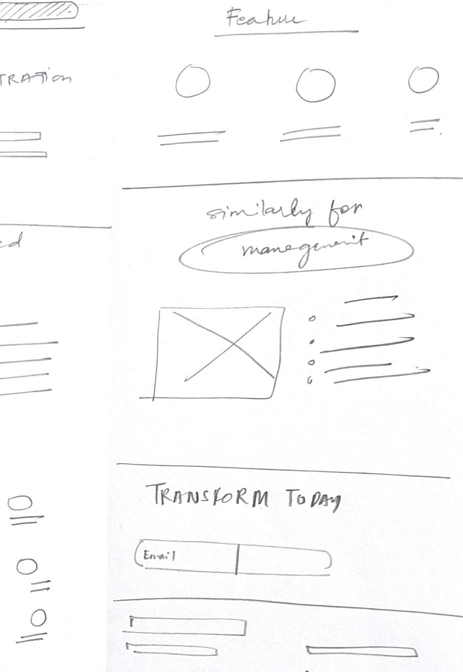
1. First section displays an image with three lines that are animated.
This is to pitch 3 hard hitting lines to the clients according to the senior marketer in my firm.
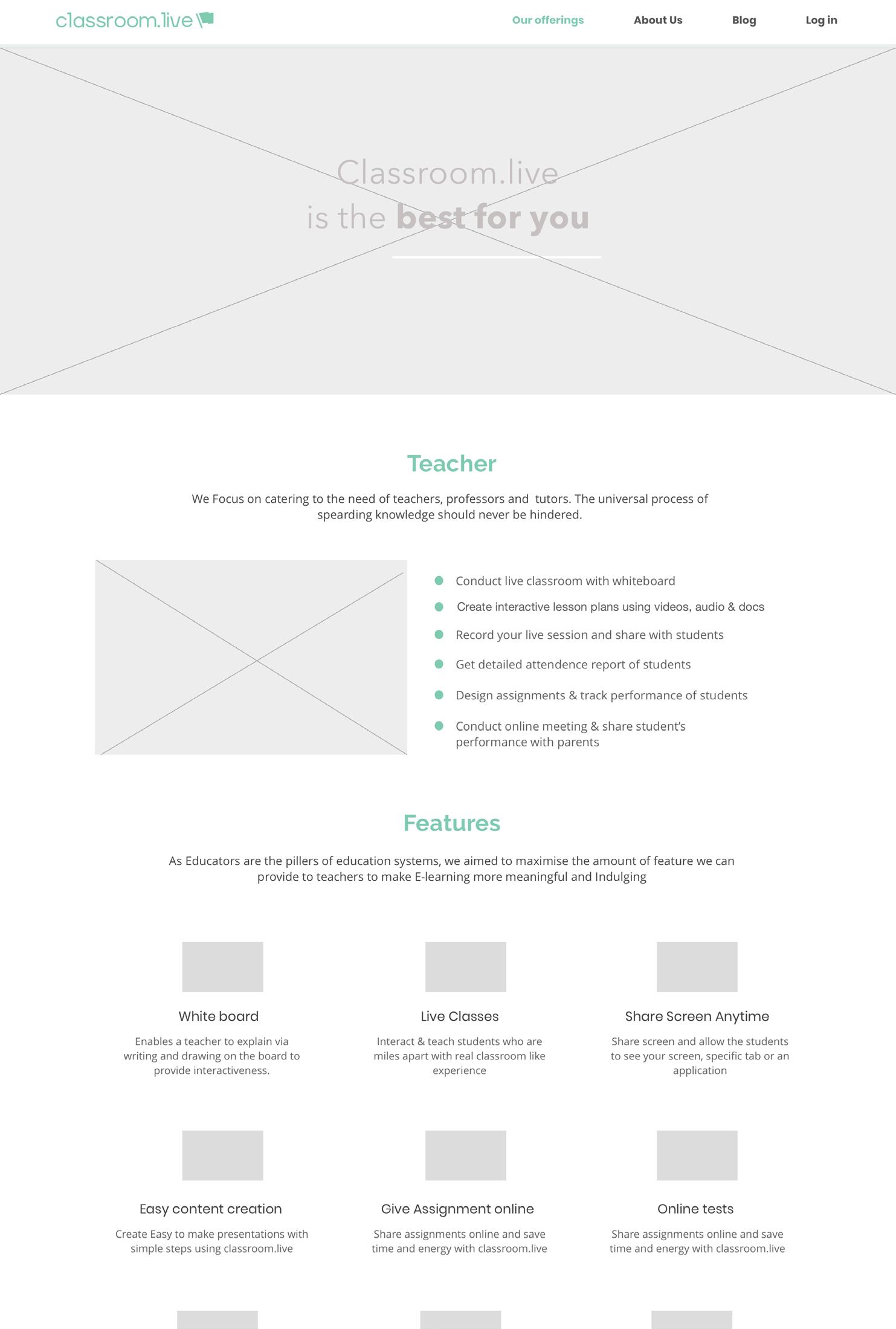
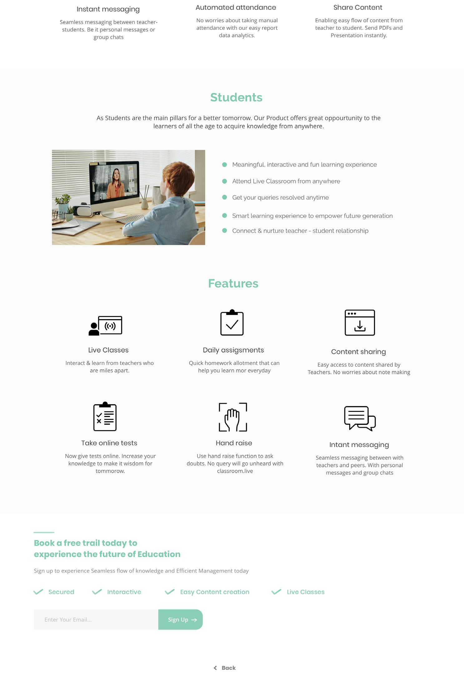
2. Since this was a feature page. Every section is simply about the user and the features we are providing the user. The second section is about the Teachers and how is classroom.live essential for a teacher.
3. Similarly after teaching we are positioning students as we are catering to the teacher- student relationship. here we display features like hand raie, direct messaging, assignments and assessment etc.
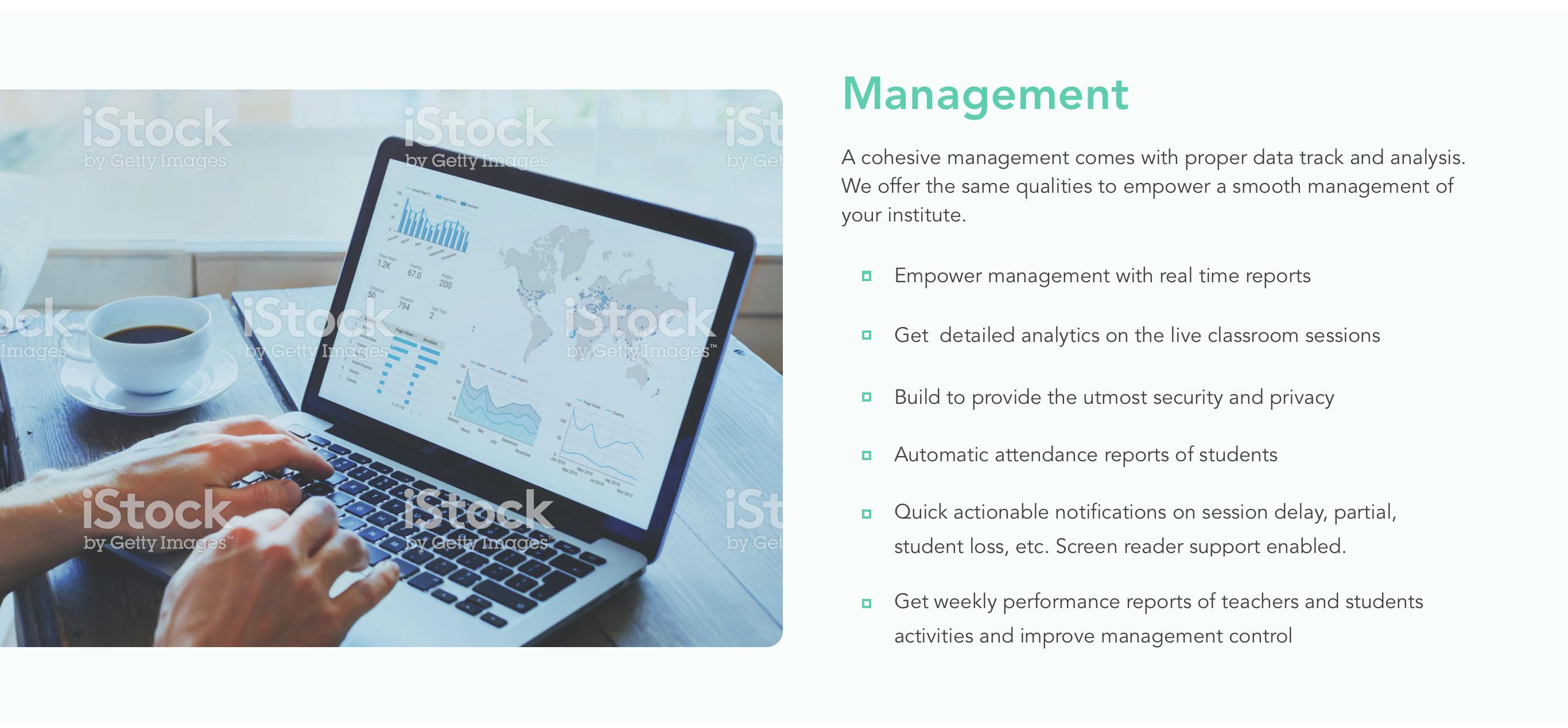
4. As the solution we are providing is a full management pack for a cloud based functioning of the school. The last we mention is management as to run a school on cloud. It is important that management gets full control over the functioning of the school remotely.
5. I have treated the CTA and the footer as one section and decided to place it on every page so that it is easily accessible at the end of every page.
Conclusion: This page is dedicated to the features that were previously decided to be the part of the home page.


Long story long
1. The idea was to keep every page consistent by adding a catch line on the top. In this wireframe I picked the line: “Classroom.live is the best for you”, here you were anybody who was looking at the site. Be it a teacher, a student or a principal or a manage.
2. Feature page had the simple flow of explaining the features of three targeting users. Previously we were starting with management but with time my head realised that the pivot for the website is supposed to be a teacher.
3. If you read the content for the flow, maximum time was consumed by the list of features we wanted to show the maximum amount of services that we are providing over our competitors
4. As my whole narration is kept very personal and informal, this is to keep the topic and the project light and more visual than text.
5. Coming back to the flow, in the flow for the teacher one can see how all the features are placed in a sequence of what features we want our users to get attracted by. After studying multiple competitors, one common error I found was the similarity between the features they explained. For example: it always started with Privacy and security and then content sharing. Nobody was too specific to show what all features are there in their product
6. This was seen as an opportunity to overload the feature page with custom made icons and show the full spectrum of features that classroom.live had to offer. Also to some extent it was important to brag about our features as this was a new product and it was really important to sell what was there in the product. An ambiguous website with a lot of empathy in it would not have worked since we were in our early steps.

LESSONS
1. In this draft I had already worked on the visuals(a little) and also on the icons. These were the first drafts of icons that I created for the website. This will be better explained in the visual treatment.
2. Till this time I learnt patience is important when working cohesively with your heads.
3. This was the final content flow but still you will notice tweaks in between as the UX of the website was constantly changed by the xyz team for whom the website was being made. Moral: Clients are just clients.
4. The designing part of the same will evolve by the end. These icons were boring but I created them considering the aesthetics of the corporation I was working in.


Long Story Short:
1. As the previous content flow was final, it still got changed after 2 weeks. Lesson: Learn to defend your designs.
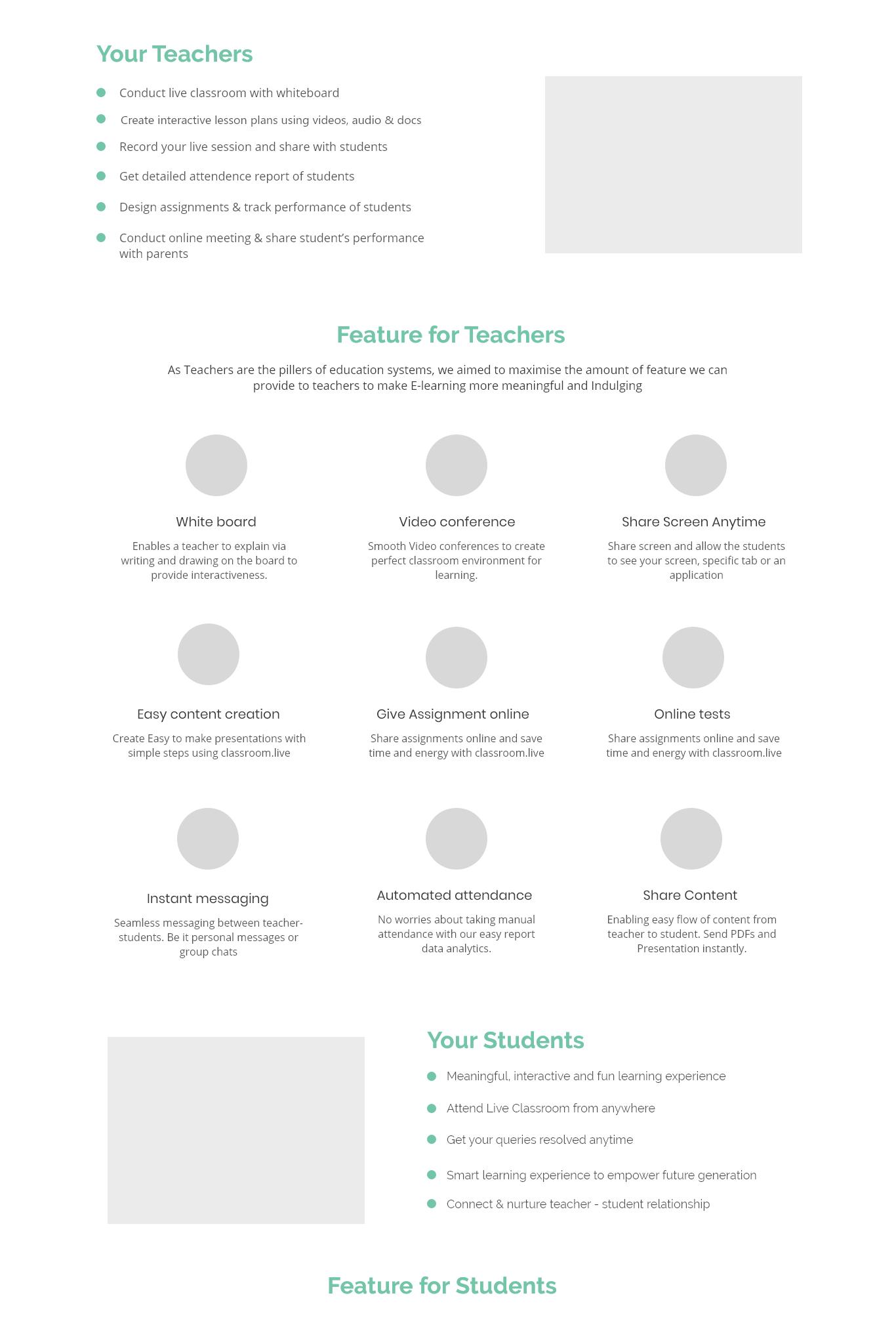
2. This was the final-final flow on which i will began my visual treatment. The features are rearranged and the content was rewritten on XL sheet (Somehow on shouldn’t use xl sheet for content but never tell your boss the same)
3. The footer design you see was fixed and the next step is just working on the imagery and the icons.
4. UX Tweak: the three tabs you see on the opposite page was added to keep the magnetic scroll effect.
5. We all know this effect where once you scroll down, as you change your section the tab automatically shows the section that you are in. Or one can simply click on the tab to avoid the time one consumes in scrolling and finding particular sections.
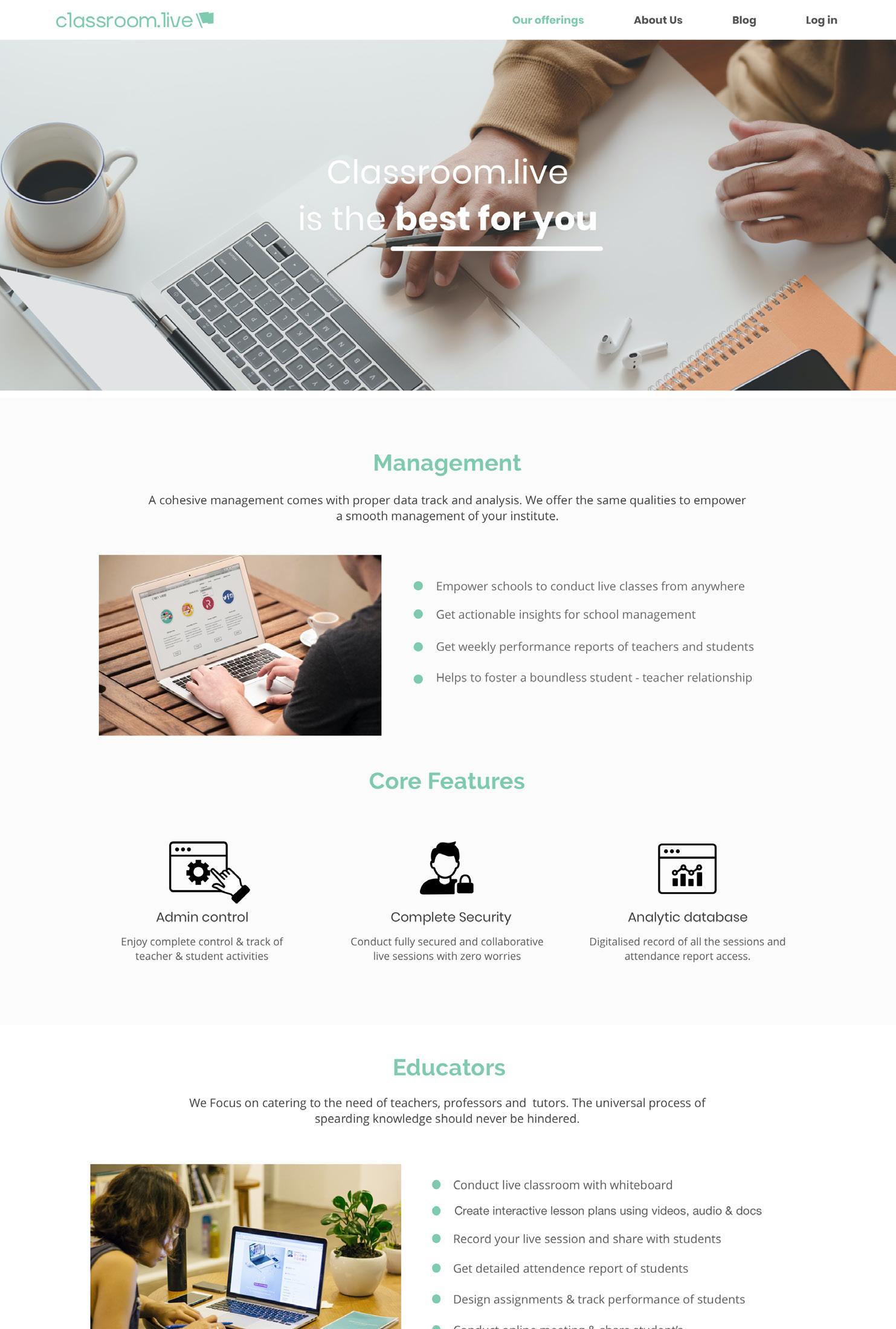
Visual treatment
The Visual treatment of the feature page consists of two sections: IMAGERY ICONOGRAPHY
First we will be dealing with the imagery section. In my previous project I have explained the type of imagery that should be used for classroom.live. According to the guideline I created the imagery has to be cool, clean and calm. Imagery

The website required apt images for four sections:
1. The first section that has the animated text 2. The Teacher 3. The Student 4. The Management
Source of the images
Shutter Stock Pexels
Type of the images
clean calm cool related to virtual learning

Source: Pexels

Tones of the image
Source: Istock

Tones of the image
Source: Pexels

Tones of the image
Source: Istock
Tones of the image
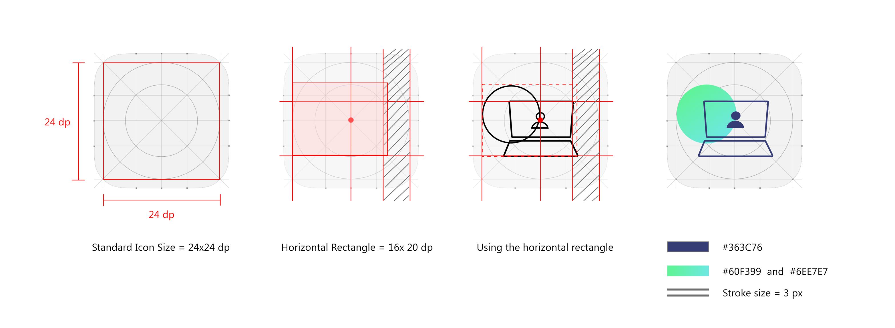
Iconography - Part 1
Icons are a way of visually representing a characteristic/ object in a small pace. We see icons everyday, in website, applications and real objects are bike, washing machine. Iconography is the second part for the visual treatment of feature page.
The Area for which we will be making icons are: Feature for teachers, students, management and also the three tab that is placed after the first section. These tabs are like secondary banner that will be acting as a medium to toggle between teacher, student, management. Below is the process with which i attained similar looking custom made icons for the website.
The process:
The icons were made in 4 steps. I followed material design icon guidelines to create the following icons. I followed different shapes for the icons in accordance to the need of the doodled drafts.


Live Class with Whiteboard Parent Connect


Give Assignment Online Instant Notification Share Content
Hand Raise Single Virtual Classroom
Real Time Reports
Automatic Lectures Easy Content Creation Automatic Recorded Lecture Instant Messaging

Online Test & Assessment Screen Share Anytime Detailed Analytics Security & Privacy

Iconography Part- 2
(Highlighted below) These were the three tabs for which I made detailed icons. These Icons were more like an illustration. As I wanted the icons to look more realistic and literal, I choose Gradients to be used for the same. The illustration for the same were created with one comman element that the user uses. These Items were simple. Such as: laptop, book, notebook, desk etc.
The idea for these illustration/icon came from a reference. In this illustration i used a book and a happy teacher over a generic icon. For this cute illustration I thought of my brother Naman and thought of his face when he was 5 years old. Object used: notebook & pen


As the most generic thought of a management guy, i made this tab with a laptop. Short story: this icon somehow looks like an employee at unthinkable solutions.
This was made because suddenly my head wanted to include parents in the feature section. Later it was removed because it was unwanted in the middle of the final output


