7 minute read
Home page


The flow explained:
Advertisement
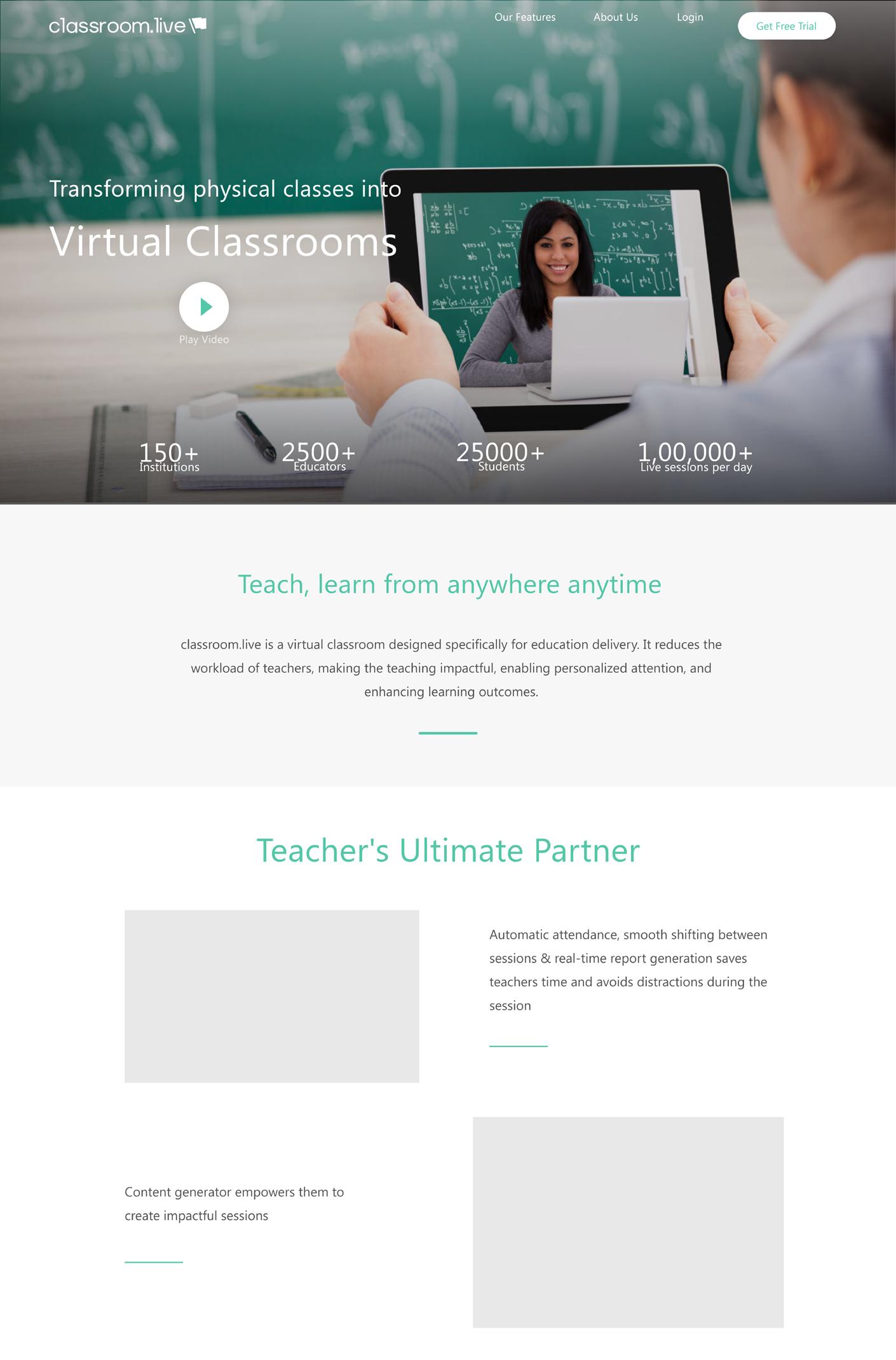
1. As it says “transforming physical classes into virtual classrooms”
It is to present the new normal world where digital presence is not just fancy but a need.
2. As the motto of the website is to act as a sales funnel, we go from addressing the current scenario (indirectly) to presenting a solution where remote learning and teaching comes into action.
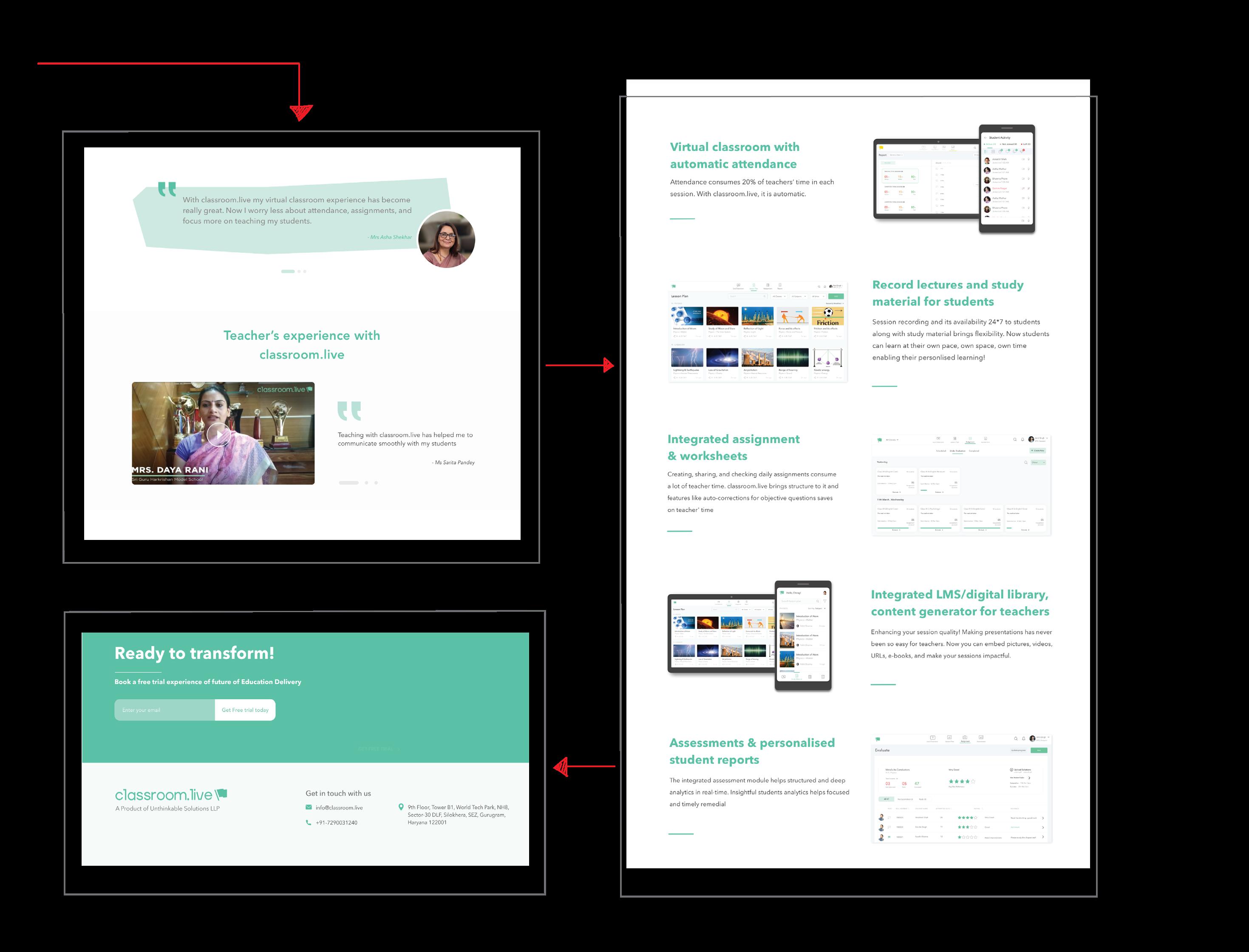
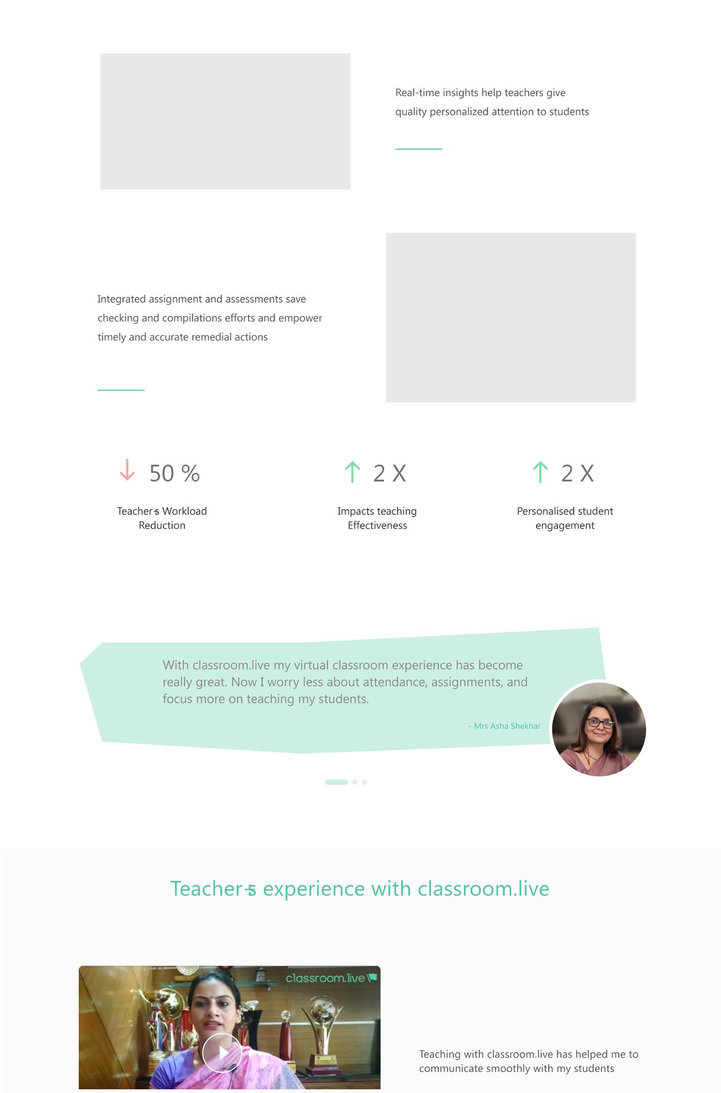
3. This portion is to represent the product as the teacher’s ally. In these troubled times where teachers are overburdened due to a sudden collapse of a physical system and lack of a digital system to work with. Classroom.live promises some key features that are exclusively built to make teaching hassle- free
4. Nothing is better than the words of a real user of the product. As we are targeting teacher’s pain points. Their views as testimonial adds weight to the home page. Including a video of the teacher makes it more reliable to the users and potential users.
5. Now we come to the values of the product. The ease elements that we are providing to the users. These values are explained elaborately. As the features are shifted to another tab, there is no need to explain or add the features provided to the user
6. After explaining the values and core characteristics of the product we bring in book a demo, call to action and footer design.


The flow explained:
1. I started here with the Tagline “Empowering Future” because what exactly the product is doing is to empower the next generation and bring smooth functioning of education systems even in such times because we know in future we will have to face more viruses and unknown diseases rather than a nation wide war.
2. The content of this flow is different from the content flow you see on page no ___ because the content mentioned there is the final one, whereas these were the initial drafts I worked on. The second section states “ you can fight the challenges too” considering the tough situation where we were. (I know it sounds Too NGO but a draft is a draft, a progress is a progress). But this section was to tell the potential clients that ‘N’ no. of students are going online, the paradigm is shifting and we are here to help you.
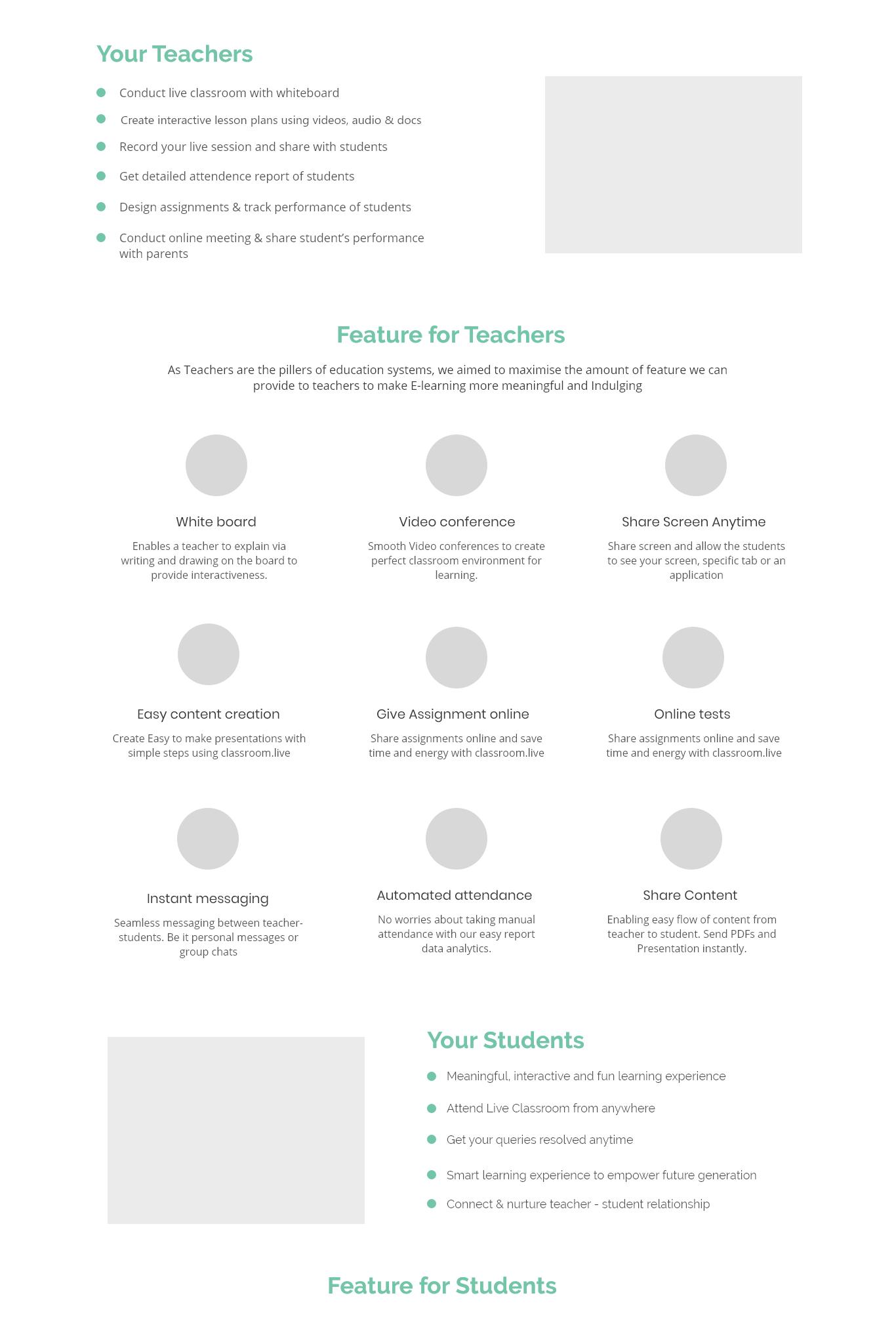
3. This was the feature section that was divided into 3 parts and yes i was asked to keep the management the top priority because initially they business leaders thought of targeting management, rather than teachers. I know how it sounds :)
4. Fourth section showed empathy as the words are motivating and empathetic because everybody needs a soft corner and a feeling that the other human/ organization gets its needs and is ready to support them and uplift them for income.
5. Here I kept the names of the schools that were already clients of the product. Hence the clientales portion. One thing i have learnt is that if your client base is not GREAT, you always add videos and testimonials of small businesses you catered. It adds quality if the quality of your video testimonials are good
6. Then the Call to action section. This CTA is on the top section as well. But it is always favourable to keep it on both the ends for slightly super imposing a call to action. And then a simple footer

Long Story Short:
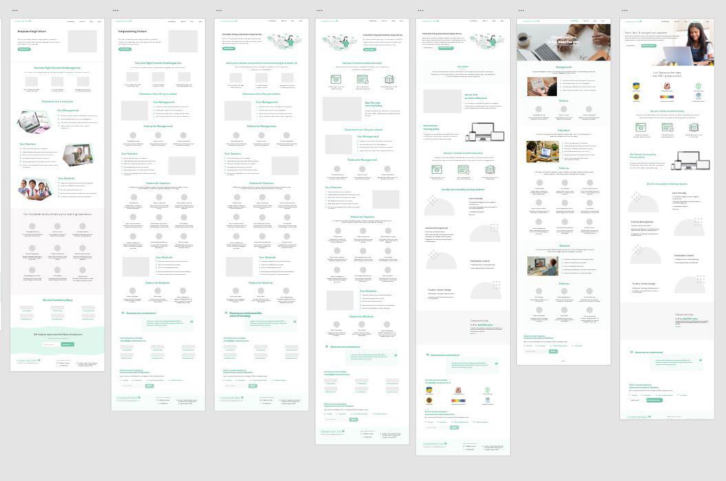
1. On the left hand side on can see the number of drafts I worked on.
This was only home page and these are half the no. of artboards
I made. This is the kind reflection of corporate pace. My first draft was a 2 days job. My second draft was my 2 months fruit. I had to make 20 iterations for the home page.
2. The wireframe one sees on this screen is the first wireframe they agreed upon. This wireframe gave some direction to the work but you will see how much a design evolves in two months.
3. The flow worked in loops.
4. But as you can see on the left side with each iteration my designs were getting better or at least they did not degrade because we students are used to quick work. We do something because we feel like doing it. But in work places it does not work like that.
This is the story of every client you and I will work with. Since they don’t know how to draw or achieve the type of service they want to extract from you, the process becomes very lagged and multi-directional as in most cases the clients do not know what they want.
5. I am saying all this because each and every design student has to face them one day. And it is a good thing. Why? because in the process of being extremely worked up you also learn how to defend your designs. We know the stuff we do but where we fail is a confident communication of the idea and literally selling our design
6. And with time one learns how to defend the designs. This was an extreme condition where I worked on a project for a very long time but with progress you will be able to see consistent improvement.


Visual treatment
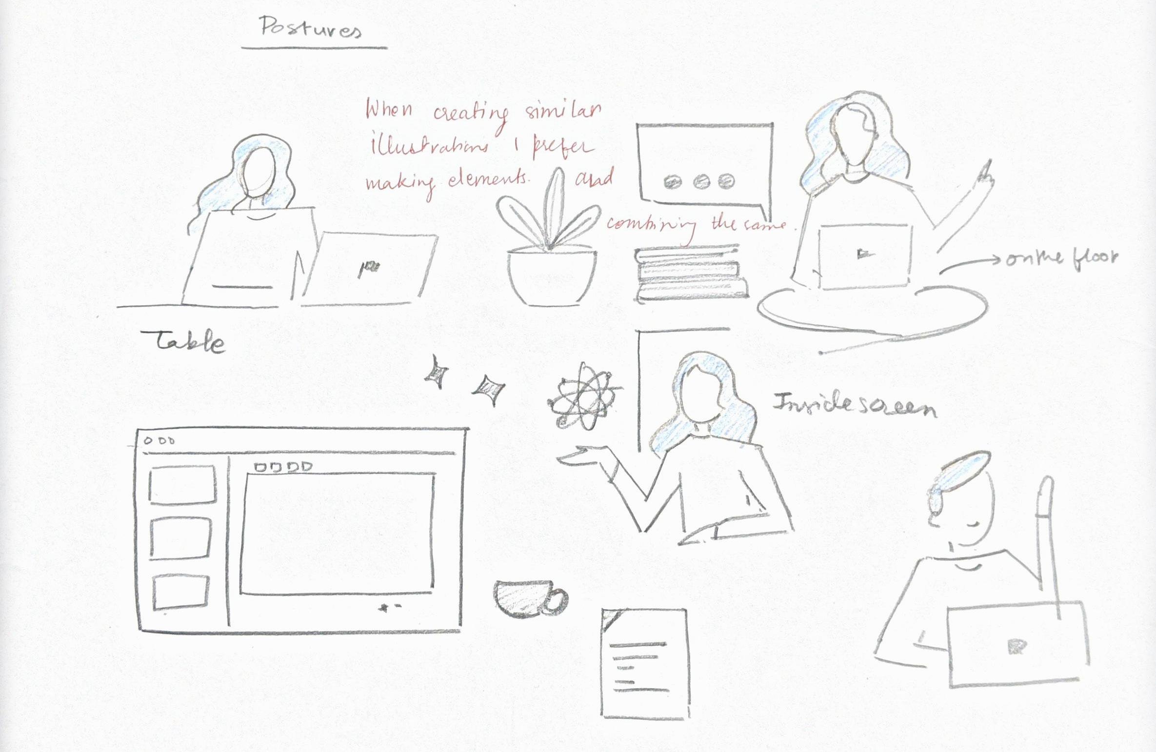
The previous spread displays the final flow on which I worked for the home page. Similar steps will be taken for other tabs. The visual treatment of this spread majorly consist of illustration making.
Apart from that this screen had mobile and tablet mock ups to show the actual product. In this ----> illustration you can see the 4 sections for which i will be creating illustrations. I brain stormed the key words to create visuals for the same. As illustrations are a form of visual representation. They do not need to be literal when appended with context. My illustration would be looking very formal because I had to keep in mind the user/ potential client for the software. So being abstract was a complete No.

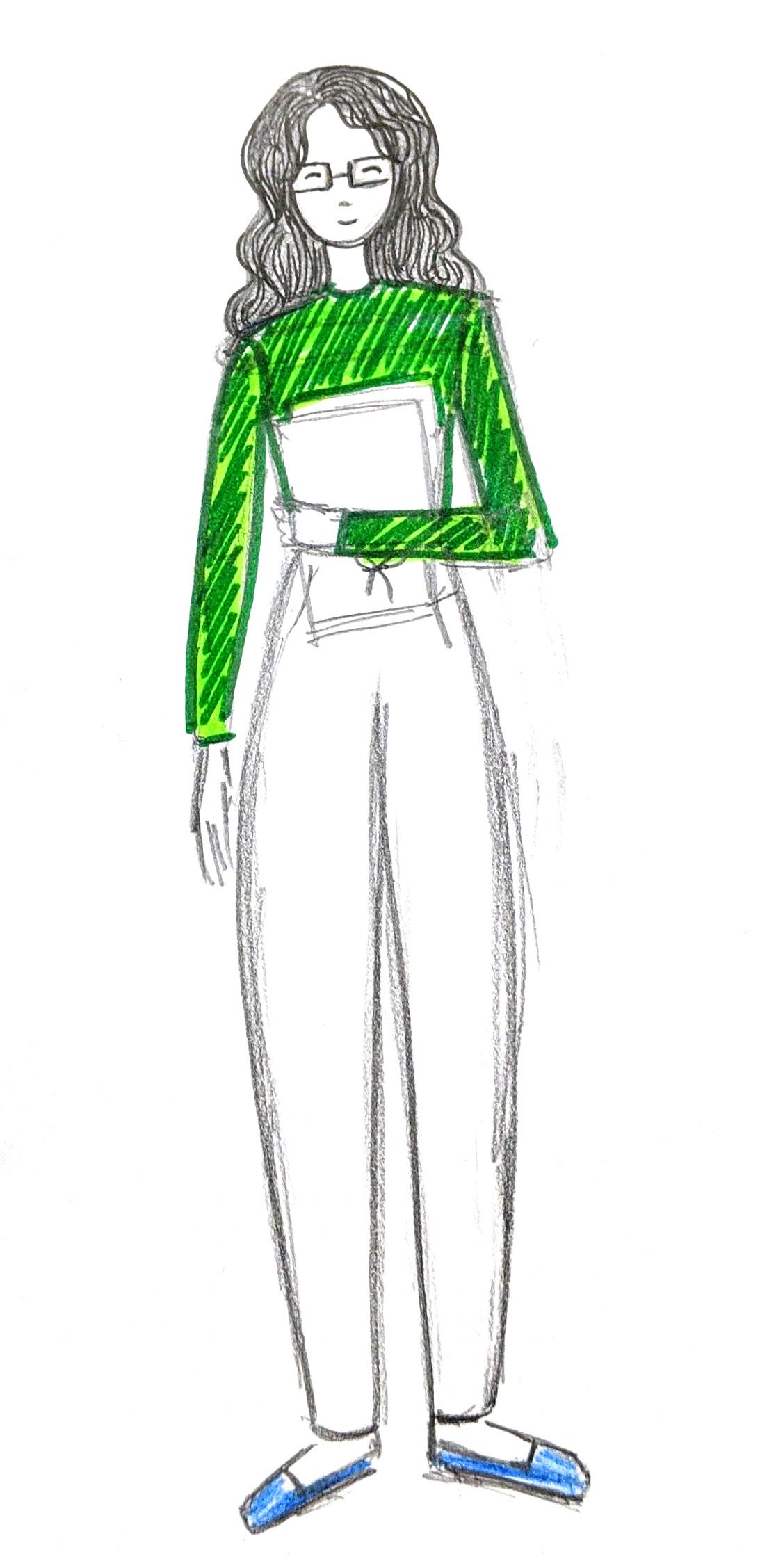
The concept for the illustration was to depict a teacher working on the following task for which ultimate partner is classroom.live. The teacher was conceptualized in the primary color. This is all theoretical before I put it on sheet. My aim was to make the work a teacher does look very light and fun.
Concept
Keywords for illustrations:
Illustration 1 - Automatic attendance, report making.
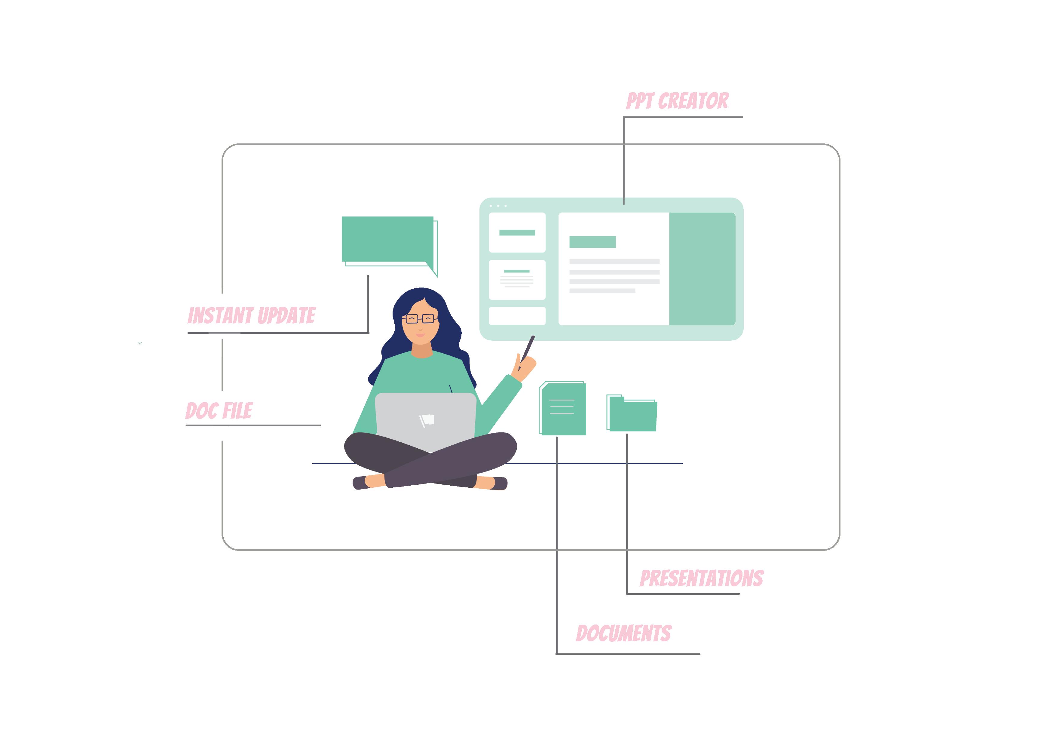
Illustration 2 - Content Creation, presentations, slides
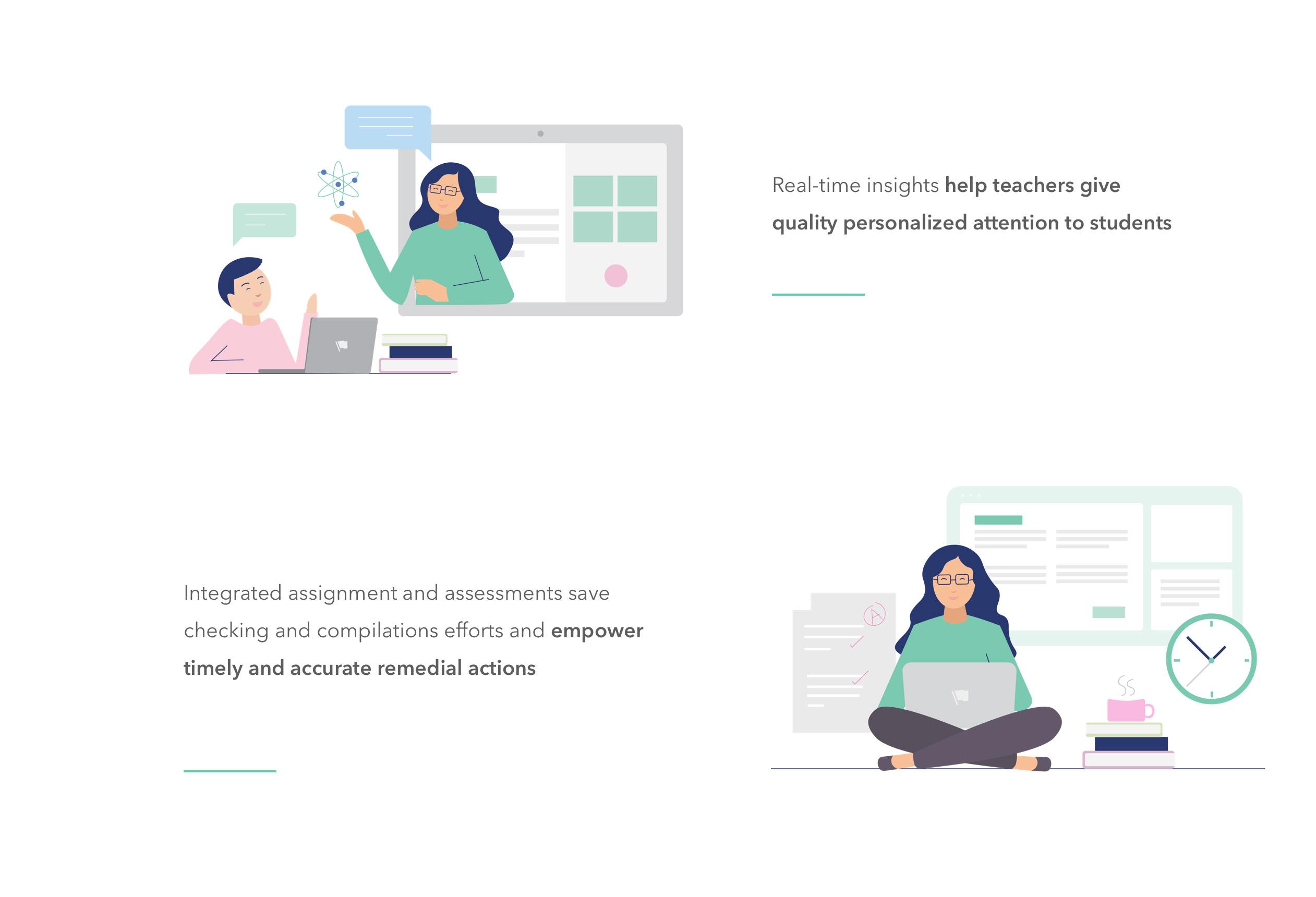
Illustration 3 - Personal attention, close contacts with each student
Illustration 4 - Online Tests, Online Assignments, Time saving
Rough sketches