15 minute read
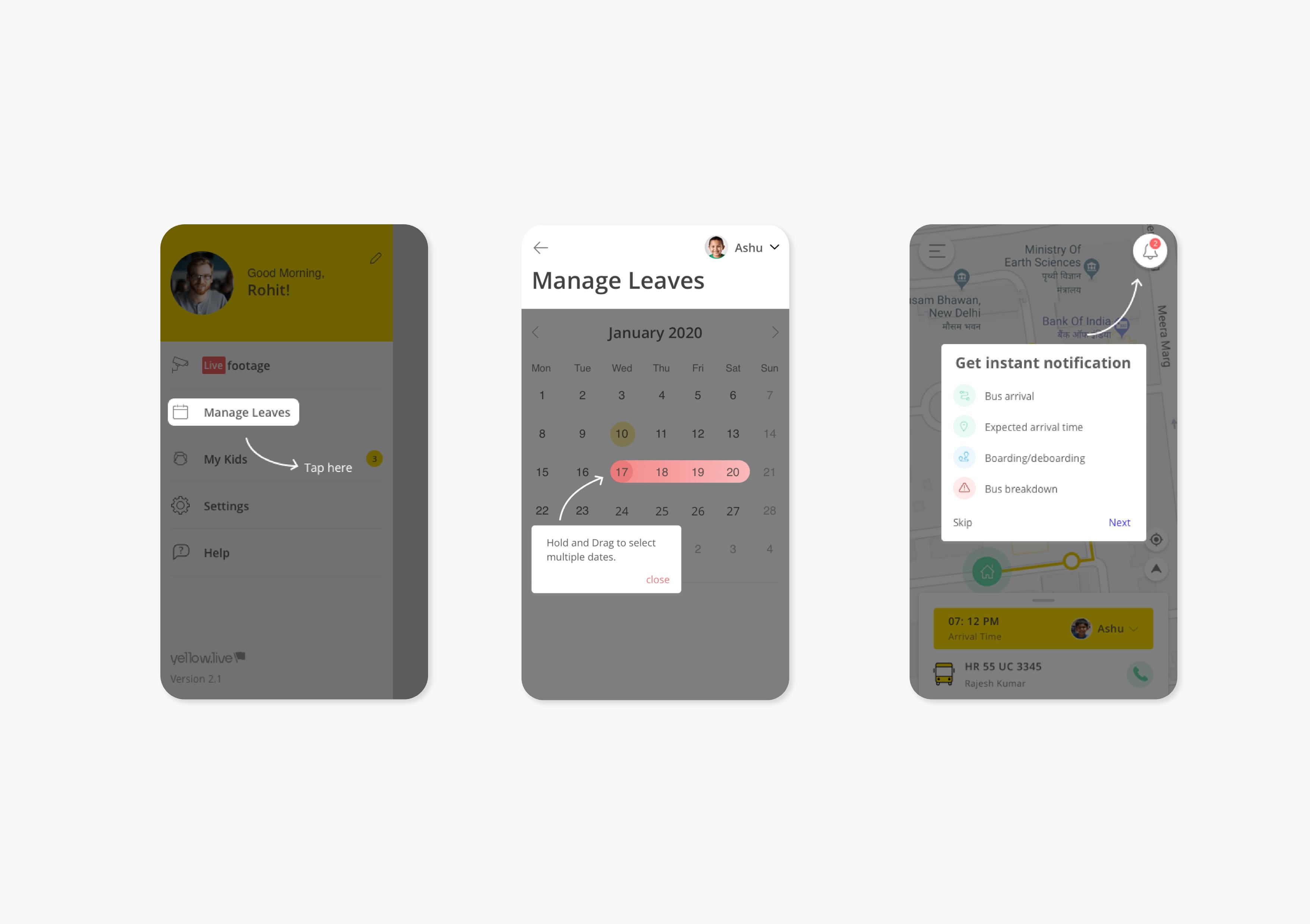
Coach marks for Yellow.live


3. Coach marks designs
What are Coach Marks ?
Advertisement
Coach Marks are those instruction lines we get when we first onboard an application or software.They call for attention to new or unique features, nudge users in the right direction, or guide users during onboarding. It is important to use coach marks when we consider are user base to be less tech savvy.
Usage
Coach marks can either appear automatically, for example, when users visit a page for the first time or when a new feature is added, or in response to an action, like activating an info icon.
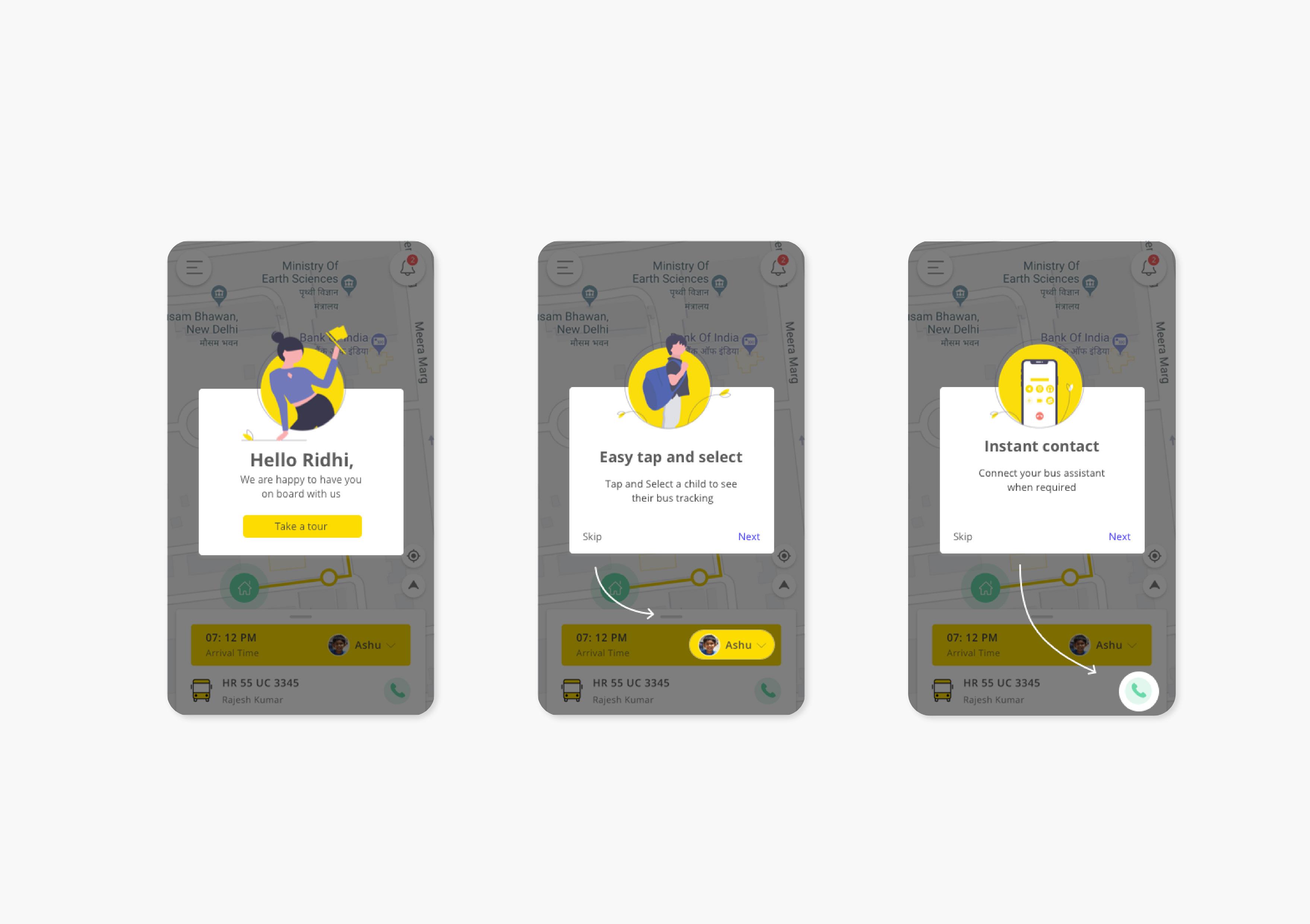
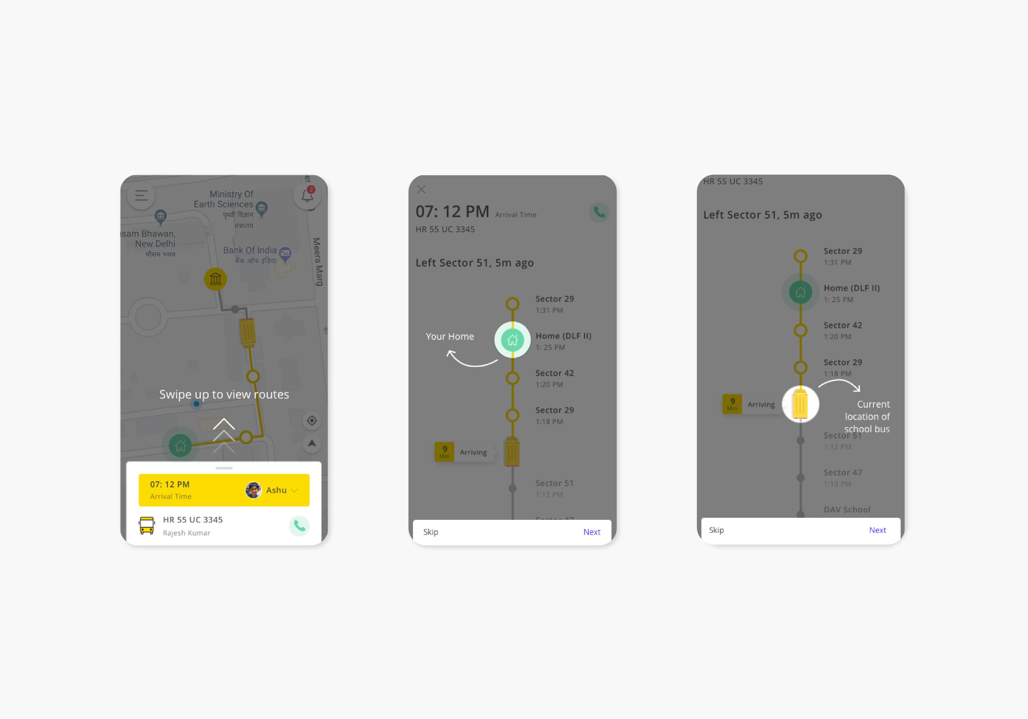
A coach mark points to the targeted UI element on the page. It displays a title, description and either a dismissal link or ‘X’ icon. Once the coach mark is dismissed, it will not appear again.
Types
Informational: This calls attention to a section on the page. (If there is too much informational text to add below a field, it is better to use a coach mark.)
Instructional: It provides short, task-oriented tips. That helps the user to make better choice. Like in Adobe softwares while using a specific tool.
Design Brief
Design Coach marks for yellow.live parent app
Design Process
To create coach marks for the app, I had to consider the UX flow for the parent app and identify what actions will need a couch mark. When one defines one’s user for a product, it becomes really important to understand a user’s point of view.
Since this app was for Parents. I kept the scope of my users low in terms of using the product. Even if today people have become comfortable in using smartphones, it is very important to consider even the 10% of the users who might feel difficulty in using the app for the first time. It becomes the responsibility of a UX designer to guide the user before enabling them to use the app. It has been seen that users no more need coach marks and superimposing a layer of direction might create hindrance to the user’s experience. But again i had to consider the worst case scenario and be handy for those users too
Steps Taken
Identifying Scope Content creation Fetching References Final Designs
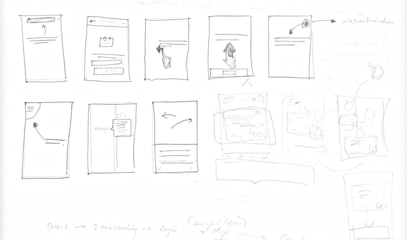
Identifying Scope/ Wireframes
Rough Sketches
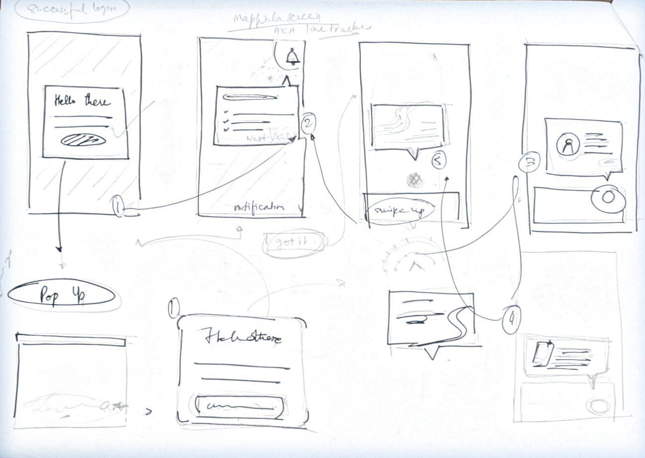
Final coach marks created
Note* all the illustration were taken from unDraw illustration. It is an open source site for referencing and inspiration

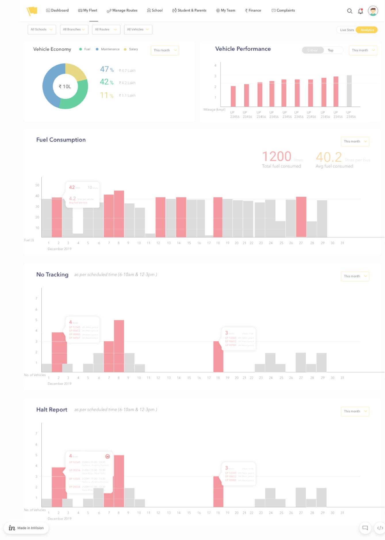
1. Transporter website_dashboard
About
Transporter Website is a SAAS product ( Software as a solution) that comes under Yellow.live. It is one of the websites created for the Transporter Incharge and owner. Since Yellow.live offers a product to the school, it is bound to create different portals for different holders under yellow.live. For example, principle, administration, transporter Incharge, bus assistant and drivers and Parents. As mentioned, this is a portal created for head transporters who are in incharge for overviewing and monitoring the fleet on roads. This website enables a digitalisation and automation of the data feeded by the business. This makes the whole process of monitoring the fleet cloud based
Design Brief
Design Dashboard for Transporter website
What is a dashboard?
Before starting designing a dashboard, it was important to understand theoretically what exactly is the purpose of a dashboard. A dashboard is a type of graphical user interface which often provides at-a-glance views of key performance indicators (KPIs)
Importance:
• Visual presentation of performance measures • Ability to identify and correct negative trends • Ability to generate detailed reports relevant to a particular objective or business process. In other usage, “dashboard” is another name for “progress report” or “report.”
• Align strategies and organizational goals • Saves time compared to running multiple reports • Gain total visibility of all systems instantly
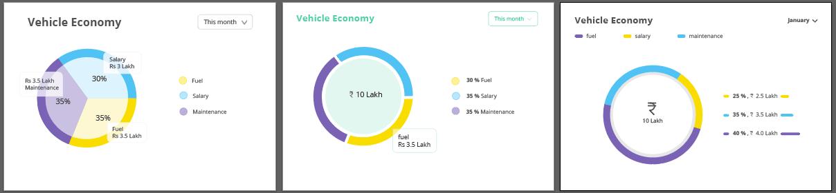
The wireframe provided.
Reference for color palette. (Mobile version)
Design Process
I was given a high fidelity wireframe as the foundation of my user interface. After learning the purpose of a dashboard, I did some reference research. I looked at the various types and forms of dashboards used. Behancing the dashboard design was a helpful activity to understand how exactly am i supposed to present the data in a wholesome way. Finding references is an alternate work. The main job was to create the color palette and explore design that would be more user oriented rather aesthetic. The first step
Identifying components
was identifying the scope of elements in the dashboard. This is similar to the process of deconstructing a house before one makes new changes to the form.
These the following steps taken in this design process: 1. Color Palette 2. Pie Donut Design 3. Graph Design 4. Designing the Screen
Pie Chart Bar Graphs
Step 1 - Color Palette
I am putting emphasis on it because i had to go through a very extensive process to create the desired dashboard.
Initial step to create a color palette
Before starting i studied the colors use in the whole portal to understand what all colors are being used since there was no design guideline for this website. I collected all the colors i could find in the icons, buttons, tables etc. Below is a screenshot of the same rough collection of colors and various combination created according to visual subjectivity. When it comes to visual design, there are theories but everything narrows down to the judgment your eyes makes. The world has “n” number of aesthetics, “n” number of ways to articulate information. And there are no hard hitting rules for them.
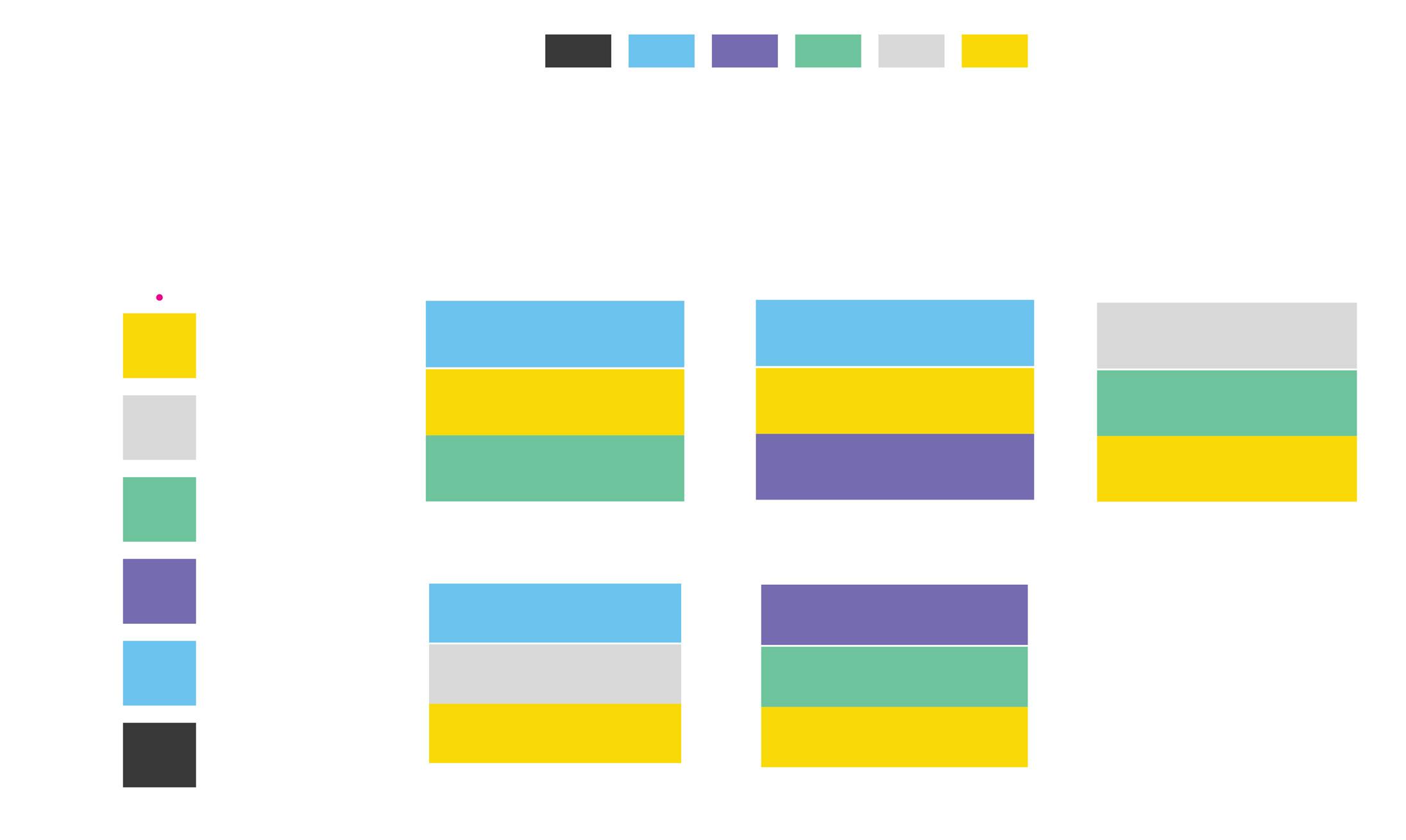

To Truly justify my eyes and understand colors better. i made various combination with perceiving one of the color primary and unchanged. I did this process for all the 4 colors of the color palette excluding grey since according to the identity of the whole website grey was just a complimentary friend throughout the UI.”
Now we will go on a visual ride

visual ride
Final color palette
Primary Color Palette Secondary Color Palette
Hexcode: #6BD7A8
Hexcode: #FCD800
70% 40%
87% 60% 20% Hexcode: #9E97C7
Hexcode: #E55252
70% 40% 10%
87% 60% 10%
Hexcode: #6BC2ED
87% 60% 20%
A thought:
A designer often goes through a long inaudible monologue while working on a design. Things look simple and easily achievable before once steps his foot into the path of designing a thing pedantically. There is a constant flux that remains when one is looking at the colors, alignments, typefaces as everything we do is far away relative of art. We have been making design a science of doing things for the purpose of leading somewhere, hence achieving a goal. But in the process of making design a particular way of doing things, we leave intuition behind. And leaving intuition behind is a scary thing for designing and also for life. All i mean, is that gut feeling, that unexplainable certainty of performing something in a particular manner is must to off beat your designs and grow internally as a designer.
Step - 2 Donut Design
I am putting emphasis on it because i had to go through a very extensive process to create the desired dashboard.
Given Wireframe

Designing a Donut
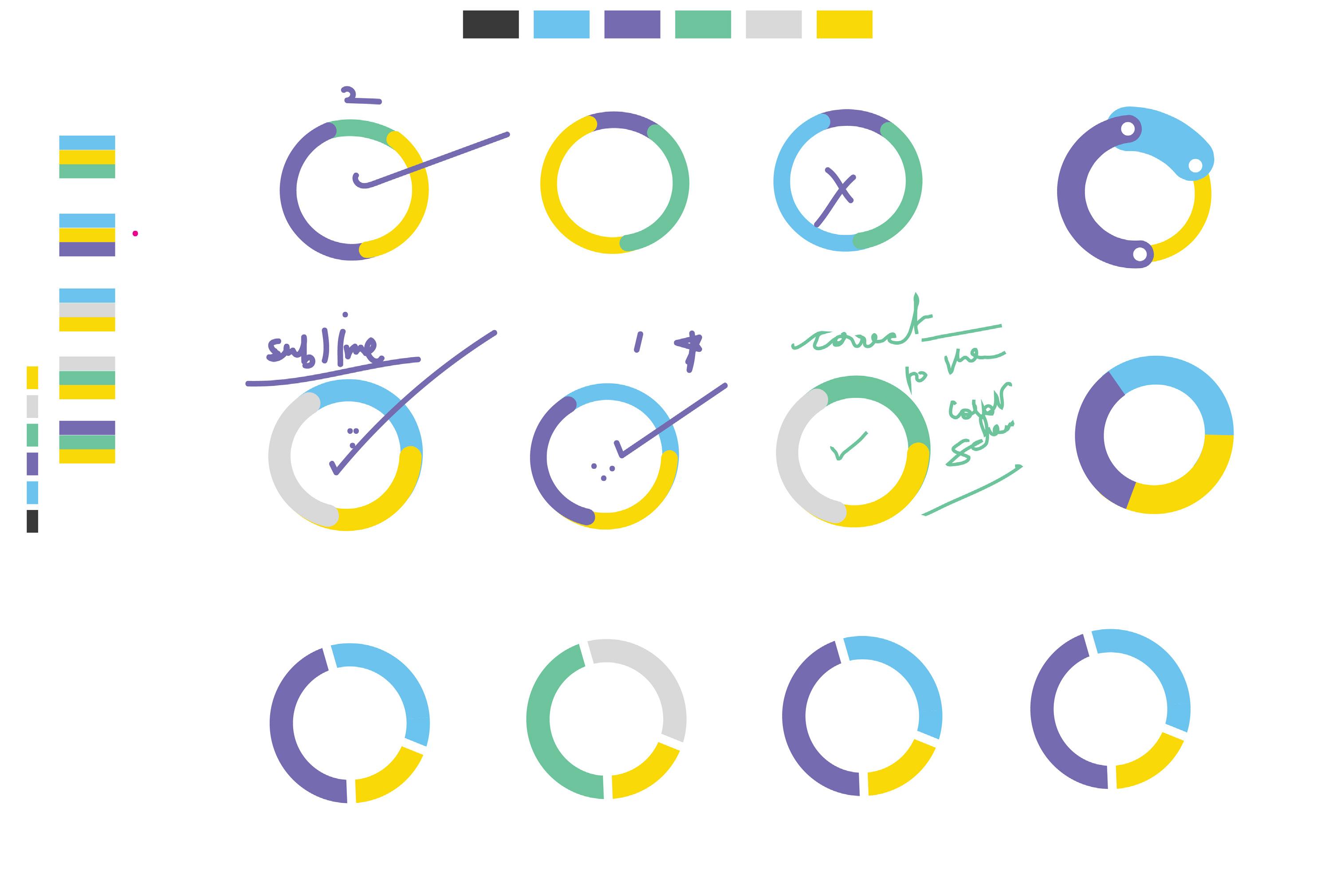
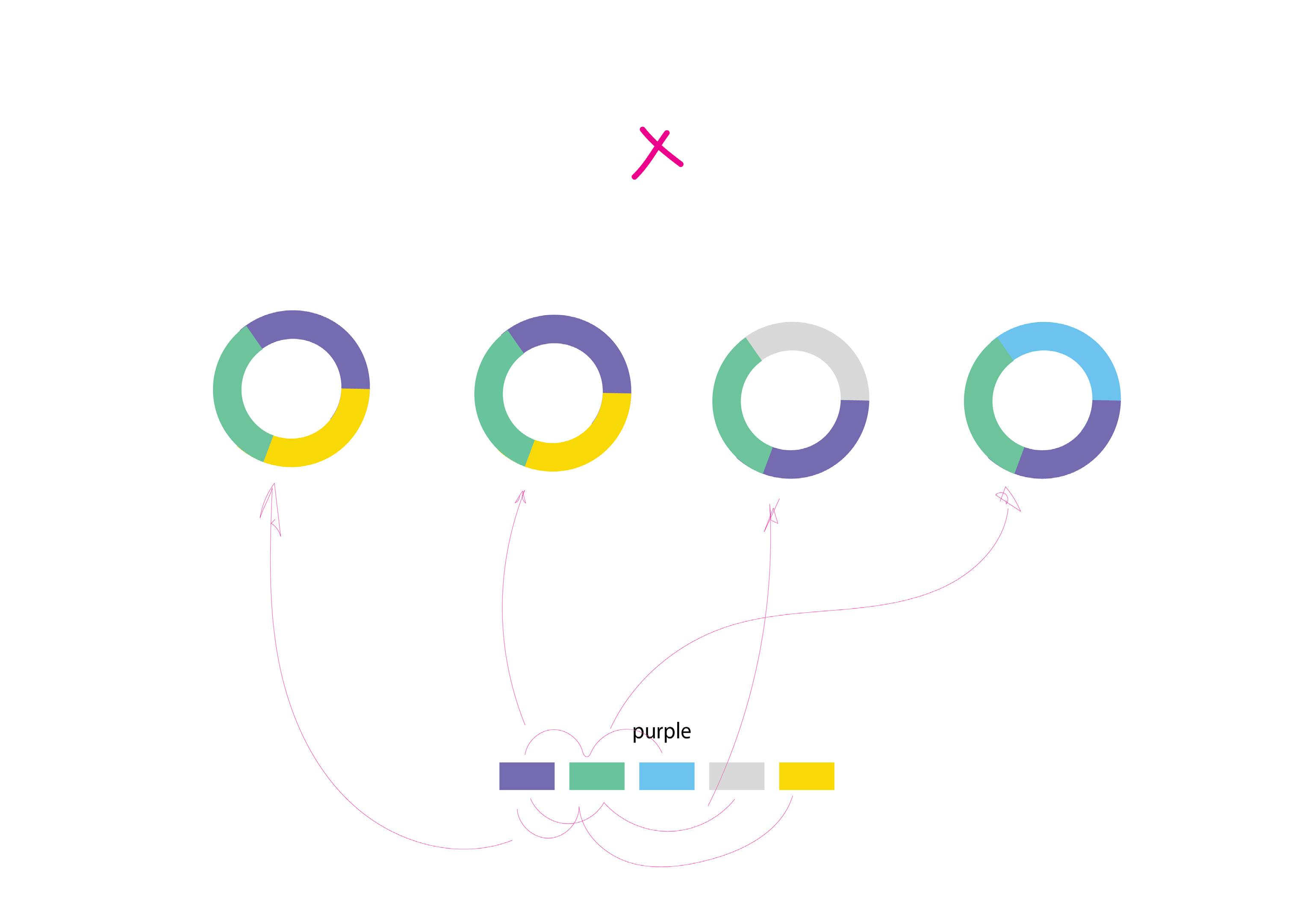
As one can see in my first attempts I was trying to find possible static ways to present the data with the best visibility. When we use pie graphs, fundamentally it is to divide and describe the division in the minimum time. The whole idea of presenting a pie graph is to make it easier for the transporter incharge to locate his various expenses. The challenge I faced initially was the level of insight that was expected from these graphs. As you can see below i struggled in deducting what to keep and which colors to use as I was doing it for the first time. As a design student, I must say design looks pleasing or easy to do until and unless one. When you go down to understand the symbolization of color, the importance of uniformity you realize it isn’t about the idea but the execution.
First Rough Attempts
Don’ts
• Never over do a design, simplicity is good • Do not use CTA color everywhere, it is called Call to action for some purpose. • Do not add the elements to increase the aesthetic value when you are designing a dashboard.
Draft 1
In these drafts i will explain my mistakes as i wish to do so. This draft looked more similar to the UX wireframe provided. Because i did wanted the UI to look similar to the wireframe.
The mistake i made was writing numbers on donut. • One reason is its lack of aesthetic appeal. Also it is not functional because when you design something, you consider the plausibility in terms of the developer’s team who is going to put life into your designs. • The visual weight is not divided equally and the upper section has all the element. • The shape of the card lacks negative space. This ruins the overall cohesiveness of the card.
Draft 2

Here i made the design evidently more cleaner. Locating the total amount in the center to show the total expense for the month.
• This card was more visual balance than my first draft and other petty efforts i made. • The font used was open sans, as mentioned the design guideline in project 1. • I chose to denote all three division with random color from my color palette. This was completely wrong on my part.
Draft 3
Sometimes you listen to your mentor and it turns out to be wrong. This was on of those drafts that meant nothing but you still try it. Just in case.
• This design was 100 percent off. It was an alien to the color theme of the transporter website. • The color symbolization is not there. It does not communicate the difference between the elements. • It makes it look like a family. Different but sub sections of one another. • The information give is not optimized and deduced to its simplest form here. But obviously it was a try and one must try.
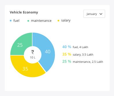
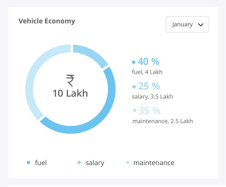
Final Draft
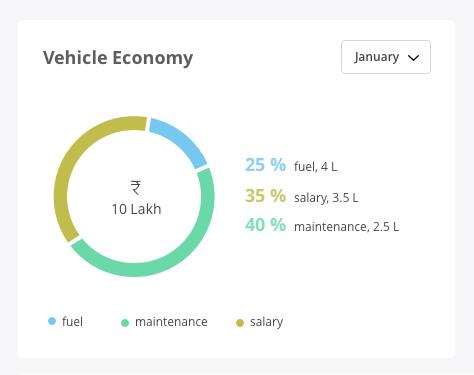
This was the final draft from my end. To keep it informative the percentage, item’s name, the amount is kept on the same line in the most minimal manner.
• You can see that the colors are slightly different, this was needed because yellow and green were the call to action color. • And to not confuse the user and corrupt the theoretical knowledge of web design we choose tones of the same colors. • The month dropdown was kept generic to what was used in other screens. • The card follows left flush alignment that i mention in my first project section A.
Step - 3 Graph Design
Given Wireframe

Designing a Graph
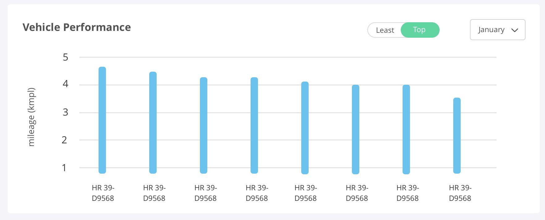
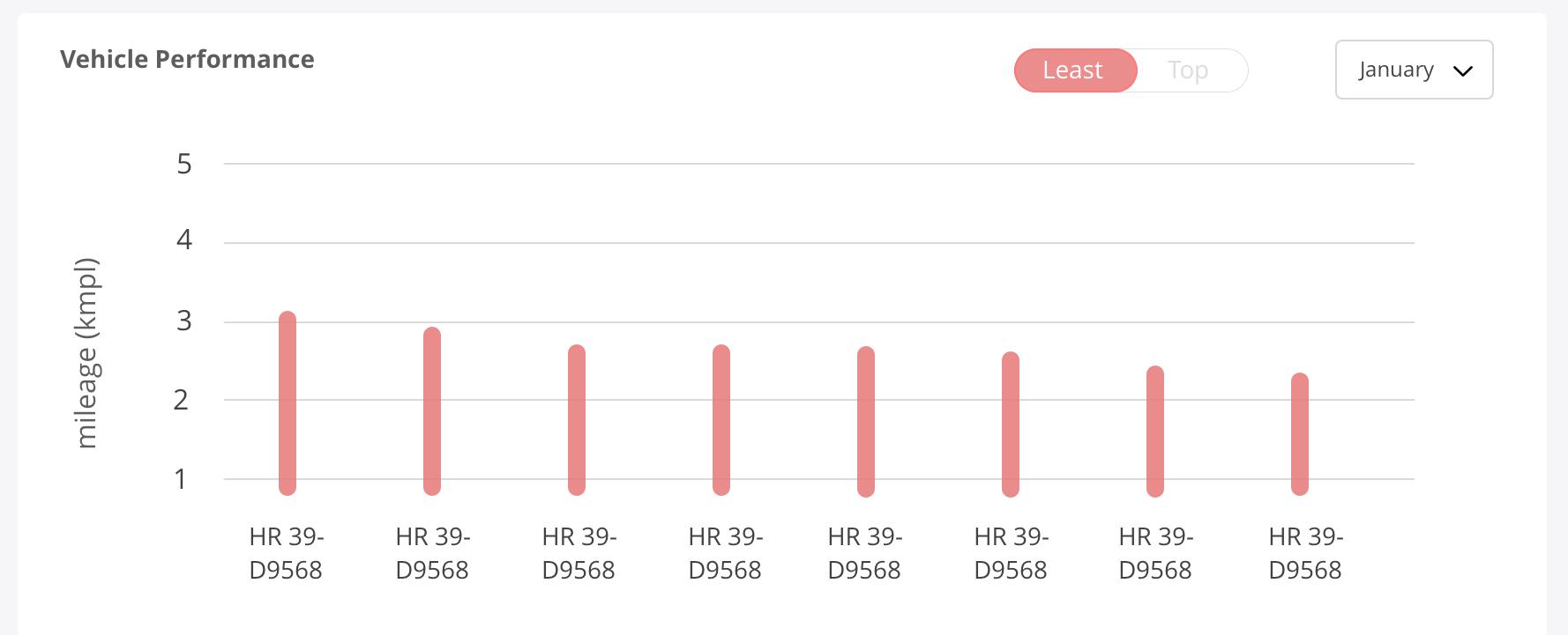
To design the vehicle performance graph, I first formed the rough design I will follow for the bars. Since all my designs have a soft edge to itself. I made the bars round cornered. While designing the bars I considered the color we could give to the vehicle performance. Since the color should relate to the purpose of the bar. I kept it green initially but one can not repeat the CTA color. So the color selected on the basis of overall look and feel is blue. Since blue is one of the neutral colors. As per the rounded edges of the bars. I choose not to completely round them so that the whole interface does not appear too contemporary. As this card has two states, one state is the vehicles who are top performing, hence blue. The other state is for the vehicles that are least performing, hence red. Red is the most ubiquitous color for negative highlight when depicting dichotomy.
Rough Design
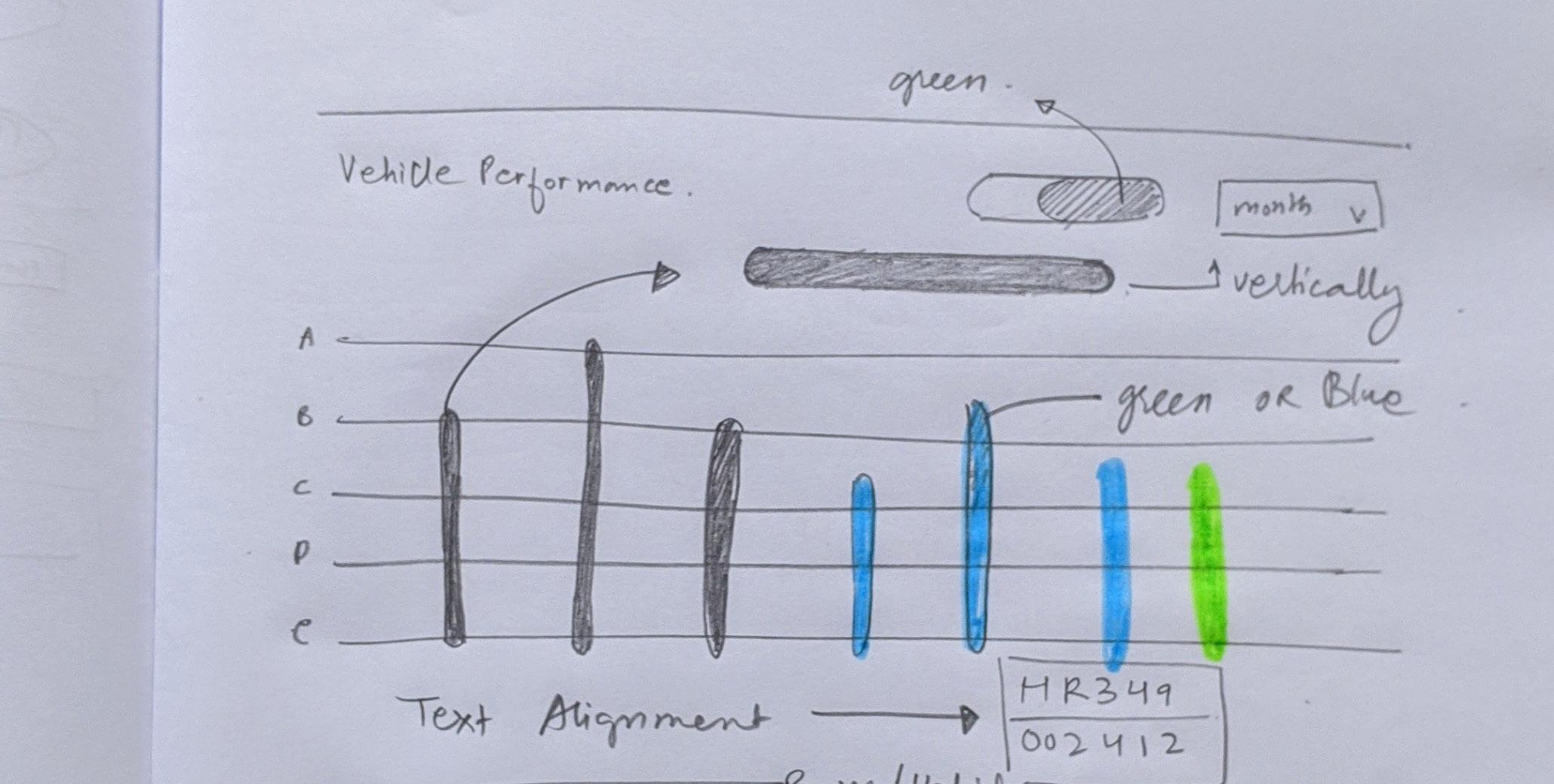
State 1_ Top performing vehicles
State 2_ Least performing vehicles

Given Wireframe
Designing a Graph
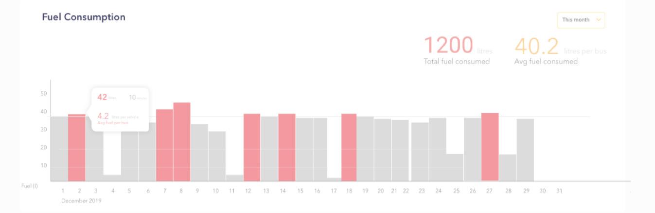
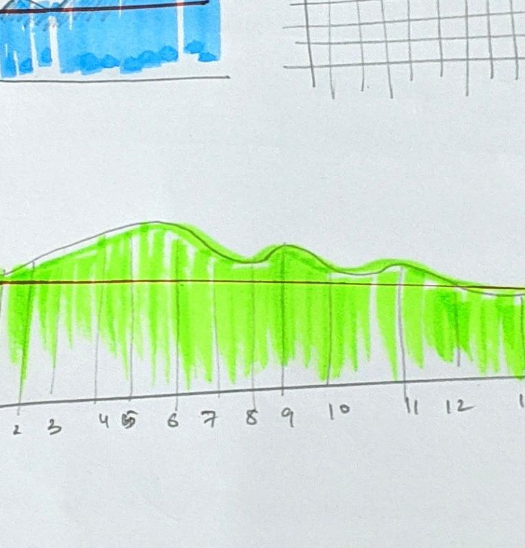
To design the fuel consumption graph, first I found different ways to represent the continuous bar as shown in the wireframe. The challenge in this graph was the number of days on X axis. Since X axis represented the no. of days in a month, it was bound to look bulky with bars. Another challenge was representing the bars that crossed the threshold. Since the wireframe presented was quite simple, I had to make it more appealing for the product. Since this dashboard had 5 tabs for different data, one could not use the similar bar design throughout. Monotony in the design makes things boring and contrast is very important to create a different visual presence of each and every graph.
Rough Design
Design Story
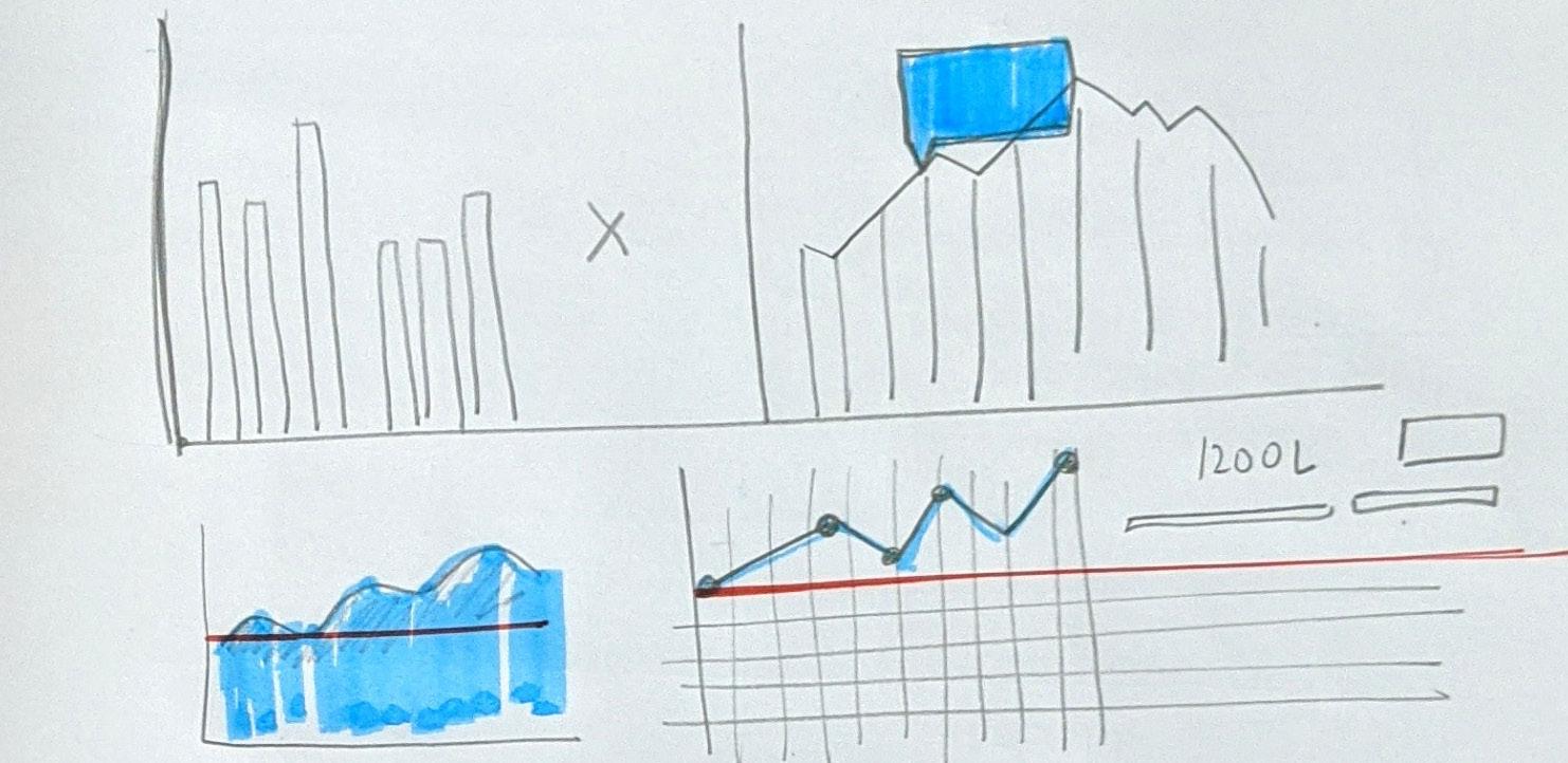
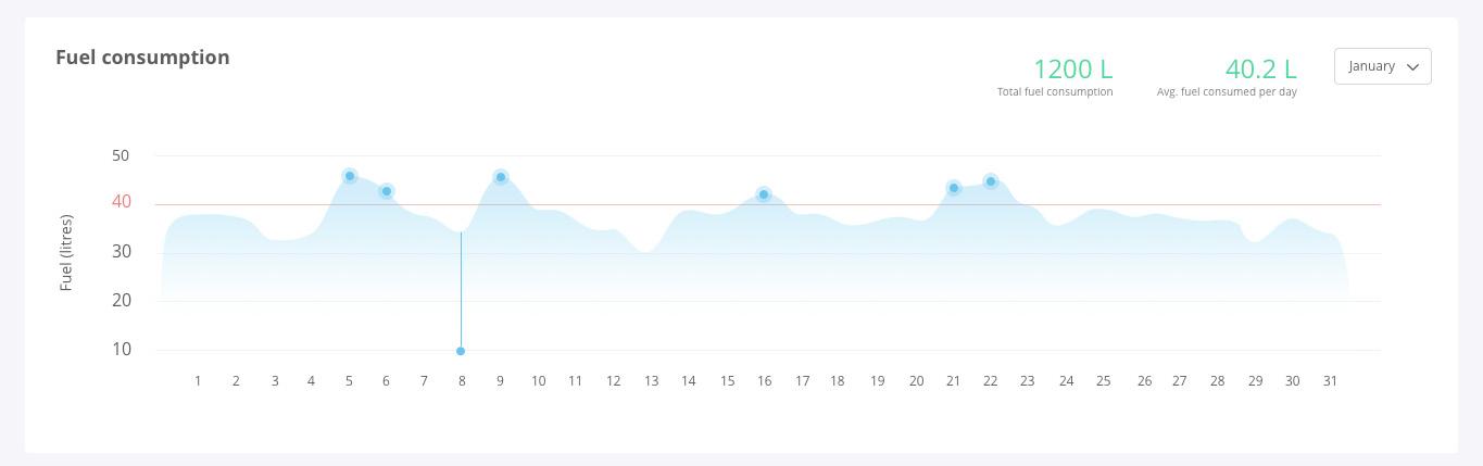
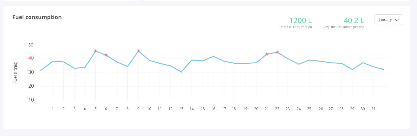
For the research I went through different references but the utmost help was provided by studying Google analytics. Their designs are simple and highly functional. Also since i had a responsibility of breaking the monotony, i explored with various types of data visualization. You can see the different drafts as you proceed. The designs created are to be seen as a part of the whole dashboard. The whole design process expresses the wide evolution of a simple graph. User Interface design is a slow process with minor delicacies. We think it’s easy but it is never less than a drag. In the next pages you will see how I minimised the representation of the red bar and depicted it as a thin line of threshold. Because deducing is crucial.
Draft 1
Draft 2

Draft 3
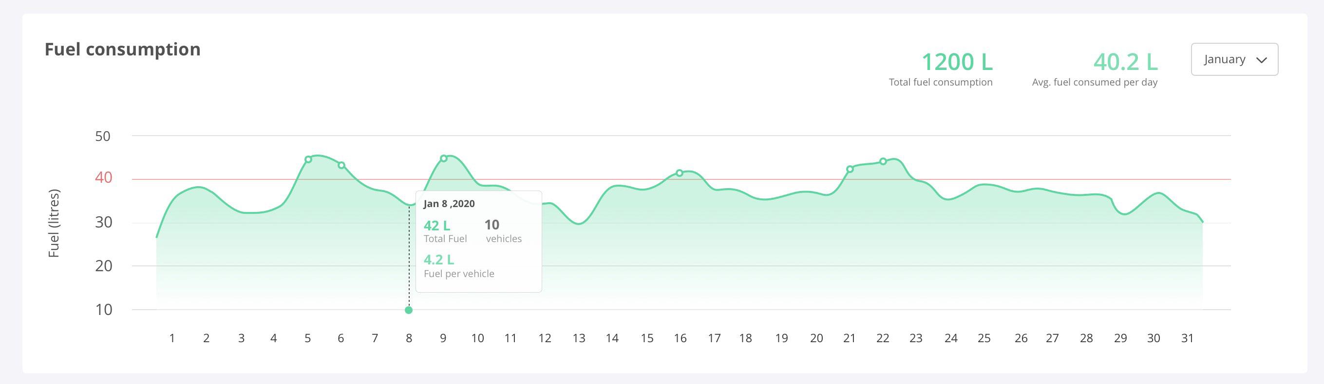
Design Story
After designing many drafts and placing them with the whole dashboard design. I had to make the color green because our previous graph was blue and if this graph was blue too. There would have been a drastic change in the look and feel of the product. This green is also a CTA color but since we did not used this green in our previous donut and graph. UI designers get a little leverage to play around. Also since this is the highlight of the dashboard (since it has gradient in it), It is really important to choose the right color since it has the strongest attention grabbing power among all five graphs.
Draft 4

Given Wireframe
Design Story
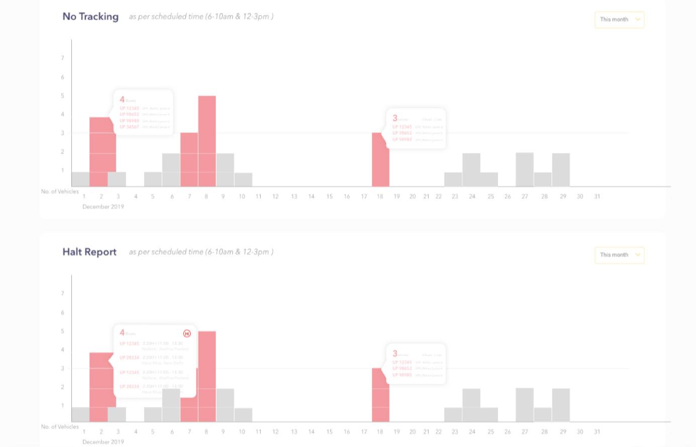
The design treatment for the last two graphs are similar since they fall under the same category. First depicts No tracking and the latter depicts Halt report. Both state the negative setbacks of the business, hence are kept in the bottom for the same reason. These two are designed with the same style with which I designed Vehicle Performance. Why? To maintain consistency of the design. Also the color is kept similar to the wireframe because the only highlights are supposed to be the days on which the vehicles cross the threshold
Rough Design
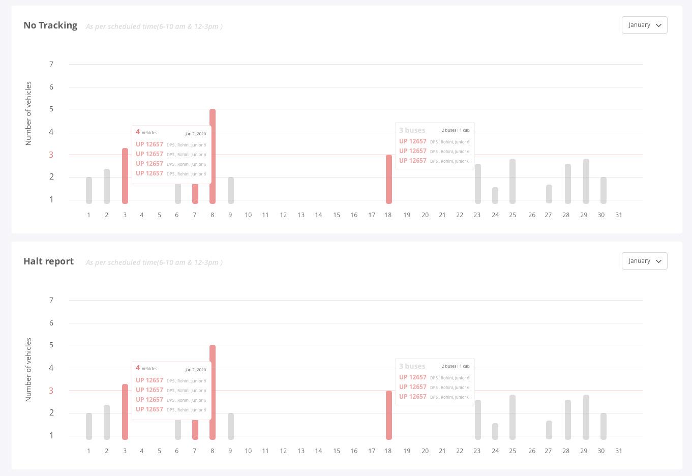
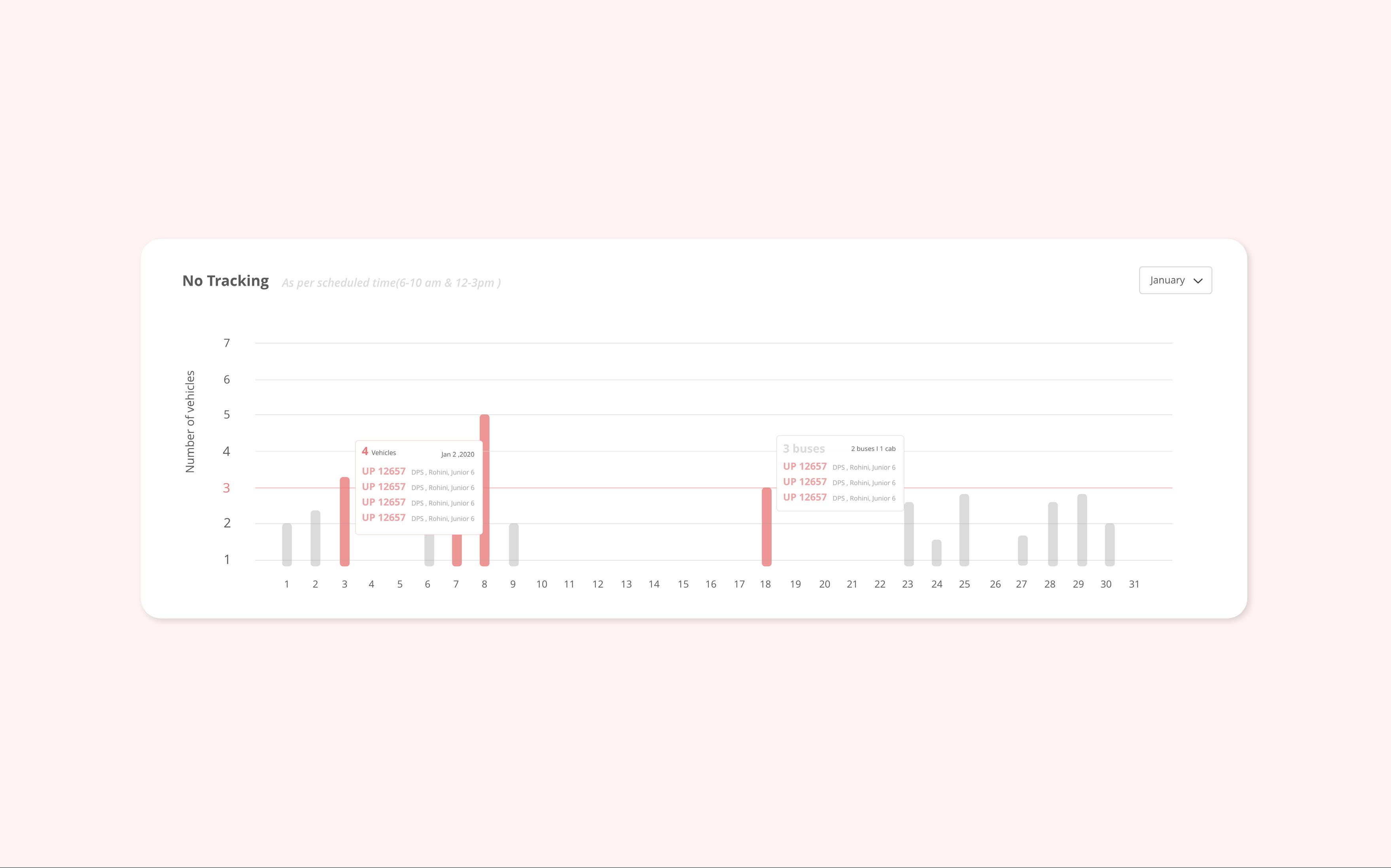
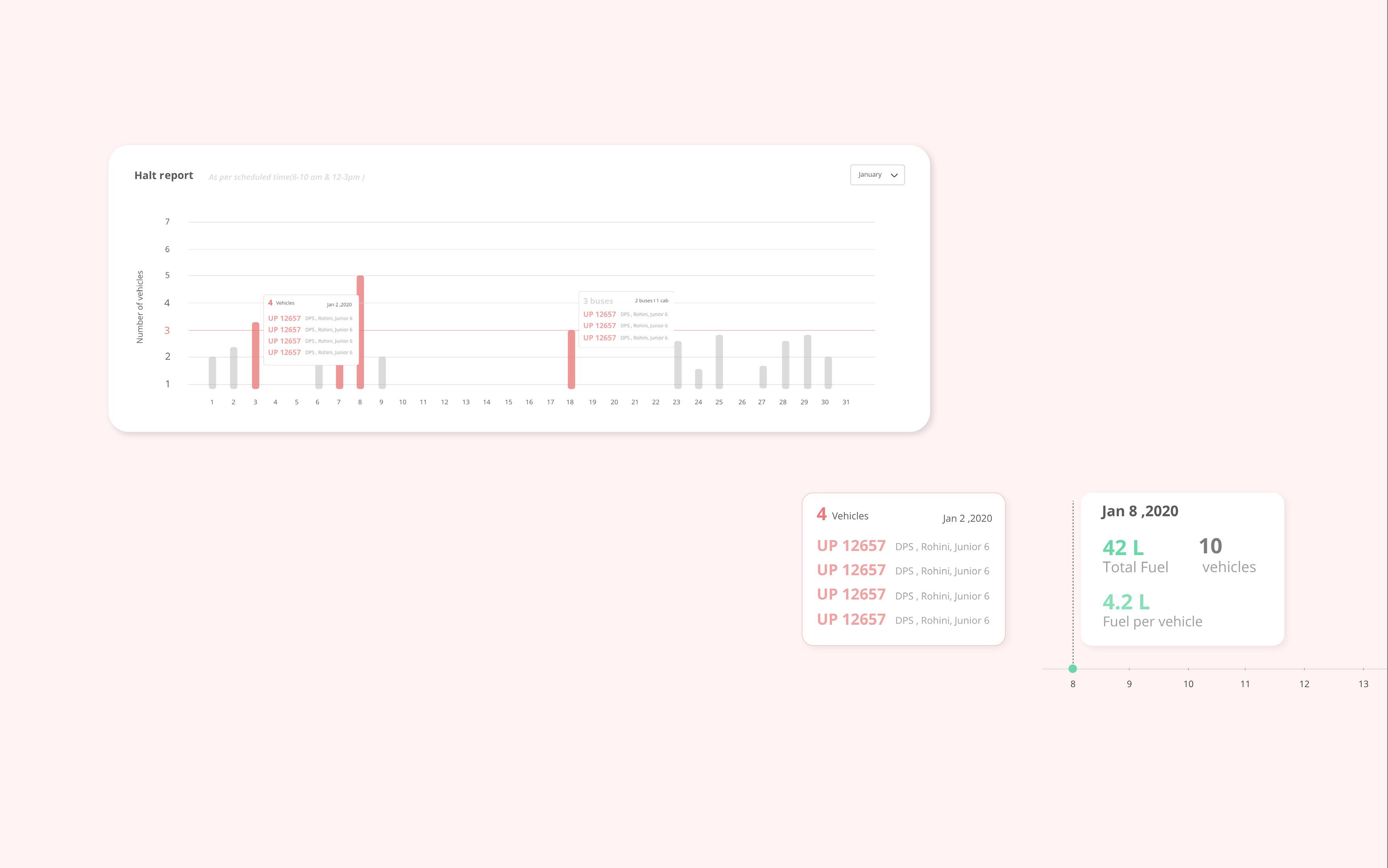
Last Section
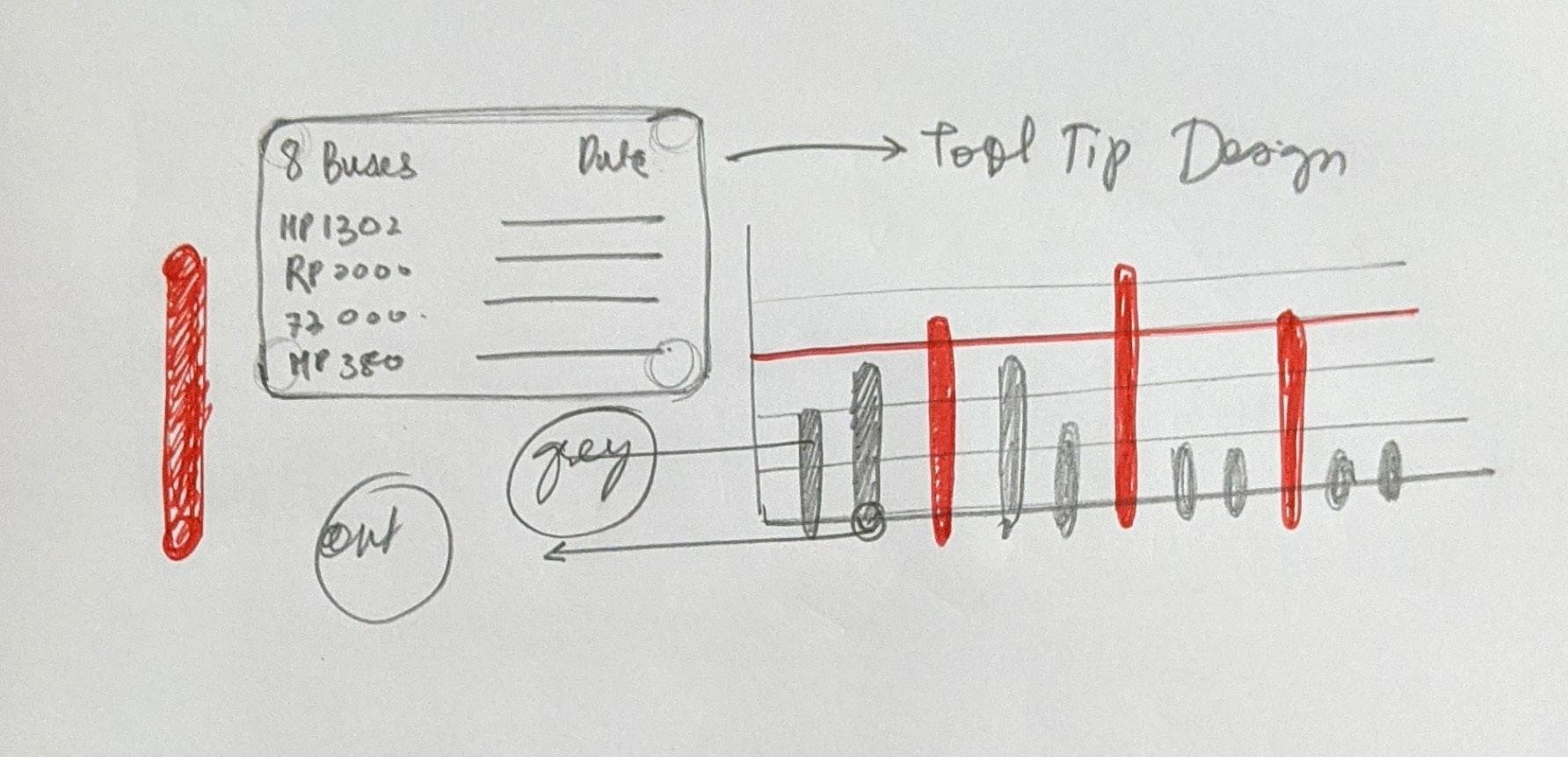
Making this dashboard literally took me 2 weeks. Which is a lot of time when i have been able to create a single page website in 2 days. But the steady growth is the part of the learning. Also Every task helped me learn something new. For eg. The two box you see in the bottom right in the opposite page is called Tool Tip. A tooltip or infotip or a hint is a common graphical user interface element. It is used in conjunction with a cursor, usually a pointer. The user hovers the pointer over an item, without clicking it, and a tooltip may appear—a small “hover box” with information about the item being hovered over.


