7 minute read
Part Two: Create a website for classroom.live (version 1


3 : Create a website for classroom.live_V-01 _ DESIGN PROCESS
Design process: The design process followed to create the website for classroom.live is broken into 9 steps. These steps are must in creating a website. Before jumping to these crucial steps it is very important to do competitor analysis. I did a thorough competitor analysis of the companies like vedantu, impartus, Wiz Iq, google classroom, microsoft team, zoom etc. Since this website was more of a sales funnel. The content flow was created to convert the traffic into sales.
Advertisement
The steps to create a website:
1. Content
Create the content
Design the flow
2. Wireframes
Low fidelity wireframe
High fidelity wireframe
Laying the content on the screens
3. Visual treatment
Illustration/ graphics
Iconography
Footer design
Alignment
DESIGN PROCESS STEPS
1.Content
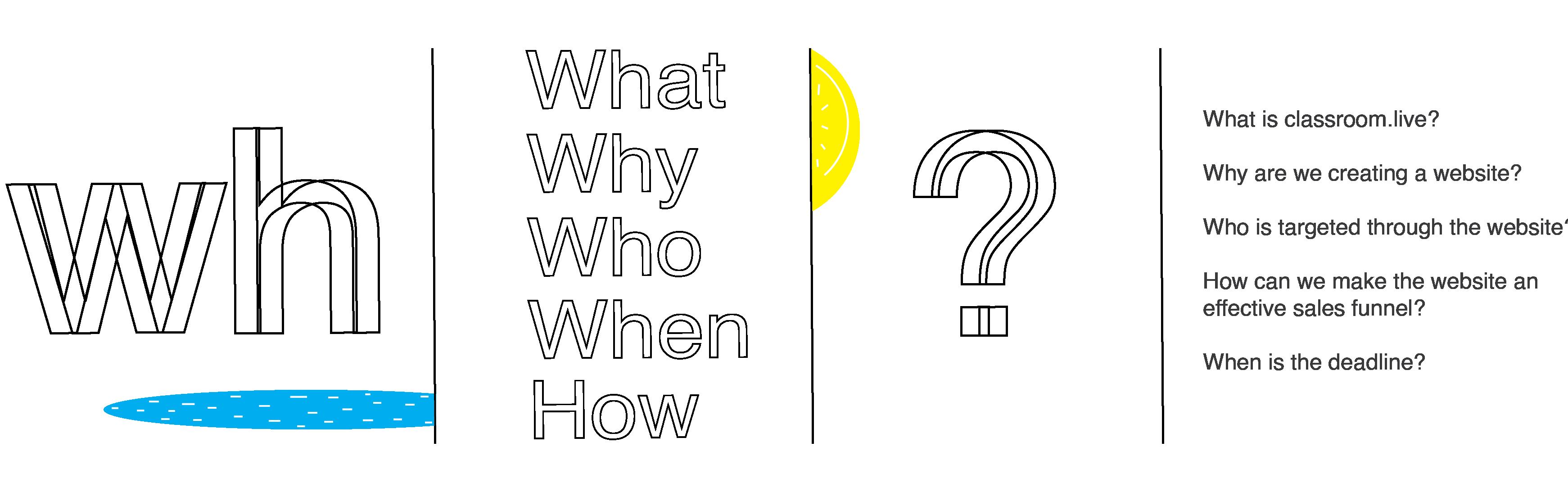
Creating content is the first step in the making of a website. There should be a direction and a goal towards which the content is written. To start with, one can ask the Kipling questions as it is always helpful, if the creator knows the subject inside-out.
The questions asked to the product team and myself were:
1. What is classroom.live? 2. Why are we creating a website? 3. How can we make the website an effective sales funnel? 4. Who is targeted through the website? 5. When is the deadline?
After addressing and answering these questions repeatedly, I created the first draft of the content. This content is displayed on the next page.
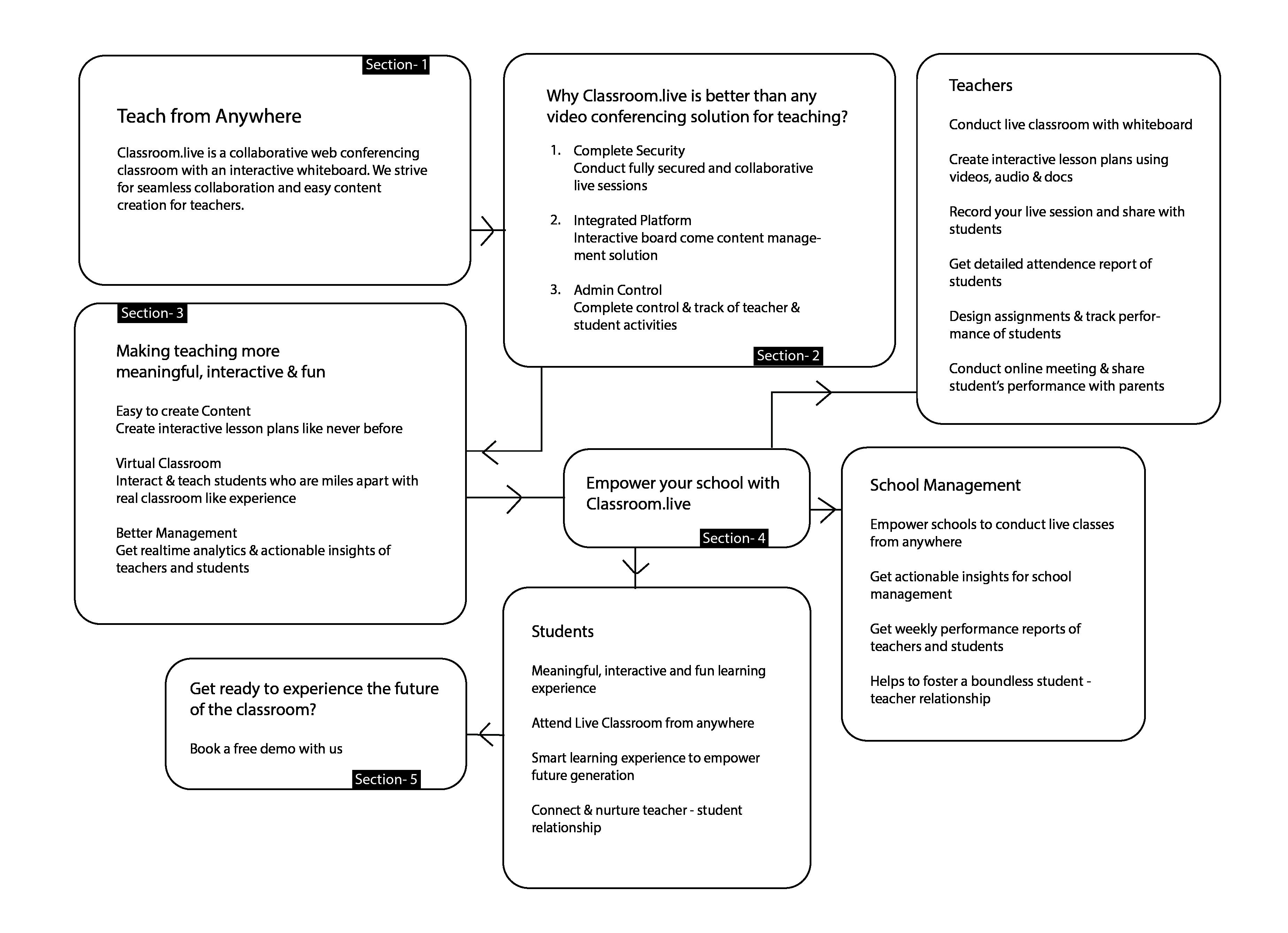

A ideal flow of a one pager website:
1. 1. Place a good line that explains the problem/ a solution you are proposing to offer. Something in a layman’s language.
2. Start with why you are doing what you are doing. Because it is very important to address why you are presenting an idea/ service or a product to the users. This is about the philosophy that drives you.
3. Speak of how you do it. Elaborate the efforts that you took, the kind of people who were doing everything they could to create what you are aiming to serve. And by this I don’t mean, highlight your team.
4. Speak of what you have as a product. Speak of what is it that can make the life of the potential user easy. Here you talk about the features. Never display your feature in the second section of your website. Because a website is a narration. It is not a presentation you place on a clients table to sell the features you have.
5. Then add a testimonial if you have any because it is important to show what people think of you and your service. This adds an external weight that can make you look more promising.
6. Add a call to action if any. Always keep it in the header or the top banner of your website too. As it is important to direct the user to do an action to you site.
7. Add a footer.
2. Wireframes
What is a wireframe?
A wireframe is a digital/manual way to visualize the data segregation of the website. Wireframing is a way to design a website service at the structural level. A wireframe is commonly used to lay out content and functionality on a page which takes into account user needs and user journeys. Wireframes are used early in the development process to establish the basic structure of a page before visual design and content is added.
There are two types of wireframe that i will be showing ahead, low fidelity and high fidelity wireframes. There are mid fidelity wireframes too but i will leave that for now
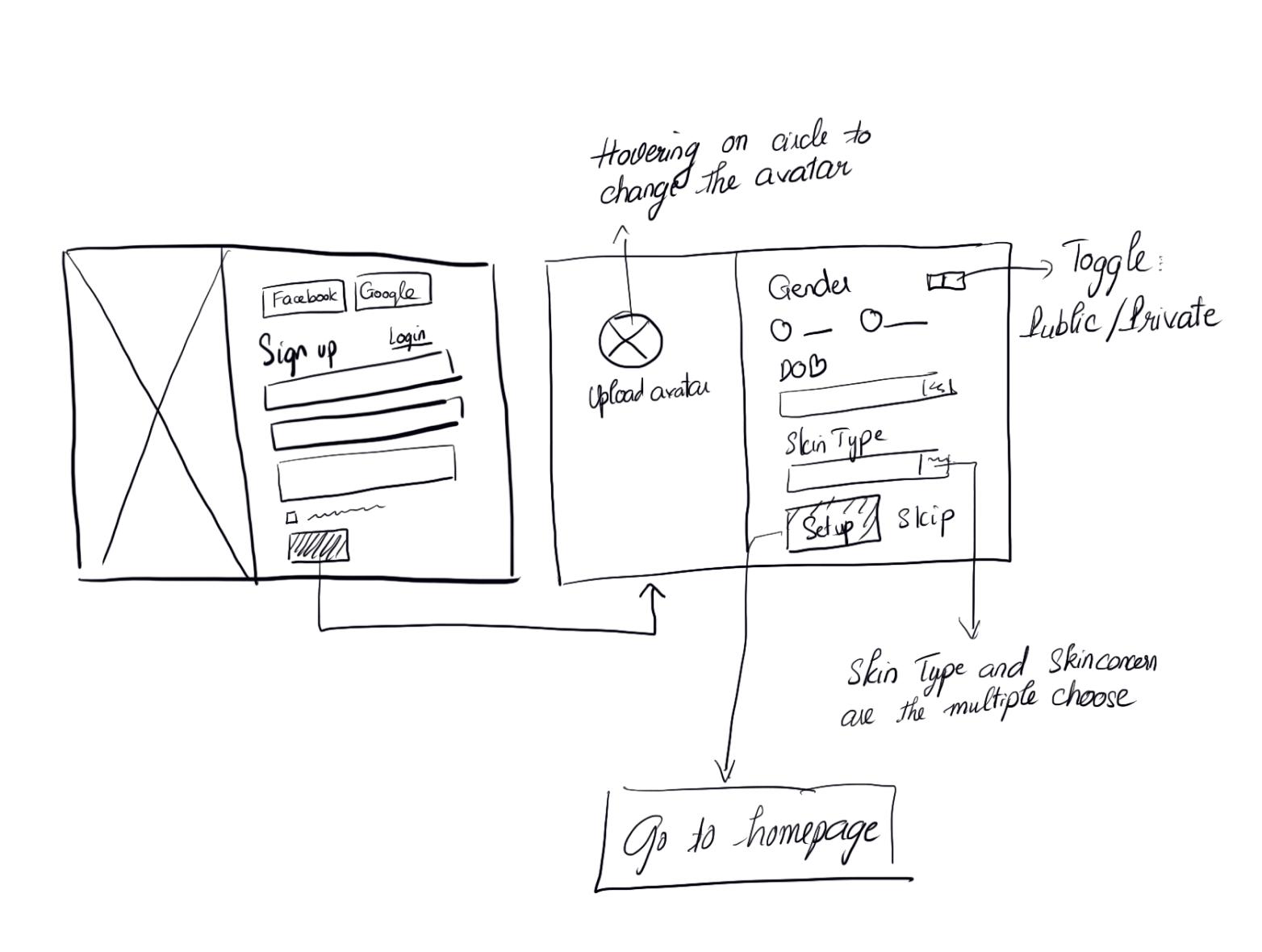
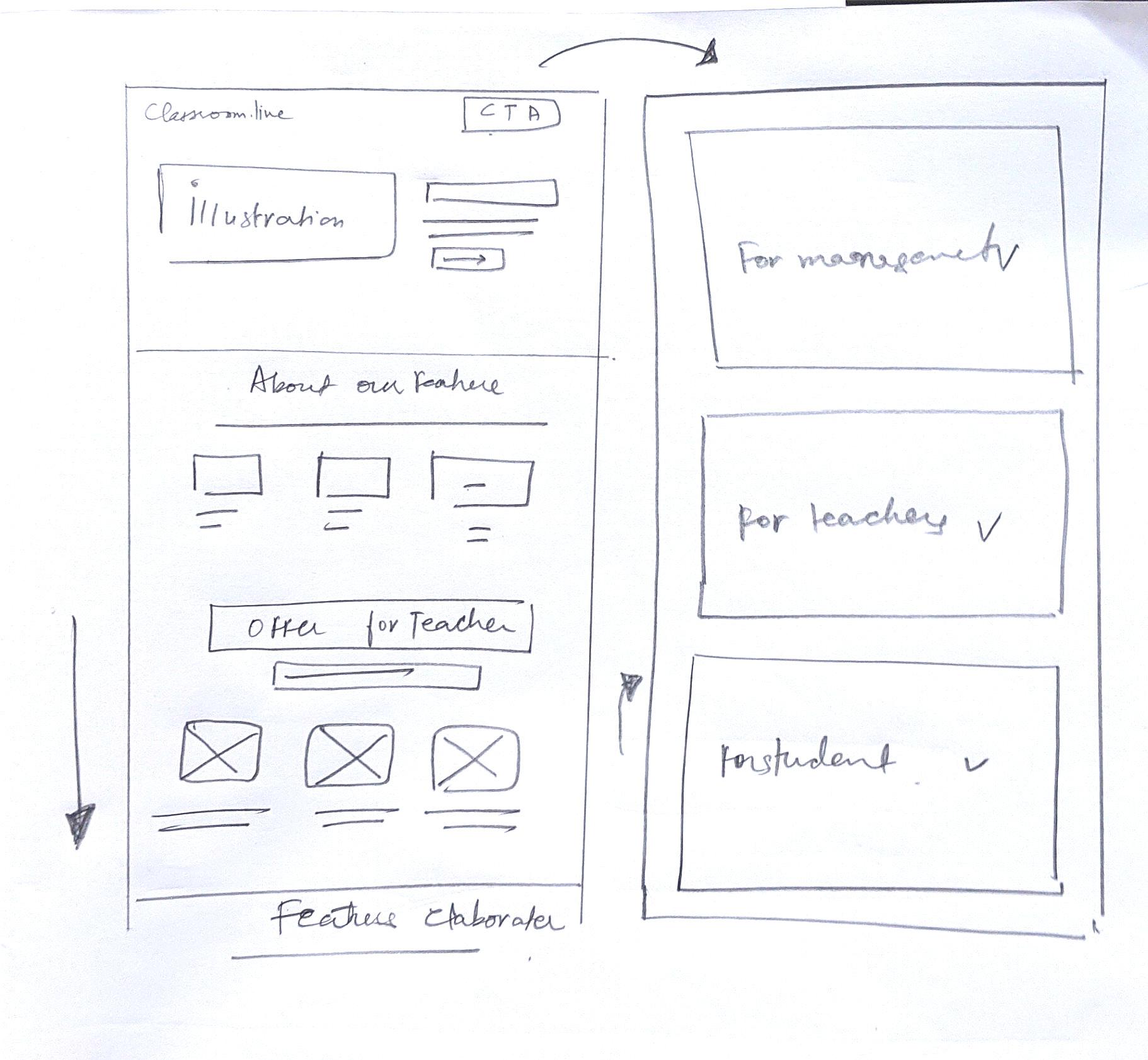
What is a low fidelity wireframe?
Low fidelity wireframes are the first draft of visual representation of a designer’s idea. This wireframe is usually a rough sketch that helps the designer to make his/her idea look more tangible and easy to explain. These wireframes are usually abstract and help the team to be on the same page. These wireframes are also good, giving the designer a creative space to experiment his hands on paper before jumping to the actual project.
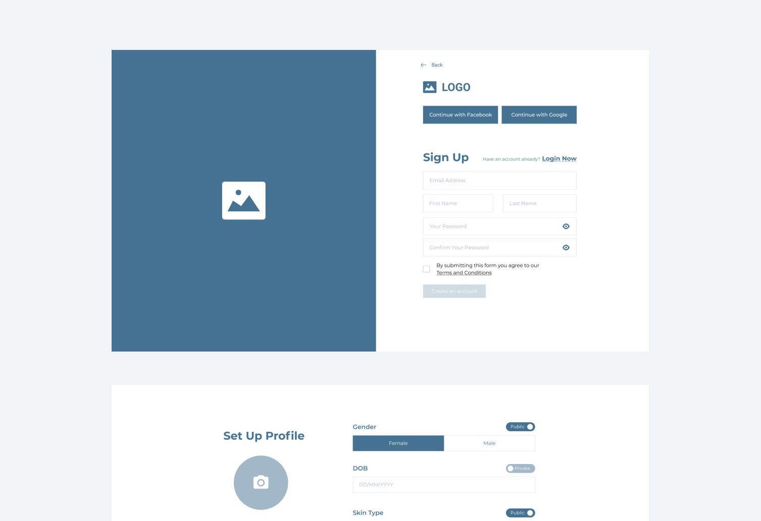
What is a high fidelity wireframe?
A high fidelity wireframe are the screens that are designed on softwares. These screens include the real text and visual that makes it look closer to the final result the designer is thriving for. These wireframes take considerate amount of time to work on.
Low Fidelity High Fidelity

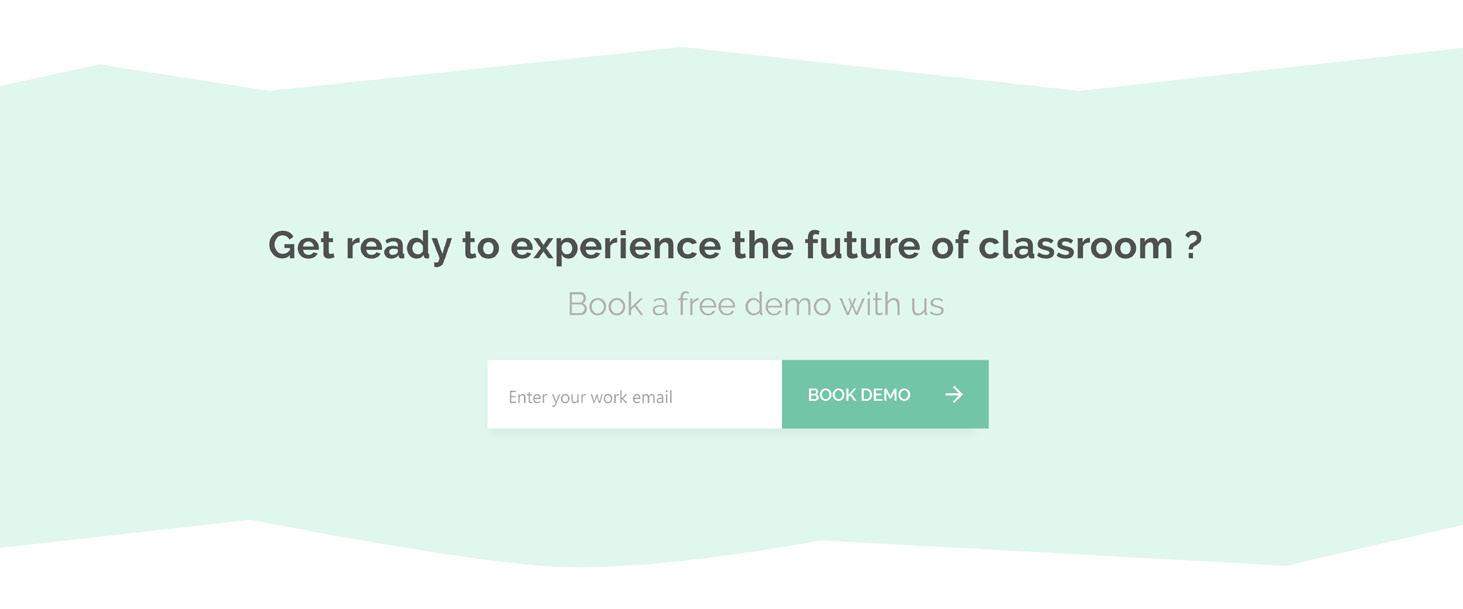
Book a Demo section
Footer of the website
3. Visual treatment
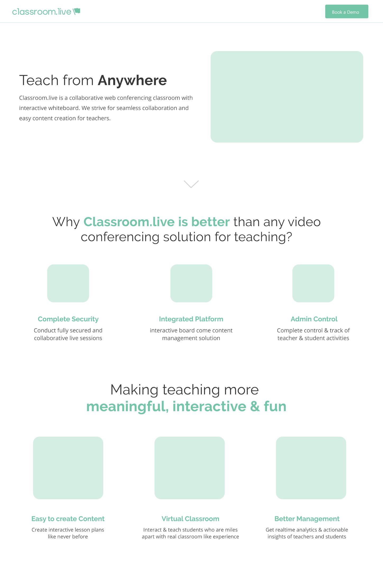
The visual treatment of the website consists of the illustrations, proper alignment, iconography and imagery. I have already discussed the importance and the criteria I have considered before making them. As this was a quick process I will be showing the designs I created for the website.
Elements used in the first draft:
Illustration/ graphics Iconography footer design Final screen
Illustration/ Graphics
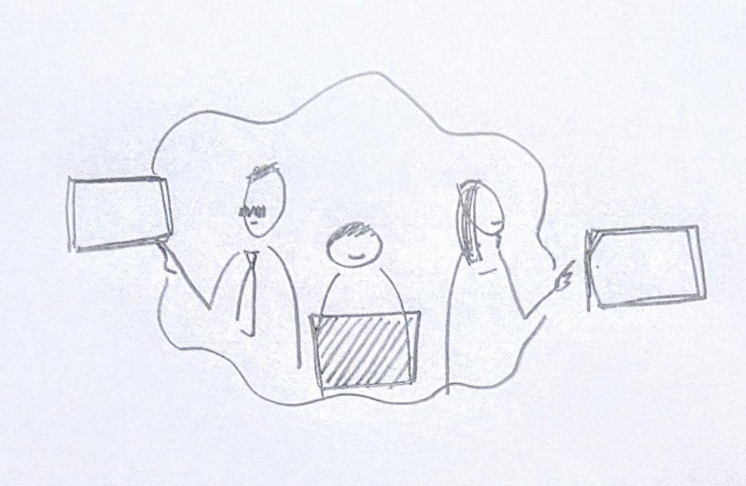
In this single scroll website I have used one illustration on the landing page. This illustration was created referring to the three types of users we were benefiting. As it is important to align the meaning of the header and graphic that one is using with it.
Users portrayed in the illustration:
Management (left) Student (centre) Teacher (right) In the illustration I have represented them in the actions that they usually perform as a user. For example, we are providing full control of the reports and actions taken by the teacher and student to the management, this is represented as the management using a system to check the dashboard.
Similarly as we provide hand raise options to the student, which helps in solving their doubts and problems. I have made the student with a hand raise. The third part, teacher in the illustration is illustrated simply by showing how she teaches using the teacher’s tool kit.
Rough sketches
Final illustration


Icons for first version of classroom.live
The icons shown below are for the second section of the website. This section was about, why classroom.live is better than any video conferencing solution for teaching. This was crucial because initially every school started teaching via Zoom, Whatsapp etc and stating the three important characteristic of the product could provide weightage to our new product
Three titles for the icons
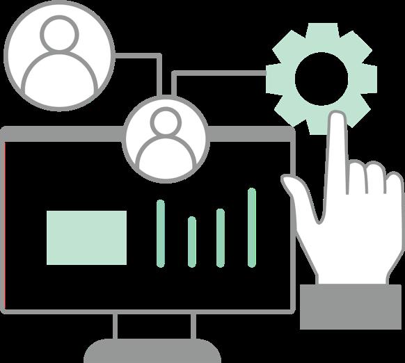
Complete Security Integrated Platform Admin Control Icons were not completely designed from scratch. These were ubiquitous in nature and were identical to many icons we see everyday in our virtual lives.
Complete Security: This meant the data was safe and no third party could access the product
Integrated Platform: This was about the integration of content creator and manager within the product.
Admin Control: The school could monitor the results of Online learning in terms is reports and dashboard of data collected.
Complete Security Integrated Platform Admin Control

Easy to Create Content Virtual Classroom Better Management

The above shown Icons were created for the third section of the website. This section dealt with how we make teaching meaningful, fun and interactive. As I was learning to create Icons, I learnt the importance of Line weight, color consistency, stroke style and icon dimensions.
Key words:
• Easy Content Creation • Virtual Classroom • Better Management • In easy to create content I created a teachers hand that was adding a picture to the group of text (good idea, bad execution)
• In virtual classroom, the whole idea was that we are interactive as we host video conferencing along with a unique portal for creating content and sharing it to every student.
• Better management focused on the meaningful part because with constant monitoring, remote learning could become more fruitful


