Our vision for Allison is ‘To be known as the homebuilder you can trust’. This ambition drives everything we do; our decisions, our procedures and our attitude – and achieving this in the hearts and minds of our customers will help build a successful, resilient and profitable business.
Our high (and growing) customer and employee satisfaction scores are a testament to the fact that we’re continuously working to improve. We’re not perfect, but we’re striving to be better in everything that we do.
These guidelines set out what the Allison brand represents; its strong identity, values, and personality along with its visual representation.
By adhering to these principles, we can build a trusted, valued business that all stakeholders will be proud of.
OUR
why
All companies know WHAT they do (the products or services they sell), but very few actually know WHY they do it. Making money is not a ‘Why’; it’s a result of what they do.
The WHY is about a company’s purpose or belief. Something that sets us apart from our competitors. This is our why:
To create great homes and communities that realise people’s dreams.
OUR
This is our primary goal; a declaration of our objectives. Our vision is something we have to remain focussed on, even when the business landscape changes.
To be known as the homebuilder you can trust.
BRAND OUR
TRUST
We ALL keep our promises and do what we say
We ALL genuinely care for our people; customers, suppliers, employees KINDNESS
TEAMWORK
PASSION
We ALL work as a team, for the good of the team
We are ALL ambitious, motivated and driven to succeed together
How we will achieve this...
OUR
mission
We aim to act with integrity in everything we do, while building long-term trusting relationships with our customers, communities, stakeholders, suppliers, investors and our people. By delivering on our promises, we will grow a highly successful, trusted business known for creating exceptional homes and communities with uncompromising quality, service and care for the planet.
PERSONALITY BRAND OUR
HONEST
We are truthful and act with integrity in all our business dealings
CARING
We listen to our customers and do what we say
RESPONSIBLE
Knowing that we are accountable for our legacy, we build responsibly
RESPONSIVE
If a customer has any issues, we will identify and resolve them quickly and efficiently
AUTHENTIC
Our vision and our values are genuine objectives and beliefs, not filtered marketing messages
IN ORDER TO ACHIEVE A REPUTATION FOR ‘ TRUST ’, OUR TONE OF VOICE SHOULD BE
ONE
THAT CONVEYS HONESTY AND TRANSPARENCY.
OUR TONE OFvoice
TONE CONVEYS
PROFESSIONAL Authority / Experience / Confidence
JARGON-FREE Authenticity / Transparency
EXPRESSIVE Emotional Connection
CONSCIENTIOUS Empathy / Accountability
OUR
language
To convey authenticity, our messaging should be delivered in a relaxed, friendly manner that is clear and meaningful to help give confidence to our purchasers.
This means a more casual, ‘conversational style’ which lends itself perfectly to a greater use of ‘we’ll and ‘you’ll ’.
This approach will add character and is a key element in helping to communicate Allison’s Vision and Mission.
Our brand assets
Our logo
Our colour palette
Our typography
Our signage
Our devices
Our photography
Our logo
Our logo
Our logo has an aspirational feel
A classic-looking roundal that alludes to quality and tradition but with a modern edge due to the sans serif open font, designed to offer good legibility.
Our horizontal logo
Whenever possible, the stacked version of our logo should be used.
However, if this is not possible, a horizontal version of the logo should be used instead, ensuring that all elements retain the same proportions and spacing as in the stacked version.
Note
Only use the logo artwork provided.
Our logo roundal
Our logo roundal has been configured to blend tradition with modernity, symbolising timeless elegance and innovation.
Its balanced symmetry and clean lines convey stability and precision, showcasing our dedication to quality craftsmanship and progressive design.
Logo exclusion zone
At Allison Homes we value space, so we give our logo room to breathe in order to separate it from other graphic elements. Using the roundal as a unit of measurement:
Allow at least half a roundal’s worth of clearance all around the logo. No other graphic elements must intrude within this space.
Partnerships logo
The Allison Partnerships identity incorporates the our logo and typeface with the word HOMES replaced with PARTNERSHIPS.
Note
Only use the logo files provided.
A logo exclusion zone is shown on page 16.
Permitted and non-permitted placements on different backgrounds are the same as those applying to the Allison Homes logo (see pages 18 and 19).
Colours to be used on Partnerships assets are show on page 23.
Using the logo with colour and imagery
Using the logo on white, light backgrounds and images.
The logo must always appear as shown. The roundal and word HOMES should be gold. The word ALLISON should be black or white depending on the background.
Using the logo with colour and imagery
Using the logo on coloured dark backgrounds and images.
In order to ensure legibility, the roundal and words ALLISON HOMES should all appear either black or white.
Using the logo with colour and imagery
Using the logo on coloured dark backgrounds and images.
These are example of how not to use the colour
Our colour palette
C:70, M:50, Y:30, K:100
R:0, G:4, B:12
The core logo palette consisting of Allison Gold and Onyx exudes elegance and sophistication. Together they create a striking contrast and convey a prestigious image.
Allison Gold
60 60
C:24, M:38, Y:100, K:13 R:184, G:143, B:13
Primary colour
C:65, M:60, Y:37, K:26 R:93, G:87, B:107
Amethyst has been selected as the primary colour for Allison Homes to distinguish it from competitors and to provide a sense of sophistication and strength when incorporated into various visual elements alongside supporting colours.
Supporting colour palette
Main supporting palette
The supporting colour palette consists of five shades that are carefully selected. These shades provide versatility and flexibility, enabling a wide range of design elements that suit different contexts and applications. This expanded palette allows for consistency across various mediums, while still offering the creative freedom to tailor designs to specific campaigns or messages.
Partnership colour palette
This singular shade creates a strong, unified identity, ensuring consistency across all collaborative efforts. Its versatility allows it to adapt seamlessly to various design contexts, providing a cohesive look while maintaining the flexibility to be incorporated into different campaigns and messages without losing its impact.
Typography
Our typography
Typography hierarchy
TONE OFvoice
Typography -
Print
Museo Sans has been selected as the primary typeface due to its clean, modern design and strong legibility across various mediums. The sansserif style reflects a focus on simplicity, efficiency, and clarity, which are essential in delivering a clear message. Museo Sans combines geometric precision with a touch of warmth, making it both professional and
Primary Print Fonts
Museo Sans
Museo Sans Display Extra Light
ABCDEFGHIJKLMNOPORSTUVWXYZ
abcdefghijklmnopqrstuvwxyz 0123456789
Museo Sans 100
ABCDEFGHIJKLMNOPORSTUVWXYZ
approachable. Its wide range of weights ensures flexibility in both headings and body text, allowing for a cohesive and dynamic visual presence in all brand communications. This choice enhances the brand’s identity as reliable and user-friendly.
Museo Sans 100 Italic
ABCDEFGHIJKLMNOPORSTUVWXYZ
Ag
Museo Sans
abcdefghijklmnopqrstuvwxyz 0123456789
Museo Sans 300
ABCDEFGHIJKLMNOPORSTUVWXYZ
abcdefghijklmnopqrstuvwxyz 0123456789
Museo Sans 500
ABCDEFGHIJKLMNOPORSTUVWXYZ
abcdefghijklmnopqrstuvwxyz 0123456789
Museo Sans 700
ABCDEFGHIJKLMNOPORSTUVWXYZ
abcdefghijklmnopqrstuvwxyz 0123456789
Museo Sans 900
ABCDEFGHIJKLMNOPORSTUVWXYZ
abcdefghijklmnopqrstuvwxyz 0123456789
abcdefghijklmnopqrstuvwxyz 0123456789
Museo Sans 300 Italic
ABCDEFGHIJKLMNOPORSTUVWXYZ
abcdefghijklmnopqrstuvwxyz 0123456789
Museo Sans 500 Italic
ABCDEFGHIJKLMNOPORSTUVWXYZ
abcdefghijklmnopqrstuvwxyz 0123456789
Museo Sans 700 Italic
ABCDEFGHIJKLMNOPORSTUVWXYZ
abcdefghijklmnopqrstuvwxyz 0123456789
Museo Sans 900 Italic
ABCDEFGHIJKLMNOPORSTUVWXYZ
abcdefghijklmnopqrstuvwxyz 0123456789
Typography
For our online materials and digital presentations, we use the Google font Lato. This font is ideal for digital use because they are open-source, ensuring that there are no licensing or copyright issues, allowing for
Lato Light
ABCDEFGHIJKLMNOPORSTUVWXYZ
abcdefghijklmnopqrstuvwxyz 0123456789
Lato Regular
ABCDEFGHIJKLMNOPORSTUVWXYZ
abcdefghijklmnopqrstuvwxyz 0123456789
Lato Medium
ABCDEFGHIJKLMNOPORSTUVWXYZ
abcdefghijklmnopqrstuvwxyz 0123456789
Lato Semibold
ABCDEFGHIJKLMNOPORSTUVWXYZ
abcdefghijklmnopqrstuvwxyz 0123456789
Lato Bold
ABCDEFGHIJKLMNOPORSTUVWXYZ
abcdefghijklmnopqrstuvwxyz 0123456789
Lato Black
ABCDEFGHIJKLMNOPORSTUVWXYZ
abcdefghijklmnopqrstuvwxyz 0123456789
Lato Heavy
ABCDEFGHIJKLMNOPORSTUVWXYZ
abcdefghijklmnopqrstuvwxyz 0123456789
seamless application across all digital touchpoints. Lato offers a clean, modern aesthetic with geometric proportions.
TypographyMicrosoft
For internal digital presentations, we use the Microsoft font Century Gothic. This decision is guided by several key factors, including the font’s design characteristics, readability, and availability.
The use of Century Gothic for internal digital presentations provides a consistent, professional, and easily readable visual style. Its modern design and widespread availability make it an ideal choice for conveying information clearly and effectively in a corporate setting.
Microsoft fonts
Century Gothic
Century Gothic Thin
ABCDEFGHIJKLMNOPORSTUVWXYZ
abcdefghijklmnopqrstuvwxyz 0123456789
Century Gothic Light
ABCDEFGHIJKLMNOPORSTUVWXYZ
Century Gothic Thin Italic
ABCDEFGHIJKLMNOPORSTUVWXYZ
abcdefghijklmnopqrstuvwxyz 0123456789
Century Gothic Light Italic
ABCDEFGHIJKLMNOPORSTUVWXYZ
AgCentury Gothic
abcdefghijklmnopqrstuvwxyz 0123456789
Century Gothic Regular
ABCDEFGHIJKLMNOPORSTUVWXYZ
abcdefghijklmnopqrstuvwxyz 0123456789
Century Gothic Bold
ABCDEFGHIJKLMNOPORSTUVWXYZ
abcdefghijklmnopqrstuvwxyz 0123456789
Century Gothic Extra Bold
ABCDEFGHIJKLMNOPORSTUVWXYZ
abcdefghijklmnopqrstuvwxyz 0123456789
abcdefghijklmnopqrstuvwxyz 0123456789
Century Gothic Regular Italic
ABCDEFGHIJKLMNOPORSTUVWXYZ
abcdefghijklmnopqrstuvwxyz 0123456789
Our devices
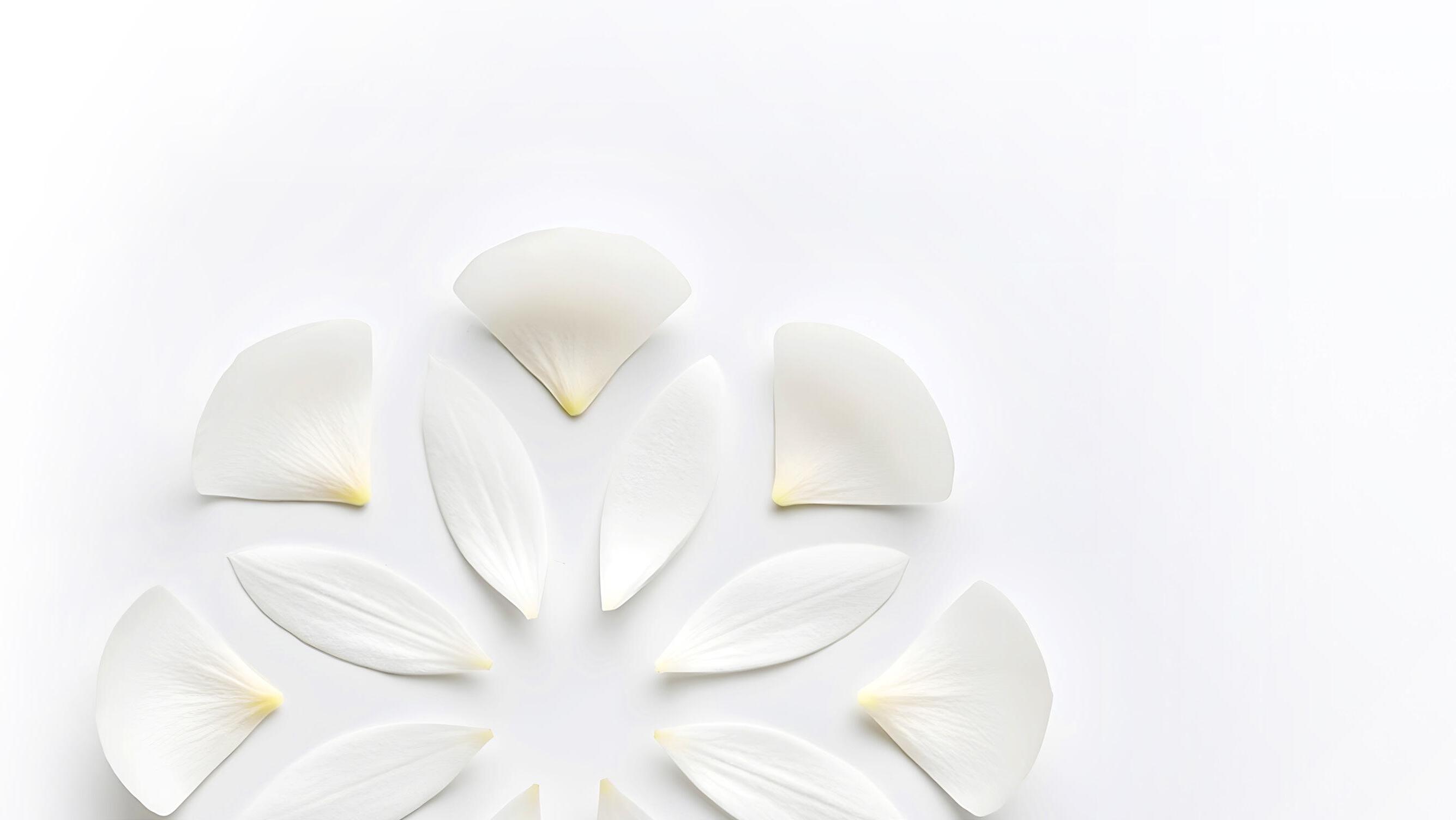
The petal flourish
The ‘petal flourish’ visual device, inspired by the petals in our logo, enhances brand cohesion and aesthetic appeal. Incorporating this flourish into marketing materials help to make our communications more engaging and boosts brand recognition.
While layout, petal sizes and positioning can be changed to suit where it is to appear, a few criteria have been developed to ensure brand consistency across marketing collateral.
The petal flourish
Across white backgrounds
The petal flourish should only contain colours taken from the supporting colour palette. On white and plain backgrounds the petals should appear 100% normal opacity.
The actual position and number of petals will be influenced by the page design and content, so it is not practical to have a proscriptive template for their usage.
The petal flourish
Across
imagery
The petal flourish should only contain colours taken from the supporting colour palette.
When the flourish lays across the imagery the opacity of the petals are to be 80%
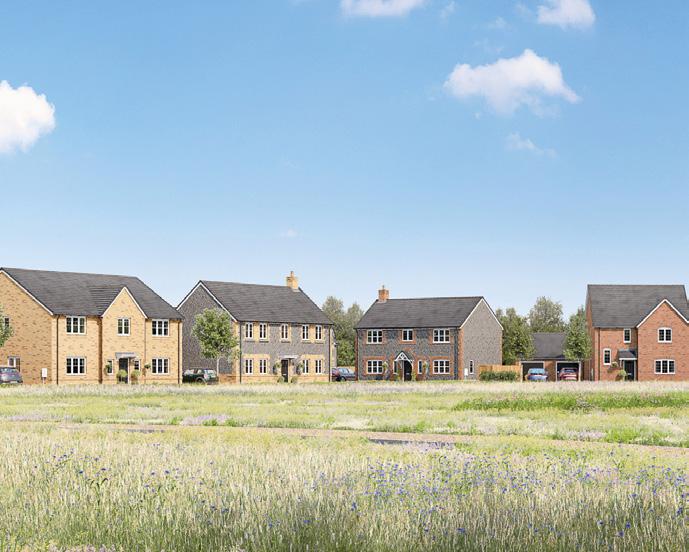
Our photography
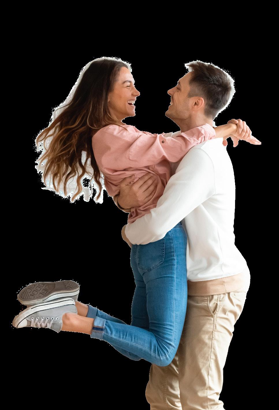
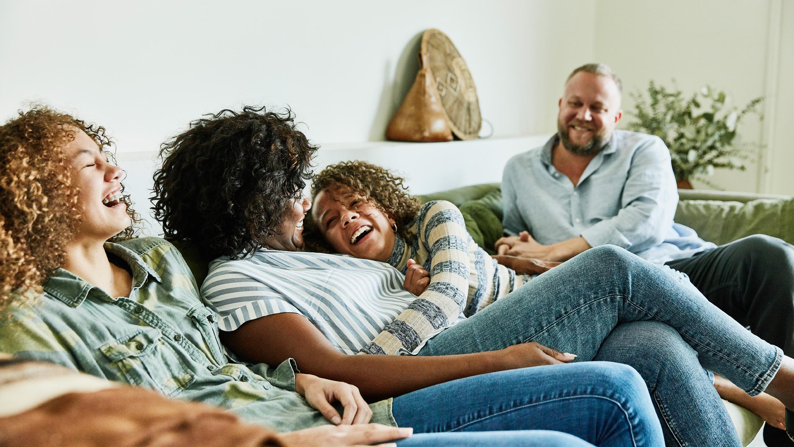
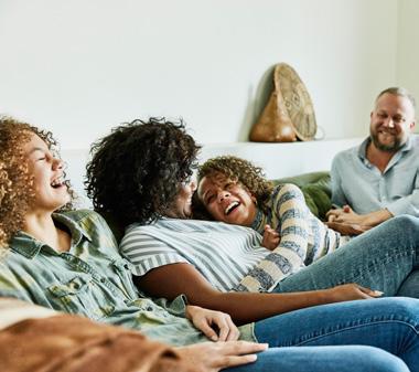
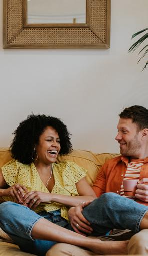
Lifestyle photography
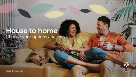
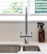
Lifestyle photography should complement product imagery to create an engaging and relatable brand narrative. It showcases both the product and the community, enhancing perceived value and maintaining brand consistency. The photography should be professionally shot, well-lit, bright, and depict energetic, composed life moments, reflecting the brand’s
attention to detail and commitment to excellence. An authentic and diverse representation of age groups, ethnicities, and family structures is essential to appeal to a broad audience. This approach fosters emotional connections, making our properties and brand more memorable. Library photography should adhere to the same standards.
Examples
The following pages show examples of marketing material using our branding.
G
SOON
G range
00000 000 000 Open Thursday - Monday 10am - 5pm Wootton G range