4 minute read
internal elementS


Vision
We envision a future where everyone in the world uses Poppits.
Advertisement
Poppits are part of a revolution. An environmental, social and face it, bathroom evolution. There is no reason NOT to use a Poppit instead of a toothpaste tube. If you are a resident of this global community, Poppits will be part of your daily routine because nothing less will do.
No matter your age, gender, country of origin, or political view - choosing a Poppit brings every smile closer to a conscious and clean new frontier.
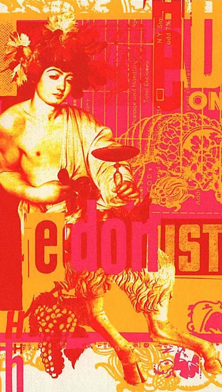
Character
Pioneer
We courageously leave behind the known for the promise of what might be
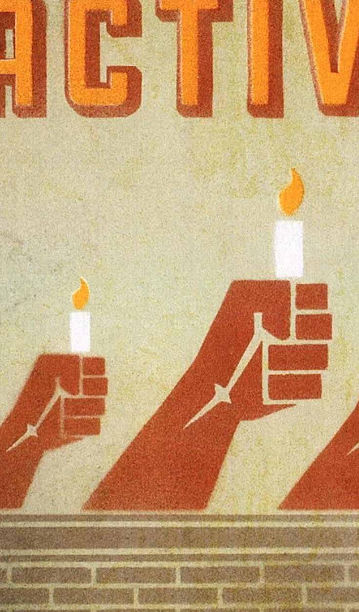
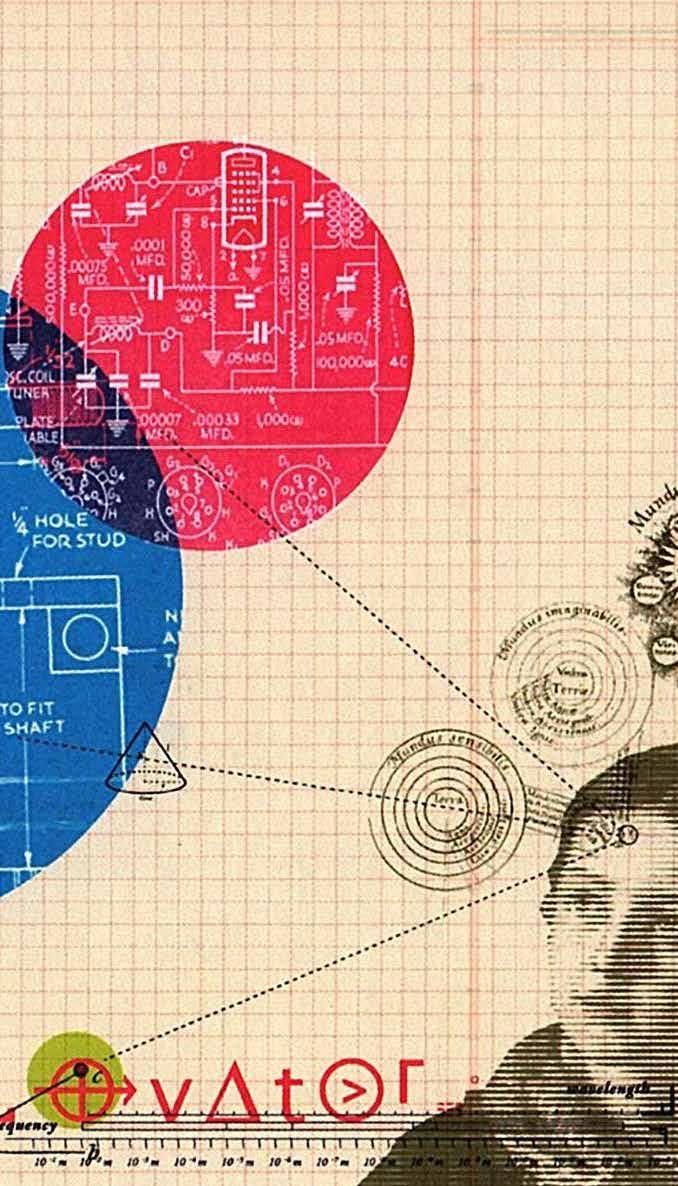
Innovator
We take risks and prefer to ask ‘why not?’ than ‘why?’
Activist
We ask people to change their behavior for the good of the world
Hedonist
We seek to bring out the good things in life
PERSONALITY
We are Vibrant, never Radical
We are Fun, never Ordinary
We are Approachable, never Niche
We are Modern, never Complex
AUDIENCE SEGMENTS
External Elements
Position
Hell yeah we did. (Improve everything).
We took your toothpaste and made it better
We looked at your sink, and made it cleaner
We looked at landfills and said let’s make them lighter
We’re not excusing ourselves for improving, well, everything. What’s your excuse? Brush Better.
New eras and trends as well as generation altering innovations belong to those who stand up and dare.
We want to inspire people to brush better. Better for their personal lives and better for the planet.
We’ve created a new delivery system for toothpaste that will inspire people to do just that.
Savvy Adults
• Enjoy better brushing
• Less mess, less waste
• Environmentally conscious
• Cutting Edge
Smart Parents
• Fun for kids
• Successful brushing
• Less mess and waste
• Successful parenting
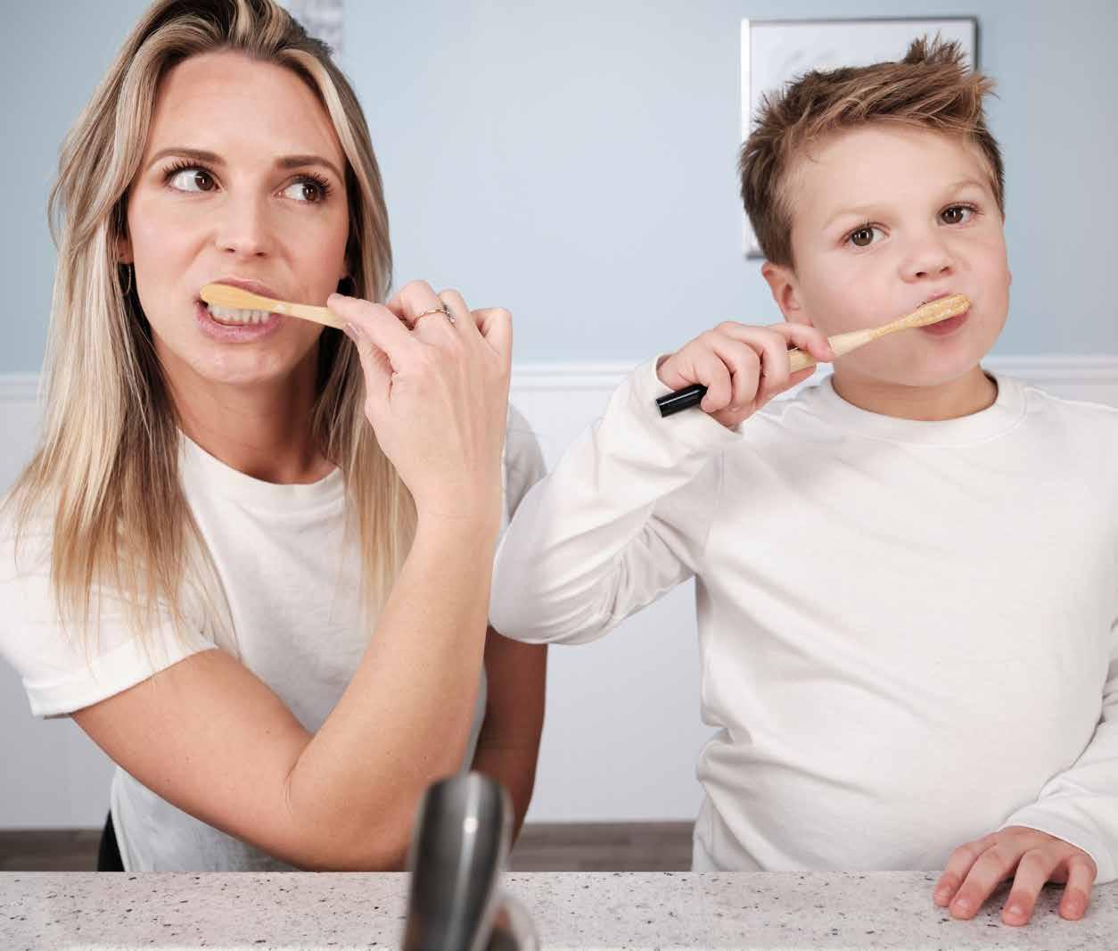
Our Story
We are the innovators of a cutting edge new toothpaste delivery product that will change the world - the Poppit. This toothpaste filled water soluble poppit eliminates waste, using zero plastic and no tube, while delivering the right dose of active ingredients for complete oral care. Every person worldwide will replace their old toothpaste tube with this fun and environmentally conscious product reducing the burden on landfills and improving our most valuable feature - our smile.
Sharp Tweens
• Cool brushing experience
• Cutting Edge
• Environmentally conscious
• Less mess, less waste
Silly Kids
• Fun and playful
• Successful brushing
• Harmony with parent
• Less mess and waste
Color Palette
AQUA CITRON
RGB: 115 212 223
HEX (#): 73D4DF
CMYK: 49% 0% 14% 0%
PMS: 319 U
Use for web/print elements..
RGB: 161 209 84
HEX (#): A1D154
CMYK: 41% 0% 86% 0%
PMS: 367 C
Use for web buttons and bolded headers.
AZUL
RGB: 45 173 227
HEX (#): 2DAEE9
CMYK: 67% 14% 0% 0%
PMS: 298 C
A primary brand color.
DEEP OCEAN
MIDNIGHT
RGB: 9 105 187
HEX (#):0969BB
CMYK: 88% 59% 0% 0%
PMS: 279 U
A primary brand color. .
RGB: 96 96 96
HEX (#): 606060
CMYK: 61% 53% 52% 24%
PMS: 418 C
Use for text.
RGB: 58 67 75
HEX (#): 3A434B
CMYK: 75% 63% 53% 41%
PMS: 446 C
Use for thin headers and header bars.
Maintain white space.
Your logo should always be surrounded with an ample buffer of white space. As a general rule of thumb, the buffer should be roughly half of your logo’s height.
When printing small, keep it simple.
For instances where your logo will appear small, switch to a one-color version and use a high-contrast color or black and white.
Use the proper format.
Use CMYK versions for anything you print. Use RGB versions for screens (emails, web, social media). Vector file formats (.eps, .pdf) are scalable and will maintain clarity at larger sizes; vector files are preferred for signage, billboards, and other oversized applications
Keep your logo unique.
Part of how your logo stands out in layouts is by using fonts that do not appear elsewhere in your designs. Don’t be tempted to use your unique logo fonts as headers or text in layouts..
Do not stretch or modify.
The quickest way to undermine your brand is altering your logo—either intentionally by adding to or changing the art, or unintentionally by improperly squeezing or stretching the logo as you scale it larger or smaller.
Preserve the integrity of your brand. Do not change any aspects of your logo. Learn how to scale graphics while preserving the original proportions (the aspect ratio). In many programs, holding down the Shift key will retain the proportions as you scale with a pointer tool.
Typography
Example of a Header
Example of large intro copy.
Example of body copy. At vero eos et accusamus et iusto odio dignissimos ducimus qui blanditiis praesentium voluptatum deleniti atque corrupti quos dolores et quas molestias excepturi sint occaecati cupiditate non provident.
Example of regular information.
A word on substitute fonts.
In a pinch, you can substitute Calibri for Zona Pro. Calibri will not have the same fine quality to the letters but is highly legible. If budget is an issue, consider purchasing one or two font styles of Zona Pro (Thin for large headers and Light for body copy) and use Calibri for everything else. You may also strategically purchase one or two licenses for workstations that produce the bulk of clientfacing materials.
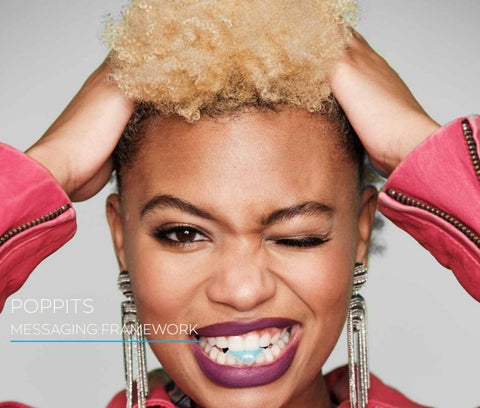
Imagery
Selecting photos
Photos should reflect your color palettes incorporating a pop of sassy bold visuals alongside a mix of turquoise, blue, green, charcoal and purple. Photos should convey being fun and playful even when using muted versions of an image.

Art and Icons
Icons should be flat and filled with a solid color, just like the art in your logo. Do not use cartoons or clip art, as they will erode your brand’s sophisticated and modern look.