BRAND STYLE GUIDE
A MANUAL FOR STAYING ON VIBE




Studio Chromatica is a queer-owned, one-man stained glass studio making vibrant, handmade pieces that transform sunlight into moments of joy. Rooted in self-expression, color, and connection, every piece brings a little more magic into everyday spaces.
Playful, heartfelt, & a little bit silly, the brand identity is an extension of founder Anthony’s fun-loving & vibrant personality.
Adults 20-40+ with some disposable income
Art Lovers
Plant/Nature Lovers
LGBTQIA+ & Allies
Creatives
Pet Owners
Self-Expression
Accessibility in Pricing
Celebration of Queer Identity
Honoring the Beauty of Imperfection

To create vibrant, handmade stained glass and other works of art that celebrate selfexpression, light, & whimsy–bringing everyday joy into homes and lives.
To build a world where color, craft, and queer identity shine proudly in the spaces we live and love—one beam of sunlight at a time. Spark joy,


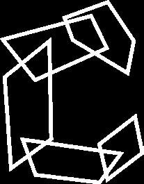

The pictorial mark can be used on its own for small spaces such as social media profile icons, favicons, or as part of a pattern.
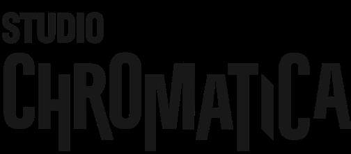
The B&W logo can be used on light backgrounds when a single color is needed for printing, embroidery, or cost-saving purposes.

The Reversed logo can be used on dark backgrounds when a single color is needed for printing, embroidery, or cost-saving purposes.


Clear space around the logo is necessary to retain its integrity and legibility in all use cases. No other text or imagery should come within one “STUDIO” height of the logo.
The logo may, however, be placed fully on top of an image in rare cases, so long as the placement provides clear legibility of the logo.
MINIMUM SIZES
The logo should never be reproduced below the following minimum sizes, in order to maintain legibility of both text and imagery.
PRINT: 1.25” (32mm)
DIGITAL: 150 px
The brand’s typography system uses two complementary typefaces: Antarctican Headline and Korolev Rounded Light.

1 2 3 4 5 6 7 8 9
Antarctican Headline brings bold energy and modern edge to the brand. Its clean, geometric structure gives headlines and the wordmark a punchy, eye-catching feel that fits the creative, vibrant spirit of the brand.
KOROLEV ROUNDED LIGHT
1 2 3 4 5 6 7 8 9
Korolev Rounded Light adds balance with a softer, more approachable tone. Its rounded shapes keep body text feeling fresh, friendly, and easy to read, supporting the brand’s welcoming personality.
This is an example of body copy using Korolev Rounded Light. Korolev Rounded Medium and Korolev Rounded Light Italic can be used for emphasis within any body copy. 130 pt | ALL CAPS
50 pt | ALL CAPS 52 pt | ALL CAPS

32 pt | Sentence case

HAPPY CREATING!
