forADH ADH
RESOLUTION
DESIGN RESOURCES KEYBOARD SHORTCUTS SIZING (FOR PRINT & WEB)
As a creative living with ADHD, I am a firm believer that this neurodivergance is both our biggest asset & greatest challenge.
ADHD means our minds have quite the knack for freely associating one thing with another – sometimes this is detrimental, like when you’re supposed to be designing a poster but the font choice reminded you of a band you like and now you’re going down a rabbit hole into their discography and – Oh, crap! You forgot to eat today! Other times, this superpower can be harnessed to open up creative possibilities that the neurotypical designer might not reach as readily.
This reference guide is designed to be a quick & accessible resource for all of those basic design things that neurotypical graphic designers likely have memorized – including standard sizing and resolutions for various project types, color modes & theory, keyboard shotcuts that will change your life, resources for inspiration and more. I created this booklet for myself and anyone like me that needs to be able to verify these things at a moment’s notice since my memory can’t be trusted, and I hope that you will find it useful as well.

By acknowledging & organizing the essential information, we free up space for our talents & creativty to shine – We can tame & harness the chaos.
“So, go back to your desk, push aside the candy bar wrappers, crank
Because if you’re an Attention Deficit Designer, I believe you’ve found
– Jon Winebrenner
Red: Energy, Passion, Love, Excitement, Aggression
Blue: Calmness,Trust, Serenity, Stability, Professionalism
Yellow: Happiness, Optimism, Warmth, Creativity, Attention-grabbing
Green: Nature, Growth, Health, Renewal, Balance
Purple: Royalty, Luxury, Mystery, Spirituality, Creativity
Orange: Energy, Enthusiasm, Warmth, Playfulness, Vitality
Pink: Romance, Femininity, Love, Sweetness, Youthfulness
Brown: Stability, Earthiness, Reliability, Warmth, Simplicity
Black: Elegance, Power, Sophistication, Mystery, Formality
White: Purity, Cleanliness, Simplicity, Innocence, Space
Gray: Neutrality, Balance, Professionalism, Timelessness, Conservatism
Gold: Luxury, Prosperity, Prestige, Elegance, Wealth
Silver: Modernity, Sleekness, Innovation, Technology, Futuristic
COLOR
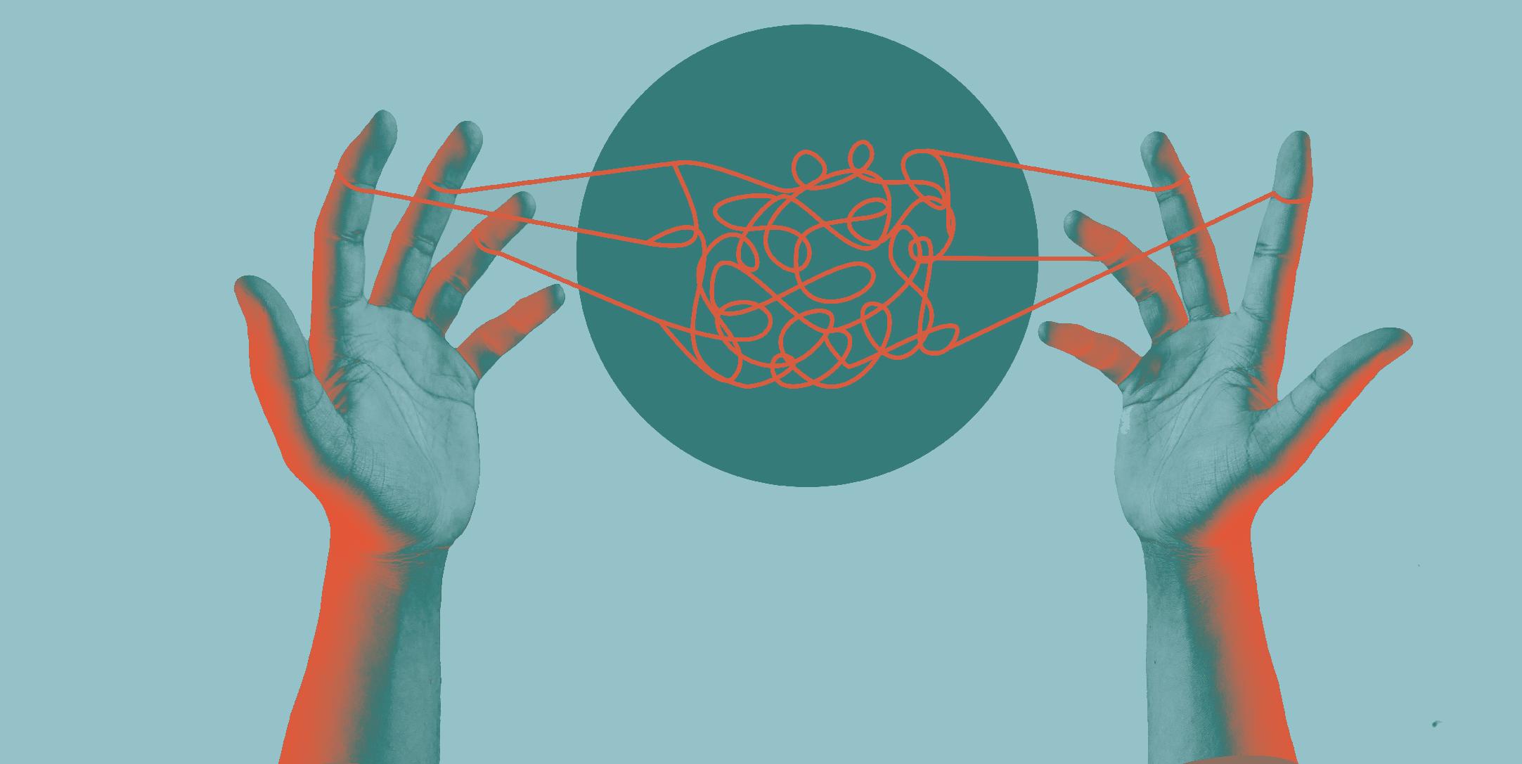
This image is an example of a duotone effect, which limits the value creation to a combination of two designated colors (in this case, the orange and teal found throughout this booklet)– perfect for spot color printing without breaking the bank!
COLOR PSYCHOLOGY
crank the tunes and find the flow. found the perfect job for yourself.”
RGB / CMYK / SPOT
RGB (Red, Green, Blue)
An additive color model used for digital displays. It combines varying intensities of red, green, and blue light to create colors. In RGB, colors are created by adding these primary colors, with white resulting from the full combination and black from none.
CMYK (Cyan, Magenta, Yellow, Key/Black)
A subtractive color model used in color printing.It involves subtracting percentages of cyan, magenta, yellow, and black ink from a white background to create colors.
Spot Color (Pantone or Spot Ink)
A printing method using pre-mixed ink colors (e.g., Pantone) for precise and consistent results. It’s ideal for brand-ing and designs requiring exact color matching. A single ink is used to achieve vibrant and uniform colors, distinct from standard CMYK printing. This printing method is typically the most costly, and limiting distinct colors to one or two spot inks (+paper color) is recommended.
In essence, RGB is for digital screens, CMYK is for general color printing, and spot color is for precise, consistent, and custom ink colors, often used in logo design and branding. The choice depends on the medium and specific requirements of a project.

SIZE MATTERS
AT LEAST IN DESIGN...
Standard sizes, whether for print materials like business cards, brochures, or digital media like social media images, website banners, and screen resolutions, offer consistency and predictability in design. They help designers create content that fits seamlessly into various platforms and mediums, ensuring a harmonious visual experience for the audience. While creative freedom is essential in graphic design, the adherence to standard sizes serves as a reliable foundation that aids in effective communication and presentation of visual content across diverse media.
Remembering all of those sizes, though? For the ADHD Designer, that’s quite the challenge. The table on the right lists some of the most common sizes you will work with on a day to day basis.
When in doubt, always clarify with your client and/or printer!

Logos must be scalable to a wide range of sizes without sacrificing legibility, brand recognition, or accessability.
Design them as a vector and stress-test them at various sizes.
FACEBOOK BANNER
TWITTER BANNER
INSTAGRAM SQUARE
INSTAGRAM STORY
SHOW POSTER
HANDBILL FLYER
SKYSCRAPER AD
SUPER-SKYSCRAPER
BUSINESS CARD
BILLBOARD
LETTERHEAD
POSTCARD
FLYER
WEB GRAPHICS
BROCHURE
EMAIL NEWSLETTER
600 - 700 PX WIDE

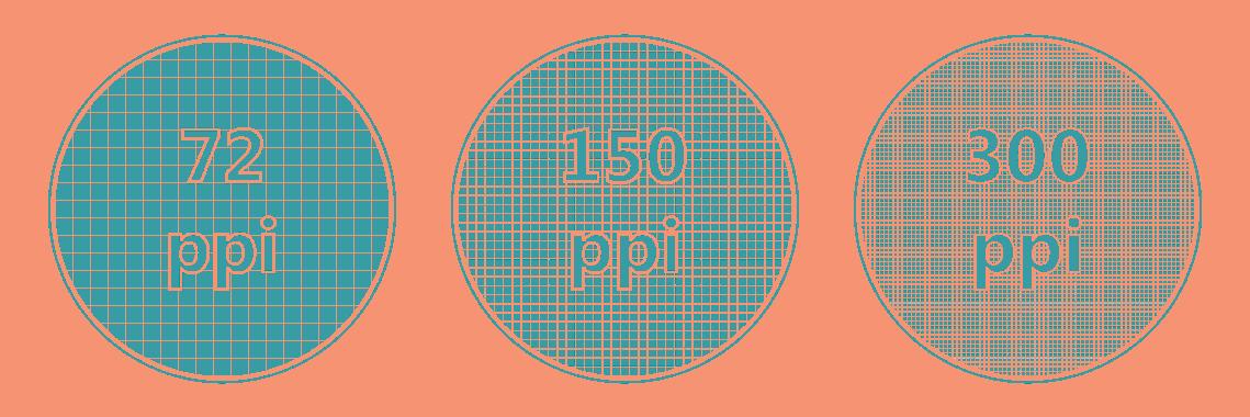
DPI = DOTS PER INCH (PRINT) = PPI = PIXELS PER INCH (SCREEN)
Brochures, Flyers, Business Cards:
SO DOES
Print Materials Digital Graphics
300 DPI is the standard for high-quality print materials.
Magazines, Newspapers:
150-300 DPI, depending on the publication’s quality and paper type.
Large Format Prints (Posters, Banners):
150-300 DPI for close viewing, but large billboards may use lower resolutions.
Web Graphics:
72-96 DPI is standard for web images, but 150 DPI can be used for high-quality web graphics.
Social Media Graphics:
72-96 DPI is sufficient for most social media platforms.
RESOLUTION

Keyboard commands are essential to the efficiency of a graphic designer’s workflow. These commands allow designers to swiftly navigate intricate design software and access crucial tools without the need to interrupt their creative flow by searching through menus and toolbars.
With a deft combination of shortcuts, designers can effortlessly switch between tools, adjust settings, and manipulate elements on the canvas, saving precious seconds that accumulate into hours of productivity over time. In the fast-paced world of graphic design, where time is of the essence, mastering keyboard commands is a cornerstone of success. There are so many that it’s impossible to memorize them all, but find your favorites and keep adding to that muscle memory to enhance your workflow over time.
Why some commands aren’t ubiquitous across the Adobe CC suite, only the evil geniuses at Adobe could tell you. Probably to torture me.
Here are some of my favorite time-saving shortcuts.
COMMON (ACROSS ADOBE SUITE)
CMD + A = SELLECT ALL
CMD +/- = ZOOM IN/OUT
CMD + SHIFT = SELECT MULTIPLE
CMD + R = SHOW/HIDE RULERS
CMD + U = SMART GUIDES ON/OFF
CMD + SHIFT + S = SAVE AS / CMD + S = SAVE
CMD + { = MOVE BACK / CMD + ] = MOVE FORWARD
CMD + SHFT + [ = MOVE ALL THE WAY BACK
CMD + SHIFT + ] = MOVE ALL THE WAY FORWARD
SHIFT + CMD + , = REDUCE SELECTED TEXT SIZE
SHIFT + CMD + . = INCREASE SELECTED TEXT SIZE
CMD + ; = SHOW/HIDE GUIDES / OPT + CMD + ; = LOCK/UNLOCK GUIDES
SHIFT + CMD + , = REDUCE SELECTED TEXT SIZE
SHIFT + CMD + . = INCREASE SELECTED TEXT SIZE
SHIFT + ANY ARROW KEY = MOVE SELECTED, 10X INCREMENTS (MOVE FASTER)
CMD + G = GROUP SELECTED / SHIFT + CMD + G = UNGROUP SELECTED
ALT + DRAW SHAPE, TEXT/CONTENT BOX, ETC. = DRAW FROM CENTER
[ OR ] WHILE USING A BRUSH TOOL = DECREASE/INCREASE BRUSH SIZE
HOLD SHIFT..
WHILE SCALING = SCALE PROPORTIONALLY
WHILE ROTATING = ROTATE IN 45 DEGREE INCREMENTS
WHILE DRAGGING OBJECT = MOVE STRAIGHT (HORIZ. OR VERTICAL)
TIME IS MONEY
ILLUSTRATOR
OPT + CMD + A = SELECT ALL ON ACTIVE ARTBOARD
V = SELECTION TOOL
A = DIRECT SELECTION TOOL
CMD + 2 - LOCK SELECTED
OPT + CMD + 2 = UNLOCK ALL
I = EYEDROPPER TOOL
SHIFT + CMD + P = PLACE IMAGE
CMD + 3 = HIDE SELECTED
SHIFT + CMD + E = APPLY LAST EFFECT
SHIFT + CMD + O = CREATE TEXT OUTLINES
SHIFT + M = SHAPE BUILDER TOOL
X = TOGGLE BETWEEN FILL/STROKE
ALT + DRAG = DUPLICATE
CMD + 7 = MAKE CLIPPING MASK

INDESIGN
V = SELECTION TOOL
A = DIRIECT SELECTION TOOL
CMD + L = LOCK SELECTED
ALT + CMD + L = UNLOCK ALL
F = RECTANGULAR FRAME TOOL
CMD + D = PLACE LINKED IMAGE
SHIFT + CMD + P = ADD PAGE
CMD + ARROW UP/DOWN =
NEXT/LAST PAGE
OPT + CMD + O = FIT SPREAD
IN WINDOW
OPT + CMD + W = TEXT WRAP
SHIFT + W = PRESENTATION MODE
CMD + J = NEW LAYER (COPY)
SHIFT + CMD + J = NEW LAYER (CUT)
CMD + SHIFT + N = NEW LAYER (CREATE)
CMD + I = INVERT LAYER MASK
TAB = TOGGLE VIEW MODE
SHIFT + CMD + I = INVERT SELECTION
SHIFT + (+ PLUS) OR (- MINUS) = CYCLE THROUGH BLEND MODES
ALL NUMBER KEYS 1-0 = CHANGE
OPACITY (1 = 10%, 0 = 100%)
CMD + M = MARQUEE TOOL
C = CROP TOOL
CMD + E = MERGE SELECTED LAYERS


“Every new idea is just a mashup or a remix of one or more previous ideas.”
Like An Artist’
Austin Kleon, ‘Steal
FREE DESIGN RESOURCES FOR...
Imagery
PIXABAY
photos & illustrations
UNSPLASH
high-res photography
HUMAANS
mix-&-match illustrations of people
BLUSH
customizable illustrations
UNDRAW
open-source illustrations
SHOTSNAPP
device mock-ups
FEATHER ICONS
open-source icons
Inspiration
DRIBBBLE
curated design inspo
collect what inspires you
NICELYDONE
ui/ux design inspo
TYPEWOLF
what’s trending in type
DUO
curated color combos
Typography
DAFONT filter by ‘100% free’ FONTJOY
ai-powered font pairing
FONTPAIR
fonts & pairing
TYP.IO
popular font pairings
GOOGLE FONTS
open-source fonts
Misc.
LOGOLAB
stress-test your logos
DESIGNER MILL collection of freebies in all categories
THE ADHD ARTIST PODCAST
Life, art, superpowers, &... wait what was I saying?! Hosted by Sarah Gise, your fellow ADHD artist.
BUT FREE IS BETTER

ADHD IS YOUR SUPERPOWER
