Brand Style Guide 2019


© Snappy Salads Enterprises, LLC - Confidential

© Snappy Salads Enterprises, LLC - Confidential Contents 2 Introduction pg. 3 Who is Snappy Salads? Our Purpose, Values, Personality, and Tone of voice pg. 4 Creative Roadmap Logos, Fonts, Colors, Assets & Imagery pg. 8 We’re here for you The Guide & Phrases pg. 15 In-Store Boards pg. 21 Email pg. 26 Social pg. 28 Direct Mail pg. 31 The Environment pg. 33
that it
This was the
“No matter where I looked, I couldn't find a nutritious meal served quickly that tasted good enough
made me want to order it again.
inspiration for Snappy Salads."
- Chris Dahlander, Founder 2006
Welcome!
• This document contains all you need to know about how the Snappy Salads brand should be used in marketing materials. Living by these guidelines protects our brand because it will appear consistent across all touchpoints.
• Just like a recipe, this guide is part science and part art. It was developed to create effective communication that matches the character and voice of Snappy Salads. Using this guide appropriately and accurately resides in knowing as much about the foundation and spirit of Snappy Salads as possible.
© Snappy Salads Enterprises, LLC - Confidential
3
Who is Snappy Salads?
© Snappy Salads Enterprises, LLC - Confidential
4
Our Purpose
• Snappy Salads reframes how people perceive salads – from “diet food” to “center-of-the-plate, can’t-get-enough, want-tocome-back” meals. We guide our guests as they discover satisfying salads so they feel satisfied, refreshed, and fulfilled.
• At Snappy Salads, we believe that when everything has a purpose, the benefits are exponential. We create life-changing salads with fresh flavors, intriguing combinations, and consciously-sourced ingredients.
• We are “neighbors serving neighbors” which creates a dining experience that’s so good the guest wants to come back again tomorrow.
© Snappy Salads Enterprises, LLC - Confidential
5
Our Values and Personality
© Snappy Salads Enterprises, LLC - Confidential
6 Involved Authentic Interesting Humble Progressive Inclusive Welcoming Transparent Intelligent Fun Self-aware Charming Disciplined Generous Motivating Curious Healthy Respectful Happy Non-judgemental Captivating Interesting Neighborly Inspiring Leaders Dedicated Professional Optimistic Realistic Honest
Tone of Voice:
Direct
Friendly
Honest
Natural
Informal
Insightful
*This is the brand tone of voice and not instructions for writing copy. Any copy requests should be directed to the marketing team.
We refer to our tone of voice as...
“Genuinely interested in sharing our passion for leaving this world better than the way we found it through intelligent conversations.”
We are not…
Condescending. Trite. Expected. Predictable. Assuming. Pompous. Disingenuous. Brusque.
We are a guide upon which our guests can rely.
© Snappy Salads Enterprises, LLC - Confidential
7
Creative Roadmap
© Snappy Salads Enterprises, LLC - Confidential
8
Logos:
Always include the register mark ® symbol on logo and tagline
Logo must be enclosed with rectangle if “Snappy Salads” and pinwheel are used together
When shown together, the pinwheel must be placed between “Snappy” and “Salads” Logo can be displayed without the tagline

© Snappy Salads Enterprises, LLC - Confidential
9
Logo: Clear Zone
When using the Snappy Salads, logo nothing else should appear within the “clear zone” around the logo. This is done to assure that the Snappy Salads logo is not crowded by other visuals that diminish the impact of the brand. The diagram below shows the clear zone that should be observed. This area is defined by the height of the letter “S”. As the logo is made larger/smaller the clear zone will scale up/down proportionately.

© Snappy Salads Enterprises, LLC - Confidential
10
x x x
Fonts:
“Roboto Slab is used as the primary header font Body text is intended to be used for optimal legibility
© Snappy Salads Enterprises, LLC - Confidential
11 Primary Header Roboto Slab: A b c d e f g h I j k l m n o p q r s t u v w x y z 1 2 3 4 5 6 7 8 9 0 ! ? . , ; ’ ” Secondary Header Lunchbox: A b c d e f g h I j k l m n o p q r s t u v w x y z 1 2 3 4 5 6 7 8 9 0 ! ? . , ; ” Primary Body Arial Aa Bb Cc Dd Ee Ff Gg Hh Ii Jj Kk Ll Mm Nn Oo Pp 1 2 3 4 5 6 7 8 9 0 ! ? . , ; ‘ “
Colors:
Any other colors used for brand messaging must be approved by Snappy Salads Acceptable textured background/accents: Chalkboard
Paper bag
Stainless steel
Dark Green:
RGB: 19, 50, 43
CMYK: 93, 33, 68, 85
Pantone 627C
Dark Green: Hex #13322B

Light Green:
RGB: 80, 158, 47
CMYK: 78, 0, 100, 2
Pantone 362C
Light Green: Hex #509E2F
White:
RGB: 255, 255, 255
CMYK: 0, 0, 0, 0
Pantone None
White: Hex #ffffff
True Black:
RGB: 0, 0, 0
CMYK: 75, 50, 30, 100
Pantone Black
True Black: Hex #000000

© Snappy Salads Enterprises, LLC - Confidential
12
Assets:
• All other assets are available on Dropbox by invitation only.
• Any backgrounds, borders, archives, or other sources available through SM are not authorized by Snappy Salads for use.
• All final artwork must be approved prior to use.
© Snappy Salads Enterprises, LLC - Confidential
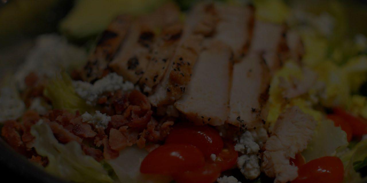
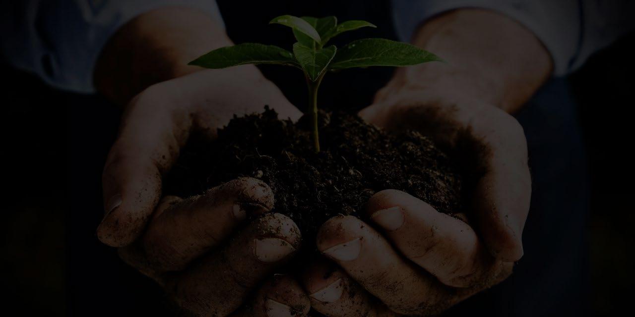
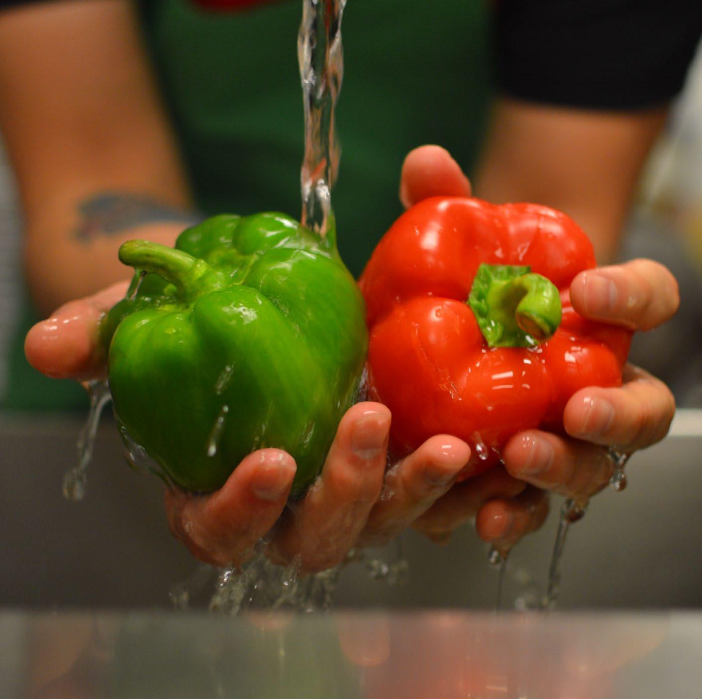
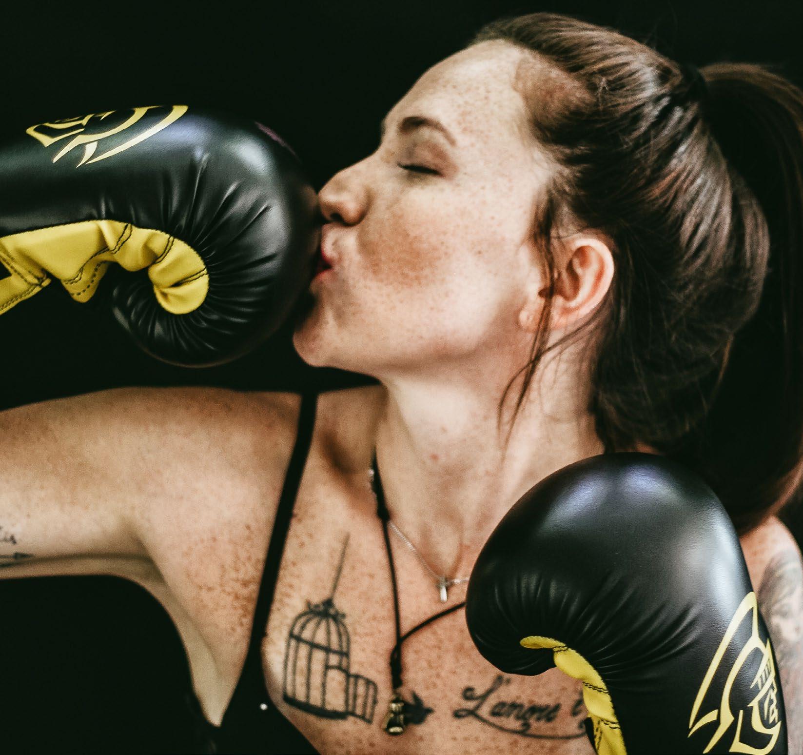
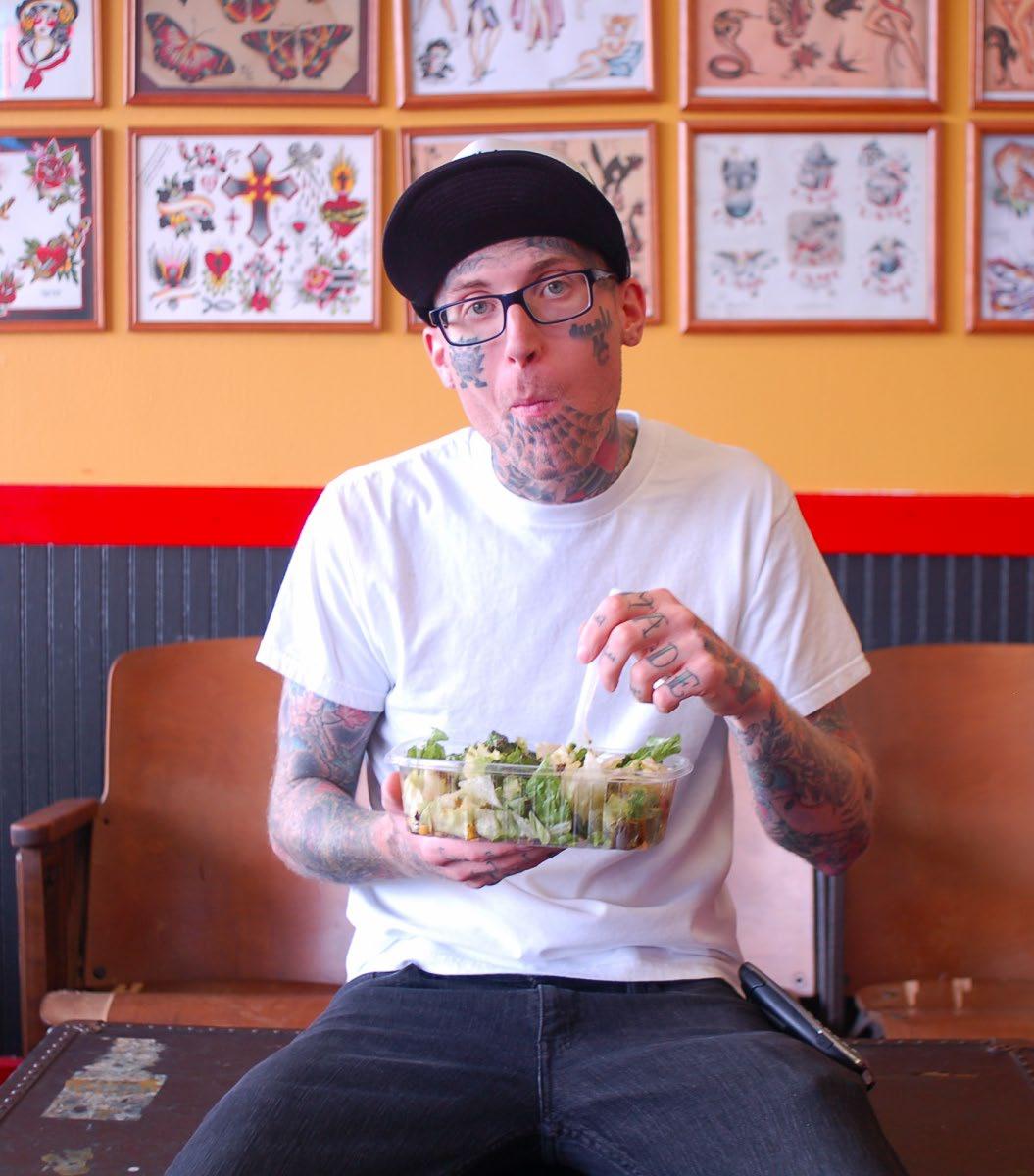
Photos and imagery should appeal to an active 32-year old. Make it inspirational, brooding, and cool.


Snappy Salads Enterprises, LLC 14
We’re here for you
© Snappy Salads Enterprises, LLC - Confidential
15
Every great movie has a simple formula…
The unsuspecting Character who has a problem meets a Guide who gives him a Plan and calls them to action, and while battling the Bad Guy, is transformed into the Hero.
© Snappy Salads Enterprises, LLC - Confidential 16
Our great movie has a simple formula too…
The unsuspecting Character who has a problem meets a Guide who gives him a Plan and calls them to action, and while battling the Bad Guy, is transformed into the Hero.
The unsuspecting Non-salad Eater who’s tired of poor-eating choices discovers Snappy Salads where he tries the Grilled Avocado Salad which satisfies his physical and emotional appetite, and conquers his chronic Weight and Health Issues, that transforms him into a New Person. Discover satisfying.
© Snappy Salads Enterprises, LLC - Confidential 17
TM
We are their Guide
• We’ve all said, “I wish I hadn’t eaten that” after a gluttonous meal. We know that salads are better for us, but we haven’t had a salad that fills our cravings – well not until Snappy Salads came into our lives with craveable salads.
• Snappy Salads is the guide that people need to help them eat better so that they don’t have the regret that comes immediately after an unhealthy meal -- the meal that makes them feel physically uncomfortable and disappointed emotionally. Feeling bad mentally makes us eat our stress which starts a vicious cycle.
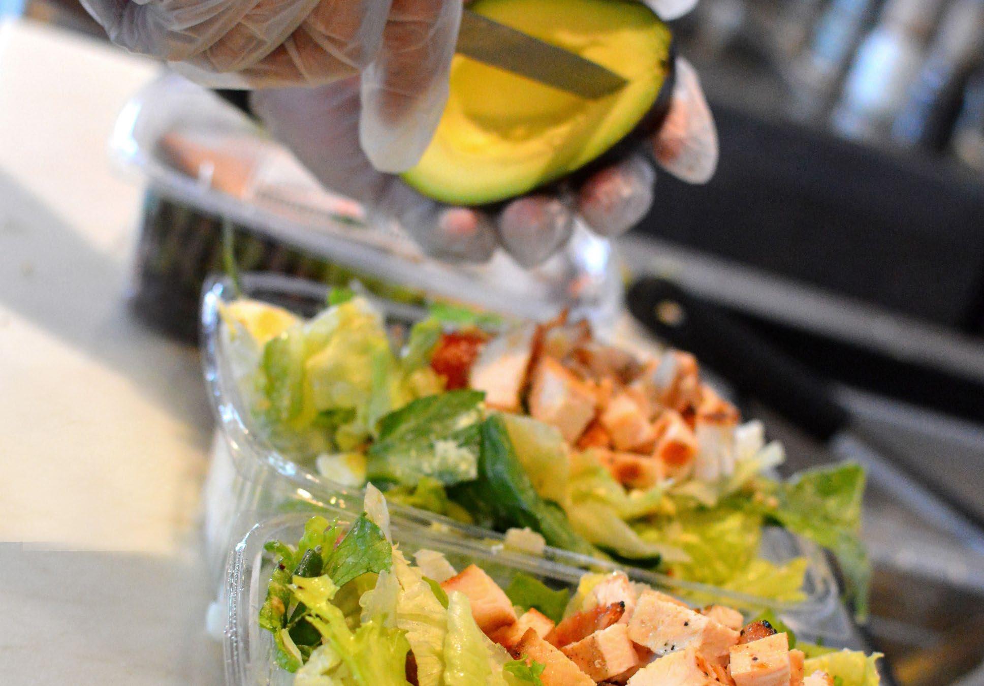
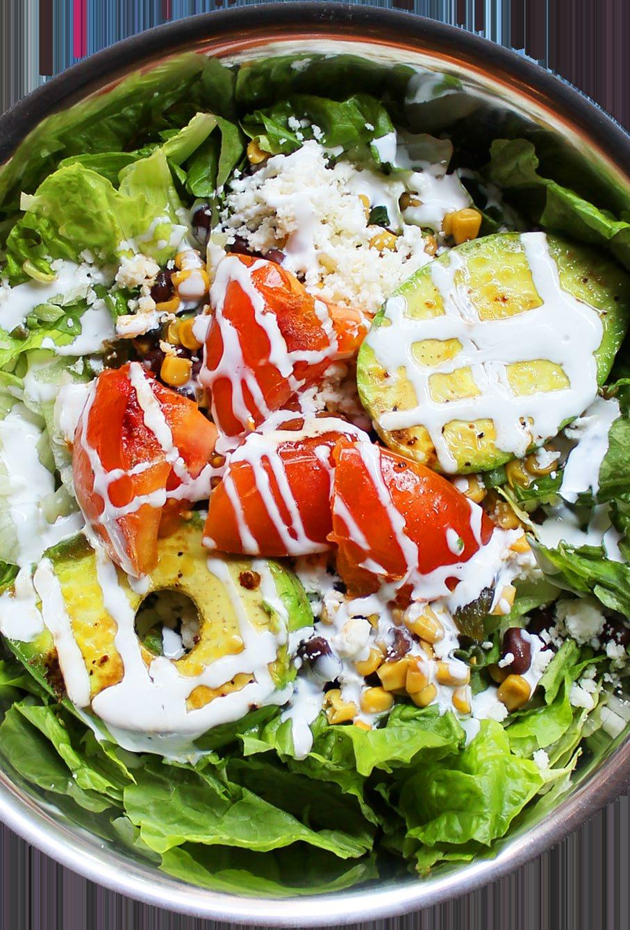
• Our #1-Selling Grilled Avocado salad is the source for a life-changing discovery that salads are indeed fulfilling and what guides people out of the food abyss into a new life of fulfillment.
© Snappy Salads Enterprises, LLC - Confidential
18
We are their Guide
Wherever we can and as often as we can, we will use the Grilled Avocado Salad in our promotional materials. Sure, we have other craveable, life-changing salads and Piadina Wraps, but by focusing our message on the Grilled Avocado Salad, we’ll promote the reason why people come to Snappy Salads in the first place. Remember, “repetition doesn’t ruin the prayer.”
Red leaf lettuce, iceberg, black bean/poblano/corn relish, Grilled Avocado and thick-sliced grilled tomato, queso fresco, our housemade Chipotle-Lime Vinaigrette, and Mexican crema.
19
Phrases we like to use
• Testimonials from our guests are our best source of affirmation. Actual quotes create powerful message that we should use to our advantage. Always source the quote (i.e. – A. Smith).
• It’s been proven that a good headline increases “click-through” rates. Using questions is the best method:
- Want to - Looking for - Don’t you
- Tired of - Are you - Wouldn’t you
• Regardless of the message, the point of view must be written from the reader’s vantage point (We’re here for you. We are your guide).
- You told us - You were asking
- Thanks to you - Because of your
© Snappy Salads Enterprises, LLC - Confidential
In-store Boards
© Snappy Salads Enterprises, LLC - Confidential
21
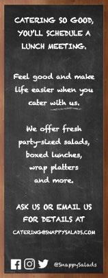
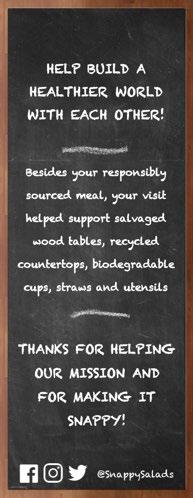
In-store Boards:
What’s Snappening
Since 2006
Exterior boards
What’s Snappening Board
Found in all of our stores, this black board is usually in a focal point. The intent of this board is to communicate what’s happening at Snappy Salads during a period of time. The Board copy may last as little as one week or up for 6 weeks.
Since 2006 Board
Currently this is only at the West Park Blvd., and Beltline locations. The goal of this board is to communicate specific messaging around two key content pillars:
1. How is Snappy Salads purposeful?
2. How is Snappy Salads fresh?
Other Boards
Additional boards can be found in select stores. This message will either focus on an upcoming event, recently won award or support message to the current What’s Snappening board.
© Snappy Salads Enterprises, LLC - Confidential
22
In-store
Boards:
All boards should be written on standard black chalkboard
All board should be seasoned before first use
Primary chalk color is white
Boards should be written with chalk medium unless otherwise specified
Use of decorative borders around board and words will not be used unless otherwise specified
No legal needed
Always include social media icons for Facebook, Twitter and Instagram
Attention statement
What we’re up to or what we need from customer
Call to action
Invitation to follow us on social
© Snappy Salads Enterprises, LLC - Confidential
23
“Since 2006” Board
Header remains constant
Fresh statement
Supporting copy
Social Icons
Year and hashtag remain constant
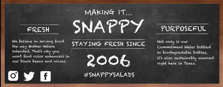
Purposeful statement
Supporting copy
© Snappy Salads Enterprises, LLC - Confidential 24
In-store Boards:
Tips & Tricks
Tips and Tricks to the perfect In-store Boards!
• Seasoning a chalkboard: Use a full piece of chalk and run it on its side over the entire surface of the chalkboard. Make sure to rub it in well. Once the board is covered – erase it.
• Don’t use dry chalk: Dip the chalk in water before drawing on the board. As you work, keep dipping the chalk in water to keep it wet. At first, the chalk lines will look faded – not bright – be patient and let it dry – it will dry bright white (white is to be used all copy) and whatever color chalk you are using for illustrations. You can also keep the board wet and draw on a wet board. When you add the wet colored chalk over existing dry white chalk it will appear that the white chalk has been ruined. It has not – just wet and looks faded. When it dries it will look nice and bright again.
• Use a level and a ruler: Nothing looks more amateur than text that drifts up or falls down. Use a level and a ruler to mark some guidelines so your letters are the same size and on the same line.
• Avoid the Widows: A widow is the paragraph-ending word that falls at the beginning of a new line, thus separated from the rest of the text.
• Make a border: Use a square at each corner and double lines then fill the double lines in with dots of color.
• Mix up font styles: Thick, 3-D, thin, serif, shadow, and script. A good rule of thumb is to use no more than 3 fonts. One heavy print font, a script font, and one thin caps font.
• To find the center of a word or words for one line: Count the number of letters and spaces between each word. For instance “fresh-squeezed” has 14 letters – an even amount – no spaces, so the center is between the “S” and the “Q”. If using both lower case and capital letters, capital letters take up a bit more room, but this is a good rule of thumb to center lettering. Draw the center letter or space on your center point and then draw the other letters out from this center point to each side to complete your word. This is the hardest part of chalkboard art – making free hand letters. Some letters will be bigger and your centering will look off. Mine is off, but it still looks OK – not perfect – but fun and festive. Don’t try for perfection. The imperfections can sometimes add to the charm of chalkboard art.
• Always have Q-tips and damp rags: When you are done, go back thru and touch up/clean up any spots that are a little smudged or have a lot of detailing with a wet q-tip. Keep a stack of them plus a cup of water for easy clean up. Oh, and while you are at it, know that a wet rag is your next best friend. DON’T use paper towel you will get little fuzzies stuck everywhere.
© Snappy
LLC - Confidential
Salads Enterprises,
25
Email
© Snappy Salads Enterprises, LLC - Confidential
26
Always provide a subject line
Email:
Emails should always come from:
chris@snappysalads.co m
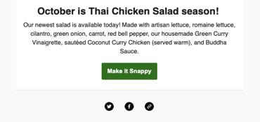
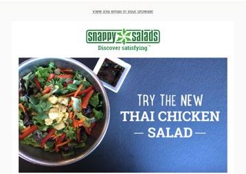
Stick to one (1) idea or message per email
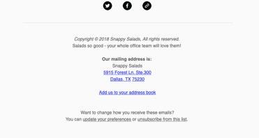
The voice needs to always be simple and conversational
Always include a header image
Include links to active social media platforms
We are legally required to provide “unsubscribe” option
© Snappy Salads Enterprises, LLC - Confidential
27
Include sender email
Have a call to action
Social Media
© Snappy Salads Enterprises, LLC - Confidential
28
Platforms and Profile:
All posts must be approved by Chris D. and marketing team Usernames must be @snappysalads
Use approved pictures found in Dropbox folder
Use approved hashtags
Active Social Media Platforms:
Facebook: facebook.com/SnappySalads/
Instagram: instagram.com/snappysalads/
Twitter: twitter.com/snappysalads
Social Media Tone:
We are proud and passionate about the food we serve and the work we do to serve our community. We believe in what we do and accept when we make a mistake. We love to converse and make people rethink the way they eat. We’re optimistic but realistic. We tell the truth.
Profile Pictures: Must stay consistent across all parent platforms
Use as much as the space provided without cropping or distorting logo
Use pinwheel as profile picture unless instructed differently

© Snappy
Salads Enterprises, LLC - Confidential
29
Social Imagery:
Profile Image: 180 x 180 400 x 400

Cover Image Guidelines: 820 x 312
Appear on page at 820 x 312 pixels. Anything less will be stretched.
Minimum size of 399 x 150 pixels. Displays at 820 x 312 pixels on desktop and 640 x 360 pixels on smartphones. For best results, upload an RGB JPG file less than 100 KB. Images with a logo or text may be best as a PNG file.
Take into account placement of buttons and profile picture
Cover Image Guidelines: 1,500 x 500
Maximum file size of 5 MB.
Image types include: JPG, GIF or PNG. Take into account placement of buttons and profile picture

Profile Image: 110 x 110 (round)

Image Guidelines
1080 x 1080 pixels.
Instagram still scales these photos down to 612 x 612 pixels.
Appear in feed at 510 x 510 pixels. Square or rectangle photos: make sure to maintain an aspect ratio between 1.91:1 and 4:5 ratio.
Smaller featured header images appear as 204 x 204 pixels, and larger featured header images appear as 409 x 409 pixels.
Best for sharing: New menu items, events, NROs, values, and customer engagement
Best for sharing: New menu items, events, NROs, values, and customer engagement
Best for sharing: New menu items, reshares, NROs, values, and customer engagement
© Snappy Salads Enterprises, LLC - Confidential
30
Platform updates happen regularly Always check the most recent dimensions to reduce any unnecessary cropping or distortion across all devices
Direct Mail
© Snappy Salads Enterprises, LLC - Confidential
31
Include name of salad when shown
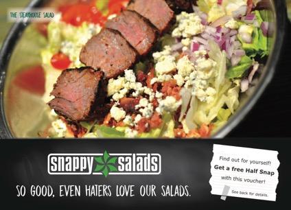
Direct Mail:
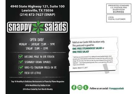
Each campaign will differ but style guide use of logo, pinwheel, color and fonts should be applied
Offers should have a legible font of 8pt font. The legal must contain location where the offer is excepted and date the offer is good for.
Include legal when offer present
Include logo


© Snappy Salads Enterprises, LLC - Confidential 32
Front Back
The Environment
• Being and staying environmentally conscious is one of the biggest drivers in our daily values. We go to great lengths to find food that’s both great tasting and great for Mother Earth. As an extension of this practice, we ask that you use suppliers who use sustainable manufacturing practices and suppliers who value their environmental credentials. It is important that everyone understands the importance of reducing our footprint on the planet.
Whenever possible, limit the use of raw materials being produced. The following materials have been approved and are encouraged when needed:
• Corn polymer plastic
• Hemp fabric
• Organic cotton
• Recycled paper
© Snappy Salads Enterprises, LLC - Confidential
•
33
© Snappy Salads Enterprises, LLC - Confidential Thank You. For more information: Chris Dahlander chris@snappysalads.com
