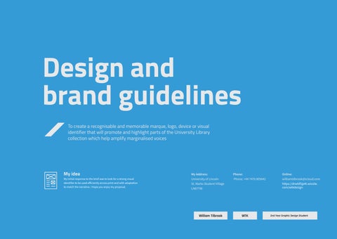
To create a recognisable and memorable marque, logo, device or visual identifier that will promote and highlight parts of the University Library collection which help amplify marginalised voices
My idea My initial response to the brief was to look for a strong visual identifier to be used efficiently across print and with adaptation to match the narrative. I hope you enjoy my proposal. My Address: University of Lincoln St. Marks Student Village LN67TW Phone: Phone: +44 7470 805642 Online: williamtilbrook@icloud.com https://drwbf5jp4t.wixsite. com/wtkdesign WTKWilliam Tilbrook 2nd Year Graphic Design Student Design and brand guidelines
Welcome to my vision of Decolonising Lincoln
01.1
Table of contents
Logo and usage 5
01.2 Minimum logo sizes 6
02.1 Primary font 8
02.3 Secondary font 10
03.1 Website grid system 13
03.2 Mobile grid system 14
04.1 Images and mockups 16
04.2 Images and mockups 17
00.0
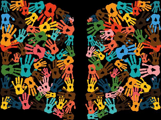
The corporate logo design
My idea for the logo.
01
Logo and usage


1 2
COLOUR PALETTE
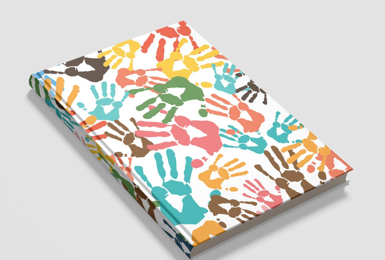
The design for me represents accessibility and diversity. I did this by looking at how to link what the library offers with the representations of what it is looking to get across. So with the design you can see it’s a book so there is no confusion to the customers.
It’s more than that though the book is created with a combination of handprints in different colours and sizes to represent the a diverse range voices being heard with peoples hands. Also, you read and write book with your hands so therefore it is a good fit. I believe this visual identifier matches the core values of a decolonised world.
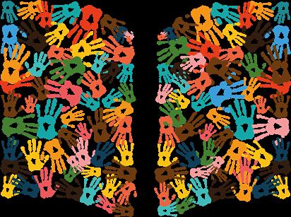
A large number of handprints appear this is to give off the value of accessibility in that everyone’s book can be read which this project is looking to do. The colours where chosen as the are varied from one another therefore helping the design stand out on page.
GREY SCALE VERSION

5 MY LOGO DESIGN AND REASONING
DARK VERSION

01.1
Minimum logo sizes


20 mm
mm 4,6 mm 11 mm 8 mm


7,9
6
01.2
The corporate typography
The typography choice for display and company usage.
02
I chose this typeface as its modern and works well with the logo and has a range of different styles to it. This matches with how I want the logo type to look like in terms of classy.
8 Primary font02.1 ABCDEFGHIJKLMNOPQRSTUVWXYZ abcdefghijklmnopqrstuvwxyzAa Fenwick Bold 123456789£$?!<>{}
Default Slogan
Default
Header
Default
9 Primary font02.2 Brand
Default Text
Subtitle Contents
Name Header Subtitle Contents
I chose this typeface as its modern and works well with the logo and has a range of different styles to it. This matches with how I want the logo type to look like in terms of being classy.
10 Secondary Font02.3 ABCDEFGHIJKLMNOPQRSTUVWXYZ abcdefghijklmnopqrstuvwxyzAa Fenwick Regular 123456789£$?!<>{}
Brand
Default Slogan
Header
Default
Default
Header
11 Secondary Font02.4 Subtitle
Default Text
Subtitle Contents
Name
Contents
The print and web grid system
Logo placements and styles.
03
grid system


13 Website
03.1
Web grid system
Mobile Device
14 03.2
Images and Mockups
A look into how the logo would shape the brand on different products
04
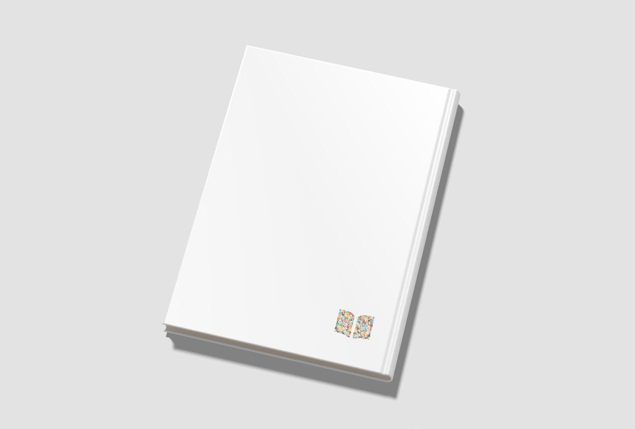
Mockups
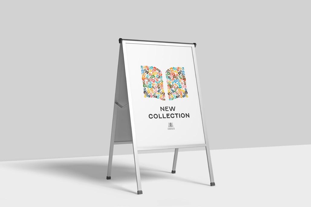
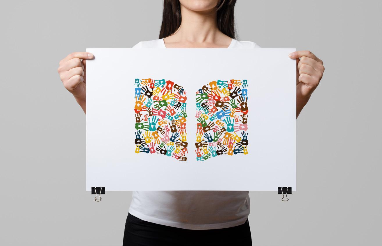
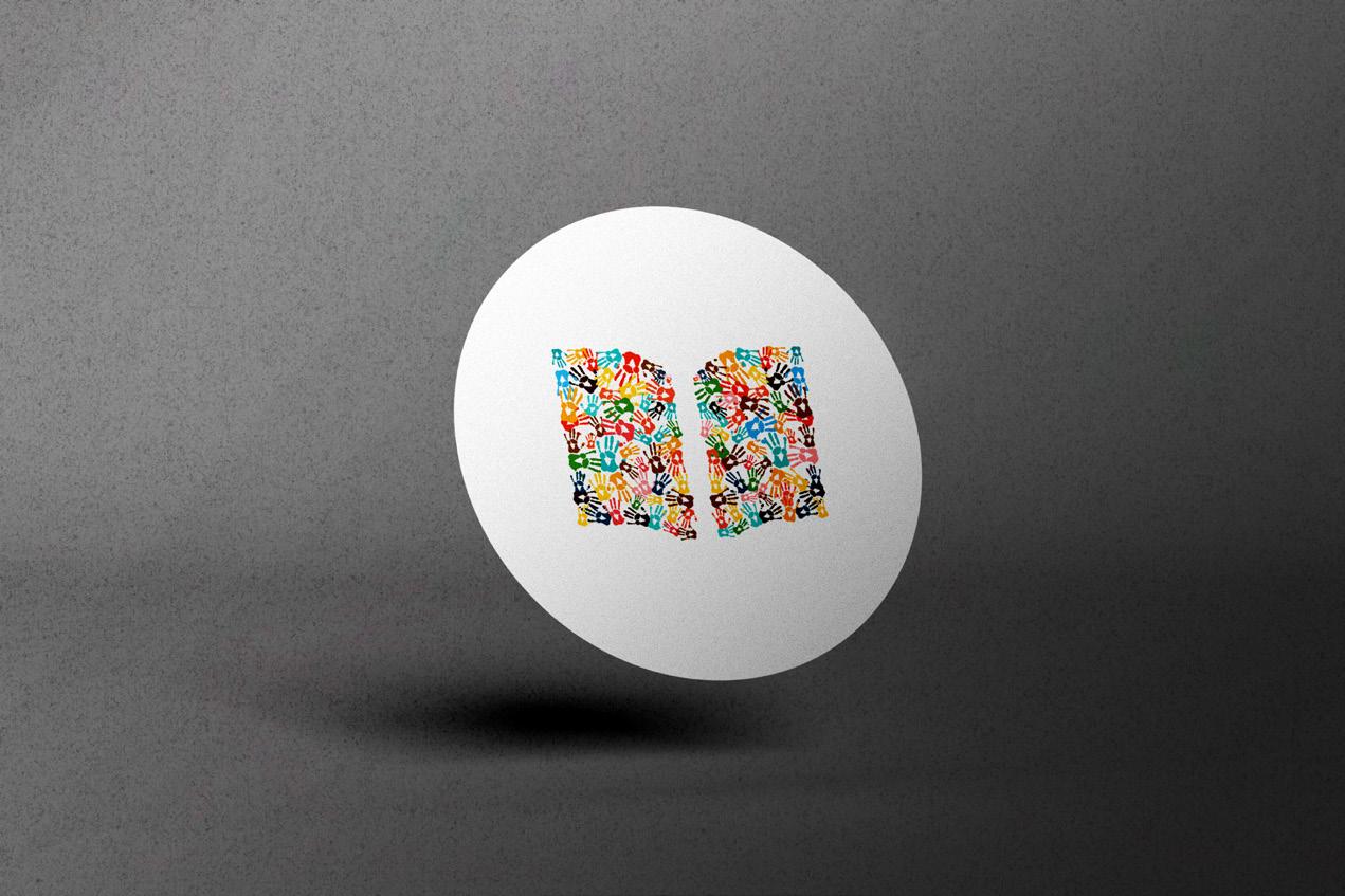
16 04.1
Mockups
17 04.2

My Address: University of Lincoln St. Marks Student Village LN67TW Phone: Phone: +44 7470 805642 Online: williamtilbrook@icloud.com https://drwbf5jp4t.wixsite.com/ wtkdesign Thank you. I hope you enjoyed my presentation.