Brand Identity
version 2.0 WENTWORTH BRANDING GUIDELINES 2023
How
IDENTITY COLOR BRAND ARCHITECTURE TYPOGRAPHY PHOTOGRAPHY
2
RESOURCES WENTWORTH INSTITUTE OF TECHNOLOGY
This document reviews Wentworth’s brand positioning and graphic identity. If you are officially representing Wentworth, you should use these components to produce institute-branded communications. You can download the elements (logos, gestures, fonts, etc.), by logging into your myWentworth account and following the link to Digital Communications or refer to the Resources section in this document for more information. Submit questions or requests to Marketing & Communications by filling out a request form.
to Use the Guidelines Identity Primary & secondary identifiers; proper logo usage Brand Architecture Wentworth sub-brands Color How to apply the official color palettes Typography Wentworth’s official fonts Photography & Videography Guidelines for creating & using photographs & video Resources Business papers, design samples, & asset links 03 10 13 18 20 22
PHOTOGRAPHY RESOURCES
Primary Identifier
Our wordmark, or logo, is the most consistent component of our identity. It is set in a customized font called Wentworth IBM/Lab Display. Created specifically for Wentworth, this font is used for the university wordmark and for the school and division sub-branding. The Wentworth wordmark can appear in a “full” or “short” version, depending on the context.
FULL WORDMARK SHORT WORDMARK
For external audiences, always use the version of the Wentworth logo with “Institute of Technology” underneath, reinforcing brand positioning.
The simplified version is appropriate for internal audiences already familiar with the breadth of Wentworth’s academic offerings.
External Facing Internal Facing
IDENTITY COLOR BRAND ARCHITECTURE TYPOGRAPHY
3
WENTWORTH INSTITUTE OF TECHNOLOGY
PHOTOGRAPHY RESOURCES
Secondary Identifiers
Wentworth’s graphic identifiers each have a unique place in our history and represent the school and serve different purposes in expressing our brand. The ‘W’ logo, shield, or seal should not be used without first obtaining permission from the office of Marketing & Communications. Ensuring proper use of these identifiers is essential for maintaining brand consistency across the university.
Represents the school in formal contexts when a collegiate image is desired. THE ‘W’
Represents the school when a technology-centered, modern image is desired. The red logo should be replaced with a logo in our primary color.
THE SHIELD
Innovative, proactive, technological, futuristic, modern, industrious, corporate
Scholastic, traditional, historical, collegiate, formal, austere, elegant
IDENTITY COLOR BRAND ARCHITECTURE
TYPOGRAPHY
4
WENTWORTH INSTITUTE OF TECHNOLOGY
PHOTOGRAPHY RESOURCES
Leopard Logo
The leopard mascot logo conveys our sense of school spirit. It can be used in lighthearted ways across campus to bring our community together. It does not replace the athletic fighting leopard.
THE LEOPARD SEAL THE LEOPARD HEAD
The leopard can appear within the Wentworth seal circle. The one-color version in yellow or white should be used when placing the leopard on black or dark background.
The leopard head logo can be used independently from the Wentworth seal to represent the school to internal audiences. Follow the same placement guidelines as the leopard seal.
IDENTITY COLOR BRAND ARCHITECTURE
TYPOGRAPHY
5
WENTWORTH INSTITUTE OF TECHNOLOGY
Full Color Yellow with outline Yellow White White Yellow no outline
PHOTOGRAPHY RESOURCES
Logo Proportions
It is important to be conscious of the amount of clean space around the logo. Ample space helps establish the importance of the logo, especially in environments where it competes with other graphic elements for attention.
CLEAR SPACE MINIMUM SIZE
0.25” or 18px
0.15” or 12px
To ensure visual balance, the logo should always be surrounded by an ample amount of space, clear of text and graphic elements. The minimum clear space required is equal to the width of the W in ‘Wentworth.’ The vertical space is equal to the W turned on its side.
For the best legibility, the long version of the logo should not appear smaller than 0.25 inches (print) or 18 pixels (screen) high while the short version can be reduced to 0.15 inches (print) or 12 pixels (screen).
WENTWORTH INSTITUTE OF TECHNOLOGY

IDENTITY COLOR BRAND ARCHITECTURE TYPOGRAPHY
6
TYPOGRAPHY PHOTOGRAPHY RESOURCES
Placement
The placement of the Wentworth logo should remain consistent across materials. There are several possible configurations and alignment options, so choose what works best for the composition at hand.
LOGO PLACEMENT
A B C A — The logo may be left-aligned with the edge of the composition, with clear space equal to the height of the W in ‘Wentworth’ along each edge.
B — The logo may be right-aligned with the edge of the composition, with clear space equal to the height of the W in ‘Wentworth’ along each edge.
C — When horizontal space is limited, the wordmark can be oriented vertically. (i.e., on a banner or vertical web ad). Follow the same placement rules as outlined above.
IDENTITY COLOR BRAND ARCHITECTURE
7
WENTWORTH INSTITUTE OF TECHNOLOGY
Color Variations
RESOURCES
ONE-COLOR LOGO
The are four available colorways for the Wentworth wordmark.
The black Wentworth wordmark is the primary logo to use in most applications. On a white or light background the logo should appear in black. On a dark color or the dark area of an image, the logo should be knocked out to white.
YELLOW LOGO
A version of the logo in yellow may be used in some instances to create variety and interest. On a dark background, use the logo in the primary shade of yellow (#ff50d). On white, or lighter backgrounds, the logo should appear in the secondary shade of yellow (#ff123f).
IDENTITY COLOR BRAND ARCHITECTURE
TYPOGRAPHY PHOTOGRAPHY
8
WENTWORTH INSTITUTE OF TECHNOLOGY
PHOTOGRAPHY RESOURCES
Incorrect Uses of Wordmark
To maintain a high and consistent level of visual sophistication, legibility, and quick recognition, the logo

shouldn’t be manipulated. Below are examples of some changes that should never be made.
Do NOT place the knocked out logo in an area of an image that hinders the legibility of the logo.
Do NOT change the color of the Wentworth logotype from an approved color (see page xx).
Do NOT add a drop shadow to the logo.
SUMMER COMMENCEMENT 2023
Do NOT replace an element of the logo or add any graphic elements such as a symbol or punctuation mark.
Do NOT manipulate or distort the logo, for example, by stretching or compressing it.
Do NOT have typographic or graphic elements fill the clear space of the logo.
IDENTITY COLOR BRAND ARCHITECTURE
TYPOGRAPHY
9
WENTWORTH INSTITUTE OF TECHNOLOGY
PHOTOGRAPHY RESOURCES
School
Sub-Brand The school name appears underneath the wordmark and can be written with or without “school of” depending on the context. By maintaining this flexibility, Wentworth can deliver a tailored experience to external and internal audiences.
FULL WORDMARK SHORT WORDMARK
For external audiences, always use the version of the Wentworth logo with “School of,” reinforcing brand positioning. This simplified version is appropriate for internal audiences already familiar with the breadth of Wentworth’s academic offerings.
IDENTITY COLOR BRAND ARCHITECTURE
TYPOGRAPHY
10
WENTWORTH INSTITUTE OF TECHNOLOGY
TYPOGRAPHY PHOTOGRAPHY RESOURCES
Division Sub-Brand
As a way to link the vast network of Wentworth’s departments, groups, and activities to our identity, the school name appears underneath the wordmark. To download your division’s logo visit [link]. If your division is in need of a logo you may request one by filling out the Marketing & Communications work request form.
SHORT WORDMARK PAIRED WITH IBM PLEX SANS LIGHT
IDENTITY COLOR BRAND ARCHITECTURE
11
WENTWORTH INSTITUTE OF TECHNOLOGY
RESOURCES
Initiative Sub-Brand Branding for the vital Wentworth initiatives that support the university utilizes a serif font that evokes a collegiate feeling and conveys formality. SHORT WORDMARK PAIRED
IDENTITY COLOR BRAND ARCHITECTURE TYPOGRAPHY PHOTOGRAPHY
12
Al umni A
WENTWORTH INSTITUTE OF TECHNOLOGY
WITH IBM PLEX SERIF MEDIUM
ff airs
IDENTITY COLOR BRAND ARCHITECTURE TYPOGRAPHY PHOTOGRAPHY RESOURCES WENTWORTH INSTITUTE OF TECHNOLOGY 13 Primary Palette Wentworth’s official school colors, gold and black, make up our primary color palette. In most instances, these colors should be used to represent the school. In some cases, another shade or variation made be required. Please select these variations from the Primary Palette Expanded, referenced on the next page PRIMARY BRAND COLORS CMYK: 0/20/100/0 RGB: 255/203/5 HEX: #FFCB05 PMS: MEDIUM YELLOW C CMYK: 60 /40/40/100 RGB: 0/0/0 HEX: #000000 PMS: BLACK Wentworth Gold Rich Black
Primary Palette
Expanded
CMYK: 0/38/100/0
HEX: #FBAA19
CMYK: 0/30/100/0
HEX: #FDB913
RESOURCES
Reference the palette below when alternate shades of the primary colors are required. The darker
shade of yellow (#FBAA19) is best used on a white background, while any shade can be used on black.
CMYK: 75/68/64/79
HEX: #151719
CMYK: 70/67/64/73
HEX: #231F20
Wentworth Gold Rich Black
CMYK: 0/20/100/0
HEX: #FFCB05
CMYK: 0/11/100/0
HEX: #FFDB00
CMYK: 0/05/100/0
HEX: #FFE600
CMYK: 60/40/40/100
HEX: #00000
CMYK: 10/0/0/95
HEX: #2A2E33
CMYK: 70/67/64/73
HEX: #231F20
IDENTITY
BRAND ARCHITECTURE
14
COLOR
TYPOGRAPHY PHOTOGRAPHY
WENTWORTH INSTITUTE OF TECHNOLOGY
CMYK:
IDENTITY COLOR BRAND ARCHITECTURE TYPOGRAPHY PHOTOGRAPHY RESOURCES WENTWORTH INSTITUTE OF TECHNOLOGY 15
Palette Printing Assets
cases where additional colors are needed to complement and support Wentworth’s primary palette, the Secondary Palette can be used. This page includes the approved secondary colors that should be used for print and marketing assets.
Secondary
In
30/100/100/15
100/99/29/19 HEX: #232566
90/30/50/10 HEX: #007F7E
35/40/100/15 HEX: #9A812C
20/100/100/5 HEX:
99/97/7/0 HEX: #30338C
80/20/40/5 HEX: #149497
HEX: #A02225 CMYK:
CMYK:
CMYK:
CMYK:
#BF2225 CMYK:
CMYK:
CMYK: 30/40/100/10 HEX: #AB892C
CMYK: 0/01/01/14 HEX: #DBD9D9
HEX: #E5242A CMYK: 86/82/0/0 HEX: #3D41B3 CMYK: 70/10/30/0 HEX: #3DAEB5 CMYK: 20/30/90/0 HEX: #D1AC3F CMYK: 0/95/88/0 HEX: #EE2F31 CMYK: 75/68/0/14 HEX: #5258F2 CMYK: 60/0/20/0 HEX: #56C5D0 CMYK: 10/20/90/0 HEX: #E8C43A Ruby Red Sapphire Turqouise Old Gold Platinum CMYK: 10/100/100/0 HEX: #D92228 CMYK: 90/87/0/0 HEX: #3D439B CMYK: 75/19/35/0 HEX: #359EA6 CMYK: 26/36/95/0 HEX: #C49E39 RGB: 232/230/230 HEX: #E8E6E6
CMYK: 0/01/01/40 HEX: #999797 CMYK: 0/01/01/60 HEX: #666565 CMYK: 0/01/01/04 HEX: #F5F2F2 CMYK: 3/99/95/0
IDENTITY COLOR BRAND ARCHITECTURE TYPOGRAPHY PHOTOGRAPHY RESOURCES WENTWORTH INSTITUTE OF TECHNOLOGY 16 Secondary Palette Digital Assets This page identifies the approved secondary palette that can be used for digital assets. Colors render differently between digital and print media, so these should never be used for printed materials. Red Accent Blue Accent Teal Accent Neutral Dark Neutral Light RGB: 212/66/66 HEX: #D44242 RGB: 148/46/46 HEX: #942E2E RGB: 10/81/102 HEX: #0A5178 RGB: 108/144/148 HEX: #6C9094 RGB: 40/51/61 HEX: #28333D RGB: 154/161/173 HEX: #9AA1AD RGB: 244/70/70 HEX: #E04646 RGB: 20/168/247 HEX: #14A8F7 RGB: 189/229/239 HEX: #BDE5EF RGB: 123/158/189 HEX: #7B9EBD RGB: 222/232/250 HEX: #DEE8FA RGB: 84/26/26 HEX: #541A1A RGB: 07/55/82 HEX: #073752 RGB: 80/107/110 HEX: #506B6E RGB: 33/43/51 HEX: #212B33 RGB: 98/102/110 HEX: #62666E RGB: 186/58/58 HEX: #BA3A3A RGB: 15/124/184 HEX: #0F7CB8 RGB: 136/181/186 HEX: #88B5BA RGB: 81/105/125 HEX: #51697D RGB: 188/197/212 HEX: #BCC5D4 RGB: 09/73/107 HEX: #09496B RGB: 127/169/174 HEX: #7FA9AE RGB: 32/41/49 HEX: #202931 RGB: 212/221/237 HEX: #D4DDED
Gradient
BRAND GRADIENT
RGB: 237/148/29
RGB: 253/202/11
RGB: 255/231/45
RESOURCES
Color gradients are useful flourishes that can be used to enhance an image and drive interest. Please use gradients sparingly. Gradients should never be used for the Wentworth wordmark or official logos.
WENTWORTH INSTITUTE OF TECHNOLOGY
IDENTITY
BRAND ARCHITECTURE
17
COLOR
TYPOGRAPHY PHOTOGRAPHY
IDENTITY COLOR BRAND ARCHITECTURE TYPOGRAPHY PHOTOGRAPHY RESOURCES WENTWORTH
OF TECHNOLOGY 18
IBM PLEX SANS IBM PLEX MONO IBM PLEX SERIF
PLEX SANS CONDENSED
USED FOR TITLE, HEADERS, & BODY TEXT (IN PRINT) USED FOR CAPTIONING USED FOR PULL-QUOTES & FORMAL TEXT USED FOR CREDITS AND FINE PRINT
INSTITUTE
Primary Typeface There are four primary typefaces in Wentworth’s identity system: IBM Plex Sans, IBM Plex Sans Condensed, IBM Plex Mono, and IBM Plex Serif. While the typefaces were chosen to serve different purposes, they were also selected because of their innate compatibility. The full IBM Plex font family is available to download for free on Google Fonts (https://fonts.google.com/?query=ibm+plex).
IBM
abcdefghijklmnopqrstuvwxyz ABCDEFGHIJKLMNOPQRSTUVWXYZ 1234567890 abcdefghijklmnopqrstuvwxyz ABCDEFGHIJKLMNOPQRSTUVWXYZ 1234567890 abcdefghijklmnopqrstuvwxyz ABCDEFGHIJKLMNOPQRSTUVWXYZ 1234567890 abcdefghijklmnopqrstuvwxyz ABCDEFGHIJKLMNOPQRSTUVWXYZ 1234567890
IDENTITY COLOR BRAND ARCHITECTURE TYPOGRAPHY PHOTOGRAPHY RESOURCES WENTWORTH INSTITUTE OF TECHNOLOGY 19 Alternative Fonts When the primary typefaces are not available Arial should be used in place of IBM Plex Sans and IBM Plex Serif, respectively. These typefaces are included in the font libraries for most operating systems. Open Sans is an available typeface use solely for the web in body text, subheads, captions, and navigation text. ARIAL OPEN SANS abcdefghijklmnopqrstuvwxyz ABCDEFGHIJKLMNOPQRSTUVWXYZ 1234567890 abcdefghijklmnopqrstuvwxyz ABCDEFGHIJKLMNOPQRSTUVWXYZ 1234567890 abcdefghijklmnopqrstuvwxyz ABCDEFGHIJKLMNOPQRSTUVWXYZ 1234567890 abcdefghijklmnopqrstuvwxyz ABCDEFGHIJKLMNOPQRSTUVWXYZ 1234567890 abcdefghijklmnopqrstuvwxyz ABCDEFGHIJKLMNOPQRSTUVWXYZ 1234567890 abcdefghijklmnopqrstuvwxyz ABCDEFGHIJKLMNOPQRSTUVWXYZ 1234567890 USED IN PLACE OF IBM PLEX SANS USED ON THE WEBSITE
PHOTOGRAPHY RESOURCES
Photography
ACTION COMPOSED
FOCUSED
When depicting students or faculty in their learning environment, they should be shown actively working. The subject should appear engaged in the environment and subject material. This technique can also be applied to student life and athletic photography.


Contextual scenes establish a visual setting in addition to giving viewers an inside look into what the campus, classrooms, and labs at Wentworth are like.


Emerging technology at Wentworth can be highlighted by depicting close-up shots of technical instruments, electrical and mechanical components, and complex student projects. This type of imagery can be paired with contextual and action shots or used as a background texture.


IDENTITY COLOR BRAND ARCHITECTURE TYPOGRAPHY
20
WENTWORTH INSTITUTE OF TECHNOLOGY
PHOTOGRAPHY RESOURCES

Videography
Review the Videography Guidelines for more information on how to create your own Wentworth branded video (coming soon).


EXAMPLES OF VIDEO STILLS
Videography should focus on students in labs and studios actively doing projects and creating artifacts. Look to capture those moments of deep concentration, surprise, humor, and victory while learning. Time highpaced video edits to the beats of music to generate energy and avoid audience tune out. Short videos are ideal and allow us to share on mobile devices. Wentworth should strive to show, not tell, its active learning stories to viewers.

IDENTITY COLOR BRAND ARCHITECTURE TYPOGRAPHY
21
WENTWORTH INSTITUTE OF TECHNOLOGY
Business Papers

LETTERHEAD BUSINESS CARDS

IDENTITY COLOR BRAND ARCHITECTURE TYPOGRAPHY
22
PHOTOGRAPHY RESOURCES WENTWORTH INSTITUTE OF TECHNOLOGY
The rebranded Wentworth letterhead and business cards can be ordered through Collegiate Press (coming soon). Download the letterhead template from the branding assets portal.
back
FIRSTNAME LASTNAME Department Official Job Title 617.989.4000 lastnamef@wit.edu 617.806.6353 firstname.lastname@gmail.com 550 HUNTINGTON AVE BOSTON, MA 02115-5998 wit.edu she / her / hers
There are two versions of the letterhead. To insure consistency with the branding be sure to download and install the official font, IBM Plex Sans. Business cards information includes name, title, division, pronouns (optional), up to two email address, two telephone numbers and a customize URL (optional). alternative
primary front


IDENTITY COLOR BRAND ARCHITECTURE TYPOGRAPHY
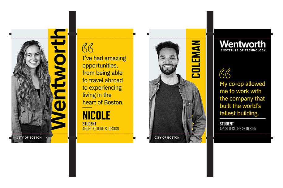
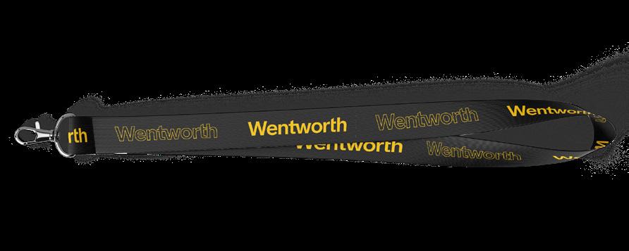
23 Design Samples Wentworth’s visual identity evokes a strong collegiate presence and conveys a sense of school spirit in its applications across media. Below are some examples of Wentworth’s branding coming to life. Trinh Huynh B.S. ’24 (Electrical Engineering) SPRING 2022 Advancing Student Access & Potential Challenge Spring 2020 Banner Designs Sweatshirt Mockup ASAP Report Cover Co-Branded T-Shirt Mockup Lanyard Mockup
PHOTOGRAPHY RESOURCES WENTWORTH INSTITUTE OF TECHNOLOGY
PHOTOGRAPHY RESOURCES
Resources
DOWNLOADS & LINKS
Download the Official Wentworth Wordmarks https://wit.canto.com/b/K1J71
To download branded templates, including letterhead, slide deck, an email signature and more, log into your MyWentworth account and follow the links listed under “Digital Communications”.
Need help? Submit questions or requests to Marketing & Communications by filling out a request form.
WENTWORTH INSTITUTE OF TECHNOLOGY
IDENTITY COLOR BRAND ARCHITECTURE
TYPOGRAPHY
25
