WHAT'S BLACK,WHITE &READ ALLOVER?
WHAT’S OUT THERE IN THE WORLD OF COOL
A WELSPUN SIGHTS AND SOUNDS BIANNUAL | 09.2023

a heritage brand

TEMPERATURE CONTROL MOISTURE WICKING
SOFTER OVER TIME
DURABLE WRINKLE RESISTANT 100% COTTON SUPERPOWER
SOFTER & LOFTIER AFTER WASHING QUICKER DRYING ABSORBENT


WELSPUN USA 10 W. 33rd St. Penthouse New York, NY ©2023 Welspun USA, Inc.
HYGROCOTTON® is a registered trademark of Welspun; patented under U.S. Pat. No. 8,733,075 and corresponding international patents/applications of Welspun.
So oo s oft ! I loo k forward to get tin g into bed eve ry n igh t w i th th ese s he e ts on my be d. T he sh eets a r e amaz ing I r un h ot wh e n I slee p ...n o w I n o l on ger n eed to slee p w i th th e f an o n. I h av e go ne out and bo ug h t 2 mor e s ets , I wo ul d h i gh ly rec om m end t o every on e.


A maz ing - th ese a re an examp le of my p er fec t t ow els T hes e a re a pe rfect
abs or ben t. A bs olute ly amaz i ng. Love , love th ese t ow els The y’ ve re tain e d so ftne ss

recom me nd !
Lov e H ygro; K eep selli ng th ese tow els The t ow el dries fas t an d is s oft to the s k in. I w oul d buy th ese agai n & a gain!

Ver y thick and ft and a lso very abso rben t. Ma k es yo u ju s t wan t to uch them. They lo ok very xpens iv e but a re als o ve ry prac tical. O ver all er y g ood bu y I don’t bel iev e I can be a t the s e on quali t y o r p rice.
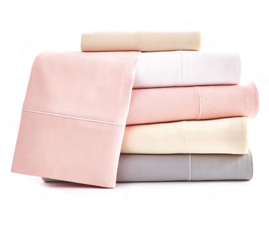
A mazin g she e ts! So soft, ri gh t f rom th e ac kage The y w ash eautifull y W ill b uy mor e for su re.
The y was h up wel l and a r e ni ce and brea tha ble . She ets a r e a v ery g oo d qua li t y and it show s. Out o f th e othe r 3 br and s I h ave recen tly pu r chas e d, thes e have bee n the be s t. I wi ll be pu r cha s ing more i n th e ver y n e ar futu re.

ABSO RBE NT QUICKER D R YI NG S OFT ER & LOFTIER
YGROCOTTON
MOISTURE WICKING TEMPE RA TU RE C ONTRO L SOFTER OV ER TIM E
H
® Tow el s
H YGROCOTTON ® She ets
OUR CU ST OME RS LO VE HYG RO COTTON® WELSPUN USA 10 W. 33rd St. Penthouse New York, NY ©2023 Welspun USA, Inc. C eleb ra ting a m az ing performance & over $3 b ill ion in retail sale s gl oba ll y.
A NOTE FROM THE EDITORS OF WelSpotted , A WELSPUN SIGHTS & SOUNDS
You might have noticed that the WelSpotted team loves words (in addition to our deep appreciation for all things Beauty and Grace), and one of our “pet peeves,” as it were, is “right!” as a response, when really, the right response (correct response?) is “correct!” Not to be the grammar police, but we do enjoy the idea that there is just one left, one right, and one “correct.” This led us to think about the phrase, “Sometimes, it IS just black and white.” Yes, we have our opinions, but having a strong POV is what made magazines, newspapers, and periodicals so compelling in the deeply mourned golden age of print publishing. It’s been said that S.I. Newhouse, publishing titan whose portfolio included Condé Nast (Vogue, Vanity Fair, the New Yorker, et al), regularly instructed his editors to have big opinions, saying “this is what sells magazines.” We agree; Samuel Irving was correct, and, in that vein, we present our Black & White issue, which contains our favorite takes on the classic palette, as well as our own deeply held black-and-white points of view on why sometimes, there is only one (correct) road to travel, whether it leads to particular social commentary or a design trend to be applauded. Related to that, as we’re sure many of you art buffs will agree, black and white is not a palette for the faint of heart. It takes nuance, precision, and a balanced eye to hit a blackand-white bullseye. That’s why we’re so excited to also present to you, Dear Reader, a bevy of ads in this issue designed not for any old trade glossy, but rather, created in the style you might find flipping through S.I.'s beloved Vogue. Why not? After all, WelSpotted is now an award-winning publication—recently tapped by the Society of Publication Designers (SPD), the Oscars for magazines, to receive a Merit Award in the category of corporate communications. So, let's take a look at Black & White in all its permutations and translations, shall we?
WELCOME
MONTHLY
A WELSPUN SIGHTS & SOUNDS MONTHLY CHRISTOPHER MOONEY EDITOR-IN-CHIEF ABBE ARONSON CONTENT CREATOR GREGORY MONFRIES CREATIVE DIRECTOR SHARLENE BREAKEY EDITOR
MARY BONANNO, ISOBEL MODICA , MICHELE MANDATO WELSPUN CREATIVE TEAM WELSPUN, 10 WEST 33RD ST.
SHOWROOM: PENTHOUSE, MAIL: STE. 1221 NEW YORK, NY 10001
INSIDE
HASHTAG ICON
PATTERN TREND
RETAIL LUXURY IN HAND/UNDER FOOT INNOVATION
SOCIAL MEDIA CELEBRATION AMPERSAND
FOR MORE, GO TO: WELSPOTTED.COM
ON THE
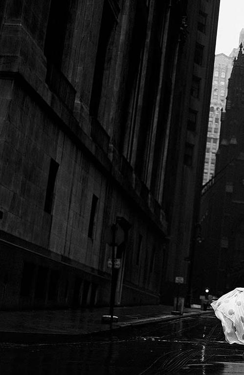
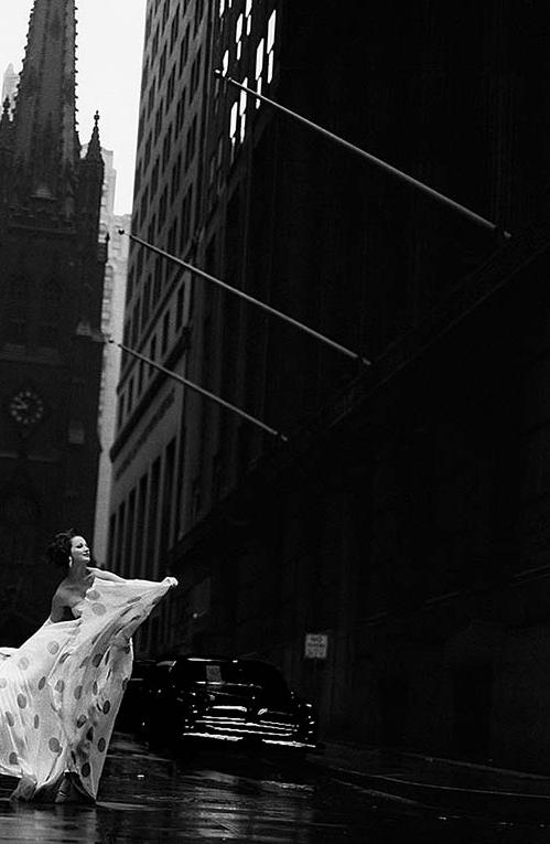
Model Betsy Pickerling on Wall Street. Photo by Jerry Schatzberg for Vogue, 1958
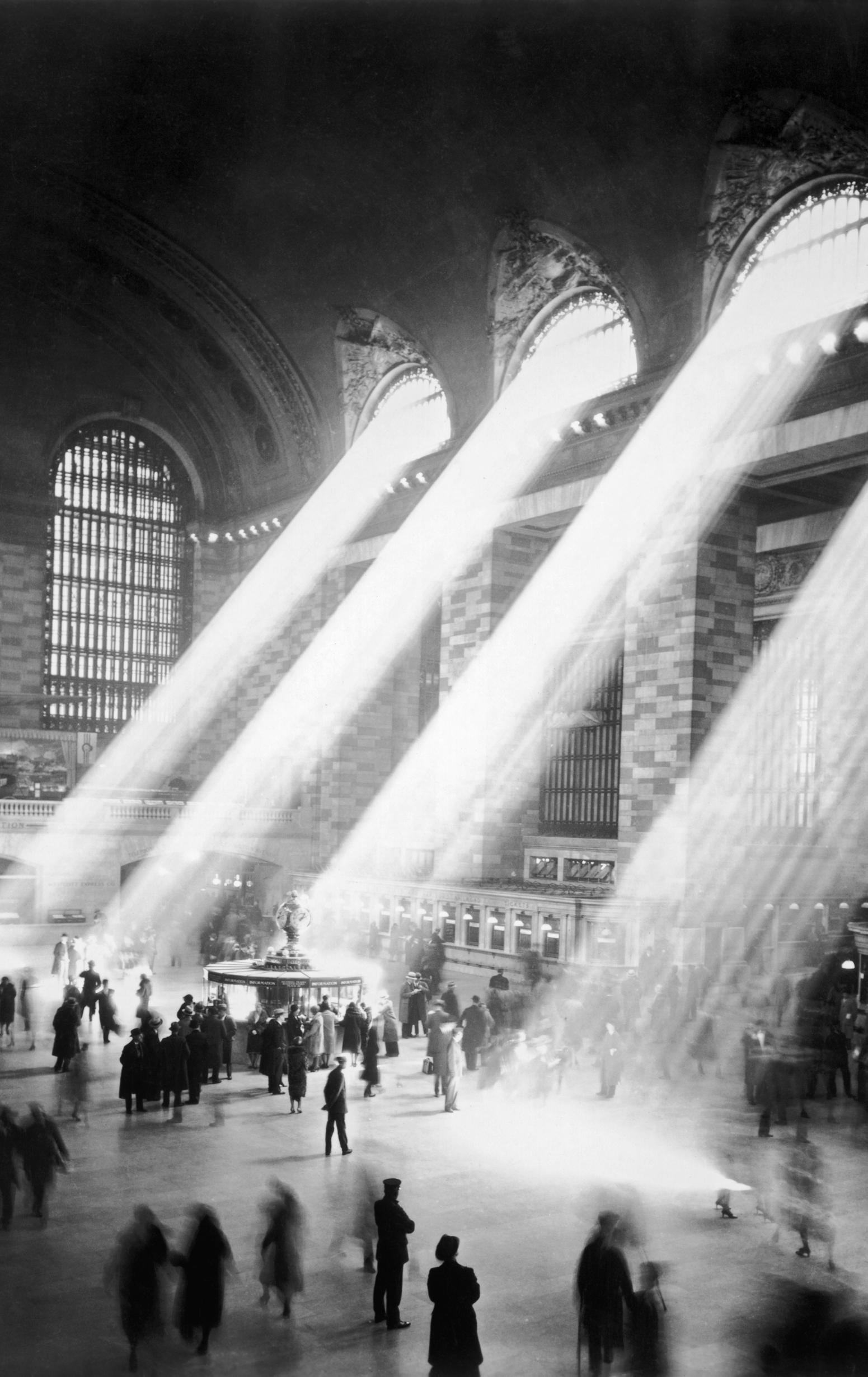
COVER Grand Central Terminal (a.k.a. Grand Central Station) was often captured with light streaming through the glass from the 1920s and 1930s—a time before skyscrapers blocked the sun and shut down the effect. This photo is widely attributed to Hal Morey of the New York Central Railroad, or the N.Y. Transit Museum
EDEL RODRIGUEZ
Named “America’s illustrator in chief” by Fast Company magazine and lauded for his iconic art on the cover of Time magazine and jumbotrons around the world, Edel Rodriguez is a Cuban American artist who has exhibited internationally with shows in Los Angeles, Toronto, New York, Dallas, Philadelphia, and Spain. Inspired by personal history, religious rituals, politics, memory, and nostalgia, his bold, figurative works are an examination of identity, cultural displacement, and mortality. Born in Havana, Cuba, in 1971, Edel and his family boarded a boat and left for America during the Mariel boatlift in 1980, settling in Miami where Rodriguez was introduced to and influenced by American pop culture for the first time. Socialist propaganda and western advertising and island culture and contemporary city life are all aspects of his life that continue to inform Edel’s work, and he has received commissions to create artwork for numerous clients, including the New York Times , the New Yorker , and many other publications and book publishers. Political junkies will no doubt remember Edel’s mostly black and white with orange illustrations that were widely shared during the last campaign cycle, including his covers for Time . We’re deeply honored that Edel shared a SNEAK PEAK of Worm: A Cuban American Odyssey , a soon-to-publish graphic memoir of his childhood in Cuba, his family’s boatlift odyssey, and a defense of democracy, both here and there (sneak peek! look at the perks that winning an award can get ya, huh?). The synopsis: When Edel was nine, Fidel Castro announced his surprising decision to let 125,000 traitors of the revolution, or “worms,” leave the country. The faltering economy and Edel’s family’s vocal discomfort with government surveillance had made their daily lives on a farm outside Havana precarious, and so they secretly planned to leave. But before that could happen, a dozen soldiers confiscated their home and property and imprisoned them in a detention center near the port of Mariel, where they were held with dissidents and criminals before being marched to a flotilla that miraculously deposited them, overnight, in Florida. The astonishing illustrations in color as well as black and white already have Worm drawing comparisons to another (correct!) tome: Maus Worm publishes 11/7/23.
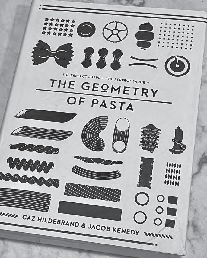
GEOMETRY OF PASTA
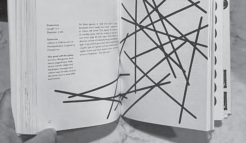
When it was published about ten years ago, The Geometry of Pasta was heralded as a one-of-akind cookbook, unlike anything the culinary world had ever seen. It trumpeted the fact that, over the centuries, Italians have pioneered more than 300 shapes of pasta, each with a history, a story to tell, and perfect food pairings (note: many chefs maintain that there is a “correct” shape for every sauce). This is at least partly because shapes evolved along with the flavors of local ingredients, and a “correct” combination can turn an ordinary dish into something sublime. The book features 100+ authentic recipes from critically acclaimed chef Jacob Kenedy, along with stunning black-and-white designs from award-winning designer Caz Hildebrand, and reveals the science, history, and philosophy behind spectacular pasta dishes from all over Italy. The dust jacket unfolds into a poster of pasta shapes and patterns for even more eye dazzle. We love this cookbook, not least of which because as more and more recipes migrate to digital, it gives us one more gorgeous reason to buy print. G of P does it in flying B and W (get it?).

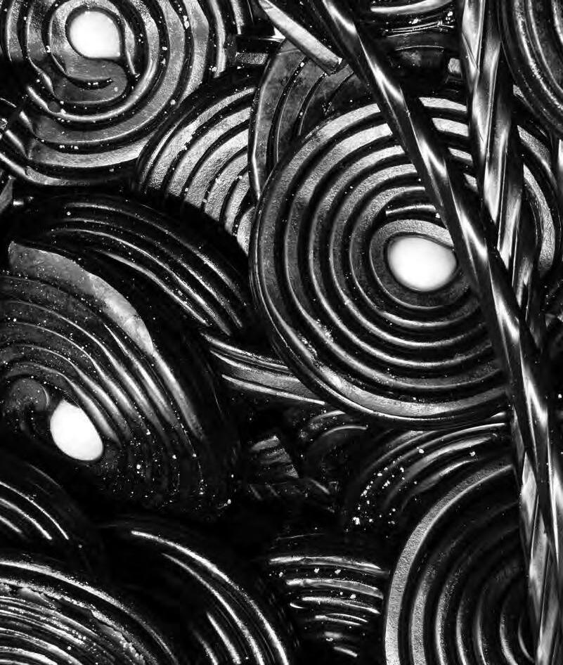
BLACK LICORICE. YAY OR NAY?
In a piece titled “The Twisted History of Licorice, the Candy We Love to Hate: Why this dud candy keeps on keeping on, despite a distinct lack of redeeming qualities,” Bon Appetit writer Rebecca Douglas declares that, for her as a child in Australia, black jellybeans and “stuck-together clumps of foul, fennel-y licorice” were the candies at the bottom of the barrel. Aussies came to eat this confection via their English roots; the candy’s birthplace is reportedly Pontefract, a town in West Yorkshire, where, circa 1760, a pharmacist supposedly added sugar to cough medicine that contained licorice root to make it more palatable. From there, manufacturers began cranking it out in the mid-1800s, and licorice went viral. In Sweden, Norway, Denmark, Iceland, Finland, Germany, and the Netherlands—countries that consume the most licorice per capita in the world—salmiakki, a black, salted, diamond-shaped, and deeply astringent version, is beloved by superfans. In the U.S. Twizzlers and Red Vines both make black licorice twists. The French are all about Cachou Lajaunie pastels, which are intended to freshen your breath after a meal. In Sweden they’re so keen on the stuff, they kicked off Lakritsfestivalen in 2009, a licorice festival that features tastings, contests, entertainment, and even sculptures made from the substance. It might be as polarizing as cilantro, but licorice, with its natural sweetness, was forecasted by a recent global study to take over as the treat of choice by those who abandon sugary “junk food” for better health. With a whopping 10.4 percent of the world population expected to be diabetic by 2030, this treat is poised to hit the sweet spot.

NEXT!
If you love our NEXT! quips, you’ll love Jared Freid’s new comedy special on Netflix—nothing but dating “icks.” We’re still laughing.
# everyone’sdoingit
ICO N


ICO N
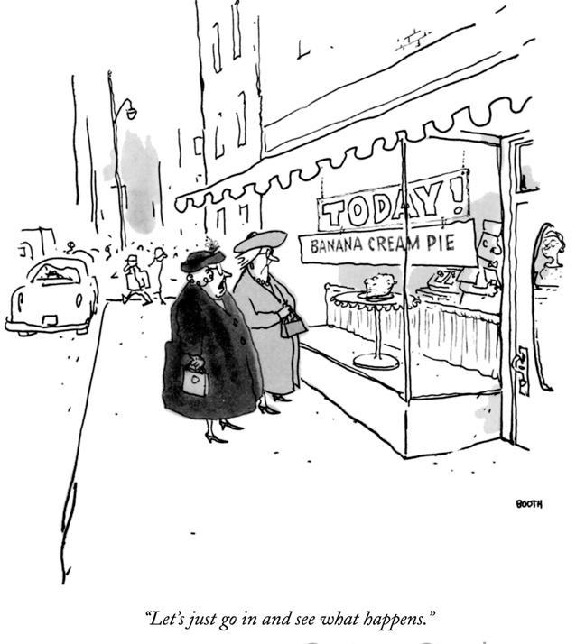
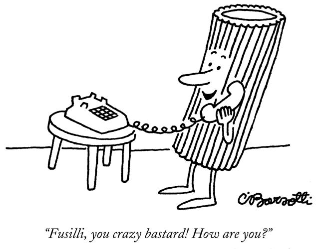
Since its inaugural issue in 1925, the New Yorker has understood that visual humor in the form of cartoons doesn’t just “break up the page.” It’s a very real way to poke our society and our culture with reminders to “lighten up” and have a laugh, even when it’s at humankind’s expense. Whole class agendas have been centered around the history of the New Yorker cartoon, including at prestigious centers like the 92nd Street Y in New York City, although creator and founding editor Harold Ross jokingly said of the genre: “Everybody talks of New Yorker ’s art—that is, its illustration—and it has been described as the best magazine in the world for someone who cannot read.” Recently, curatedcartoons.com organized the New Yorker cartoon phenom into four “eras” which track the POVs of the principal art or cartoon editors at the magazine. The Garaghty Era is the period from 1925 to 1972,
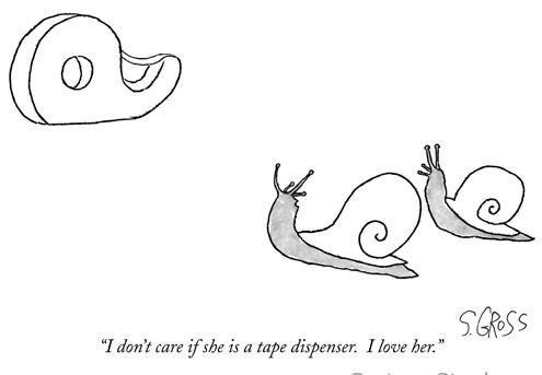

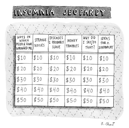

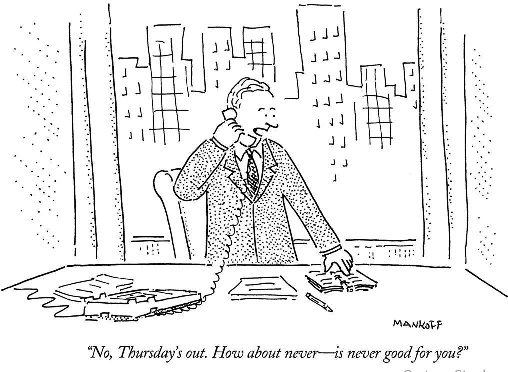
when noted illustrators Peter Arno, James Thurber (who also served as editor), and Charles Addams published in the magazine, mostly under the eye of art editor James Geraghty. During this time, editor Wallace Shawn also brought to public attention the now-celebrated cartoonists who not only drew but also captioned their work, including Ed Koren and George Booth. The Lorenz Era, from 1973 to 1997, is named for Lee Lorenz, himself a noted cartoonist-turned-art editor, who tapped the incredible Roz Chast for publication. Since 1977, she’s contributed more than 800 cartoons to the magazine. The Mankoff Era, named for cartoon editor Bob Mankoff, was noted for the enormously important contributions of Michael Maslin, today known as the premier authority on New Yorker cartoon history. Mankoff also is credited with launching the weekly Caption Contest for the magazine in 2005. The Allen Era, from 2017 to present day, is named for cartoon editor Emma Allen, who was anointed at the tender age of 29, and is correctly known for adding nearly one hundred new cartoonists to the mix, about half of whom are women, along with artists of color and those that speak to the LGBT perspective.
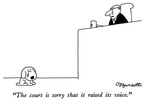 Iconic for sure...launched with the birth of the mag, the New Yorker cartoon exemplifies all things wry, snarky, and urban cheeky.
Marimekko takes its iconic black-and-white logo inspo (above) from Olivetti typewriter letters. While most of the offerings in its retail stores focus on bold colors, some of the company’s most iconic prints, like the Kaivo pattern on the swaths of fabric below, stand out in stark raving chicness in simple black and white. Opposite page: The Ramona Dress



patter
rn
PATTERN
For a brand like Marimekko, which is so strongly associated with iconic colorways, purposefully selecting black and white as the foundation for its logo was a bold move. But Armi Ratia, the creative vision behind the Finnish company, wanted her logo, which was designed in 1954, to be “simple and timeless,” and asked graphic designer Helge Mether-Mether-Borgström to use a modified version of classic Olivetti typewriter letters to create it. Black and white is equally show stopping used in some of Marimekko’s signature patterns, including Unikko, the huge splashy poppy motif we all know and love.
Fun fact: Unikko only exists because a designer dared to defy her boss. Armi was determined that there be no floral designs under the brand, because she said the beauty of flowers were best enjoyed in nature. Maija Isola, one of her lead designers, poo-pooed that request and created florals galore. Her instinct was correct. Unikko has never been out of production since its intro in 1964.

PATTERN
When we think about Paris, our isn’t-it-romantic minds tend to first conjure its patisseries and markets, that distinctive golden light, and the effortless chic of city residents. Less front-of-mind is the city’s Brutalist architecture—and that makes sense, because with so many gorgeous scapes, wide boulevards, and elaborate balconies to admire, who spends their time searching for great graphic blocks of rugged concrete and angular forms? But these buildings are, as is the case of Brutalism the world over, an important and uniquely charming part of its history. Maintaining that the city’s Brutalist buildings have an important role to play in the trajectory of architecture, artist/critic Robin Wilson and artist/photographer Nigel Green of Photolanguage have created a Brutalist Paris book and map, a plotted guide to structures all around the City of Lights, that also plays an important role in this, our guide to all things black and white. Many of the Parisian Brutalists experimented with the structural and aesthetic properties of plain ol’ concrete—the most affordable material available during post war reconstruction—and the book delves into more than forty buildings and includes stunning black-and-white photos taken by Green. Printed by a U.K.-based B Corp-certified printer on recycled paper, the guide is also the first of its kind to be published in English—a costly endeavor that was funded by a Kickstarter campaign. An accompanying map pinpoints examples by architects from Le Corbusier to Marcel Breuer and includes the Maison du Brésil and Communist Party and UNESCO Headquarters. While the decades since these Brutalist buildings were first erected have seen impassioned debate about whether they are better classified as icons or eyesores, a new school of thought seems to be leaning towards the former and celebrates the diverse signatures of Brutalism on their own merit. A welcome bellelaide counterpoint, surely, to the city’s otherwise achingly lovely skylines. Polarizing? Sure. Call us brutes, we love this!


trend W
Clockwise from top: Ivry-Cité du Parc and the Albert Einstein School, 1982-’83; A car park in Noisy-le-Grand, also built in the early ’80s; The Headquarters of the French Communist Party, by famed Oscar Niemeyer.
TREND
trend

 Les Chops de Créteil (The Cabbages of Créteil) housing towers, built by Gérard Grandval, were completed in 1974 and remain fully occupied. Below, The Orgues de Flandre (Organs of Flanders) built by Martin van Trek, completed in 1980. Images from the chic Brutalist Paris, out from Blue Crow Media.
RETAIL
WHITE HOUSE BLACK MARKET
In 1985, before Calvin Klein opened his monochromatic retail temples and minimalism chic flooded the decor glossies, design guru John Pawson, a Baltimore, Maryland-based retailer had a wild idea: why not open boutique doors with only white clothing and accessories for women? Admittedly, some of us urbanites in and around New York City were slack-jawed in disbelief that one might want to look like extras from Heaven Can Wait—and corporate must have gotten the memo. In 1995, the company debuted Black Market, with a similar monochromatic theme, this time offering women’s clothing and accessories in shades of…well, you get it. Around 1997, the company folded both concepts into one store, and today, White House Black Market exists like a retail Frick & Frack. As its website states: “we built our brand on the foundation of fashion’s most iconic contrast—White + Black. We empower [our customer] to embrace her complexity with looks that are feminine yet strong, sensual yet sophisticated, attractive yet approachable. Because we believe that no woman is any one thing.” Today, a quick scroll through the company’s website, reveals that yes, Virginia, you may find a pink blouse or a khaki green pair of trousers at WHBM, as it’s lovingly called by devotees, but the real story here is still focused on the chain’s signature color combo, or any of the head-to-toe looks offered in either white or black. Pricing is firmly locked in middle-of-theroad territory, and sizing is fairly inclusive, with most items ranging from XXS to XL and “curvy” options that go up to 18C. Landing somewhere between all that white and black? The Pret Collection, in shades of beige and sand, for those who want it neutral and want it now! Yes, head-to-toe monochromatic fashion seems pretty expected these days, but we applaud WHBM for making uniform dressing easy even back when all black still signaled you were headed to a funeral, a punk rock show, or maybe a Tupperware party at Johnny Cash’s place.

White House Black Market is a woman-founded boutique retailer, with 300+ locales (and fifty outlets) in the U.S., Puerto Rico, and the U.S. Virgin Islands; it launched on fashion’s most iconic contrast—the intoxicating combo of white and black!
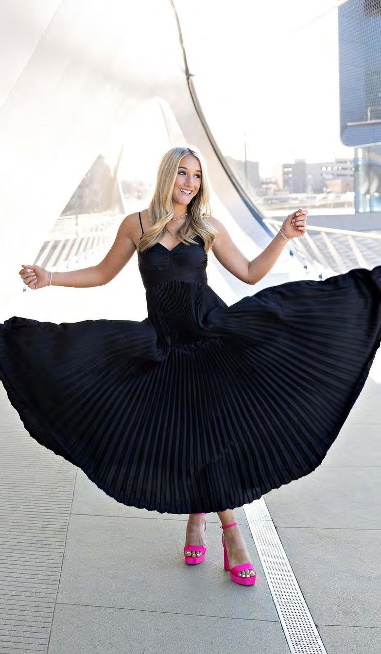
P in nova tion
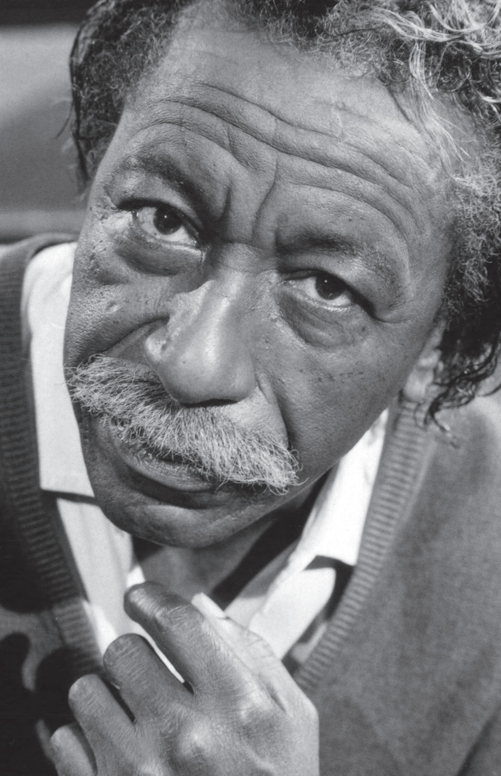
Photographer, poet, musician, storyteller, activist—Gordon Parks has captivated our attention for what seems like forever. And as the co-founder of Essence magazine, Parks inspired our own Gregory Monfries, formerly a creative director there, and now the creative director of the magazine you hold in your hands. It’s been said that Parks shaped the times in which he lived as much as he was shaped by them. In his six-decade career, the period of 1940 to 1950 most notably defined him as an African American artist and documentarian of American life at the dawn of the modern civil rights movement. Parks purchased his first camera in the late 1930s, while working as a waiter on the North Coast Limited passenger train. Having viewed iconic images of Depression-era farmers a la Dorothea Lange’s migrant series, Parks was intent on training that same sort of eye on those in his world who struggled with poverty, violence, oppression, and social injustice. Likewise, he photographed the mightily beautiful, including churchgoers, socialites, and such prominent African Americans as poet Richard Wright and singer Marian Anderson. When it came to “the American Dream,” the disparities that separated white and Black society were enormous, and Parks used his camera to fight the inequalities he saw. Parks also shot fashion, a twin career path born in 1940, when he walked into Frank Murphy’s department store in St. Paul, Minnesota, with borrowed equipment, and offered to photograph their models; he credits his ability to shoot both fashion AND commentary with always keeping him steadily employed. The two skills made him invaluable at Life, which prominently featured both types of photography in its coverage and went on to work for both Vogue and Glamour as well. When Essence was formed in 1970, it was a no-brainer that Parks would be at the helm, serving as co-founder and editorial director. As an innovator, particularly in this Black & White issue, we think Parks stands alone. His images manage to take our breath away, with their simplicity, emotion, elegance, and, in many instances, provocation.



P
Clockwise, from top: Three Youngsters, 1942; A Woman and Her Dog in the Harlem Section, 1943; Mother and Daughter in Bathroom, Frederick Douglass Housing Project, 1942. Opposite page: The artist himself, Gordon Parks, 1979
INNOVATION
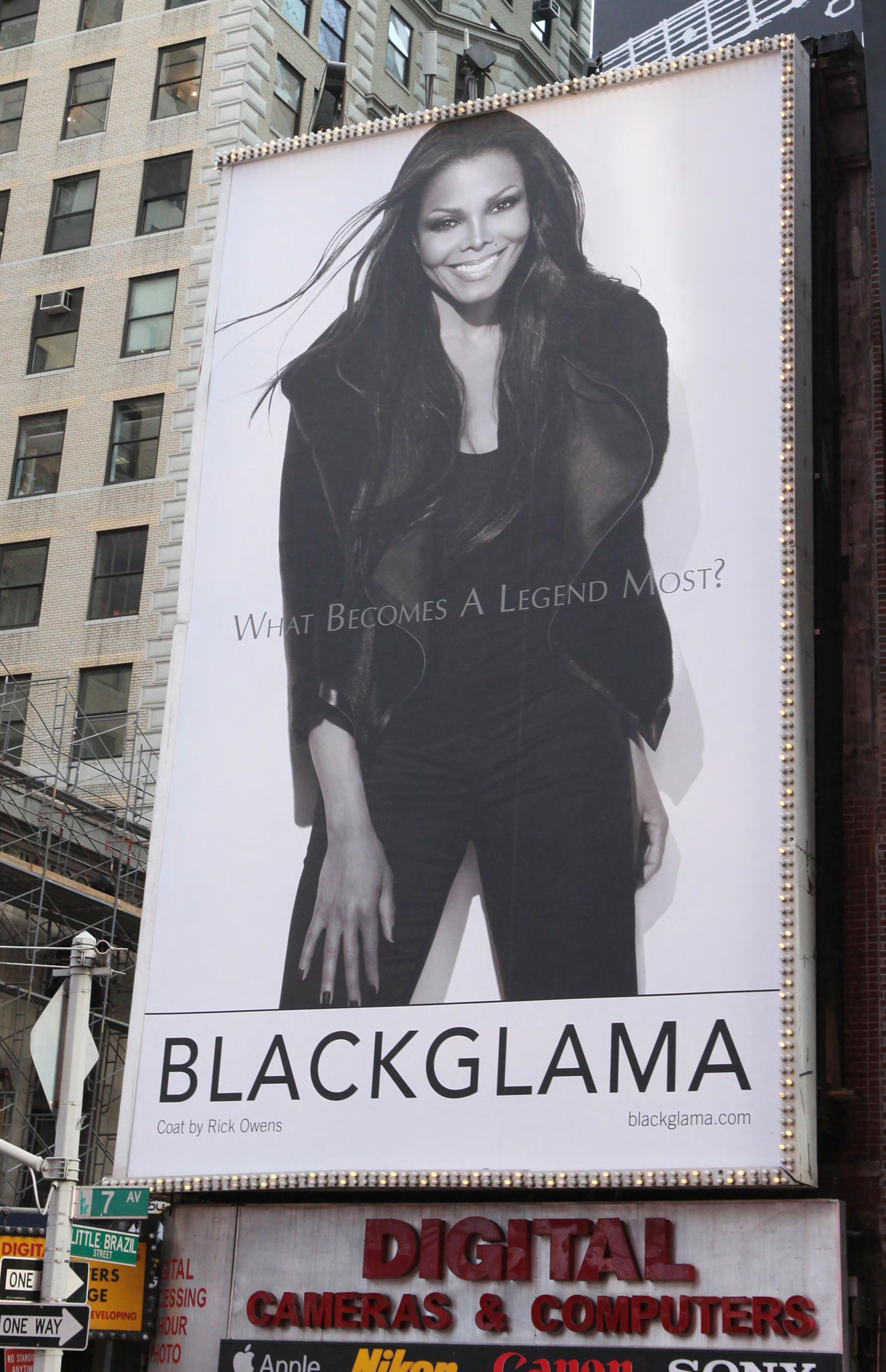
If you don’t know it, check out ifitshipitshere.com, a website where you can find epic deep dives on any manner of topics. Our current fave: the enduring brand Blackglama, which has kept its same ad campaign and tagline, “What becomes a legend most?” for more than forty years, and features black-and-white photography of many of the world’s most beautiful women and men wrapped in the world’s finest black ranch mink. It started in 1968, when New York ad exec Jane Trahey conceived of the Blackgama campaign because she thought black fur wouldn’t show up well in photography. Her gimmick? Associate the furs with the very famous and shoot them in black and white. The campaign was executed by her associate, Peter Rogers, who later bought out the firm and wrote the 1979 book, What Becomes A Legend Most? Over the years, a few of the models, including Cindy Crawford
and Elle Macpherson, were featured in color, but most—from Cher to Ann Margaret to Catherine Deneuve to Sophia Loren to Faye Dunaway (should we go on? Angela Lansbury! Judy Garland! Joan Crawford!)—appeared in black and white. We gleaned an abundance of fascinating trivia: Richard Avedon shot the campaign for the first five years, followed by Bill King, and then Rocco Laspata. As of 1980, none of the models were paid, nor did their names appear on the ads, but they did each receive a coat of their choice. Janet Jackson, shown here in our spread, is the only model to be featured in the campaign for two consecutive years. As far as good deeds are concerned, Carol Burnett was the only model to turn down a coat; she asked for the money to go to charity instead. Liza Minelli, Lillian Hellman, and Bette Davis all posed with lit cigarettes. As for men, Ray Charles, Tommy Tune, Luciano Pavarotti, and Rudolf Nureyev all made the cut. Frank Sinatra was tapped but bowed out at the last minute. In 1984, Joan Rivers released a comedy album on whose cover she posed as a Blackglama ad with the tagline altered to read, “What Becomes A Semi-Legend Most?” Aaaaaaand…in protest, PETA created their own mock version of the ad campaign with Amy Sedaris. Regardless of your feelings about fur coats, Blackglama certainly proves that singular brand messaging has staying power. What becomes a legend most, indeed!
bl ackgl ama
Janet Jackson was the first model to be consecutively
featured (three times!) in this renowned campaign
LUXURY
l ama
IN HAND/UNDER FOOT
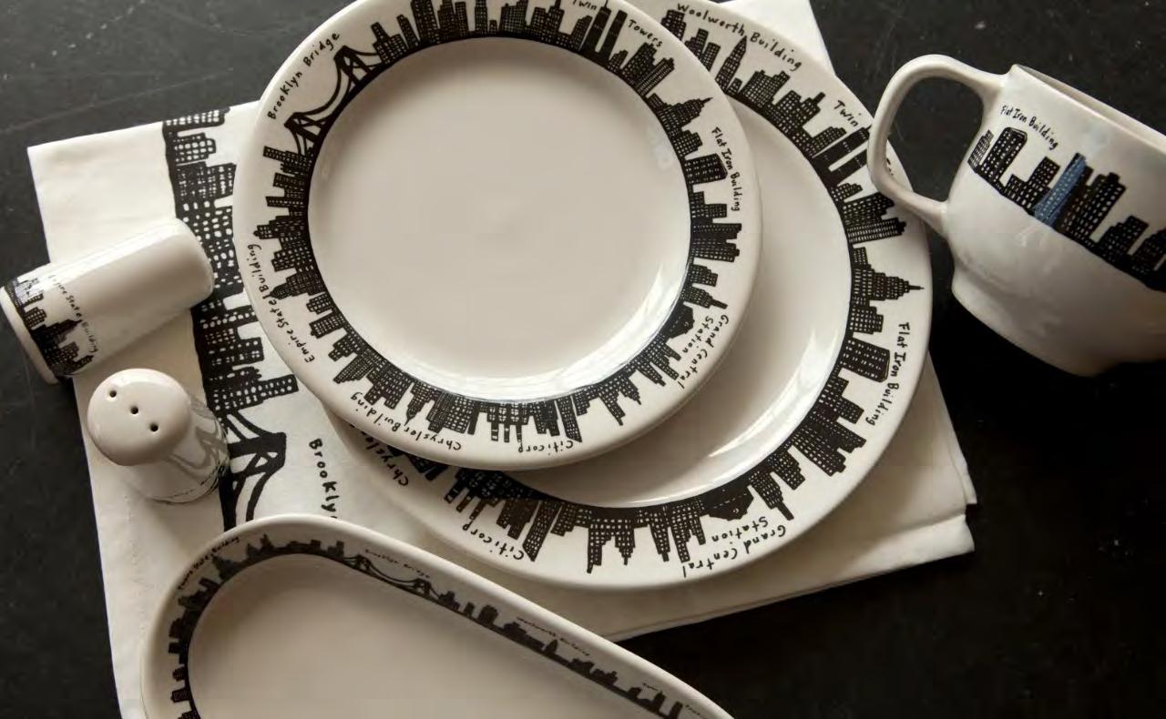
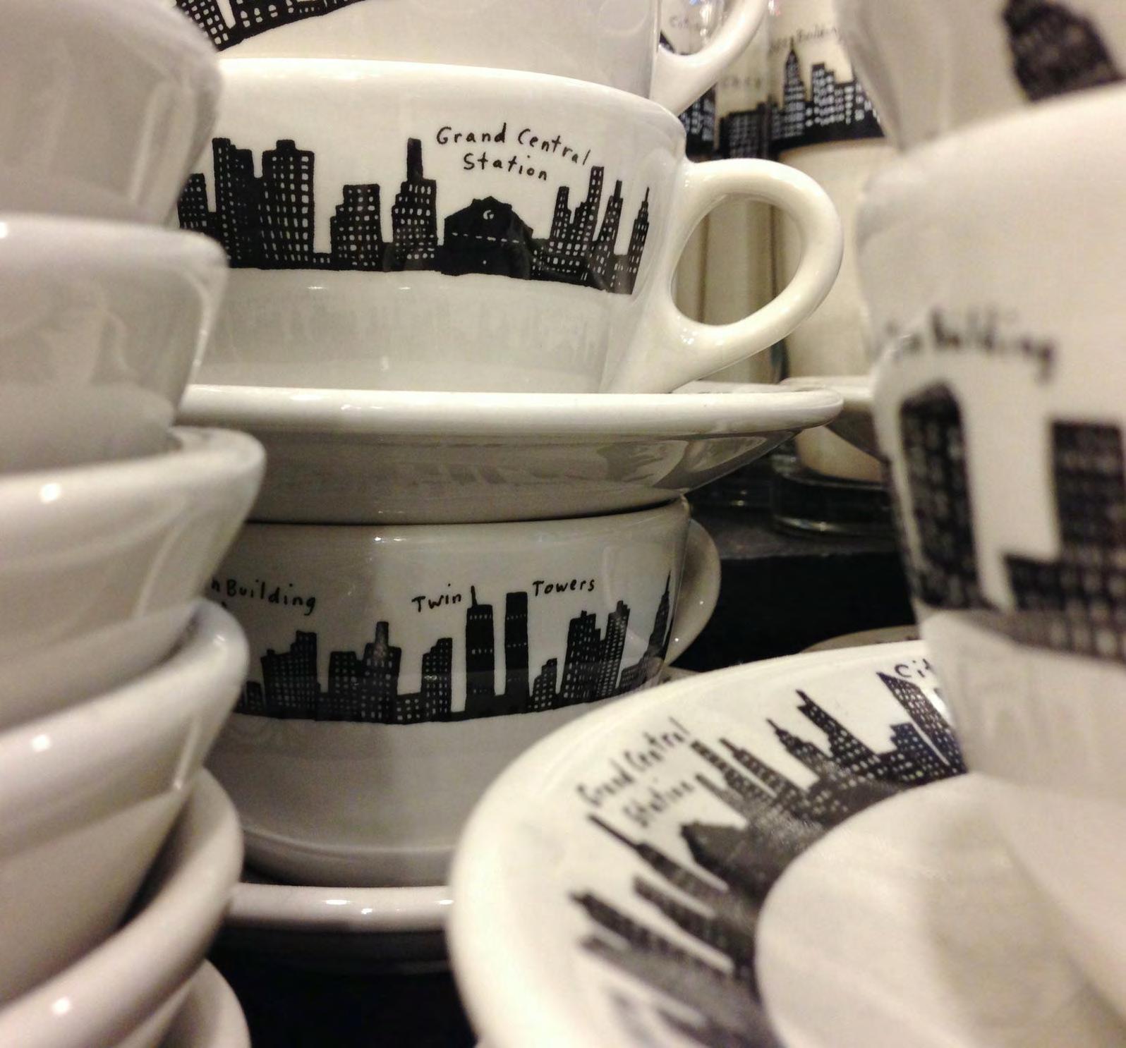
Consider the 212 Skyline pattern from Fishs Eddy an affordable way to “own” the real estate of your dreams. We especially love the tagline: “The city that never sleeps, but always eats!”
When we say “Fishs Eddy,” inevitably, you, Dear Reader, sigh with adoration. We’ve been Fangirling on the homegoods store since the ’80s when founders Julie Gaines and David Lenovitz opened their doors with endless stockpiles of unwanted dishes acquired from antique sales and the NYC restaurant supply district. Soon a cult fave among Those In The Know Who Shop, Fishs Eddy began to design its own patterns on American-made wares and gathered even more praise for iconic patterns like Floorplan and 212 Skyline, both rendered in black line drawings on creamy white ceramics, glassware, and kitchen textiles. Let’s face it, coffee just tastes better when you’re drinking it out of a Masters Of The Universe cityscape mug, and even the most budget-conscious city dweller can dream big and serve guests on a “Classic Six” platter. We’ve seen a lot of trends come and go in dinnerware (that ’80s Mikasa dinnerware still shows up in period movies), but Fishs is timeless, like the city it honors.
Speaking of eternal YES, digital design platform
in hand, under foot
The Spruce recently ran a piece on why linoleum (black-and-white diamond patterned linoleum, no less) has Paris-chic written all over it. Poke around online and you’ll see an endless parade of black and white flooring, which caused our WelSpotted teams to say, hmm, what started the perpetual love affair with black-and-white floors? Turns out, the “timeless chic” of black-and-white checkered floors traces its roots all the way back to….the excavation of Pompeii. During the 18th century, the digging out of the buried city created a craze for all things Greek and Roman. Neoclassical details appeared in architecture, on furniture, and naturally, on floors. Black-and-white marble floors gained new popularity in public buildings and estates all over Europe, and ultimately, that transferred to America as immigrants made their way over in the 19th century. Ever since, black-and-white marble has been the standard of “high class” in flooring. On the flipside, black-and-white style on a shoestring was created in 1855 when rubber manufacturer Fredrick Walton left open a can of linseed oil, causing a waterproof film of solidified oil to form on top. Soon, linoleum (from the Latin word “linium” meaning flax, and “oleum,” meaning oil) became a rival to oilcloth floor coverings. Synonymous with institutional flooring, linoleum was, at one point, THE choice for flooring in the first half of the 20th century—The Titanic featured linoleum floors in parts of the ship! After WWII, plastics and vinyl impacted linoleum sales, leading industry leader Armstrong to stop production of it in the 1970s. However, linoleum’s slightly cushioned feel, eco-qualities, and longevity, have all added to a recent comeback—and the cost ($4 to $8 per square foot) cannot be beat.
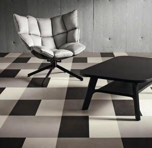
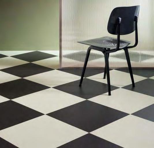



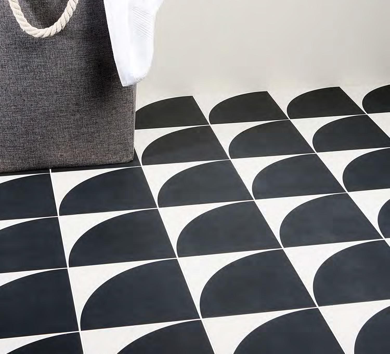 An assortment of tiles and vinyl floor mats that either mimic or are indeed linoleum (top three from Forbo Marmoleum), the updated way to get your black-and-white flooring fix
SOC IAL ME DIA

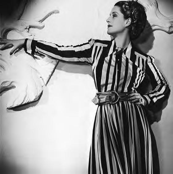
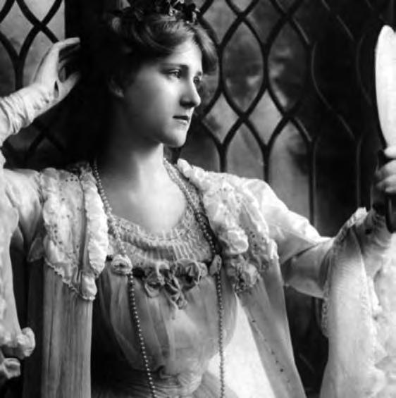
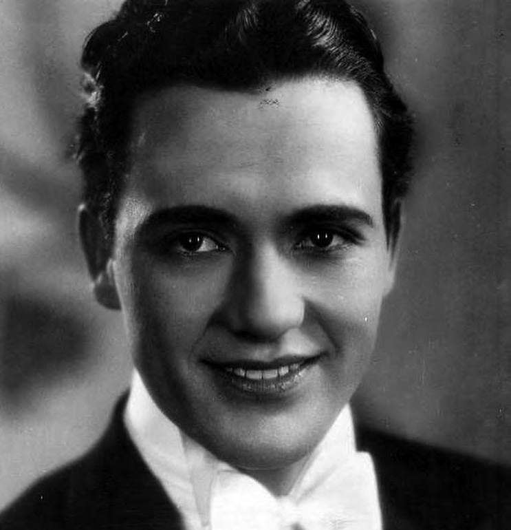
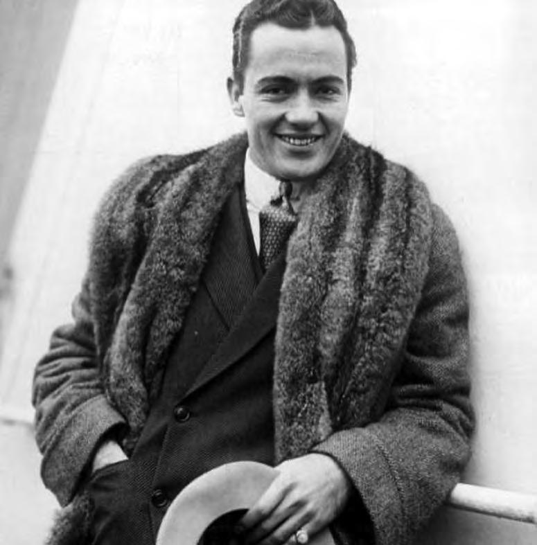
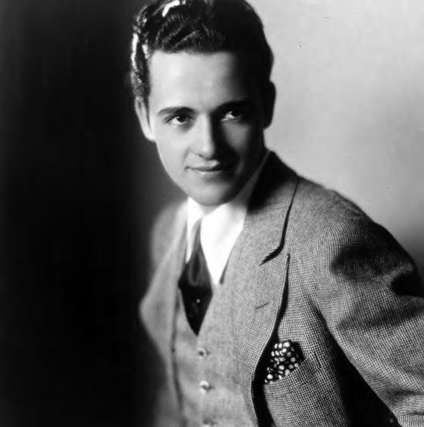
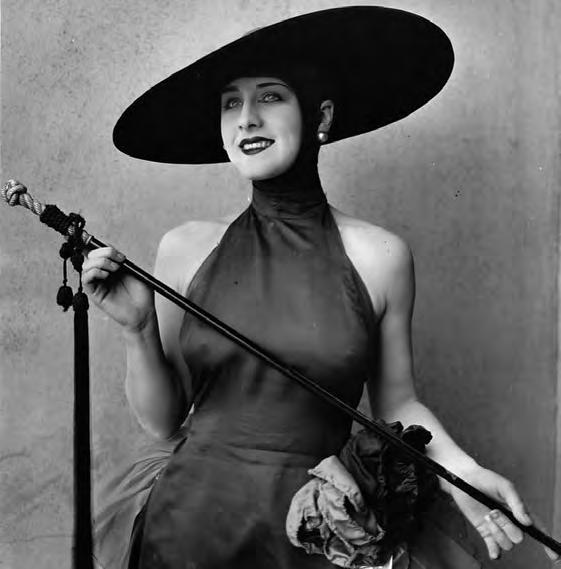
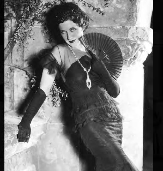 A study in contrasts. Clockwise from top left: Some of the guys and dolls of the silent screen era, captured by @silenceisplatinum on IG; three of the 250 tract homes designed in the mid 40s by architect Paul R. Williams, when Black real estate agent Velma Grant acquired land to house Black veterans returning from WWII (per @hoodmidcenturymodern on IG)
IAL
SOCIAL MEDIA

Two very different IG accounts captured our attention for this, our Black & White issue: @hoodmidcenturymodern and @silenceisplatinum. Let’s start with Jerald Cooper, who lives in Cincinnati, and wants to recognize and help preserve modern architecture and interior design that has added to the aesthetic and culture of Black communities. His IG, @hoodmidcenturymodern, with almost 90K followers, highlights “modernism in the hood” and aims to filter modernism through a different cultural lens, using layman’s language to break down barriers typically set up by white academics with advanced degrees. A creative consultant who rose through the hip-hop industry, Jerald has developed three definitions of “Black modernism”: modernism designed for Black people, modernism that has been “handed down” to Black people, and modernism that has taken on cultural significance in Black popular culture. Next up, with 77K followers, @silenceisplatinum is dedicated to the “lovely ladies and dashing gents of the silent movie era, along with a smattering of stage actresses and Ziegfeld girls.” During the silent film era (1894-1929), most movies featured live music or other sound accompaniment to add to the mood, but the thrust of conveying emotion in these black and white flicks fell to the actors themselves. The feed is filled with examples of how they over-emphasized body language and facial expressions so that the audiences could better understand what was being portrayed on screen.


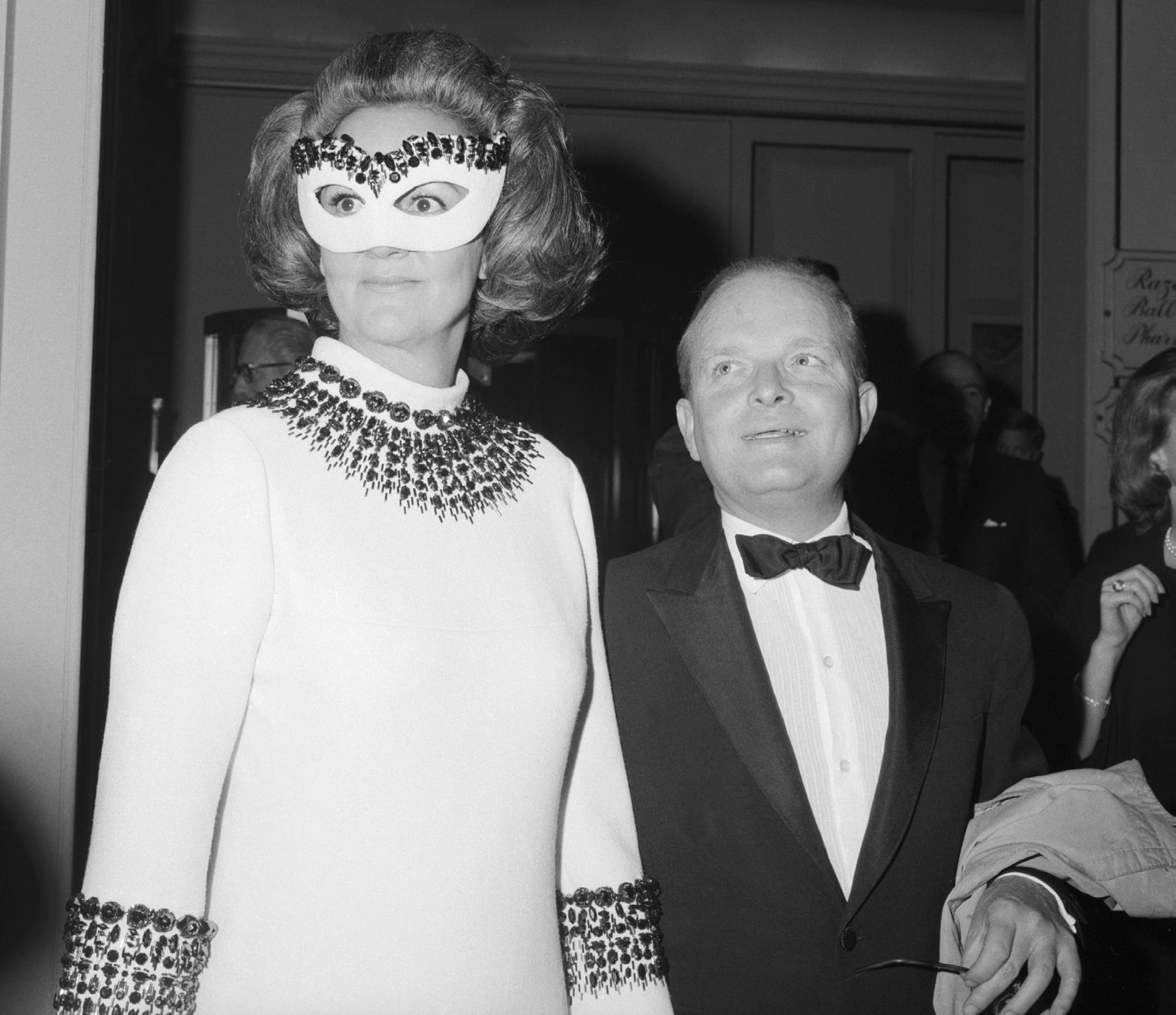

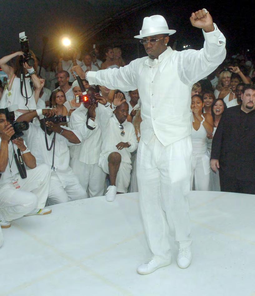 Clockwise from top left: Katharine Graham and Truman Capote at Capote’s famous black-and-white ball; A Dan McKeon’s capture at a White Party in Provincetown, Massachusetts; Diddy driving the paparazzi wild at his White Party; Surprise pop up, Le Diner en Blanc NYC
A party? We love a party! Black-and-white themes have figured into some of the most sensational shindigs ever, and there’s no better place to start than Truman Capote’s black-and-white ball. It was 1966, and In Cold Blood , Truman’s sensational nonfiction novel about a murdered Kansas family, made him the best-known writer in America. A cover boy on Life, Newsweek, the New York Times Book Review, and more, what else to do but throw a huge gathering in New York for all his friends? The A+++ guest list filled the Plaza’s 540-capacity ballroom and Katharine Graham, then-owner of the Washington Post and Newsweek, was guest of honor. Much has been written about the party, thanks to the striking black-and-white photos of the famous attendees, but also because the ball’s timing—just before Vietnam and the Youthquake of the 1960s split the country into Past and Future— served as an oft-discussed tipping point on class, fame, and modern culture.
Speaking of class and culture, in 1998, a then-newly wealthy (big-time wealthy) Sean Combs—a.k.a. Puff Daddy, a.k.a. Diddy—purchased a house in the Hamptons in an area heavily populated by an old money crowd (read: very white) who didn't exactly relish having a hip-hop mogul moving in. Combs realized that the best way to make his mark in town wasn’t to try and join them but to do it on his own terms. Enter the White Party. What started as a Fourth of July get-together with a strict dress code and Diddy’s family and music industry friends rapidly grew into the most talked about summer party in the Hamptons—for a decade. Every July 4th until 2009, you could count on spotting some of the biggest musicians, celebrities, and personalities (and a wonderfully unexpected C-lister or two) getting on their crispiest whites to get down.
Launched with just a handful of friends in Paris in 1988, Le Dîner en Blanc began as a strictly word-of-mouth event and now takes place in cities around the world. The concept remains the same throughout: guests must be a member to attend wearing white only and bring a table, two white chairs, and a picnic basket with all-white dinnerware and linens. Wine or champagne only, s’il vous plaît. A rain or shine event, there are no cancellations, unless severe weather is threatened. And if the heavens part? Raingear must also be white or transparent. And the location? Ah, Dear Reader, that is only revealed at the last minute—some public space where thousands of attendees converge for a mass, yet très chic picnic.
Finally, several activism-based groups claim creative ownership of the infamous gay circuit parties known as White Parties, thrown in such venues as Palm Springs, Fire Island, and Provincetown, a.k.a. Ptown. With the latter, the annual White Party has been a constant of the Cape Cod social scene for the better part of three decades and has morphed into a highly successful fundraiser for Outer Cape Health Services. In all manifestations, the White Party has parodied the self-imposed social class moratorium on wearing white after Labor Day. Attendees celebrate the end of summer attired in “resourceful, wonderful white”—including a fabulous abundance of drag.

CELEBRATION
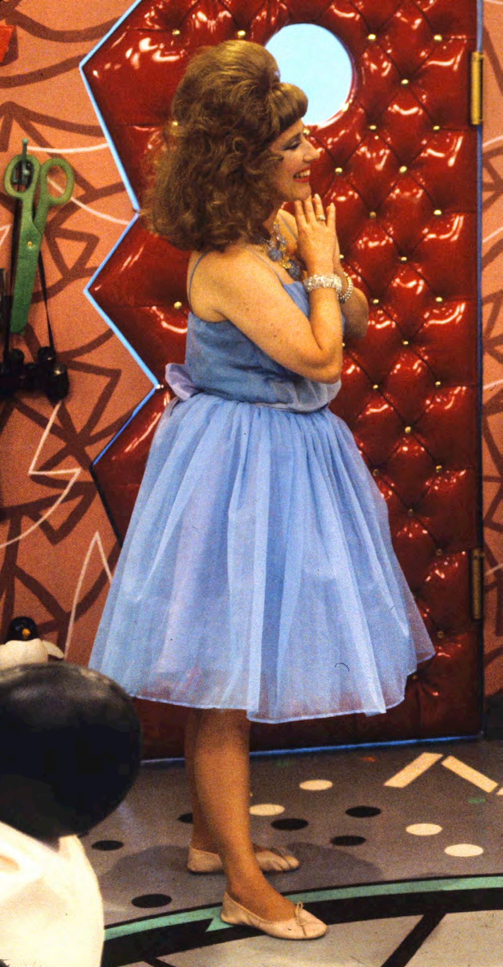
Amid the great sadness that we of a certain age felt upon hearing that Paul Reubens—a.k.a. Pee-wee Herman— had died at age 70 on July 30th, there were also smiles, as we read tribute after tribute to Pee-wee. For entertaining us, yes, but also for bringing the spirit of downtown art to his masterpiece kids show, Pee-wee’s Playhouse, and its magical and COLORFUL sets. Here’s an excerpt from an excellent piece by William Van Meter that ran in artnet.com that speaks for all of us here at WelSpotted
“Pee-wee’s Playhouse debuted in 1986 and ran for five seasons. The bonkers, anthropomorphic set was a character unto itself—with components like Floory the talking floor, Mr. Window, and Clockey (not to mention a resident pterodactyl and an entire universe of friendly and stylish weirdos popping by that put Mister Rogers’ Neighborhood to shame). Garish and glorious, the Playhouse was a distillation of the 1980s, both retro and futuristic. It reflected the era, looked back at the past, and would affect design for decades to come. ‘It was a touchstone, giving people license to explicitly want interiors to have an unapologetic sense of joy and wonder,’ said Mayer Rus, the West Coast Editor of Architectural Digest , who is a fan of the show. ‘It channeled the colorful wave of post-

modernism that had swept the design world in the mid-’80s with the advent of Memphis design, but it also had elements of hippie chic, psychedelia camp, and thrift store aesthetics. It blended them all into this pastiche of Pee-wee-ness. There was a childlike wonder that the set evoked that registered with lots of people. There was a sweetness and a humor to the whole thing. It reached people on an emo-
tional level.’ The show’s three production designers were all artists—Gary Panter, Ric Heitzman, and Wayne White—approaching Pee-wee’s Playhouse like an evolving installation and performance piece.”
Later in the tribute, White says of the set designs: “My references were old Fisher Price toys and Little Golden Books. We were trying to start anew, to find this niche of design
& && &&
Publicity still from Pee-wee's Playhouse (CBS), the show-stopping children’s television show, starring Paul Reubens, a.k.a. Pee-wee Herman, who died at 70 in late July, and Lynne Marie Stewart (as Miss Yvonne, “the most beautiful woman in puppet land”), 1986

that hadn’t been pored over a million times. We were doing a lot of nostalgic kinds of things because we were all Baby Boomers and we had all grown up with the same kinds of toys and had the same kinds of memories. But I mainly thought of the packaging that the toys would come in. I was also thinking of old textile designs from the late ’40s and early ’50s. For wallpapers, I was mostly inspired by a lot
of old shirts and ties. Especially the Polynesian wallpaper that’s around Mr. Window. And of course, the classic underground comic motifs.”
White continues, “Anybody who doesn’t know Paul, it’s hard for them to think of him as a real person.
Pee-wee Herman is such a complete reality. It’s strange for people to think of Paul as a human being, as a real person. But working around him
was just like, this sounds cliché, but man, it was a blast. I mean, I got so spoiled. It was a dream job. I didn’t have any responsibilities other than to be creative. We would just play like idiots. It’s almost embarrassing how irresponsible I felt at the time, you know, and everybody indulged us. We would just sit around, and laugh, and it was just incredible. Just the best job you can imagine.”
&& &&
AMPERSAND


For Planet and Home. For Planet and Home.

a heritage brand a heritage brand a heritage brand


 Iconic for sure...launched with the birth of the mag, the New Yorker cartoon exemplifies all things wry, snarky, and urban cheeky.


 Les Chops de Créteil (The Cabbages of Créteil) housing towers, built by Gérard Grandval, were completed in 1974 and remain fully occupied. Below, The Orgues de Flandre (Organs of Flanders) built by Martin van Trek, completed in 1980. Images from the chic Brutalist Paris, out from Blue Crow Media.


 An assortment of tiles and vinyl floor mats that either mimic or are indeed linoleum (top three from Forbo Marmoleum), the updated way to get your black-and-white flooring fix


 A study in contrasts. Clockwise from top left: Some of the guys and dolls of the silent screen era, captured by @silenceisplatinum on IG; three of the 250 tract homes designed in the mid 40s by architect Paul R. Williams, when Black real estate agent Velma Grant acquired land to house Black veterans returning from WWII (per @hoodmidcenturymodern on IG)


 Clockwise from top left: Katharine Graham and Truman Capote at Capote’s famous black-and-white ball; A Dan McKeon’s capture at a White Party in Provincetown, Massachusetts; Diddy driving the paparazzi wild at his White Party; Surprise pop up, Le Diner en Blanc NYC

