
BOOK

BOOK
This brand book will guide users through the visuals and personality of the destination brand: Visit Rapid City. It serves as a road map for communicating our brand identity with consistency, clarity, and creativity.
Here, you’ll find the essential tools and principles needed to convey the essence of Rapid City. While campaign elements will change and evolve, the brand elements are consistent long-term and across all Visit Rapid City business segments.
The Rapid City Brand Guidelines should be used for any owned channels or general marketing efforts that are not associated with a specific campaign vertical of the Visit Rapid City Brand. For example, use brand logos, brand colors and fonts when creating or updating brand specific assets such as the Official Rapid City Guide, VisitRapidCity.com style guides, email templates, signage, or banners.
Campaign Guidelines should be used for marketing efforts that can or do change on a regular basis. For example, campaign guidelines should be used for print ads, digital banners, or social media,

Visit Rapid City’s brand strategy consists of a multi-channel approach that utilizes owned, paid and earned channels to communicate Visit Rapid City’s brand promise. The objective of the brand strategy is to maximize our influence with potential travelers, event planners, and destination ambassadors to inspire, educate and help our target audiences choose Rapid City. This is done through a variety of focused marketing, sales and public relations efforts.
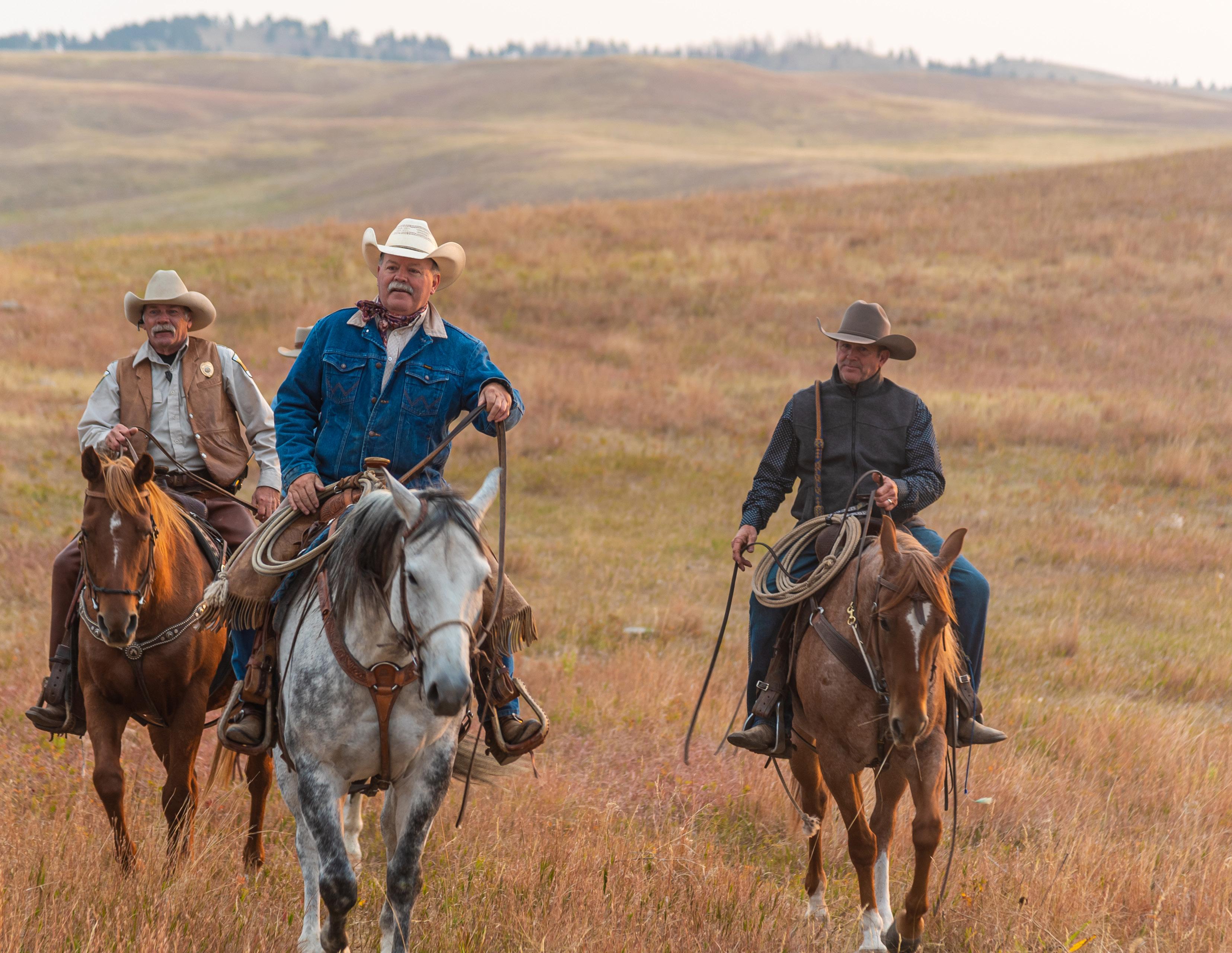
The spirit of generations that have called Rapid City home is deeply woven into the energy of our city. The very heart of South Dakota can be found right here in Rapid City’s vibrant local community to America’s history carved in stone. When you’re here, you feel the significance of these lands, the story of the Hills, and the magnetic pull of the people - past and present - who welcome you in with open arms.
Visit Rapid City is a dynamic organization that serves a variety of unique audiences to drive economic impact in the Rapid City area. Our communications are targeted at potential leisure visitors, meeting planners, sports planners, and a variety Rapid City Resident segments.
Rapid City’s unique offerings attract visitors from around the world for a variety of reasons, but VRC strategically focuses on five specific audiences to drive the most return on investment for the organization: Time Travelers, Modern Explorers, Family Fun Seekers, Meeting Planners and Sports Planners.
To our target leisure market, Rapid City is a place to immerse themselves in authentic Americana experiences, be one with nature through outdoor recreation, take in our scenic landscapes, and experience our unique local attractions, events and festivals. Visitors come from the top five feeder markets of South Dakota, Wyoming, Minnesota, Nebraska and Colorado. In 2023, more than half of our visitors (56%) had been to Rapid City at least once before.
Visitors don’t match one single demographic from these regions, but we know in general, our visitors are high school educated, has disposable income to spend on travel, are middle aged (45-65), and have 3-5 individuals living in their household.
Visitor persona’s help Visit Rapid City tailor strategies to audiences by providing a detailed understanding of the market’s preferences, behaviors, and pain points. This enables the creation of more relevant and engaging content and campaigns that resonate deeply with each segment.
Family Fun Seekers are families traveling to Rapid City to create unique, memorable experiences together. They value a safe, small-town feel with rich historical and cultural activities at an affordable cost, seeking a stressfree itinerary that entertains all ages without being limited to only children’s attractions. Concerns include safety, budget, and transportation.
Modern Explorers are outdoor enthusiasts drawn to Rapid City for its vast, iconic landscapes and hidden gems. They seek authentic, off-the-grid adventures that go beyond the typical, striving for presence and purpose in their travels. Concerns include access to unique experiences, quality guidance, and avoiding generic activities.
Time Travelers are lifelong learners drawn to Rapid City for its rich American history and Native American cultural legacies. They value tradition, storytelling, and authentic experiences amidst stunning scenery. They seek immersive, rejuvenating cultural stories with concerns about time, itinerary planning, and accessibility.
Planner personas are helpful to understanding of the specific nuances between sports and meeting planners and their preferences, behaviors, and pain points. This enables the creation of more relevant and engaging content and campaigns that resonate deeply with each segment.
Sports Planners seek destinations like Rapid City that offer top-notch facilities and unique local experiences to enhance event appeal. They value a variety of competition spaces, affordable lodging with amenities, and distinctive historical and cultural attractions. Key concerns include accessibility, regional isolation, flight logistics, and the perception of South Dakota as remote, influencing the feasibility and attractiveness of hosting events that draw regional participation and meet competitive standards.
Meeting Planners look for destinations like Rapid City for their unique experiences and affordable amenities, aiming for a memorable impact on attendees. They prioritize destinations with natural beauty, cultural depth, and versatile activities, ensuring safety, walkability, and a vibrant local scene. Major concerns include accessibility, budget management, transportation, modern facilities, diverse dining options, and avoiding tourist traps while managing hotel availability during large events.
Like the destination itself Rapid City’s communication should inspire child-like wonder, a sense of adventure, and care. Embodying the below characteristics when writing in the brand voice will that every word reflects our identity and resonates with our audiences. Tailor the tone to fit the setting, the audience, and the message’s intent. While our voice remains constant, our tone can flex to engage effectively with the situation at hand.
Refer to this guide for everything from marketing materials to social interactions, ensuring all communications are unified and true to the Rapid City brand.
You would say they are:
Salt of the Earth
Quirky
Patriotic Intelligent Charismatic Humble
You would never say they are:
Simple
Curated
Stuffy
Boastful
Obnoxious
This is body copy to be used for any long form copy. For example: Experience the best of Rapid City, South Dakota on the City View Trolley Tour! Listen to the history as you tour through Downtown Rapid City, West Boulevard Historic District, and past city landmarks like the quirky green dinosaurs of Dinosaur Park while riding the City View Trolley.
Yellowtail; Title Case
Quatro Slab Bold; Title Case
• always should be most prominent in typography hierarchy
Quatro Bold; UPPER CASE
• Generally used as a subhead, but can be used stand alone in more subtle use cases or when type size is small.
Quatro Book; Sentence case
• Be mindful of type size for legibility Always turn hyphenation off on paragraphs of text
• Align text to the left as the default.
This is the primary, full color logo for Visit Rapid City and should be used interchangeably with the horizontal logo, dependent on creative execution. Best for large to medium applications where the logo has room to breathe or where the logo exists on it’s own without any additional marks. Additionally, this is the default mark for most vertical applications.
This is the primary, full color logo for Visit Rapid City and should be used interchangeably with the stacked logo, dependent on creative execution. Best for large, medium and some small horizontal applications. Any situation where the primary logo would look too small in context An example might be on the back envelope (small application) or a horizontal banner (large application).
This is a very simplified logo for use in small and medium applications where the primary logos would not be legible. It can also work as a supporting mark to a primary logo if it is already present. The simplified logo should not generally be used in a case where another primary logo is not present.
When the logo is being used on a dark background, the white version of all Visit Rapid City logos should be used for the best legibility.
When the logo is being used on a dark background, that is more complex where the full color logos are not legible or the colors clash, the single color white version of all Visit Rapid City logos should be used. This is the version that should be used when placed over photographs in most cases.
When the logo is being used on a light color or white/paper background, the single color black version of all Visit Rapid City logos should be used. This is the version that should be used when printing in greyscale or black and white.
These expanded logo options are meant to be used on a case-by-case basis and at the direction of the Visit Rapid City marketing department only. The colors shown are the recommended combinations for optimal contrast.
This is the primary, full color logo for the Rapid City Sports Commission. This should be the default logo used wherever space and creative allow. However, due to it’s complexity, it can also be secondary to the horizontal or stacked versions below where necessary for legibility. Best for large to medium applications where the logo has room to breathe or where the logo exists on it’s own without any additional marks.
This is the horizontal, full color logo for RCSC and should be used interchangeably with the stacked logo, dependent on creative execution. It should also be used as default in any situation where the badge logo would look too small or overly complex in context
This is the stacked, full color logo for RCSC and should be used interchangeably with the stacked logo, dependent on creative execution. It should also be used as default in any situation where the badge logo would look too small or overly complex in context.
LETTERMARK
This is the horizontal, full color logo for Downtown & MSS and should be used interchangeably with the stacked logo, dependent on creative execution.
This is the stacked, full color logo for Downtown & MSS and should be used interchangeably with the horizontal logo, dependent on creative execution.
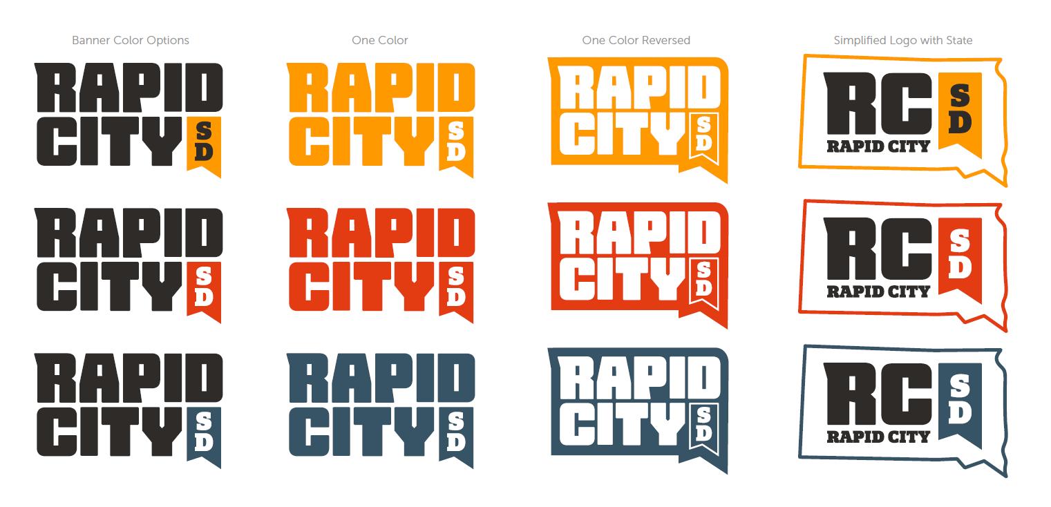
Consistent use of brand colors create a cohesive brand look and feel. Whenever possible, the primary brand colors should be used. However, in specific instances, the extended palette can be implemented for an aesthetically pleasing application.
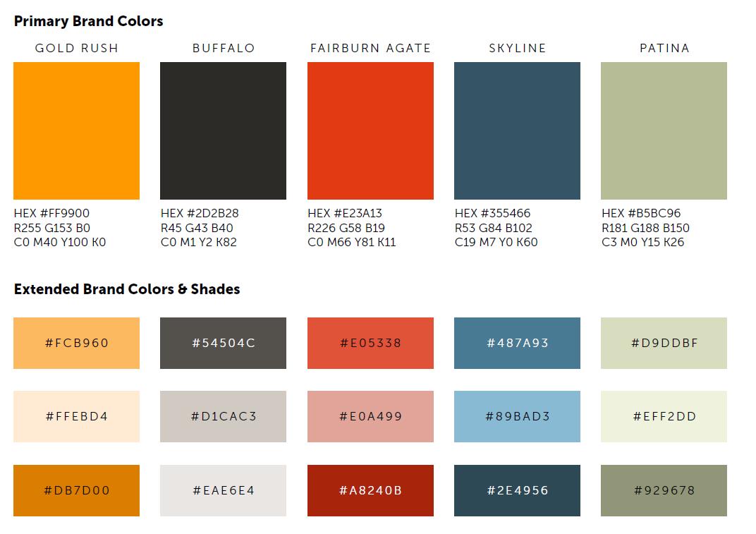
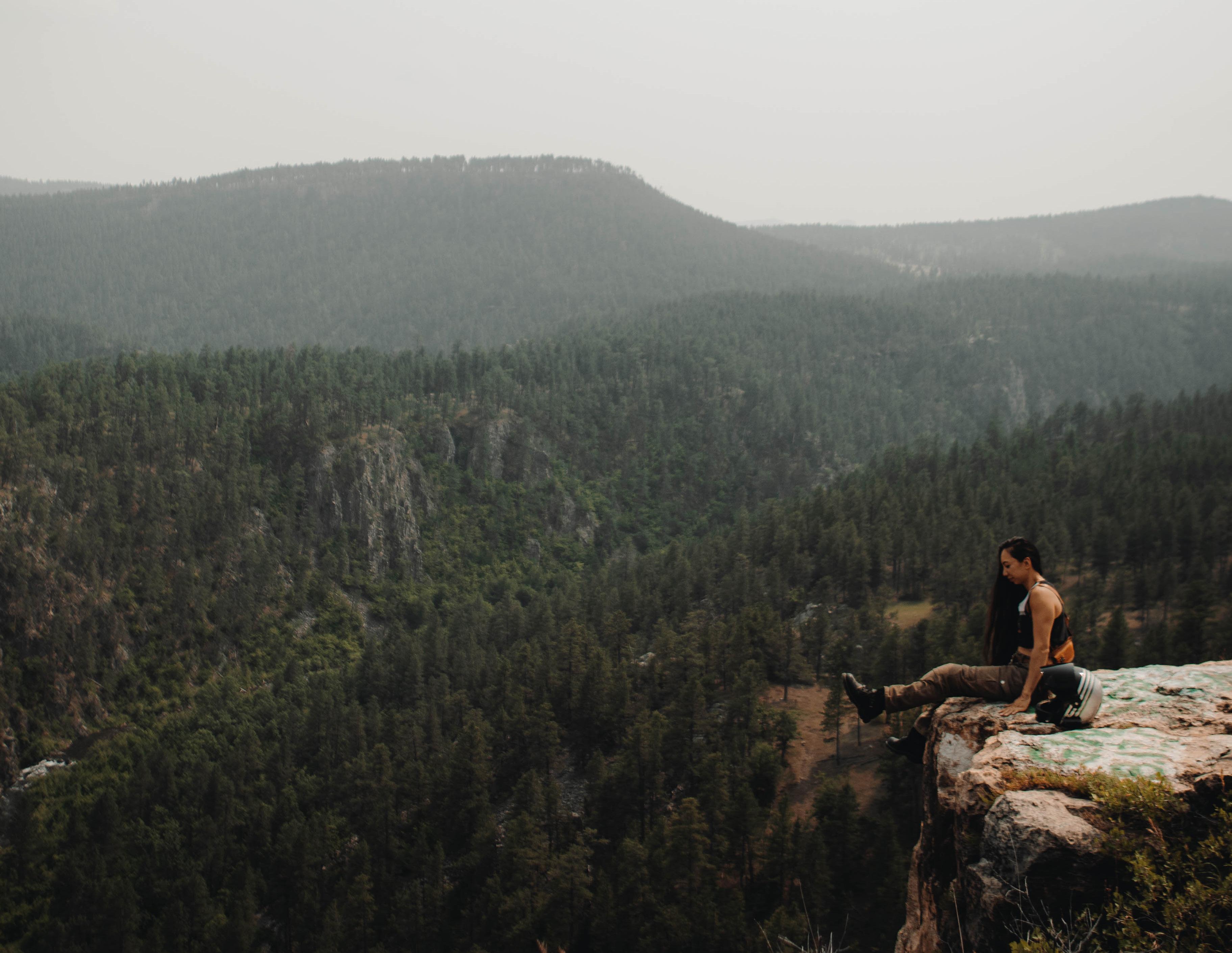
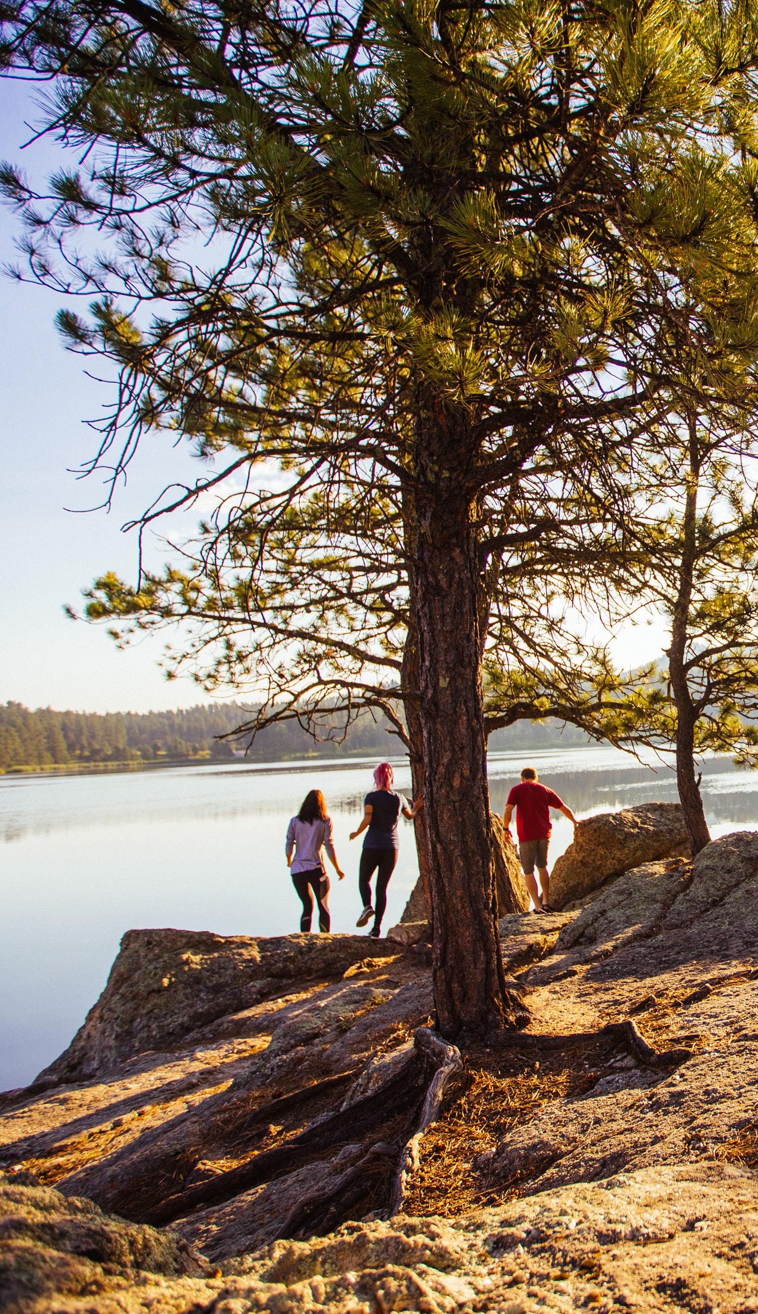
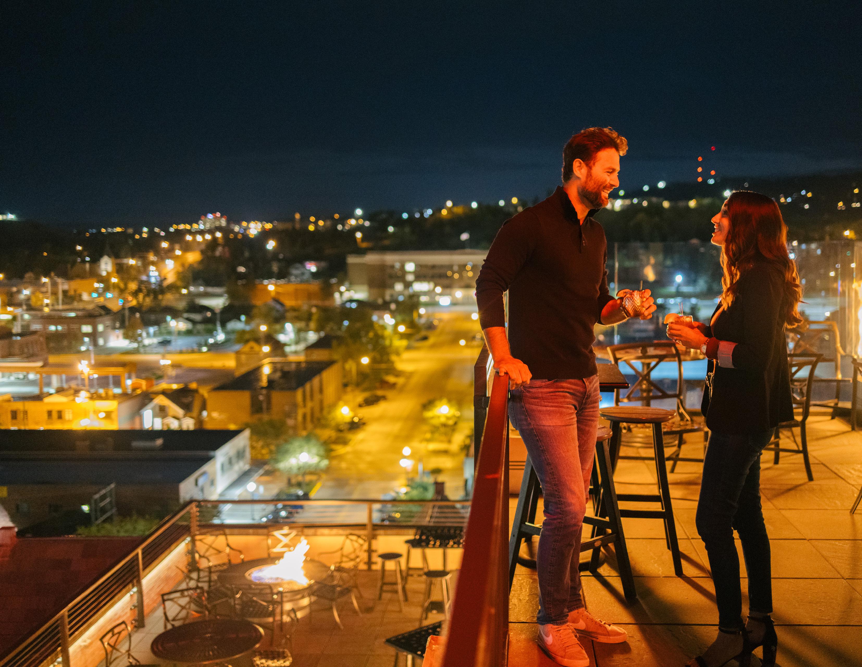
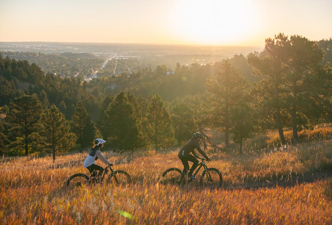
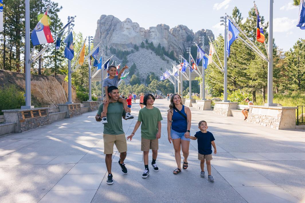
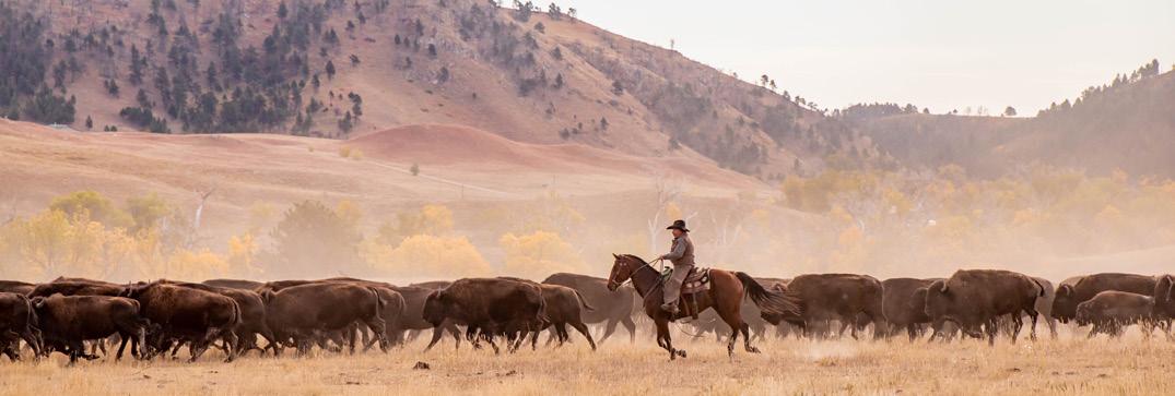
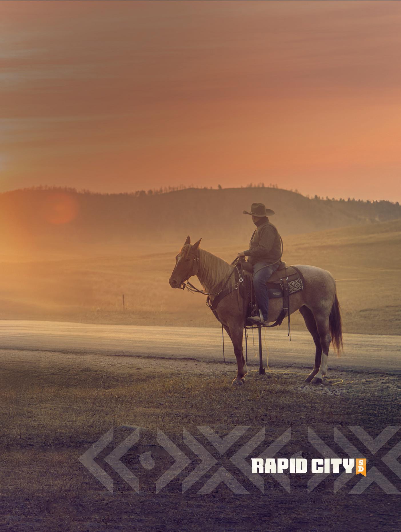
Brand photography and videography is key to capturing a sense of place in Rapid City. Imagery is key to setting a scene, conveying a message, and build an emotional connection to the place. Imagery for Rapid City campaigns should be high quality and accurately reflect the experience of the destination.
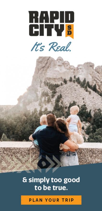
• Whenever possible, utilize images with people in them to help consumers envision themselves in the destination and experience.
• When planning asset collection, prioritize both vertical an horizontal oriented content for use across a variety of digital and printed channels.
• Consider and prioritize representation when selecting models and creators. This includes consideration of age, gender, body types, physical abilities, and lifestyles.
• Opt for creative assets that feel genuine and repeatable rather than overly staged or artificial. Authentic imagery can enhance trust and credibility, making the brand more approachable and appealing to consumers.
• Choose images that not only capture attention but also enable the brand story to be told
• Always ensure appropriate usage rights and that credit is given to creators and photographers when necessary and/or possible.
The illustrated elements below can be used across all media to creative executions for added visual aesthetic, to convey a message, and to give a sense of place.
• All collateral campaign creative should utilize one of the below graphics that is relevant to the placement. Any single asset should not include more than one graphic.
• The triangle banner pattern can serve as a default for all creative, if others are not appropriate or relevant.
• Graphics should be placed subtly in designs as to not be the most prominent element in the design, but should add to the overall design.
• As a general rule, graphics should be subdued, in neutral brand colors, and at 25%-50% transparency.
• For national, international and sports/meetings campaigns, utilize nationally known icons like Mount Rushmore and Crazy Horse Monument to provide a sense of general location.
Communicating what makes Rapid City a city worth visiting, caring for, and celebrating isn’t always as easy as it would seem. As a destination that offers so much to so many, it can be hard to put our finger on exactly the right words that describe it. One thing is true no matter who you are, where you come from, or why you find yourself in Rapid City: it’s real. We can’t help it - authenticity bubbles over here.
Rapid City’s brand campaign speaks to prospective visitors, planners, and residents by connecting them to something we are all craving: something real. Whether our visitors here to see the nation’s most iconic landmarks and lands or simply the pure joy on their toddler’s face as they see their first life-sized dinosaur, Rapid City will leave an impression.
There’s something about this place that almost feels too iconic, too legendary, too remarkable... Simply too good to be true.
But we’re here to tell you: It’s real. It’s Rapid City.
It’s Real.


UPDATED AUGUST 2024