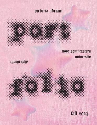
typography
victoria adriani

nova southeastern university
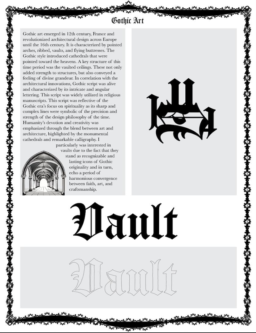

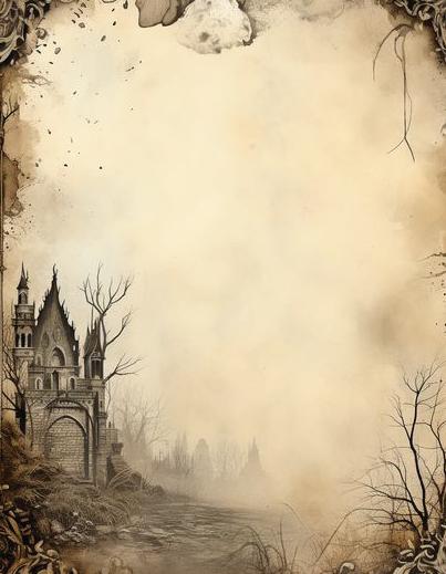
roman empire and middle ages
I had a lot of fun with this week’s assignment. I chose Gothic art as my topic and utilized the Carol Gothic regular font. I chose vault as my word to trace because while I conducted my research for the page, I found that vaulted ceilings were a staple in Gothic architecture at the time. Ceilings are such a recognizable architectural style that interconnect with Gothic design immediately.
I started by sketching my word out in the Carrol Gothic regular font in Photoshop, and I then imported it into illustrator and traced. I then utilized vector graphics of vaulted ceilings as my image that correlated with my research, and I made a frame for the page. I really like the way that my first page came out and I think it’s quite cohesive and is representative of the time period.

A4
renaissance typography
For this week’s assignment, I decided to research the Italian Renaissance and utilize Nicolas Jenson’s font. I first sketched out my word, Illuminare, which means to illuminate in Italian, in Photoshop.
I then imported that into illustrator and traced with the pen tool and then created my page. I also created an abstract work utilizing the letters from my chosen word.
Renaissance
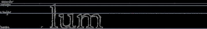

Italian Renaissance Nicolas Jenson
Initializing in the 14th century, the Italian Renaissance was a cultural and intellectual movement that illuminated the country and sparked a revival of classical ideas in art, literature, and philosophy. Humanism was a strong part of the movement and was characterized by the potential of individuals and returning to ancient Roman and Greek manners of thought. Italy became a hub of artistic and scholarly innovation, particularly in cities such as Venice and Florence. Spreading Renaissance ideas was made possible by way of printing. Nicolas Jenson, a French engraver and printer who settled in Venice, created one of the earliest and most elegant Roman typefaces. He was inspired by classical Roman inscriptions and his fonts were renowned due to their readability, clarity, and balance. His fonts embodied the humanist spirit of the Renaissance with their re ned serifs and proportions which aligned with the emphasis on harmony and order at the time. In Venice, his type quickly became the standard as it laid down the building blocks for a myriad of modern serif fonts utilized today and has continued to in uence typography for centuries.
BODONI
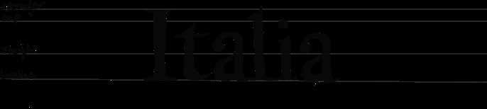
In Parma, Italy, in 1788, Giambattista Bodoni, introduced the first modern style type face. A contrast between thick and then strokes characterized the type. It's narrow round letters and thin unbracketed serifs were straight and unconnected to the main strokes. This type face has a classical and elegant feel due to its geometric precision and emphasis on vertical stress combined with a small x-height relative to the capital letter height. Sharp angles on the serifs and ascenders matched the height of capital letters, becoming notable design elements. Bodoni’s design was also characterized by a mechanical consistency, which was achieved through repeating shapes across the alphabet. A French designer named Firmin Didot may have influenced Bodoni through his royal typeface, Romain du Roi. As the thin, pointed stylus used to mark on metal plates, or the “engraver’s tool”, advanced, Bodoni and Didot’s Modern Style type faces became widely used.
colonization and industrialization A5
For this week’s assignment, I chose typography in Italy and researched Giambattista Bodoni’s Modern Style font. I chose the Bodoni font and the word Italia, which means Italy in Italian. I first sketched out the word in my chosen font in Photoshop and I then converted that to a smart object because my layers were multiplied. Then, I traced the word with the pen tool. Then I created the layout for my page. I wanted the page to have an elegant, classical, and minimalistic feel in order to reflect the late 18th century Italy.
early 20th century A6
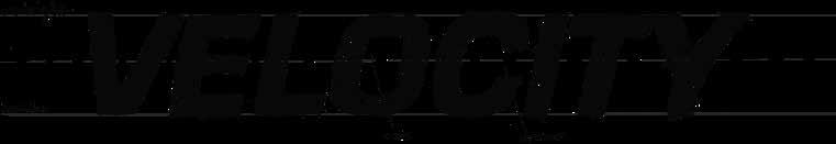
For this week’s assignment, I chose futurism as my topic and chose Eurostile bold italic as my font. I chose the world Velocity to reflect the period’s emphasis on speed, technology, and the future. Firstly, I sketched out the word on Photoshop.
Then I converted the layers into smart objects. I then imported that into Illustrator and traced with the pen tool. I then created my page layout with my vector image and abstract design!

the swiss design style A7
For this week’s assignment, I chose futurism as my topic and chose Eurostile bold italic as my font. I chose the world Velocity to reflect the period’s emphasis on speed, technology, and the future.
Firstly, I sketched out the word on Photoshop. Then I converted the layers into smart objects. I then imported that into Illustrator and traced with the pen tool. I then created my page layout with my vector image and abstract design!

A8
contemporary/ digital
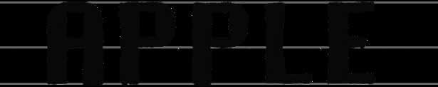
For this weeks assignment, I chose the Apple/Macintosh era. I chose the word Apple. I first sketched out my word in Photoshop utilizing the Chicago font and then traced the illustrator and created my page layout.
I wanted the page to represent the Macintosh vibe of the early 1980s. The font I chose, Chicago, was introduced specifically for the McIntosh computer in 1983!
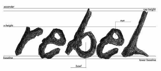
1.ascender
2.cap line
3.x-height
4.tail
5.ligature
6.baseline
7.descender
8.eye
9.counter (open)
10.serif
11.aperture
12.finial
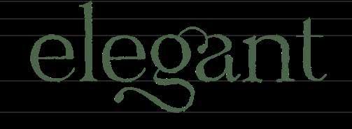
Hastegi is an elegant serif typeface known for its graceful curves, high contrast, and refined style. Perfect for luxury branding, editorial layouts, and sophisticated print materials, it blends tradition with contemporary design. One of its standout features is its beautifully crafted ligatures, which enhance the fluidity and visual harmony of the text.
For instance, in the word "elegant," the ligature between the "g" and "a" forms a seamless connection, where the tail of the "g"
Ligatures: Hastegi
flows elegantly into the curve of the "a." This subtle design element not only improves readability but also adds a decorative touch, making the word appear cohesive
and visually engaging. The use of such ligatures contributes to the sophisticated appeal of Hastegi, highlighting how typography can elevate even the simplest words. Additionally, Hastegi’s bracketed serifs, high contrast strokes, and teardrop-shaped terminals contribute to its refined look. The moderately tall x-height and balanced ascenders and descenders further enhance its elegance which does make Hastegi an ideal choice for designers and professionals to include in their high-end design projects.
typeface anatomical details A9
For this week’s assignment, I chose Ligatures as my topic. I chose the word Elegant. I first sketched out my word in Photoshop utilizing the typeface, Hastegi, and then traced the illustrator and created my page layout.
Ligatures really exude elegance to me hence my word choice. I went with a green theme as well as I tend to associate deep greens with elegance as well!
A10
type identification and classification
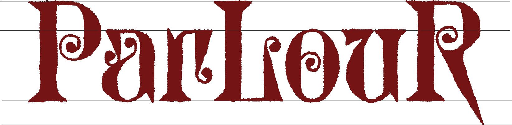
For this week’s assignment, I chose Decoration as my topic. I chose the word Parlour. I first sketched out my word in Photoshop utilizing the typeface, Glyptic DJR, and then traced the illustrator and created my page layout.
This typeface revives a Victorian font called glyptic. It leans into the frenzied energy of the design and emphasizes the angular wedges + vertical serifs, and contrasts them against delicate spirals and curlicues.

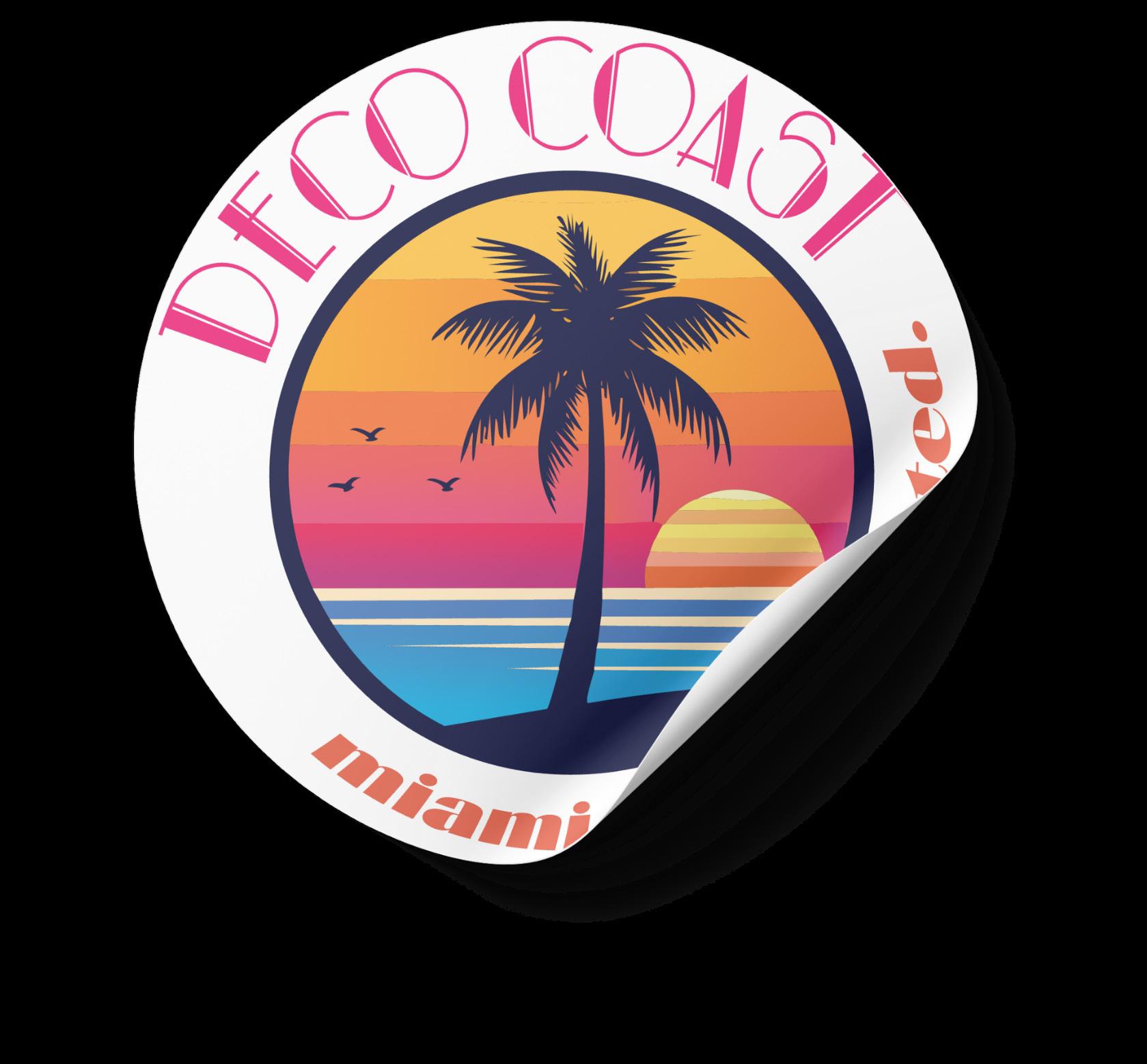
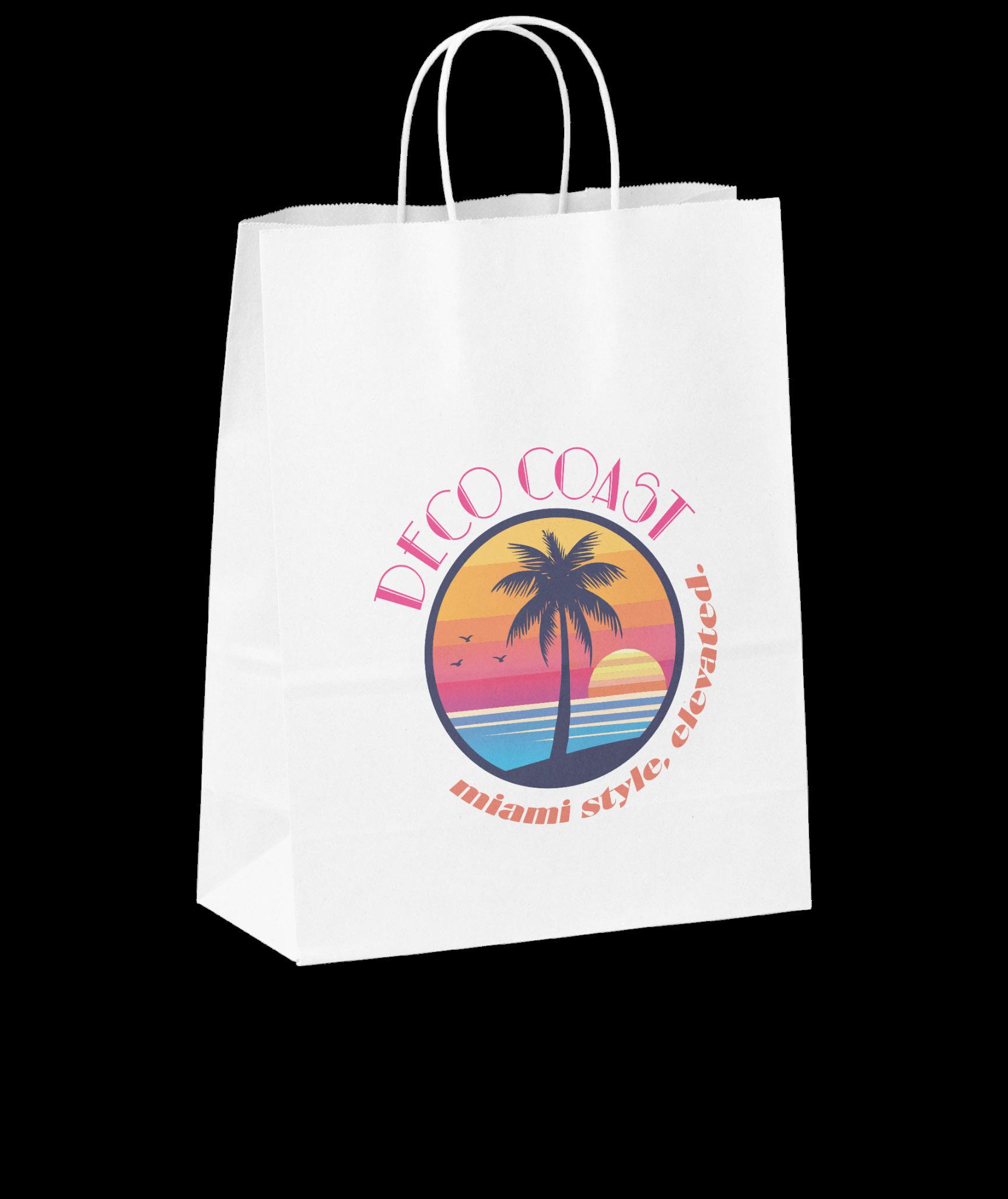
DECO COAST
Miami style, elevated.
An upscale boutique inspired by the South Beach Art Deco aesthetic, merging geometric lines and retro tropical colors. Deco Coast is a destination for curated, high-end apparel and accessories that celebrate Miami’s glamorous past with a modern twist , blending vintage charm with contemporary luxury.
selecting and combining fonts A12
For this week’s assignment, I started by coming up with and sketching six different logo for 2 south florida businesses. I up being inspired by the retro art sun the most. This prompt ed me to create my logo for Deco Coast. I tried a few different variations of text placement and color.
The slogan is “miami style, elevated.”
Deco Coast would be an upscale bou tique inspired by the South Beach Art Deco aesthetic, merging geometric twist, blending vintage charm with contemporary luxury.
A13: typographic compositions
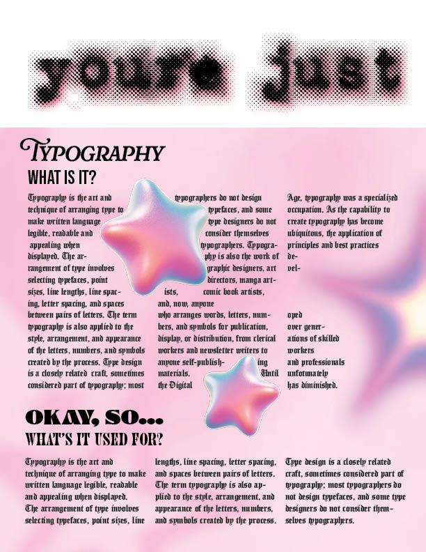
For this week’s assignment, I created a conservative page layout that highlighted different typefaces and the evolution of typography.
conservative page design
I wanted to create a composition that guides the eye to different parts of the page and allows for a variety of typefaces to be present. I use the mini graphics in order to keep the focus on the graphical elements of the page.
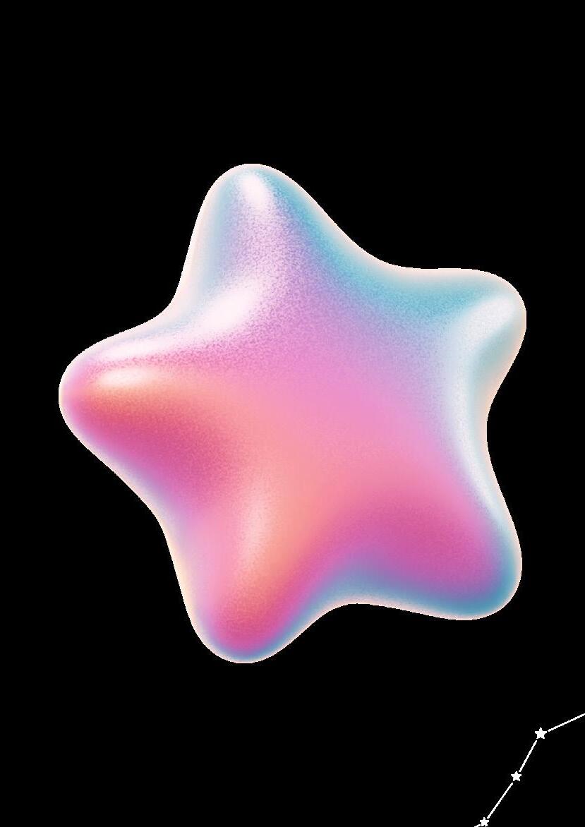
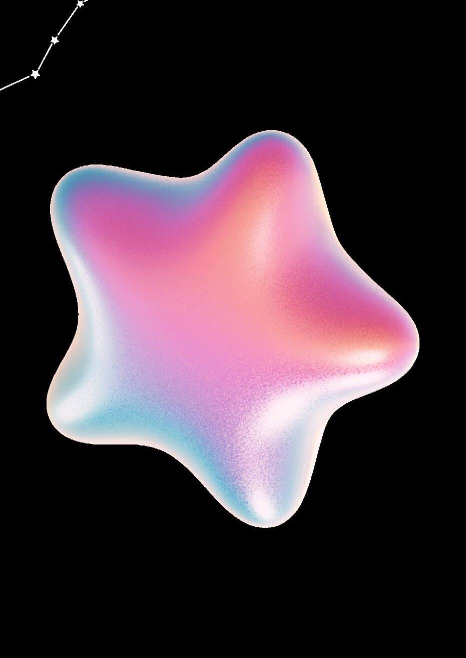
A14: typographic compositions
For this week’s assignment, I created my contemporary page layout utilizing InDesign. I played around a lot with text wrap and design elements.
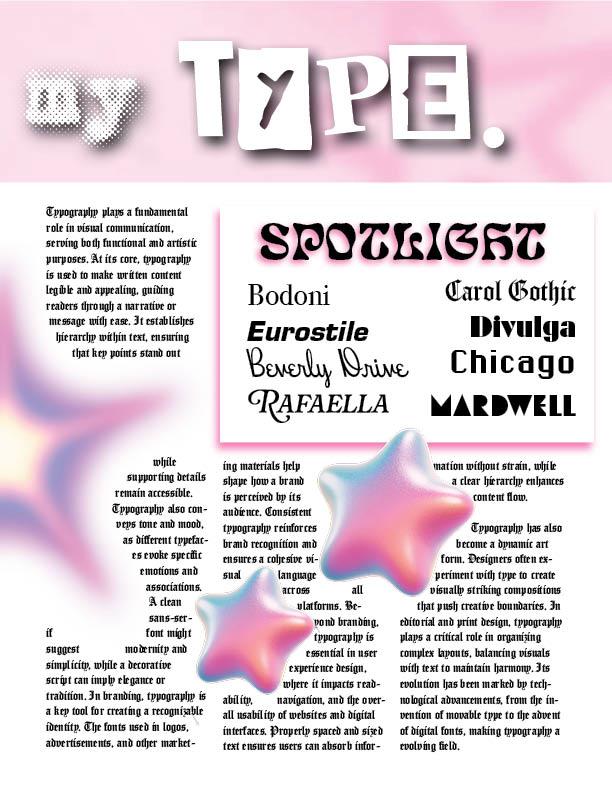
contemporary page design
I wanted the page to exude a fun, playful vibe. I used a lot of pastel gradients, starry accents, and a variety of fonts. I aimed for a mix of whimsy but sophisticated feel!