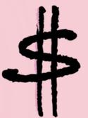

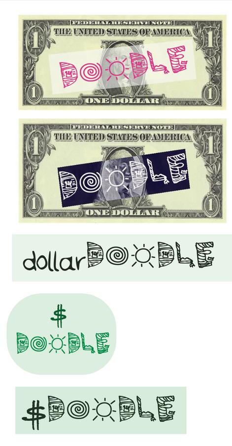
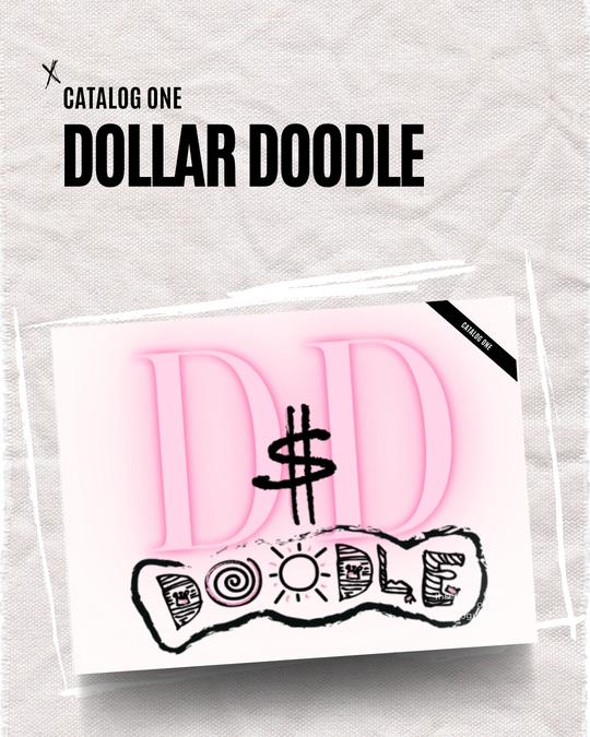
Everyone likes to doodle. When we are bored, on the phone, in a class, at work, etc., many tend to doodle. The brand, “Dollar Doodle”, was my original brand that would focus on buying people’s doodles and donating a dollar to good causes for every purchase and printing said doodles on curated products such as menswear, womenswear, accessories and more in order to support small artists internationally. My favorite design concept for a logo that I had come up with for this brand was the dollar bill with hysical word “doodle” essentially “doodled” on ll.
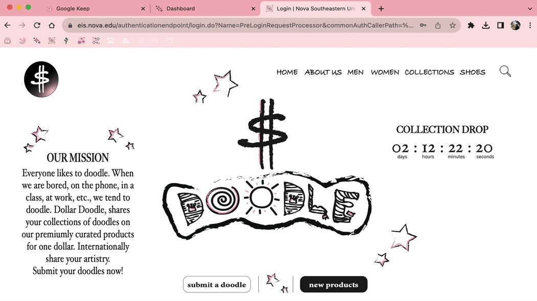
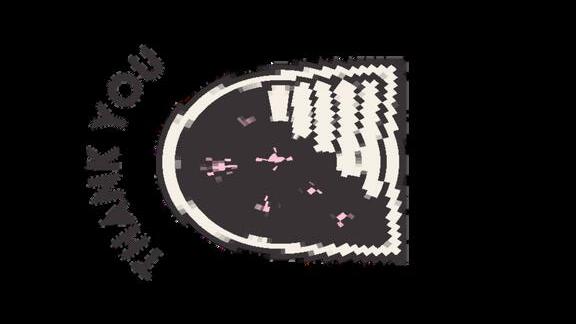
I then came up with these for Phase 2. For this concept, I chose two of my favorite colors, black and pink, as my color mood across both the web and mobile designs. I had so much fun making both pages! I wanted to create a feeling of doodles by utilizing the charcoal feather brush tool. The web design would essentially be the homepage of the website. On the mobile page, I added a few mock products as an example of what it would look like to be shopping on the application.
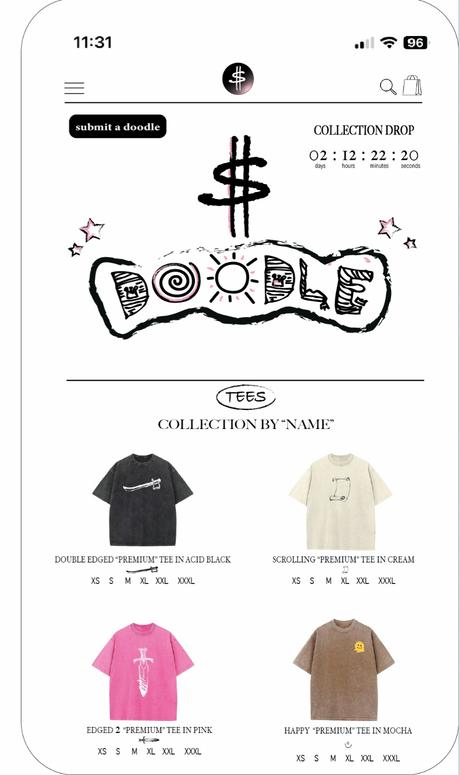
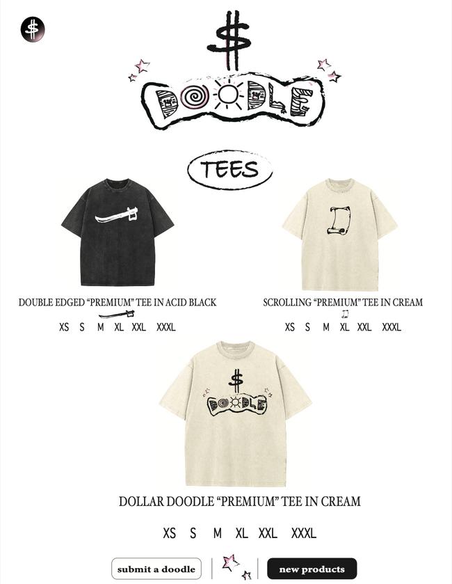
I created 3 mock up designs of the types of t-shirts that could potentially be sold on the website. I wanted to showcase the different types of "doodles" that could be found on said products. One is the dollar doodle logo itself for anyone who wanted to nt the brand and the other two would essentially be how the would look in a collection of products of people's doodles igns!
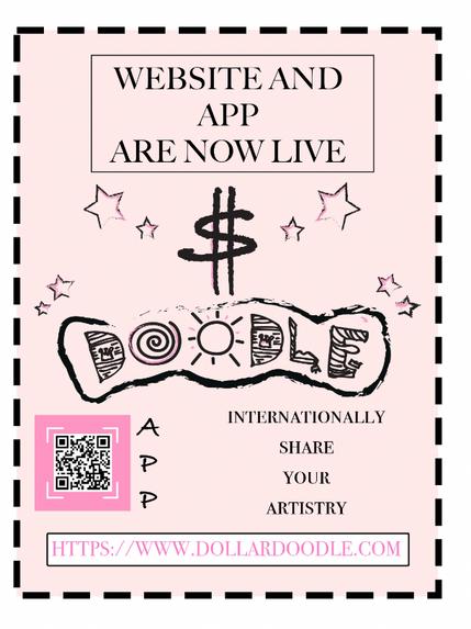
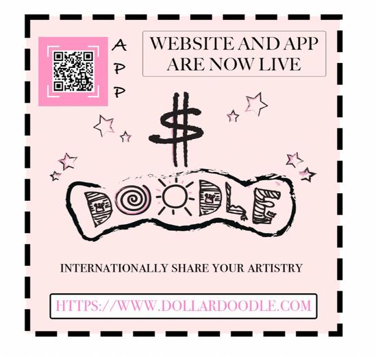
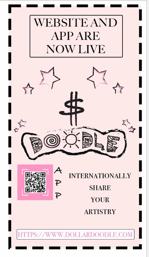
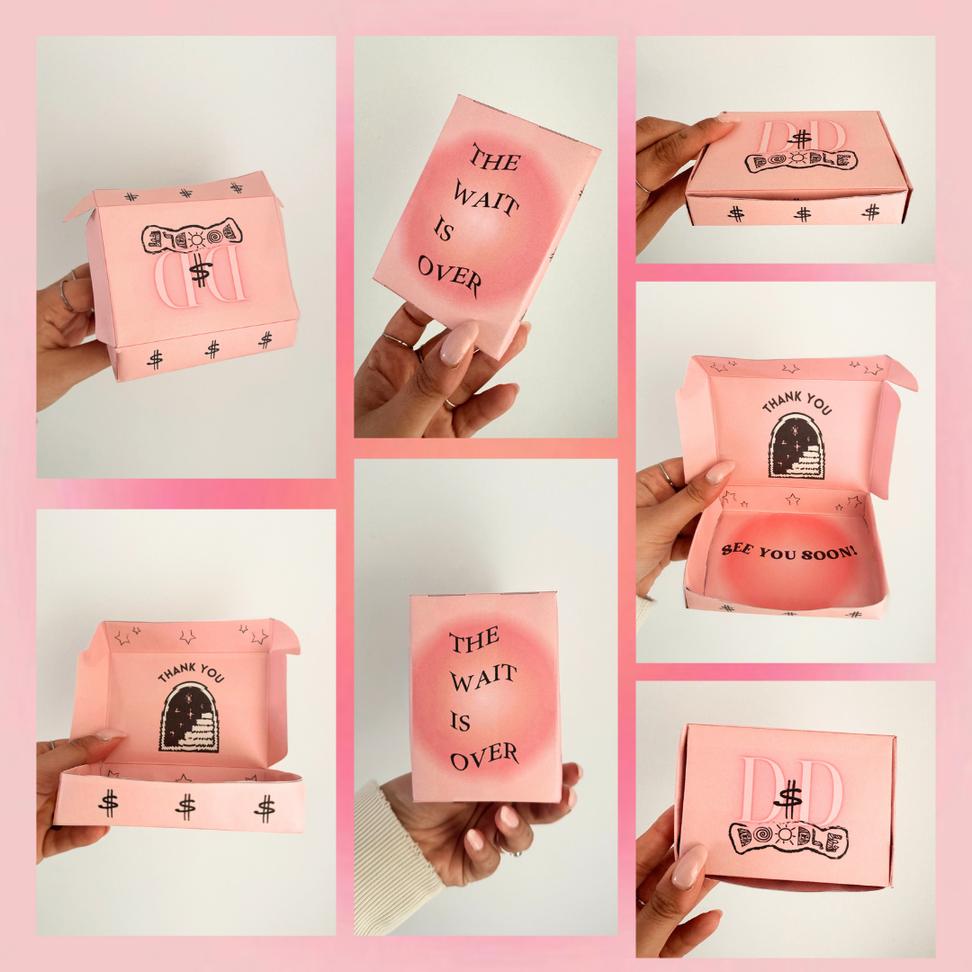
For Phase 4, I wanted the advertisements to appear cohesive across each platform. I utilized the different fonts so that the typography could stand out. I used variations of black and pink that I thought would complement the brand and pop. I also included a QR code in my advertisement for easy user accessibility to download the a
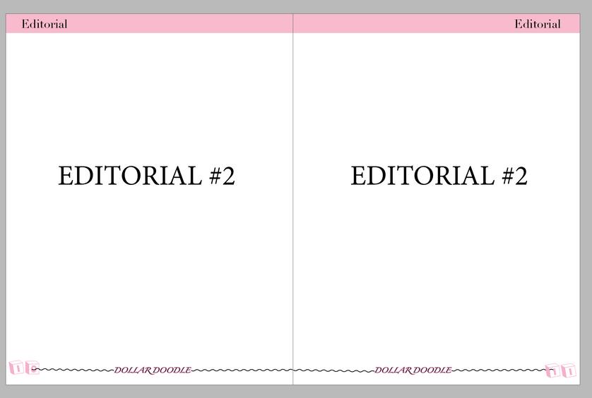
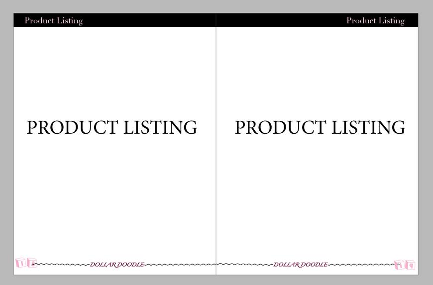
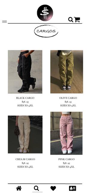
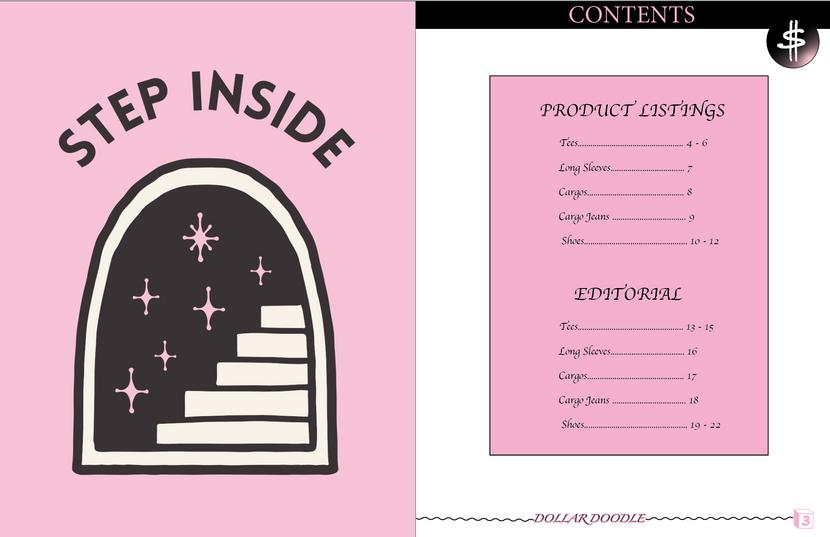
I chose pink and black as my main color scheme as I have been doing for my brand, "Dollar Doodle". I added wavy lines at the m footer to create a sense of doodles and added a variation k and pink headers. I created Parent A and B pages for the ial and product listing pages.
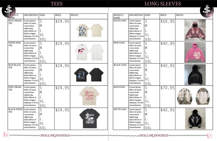
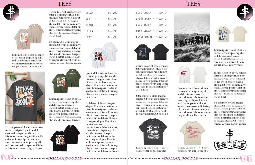
These are just a couple of sample pages from the catalog that showcase the different variations of pages I featured in the catalog!
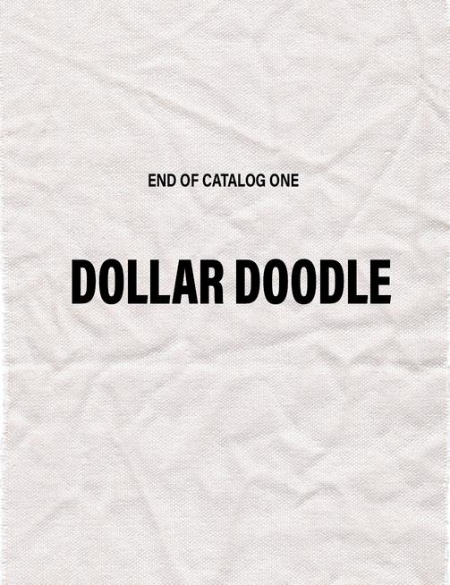
These are my 2 outer cover pages from the catalog that I was really proud of!

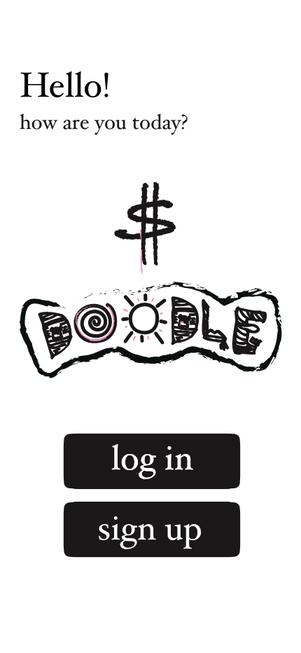
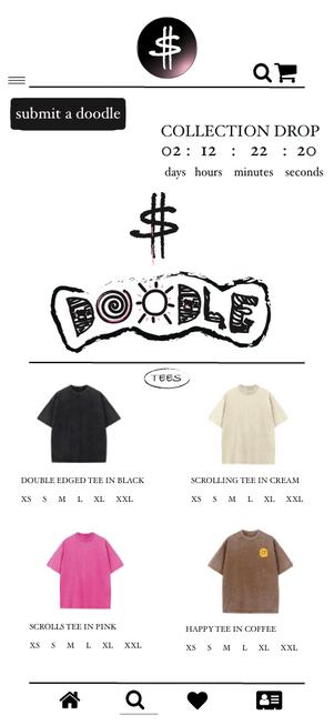
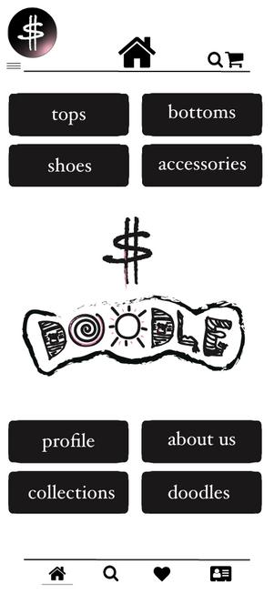
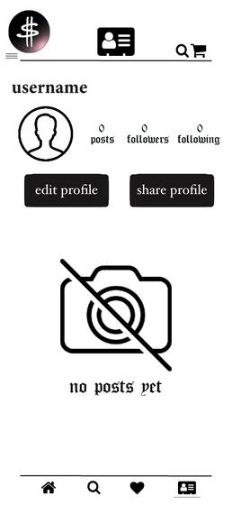
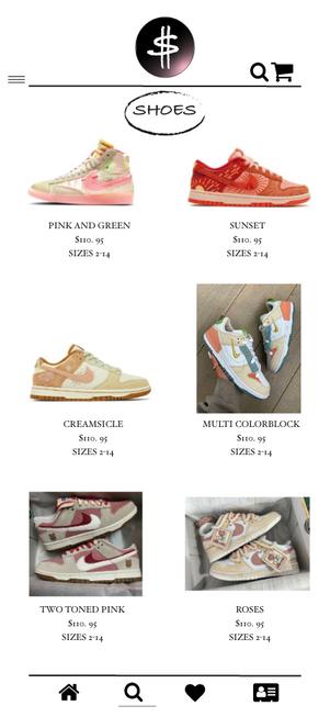
I created 3 pages consisting of a login page, home page, and profile page. I wanted to create a visually appealing shopping and social app that goes along with my Dollar Doodle brand. I wanted the app to be user-friendly and have an interface that is easy to navigate for an optimal user experience.
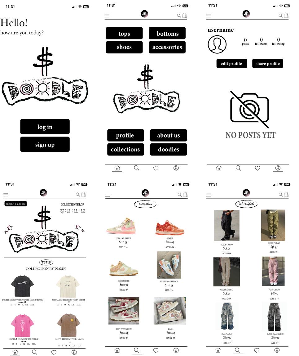
I created 6 pages consisting of a login page, home page profile page, and 3 additional pages
ting the shopping experience on the app.