victoria adriani port folio
nova southeastern university
professional print design

nova southeastern university
professional print design
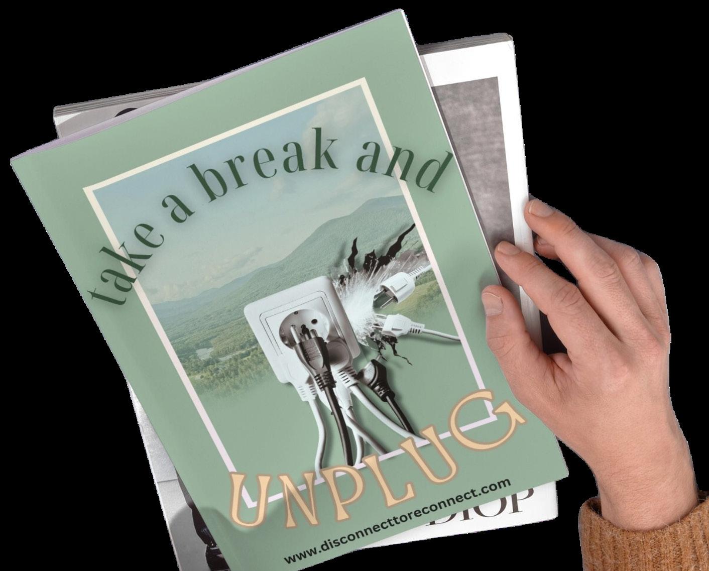
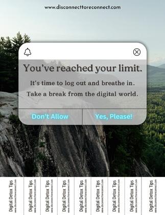
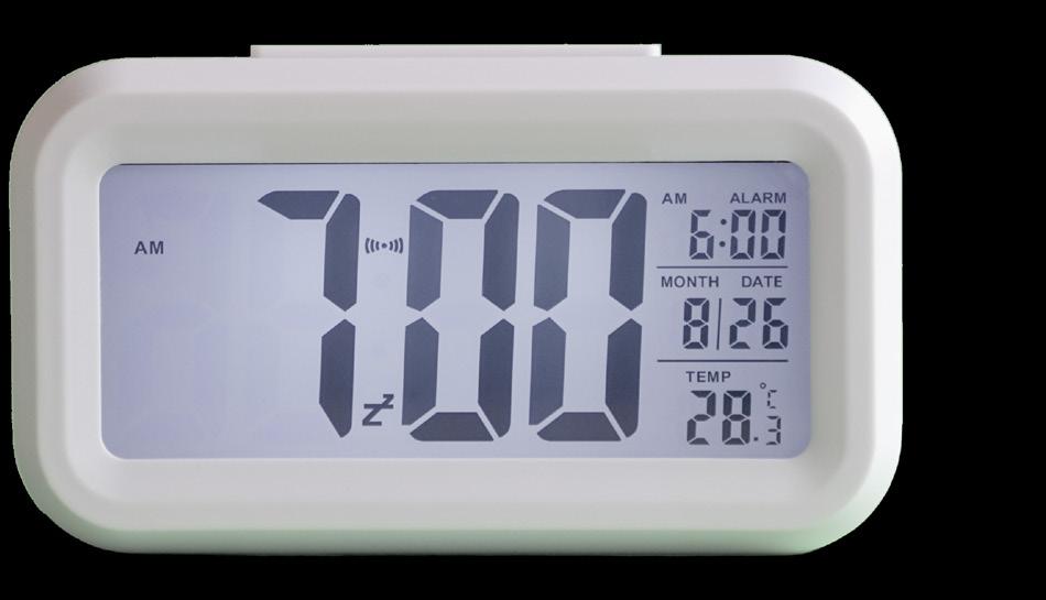
My advertising campaign will address the universal negative effects that social media and the internet has on soci ety and our overall men tal health. I will be cre ating a public service advertising campaign advocating for more mindful consumption of the media. My campaign will be char acterized by retro and vintage design elements combined with a modern design aes thetic that will all work together in order to be thought-provoking regarding our digital habits. My campaign’s target audience is chil dren, teenagers, young adults, and adults who are heavily exposed to social media and are social media users as well as individuals who are concerned with the harmful mental and emotional impact tech nology often times elicits.
to life. Multiple stages were involved in my process. These included brainstorming throughout my creative, brief
I utilized Photoshop to bring each concept
cohesive throughout all of the media as I wanted to use consistent imagery and I will be employ-
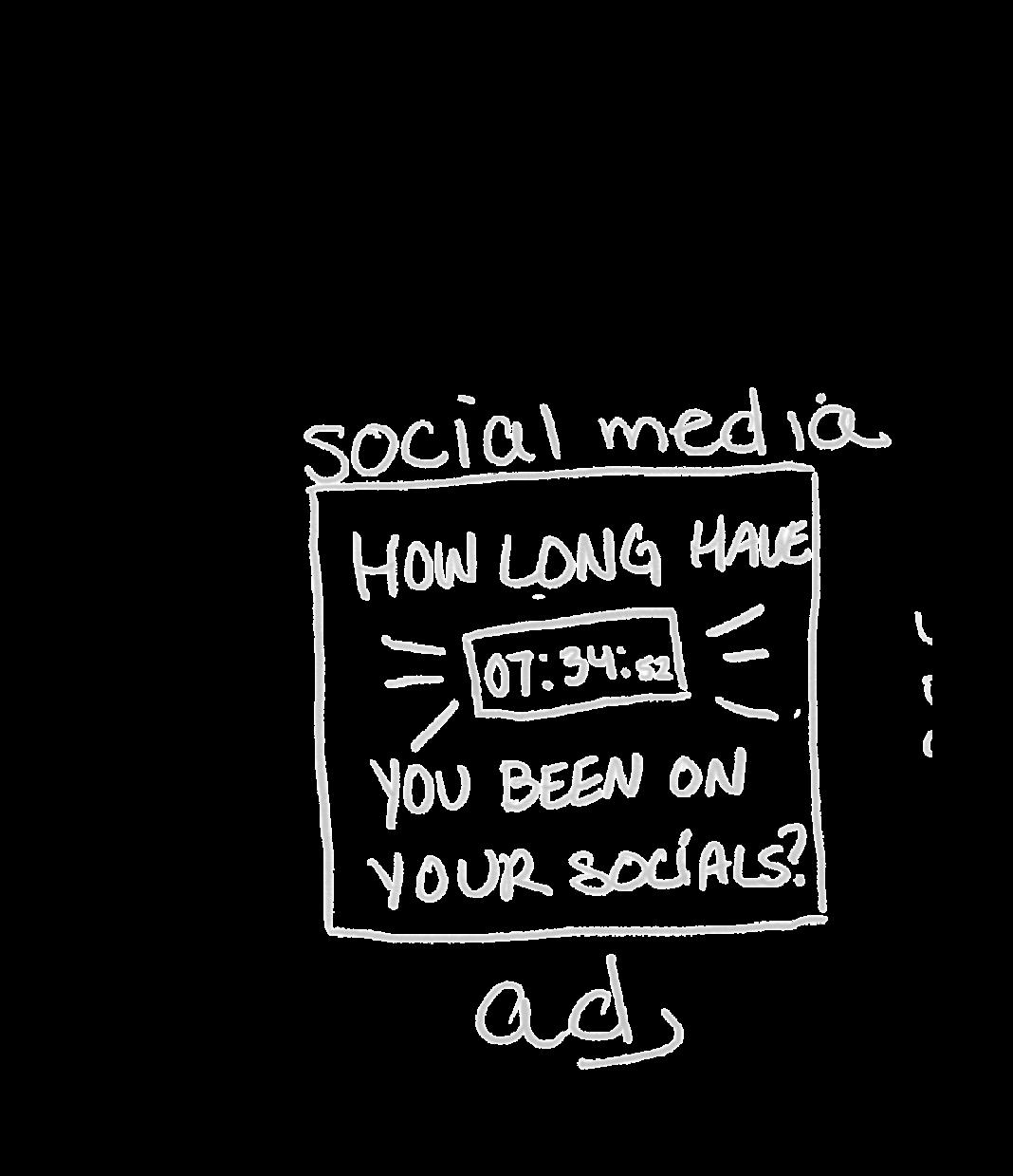
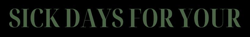
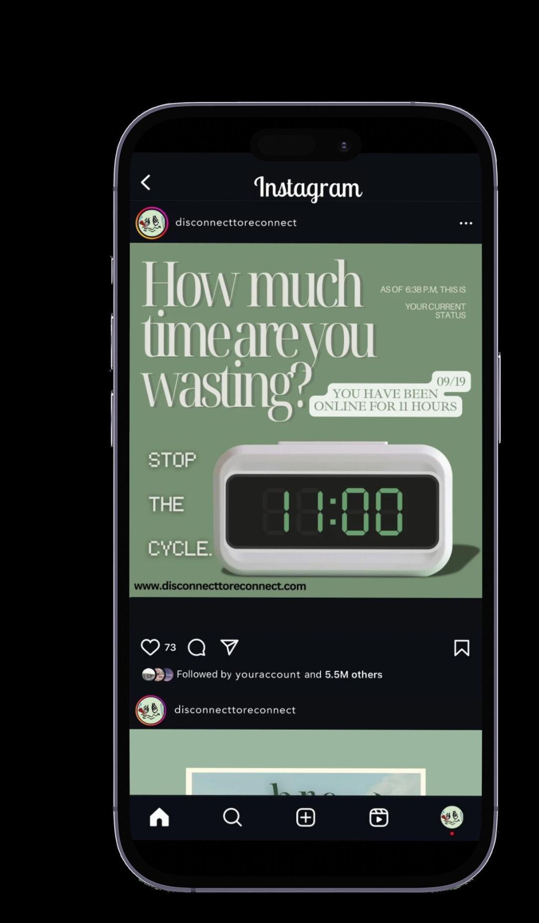
ing more colors that will be viewed throughout my campaign. I will be choosing typography that I am visually drawn to, and that resonates with my vintage feel.. I really want to focus on making my typography stand out so that it may effectively communicate my message throughout the campaign. I want the entire campaign to elicit a retro and vintage, feel as I am very drawn to that and I want to play with the juxtaposition of the digital age and the non-digital age. I utilized a pencil on Photoshop and my iPad in order to sketch out each advertisement idea, including a billboard, poster, flyer, website, and a double-paged magazine ad, and a social media ad. I want to employ the social media ad campaign so that I can utilize the specific platform that I am advocating against in in order to convey and spread my message.


I really want each platform to embody the message and the aesthetic of the brand.
www.disconnecttoreconnect.com
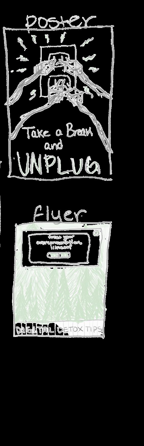
I then utilized Canva to create the layout for my poster. I utilized my own photo, and faded it out on the bottom as well as reduced the opacity on it.
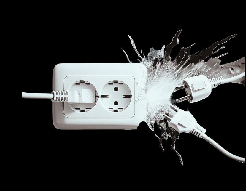
For my poster, I utilize Adobe firefly to generate some photos of plugs overloading a wall. Then, I imported those photos into Photoshop and modified them and their colors to make them my own.
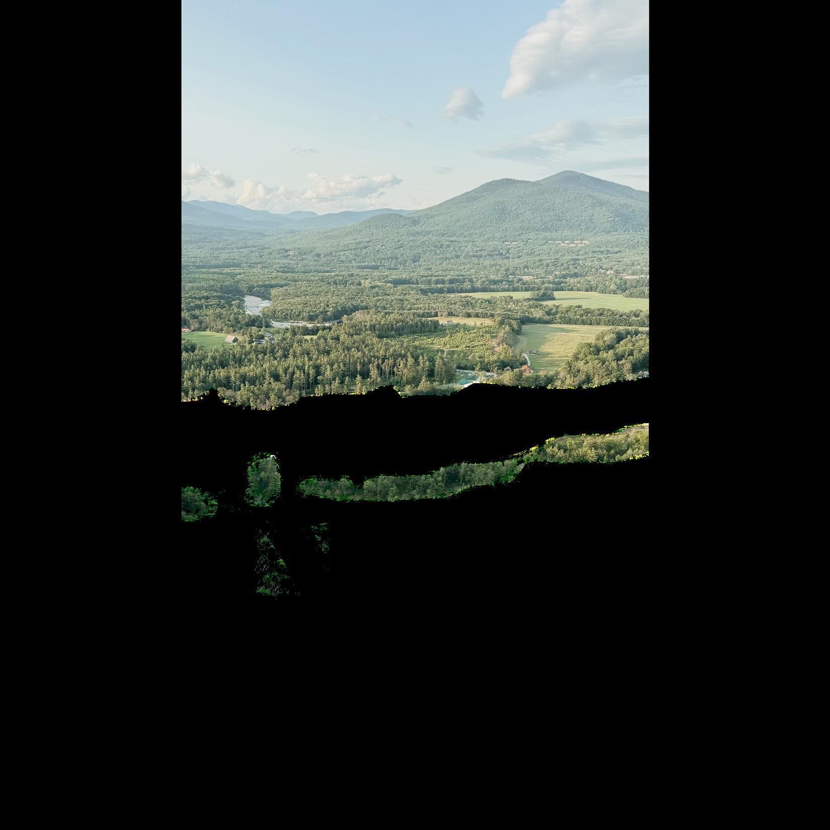
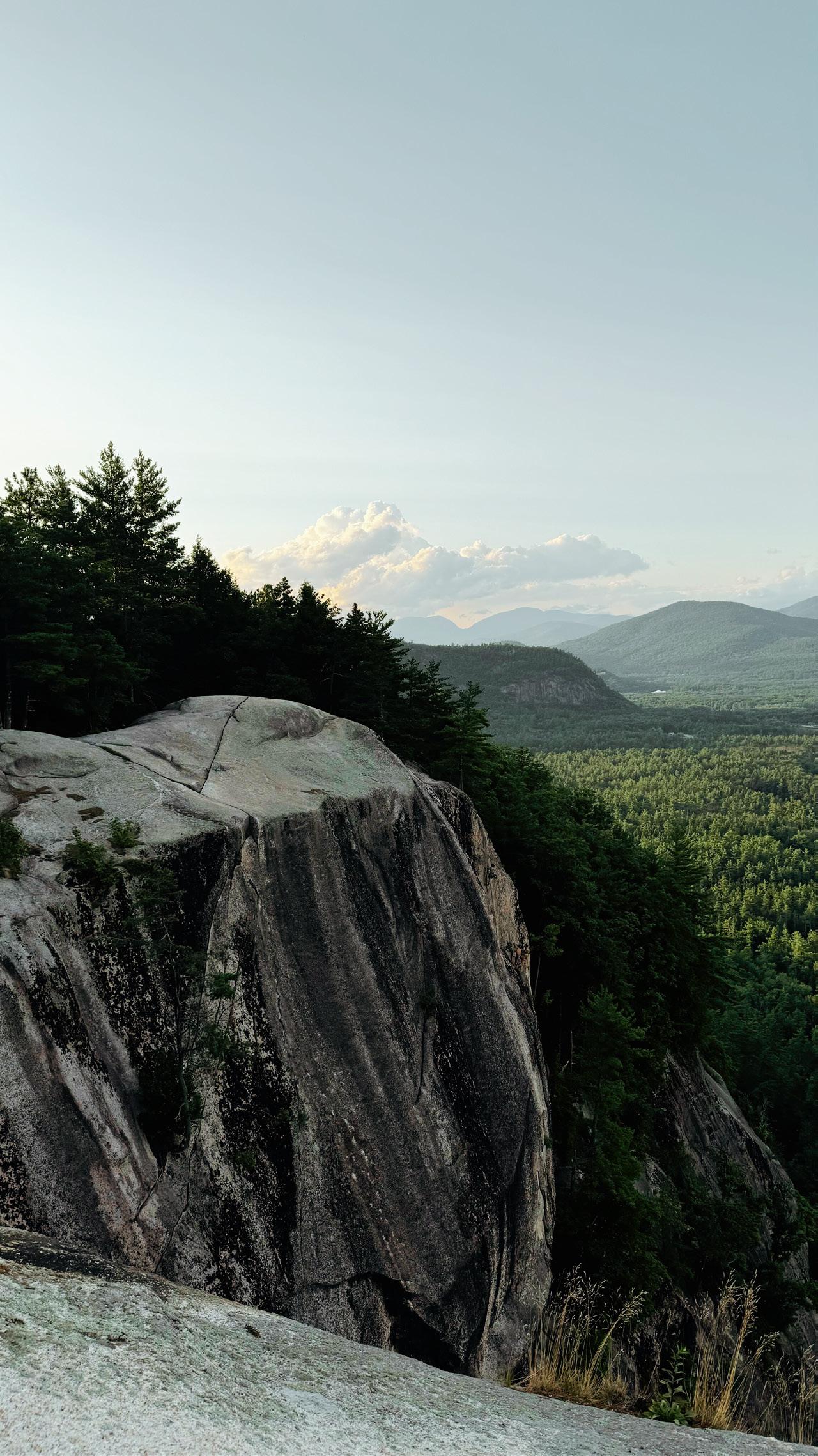
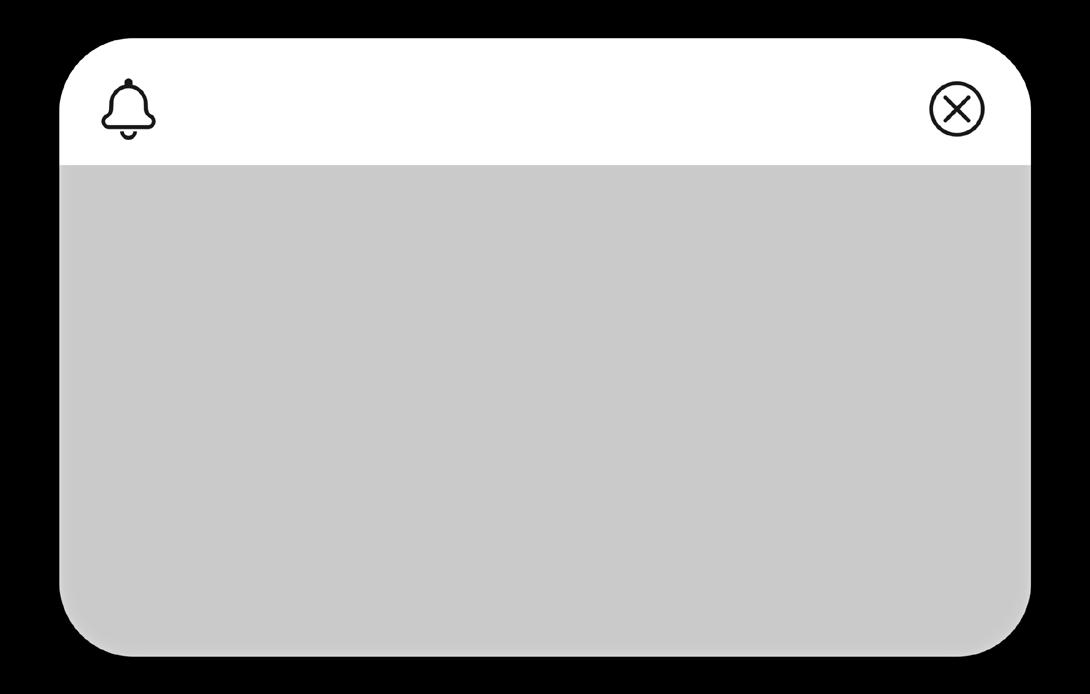
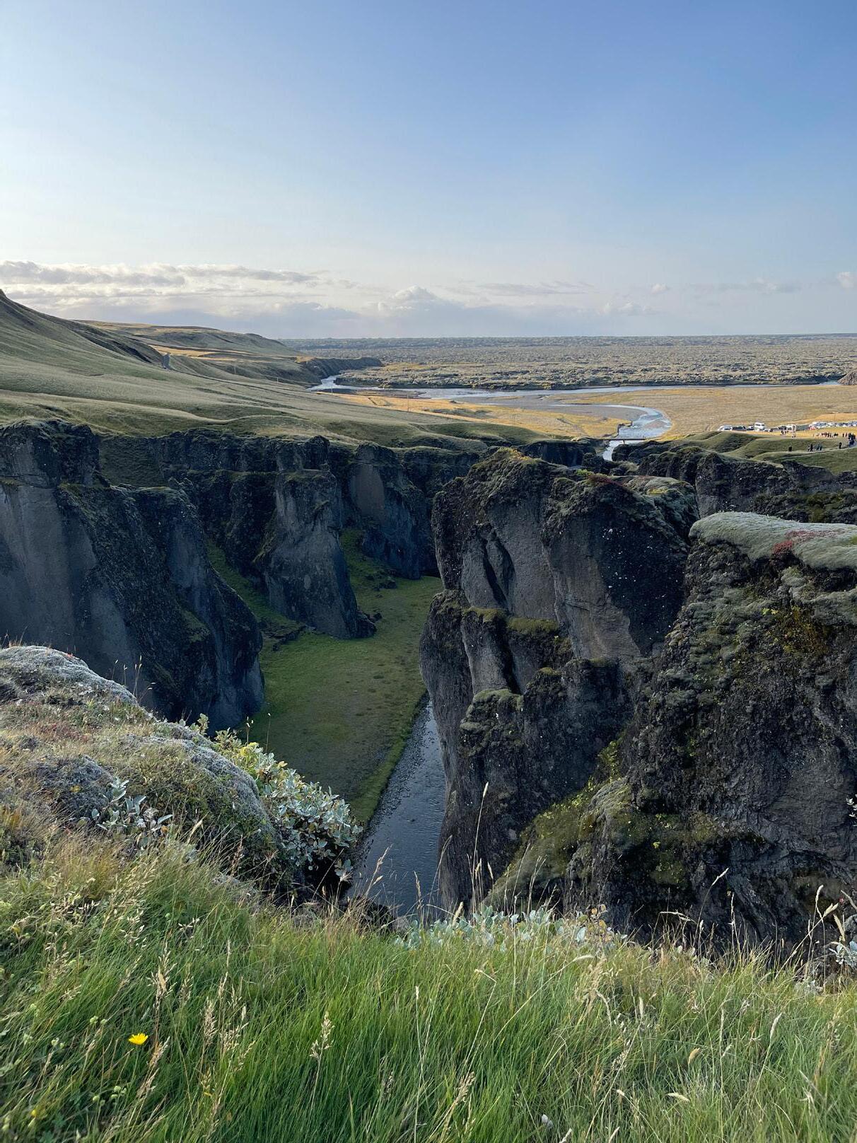
For the tear-off flyer, I utilized my own photo of New Hampshire. I added a pop-up notification that would stand out and call for the viewer’s attention.
Theoretically, each tear-off strip would have QR codes on the back, so that individuals would be able to be directed straight to the website.
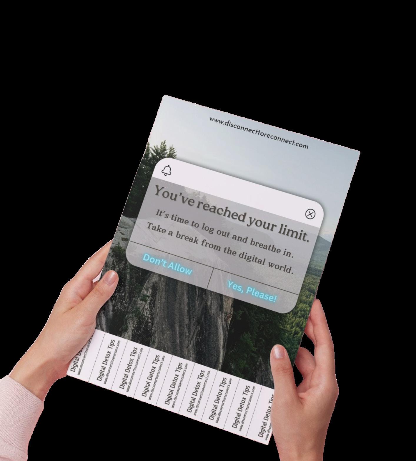
I added the name of my website/campaign, “disconnect to reconnect”, to each of my creations for this campaign.
I want to create and emphasize a digital but also retro/vintage mood and I think I have effectively communicated that here!
www.disconnecttoreconnect.com
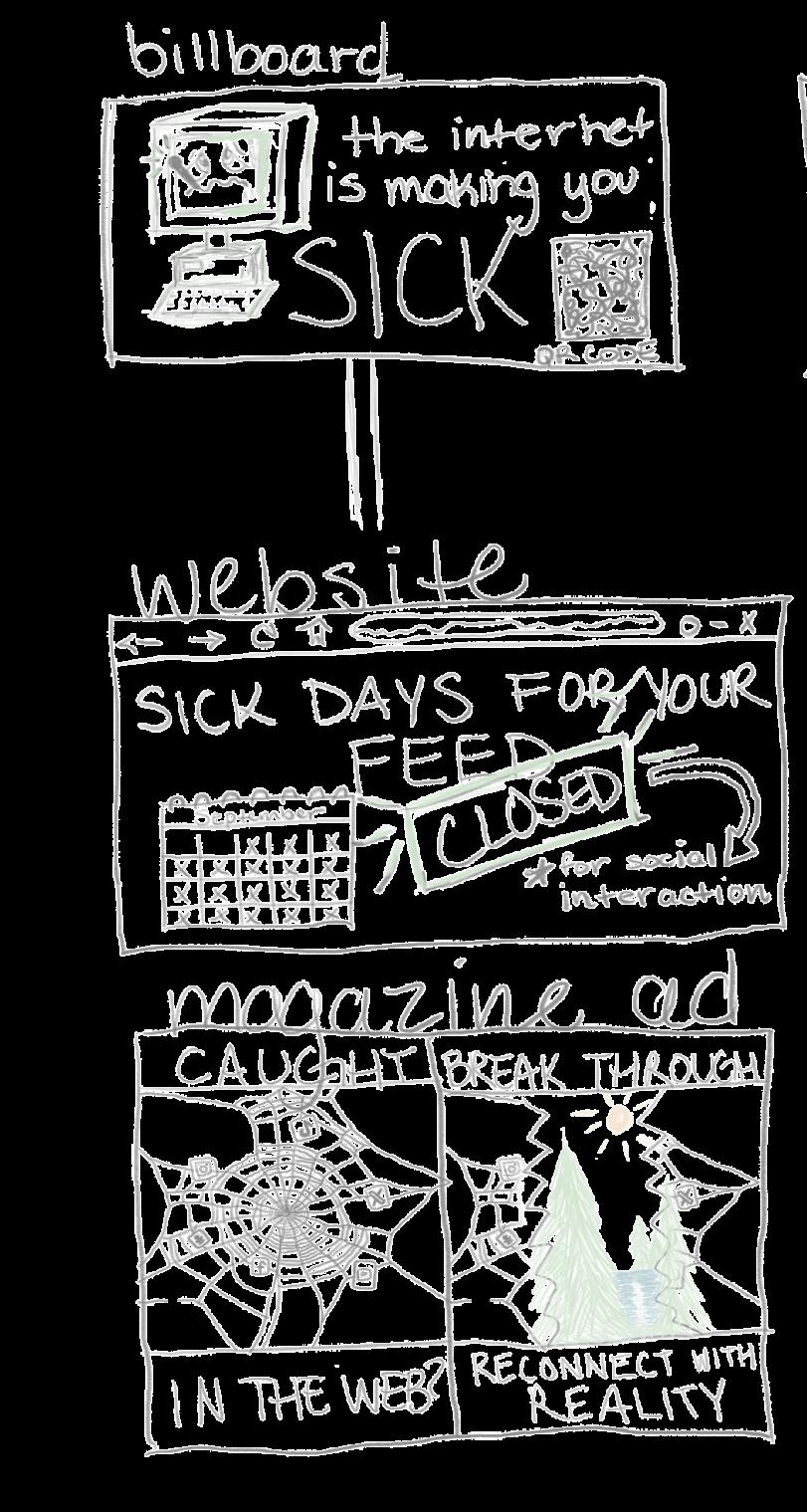
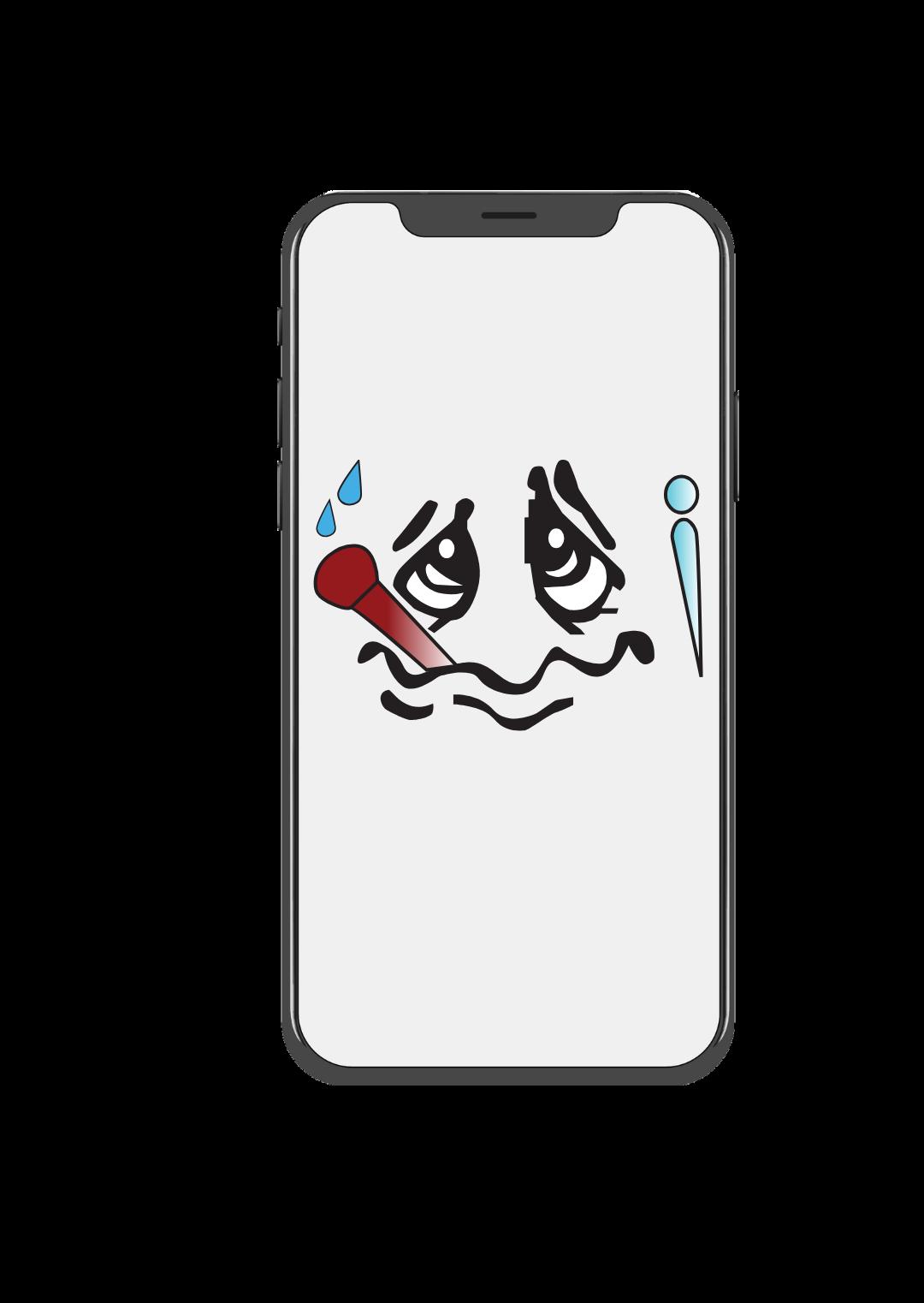
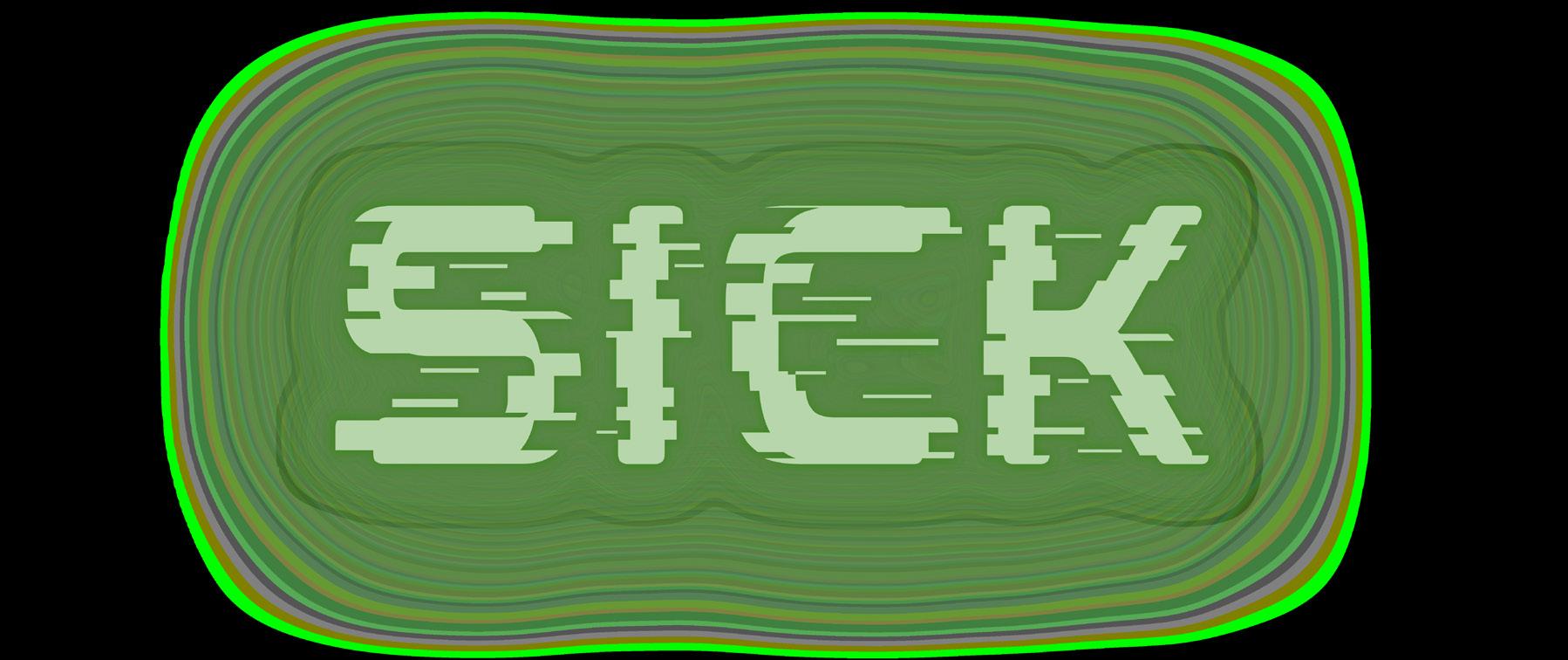
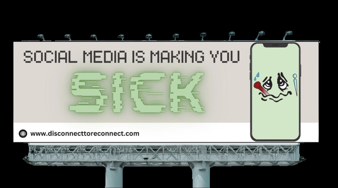
For the billboard, I went ahead and created an animated sick face on illustrator with the pen tool, and added gradients to the thermometer, and the screen glare detail. I also imported the illustrator document into canva and applied it into my billboard.


I really found it to be beneficial for me to use Canva. I utilized two fonts called retropix and mokoto glitch and I also added shadow/neon effects to the word “sick” to really make it pop.
For my website, I also used my own photos and the sick iPhone face that I created for my billboard.
Overall, as I created my website, I kept in mind wanting to build a design that I felt was user-friendly and visually pleasing!


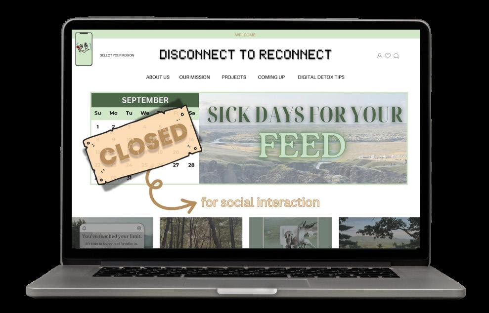
www.disconnecttoreconnect.com
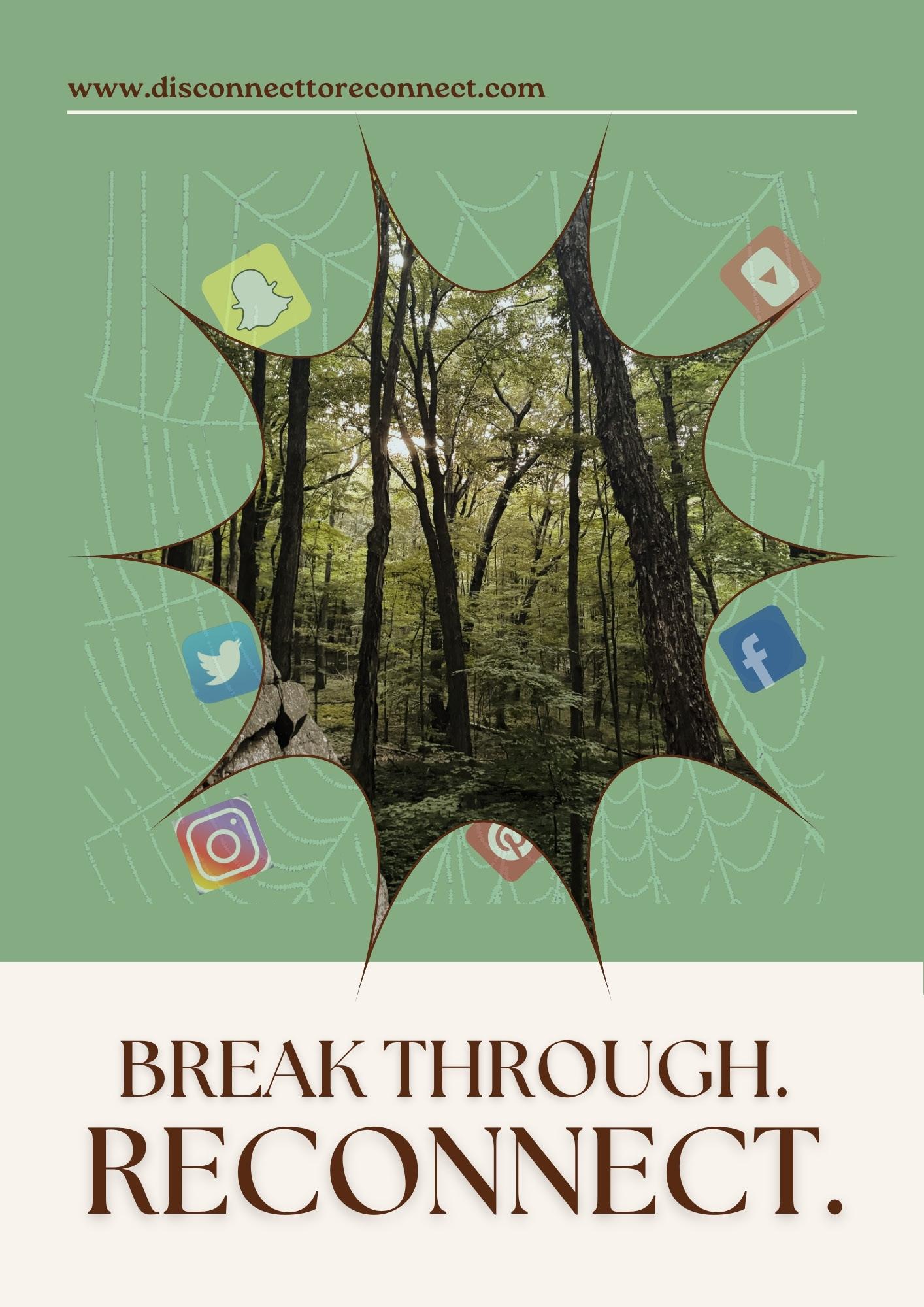
For the magazine spread, I created two pages that stayed true to my original sketch and conveyed a sense of breaking through the digital world and reconnecting with the real world.
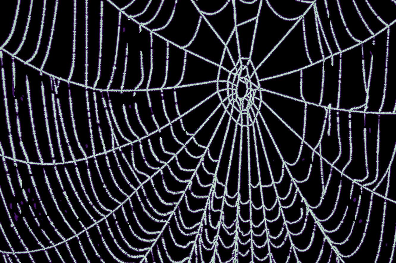
I created the web from scratch utilizing Photoshop and I also utilized one of my own photos for the trees.


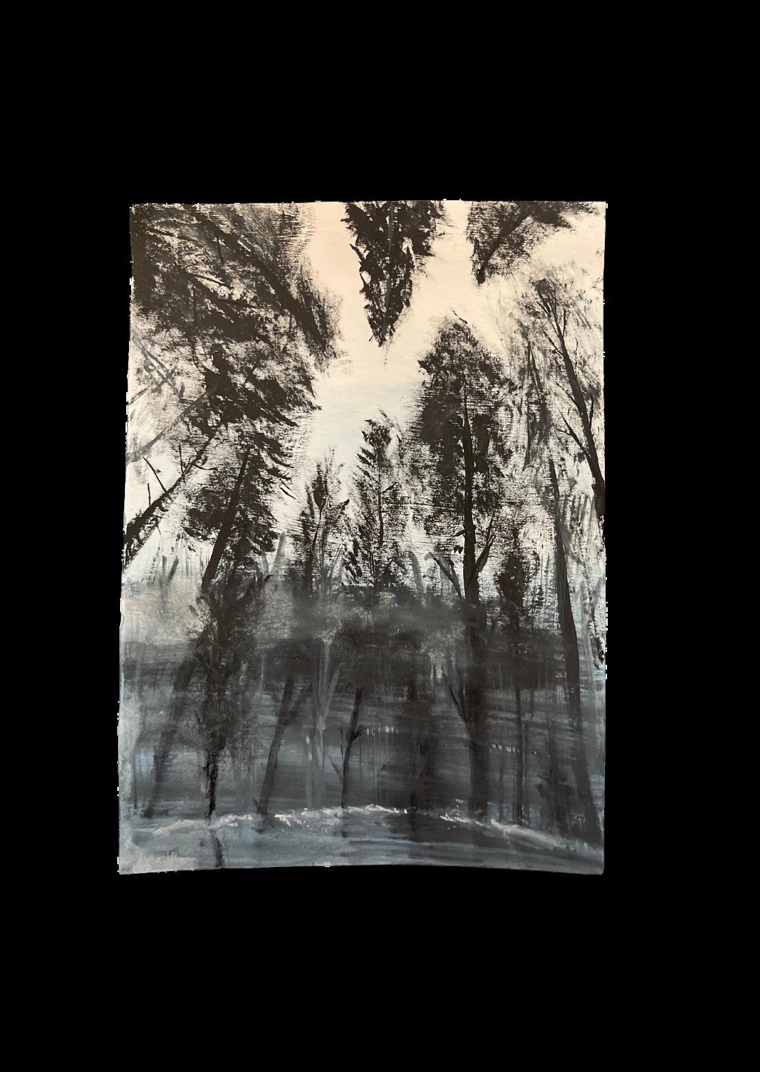
This was my first rough sketch when I was coming up with my brand and design idea.
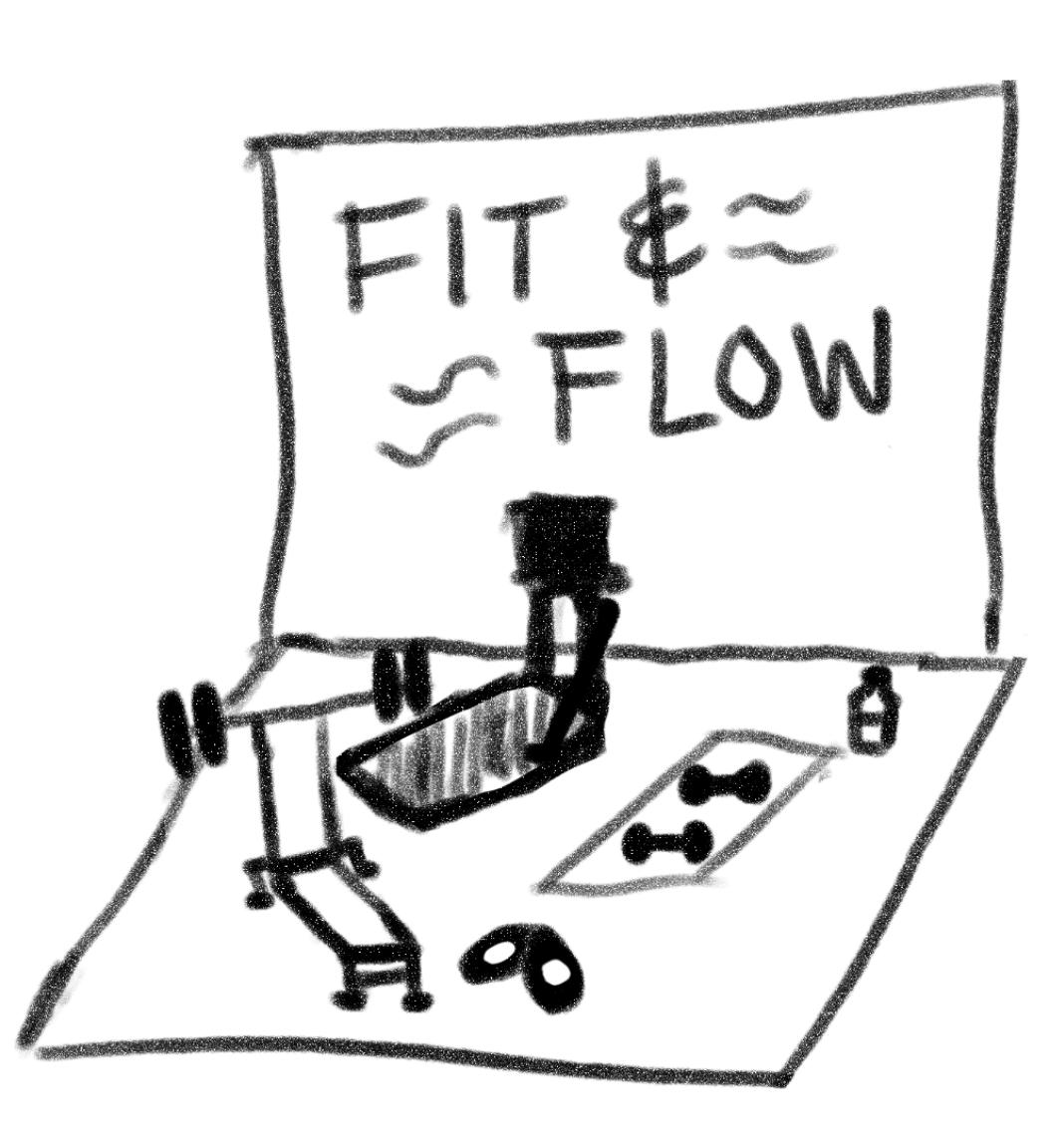
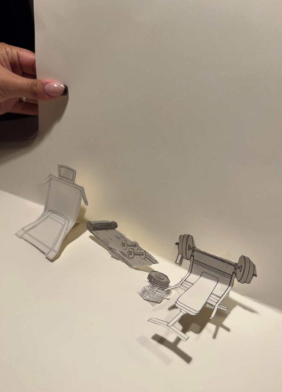
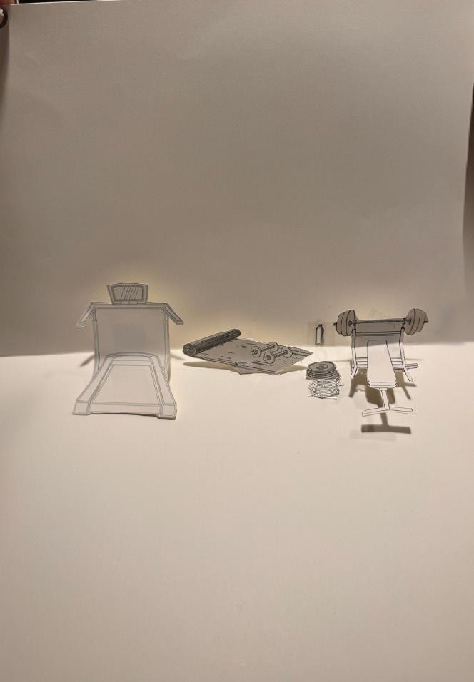
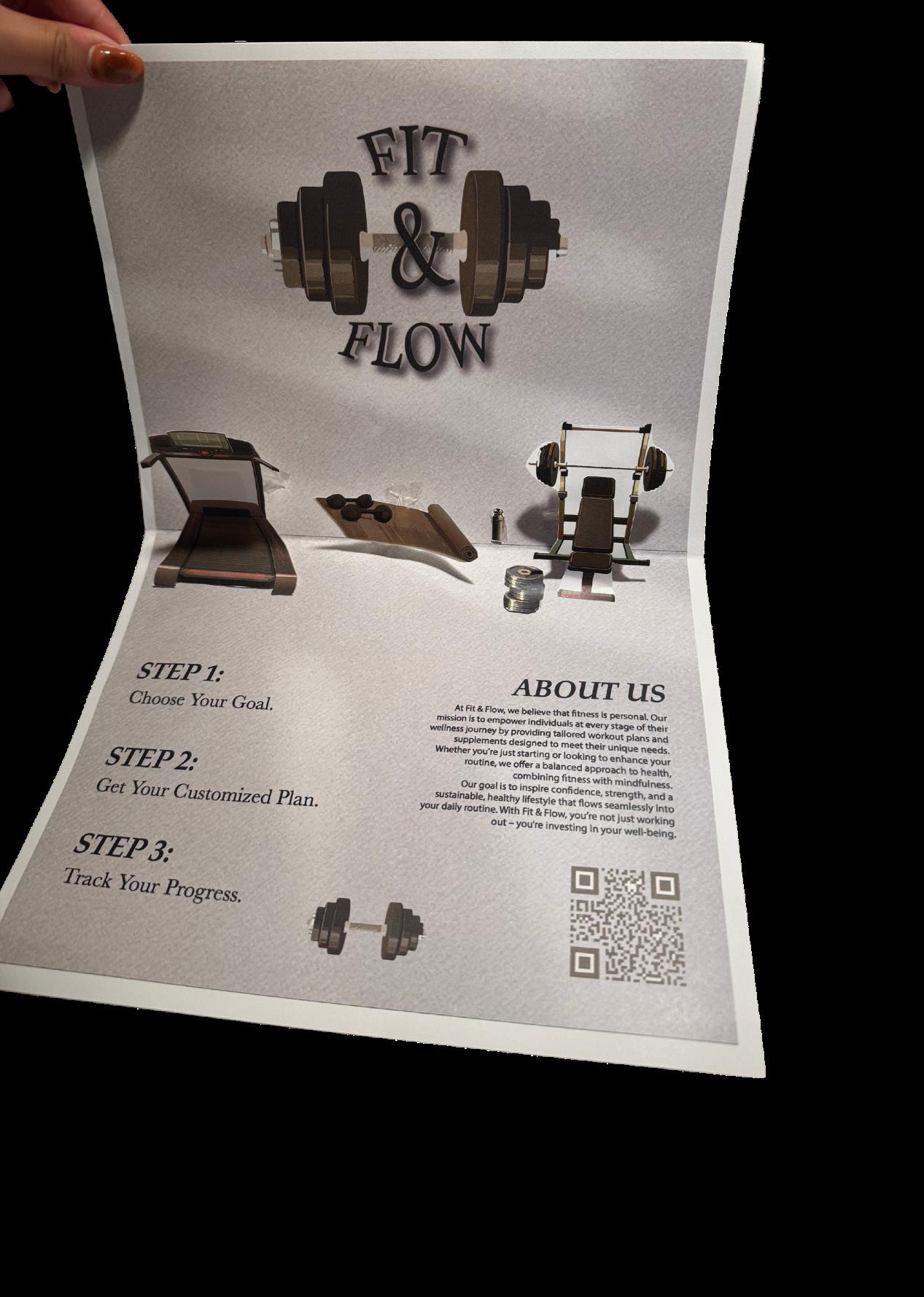
I wanted each gym element to pop out at the viewer so that they would be immersed into the space to create a fun, interactive feel!
For this assignment, I created a popo-out mailer. My target group is individuals embarking on or that have already been on their fitness journey, and wellness enthusiasts. The mailer will include engaging, 3D pop-out features that mirror a gym scene, with spaces to highlight our workout plans and supplement offerings. Our mission at “Fit & Flow” is to offer personalized workout plans tailored to individual fitness levels, goals, and preferences, ensuring that each client feels supported throughout their journey. The mailer will include engaging, 3D pop-out features that mirror a gym scene, with
spaces to highlight our workout plans and supplement offerings. As a pop out mailer, it would be promoting the brand. Through this interactive experi-

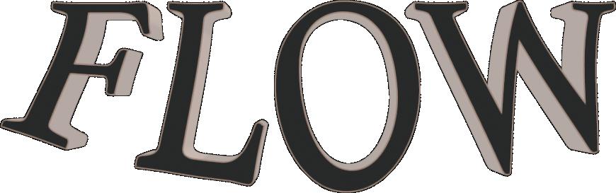
we can help them on their path to a healthier, more balanced life. When creating my logo, I vector generated a dumbbell and re-colorized it to match the beige color scheme of my brand.
ence, recipients will gain a hands-on understanding of our products and how
I also played around a lot to figure out how I wanted my logos typography to look. I added 3-D depth effects as well as a drop shadow and a stroke. I also warped the text so that it laid how I wanted it to around the dumbbell. Overall, any individual receiving the mailer would include health, conscious consumers, looking for customized fitness, and wellness solutions.
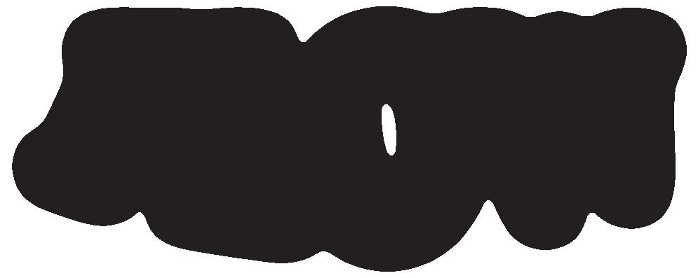
To clearly convey an image of my brand, I want my logo to be on the top in the middle so it is perfectly aligned with the consumer.
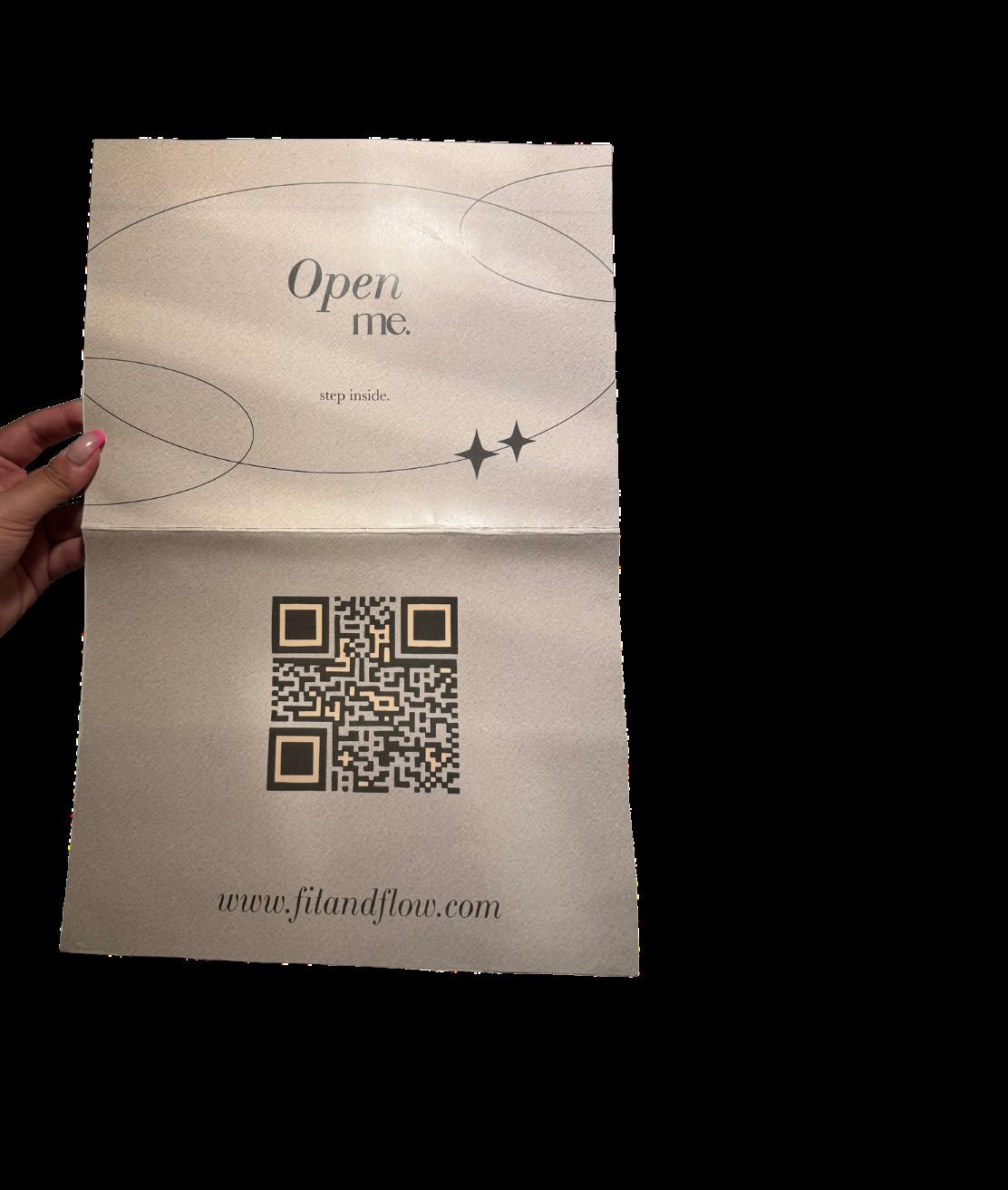
I created an outer page for the mailer with an inviting open me and step inside tagline. I also switched around and refined the composition of my inner mailer layout.
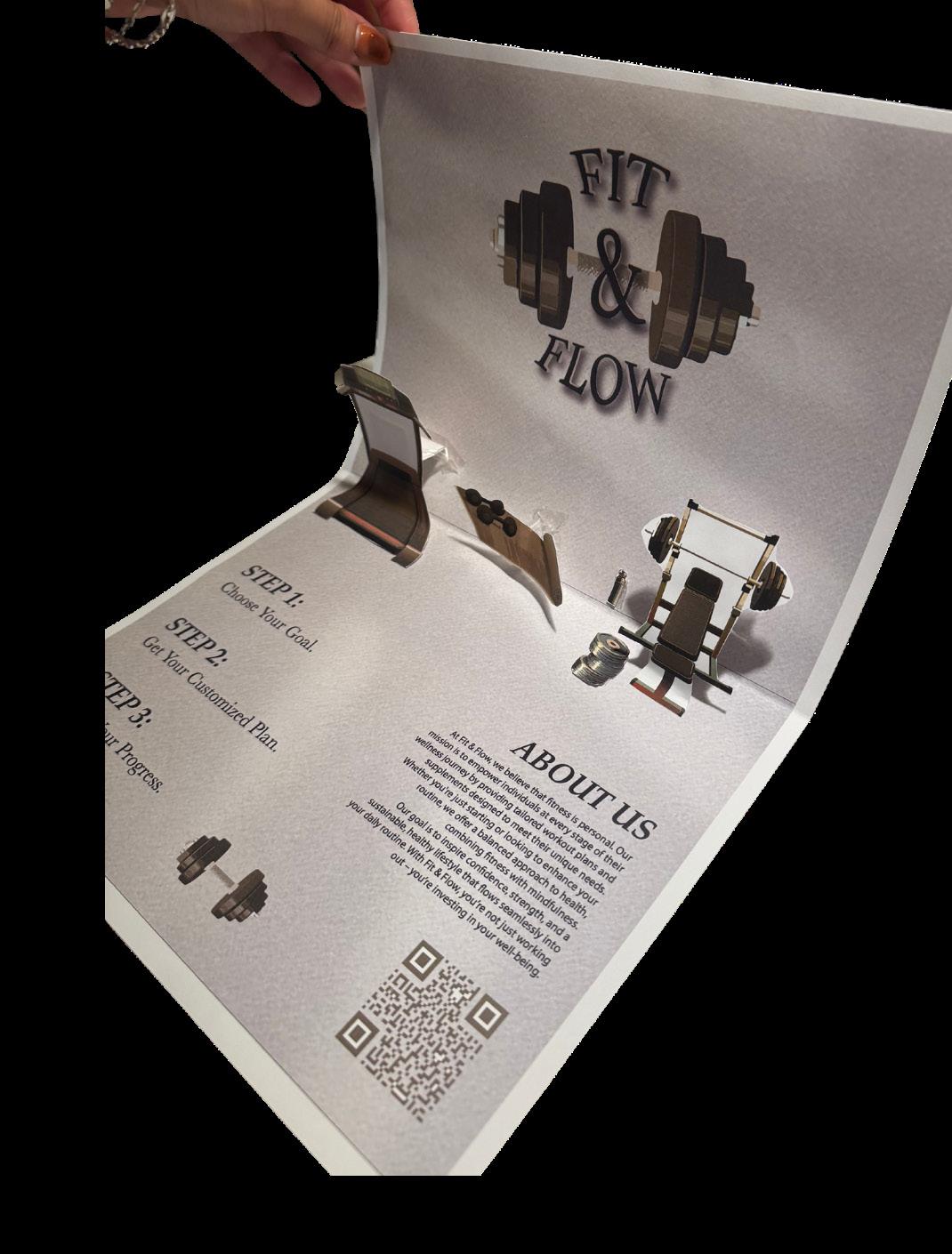
After seeing my mailer assembled, I wanted to add a slogan underneath my logo as I feel that that negative space needed some filling. Also, I moved my QR code to the middle on the bottom in order for it to be rented with the yoga mat.
I moved the logo weight design on the right hand side where my QR code previously was. I also changed a few typefaces to better reflect my brand!
Here, I finalized my pop-out mailer! I converted every element of my design to pantone spot colors. I added my brand’s website QR code on the bottom outer portion of my mailer and an interactive “open me” on the top outer portion of the mailer.
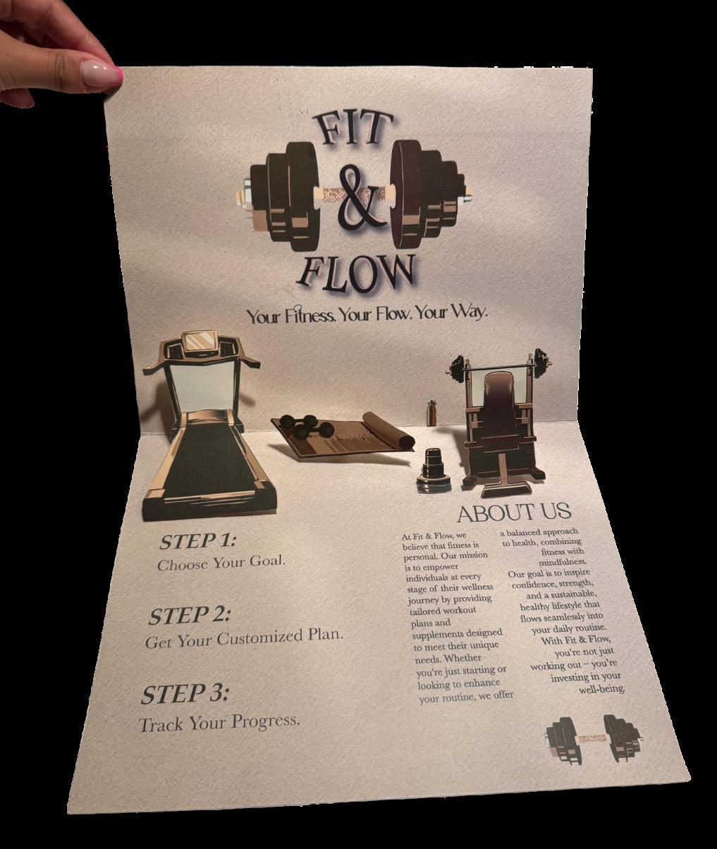

The inside conveys my brand’s purpose, aesthetic, color palette, and message. I cut and assembled every element of my design and put everything together!


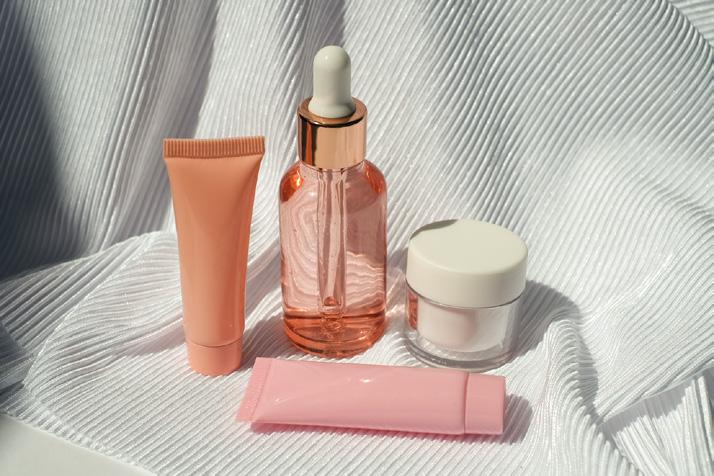
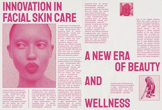

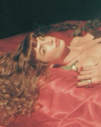


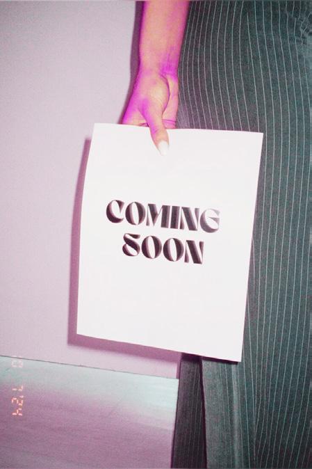

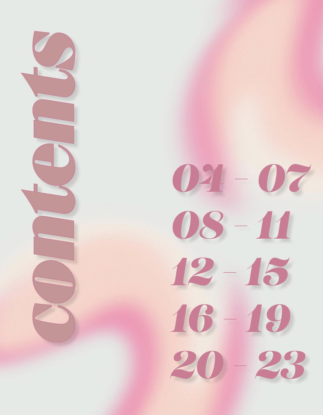
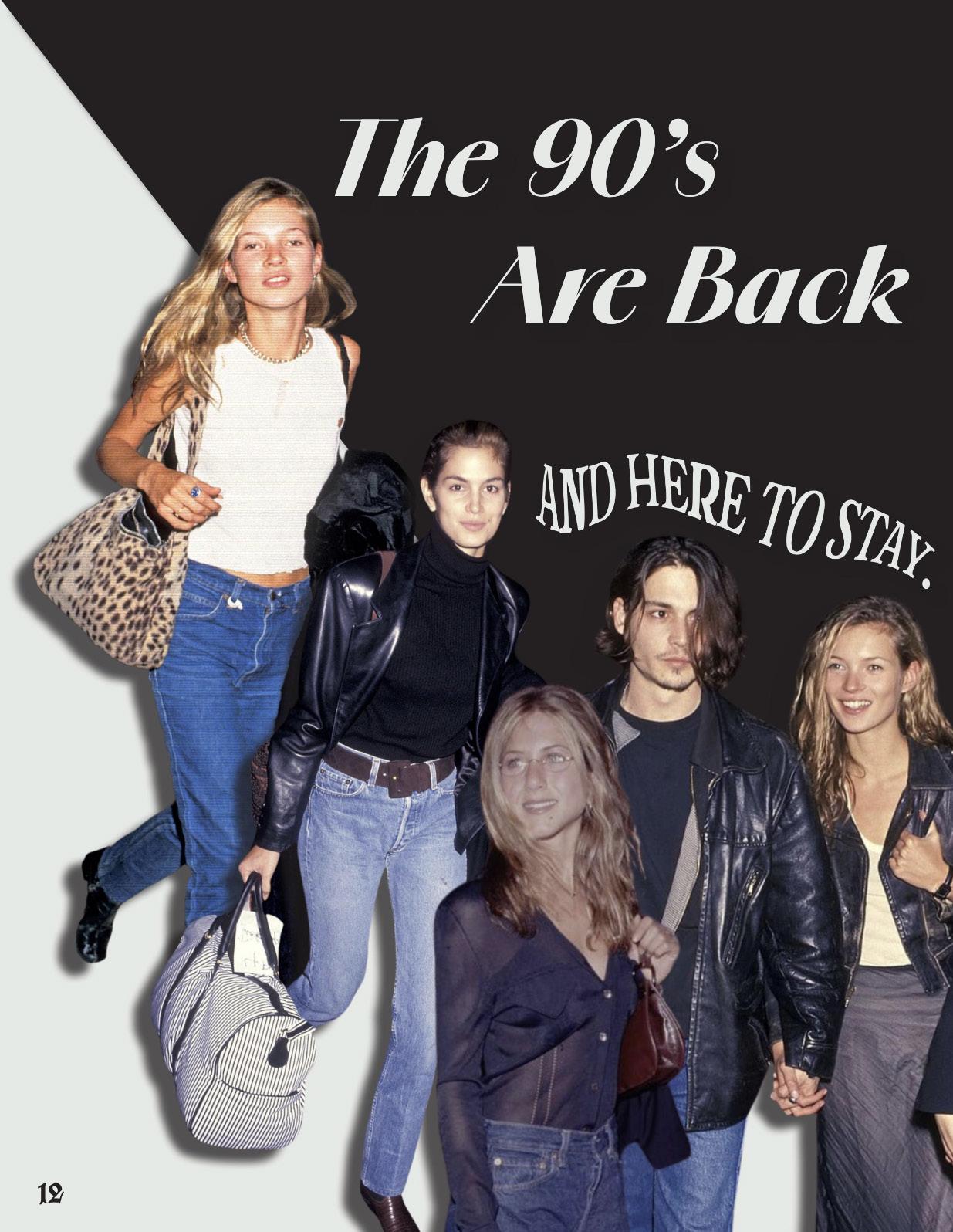
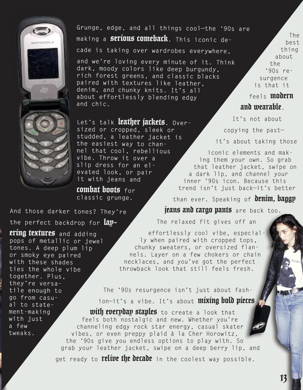
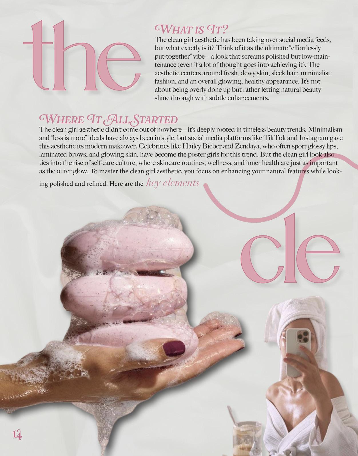
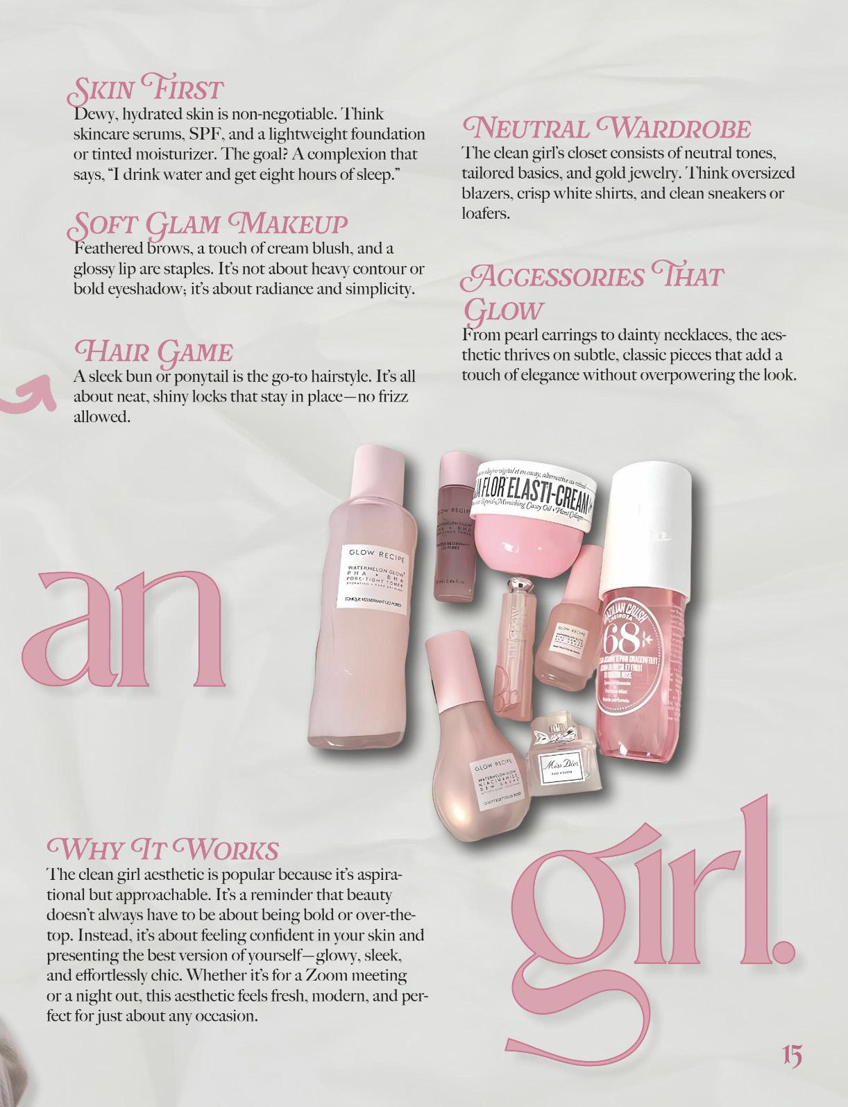
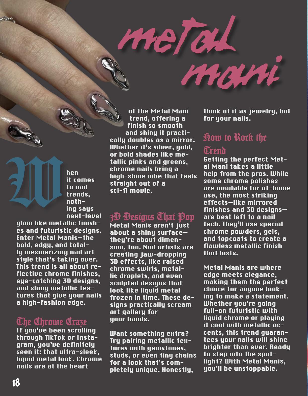
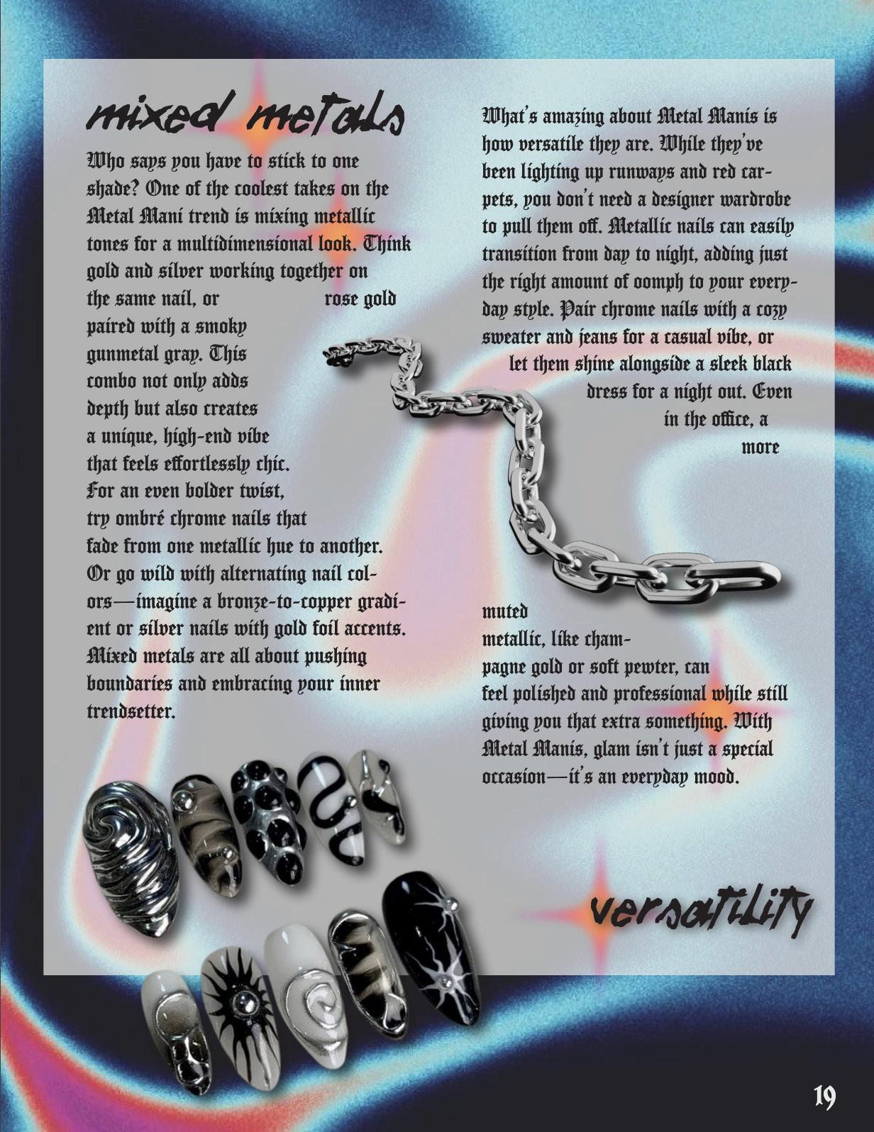
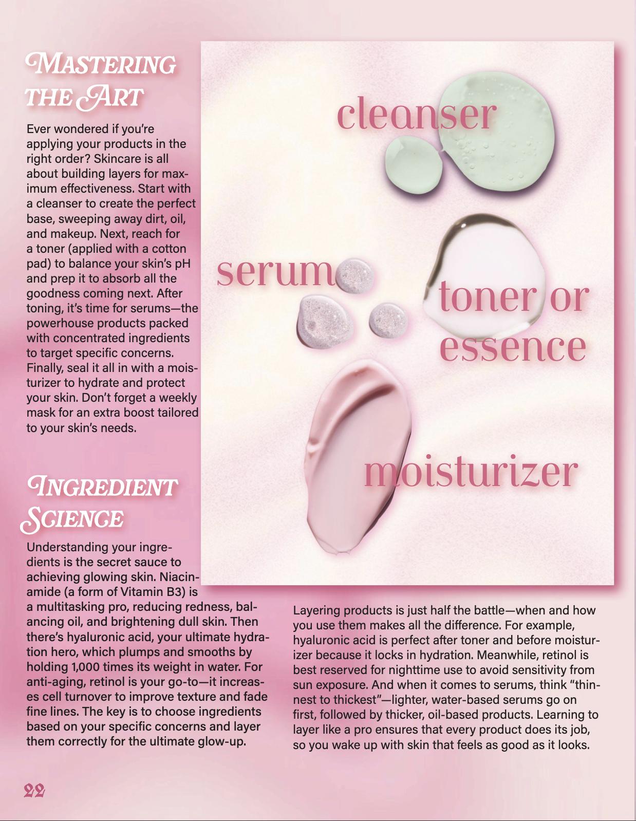
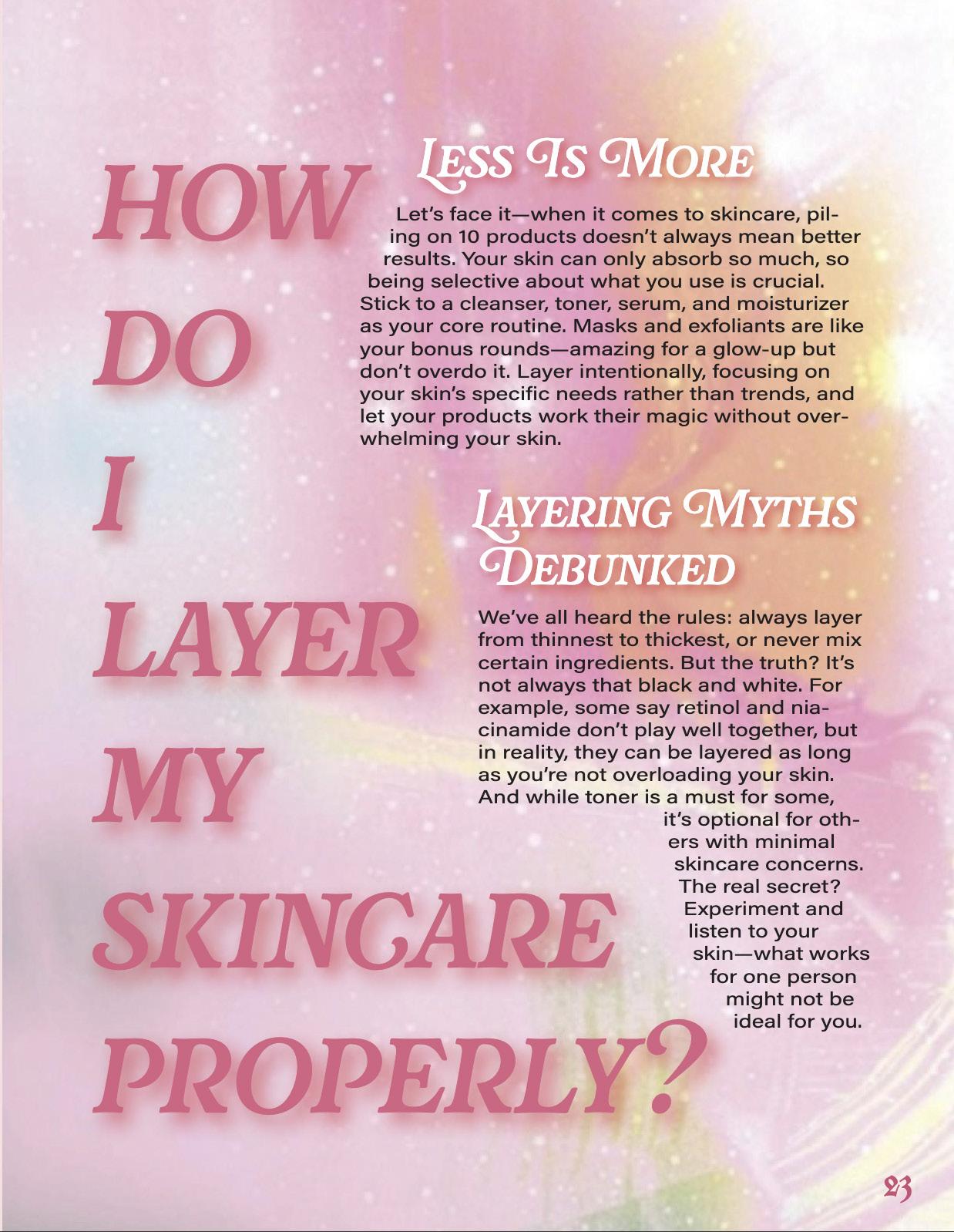
I wanted to create a progressive magazine that blends fashion, beauty, and wellness with a focus on conscious beauty, celebrating unique personal style, and exploring avant-garde aesthetics. VANGUARD promotes self-expression and authenticity, featuring fashion and mindful beauty practices.
My target audience includes fashion-forward readers, creatives, and those interested in ethical beauty, and alternative fashion. My color palette will mainly be full of white, pink, green, orange, black shades and gradients + auras!
PROFESSIONAL PRINT DESIGN
NOVEMBER 2024 | ISSUE 01

fall 2024
victoria adriani