visual development guide.
How to use this guide
These principles are designed to simplify design choices for anyone working with NASA. The brand identity principles provide you with a structure to work with.
Think of this guide as a tool to build a consistent brand presence when designing deliverables. This way we can ensure we will benefit by using these guidelines in our everyday work and contribute to a stronger, more focused brand.
Building a brand is no easy feat. It’s takes a lot of time to perfect the exact messaging and persona of a brand. It’s imperative to develop a base understanding of the types of examples that exist out in the space already with visual research.
Visual research is a valuable tool for creative exploration. It offers a gateway to understanding and inspiration. Artists and designers gain insights into effective techniques and aesthetic trends. This process not only broadens the perspective but also fuels creativity and sparks fresh ideas.
Leveraging inspiration from good design allows designers to develop a process and to try new things.
What you see in this section is our visual standards guide and the visual examples that were used to create it.
ii Tyler Cleveland // GR604 Nature of Identity
CONTENTS
2.1 Brand Introduction
2.2 Conceptual Foundations
2.3 Sketching Preparation
2.4 Conceptual Sketches
2.5 Visual Inspirations
iii Visual Development Guide
CHAPTER ONE
BRAND INTRODUCTION
iv Tyler Cleveland // GR604 Nature of Identity
1 Visual Development Guide
1958
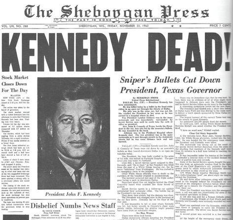
NACA evolves into NASA. The NACA transition marked the U.S. entry into the space race. JFK made it a national promise to go to the moon.
1967
Apollo project starts off with tragedy. The first mission , Apollo 1, ends with three astronauts burning alive.
1981
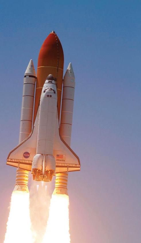
President Ronald Reagan succeeds in finishing the space shuttle program that produced a reusable spacecraft
1957
Russia launches “Sputnik I” into space.
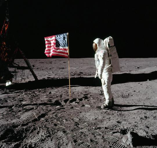
1969 – 1972
1915
NACA founded
Developed the U.S. Air Force planes.
First Jet Plane paves way for space rockets
Apollo 11 mission had achieved a historic moment marking a pivotal moment in society. The project had caught the attention of the entire globe. However, shortly after, JFK was assassinated leaving the program without a big supporter. NASA had become halted.
2 Tyler Cleveland // GR604 Nature of Identity
1998
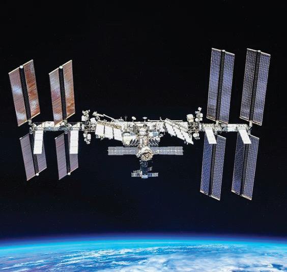
International Space Station (ISS) project completed. This provided a place for astronauts worldwide to do research in space and collaborate.
2015
1986
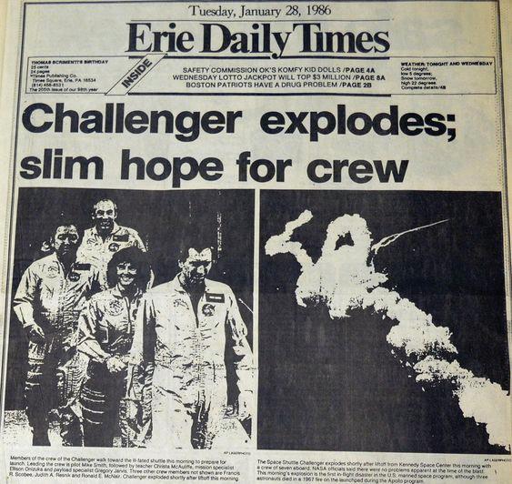
Tragedy strikes again almost a decade later at NASA. Space shuttle Challenger explodes one minute into the ascent. This caused a 3 year hiatus for the agency.
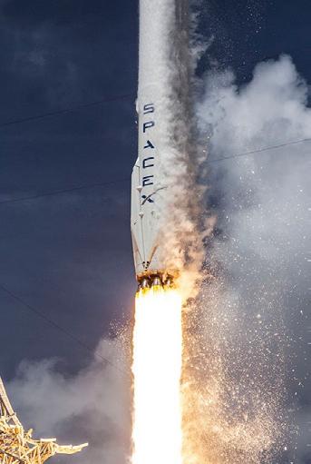
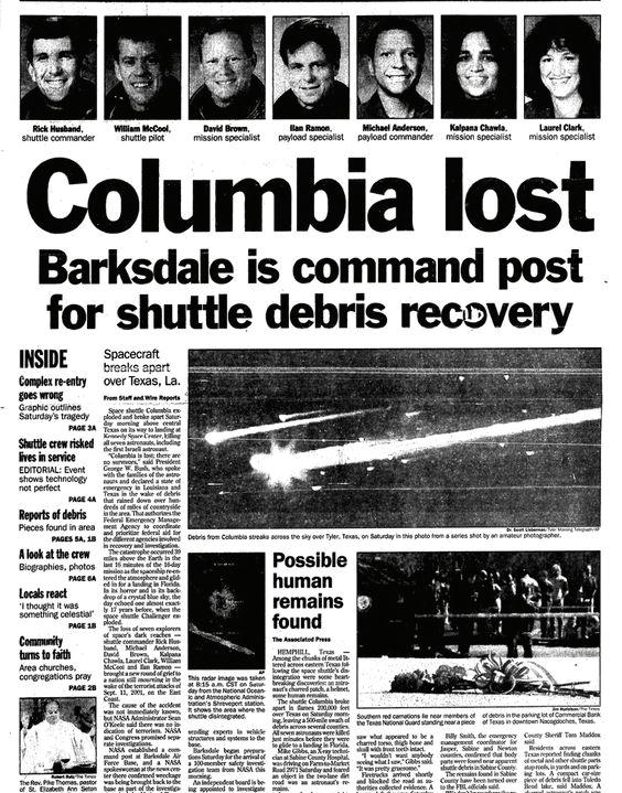
First reusable rocket by SpaceX. 2003 Shuttle Columbia explodes killing all members on board.
3 Visual Development Guide
WHAT’S
NEXT?
OUR MISSION
Tyler Cleveland // GR604 Nature of Identity 4
WE INSPIRE INNOVATION, ADVANCE DISCOVERY, AND PROMOTE GLOBAL EXPLORATION FOR THE BRAVE BECAUSE BRAVERY HAS THE POWER TO FUEL PROGRESS IN ORDER TO MAKE GROUNDBREAKING ACHIEVEMENTS.
This is the newly crafted mission statement, pivotal in creating NASA’s new brand image. It’s imperative to recognize that the revised mission encapsulates a broader scope beyond solely space exploration. It embodies our commitment to advancing not only the frontiers of space exploration but also our dedication to innovation, exploration, and discovery.
5 Visual Development Guide
Keywords are the building blocks of brand identity, encapsulating the essence of what a brand stands for. They distill complex concepts and emotions into simple, memorable terms that resonate with both internal stakeholders and external audiences.
Keywords
INNOVATION
Find a way to do the impossible.
EXPLORATION
Embrace the courage to venture into the unknown.
DISCOVERY
New experiences await just beyond the horizon.
6 Tyler Cleveland // GR604 Nature of Identity
Attributes give us an option to use more keywords because we feel that a brand can’t be defined with only three words. These keywords evolved into key phrases which set up the exploration in the visual development phase.
We are innovative. We are collaborative.
We craft novel solutions for the most formidable challenges we encounter.
Collaborating with partners both domestic and international.
We are influential.
Our actions have significantly reshaped the landscape of science .
We are courageous.
We have continually shown that its possible to go where no human has gone before, but getting there takes courage.
We are iconic.
Our brand embodies the original American spirit, one that was about being a united nation towards one goal.
7 Visual Development Guide
VISUAL DEVELOPMENT
“THE CREATIVE PROCESS”
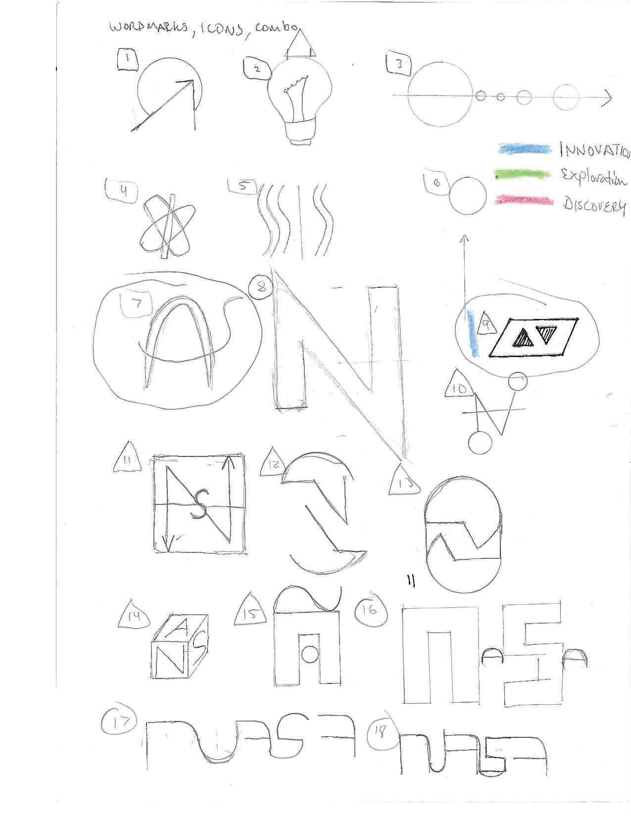
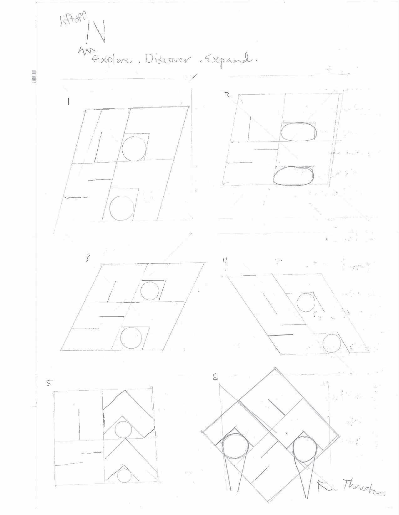
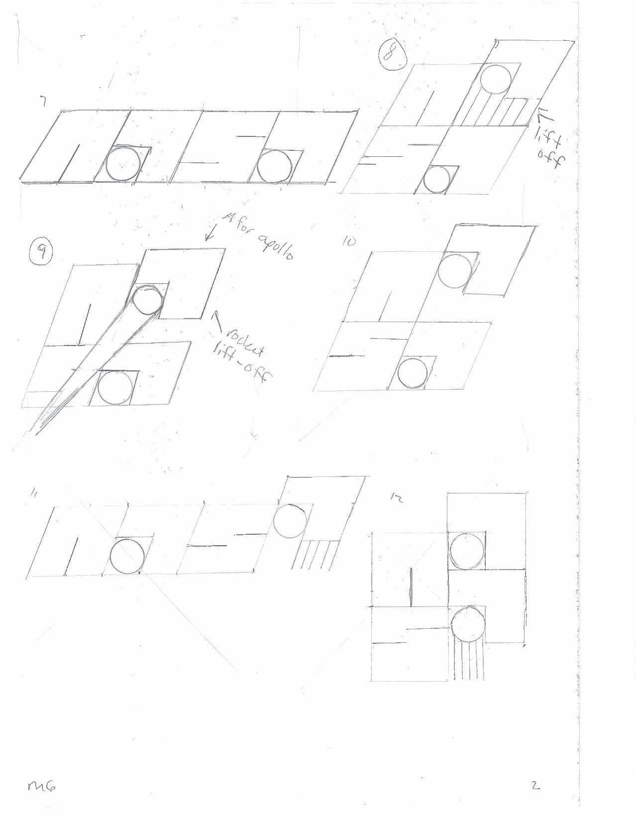
This section provides an in-depth exploration of the creative process behind the logo design. It presents three rounds of sketching. Each round represents a distinct stage in the development. Stage on is initial brainstorming of ideas. Stage two is refinement of the most promising. Third stage is finalization of the logo.
To be effective, the initial two rounds involved an extensive brainstorming process, yielding a total of 300 sketches per round. These sketches served as a foundation for exploring various concepts, shapes, and visual elements.
The iterative nature of the design process allowed for refinement and evolution of ideas, leading to the final round where the most promising concepts were perfected.
8 Tyler Cleveland // GR604 Nature of Identity
9 Visual Development Guide
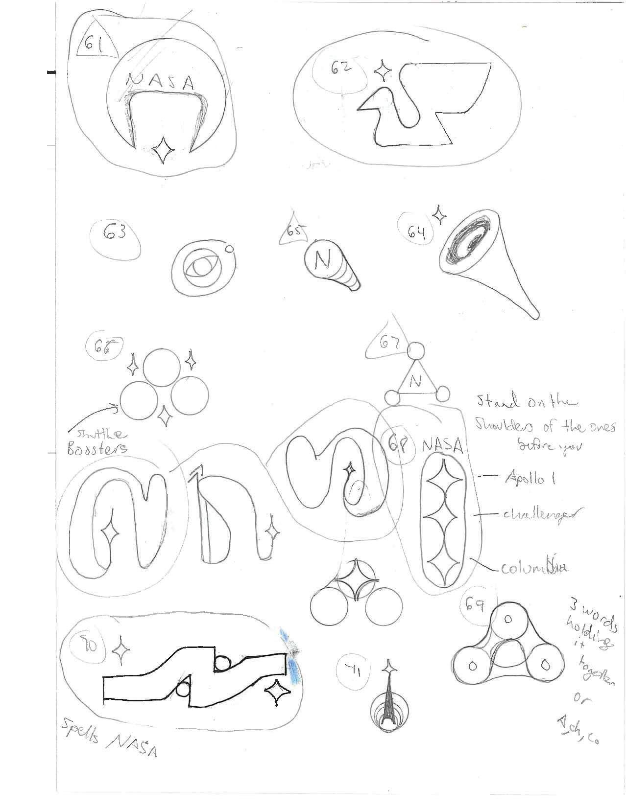
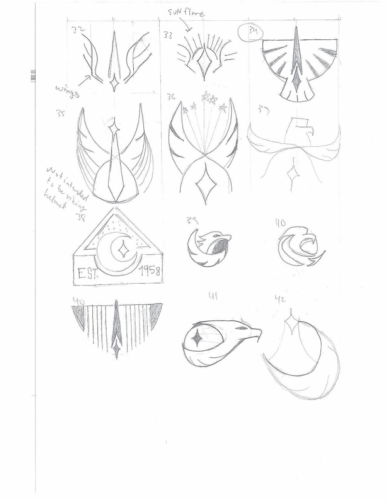
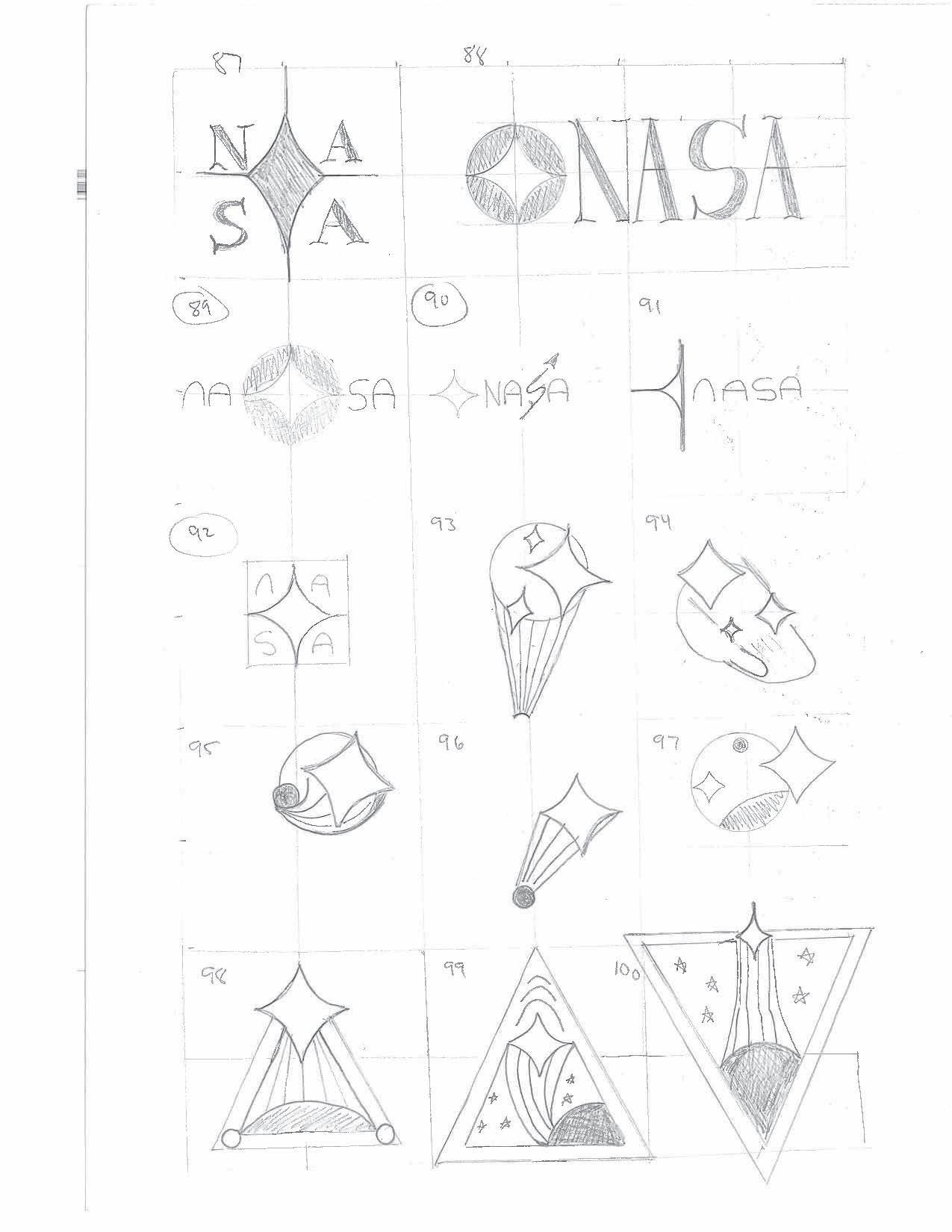
ROUND 1 SKETCHES
At the beginning of the sketching process, the initial approach prioritized exploration using a fluid approach versus the rigid approach.
The keywords and key phrases served as anchor points to stay parallel with the brand mission during the fluid process. They fuel the imagination, allow for a free-flowing exploration of ideas, communicate the brand’s soul and mission.
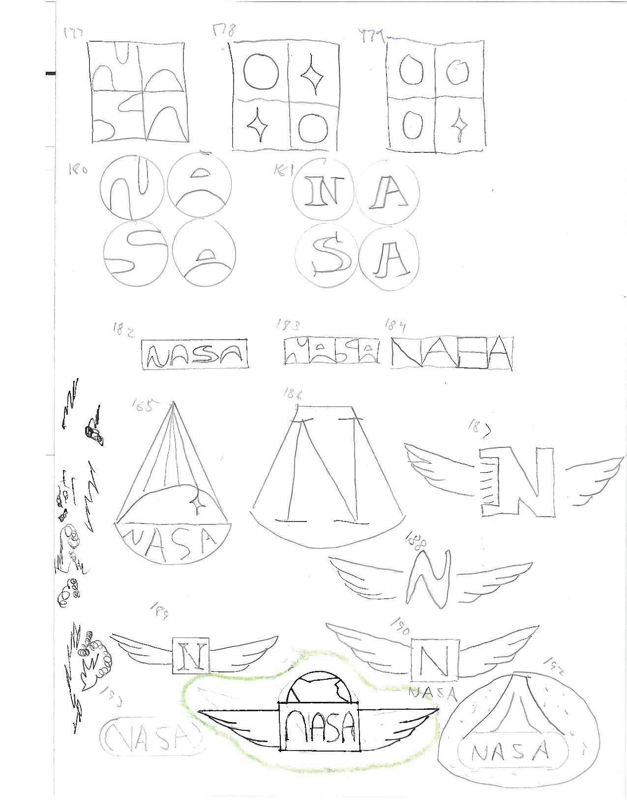
You may immediately notice some logos are circled meaning they were selected for final choices in this round.
10 Tyler Cleveland // GR604 Nature of Identity
11 Visual Development Guide
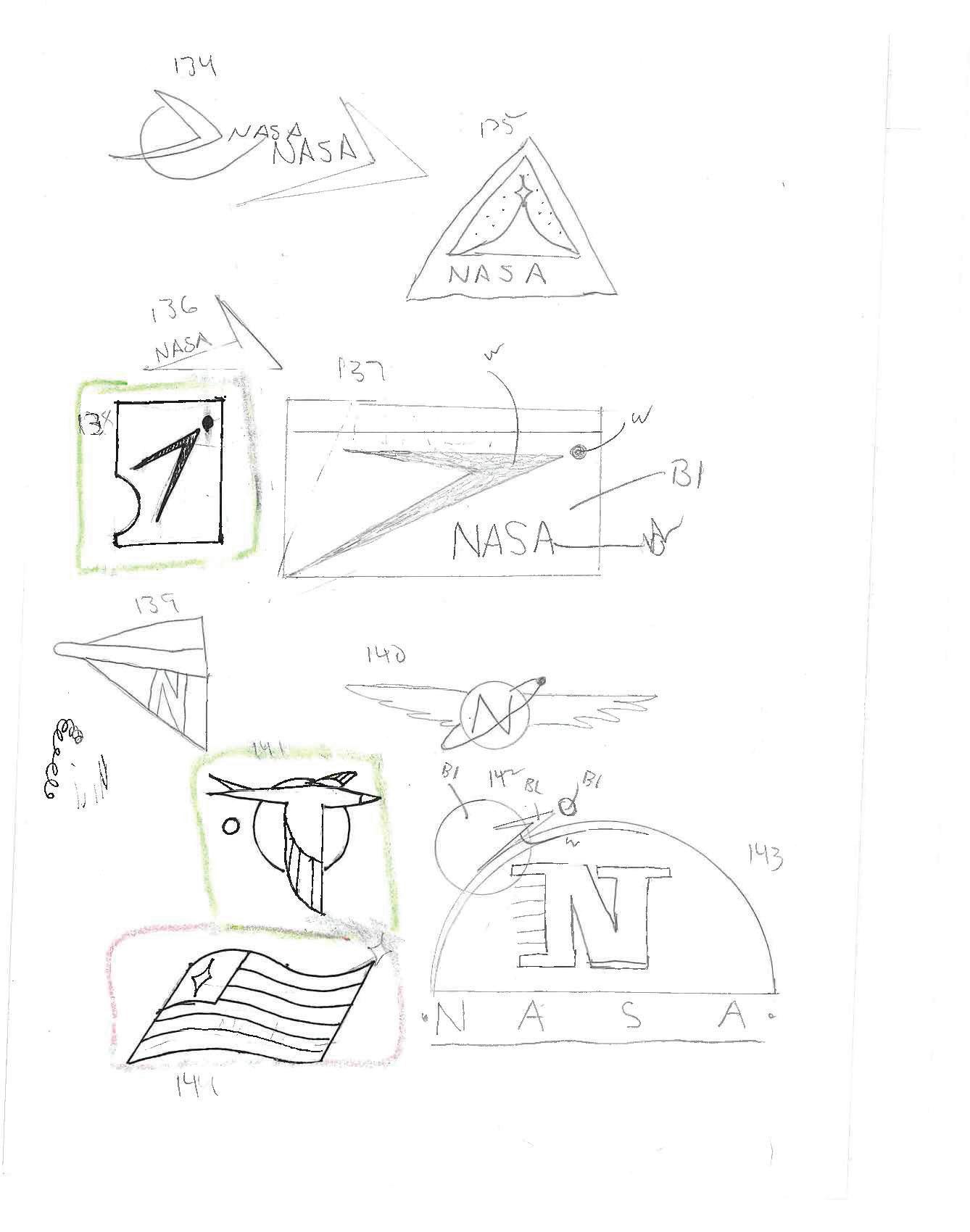
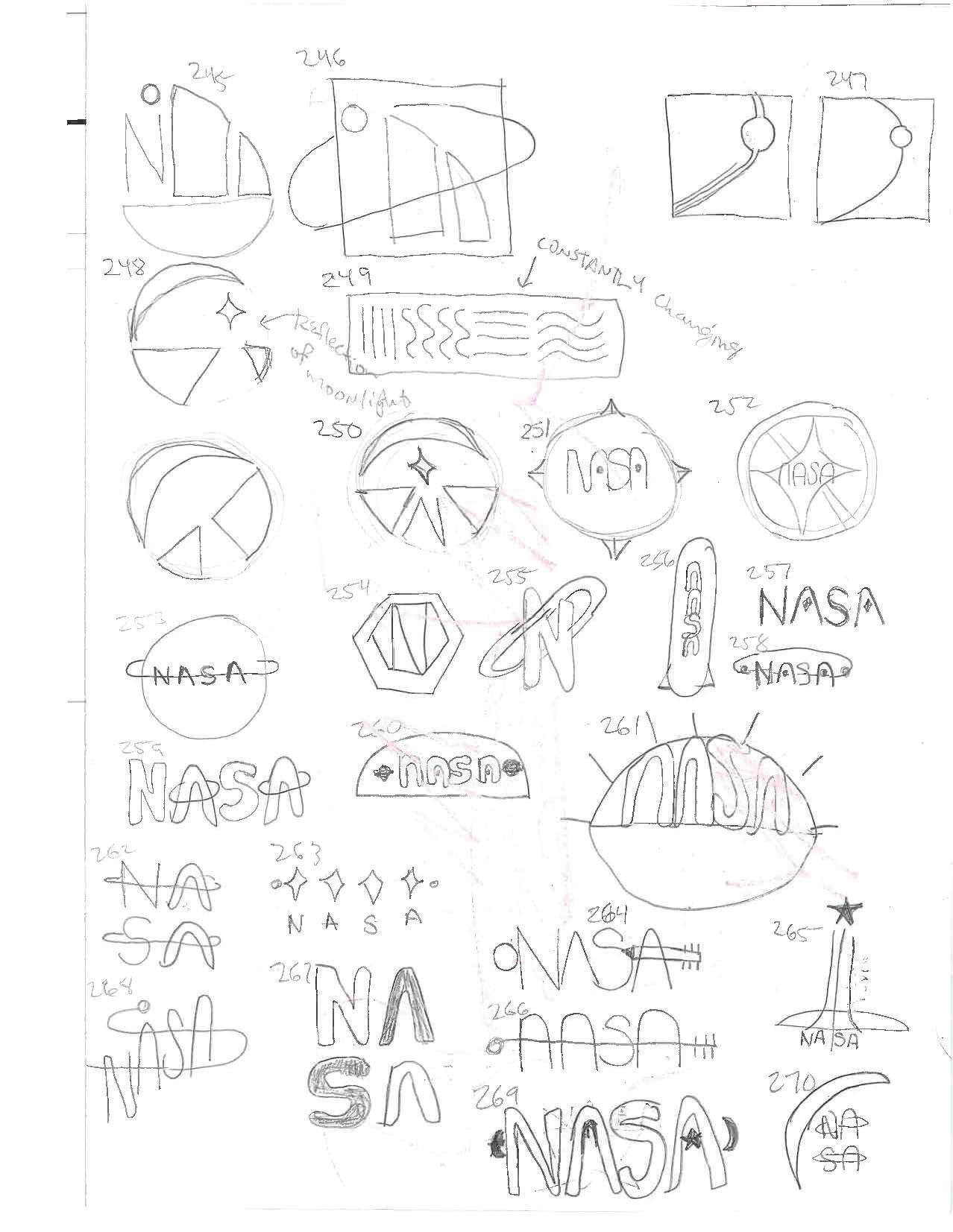
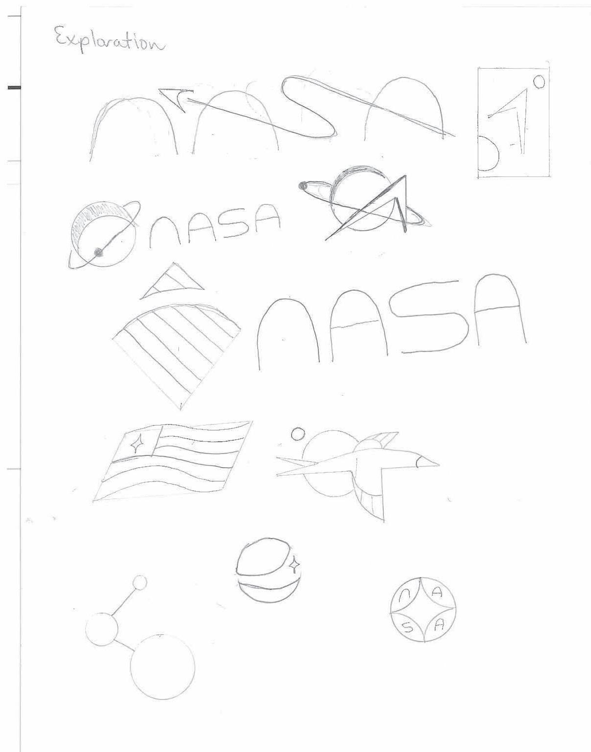
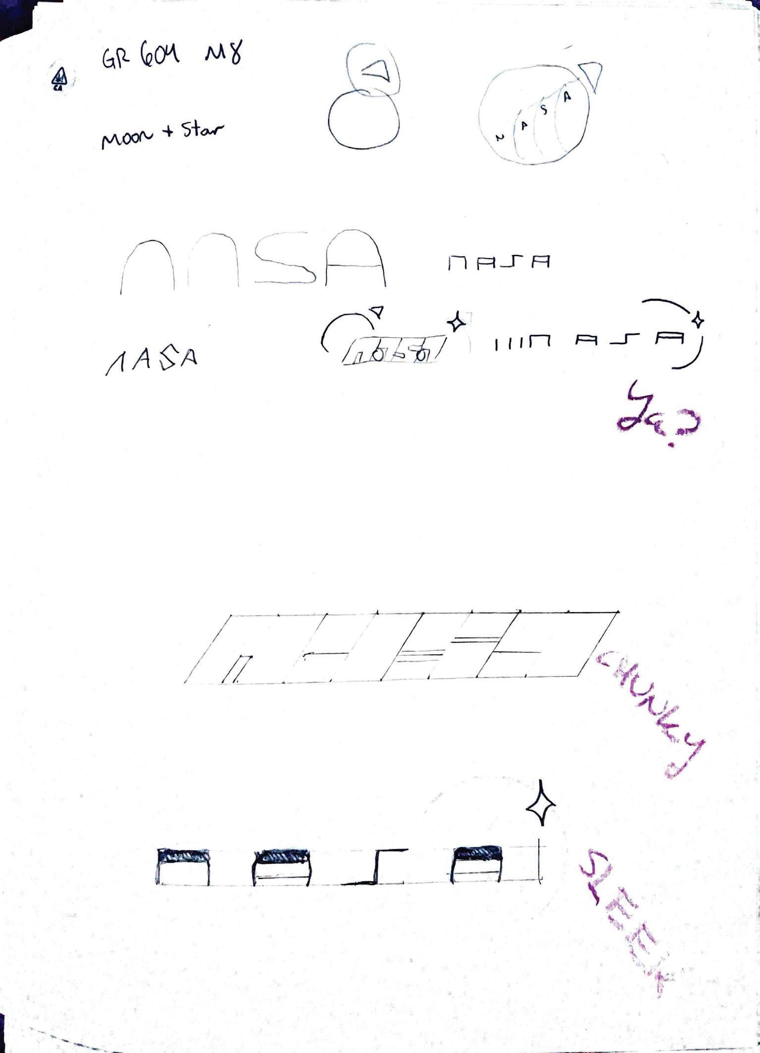
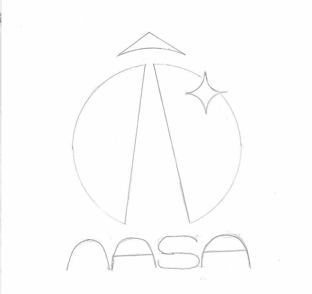
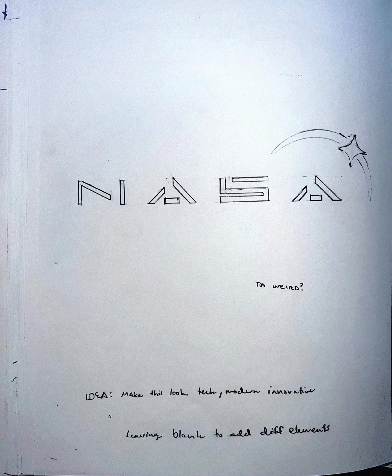
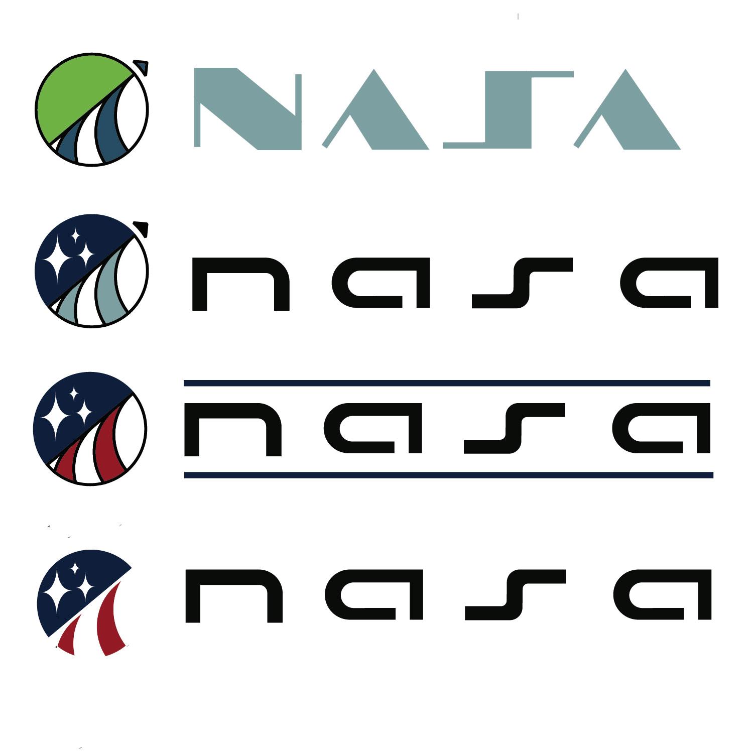
My idea here was to start with anything. I went with the first idea that came to my mind regardless of the relevance. My first big idea was to use the letter “N” and explore the letters of the word NASA and how they might fit together.
12 Tyler Cleveland // GR604 Nature of Identity
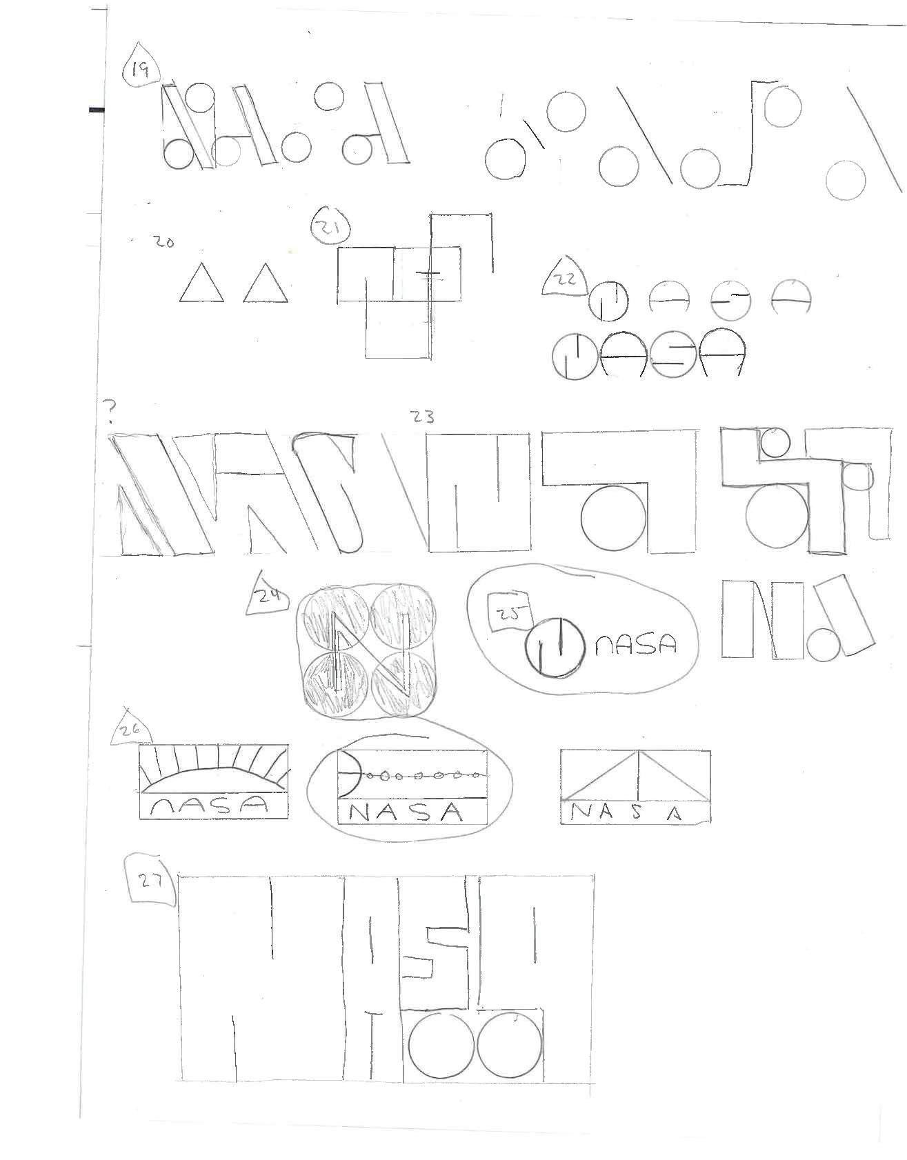
13 Visual Development Guide
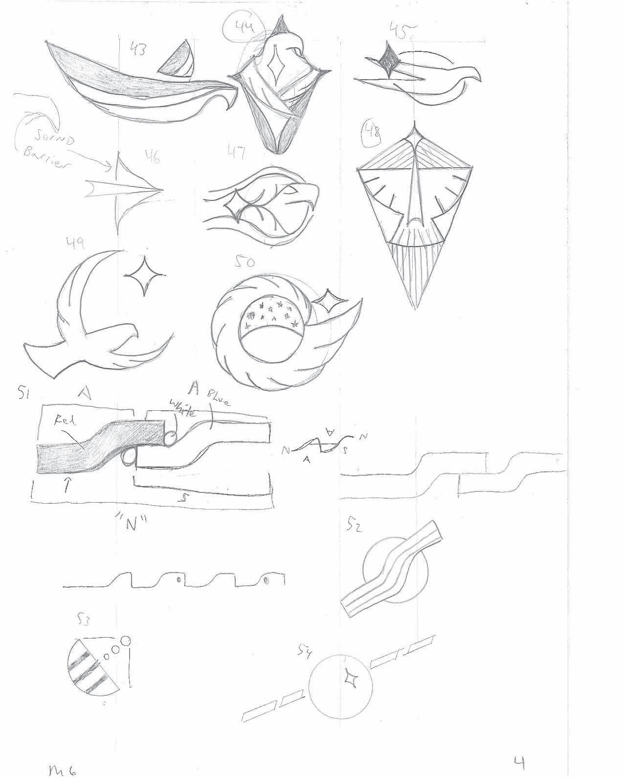
The stream of ideas regarding the letter “N” started to fade. So the exploration anchored into the keyword innovative. Is there something modern and tech looking? The circles represent a planet and the lines are different ways at attempting to spell NASA in a new and innovative way.
14 Tyler Cleveland // GR604 Nature of Identity
15 Visual Development Guide
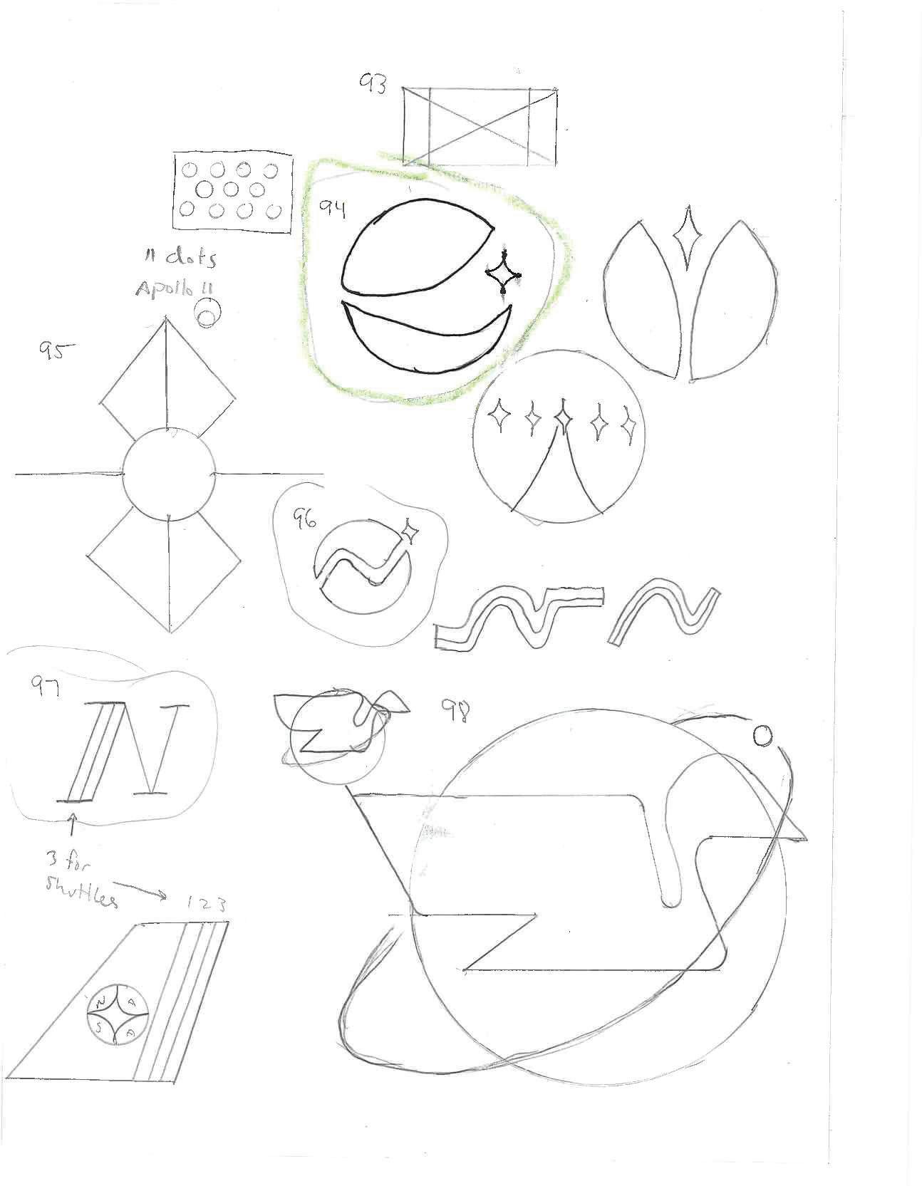
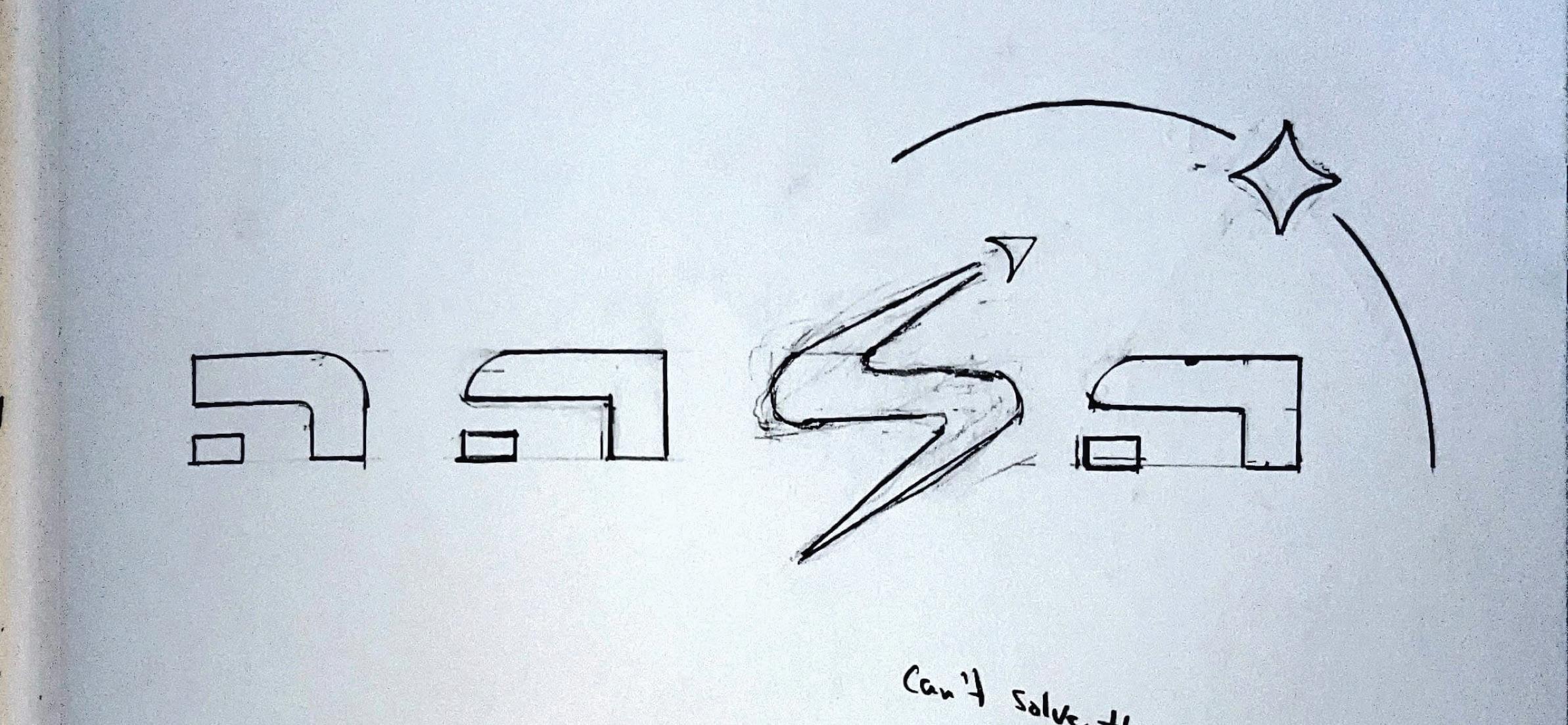
The goal of this page was to start looking for icons that could work with a wordmark. A lot of the exploration up until this point was exploring wordmarks and combinations of the two.
The three parts of the final logo can be found on this page as well — the four-point star (#50), the initial wordmark style (#53), and the crescent moon (#54)
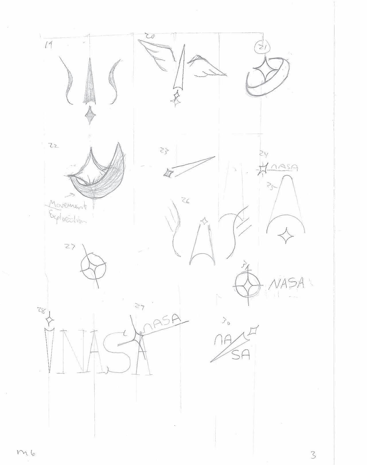
The four-cornered star began to become a staple in the sketches. It can be seen on each page through to the final design.
16 Tyler Cleveland // GR604 Nature of Identity
17 Visual Development Guide
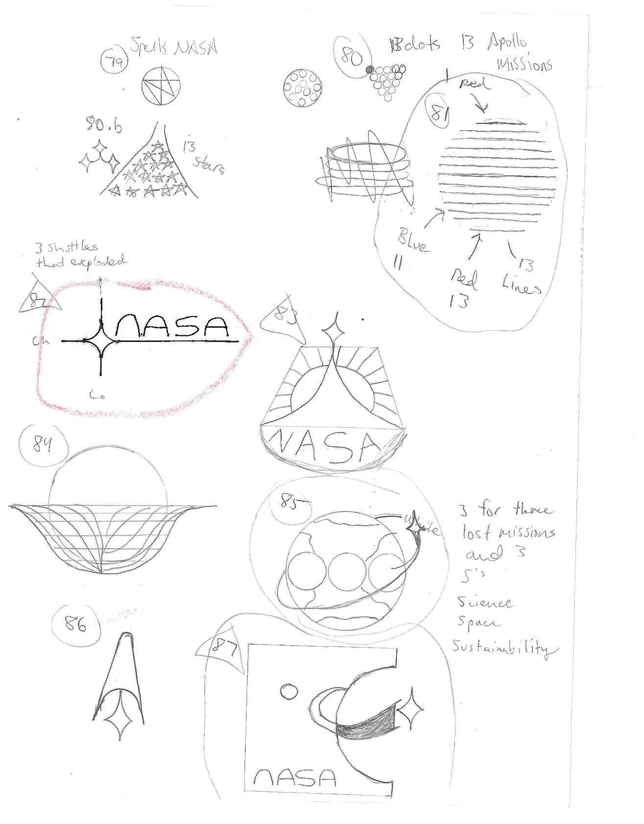
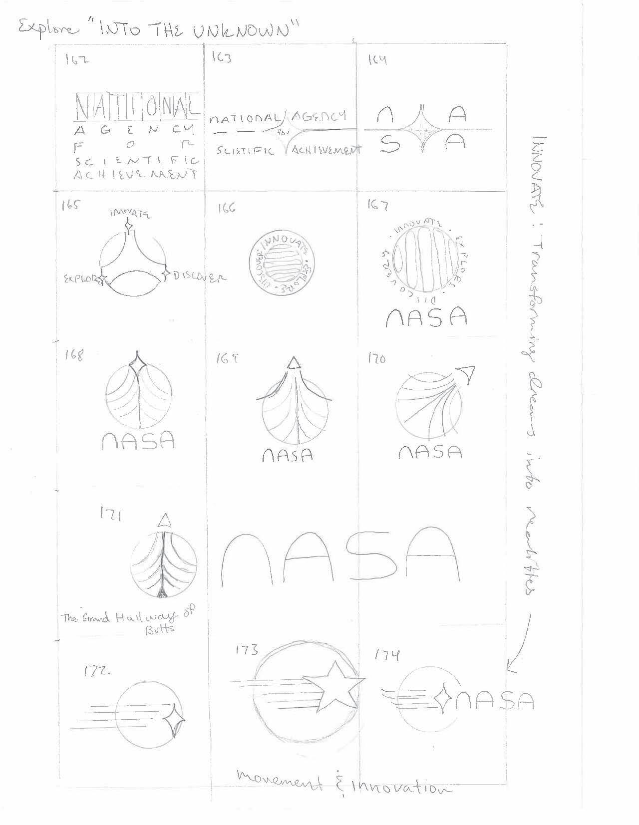
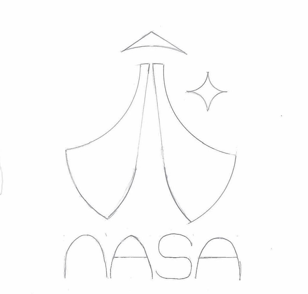
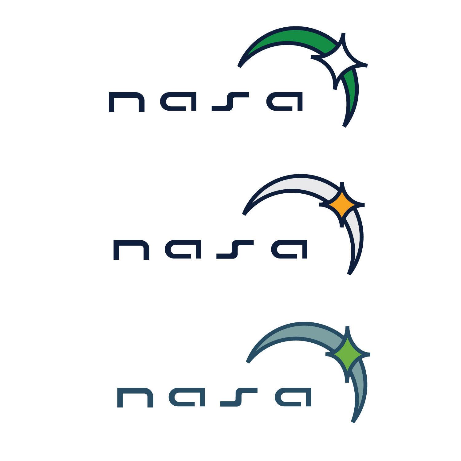
The exploration is now anchored to the exploration and discovery keywords. The star represents a symbol of guidance or direction. We feel that NASA is the North Star when it comes to space exploration. They provide guidance to other space agencies, space travel needs to follow a specific path to stay on track. The star represents something to dream of exploring one day.
18 Tyler Cleveland // GR604 Nature of Identity
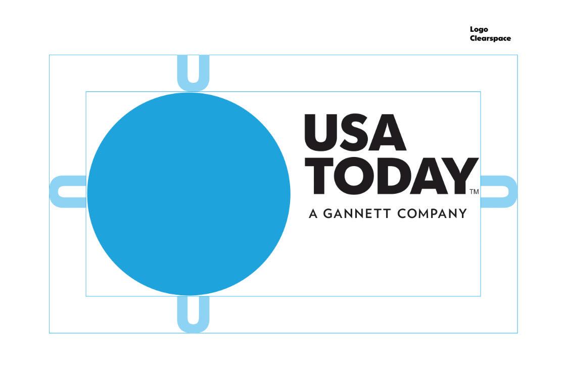
The planet earth was also explored as an icon. However, we weren’t going for just a circle like USA Today. The number three was also explored because there were three failed missions and we feel they should be remembered in the logo.
19 Visual Development Guide
20 Tyler Cleveland // GR604 Nature of Identity
21 Visual Development Guide
22 Tyler Cleveland // GR604 Nature of Identity
23 Visual Development Guide
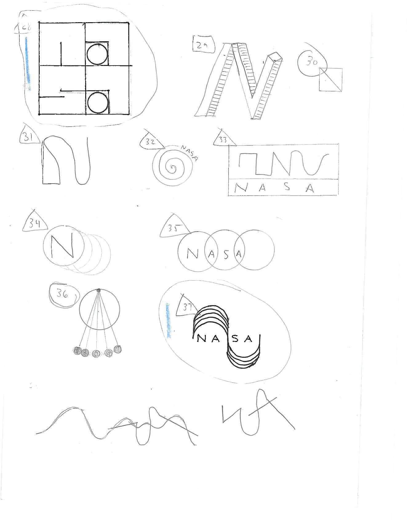
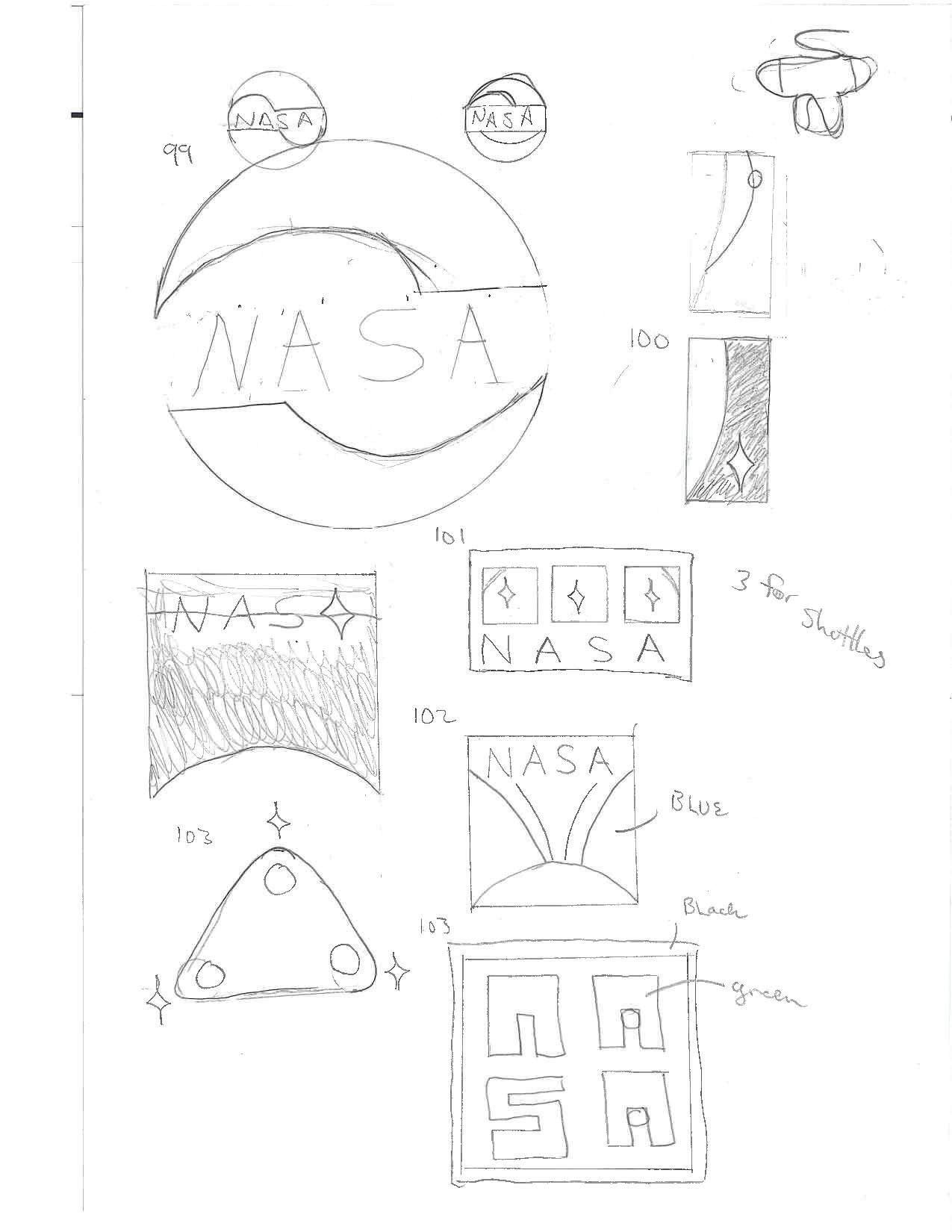
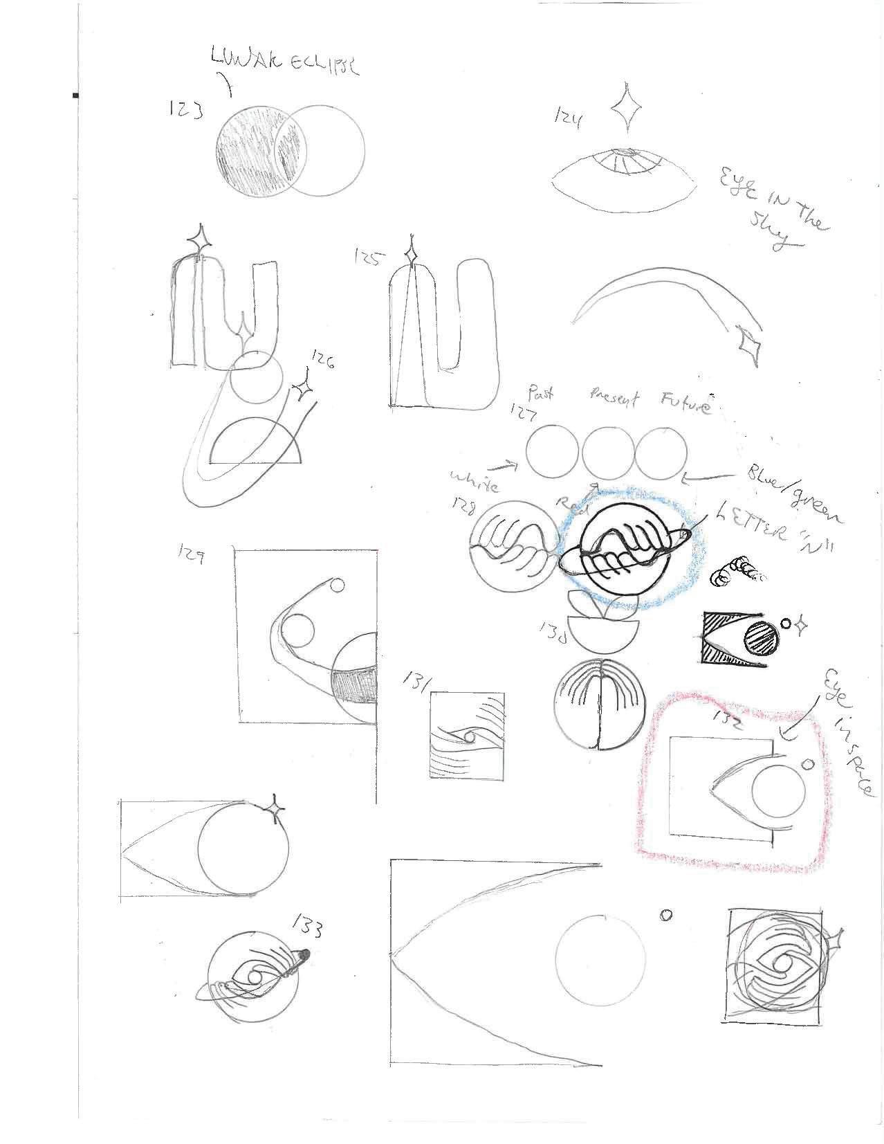
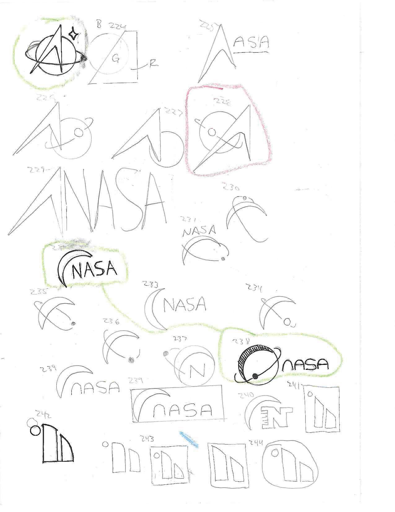
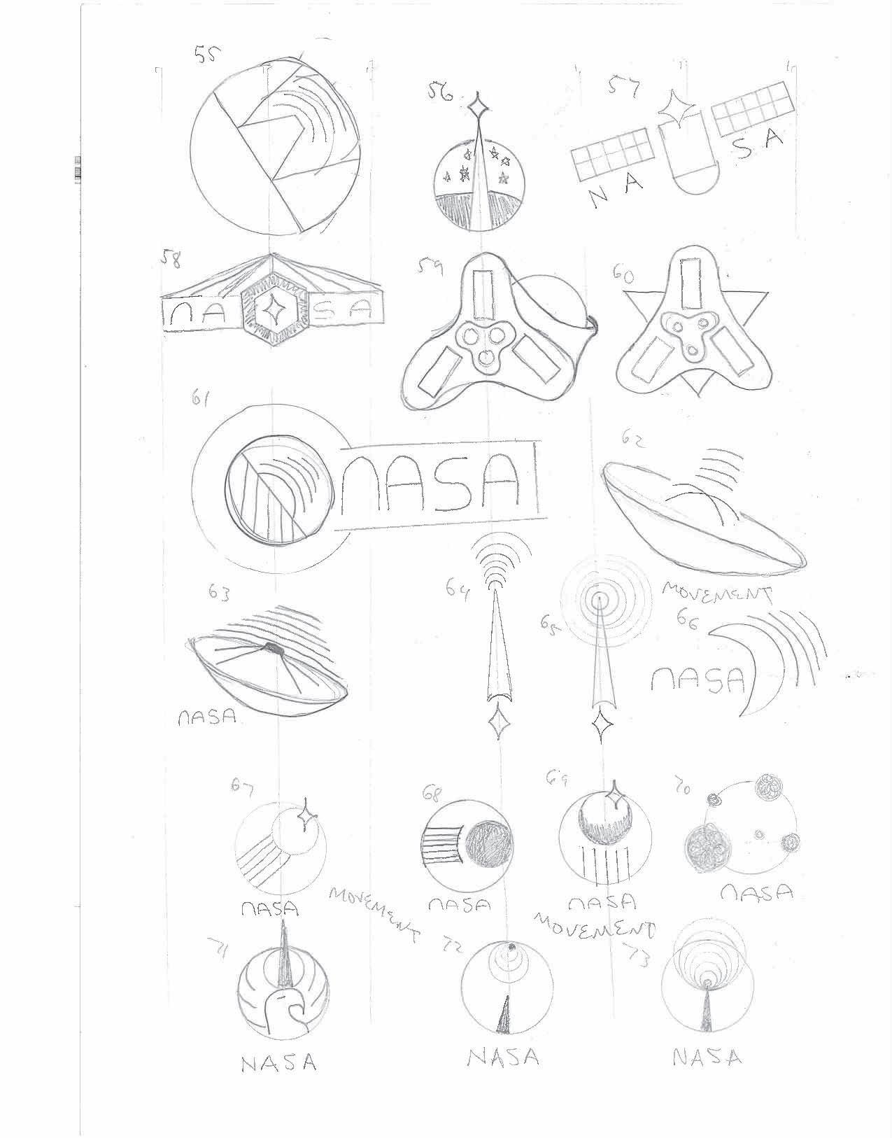
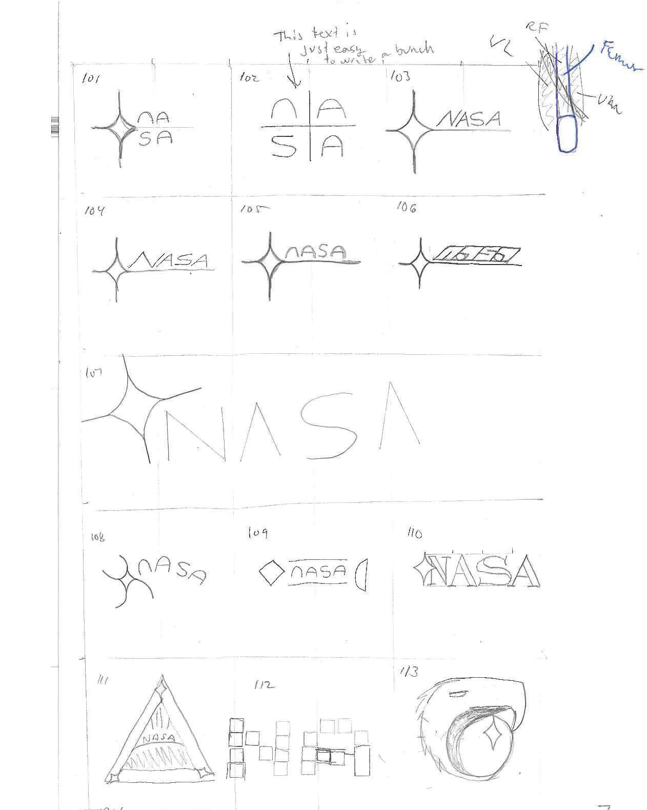
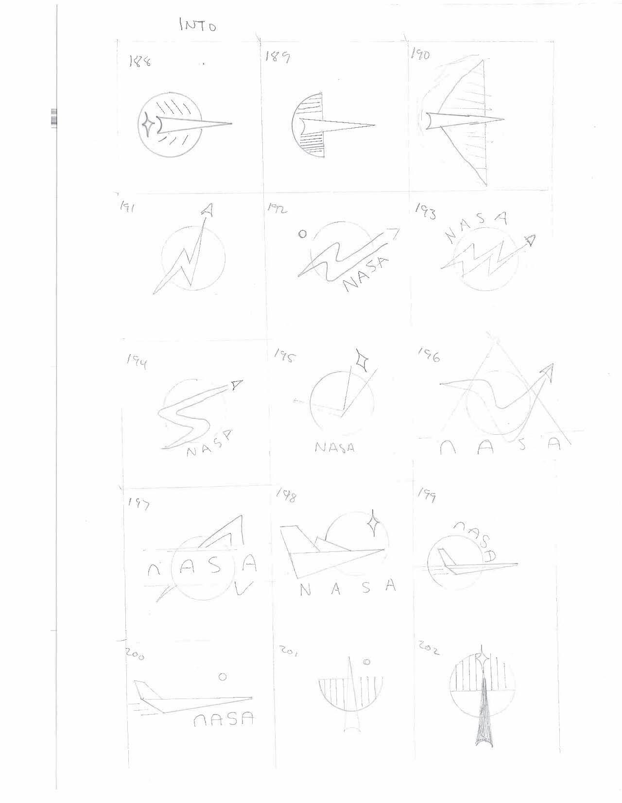
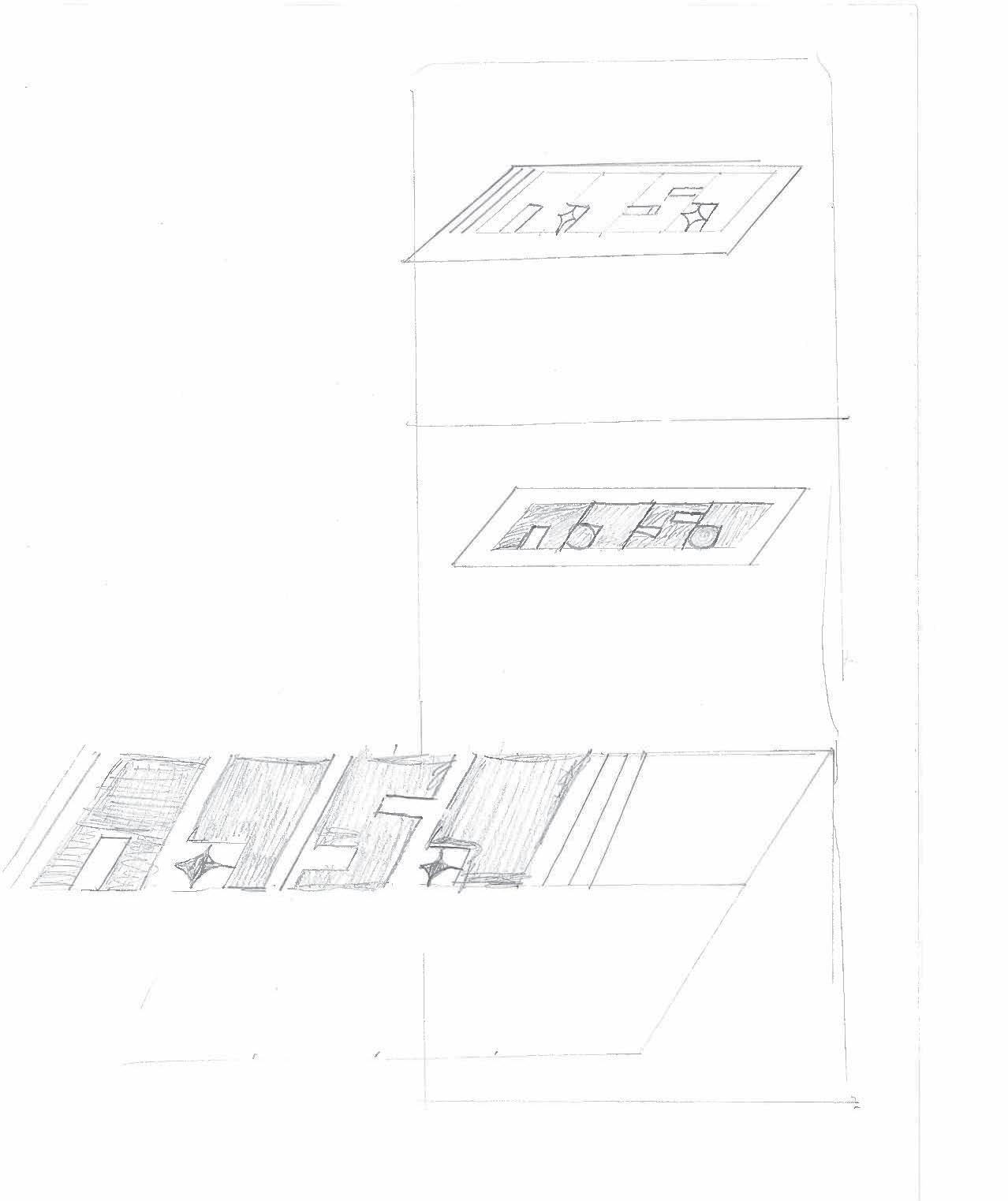
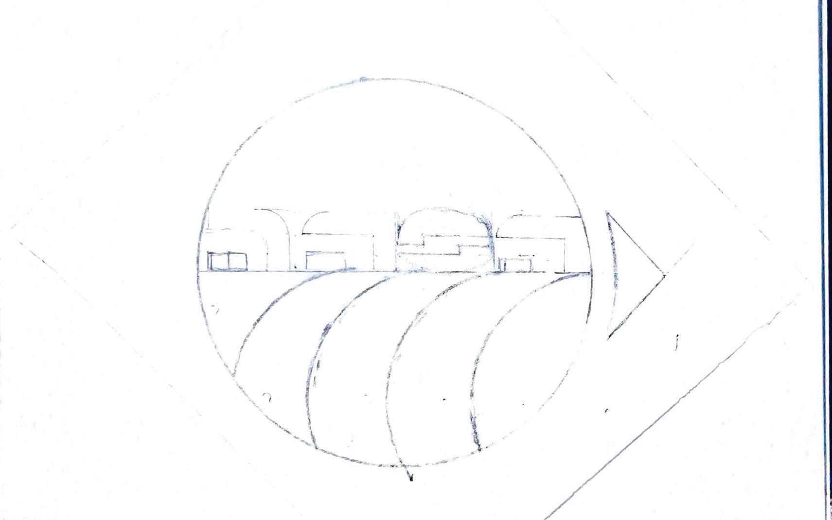
On this page the idea was to symbolize flight in some way. This was in response to the idea of placing the small circle next to a big circle. Something that orbits.
24 Tyler Cleveland // GR604 Nature of Identity
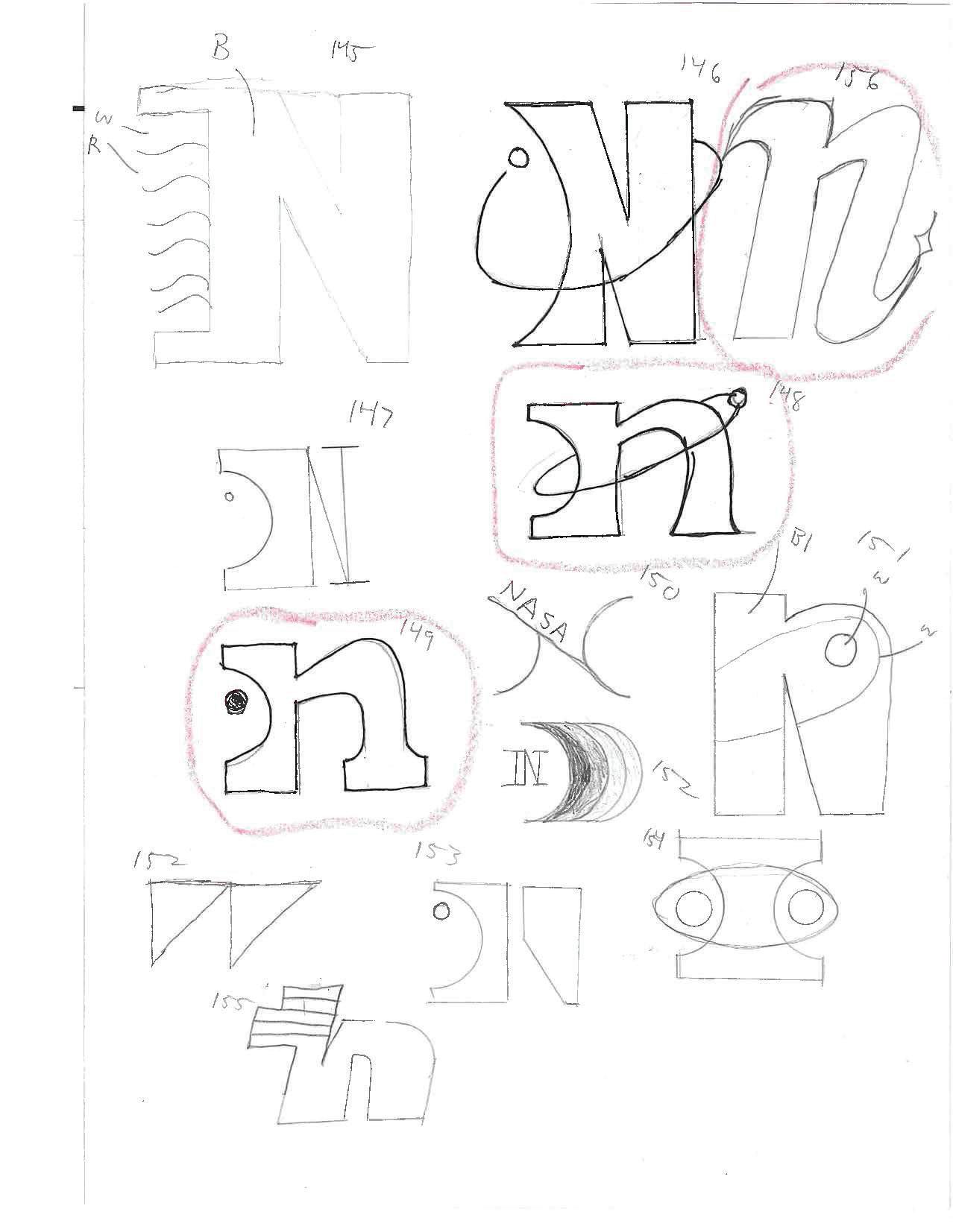
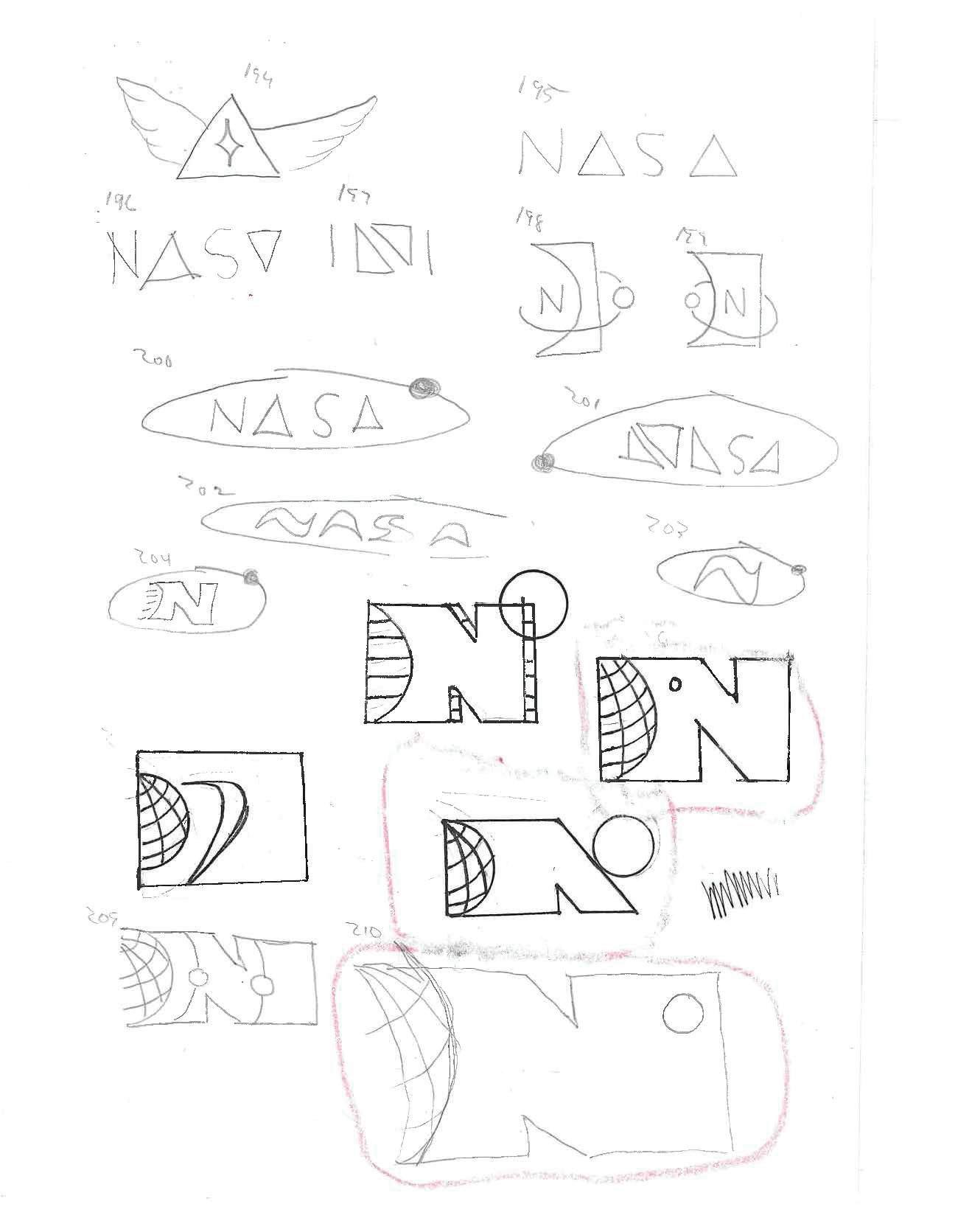
Feedback was that logos should focus on shapes, not lines, so we need to find a letter style that could be drawn and easily changed. The letter “N” was a focus at the beginning, we felt it was a good idea to start circling back on some ideas to start combining ideas. Heavy use of the circle can be seen and indicator of it’s potential in the end logo.
25 Visual Development Guide
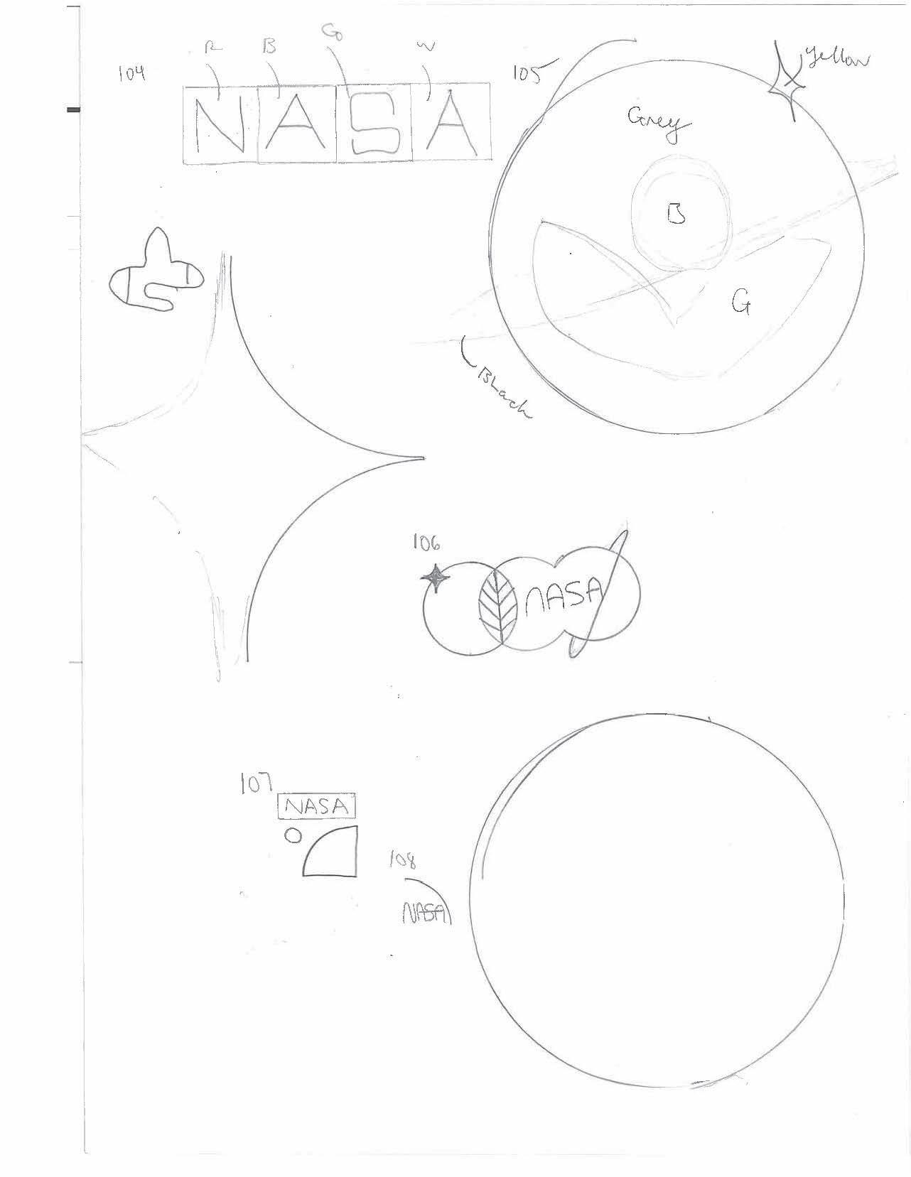
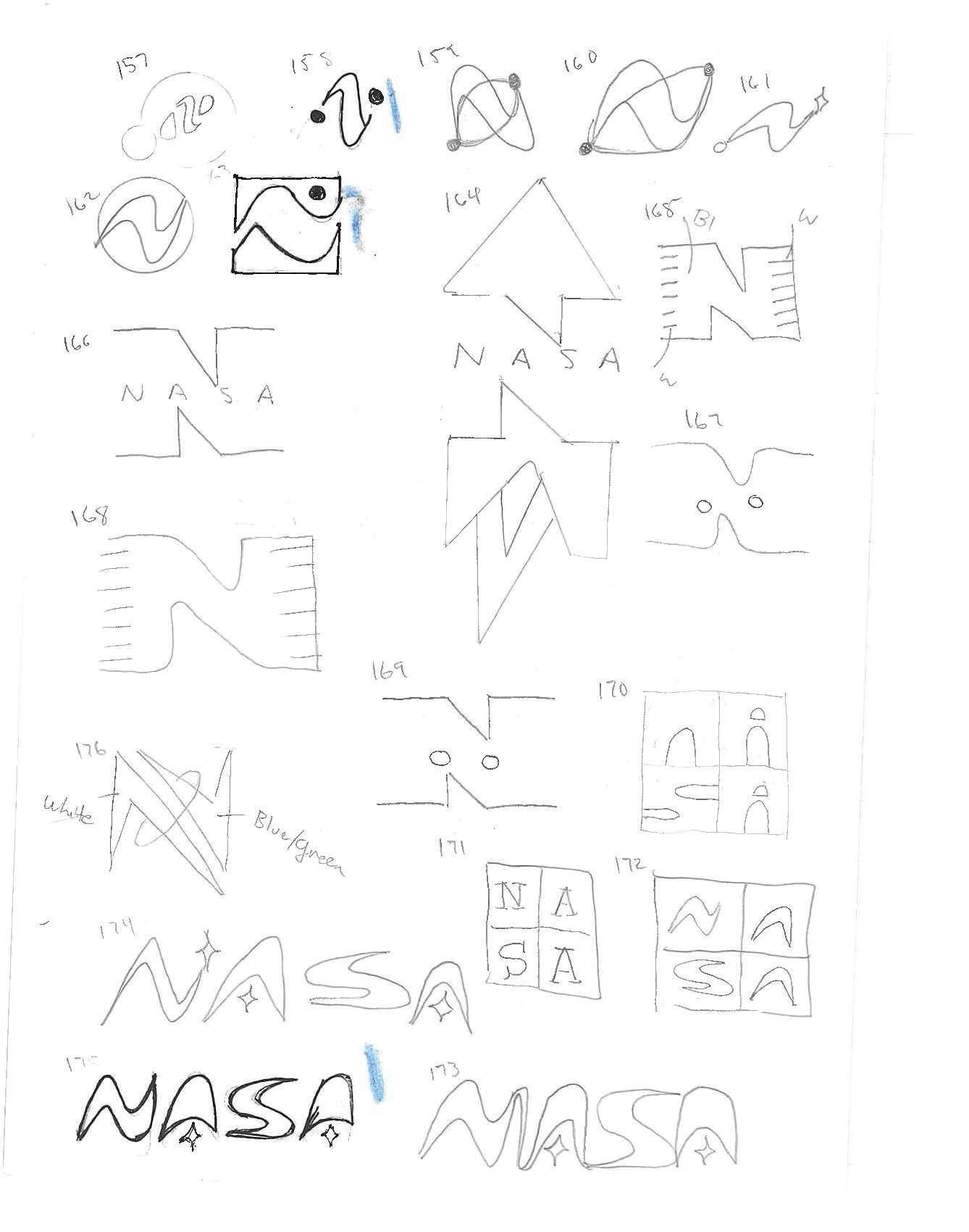
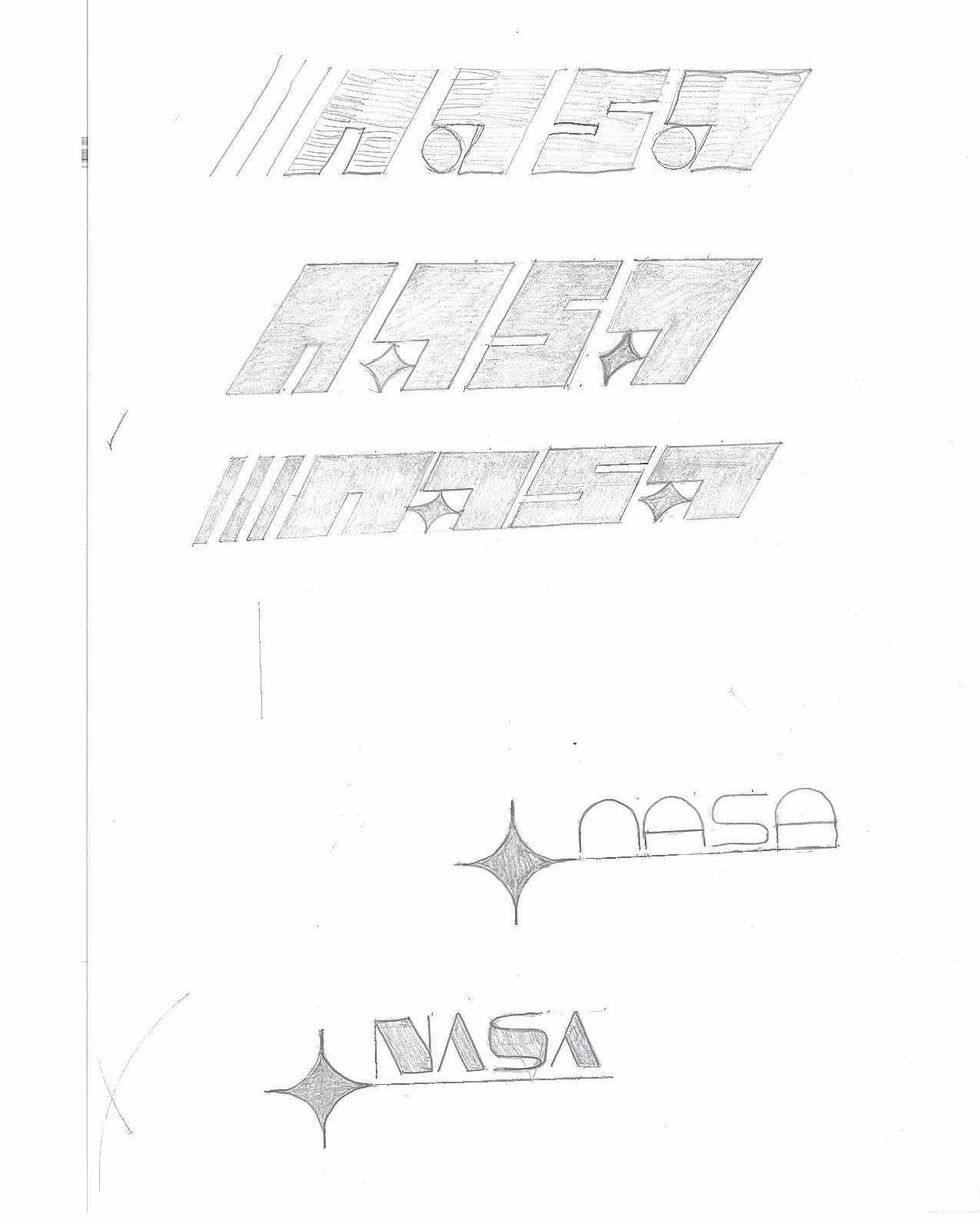
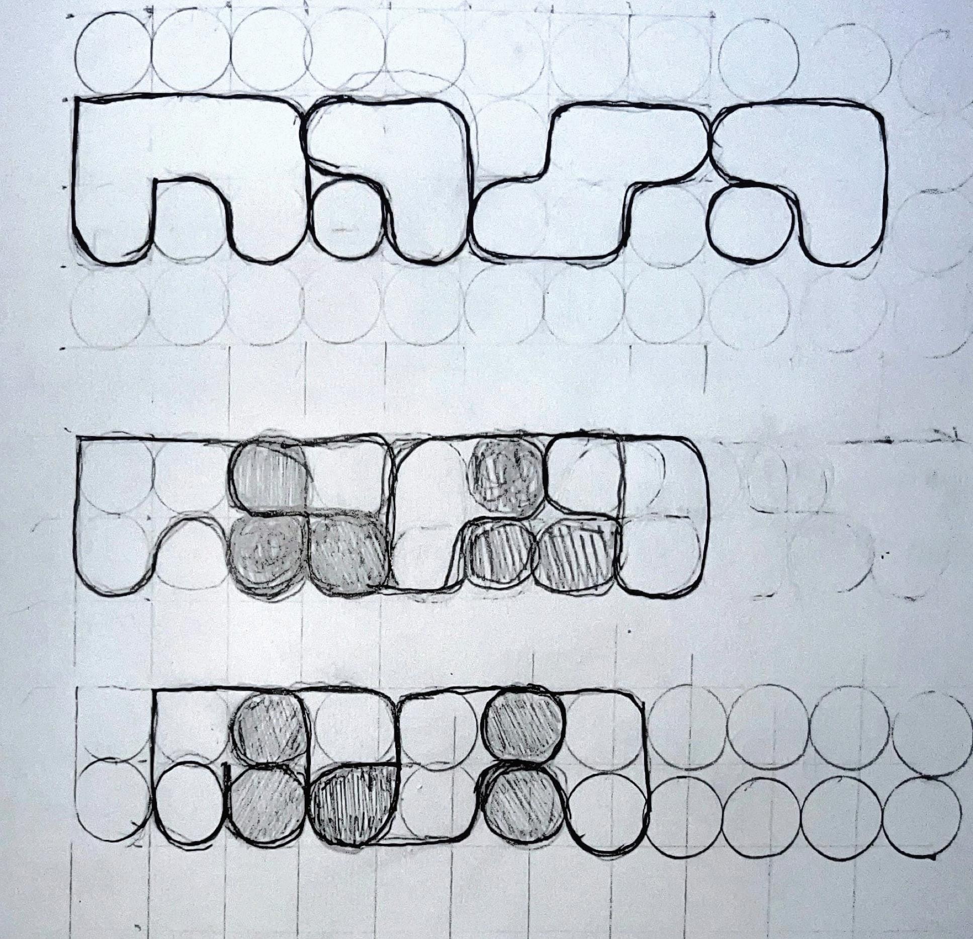
The circle and star are beginning to be included in most design ideas. They are easy to draw and easy to include into ideas. Also, only the letter “N” was explored. Now the full name was explored. The idea was to create something modular. The designs followed left to right, top to bottom. We also like how the two A’s stacked.
26 Tyler Cleveland // GR604 Nature of Identity
We also decided to circle back and see how the earlier designs looked with the full name. The way NASA explores is through flight, so I tested out some wings as well.
27 Visual Development Guide
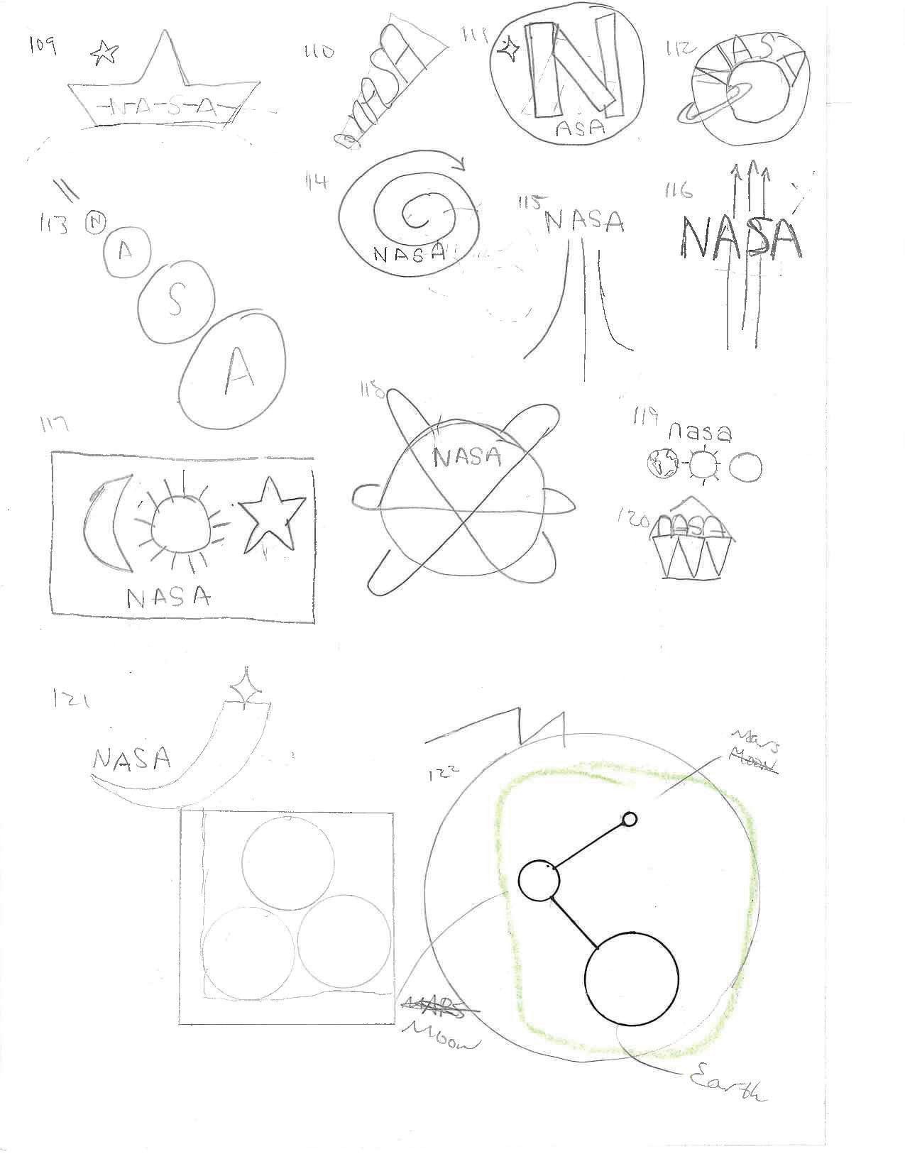
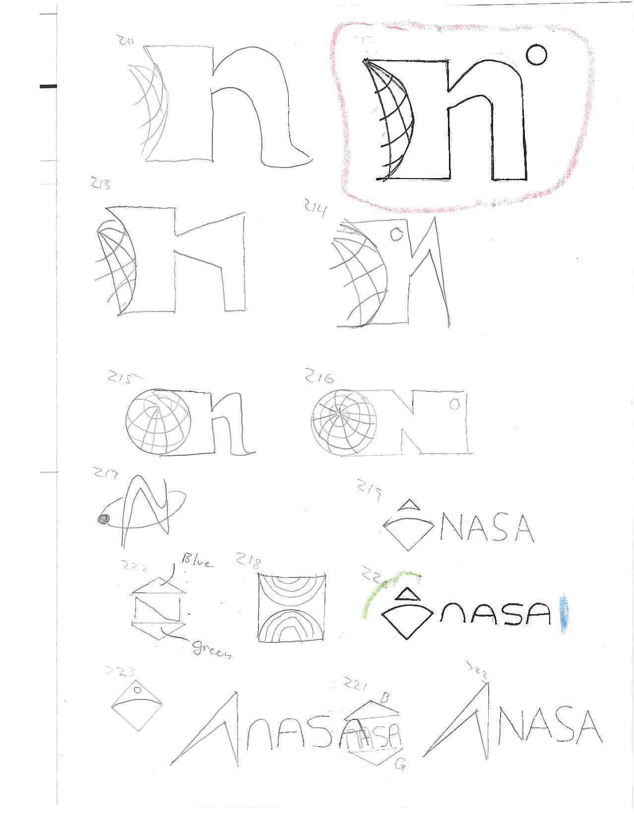
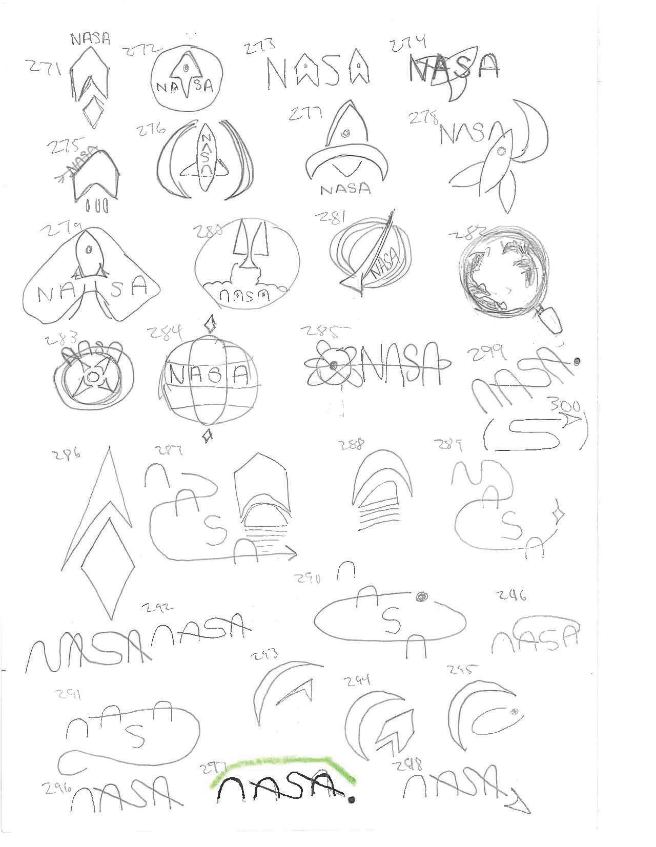
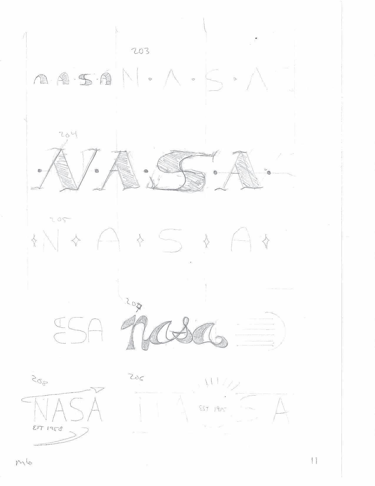
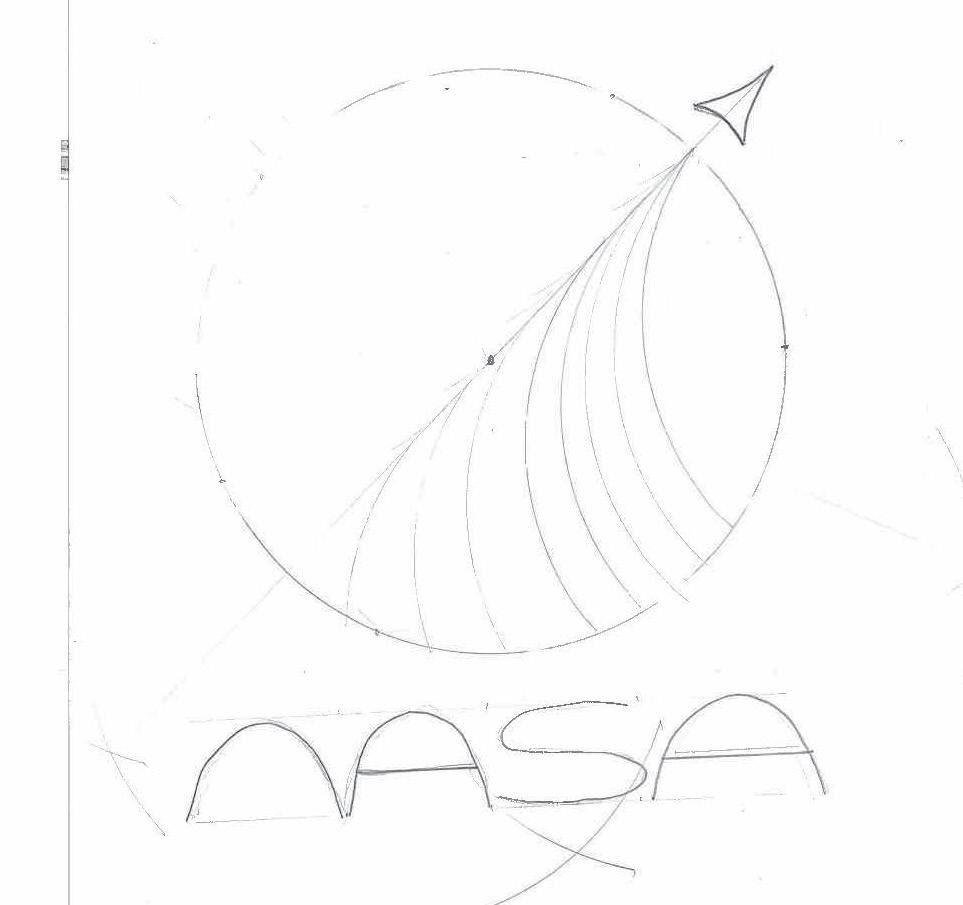
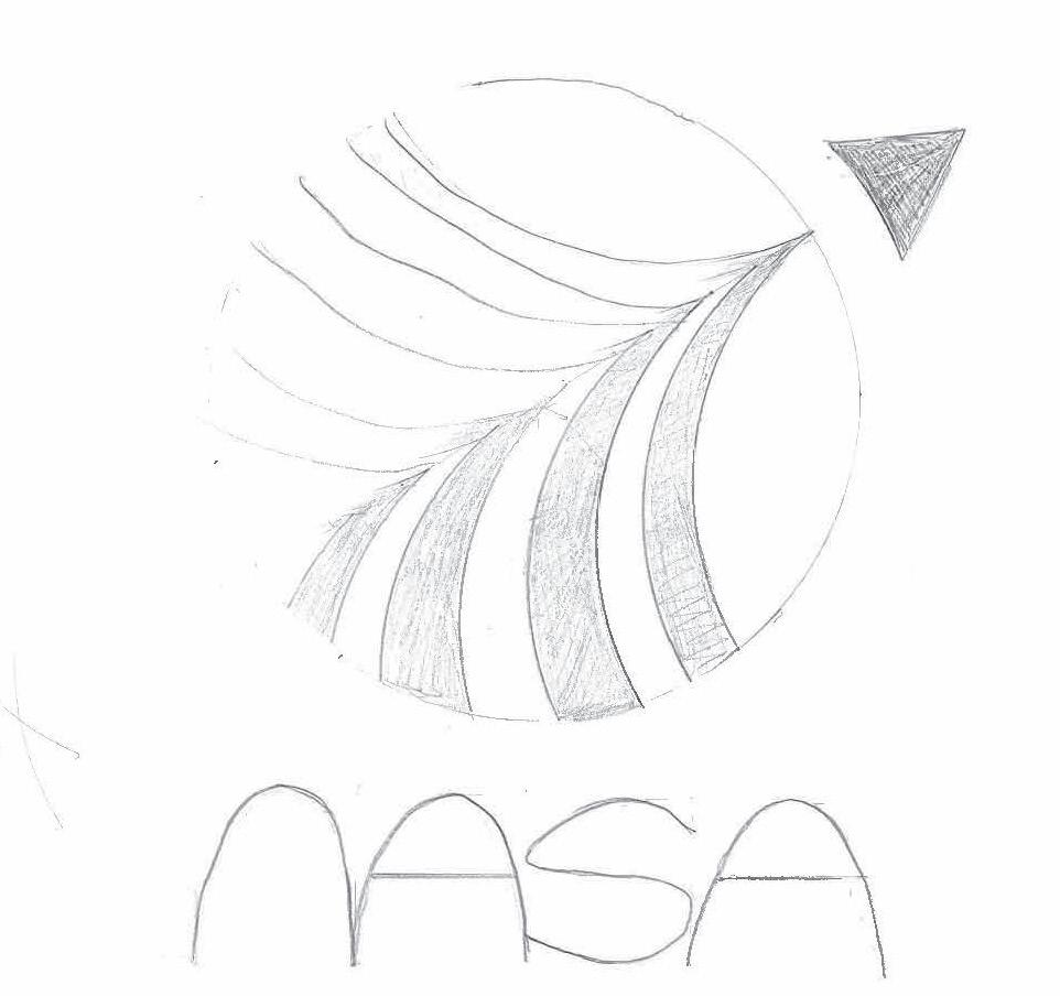
This page I start to get comfortable creating scenes in and around the letter. When #204 was drawn I looked at it and noticed tha the sub-par sketch made the lines look like a globe spinning around.
28 Tyler Cleveland // GR604 Nature of Identity
The globe had a few iterations ranging from str
29 Visual Development Guide
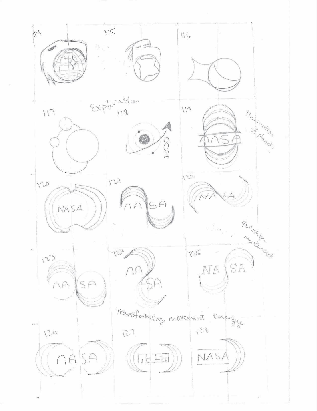
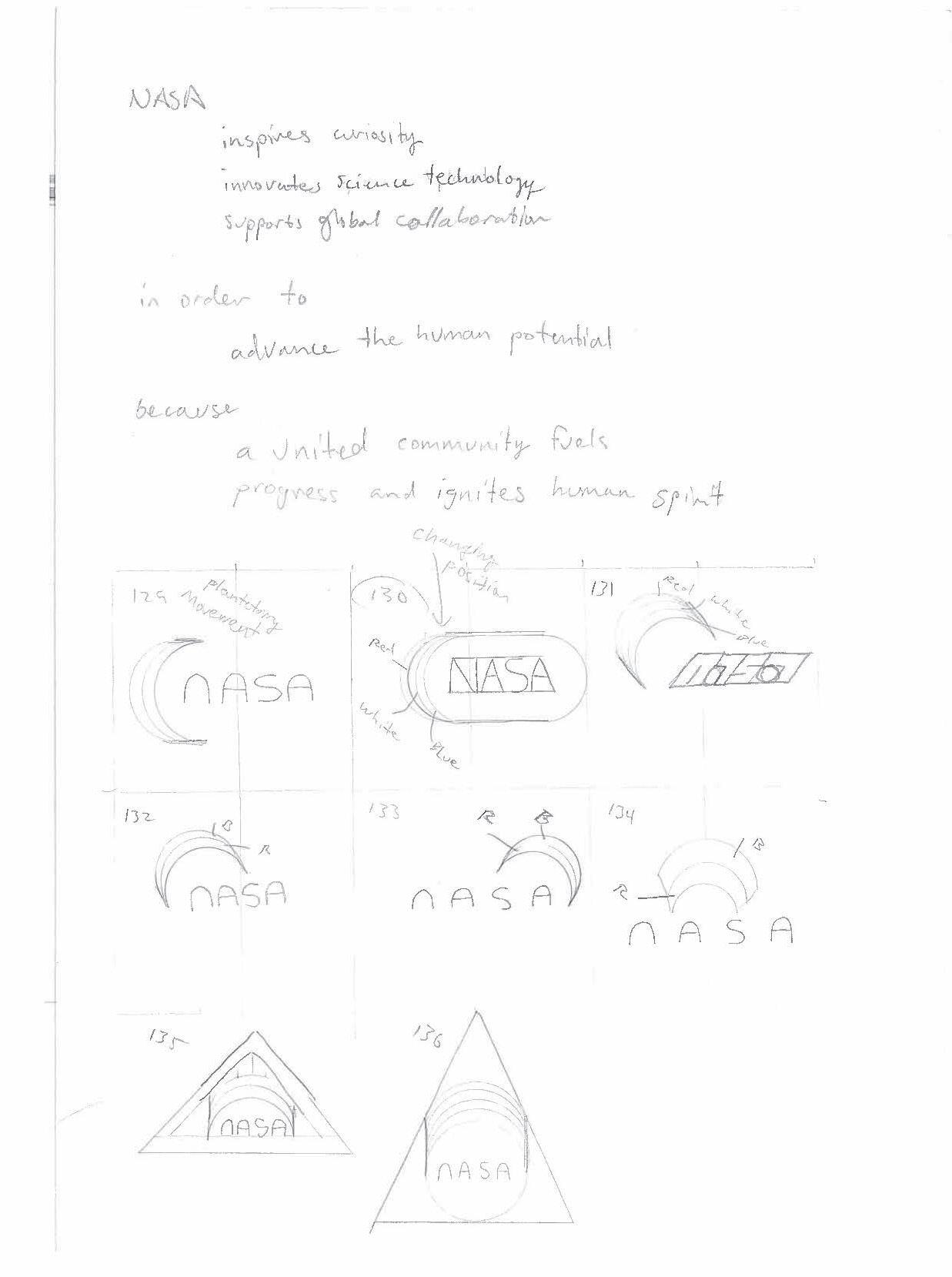
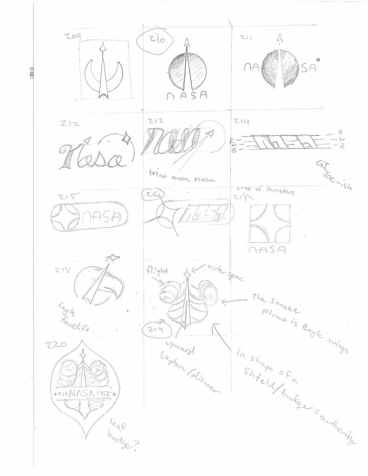
Another aspect of exploration is movement. This began to explore the use of line to show movement. Given that NASA goes to space, we felt it was appropriate to have the movement point upwards to space.
30 Tyler Cleveland // GR604 Nature of Identity
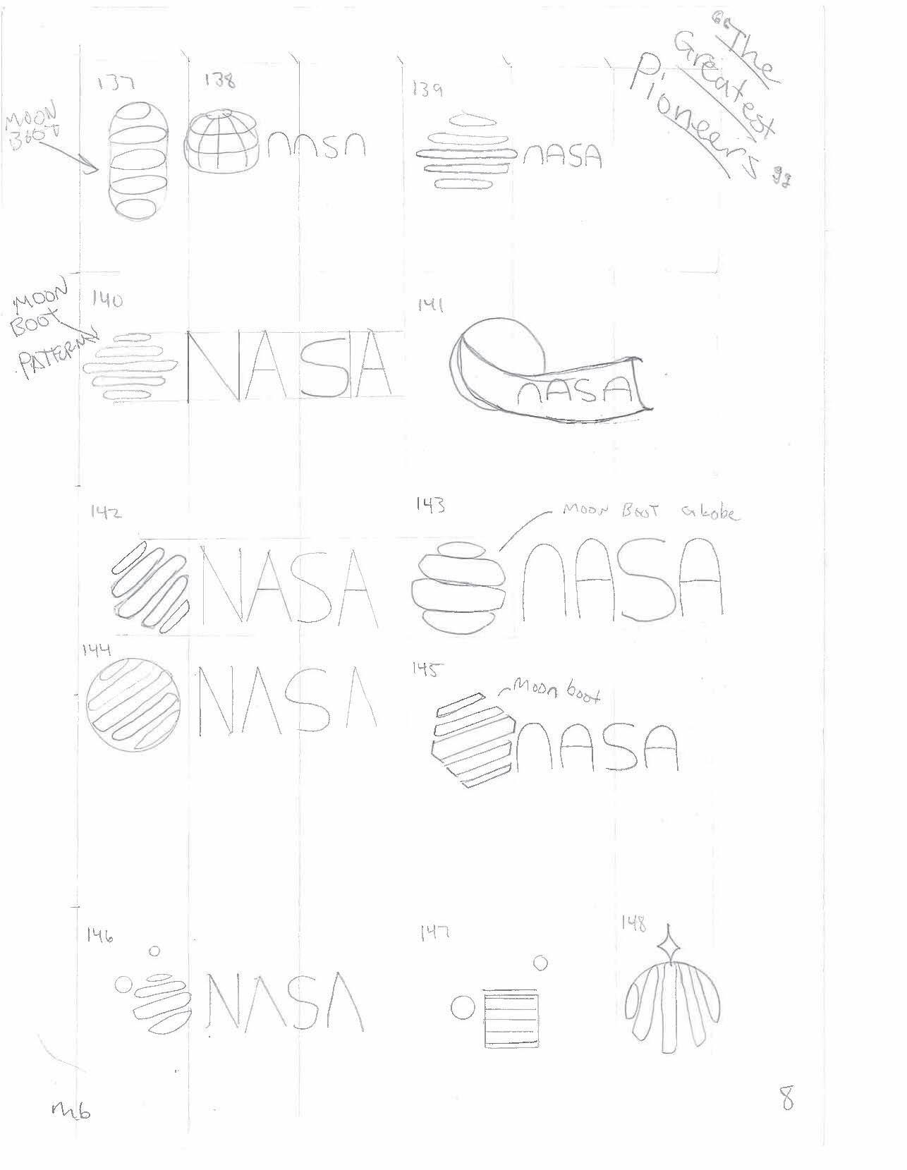
Ideas were thin at the beginning on this page but starting at #132, you can see the inclusion of the small circle in the designsto represent the moon (what made NASA famous) and also exloration.
31 Visual Development Guide
33 Visual Development Guide
34 Tyler Cleveland // GR604 Nature of Identity
35 Visual Development Guide
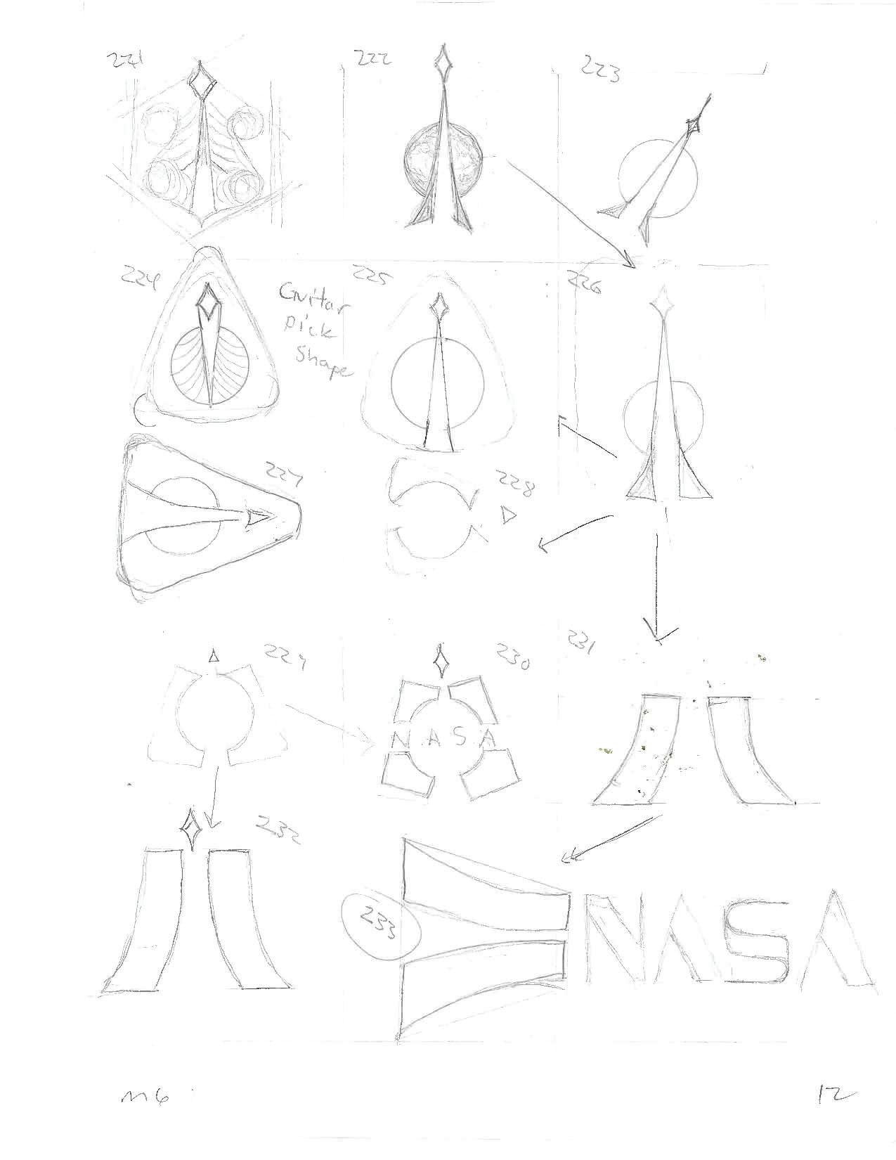
ROUND 2 SKETCHES
36 Tyler Cleveland // GR604 Nature of Identity
37 Visual Development Guide

50 Tyler Cleveland // GR604 Nature of Identity

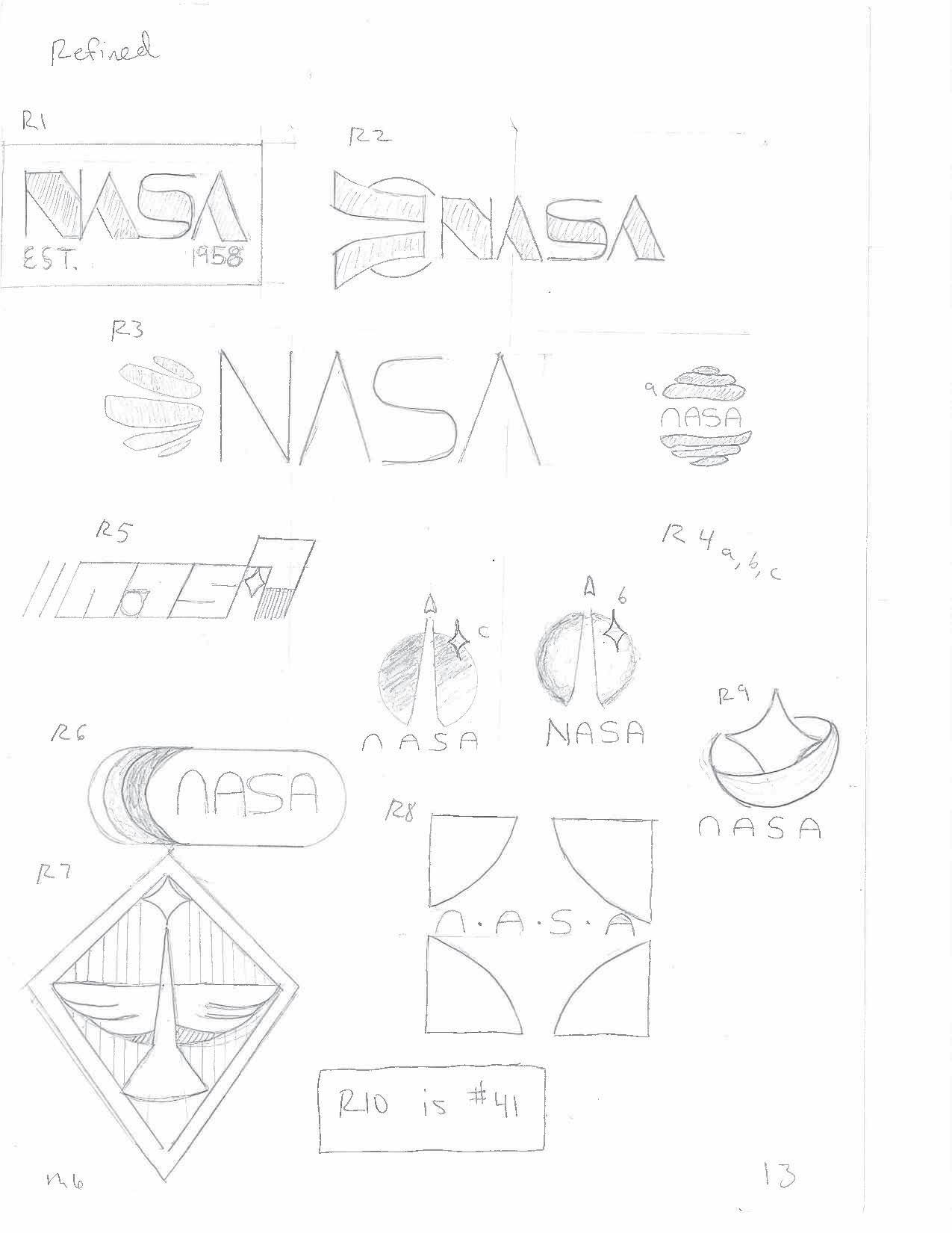
2ND SET REFINED
60 Tyler Cleveland // GR604 Nature of Identity
ROUND 3 SKETCHES
62 Tyler Cleveland // GR604 Nature of Identity
63 Visual Development Guide
64 Tyler Cleveland // GR604 Nature of Identity
65 Visual Development Guide
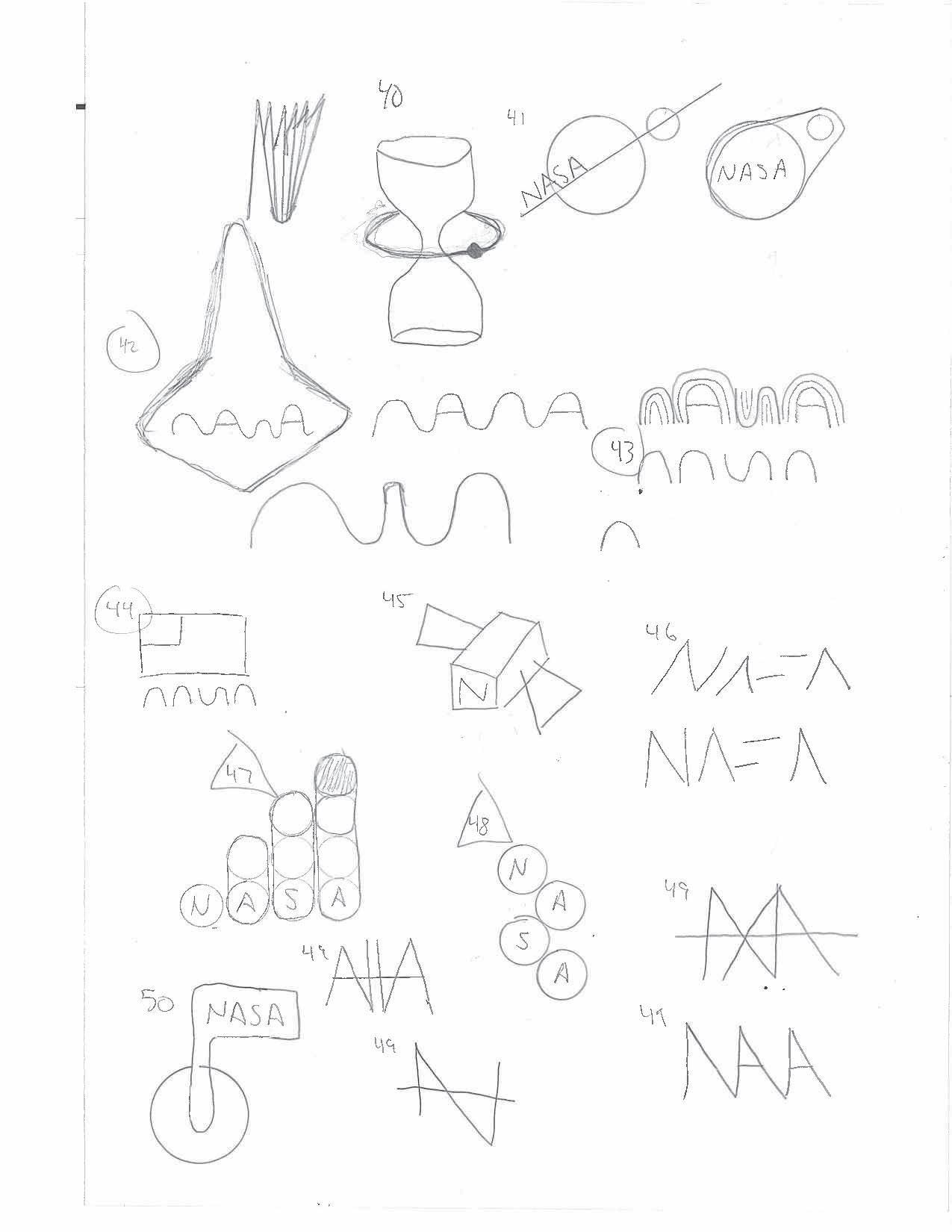
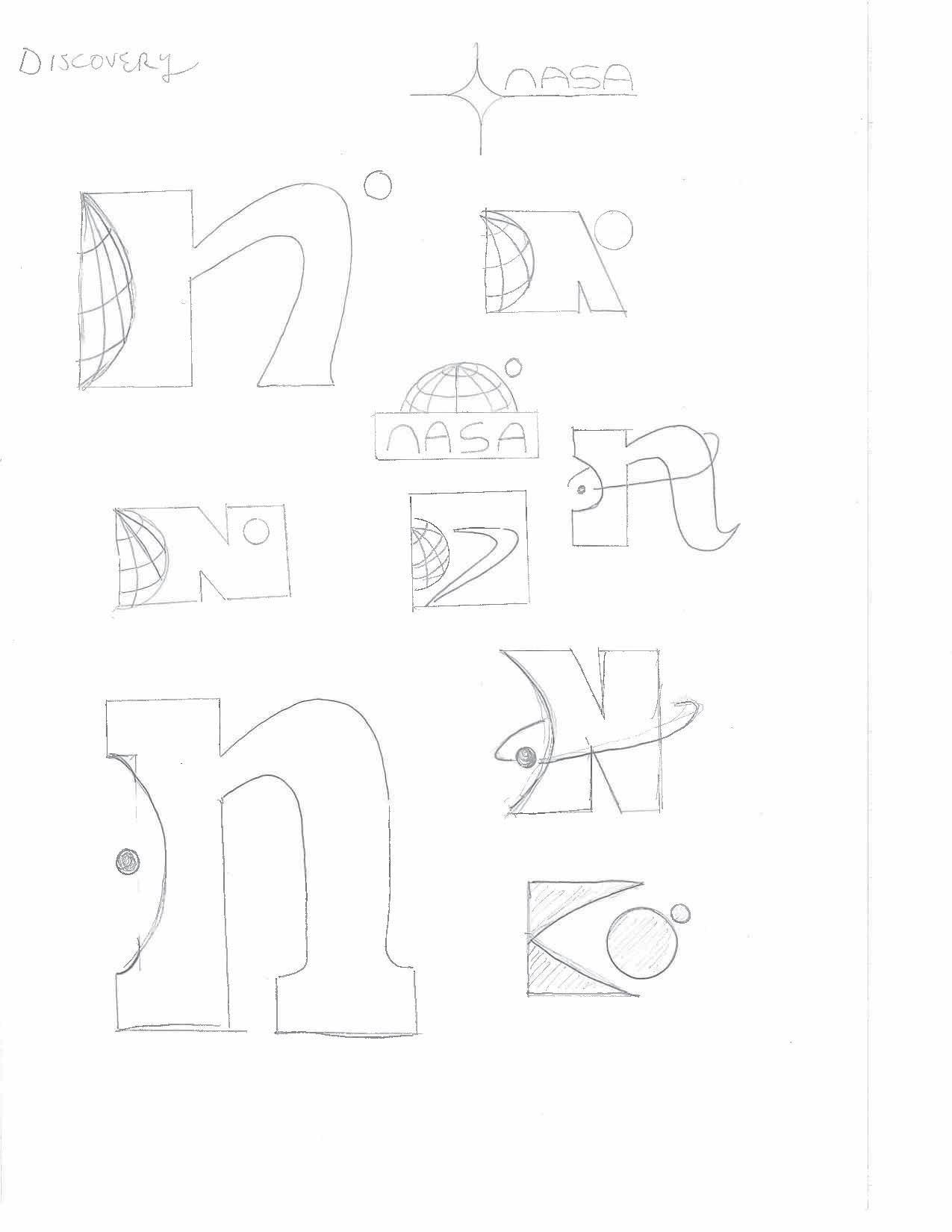
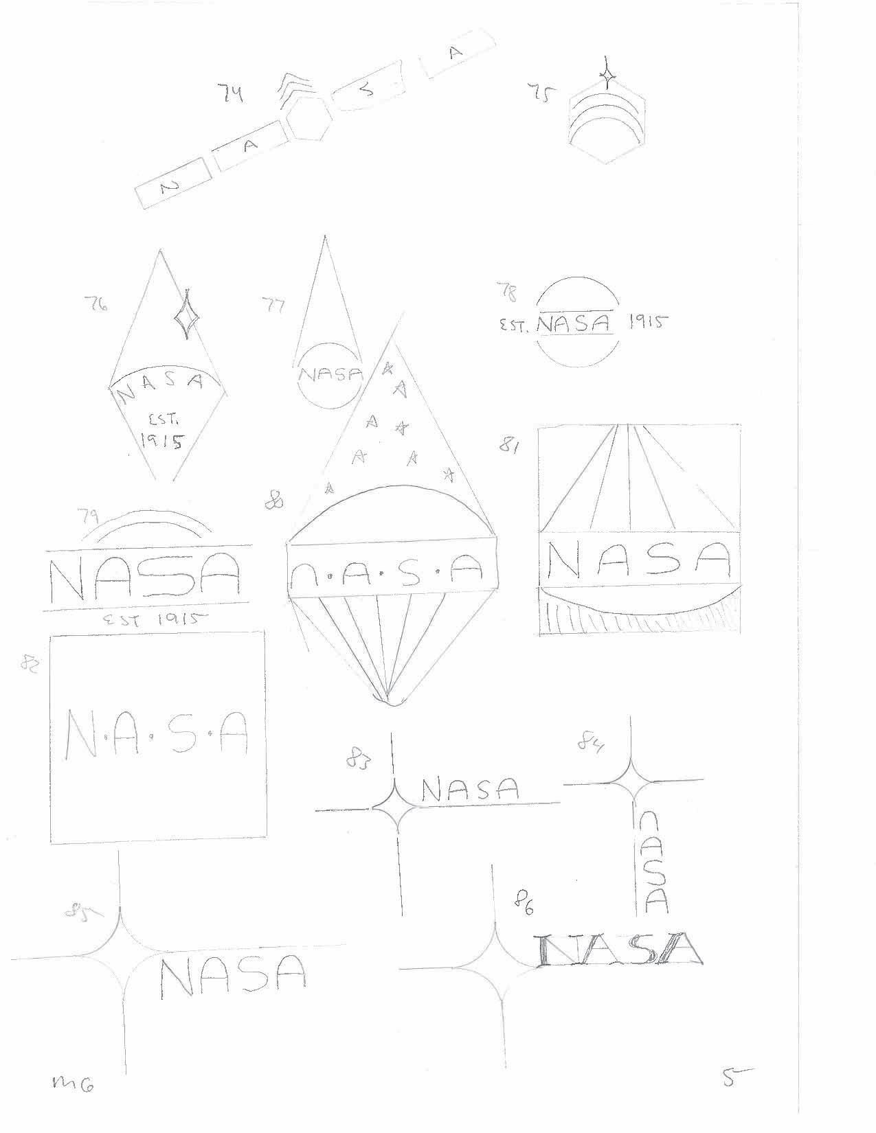
The idea here was to just get started and try to find something for the typeface. I was waiting for feedback before I really got into it.
66 Tyler Cleveland // GR604 Nature of Identity
This was the idea that came out and now I wanted to start applying it to my older ideas.
67 Visual Development Guide
68 Tyler Cleveland // GR604 Nature of Identity
69 Visual Development Guide
70 Tyler Cleveland // GR604 Nature of Identity
71 Visual Development Guide
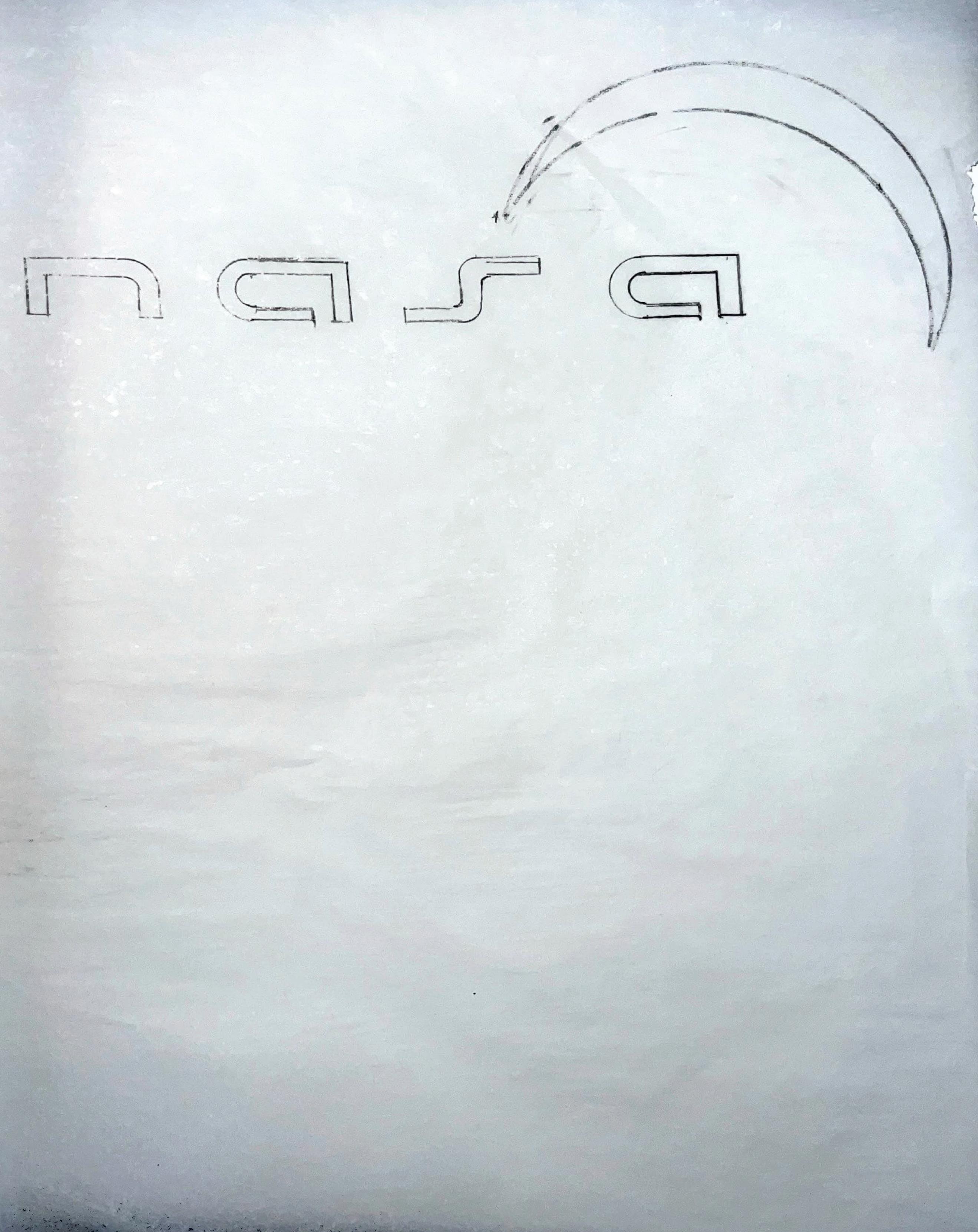
I progressed to a nice iteration of the round 2 typeface. I wanted something low and extended to give it an innovative modern look.
72
// GR604 Nature of Identity
Tyler Cleveland
One more attempt at trying to make a modular logo. I did heavily use the destiny logo. But, it was not professional enough for what I wanted.
73 Visual Development Guide
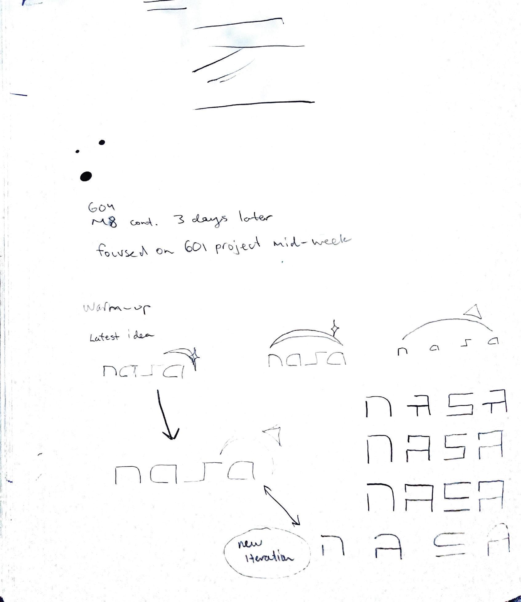
This is three days later after the initial round three exploration. I was just getting warmed up mentally to get back into that space previously.
74 Tyler Cleveland // GR604 Nature of Identity
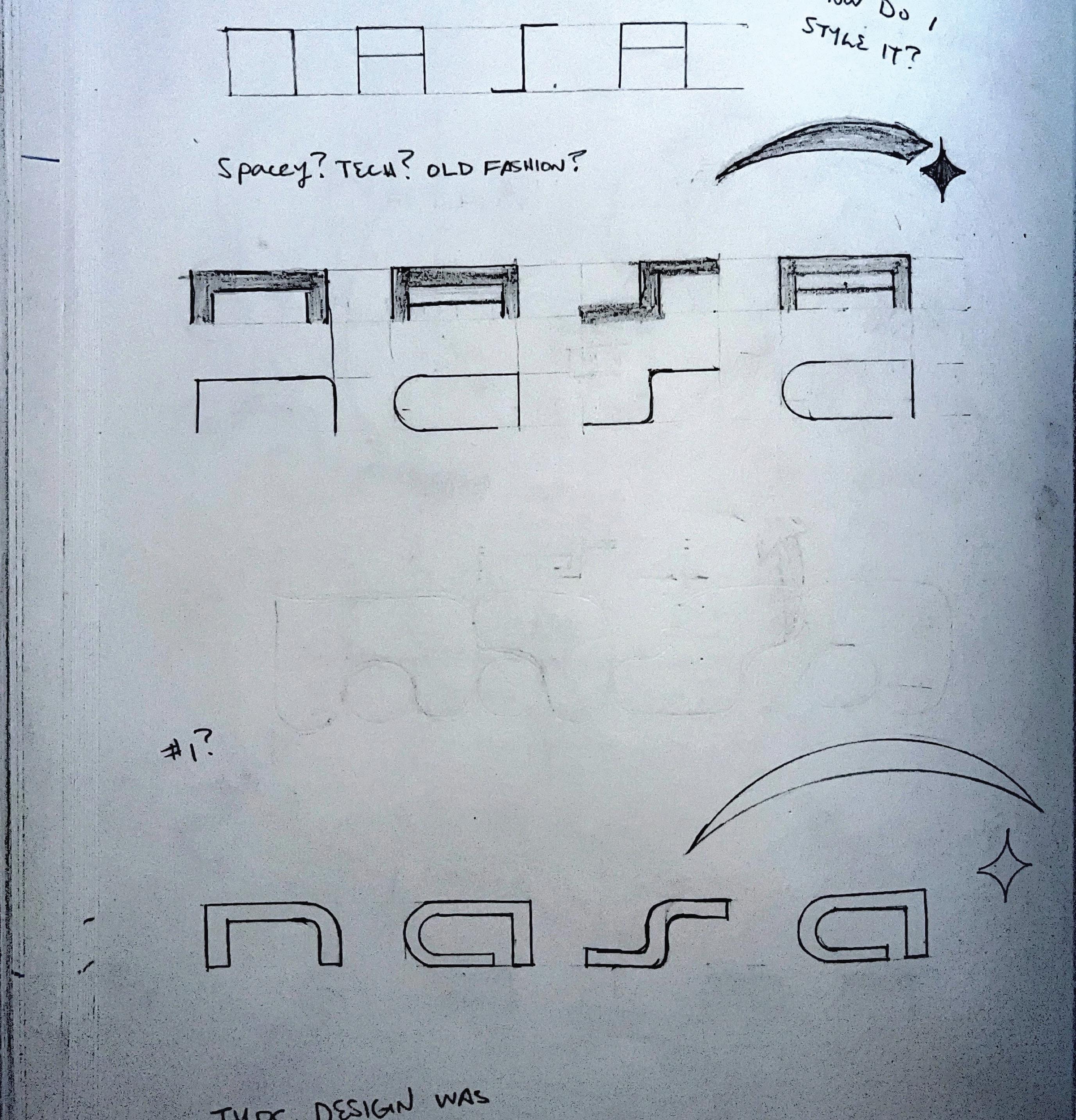
Deep into the typeface development here. I had to reset and remember the original skeleton I had made previously. I was stuggling with being too cliche or not executed well.
75 Visual Development Guide
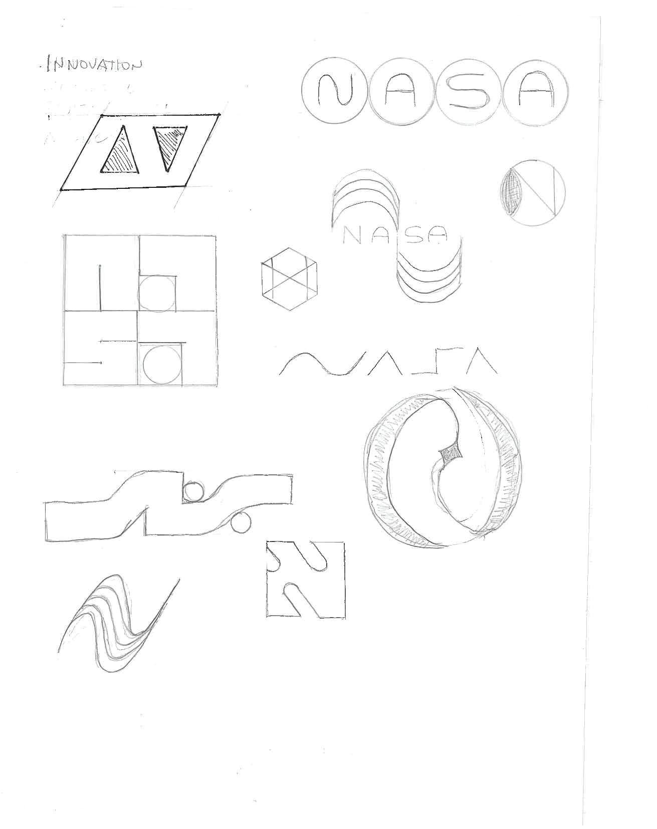
This one I tried one more attempt to find a typeface for the logo. I was thinking about innovation and technology for this.
76 Tyler Cleveland // GR604 Nature of Identity
I was just seeing if I could find a solution to the “S” one more time and ended like this. I did not oursue.
77 Visual Development Guide
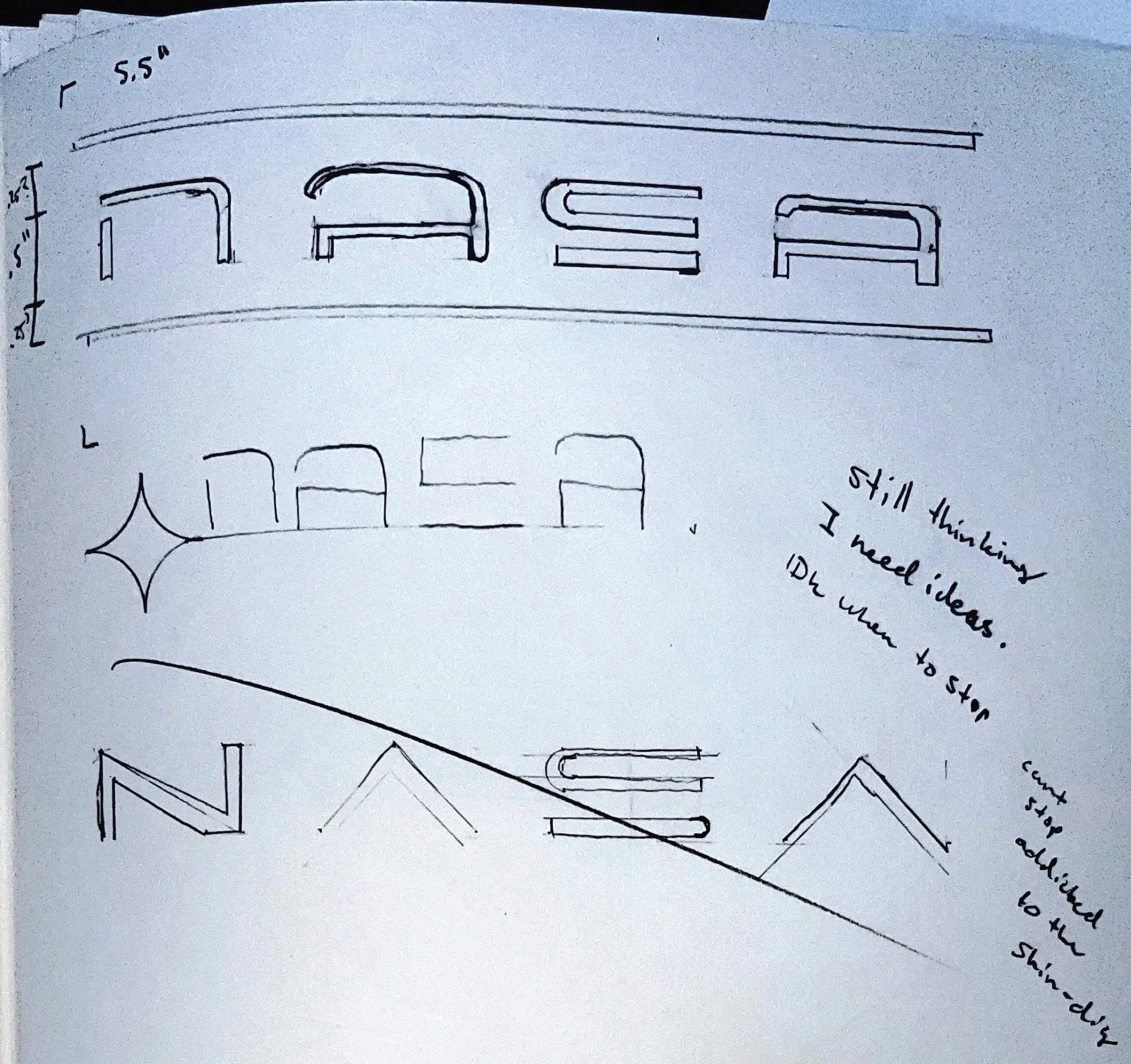
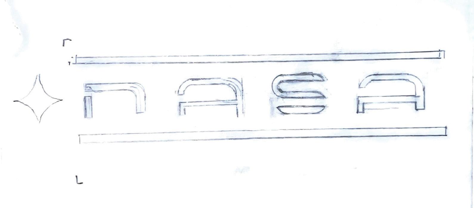
These were the three sketches I transferred to the computer. I had measured each structure to maintain consistency.
79 Visual Development Guide
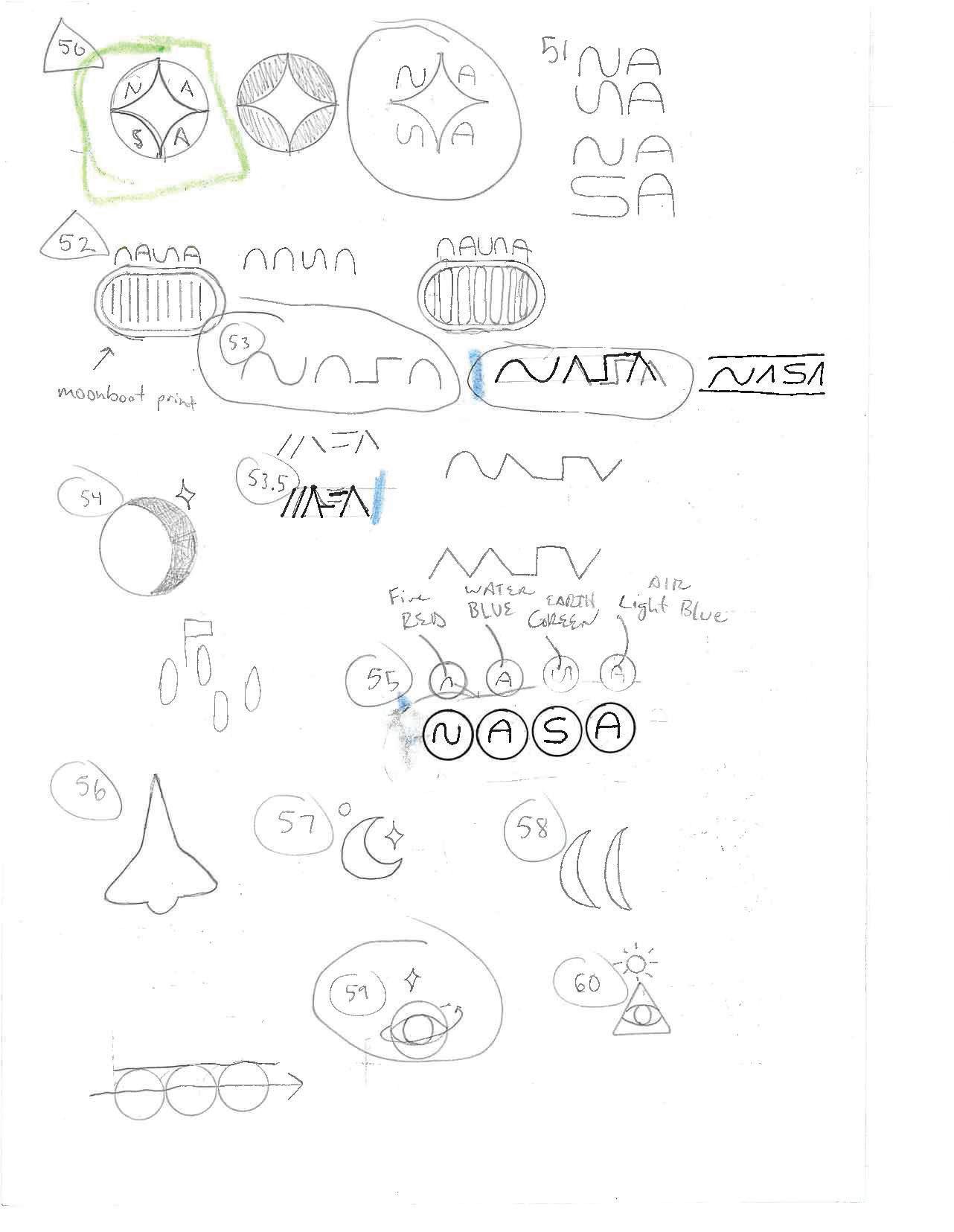
Started off with something easy. Mixed an old design with the new word mark. I also chose some colors to try out.
80 Tyler Cleveland // GR604 Nature of Identity
Same thing here
81 Visual Development Guide
I cut the colors down to green navy, gold, and some sort of red.
82
Cleveland // GR604 Nature of Identity
Tyler
Nothing felt good yet so I jumped into the main ideas I had scanned over.
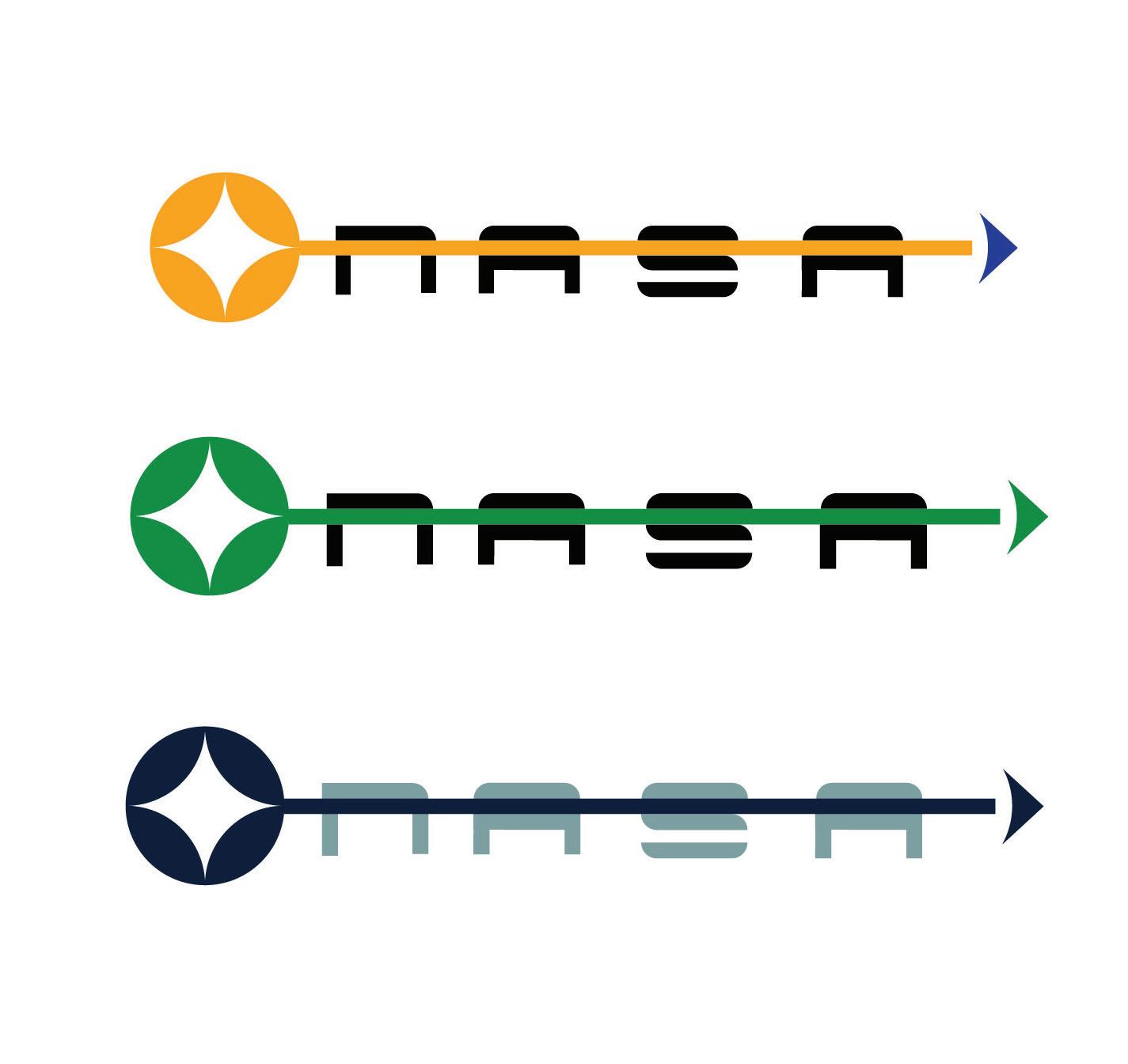
The three sars represent the three failed missions each being further in distance (time). The swooping arcs look like the american flag and also smoke from the rocket.
83 Visual Development Guide
Starting to get happy here. I tried tilting some stars and changing the dimensions of the star.
There is a lot of symbolism in this I feel and might be it.
84 Tyler Cleveland // GR604 Nature of Identity
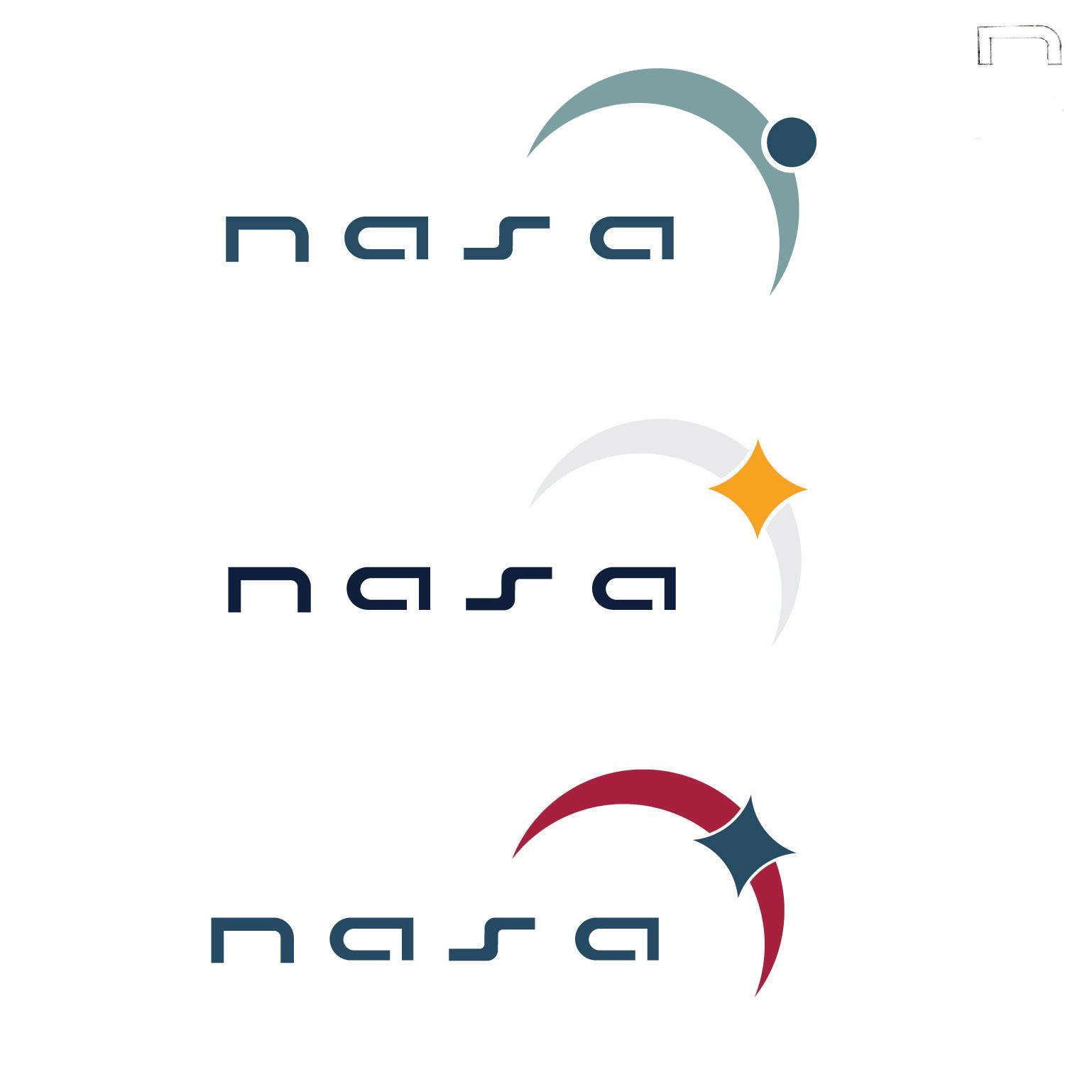
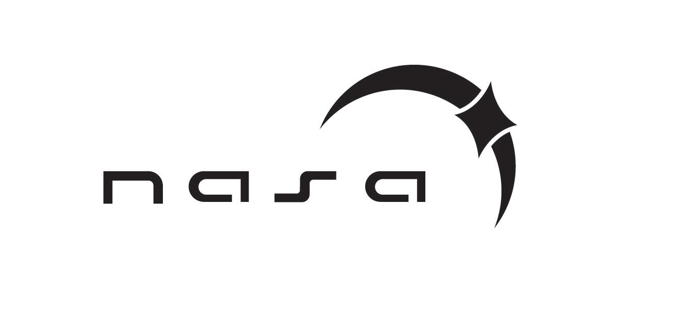
But lets make sure. I got rid of the star because the star was just not fitting. It was too cute for me. So I put the circle there instead and liked it a lot. The circle has 3-4 meanings as well and the crescent shape. (explained later).
85 Visual Development Guide
86 Tyler Cleveland // GR604 Nature of Identity
These are the two to choose from. DO I want to go science route or nationalist route.
87 Visual Development Guide
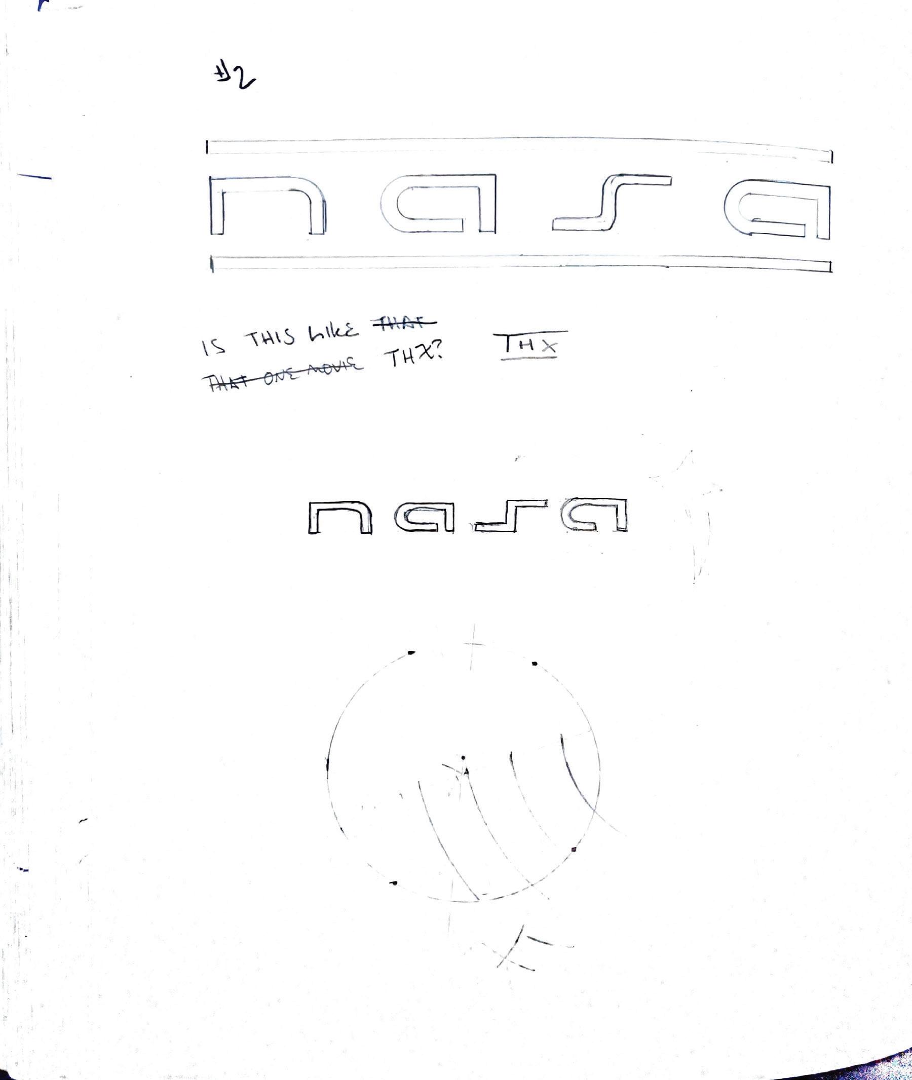
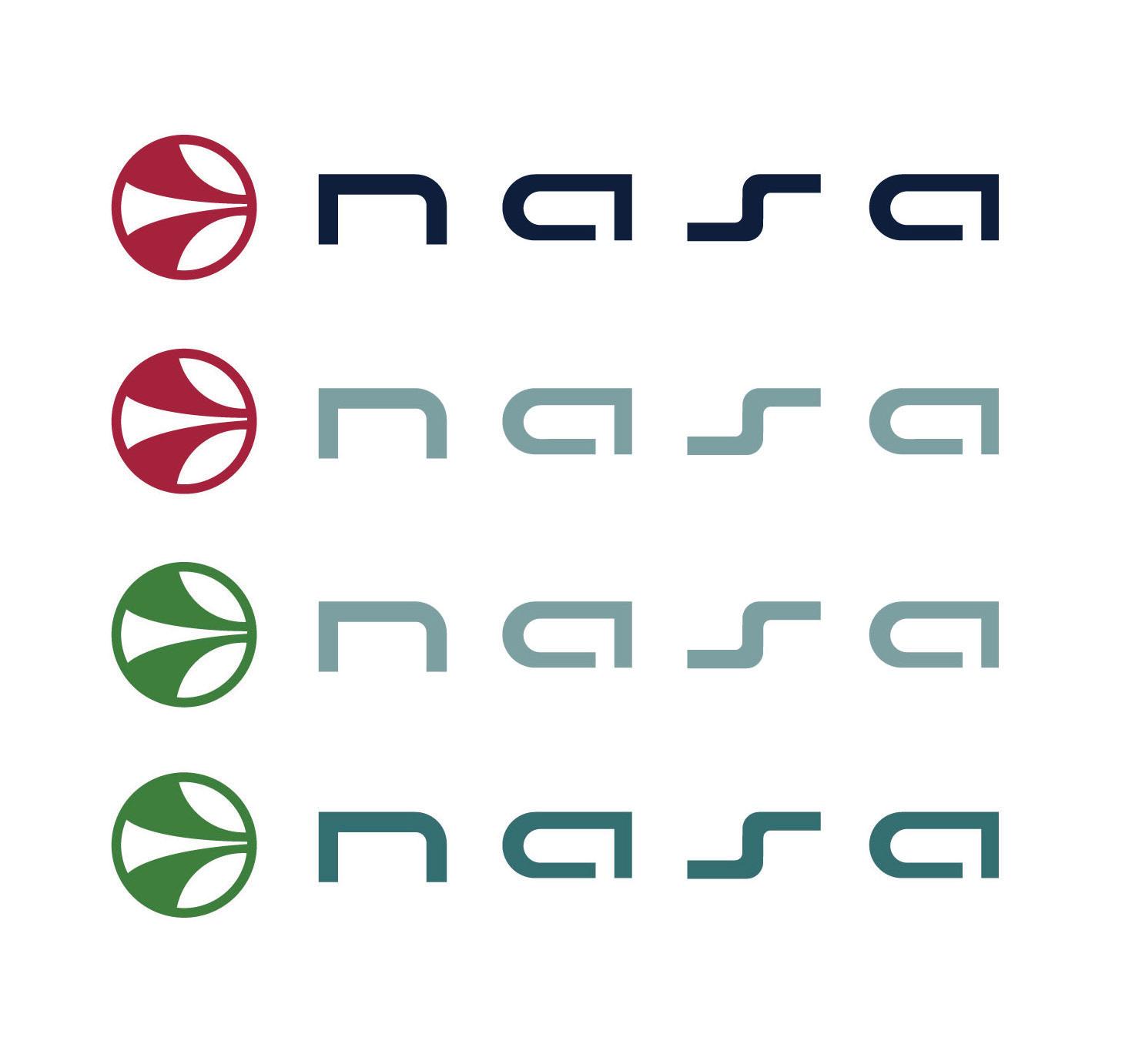
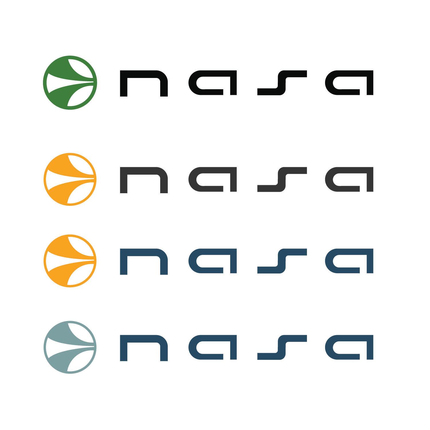
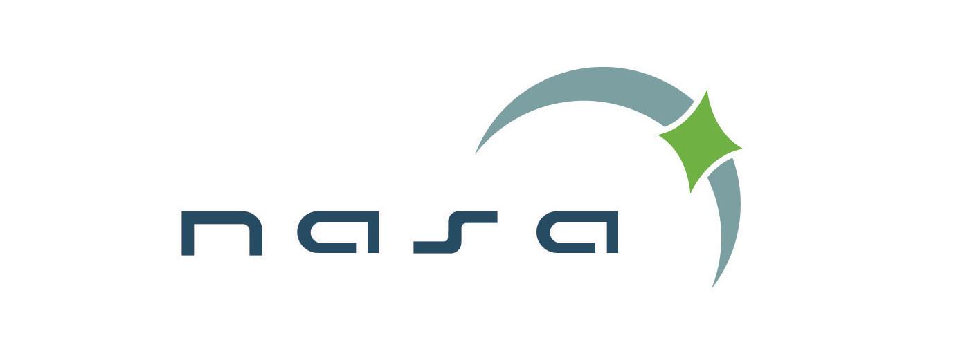
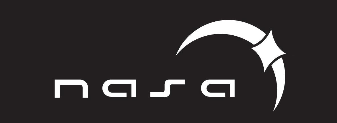
THE FINAL MARK
and there it is. The moon was adjust to be spaced evenly from the wordmark.,
88 Tyler Cleveland // GR604 Nature of Identity
89 Visual Development Guide
90 Tyler Cleveland // GR604 Nature of Identity
Visual research is a valuable tool for creative exploration. It offers a gateway to understanding and inspiration. Artists and designers gain insights into effective techniquesand aesthetic trends. This process not only broadens my perspective but also fuels my creativity and sparks fresh ideas.
Leveraging inspiration from good design allows me to develop my process and try new things. Whether studying fine art, analyzing designs, each encounter serves as a source of learning and motivation for my project inspiration.
In today’s digital world, where designs constantly change and adapt to new soceital trends, visual research stands as a vital practice to learn what to do or where to go next.
What you see in this section is a selection of visual standards from well-known brands like USA Today and UPS. Getting inspiration for a visual standards guide is tough if you don’t have access to a collection of them. I was able to get a collection and have chosen a few examples that I feel are working well.
91 Visual Development Guide
Brand Introduction
What I liked from these two exampels were there language choices. Each open with a provocative sentence desgined to get the clients to think.
92 Tyler Cleveland // GR604 Nature of Identity
Brandmark Anatomy
These inspired me because they show how connected and thought out the brandmarks are in relation to all its parts.
93 Visual Development Guide
TYPE SPECS
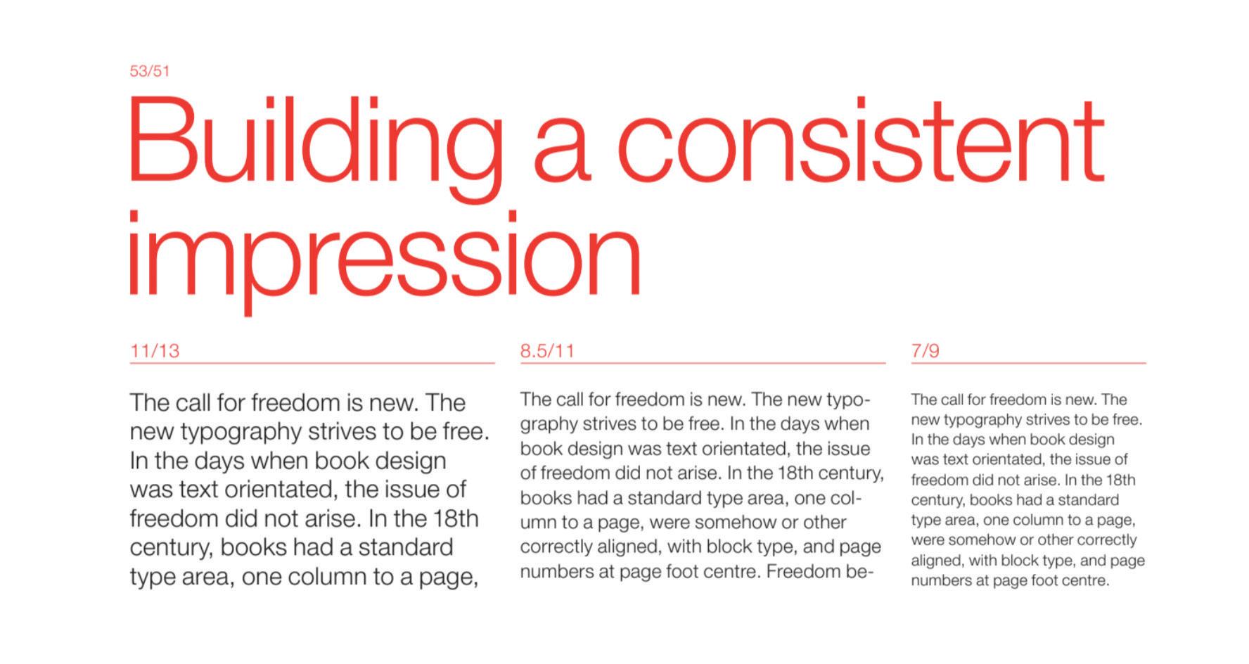
These two examples show a dynamic and alternative approach to showing the characteristics of the typefaces used.
94 Tyler Cleveland // GR604 Nature of Identity
MAIN ID COLORS
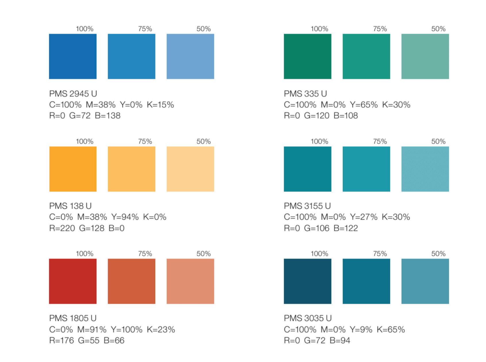
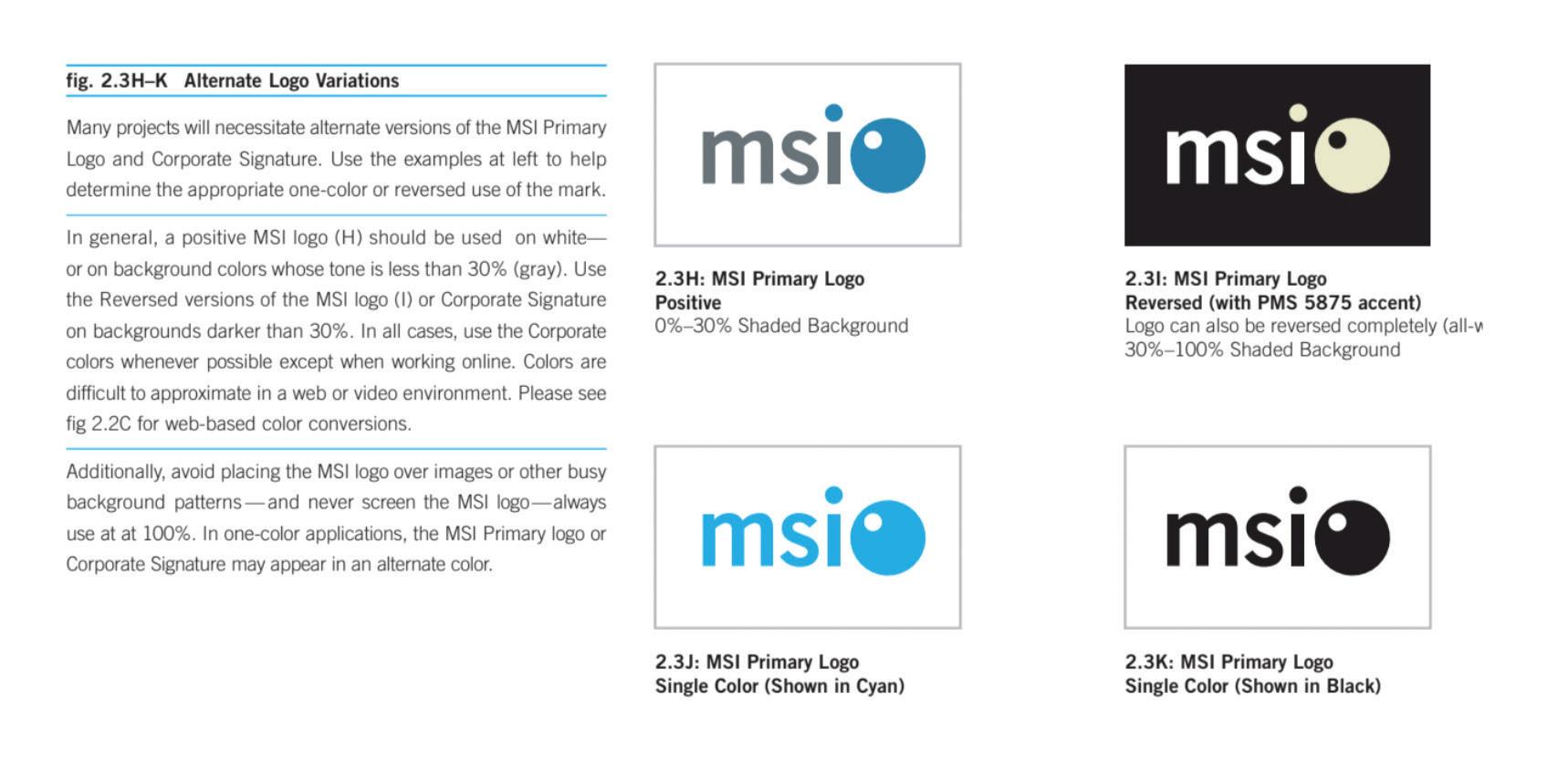
I am inspired by the technical look tot he circles and table look. Eyes are also drawn to the circles.
95 Visual Development Guide
BRANDMARK DO NOTS
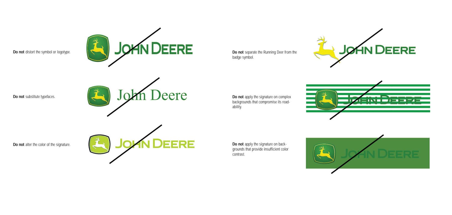
What stood out to me with these two examples were the clarity that I got. Each example shows a clear visual of what not to do. Others had descriptions in writing or not many examples.
96 Tyler Cleveland // GR604 Nature of Identity
MARK ALTERNATES
These examples helped me under-stand where an alternate mark might be used. Various background require a versitile design.
97 Visual Development Guide
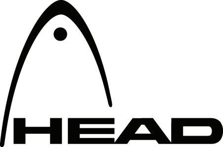
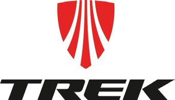
Dynamic Swoop Logos
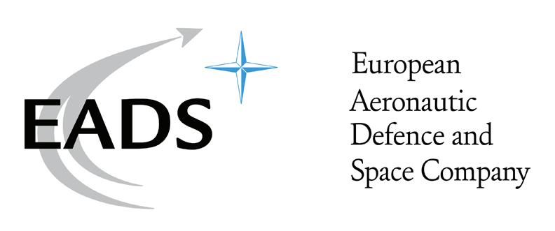
EADS is the European Aeronautic and Defense Space Company which specializes in ae4rial military defenses.
Head
Head is a leading manufacturer of tennis equipment, including tennis rackets, balls, strings, bags, and accessories. The logo symbolizes movement of a ball in an arching motionin much like the path of a moon around a planet or a ship around the moon.
Trek
TREK is a bicycle brand famous for it’s involvement in tLance Armstrong’s bike career. Their logo has dynamic swooping lines that represent the dynamic movement of a bicycle moving along the road. My logo design is similar in the way the line is used to create movement and depth.
98 Tyler Cleveland // GR604 Nature of Identity
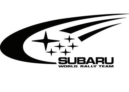
Subaru is an automobile manufacturer. The logo represents the stars. Specifically they chose a four corner star much like the form I have chosen in my designs.
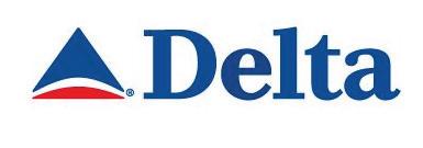
Delta is an airline. The logo has a triangular shape that resembles an aircraft and a red semi-circle shape that looks like the earth. This look can be seen in my designs. It differs by making the triangle the focus versus the earth form.
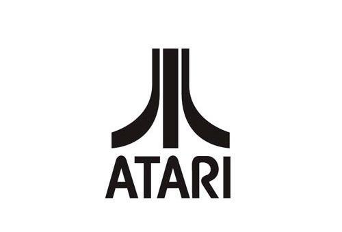
Atari is an iconic video game brand. Their logo is the shape of an A but stylized in a way that makes a dynamic motion upward.
99 Visual Development Guide
Subaru
Delta
Atari
Circular Swoop Logos
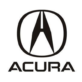
Acura is an automobile manufacturing brand. The logo is a stylized “A” in a modern technological style.This is similar due to the triangular form within a circular form.
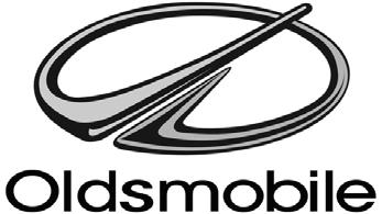
Oldsmobile
Oldmobile is an automobile brand. The logo is a circular form with a dynamic path leading to the top of the circle.
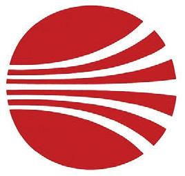
Continental Airlines
Continental Airlines is an airline brand. The logo references a dynamic path within a circle. However, this shows horizontal movement whereas my design is diagonal.
100 Tyler Cleveland // GR604 Nature of Identity
Acura
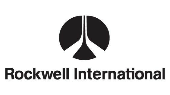
Rockwell International
Rockwell is an airline brand. The lines are dynamic and may sugegsest the motion of a plane taking off into the distance . My design also uses line to show the movement of the aircraft off into the distance.
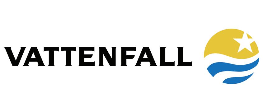
Vattenfall
Vattenfall is an electrcity company. The logo uses all the same elements as my design, hoewever, they symbolize different objects like water and sunlight to represent sustainable energy.
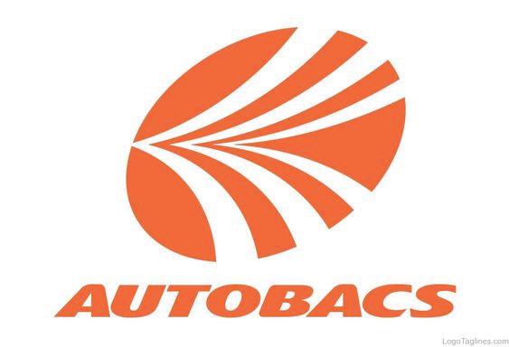
Autobacs
Autobacs is an auto retail company. The logo uses lines as a dynamic element and a circle to make the logo unified.
101 Visual Development Guide
