
INSTRUCTOR’S SOLUTIONS MANUAL
KEVIN BODDEN RANDY GALLAHER
Lewis and Clark Community College Lewis and Clark Community College
S T ATISTICS :
I NFORMED D ECISIONS
U SING D ATA
SEVENTH EDITION
Michael Sullivan, III
Joliet Junior College and Florida SouthWestern State College

Copyright © 2025, 2021, 2017 by Pearson Education, Inc. or its affiliates. All Rights Reserved. Manufactured in the United States of America. This publication is protected by copyright, and permission should be obtained from the publisher prior to any prohibited reproduction, storage in a retrieval system, or transmission in any form or by any means, electronic, mechanical, photocopying, recording, or otherwise. For information regarding permissions, request forms, and the appropriate contacts within the Pearson Education Global Rights and Permissions department, please visit www.pearsoned.com/permissions/
PEARSON and MYLAB are exclusive trademarks owned by Pearson Education, Inc. or its affiliates in the U.S. and/or other countries.
Unless otherwise indicated herein, any third-party trademarks, logos, or icons that may appear in this work are the property of their respective owners, and any references to third-party trademarks, logos, icons, or other trade dress are for demonstrative or descriptive purposes only. Such references are not intended to imply any sponsorship, endorsement, authorization, or promotion of Pearson’s products by the owners of such marks, or any relationship between the owner and Pearson Education, Inc., or its affiliates, authors, licensees, or distributors
4.1
Chapter 5 Probability
5.5
5.6
5.7
Chapter 6 Discrete Probability Distributions
6.1
6.2
6.3
6.4
Chapter
Chapter
9.1
Chapter 13 Comparing Three or More Means
Chapter 14 Inference on the Least-Squares Regression Model and Multiple Regression
14.1 Testing the Significance of the Least-squares Regression Model
14.1A Using Randomization Techniques on the Slope of the Least-squares Regression
14.1B Testing the Significance of the Least-squares Regression Model
Chapter 15 Nonparametric
15.6
Preface
This solutions manual accompanies Statistics: Informed Decisions Using Data, 7e by Michael Sullivan, III. The Instructor’s Solutions Manual contains detailed solutions to all exercises in the text as well as the Consumer Reports® projects and the case studies. The Student’s Solutions Manual contains detailed solutions to all odd exercises in the text and all solutions to chapter reviews and tests. A concerted effort has been made to make this manual as user-friendly and error free as possible.
Chapter 1
Data Collection
Section 1.1
1. (a) III. Statistics is the science of collecting, organizing, summarizing, and analyzing information in order to draw conclusions and answer questions. It is also about providing a measure of confidence in any conclusions.
(b) VIII. The population is the entire group of individuals to be studied.
(c) IV. A sample is a subset of the group of individuals that is being studied.
(d) VII. A parameter is a numerical summary of a population.
(e) I. A statistic is the numerical summary of a sample.
(f) VI. An individual is a person or object that is a member of the group being studied.
(g) II. Descriptive statistics involves organizing and summarizing data through tables, graphs, and numerical summaries.
(h) V. Inferential statistics uses methods that take results from a sample and extends them to the population, and measures the reliability of the result.
2. (a) V. A discrete variable has either a finite number of possible values or countable number of possible values. The values of these variables typically result from counting.
(b) IV. Data are information that describe characteristics of an individual.
(c) VI. A continuous variable has an infinite number of possible values that are not countable. The values of these variables typically result from measurement.
(d) II. A qualitative variable allows for classification of individuals based on some attribute or characteristic.
(e) I. A quantitative variable provides numerical measures of individuals. The measures can be added or subtracted, and provide meaningful results.
(f) III. A variable is the characteristics of the individuals within the population.
3. 24% is a parameter because it describes a population (all of the governors).
4. 72% is a parameter because it describes a population (the entire class).
5. 32% is a statistic because it describes a sample (the high school students surveyed).
6. 13.3% is a statistic because it describes a sample (the 12th graders surveyed).
7. 0.366 is a parameter because it describes a population (all of Ty Cobb’s at-bats).
8. 43.92 hours is a parameter because it describes a population (all the astronauts who have walked on the moon).
9. 23% is a statistic because it describes a sample (the 6076 adults studied).
10. 44% is a statistic because it describes a sample (the 100 adults interviewed).
11. Qualitative 12. Quantitative
13. Quantitative 14. Qualitative
15. Quantitative 16. Quantitative
17. Qualitative 18. Qualitative
19. Discrete 20. Continuous
21. Continuous 22. Discrete
23. Continuous 24. Continuous
25. Discrete 26. Continuous
27. Nominal 28. Ordinal
29. Ratio 30. Interval
31. Ordinal 32. Nominal
33. Ratio 34. Interval
35. The population consists of all teenagers 13 to 17 years old who live in the United States. The sample consists of the 1028 teenagers 13 to 17 years old who were contacted by the Gallup Organization.
36. The population consists of all bottles of CocaCola filled by that particular machine on October 15. The sample consists of the 50 bottles of Coca-Cola that were selected by the quality control manager.
37. The population consists of all of the soybean plants in this farmer’s crop. The sample consists of the 100 soybean plants that were selected by the farmer.
38. The population consists of all households within the United States. The sample consists of the 50,000 households that are surveyed by the U.S. Census Bureau.
39. The population consists of all women 27 to 44 years of age with hypertension. The sample consists of the 7373 women 27 to 44 years of age with hypertension who were included in the study.
40. The population consists of all full-time students enrolled at this community college. The sample consists of the 128 full-time students who were surveyed by the administration.
41. Individuals: Alabama, Colorado, Indiana, North Carolina, Wisconsin.
Variables: Minimum age for driver’s license (unrestricted); mandatory belt use seating positions, maximum allowable speed limit (rural interstate).
Data for minimum age for driver’s license: 17, 17, 18, 16, 18;
Data for mandatory belt use seating positions: all, front, all, all, all;
Data for maximum allowable speed limit (rural interstate) 2011: 70, 75, 70, 70, 70 (mph.)
The variable minimum age for driver’s license is continuous; the variable mandatory belt use seating positions is qualitative; the variable maximum allowable speed limit (rural interstate) is continuous (although only discrete values are typically chosen for speed limits.)
42. Individuals: 3 Series, 4 Series, 5 Series, 7 Series, X3, Z4
Variables: Body Style, Weight (lb), Number of Seats
Data for body style: Sedan, Coupe, Sedan, Sedan, Sport utility, Roadster Coupe; Data for weight: 3489, 3574, 3790, 4244, 4034, 3287 (lb);
Data for number of seats: 4, 4, 5, 5, 5, 2. The variable body style is qualitative; the variable weight is continuous; the variable number of seats is discrete.
43. (a) The research objective is to determine if adolescents who smoke have a lower IQ than nonsmokers.
(b) The population is all adolescents aged 18–21. The sample consisted of 20,211 18-year-old male Israeli military recruits.
(c) Descriptive statistics: The average IQ of the smokers was 94, and the average IQ of nonsmokers was 101.
(d) The conclusion is that individuals with a lower IQ are more likely to choose to smoke.
44. (a) The research objective is to determine if the application of duct tape is as effective as cryotherapy in the treatment of common warts.
(b) The population is all people with warts. The sample consisted of 51 patients with warts.
(c) Descriptive statistics: 85% of patients in group 1 and 60% of patients in group 2 had complete resolution of their warts.
(d) The conclusion is that duct tape is significantly more effective in treating warts than cryotherapy.
45. (a) The research objective is to determine the proportion of adult Americans who believe the federal government wastes 51 cents or more of every dollar.
(b) The population is all adult Americans aged 18 years or older.
(c) The sample is the 1017 American adults aged 18 years or older that were surveyed.
(d) Descriptive statistics: Of the 1017 individuals surveyed, 35% indicated that 51 cents or more is wasted.
(e) Gallup is 95% confident that the percentage of all adult Americans who believe the federal government wastes 51 cents or more of every dollar received is between 31% and 39%.
46. (a) The research objective is to determine what proportion of adults, aged 18 and over, believe it would be a bad idea to invest $1000 in the stock market.
(b) The population is all adults aged 18 and over living in the United States.
(c) The sample is the 1018 adults aged 18 and over living in the United States who completed the survey.
(d) Descriptive statistics: Of the 1018 adults surveyed, 46% believe it would be a bad idea to invest $1000 in the stock market.
(e) Gallup is 95% confident that the proportion of adults aged 18 or older living in the United States who believe investing $1000 in the stock market is a bad idea is between 42% and 50%.
47. (a) State is a qualitative variable because it is an individual categorization.
(b) F scale is a qualitative variable because each tornado is rated according to a category.
(c) Fatalities is a quantitative variable because it is a numerical measure. It is a discrete variable because it is countable.
(d) Length is a quantitative variable because it is a numerical measure. It is a continuous variable because it results from measurement.
48. (a) State is a variable measured at the nominal level because values of the variable name, label, or categorize. In addition, the naming scheme does not allow for the values of the variable to be arranged in a ranked or specific order.
(b) F scale is a variable measured at the ordinal level because the naming scheme allows for the values of the variable to be arranged in a ranked or specific order.
(c) Fatalities is a variable measured at the ratio level because the ratio of two values makes sense and a value of zero has meaning.
(d) Length is a variable measured at the ratio level because the ratio of two values makes sense and a value of zero has meaning.
49. (a) Age is a quantitative variable because it is a numerical measure. It is a continuous variable because it results from measurement (time since birth).
(b) Day is a qualitative variable because each day of the week is a category.
(c) BMI is a quantitative variable because it is a numerical measure. It is a continuous variable because it results from measurement.
(d) Education is a qualitative variable because it categorizes based on level of schooling.
50. (a) Age is a variable measured at the ratio level because the ratio of two values makes sense and a value of zero has meaning.
(b) Day is a variable measured at the nominal level because values of the variable name, label, or categorize. In addition, the naming scheme does not allow for the values of the variable to be arranged in a ranked or specific order since the first day of the week is not clearly defined.
(c) Energy is a variable measured at the ratio level because the ratio of two values makes sense and a value of zero has meaning.
(d) Education is measured at the ordinal level because level of schooling can be placed in rank order.
51. Jersey number is nominal (the numbers generally indicate a type of position played). However, if the researcher feels that lower caliber players received higher numbers, then jersey number would be ordinal since players could be ranked by their number.
52. (a) Nominal; the ticket number is categorized as a winner or a loser.
(b) Ordinal; the ticket number gives an indication as to the order of arrival of guests.
(c) Ratio; the implication is that the ticket number gives an indication of the number of people attending the party.
53. (a) The research question is to determine if the season of birth affects mood later in life.
(b) The sample consisted of the 400 people the researchers studied.
(c) The season in which you were born (winter, spring, summer, or fall) is a qualitative variable.
(d) According to the article, individuals born in the summer are characterized by rapid, frequent swings between sad and cheerful moods, while those born in the winter are less likely to be irritable.
(e) The conclusion was that the season at birth plays a role in one’s temperament.
54. The population is the group to be studied as defined by the research objective. A sample is any subset of the population.
55. Quantitative variables are numerical counts or measures such that meaningful arithmetic operations can be performed on the values of the variable. Qualitative variables describe an attribute or characteristic of the individual that allows researchers to categorize the individual.
A discrete variable is a quantitative variable that has a finite or countable number of possible values. A continuous variable is a quantitative variable that has an infinite number of possible values that are not countable. A continuous variable may take on every possible value between any two values.
56. The four levels of measurement of a variable are nominal, ordinal, interval, and ratio.
A variable is at the nominal level of measurement if the values of the variable provide a naming scheme in which the values of the variable cannot be ranked or put in a specific order.
A variable is at the ordinal level of measurement if it has the characteristics of the nominal level of measurement and the naming scheme allows the values of the variable to be ranked or placed in a specific order.
A variable is at the interval level of measurement if it has the properties of the ordinal level of measurement and the difference in the values of the variable has meaning. A value of zero does not mean the absence of the quantity. Arithmetic operations
such as addition and subtraction can be performed on the values of the variable.
A variable at the ratio level of measurement has the properties of the interval level, and the ratio of the values of the variable has meaning. A value of zero at the ratio level means the absence of the quantity. Arithmetic operations such as multiplication and division can be performed on the values of the variable.
Examples: Nominal—brand of clothing; Ordinal—size of a car (small, mid-size, large); Interval—temperature (in degrees Celsius); Ratio—number of students in a class (Examples will vary.)
57. We say data vary, because when we draw a random sample from a population, we do not know which individuals will be included. If we were to take another random sample, we would have different individuals and therefore different data. This variability affects the results of a statistical analysis because the results would differ if a study is repeated.
58. The process of statistics is to (1) identify the research objective, which means to determine what should be studied and what we hope to learn; (2) collect the data needed to answer the research question(s), which is typically done by taking a random sample from a population; (3) describe the data, which is done by presenting descriptive statistics; and (4) perform inference in which the results are generalized to a larger population.
59. Age, measured as time alive, is a continuous random variable. A random variable can be discrete by allowing, for example, only whole numbers to be recorded. If age is measured as the number of birthdays celebrated, then the variable could be considered a discrete random variable.
Section 1.2
1. The response variable is the variable of interest in a research study. An explanatory variable is a variable that affects (or explains) the value of the response variable. In research, we want to see how changes in the value of the explanatory variable affect the value of the response variable.
2. (a) III. A designed experiment is when a researcher randomly assigns the individuals in a study to groups, intentionally manipulates the value of an explanatory variable, controls other explanatory variables at fixed values, and then records the value of the response variable for each individual.
(b) V. An observational study is when a researcher measures the value of the response variable without attempting to influence the value of either the response or explanatory variables. That is, the researcher only observes the behavior of individuals in the study and records the values of the explanatory and response variables.
(c) IV. A lurking variable is an explanatory variable that was not considered in a study, but that affects the value of the response variable in the study. In addition, this variable is typically related to other explanatory variables in the study.
(d) I. Confounding occurs when the effects of two or more explanatory variables are not separated. Therefore, any relation that may exist between an explanatory variable and the response variable may be due to some other variable not accounted for in the study.
(e) II. A confounding variable is an explanatory variable that was considered in a study whose effect cannot be distinguished from a second explanatory variable in the study.
3. (a) II. A cohort study follows a group of individuals over a long period of time. Characteristics of the individuals are recorded and some individuals will be exposed to certain factors (not intentionally) and others will not. Because the data are collected over time, cohort studies are prospective.
(b) III. A cross-sectional study collects information about individuals at a specific point in time, or over a short period of time.
(c) I. A case-control study is retrospective, meaning it requires the researcher to look at existing records, or the subject to recall information from the past. Individuals who have certain characteristics are matched with those who don’t.
4. An observational study uses data obtained by studying individuals in a sample without trying to manipulate or influence the variable(s) of interest. In a designed experiment, a treatment is applied to the individuals in a sample in order to isolate the effects of the treatment on a response variable. Only an experiment can establish causation between an explanatory variable and a response variable. Observational studies can indicate a relationship, but cannot establish causation.
5. The choice between an observational study and an experiment depends on the circumstances involved. Sometimes there are ethical reasons why an experiment cannot be conducted. Other times the researcher may conduct an observational study first to validate a belief prior to investing a large amount of time and money into a designed experiment. A designed experiment is preferred if ethics, time, and money are not an issue.
6. A cohort study identifies the individuals to participate and then follows them over a period of time. During this period, information about the individuals is gathered, but there is no attempt to influence the individuals. Cohort studies are superior to case-control studies because cohort studies do not require recall to obtain the data.
7. There is a perceived benefit to obtaining a flu shot, so there are ethical issues in intentionally denying certain seniors access to the treatment.
8. A retrospective study looks at data from the past either through recall or existing records. A prospective study gathers data over time by following the individuals in the study and recording data as they occur.
9. This is an observational study because the researchers merely observed existing data. There was no attempt by the researchers to manipulate or influence the variable(s) of interest.
10. This is an experiment because the researchers intentionally changed the value of the explanatory variable (medication dose) to observe a potential effect on the response variable (cancer growth).
11. This is an experiment because the explanatory variable (teaching method) was intentionally varied to see how it affected the response variable (score on achievement test).
12. This is an observational study because no attempt was made to influence the variable of interest. Presence or absence of hair and heart disease were merely observed.
13. This is an observational study because the survey only observed preference of Coke or Pepsi. No attempt was made to manipulate or influence the variable of interest.
14. This is an experiment because the researcher intentionally imposed treatments on individuals in a controlled setting.
15. This is an experiment because the explanatory variable (carpal tunnel treatment regimen) was intentionally manipulated in order to observe potential effects on the response variable (level of pain).
16. This is an observational study because the conservation agents merely observed the fish to determine which were carrying parasites. No attempt was made to manipulate or influence any variable of interest.
17. (a) This is a cohort study because the researchers observed a group of people over a period of time.
(b) The response variable is whether the individual has heart disease or not. The explanatory variable is whether the individual is happy or not.
(c) There may be confounding due to lurking variables. For example, happy people may be more likely to exercise, which could affect whether they will have heart disease or not.
18. (a) This is a cross-sectional study because the researchers collected information about the individuals at a specific point in time.
(b) The response variable is whether or not the woman has nonmelanoma skin cancer. The explanatory variable is the daily amount of caffeinated coffee consumed.
(c) It was necessary to account for these variables to avoid confounding with other variables.
19. (a) This is an observational study because the researchers simply administered a questionnaire to obtain their data. No attempt was made to manipulate or influence the variable(s) of interest. This is a cross-sectional study because the researchers are observing participants at a single point in time.
(b) The response variable is body mass index. The explanatory variable is whether a TV is in the bedroom or not.
(c) Answers will vary. Some lurking variables might be the amount of exercise per week and eating habits. Both of these variables can affect the body mass index of an individual.
(d) The researchers attempted to avoid confounding due to other variables by taking into account such variables as “socioeconomic status.”
(e) No. Since this was an observational study, we can only say that a television in the bedroom is associated with a higher body mass index.
20. (a) This is an observational study because the researchers merely observed the individuals included in the study. No attempt was made to manipulate or influence any variable of interest. This is a cohort study because the researchers identified the individuals to be included in the study, then followed them for a period of time (4 years).
(b) The response variable is whether or not the individual developed Alzheimer’s. The explanatory variable is whether or not there was engagement in social activities and computer use at least once weekly.
(c) Answers will vary. Some potential lurking variables are diet, exercise routine, overall health, and contact with family.
(d) No. Since this is an observational study, we can only say that participating in social activities and computer use is associated with decreased Alzheimer’s risk.
21. (a) This is a cross-sectional study because information was collected at a specific point in time (or over a very short period of time).
(b) The explanatory variable is delivery scenario (caseload midwifery, standard hospital care, or private obstetric care).
(c) The two response variables are (1) cost of delivery, which is quantitative, and (2) method of delivery (vaginal or not), which is qualitative.
22. (a) The explanatory variable is web page design; qualitative
(b) The response variables are time on site and amount spent. Both are quantitative.
(c) Answers will vary. A confounding variable might be location. Any differences in spending may be due to location rather than to web page design.
23. (a) The explanatory variable is grades. The response variable is income.
(b) Grade point average is a quantitative variable because it is a numerical measure and meaningful arithmetic operations can be performed on the values of the variable.
(c) The response variable in the first situation would be qualitative because it would be a categorization.
The response variable as annual income would be quantitative because income is a numerical measure and meaningful arithmetic operations can be performed on the values of the variable.
(d) Answers will vary. A stronger work ethic could include studying more, which could lead to higher grades, and that same work ethic could lead to promotions or raises, which could result in higher income.
24. Answers will vary. This is a prospective, cohort observational study. The response variable is whether the worker had cancer or not, and the explanatory variable is the amount of electromagnetic field exposure. Some possible lurking variables include eating habits, exercise habits, and other health-related variables such as smoking habits. Genetics (family history) could also be a lurking variable. This was an observational study, and not an experiment, so the study only concludes that high electromagnetic field exposure is associated with higher cancer rates. The author reminds us that this is an observational study, so there is no direct
control over the variables that may affect cancer rates. He also points out that while we should not simply dismiss such reports, we should consider the results in conjunction with results from future studies. The author concludes by mentioning known ways (based on extensive study) of reducing cancer risks that can currently be done in our lives.
25. (a) This is a cohort study because a group of individuals was identified to participate in the study, and then they were observed over a long period of time.
(b) Because there is a link established between higher levels of BMI (obesity) and cell phone use, and a link between higher levels of BMI and negative health outcomes, if it is determined that cellphone users are experiencing higher incidence rates of negative health outcomes, it cannot be established that the factor leading to the negative health outcome is due to the cell phone—it may be due to the lurking variable body mass index.
26. Because individuals in the early 1900s were pressured to become right-handed, we would see a lower proportion of left-handers who are older in the study. This would make it seem as though left-handers die younger because the older individuals in the study are primarily right-handed.
27. (a) The research objective is to determine whether lung cancer is associated with exposure to tobacco smoke within the household.
(b) This is a case-controlled study because there is a group of individuals with a certain characteristic (lung cancer but never smoked) being compared to a similar group without the characteristic (no lung cancer and never smoked). The study is retrospective because lifetime residential histories were compiled and analyzed.
(c) The response variable is whether or not the individual has lung cancer. This is a qualitative variable.
(d) The explanatory variable is the number of “smoker years.” This is a quantitative variable.
Copyright © 2025 Pearson Education, Inc.
(e) Answers will vary. Some possible lurking variables are household income, exercise routine, and exposure to tobacco smoke outside the home.
(f) The conclusion of the study is that approximately 17% of lung cancer cases among nonsmokers can be attributed to high levels of exposure to tobacco smoke during childhood and adolescence. No, we cannot say that exposure to household tobacco smoke causes lung cancer since this is only an observational study. We can, however, conclude that lung cancer is associated with exposure to tobacco smoke in the home.
(g) An experiment involving human subjects is not possible for ethical reasons. Researchers would be able to conduct an experiment using laboratory animals, such as rats.
28. Web scraping can be used to extract data from tables on web pages and then upload the data to a file. Web scraping can also be used to create a data set of words from an online article (that is, fetching unstructured information and transforming it into a structured format through something called parsing and reformatting processes). In addition, web scraping can be used to dynamically call information from websites with links.
29. Answers will vary. Discussions may include the responsibility of host sites to protect private information; the ethics behind using information collected from a site to harm a competitor; the ethics behind putting stress on a host’s servers so that the website slows down; the role of social media to scrape its site for “fake news.”
Section 1.3
1. The frame is a list of all the individuals in the population.
2. A simple random sample is a sample drawn from a population such that every possible sample of size n has an equally likely chance of occurring.
3. Sampling without replacement means that no individual may be selected more than once as a member of the sample.
4. Random sampling is a technique that uses chance to select individuals from a population to be in a sample. It is used because it
maximizes the likelihood that the individuals in the sample are representative of the individuals in the population. In convenience sampling, the individuals in the sample are selected in the quickest and easiest way possible (e.g. the first 20 people to enter a store). Convenience samples likely do not represent the population of interest because chance was not used to select the individuals.
5. Answers will vary. We will use one-digit labels and assign the labels across each row (i.e. Pride and Prejudice – 0, The Scarlet Letter – 1, etc.). In Table I of Appendix A, starting at row 5, column 11, and proceeding downward, we obtain the following labels: 8, 4, 3
In this case, the 3 books in the sample would be As I Lay Dying, The Jungle, and Crime and Punishment. Different labeling order, different starting points in Table I in Appendix A, or use of technology will likely yield different samples.
6. Answers will vary. We will use one-digit labels and assign the labels in the order the names are listed (Mady – 0, Breanne – 1, etc.). In Table I of Appendix A, starting at row 9, column 21, and then proceeding downward, we obtain the following labels: 1, 8 In this case, the two captains would be Breanne and Payton. Different labeling order, different starting points in Table I in Appendix A, or use of technology will likely yield different results.
7. (a) {616, 630}, {616, 631}, {616, 632}, {616, 645}, {616, 649}, {616, 650}, {630, 631}, {630, 632}, {630, 645}, {630, 649}, {630, 650}, {631, 632}, {631, 645}, {631, 649}, {631, 650}, {632, 645}, {632, 649}, {632, 650}, {645, 649}, {645, 650}, {649, 650}
(b) There is a 1 in 21 chance that the pair of courses will be EPR 630 and EPR 645.
8. (a) {1, 2}, {1, 3}, {1, 4}, {1, 5}, {1, 6}, {1, 7}, {2, 3}, {2, 4}, {2, 5}, {2, 6}, {2, 7}, {3, 4}, {3, 5}, {3, 6}, {3, 7}, {4, 5}, {4, 6}, {4, 7}, {5, 6}, {5, 7}, {6, 7}
(b) There is a 1 in 21 chance that the pair Tamela and Demetrius will be selected.
Copyright © 2025 Pearson Education, Inc.
9. (a) Starting at row 5, column 22, using twodigit numbers, and proceeding downward, we obtain the following values: 83, 94, 67, 84, 38, 22, 96, 24, 36, 36, 58, 34,.... We must disregard 94 and 96 because there are only 87 faculty members in the population. We must also disregard the second 36 because we are sampling without replacement. Thus, the 9 faculty members included in the sample are those numbered 83, 67, 84, 38, 22, 24, 36, 58, and 34.
(b) Answers will vary depending on the type of technology used. If using a TI-84 Plus CE, the sample will be: 04, 20, 52, 05, 24, 87, 67, 86, and 39.
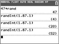

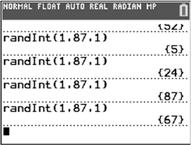
Note: We must disregard the second 20 because we are sampling without replacement.
10. (a) Starting at row 11, column 32, using fourdigit numbers, and proceeding downward, we obtain the following values: 2869, 5518, 6635, 2182, 8906, 0603, 2654, 2686, 0135, 7783, 4080, 6621, 3774, 7887, 0826, 0916, 3188, 0876, 5418, 0037, 3130, 2882, 0662,…. We must disregard 8906, 7783, and 7887 because there are only 7656 students in the population. Thus, the 20 students included in the sample are those numbered 2869, 5518, 6635, 2182, 0603, 2654, 2686, 0135, 4080, 6621, 3774, 0826, 0916, 3188, 0876, 5418, 0037, 3130, 2882, and 0662.
(b) Answers will vary depending on the type of technology used. Using a TI-84 Plus CE, the sample will be: 6658, 4118, 0009, 4828, 3905, 0454, 2825, 2381, 0495, 4445, 4455, 5759, 5397, 7066, 3404, 6667, 5074, 3777, 3206, 5216.


Note here that we sampled five labels at a time for efficiency.
11. (a) Answers will vary depending on the technology used (including a table of random digits). Using a TI-84 Plus CE graphing calculator with a seed of 17 and the labels provided, our sample would be North Dakota, Nevada, Tennessee, Wisconsin, Minnesota, Maine, New Hampshire, Florida, Missouri, and Mississippi. (From labels 34, 28, 42, 49, 23, 19, 29, 09, 25, and 23 – ignoring the second 34.)
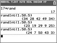
(b) Repeating part (a) with a seed of 18, our sample would be Michigan, Massachusetts, Arizona, Minnesota, Maine, Nebraska, Georgia, Iowa, Rhode Island, and Indiana.
12. (a) Answers will vary depending on the technology used (including a table of random digits). Using a TI-84 Plus CE graphing calculator with a seed of 2023 and the labels provided, our sample would be Fillmore, B. Harrison, Clinton, Taylor, W.H. Harrison, Nixon, Trump, and J.Q. Adams.

(b) Repeating part (a) with a seed of 2024, our sample would be Washington, Lincoln, J.Q. Adams, Eisenhower, Reagan, G.H. Bush, Jefferson, and Kennedy.
13. (a) The list provided by the administration serves as the frame. Number each student in the list of registered students, from 1 to 19,935 using 5-digit labels. Generate 25 random numbers, without repetition, between 1 and 19,935 using a random number generator or table. Select the 25 students with these numbers.
(b) Answers will vary.
14. (a) The list provided by the mayor serves as the frame. Number each resident in the list supplied by the mayor, from 1 to 5832 using 4-digit labels. Generate 20 random numbers, without repetition, between 1 and 5832 using a random number generator or table. Select the 20 residents with these numbers.
(b) Answers will vary.
15. Answers will vary. Members should be numbered 01–32, though other numbering schemes are possible (e.g. 00–31) using 2digit labels. Using a table of random digits or a random-number generator, four different numbers (labels) should be selected. The names corresponding to these numbers form the sample.
16. Answers will vary. Employees should be numbered 01–29, though other numbering schemes are possible (e.g. 00–28) using 2digit labels. Using a table of random digits or a random-number generator, five different numbers (labels) should be selected. The names corresponding to these numbers form the sample.
17. Answers will vary. The list provided serves as the frame. Number each high school in the list, from 001 to 180 using 3-digit labels. Generate 8 random numbers, without repetition, between 001 and 180 using a random number generator or table. Survey all the students at the 8 selected high schools.
Section 1.4
1. Stratified random sampling may be appropriate if the population of interest can be divided into groups (or strata) that are homogeneous and nonoverlapping.
2. Systematic sampling does not require a frame.
3. Convenience samples are typically selected in a nonrandom manner. This means the results are not likely to represent the population.
Convenience samples may also be selfselected, which will frequently result in small portions of the population being overrepresented.
4. cluster
5. stratified
6. False. In a systematic random sample, every kth individual is selected from the population.
7. False. In many cases, other sampling techniques may provide equivalent or more information about the population with less “cost” than simple random sampling.
8. True. When the clusters are heterogeneous, the heterogeneity of each cluster likely resembles the heterogeneity of the population. In such cases, fewer clusters with more individuals from each cluster are preferred.
9. True. Because the individuals in a convenience sample are not selected using chance, it is likely that the sample is not representative of the population.
10. False. With stratified samples, the number of individuals sampled from each strata should be proportional to the size of the strata in the population.
11. Systematic sampling. The quality-control manager is sampling every 8th chip, starting with the 3rd chip.
12. Cluster sampling. The commission tests all members of the selected teams (clusters).
13. Cluster sampling. The airline surveys all passengers on selected flights (clusters).
14. Stratified sampling. The congresswoman samples some individuals from each of three different income brackets (strata).
15. Simple random sampling. Each known user of the product has the same chance of being included in the sample.
16. Convenience sampling. The radio station is relying on voluntary response to obtain the sample data.
17. Cluster sampling. The farmer samples all trees within the selected subsections (clusters).
18. Stratified sampling. The school official takes a sample of students from each of the five classes (strata).
19. Convenience sampling. The research firm is relying on voluntary response to obtain the sample data.
20. Systematic sampling. The presider is sampling every 5th person attending the lecture, starting with the 3rd person.
21. Stratified sampling. Shawn takes a sample of measurements during each of the four time intervals (strata).
22. Simple random sampling. Each club member has the same chance of being selected for the survey.
23. The numbers corresponding to the 20 clients selected are 16, 162541 +=, 412566 +=, 662591 +=, 9125116 +=, 141, 166, 191, 216, 241, 266, 291, 316, 341, 366, 391, 416, 441, 466, 491.
24. Since the number of clusters is more than 100, but less than 1000, we assign each cluster a three-digit label between 001 and 795. Starting at row 8, column 38 in Table I of Appendix A, and proceeding downward, the 10 clusters selected are numbered 763, 185, 377, 304, 626, 392, 315, 084, 565, and 508. Note that we discard 822 and 955 in reading the table because we have no clusters with these labels. We also discard the second occurrence of 377 because we cannot select the same cluster twice.
25. Answers will vary. To obtain the sample, number the Democrats 01 to 16 and obtain a simple random sample of size 2. Then number the Republicans 01 to 16 and obtain a simple random sample of size 2. Be sure to use a different starting point in Table I or a different seed for each stratum.
For example, using a TI-84 Plus CE graphing calculator with a seed of 38 for the Democrats and 40 for the Republicans, the numbers selected would be 06, 09 for the Democrats and 14, 04 for the Republicans. If we had numbered the individuals down each column, the sample would consist of Haydra, Motola, Thompson, and Engler.

26. Answers will vary. To obtain the sample, number the managers 1 to 8 and obtain a simple random sample of size 2. Then number the employees 01 to 21 and obtain a simple random sample of size 4. Be sure to use a different starting point in Table I or a different seed for each stratum.
For example, using a TI-84 Plus CE graphing calculator with a seed of 18 for the managers and 20 for the employees, the numbers selected would be 4, 1 for the managers and 20, 03, 11, 09 for the employees. If we had numbered the individuals down each column, the sample would consist of Lindsey, Carlisle, Weber, Bryant, Hall, and Gow.


27. (a) 4502 90.0490 50 N n ; Thus, 90 k = .
(b) Randomly select a number between 1 and 90. Suppose that we select 15. Then the individuals to be surveyed will be the 15th, 105th, 195th, 285th, and so on up to the 4425th employee on the company list.
28. (a) 945035 7269.57269 130 N n ; Thus, 7269 k =
(b) Randomly select a number between 1 and 7269. Suppose that we randomly select 2000. Then we will survey the individuals numbered 2000, 9269, 16538, and so on up to the individual numbered 939701.
29. Simple Random Sample:
Number the students from 0001 to 1280 using 4-digit labels. Use a table of random digits or a random-number generator to randomly select 128 students to survey.
Stratified Sample:
Since class sizes are similar, we would want to randomly select 128 4 32 = students from each class to be included in the sample.
Copyright © 2025 Pearson Education, Inc.
Cluster Sample:
Since classes are similar in size and makeup, we would want to randomly select 128 4 32 = classes and include all the students from those classes in the sample. Answers will vary for which is best.
30. No. The clusters were not randomly selected. This would be considered convenience sampling.
31. Answers will vary. One design would be a stratified random sample, with two strata being commuters and noncommuters, as these two groups each might be fairly homogeneous in their reactions to the proposal.
32. Answers will vary. One design would be a cluster sample, with classes as the clusters. Randomly select clusters and then survey all the students in the selected classes. However, care would need to be taken to make sure that no one was polled twice. Since this would negate some of the ease of cluster sampling, a simple random sample might be the more suitable design.
33. Answers will vary. One design would be a cluster sample, with the clusters being city blocks. Randomly select city blocks and survey every household in the selected blocks.
34. Answers will vary. One appropriate design would be a systematic sample, after doing a random start, clocking the speed of every tenth car, for example.
35. Answers will vary. Since the company already has a list (frame) of 6600 individuals with high cholesterol, a simple random sample would be an appropriate design.
36. Answers will vary. Since a list of all the households in the population exists, a simple random sample is possible. Number the households from 1 to N, then use a table of random digits or a random-number generator to select the sample.
37. (a) For a political poll, a good frame would be all registered voters who have voted in the past few elections since they are more likely to vote in upcoming elections.
(b) Because each individual from the frame has the same chance of being selected, there is a possibility that one group may be over- or underrepresented.
(c) By using a stratified sample, the strategist can obtain a simple random sample within each strata (political party) so that the number of individuals in the sample is proportionate to the number of individuals in the population.
38. Random sampling means that the individuals chosen to be in the sample are selected by chance. Random sampling minimizes the chance that one part of the population is overor underrepresented in the sample. However, it cannot guarantee that the sample will accurately represent the population.
39. Answers will vary.
40. Answers will vary.
Section 1.5
1. A closed question is one in which the respondent must choose from a list of prescribed responses. An open question is one in which the respondent is free to choose his or her own response. Closed questions are easier to analyze, but limit the responses. Open questions allow respondents to state exactly how they feel, but are harder to analyze due to the variety of answers and possible misinterpretation of answers.
2. A certain segment of the population is underrepresented if it is represented in the sample in a lower proportion than its size in the population.
3. (a) III. Bias occurs when the results of the sample are not representative of the population.
(b) I. Sampling bias occurs when the techniques used to select individuals for a sample favor one part of the population over another.
(c) IV. Nonresponse bias occurs when the individuals selected to be in the sample who do not respond to the survey have different opinions from those who do respond.
(d) II. Response bias occurs when the answers on a survey do not reflect the true feelings of the respondent.
4. Nonsampling error is the error that results from undercoverage, nonresponse bias, response bias, or data-entry errors. Essentially, it is the error that results from the process of obtaining and recording data. Sampling error is the error that results because a sample is being used to estimate information about a population. Any error that could also occur in a census is considered a nonsampling error.
5. (a) Sampling bias. The survey suffers from undercoverage because the first 60 customers are likely not representative of the entire customer population.
(b) Since a complete frame is not possible, systematic random sampling could be used to make the sample more representative of the customer population.
6. (a) Sampling bias. The survey suffers from undercoverage because only homes in the southwest corner have a chance to be interviewed. These homes may have different demographics than those in other parts of the village.
(b) Assuming that households within any given neighborhood have similar household incomes, stratified sampling might be appropriate, with neighborhoods as the strata.
7. (a) Response bias. The survey suffers from response bias because the question is poorly worded.
(b) The survey should inform the respondent of the current penalty for selling a gun illegally and the question should be worded as “Do you approve or disapprove of harsher penalties for individuals who sell guns illegally?” The order of “approve” and “disapprove” should be switched from one individual to the next.
8. (a) Response bias. The survey suffers from response bias because the wording of the question is ambiguous.
(b) The question might be worded more specifically as “How many hours per night do you sleep, on average?”
9. (a) Nonresponse bias. Assuming the survey is written in English, non-English speaking homes will be unable to read the survey. This is likely the reason for the very low response rate.
(b) The survey can be improved by using face-to-face or phone interviews, particularly if the interviewers are multilingual.
10. (a) Nonresponse bias
(b) The survey can be improved by using face-to-face or phone interviews, or possibly through the use of incentives.
11. (a) The survey suffers from sampling bias because the attendees of a town hall are not likely representative of the entire voting base. Possible interview error if the politician is monitoring responses.
(b) A well-designed sampling plan, such as a cluster sample, could make the sample more representative of the population.
12. (a) The survey suffers from sampling bias due to a bad sampling plan (convenience sampling) and possible response bias due to misreported heights on driver’s licenses.
(b) The teacher could use cluster sampling or stratified sampling using classes throughout the day. Each student should be measured to get a current and accurate height.
13. (a) Response bias due to a poorly worded question
(b) The question should be reworded in a more neutral manner. One possible phrasing might be “Do you believe that a marriage can be maintained after an extramarital relation?”
14. (a) Sampling bias. The frame is not necessarily representative of all college professors.
(b) To remedy this problem, the publisher could use cluster sampling and obtain a list of faculty from the human resources departments at selected colleges.
15. (a) Response bias. Students are unlikely to give honest answers if their teacher is administering the survey.
(b) An impartial party should administer the survey in order to increase the rate of truthful responses.
16. (a) Response bias. Residents are unlikely to give honest answers to uniformed police officers if their answer would be seen as negative by the police.
(b) An impartial party should administer the survey in order to increase the rate of truthful responses.
17. No. The survey still suffers from sampling bias due to undercoverage, nonresponse bias, and potentially response bias.
18. The General Social Survey uses random sampling to obtain individuals who take the survey, so the results of their survey are more likely to be representative of the population. However, it may suffer from response bias since the survey is conducted by personal interview rather than anonymously on the Internet. The online survey, while potentially obtaining more honest answers, is basically self-selected so may not be representative of the population, particularly if most respondents are clients of the family and wellness center seeking help with health or relationship problems.
19. It is very likely that the order of these two questions will affect the survey results. To alleviate the response bias, either question B could be asked first, or the order of the two questions could be rotated randomly.
20. It is very likely that the order of these two questions will affect the survey results. To alleviate the response bias, the order of the two questions could be rotated randomly. Prohibit is a strong word. People generally do not like to be prohibited from doing things. If the word must be used, it should be offset by the word “allow.” The use of the words “prohibit” and “allow” should be rotated within the question.
21. The company is using a reward in the form of the $5.00 payment and an incentive by telling the reader that their input will make a difference.
22. The two choices need to be rotated so that any response bias due to the ordering of the questions is minimized.
23. Students should look up the study on the web.
(a) We would expect to find sampling bias due to undercoverage. Individuals who choose not to register to vote may have
some characteristics that differ from those who do register.
(b) Yes. Undercoverage also would exist for RDD polls. It is likely the case that the poll is not capturing individuals in a lower socioeconomic class. RBS likely has more of this type of bias because access to cell phones is fairly prevalent today.
(c) RDD had the lower response rate at 6% versus 8% in the RBS survey. This is likely due to the fact that the RBS survey had actual phone numbers to choose from, rather than random digits.
(d) The RDD survey oversampled Republicans 53% to 37%. This could be due to socioeconomic considerations.
24. Today, many individuals no longer have a land-line phone. Therefore, this segment of the population would not be included in any surveys that utilize robocalling. This would be undercoverage. Also, the use of caller ID has likely increased nonresponse bias of phone surveys since individuals may not answer calls from numbers they do not recognize. If individuals with caller ID differ in some way from individuals without caller ID, then phone surveys could also suffer from sampling bias due to undercoverage.
25. It is extremely likely, particularly if households on the do-not-call registry have a trait that is not part of those households that are not on the registry.
26. There is a higher chance that an individual at least 70 years of age will be at home when an interviewer makes contact.
27. Answers will vary. However, the research should include the fact that exit polls tended to undersample non-college-educated whites and oversampled college-educated whites. In this election, non-college educated voters broke for Trump, while college-educated voters were carried by Clinton.
28. Answers will vary.
29. The words used in a survey question can have a significant impact on the response. Whenever you read survey results, be mindful of the way the survey question was written. In this particular situation, the words “along with its allies in Europe” had a large impact on survey results.
30. – 32. Answers will vary.
33. The Literary Digest made an incorrect prediction due to sampling bias (an incorrect frame led to undercoverage) and nonresponse bias (due to the low response rate).
34. Answers will vary. (Gallup incorrectly predicted the outcome of the 1948 election because he quit polling weeks before the election and missed a large number of changing opinions.)
35. (a) Answers will vary. Stratified sampling by political affiliation (Democrat, Republican, etc.) could be used to ensure that all affiliations are represented. One question that could be asked is whether or not the person plans to vote in the next election. This would help determine which registered voters are likely to vote.
(b) Answers will vary. Possible explanations are that presidential election cycles get more news coverage or perhaps people are more interested in voting when they can vote for a president as well as a senator. During non-presidential cycles it is very informative to poll likely registered voters.
(c) Answers will vary. A higher percentage of Democrats in polls versus turnout will lead to overstating the predicted Democrat percentage of Democratic votes.
36. It is difficult for a frame to be completely accurate since populations tend to change over time and there can be a delay in identifying individuals who have joined or left the population.
37. Nonresponse can be addressed by conducting callbacks or offering rewards.
38. Trained, skillful interviewers can illicit responses from individuals and help them give truthful responses.
39. Conducting a presurvey with open questions allows the researchers to use the most popular answers as choices on closed-question surveys.
40. Answers will vary. Phone surveys conducted in the evening may result in reaching more potential respondents; however some of these individuals could be upset by the intrusion.
41. Provided the survey was conducted properly and randomly, a high response rate will provide more representative results. When a survey has a low response rate, only those who are most willing to participate give responses. Their answers may not be representative of the whole population.
42. The order of questions on a survey should be carefully considered, so the responses are not affected by previous questions. The order of answers should be rotated since respondents may be more likely to pick earlier choices.
43. The question is ambiguous because it could be interpreted as hours per day, or hours per week, or hours for a particular class. The question could be improved by being more specific, such as, “On average, how many hours do you study each day for your statistics course?”
44. Higher response rates typically suggest that the sample represents the population well. Using rewards can help increase response rates, allowing researchers to better understand the population. There can be disadvantages to offering rewards as incentives. Some people may hurry through the survey, giving superficial answers, just to obtain the reward.
Section 1.6
1. (a) An experimental unit is a person, object, or some other well-defined item upon which a treatment is applied.
(b) A treatment is a condition applied to an experimental unit. It can be any combination of the levels of the explanatory variables.
(c) A response variable is a quantitative or qualitative variable that measures a response of interest to the experimenter.
(d) A factor is a variable whose effect on the response variable is of interest to the experimenter. Factors are also called explanatory variables.
(e) A placebo is an innocuous treatment, such as a sugar pill, administered to a subject in a manner indistinguishable from an actual treatment.
(f) Confounding occurs when the effect of two explanatory variables on a response variable cannot be distinguished.
(g) Blinding refers to nondisclosure of the treatment an experimental unit is receiving. There are two types of blinding: single blinding and double blinding.
2. Replication occurs when each treatment is applied to more than one experimental unit.
3. In a single-blind experiment, subjects do not know which treatment they are receiving. In a double-blind experiment, neither the subject nor the researcher(s) in contact with the subjects knows which treatment is received.
4. completely randomized; matched-pair
5. blocking
6. True
7. (a) The research objective of the study was to determine the association between number of times one chews food and food consumption.
(b) The response variable is food consumption; quantitative.
(c) The explanatory variable is chew level (100%, 150%, 200%); qualitative.
(d) The experimental units are the 45 individuals aged 18 to 45 who participated in the study.
(e) Control is used by determining a baseline number of chews before swallowing; same type of food is used in the baseline as in the experiment; same time of day (lunch); age (18 to 45).
(f) Randomization reduces the effect of the order in which the treatments are administered. For example, perhaps the first time through the subjects are more diligent about their chewing than the last time through the study.
8. (a) The researchers used an innocuous treatment to account for effects that would result from any treatment being given (i.e. the placebo effect). The placebo is a drug that looks and tastes like topiramate and serves as the baseline against which to compare the results when topiramate is administered.
(b) Being double-blind means that neither the subject nor the researcher in contact with the subjects knows whether the placebo or topiramate is being administered. Using a double-blind procedure is necessary to avoid any intentional or unintentional bias due to knowing which treatment is being administered.
(c) The subjects were randomly assigned to the treatment groups (either the placebo or topiramate).
(d) The population is all adults aged 18 to 65 years diagnosed with alcohol dependence. The sample is the 371 subjects aged 18 to 65 years diagnosed with alcohol dependence who participated in the 14-week trial.
(e) There are two treatments in the study: 300 mg of topiramate or a placebo daily.
(f) The response variable is the percentage of heavy drinking days.
9. (a) The response variable is the achievement test score.
(b) Answers may vary. Some factors are teaching methods, grade level, intelligence, school district, and teacher.
Fixed: grade level, school district, teacher Set at predetermined levels: teaching method
(c) The treatments are the new teaching method and the traditional method. There are 2 levels of treatment.
(d) The factors that are not controlled are dealt with by random assignment into the two treatment groups.
(e) Group 2, using the traditional teaching method, serves as the control group.
(f) This experiment has a completely randomized design.
(g) The subjects are the 500 first-grade students from District 203 recruited for the study.
(h) If students tend to perform worse in classes later in the day (due to being tired or anxious to get out of school), then time of day may be a confounding variable. Suppose group 1 is taught in the morning and group 2 is taught in the afternoon; if
group 1 scores better on the achievement test, we won’t know whether this is due to the new method of teaching, or due to time of day the course is offered. One solution would be to have a rotating schedule so classes are not always taught at the same time of day.
(i)

10. (a) The response variable is the proportion of subjects with a cold.
(b) Answers may vary. Some factors are gender, age, geographic location, overall health, and drug intervention.
Fixed: gender, age, location Set at predetermined levels: drug intervention
(c) The treatments are the experimental drug and the placebo. There are 2 levels of treatment.
(d) The factors that are not controlled are dealt with by random assignment into the two groups.
(e) This experiment has a completely randomized design.
(f) The subjects are the 300 adult males aged 25 to 29 who have the common cold.
(g)

11. (a) This experiment has a matched-pairs design.
(b) The response variable is the level of whiteness.
(c) The explanatory variable or factor is the whitening method. The treatments are Crest Whitestrips Premium in addition to brushing and flossing, and just brushing and flossing alone.
(d) Answers will vary. One other possible factor is diet. Certain foods and tobacco products are more likely to stain teeth. This could impact the level of whiteness.
(e) Answers will vary. One possibility is that using twins helps control for genetic factors such as weak teeth that may affect the results of the study.
12. (a) This experiment has a matched-pairs design.
(b) The response variable is the difference in test scores (knowledge gained score).
(c) The treatment is the mathematics course.
13. (a) This experiment has a completely randomized design.
(b) The response variable is the travel time it takes to travel 9.75 meters. It is a quantitative variable.
(c) Priming is the treatment and it is set at two levels—scrambled sentence task using words associated with old age or words not associated with old age.
(d) The subjects are the 30 undergraduate students.
(e) The undergraduates did not know to which group they were assigned, and the individual assigning the students did not know to which group the student was assigned.
(f) The conclusion was that the elderly priming condition subjects had a travel time significantly higher than that of the neutral priming condition.
14. (a) This experiment has a completely randomized design.
(b) The population being studied is adults with insomnia.
(c) The response variable is the wake time after sleep onset (WASO).
(d) The explanatory variable, or factor, is the type of intervention. The treatments are cognitive behavioral therapy (CBT), muscle relaxation training (RT), and the placebo.
Copyright © 2025 Pearson Education, Inc.
(e) The experimental units are the 75 adults with insomnia.
(f)

15. (a) This experiment has a completely randomized design.
(b) The population being studied is adults older than 60 years and in good health.
(c) The response variable is the standardized test of learning and memory.
(d) The factor set to predetermined levels (explanatory variable) is the drug. The treatments are 40 milligrams of ginkgo 3 times per day and the matching placebo.
(e) The experimental units are the 98 men and 132 women older than 60 years and in good health.
(f) The control group is the placebo group.
(g)

16. (a) This experiment has a completely randomized design.
(b) The population being studied is overweight individuals.
(c) The response variable is the volume of the stomach. This is a quantitative variable.
(d) The treatments are the 2508-kJ diet versus the regular diet.
(e) The experimental units are the 23 overweight patients.

17. (a) This experiment has a matched-pairs design.
(b) The population being studied is females with hair loss 20 to 45 years of age.
(c) The response variables are hair density and hair diameter.
(d) The treatment is the injection and it is set at two levels: platelet-rich plasma (PRP) injection or saline injection.
(e) The experimental units are the 30 female patients.
(f) Randomization was used to choose the area of the scalp that receives the treatment.
(g)

18. (a) This experiment has a matched-pairs design.
(b) The response variable is the distance the yardstick falls.
(c) The explanatory variable, or factor, is hand dominance. The treatment is dominant versus nondominant hand.
(d) The experimental units are the 15 students.
(e) Professor Neil used a coin flip to eliminate bias due to starting on the dominant or nondominant hand first on each trial.
(f)

(f)
19. (a) This experiment has a randomized block design.
(b) The response variable is the score on the recall exam.
(c) The explanatory variable, or factor, is the type of advertising. The treatments are print, radio, and television.
(d) Level of education is the variable that serves as the block.
(e)
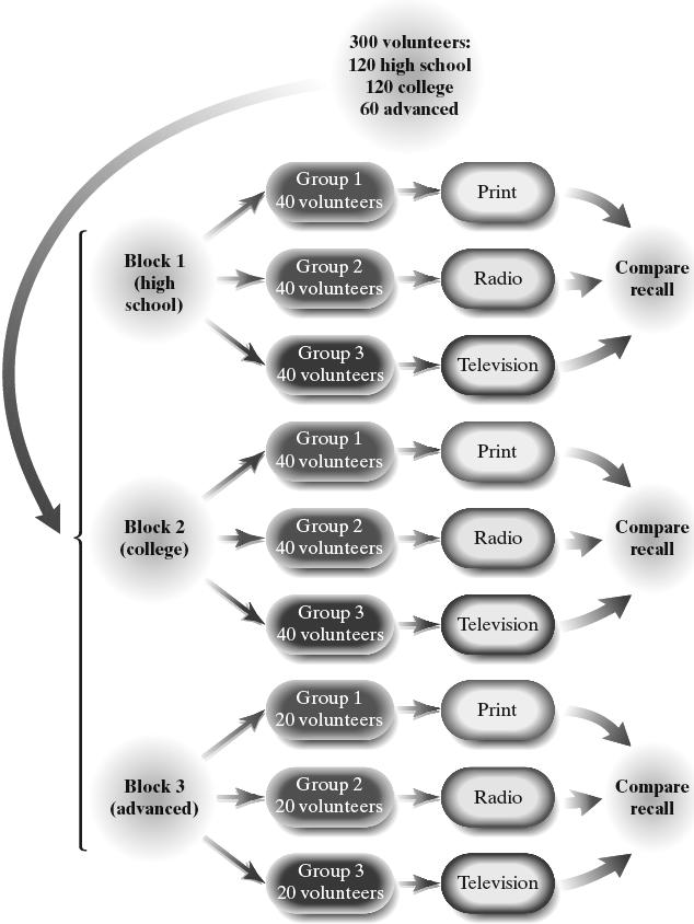
20. (a) This experiment has a randomized block design.
(b) The response variable is the total number of truancies.
(c) The explanatory variable, or factor, is the type of intervention. The treatments are no intervention, positive reinforcement, and negative reinforcement.
(d) Income is the variable that serves as the block. (e)

21. Answers will vary. Using a TI-84 Plus CE graphing calculator with a seed of 195, we would pick the volunteers numbered 8, 19, 10, 12, 13, 6, 17, 1, 4, and 7 to go into the experimental group. The rest would go into the control group. If the volunteers were numbered in the order listed, the experimental group would consist of Ann, Kevin, Kai, Jada, Rozalind, Randy, Tom, Wanda, Kim, and Colleen.
22. (a) This experiment has a completely randomized design.
(b) Answers will vary. Using a TI-84 Plus CE graphing calculator with a seed of 223, we would pick the volunteers numbered 6, 18, 13, 3, 19, 14, 8, 1, 17, and 5 to go into group 1.
23. (a) This is an observational study because there is no intent to manipulate an explanatory variable. The explanatory variable, or factor, is whether the individual is a green tea drinker or not, which is qualitative.
(b) Some lurking variables include diet, exercise, genetics, age, gender, and socioeconomic status.
(c) The experiment is a completely randomized design.
(d) To make this a double-blind experiment, we would need the placebo to look, taste, and smell like green tea. Subjects would not know which treatment is being delivered. In addition, the individuals administering the treatment and measuring the changes in LDL cholesterol would not know the treatment either.
(e) The treatment is the tea, which is set at three levels.
(f) Answers will vary. Other factors you might want to control in this experiment include age, exercise, and diet of the participants.
(g) Randomization could be used by numbering the subjects from 1 to 120. Randomly select 40 subjects and assign them to the placebo group. Then randomly select 40 from the remaining 80 subjects and assign to the one cup of green tea group. The remaining subjects will be assigned to the two cups of green tea group. By randomly assigning the subjects to the treatments, the expectation is that uncontrolled variables (such as genetic history, diet, exercise, etc.) are neutralized (even out).
(h) Exercise is a confounding variable because any change in the LDL cholesterol cannot be attributed to the tea. It may be the exercise that caused the change in LDL cholesterol.
24. (a) The research objective is to determine if alerting shoppers about the healthiness of energy-dense snack foods changes the shopping habits of individuals.
(b) The subjects were the 42 shoppers who received a flyer.
(c) Blinding is not possible because health information is visible.
(d) The explanatory variable is health information or not.
(e) The number of unhealthy snacks purchased is quantitative.
(f) The researchers would not be able to distinguish whether it was the priming or the weight status that played a role in purchase decisions.
25. Answers will vary. A completely randomized design is probably best.

26. Answers will vary. A matched-pairs design matched by car model is likely the best.

27. Answers will vary. A randomized block design blocked by type of car is likely best.

Copyright © 2025 Pearson Education, Inc.
28. Answers will vary. A randomized block design blocked by school is likely the best.

29. (a) The response variable is blood pressure.
(b) Three factors that have been identified are daily consumption of salt, daily consumption of fruits and vegetables, and the body’s ability to process salt.
(c) The daily consumption of salt and the daily consumption of fruits and vegetables can be controlled. The body’s ability to process salt cannot be controlled. To deal with variability of the body’s ability to process salt, randomize experimental units to each treatment group.
(d) Answers will vary. Three levels of treatment might be a good choice – one level below the recommended daily allowance, one equal to the recommended daily allowance, and one above the recommended daily allowance.
30. Answers will vary.
31. Answers will vary.
32. Answers will vary for the design preference.
Completely Randomized Design
The researcher would randomly assign each subject to either drink Coke or Pepsi. The response variable would be whether the subject likes the soda or not.
Preference rates would be compared at the end of the experiment. The subject would be blinded, but the researcher would not. Therefore, this would be a single-blind experiment.

Matched-Pairs Design
The researcher would randomly determine whether each subject drinks Coke first or Pepsi first. To avoid confounding, subjects should eat something bland between drinks to remove any residual taste. The response variable would be either the proportion of subjects who prefer Coke or the proportion of subjects who prefer Pepsi. This would also be a single-blind experiment since the subject would not know which drink was first but the researcher would. The matched-pairs design is likely superior.

33. Answers will vary. Control groups are needed in a designed experiment to serve as a baseline against which other treatments can be compared.
34. (a) Answers will vary.
(b) Answers will vary.
35. Answers will vary.
36. In a randomized block design, experimental units are divided into homogeneous groups called blocks before being randomly assigned to a treatment within each block. In a stratified random sample, the population is subdivided into homogeneous groups called strata before a simple random sample is drawn from each strata. The purpose of blocking is to remove any variability in the response variable that may be attributable to the block.
37. The purpose of randomization is to minimize the effect of factors whose levels cannot be controlled. (Answers will vary.) One way to assign the experimental units to the three groups is to write the numbers 1, 2, and 3 on identical pieces of paper and to draw them out of a “hat” at random for each experimental unit.
38. The six treatments are: Saturated-fat with drug, Saturated-fat with placebo, Mediterranean with drug, Mediterranean with placebo, NCEP-1 with drug, and NCEP-1 with placebo
Chapter 1 Review Exercises
1. (a) The response variable is the variable of interest in the study.
(b) A variable is a characteristic of an individual.
(c) A qualitative variable is a variable that allows for classification of individuals based on an attribute or characteristic.
(d) A quantitative variable is a variable that provides numerical measures of individuals. The values of quantitative variables can be added or subtracted and provide meaningful results.
(e) An observational study measures the value of the response variable without attempting to influence the value of the response or explanatory variables.
(f) A study is a designed experiment if a researcher randomly assigns the individuals in a study to groups, intentionally manipulates the value of an explanatory variable and controls other explanatory variables at fixed values, and then records the value of the response variable for each individual.
(g) Confounding occurs when the effects of two or more explanatory variables are not separated. Therefore, any relation that may exist between an explanatory variable and response variable may be due to some other variable or variables not accounted for in the study.
(h) A lurking variable is an explanatory variable that was not considered in the study, but that affects the value of the response variable in the study.
2. The three major types of observational studies are (1) cross-sectional studies, (2) case-control studies, and (3) cohort studies.
Cross-sectional studies collect data at a specific point in time or over a short period of time.
Cohort studies are prospective and collect data over a period of time, sometimes over a long period of time.
Case-controlled studies are retrospective, looking back in time to collect data either from historical records or from recollection by subjects in the study. Individuals possessing a certain characteristic are matched with those that do not.
3. The process of statistics refers to the approach used to collect, organize, analyze, and interpret data. The steps are to (1) identify the research objective, (2) collect the data needed to answer the research question, (3) describe the data, and (4) perform inference.
4. The three types of bias are sampling bias, nonresponse bias, and response bias.
Sampling bias occurs when the techniques used to select individuals to be in the sample favor one part of the population over another. Bias in sampling is reduced when a random process is to select the sample. Nonresponse bias occurs when the individuals selected to be in the sample that do not respond to the survey have different opinions from those that do respond. This can be minimized by using callbacks and follow-up visits to increase the response rate. Response bias occurs when the answers on a survey do not reflect the true feelings of the respondent. This can be minimized by using trained interviewers, using carefully worded questions, and rotating question and answer selections.
5. Nonsampling errors are errors that result from undercoverage, nonresponse bias, response bias, and data-entry errors. These errors can occur even in a census.
Sampling errors are errors that result from the use of a sample to estimate information about a population. These include random error and errors due to poor sampling plans, and result because samples contain incomplete information regarding a population.
6. The following are steps in conducting an experiment:
(1) Identify the problem to be solved. Give direction and indicates the variables of interest (referred to as the claim).
(2) Determine the factors that affect the response variable. List all variables that may affect the response, both controllable and uncontrollable.
(3) Determine the number of experimental units.
Determine the sample size. Use as many as time and money allow.
(4) Determine the level of each factor. Factors can be controlled by fixing their level (e.g. only using men) or setting them at predetermined levels (e.g. different dosages of a new medicine). For factors that cannot be controlled, random assignment of units to treatments helps average out the effects of the uncontrolled factor over all treatments.
(5) Conduct the experiment. Carry out the experiment using an equal number of units for each treatment. Collect and organize the data produced.
(6) Test the claim.
Analyze the collected data and draw conclusions.
7. “Number of new automobiles sold at a dealership on a given day” is quantitative because its values are numerical measures on which addition and subtraction can be performed with meaningful results. The variable is discrete because its values result from a count.
8. “Weight in carats of an uncut diamond” is quantitative because its values are numerical measures on which addition and subtraction can be performed with meaningful results. The variable is continuous because its values result from a measurement rather than a count.
9. “Brand name of a pair of running shoes” is qualitative because its values serve only to classify individuals based on a certain characteristic.
10. 73% is a statistic because it describes a sample (the 1011 people age 50 or older who were surveyed).
11. 72% is a parameter because it describes a population (all the passes completed by Stetson Bennett in the 2023 Championship Game).
12. Birth year has the interval level of measurement since differences between values have meaning, but it lacks a true zero.
13. Marital status has the nominal level of measurement since its values merely categorize individuals based on a certain characteristic.
14. Stock rating has the ordinal level of measurement because its values can be placed in rank order, but differences between values have no meaning.
15. Number of siblings has the ratio level of measurement because differences between values have meaning and there is a true zero.
16. This is an observational study because no attempt was made to influence the variable of interest. Sexual innuendos and curse words were merely observed.
17. This is an experiment because the researcher intentionally imposed treatments (experimental drug vs. placebo) on individuals in a controlled setting.
18. This was a cohort study because participants were identified to be included in the study and then followed over a period of time with data being collected at regular intervals (every 2 years).
19. This is convenience sampling since the pollster simply asked the first 50 individuals she encountered.
20. This is a cluster sample since the ISP included all the households in the 15 randomly selected city blocks.
21. This is a stratified sample since individuals were randomly selected from each of the three grades.
22. This is a systematic sample since every 40th tractor trailer was tested using a random start with the 12th tractor trailer.
23. (a) Sampling bias; undercoverage or nonrepresentative sample due to a poor sampling frame. Cluster sampling or stratified sampling are better alternatives.
(b) Response bias due to interviewer error. A multilingual interviewer could reduce the bias.
(c) Data-entry error due to the incorrect entries. Entries should be checked by a second reader.
24. Answers will vary. Using a TI-84 Plus CE graphing calculator with a seed of 1990, and numbering the individuals from 01 to 21, we would select individuals numbered 14, 06, 10, 17, and 11. If we numbered the businesses down each column, the businesses selected would be Jiffy Lube, Nancy’s Flowers, Norm’s Jewelry, Risky Business Security, and Solus, Maria, DDS.
25. Answers will vary. The first step is to select a random starting point among the first 9 bolts produced. Using row 9, column 17 from Table I in Appendix A, he will sample the 3rd bolt produced, then every 9th bolt after that until a sample size of 32 is obtained. In this case, he would sample bolts 03, 12, 21, 30, and so on, until bolt 282.
26. Answers will vary. The goggles could be numbered 00 to 99, then a table of random digits could be used to select the numbers of the goggles to be inspected. Starting with row 12, column 1 of Table 1 in Appendix A and reading down, the selected labels would be 55, 96, 38, 85, 10, 67, 23, 39, 45, 57, 82, 90, and 76.
27. (a) To determine the ability of chewing gum to remove stains from teeth
(b) This is an experimental design because the teeth were separated into groups that were assigned different treatments to see their effect on stain removal.
(c) Completely randomized design
(d) Percentage of stain removed
(e) Type of stain remover (gum or saliva); Qualitative
(f) The 64 stained bovine incisors
(g) The amount of time chewing (fixed at 120 minutes); method of chewing (The chewing simulator could impact the percentage of the stain removed).
(h) Gum A and B remove significantly more stain than Gum C or saliva.
28. (a) Matched-pairs
(b) Reaction time; Quantitative
(c) Alcohol consumption (placebo and 40% vodka mixed with orange juice).
(d) Food consumption; caffeine intake
(e) Weight, gender, etc.
(f) To act as a placebo to control for the psychosomatic effects of alcohol
(g) Alcohol delays the reaction time significantly in adults aged 65 years or older for low levels of alcohol consumption; the study applies to healthy adults aged 65 years or older who are not regular drinkers.
29. (a) This experiment has a randomized block design.
(b) The response variable is the exam grade.
(c) The factor “Notecard use” is set at predetermined levels. The treatments are “with notecard” and “without notecard.”
(d) The experimental units are the instructor’s statistics students.
(e)
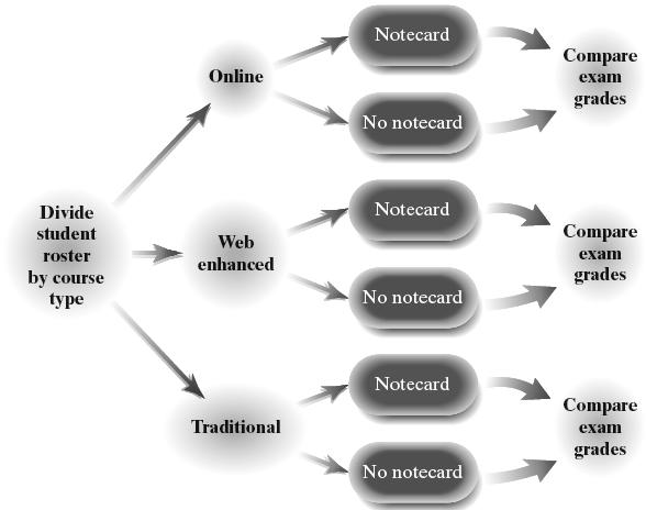
30. Answers will vary. Since there are ten digits (0 – 9), we will let a 0 or 1 indicate that (a) is to be the correct answer, 2 or 3 indicate that (b) is to be the correct answer, and so on.
Beginning with row 1, column 8 of Table 1 in Appendix A, and reading downward, we obtain the following:
2, 6, 1, 4, 1, 4, 2, 9, 4, 3, 9, 0, 6, 4, 4, 8, 6, 5, 8, 5
Therefore, the sequence of correct answers would be:
b, d, a, c, a, c, b, e, c, b, e, a, d, c, c, e, d, c, e, c
Copyright © 2025 Pearson Education, Inc.
31. (a) Answers will vary. One possible diagram is shown below.

(b) Answers will vary. One possible diagram is shown below.

32. A matched-pairs design is an experimental design where experimental units are matched up so they are related in some way.
In a completely randomized design, the experimental units are randomly assigned to one of the treatments. The value of the response variable is compared for each treatment. In a matched-pairs design, experimental units are matched up on the basis of some common characteristic (such as husband-wife or twins). The differences between the matched units are analyzed.
33. Answers will vary.
34. Answers will vary.
35. Randomization is meant to even out the effect of those variables that are not controlled for in a designed experiment. Answers to the randomization question may vary; however, each experimental unit must be randomly assigned. For example, a researcher might
randomly select 25 experimental units from the 100 units using simple random sampling and assign them to treatment 1. Then the researcher could randomly select 25 from the remaining 75 units and assign them to treatment 2, and so on.
Chapter 1 Test
1. Collect information, organize and summarize the information, analyze the information to draw conclusions, provide a measure of confidence in the conclusions drawn from the information collected.
2. The process of statistics refers to the approach used to collect, organize, analyze, and interpret data. The steps are to (1) identify the research objective, (2) collect the data needed to answer the research question, (3) describe the data, and (4) perform inference.
3. The time to complete the 500-meter race in speed skating is quantitative because its values are numerical measurements on which addition and subtraction have meaningful results. The variable is continuous because its values result from a measurement rather than a count. The variable is at the ratio level of measurement because differences between values have meaning and there is a true zero.
4. Video game rating is qualitative because its values classify games based on certain characteristics but arithmetic operations have no meaningful results. The variable is at the ordinal level of measurement because its values can be placed in rank order, but differences between values have no meaning.
5. The number of surface imperfections is quantitative because its values are numerical measurements on which addition and subtraction have meaningful results. The variable is discrete because its values result from a count. The variable is at the ratio level of measurement because differences between values have meaning and there is a true zero.
6. This is an experiment because the researcher intentionally imposed treatments (wellness program or not) on individuals (employees) in a controlled setting. The response variable is the change in body mass index.
7. This is an observational study because no attempt was made to influence the variable of interest. Opinions about the wage gap were merely observed. The response variable is whether the individual thinks the wage gap will increase or decrease.
8. A cross-sectional study collects data at a specific point in time or over a short period of time; a cohort study collects data over a period of time, sometimes over a long period of time (prospective); a case-controlled study is retrospective, looking back in time to collect data.
9. An experiment involves the researcher actively imposing treatments on experimental units in order to observe any difference between the treatments in terms of effect on the response variable. In an observational study, the researcher observes the individuals in the study without attempting to influence the response variable in any way. Only an experiment will allow a researcher to establish causality.
10. A control group is necessary for a baseline comparison. This accounts for the placebo effect that says that some individuals will respond to any treatment. Comparing other treatments to the control group allows the researcher to identify which, if any, of the other treatments are superior to the current treatment (or no treatment at all). Blinding is important to eliminate bias due to the individual or experimenter knowing which treatment is being applied.
11. The steps in conducting an experiment are to (1) identify the problem to be solved, (2) determine the factors that affect the response variable, (3) determine the number of experimental units, (4) determine the level of each factor, (5) conduct the experiment, and (6) test the claim.
12. Answers will vary. The franchise locations could be numbered 01 to 15 going across. Starting at row 7, column 14 of Table I in Appendix, and working downward, the selected numbers would be 08, 11, 03, and 02. The corresponding locations would be Ballwin, Chesterfield, Fenton, and O’Fallon.
13. Answers will vary. Using the available lists, obtain a simple random sample from each stratum and combine the results to form the stratified sample. Start at different points in Table I or use different seeds in a random
number generator. Using a TI-84 Plus CE graphing calculator with a seed of 14 for Democrats, 28 for Republicans, and 42 for Independents, the selected numbers would be Democrats: 3946, 8856, 1398, 5130, 5531, 1703, 1090, and 6369
Republicans: 7271, 8014, 2575, 1150, 1888, 3138, and 2008
Independents: 945, 2855, and 1401
14. Answers will vary. Number the blocks from 1 to 2500 and obtain a simple random sample of size 10. The blocks corresponding to these numbers represent the blocks analyzed. All trees in the selected blocks are included in the sample. Using a TI-84 Plus CE graphing calculator with a seed of 12, the selected blocks would be numbered 2367, 678, 1761, 1577, 601, 48, 2402, 1158, 1317, and 440.
15. Answers will vary. 600 42.86 14 » , so we let
42 k = . Select a random number between 1 and 42 that represents the first slot machine inspected. Using a TI-84 Plus CE graphing calculator with a seed of 132, we select machine 18 as the first machine inspected. Starting with machine 18, every 42nd machine thereafter would also be inspected (60, 102, 144, 186, …, 564).
16. In a completely randomized design, the experimental units are randomly assigned to one of the treatments. The value of the response variable is compared for each treatment. In a randomized block design, the experimental units are first divided according to some common characteristic (such as gender). Then each experimental unit within each block is randomly assigned to one treatment. Within each block, the value of the response variable is compared for each treatment, but not between blocks. By blocking, we prevent the effect of the blocked variable from confounding with the treatment.
17. (a) Sampling bias due to voluntary response
(b) Nonresponse bias due to the low response rate
(c) Response bias due to poorly worded questions.
(d) Sampling bias due to poor sampling plan (undercoverage)
18. (a) This experiment has a matched-pairs design.
(b) The subjects are the 159 social drinkers who participated in the study.
(c) Treatments are the types of beer glasses (straight glass or curved glass).
(d) The response variable is the time to complete the drink; quantitative.
(e) The type of glass used in the first week is randomly determined. This is to neutralize the effect of drinking out of a specific glass first.
(f)

19. (a) This experiment has a completely randomized design.
(b) The factor set to predetermined levels is the topical cream concentration. The treatments are 0.5% cream, 1.0% cream, and a placebo (0% cream).
(c) The study is double-blind if neither the subjects, nor the person administering the treatments, are aware of which topical cream is being applied.
(d) The control group is the placebo (0% topical cream).
(e) The experimental units are the 225 patients with skin irritations.
(f)

20. (a) This was a cohort study because participants were identified to be included in the study and then followed over a long period of time with data being collected at regular intervals (every 4 years).
(b) The response variable is bone mineral density. The explanatory variable is weekly cola consumption.
(c) The response variable is quantitative because its values are numerical measures on which addition and subtraction can be performed with meaningful results.
(d) The researchers observed values of variables that could potentially impact bone mineral density (besides cola consumption), so their effect could be isolated from the variable of interest.
(e) Answers will vary. Some possible lurking variables that should be accounted for are smoking status, alcohol consumption, physical activity, and calcium intake (form and quantity).
(f) The study concluded that women who consumed at least one cola per day (on average) had a bone mineral density that was significantly lower at the femoral neck than those who consumed less than one cola per day. The study cannot claim that increased cola consumption causes lower bone mineral density because it is only an observational study. The researchers can only say that increased cola consumption is associated with lower bone mineral density for women.
21. A confounding variable is an explanatory variable that cannot be separated from another explanatory variable.
A lurking variable is an explanatory variable that was not considered in the study but affects the response variable in the study.
Case Study: Chrysalises for Cash
Reports will vary. The reports should include the following components:
Step 1: Identify the problem to be solved. The entrepreneur wants to determine if there are differences in the quality and emergence time of broods of the black swallowtail butterfly depending on the following factors: (a) early brood season versus late brood season; (b) carrot plants versus parsley plants; and (c) liquid fertilizer versus solid fertilizer.
Step 2: Determine the explanatory variables that affect the response variable. Some explanatory variables that may affect the quality and emergence time of broods are the brood season, the type of plant on which the chrysalis grows, fertilizer used for plants, soil mixture, weather, and the level of sun exposure.
Step 3: Determine the number of experimental units. In this experiment, a sample of 40 caterpillars/butterflies will be used.
Step 4: Determine the level of the explanatory variables:
• Brood season – We wish to determine the differences in the number of deformed butterflies and in the emergence times depending on whether the brood is from the early season or the late season. We use a total of 20 caterpillars/butterflies from the early brood season and 20 caterpillars/butterflies from the late brood season.
• Type of plant – We wish to determine the differences in the number of deformed butterflies and in the emergence times depending on the type of plant on which the caterpillars are placed. A total of 20 caterpillars are placed on carrot plants and 20 are placed on parsley plants.
• Fertilizer – We wish to determine the differences in the number of deformed butterflies and in the emergence times depending on the type of fertilizer used on the plants. A total of 20 chrysalises grow on plants that are fed liquid fertilizer and 20 grow on plants that are fed solid fertilizer.
• Soil mixture – We control the effects of soil by growing all plants in the same mixture.
• Weather – We cannot control the weather, but the weather will be the same for each chrysalis grown within the same season. For chrysalises grown in different seasons, we expect the weather might be different and thus part of the reason for potential differences between seasons. Also, we can control the amount of watering that is done.
• Sunlight exposure – We cannot control this variable, but the sunlight exposure will be the same for each chrysalis grown within the same season. For chrysalises grown in different seasons, we expect the sunlight exposure might be different and thus part of the reason for potential differences between seasons.
Step 5: Conduct the experiment.
(a) We fill eight identical pots with equal amounts of the same soil mixture. We use four of the pots for the early brood season and four of the pots for the late brood season.
For the early brood season, two of the pots grow carrot plants and two grow parsley plants. One carrot plant is fertilized with a liquid fertilizer, one carrot plant is fertilized with a solid fertilizer, one parsley plant is fertilized with the liquid fertilizer, and one parsley plant is fertilized with the solid fertilizer. We place five black swallowtail caterpillars of similar age into each of the four pots.
Similarly, for the late brood season, two of the pots grow carrot plants and two grow parsley plants. One carrot plant is fertilized with a liquid fertilizer, one carrot plant is fertilized with a solid fertilizer, one parsley plant is fertilized with the liquid fertilizer, and one parsley plant is fertilized with the solid fertilizer. We place five black swallowtail caterpillars of similar age into each of the four pots.
(b) We determine the number of deformed butterflies and in the emergence times for the caterpillars/butterflies from each pot.
Step 6: Test the claim. We determine whether any differences exist depending on season, plant type, and fertilizer type.
Copyright © 2025 Pearson Education, Inc.
Conclusions:
Early versus late brood season: From the data presented, more deformed butterflies occur in the late season than in the early season. Five deformed butterflies occurred in the late season, while only one occurred in the early season. Also, the emergence time seems to be longer in the early season than in the late season. In the early season, all but one of the 20 emergence times were between 6 and 8 days. In the late season, all 20 of the emergence times were between 2 and 5 days.
Parsley versus carrot plants: From the data presented, the plant type does not seem to affect the number of deformed butterflies that occur. Altogether, three deformed butterflies occur from parsley plants and three deformed butterflies occur from the carrot plants. Likewise, the plant type does not seem to affect the emergence times of the butterflies.
Liquid versus solid fertilizer: From the data presented, the type of fertilizer seems to affect the number of deformed butterflies that occur. Five deformed butterflies occurred when the solid fertilizer was used, while only one occurred when the liquid fertilizer was used. The type of fertilizer does not seem to affect emergence times.
Copyright © 2025 Pearson Education, Inc.
Chapter 2
Organizing and Summarizing Data
Section 2.1
1. Raw data are the data as originally collected, before they have been organized or coded.
2. number (or count); proportion (or percent)
3. The relative frequencies should add to 1, although rounding may cause the result to vary slightly
4. A bar graph is an illustratation of qualitative data in which rectangles represent the frequency or relative frequency of each category of data A Pareto chart is a bar graph whose bars are drawn in decreasing order of frequency or relative frequency.
5. (a) The most common response was “Boss.”
(b) 00.151053158 , so 158 people stated that their significant other is the most difficult to “sell yourself” to.
(c) The graphic cannot be displayed as a pie chart because the percentages do not sum to 100%, or 1. That is, there is no “whole.”
6. (a) “Washing your hands” is the largest sector of the pie chart, so the most commonly used approach to beat the flu bug is washing your hands. 61% of respondents selected this as their primary method for beating the flu.
(b) “Drinking Orange Juice” is the smallest sector of the pie chart, so the least used method is drinking orange juice. 2% of respondents selected this as their primary method for beating the flu.
(c) 25% of respondents felt that flu shots are the best way to beat the flu.
7. (a) The highest bar corresponds to OF (outfield), so OF is the position with the most MVPs.
(b) The bar for third base (3B) reaches the line for 10, so 10 MVPs played third base.
(c) The bar for first base (1B) is 17 on the vertical axis. The bar for third base (3B) reaches 10. 17 – 10 = 7, so 7 more MVPs played first base than third base.
(d) MVPs for each of the three outfield positions should be reported seperately rather than reporting the three positions together as one.
8. (a) 22,617,000 white people were living in poverty.
(b) Total number of people (in thousands) = 22,617 + 8630 + 615 + 1901 + 99 + 3440 + 3358 + 10,560 = 51,220 Relative frequency of “Hispanic or Latino”
= 10,560 0.20620.6% 51,220 =
In 2021, about 20.6% of the impoverished in the United States were Hispanic or Latino.
(c) This graph should use relative frequencies rather than frequencies. The graph does not account for the different population size of each ethnic group. Without knowing the population sizes, we cannot determine whether a group is disproportionally impoverished.
9. (a) About 69% of the respondents believe divorce is morally acceptable.
(b) About 23% believe divorce is morally wrong. So, about 0.23240 million = 55.2 million adult Americans believe divorce is morally wrong.
(c) This statement is inferential because it is a generalization based on the observed data.
10. (a) About 5% of identity theft was loan fraud.
(b) About 26% of the identity fraud cases involved credit card fraud. So, about 0.2610 million = 2.6 million cases of credit card fraud occurred in a recent year.
11. (a) Age was the other variable measured.
(b) The proportion of 18–34 year old respondents who are more likely to buy when made in America is about 0.42. The proportion of 35–44 year olds who are more likely to buy when made in America is about 0.61.
(c) The 55+ age group has the greatest proportion of respondents who are more likely to buy when made in America.
(d) The 18–34 age group has a majority of respondents who are less likely to buy when made in America.
(e) As age increases, so does the likelihood that a respondent will be more likely to buy a product that is made in America.
12. (a) Political philosophy was the other variable measured.
(b) The proportion of moderates who believe the amount spent on improving and protecting the enrironment is about right is about 0.30
(c) The extremely liberal political philosophy has the highest proportion of individuals who believe the amount spent on improving and protecting the environment is too little.
(d) The slightly conservitative political philosophy has about 10% of individuals who believe the amount spent on improving and protecting the environment is too much.
(e) As political philosophy changes from extremely liberal to extremely conservative, the opinion “spending too little” on improving and protecting the environment decreases while the opinion “spending too much” increases.
13. (a) Total students surveyed = 125 + 324 + 552 + 1257 + 2518 = 4776
Relative frequency of “Never” = 125 0.0262, 4776 relative frequency of “Rarely” = 324 0.0678, 4776 and so on.
ResponseRelativeFrequency


(g) The statement is descriptive because it is describing the particular sample.
14. (a) Total students surveyed = 249 + 118 + 249 + 345 + 716 + 3093 = 4770
Relative frequency of “I do not drive” = 249 0.0522, 4770 and so on.
ResponseRelativeFrequency Idonotdriveacar 0.0522
0.0247
0.0522
0.0723
0.1501
0.6484
0.2632
0.5272
(b) About 52.72% of respondents answered “Always.”
(c) 0.02620.06780.0940 += About 9.40% of respondent answered “Never” or “Rarely.”
(d)

(b) About 64.84% of respondents answered “Always.”
(c) 0.02470.05220.0769 += About 7.69% of respondent answered “Never” or “Rarely.”
(d)
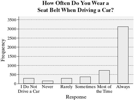
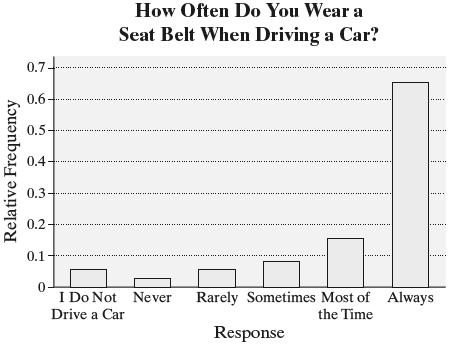
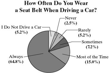
(g) Total (excluding those who do not drive) = 118 + 249 + 345 + 716 + 3093 = 4521
Relative frequency of “Never” = 118 0.0261, 4521 and so on.
ResponseRelativeFrequency
Never 0.0261
Rarely 0.0551
Sometimes 0.0763
Mostofthetime 0.1584
Always 0.6841
The relative frequencies of all categories are similar except that students are more likely to wear their seatbelt ‘Always’ when driving It appears an individual’s seat belt use does not vary much whether they are a driver or passenger.
(h) The statement is descriptive because it is describing the particular sample.
15. (a) Total adults surveyed = 377 + 192 + 132 + 81 + 243 = 1025
Relative frequency of “More than 1 hour a day” = 377 0.3678, 1025 and so on.
ResponseRelativeFrequency
Morethan1hraday 0.3678
Upto1hraday 0.1873
Afewtimesaweek 0.1288
Afewtimesamonthorless 0.0790
Never 0.2371
(b) The proportion of those surveyed who never use the Internet is 0.2371, or about 24%


(f) The statement provides an estimate, but no level of confidence is given.
16. (a) Total adults surveyed = 103 + 204 + 130 + 79 + 5 = 521
Relative frequency of “Several times a week” = 103 0.1977, 521 and so on.
ResponseRelativeFrequency
Severaltimesaweek 0.1977
Onceortwiceaweek 0.3916
Afewtimesamonth 0.2495
Veryrarely 0.1516
Never 0.0096
(b) The proportion of those surveyed who dine out once or twice a week is 0.3916
(d)
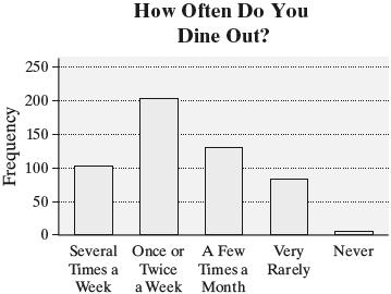

17. (a) Total non-college graduates surveyed = 298 + 207 + 124 + 83 + 66 + 41 = 819
Relative frequency of “Woke” = 298 0.3639, 819 and so on.
WordorPhraseRelativeFrequency
(b) Total college graduates surveyed = 169 + 87 + 77 + 72 + 51 + 46 = 502
Relative frequency for “woke” = 169 0.3367, 502 and so on.
WordorPhraseRelativeFrequency
(c)

(d) Both groups find “woke” to be most annoying. However, the proportion of non-college graduates find “whatever” more annoying than do college graduates A higher proportion of college graduates find “like” and “kidding” more annoying than do non-college graduates.
18. (a) Total adults surveyed = 173 + 978 + 249 + 249 + 134 + 153 = 1936
Relative frequency of “None” = 173 0.0894, 1936 and so on.
NumberofTextsRelativeFrequency
(b) Total teens surveyed = 13 + 138 + 69 + 113 + 113 + 181 = 627
Relative frequency of “None” = 13 0.0207, 627 and so on.
NumberofTextsRelativeFrequency None 0.0207 1to10 0.2201 11to120 0.1100 21to150 0.1802
0.2887 +

(d) Adults are much more likely to send fewer texts per day, while teens are much more likely send more texts per day.
19. (a) Total number of men surveyed = 40 + 26 + 13 + 13 + 7 = 99
Relative frequency of “Professional athlete” = 40 0.4040, 99 and so on.
Total number of women surveyed = 18 + 37 + 13 + 13 + 19 = 100
Relative frequency of “Professional athlete” 18 0.18, 100 == and so on.
Response
(b)
0.18
0.37
0.13
0.13
0.19

(c) Answers will vary. Men are much more likely to want to be a professional athlete than women. Women are more likely to aspire to a career in acting than men
20. (a) Relative frequency for “White” luxury cars 25 0.25, 100 == and so on.
Relative frequency for “White” sport cars 10 0.10, 100 == and so on.
ColorLuxuryCarsSportCars
0.25 0.10
0.22 0.15
0.16 0.18
0.03 0.02
0.02 0.07
(b)

(c) Answers will vary. White is the most popular color for luxury cars, while silver is the most popular for sports cars. People who drive luxury cars may enjoy the clean look of a white vehicle. People who drive sports cars may prefer the flashier look of silver.
21. (a), (b) Total number of trading days = 30 Relative frequency for “Down” 15 0.5, 30 == and so on.
PriceChangeFrequencyRelativeFrequency
(c) (d)


Copyright © 2025 Pearson Education,

22. (a), (b) Total number of responses = 40 Relative frequency for “Sunday” 3 0.075, 40 == and so on.
DayFrequencyRelativeFrequency
Sunday 3 0.075 Monday 2 0.05 Tuesday 5 0.125 Wednesday 6 0.15 Thursday 2 0.05
14 0.35
8 0.2
(c) Answers will vary. A restaurant owner will probably want to advertise on days prior to days when people are most likely to order takeout Because people are most likely to order takeout on Friday, advertise on Thursday. Likewise, because people are least likely to order takeout on Monday and Thursday, avoid advertising on Sunday and Wednesday (d)

(e)

(f)

23. (a) Total number of responses = 42 Relative frequency for “Sunday” 8 0.1905, 42 = and so on.
DayFrequencyRelativeFrequency
7
6
3
4
9
(b) You would want to have the most drivers available on the day when people are most likely to use Instacart, which is Saturday (c)

(d)

24. (a), (b) Total number of patients = 50 Relative frequency for “Type A” 18 0.36, 50 == and so on. BloodTypeFrequencyRelativeFrequency
(c) Type O is the most common.
(d) Type AB is the least common.
(e) We estimate that 44% of the population has type O blood. This is considered inferential statistics because a conclusion about the population is being drawn based on sample data.
(f) Answers will vary. In 2023, the Red Cross reported that 45% of the U.S. population had type O blood (38% O-positive, 7% Onegative). Results will differ because of sampling variability.
(g)


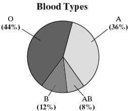
25. (a) Total number of tornadoes = 67,098
Relative frequency for F0
31,016 0.4622, 67,098 = and so on
FScaleFrequencyRelativeFrequency
0 31,016 0.4622
1 22,798 0.3398 2 9713 0.1448
3 2759 0.0411 4 724 0.0108
5 88 0.0013
88 tornadoes were F5.


(d) Answers may vary, but a bar chart is easier to read with twelve observations.

(e) Between 1950 and 2020, Texas had the most tornados with 9026
26. (a) Yes, it would make sense to draw a pie chart for land area since the 7 continents contain all the land area on Earth.
Total land area = 57,217,000 square miles
Relative frequency for Africa
11,608,000 0.2029, 57,217,000 = and so on.
ContinentRelativeFrequency
SouthAmerica 0.1202
Copyright © 2025 Pearson Education, Inc.
(h)
(i)
(b)
(c)
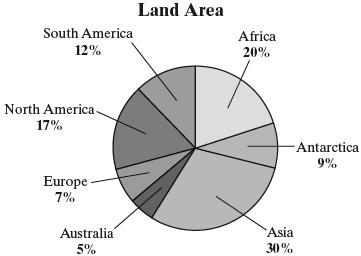
(b) It would not make sense to draw a pie chart for the highest elevation because there is no whole to which to compare the parts.
27. Use technology to create a relative frequency bar graph by race.

The proportion of Mexican American respondents is 0.135.
28. Graph choice may vary, but a Pareto chart is a good choice that allows for easy identification of the most common pitch time that results in home runs. Use technology to create a relative frequency Pareto chart.

The four-seam fastball results in the most home runs.
29. (a) The researcher wants to determine if online homework improves student learning over traditional pencil-and-paper homework.
(b) This study is an experiment because the researcher is actively imposing treatments (the homework style) on subjects.
(c) Answers will vary. Some examples are same teacher, same semester, and same course.
(d) Assigning different homework methods to entire classes could confound the results because there may be differences between the classes. The instructor may give more instruction to one class than the other. The instructor is not blinded, so he or she may treat one group differently from the other.
(e) Number of students: quantitative, discrete Average age: quantitative, continuous Average exam score: quantitative, continuous
Type of homework: qualitative College experience: qualitative
(f) Letter grade is a qualitative variable at the ordinal level of measurement. Answers will vary. It is possible that ordering the data from A to F is better because it might give more “weight” to the higher grade and the researcher wants to show that a higher percent of students passed using the online homework.
(g) The graph being displayed is a side-byside relative frequency bar graph.
(h) Yes. The “whole” is the set of students who received a grade for the course for each homework method.
(i) The table shows that the two groups with no prior college experience had roughly the same average exam grade. From the bar graph, we see that the students using online homework had a lower percent for A’s, but had a higher percent who passed with a C or better.
30. Relative frequencies should be used when the size of two samples or populations differ. This is done to eliminate the effect of different population sizes.
31. Answers will vary. If the goal is to illustrate the levels of importance, then arranging the bars in a bar graph in decreasing order makes sense. Sometimes it is useful to arrange the categorical data in a bar graph in alphabetical order. A pie chart does not readily allow for arranging the data in order.
Copyright © 2025 Pearson Education, Inc.
32. A bar graph is preferred when trying to compare two specific values. Pie charts are useful for comparing parts of a whole. A pie chart cannot be drawn if the data do not include all possible values of the qualitative variable.
33. No, the information could not organized into a pie chart because the percentages do not add to 100%.
Section 2.2
1. classes
2. lower; upper
3. class width
4. Skewed left means that the left tail is longer than the right tail.
5. True
6. False. The class width is 10.
7. False. The distribution shown is skewed right.
8. False. The distribution shown is bell-shaped.
9. (a) The value with the highest frequency is 8.
(b) The value with the lowest frequency is 2.
(c) The value of 7 was observed 15 times.
(d) The value of 5 was observed 11 times and the value of 4 was observed 7 times. So, the value of 5 was observed 1174 −= more times than the value of 4
(e) A 7 was observed 15 times out of the 100 observations. Therefore, a 7 was observed 15 0.15 100 = or 15% of the time
(f) The distribution is roughly bell-shaped.
10. (a) The most frequent number of cars sold in a week was 4 cars.
(b) There were 9 weeks in which 2 cars sold.
(c) Total frequency = 4 + 2 + 9 + 8 + 12 + 8 + 5 + 2 + 1 + 1 = 52 (as required). Therefore, 2 cars were sold 9 0.173 52 or 17.3% of the time.
(d) The distribution is slightly skewed to the right
11. (a) Total frequency = 2 + 3 + 13 + 42 + 58 + 40 + 31 + 8 +2 + 1 = 200 students
(b) Class width = 10 (e.g., 70 – 60 = 10)
(c) IQScore(Class)Frequency 6069 2 7079 3 8089 13 9099 42 100109 58 110119 40 120129 31 130139 8 140149 2 150159 1
(d) The class “100–109” has the highest frequency.
(e) The class “150–159” has the lowest frequency.
(f) The number of students with an IQ of at least 130 was 8 + 2 + 1 = 11. Therefore, 11 0.055 200 = or 5.5% of students had an IQ of at least 130.
(g) No. There were no IQs above 159.
12. (a) Class width = 100 (e.g., 100 – 0 = 100).
(b) Classes: 0–99, 100–199, 200–299, 300–399, 400–499, 500–599, 600–699, 700–799, 800–899, 900–999, 1000–1099, 1100–1199, 1200–1299, 1300–1399, 1400–1499
(c) The class “0–99” has the highest frequency
(d) The distribution is skewed right.
(e) Answers will vary. The statement is incorrect because they are comparing counts from populations of different size. Texas has a much larger population than Vermont. To make a fair comparison, the reporter should use data that are adjusted for population size such as the number of fatalities per 1000 residents.
13. (a) Likely skewed right. Most household incomes will be to the left (perhaps in the $50,000 to $150,000 range), with fewer higher incomes to the right (in the millions).
(b) Likely bell-shaped. Most scores will occur near the middle range, with scores tapering off equally in both directions.
(c) Likely skewed right. Most households will have, say, 1 to 4 occupants, with fewer households having a higher number of occupants.
(d) Likely skewed left. Most Alzheimer’s patients will fall in older-aged categories, with fewer patients being younger.
14. (a) Likely skewed right. More individuals would consume fewer alcoholic drinks per week, while fewer individuals would consume more alcoholic drinks per week.
(b) Likely uniform. There will be approximately an equal number of students in each age category.
(c) Likely skewed left. Most hearing-aid patients will fall in older-aged categories, with fewer patients being younger.
(d) Likely bell-shaped. Most heights will occur, say, in the 66- to 70-inch range, with heights tapering off equally in both directions.
15. (a) Total number of rooms = 78 + 198 + 713 + 1693 + 1848 + 1562 + 1115 + 670 + 415 + 276 + 79 + 51 + 47 = 8745 Relative frequency for 1 room 78 0.0089, 8745 = and so on.
RoomsRel.Freq.RoomsRel.Freq. 10.008980.0766
20.022690.0475
30.0815100.0316
(b) Relative frequence for 5 rooms 1848 0.2113. 8745 = Therefore, about 21.1% of individuals have a home with 5 rooms.
(c) The number of households with more than 10 rooms is 79 + 51 + 47 = 177, and 177 0.0203 8745 Therefore, about 2.0% of households have more than 10 rooms
16. (a) Total number of households = 1618123150 ++++= Relative frequency for 0 children under 5 16 0.32, 50 == and so on. NumberofChildren Relative Under5
(b) Relative frequency for 2 children 12 0.24. 50 == So, 24% of households have two children under age 5.
(c) The number of households with one or two children under 5 is 181230, += and 30 0.6. 50 = Therefore, 60% of households have one or two children under age 5.
17. (a) There are five classes.
(b) Lower class limits: 22, 24, 26, 28, 30 Upper class limits: 23.9, 25.9, 27.9, 29.9, 31.9.
(c) Class width = 2 (e.g., 24222 −= )
18. (a) There are eight classes.
(b) Lower class limits: 0, 1.0, 2.0, 3.0, 4.0, 5.0, 6.0, 7.0 Upper class limits: 0.9, 1.9, 2.9, 3.9, 4.9, 5.9, 6.9, 7.9
(c) Class width = 1.0 (e.g., 2.01.01.0 −= )
19. (a) Total frequency = 18 + 104 + 253 + 166 + 8 = 549 Relative frequency for 22–23.9 18 0.0328, 549 = and so on.
Speed(ft/sec)RelativeFrequency
2223.9 0.0328
2425.9 0.1894
2627.9 0.4608
2829.9 0.3024
3031.9 0.0146
Copyright © 2025 Pearson Education, Inc.


The percentage of players that had a sprint speed between 24 and 25.9 ft/sec is 18.94%. The percentage of players that had a sprint speed less than 24 ft/sec is 3.28%.
20. (a) Total frequency = 2342 + 4041 + 1550 + 287 + 820 + 128 + 8 + 3 = 9179 Relative frequency for 0–0.9 2342 0.2551, 9179 = and so on.
MagnitudeRelativeFrequency
00.9 0.2551
1.01.9 0.4402
2.02.9 0.1689
3.03.9 0.0313
4.04.9 0.0893
5.05.9 0.0139
6.06.9 0.0009
7.07.9 0.0003
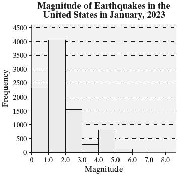

The percentage of earthquakes that registered 4.0 to 4.9 is 8.93%. The percentage of earthquakes that registered less than 2.0 is 69.53% (from 0.2551 + 0.4402 = 0.6953)
21. (a) The data are discrete. The possible values for the number of televisions in a household are countable
(b), (c) Relative frequency for 0 televisions 1 0.025, 40 == and so on.
TelevisionsFrequencyRelativeFrequency 0 1 0.025 1 14 0.35 2 14 0.35 3 8 0.2 4 2 0.05 5 1 0.025
(d) The relative frequency is 0.2, so 20% of the households surveyed had 3 televisions.
(e) 0.050.0250.075 += 7.5% of the households in the survey had 4 or more televisions.
(b)
(c)


(h) The distribution is skewed right.
22. (a) The data are discrete. The possible values for the number of customers waiting for a table are countable.
(b), (c) Relative frequency for 3 customers 2 0.05, 40 == and so on.
CustomersFrequencyRelativeFrequency
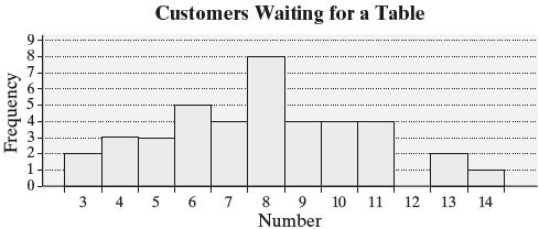
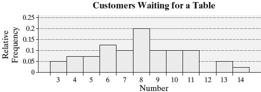
(h) The distribution is roughly symmetric.
23. (a), (b) Relative frequency for 20–24.9 5 0.037, 136 = and so on.
(d) Relative frequency for 10 or more customers
0.10.100.050.0250.275 =++++=
Therefore, 27.5% of the Saturdays had 10 or more customers waiting for a table at 6 P M
(e) Relative frequency for 5 or fewer customers
0.050.0750.0750.2 =++=
Therefore, 20% of the Saturdays had 5 or fewer customers waiting for a table at 6 P.M.


(e) The distribution is skewed right.
Copyright © 2025 Pearson Education, Inc.
(f) Relative frequency for 20–29.9 21 0.154, 136 = and so on.
GiniIndexFrequencyRelativeFrequency
2029.9 21 0.154
3039.9 55 0.404
4049.9 37 0.272
5059.9 18 0.132
6069.9 5 0.037


The distribution is skewed right.
(g) Answers will vary. The graph with a class width of 5 provides more detail, so it seems to be a superior graph.
24. (a), (b) Relative frequency for 45,000–49,999 1 0.0196, 51 = and so on.
IncomeFrequencyRelativeFrequency
45,00049,999 1 0.0196
50,00054,999 5 0.0980
55,00059,999 4 0.0784
60,00064,999 9 0.1765
65,00069,999 12 0.2353
70,00074,999 6 0.1176
75,00079,999 3 0.0588
80,00084,999 6 0.1176
85,00089,999 3 0.0588
90,00094,999 2 0.0392

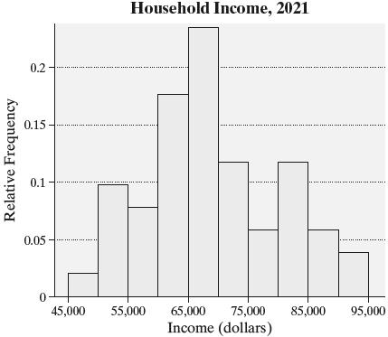
(e) The distribution is fairly symmetric.
(f) Relative frequency for 45,000–54,999 6 0.1176, 51 = and so on.
IncomeFrequencyRelativeFrequency
45,00054,999 6 0.1176
55,00064,999 13 0.2549
65,00074,999 18 0.3529
75,00084,999 9 0.1765
85,00094,999 5 0.0980
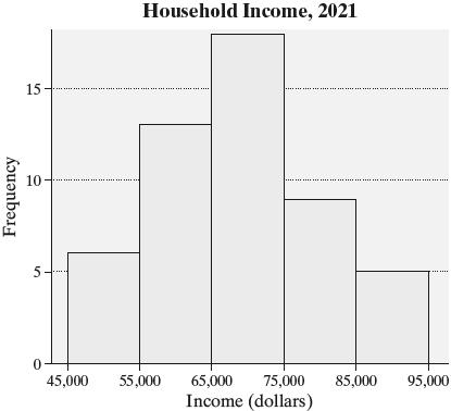
Copyright © 2025 Pearson Education,

The distribution is fairly bell-shaped.
(g) Answers will vary. The graph with a class width of 10,000 seems better
25. (a) Two of the 50 data values are within the class 90–93.9, so the relative frequency for 90–93.9 2 0.04. 50 == Three data values are within 94–97.9, so the relatve frequency for 94–97.9 3 0.06, 50 == and so on.
ExitVelocity(mph)RelativeFrequency
(b)

(c) The distribution is roughly symmetric and bell-shaped
(d) One of the 50 data values is within the class 90–92 4, so the relative frequency for 90–92 4 1 0.02. 50 == Two data values
are within 92.5–94 9, so the relatve frequency for 92.5–94.9 2 0.04, 50 == and so on.
ExitVelocity(mph)RelativeFrequency
0.02
0.04
0.02
0.20
0.06 110112.4 0.04

With a class width of 2.5, the distribution looks skewed left
(g) Answers will vary. However, the class width of 4 appears to provide a better summary
26. (a), (b) Relative frequency for 10–19 1 0.02, 50 == and so on.
GraduationRateFrequencyRelativeFrequency
Copyright © 2025 Pearson Education, Inc.
1 0.02


(e) The distribution fairly symmetric and bell-shaped.
(f) Relative frequency for 10–14 1 0.02, 50 == and so on.


The distribution is fairly symmetric and bell-shaped
(g) Answers will vary. However, the summary with a class width of 10 seems better.
27. (a), (b) Relative frequency for 0–1.99 6 0.12, 50


(e) The distribution is skewed left
(f) Relative frequency for 0–0.99 2 0.04, 50 == and so on. KilowattHoursFrequencyRelativeFrequency
28. Answers will vary. One possibility follows.
(a) The largest data value is 23.59, and the smallest is 6.37. To find the class width, subtract the smallest value from the largest, divide the result by the desired number of classes, 6, and round up: 23.596.37 2.873 6 =→
For the lower class limit of the first class, choose a convenient number below 6.37. In this case, 6 is a good choice
(b), (c) Relative frequency for 6–8.99 15 0.4286, 35 = and so on. VolumeFrequencyRelativeFrequency
9
4 0.1143 1517.99 4 0.1143
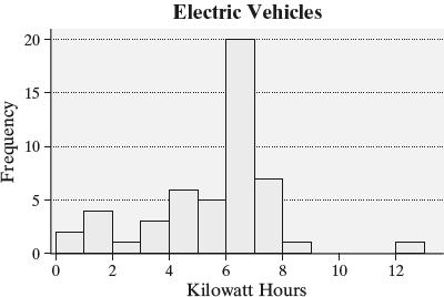

The distribution is skewed left
(g) Answers will vary. Both distributions do a nice job of summarizing the data.
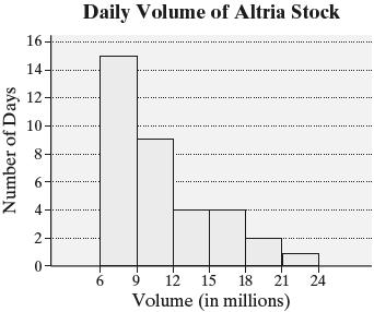
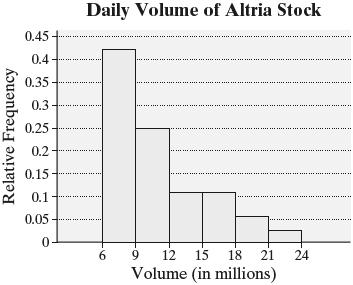
(f) The distribution is skewed right.
Copyright © 2025 Pearson Education, Inc.
29. Answers will vary. Use technology to create a relative frequency histogram for ROI

It is disconcerting that some schools have a negative ROI.
30.
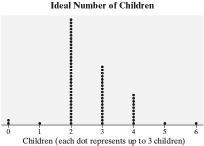
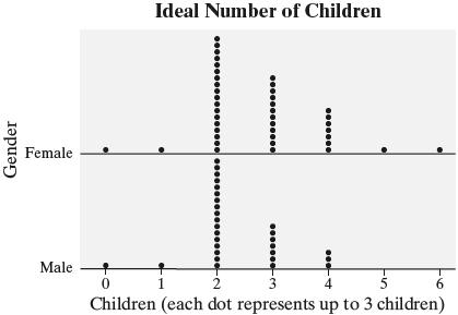
There do not appear to be much of a difference in the ideal number of children for males and females. However, females seem more likely to deem larger families as ideal. A histogram might be better for comparing the preferences between males and females.


33. (a) Use technology to create a relative frequency histogram for length
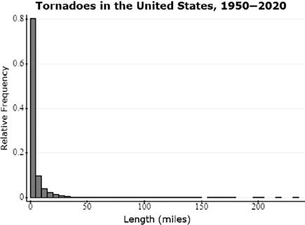
(b) The distribution is skewed right.
(c) There were 67,098 tornadoes in the United States between 1950 and 2020 of which 6508 were between 5 and 9.999 miles in length. So, the relative frequency is 6508 0.097.
67,098
(d) Use technology to distinguish the lengths of tornadoes in Texas and create a relative frequency histogram for length.
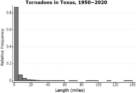
There were 9026 tornadoes in Texas between 1950 and 2020 of which 625 were between 5 and 9.999 miles in length. So, the relative frequency is 625 0.069. 9026
(e) Use technology to distinguish the 2017 tornadoes and create a dot plot for number of fatalities

Three tornadoes resulted in four or more deaths in 2017.
34. (a) Graph choice may vary. Use technology to create a relative frequency histogram for upper leg length. For the following graph, we use 25 as the lower limit of the first class and a class width of 2.
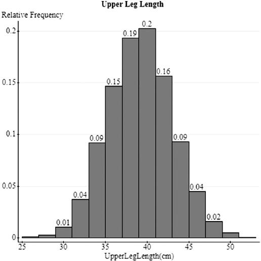
The data containe 4226 respondents of which 190 had an upper leg length of at least 45 cm, but less than 47 cm So, the relative frequency is 190 0.04. 4226
(b) Graph choice may vary. Use technology to distinguish the individuals who were born outside the United States and create a relative frequency histogram for upper leg length.

(c) Answers will vary. Yes, there are differences. While both histograms are bell-shaped, the relative frequencies for the classes differ. For example, for an upper leg length of at least 45 cm, but less than 47 cm, the relative frequency is 0.02 for respondents born outside the United States versus 0.04 for respondents in general.
35. Answers will vary. However, because the data are quantitative and continuous, a frequency histogram or relative frequency histogram would be appropriate. For the following histogram, we use 0 as the lower limit of the first class and a class width of 30.
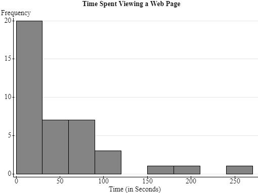
The data appear to be skewed right with a gap and one potential outlier. It seems as if the majority of people spent less than one minute viewing the page, while a few people spent several minutes viewing the page.
36. (a) The data are quantitative and discrete. (b) This is population data because it is all recorded violations for the day.
(c) There are 271 red light cameras.
(d) Use technology to create a relative frequency histogram for violations.

The distribution is skewed right.
(e)

Answers will vary.
Copyright © 2025 Pearson Education, Inc.
(f) Yes, six cameras did not record any violations.
37. Age:histogram;Income:histogram; Maritalstatus:bargraphorpiechart; Numberofvehicles:histogramordotplot
38. Classes should not overlap so there is no confusion as to which class an observation belongs
39. There is no such thing as a correct class width, however some choices are better than others. For example, if the class width is too small, the histogram may show many gaps between the bars. If the class width is too large, the histogram may not provide enough detail.
40. Use relative frequencies when comparing two data sets with different sample sizes.
41. Answers will vary. This exercise illustrates the fact that there is no such thing as the “correct” histogram. However, some histograms are better than others and class width can affect the shape of a graph.
42. Answers will vary. Sample histograms are given below.

A histogram is skewed left if it has a long tail on the left side. A histogram is skewed right if it has a long tail on the right side. A histogram is symmetric if the left and right sides of the graph are roughly mirror images of each other.
Section 2.3
1. An ogive is a graph that represents the cumulative frequency or cumulative relative frequency for the class
2. Time series data are the values of a variable measured at different points in time.
3. True
4. False. When plotting a frequency polygon, plot the frequency (or number) for each class above the class midpoint and connect the points with straight line segments.
5. 1|0 represents 10, so the original data set is: 10, 11, 14, 21, 24, 24, 27, 29, 33, 35, 35, 35, 37, 37, 38, 40, 40, 41, 42, 46, 46, 48, 49, 49, 53, 53, 55, 58, 61, 62.
6. 24|0 represents 240, so the original data set is: 240, 244, 247, 252, 252, 253, 259, 259, 263, 264, 265, 268, 268, 269, 270, 271, 271, 273, 276, 276, 282, 283, 288.
7. 1|2 represents 1.2, so the original data set is: 1.2, 1.4, 1.6, 2.1, 2.4, 2.7, 2.7, 2.9, 3.3, 3.3, 3.3, 3.5, 3.7, 3.7, 3.8, 4.0, 4.1, 4.1, 4.3, 4.6, 4.6, 4.8, 4.8, 4.9, 5.3, 5.4, 5.5, 5.8, 6.2, 6.4.
8. 12|3 represents 12.3, so the original data set is: 12.3, 12.7, 12.9, 12.9, 13.0, 13.4, 13.5, 13.7, 13.8, 13.9, 13.9, 14.2, 14.4, 14.4, 14.7, 14.7, 14.8, 14.9, 15.1, 15.2, 15.2, 15.5, 15.6, 16.0, 16.3.
9. (a) The class width is the difference between successive class midpoints, which is 0.5 (e.g., 1.25 – 0.75 = 0.5).
There are 6 classes represented in the graph Note: The 8 plotted points are for the 6 class midpoints plus two additional points to connect the graph to the horizontal axis on each end
(b) The midpoint of the first class is 1.25. The lower limit of the first class is 1.00 and the upper limit is 1.49.
(c) The midpoint of the last class is 3.75. The lower limit of the last class is 3.50 and the upper limit is 3.99.
(d) The lower and upper limits of the class with 25 students are 2.50 and 2.99, respectively.
(e) The lower and upper limits of the class with the fewest students are 1.00 and 1.49, respectively
10. (a) The class width is the difference between successive class midpoints, which is 4 (e.g., 2(2)4 −−= )
There are 6 classes represented in the graph. Note: The 8 plotted points are for the 6 class midpoints plus two additional points to connect the graph to the horizontal axis on each end
(b) The midpoint of the first class is 2. The lower limit of the first class is 0 and the upper limit is 3.9
(c) The midpoint of the last class is 22. The lower limit of the last class is 20 and the upper limit is 23.9
(d) The most popular number of hours spent exercising each week is 0 to 3.9 hours, which is the group with the highest frequency.
(e) The least popular number of hours spent exercising each week is 16 to 19.9 hours, which is the group with the lowest frequency.
(f) The lower and upper limits of the class with 55 students are 4 and 7.9, respectively
11. (a) The class width is the difference between successive upper class limits, which is 5. (e.g., 24.9 – 19.9 = 5)
(b) From the graph, the cumulative relative frequency is about 0.1 (or 10%) for the class that has an upper limit of 34.9, which means that about 10% of four-year universities have a graduation rate less than or equal to 34.9%. Therefore, approximately 10% of all four-year universities have a graduation rate strictly below 35%.
(c) From the graph, the class with an upper limit of 59.9 (which is just below 60) has a cumulative relative frequency of about 0.6 (or 60%). Therefore, approximately 60% of all four-year universities have a graduation rate strictly below 60%.
(d) From the graph, the cumulative relative frequency is about 0.95 (or 95%) for the class that has an upper limit of 89.9, which means that about 95% of four-year universities have a graduation rate less than or equal to 89.9%. Therefore, approximately 5% of all four-year universities have a graduation rate above 89.9%.
12. (a) The class width is the difference between successive upper class limits, which is 2 (e.g., 3.9 – 1.9).
(b) From the graph, the cumulative relative frequency is about 0.92 (or 92%) for the class that has an upper limit of 9.9, which means that about 92% of all tornadoes have a length less than or equal to 9.9 miles. Therefore, approximately 92% of all tornadoes have a length strictly less than 10 miles.
(c) From the graph, the class with an upper limit of 5.9 (which is just below 6) has a cumulative relative frequency of about 0.8 (or 80%). Therefore, approximately 80% of all tornadoes have a length strictly less than 6 miles.
(d) From the graph, the cumulative relative frequency is more than 0.5 (or 50%) for the class that has an upper limit of 1.9, which means that more than 50% of all tornadoes have a length less than or equal to 1.9 miles. Therefore, more than 50% of all tornadoes have a length strictly less than 2 miles.
13. (a) The unemployment rate in 2012 was about 8%.
(b) The highest unemployment rate was about 9.8%. This occurred in 2010.
(c) The highest inflation rate was about 8%. This occurred in 2022
(d) The unemployment rate and inflation rate were furthest in 2009.
(e) The misery index for 2008 was aabout 4 + 6 = 10. The misery index for 2011 was about 3 + 9 = 12. Therefore, the year 2011 was more “miserable” than 2008.
14. (a) To the nearest year, the average age of a man who first married in 1980 was 25.
(b) To the nearest year, the average age of a woman who first married in 1960 was 21
(c) The largest difference in the average age of men and women at which they first married occurred in 1950. The approximate age difference was 24 – 20.5 = 3.5 years.
(d) The least amount of difference in the average age of men and women at which they first married occurred in 2000. The approximate age difference was 26.5 – 25.2 = 1.3 years.
15. (a)

(b) The distribution is roughly symmetric and bell-shaped.
16. (a)
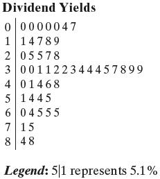
(b) The distribution is skewed right
17. (a)
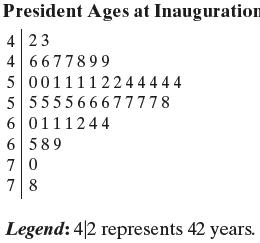
(b) The distribution is skewed right
18. (a)

(b) The distribution is skewed right
19. (a) Rounded data: 211, 105, 228, 105, 148, 209, 257, 224, 125, 206, 151, 263, 224, 208, 123, 271, 257, 155, 208, 204, 210, 323, 193, 208, 135, 126, 244, 151, 125, 168, 191, 237, 127, 125, 121, 187, 260, 140, 148, 132, 229, 162, 216, 206, 121, 125, 65, 210, 183, 144
(b)

(c) Answers may vary. The distribution appears to be skewed right
20. (a) Rounded data: 23, 24, 24, 25, 25, 25, 26, 26, 26, 26, 27, 27, 27, 27, 28, 28, 28, 28, 29, 29, 30, 30, 30, 30, 31, 31, 31, 31, 31, 31, 32, 32, 32, 32, 32, 33, 33, 33, 33, 33, 33, 33, 34, 34, 34, 34, 34, 34, 35, 35, 35, 36, 36, 36, 37, 37, 37, 37, 37, 37, 38, 38, 38, 38, 38, 38, 39, 39, 39, 39, 39, 39, 39, 39, 40, 40, 40, 40, 40, 40, 41, 41, 41, 41, 42, 42, 42, 42, 43, 43, 44, 44, 45, 45, 45, 45, 45, 45, 45, 46, 46, 46, 46, 46, 47, 47, 47, 47, 48, 48, 48, 48, 49, 50, 50, 50, 50, 51, 51, 52, 52, 52, 53, 53, 54, 54, 55, 58, 59, 59, 60, 61, 63, 63, 63, 63
(b)

(c)
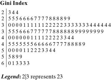
(d) The split stems provide a better graphical summary.
Copyright © 2025 Pearson Education, Inc.
21. (a)

(b) Answers will vary. The Academy Award winners for Best Actor tend to be older on the whole than winners for Best Actress. Both distributions are skewed right
22. (a)

(b) Answers will vary. For both players, the distances of home runs mainly fall from 360 to 450 feet. McGwire has quite a few extremely long distances.
23. (a), (b) Cumulative Frequency for 22–23.9 18, = for 24–25.9 18104122,=+= for 26–27.9 122253375,=+= and so on.
Cumulative Relative Frequency for 22–23.9 18 0.0328, 549 = for 24–25.9 122 0.2222, 549 = for 26–27.9 375 0.6831, 549 = and so on.
SpeedCumulative Cumulative (ft/sec) FrequencyRelativeFrequency
2223.9 18 0.0328
2425.9 122 0.2222
2627.9 375 0.6831
2829.9 541 0.9854
3031.9 549 1


24. (a), (b) Cumulative Frequency for 0–0 9 2342, = for 1.0–1 9 234240416383,=+= for 2.0–2 9 638315507933,=+= and so on.
Cumulative Relative Frequency for 0–0.9 2342 0.2551, 9179 = for 1.0–1 9 6383 0.6954, 9179 = for 2.0–2 9 7933 0.8643, 9179 = and so on.
Cumulative Cumulative
Magnitude FrequencyRelativeFrequency 00.9 2342 0.2551 1.01.9 6383 0.6954 2.02.9 7933 0.8643
3.03.9 8220 0.8955 4.04.9 9040 0.9849
5.05.9 9168 0.9988 6.06.9 9176 0.9997
7.07.9 9179 1
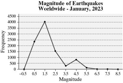
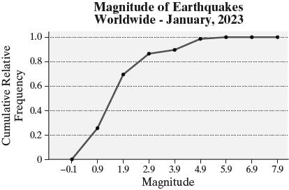
25. (a), (b) Cumulative Frequency for 20–24 9 5, = for 25–29.9 51621,=+= for 30–34.9 212849,=+= and so on.
Cumulative Relative Frequency for 20–24.9 5 0.0368, 136 = for 25–29 9 21 0.1544, 136 = for 30–34.9 46 0.3603, 136 = and so on.
Cumulative Cumulative GiniIndex FrequencyRelativeFrequency
2024.9 5 0.0368
2529.9 21 0.1544
3034.9 49 0.3603
3539.9 76 0.5588
4044.9 96 0.7059
4549.9 113 0.8309
5054.9 126 0.9265
5559.9 131 0.9632
6064.9 136 1
(c)
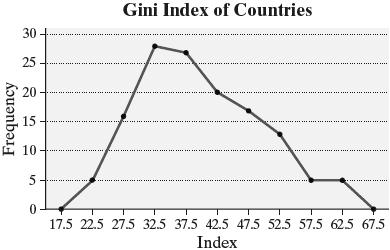

26. (a), (b) Cumulative Frequency for 45,000–49,999 1, = for 50,000–54,999 156,=+= for 55,000–59,999 6410,=+= and so on.
Cumulative Relative Frequency for 45,000–49,999 1 0.0196, 51 = for 50,000–54,999 6 0.1176, 51 = for 55,000–59,999 10 0.1961, 51 = and so on.
Cumulative Cumulative Income FrequencyRelativeFrequency
45,00049,999 1 0.0196 50,00054,999 6 0.1176
55,00059,999 10 0.1961
60,00064,999 19 0.3725
65,00069,999 31 0.6078
70,00074,999 37 0.7255
75,00079,999 40 0.7843
80,00084,999 46 0.9020
85,00089,999 49 0.9608
90,00094,999 51 1


Copyright © 2025 Pearson Education, Inc.
(d)
(d)
(c)
(d)
27. (a)
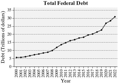
(b) For 2008 to 2009, Percentage change 11.910.0 0.19019.0%. 10.0 ===
No, there have not been any years when the debt decreased since 2000.
28. (a)

(b) For 2015 to 2016, Percentage change 74 0.7575%. 4 === For 2016 to 2017, Percentage change 107 0.42942.9%. 7 ==
29.

Births per woman was lowest in 1978. 30.
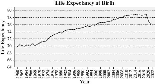
Life expectancy at birth was highest in the years 2014 and 2019.
31. (a) ReturnConsumer
(b)
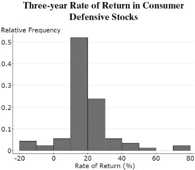
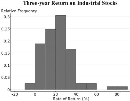

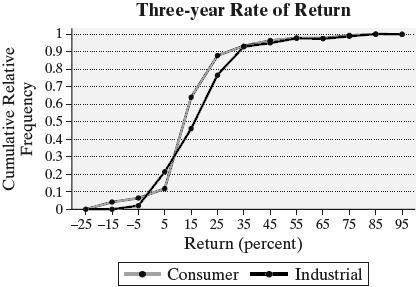
(e) Answers will vary. However, industrial stocks had a higher proportion of highreturn stocks, and industrials had fewer stocks with negative returns.
32. Answers will vary. Reports should address the fact that the number of people going to the beach and participating in underwater activities (e.g., scuba diving, snorkeling) has also increased, so an increase in shark attacks is not unexpected. A better comparison would be the rate of attacks per 100,000 beach visitors. The number of fatalities could decrease due to better safety equipment (e.g., bite resistant suits) and better medical care.
33. Answers will vary.
34. Since the cumulative relative frequency displays the proportion (or percentage) of observations less than or equal to the category or class, and all the observations are less than or equal to the last class or category, the cumulative relative frequency for the last class must be 1, or 100%.
35. Time-series plots are drawn with quantitative variables. They are drawn to see trends in the data.
Section 2.4
1. The number of shark attacks is going to be higher in the summer months due to there being more swimmers. This graphic should be changed to account for the number of swimmers in the water.
2. (a) Answers will vary. It is unclear where the start of the graph is. Is it at the base of each figure or at the bottom of the platform? Either way, the lengths of the bars are not proportional. For example, the top of the cheeseburger should be 2.2 times as high as the soda, but that is not the case in the current graph.
(b) Answers will vary. The pictures could be replaced by simple bars (of the same width) that are proportional in area.
3. (a) The vertical axis starts at $60,000 instead of $0. Doing this suggests that the median household income changed much more that it actually did
(b)

This new graph indicates that the median household income has changed, but not a significantly as suggested by the original graph.
4. (a) The vertical axis starts at 4 instead of 0. This may lead the reader to conclude, for example, that the percent of employed people aged 55–64 who are members of a union is much higher than the percent of those aged 25–34 years.
(b)
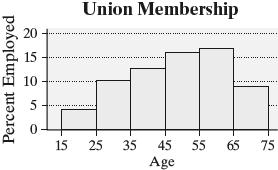
5. The bar for 12p–6p covers twice as many hours as the other bars. By combining two 3-hour periods, this bar looks larger compared to the others, making afternoon hours look more dangerous. When this bar is split into two periods, the graph may give a different impression.
6. The graph is comparing counts for two categories that do not cover the same number of years. A better comparison is the incidence rate (number of accidents per 100,000 licensed drivers).
7. This graph is misleading because it does not take into account the size of the population of each state. Certainly, Vermont is going to pay less in total taxes than California simply because its population is so much lower. The moral of the story here is that many variables should be considered on per capita (per person) basis. For example, this graph should be drawn to represent taxes paid per capita
8. Answers may vary. One possibility follows:

9. (a) The graphic is misleading because the bars are not proportional. The bar for housing should be a little more than twice the length of the bar for transportation, but it is not.
(b) To improve the graphic, adjust the lengths of the bars so that they are proportional.
10. The graph does not support the safety manager’s claim. The vertical scale starts at 0.17 instead of 0, so the difference between the bars is distorted. While there has been a decrease, it appears that the decrease is roughly 10% of the 2006 rate.
11. (a) The following plot could be used to support the politician’s position.

(b) The following graph could be used to refute the politician’s position. Yes, this graph is convencing

(c) Answers may vary. Changing the scale on the graph will affect the message. The variable used to measure the argument (e.g., “Health Care per Capita” versus “Health Care as a Percent of GDP”) will also affect the message
12. (a) A graph that is not misleading will use a vertical scale starting at $0 and bars of equal width. One example is:
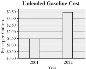
(b) A graph that is misleading might use a vertical scale that does not start at $0. For example, the following graph is misleading because it starts at $1.25 instead of 0 without indicating a gap. This might cause the reader to conclude that cost of unleaded gasoline has risen more sharply than actually occurred.
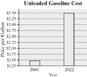
13. (a) A graph that is not misleading will use a vertical scale starting at 0% and bars of equal width. One example is:
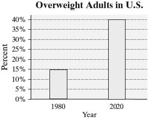
(b) A graph that is misleading might use a vertical scale that does not start at 0% For example, the following graph is misleading because the vertical scale starts at 10% instead of 0% without indicating a gap. This might cause the reader to think that the proportion of overweight adults in the United States increased more significantly that it actually did.

14. (a) A bar graph
(b) A reader cannot tell whether the graph ends at the top of the nipple on the baby bottle or at the end of the milk.
(c) Answers will vary. An example of a graph that is not misleading is:
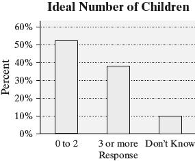
15. Answers will vary. Three-dimensional graphs are deceptive. The sectors for P (pitcher) and 3B (third base) appear to be different sizes even though both are the same percentage. Graphs should not be drawn using three dimensions. Instead, use a two-dimensional graph.
16. Answers will vary. This is a histogram so the bars should touch. In addition, there are no labels on the axes and no title.
Chapter 2 Review Exercises
1. (a) 614 + 154 + 1448 = 2216 participants
(b) 1448 0.653 2216
(c)

(d) Answers will vary
2. (a) Total 844149691621224 =+++=
Relative frequency for firearms 844 0.6895, 1224 = and so on.
TypeofWeaponRelativeFrequency
Firearm 0.6895
Knivesorcuttinginstruments 0.1217
Personalweapons 0.2564
Otherweapon 0.1324
(b)

(c)

3. (a), (b), (c)
Total births = 1877 + 146,973 + 648,484 + 1,023,989 + 1,115,055 + 592,179 + 126,332 + 8362 + 1041 = 3,664,292
Relative frequency for 10–14 1877 0.0005, 3,664,292 = for 15–19 146,973 0.0401, 3,664,292 = for 20–24 648,484 0.1770, 3,664,292 = and so on.
Cumulative frequency for 10–14 1877, = for 15–19 1877146,973148,850, =+= for 20–24 148,850648,484797,334, =+= and so on.
Cumulative relative frequency for 10–14 1877 0.0005, 3,664,292 = for 15–19 148,850 0.0406, 3,664,292 = for 20–24 797,334 0.2176, 3,664,292 = and so on.
Cumulative
AgeofRelativeCumulativeRelative MotherFrequency FrequencyFrequency
1014 0.0005 1877 0.0005
1519 0.0401 148,850 0.0406 2024 0.1770 797,334 0.2176
2529 0.2795 1,821,323 0.4970
3034 0.30432,936,378 0.8013
3539 0.16163,528,557 0.9630
4044 0.03453,654,889 0.9974
4549 0.00233,663,251 0.9997
5054 0.00033,664,292 1 (d)

The distribution is roughly symmetric and bell-shaped.


(j) The relative frequency for 20–24 is 0.1770 So, 17.70% of live births were to mother aged 20 to 24
(k) The number of births to mother of age 30 or older is 1,115,055 + 592,179 + 126,332 + 8362 + 1041 = 1,842,969.
Relative frequency 1,842,969 0.5030 3,664,292 =
So, 50.30% of live births were to mothers aged 30 years or older.
(e)
(f)
(g)
(h)
4. (a), (b) Of the 100 voters, 46 are Democrat, 16 are Independent, and 38 are Republican. The relative frequency for Democrat 46 0.46, 100 == and so on.
AffiliationFrequencyRelativeFrequency
Democrat 46 0.46
Independent 16 0.16
Republican 38 0.38 (c) (d)

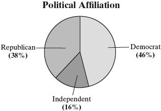
(e) Democrat appears to be the most common political affiliation in Naperville.
5. (a), (b), (c), (d)
Counting, 7 of the 60 married couples have no children, 7 have one child, 18 have two children, 20 have three children, 7 have four children, and 1 has five children.
Relative frequency for 0 children 7 0.1167, 60 = for 1 child 7 0.1167, 60 = for 2 children 18 0.3, 60 == and so on.
Cumulative frequency for 0 children = 7, for 1 child = 7 + 7 = 14, for 2 children = 14 + 18 = 32, and so on.
Cumulative relative frequency for 0 children 7 0.1167, 60 = for 1 child 14 0.2333, 60 = for 2 children 32 0.5333, 60 = and so on.
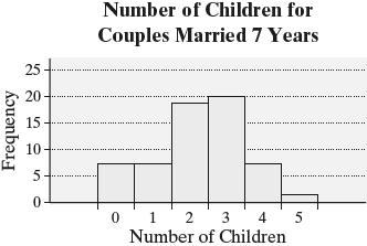
The distribution is roughly symmetric.

(g) The relative frequency for two children is 0.3. So, 30% of couples married seven years has two children.
(h) The number of couples with at least two children is 18 + 20 + 7 + 1 = 46.
Relative frequency 46 0.7667 60 =
So, 76.67% of of couples married seven years has at least two children. (i)
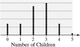
6. (a), (b) Relative frequency for 40–44.9 is 1 0.0196, 51 = and so on.
HomeownershipRateFreq.Rel.Freq.
4044.9 1 0.0196
4549.9 0 0
5054.9 1 0.0196
5559.9 3 0.0588
6064.9 6 0.1176
6569.9 17 0.3333
7074.9 19 0.3725
75 79.9 4 0.0784


(e) The distribution is skewed left.
(f) Relative frequency for 40–49 9 is 1 0.0196, 51 = and so on.


(g) Answers will vary. Both class widths give a good overall picture of the distribution. However, the class width of 5 appears to be the better summary.
7. (a), (b), (c), and (d) Answers will vary. Using 2.2000 as the lower class limit of the first class and 0.0200 as the class width, we obtain the following:
2.20002.2199 20.0588 2 0.0588 2.22002.2399 30.0882 5 0.1471
2.24002.2599 50.1471 10 0.2941 2.26002.2799 60.1765 16 0.4706
2.28002.2999 40.1176 20 0.5882
2.30002.3199 70.2059 27 0.7941
2.32002.3399 50.1471 32 0.9412
2.34002.3599 10.0294 33 0.9706
2.36002.3799 10.0294 34 1

The distribution is roughly semmetric. (f)


8. The distribution is skewed right.
Copyright © 2025 Pearson Education, Inc.
9. (a) Yes. Grade inflation seems to be occurring Grade point averages have increased every time period for all schools.
(b) GPAs increased about 5.1% for public schools. GPAs increased about 6.1% for private schools. Private schools have higher grade inflation because the GPAs are higher and they are increasing faster.
(c) The graph may be misleading because it starts at 2.6 on the vertical axis.
10. (a) Answers will vary. The following timeseries plot shows the divergence. The adjusted gross income share of the top 1% of earners shows increases on the whole The adjusted gross income share of the bottom 50% of earners shows steady decreases overall.

(b) Answers will vary. The following timeseries plot show the divergence. The income tax share of the top 1% of earners shows steady increases overall. The income tax share of the bottom 50% of earners has stayed relatively steady over time.
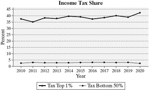
11. (a) Graphs will vary. One way to mislead would be to start the vertical scale at a value other than 0. For example, starting the vertical scale at $30,000 might make the reader believe that college graduates earn more than three times what a high school graduate earns (on average).
(b) A graph that does not mislead would use equal widths for the bars and would start the vertical scale at $0. Following is an example of a graph that does not mislead:

12. (a) Flats are preferred the most (40%). Extrahigh heels are preferred the least (1%).
(b) The graph is misleading because the bar heights and areas for each category are not proportional.
Chapter 2 Test
1. (a) A 5 Star rating was the most popular rating with 1675 votes.
(b) 35 + 67 +246 + 724 + 1675 = 2747 postings were posted on Yelp for Hot Doug’s restaurant.
(c) 1675724951 −=
There were 951 more 5 Star ratings than 4 Star ratings.
(d) Relative frequency for Star ratings 1675 0.6098 2747 =
About 61% of all ratings were 5 Star ratings.
(e) No, it is not appropriate to describe the shape of this distribution as skewed left. This is a bar graph, so the data are qualitative. We only talk about distribution shape for graphs of quantitative data, such as histograms.
2. (a) There were 1005 responses. The relative frequency for “New tolls” is 412 0.4100, 1005 and so on.
ResponseFrequencyRelativeFrequency
(b) The relative frequency is 0.1801, so about 18% of respondents who would like to see an increase in gas taxes (c)


3. (a), (b) Of the 50 customers, 9 had “No high school diploma,” 16 were “High school graduate,” and so on.
Relative frequency for “No high school diploma” 9 0.18, 50 == for “High school graduate” 16 0.32, 50 == and so on.

(d)

(e) The largest bar (and largest pie segment) corresponds to “High School Graduate,” so high school graduate is the most common educational level of a commuter.
4. (a), (b), (c), (d) Counting, 5 of the 50 weeks had one car, 7 weeks had two cars, 12 weeks had three cars, and so on.
Relative frequency for 1 car 5 0.1, 50 == for 2 cars 7 0.14, 50 == for 3 cars 12 0.24, 50 == and so on.
Cumulative frequency for 1 car = 5, for 2 cars = 5 + 7 = 12, for 3 cars = 12 + 12 = 24, and so on.
Cumulative relative frequency for 1 car 5 0.1, 50 == for 2 cars 12 0.24, 50 == for 3 cars 24 0.48, 50 == and so on.
Copyright © 2025 Pearson Education, Inc.
SerumHDLFreq.Rel.Freq. 2029 1 0.025
3039
(e)
2
5
6
7
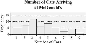
The distribution is skewed right.

(g) The relative frequency for 3 cars is 0.24.
So, 24% of the weeks had three cars arrive between 11:50 A.M. and noon.
(h) The number of week that had 3 or more cars is 12 + 6 + 8 + 5 + 2 + 4 + 1 = 38
Relative frequency 38 0.76 50 ==
So, 76% of the weeks had three or more cars arrive between 11:50 A.M. and noon.
(i)

5. Answers may vary. One possibility follows: (a), (b) Using a lower class limit of the first class of 20 and a class width of 10, we obtain the following:


(e) The distribution is roughly bell-shaped.
6. (a), (b) Cumulative frequency for 50,000–99,999 = 4, for 100,000–109,999 = 4 + 13 = 17, for 110,000–119,999 = 17 + 19 = 36, and so on.
Cumulative relative frequency for 50,000–99,999 4 0.08, 50 == for 100,000–109,999 17 0.34, 50 == for 110,000–119,999 36 0.72, 50 == and so on.
Cumul. Cumul. Freq.Rel.Freq. ClosingPrice
50,00099,999 4 0.08
100,000149,999 17 0.34
150,000199,999 36 0.72
200,000249,999 43 0.86
250,000299,999 46 0.92
300,000349,999 48 0.96
350,000399,999 49 0.98
400,000449,999 49 0.98
450,000499,999 50 1
(c) The cumulative relative frequency for the class $150,000–$199,000 is 0.72. Therefore, 72% of the homes sold for less than $200,000.
8.
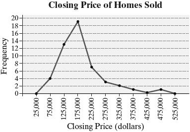
The distribution is skewed right.
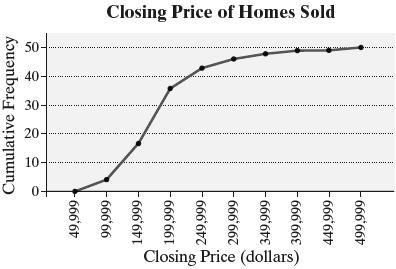
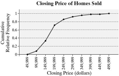
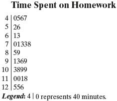
The distribution is roughly symmetric and uniform.

As percent of income females earn increases, birth rate appears to decrease.
9. Answers may vary. It is difficult to interpret this graph because it is not clear whether the scale is represented by the height of the steps, the width of the steps, or by the graphics above the steps. The graphics are misleading because they increase in size both vertically and horizontally, so the resulting areas are not proportionally correct. The graph could be redrawn using bars whose widths are the same and whose heights are proportional based on the given percentages. The use of graphics should be avoided, or a standard size graphic representing a fixed value could be used and repeated as necessary to illustrate the given percentages.
Case Study: The Day the Sky Roared


During the April 3–4, 1974 outbreak, about 44% of the tornadoes exceeded F3 on the Fujita Wind Damage Scale. This was much greater than the 1% that typically occurs.
Copyright © 2025 Pearson Education, Inc.
2. The histogram will vary depending on the class width. One possibility follows:

3. Histograms will vary depending on class widths. For comparison purposes, the same class width was used for each histogram.

The distributions all appear to be skewed right, though the distribution for F5 tornadoes is difficult to see due to the low sample size. There is an obvious shift in the distributions. As the strength of the tornado increases, the duration of the tornado increases.
4.

Of the 305 deaths during the outbreak, 259 were due to the more severe tornadoes.
Relative frequency 259 0.8492 305 =
Roughly 85% of the deaths during the outbreak were due to the more severe tornadoes. This may be a little high, but it is consistent since it is greater than 70%.
5.
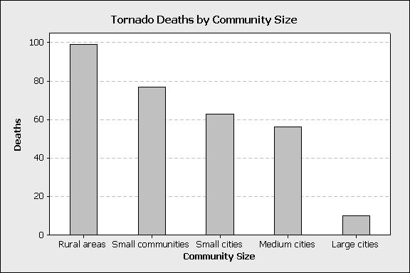
The provided data are not sufficient to determine whether or not tornadoes are more likely to strike rural areas. Some research at Texas A&M University indicates that tornadoes are more likely to occur in urban or suburban areas, possibly due to greater temperature differences. The data do indicate that the number of deaths decreases as the population of the community increases. The higher the population density, the greater the chance that a tornado is detected and reported early, thereby providing more time for residents to take shelter.
6. Answers will vary. The outbreak of April 3–4, 1974 seemed to be more severe in intensity than usual, with 20% of the tornadoes being classified as F4 or F5. While the shape of the duration distribution was roughly the same for each intensity level, the duration of a tornado increased with its intensity. The number of deaths decreased as the community size increased.
Chapter 3
Numerically Summarizing Data
Section 3.1
1. A statistic is resistant if its value is not sensitive to extreme data values. The median is resistant because it is a positional measure of central tendency, and increasing the largest value or decreasing the smallest value does not affect the position of the center. The mean is not resistant because it is a function of the sum of the values of data. Changing the magnitude of one value changes the sum of the values.
2. Personal income tends to be skewed right, so the mean is greater than the median. Thus, the mean personal income is $57,143 and the median is $37,522.
3. HUD uses the median because the data are skewed. Explanations will vary. One possibility is that the price of homes has a distribution that is skewed to the right, so the median is more representative of the typical price of a home.
4. The mean will be larger because it will be influenced by the extreme data values that are to the right end (or high end) of the distribution and pulled in that direction.
5. 10,0001 5000.5 2 . The median is between the 5000th and the 5001st ordered values.
6. False. A data set may have multiple modes, or it may have no mode at all.
7. 2013481055 11
11. 108,005,700 $1725 62,612
The mean price per ticket was $1725.
12. Let x represent the missing value. Since there are 6 data values in the list, the median 26.5 is between the 3rd and 4th ordered values, which are 21 and x, respectively. Thus,
The missing value is 32.
13. 42.149.942.939.250.640.8 265.5 xi
Mean = 265.5 44.25 mpg 6 xi x n
Data in order: 39.2, 40.8, 42.1, 42.9, 49.9, 50.6 42.1 + 42.985.0 Median42.5 mpg 22
No data value occurs more than once, so there is no mode.
14. 60.5128.084.6122.378.994.7 85.989.9 744.8
Mean = 744.8 93.1 minutes 8 xi x n
Data in order: 60.5, 78.9, 84.6, 85.9, 89.9, 94.7, 122.3, 128.0 85.989.9175.8 Median87.9 minutes 22
No data value occurs more than once, so there is no mode.
15. 39604090320031002940 3830409040403780 33,030 psi
Mean = 33,030 3670 psi 9 xi x n
Data in order: 2940, 3100, 3200, 3780, 3830, 3960, 4040, 4090, 4090
Median = the 5th ordered data value = 3830 psi Mode = 4090 psi (it occurs twice, which is the most number of times)
16. 282270260266257260267 1862 minutes xi
Mean = 1862 266 minutes 7 xi x n
Data in order: 257, 260, 260, 266, 267, 270, 282
Median = the 4th ordered data value = 266 min
Mode = 260 minutes (it occurs twice, which is the most number of times)
17. (a) The histogram is skewed to the right, suggesting that the mean is greater than the median. That is, x M
(b) The histogram is symmetric, suggesting that the mean is approximately equal to the median. That is, x M .
(c) The histogram is skewed to the left, suggesting that the mean is less than the median. That is, x M
18. (a) IV. The distribution is symmetric (so mean median) and centered near 30.
(b) III. The distribution is skewed to the right, so mean > median.
(c) II. The distribution is skewed to the left, so mean < median.
(d) I. The distribution is symmetric (so mean median) and centered near 40.
19. (a) Traditional Lecture:
70.869.179.467.6
85.378.256.281.3
80.971.563.769.8
+59.8
933.6
Mean71.82 13 xi x n
Data in order:
56.2, 59.8, 63.7, 67.6, 69.1, 69.8, 70.8, 71.5, 78.2, 79.4, 80.9, 81.3, 85.3
Median70.8 M
Flipped Classroom:
76.471.663.472.4
77.991.878.976.8
82.170.291.577.8
+76.5
1007.3
1007.3 Mean77.48 13 xi x n
Data in order: 63.4, 70.2, 71.6, 72.4, 76.4, 76.5, 76.8, 77.8, 77.9, 78.9, 82.1, 91.5, 91.8
Median76.8 M
(b) If the score of 59.8 had been incorrectly recorded as 598 in the traditional lecture, then the incorrect mean and median would be:
70.869.179.467.685.3
78.256.281.380.9
71.563.769.8 + 598 1471.8
1471.8
Mean113.22 13 xi x n
Data in order: 56.2, 63.7, 67.6, 69.1, 69.8, 70.8, 71.5, 78.2, 79.4, 80.9, 81.3, 85.3, 598
Median71.5 M
The incorrect entry causes the mean to increase substantially while the median only slightly changes. This illustrates that the median is resistant while the mean is not resistant.
20. (a) Tap Water: 7.647.457.477.507.687.69 7.457.107.567.477.527.47 90.00
Mean7.50 12 xi x n
Data in order: 7.10, 7.45, 7.45, 7.47, 7.47, 7.47, 7.50, 7.52, 7.56, 7.64, 7.68, 7.69 7.477.5014.97
Median7.485 22
Mode = 7.47 (because it occurs three times, which is the most)
Bottled Water: 5.155.095.265.205.025.23 5.285.265.135.265.215.24 62.33
Mean5.194 12 xi n
Data in order: 5.02, 5.09, 5.13, 5.15, 5.20, 5.21, 5.23, 5.24, 5.26, 5.26, 5.26, 5.28 5.215.2310.44
Median5.22 22
Mode = 5.26 (because it occurs three times, which is the most)
The pH of the sample of tap water is somewhat higher than the pH of the sample of bottled water.
(b) 7.647.457.477.507.687.69 7.451.707.567.477.527.47
Data in order: 1.70, 7.45, 7.45, 7.47, 7.47, 7.47, 7.50, 7.52, 7.56, 7.64, 7.68, 7.69 7.477.5014.97 Median7.485
The incorrect entry causes the mean to decrease substantially while the median does not change. This illustrates that the median is resistant while the mean is not resistant.
21. (a) 76606081728080
(b) Samples and sample means will vary.
(c) Answers will vary.
22. (a) 39219323045111239 238 xi
(b) Samples and sample means will vary.
(c) Answers will vary.
23. (a) The distribution is skewed right.
(b) Because the distribution is skewed, the median is the better measure of central tendency since it is resistant to the skewness.
(c) Roughly 99% of patients diagnosed with COVID-19 showed symptoms within 14 days of infection.
24. The distribution is relatively symmetric as is evidenced by both the histogram and the fact that the mean and median are approximately equal. Therefore, the mean is the better measure of central tendency.
25. To create the histogram, we choose the lower class limit of the first class to be 0.78 and the class width to be 0.02. The resulting classes and frequencies follow: Class Freq. Class Freq. 0.780.7910.880.8910 0.800.8110.900.919 0.820.8340.920.934 0.840.8580.940.952
0.860.8711
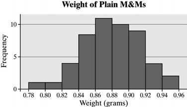
To find the mean, we add all of the data values and divide by the sample size: 43.73 xi
To find the median, we arrange the data in order. The median is the mean of the 25th and 26th data values: 0.870.88 0.875 grams
The mean is approximately equal to the median, suggesting that the distribution is symmetric. This is confirmed by the histogram (though is does appear to be slightly skewed left). The mean is the better measure of central tendency.
26. To create the histogram, we choose the lower class limit of the first class to be 90 and the class width to be 4. The resulting classes and frequencies follow:
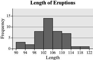
To find the mean, we add all of the data values and divide by the sample size: 4582 xi ; 4582 104.1 seconds 44 xi x n
To find the median, we arrange the data in order. The median is the mean of the 22nd and 23rd data values:
The mean is approximately equal to the median, suggesting that the distribution is symmetric. This is confirmed by the histogram. The mean is the better measure of central tendency.
27. To create the histogram, we choose the lower class limit of the first class to be 0 and the class width to be 5. The resulting classes and frequencies follow:

To find the mean, we add all of the data values and divide by the sample size: 538 xi ; 538 13.5 minutes 40 xi x n
To find the median, we arrange the data in order. The median is the mean of the 20th and 21st data values: 89 8.5minutes 2 M
The median is less than the mean, suggesting that the distribution is skewed right. This is confirmed by the histogram. The median is the better measure of central tendency.
28. To create the histogram, we choose the lower class limit of the first class to be 0 and the class width to be 5. The resulting classes and frequencies follow:
0–4 3 5–9 18 10–14 8 15–19 2 20–24 0 25–29 2 30–35 7

To find the mean, we add all of the data values and divide by the sample size: 516 xi ; 516 12.9days 40 xi x n
To find the median, we arrange the data in order. The median is the mean of the 20th and 21st data values: 89 8.5days 2 M
The histogram is almost bimodal, suggesting that folks either order every 7 days (or so) or place orders monthly. The median is likely the better measure of central tendency.
29. (a) The frequencies are:
Liberal = 10
Moderate = 12
Conservative = 8
The mode political view is moderate.
(b) Yes. Rotating the choices will help to avoid response bias that might be caused by the wording of the question.
30. The frequencies are:
Cancer = 1
Gunshot wound = 8
Assault = 1
Motor vehicle accident = 7
Fall = 2
Congestive heart failure = 1
The mode diagnosis is gunshot wound.
31. Sample size of 5:
All data recorded correctly: 99.8; 100 xM
106 recorded as 160: 110.6; 100 xM
Sample size of 12:
All data recorded correctly: 100.4; 101 xM
106 recorded as 160: 104.9; 101 xM
Sample size of 30:
All data recorded correctly: 100.6; 99 xM
106 recorded as 160: 102.4; 99 xM
For each sample size, the mean becomes larger while the median remains the same. As the sample size increases, the impact of the incorrectly recorded data value on the mean decreases.
32. 14(68.0)651017 Mean67.8 1515 inches
33. The sum of the nineteen readable scores is 19841596 . The sum of all twenty scores is 20821640 . Therefore, the unreadable score is 1640159644 .
34. Answers will vary. You could point out to the friend that the mean survival time for this type of cancer is 69 months with a median of 11 months. Although about 50% of the patients survive 20 months or less, about 50% of the patients survive over 80 months!
35. Answers will vary. 0.061; 0 xM The histogram is skewed to the right, so we would expect to report the median as the measure of central tendency. However, a median of 0 does not tell the whole story of the fatal accidents, so it could be argued that
both the mean and median should be reported. With this data, because the median is 0, at least half of all fatal accidents involved drivers with no alcohol in their system.
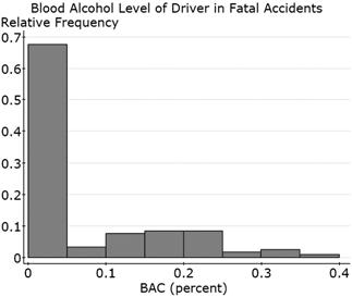


Both distributions are skewed right. It is clear that females tend to send more texts each month than males. Using the mean, the data suggest almost three times as many texts are sent by females, on average; using the median, the data suggest almost twice as many texts are sent by females.
36. Answers will vary.
37. (a) Mean: 3030455050505555
The mean is $50,000.
Median: The ten data values are in order. The median is the mean of the 5th and 6th data values: 5050100 50 22 M
The median is $50,000.
Mode: The mode is $50,000 (the most frequent salary).
(b) Add $2500 ($2.5 thousand) to each salary to form the 2nd data set: 32.5, 32.5, 47.5, 52.5, 52.5, 52.5, 57.5, 57.5, 62.5, 77.5
2nd Mean:
The mean for the 2nd data set is $52,500.
2nd Median: The ten data values are in order. The median is the mean of the 5th and 6th data values:
The median for the 2nd data set is $52,500.
2nd Mode: The mode for the 2nd data set is $52,500 (the most frequent new salary).
All three measures of central tendency increased by $2500, which was the amount of the raises.
(c) Multiply each original data value by 1.05 to generate the 3rd data set: 31.5, 31.5, 47.25, 52.5, 52.5, 52.5, 57.75, 57.75, 63, 78.75
3rd Mean: 31.531.547.2552.552.5 52.557.7557.756378.75
The mean of the 3rd data set is $52,500.
3rd Median: The ten data values are in order. The median is the mean of the 5th and 6th data values:
The median of the 3rd data set is $52,500.
3rd Mode: The mode of the 3rd data set is $52,500 (the most frequent new salary).
All three measures of central tendency increased by 5%, which was the amount of the raises.
(d) Add $25 thousand to the largest data value to form the 4th data set: 30, 30, 45, 50, 50, 50, 55, 55, 60, 100
4th Mean: 3030455050505555 60100 525
4th 525 52.5 10 xi N
The mean of the 4th data set is $52,500. 4th Median: The ten data values are in order. The median is the mean of the 5th and 6th data values: 4th 5050100 50 22 M
The median of the 4th data set is $50,000.
4th Mode: The mode of the 4th data set is $50,000 (the most frequent salary).
The mean was increased by $2500, but the median and mode remained unchanged.
38. (a) 6570717595376 75.2 55 x
(b) The five data values are in order, so the median is the middle (3rd) value: 71 M
(c) The distribution is skewed right, so the median is the better measure of central tendency.
(d) Adding 4 to each score gives the following new data set: 69, 74, 75, 79, 99. 6974757999396 79.2 55 x
(e) The curved test score mean is 4 greater than the unadjusted test score mean. Adding 4 to each score increased the mean by 4.
39. The largest value is 0.95 and the smallest is 0.79. After deleting these two values, we have: 41.99; xi 41.99 0.875 grams 48 xi x n
The mean after deleting these two data values is 0.875 grams. The trimmed mean is more resistant than the regular mean because the most extreme values are omitted before the mean is computed.
40. The largest value is 0.95 and the smallest is 0.79. 0.790.951.74 Midrange0.87 grams.
The midrange is not resistant because it is computed using the two most extreme data values.
41. (a) = 3.63 mi M = 0.8 mi
We expect the distribution of tornado lengths to be skewed right because the mean is greater than the median. The histogram confirms this.
(b)
2.50 mi, TX M 0.50 mi
4.74 mi, GA M 1.53 mi
Georgia has longer tornadoes by both measures of central tendency.
(c) It does not make sense to determine the mean F scale because F scale is a qualitative variable.
42. (a) 2130.0 kcal x , 1956.0 kcal M ; Because the mean is greater than the median, we expect the distribution of kcal consumed to be skewed right. The histogram confirms this.

(b) males 2452.7 kcal x , females 1823.6 kcal x
males 2275.0 kcal M , females 1706.5 kcal M
Males tend to consume more calories.
43. (a) The data are discrete.
(b) To construct the histogram, we first organize the data into a frequency table: Number of Drinks Frequency

The distribution is skewed right.
(c) Since the distribution is skewed right, we would expect the mean to be greater than the median.
(d) To find the mean, add all of the data values and divide by the sample size. 47 xi
To find the median, arrange the data in order. The median is the mean of the 25th and 26th data values. 11 1 2 M
This tells us that the mean can be less than the median in skewed-right data. Therefore, the rule skewed right data implies mean greater than median is not always true.
(e) The mode is 0 (the most frequent value).
(f) Yes, Carlos’s survey likely suffers from sampling bias. It is difficult to get truthful responses to this type of question. Carlos would need to ensure that the identity of the respondents is anonymous.
44. (a) The mean FICO score is expected to be less than 723, since the mean is usually less than the median for left-skewed data.
(b) 50% of the scores will be above 723.
45. The median is resistant because it is the “middle observation” and increasing the largest value or decreasing the smallest value does not affect the median. The mean is not resistant because it is a function of the sum of the data values. Changing the magnitude of one value changes the sum of the values, and thus affects the mean.
46. No, this is not a valid approach since the number of households is not equal in all the states.
47. (a) The median describes the typical U.S. household’s net worth better. Household net worth is expected to be skewed right, and the mean will be affected by the outliers.
(b) Household net worth is expected to be skewed right because the mean is much bigger than the median.
(c) There are a few households with very high net worth.
48. The salary distribution is skewed right, so the players’ negotiator would want to use the median salary; the owners’ negotiator would use the mean salary to refute the players’ claims.
49. The distribution is skewed right, so the median amount of money lost is less than the mean amount lost.
50. (a) Median; the data are quantitative and the distribution of home prices tends to be skewed right.
(b) Mode; the data are qualitative.
(c) Mean; the data are quantitative and symmetric.
(d) Median; the data are quantitative and skewed right.
(e) Median; the data are quantitative and the distribution of NFL salaries is skewed right.
(f) Mode; the data are qualitative since jersey numbers categorize a player.
(g) Mode; the data are qualitative.
Section 3.2
7.
11. Range = Largest Value – Smallest Value = 50.639.211.4
To calculate the sample variance and the sample standard deviation, we use the computational formulas:
42.11772.41
49.92490.01
42.91840.41
39.21536.64
13. Range = Largest Value – Smallest Value = 4090 – 2940 = 1150 psi
To calculate the sample variance and the sample standard deviation, we use the computational formulas:
396015,681,600 409016,728,100
320010,240,000 31009,610,000 29408,643,600 383014,668,900 409016,728,100 404016,321,600 378014,288,400 33,020122,910,300
12. Range = Largest Value – Smallest Value
To
14. Range = Largest Value – Smallest Value = 282 – 257 = 25 minutes
To calculate the sample variance and the sample standard deviation, we use the computational formulas:
28279,524 27072,900 26067,600 26670,756 25766,049 26067,600 26771,289 1862495,718 ii ii
15. Histogram (b) depicts a higher standard deviation because the data is more dispersed, with data values ranging from 30 to 75. In histogram (a), the data values only range from 40 to 60.
16. (a) III, because it is centered near 53, and it has a dispersion consistent with s = 10, but not with s = 1.8 or s = 22.
(b) I, because it is centered near 53, and it has the least amount of dispersion of the three histograms with mean = 53.
(c) IV, because it is centered near 53, and it has the greatest amount of dispersion of the three histograms with mean = 53.
(d) II, because it has a center near 60.
17. (a) Set 1(a) has the higher standard deviation because the observations 6 and 8 create more dispersion than the corresponding observations 7 and 7. Set 1a
(b) Set 2(b) has the higher standard deviation because each observation is farther away from the mean by a factor of 10.
(c) Each corresponding observation is the same number of units from the mean so the standard deviations are the same.
