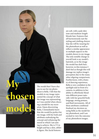
e model that I have chosen to use for my photoshoot is Bella. I felt that the models in my image represented the concept of what the image was representing, so I was careful when choosing a model for my recreation. Upon discovering Bella, I immediately knew that she would be perfect for my image, with her look and attributes embodying the concept and enhancing the mood in which I am aiming to achieve. She is 5’5 in height and has a slim, athletic gure. Her facial features
are so , with a pale skin tone and medium-length blonde hair. Features that all harmoniously suit the styling and clothing choices that she will be wearing for the photoshoot as well as re ect a similar appearance in multiple aspects to the models shown in my image. e only notable change in overall look is my model's hairstyle, as in the image the model has dark hair; however, in this instance I don’t feel as though this will damage my replica image's perception due to the many other aligning comparisons. Furthermore, with a history of dancing experience, Bella is very con dent in the spotlight and in front of a camera, in addition to her ability to e ortlessly blend into di erent poses naturally with her graceful body language, strong posture, and uid movements. All of these attributes combined nalised my decision on using Bella as the model for my photoshoot, and I am excited to view the outcome of my photoshoot images.
THE GARMENTS THAT I WILL
BLAZER/JACKET SHIRT
I will be using one blazer that I thried from Vinted for both out ts. As opposite sides of the jacket are shown for both models looks, I have added details to the corresponding sides to replicate the look of the image.
I will be using a pink shirt that I thried from Vinted.
WILL BE USING
A breakdown of the nished garments that I have sourced, found, or created through DIY for this project. To style my model's out ts for the photoshoot, I'll use all of these items.
LEGGINGS TRAINERS
I will be asking my model to wear a simple pair of black leggings on the day of the photoshoot and adding my DIY blue bands over the top to replicate this design.
I will be using a pair of white Nike AirForce 1's that I have painted to replicate the look of the trainers in the image and added other key details to through DIY measures.
ADDITIONALLY
TOP/NECKLACES SHORTS
I will be asking my model to wear a simple black tted top, and I will be styling it with two silver necklace chains to layer on top that I already own.
I will be using a pair of black oversized shorts that I already own. As only the bottom of the shorts are visible under the blazer, the style and design of this garment weren’t speci c.
BLACK GLASSES SOCKS
I will be using a pair of black sunglasses that I already own.
I will be using a pair of black kneehigh socks that I already own.
GLOVES CLEAR GLASSES
I will be using a pair of black gloves that I already own.
I will be using construction work glasses, as this is the most similar design that I could locate and easily possess.
Visible in my image are three props that I must replicate to use for my photoshoot. Using by model 2 is a light grey desk with silver legs and a silver desk chair. e details of the furniture are less important, as in order to ensure my image's sustainability, I will have to nd and utilise what is available to me within the university, rather than trying to source a replica myself, which could be expensive. Luckily, there are plenty of tables and chairs available for my use within the university, so I will be using those within my image, in the form of a grey table and a clear chair that we already have in Studio 204. e nal prop, perhaps the most important and crucial to the image’s narrative, is a robot-looking drone object that is
placed on top of the table. As nding an object remotely close to this would be very di cult as well as costly, I decided to utilise my DIY skills and make one myself. Using old cardboard that was already around the house and black duck tape, I cra ed an object in correspondence to the one apparent in the image, discovering its angle and trying to make it look as similar as possible. I began by using a small cardboard box for the body of the drone and covering it in black duck tape. I then rolled up cardboard to create the back legs and followed a similar process for the front, adding all of the key details. I shaped my drone so that the corner of the box, the body, would be positioned at the front; this really added dimension to the cra and helped to shape the position of the legs so that they would re ect the correct angles. Once the structure of my drone was complete, I covered the entire object with black duck tape, matching the colour of the drone in the image and eliminating the need for my extra painting. I additionally added more tape to the connecting point of each section of cardboard as well as the legs of my drone for extra support and to ensure its durability for shoot day. I am overall very pleased with my outcome of this DIY; now I have a perfect replica of the symbolic prop that I managed to do both sustainably and a ordably.
One of my last-minute preparations for my photoshoot was to practice styling. As I had already gathered all the clothing and accessories visible in my image as accurately as possible, it was crucial to test how my gathered garments would look when styled together in the same manner as shown in my provided image. In order to do this, I used one of my peers to act as my model and examined my previous notes as well as my
image to ensure that my styling was accurate and appeared as a replica. I styled both separate out ts on her and took pictures against a white studio backdrop under studio lighting to get a feel for how my vision will come together on the day of the photoshoot. As the premise of this project is DIY as we are recreating our images ourselves,
I played around with di erent styling options of the garments to re ect this, such as testing how my DIY Nike trainers look without the laces added on. I additionally adjusted the sleeves of the blazer, pulling it up to create a di erent appearance to the same look. I am very happy with the outcome of my nished looks and how I have managed to fully evaluate the image and create two separate out ts replicating what is shown. I consulted with the CEO of this live project, who additionally was very pleased with the nal outcome and aided me in making some minor changes to the styling of the garments in order to achieve her own vision for the zine.
PHOTOSHOOT REFLECTION
A er all of my planning and preparation, the image recreation photoshoot took place on 23/10/24. With an early rst time slot of 10:30am, I arrived to the studio in advance to allow time for organisation before my models arrival. A er the disappointing problem of our planned makeup artist cancelling last minute, luckily my model arrived in perfect timing, allowing for a longer section of time for her makeup to be done by herself. She additionally arrived with her hair already completed, following the inspiration image and hair and makeup brief that I had sent her previously perfectly. I began with the out t from model one; my model had already come dressed in the base for this out t, black leggings, and a black tted t-shirt, so it was very easy to style the additional garments and accessories in a time-e cient manner. I had additionally already hung up my given image and moodboard for the photographer in the studio, so it was very simple to re ect on my visuals and position Bella in the appropriate places and ensure that all aspects of the out t were correctly placed. We began with the original positioning from the image, ensuring that the most replicated outcome was taken before we moved on to di erent poses that I also felt would suit the theme of the out t to add di erent narratives to my given image. A er feedback from the photographer, we also styled the out t without the clear glasses so that I could see the outcome of the look without the light re ection coving my model's eyes. I took lots of behind-the-scenes footage from this out t in both images and videos that I can use for future use in capturing the photoshoot process. As my rst time slot with the photographer went very smoothly, my images were taken well within the 30-minute time period, which meant that I had saved additional time to prepare my model for out t 2. Out t 2 required more dress changes than out t 1, but this was quickly put on and styled, meaning that I could shoot earlier than my second time slot at 11:30am. One of my peers assisted
me with this part of the photoshoot due to my props needing to be added to the studio set up, consisting of a table, chair, and my DIY robot. I used a table and chair already available in the room and, with help, positioned them in the correct places in accordance with my image. We began shooting my replica image with my model sitting at the desk looking straight in front of them. Minor adjustments were made during this image attempt, such as adjusting the model's blazer to go over the top of the back of the chair, completely covering it, as well as switching out the chair to one with silver legs instead of black, all of which successfully improved and enhanced the image outcome. Additional styling changes were also made to add an interesting look to the usual, such as pulling the tongue of the trainers forward, enhancing the idea of DIY as an objective for this project. Once I was happy with the nal outcome of this replica look, I asked my model to try di erent positioning to again create a di erent dynamic. My peers, the photographer, the editor, and the CEO also gave their opinions on di erent posing positioning, all of which created an interesting appearance that matched both the out t and the theme of the image. Representing the visual of a masculine appearance, lots of poses incorporated straight lines and sharp posture, and the robot prop, which represented a deeper understanding in storytelling, was incorporated in creative ways, such as being held almost like a handbag by its leg. While getting my own behind-the-scenes footage, my peer additionally captured lots of content for me to really capture my position in the styling and creative direction of the photoshoots outcome. Overall, the whole process ran very smoothly due to my planning and preparation ahead of time; both out ts were captured well under my time limits, and no further problems occurred. I have lots of footage of the day's journey, and I am very pleased with the outcomes that resulted from my organisation skills and e ective planning.
Moodboard
My idea for my reinterpretation photoshoot is to alter both the market level and theme of the image while still maintaining the same key message. My original image was Nike trainers styled to re ect a more luxurious market. My intention is to adjust this styling to re ect my chosen market level in addition to the market level that the brand would typically be positioned in, fast fashion. e styling of my garments will also re ect a genre that the brand Nike is usually associated with, streetwear, displaying how I would personally envision the Nike Air Force 1 “Para-noise” 3.0 trainers, that are the focus of the image, to be styled if I hadn’t seen the original image. In terms of the image's colour scheme, I want to keep it fairly similar to re ect the original elements of the image; however, I would like to incorporate higher quantities of colour, still maintaining the dark focus of the out ts but using bolder props and an outdoor location. e location for this photoshoot will be a multi-story carpark, primarily the top oor with an exposed view. Relating back to the streetwear styling elements that I want to incorporate into this interpretation, I feel as though this location would perfectly complement this and enhance the theme of the overall look. In terms of props, the main prop that I want to incorporate is a brightly coloured car, speci cally a bright blue car that reects a recurring shade of the original image, both present on model 1’s knees and on the branding of the trainers. rough using this large colourful prop, it not only changes the dynamic of the image from its original monotone appearance, but it also perfectly matches the theme of the styling and the location while allowing for more
creative poses to be executed by my models. It will also allow for a unique xture to display the same poses as the original image using something di erent to a table and chair, allowing me to use an outdoor location but achieve a similar appearance. In order to maintain the same key message and futuristic narrative of the original image and artistic selling point of the trainers, I will additionally be using the same robot prop that I used in my recreation photoshoot and creatively position it as a background focus on and around the car. For lighting, I hope to exploit as much natural light as possible, in strong comparison to my original image that used only studio lighting. As natural lighting and the weather can be extremely unpredictable, I will be bringing a small LED box light with me to the photoshoot that I can then adopt to enhance the lighting if the natural daylight is poor on the day of shooting. is will also allow me to manipulate the lighting if desired through creating highlights and shadows or changing tones from cool to warm, all enhancing the outcome of the visual. Furthermore, in relation to unpredictable weather, my location of choice is easily adaptable if needed, as the car park level can be changed to provide shelter. is proves to be a problem in its in uence on the outcome of the image. In order to take my images, I will be using a combination of my iPhone 15 and the Canon 550D. I enjoy using a combination of cameras when taking pictures, which I have learnt from experience in previous trimesters as they both o er di erent outcomes, and I nd that having multiple opinions is the most bene cial practice to achieving a successful selection of images. From this photoshoot, I aim to recreate my given image in my own interpretation and utilise my creative skills to achieve my desired outcome from this section of the project that I feel re ects a di erent perspective on the original image curated to my own style and vision.
MODELS
For my reinterpretation photoshoot, I will be using two models as visible in my original image, in comparison to the one model that I used for my recreation photoshoot. is is because the option of using two models is easily available for me to utilise for this part of the project, unlike my recreation, where an external model was required and involved a more complicated process resulting in the use of only one model. Furthermore, due to the display of my recreation image, it was possible to only use one model, as it only involved a simple editing process in merging both looks together to create the nished result. For my interpretation image, however, as I am using a location with more depth as well as a large prop, the editing process would be more di cult, making the use of two models the most appropriate option. My models for this photoshoot will be my peers, Emily and Izzy, who I feel will perfectly complement the theme and style of my reinterpretation. With both of my models holding opposite physical attributes, I feel as though this will make an interesting change in dynamic to my original image where both models had very similar qualities, further enhancing the outcome of my images. Furthermore, they are both very con dent in front of the camera, and with our clear communication that we have developed among us, this will overall aid in the success of the photoshoot.
HAIR AND MAKEUP
e style of makeup and hair for my reinterpretation will not di er largely from the original look of my given image, as I would like to maintain the masculine essence and overall narrative of the image. As I am making large adjustments in other areas of my interpretation, I feel as though it is necessary to allow for some similarities to remain so that I do not change the message entirely. My models makeup will remain simple and natural, with little on the base except for contouring to provide depth and very light blush for a hint of warmth. As my images will be taken in natural light with an outdoor location, I feel that this hint of
warmth is required compared to my original image, which displayed mainly cool tones in a studio environment. e eye makeup will consist of a subtile brown eye shadow and light mascara, and the eyebrows will be le fairly natural and e ortless. Little to no product will be placed on the lips except for a perhaps natural pink to nish. My model’s hair will additionally be kept fairly similar to my original image in the form of a simple low ponytail and a half-up, half-down style to frame the face. Keeping it e ortless and unisex to re ect both the image narrative and the styling of the garments that my models will be wearing.
Drawn makeup guide.
A key component in the reinterpretation of my image is the clothing visible in it. I must nd a way to adjust the same garments and accessories used in my recreation image either by changing its styling or adding additional garments to alter its look into my own perception. For this photoshoot, I aim to move the market level into a fast fashion space in comparison to the upscaling of my original image, which was presented to represent a higher market level. e niche of style that I would like to display in order to further establish this fast fashion market level is streetwear. My idea to achieve this is by adding typical streetwear elements to my original clothing items in a way that adjusts the out ts to appear more casual, a typical association with streetwear-related fashion. Adding layers to enhance the already oversized appearance of my out ts and play further into the relaxation of the already established garments. I will be adding one additional garment to both of my models original out ts as well as the incorporation of additional accessories to represent the style that I am aiming to accomplish. I chose to only make minor yet in uential adjustments as the change in location itself will already drastically change the dynamic of the image and represent its reinterpretation of style, and I feel as though it is important to remain some xtures the same so that I do not completely change the image's narrative. In order to make adjustments to the model's out t, I will be switch ing out the tight- tting top visible under the
blazer to an oversized hoodie and then layering the same necklaces over the top to showcase the same idea but interpreted di erently. By adding the oversized black hoodie, this relaxes the out t and provides the vision of comfort while contributing to the streetwear aesthetic that I would like to in uence the image. Additional accessories that I will also like to add to enhance the reinterpretation of this image are a cap and black sunglasses, both contributing to achieving my overall goal and vision of my image. For model 2’s out t, I will only be adding additional layers to further enhance the aesthetic that I want to achieve. I will be asking my model to wear a pair of leggings under the shorts and long socks, and I will be positioning a black gilet over the top of the jacket to add an editorial streetwear essence. As for my rst photoshoot, I only used one model and therefore only have one blazer. I will be using a very similar design of blazer that my model already owns for this out t in order to make the recreation photoshoot a sustainable and zero-cost project. For accessories, similar to my recreation image, large black sunglasses will be worn; however, a di erent pair of Nike shoes will be worn to remain on theme while accommodating to my model's sizing requirements. Additionally, this is necessary as I have only one pair of my DIY Nike Air Force 1 “para-noise” 3.0, as I only used one model for my recreation image, and I would like to create my reinterpretation image with no added costs involved. In terms of the poses for this photoshoot, I have many ideas that both represent the original image and present the theme of the interpretation. In order to recreate the appearance of my original image, I will be positioning my models in a similar position; however, instead of using a table and chair, I will be using the drivers seat of the car for model 2 to position themselves in the same manner. Other pose ideas are all centred around the car using a mixture of sitting and standing placements, matching the same strong stance and masculine aura of my original image.
In addition to capturing my recreation image as well as additional imagery as an aim for my second photoshoot, I also want to go a step further and create a campaign video in the form of a reel to represent the Nike Air Fore 1 “para-noise” 3.0 trainers. Understanding the brand Nike and their previous pattern of campaign videos to showcase their latest releases as well as the creative elements and artistic features involved with the designing and creation of the trainer, I would love to create my own video capturing the theme and aesthetic that I am aiming to establish through my reinterpretation. When looking for inspiration for my reel, I looked at both previous Nike campaign videos as well as campaign videos from fast fashion brands, as this is the market level that I am trying to represent. I have found that Nike o en follows a similar pattern of expressing the story behind the product on show throughout the course of the video, with storytelling qualities being a large component in order to connect to the consumer on a deeper level. When looking at fast fashion brands such as Pretty Little ing and Boohoo, I have noticed less of this storytelling component and a
higher focus on the actual products being shown. However, brands such as Zara and H&M, who are placed rmly in the fast fashion sector but try to appeal to a higher market, very similar to Nike, o en involve more storytelling qualities and the ideology of a lifestyle in their campaign videos. Additionally, brands in the fast fashion market who aim to attract consumers by their low price point o en utilise shorter videos for quick consumption on social media platforms, unlike brands who try to attract consumers through this idea of being sold a certain lifestyle by buying into the products being shown that o en include storytelling in longer videos. e goal for my reinterpretation is to adjust my original image to present a fast fashion market.
In comparison to the appearance of a luxury product, I would like my campaign video to be shorter and can be used either as an Instagram reel or a TikTok. I would however like to incorporate a sense of storytelling into my video to represent Nike appropriately. As my location is a carpark and my main prop is a car, my video will be centred around this, showcasing the trainers with a streetwear style and living a lifestyle surrounding this. My intention is to capture lots of footage of the models around the car as well as close-ups of the clothing and, most importantly, the trainers. As the car is my main prop, I also aim to capture footage of my models getting into and out of the car, performing work on the car, as well as clips of the car driving away. I want the location to be a main focal point, with the ending of the camera edging up to the sky where branding and information can be displayed. Once I have gathered all necessary footage, I will be combing it together in Premier Pro, where I can edit it to match my perfect vision.
Colour scheme
e intent for the colour scheme of my reinterpretation images was to create the opposite e ect to my original image, which consisted of a largely monochrome visual with small pops of colour. e contrast being a largely colourful visual with smaller focuses of darker tones and black. In order to accomplish this, I included a higher quality of the small pops of colour visible in my original image through my location and prop choices, while remaining the primary black out ts the same as the focus of the reinterpretation imagery. In conclusion, I managed to successfully achieve my desired visual outcome through the inclusion of a bright blue car and its positioning on top of emerald and yellow oor markings, matching the colours present on the featured trainers. I additionally edited the red break lights on multiple images to display a bold pink matching the other prominent colour visible on the trainers.
A er my advance planning and preparation, my reinterpretation photoshoot took place on 5/11/24. I met with my models, who already had their hair and makeup done, at around 10am and we headed to the top oor of a local car park for our photoshoot location, bringing along all required clothing, accessories, and additional props. I was very fortunate with my chosen location, as the oor of the car park that was going to be utilised was completely empty, meaning that I had the freedom to choose any angle and placement of my models and props. I was additionally very lucky with the weather, as it was a dry day; it was however very cloudy, but this did not cause complications in the outcome of my images. We parked the car at a slanted angle at the back of the carpark to allow for further freedom in terms of model placement as well as to allow for the entire car to t comfortably into the shot without being hindered by fences and barriers. I also took the oor markings into consideration, as I really wanted to capture them within the colour scheme to enhance the outcome of my visuals, positioning the car in a way that re ected this idea. I styled my models in the correct out ts in correspondence to my planned
styling and began taking pictures at the side of the car with the drivers door open. I used a mixture of both my phone and professional camera, switching back and forth between the two for all poses to ensure that I achieved my desired outcome. My intent for the posing and positioning of the models was to achieve a range of imagery that re ected the original image, highlighted the out ts, and most importantly, the trainers, as well as capture imagery that re ected the new aesthetic created in my interpretation. With the drivers door open, this allowed for levels to be created between my models, relating back to my original image, with model 1 standing straight and model 2 sitting both completely in the vehicle facing the side and edging out in front facing forward. I enjoyed the visual appearance of the di erent levels and duplicated this approach in other styles, utilising the oor area as well as the car for seating. In order to highlight the featured clothing and trainers, I took multiple shots of my models standing straight, both facing forward and turned around to capture the back of the out ts. I made sure to include the whole out t in the frame to showcase how the styling looks exactly without additional posing and movement. Furthermore, I took multiple steps to capture both the essence of the new aesthetic that I had created in addition to the narrative of the original image that I wanted to include. Close-up oor shots were taken of my models leaning against the car from di erent angles, as well as the inclusion of the sole of the trainers being the focus with the Nike branding taking centre position. I made sure to incorporate my robot pop subtly as a background aspect in the majority of my images to replicate its positioning in my original
image and the narrative in which it represents. e robot was also used creatively, similar to the additional imagery I achieved from my replica photoshoot, being held by my models in creative ways and being thrown up into the air and photographed on its journey of movement. As well as the side of the car, I moved my models round to the front to achieve a di erent perspective and angle, positioning them both leaning on the bumper and standing in front of it. I came up with the idea to recreate another image from the campaign in which my original image came from that I had discovered while completing my research for my recreation photoshoot. e two models stood back to back with a slight gap in between, with an obvious height di erence between the two. I felt as though this was perfect to recreate as my chosen models for this photoshoot also had a large height di erence, and I was able to capture this visual excellently. e last section of images that I wanted to take had a strong focus on the trainers, and when pondering on how I could achieve this creatively, I thought back to a digital image that I had created where I edited the trainers onto an AI robot. I decided to create a similar physical image by asking my model to place her foot lightly on top of the robot prop in front of the car, achieving my nal set of images. e process for this photoshoot overall went very successfully, and I am very pleased with the outcomes that I resulted with. I was able to complete this photoshoot in just under an hour due to my organisation, preparation, and clear communication with my models, who additionally aided me with creative ideas and concepts that helped me to achieve a perfect array of visuals for my lookbook.
In order to further re ect on my reinterpretation photoshoot and my image outcomes, I have created a 20x20. A 20x20 is a tool used to help summarise a particular subject into 20 words. In this instance, I have discovered 20 key words to describe the visual appearance of my reinterpretation images. rough doing this, it will allow me to discover if my nished outcome achieved my
overall objectives and vision for my reinterpretation. To further enhance my re ection, I have additionally created a 20x20 for the original image that I was given, allowing me to compare the two to analyse the successful changes that I have made to the image in my reinterpretation to create a di erent visual repressing the same product and narrative. Upon re ection, both images
contain a similar basis of words such as edgy, unconventional, modern, and futuristic. Allowing me to recognise that despite the changes in interpretation, I successfully kept the narrative and storytelling aspects the same, which was my objective for this section of the project. Furthermore, I can recognise the clear changes in the visual of the reinterpretation, with the new aesthetic and uctuations creating a new market level being clearly noticeable. As an overview for my original image, obvious adjectives include monochromatic, avant-garde, sophisticated, and clean. In comparison to my reinterpretation where adjectives form relaxed, vibrant, sporty, and industrial, displaying an opposite approach to suit a lower market level as intended.
PHOTOSHOOT 1
Once I had received all of the images from the photoshoot that the photographer had taken, it was time to begin the editing process in order to ensemble my recreation image as well as additional imagery that I wanted to enhance. I started by si ing through all the photoshoot images, selecting the most suitable replicas for both model looks, and deciding which two images would look the best when edited together. e editing so ware that I used was Photoshop, and I began by removing the background on both sections of the images, leaving only the models and props behind, using the eraser tool to ensure that I achieved a polished nish. en, using a mixture of AI and the healing tool, I recreated a backdrop in as much detail as I could re ecting the original image, utilising the image adjustment setting to alter lighting and shadowing controls. I additionally
Edit from photoshoot 1.
Edit from photoshoot 2.
used this setting to adjust the lighting on my model, creating a smoother blend into the background as well as enhancing the saturation on designated areas of the out ts that allowed for a brighter pop of colour to match my original image, such as the Nike ticks on the trainers. Once I was happy with the appearance of the backdrop and my individual model looks, I had to evaluate the placements carefully and adjust sizings to look natural in the setting. is took a couple attempts until I concluded with my nal recreation image, which I am extremely pleased with. For the rest of the images from my recreation photoshoot, I copied a similar style utilising the di erent poses and positioning that I captured, creating a clean selection of nished edits that will be displayed in my lookbook.
PHOTOSHOOT 2
e editing process for my reinterpretation imagery was much simpler, as the background to my images did not need to be changed or adjusted. My process for editing these images was centred around the adjustment of lighting, toning, and saturation in order to create a bold, eye-catching visual that clearly captured the colour scheme that I was striving to achieve as a result of the visuals. All of my editing for my reinterpretation images was also performed on Photoshop, as this is my favourite so ware to use for its tool options and abilities. I adopted the use of all image adjustment settings to really experiment with the di erent changes that I
could make until I was pleased with the result. I additionally utilised editing to clean up certain areas of my imagery with the healing tool that I felt was necessary to create a polished nish. Furthermore, for speci c images where the reg plate was visible on the car, I decided to be creative and change the original writing to display Nike, as this is the featured brand. I accomplished this by again using the healing tool to remove the original writing on the reg plate and adjusting the word Nike in the correct font to naturally take its place. I really enjoy the nished visual of this creative change and feel as though it makes a large di erence in the branding to the image while not taking any distraction away from the featured models and out ts. As a result, I have accumulated 20 nished edits of this photoshoot that will be displayed in my lookbook.
In addition to creating a selection of clean, polished images for my lookbook from both my recreation and reinterpretation photoshoots, I also wanted to be creative by seeing what interesting visuals I could make with my selection of imagery. Given that Nike is the featured brand in my images, I conducted research on previous Nike campaign imagery to nd inspiration for replicating its style. A distinctive creative edit that I discovered upon my research was Nike posters, which the brand o en creates for di erent campaigns and collections. is gave me the inspiration to recreate the di erent styles of posers for the campaign present in my original image as well as the inclusion of the new aesthetic that I have created through my reinterpretation. One poster style that I recreated was a Nike Run poster, highlighting a campaign that the brand was running and encouraging individuals to run more. is poster had the primary colour of green throughout, therefore in uencing my decision to change this to blue as it was both di erent and the main colour focus in my reinterpretation images. I aimed to recreate all elements of the poster in my own style with my collected images, using Photoshop as my so ware of choice for this task. In the poster that I was using for inspiration, the main feature was an action shot representing the visual of running, manipulated three times with different exposures. It additionally included two black and white images, large letters spelling the word run, subtle branding throughout, and the inclusion of words that repeated back to its key message. In order to establish this myself, I additionally utilised an action shot of my model throwing up the robot drone into the air so that my own key narrative of the
image could be presented. I used two black and white images from my reinterpretation photoshoot and replaced the bold letters of run to 3.0, symbolising the 3rd release of the Nike Air Force 1 “para-noise” trainers at the centre of the campaign images. For additional wording, I took sections of a quote from the designer of the trainers, G-dragon, and additionally implemented the name of the trainers onto a simple strip in the lower le corner, similar to the original poster. I to included subtile branding in the form of Nike tick outlines and an identical white rectangle with a black Nike tick in the top le corner. For additional details, I implemented a similar array of designs, recreating the circle detailing with tools on Photoshop until I was happy with their result. I played around with all adjustment controls until I was happy with the nal display of colourings and shades present before adding it into the centre of the same border used in the original poster. I am very pleased with the outcome of this creative edit and feel as though it captures the essence of the camping images perfectly in the form of a poster, which I have not seen already done for this campaign.
(FIG.11)
When planning for my reinterpretation photoshoot, I thought of the idea to create a slogan to go along with it and to be featured in advertisements that the images and video footage may appear in hypothetically to promote the trainers. I additionally recognised a slogans use while creating my campaign video, as I wanted to add my own elect of branding within it that links to the project itself. As the whole project is based on the idea of DIY and this will be the name of the Zine that both my recreation and reinterpretation images will be featured in, I wanted to
highlight this incentive within my branding to demonstrate how the project has been completed ourselves sustainably. I rst looked at Nike’s signature logo of “Just Do It” and re ected on what I view its intention as being before researching further into its key meaning and relation to Nike as a brand, what they sell, and what they promote in order to generate sales. e intent behind the slogan is fairly easy to understand, with my research matching my own personal view but unveiling its original creation. It demonstrates the attitude of facing fears and taking the rst step in achieving ones goals despite challenges that they might face; this can be linked to exercise and sporting goals in which Nike supplies appropriate clothing, footwear, and resources
to complete. Promoting the idea that you can just do it when you shop at Nike. e deeper story behind the slogan is its inspiration, with just do it being the last words of a death row convict before they were executed in 1988. (FIG.6) e inspiration for my twist on the signature slogan was discovered while editing my campaign video, which featured my models completing work on a car themselves, linking back to the project narrative of DIY. I came up with the slogan “Just Do It Yourself," incorporating both Nike’s original logo and the word DIY into an appropriate twist that harmoniously explained the key focus of the project, represented the storyline of my campaign video, and remained an obvious re ection of the original branded slogan.
In order to celebrate the launch of the Zine that will display all students recreation and reinterpretation images from this project, an event will be held that requires additional planning and preparation. Our CEO has placed us into designated groups of commes, marketing, and social media so that each required area can be focused on and our teamwork skills can be carried out to ensure the event's success. I have been placed in the marketing group along with 3 of my other peers, as this is the position that I felt the most appropriate within. Our collective role as a team is to market the launch in order to ensure its absolute success. It additionally involves the planning of the event itself in terms of food and drink, additional goodies, and the overall decoration of the event space. To ensure that we remained organised and on track, just over a month before our launch night on 9/12/24, the leader of our group held a meeting and created a brief that listed all of our individual roles as a part of the marketing team and each of our individual responsibilities, along with our overall objectives and goals that we would like to establish as a result. In order for this brief to be made, we needed to have a discussion and share our ideas for launch night, including what we wanted to create, provide, and how we wanted to market the event to external sources, all on a cost-e ective budget. Our budget was decided by our
CEO of an amount of £75 to purchase all necessary resources. As a group, we discussed and evaluated each individual's preferences in terms of their roles and, additionally, our strengths, to ensure that each section of the process can be completed to the highest standard. One of my team members expressed her interest in the event decorator role, placing her with the responsibility of the overall decoration of the event space, as well as the catering of the vent and additional goodies that may be provided to guests, such as goodie bags. Two of my other team members collectively came up with the idea to send out PR boxes to members of industry in which we would like to attend the event. As this is a larger job role with more responsibility, they both have this responsibility along with the creation of a spread sheet naming all guest list individuals along with their contact details, as well as a list of all attendees who have noti ed us of their attendance on the day so that numbers can be evaluated to determine amounts of catering and other areas. Both of these team members additionally have singular job roles, such as planning the music for the event and our team leader being in charge of budgeting for all areas. e job role that I have been given was decided based on my strength of writing, leaving me with the responsibility of creating posters to market the event as well as the creation of booklets that will be passed out to attendees on the day explaining what the Zine is about and other acknowledgements. Collectively, our objectives and goals for the launch night are to create a buzz around the Zine and utilise the event as a chance to market ourselves, the course, and primarily the Zine. We have evaluated our target audience and how we aim to utilise marketing tactics to reach them, as well as rm plans for how we will break down our budget appropriately for each necessarily section of the event planning. We have additionally secured appropriate actions for how we will follow up on attendees a er the event to maintain their engagement for our nal launch night in July 2025.
Briefs created by our team leader.
My contribution and job role as a part of the marketing team is to create posters that will be displayed in numerous places in order to attract attention to our launch night of the Zine as well as the creation of mini booklets that will be passed out to attendees on the night, providing additional information. When creating the posters, I wanted to display a visual that was both clean and informative, highlighting only relevant information but additionally providing an interesting appearance. As the colour scheme for Studio 204 consists of hot pink, black, and white, I wanted to stick rmly to these colours to highlight our branding clearly and create an easily recognisable poster. I additionally wanted to incorporate Studio 204’s creative logo into the poster, but in a way that markets the Zine; therefore, I utilised the three pink 3D spheres that usually spell 204 and instead wrote DIY on them, as this is the name of our Zine. I wrote the word DIY in a font that re ected a pain stroke in order to remain on theme to the word that it was spelling and the theme surrounding the event. I kept the additional branding of the Zine to the same pink colour to create consistency at the top of the page to state what the event is for. In correspondence to the logo, I made the background to my
poster black to re ect this appropriately. To display all relevant information about when the event is, its time, and location, I instead wrote this in white to clearly separate the two areas of information while adhering to the colour scheme and maintaining the posters clean appearance. With branding being an important focus, I wanted to create my booklets following the same colour scheme so that everything matched appropriately. I decided to create a booklet instead of a lea et as I felt that this was a unique and interesting way to display information while allowing it to be spaced out and organised by section, creating a brief that is less overwhelming andmore likely to be read by our attendees. For the front cover, I used the same pink branding from my posters and placed it boldly in the centre, further providing information on what the event is about and what the
contents of the booklet are going to include, with very minimal writing covering the front page. e booklet begins with a brief paragraph providing information as to what the launch night is for and the overall project that created it, explaining the steps that students had to take to achieve this nal outcome displayed within the Zine. Furthermore, the booklet goes on to list the class of 2025 whose work is featured within the Zine and a small section of the images inside it. I also asked our CEO to write a comment from her perspective on the Zine and the overall project that will be available for viewers to read. I wanted to add a fun elect to the booklet and therefore included a small word search with eight words to nd that I created through an external website. To conclude the booklet, I wanted to add a series of thank yous, including all the names of people that helped us to create the Zine and those who are featured within it, such as all of our models, our photographer for our reaction images, our editor who edited all of the images within the Zine and nally our CEO who created the project and the Zine. ese booklets will be passed out to attendees as they enter the event, and we hope that they aid in providing useful knowledge and guidance into the launch of the Zine.
THE LAST WORD
To conclude this project, I wanted to personally re ect on my journey and examine what was successful and what was unsuccessful, and most importantly, reect on my progress throughout in order to achieve my nished results. When I was rst given my image, I immediately began analysing and researching to discover as much about the image as I could. I think that doing this really assisted me in my decision-making further along and allowed me to build up the knowledge on what I needed to recreate and later reinterpret. I covered all possible areas, diving into the potential story telling, the creators behind the image, and the narrative in which it was trying to represent, analysing all elements from the colours used throughout the image to the styling, props used, and the models posing. Achieving a clear understanding of the image itself allowed me to really envision my recreation as well as discover ways that I could reinterpret it for the second section of the project. When planning my recreation image, I took all available measures to ensure that my recreation could be as perfected as possible. My idea of creating digital drawings of each individual clothing item really allowed me to grasp a greater insight into what I needed to locate, purchase, or recreate, allowing
me to acknowledge all integrated details that I think could have been missed if I didn’t take this step. It additionally provided me with further tools to practice the layering of my garments for the styling of my image, ensuring that everything was achieved as accurately as possible. is additionally really guided me through the DIY element of my garments, as I had a clear guide to follow and resulted in an amazing outcome. Furthermore, although my trips to multiple charity shops were unsuccessful when trying to locate clothing items that I could use for my photoshoot, my quick thinking of utilising online market places helped me to easily navigate my precise searches and allowed me to nd all items that I needed a ordably. In order to locate a model for my recreation photoshoot, me and my team planned and executed a street casting session where we created social media pages and headed out to the streets of Manchester. Despite additional planning being performed and many good ideas taking action to aid our attempt, this was an unsuccessful section of this project. Although we appeared to have gained interest from those who contacted us or that we spoke to while out street casting, our casting day allowed us to acknowledge our perhaps mistakes and re ect on what we could have done di er-
ently to have achieved a di erent outcome. Despite this problem occurring, I was able to overcome it and locate a model that I knew through connections that was perfect for my recreation image. My recreation photoshoot ran extremely smoothly; thanks to my careful planning and organisation beforehand, I accumulated an array of images, all of which I am very happy with. e editing process for these images also went extremely smoothly, allowing me to edit two of my images together to create the perfect recreation image. By completing so much research and analysis on my original image, it really aided me in generating ideas for my reinterpretation, making this process run fairly smoothly. All of my ideas formed nicely together to create my nished outcome that represented everything in which I was striving to achieve. I carefully planned and organised all elements precisely, which resulted in my photoshoot day running very smoothly and allowing me to achieve my nished set of images and video footage. Overall, I think this project was very successful, as I took all necessary measures and performed key research. Despite facing problems, I was able to professionally overcome them, and I am extremely pleased with my progress and my nal lookbook images.
RESEARCH SOURCES
• Gen Z: sportswear brand ownership UK 2023 | Statista. (2024, March 8). Statista. https://www.statista. com/statistics/1401889/most-owned-sportswear-brands-among-gen-z-in-the-united-kingdom/#:~:text=Most%20owned%20sportswear%20brands%20among%20Gen%20Z%20in%20the%20UK%202023&text=Nike%20took%20the%20crown%20as,Adidas%20followed%20in%20second%20place.
• Carmely, M. (2024, September 3). Nike Target Market Segmentation – Customer Analysis & Marketing Goals (2024 Update). Start.io - a Sell-side Omnichannel Advertising Platform. https://www.start.io/blog/ nike-target-market-analysis/#:~:text=Nike%20Demographic%20Segmentation,build%20life%2Dlong%20 brand%20enthusiasts.
• Bauer Media Group. (2024, February 7). Grazia - Bauer Media. Bauer Media. https://www.bauermedia. co.uk/brands/grazia/
• Communications Department. (2021, July 9). GRAZIA USA REVEALS ITS REMARKABLE DIGITAL GROWTH SINCE LAUNCH. EIN Presswire. https://www.einpresswire.com/article/545822209/graziausa-reveals-its-remarkable-digital-growth-since-launch
• Wikipedia contributors. (2024, September 21). G-Dragon. Wikipedia. https://en.wikipedia.org/wiki/GDragon
• Udegbunam, S. (2024, May 31). True Meaning Behind Nike’s “Just Do It” Slogan - Write A Catalyst - Medium. Medium. https://medium.com/write-a-catalyst/true-meaning-behind-nikes-just-do-it-slogan-42c99d55c5a1#:~:text=%E2%80%9CJust%20Do%20It%E2%80%9D%20was%20born,taking%20 that%20crucial%20 rst%20step.
• Greicius, A. (2024, July 16). Here’s How AI Is Changing NASA’s Mars Rover Science - NASA. NASA. https://www.nasa.gov/missions/mars-2020-perseverance/perseverance-rover/heres-how-ai-is-changingnasas-mars-rover-science/