
LAUNCH NIGHT JOURNAL

Introduction
This journal will highlight my contribution to the Class of 2025 Launch Night — a special evening organised by the class to celebrate the end of our two-year journey and the amazing work produced. Attending the event will be friends and family, industry professionals, mentors, and current or upcoming students. In preparation, different teams were formed, each with varying responsibilities and roles to ensure the success of the event.
My Team
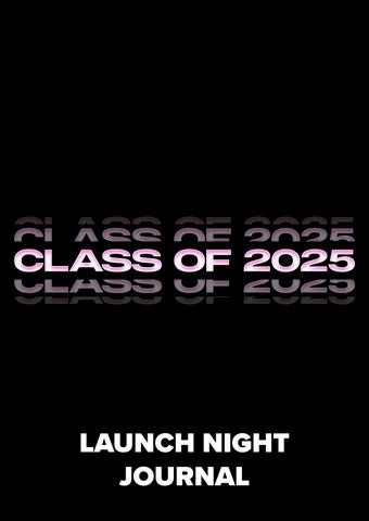
CLASS OF 2025
Ahead of Launch Night, I was placed in the Class of 2025 team alongside my peer, Izzy. The objective of our designated team was to promote the Class of 2025 through various forms of media, such as a yearbook and a film. All outcomes were created with the intention of being displayed or showcased at the event. After receiving our list of responsibilities, we held a meeting to collectively divide the tasks and establish our own individual KPIs.
My KPI’s
JOB ROLE: YEARBOOK COORDINATOR
1. TIMELINE, COMMUNICATION & ORGANISATION
• Set a timeline for yearbook production.
• Schedule regular check-in meetings with my team.
• Communicate with other peers to outline expectations and inform on requirements.
• Ensuring deadlines are maintained by peers through persistent follow-ups and organised charts.
2. YEARBOOK DESIGN STYLE & LAYOUT
• Locate yearbook layout and design style inspiration.
• Ensure that the yearbook accurately reflects the Studio 204 brand while highlighting each classmate's individual style and career direction.
• Design the yearbook’s font and back cover, incorporating new branding styles that represent the class of 2025. 3. YEARBOOK PLANNING
• Decide how many pages the yearbook will feature and what they will include.
• Designate set pages to each student, deciding the amount and style.
• Decide how many questions will be featured in each student interview and form a question sheet to be completed.
• Decide how many images each student will have featured according to their chosen direction and strengths, all relating to the returned question sheet answers.
• Navigate sponsorship pages, deciding on page amount and how they will be presented cohesively according to the provided business information.
• Assess additional pages of information to be marketed within the yearbook.
4. INFORMATION & IMAGE COLLECTION
• Distribute the question sheet to students and collect it once completed.
• Request images from students to be featured within the yearbook.
• Request sponsorship information and logos.
• Collect student headshots to be featured.
• Request additional information to be included on featured pages.
• Confirm graduate names and spellings.
• Request social media handles and email addresses to be featured.
5. YEARBOOK CREATION
• Welcome page with an introduction to the yearbook
• Contents pages
• Individual student pages, inserting questions and selected images.
• Sponsorship pages
• Additional pages to market elements such as social media, the Nest and enterprise.
• Ensuring all grammar is correct and wording is clear and professional throughout.
6. PODCAST ASSISTANT
• Capture behind-the-scenes content.
• Ensure accurate angles and camera placement.
• Efficient communication with the podcast host.
• Timeline organisation.
TIMELINE, COMMUNICATION & ORGANISATION
Before beginning the yearbook creation, it was important to establish a structured timeline with set deadlines for both myself and my peers to follow. Being mindful of delivery timeframes ahead of Launch Night, I first set a personal deadline for the yearbook to be printed exactly two weeks before the event. I chose a two-week buffer to allow for any unexpected external issues that could arise. With this deadline in place, I allocated myself ten days to complete
the yearbook from the first student submission deadline, knowing I would be building the pages as I received the necessary information. Aware of everyone’s demanding schedules, I gave students a one-week timeframe to complete and return my question sheet from the day it was distributed. Final touches, such as inserting images, had more flexible deadlines, as they were not required for the initial layout.
As for my job role, I required a large amount of information and visuals from each student; it was important to ensure clear and persistent communication so that everyone understood the expectations. This communication took place both within our class group chat and individually. I found that communicating in the group chat was perfect for voicing updates and collective messages, whereas private messages were ideal for ensuring the organisation of student information and personal requests.
As I was collecting various elements of information from each student, organisation was key in helping me track what had been completed and what was still outstanding. To manage this, I created a designated chart outlining all the categories of information I had requested and received. This system proved vital in helping me stay organised and meet my personal deadlines for the yearbook’s completion. It also allowed me to clearly identify which students required direct follow-ups.


YEARBOOK DESIGN STYLE & LAYOUT
Before beginning the yearbook creation, it was important to identify key inspirations and themes that I wanted to represent consistently throughout. I chose to draw inspiration from i-D Magazine, aiming to reflect a bold, editorial aesthetic that felt both modern and representative of our creative class. i-D’s clean layouts, striking typography, and playful yet professional tone aligned with the energy I wanted to in-
fuse into the yearbook, something that celebrated individuality while maintaining a strong sense of cohesion. I also decided to incorporate Studio 204’s brand colours into the design, using our signature pink for bold titles to tie the visuals back to our class identity. This consistent styling made the yearbook not only visually engaging but also reinforced the collective personality and creative voice of our group.


FRONT COVER
To decide the Class of 2025 yearbook cover, I developed multiple options before ultimately selecting the final visual. In preparation for Launch Night, new Studio 204 branding had been created by another team, a logo style that would represent the Class of 2025. This made it clear to me that the logo should be incorporated, along with the colours pink and black, to stay on brand and represent the course. After communicating
with my course leader, I decided to use the updated font from our Instagram page, The Lab, to write "Class of 2025", marking the focal point of the cover.
After inserting the Studio 204 logo, I created several colour variations before finally selecting a pink cover with black writing, a base colour that hadn’t been used in previous yearbooks, making it the perfect choice to represent our unique group.
Other design options:


BACK COVER
All back cover design mock-ups were originally created alongside my front cover as potential options. However, after deciding to go with a clean and professional branding approach for the front of the yearbook, it became clear that I wanted to incorporate one of these designs for the back. Designed using two of our group images and incorporating brand colours, the back
cover offers a fun, creative insight that represents the Class of 2025. While experimenting with multiple options, I ultimately chose the design without block colours, as it allowed for a cleaner and more cohesive visual flow with the front cover. This maintained consistency by using the same branding and font style while introducing different colourways.
Other design options:


YEARBOOK PLANNING
One of the first steps in planning the yearbook was deciding which questions students would answer on their personal pages. I wanted to highlight different aspects of the course and each student’s individual journey, allowing their personality and career direction to shine through. I ultimately chose five questions, beginning with an introduction, giving each student the chance to make a strong first impression by sharing their background, interests, and key details of their choice. The second question focuses on a pivotal part of their Studio 204 journey: their favourite trimester. This allows students to reflect on when they discovered personal strengths and growth that helped shape their direction. Another key question centres on the Brand Me project. Based on feedback, I found this was a particularly influential
Once I had established the design style of the yearbook and gained an understanding of the amount of featured text, I began distributing page allocations. I decided to give each student four pages, covering two spreads. As students were answering five questions that covered various projects and aspects of the course, I felt this was an even, suitable amount of space to include all written content and selected imagery while maintaining the stylistic layout inspired by i-D Magazine. This resulted in a total of 56 student-focused pages. Additional
component for many, playing a significant role in shaping our group’s FMP direction. Including this question adds a personal and heartfelt touch, offering deeper insight into each student’s creative development. The most in-depth question asks students to explain their final major project, giving space to explore the concept behind their final outcomes. To conclude, I asked each student to provide a short piece of advice for future students. I felt this was a meaningful way to end the profile, especially for readers who may be new to the course or preparing to join, offering thoughtful guidance from those who’ve completed the journey. Each question came with a specified word count based on its depth, and I provided guidance and examples under each prompt to help students respond clearly and consistently.
pages included a welcome spread placed at the front of the yearbook to introduce the publication, followed by a general contents spread and a class overview spread featuring headshots and names of each student. I was also informed that three additional features were to be included, so I allocated individual spreads for each to allow space for imagery. Finally, the event received four sponsorships; to express our gratitude, I allocated one page per sponsor, along with a final thank-you spread. Altogether, the completed yearbook totalled 76 pages.

INFORMATION & IMAGE COLLECTION
As previously mentioned, to build the yearbook, I needed to collect various forms of media from each student, as well as from other marketed sources such as sponsorships. Once I had finalised the question sheet, I distributed it as an editable PDF to each student via individual message chats. This allowed students to fill in the document directly and return it to me in a clear, structured format. After completing
each student's layout design, I then requested their chosen number of images in the same chat, as these varied from person to person. Additional requested information included their professional Instagram handle, email address, and the headshot image taken for the contents page. At this stage it was additionally important for me to confirm each student’s graduate name and spelling.
To promote our event sponsors, I requested key information, including their brand name, contact details, logo, and a short paragraph outlining who they are and what they offer. This request was intentionally flexible, allowing each business to include details of their choice that best represented and promoted their brand.
In the yearbook, there will be additional pages to promote different aspects related to the course; these include Studio 204's social media, The Nest, and Enterprise. To ensure the information featured was factual and met the desired standard, I communicated with my course leader, who
provided the necessary media. I also followed their guidance on the visual elements for each page, creating imagery that reflected the content appropriately. For other included media, such as The Nest poster and the FMP croqui, I contacted the original creators directly to obtain the files.


YEARBOOK CREATION
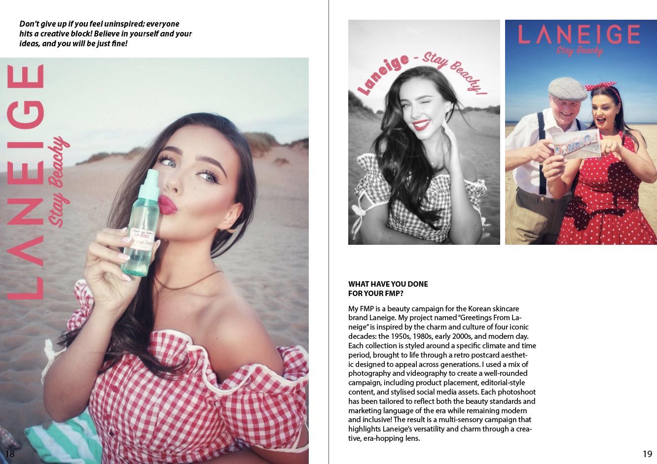
To create the yearbook foundations, I began with the student pages, forming layouts in response to their personal question answers and drawing inspiration from i-D Magazine. Once I received a completed sheet, I reviewed it to determine whether the student was conceptual or a marketer, as this influenced the number and format of images to be featured. If the student was conceptual, fewer full-page images were used to reflect their style, whereas marketer students included more visuals in smaller frames to suit their content, ensuring smooth and consistent storytelling throughout. I experimented with various design styles, using the shape tool to mark where related images would be placed and applying margins to maintain visual cohesion. Knowing i-D Magazine often features mini-

mal text, I used the surrounding blank space creatively, particularly for marketer pages. For conceptual students, who had full-page imagery, I realised that full pages would also be needed to accommodate all written content. To stay consistent with my inspiration, I replicated the striped writing style seen in i-D layouts. I chose to visually support two specific questions with imagery: some representing their favourite trimester and the other showcasing their final FMP outcomes. This felt like the most appropriate option, especially as student headshots were already featured at the front of the yearbook, and the Brand Me project directly informed the FMP. Once each student’s layout was finalised, I requested the chosen visuals and inserted them into the pre-planned image placeholders.


For the additional pages, I chose to build my layouts around the information provided and the required visuals while maintaining the clean and bold style established in the student pages. Creating space was key to aligning with the stylistic design of i-D Magazine, a format I followed consistently throughout. I also decided to incorporate bold pink headings on these pages to stay on brand with Studio 204 and tie in with the yearbook’s front cover, helping to create visual cohesion. This was a notable element missing from the student pages,
making its inclusion in other areas even more important. For our group contents page, I took inspiration from a layout featured in a previously viewed issue of i-D Magazine, which displayed a table of cover images. I liked the structured visual appeal of the grid style and chose to replicate it using each yearbook photo, expanding it across a larger spread. The most important aspect of the overall design was that it reflected professionalism, structure, and organisation, ensuring it was easy to understand, clearly laid out, and visually engaging for the reader.
YEARBOOK CREATION
At the beginning of the yearbook, a welcome page was essential in communicating the book’s purpose, outlining what it includes, and introducing its core narrative. After capturing a group image, I felt strongly about featuring it on this page, as it visually represented our collective and added a personal touch that connected directly to the written introduction. I wrote the short introduction in a clear and professional tone, including all necessary information while keeping it concise and minimal. Throughout the yearbook, I ensured all written content was thoroughly read and grammar-checked, making sure the text was clear, polished, and easy to navigate. I additionally added page numbers throughout correlating with the contents pages to maintain organisation and easy navigation.


PODCAST ASSISTANT
While my teammate was completing her KPI of producing the podcast, I supported behind-the-scenes operations by assisting the host, helping her stay organised, and ensuring she achieved her desired outcome from behind the camera. This included checking that the camera angle was correct, capturing the full setup, and maintaining time management. To keep the day running smoothly, each
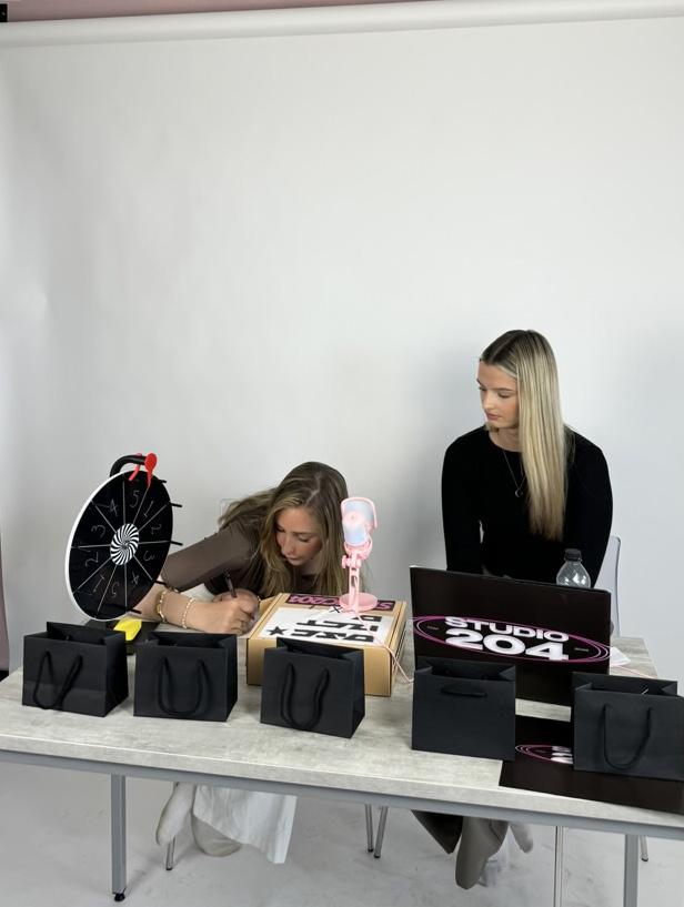
guest had a set amount of time on camera, and it was my responsibility to time each session and ensure we stayed on schedule. I was also in charge of coordinating the guest timeline, inviting students into the studio space as needed. Throughout the process, I captured behind-the-scenes content, including a series of images and videos taken during interviews and of the setup itself.


YEARBOOK ARRIVAL
After adhering to my set timeline and meeting the stated deadline, the printed yearbooks arrived one week before the event. This gave me the opportunity to unbox them and see my digital creation come to life ahead of Launch Night. I was incredibly pleased with the final result and received positive feedback from my peers, bringing my job role towards a close with a successful outcome.


LAUNCH NIGHT
At Launch Night, the printed yearbooks were displayed throughout the venue and handed directly to attendees. They were also included in select gift bags and featured in PR boxes, which were personally delivered to industry professionals and our sponsors.


Where were the yearbooks displayed?
• A stack of yearbooks was placed on a featured shelf alongside the Scene Zine and its advertisement, allowing attendees to take a copy and browse as desired.
• As part of the venue decor, yearbooks were creatively displayed – hung beneath the main bar, draped on coat hangers attached to light fixtures, and suspended from greenery above the seated tables.


THE FINAL OUTCOME


Personal Reflection...
To conclude this journal, I wanted to personally reflect on my efforts as part of the Class of 2025 team. Seeing the final yearbook, created entirely by me, being displayed and read at Launch Night was incredibly rewarding. I’ve thoroughly enjoyed the privilege of representing our class in this role, and the experience has taught me so much about organisation, communication, and trusting my creative direction. As I move into the next chapter, I’ll look back positively on this incredible event and the personal contribution I made to its success.