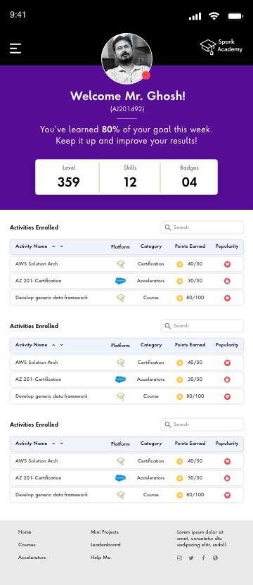
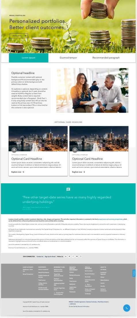
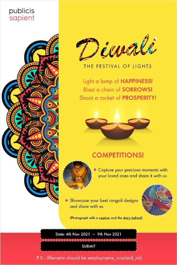
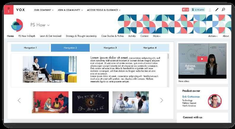
Visual Experience Designer Presenting digital assets
Note: All images are low resolution and not paid one. Here I’m just showing the concept.

Note: All images are low resolution and not paid one. Here I’m just showing the concept.

I did some research and produced few ideas that I think might resonate with my audience and represent Tend Skin Solution brand well. It should connect emotionally and universally.
So, did some brainstorming, developed engaging content and selected an image of which our target audiences will respond to. My concept is pretty fresh, bold and associate. Therefore, it will grab attention of the audience by first short itself. Technical description will come later.
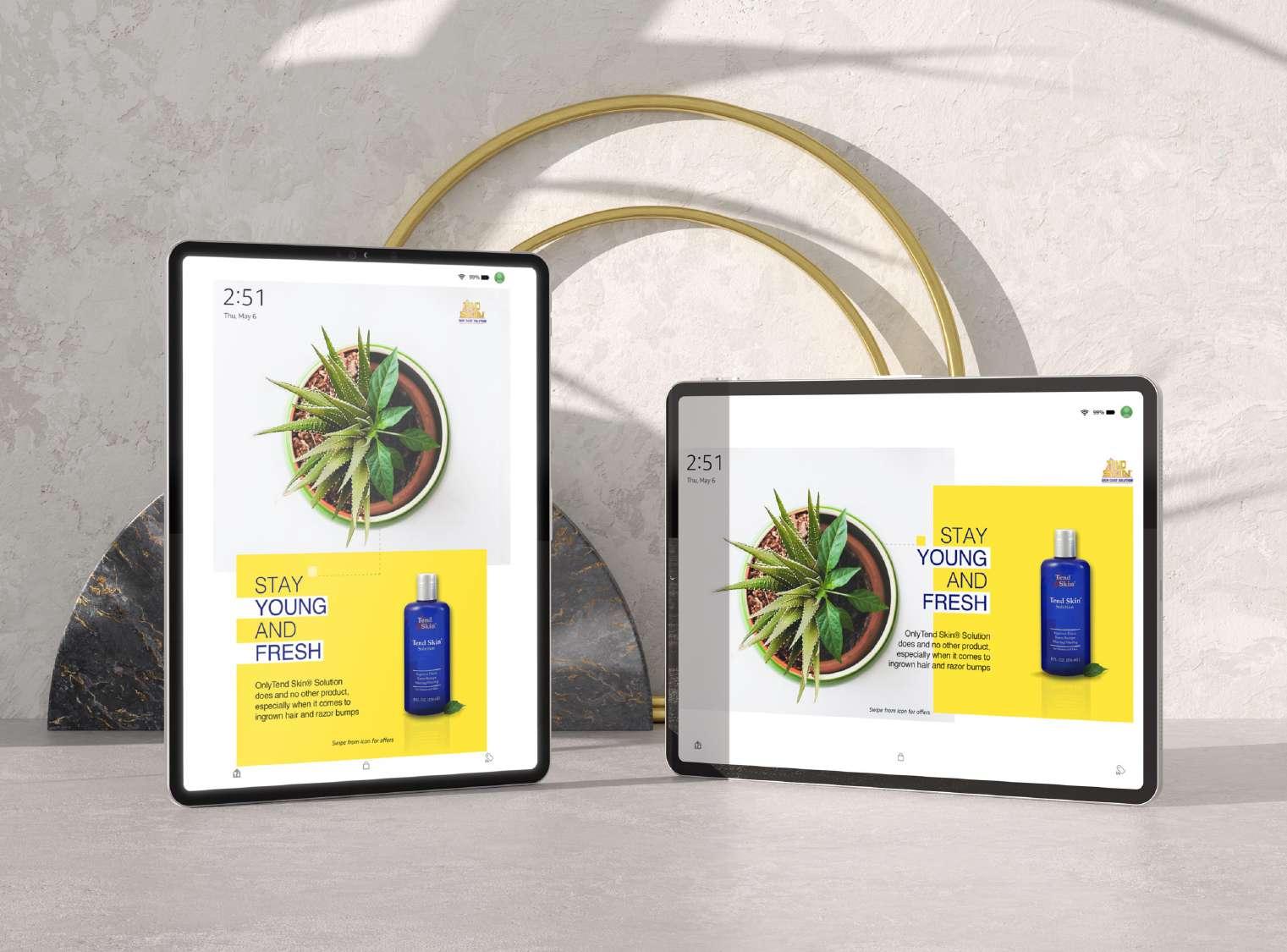
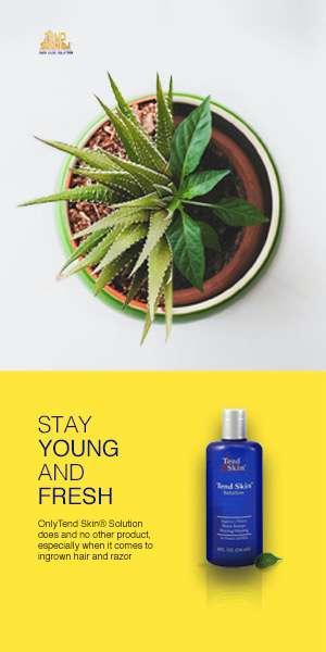
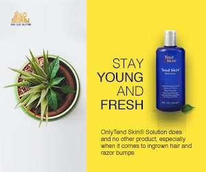
The message of this campaign (1) is ‘Stay young and fresh’. The underlying idea here is how a customer will get a unique advantage from this product and not by other products. Everyone should aspire to their own unique look, so needs to be serious about taking intelligent steps!
The transformation from a rough painful surface to a smooth clean skin, is what we propose.
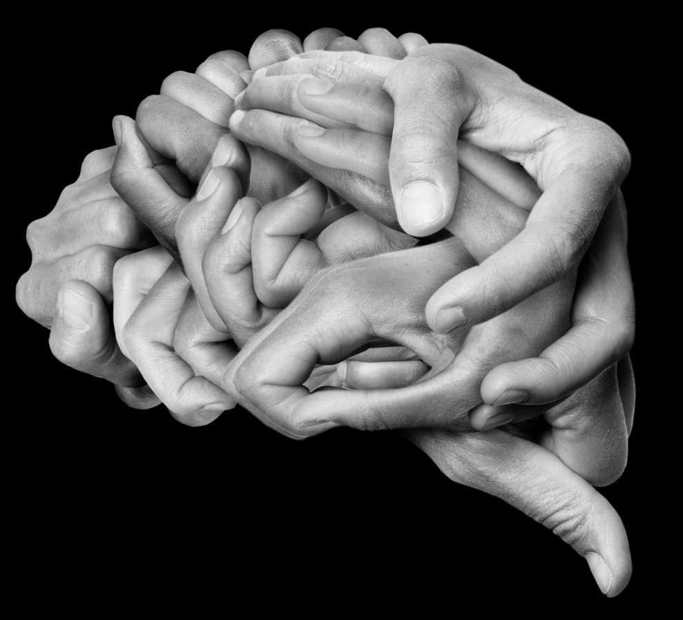
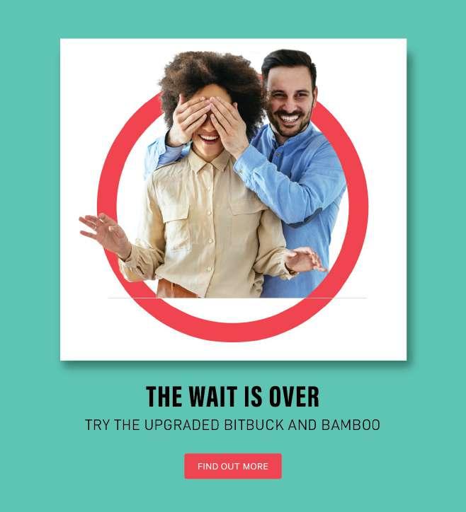
It’s not only for men or women, but for both. So, rather than using a regular model shoot photographs for this campaign (1) I tend to make some interesting abstract thought, ideas to build relevant and long trustworthy relation.
For me (put myself in a customer’s shoes) a product’s ‘look & feel’ is also important. Hence, presenting the product’s image in a bold and beautiful way to develop a transparent relation with the users, is my objective over here.
Here, the focal point is clearly defined, and so the hierarchy.
Providing something of value prior to purchase can help people understand the product better. This kind of marketing will not only provide a brand recognition to those who haven’t heard of it but will be inclined to trust it, which can increase an engagement and assess of the product features.

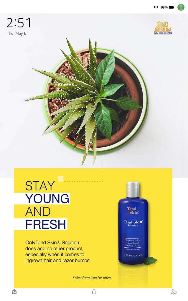


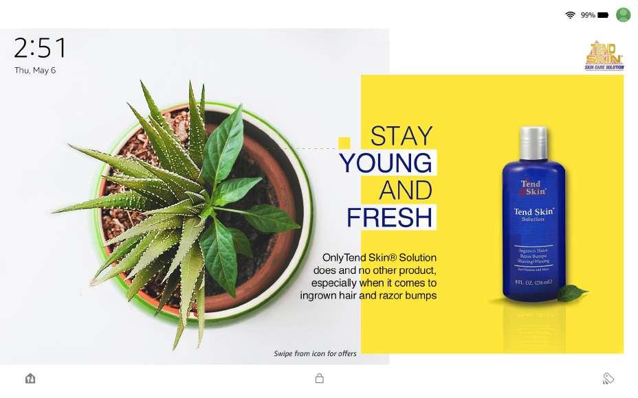

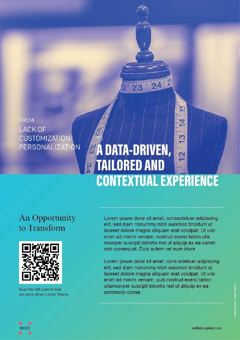
Could be possible the landscape image can use for portrait scale as well. Only the body copy will come followed by the banner image section.


Excited to launch a new great product ‘Tend Skin Solution’. Capturing a humor, energy of joy with mix of contemporary colour and font weightages. In this scenario, Model is the focal point. With adapting different emotions, moods; can produce more campaign banners. Transformation of exciting, an effective product. Brand name
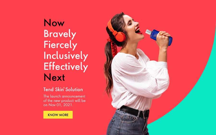
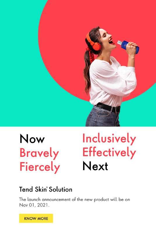
Save the date New CTA
Mood
TM
TM
Form ‘Z’ a clear division of Ezetimibe starts after Rosuvastatin.

Used arial black with some minute curvature, tweaks which is highlighted and create an attention to spectator.



Here medical sign “+” addon between Rosuvastatin and Ezetimibe and create an interesting negative space without disturbing the flow and compactness of the logo RoszetTM
Emblem Logo : The logo consists of font and a symbol or an icon which gives you a fragrance of pharma.
Abstract logo: A pictorial represent of type ‘R’ with ‘Z’. Playing with +ve and -ve space to create an interesting logo form.



Lorem ipsum dolor sit amet, consectetur adipiscing elit. Mauris congue
Lorem ipsum dolor sit amet, consectetur adipiscing elit. Mauris congue uto alme rato etlio van
Lorem ipsum dolor sit amet, consectetur adipiscing elit. Mauris congue
Lorem ipsum dolor sit amet, consectetur adipiscing elit. Mauris congue elo


Lorem ipsum dolor sit amet, consectetur adipiscing elit. Mauris congue uto alme rato etlio van
Lorem ipsum dolor sit amet, consectetur adipiscing elit. Mauris congue
