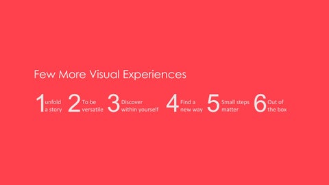
Few More Visual Experiences unfold a story 1 To be versatile2 Discover within yourself 3 Find a new way 4 Small steps matter 5 Out of the box 6
Rollout | Digital platform
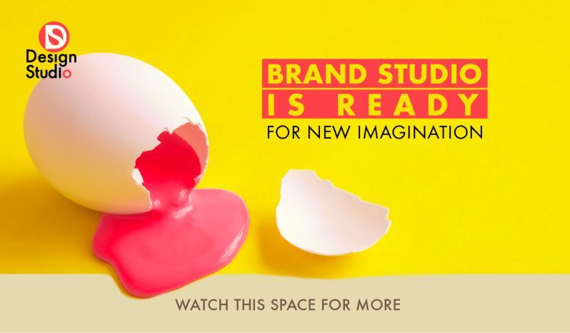
1. Visual Identity (a vision behind Design Studio)
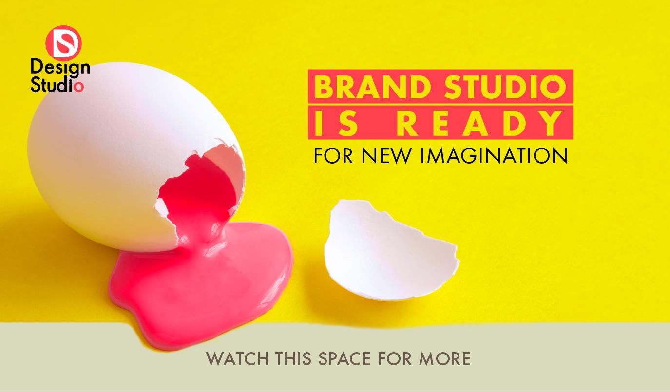
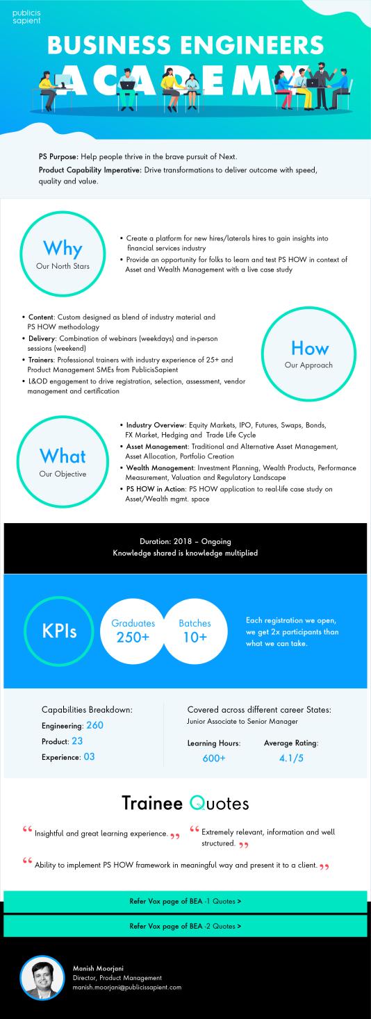
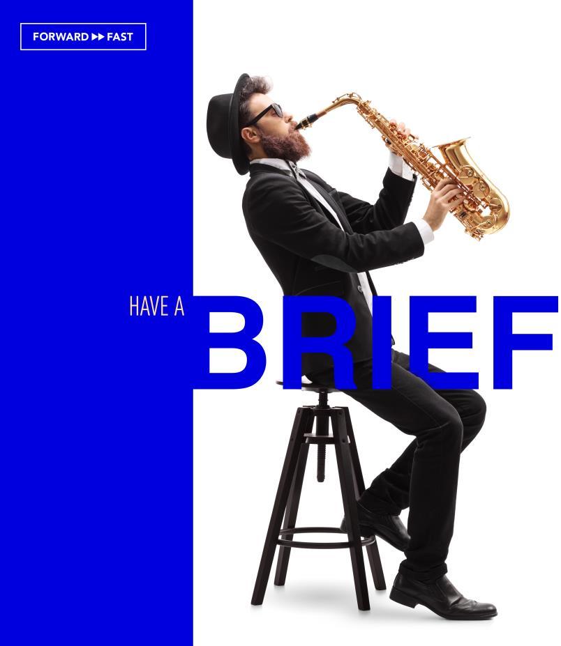
2. Teaser (create a buzz or curiosity and take attention towards new launch)
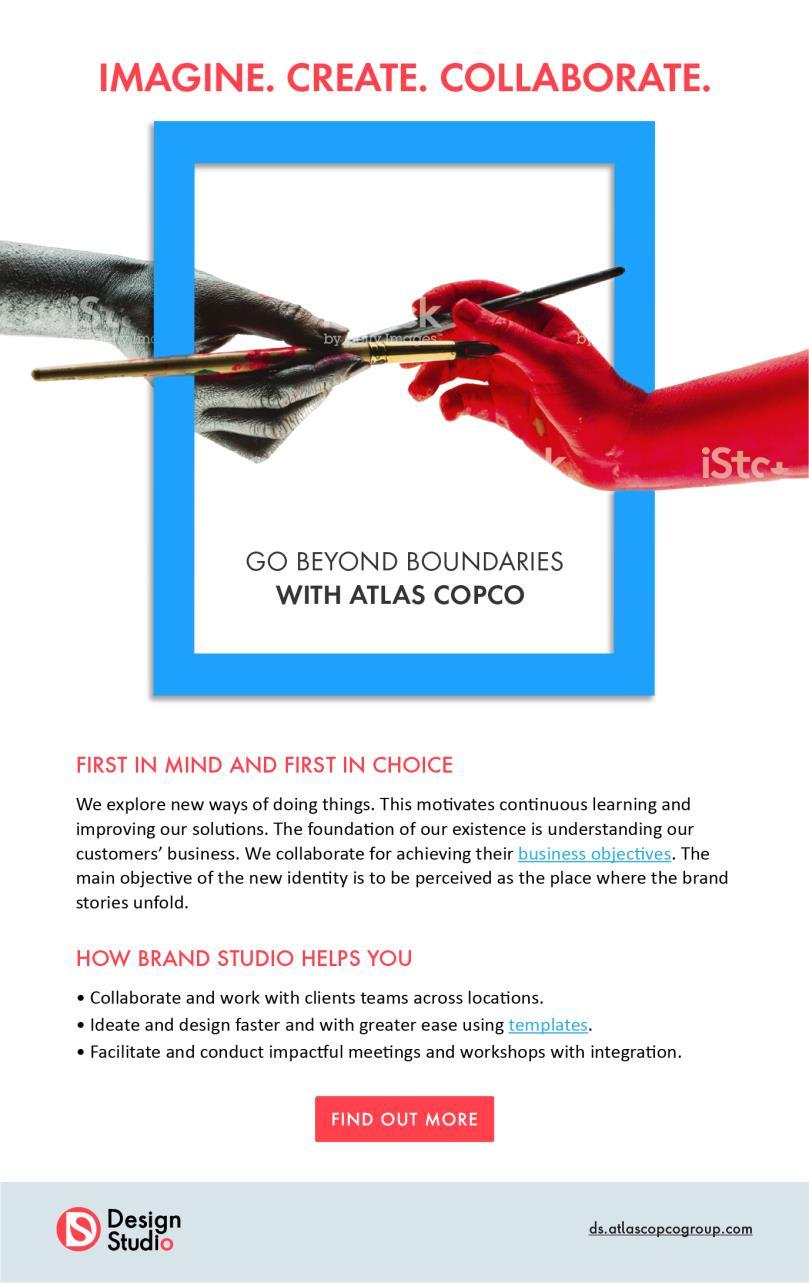
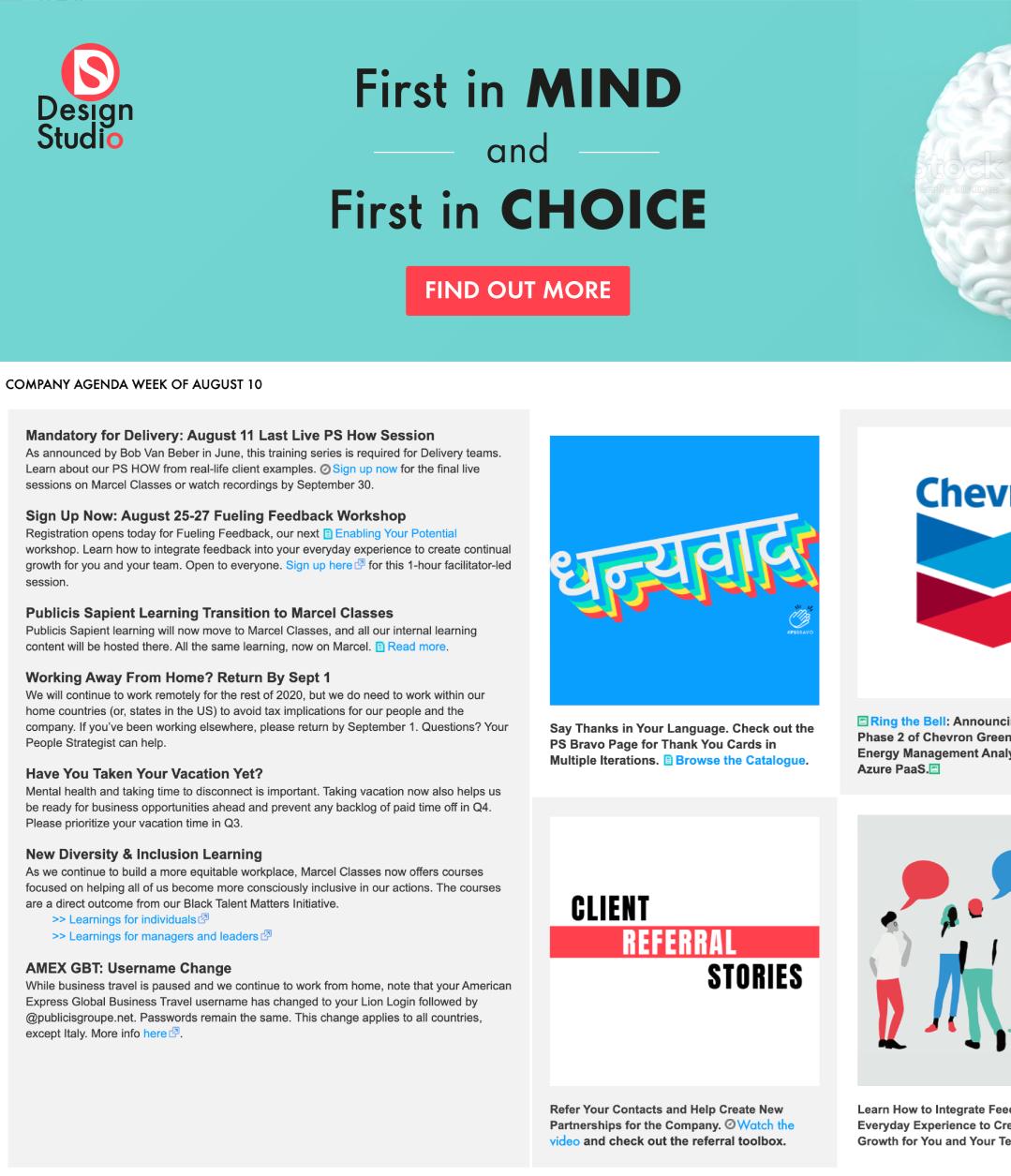
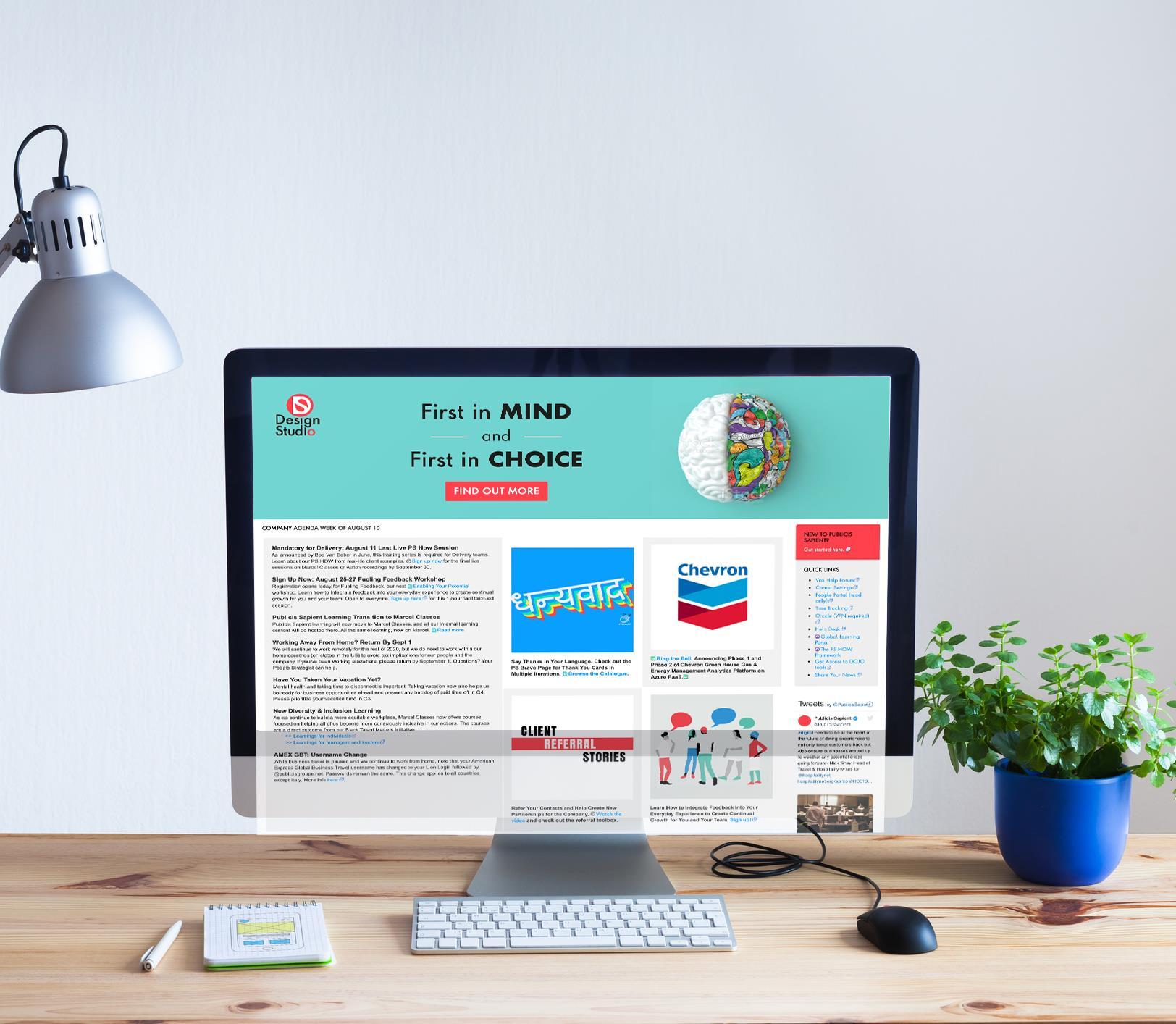
3. Mailer (details about the topics to discuss; redirect towards the detail pages or sections)
4. Blogs Post (a piece of writing or other item of content published on a blog site)
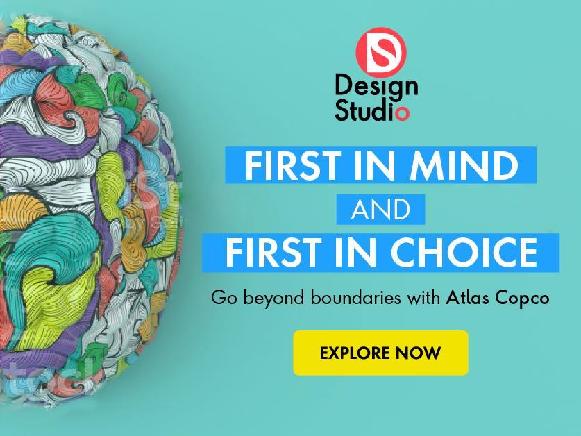
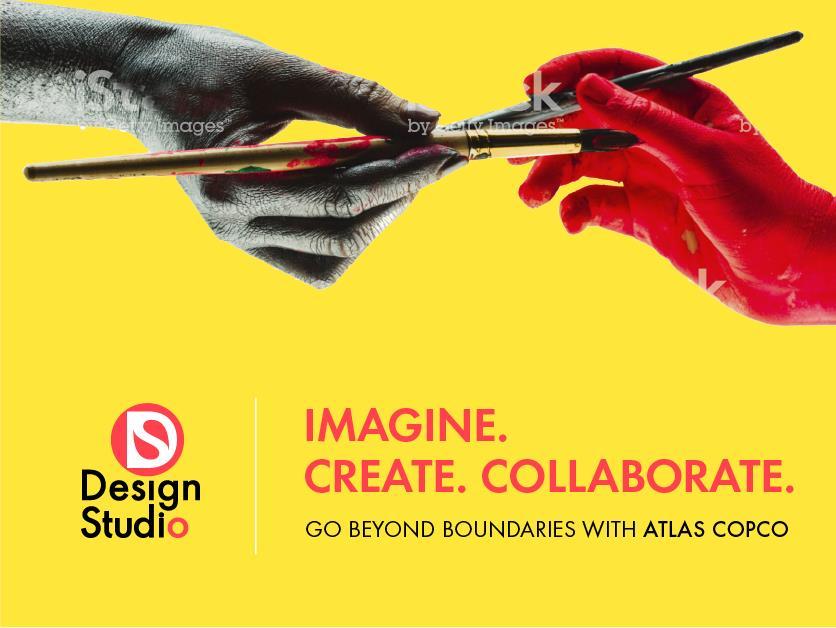
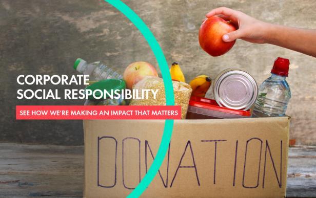
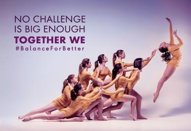
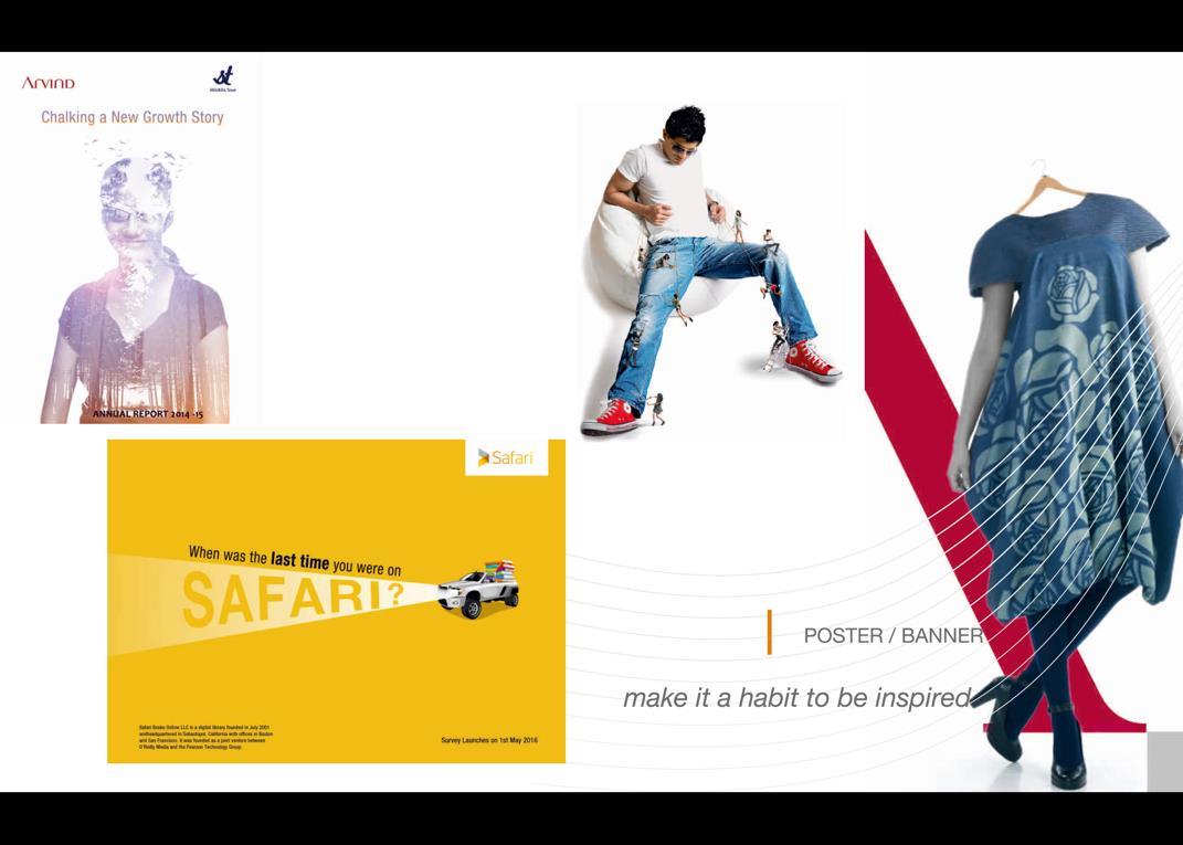
5. Banner (express the objective of the event through a visual and copy)
6. Case studies (pages as per brand guideline and content flows)
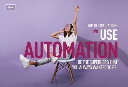
7. Sale Presentation (using icons, graphs, infographics and images)
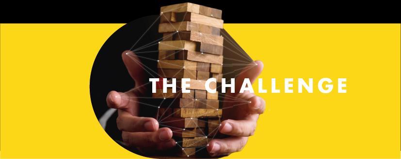
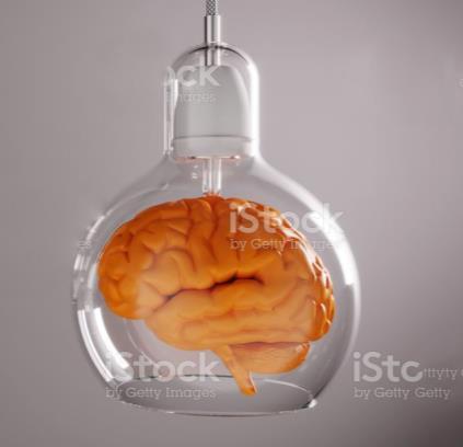
Brainstorming | Ethos of the Organization
• Celebrating
• Hospitable
• Abstract
• Integrity
• Collaboration
• Inspirational
• Element of surprise
• Humor
• Original
• Graceful
• Visual Retailing
• Revolution
• Experiences
• Experimental
• Diverse Offerings
• In out
• Harmony
• Key ideas
• Invention
• Imagination
Taking the Brand Studio as a Creative agency and not only for product-based working profile agency. Skill and services which we providing is much more creative, competitive and thoughtful. These above words came in my mind to new start.
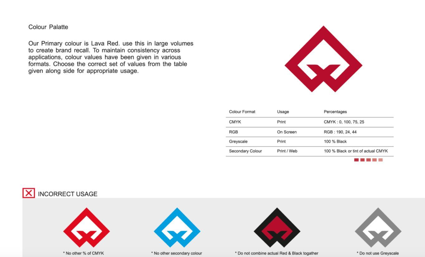
Brand Guideline
Colour:
Fonts: Futura Next, Times New Roman
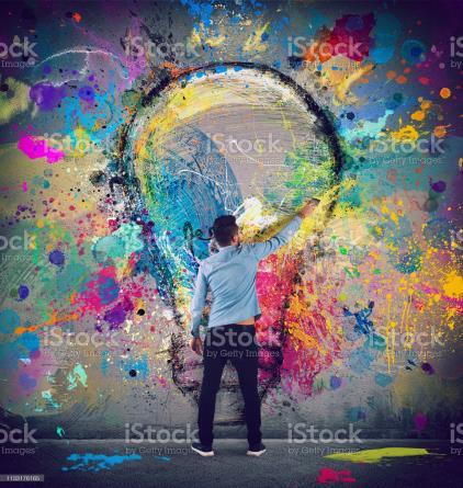
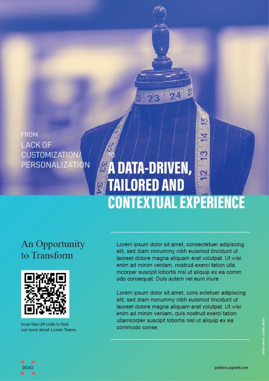
An Opportunity to Transform
An Opportunity to Transform
An Opportunity to Transform
An Opportunity to Transform
An Opportunity to Transform
An Opportunity to Transform
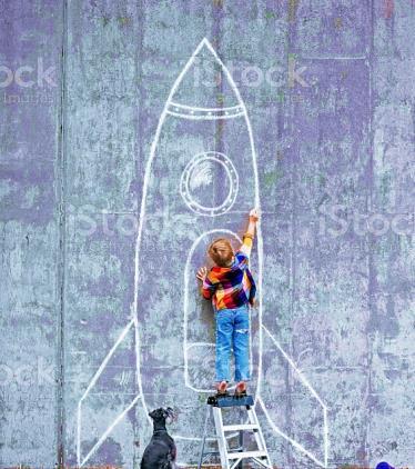
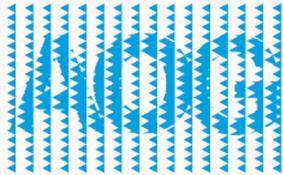
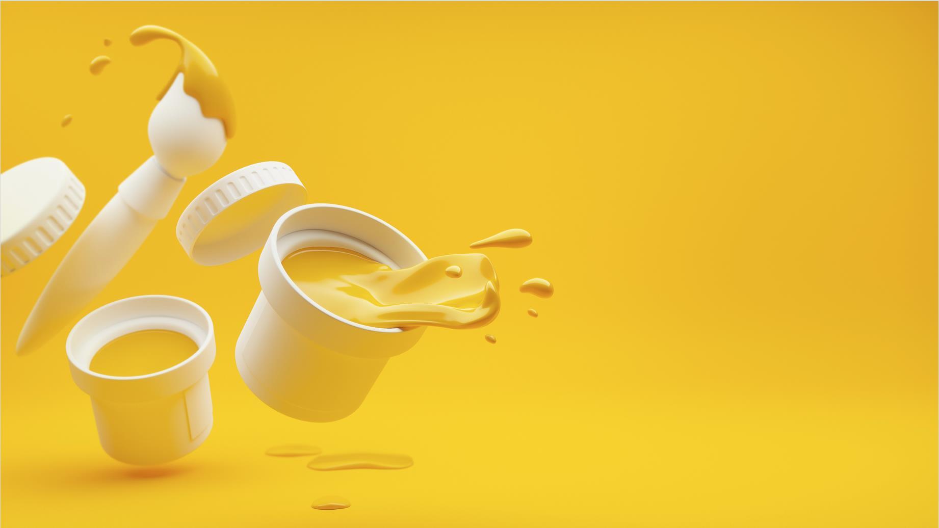
Concept Images


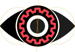
VISUAL IDENTITY
Competitive analysis
1. Monogram logos

3. Pictorial marks
2. Wordmarks
4. Abstract marks
Brand Studio Logo | Symbolize


Our brand personality is built on our core values. We offer wide range of communication, branding and graphic design services to group units across business areas, functions and brands worldwide.
New and relevant outlook logo for Brand Studio. Being a part of the Atlas Copco group, it is very important to be known to each divisions and business areas and help them in solving their creative communication needs.
Target Audience: Internal stakeholders of AC group, worldwide.

Vision Different Verticals Skilled DNA Vision 360o Creativity in our DNA + +
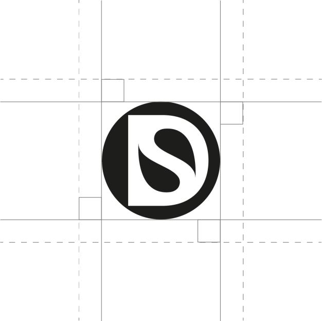
Other potential options | Logo Type – Design Studio
Here is a good example of a Logo Type DS. Enhance the negative and positive at a same time make one unit out of it. Compact and scalable.

It’s derived from subconscious mind of creative sense. Right side is busy with creative novelty by Design studio.

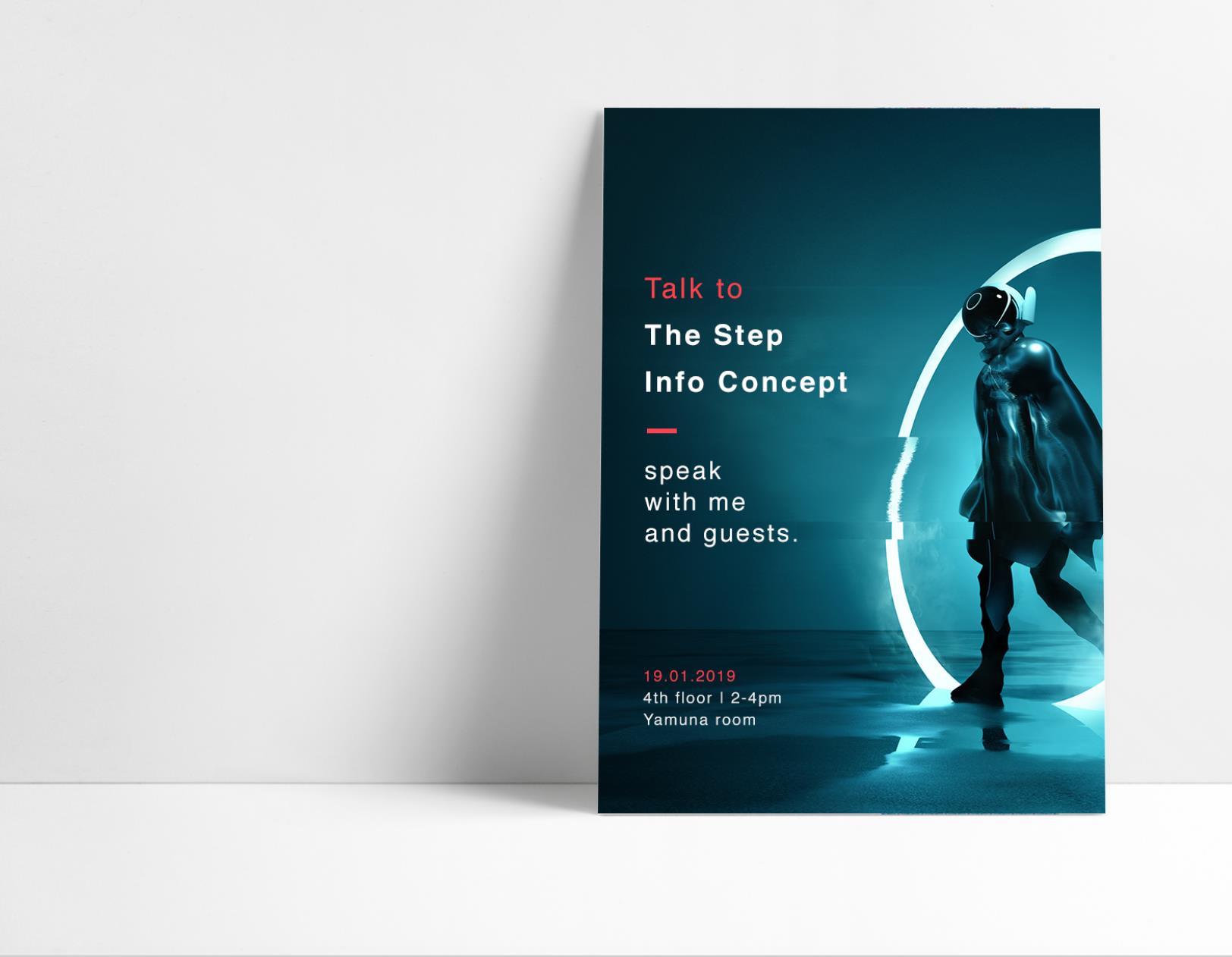
In Teaser
In Email Design
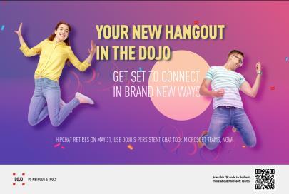
 WITH DOJO
Brand Studio is the creative communication hub of design studio. We work with companies…
Brand Studio is the creative communication hub of DOJO Group. We work with companies…
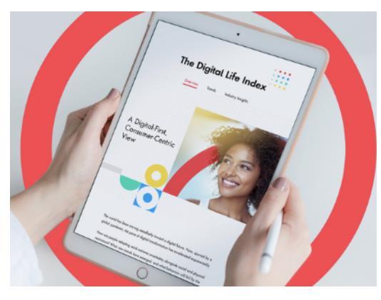
Digital Life Index: Share the latest consumer-centric insights with your Clients and end user…
In Blog Post GO BEYOND BOUNDARIES WITH DOJO Go beyond boundaries with DOJO
Banner
A NEW JOURNEY
Go beyond boundaries with PS Group
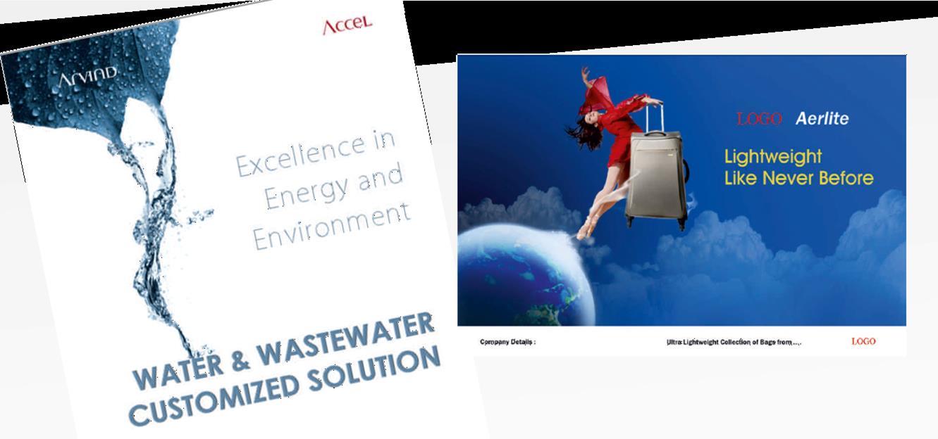
 Sales Presentation
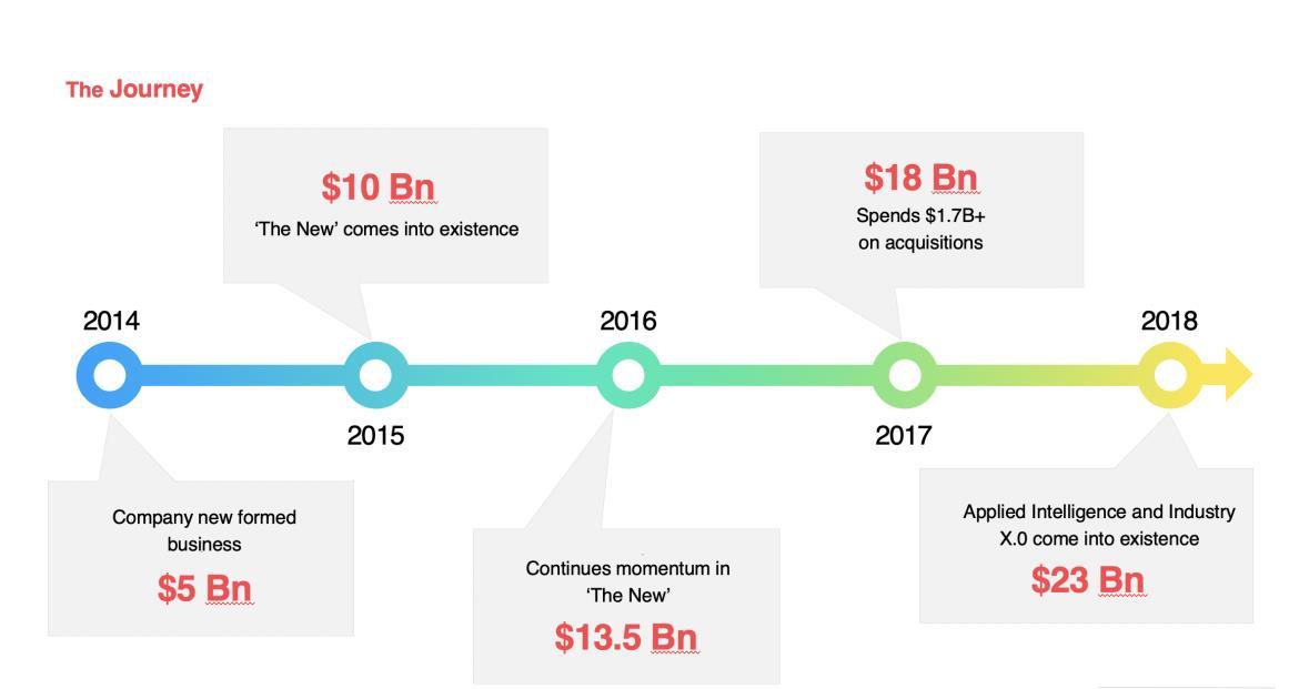
Data Visualizing
Example: continue…
GENERATE ICONS FOR SALES PRESENTATION
Sales presentation | Infographics
Contrary to popular belief to aleo lorem ipsum
Latin professor at Hampden-Sydney College in Virginia
Lorem Ipsum is simply dummy text of the printing and typesetting industry.
Lorem Ipsum has been the industry's standard dummy text ever since the 1500s, when an unknown printer took a galley of type and scrambled it to make a type specimen book.
Lorem Ipsum is simply dummy text of the printing and typesetting industry.
Lorem Ipsum has been the industry's standard dummy text ever since the 1500s, when an unknown printer took a galley of type and scrambled it to make a type specimen book.
Lorem Ipsum is simply dummy text of the printing and typesetting industry.
Lorem Ipsum has been the industry's standard dummy text ever since the 1500s, when an unknown printer took a galley of type and scrambled it to make a type specimen book.

18
Lorem Ipsum passages, and more recently with desktop publishing software like Aldus PageMaker including versions of Lorem Ipsum.
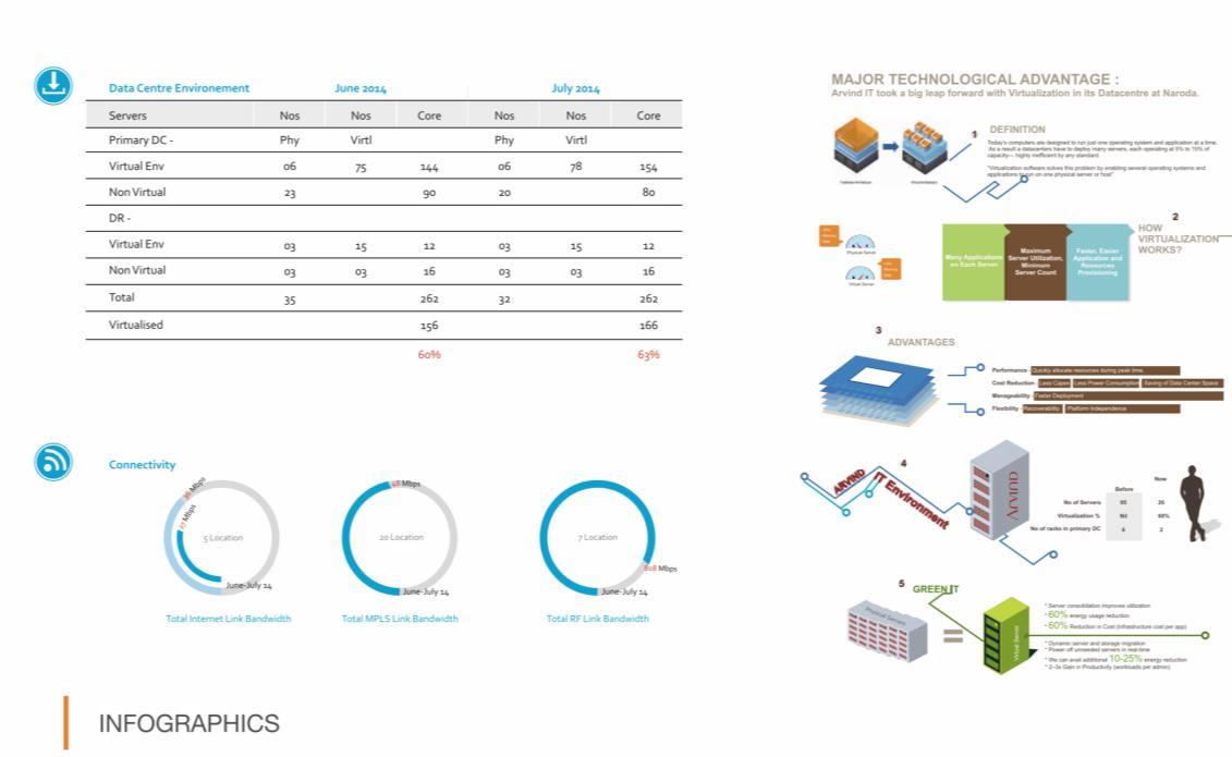
Infographics
Infographics
DIGITAL HARMONY _
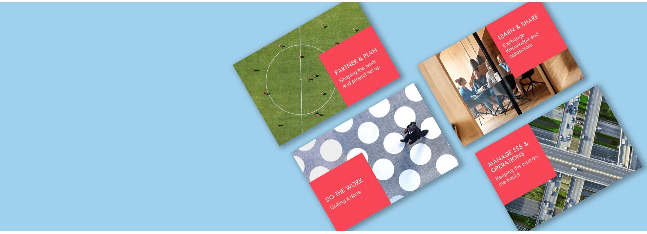
MANAGE $$$ & OPERATIONS Keeping the train on the tracks PARTNER & PLAN Shaping the work and project set up DO THE WORK Getting it done LEARN & SHARE Exchange Knowledge and collaborate
Product Management team
VOX site page mockup for PS ‘Product Business team’ with banner, infographics, different Icons for respective topics, and so on keep in mind the target audience and their journey
• The milestone is to achieve the user interaction and give values of there new opportunities


•
CTA Registration button
Teaser, Mailers are a great way to keep in-touch and to keep our clients motivated and up-to-date with the progress.
Clean, fun designs with punchy compelling content are the order of the day here...
Email is one of the fastest ways to communicate, so we use it a lot. It’s important to ensure the love to ride branding is present and correct on all our email footers.
Campaign- as per the guidelines, always try to summaries the content in the header, make sure the message is simple bold and compelling with concept visuals, so that mobile and desktop users are both served a layout that works.
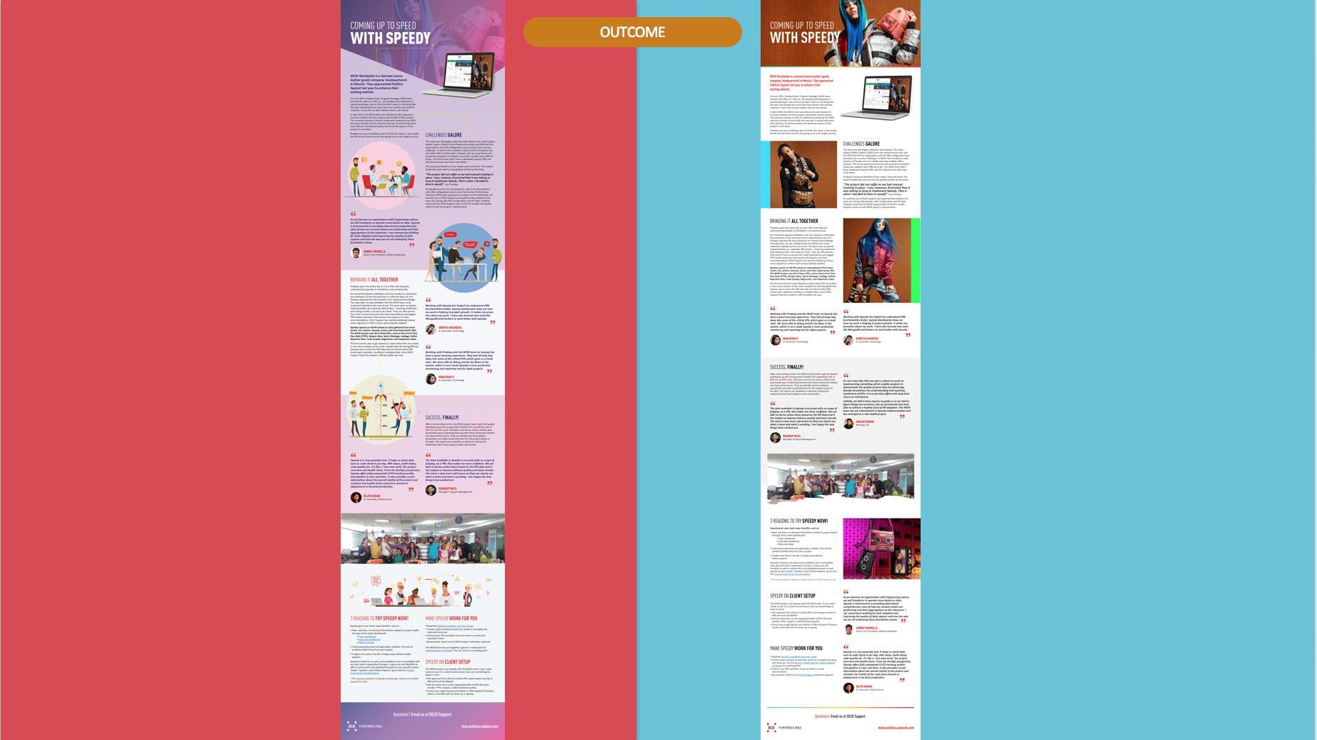
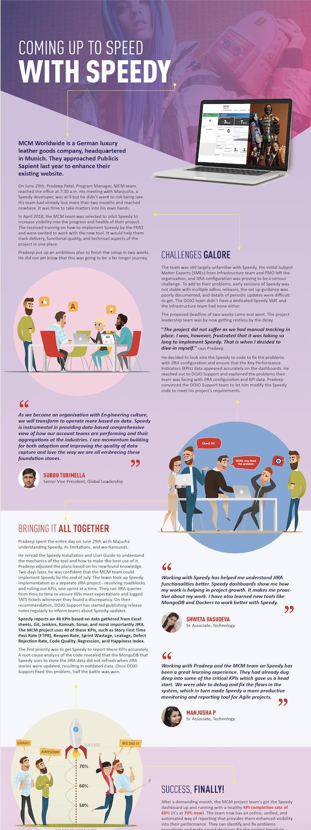
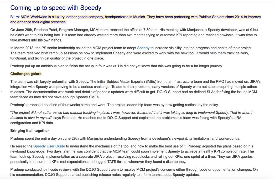
VS MCM OUTCOME
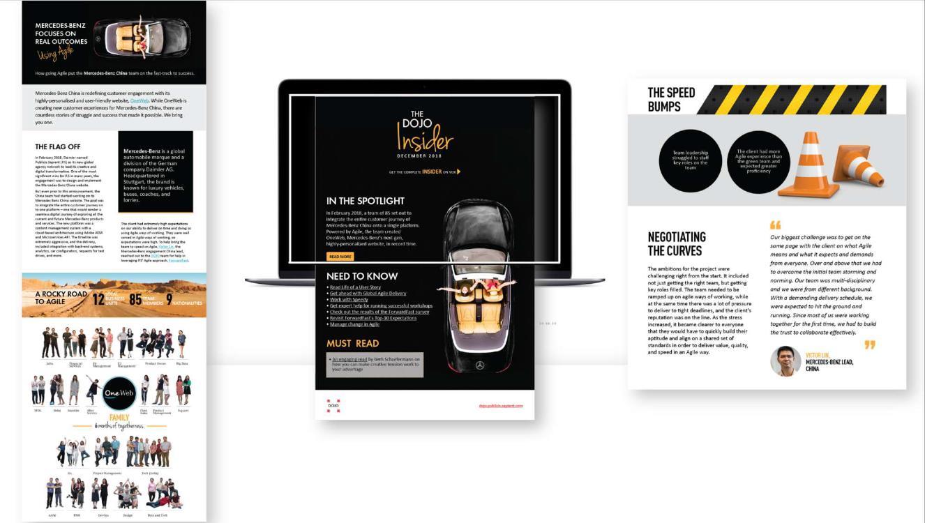
PROJECT | Mercedes Benz
Background


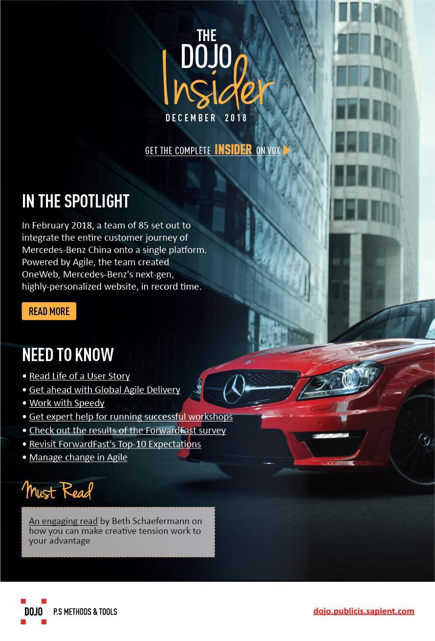
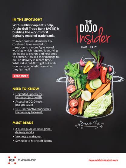
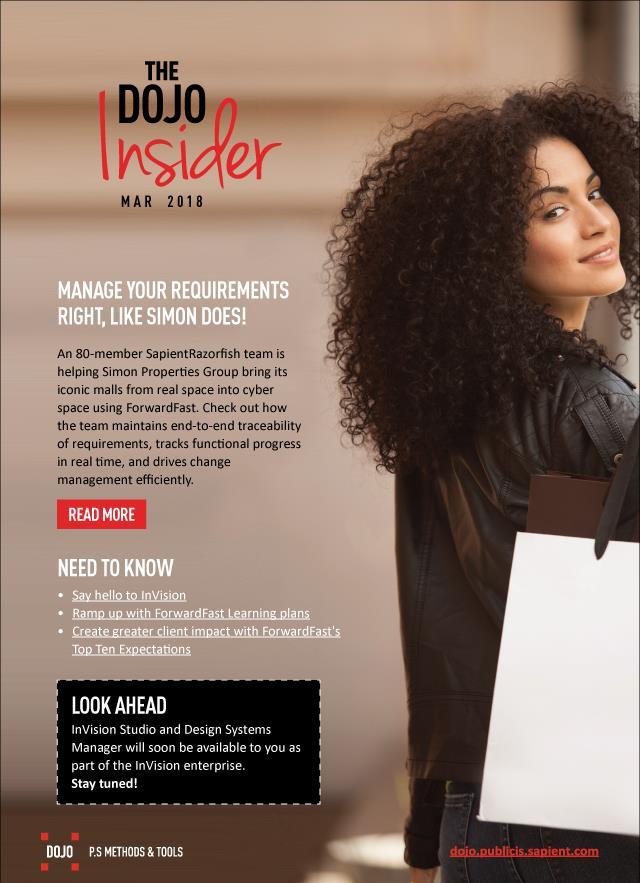
The current format of the DOJO Insider, released quarterly, has been in existence for a year. There are two parts to this communication:
• The short version, sent out as an email
• The long version, which resides on the DOJO microsite
We need to reformat the DOJO Insider based on:
• Look and feel
• User experience
Methodology
The following methodology was adopted to arrive at the explorations:
• The DMC team brainstormed on what they felt was not working with the current format (including process, tracking, and so on) and what could be improved.
• The above points were taken in as design considerations.
• The team was then divided into duos where each duo would come up with a concept.
• The concepts were then reviewed internally within the team. Review comments were factored in during the next iteration and were submitted as explorations.
Inputs from Brainstorming
• Find out the success rate: Use Mail Chimp to assess clicks.
• Conduct data gathering exercises to get input from our target audience as to what works for them, what does not, and what they want.
• Speak to India Marketing Team and get inputs taking Sapient Times as a case in point.
• More interaction than information: Have testimonials from product users.
• Include videos in the Insider if possible.
• Leader speak: Have a section where leaders endorse DOJO tools and services.
• Process improvement: Improve the process so that content gathering is planned well in advance, and it becomes less tedious.
• The design needs to be more visual, as it makes it easy for people to absorb information and get them adoption.
• Consider designing across devices.
• Released to all intended audience
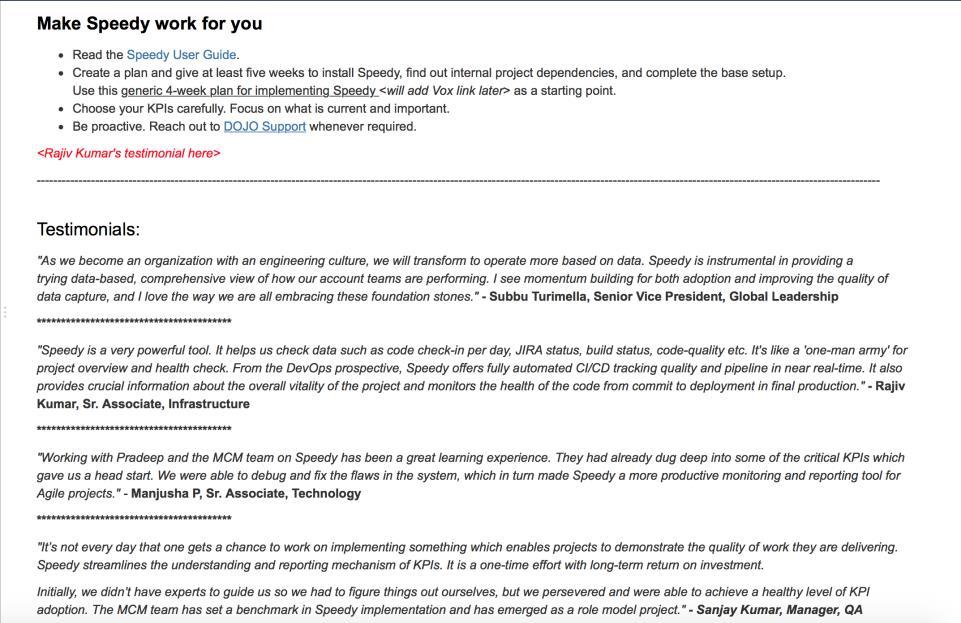
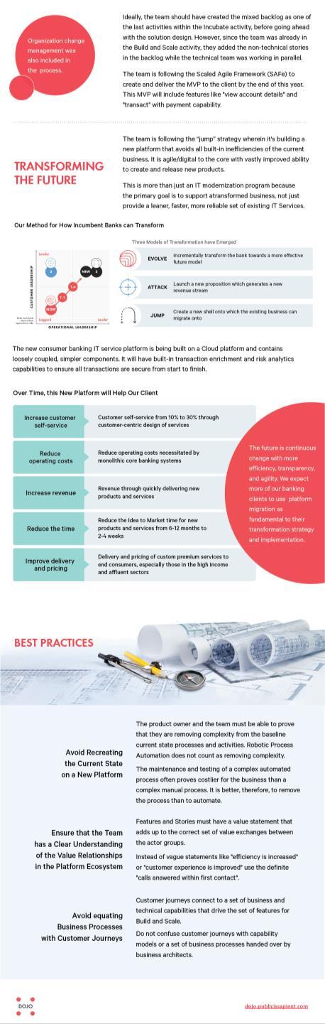
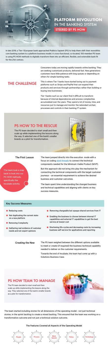
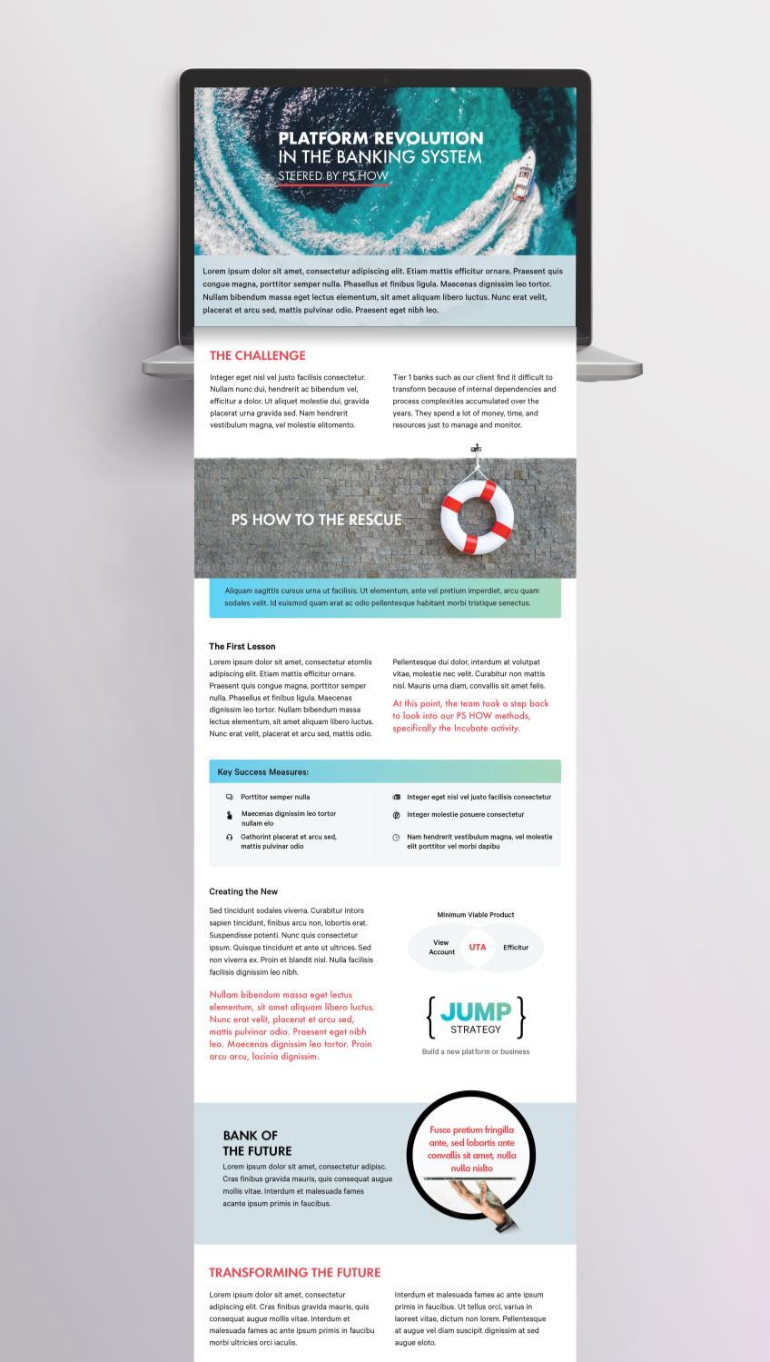
PROJECT | T1 BANK
I O N O S
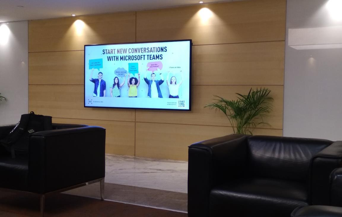
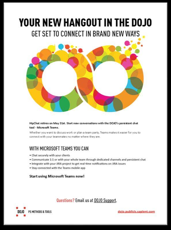
HipChat retires on May 31st. Start new conversations with the DOJO’s persistent chat tool - Microsoft Teams.
Whether you want to discuss work or plan a team party, Teams makes it easier for you to connect with your teammates no matter where they are.
TV DISPLAY
RELEASE DATE 26 th MARCH 2019
BRAND LOGO

APPROACH
Swastikam : Auspicious sign

Competitor Analysis – Mind Maps (brainstorming) – Mood Board – Sketching –
Line art in my software

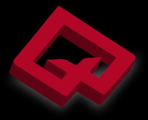
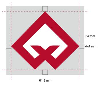
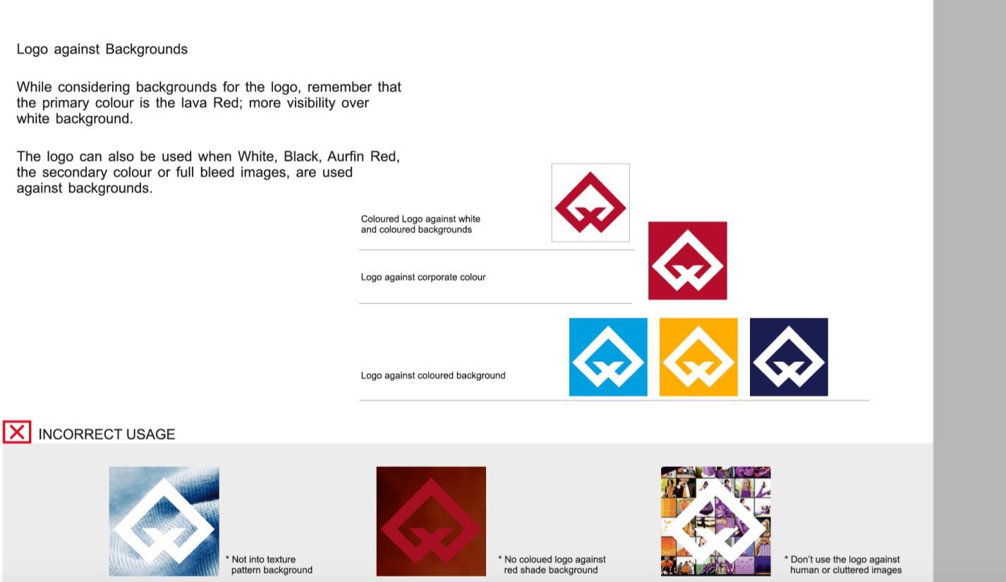
AURFIN: ‘The symbol consists of simple geometric shape of “A” – Aurfin and text which symbolizes collective growth; carryout by our intimate generous and support.’ The symbol has immense recall value.
CREATIVE COMMUNICATION APPROCHE S
Branding Solutions : Poster, Billboard, Standee, Interior / exterior graphics -
films Billboards
Promotional graphics
Floor graphics
Wall hanging graphics
Transit advertising – buses, vans, etc Directional signages
Packaging, Visiting card etc…


Few more works…
Packaging: Handmade sona signature textured paper.
WITH DARK CHOCOLATE
“May you enjoy the blessings of family and friends, while our thoughts turn gratefully to you with warm appreciation.” Happy Janmashtami
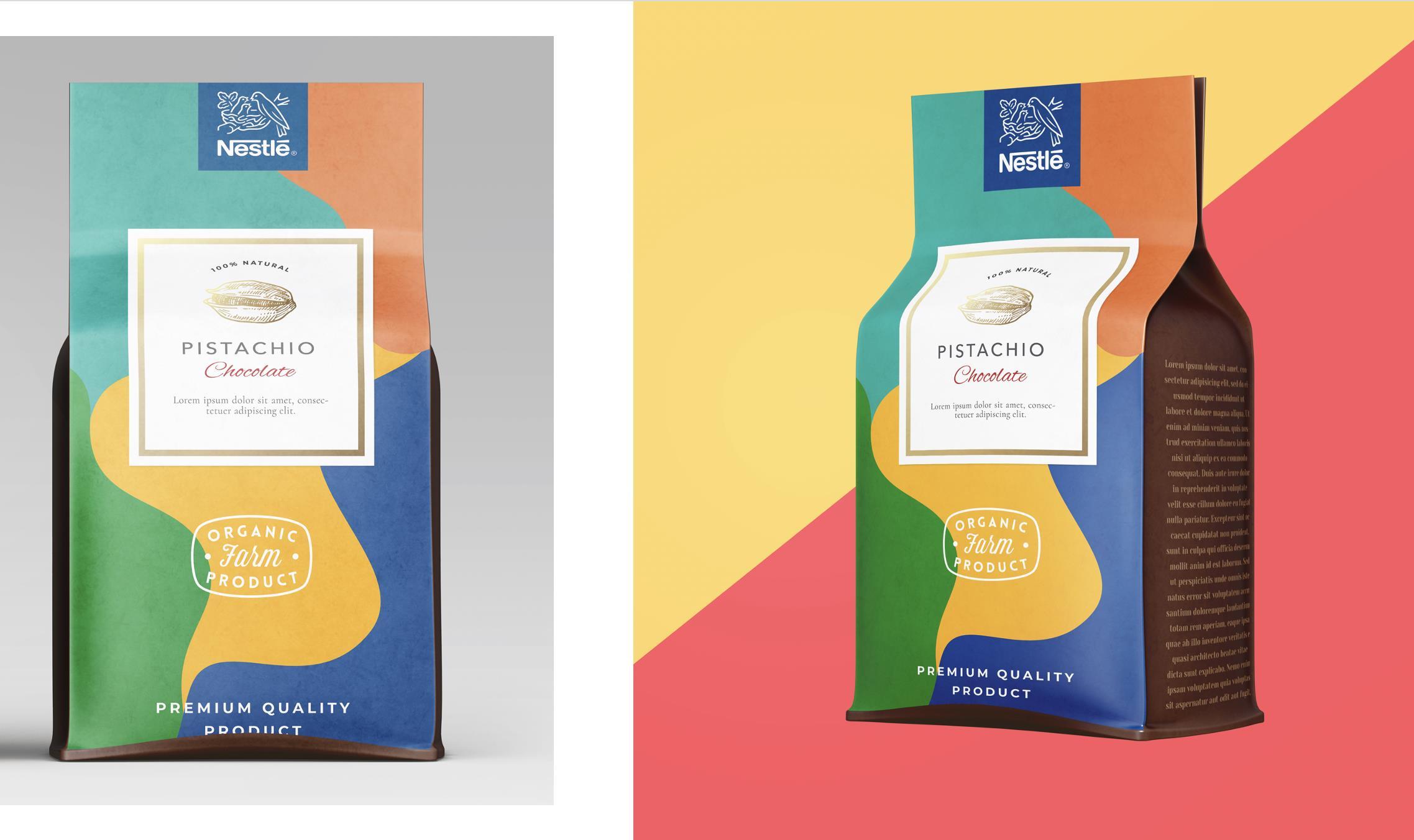
ORGANIC NESTLE DRYFRUITS DAIRY MILK
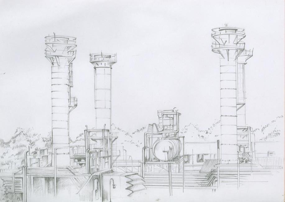
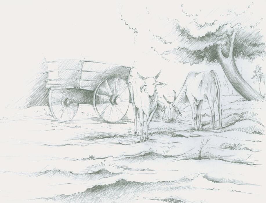
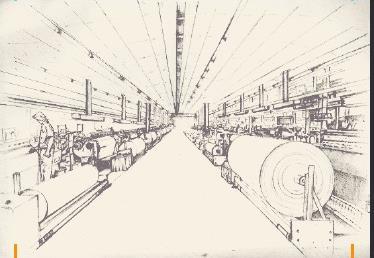
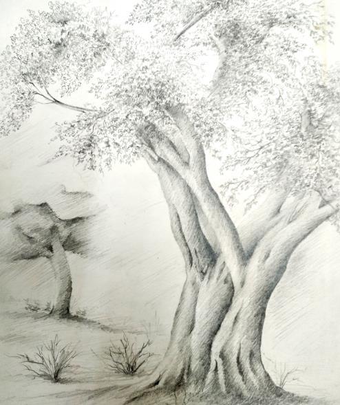
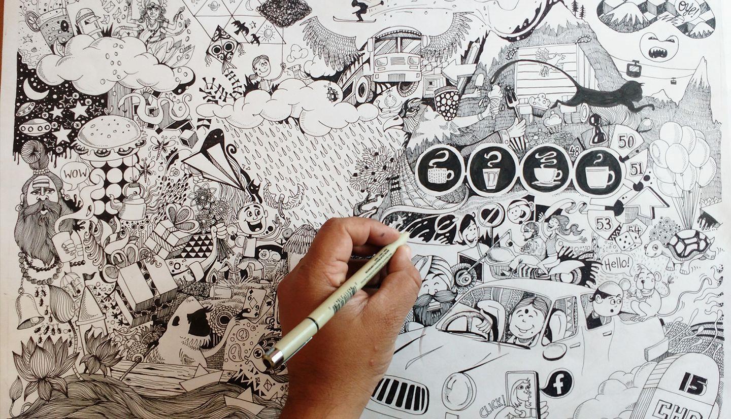
DRAWINGS


© Copyright Publicis.Sapient | Confidential
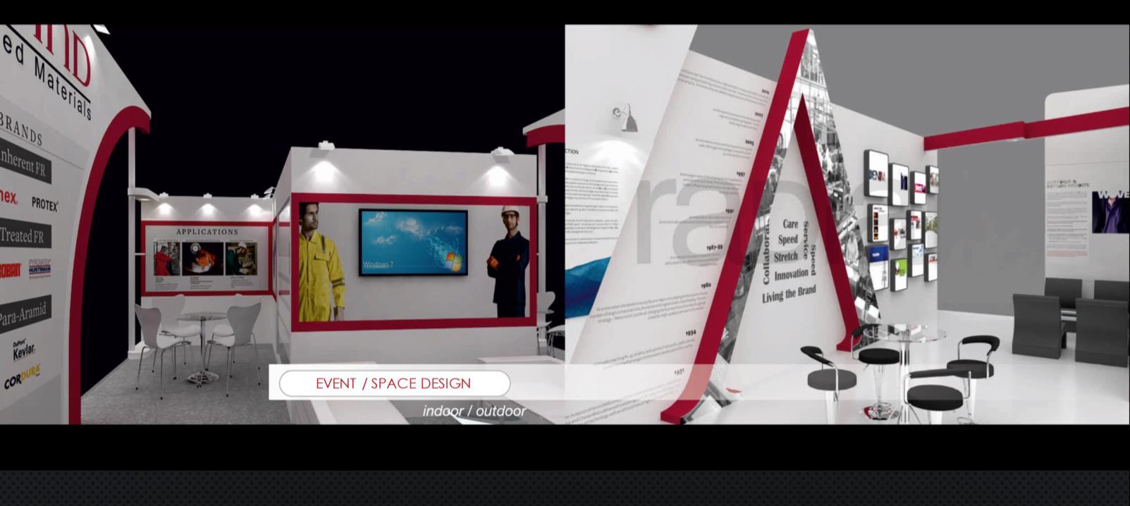
Events & Exhibitions
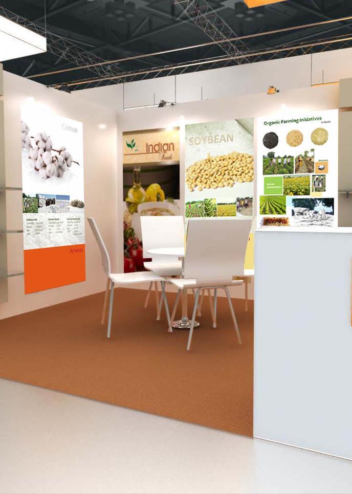
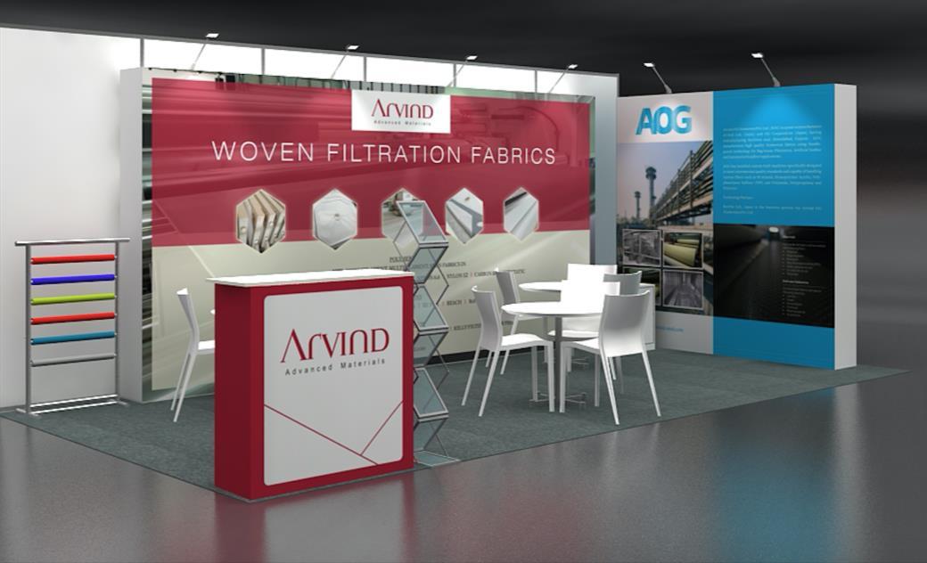
I believe in activations and brand experiences that create impact and build emotional bonds with consumers. From sampling programs to roadshows, from employee activations to influencer events. A memorable experiences that will engage consumers emotionally, turning them into loyal and passionate fans.
© Copyright Publicis.Sapient | Confidential