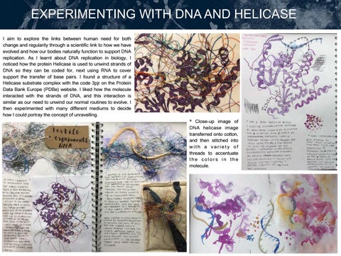
EXPERIMENTING WITH DNA AND HELICASE I aim to explore the links between human need for both change and regularity through a scientific link to how we have evolved and how our bodies naturally function to support DNA replication. As I learnt about DNA replication in biology, I noticed how the protein Helicase is used to unwind strands of DNA so they can be coded for, next using RNA to cover support the transfer of base pairs. I found a structure of a Helicase substrate complex with the code 3pjr on the Protein Data Bank Europe (PDBe) website. I liked how the molecule interacted with the strands of DNA, and this interaction is similar as our need to unwind our normal routines to evolve. I then experimented with many different mediums to decide how I could portray the concept of unravelling. ^ Close-up image of DNA helicase image transferred onto cotton, and then stitched into with a variety of threads to accentuate the colors in the molecule.
USING TEXTILES AND INKS TO PORTRAY DNA UNRAVELLING
I decided that I wanted to create the DNA double helix with with a permanent ink outline and adding inks to create distinction between the 4 bases (A, G, C, T). For the first experiment on the top left, I used coloured inks, one for each different shape of base. I ironed two different helicase photo transfer on top of the two DNA experiments: in the top left experiment, I used a purple colour scheme for helicase, but in the top right one, I used a warmer colour palette with a bright pop of blue. I preferred the multicoloured helicase experiment, so I went on to add bright alcohol inks on top. I didn’t like how much these inks spread, so I tried using much less and applying them selectively, which I preferred and decided to use in my final piece. For the second experiment, I used black ink to create a monotone palette to distinguish between the four base types; I wanted to have these be more minimalist and neutral so they wouldn’t distract from the helicase, which is the main focal point, yet also show the four different types of bases. I liked the effect of this best out of all of my experiments, so I mixed black ink and white gouache to create a thicker consistency that didn’t spread as much, and painted different tones onto each different base pair. I used a multicolour ombre thread with red, orange, and blue to stitch abstract shapes of the beta-sheets and alpha-helices within the helicase, onto dissolvable fabric. I also incorporated rope into these stitch pieces to give it more independent structure once the fabric dissolves away.
DEVELOPING FINAL PIECE: PHOTOGRAPHY Intentions and exploration: I aim to depict how individuals experience novel situations in comparison to our everyday routine. I originally explored the vast yet daunting experience of adventure through youthful eyes within the oil painting I created with my brother, pensively gazing into the future with an ambivalent expression on. However, I decided to experiment using photography to create a triptych of three faces, because the painting of a single adolescent wasn’t able to tell the complete story of our views of growth at different ages. I took photographs of three people at different ages - my three-year old cousin, me, my mom, who is fifty. I wanted to take this idea of feelings from one age group, and portray different emotions about the future and unknown versus our everyday routine, so I created a list of interview questions to ask my subjects as I photographed them, and I asked them to pose how they would in reaction to their future.
Photography process
Here is a photo of my process. This shows the DLSR camera I used for some of the photographs and I propped it up on my knee and steadied my elbow on the chair to minimise blurriness.
Photography outcomes: Here are some of the best photos that I took. The photos on the top were taken with an iPhone, in the same lighting and position as the photos on the bottom, which were taken by a Nikon D300s camera. I prefer the photos taken with the DSLR because they have a higher contrast, since I decided to use the flash. The higher contrast will create a better base for the black and white edit on Photoshop afterwards. I still imported both into photoshop later on so I could truly decide which photo was the best for each person.
Photoshop Editing I wanted to experiment with editing the colour balances and trying out black and white on the photographs, so I imported several photos of each person and experimented with the ‘curves’ effect in photoshop. I added the black and white effect on top of three of the photos and then added specific curves layers to each different photo so I could target the ratio between highlights and shadows more effectively. Lastly, I also scaled the photos so that the people were all the same size, by cropping the surrounding area, and scaling the size of the image.
I used neutral toned artificial lighting to create sharp contrast along the upwards gaze of the figure.
Mounting As shown to the right, I tried out many different mediums to apply the printed photographs to wood and board. I initially used simple inkjet printouts, which I then attached using Mar Vin medium or Mod Podge, both of which had a glossy finish, and then I also used another glue with a matte finish. I preferred the glossy appearance, although I didn't like the messy brushstrokes, and the finishings once stuck to other objects once dry which caused it to tear the photo on the right. I decided to use glossy and matte photo paper to experiment further, and decided that I still preferred the glossy finish. For these photos, I used photo mount, not spray mount, as I wanted the result to be more permanent. I much preferred the simplicity of the photo mount as it didn’t produce messy brushstrokes, so I created A3 prints of the black and white photos on glossy photo paper.
I used these settings to achieve the 3 photographs on the bottom left: 1/200 shutter speed, 5.6 f-stop, and the flash. In initial photography, there wasn’t enough light without the flash, so I decided to take some photos with the flash. In the end, the photos with the flash were sharper and had better contrast due to the high ISO required for the no flash photos.
Once I mounted the three best photos on wood with photo mount, I experimented with three different types of nails, varying in width and strength, to test out the different looks of the hardware. I think it is interesting how I used the lightest nails on the youngest face, and the heaviest on the oldest face, to show this change in responsibility and rigidity of life as we age.
USING STRINGS TO PORTRAY FUTURE 1. Strings showing innocence and unknown I decided to put nails close together along the shadow of her face, not on her actual face, to create some separation from the troubles of the world in the form of a physical shield. I wanted to emphasize the spotlight of external stimulation felt at a young age with fewer nails along the edge of the wood and many more around the face, so it fans inwards. Then, I wanted the strings to continue slightly off the wood to show knowledge of the future, yet control and no need to worry, since the strings are so limited. I used dark threads to create the depth in the areas along her face which sunk inwards, and the lighter threads for the areas which struck outwards. I got thinner strands of thread from unwinding a thicker strand of embroidery thread for some colours.
Interview Questions and Portrayal with Strings 1. 'How do you feel about your future? Are you more scared/ excited about it?’ 2. 'Do you step outside your comfort zone/ usual routine everyday? My aim was to understand each individual’s differences in how they portray future and then create a unique string design to illustrate their emotions. My 3 year old cousin didn’t answer the questions fully, so I showed a sense of innocent obliviousness with the strings fanning in towards her, to show the internal focus of oneself at a young age and the focus she receives from parents.With the middle portrait, I portrayed a divergence of options and the chaos that comes with an undetermined future, as I feel that it is daunting yet exciting. I depicted the final portrait with straight outward spreading strings to show direction yet a plethora of chances still.
1. Experimenting with creating a boomerang shape. I initially tried this with the blue and red ombre thread but didn't like the effect of the blue - it appeared too calm.
2. Using a ruler to create straight lines of nails. I then hammered these nails in once marking the position
3. I wrapped one shade of dark embroidery thread to create this pattern around one nail on one line and to the lowest down on the other.
I created a boomerang shape of strings within the wood to show the great divergence of options and decisions to be made at the age of 16, and some crossing over to show the complex links between things in everyday life and larger impacts of subtle decisions. However, when the strings go off of the wood, I wanted to show a loss of control so I depicted this with the dangling lines, and the two triangle shapes emulate spikes to show an obstacle to the future.
^String colours I chose to use a variety of red colors because I was inspired by the multiple colors which Maurizio Anzeri used in his pieces. I loved the depth that multiple colors create when layered. I wanted to emphasise that her life is more hectic than the 3 year old’s, so I decided to use the pins to represent many pinpoints of possibilities and tasks to do, with the strings connecting what we see. The future is less densely packed with strings but they stretch further, showing our need to stretch ourselves in our lives too, in order to step out of our comfort zone and grow.
EXPERIMENTATION FOR ‘UNRAVELLING’ I initially intended to create one piece combining the DNA helicase protein and the portrait, to meld the scientific idea of unravelling with our emotional unravelling. I decided to create two separate pieces, however, because I wanted to focus on the simplistic beauty of the portrait style and not confuse the viewer over the accuracy of the science of helicase. I was inspired by Januz Miralles, a mixed media artist from the Philippines. He uses digital editing and drawing to manipulate his photographs, and then uses various painting techniques to work into the prints. I was very inspired by the ethereal quality of his work, and wanted to experiment with inks and watercolours to try to emulate this.
I first experimented with a Photoshop digital drawing, as shown in the photo on the top right. I didn’t like this very much because it was very dark and detailed, and I was looking for a starker contrast and more beautiful simplicity, rather than complexity of detail. I then experimented with black ink, white gouache, and alcohol inks on Yupo ‘paper’ to explore the fluidity of liquid on a slippery surface. I used rubbing alcohol to distort the drops of ink to create a distressed appearance, like those in Miralles’ work below.
The leftmost image shows an edit I did of a photograph I took. I used Photoshop to apply a B&W filter and the curves layer to enhance the contrast. I printed them out on a different type of paper - the green tinted one was Yupo paper and this smudged in the printing, creating a fluid and geometrically shaped face, the middle one was on a thicker matte photo paper, and the left one was on cartridge paper. I then experimented with inks, and gouache. On the Yupo paper, I tried using the alcohol inks and rubbing alcohol to experiment with colour.
Here are two pieces by Januz Miralles which inspired me to experiment with gouache and ink, since I was intrigued by the mixing of opaque and thick medium (gouache) with thinner inks. I tried this technique out on cartridge paper and yupo paper, bu the yupo paper held the water much better without warping. I love the simple obscurity in Miralles’ work, and I wanted to bring in this balance between the figure and the blurred shapes in my pieces.
Januz Miralles — https://beautifulbizarre.net/ 2014/04/27/the-photomanipulations-paintedtextures-of-januz-miralles/
LIFE DRAWING — EXPLORING MEDIUMS I attended a six-week long drawing from life course, where we experimented with depicting the models with many different mediums, and in different positions, which helped me to gain confidence with proportions. On the right, both paintings are made with acrylic paint and are of the same model in the same pose. I enjoyed the tonal quality of working with just the black and white acrylic paint, and I liked the forgivingness of working larger scale with paint, since I could work tonally with large blocks of shading by layering paint. Throughout the course I also learnt that there is beauty in a drawing that may look more messy or impressionistic: I really enjoyed experimenting with large dashes of paint and creating linear forms in my drawings to show furniture. The two pieces on the left are monoprinting. I think this was the most challenging medium for me because it was difficult to achieve the right quantity of inks and it was difficult to predict the outcome therefore. Despite that, I really enjoyed the freedom of drawing without judgement until it was all done, and as I created more prints, I began to use black inks on top of the pieces as well. I love how abstract the top figure is, and only the splotches of ink make up its form. I really like the outcome of the charcoal and pencil piece on the right: the direction of the figure appears shy and timid, and the faltering lines have a shaky energy to them. I like the realistic depiction of the wrinkles on the back as it feels nervous yet present. I liked using the medium of charcoal to add more graphic lines to contrast the timidness of the figure.
The two images above show a clay sculpture I created from life. The medium of clay was also difficult to work with because it was necessary to keep rotating around the figure as you sculpt the clay. This technique brought my attention to various proportion issues as I moved around, which looked right at one angle and wrong at the other. I began the piece with a regular cuboid of clay and removed pieces to create the form. My experimentation with ink and gouache during life drawing class prompted me to experiment more with the mediums in my piece ‘Unravelling’, as I was interested in the fluidity of the two materials mixed. Since gouache is more opaque than inks, the two mixed to create an opaque, yet fluid liquid, which could create flowing lines.
FINAL DRESS SKETCH
DRAPING - CREATING A DRESS WITH MOVEMENT I chose to use polyester georgette in an ivory / off-white colour to create a luxurious and voluminous effect while being within a price range to allow me to purchase enough of it to create a flowy dress.To create the volume and drape once worn, I used my dress form to drape the outer fabric on a bias (45 degrees to the grain of the fabric) which creates an effortless draped effect as the fabric falls naturally. This allowed me to draft a paper pattern using draping tape guidelines, which I used to outline the desired fit of the top piece. I then cut out these pieces for the lining and constructed the lining and outer layers. In the photo below, the back of the top is pictured where I used pins to create tucks in the back for detail. To achieve an even hem at the bottom of the skirt, I measured the width of create markings for a double fold hem and pressed (ironed) it. Because of the bias cut, this will allow the fabric to flutter and drape in waves in mid-air
I decided to add voluminous long sleeves, so I first gathered the top of the sleeve to create volume around the shoulders, and then created a casing for elastic around the mid-arm and gathered the fabric there.
**These two images are photos of the painting ‘Woman with a Parasol’ by Claude Monet, 1875
USING STRING TO PORTRAY FUTURE CREATING A DRESS WITH MOVEMENT I was heavily inspired by Claude Monet’s ‘Woman with a Parasol’ painting as the impressionist brushstrokes mimic the freedom while capturing the movement as if it’s frozen in time. I wanted to capture the sense of free movement and the interaction between the wind and the flow of her skirt in my photography, so I composed a scene in a field of rapeseed, and alternated shots from beneath the subject and at eye level, to attempt to find the best angle to show the movement of the skirt.
**See Above
Here I used a low f-stop number (high aperture of 5.6) to create a narrow depth of field to focus on the flowers and blur the skirt slightly, creating an ethereal feel I love the dramatic flourish of the skirt here, which really emphasis it’s movement as the subject’s face is hidden. However, I prefer the landscape photographs as the composition here is too central **See Above I chose this one because of the effortless sense of movement in the skirt and it’s ethereal volume as it floats in mid-air. I selected this over the others to it’s right due to the subject’s neutral expression, meaning it doesn’t distract from the movement in the photograph
This image above shows the settings I used to achieve the shallow depth of field while shooting the single flower and the two shots with the skirt blurred in the background.
**
**
**
** **
**
**
**
**
**
**These photos are of works of others: the artist’s name is detailed below the image on the page
**Found on BioNinja (https://ib.bioninja.com.au/)
PORTRAYING tRNA MOLECULE WITH BEADS I’m interested in portraying the biological process of translation, where polypeptide chains are synthesised. These chains of amino acids form the first structure of a protein. I wanted to combine the process of ‘transforming’ smaller molecules into polymers (large chains of repeats) with the transformative nature of wind on embroidery. **
I began to experiment with ways to portray the molecular structure of the molecule tRNA (a molecule which transfers amino acids to form the new protein). The watercolour experiments above take an abstract approach to generally portraying the silhouette of the molecule. The embroidery piece below shows a more accurate depiction of the tRNA’s loops or ‘arms' **
The string of beads represents the main vertical structure of the molecule and I wanted to experiment with creating some of these bead structures. I then intend to add a bead at the top, like in the embroidery piece to the left, to show the amino acid and add bugle beads to each side as the ‘arms’.The process of translation is illustrated in the diagram above and the pink strand forming shows the polypeptide. I want to also show these chains of amino acids using bead strands to give the impression of long repeating chains. This emphasises the transformation occurring
GARMENT CONSTRUCTION - BEADS & ORGANZA First, I used cotton to create a bodice base, so I could build organza on top of the piece to create visual interest and reflect the elegance of the glass beads. Here I started by constructing the short yet wide sleeves to add volume and gathering later, I used teal bias binding to create a casing which I threaded elastic through to gather the sleeve at the shoulder.
Creating an organza sleeve overlay with 4 layers of organza and hand gathering it at the shoulder
I used an invisible zipper and zipper foot to achieve a neat centre back zipper closure and used a hook and eye at the top to close it. Initially I experimented with the zipper placement higher up but this meant that the zipper fell short at the bottom meaning the fit of the top was too small so I sewed it in further down. This time I also used only one seam, enclosing the zipper and acting as topstitching which was neater. I then hand stitched the top looser organza down and the hook and eye.
Then to create the tRNA molecules to represent the process of translation, where the first structure in proteins is built known as polypeptide strand (consisting of amino acids), I created short strings of toho seed beads to represent the acceptor stem and anticodon loop.