
Driving Innovation, Experience, and Strategic Growth

Driving Innovation, Experience, and Strategic Growth
Integrity
We lead with honesty, confidentiality, and neutrality, operating in the best interests of our clients and partners.
Excellence
We act with purpose to craft and deliver the best possible products and services to our clients - on time and on budget.
Hospitality
We lead with empathy and focus on people-driven solutions. We are approachable, kind, and supportive, while remaining firm when needed.
Trust
We build long-term relationships rooted in reliability, transparency, and mutual respect.
Innovation
We bring fresh ideas and bold thinking to the table, challenging the status quo.
Personalization
We know that no two customers or clients are the same and that’s why we don’t deal in cookie-cutter solutions. We meet people where they are with customized solutions.
Presense
Our collective talent, expertise, and energy attract the best clients and collaborators.

To help our clients, service providers, and operators grow through tailored, innovative solutions, powering experiences wherever people work, learn, recover, or play.
Our strength lies in the power of our collective: the top talent and expertise within our industry.
To become the most trusted experience partner in the away-fromhome markets – the clear choice in every sector and industry we serve.
We help organizations grow and thrive - through experience design, innovation, and operational excellence that delivers measurable results.

We may not be the biggest, but we aim to be the best.
• Deep, real-world experience on both the client and operator sides
• A broad scope that extends beyond foodservice or design— spanning the full spectrum of the away-from-home market
• Enterprise-level expertise with an agile, boutique approach
• Strategic consulting that goes beyond theory - we help train, implement, operationalize, and execute
• A collective of top tier experts, not generalists
• Proven tools and frameworks that bring drive measurable, repeatable results
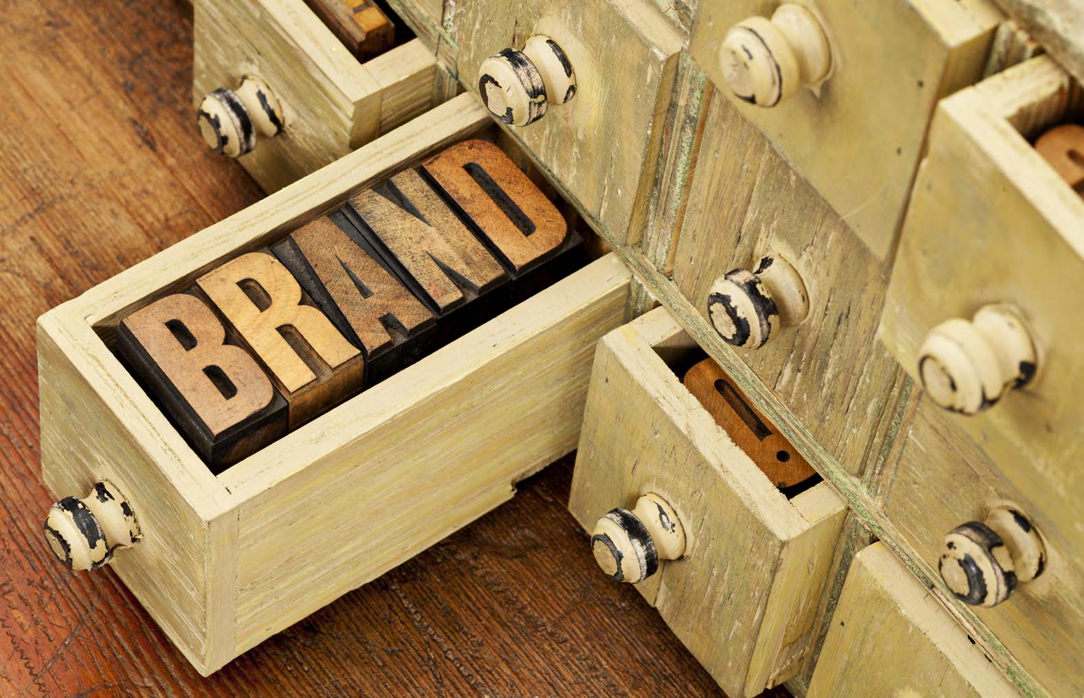
Our name reflects who we serve and how we think.
The Unity Mark
Our core symbol represents connection, collaboration, growth, and balance. These principles guide how we work with clients and partners. It serves as our visual stamp of approval, ensuring that anything carrying our mark reflects our values and mission.
4 — Represents the four types of partners we work with: Corporations, Service Providers, Innovators, and Accelerators.
x — Symbolizes the actions we take together: Explore, Experience, Extend, and Expand.
i — Embodies the mindset we bring to every engagement: Inspire, Imagine, Innovate, and Impact.
Together, 4xi is both our name and our approach — a reminder that the power of our work lies in bringing the right people, actions, and ideas together to create meaningful change.
Connection | Collaboration Growth | Balance
Corporations | Service Providers Innovators | Accelerators
Explore | Experience Extend | Expand
Inspire | Imagine Innovate | Impact
The 4xi logo reflects our commitment to trust, professionalism, and forward thinking. Its clean, neutral design ensures it integrates seamlessly across a variety of use cases while reinforcing a consistent and confident brand presence.
We use a monochromatic palette for the core logo black on light backgrounds and white on dark — to maintain clarity and visual harmony, especially when paired with our more colorful sub-brand marks. This neutral aesthetic allows the sub-brand system to shine while keeping the 4xi identity grounded and cohesive.
In select cases — such as over photography, textured backgrounds, or on report covers — the black box version of the logo may be used to enhance contrast and legibility. The Unity Mark, a rounded, modular cross symbolizing connection and cohesion, is reserved for limited use in digital contexts like mobile menus or favicons. It should never appear without the accompanying “4xi” wordmark to ensure clarity and brand consistency.
The 4xi logo is designed for maximum clarity and versatility across digital and print applications. We use a monochromatic color scheme for the core brand mark to maintain a professional, cohesive aesthetic across all environments.
Do’s
✅ Use black on light or white backgrounds
✅ Use white on dark or colored backgrounds
✅ Always maintain a minimum clear space of 0.25 inches on all sides of the logo. This margin ensures the logo is never crowded by text, imagery, or other graphic elements, preserving its legibility and visual impact.
Don’ts
❎ Do not alter the logo’s colors
❎ Do not add drop shadows, glows, or effects
❎ Do not stretch, skew, or rotate the logo
❎ Do not place the logo over low-contrast or busy backgrounds
The logo should always be presented with intention and consistency — it’s a reflection of our brand’s professionalism and credibility.
This is the standard and preferred logo mark, featuring the Unity Mark and “4xi” wordmark in a horizontal configuration. It should be used in most cases, maintaining the .25" clear margin for balance and breathing room.
Ideal for use over photography, video stills, gradients, or textured backgrounds. The black box provides a neutral base for the white wordmark, ensuring visibility and brand consistency in dynamic environments.
The Unity Mark — a rounded, modular cross — may be used as a standalone element only in select digital applications such as mobile menu icons or favicons. It should never be used on its own in formal materials or brand communications without the “4xi” wordmark.
When in doubt, default to the primary logo and ensure spacing, contrast, and consistency are respected.


To protect the integrity of the 4xi brand, always use the approved logo files and follow these rules. Any modification or misuse weakens the visual consistency and professionalism we aim to convey.
Do not:
❎ Alter the logo colors
❎ Add drop shadows, glows, bevels, or other effects
❎ Place the logo over low-contrast or complex backgrounds without the black box version
❎ Stretch, skew, or rotate the logo
❎ Add outlines or strokes
❎ Use the Unity Mark on its own in formal applications
❎ Change the arrangement or spacing of the Unity Mark and “4xi” wordmark
❎ Reduce the logo size below minimum legibility requirements (0.75" for print, 90px for screen)
The 4xi color palette is rooted in clarity, confidence, and modern professionalism. Anchored by crisp white and deep black, the palette uses layers of neutral gray to create depth and structure. Accents of vibrant teal (#18AAC6), grounded blue (#0E4D61), and deep navy (#091827) bring energy, trust, and focus to the system. Together, these colors reflect the forward-thinking, high-performance nature of our brand. For further guidance on the colors used in the core and supporting practices, see the sub-brand guidance section.
HEX: 000000
RGB: 0 0 0
CMYK: 75 68 67 90
Used for body text, strong contrast, and high-clarity elements
HEX: 383838
RGB: 56 56 56
CMYK: 69 62 61 54
Used for headers, icons, and UI elements.
Gray
HEX: 9F9F9F
RGB: 159 159 159
CMYK: 40 33 33 0
Used for dividers, supporting text, or muted backgrounds.
Gray
HEX: F3F3F3
RGB: 242 242 242
CMYK: 4 2 2 0
Used for background fills, subtle section contrast.
HEX: 18AAC6
RGB: 24 170 198
CMYK: 74 12 18 0
Primary callto-action — energetic and modern, used for buttons, icons, links, CTAs.
Trust Blue
HEX: 0E4D61
RGB: 14 77 97
CMYK: 93 61 45 28
Deep, grounded blue — reinforces professionalism, used for structure and depth.
Deep Navy
HEX: 091827
RGB: 9 24 39
CMYK: 89 76 55 70
Cool nearblack — used for backgrounds, bold text, and contrast layering.
Photography should:
• Focus on diverse people and age groups, a mix of candid photos and with direct eye contact
• Evoke authenticity, thoughtfulness, and impact
• Avoid stocky or overly staged imagery
• Feel slightly unconventional — it’s okay to be a little quirky
• Align with the messaging it supports — the image should say a thousand words through the action and imagery displayed in the photo.


The 4xi brand uses a modern, accessible type system designed for clarity, professionalism, and flexibility across all formats.
We use Raleway for headers — a clean, geometric sans-serif that brings structure and sophistication to titles and callouts.
Our body copy is set in Barlow, a versatile and highly readable typeface that balances friendliness with authority. Its open forms and smooth rhythm make it ideal for reports, presentations, and digital content.
Together, this type pairing ensures our voice is delivered with impact and intention — no matter the platform.

Application & Structure
Our typography system brings structure, clarity, and consistency to all 4xi communications. Raleway is used for headline elements, Barlow for supporting content, and Domine for moments where we want to draw the eye and create impact. This refined combination supports both editorial layouts and functional communications, from thought leadership articles to proposal decks and digital assets. Always apply clear hierarchy, maintain consistent spacing, and ensure typography aligns with the tone of the message.
Raleway
Headings
ABCDEFGHIJKLM
NOPQRSTUVWXYZ
Body Copy
0123456789!.@#$& Barlow
ABCDEFGHIJKLM
NOPQRSTUVWXYZ
0123456789!.@#$&
Body Copy
ABCDEFGHIJKLM
NOPQRSTUVWXYZ 0123456789!.@#$&

Our tone of voice is designed to engage thoughtful professionals. We aim to be insightful and educational, offering content that sparks curiosity and adds real value. We speak with authority grounded in experience, while remaining approachable and purposeful in our delivery. Our communication style is stimulating and intelligent, often enriched with relevant examples and the occasional touch of light humor to keep things engaging. Whether we’re writing a report, leading a workshop, or posting online, we strive to make our message clear, interesting, and aligned with our visual and strategic identity.


The 4xi sub-brands represent specialized practices within our greater consulting collective. Each practice delivers a unique area of expertise — from sustainability to experience design to data analytics — while operating as an integral part of the 4xi ecosystem.
Sub-brands are designed to stand alone when needed, yet always align with the broader values, tone, and identity of 4xi. Together, they form a unified portfolio of solutions built to serve complex client needs through collaborative and cross-functional thinking.
• Sub-brands follow a clear naming convention:
• [Practice Name] by 4xi
• (e.g., Evolving Experiences by 4xi, SPx by 4xi)
• In layouts, sub-brand logos may appear independently at the top of a page or asset, while the 4xi mark appears in the footer or elsewhere on the page.
• The 4xi brand must always be present in some form on all sub-brand collateral — visually (logo) or contextually (in the copy).
• Sub-brand logos always appear with the 4xi mark, though not necessarily in a fixed lockup.
• Logos may be used side-by-side (e.g., footers or presentation slides), or stacked vertically for editorial layouts.
• The sub-brand logo should be primary in its own materials, with the 4xi mark supporting.
• Use only approved logo files for each sub-brand and never alter their proportions, arrangement, or typefaces.


Elevating service provider performance through strategy, insights, and pursuit support.
Designing and enhancing employee, student, and customer experiences to create workplaces and environments people love.

Supporting leaders and organizations with vision-setting, strategic alignment, and organizational clarity.

Translating sustainability goals into simple, actionable strategies that drive impact and engagement.
Helping organizations innovate, optimize, and elevate their foodservice strategies — from operations to experience.

Access top-tier consulting support when and where you need it, without long-term contracts.

Access top-tier consulting support when and where you need it, without long-term contracts.
Design services at the intersection of insights, strategy, and creativity — from brand to campaign.
Human-centered design solutions that enhance environments and improve daily life.

Showcasing and connecting innovative tools, technologies, and products that elevate experience.
A framework for evaluating experience success across people, place, and performance.

Insights, metrics, and dashboards that connect experience strategies to measurable business outcomes.
Tools, training, and enablement programs that raise performance across teams and service partners.

Online training and education programs to scale knowledge, improve execution, and grow talent.
Empowering schools to design and operate their own dining programs, focused on nourishing students and enhancing the everyday campus experience.
• Each sub-brand has a unique primary and accent color, with black, white, and neutral grays used as supporting tones.
• Sub-brand content (such as social posts or reports) may use subbrand-specific typography and color styling — as long as it aligns with the greater 4xi tone and standards.
• Avoid mixing multiple sub-brand palettes within a single piece unless clearly defined sections warrant it (e.g., a collaborative proposal with distinct practice contributions).
In collaborative work:
• The lead practice takes visual precedence
• Supporting practices may be mentioned in a secondary capacity or omitted
• If no single practice leads, the core 4xi brand takes the primary position
Each sub-brand is an extension of the 4xi brand — not a separate entity. While they allow for greater focus within specialty areas, they share a common voice: thoughtful, professional, forward-thinking, and human.
Header: BEBAS
Subhead: Barlow Bold
Body: Barlow
Burnt Orange
HEX: E35F21, RGB: 227 95 33
Mustard
HEX: FAAB05, RGB: 250 171 25
Header: Gotham Bold
Subhead: Barlow Bold
Body:Barlow
Action Red
HEX: EE2526, RGB: 238 42 40
HEX: 000000, RGB: 0 0 0
Header: Modula Serif Black
Subhead: Barlow Bold
Body:Barlow
HEX: FFE62F, RGB: 255 230 47
Sky Blue
HEX: 0780BA, RGB: 7 128 186
Header: Poppins Black
Subhead: Barlow Bold
Body: Barlow
Charcoal
HEX: 191919, RGB: 25 25 25
Orange
HEX: F95B3D, RGB: 249 91 61
Header: Montserrat Bold
Subhead: Barlow Bold
Body:Barlow
Lime Green
HEX: 2DC23C, RGB: 45 194 60
HEX: 143E68, RGB: 20 62 104
Cyan
Header: Bowlby One SC
Subhead: Barlow Bold
Body: Barlow
HEX: 019CDD, RGB:1 156 221
Pink
HEX: FF89AE, RGB:255 137 174
Header: Montserrat Extra Bold
Subhead: Barlow Bold
Body: Barlow
Navy
HEX: 0F3557, RGB: 15 53 87
Coral
HEX: DC7364, RGB: 220 115 100
Header: Avenir Black
Subhead: Barlow Bold
Body: Barlow
Midnight
HEX: 0D0F37, RGB: 13 15 55
Electric Green
HEX: 93C951, RGB: 147 201 81
Header: Barlow Bold
Subhead: Barlow Bold
Body: Barlow
Navy Blue
HEX: 1B2E5A, RGB: 27 46 90
Lime
HEX: 95CV5C, RGB: 149 203 92
Header: Barlow Bold
Subhead: Barlow Bold
Body: Barlow
Bright Purple
HEX: 852BFF, RGB: 133 43 255
Dark Purple
HEX: 351166, RGB: 53 17 102
Header:Orbitron Bold
Subhead: Barlow Bold
Body: Barlow
Suit Blue
HEX: 121A26, RGB: 118 26 38
Oxford Blue
HEX: B6DFF1, RGB: 182 223 241
At 4xi, our logo is more than just a design — it’s a stamp of approval and a direct reflection of our beliefs, our standards, and the quality we stand for.
To preserve the integrity of our brand, all materials bearing the 4xi name or logo — including subbrand marks — must be reviewed and approved by a designated Brand Ambassador before being shared externally. This includes, but is not limited to, presentations, proposals, reports, marketing content, and digital assets.
Use of the 4xi logo without approval is not permitted. This safeguard ensures that every touchpoint upholds our values, reflects our professionalism, and aligns with our collective voice.
For questions or assistance, please contact hello@4xiconsulting.com.

hello@4xiconsulting.com