COMMUNICATION PLACE
August 2021 +

Introduction
Current Members of the Academic Task Force
A Message from Christina Lyons
Chair, SEGD Academic Task Force
A Message from Cybelle Jones
SEGD CEO
Bridging Barriers
A Framework for Effective Evolution and Ecology Communication in Exhibitions
Abigail Sarver-Verhey
Co-creating the Brand
Modelling the Perceived Authenticity in a Branded Environment Through Co-creation
Chang Lee
Copenhagen: Sustainable by Design
Understanding the Use of Sustainability
Through Design in Denmark
Carlea Stremme
Exploring Experiential Information Environments
Yvette Shen and Elizabeth Sanders
Fostering a New Generation of Equity-Centered Designers
Archana Shekara
The Gateway Project
The Rise of the Designer Diplomat
Colleen Connolly
A Model for Interdisciplinary Innovation in Education
Preparing Students for a Global Future of Design Problem Solving
Andrea Quam, Peter Evans, and Mike Ford
Introduction to the Flight Information Display Systems (FIDs)
Enhancing EGD Awareness in the Communication Design Studio
Muhammad Rahman and Reneé Seward
Cripping the Crit: Towards a More Accessible Design Academy
Gabi Schaffzin
Scaffolded and Adaptable Pedagogy for Data Literacy
Bree McMahon and Marty Maxwell Lane
Strategies for Incorporating Anti-ableism Into Design Curriculum
Audra Buck-Coleman, Cheryl Fogle-Hatch and Robin Marquis
The CHaSSMM Model of Analysis
A Framework for the Design of ‘Difficult’ Exhibitions
Willhemina Wallin
There is Nothing to See
A Hyperlocal Study of Ephemeral Signs Reveals
Hidden Tensions and Celebrates Resilience
Ann McDonald
Case Study: Toward Decoding Design’s Value—Communicating and Visualizing Design Research
Aija Freimane
The Society for Experiential Graphic Design (SEGD) is a multidisciplinary network of designers, industry and technology specialists, educators, and students dedicated to experiential graphic design. We work in wayfinding, placemaking and identity, digital experience design, exhibitions, public installations, branded environments, and other aspects of EGD/XGD.
SEGD exists to “educate, connect and inspire” the global, multidisciplinary community of professionals, creating experiences that connect people to place. We are committed to knowledge sharing and continually raising the standards of practice in a design discipline that has the potential to enrich the lives of people wherever they work, play, shop, learn, travel, or gather.
SEGD’s education conferences, workshops, webinars, and courses span a wide swath of design practice areas including branded environments, exhibition and experience design, technology and interactive experiences, user experience, healthcare, practice and technical topics, wayfinding, accessibility, and the business of design.
SEGD actively collaborates with and provides outreach to design programs at internationally recognized colleges and universities. Our signature academic education event is the annual SEGD Academic Summit, immediately preceding the SEGD Conference each June. Design educators from around the world are invited to submit papers for presentation at the Summit and publication in SEGD’s blind peer-reviewed Communication + Place, which is published electronically on an annual basis. The Summit and e-publication are platforms for academic researchers to disseminate their creative work, models for innovation in curriculum, and best practices for research related to experiential graphic design.
Yeohyun Ahn | University of Wisconsin, Madison
Joell Angel-Chumbley | University of Cincinnati, College of Design, Architecture, Art, and Planning
Michael Chad Eby | University of Kentucky
Angela Iarocci | York University, Sheridan College
Tim McNeil | University of California, Davis
Michael Lee Poy | Ontario College of Art + Design
Amy Rees | Drexel University, Westphal School of Art + Design
Debra Satterfield | California State University, Long Beach
Inessah Selditz | New York University
Neeta Verma | University of Notre Dame
Willhemina Wahlin | School of Communication and Creative Industries, Charles Sturt University
Michele Washington | Columbia University
For more information, please contact Cybelle Jones or Christina Lyons
Cover photo and journal design: Willhemina Wahlin
Chair: Christina Lyons | Fashion Institute of Technology/SUNYChair SEGD Academic Task Force
"The SEGD Academic Task Force is a team of dedicated design educators, researchers and practitioners that works together to support and create resources that advance the global academic design community.
Our mission is to promote knowledge of experiential design academic trends, professional practices, curricular innovations and research. Each year we commit to multiple projects in an effort to serve educators advancing interdisciplinary experiential graphic design curriculum and research and initiatives that introduce students and programs to the experiential graphic design field.
The SEGD Academic Task Force produces an annual Call for Papers and conducts a peer review of abstracts submitted from across the globe. The Task Force then invites authors to present at the annual SEGD Academic Summit and to publish full papers in Communication + Place to highlight research and insights for professional development and education in the field of experiential graphic design.
If you are interested in learning more about the work of the SEGD Academic Task Force, please feel free to contact me at christina_lyons@fitnyc.edu.
"Our community of educators, designers and makers strives to create environments that improve the human experience...
"The Society for Experiential Graphic Design (SEGD) exists to “educate, connect and inspire” the global, multidisciplinary community of professionals creating experiences that connect people to place.
We are an association of people who create content-rich, emotionally compelling, experiential spaces for a wide range of environments, from hospitals and transit hubs to museums and educational campuses.
Our work creates a sense of place, helps people find their way, communicates important information and fuels a dialogue between users and the spaces they inhabit. We research, plan, design and build a diverse range of visual communications and information systems for the built environment.
Our community of educators, designers and makers strives to create environments that improve the human experience and share knowledge that raises the standards of design in practice.
We hope that you will explore more about our educational and professional resources at www.segd.org
Cybelle Jones CEO, SEGDAbstract
Natural history museums have a long history of interpreting the natural world. Today, they have become popular informal learning destinations that possess a unique set of tools for communicating natural science to the public in meaningful ways. This article presents a framework that assists exhibit creators in identifying and directly addressing the multifaceted challenges, or barriers, visitors face as they interact with content in exhibitions. It was developed specifically in the context of evolution and ecology exhibitions that explore topics such as fossils, climate change, and human health.
The framework codifies a set of six barriers that form a foundation for developing successful exhibition designs by anticipating visitors’ needs and the challenges they may face in understanding and connecting to evolutionary and ecological science. In response to these barriers, exhibition creators can employ bridges, long proven or newly developed solutions, that make exhibitions more welcoming and accessible, educate more effectively, and help visitors form stronger connections between evolutionary and ecological science and their own lives.
Category: Expanding Perspectives: Exhibition Design
Keywords: Exhibit design , Evolution education, Ecology education, Informal science learning
An evaluation was conducted to explore how the use of the framework affected visitors’ experiences with a T. rex exhibit. The promising findings suggest that it has the potential to help exhibition creators design evolution and ecology exhibits that promote engagement and foster greater connections to content.
Introduction
Science communication is vital for preparing people to respond to sciencerelated issues in informed, responsible ways. Now more than ever we rely on science in many aspects of our lives. Evolution and ecology are among the most critically and intimately relevant sciences, as they connect to issues and decisions people face at both global and personal levels, from the climate crisis to personal health. Several aspects of museums make them ideal sites forevolution and ecology communication.
• From famous dinosaurs to iconic living animals, evolution and ecology exhibits have an inherent wonder to them.
• The “realness” and immersion of museum experiences can connect visitors to content in a uniquely affective way.
• As repositories of evidence for evolution and ecological processes, this realness is also significant as a tool for supporting scientific statements.
• Museums are a voluntary learning experience, setting them apart from the stigmas of formal education. Their ability to make learning entertaining and fun creates a more positive perception of it that ultimately makes visitors more open to learning new things.
Museums have broadly taken on this role of evolution and ecology educator, but can face challenges in doing so effectively. The responsibility they have in this role means that they should take steps to do it as effectively as possible, a process that entails understanding not just the content they are presenting, but how their audience will interact with it experientially and cognitively.
Background
Understanding how to better communicate evolution and ecology begins with an understanding of visitors’ current experiences as learners in museum settings. Considering what visitors can come away knowing is essential to setting realistic learning goals. It should guide what we want them to learn and influence how we approach the presentation of content. There has been extensive debate around reasonable learning expectations in museums, but Falk and Storksdieck suggest that it is possible and does occur, it just looks different from formal learning. Shouse et. al.’s definition of science
learning encompasses motivational, physical, social, and personal development in addition to cognitive development. It is also important to be conscientious of the fact that the museum is only a small aspect of the lifelong learning process that people will go through to understand dynamic systems like evolution and ecology.
While visitors are willing to engage with content and to learn, what information they expose themselves to and have the chance to learn is typically guided by topics and experiences that are of personal interest or the interest of those they visit with. Research on how visitor motivation shapes visitors’ learning experiences has shown that visitors are motivated to learn by entertainment as well as education and more often than not, find museums both entertaining and educational.
With this understanding of the landscape of learning in museums, my research turned toward developing ways to address the challenges museums face in evolution and ecology communication. In this phase, my work began to take on an organizational structure of challenges and solutions that I dubbed barriers and bridges, respectively.
A goal of mine was to generate a practical tool that could be used by exhibition creators to apply my research to their work. Through further development, I built this structure into a framework of codified challenges and solutions that provides both a thinking strategy and reference guide for users.
As illustrated in Figure 1.1, the framework encourages users to see barriers standing between a visitor simply going to an exhibition and a visitor learning from that exhibition. These barriers, when specifically identified, become concrete and actionable elements to focus on in the exhibition creation process. Ultimately, it suggests that by anticipating the challenges visitors will have with content and building exhibitions that are prepared to help visitors overcome those challenges, we can create exhibitions that more effectively communicate and educate.
This project involved broad research on evolution and ecology education in museums as well as other informal and formal learning settings through literature reviews and interviews with practitioners. Over the course of this investigation, six key types of visitor traits and circumstances emerged as universal and primary challenges for visitors learning about and connecting with evolution and ecology. By identifying these barriers, exhibition creators can have a clearer sense of what they need to provide for visitors to help facilitate meaningful interactions.
The six barriers are:
• Complex Content: Evolution and ecology are complex topics that are inherently challenging for visitors to understand.
• Relevance & Relatability: Visitors do not see how evolution and ecology is relatable or relevant to their own lives.

"
By identifying these barriers, exhibition creators can have a clearer sense of what they need to provide for visitors to help facilitate meaningful interactions.
"
• Cognitive Biases: Evolution and ecology trigger a range of inaccurate intuitive reasoning patterns in visitors that lead to incorrect understandings.
• Ideological Biases: Evolutionary and/or ecological interpretations of the natural world may conflict with visitors’ religious, cultural, or political ideologies, making them difficult to accept.
• Learning Needs: Visitors have different learning needs depending on their background, age, and visit context that effect their engagement with exhibitions on evolution and ecology. These needs are dynamic, shifting over time and within even a single visit.
• Experiential Needs: Visitors have personal and/or social needs within a museum that affect their capacity for engagement and learning.
Helping visitors to overcome these barriers requires the thoughtful design of everything from exhibition layouts to infographics. To help exhibition creators in their work designing, developing, curating, and educating through exhibitions, this research identified a robust array of suggested bridges, or strategies, for helping visitors overcome the six barriers. Bridges were drawn from proven exhibition strategies, professional recommendations, successful approaches to communicating evolution and ecology in other fields, and in some cases newly developed in response to the barriers. The nature of this framework and the diversity of exhibitions on evolution and ecology means that the bridges are a virtually limitless collection of solutions.
The following descriptions survey relevant research in order to establish key methods of addressing each barrier. These general directions served as the basis for the development of a library of bridges specific to each barrier that were assembled into a toolkit for exhibit creators as part of the larger research project.
• Frame content in familiar contexts, for example, color or biome. When more esoteric frameworks such as taxonomy are employed, it is essential to give visitors the motivation to explore them and the cognitive tools to make sense of them through enjoyable experiences and accessible interpretation.
• Present content in approachable amounts and terms. Technical and lengthy interpretations can intimidate visitors who have neither the interest nor expertise to engage with them.
• Connect scientific topics to real world decisions or issues visitors are facing in their own lives. This helps visitors see abstract science on a more personal level, encourages them to reflect on content, and motivates them through emotion.
• Create opportunities for visitors to identify with scientists through interactions or visual and narrative representations.
When creating “relevant” exhibitions, exhibition creators need to consider who the exhibition is relevant for. Visitors come from a variety of backgrounds and circumstances and do not all share the same references or issues. It is essential to consider the specific audiences of an exhibition or museum and determine what angles will truly make content relevant to them.
• Present information through common scales, streamlined graphs, or other methods that are easy for visitors to analyze. From large scale numbers to the order of major landmarks over geologic time, evolution involves a host of numerical and temporal information that is not within the average visitors’ frame of reference.
• Help visitors to see and reflect on their biases. This can be the first step in moving from intuitive toward scientific reasoning. By creating activities where learners are reasoning about evolution, they can see where errors arise.
• Show visitors how they can incorporate science into their understanding of the world. Effective evolution communication must provide opportunities for visitors to understand and/or accept evolution without threatening the values and beliefs that are an important part of their identity and that they are not likely to compromise, consciously or unconsciously.
• Avoid shaming and focus on opportunities. Educating visitors about actions they can take to address evolution and ecology related issues should involve a variety of motivations to appeal to the different values visitors will hold.
Bridging this barrier is a complex and somewhat moral challenge that is not intended to invite non-scientific interpretations into museum exhibitions, but to make all visitors feel welcome and comfortable in our spaces.
• Provide multiple points of entry to content both experientially to appeal to visitors’ different preferred modes of interaction and narratively to appeal to their different interests.
• Foster meaningful learning at many levels of engagement by providing multiple “entry points” and “pathways” for meaning making in everything from labels to digital interactives.

 Figure 2.1: T. rex exhibit in the Academy of Natural Sciences of Drexel University Dinosaur Hall
• Make visitors feel comfortable and welcome within exhibitions and the museum as a whole. These are basic needs that must be met before visitors can be expected to engage meaningfully with content.
• Create unique and memorable experiences for visitors to help facilitate positive associations with content and the process of learning. Bridges to this barrier are sometimes beyond the control of exhibition teams and require collaboration with departments across the museum, particularly visitor services, to develop and implement.
The usability and effectiveness of this design framework was evaluated through a visitor study at the Academy of Natural Sciences of Drexel University in Philadelphia, Pennsylvania. A set of interpretive label rails for the T. rex in the museum’s Dinosaur Hall served as the focus of the study. Visitors’ experiences with the existing labels and a new set of parallel labels developed using the barriers and bridges framework were compared to determine whether the application of the framework could increase the effectiveness of the exhibition experience in communicating information about evolutionary and ecological science on T. rex.
To apply the framework, I began by assessing three factors: the content, the exhibit medium, and the context of the exhibit within the museum. I chose to align the design and content of the new labels as closely as possible with the existing labels in an effort to make the outcomes of the surveys more comparable.
With these key factors in mind, I determined which of the six barriers visitors might face interacting with the exhibit. With a selection of barriers to attend to, I referenced the bridges suggested for each barrier and determined which might be applicable to the exhibit. I employed these bridges in the conception, design, and writing of the new labels. Figure 3.1 shows how this process was applied to one of the labels from the set. In many cases, I redesigned or reinterpreted existing content, though in some instances the use of the framework led to the addition or removal of content on the new labels. The design of the labels drew from the existing color palette of the gallery and reused some original imagery to achieve a level of similarity, but sought to modernize dated design aesthetics, rework confusing layouts, and incorporate more scientifically accurate artistic interpretations of the dinosaurs in line with the suggestions of the design bridges.

The first evaluation period aimed to determine how visitors interacted with the existing interpretation and what they took away from it as a baseline with which to compare their experiences with the new labels. The second evaluation period involved the installation of prototypes of the new label rails and aimed to determine what visitors’ experiences were with them in order to compare them to the existing interpretation. The same survey questions were asked in both periods. The first evaluation period also included an A/B test where visitors were asked to compare mockups of the new labels with the existing labels.
The evaluations consisted of a verbal survey within the Dinosaur Hall after visitors had finished viewing the T. rex. They were conducted on the weekends of February 29-March 1, 2020 and March 7-8, 2020 from 11 a.m.-2 p.m. Different visitors were surveyed each time. In total, 60 surveys were conducted, with 30 on each weekend. After the completion of the two evaluations, the results were compared to assess whether the framework did in fact increase learning from and connection with the T. rex interpretive labels.
Figure 3.1: Process for creating the new label railsVerbal surveys were primarily conducted with one to two adult visitors, but participants ranged in age from 5-8 to 60+ years old and from individuals up to a group of six. Demographics of evaluation participants remained fairly consistent across the two evaluation periods.
In order to gain insight into what learning and connection the exhibit facilitated, participants were asked if they “discovered something new about T. rex” on their visit. Their responses are shown in Figures 4.1 and 4.2.
In the first evaluation period with the existing labels, only half of participants responded with specific content points from the labels, while the other half had not engaged with or did not discover any particular content from the rail. The second evaluation period explored visitors’ responses to the new labels. The new labels included content that was not in the existing interpretation, thus some responses differ from the first evaluation. Overall, participants’ responses to this question were more varied, and a significantly lower portion of participants reported that they had not discovered any new information. Participants’ conversations while engaging with the labels were also observed. Conversations about the existing labels consisted most often of awe at the fossil itself and physical exploration of a 3D tooth model on the labels. With the new labels, participants discussed a variety of topics represented through text, graphs, and maps, such as the fact that the fossil on display is a cast and that T. rex never lived in Philadelphia. The number and diversity of these conversations suggests visitors were engaging with the new labels more and, in doing so, finding content that interested them. When asked directly, the majority of participants (56%) expressed a clear preference for the new labels. “I like them because they have more images and more of a story instead of straight facts,” said one participant, while another commented, “if I was a kid [the image] is what I’d be attracted to, and just the word ‘On the Hunt’—it’s mysterious, it’s exciting.”
The visitor evaluation demonstrated that applying the bridges could, in some cases, promote visitors’ retention of evolution and ecology information and foster connections with content. These findings suggest that the barriers and bridges framework has potential to be a valuable tool for developing evolution and ecology exhibitions.

 Figure 4.1: Existing label results
This research aimed to contribute to informal science communication theory and ultimately generate a practical resource that could aid museum exhibition creators in applying its theoretical implications to their work.
In the realm of theory, it serves to coalesce research on diverse facets of evolution and ecology communication in museums into the model of the six barriers. While identified individually and in detail in a variety of settings, the identification of these primary challenges visitors face both streamlines an understanding of visitor interactions with evolution and ecology content in exhibitions and reminds us of their multifaceted nature. The practical contributions of this research stem also from the identification of the six barriers. The barriers provide a valuable resource for exhibition creators, giving them concrete challenges to be mindful of in their design process. Through the bridges, it also inspires and suggests effective solutions. The larger research project this article draws from involved the development of a reference manual of bridges for designers, developers, writers, and other exhibit creators to employ in their work on evolution and ecology exhibitions. While this project focused on evolution and ecology exhibitions in natural history museums, other institutions are likely able to draw on its findings to inform their exhibitions. Evolution and ecology possess several strengths that make them a suitable lens through which to explore the broader challenges of communication in museums. They are highly complex topics, encompassing large-scale networks and non-intuitive processes. Consequently, they allow for the study of visitor cognition and development of design and narrative strategies that better communicate complex information to non-experts. The barriers may even present universal challenges that exist in all museums, including those that explore history, art, and other sciences. Further work to assess the universality of the barriers would be necessary, but their prevalence presents exciting opportunities to expand this framework as a tool for strategic exhibition creation across the museum field.
Fundamentally, this article emphasizes an approach to exhibition creation that is mindful of the communicative goals of exhibitions and views design as an interpretive tool. The framework of barriers and bridges identifies critical visitor needs and challenges to consider when creating exhibitions, as well as acts as a thinking strategy that can help museum professionals incorporate this philosophy into their process. Through this, it aims to support the creation of evolution and ecology exhibitions that better fulfill museums’ missions to advance and disseminate science as well as help visitors become more scientifically literate citizens.
Charles R. Ault, and Dodick, Jeff, “Tracking the Footprints Puzzle: The Problematic Persistence of Science-as-Process in Teaching the Nature and Culture of Science,” Science Education 94, no. 6 (2010): 1095, 116-117, https://doi.org/10.1002/sce.20398.
Mary Bailey, “Education in Natural History Museums,” Interview by Abigail Sarver-Verhey, November 20, 2019.
Delgado, Cesar. “Navigating Deep Time: Landmarks for Time From the Big Bang to the Present.” Journal of Geoscience Education 61, no. 1 (February 21, 2013): 103-12.
John Durant, Museums and the Public Understanding of Science (London: Science Museum, 1992), 9-10.
E. Margaret Evans, “Research on Learning in Evolution Exhibitions,” Interview by Abigail Sarver-Verhey, January 22, 2020.
Margaret E. Evans and Karl S. Rosengren, “Cognitive Biases or Cognitive Bridges? Intuitive Reasoning in Biology,” In K. Kampourakis and M. Reiss (Eds.,), Teaching Biology in Schools: Global Research, Issues, and Trends, New York, NY: Routledge, 2018: 9-10, 17-19.
John H. Falk, Understanding Museum Visitors’ Motivations and Learning, 106-124.
John H. Falk and Martin Storksdieck, “Science Learning in a Leisure Setting,” Journal of Research in Science Teaching 47, no. 2 (February 1, 2010): 194.
Erik C. Nisbet, Kathryn E. Cooper, and R. Kelly Garrett, “The Partisan Brain: How Dissonant Science Messages Lead Conservatives and Liberals to (Dis)Trust Science,” The ANNALS of the American Academy of Political and Social Science 658, no. 1 (March 2015): 51-53, https://doi.org/10.1177/0002716214555474.
Erminia G. Pedretti,“Perspectives on Learning through Research on Critical Issues-Based Science Center Exhibitions,” Science Education 88, S1 (2004): S34—37, 39-45, https://doi.org/10.1002/sce.20019.
Miia Rannikmäe, Moonika Teppo, and Jack Holbrook, “Popularity and Relevance of Science Education Literacy: Using a Context- Based Approach,” Science Education International 21, no. 2 (June 2010): 116-118. E. Margaret Evans, “Research on Learning in Evolution Exhibitions,” Interview by Abigail Sarver-Verhey, January 22, 2020.
Andrew Shouse, Bruce V. Lewenstein, Michael Feder, and Philip Bell, “Crafting Museum Experiences in Light of Research on Learning: Implications of the National Research Council’s Report on Informal Science Education,” Curator 53, no. 2 (2010): 137—47.
Stephan Uzzo, “Connected Worlds and Dynamic Systems Learning in Museums,” Interview by Abigail Sarver-Verhey, October 30, 2019.
Abstract
The perceived authenticity from consumers matters for brands, because many studies and articles show that perceived authenticity can affect consumers’ consumption of the brands. This paper proposes a design framework with factors that can be considered when designing a branded environment. Brands can apply this framework to their space and build an authentic image for their consumers effectively.
If we examine Starbucks in relation to the local communities, there is a discrepancy between the intention of the brand and the perception of the brand from the communities. This paper exemplifies Starbucks to highlight a case where a brand’s impact aligns with its mission, through the branded environment. Experience design promotes a more positive image of Starbucks, a community supporter.
The paper is arranged in two sections. The first is the thesis, “Modelling the perceived authenticity in a branded environment through co-creation” which explores how brands can achieve perceived authenticity from the consumers through the experience design. The second section describes a proposed project, “Starblocks”, an application of the thesis into a real venue to test how the thesis works and can be visualized for the brand.
Category: Design framework, Branded environment, Exhibition and experience design
Keywords: Authenticity, co-creation, Social impact, Brand loyalty
Additional Images: https://www.changhyunlee.com/starblocks
"If authenticity is perceived differently by individuals, how can a designer create an authentic experience for the general public?
"Introduction
What is an authentic experience?
If authenticity is perceived differently by individuals, how can a designer create an authentic experience for the general public?
Authenticity can be a result of different factors. For example, some might say that the European furniture company, IKEA, is an authentic brand; IKEA involves the users in the furniture assembly and provides the satisfaction of “creating” an entire furniture from parts-and-pieces and a leaflet. Others consider the South Korean food company O-ttu-gi to be an authentic brand, as the company donates to charitable causes, like treating people with heart disease or helping low-income students afford higher education. Rather than focusing on the bottom line and profits, the company prioritizes their reputation by financially helping others in need. Brand morality seems to be one of the factors which builds an authentic brand. Because of the aforesaid factors, some people feel these brands genuinely care about their customers.
Authenticity has become one of the most influential factors for the success of a brand. One study1 proved that perceived authenticity in visitor experiences is positively related to visitor satisfaction. Thus, authenticity enhances the consumers’ loyalty for that brand, encouraging the purchase of additional
1
HedeAnne-Marie Garma Romana Josiassen Alexander Thyne Maree, 2014, “Perceived authenticity of the visitor experience in museums”, European Journal of Marketing, Vol. 48 Iss 7/8 pp. 1400.
products. However, even popular branded spaces do not fully utilize the potential possibility to provide an authentic experience to their consumers.
How can we as designers create a space with authenticity in mind? In this thesis I am going to explore the factors that can be considered in order for an experience to be perceived as authentic.
Authenticity is a perception. It is also a socially constructed interpretation of the essence of what is observed.1
In a branded environment, there is a promise of an authentic experience yet all the possible perceptions of a consumer may not be considered. By designing a branded environment which activates a connection with consumers by adding a co-creation experience, the brand will be able to achieve the perceived authenticity.
Adapting the model of co-creation into a framework for designing experiential branded environments will enable a brand to achieve visitors’ expectations of authentic engagement.
According to research done by Michael B. Beverland and Francis J. Farrelly, authenticity is a socially constructed interpretation of the essence of what is observed.2 It is also a perception, as it is different from person to person based on their knowledge and past experience. Therefore, if a brand aims to design an authentic experience, then the process to identify relevant factors should be interpretative.
The study states that the three factors that can help people to identify an experience as authentic are ‘Control’, ‘Connection’, and ‘Virtue’. For example, ‘Connection’ is related to the feeling of being connected to important individuals, to their communities and cultures, to places, and even to a larger society in general. For instance, if a group of tourists goes to Egypt and their tour guide is an Egyptian, the guide becomes a medium of connection between the tourists and the local culture. Because of this connection, the group is more likely to consider their experience in Egypt as authentic. 3
It is not necessary for brands to meet all three factors in order to provide an authentic experience. However, considering each of these factors is a highly effective way that allows us to cover all of the possibilities in creating the authentic branded environment. As Control, Connection, and Virtue are the three classifications of consumers’ self authentication goals, there is a possibility to enhance the authentic experience in a branded environment by forming a connection to the space, a consideration that is unfortunately
1 Michael B. Beverland and Francis J. Farrelly, 2010, “The Quest for Authenticity in Consumption: Consumers’ Purposive Choice of Authentic Cues to Shape Experienced Outcomes”, Journal of Consumer Research, Vol.36, No.5, pp. 839.
2 Ibid 839.
3 Ibid 841-848
ignored during the design of most physical spaces. When visitors interact with the physical space, they can more readily form a connection with the brand.
‘Co-creation’ as defined by Herbjorn Nysveen and Per Egil Pedersen can be applied as a way to deepen the connection of a brand with its consumers. This process requires a joint problem and its solution to be defined4, and it strengthens the consumer engagement with the brand. From this study, three keywords can be extracted to measure different dimensions of consumers’ participation in cocreation of value with the brand: Need, Solution, and Participation. Incorporating all of those ideas into the co-creation experience can further contribute to the authenticity; the experience will be seen as more relatable if it is more directly driven by the consumer to help address a consumer’s problem.
Interview with Nina Simon was conducted to study the ways in which suitable co-creators can be found, as well as the ways in which connections with audiences can be created. Simon is the founder of OF/BY/FOR ALL: an organization that helps groups connect with local communities. Also she is the former Executive Director of the Museum of Art and History in Santa Cruz, and the author of two books in which she explains the strategy for creating participatory experiences with local communities.
In the interview, Simon addressed that local people from a community can engage with an organization if they see that other people like them are involved. “They see that the stories on display are not about people who are very different, or very far away, or very dead, but about people like them, and that they can also contribute.” Furthermore, she mentioned the criteria for selecting participants who co-create the project from the local community as below:
“We always look for two things. First, we look for people who are highly networked within their communities, i.e. people who can legitimately speak for more people than just themselves. Second, we look for people who are ready and eager to commit in a way that works for both them and the institution. You need folks who are ready to show up.”
Therefore, if other consumers find similarities from their life stories with those of the participants, and are able to participate themselves, the experience forms a connection between the participants and other consumers. Also, to improve the experience, it is important to consider those who are both “highly networked within their communities” and “ready and eager to commit in a way that works for both them and the institution” when choosing the participants.
As a result of the research and the interview, the hypothesis can be formed
4 Herbjorn Nysveen and Per Egil Pedersen, 2013, “Influences of co-creation on brand experience: The role of brand engagement”, International Journal of Market Research Vol. 56, Issue 6, pp. 810.
as follows: people can connect with the brand and form an image of a brand authenticity by co-creating the experience, by participating or by observing the cocreated experience. In order to verify the hypothesis, a prototype was conducted where an instructor co-created a class with a conductor and led the participants, while another group was observing the experience without any participation.
Prior to the prototype, the instructor and conductor spent time to cocreate the learning experience through the preparation meetings. Afterwards, she (the instructor) mentioned that the meetings allowed her to realize how much she already knew about her specialized skills, and boosted her confidence about teaching. She added that the prototype enabled her to connect with the conductor and the groups.
Participants claimed that they observed a connection between the instructor and the conductor. When the instructor was explaining her story through the materials prepared by the conductor, both participants


 Prototype picture of conductor(left) and instructor(right)
Prototype picture of participants
Prototype picture of conductor(left) and instructor(right)
Prototype picture of participants
were presented as life experiences rather than a faceless narrative, they felt that the experience was authentic. Both groups mentioned that they felt more connected with the instructor after the class than before.
Concluding, the act of co-creating an experience helped the three groups (instructor, active participants, observers) evaluate the experience as authentic, regardless of the level of participation and individual definition of authenticity.
The project aims to bridge the gap between Starbucks’ mission and actions when it comes to its social impact on the local communities. To reduce this gap, the project suggests a sponsored story-sharing experience and co-creation process with seniors who are identified as leaders in the community. Through exemplifying the framework defined in the previous sections, the exhibit project shows how to apply the framework in the real world, with a real brand.
Client Description: Starbucks
Often, Starbucks has been perceived as a brand for high-income white customers and even the start of a gentrification process in the local community. The surprising point is that the brand’s mission is to serve the existing community and create a positive impact on it. Through designing a co-creation space to facilitate the connection within the local community, Starbucks will be able to correct this misperception and achieve the authenticity from the local community and consumers.
Site Description: East Harlem, New York
Thirty-eight percent of the people residing in East Harlem are living below the poverty line.1 Also, only 14.4 percent of them are white, compared to 32.3 percent in all of New York City.2 There is only one Starbucks store in East Harlem, and even that store is found inside a Target. This fact is an opportunity for the brand and the local community, as the mission of the brand is serving the existing community and creating a positive impact on it. One identified need for this unique community is that East Harlem is one of the most likely places at risk for senior isolation based on the number of seniors living alone and the level of need among the seniors residents.3 By designing an experience that addresses the problem of senior loneliness, Starbucks can achieve perceived authenticity from the local community, ultimately leading to re-establishing its image as a brand that brings communities together.
1 King L, Hinterland K, Dragan KL, Driver CR, Harris TG, Gwynn RC, Linos N, Barbot O, Bassett MT. Community Health Profiles 2015, Manhattan Community District 11: East Harlem; 2015; 11(59):1-16.
2 “Race and Ethnicity in East Harlem, New York, New York.” Statistical Atlas, September 14, 2018. https:// statisticalatlas.com/neighborhood/New-York/New-York/East-Harlem/Race-and-Ethnicity
3 Michael K. Gusmano, Victor G. Rodwin, The Elderly and Social Isolation, Testimony to Committee on Aging, NYC Council, February 13, 2006, pp. 5

Starblocks introduces the stories of the senior members of the neighborhood to the locals of East Harlem. The project takes over one street in the area with a community garden and six storefronts. It includes exhibitions in the community garden and classes from the seniors in the empty storefronts. Locals will visit the area and connect with the seniors through the experience. As a result the neighborhood will become a gathering space for the local community.

The project is divided into three sections: Before, during and after the experience.
Before the experience, the primary task is to identify and bring in the seniors, potential co-creators of the experience. These are seniors who are highly networked within their communities or eager to commit in a way that works for both them and the brand.
Interviews and meetings are needed, with the goal to identify the seniors’ specialized knowledge and skills, to extract related stories, and to offer class supplies.
In addition, the seniors are setting up the ‘Wall of Stars’, a photographic exhibition in the community garden, with Starbucks. Six walls display seniors’ stories by showing their pictures and objects in a timeline format and represent their classes, but also lives.
During the experience, people who visit the ‘Wall of stars’ can view the exhibit objects and pictures, and write their comments, using comment tags. Over time, the exhibition keeps on growing through the tags, and those become an inseparable part of the co-creation experience.
At the same time, the selected seniors teach classes in the storefronts. The wall of seniors’ pictures found inside the storefront sparks conversation and creates the human connection. Visitors co-create the experience by adding their pictures and comments in the space.
After the experience, the brand leaves the neighborhood intact after activating the community garden that now becomes the center of the community. The object exhibition curated by local people, ‘Wall of Memoir,’ develops into a monumental exhibition of the community and the impetus to the community connection.


After the completion of the project, the impact of the experience will be magnified through the Starblocks website and promotional material coming from Starbucks. People who were not present during the event will be able to learn about the social impact of Starbucks and how it supported the communities. According to a research from Wall Street Journal, social impact is one of the most important factors for customer brand loyalty.1 The social impact driven by the Starblocks project will eventually result in improved revenue of Starbucks.

Though authenticity is an individual perception and a socially constructed interpretation, there are common factors which contribute to an authentic experience, identified by consumer interviews. This paper focuses on authenticity through Connection, which is achieved by Participation. Authenticity for a brand can be accomplished by creating a participatory experience, which can be further strengthened using co-creation between the brand and the consumers. By incorporating community leaders that help identify community needs, co-creation establishes stronger bonds between all parties: leaders acting as co-creators, consumers, and the brand. Therefore, brands can achieve a perceived authenticity from consumers if the following factors are considered when designing the branded environment:
- Engage with leaders from the consumer group that best represent the group and know its needs.
- Form a connection between the brand and the leaders, to act as co-creators with the consumers.
- Share stories from the co-creators to establish similarities and connections between the co-creators and consumers.
- Design an experience that allows for co-creation of a solution with consumers, based on the needs of the group.
1 “Measuring the Business Value of Social Impact Efforts.” The Wall Street Journal. September 21, 2020 https://deloitte.wsj.com/cmo/2020/09/21/measuring-the-business-value-of-social-impact-efforts/
"
Authenticity for a brand can be accomplished by creating a participatory experience, which can be further strengthened using co-creation between the brand and the consumers.
"
By following these factors, brands can form authentic connections with the consumers. The perceived authenticity will help consumers retain a positive image of the brand, which can lead to many of the benefits associated with a positive image: consuming brand products, retaining brand loyalty, and helping spread the positive image to other consumers. This perceived authenticity, from involving and engaging all parties, can help unite brands and communities. Ultimately, it is my hope that this project serves as a catalyst for designers to consider the experiential branded environment as the most effective way to craft a fulfilling and valuable experience.
Hede Anne-Marie Garma Romana Josiassen Alexander Thyne Maree, 2014, “Perceived authenticity of the visitor experience in museums”, European Journal of Marketing, Vol. 48 Iss 7/8
Michael B. Beverland and Francis J. Farrelly, 2010, “The Quest for Authenticity in Consumption: Consumers’ Purposive Choice of Authentic Cues to Shape Experienced Outcomes”, Journal of Consumer Research, Vol.36, No.5.
Herbjorn Nysveen and Per Egil Pedersen, 2013, “Influences of co-creation on brand experience: The role of brand engagement”, International Journal of Market Research Vol. 56, Issue 6.
King L, Hinterland K, Dragan KL, Driver CR, Harris TG, Gwynn RC, Linos N, Barbot O, Bassett MT. Community Health Profiles 2015, Manhattan Community District 11: East Harlem; 2015; 11(59):1-16.
“Race and Ethnicity in East Harlem, New York, New York.” Statistical Atlas, September 14, 2018.
https://statisticalatlas.com/neighborhood/New-York/New-York/East-Harlem/Race-and-Ethnicity
Michael K. Gusmano, Victor G. Rodwin, The Elderly and Social Isolation, Testimony to Committee on Aging, NYC Council, February 13, 2006.
“Measuring the Business Value of Social Impact Efforts.” The Wall Street Journal. September 21, 2020
https://deloitte.wsj.com/cmo/2020/09/21/measuring-the-business-value-of-social-impact-efforts/
In continuation from the 2020 Academic Summit, Copenhagen: Sustainable by Design is an interactive exhibition that showcases topics of Danish Culture and Sustainability for the West Chester community. This paper outlines the conducted research of current Sustainable trends during the abroad program. The Office of Sustainability and Abroad programs on West Chester’s campus implemented a strong basis for design students to hone specifically to the leading country in sustainability, which is Denmark. Once the completion of the abroad program, students were tasked with contributing a design system for an exhibition that retains the message of sustainability.
As early as 1992, The United Nations (UN) have taken action to understand what countries need to grow and be sustained. With the recent decline in resources from the earth, the UN created 17 Sustainable Development Goals (also known as SDGs) for every country to adapt to create renewable resources. Each goal is representative of recurring issues. If each country changes policies to fit each development goal, they will reduce the effects of global warming to live sustainably longer. Slowly, more countries have used this action plan to undergo major overhauls for their societies. The country that forefronts this movement is Denmark by creating an action plan to use renewable resources by 2030.
To understand the implications of Denmark’s sustainability plan, visitation would be required to fully comprehend how Denmark achieves the 17 Sustainable Development Goals. West Chester University understood this with the creation of a study abroad program that allows design students to travel to different countries. The program in 2019, focused on the capital of Denmark, Copenhagen. While in Copenhagen, these students would be immersed in Danish culture + design to formulate the meaning of why Denmark chose to follow sustainability. Upon return, these findings would be displayed as an exhibition for West Chester University campus to change to sustainable habits.
For these students to comprehend the nature of Sustainability and design an interactive exhibit, West Chester University provided resources to gain intellect on how sustainability affects the community to provide a healthy living environment . First, each student was given a questionnaire that decides each student’s carbon footprint. Once everyone knew about how high each carbon footprint was, the project to make a paradigm shift was necessary to maintain personal sustainability. Visiting The Office of Sustainability in West Chester also helped gain insight about the Universities Climate Action Plan; to reach carbon neutrality by 2025. Understanding the main goals in this plan created a basis of research to look back to when learning about Denmark’s Sustainability abroad.
Since Denmark’s culture is based in agriculture and fishing, the respect for nature is what pushed Denmark to make the change to go green. Along with other countries, they took action and pursued the 2030 Agenda for Sustainable Development, an action plan that was adopted by all United Nations Member States in 2015. The Division for Sustainable Development Goals, which is part of the UN Department of Economic and Social Affairs, knew these 17 Sustainable Development Goals were created to track each countries’ performance and to create a global partnership to preserve the world. Denmark is the leading country by maintaining 9 of the 17 goals; No Poverty, Quality Education, Clean Water and Sanitation, Affordable and Clean Energy, Reduced Inequalities, Sustainable Cities and Communities, Life on
Land, Peace Justice and Strong Institutions, and Partnerships for the Goals. The DSDG continues to follow up with Denmark’s action plan with a Voluntary National Review. The newest VNR was conducted in 2021, with new policy initiatives to be launched to maintain all 17 SDG goals, not just 9. Students needed to understand first hand how Copenhagen has the facilities and resources available to create renewable resources and critique if Denmark truly maintains the 17 Goals.
In following these Goals, Denmark knew the resources needed to be renewable. Decades of extraordinary and sustained efforts to create a world-class green energy system. Denmark’s usage of renewable energy sources currently only constitutes for about 30% of the total primary energy demand. 60% of this renewable energy is sustainable. To maintain the energy resources in accordance with the SDG Goals, there needs to be an understanding of how to reduce gas emissions all over Denmark by using clean, renewable energy. By reducing the gas emissions through increased use of bicycling transportation, promotes a healthy lifestyle and stronger community bonds. Access to bicycling also is easier by providing highways designated only for non-motorized vehicles and public spaces allocated for bike racks.
Copenhagen’s weather is used to high winds conducted from the surrounding water sources, since the capital of Denmark is surrounded by water. Making the decision to build giant wind turbines around the city, keeps a renewable source when there is wind. However, certain days have no winds, which makes millions of dollars in turbines useless. Other renewable resources are needed because energy is constantly being consumed. In accordance with the SDG6, clean water and sanitation, Denmark has created affordable clean renewable water supplies that coordinate with the EU Water Framework Directive. With agriculture stopping the use of pesticides in soil, the groundwater supply provides a future resource for new generations. To keep this type of water resource unpolluted requires a high level of protection when trying to regulate a safe water source. Not only protecting a safe water supply, hydropower is becoming a strong source to use from waste water. Treatment facilities treat the waste biologically to extract the water and produce a reusing resource to power the city.
With the expanding renewable resources available, new designs are formed to be functional and sustainable. Current companies are starting to realize that sustainability is a necessity with the rise of limited resources and increase of climate change. The Carlsberg brand understood what action needed to happen to bring a positive sustainable effect. The students were given the opportunity to visit Carlsberg headquarters to get insight about reaching zero waste. The Carlsberg marketing team presented the current sustaining implementations to a recent rebranding. In 2020, Carlsberg also released a Sustainability report
to publicly release the goal of Zero Waste in conjunction with the UN Global Compact Principles and the creation of the Carlsberg Sustainability Advisory Board. This company has reimagined eliminating brewery emissions by switching the electricity usage to renewable sources by 100%, such as wind and solar energy, by 2022. By limiting the use of energy can give way to other sustainable package designs to limit waste. In conjunction with Snap Pack technology, Carlsberg designed an eco-friendly six-pack using glue dots to connect each can instead of plastic rings. This reduces the use of plastic rings and harmful shrink wrap by 76%. A little detail that goes unnoticed with the recent rebrand of Carlsberg is the research to find a sustainable green color when adding color to glass. Ironically, green dye is the most harmful to the environment even though most sustainable branding projects the color green for the earth. A substitute option that, replaces the use of metal cans, is the process of functionality paper to design a beer bottle. This concept is still in the trial period, but will create a new standard in sustainable packaging design when released to the consumer market.
Urban design plans understand that with a high population condensed to smaller living quarters, creating limited space for sustainable resources modifies the current natural water cycle. The idea of Green Roofs was one of many techniques to improve stormwater management and address future climate challenges that affect water resources. During rainfall, each Green roof will absorb water into a hydraulic mechanism that stores water under layers of vegetation and soil
"The Division for Sustainable Development Goals, knew these 17 Sustainable would create a global partnership to preserve the world.
"
substrate. Any excess water not stored is drained and lost to evapotranspiration, depending on the volume of rainwater intensity. While abroad, these students experienced first hand the effects of Green Roofs, in conjunction with the Green Bike Tours. This system is very cost effective because of being able to exist on traditional rooftops. The current urban drainage system has limited capacity but the risk of flooding is reduced with the release of excess water on non-rainy days.
Since the utilization of roof space is ever growing, architect Bjarke Ingels created a man-made mountain, Amager Bakke that allows a ski slope to be on top of an incinerator. Two furnaces underneath the ski hill intake 300 truckloads of waste each day which then turn into energy. Unfortunately, this landmark was not available to the public while the students were abroad. However, surrounding areas showcase how large the landmark really is from afar. What makes this facility sustainable is a series of advanced filters that break down particles and pollutants found in the waste and change harmful nitrogen oxide into nitrogen and water vapor. Currently all Denmark waste is not enough to sustain the incinerator, however other European countries are able to import waste to Amager Bakke and reduce the greenhouse effect globally to create 65% of municipal waste and landfill usage to 10% by 20357. With the notion in mind that this incinerator was going to be filtering out tons of waste, the design characteristics were planned to have a positive effect on the community. If people see power plants in a simple architectural design, the community will give less support in the positive lasting effects.
How can students with all this knowledge create an exhibition that showcases Danish design while keeping the message of sustainability a part of the exhibit? This message needs to be retained as a positive outlook for the West Chester Community to see sustainable change as a necessity instead of luxury. West Chester University Sustainable Action Plan has already reduced gas emissions with installations of an underground GeoThermal Systems and eco-friendly buses. More action is needed to spark the idea of sustainability across campus from the actions plans Denmark currently takes into effect. Copenhagen: Sustainable by Design, can interest a broad group of students about the positive effects of changing to have sustainable habits.
Branding the exhibit to keep the themes of sustainability was challenging from the long, narrow shape of the gallery. The limited space of the exhibit pushed the boundaries of designing more than panels from explorating the process of thematic zones. These zones maximize the space by separating each with floating floor-to-ceiling panels and wall banners to add hierarchy in each sub-zone. This allows the usation of 3D interactive elements for the enjoyment of visitors in

"More action is needed to spark the idea of sustainability across campus from the actions plans Denmark currently takes into effect.
"
the exhibit. To keep the theme of sustainability throughout the exhibit these 3D elements were constructed with reusable materials. One example used cardboard to reconstruct one of Denmark’s minimalist chair designs and lamps. Cardboard is seen as a reusable element which emulates the students practicing sustainable efforts in the materials used. Access to modern technology also pushed the boundaries of the exhibition space to reduce the use of waste. GoPro footage and animated videos helped bring the Danish culture to the viewers without traveling thousands of miles to witness the culture first hand and want to return to the exhibition. Viewers also posed the question of high amounts of paper and will it go to waste with the conclusion of the exhibition. Fortunately enough, faculty and students reused all printed materials to wrap presents for the holidays.
Conclusion:
This paper outlines conducting research to understand the topic of sustainability while abroad and how these topics are showcased in exhibition design. Denmark was specifically chosen for the 2019 program because of recognizing the United Nations 17 Sustainable Development Goals to reach carbon neutrality. Through the abroad program, each student delved deeper into the action plan Denmark to formulate messages of sustainability. These messages were brought to attention in the exhibition by the exploration of thematic zones. Students knew that at the basis of Sustainability in Denmark, the culture and design is what pushed this topic into necessity for the country. Which is why each zone builds onto each topic to give an interactive exit for visitors to make sustainable changes in their everyday lives. The goal was to present sustainable actions to the West Chester Community from abroad experiences in Copenhagen, Denmark. The final exhibition was considered successful with a major visitor turn out and delve deeper into how Sustainable actions can save the globe.
“THE 17 GOALS | Sustainable Development.” United Nations, United Nations, sdgs.un.org/goals.
Brudermann, Thomas, and Tachaya Sangkakool. “Green Roofs in Temperate Climate Cities in Europe –An Analysis of Key Decision Factors.” Urban Forestry & Urban Greening, Urban & Fischer, 31 Dec. 2016.
“Carlsberg - Our Plan.” Carlsberg Group, www.carlsberggroup.com/sustainability/our-plan/.
“Denmark .:. Sustainable Development Knowledge Platform.” United Nations, United Nations.
Hjortlund, Helene. “How Does a City like Copenhagen Cope with Heavy Rain and Cloud-Bursts?” GreenBikeTours, 9 Sept. 2020, www.greenbiketours.org/heavy-rainfalls-in-the-future/.
Murray, Adrienne. “The Incinerator and the Ski Slope Tackling Waste.” BBC News, BBC, 3 Oct. 2019, www.bbc.com/news/business-49877318.
“Office of Sustainability.” Plan for Carbon Neutrality - West Chester University, www.wcupa.edu/Sustainability/carbonneutralityplan.aspx.
“Sustainability and the Danes.” Denmark.dk, 6 Nov. 2016, denmark. dk/innovation-and-design/sustainability.
Abstract
The goal of this “research through design” exploration was to investigate how information environments that reside in physical space can be designed to encourage people to visually express their own thoughts and feelings on the topic at hand while they collaboratively create meaning with others. The study employs a case study method with five full scale information environments that were designed to elicit and facilitate hands-on, asynchronous contributions from passers-by in public space. A co-design process was used to create the environments, the tangible materials for expression and instructions for use so that people could contribute their own thoughts and feelings to the given topics. Based on the observations and interview results from these case studies, we discuss the possible benefits of co-designing information environments, and the principles of making experiential information environments with tangible materials in public space.
Category: Fill in
Keywords: co-design; tangible material; information environment; asynchronous; experiential
Information environment is defined as “the aggregation of individuals, organizations, and systems that collect, process, disseminate, or act on information” by the U.S. Department of Commerce (Information Environment - Glossary | CSRC, 2015). Traditionally, the process from information collection to information process and dissemination is carried out by data specialists and professionals, and there have been discussions about the democratization of information visualization on how it could impact society more broadly using digital (Viegas et al., 2007) and non-digital tools (Huron et al., 2014). The main goal of this research through design exploration was to investigate how information environments that reside in physical space can be designed to engage people who are not data or design experts to actively observe, contribute, process, and act on data and information. We used five key topics as the central themes to create information environments that encourage people to visually express their own thoughts and feelings on the topic at hand while they collaboratively create meaning with others.
A secondary goal of this study was to identify and discuss a range of possible benefits of co-designing information environments and the principles of making them. The term co-design refers to “collective creativity as it is applied across the whole span of a design process” (Sanders & Stappers, 2012). The process of co-design can bring together different perspectives and harness collectively creative expressions from everyone, including participants who have not been trained in design (Zamenopoulos & Alexiou, 2018). Our focus was on inviting people to co-create experiential information environments asynchronously using tangible materials in public space. People were invited to participate in providing their thoughts on pre-selected topics by adding their own data to the information environment with the given tangible objects. They could see what others who came before them expressed since the data stayed up over time. They could be inspired by what others had added or they could express their objections to what others added to the information environment.
This study employs a case study method with five full scale information environments that were designed to elicit and facilitate hands-on contributions from passers-by in public space. A co-design process was used to create the environments, the tangible materials for expression and instructions for use so that people could contribute their own thoughts and feelings to the given topics.
The case study was conducted in two Information Design classes with second and
third year undergraduate Visual Communication Design students of The Ohio State University (OSU). Across all the projects, the main driver of the planning stage was to identify problem spaces that are shared by target participants (i.e., people on a university campus, particularly students). The five research teams conducted both systematic literature reviews and surveys to gain an initial impression of the topics to be explored. These insights informed the planning of the projects, which included the design objectives, the physical settings and materials, the participant co-design approach, and the visual communication aspects of the activities.
The project teams used an iterative design approach to prototype the codesign toolkits in order to test the user experience and to determine how the toolkits fit into the environments. The iteration of prototyping and testing helped the design teams to validate the instructional wording, the backdrops of the information display, the materials offered for user participation, and the location of the display environments (Figure 1). We used these multiple cases to build a stronger evidence base in order to use a grounded theory approach for understanding the context and benefits of co-designed information environments. They were placed in several high-traffic areas on the OSU campus such as cafeterias, libraries, and hallways of popular buildings. Passersby had the opportunities of engaging in these information environments for approximately 20 days in winter 2020 before it was interrupted by the COVID-19 lock-down.


Case study #1 How are you feeling today?
Activity: Choose 3 colors to reflect your feelings, and pin them on the given template.
Materials: Paper, foam board, cardboard.


Case study #2 What is self-care to you?
Activity: Find colored stickers that represent your role in the university, and place them next to each self-care activity you currently practice.
Materials: Paper, colored dot stickers.

 Figure 2: How are you feeling today? From the initiation of the environment to the fully-engaged environment.

From the initiation of the environment to the fully-engaged environment.
Case study #3 How do people connect with each other?
Activity: Find the colored string that represents your identity and tie the string on the board to show how close you are to different people in your life.
Materials: Cardboard, colored yarn, nails, scissor.


 Figure 3: What is self-care to you?
Case study #4 Why are we constantly in a
Activity: Choose the colored pom-pom ball that represents the number of the hurry activities you agree with (listed on the board in “Step 1”), then place it into the glass jar that best describes why you think you hurry.
Materials: Foam board, pom-pom balls, glass jars, post-it notes (later).


Case
What
Activity: Thread the colored string that represents your role in the university through the rings across the board that best describe what an ideal night of sleep would look and feel like for you.
Materials: Foam board, strings, circle hooks, handle, long screws, scissor.
Figure 5: Why are we constantly in a hurry? From the initiation of the environment to the fully-engaged environment.


We observed many participants during and after their engagements with the information displays at different locations. Because the visual installations evolved over time in public locations, participants’ interactions were influenced by situational factors such as what was currently on display when they arrived and whether the participants were alone or not. Sometimes they would change their “vote” after discussing with their friends or seeing what had been done by the predecessors. We saw instances where strangers started to have a conversation while engaging in the information environment. We observed people creatively interact with the information displays in order to build personal connections, make new meanings, and convey their interpretations. Some examples include:
Figure 6: What would an ideal night of sleep look like for you ? From the initiation of the environment to the fullyengaged environment.


post-its, and then connected and reaffirmed by successors.


and people followed up by filling in these additional examples.

 Figure 7: Two colored strings were twirled together to indicate multiple identities in the “Social Connection” environment.
Figure 10: Participants arranged the colored squares in more expressive means to reflect their feelings.
Figure 8: The first customized note (“I feel useless when I don’t hurry”) was added by a participant, then designers added a stack of post-it notes. Soon, additional “reasons of hurry” were created by participants, written on
Figure 7: Two colored strings were twirled together to indicate multiple identities in the “Social Connection” environment.
Figure 10: Participants arranged the colored squares in more expressive means to reflect their feelings.
Figure 8: The first customized note (“I feel useless when I don’t hurry”) was added by a participant, then designers added a stack of post-it notes. Soon, additional “reasons of hurry” were created by participants, written on
As the preceding figures show, participants manipulated the materials to build and express stronger personal connections. Figure 7 shows how one participant twisted two color-coded strings together to represent how they self-identified as two of the given identity options. Participants created additional items to the backdrops, such as forming their own categories of reasoning (Figure 8, Figure 9). Successors recognized the new additions and contributed to these options as well. Participants also used the tangible materials in ways to make meaning and generate new knowledge through the given task. Figure 10 shows an example of how participants folded the colored squares into different heights to indicate hierarchical order or cut them into pieces to reflect the quantity and the quality of values more vividly.
We interviewed a total of 20 participants after their encounters with the information environments. The interview questions asked the participants to describe how they felt at the stage of getting started and their reflections afterwards. The former included questions such as participants’ first impressions, whether they understood the purpose of the information environment and the instructions, whether they understood what they were supposed to do, and if there was enough information provided to them. The reflection questions included whether the information environments made people more aware of the specific topic, whether they learned any new information about themselves or confirmed what they already knew, how looking at other people’s results made them feel, and if they were inspired to make some change in their own lives.
The overall response to the experiential information environments was positive. The interviewees confirmed that seeing the information posted in the public environments made them think about these issues and how to better deal with them. They said that seeing other people’s data contributions helped to create a sense of belonging and value in the community. Some preliminary insights also emerged from the interview results. We learned that the vibrant color displays and the emerging patterns drew people’s attention, and participants approached the displays with curiosity. When people moved closer to the information display, they wanted to find out what others did and then contribute to the emergent visualization. We learned that the shared public displays fostered engagement, and the physical objects made participation a fun activity. There were, however, issues that occurred during the engagement process. Confusion arose when some of the tangible materials were out of the participant’s sight. For example, the yarn (see Figure 4) was tucked away in the bins of “social connection.” At other times, an object-filled board became a distraction that made it challenging to understand what to do. Sometimes, the instructions were too complicated to follow, and then participants would give up and walk away. When the instructed visual encoding system was too complicated, participants would ignore it completely. For example, the colored pom-pom balls used in
the “hurry culture” display were to encode the number of “hurry examples” participants could relate to on the instruction board, but many participants only chose the colors that they liked. This may have produced inaccurate data results.
Through these case studies, we found some possible benefits of cocreating experiential information environments asynchronously using tangible materials in public space:
1) Information environments can trigger people’s self-awareness and self-reflection on the issues that they can relate to;
2) People can find inspiration, encouragement, and consolation from the patterns and trends in the collected information display, and they can find humor in the outliers; 3) Information environments can provoke empathy among the participants and enhance the sense of community.
There were also many creative expressions triggered by the openness and flexibility of the visual backdrops and the tangible materials that were provided for interacting. Based on our observations and interview results, we propose the following principles to create information environments that encourage people to visually express their thoughts and feelings on given topics:
• Build connection in the community.
Information environments are formed by a common intention – a uniting
"Information environments offer the possibility of providing people with the means to see, engage, collaborate, share, and reflect on topics that are important to the community.
interest, a set of shared values, or a common vision for the world and how to live in it. Therefore, they are places for gathering and sharing, and they allow people to be open to learning more about themselves and others.
• Encourage elaboration.
The information environments are intended to provide an open space for thinking and making that allow people to supply their own interpretations and compel them to make sense of the system in a way that relates to their own experiences.
• Use flexible visual stimuli to promote personalization.
Visual stimuli can push people to imagine how the situation is reflected on themselves, so they are able to make the visual expressions that fit their personal experiences and needs.
• Allow people to express qualitative and emotional experiences.
The easy-to-manipulate and flexible components in the visual stimuli can become an outlet for people to visualize their mental or emotional states, both as a means of self-reflection and as a way of voluntarily sharing their feelings with others.
• Provoke idea generation (i.e., creativity).
A high degree of flexibility can enable alternative views of the purpose of the information environments and redefine the roles and agendas of the participants. Encourage creative collaboration in the environment to allow people to communicate ideas in a way that excites and inspires others.
• Spark meaning-making and generate new knowledge.
The visual stimuli used in the information environments need to shift people’s focus from objects and their appearances to thoughts and inferences. The co-design process is a meaning-making process that allows participants to map out their experiences in the environments. These maps become a collection of how people interpret situations, events, objects, or relationships.
Information environments offer the possibility of providing people with the means to see, engage, collaborate, share, and reflect on topics that are important to the community. The process starts from initializing the environment in which the co-design will take place. Then the visual attributes of the tangible materials are assigned with meanings to represent the information that is to be placed in the environments. Personalized
expressions and manipulations of the materials also bring more nuances and diverse viewpoints into the topic area. It is a novel approach that can provide and fortify the cultivation of supportive communities of empathy.
References
Huron, S., Carpendale, S., Thudt, A., Tang, A., & Mauerer, M. (2014). Constructive visualization. Proceedings of the Conference on Designing Interactive Systems: Processes, Practices, Methods, and Techniques, DIS, 433–442. https://doi.org/10.1145/2598510.2598566
information environment - Glossary | CSRC. (2015). National Instititute of Standards and Technology, U.S. Department of Commerce. https://csrc.nist.gov/glossary/term/information_environment
Sanders, E.B.-N., & Stappers, P. (2012). Convivial Toolbox: Generative Research for the Front End of Design. BIS Publishers.
Viegas, F. B., Wattenberg, M., Van Ham, F., Kriss, J., & McKeon, M. (2007). Many eyes: A site for visualization at internet scale. IEEE Transactions on Visualization and Computer Graphics, 13(6), 1121–1128. https://doi.org/10.1109/TVCG.2007.70577
Zamenopoulos, T., & Alexiou, K. (2018). Co-design as Collaborative Research - Open Research Online. In Connected Communities Foundation Series. http://oro.open.ac.uk/58301/
We live in a world where words like Diversity, Equity, Inclusion, Accessibility and Belonging (DEIAB) are trending, and several large corporations and universities globally are readdressing and redefining their mission statement and values hoping to create welcoming spaces for all. How can predominately white universities following a Euro-centric curriculum break away from traditional learning environments and practices to promote a holistic understanding of DEIAB? How can art and design education provide a platform for building empathy, understanding, and respect? How can we engage in complex and sensitive discussions about race, racism, power, privilege and ableism in our classroom?
This paper presents innovative teaching methodologies adopted in Design Streak Studio, a senior graphic design capstone course at Illinois State University. The studio is a social innovation research lab which facilitates an immersive, interdisciplinary environment promoting student engagement and service learning. Each semester, the studio collaborates with diverse community partners that promote social justice issues. Three such collaborations, and one faculty-student-community interdisciplinary project with presidential scholars from Advanced Honors Seminar and Design Streak Studio are presented in this paper. It will also review the value of empowering students to engage in social activism using design as a tool in creating equity-centered designs for bettering our community,and respecting human dignity.
Category: New Directions: XGD Curriculum
Keywords: Equity centered design, Community collaborations, Social justice
The purpose of design in history has been to understand and meet societal needs by offering creative and practical solutions to existing problems. From designing successful brand identity to propaganda posters, design has inspired, influenced and changed cultural and political narratives. Today’s designers have a greater responsibility to become culturally aware, understand diversity, inclusion and social constructs since our audiences vary in ethnicity, language, religion, gender, race and class. Design is a philosophy of life in which designers must empathize with and respect the diverse communities of people they serve. It is imperative that design education adopts new teaching methodologies and practices which examine and include marginalized and underrepresented communities without stereotyping to create designs that are honest and authentic. In the corporate world, designers are expected to create pretty pictures promoting client’s campaigns which brings commercial success. Most of these designs gratify the designer’s and client’s ego, but not the broader purpose of human understanding and social change.
The AIGA’s Standards of Professional Practice states:
6.3 A professional designer shall respect the dignity of all audiences and shall value individual differences even as they avoid depicting or stereotyping people or groups of people in a negative or dehumanizing way. A professional designer shall strive to be sensitive to cultural values and beliefs and engages in fair and balanced communication design that fosters and encourages mutual understanding.
7.1 ....A professional designer shall take a responsible role in the visual portrayal of people, the consumption of natural resources, and the protection of animals and the environment.
7.2 A professional designer is encouraged to contribute five percent of his or her time to projects in the public good-projects that serve society and improve the human experience.
7.3 A professional designer shall consider environmental, economic, social and cultural implications of his or her work and minimize the adverse impacts.
7.6 A professional designer shall refuse to engage in or countenance discrimination on the basis of race, sex, age, religion, national origin, sexual orientation or disability.
7.7 A professional designer shall strive to understand and support the principles of free speech, freedom of assembly, and access to an open marketplace of ideas and shall act accordingly.
These standards seem lofty, hence as design educators and practitioners we need to ask: How can designers become more sensitive, responsible, and ethical? How can design education address social disparities, build inclusive communities and provide a transformative experiences to students?
Prior to teaching, I have worked in several design studios as an art director and graphic designer, creating projects for diverse clients. I have experienced that many clients are interested in showing ethnic diversity in their company’s print and digital materials to be inclusive of a diverse ethnic population. It is easy and cost effective to download stock photos showcasing individuals of African or Asian descent. Using these types of images, companies believe that they have succeeded in showing diversity. As I continued working, I began to question these assumptions. Was using such images truly speaking to a diverse ethnic audience? Were these effective? Do they truly communicate anything? I have also observed that several international magazines and companies have published promotional advertisements exotifying and racially stereotyping people or communities that are considered “the other.” Is this morally right? What are they really gaining by marginalizing certain groups of people?
"Design is a philosophy of life in which designers must empathize with and respect the diverse communities of people they serve.
"
Illinois State University’s Center for Civic Engagement promotes in class and out-of-class learning experiences that partner with the community. The center builds on the University’s core value of civic engagement preparing students to be informed and engaged global citizens; ethical leaders who will craft, promote, and further positive goals for the betterment of society.
Living in the United States for three decades, I have observed and experienced stereotyping and marginalization of minority communities, and have been actively participating in several grassroots organizations addressing these issues. I have been facilitating cross-cultural dialogues about diversity and inclusion, bridging gaps to understand, accept and respect similarities and differences of underrepresented minority identities in the United States. Most of my students are from Central Illinois and the suburbs of Chicago with similar upbringings and experiences. Only a few students come from minority or underrepresented communities. I introduce small steps towards changing the mindset, helping students to critically analyze their thinking and making. I create safe and brave spaces to openly discuss about various issues that are prevalent in the community. As a faculty of color, I find these complex discussions challenging since students at times seek validation from people who look like them and share similar experiences. I invite community collaborators and subject matter experts to visit my classroom to educate and engage students in active conversations about race and racism, identity, implicit biases, marginalization, power and privilege, class and cultural biases that exist in the community. I organize field trips to the local museum of history and facilitate tours of the West Side of Bloomington so students can witness and comprehend the socioeconomic divide to bring new understandings and sensitivity into the classroom.
1. YWCA : Labyrinth Made Goods (Identity and Branding)
Labyrinth Project is a program initiative adopted by the local YWCA. It is a social entrepreneurship project which empowers women who are working to rebuild their lives after incarceration selling hand-poured soy candles to become self-sufficient. This project received the Google Impact Award of $75,000 to support initial material costs. The project partnership began in Fall 2019 and was fully executed in 2020. The community partners were involved throughout the project framing the scope and outlining the parameters in terms of budget, and materials, however allowing us the space for creative freedom in proposing various designs for identity, labels and names for candles.
Students and I visited Labyrinth and met with the women and various volunteers who were involved in the project. Engaging in conversations helped us to better understand the project’s deep meaning and intentions. The principal owners of Wisecracker Studio along with YWCA provided four dark seasonal candle jars, a white jar for their specialty candle, and text for the label and packaging. The project was an open canvas to propose ideas as we brainstormed brand identity, strategies for brand marketing, competition and sustainability. The studio proposed ways to humanize and connect with consumers by sharing unique stories of Labyrinth women. We needed to be mindful of cost, consider the ease of assembling raw materials, and create simple templates so the women of Labyrinth can take over the project and follow the project’s brand guidelines.
The project was a five series of candles for each season — Spring, Summer, Autumn, and Winter — and a specialty candle called Serenity. Since the women of Labyrinth were pouring candles by hand, the design team decided to incorporate botanical style illustrations and chose vibrant colors with metaphorical meaning honoring the women for their perseverance and dedication. Spring was represented by a budding flower to depict new beginnings, Summer portrays the warmth of Labyrinth House, Autumn suggests the beauty of and owning the past, and Winter showcased the end of life and awaiting new beginnings. The specialty candle Serenity featured the familiar and local walking trail, along with a detailed drawing of the Labyrinth House, where the women considered their home to begin their new journey. A simple sans-serif typeface was chosen for the body text which looked clean and supportive.

The McLean County Museum of History’s Breaking Bread lecture series is a ten part program designed to explore "stories of migration, immigration, adaptation, appropriation, preservation, and sustentation in McLean County." Several community organizations like B-N Welcoming, Not In Our Town, West Bloomington Revitalization Project came together during the summer of 2020 to host migrant community history, treatment and growth in McLean County. Since I was involved in the planning committee, I proposed that we present the series through food. I have been engaging in self-initiated participatory projects investigating and understanding cultural identity, heritage, home and memory through cuisine.
Breaking Bread brings local people from various cultural backgrounds to share their migration stories, experiences, and traditional recipes. Diverse cultures are acknowledged and celebrated which promotes deeper understandings and appreciation. The lecture series is currently hosted virtually due to the pandemic and is hoped to transition to in-person events starting this summer.
The logo focuses on the concept of resilience and identity, and the understanding how and why people migrate. It combines staple crops from various cultures in a unified bunch, and the hand drawn illustration and the gestural paint brush stroke “puts people at the heart of the logo”.
Social media posts for each event were designed with prominent food from each culture’s cuisine. The image is presented with a gradient of the colors from the respective country’s national flag.
 2. McLean County Museum of History: Breaking Bread in McLean County (Concept and Promotional materials)


The lecture announcement poster concept resembles a quilt to symbolize and honor individual cultural identities in McLean county. Each lecture presentation accompanies personal recipes shared by the speaker which will be presented as book in the future.
2.2 Breaking Bread in McLean County (Image for social media) 2.3 Breaking Bread in McLean County (Image for social media)
The Food Forest is a community space open to the public to harvest any produce for free. Diverse edible plants are grown organically without use of synthetic chemicals and is managed by community volunteers. Design Streak Studio collaborated with the Town of Normal and University of Illinois at Urbana-Champaign’s Extension to create logo identity, brochure and informational cards for the Food Forest.
In 2019, we presented a panel discussion “Creating Visual Art in a Community Food Forest to Address Hunger/Sustainability” during Illinois State’s Social Work Day. Several organizations in the community joined the discussion, and the project received immense support. Students from Design Streak Studio visited the Food Forest to document diverse categories of plants and continued working on the project until the spring of 2020. The Town of Normal selected the logo design and brochure which is shared on their website and social media. Our collaboration was featured in Illinois State University Center for Civic Engagement’s Redbird Impact magazine, a biannual publication devoted to celebrating community engagement and service learning.

 3.2 Brochure side 1
3.1 Logo for The Refuge Food Forest
3.2 Brochure side 1
3.1 Logo for The Refuge Food Forest
4. This is America: (Faculty-Student-Community Exhibition)
I serve as the Honors Program Coordinator for the Wonsook Kim School of Art and was invited to teach Advanced Honors Seminar: Innovation and Inquiry for Presidential Scholars. The eight week course focused on art and social justice examining stereotypes and marginalization of minority communities living in the United States. I began the course talking about the power of visual language and how artists and designers have used various mediums and forms to convey messages that have polarized and shifted political and social policies and changed narratives. I asked students to document and voice their thoughts and concerns about the current happenings in the United States.
Topics included: Me Too movement, gender and identity, racism, immigration, power and privilege, ethnicity, food equity, religion, and politics.
I connected with my students through storytelling by sharing my immigrant experience, challenges post 911, and my participation in various organizations which addressed social justice issues. After hearing my story, students were open to share their perspectives and concerns as I was not seen as their faculty, a person of authority, but as a human sharing human experiences. The initial whispers became loud dialogues and the classroom became a safe place to have conversations. We discussed about regressive immigration policies, incarceration of people from certain ethnic groups in the name of national security, and marginalization of communities based on religion and color. Students were listening, learning, reflecting, writing and sharing. As a result of these compelling interactions, I witnessed a transformation in my students’ attitude and perceptions, there was urgency in their voices as they had a strong desire to demand and be the change. I conducted similar interactions with Design Streak students and facilitated interdisciplinary research interactions between design and non-design students. The Honors scholars along with Design Streak Studio created This is America exhibition, a floor to ceiling typographic poster installation based on reflective writings and drawings.

 4.1 This is America exhibition

The installation served as a visual voice demanding change, denouncing injustice, and confronting hypocrisy for building a better America today. The project also invited audiences to join the conversation by recording their thoughts on comment cards to be included in future exhibitions.
The honors students were overwhelmed by the installation as they shared their learning experiences with mixture of several emotions: joy, satisfaction, sympathy, disgust, fear, anger, and triumph. Several faculty from Departments of Political Science, Social Work, Women and Gender Studies, Civic Engagement have included the exhibition as a part of their class discussions.
Author’s note
I believe along with facilitating graphic design industry experience for students in Design Streak Studio, each project offered unique challenges in design research methodology and execution. Students gained new understandings using design as a tool to create equity-centered designs to better our community and respect human dignity. These collaborations promoted Illinois State’s core values empowering students to engage in social activism as a lifelong responsibility.
4.2 This is America exhibitionDavid Pedulla, “Diversity and Inclusion Efforts That Really Work.” Harvard Business Review. May 12th, 2020. https://hbr.org/2020/05/diversity-and-inclusion-efforts-that-really-work
Creative Reaction Lab, “Redesigners for Justice: the leaders we need for an equitable future” Medium.com September 23, 2019 . https://medium.com/equal-space/redesignersfor-justice-the-leaders-we-need-for-an-equitable-future-d3a73459ba60
“Resources: AIGA Standards of Professional Practice.” AIGA: The Professional Association for Design. May 12th, 2020. https://www.aiga.org/resources/aiga-standards-of-professional-practice
Kate Brunk, “A Community Effort to Reduce Recidivism” Labyrinth Made Goods. May 5th, 2021. https://labyrinthmadegoods.org/our-community
“Breaking Bread in McLean County - Kickapoo Food and Remedies” McLean County Museum of History May 5th, 2021. https://mchistory.org/participate/events/event. php?event=2021-06-08-breaking-bread-in-mclean-county-kickapoo-food-and-remedies
“The Refuge Food Forest” Town of Normal Parks & Rec. May 5th, 2021. https://www.normal.org/1372/Refuge-Food-Forest
Kate Arthur, “Leaving their Mark” Illinois State University Redbird Impact, vol. 3, no. 2, Fall 2020, (12–14). https://ir.library.illinoisstate.edu/cgi/viewcontent.cgi?article=1005&context=rit
Center for Civic Engagement, Illinois State University. May 5th, 2021. https://civicengagement.illinoisstate.edu/about/
Wisecracker Studio. May 5th, 2021. https://www.wisecrackerstudio.com/
Design Streak Studio, Wonsook Kim School of Art, Illinois State University. May 5th, 2021. https://finearts.illinoisstate.edu/graphic-design/design-streak/
Abstract
The Gateway Project is a Fulbright Arts Research project that advocates for greater access to multilingual exhibitions and resources for museum visitors. Its goal is to examine the bilingual museum design in Taiwan and present suggestions on how to implement multilingual systems in the United States. The first stage of this year-long research project in Taipei is to visit Taiwanese museums and meet with with museum staff and designers (talking in Chinese as much as possible). Taiwan’s exceptional bilingual design in public spaces could open up conversations with the international design community about the successes and challenges of designing for multilingual audiences. The Gateway Project is dedicated to humbly learning about Taiwanese languages and culture, and is especially interested in popular opinion on the Taiwanese government’s promise to become a bilingual (Chinese/English) nation by 2030.
A key point of this paper is examining how multilingual museum design is a tool for cultural diplomacy. After establishing a historical precedence for museums acting as non-state actors through public outreach and collaborations with other institutions, the National Palace Museum in Taiwan is used as an example of an institution that uses multilingual design to conduct cultural diplomacy. The examples of design diplomacy presented in this work are intended to introduce not only the growing importance of innovative multilingual design in museums, but also examine the role of museums in international relations.
As an American designer living in Taiwan and working towards fluency in Mandarin Chinese (after 8 years of study in America and mainland China), I hope to be a fresh perspective for Western designers who desire an authentic insight into East Asia’s design industry. Through my Fulbright research, I hope to raise awareness about the importance of multilingual design in order to encourage my fellow designers to think critically about the future of accessibility in our public institutions.
Category: Expanding Perspectives: Exhibition Design
Keywords: Multilinugal design, museum design, museum studies, exhibition, Fulbright
Additional Sources: www.gatewayproject.blog
This paper is the first academic publication from the Gateway Project and was published while in residency in Taipei, Taiwan. This multidisciplinary research done through the Gateway Project urges designers to look ahead to the inevitable advent of multilingual design1 — in particular, public multilingual design in museums and cultural spaces. Contemporary museums have embraced their role as servants to the public which has opened up conversations about inclusivity and accessibility in the museum space. While the Gateway Project recognizes that implementing multilingual exhibits is important as a visitor accessibility tool, this research presents that they are also necessary for museums to engage in cultural diplomacy.
This paper presents a new role for experience design as a tool of diplomacy. Contemporary museums are centers of cultural diplomacy, where sharing culture, history, and language can be important tools of soft power. The National Palace Museum in Taipei is an example of cultural diplomacy through its active role in contemporary politics, public programing, and trilingual exhibition design. Therefore, the National Palace Museum and other Taiwanese museums are an excellent case study of how experience designers can implement more multilingual design tools into their professional practice and seek opportunities for cross-cultural collaborations.
The words ‘soft power’ are all over the news, but what do they really mean, and can design be a tool of soft power? Joseph Nye’s broad explanation of soft power is the ability of a country to achieve national goals through persuasion or attraction.2 Soft power is often described in conjunction with cultural diplomacy, which Milton Cummings Jr. describes as “the exchange of ideas, information, art, and other aspects of culture among nations and their peoples in order to foster mutual understanding.”3 The fact that the definition of cultural diplomacy sounds like the
1 The term multilingual is used as a blanket term for linguistic accessibility here. Although not specifically discussed in this paper, multilingual resources may include sign language, closed captioning, Braille, and bilingual docents or tour guides that can create multilingual experiences. Bilingual and trilingual are not blanket terms, but represent specific instances when two or three languages are used in museum exhibits.
2 Joseph S. Nye, Jr., Soft Power: The Means to Success in World Politics (Public Affairs Books, 2005) http://www.tinyurl.com/mug36ku
3 John Lenczowski, “Cultural Diplomacy, Political Influence, and Integrated Strategy” in Strategic Influence: Public Diplomacy, Counterpropaganda, and Political Warfare, ed. J. Micheal Waller (Institute of World Politics Press, 2009), 82. https://tinyurl.com/4n5hhpce
mission statement of many museums is not a coincidence. Museums and other independent cultural institutions offer a platform for cross-cultural connection that can reach public audiences in ways that traditional diplomatic avenues cannot. According to the above definition of soft power, its success depends on its ability to persuade and attract — a tall order in today’s attention-deficit economy. A new role has opened up in the international space: the designer diplomat. While diplomacy is not simply a public relations campaign, welldesigned public spaces and a compelling contemporary art scene are effective tools of cultural diplomacy. In “Cultural Diplomacy, Political Influence, and Integrated Strategy,” John Lenczowski describes the importance of using exhibitions as opportunities to open up cross-cultural dialogue:
“While exhibitions can be considered an art unto themselves, they harness a variety of other elements of culture... They can convey American customs, manners, and the enthusiasms of popular culture. They can be used to teach and convey interpretations of American, regional, and world history as well as ideas.”
Museum design practices are the public face of the exhibition’s goals to educate, inspire, and build relationships with visitors. As competitors crowd the fields of business, technology, and culture, design has emerged as an essential tool of communication. Design is so ubiquitous in contemporary life that Leland Maschmeyer, former chief Brand Officer of Chobani, called for Design to be instituted as a “third pillar of human inquiry— flanked by the Sciences and Humanities” in AIGA’s recently published research initiative.1 In his view, Design bridges the gap between the goals of Science and Humanities by questioning not what is factual or important, but what is desirable.
For museums, what is desirable is not only beautiful exhibitions, but also authentic connections to the public. American museums in particular are successful agents of cultural diplomacy because they have built international networks, cultural standing, and public respect. The one power missing from that list is the connection to the national governments. How can a museum be a cog in the diplomacy machine when funding from the national government has been dwindling for the past few decades? Museum researcher Natalia Grincheva argues that the separation between museum and state actually makes them more valuable as arbiters of American culture when acting as “non-state actors.”2
Non-state actors do not have legal authority to represent their states, but many times they have other diplomatic capabilities and support from well-respected institutions. Museums already have international credibility, but they have something even more valuable: trust from the public. While government diplomats
1 Design POV: An In-Depth Look at the Design Industry Now (AIGA, 2021) 9. www.AIGA.org/DesignPOV
2 Natalia Grincheva, Global Trends in Museum Diplomacy: Post-Guggenheim Developments (Taylor and Francis, 2019), Ch 1. https://tinyurl.com/ckfxmfyx

"For museums, what is desirable is not only beautiful exhibitions, but also authentic connections to the public.
"
must adhere to established private channels, museums are much better positioned to “establish closer ties with the public and thus can better serve the populations they claim to represent.”1 For non-state actors, their credibility is tied with their authenticity. Excessive patronage from the government can subject museum initiatives to suspicion of being well-designed propaganda. “The credibility of museums as non-state actors of diplomacy rests on their reputation for serving up arts and culture rather than promoting national ideologies.” The struggle for public trust can be seen in the emphasis that contemporary museums have started to put on their community events and engagement with social media.
While American museums are powerful examples of cultural diplomacy, they are poor examples of multilingual spaces in comparison to the rest of the world. Since English is the current international lingua franca, most American institutions do not feel pressured to include consistent translations in their exhibitions.2 In contrast, Taiwan (Republic of China) invests heavily in language and cultural concerns. Mandarin Chinese is widely spoken in Taiwan, but other official languages include Hakka, Hokkien, Matsu, and Taiwanese Sign Language. English is not an official language of Taiwan, but there is a growing pressure to improve Taiwan’s English proficiency level.
1 Natalia Grincheva, Global Trends in Museum Diplomacy: Post-Guggenheim Developments (Taylor and Francis, 2019), Ch 1. https://tinyurl.com/ckfxmfyx
2 Unless the museums are in majority English as a second language communities or the specific exhibition requires cultural respect for the objects, such as displays of Indigenous People’s artwork. The Perez Art Museum in Miami and the National Portrait Gallery in Washington, DC especially deserve recognition as bilingual museums.
"But since the National Palace Museum is “a diplomatic function of Taiwan,” linguistic accessibility is essential.
"
In 2018 the Executive Yuan declared a new initiative to make Taiwan a bilingual nation by 2030. There are dozens of articles online criticizing this promise,3 but the initiative makes sense in terms of strengthening Taiwan’s international standing. Some broad goals to hit by 2030 include translating government websites, publishing English versions of judicial rulings, and creating a friendly bilingual atmosphere for tourists. But the bulk of the initiative lays out hopes for “cultivating people’s English proficiency”4 by increasing the number of English teachers and requiring linguistic diversity in the workforce. This pressure on Taiwanese citizens to keep up with other East Asian nations exposes a fear of being left behind in international affairs. Mainland China limits Taiwan’s diplomatic channels by blocking it from participating in the United Nations or World Health Organization. Forced to get more creative in order to strengthen international standing, museums and exhibits sharing Chinese culture have been used as effective tools of statesmanship.
A casual visitor to the National Palace Museum in Taiwan will find a stately, traditionally decorated building that houses 8,000 years of Chinese history and culture. The museum was built in 1956 on the northern point of Taipei, placed high on a hill as if peering down distrustfully at the rapid modernization of Taipei. The exhibits display priceless cultural works of art whose beauty seems to ask for quiet contemplation — while glowering gallery docents holding small signs that read SILENCE IN THE EXHIBIT demand it. Although the museum signage about a piece of jade carved to perfectly resemble the head of cabbage (the most popular piece in the museum)5 is extensive, there are no indications of the political controversy that has embroiled the museum since its founding. A visitor might leave the museum without knowing they bought a ticket to one of the most fascinating examples of museum diplomacy in the world. The National Palace Museum (hereby referred to as NPM) is one of the most popular museums worldwide, nabbing the spot as the sixth most visited museum in the world and crowned the most popular museum in Asia in 2015.6 The quality of the collection’s nearly 700,000 pieces of ancient Chinese artifacts is elevated by its exhibitions and storytelling techniques. Even though NPM has undergone multiple building expansions, the enormous size of its collection requires exhibitions to be rotated three times a year. In a single visit a visitor could see 3,000 pieces of the collection on display (or view them online from anywhere in a smooth VR tour). All permanent and rotating exhibits are displayed
3 Author recommendation: Adam Hatch’s op-ed “Taiwan doesn’t really want to be a bilingual nation”
4 “Bilingual Nation,” Website, 國發會全球資訊網(英文網) (National Development Council, June 29, 2015), https://tinyurl.com/xu3ntpts
5 Leslie Hook, “The Jade Cabbage,” Wall Street Journal, July 27, 2007, sec. Leisure/Weekend, https:// https://tinyurl.com/w5afe8ba
6 編輯 TNL, “Taiwan’s National Palace Museum Ranks Sixth in Worldwide Attendance,” The News Lens International Edition, April 6, 2016, https://tinyurl.com/m347sfv9

 THE NATIONAL PALACE MUSEUM IN TAIPEI (COURTESY OF TAIWAN NEWS)
employees at information desks. As a popular tourist spot or cultural attraction, this attention to multilingual design would be commendable. But since the NPM is “a diplomatic function of Taiwan,”1 linguistic accessibility is essential. The National Palace Museum’s website gives an account of the museum’s tumultuous history, tracing its origins to the end of the Qing empire in 1924. After the last emperor Puyi fled the imperial palaces, the new military government opened the gates to the highly-restricted Forbidden City and let the public marvel at its treasures. In 1928 the Nationalist government (Kuomintang or KMT) gained control of the NPM during its Northern Expedition to reunify China. Over the next twenty years, the Nationalist government hid the collection in various cities to avoid the ravages of the Japanese invasion, Chinese civil war, and treasure hunters. In 1948 it was decided that the most precious NPM artifacts would be shipped to Taiwan, and three more shipments were sent in the next months. The Nationalists would soon follow the shipments to Taiwan after losing the civil war to the Communist Party.2
Headquartered in Taiwan, the Nationalist government claimed to be the true Chinese government, declaring martial law would be temporarily instated until the mainland was recovered, but that dream was never realized and martial law continued for the next 40 years. In order to affirm legitimacy in the eyes of the rest of the world, the KMT strained to be seen as carrying on Chinese culture and identity. However, their island fortress was (and still is) home to a diverse mix of ethnic groups and aboriginal people, as well as strong cultural connections to Japanese culture left over from its previous role as a Japanese colony. The KMT implemented educational and cultural reforms that suppressed local traditions and aboriginal languages in order to “Sinicise ‘’ the population.3 In both international and domestic relations, the NPM collection of authentic Chinese artifacts was used as evidence that the Nationalists were the preservers of Chinese culture. The history of the National Palace Museum aligns closely with political upheavals of the 20th century, and its current controversies are no different. The NPM has never sent a traveling exhibition over to mainland China in fear that the CCP would seize the artifacts, and China has never asked for the collection back, because that would imply that Taiwan isn’t part of China.4 Since China refuses to deal with any country that officially recognizes Taiwan, cultural diplomacy and non-state actors are Taiwan’s statecraft tools of choice. Even if they do not have an official Taiwan embassy in many countries, the NPM can create and sustain international relationships through sharing Chinese culture in traveling exhibitions.
1 Ben Bland, “Taiwan Turns to Museum Diplomacy to Boost Global Standing,” Financial Times, February 21, 2016, https://tinyurl.com/2c4whabe. Quote from Mark O’Neill.
2 National Palace Museum, “History of the National Palace Museum,” 一般內容, National Palace Museum, April 27, 2021, https://tinyurl.com/yp9kb56n
3 “Sinicization,” in Wikipedia, May 31, 2021, https://tinyurl.com/2u6dj4z2
4 Ian Johnson, “In Taiwan, the Politics of Art,” Wall Street Journal, May 17, 2008, sec. Leisure/Weekend, https://tinyurl.com/nzm3xmmf
Where is all of this political baggage in the NPM’s exhibition design? The exhibitions have creative themes and beautiful typographic treatment, but the focus is firmly on ancient Chinese history. The wall space (always in short supply for a museum with a vast collection of calligraphy scrolls) is covered in exhibit descriptions in the most popular visitor languages: Chinese, English, and Japanese. The linguistic accessibility in the NPM far exceeds the goals of the bilingual nation initiative, but contains the same impulse to show that Taiwan is an international player. The NPM multilingual exhibits and resources seek to educate visitors on Chinese history and send them home with a new sense of relationship to Taiwan.
As a successful non-state actor, current politics are nowhere to be found even as the conflicted Chinese identity of the Taiwanese people hangs heavy on the objects. This conflict was thrown into light when the NPM opened up a southern branch in Chiayi, Taiwan, in 2015. Unlike the Taipei branch’s mission to showcase Chinese culture, this new branch seeks to connect Taiwan to the rest of Asia by exhibiting pan-Asian art. The modern structure was designed by Kris Yao, who cites inspiration from the symbolic animals of China, India, and Persia —the dragon, elephant, and horse respectively. Yao remarked that “the animals have been transformed into the streamlined and interacting structures, portraying the beauty of and communication between the three Asian cultures.”1
The result of this massive project is “purely politics,” according to art critic Victoria Lu.2 The National Palace Museum collection represents a traditional Chinese identity that is unpopular in Taiwanese society, especially younger people.3 By expanding the NPM brand to promote a wider inclusion of Taiwanese identity, the southern branch quietly “embodies Taiwan’s growing sense of separateness”.4 That a national museum is involved so directly in a conflict of national identity, democratic politics, and the tenuous Cross-Straits relationship between Taiwan and China shows how museums can be effective non-state actors.
As Ms Kung-shin Chou, former director of the National Palace Museum, mused “Yes, the palace museum has been political for many years. Maybe this is the nature of museums - to reflect the politics of the societies that founded them.”5
1 Alice Davis, “Asian Civilisations Inspire Design for New Branch of Taiwan’s National Palace Museum,” CLADnews, December 10, 2015, https://tinyurl.com/5ye3tuzm.
2 Johnson, “In Taiwan, the Politics of Art.”
3 Kat Devlin and Christine Huang, “How People in Taiwan View Mainland China and the U.S.,” Pew Research Center’s Global Attitudes Project (blog), May 12, 2020, https://tinyurl.com/25trx6r4
4 Bland, “Taiwan Turns to Museum Diplomacy
5 Johnson, “In Taiwan, the Politics of Art.”
Just as museums reflect the politics of the people who made them, experience design reflects the diversity of the people who use it. In museums and public spaces, designing for multiple languages could become an UX/EGD industry standard, just as the expectation to design for both desktop and mobile changed the standard in the digital world. Cultivating an excitement for multilingual design in our design communities could open doors to cross-cultural collaborations and more inclusivity in our workplaces. As advocates for user-centered design, experience designers should embrace this change with open arms and open type kits. The next challenge for the Gateway Project is to help designers achieve this call to action. To keep up with the lastest interviews, research, and project updates, check the blog posts at www.gatewayproject.blog.
The Gateway Project would not be possible without the support of the program managers at Fulbright Taiwan (Foundation for Scholarly Exchange) and Prof. Dr. Chang Sheng-Ching, Director of Fu Jen Catholic University’s Graduate Program in Museum Studies. Thank you to the National Scholarship Office at Virginia Commonwealth University for supporting this grant proposal through all the delays and confusion of COVID-19. And lastly, thank you to my parents and friends for your endless support.
Bland, Ben. “Taiwan Turns to Museum Diplomacy to Boost Global Standing.” Financial Times, February 21, 2016. https://www.ft.com/content/6ebdac78-cfa2-11e5-831d-09f7778e7377.
Council, National Development. “National Development Council.” Website. 國發 會全球資訊網(英文網). National Development Council, June 29, 2015. https:// www.ndc.gov.tw/en/Content_List.aspx?n=D933E5569A87A91C.
Davis, Alice. “Asian Civilisations Inspire Design for New Branch of Taiwan’s National Palace Museum.” CLADnews, December 10, 2015. http://cladglobal.com/news?codeid=319911.
Devlin, Kat and Christine Huang, “How People in Taiwan View Mainland China and the U.S.” Pew Research Center’s Global Attitudes Project (blog), May 12, 2020. https://www. pewresearch.org/global/2020/05/12/in-taiwan-views-of-mainland-china-mostly-negative/.
Grincheva, Natalia. Global Trends in Museum Diplomacy: Post-Guggenheim Developments. Taylor and Francis, 2019. Perlego Library.
Hook, Leslie. “The Jade Cabbage.” Wall Street Journal, July 27, 2007, sec. Leisure/ Weekend. https://www.wsj.com/articles/SB118549131061379569.
Johnson, Ian. “In Taiwan, the Politics of Art.” Wall Street Journal, May 17, 2008, sec. Leisure/Weekend. https://www.wsj.com/articles/SB121098772805600567.
Museum, National Palace. “History of the National Palace Museum.” 一般 內容. National Palace Museum. National Palace Museum, April 27, 2021. https://www.npm.gov.tw/en/Article.aspx?sNo=03001502.
“Sinicization.” In Wikipedia, May 31, 2021. https://en.wikipedia.org/w/ index.php?title=Sinicization&oldid=1026095194.
Waller, J. Micheal and John Lenczowski. Strategic Influence: Public Diplomacy, Counterpropaganda, and Political Warfare. Washington: Institute of World Politics Press, 2009. Google Books.
Wang, Chi, “Why National Palace Museum Controversy Is More than Storm in Teacup,” South China Morning Post, January 5, 2021. https://www.scmp.com/comment/opinion/ article/3115954/why-taiwans-national-palace-museum-controversy-more-storm-teacup.
編輯 TNL. “Taiwan’s National Palace Museum Ranks Sixth in Worldwide Attendance.” The News Lens International Edition, April 6, 2016. https://international.thenewslens.com/article/39580.
Preparing Students for a Global Future of Design Problem Solving
Andrea Quam, Associate Professor of Graphic Design, Iowa State University
Peter Evans, Assistant Professor of Industrial Design, Iowa State University
Mike Ford, Assistant Professor of Practice Interior Design, Iowa State University
"The fundamental principles of design can be applied from within every discipline, by people from all walks of life, making transdisciplinary collaborative design a crucial skill (or discipline in its own right) in the coming decades.
"
— Terry Irwin, “Wicked Problems and the Relationship Triad”
Abstract
This paper will share an interdisciplinary design class taught three times as a case study for excellence in experiential learning and design. In this study, student teams of architecture, graphic, industrial, and interior design majors were created to address a semesterlong project. Each team developed unique design proposals for design with a humancentered, experiential focus. This classroom scenario simulates situations in professional practice,where interdisciplinary practitioners are brought together to elevate design solution outcomes. As a case study, this studio experience explores a unique approach to preparing students for involved, global teamwork in future practice, by the range of disciplines involved, the distinct pedagogical framework, interaction with professional design practitioners, and integration of a study-abroad component. This pedagogical approach has been successfully replicated and refined over three consecutive years at Iowa State University’s (ISU) College of Design. ISU’s design college is known for its wellestablished range of disciplines under one roof. It was cited by 2019 NASAD reviewers as demonstrating “the most successful examples of interdisciplinary instruction” they had seen.
Category: New Directions XGD Curriculum
Keywords: Curricular Case Study, Interdisciplinary Experiential Design, Museum Exhibit Design
The curricular structure and approach for this classroom case study were inspired by an investigation of Bruce Archer’s research into systematic methods for designers. Archer’s work was influential because his research, ideas, and approach to design methods transcended both time and design disciplines. In the 1960s, Archer was an industrial designer facing an infusion of new technologies and materials—similar to the environment professional designers are experiencing today. Influenced by computer techniques and management theory, Archer embraced the growing advocacy of systematic methods of design problem assessment, solving, and solution development. These ideas and methods provided structure for an interdisciplinary curriculum for experiential design.
Additional inspirations bring contemporary thinkers into the interdisciplinary approach. Neri Oxman’s Krebs Cycle of Creativity shows the rich and timely potential to weave more interdisciplinary (and anti-disciplinary) positions. As she writes in the “Age of Entanglement”, when your design “carries meaning and relevance, you are not operating in a single, distinct domain.” (Oxman 2016) For many students, this is their first engagement with working alongside a peer from a different department or discipline. They must consider the other teammate’s perspective and priorities, and together, arrive at a singular “knotty” vision of their team’s shared project vision they must then resolve. Oxman describes knotty objects as bigger than the sum of their parts, requiring fused multiple perspectives and “generating an expanded, more profound, vision of the world.” This strategy with the multi-disciplinary class requires new empathic approaches. Aiding in this process is an introduction to professional working methods from Crucial Conversations at the beginning of the semester to support team communication.
In its first iteration, this studio formed student teams to develop detailed design proposals for an experiential learning center in a state judicial building. Subsequent developments of this classroom case study integrated a study abroad experience with an exhibition design for Rome’s Museum of the Imperial Fora at Trajan’s market (henceforth referred to as Trajan Market Museum). In January of 2019, the class traveled to Rome to become familiar with the historic site and monument, meet Italian design professionals, and expand their design and world view. With the addition of the study abroad component, students are challenged to understand the experience of an audience from another culture. In Rome, the adaptive reuse of
environments is prevalent, and students are introduced to a range of global design considerations they are unaccustomed to. This lends additional layers of complexity to their interdisciplinary design problem identification and solving experience.
This spring, due to travel restrictions, students were unable to travel to Rome, but the class has continued with the integration of an international perspective. We have all experienced working virtually through the global pandemic, affording us opportunities to come together in a shared digital space while still — in this instance — a world apart. These are important lessons and experiences students from this class will take into professional practice. They have a shared experience of working both internationally and as interdisciplinary teams in the virtual environment, forever altering previous ideas limiting collaboration. This paper and presentation will share how the classroom experience was structured each semester, and how the technologies and methods transformed through the process. In addition, it will introduce potential future implications for education and industry discovered through this global exploration — which also became virtual.
The three case studies presented in this paper were conducted at Iowa State University’s (ISU) College of Design in Ames, Iowa. ISU is uniquely positioned for this case study because of the structure of its College of Design, housing seven professional design degree programs under one roof. The college is home to majors in Architecture, Art & Visual Culture, Community and Regional Planning, Graphic Design, Industrial Design, Interior Design, and Landscape Architecture. Our perspective is that this creates a wealth of opportunity and knowledge for the education of experiential design, through a focus on interdisciplinary design learning.
Each spring, ISU’s College of Design offers students at the junior level and above the opportunity to take ‘option studios,’ coordinated by the Dean’s office. For some departments this class replaces their departmental capstone class. The intent and focus of these offerings are to begin to open up opportunities for students to study in a more interdisciplinary fashion before they graduate. This situation facilitates many opportunities for students, such as the case study shared in this paper.
It is not yet, however, ideally resolved within the college. There are always challenges of how to fiscally structure interdisciplinarity within typical academic structures, leading to determinations of faculty loads for these studios, and the flow of tuition dollars typically managed at the departmental level. These challenges are not addressed within this paper. With a more recent focus on capitalizing on the interdisciplinary opportunities within design fields, many of these barriers
have been overcome. As our college looks to the future, it is believed there is a wealth of opportunity in interdisciplinary design, leading to design professionals who have breadth, agility, adaptability, and an inherent understanding of sustainable ideals. However, most important to this discussion, an approach of this manner places human experience at the center of their global design focus.
The book titled Interdisciplinary Curriculum Design and Implementation, published by the Association for Supervision and Curriculum Development, works to build the argument for an integrated, interdisciplinary curriculum. The argument is not new, but is still not widely embraced. This book advocates the need for an integrated curriculum based on the following premise: knowledge is growing at exponential portions in all disciplines, it is imperative to improve the relevance of curriculum for future practice and to help integrate learning strategies into a larger world. (Jacobs, H. H. 2004)
Interdisciplinary Curriculum Design and Implementation focuses primarily on the integration of curriculum at the K-12 levels, but its overriding ideas translate fluidly to the collegiate level and the preparation of future design professionals for an ever-evolving environment. In examining a range of models and approaches to interdisciplinary curriculum design, author Heidi Hayes Jacobs has identified two common pitfalls. She calls the first the ‘Potpourri Problem,’ stating that often an approach is a sampling of knowledge from each discipline. This approach is criticized for its absence of focus, as there is not strong enough structure as it lacks the inherent scope and sequence of discipline-specific curriculum. The second typical downfall is the ‘Polarity Problem.’ This idea addresses the fact that traditionally interdisciplinarity and discipline fields have been seen as an either/or polarity. This innately causes tensions to emerge. Some instructors feel territorial about their subjects and are threatened as new views of their specialization are promoted. There is a need for both interdisciplinary and discipline-field perspectives in curriculum design. (Jacobs, H. H. 2004)
Instructors in this curricular case study have backgrounds in the professional practice of architecture, graphic design, industrial design, and interior design. They worked to model a collaborative interaction in which all were focused on moving the project forward in the best means possible. Territorial lines were not observed. This was a conscious effort by the faculty to ensure what Hayes Jacobs terms as the ‘Polarity Problem’ was not an issue in this interdisciplinary experiential design investigation.
Understanding of established design principles can be universal and are not always discipline-specific. At ISU, the principles of design are taught at the core level to all new College of Design students, with the goal of initiating students in all disciplines with transferable skills that can be used to solve any type of design problem. As students progress into their respective programs, their learning becomes more specialized, and the design process is directed at discipline-specific projects. This interdisciplinary studio closes the circle, bringing students back to their core design training, resulting in a well-rounded design education.
To address the ‘Polarity Problem’ issue, Hayes Jacobs asserts two criteria must be considered in the curricula. First, it must have carefully conceived design features: scope and sequence, a cognitive taxonomy to encourage thinking skills, behavioral indicators of attitudinal change, and a solid evaluation scheme. Second, she states discipline-field-based and interdisciplinary experiences for the students must both be present in the curriculum. With these two criteria in mind, instructors first looked for an opportunity to provide the needed structure for the class and its approach. As mentioned earlier, inspiration was found in the study of famed design theorist, researcher, and industrial designer, Bruce Archer. In the 1960s and 70s, Archer was renowned for his work at the Royal College of Art (RCA) and his publications work with the Design Research Society (DRS). Archer worked to understand opportunities in systematic design methods, specifically in relation to professional practice. He was a key figure in early design research and a driving force behind the attempt in the 1960s to be rigorous, and in particular ‘systematic’ about the nature and practice of designing. (Boyd Davis, S., Gristwood, S. 2016)
Archers’ studies and investigations evolved over the course of his research. His early investigations into design methods were later criticized by Christopher Jones and Nigel Cross among others. While his early work was viewed by some as dogmatic, by the end of his time at the RCA, Archer clearly promoted the value of the intuitive aspects of design preceding the scientific. (Boyd Davis, S., Gristwood, S. 2016) In reviewing Archer’s diagrams investigating the structure of the design process in professional practice, researchers in this case study saw an opportunity to use it as a starting point to give structure to the shared interdisciplinary curricular approach, to avoid the ‘Potpourri Problem.’ By embracing a three-phase approach (illustrated in Archer’s diagram on the following page titled ‘The main phases of design’) a foundation was established for instructional scaffolding. (Archer, L. B., & Council of Industrial Design, Great Britain, 1965) By adhering loosely to Archer’s design phases and ideas of design procedure, a three-phase structure was utilized for each of the iterations of this curricular case study. Researchers adapted the three phases, titling them the Research, Creative, and Execution phases. This approach gave structure to a complex design process, while also allowing space for the gamut of team dynamics and disciplinary approaches within the class, and

Archer, L. B., & Council of Industrial Design (Great Britain).1965

Archer, L. B., & Council of Industrial Design (Great Britain).1965
opportunities to expose students to discipline-field-based and interdisciplinary experiences. The three-phase approach was an understandable and approachable means to move the groups forward and established a clear evaluation scheme with a rubric addressing both individual and teamwork at the end of each phase. Thinking skills and indicators of behavior change were assessed by individual reflection on the Miro boards and team evaluation surveys also occurring at the end of each phase. Student teams were asked to take further ownership of the process by developing their own problem definition to shape their approach. To define the problem, they were asked to develop a problem statement, problem analysis, problem-solution statement, solution characteristic list, and solution elements list, as a written component of final design proposals. These were derived from Archer’s ‘breakdown of the basic design procedure’ seen on the previous page. The innovative classroom structure created new experiences for students and a clear scope and sequence for the complex design problem they were addressing. This structure also connects directly to fundamental skill sets essential for successful professional practice.
Through the three iterations of this case study, much was learned about the successful assembly of student design teams. In the first iteration, the focus was placed on the balancing of disciplines on each team. With this approach, student teams were selected before the first day of class, teams were introduced early on and expected to learn and grow together. It was quickly observed this approach was flawed because it did not take into consideration the varied personal learning, working, and communication approaches of individuals within the student teams. Whether a positive or challenging team encounter, for this group of students, it was an invaluable team collaboration experience they could carry forward into professional practice. After this first iteration, faculty quickly made the connection that in similar situations in professional practice, hiring managers and design directors would consider and take into consideration the individual personality and work styles of the varied members of the design team. In the second iteration of the case study, students were asked to take personality surveys to help faculty better understand compatibility opportunities and challenges.
Sixteen personalities (
https://www.16personalities.com) and Creative Types (www. mycreativetype.com) by Adobe Create were the personality surveys utilized. This proved to be helpful; however, what ultimately proved to be the most successful approach to team formation (in the third iteration) was a combination of the personality surveys and one-on-one meetings with the faculty. The meetings took on a job interview format as faculty worked to understand each student’s design strengths. Opportunities for growth, personal preferences, working styles, and communication style were also taken into consideration. Once teams were formed, each team member created a digital whiteboard to depict the results of
their personality surveys and samples of their previous work. Teams were asked to share their boards with one another and establish ground rules for conflict resolution based on personality inventories and ideas introduced through a class lecture based on Crucial Conversations. Seven steps from Crucial Conversations were provided as an outline for negotiating ideas that importantly started with empathy and positive intent and included ideas of mutual purpose to help orient the teams together. (Patterson, K., Grenny, J., McMillan, R., & Switzler, A. 2002)
In the second iteration of this case study, researchers realized the opportunity to introduce global design considerations in the form of a study abroad opportunity. While the first investigation of this case study into interdisciplinary experiential design was for a judicial building in the United States, in the second and third iterations, student teams designed museum exhibits for Trajan’s Market Museum in Rome, Italy. Iowa State University’s College of Design places an emphasis on study abroad opportunities, as we believe this helps foster independence and global citizenship. ISU’s College of Design students have been studying in Rome for over 20 years, establishing long-standing relationships with Italian instructors, professionals, housing, and facilities to create our ISU Roma facility. Each year students from the programs of Architecture, Interior Design, Graphic Design, and Arts and Visual Culture have the opportunity to spend a semester abroad in Rome. The program offers—what is for many—a first-time opportunity to travel abroad and experience important historical sites and the physical and cultural settings of major works of art and design overseas. Students are exposed to and study the urban geography and culture of a major European capital within the context of its regional landscape and the Italian urban tradition.
However, this is not an opportunity all of our students can afford. Many of our students come from small, rural towns in the midwest United States. Often they and their families have not traveled abroad and do not have the means to send their students abroad for an entire semester. Our college sought opportunities to expose students to study abroad experiences in a more economical manner. Through this class, we found the opportunity to do so. In coordination with Interior Design faculty from our ISU Roma facility, we have been able to secure a site location in Rome for our students’ museum design explorations, as well as a curator who is willing to act as a client. An international location provided a broad range of global design considerations for our students. Rome, with its cultural development since antiquity, provides a global audience in its museums as a global tourist destination and a rich history influencing its urban make-up today. Adaptive reuse is essential to the continued growth of this city. Museums in Rome are not ‘white boxes’ within which the designer has a blank canvas to design a display. Instead, they are buildings with complex histories that have been built upon and added to, creating unique structures with complex circulation patterns that are valued artifacts themselves. This
consideration is new to American design students and an essential consideration as they contemplate their audience’s experience within the space.
In the international context, students are introduced to what is known to us as ADA (American Disabilities Act) considerations in a different culture and context. Ideas of universal design take on new dimension and meaning. The students are confronted with design conditions in which adaptive designs must work differently to respect history. In the US, our experience includes mostly ‘newly’ built conditions, where ADA considerations tend to be more universal, integrated, and even dispassionate. In Rome, they are strategically integrated into the densely historic context in a more intentional and deliberate way. One Italian professional presented exterior accessibility work which itself was a highly polished and executed example of a sensitive design engagement with their historic context. This level of design was evident to students in the Italian context in several instances where typically the students witness local designed conditions which are not as sensitive or considered at a cultural level, but with a focus on code compliance.
As students determined how to best communicate with their broad audience of both native Italians and tourists, they wrestled with how to display copy. Questions they’d not considered before abound: What languages should be considered? What language should be given priority? How do bilingual translations co-exist within a designed space? In association with the copy and graphics, they had to question if they were utilizing colors that communicated appropriately across cultures or metaphors that would not translate effectively for this broad audience.
The addition of an Italian curator as a client—and Italian design faculty as instructional team members—helped guide students through many of these questions and provided an opportunity for them to see how international design work might be approached. This became especially apparent as the global pandemic affected all aspects of the experience: from changing their classroom experience to shutting down the museum they designed for. In the Spring of 2020, we transitioned to solely online instruction during the end of the second iteration of this project. Ironically, this provided more opportunities for the student designers to connect with their client and design consultants on the other side of the world. They were additionally introduced to time change as a consideration in communicating with their colleagues and became more familiar with digital collaboration tools such as Zoom and Miro.
With our curator functioning as a client, students were given specific content and design needs, as opposed to many design curriculum situations in which


they address fictional clients and needs. In addressing content from the curator they had to address real-world problems such as incomplete information, an ever-evolving artifact list, the need for impromptu copywriting and titling, and addressing delicate communication challenges between the intent of the curator and the best interests of the audience. In the first year the study-abroad component was added, students were able to meet the client in Rome, as well as the museum decision-makers. This afforded opportunities to ask pertinent questions and exercise both their communication skills and professionalism. While navigating—what was for many— a first-time study abroad experience, they were challenged to determine how to secure transportation and navigate an unfamiliar environment to arrive at meetings and events on time during their week in Rome. Even the mundane, such as securing a meal, took on new experience and meaning for students as they were removed from all that is familiar. This created unique opportunities to address their skills of observation as an important trait, while utilizing it as a day-to-day survival tactic in a new environment.
Each iteration of the case study focused on preparing students for professional practice. This studio was, for most students, their final capstone project. While well-prepared for their discipline-specific practice, it was determined students were universally challenged in the professional presentation of their work. To help address this, students prepared a design brief, submitted in the form of a booklet and PDF, sharing the details of their design proposal and aspects of problem definition (problem statement, problem analysis, problem-solution statement,
solution characteristic list, and solution element lists). Additionally, emphasis was placed on critique situations and the visual and verbal presentation of their work. An interim critique was established as a proof of concept for the student teams’ initial ideas and early development of their proposed design direction. Professionals were invited to serve as critics. Students prepared presentations that were presented in-person (pre-pandemic) and virtually via Zoom (postpandemic). For each presentation, student teams had two practice presentations with instructors. Initially done with one practice session, it was quickly determined two were optimal. In the first practice session, teams were asked to have an outline of their presentation and have supporting imagery ready to share. In the second, teams were asked to have their script in place, their supporting visual presentation designed, and be prepared to be timed to ensure they were within the allotted time. While some students were reticent to practice and take time for rehearsal sessions, introducing high-profile individuals as an audience for the final presentation was highly motivating. In the first iteration, students presented their final design proposals to the Chief Justice of the Iowa Supreme Court, the former head of NBC News, and a local political philanthropist. Upon achieving a level of professional presentation, students quickly realized its value and were able to discern key aspects for effectively presenting their work. Praise from the chief justice also reinforced the experience. The former Iowa Supreme Court Chief Justice, Mark Cady, stated “I’ve never been more inspired and impressed than after seeing the students’ presentations and design proposals.”
In the third run of this case study, we were still under restrictions from the global pandemic. While students were allowed to return to the studio classroom, social distancing and masks were mandatory. We adopted a hybrid approach to the studio environment, ensuring that the students were together, in person with their teams at least once a week. All other interactions were online. This oriented students to the environment that would now conceivably play a greater role in their future professional practice and also worked well to integrate our colleagues in Rome and client curator throughout the entirety of the project.
We met as a class twice a week online and once a week in-person. The in person studio time was largely reserved for opportunities for teams to work together — many embraced this, even meeting before and after class time to get more in person collaboration time together. To help introduce these students—who would not get to travel to Rome—to the culture and environment they designed for, we had 6-8 hours each week of Italian designers and curators speaking to the students. Our Zoom conversations often began by addressing how the pandemic was progressing in the U.S. and Italy. This became a point of connection


"I’ve never been more inspired and impressed than after seeing the students’ presentations and design proposals
— Iowa Supreme Court Chief Justice, Mark Cady
"
as students realized how the pandemic was affecting others and provided a humanizing aspect to the Italian design professionals they were in awe of. Small talk weaved into discussions also provided glimpses into Italian culture and life in an unscripted opportunity to help students broaden their worldview. We did, however, experience the famed ‘Zoom fatigue.’ While our intent was to ensure as much exposure as possible to our Italian colleagues, professionals, and Italian culture—students reported a limit to their ability to absorb and stay attentive.
Each class meeting was four hours in duration. We incorporated hourly breaks, but regardless, students expressed that while there was much to be learned from the Italian lectures, any more than an hour was beyond their threshold—even with breaks. A pertinent consideration for faculty was the reality that not only was this class realizing extensive screen time, but also other classes they were enrolled in were as well. All of this added up and took a toll on their ability to absorb the information presented to them. Throughout the semester, we had a total of 17 Italian presenters. In future iterations, we would ideally take the one-week study abroad trip to Rome, and then integrate the Italian speakers through the semester — in smaller numbers.
The biggest change in our third exploration of this case study was the travel restrictions in the Spring of 2021. There could be no site visit to Trajan’s Market Museum in Rome. We wondered how feasible it would be for students to design for a space they would not be able to experience personally. While we believe inperson site visits to be ideal, we found it feasible, through a range of technology for students, to not only explore the international space they were to design for but also seamlessly integrate experts from across the world in their classroom experience. Technology such as Google maps allowed students to walk through the museum, helping them to understand the navigation and scale of the space. Zoom was utilized to again consult with our Italian faculty, curator, and professionals. Miro became an essential communication, collaboration, and documentation tool.
Currently, and as we look to the future, technology is key to the foundation of professional design settings. In this curricular case study, we focused on quickly getting the teams to understand document management and documentation of the process as a team and individual. Miro, an online collaboration platform for teamwork, became integral for our groups in their process documentation and collaboration. Miro provides free educational licensing, allowing students to freely utilize it. Each team was required to establish Miro boards for the three phases of the project (Research, Creative, and Execution). Connected to each team’s boards, were individual boards containing team member’s contributions.
Miro allows hand sketches to be uploaded as images and online sources and inspiration to be linked directly, providing opportunities for students to share upto-the-minute progress with their instructors and their client. Google and Adobe provided foundations for creative collaboration and file sharing. Google’s G Suite was utilized to manage documents among teams, as many professional studios do.
Each team found its own way to work together and navigate file sharing and conversion within the open curricular structure and parameters of the class.
They quickly realized that while all disciplines make use of Adobe’s Creative Suite, they do so in different ways and with a different emphasis or focus. Photoshop was found to be the common denominator among design disciplines to finesse final images and representation of intent. Three-dimensional (3D) tools provided more of a challenge. The sharing and conversion between these programs can be challenging but again provides a window into experiences they will encounter in professional practice. Students navigated 3D platforms from Sketchup to Solidworks, and Revit to ArchiCAD. Adding graphics and imagery in the 3D environment created further opportunities for learning, teamwork, and collaboration unique to this experience. Navigating digital interoperability was an important part of the learning process for each iteration of this case study. Giving students an open framework to operate within, with established guidelines, allowed them to adapt their working styles. This also provided space for trial and error, failure and success. We found students to be more risk-tolerant as a creative team, more willing to address and work through failures, and more willing to experiment. Additional tools (students had not yet explored in their discipline-specific studios) such as 360 videos, XR, 3D scanning, and interactive media became a part of their interdisciplinary explorations.
Teaching methods enacted in this class focus on shared opportunities across interdisciplinary design fields, working to make each student a skilled problem solver. In a chapter from the Handbook of Research on Creative Problem-Solving Skill Development in Higher Education, Julie von Thienen, Adam Royalty, and Christoph Meinelvon discuss design thinking as an educational approach to enhance creative problem-solving skills. In their chapter, these authors define design thinking as a problem-based learning paradigm that builds on three pillars: a creative problemsolving process, creative workspaces, and collaboration in multi-perspective teams. They cite many countries recognizing a need for curricula changes to enhance skills that used to be neglected in school and university education (von Thienen, Julia & Royalty, Adam & Meinel, Christoph. 2017). One central concern is to help students become dedicated creative problem solvers. In addition, students need to
acquire co-operational skills to collaborate in interdisciplinary teams. Many pressing problems today cannot be solved on the basis of specialized knowledge from one single discipline alone. Design thinking has been identified as a promising approach to help students become creative problem solvers and socially competent teamworkers. (von Thienen, Julia & Royalty, Adam & Meinel, Christoph. 2017). We believe interdisciplinary curricula based on design thinking and human-centered design (HCD), with a focus on narrative and storytelling, create the richest environment for design students to be introduced to the power of experiential design.
A common arc across design disciplines is the focus of design to better the human condition and existence. This brings human-centered design (HDC) considerations to the forefront. Those who popularized design thinking, such as the design agency IDEO, believe design thinking and HDC to be synonymous. Author G. Meilles notes HCD is the more popular term in social innovation, public health, and policy interventions, but elaborates that in the field of interaction design, HCD is a specific approach. (Melles, Gavin. 2020) Regardless of HDC’s range of definitions and delineations, its common focus on the individuals for whom you are designing is a shared disciplinary emphasis within this experience— with an additional emphasis on storytelling and narration. While this project spans cultures, a common understanding of the human condition is a fascination with stories and storytelling. Leveraging this as a means to organize information and engage viewers to navigate a museum experience becomes another strong structural factor in this interdisciplinary case study.
In the book Design is Storytelling, Ellen Lupton discusses the ‘Hero’s Journey,’ which is a reference to a type of circular storytelling often employed in experiential environments, such as retail stores and museums. The journey is a call to adventure and often employs a mentor, sidekick, or guide to help the protagonist safely navigate their way through the world. In this case, the students are asked to be empathic in their design thinking and to act as the guide by providing a safe path for the users of the space by utilizing strategic circulation planning, graphic information, and effective wayfinding. Students carefully consider the most important elements, artifacts, and encounters within their exhibition design scheme, and utilize pacing and logical sequencing to encourage their audience to complete the entire journey and retain key takeaways from their experience.
Experiences in this classroom case study introduce students to systematic methods of shared problem analysis and solving, interdisciplinary workflows, and globally expanded worldviews. Looking at future work scenarios inspired by these experiences propels participants to consider how innovation and
technology will continue to require unique approaches that are scalable, adaptable, and fluid. Working internationally has prepared students to become better global citizens, able to consider a wider range of design needs and considerations. Ironically the challenges of attending school and navigating a team project during a pandemic have established in these students a readiness to collaborate with anyone, anywhere. As we look to the future, design and industry will continue to take lessons from the pandemic for new ways of working and collaborating. The students experiencing this curricular case study are primed to be key contributors to this new world.
Faculty and administrators at this college have begun exploring how this case study might inform additional opportunities in design education with a greater, global approach and understanding of interdisciplinary design convergence opportunities. As referenced in the Terry Irwin quote at the start of this paper, there are shared fundamental principles of design that all design students are versed in. Leveraging these with a focus on human-centered design (HCD) and an emphasis on storytelling become a strong foundation for experiential design. With this shared premise, students are able to transcend their discipline, examine their use of technology and tools, and apply their unique skill sets in a collaborative environment to realize powerful experiential design solutions, harnessing the full range of opportunities an interdisciplinary design team provides.
Authors’ note
Andrea Quam teaches at all levels of Iowa State’s graphic design program, and in the College of Design’s advanced interdisciplinary design studios. Her work has been published and exhibited regionally, nationally, and internationally. She has presented papers and published journal articles with organizations such as the American Institute of Graphic Artists (AIGA), the Design Research Society (DRS), International Digital Media and Arts Association (iDMAa), International Visual Literacy Association (IVLA), International Design Principles and Practice, and the University and College Designers Association (UCDA).
Pete Evans AIA IDSA is an assistant professor in the Industrial Design department at Iowa State, Pete’s teaching, scholarship, and research involve mixed reality (VR and AR) simulation; digital communications, prototyping, and design; impacts of 21st-century skills on K-16 students and workforce; UXUI, humancomputer interaction and human-centered design; phenomenology and perceptual cognition. He also founded and coordinates the FLEx (Forward Learning Experience) – a mobile design & STEM outreach program.
Michael Ford is an Assistant Professor of Practice in Interior Design at Iowa State University in Ames, Iowa. He has 29 years of professional experience in Facilities Management, Interior Design, and Exhibition Design. Michael worked for Cerner Corporation in Kansas City, Missouri, as an interior designer and trade show booth designer before moving to the Cerner Marketing Team, where he managed the team responsible for Cerner’s tradeshow properties and trade show event planning. He also worked for Display Studios in Kansas City as a designer, account executive and VP of Marketing.
Resources
Archer, L. B., & Council of Industrial Design (Great Britain). (1965). Systematic method for designers. London: Council of Industrial Design.
Boyd Davis, S., Gristwood, S. (2016). The Structure of Design Processes: Ideal and Reality in Bruce Archer’s 1968 Doctoral Thesis. Proceedings of DRS 2016, Design Research Society 50th Anniversary Conference. Brighton, UK, 27–30 June 2016.
Jacobs, H. H. (2004). Interdisciplinary curriculum: Design and implementation. Moorabbin, Vic: Hawker Brownlow Education.
Lupton, Ellen (2017) Design Is Storytelling. Cooper Hewitt
Melles, Gavin. (2020). Design Thinking in Higher Education Interdisciplinary Encounters.
https://doi.org/10.1007/978-981-15-5780-4.
Oxman, N. (2016). Age of Entanglement. Journal of Design and Science. https://doi.org/10.21428/7e0583ad
Patterson, K., Grenny, J., McMillan, R., & Switzler, A. (2002). Crucial Conversations. McGraw-Hill Contemporary.
von Thienen, Julia & Royalty, Adam & Meinel, Christoph. (2017). Design thinking in higher education: How students become dedicated creative problem solvers. 10.4018/978-1-5225-0643-0.ch014.
Muhammad Rahman, Assistant Professor, Communication Design, University of Cincinnati
Reneé Seward, Associate Professor and Program Coordinator, Communication Design, University of Cincinnati
“With distinct voices and personalities, type could whisper delicately and shout loudly. While information design is the thoughtful arrangement of data — organizing letters on a blank page or screen is the designer’s most basic challenge,” says Ellen Lupton. Therefore, to be a typography literate, the best test is to design a functional tabular timetable. During the pandemic in Fall 2020, applications of advanced typographic design and strategies for organizing information for expedient comprehension was successfully examined and explored through an experimental tabular typography exercise with functional Flight Information Display System (FIDS) in mind. How many times do we experience confusions to “read” the timetables at the arrival terminals of an airport while anxiously looking for the schedules and updates of the flights? How would you prioritize them (from most important to the least)? The exercise essentially instilled the awareness of Experiencial Graphic Design (EGD) into these communication design students in the University of Cincinnati.
Category: Future Technologies & Data Visualization
Keywords: Flight Information Display System (FIDS), Tabular Data, Typography, Communication Design, EGD, Asynchronous Studio
Hierarchical organization is the simplest structure for visualizing and understanding complexity. Perception of hierarchical relationships among elements is primarily a function of their relative left-right and top-down positions, but is also influenced by their proximity, size, and the presence of colors, context and connecting graphic lines. This paper will summarize the experimental outcomes from a Sophomorelevel studio project at the University of Cincinnati. It focuses on tabular typography and introduces critical communication design aspects in Environmental Graphic Design (EGD). The authors conducted the typography studio during the Fall 2020 semester in the undergraduate program of Communication Design. One of the course’s major objectives is to enable students to develop advanced knowledge and use type to communicate simple to complex data and messages. Traditionally, this course offers one introductory EGD-related project, among other assignments, to either design a tabular timetable and/or wayfinding sign. The EGD project was reframed with modifications to the existing tabular typography assignment within the altered paradigm of online design classes during this ongoing pandemic. The final design outcomes of that experimental assignment were better crafted than expected and quite experimental considering their maiden attempts and essentially warrant special attention and huge potential for more future initiatives.
University of Cincinnati went fully online in Fall 2020, and faculty had to adopt and reframe the learning objective along with both synchronous and asynchronous teaching methods. It was very challenging especially in the studio environment. We had to rigorously reconfigure the projects for the syllabus in the trying times — but brainstormed rigorously for the alternative EGD project options within the existing practical constraints. The new paradigm of design studio and scope of the EGD project was reframed with modifications to the existing tabular typography assignment. The authors decided that there is an opportunity to go with “screen based” personal scale for the project and considered a transit system which was restricted back at that time. We introduced the complex digital-first data to the communication design students.
A triangulation among fundamentals about screen-based typography and Information Design with technological platforms was adapted and addressed in the project. Among all the transit systems available, the authors decided to go with airports. Clear information hierarchy, legibility, and efficient communication are very critical in an airport environment. In the airports, Electronic Video Information
Displays (EVIDS) and signs are integral parts of the Wayfinding Master Plan that also include Flight Information Displays (FIDS), among other variable message contents.
This typography course (CODE 2020) is the second pre-requisite core course in a series of three (3) sequential typography courses. Reinforcing and building on lessons learned in the first course, the discussed Typography 2 course includes studying and using typography as applications of advanced typographic design and strategies for organizing information. In the airports, Electronic Video Information Displays (EVIDS) and signs are integral parts of the Wayfinding Master Plan that also include Flight Information Displays (FIDS), among other variable message contents. Instead of creating the full-size digital FIDS, students developed prototypes for screen-based FIDS Application to use on personal mobile devices. The mobile devices allow passengers or friends/family to pick up passengers and to access flight information quickly. Students developed a FIDS application prototype that communicates flights’ departure/arrival times (hypothetically used, but with actual data) at Chicago O’Hare Airport, Terminal 5. Students were introduced to tabular hierarchies in typography comprised mostly of numerical data: times, locations, graphic form, potential symbols, and other related variables for the screen space. Students applied the provided content, text, and data with researched models to design an application integrated into the aviation wayfinding system, i.e., airport terminals, for this assignment. Even though more utilitarian and complex than the usual typographic design assignments, rigorous process work with organizational research and rationales were required from each of the individual students. They had case studies and completed benchmarking from the existing mobile applications from different cultures as well (see Figure 1). At the same time, possible experimentations with user experiences were encouraged. However, the assignment’s goal was not to train UX/UI design approaches, but instead to highlight the reading sequences in differing organizational models, use essential tabular typography, experiment with communication design methods, simplify complex flight information and raise student awareness to the growing interest in the EGD industry.
Overall the project has 3 learning objectives:
1/ Students were introduced to tabular hierarchies in typography comprised mostly of numerical data: times, locations, graphic form, potential symbols, and other related variables for the screen space.
2/ As the students were dealing with a personal scale of viewing on their mobile phones, they translated and incorporated different hierarchies on screen.
"However, the assignment’s goal was not to train UX/ UI design approaches, but instead to highlight the tabular typography in differing organizational models and raise student awareness in the EGD industry.


3/ Students must demonstrate the ability to develop a visual and typographic system for a relatively complex data system. Students applied the provided content, text, and data with researched models to design an application integrated into the aviation wayfinding system, i.e., at airport terminals for this assignment.
The studio used both synchronous and asynchronous approaches and conducted studio sessions via Zoom as an online platform. Miro was used as a new collaborative tool and as a virtual alternative to the physical studio pinned-up wall reviews. It successfully encouraged constant and periodic peer feedback (see Figure 2). The project deliverables required basic navigation on the display screen. It was specified as 375 x 812 resolution at 326 pixels per inch (PPI) with the standard iPhone-X margin requirements. Students have utilized the industry-standard Adobe InDesign and Adobe Illustrator applications for typography and were introduced to the Adobe XD to ideate and generate their first prototypes. Strategies were taken to maximize the outcome of online learning, to prepare students for their future EGD interventions and introduce them to the delicate components of typographic scale, information hierarchy, choices and effects of tabular typography, viewing factors, type size, chart-making, and reading distances — especially to web-based variable fonts and navigation systems in screen-based communication design. Lastly, typographic testing reduced redundancy and structural clarity for the endusers. Peers with the class demonstrated co-creation methodology to refine the prototypes. Students shared and tested the intial prototypes to their peers and friends. They also tested accessibility with the senior family members during the time of the pandemic and recieved intriguing insights. It enriched collaborative creativity within the four sections of the course, each with 18 enrolled students on an average. Pedagogical approach prescribed four phases of process work in
general:
1) Identifying the similarities and differences in the flight information,
2) Building on a conceptual organizational model and lo-fidelity testing,
3) Computer generation and peer feedback, and
4) Refining and finalizing product.
Identifying the similarities and differences in the flight information was approached by the communication design students. They needed to understand the personal experiences and priorities of the travelers. Important questions kept being emphasized in the process work — i.e., how to reduce redundancy in communication? It led students to rigorously look for effective typeface choices, keep crafting details, test for legibility often, interact with navigation points in the app, and finally, demonstrate comprehensive knowledge of the FIDS. The final deliverable should demonstrate intermediate knowledge of macro and micro principles of typography. Students started to iterate intermediate knowledge of


multi-column grids, and grids as frames, and beginning knowledge of information architecture to communicate a moderate message in sequential communication (see Figure 3).
Typography is essentially the art of designing letters and composing text so that they may be read easily, efficiently, and enjoyably. The structure and organization of the screen-based typographic interventions were recommended to be cohesive and dynamic with strong visual hierarchy. Students tried to functionally address fundamental communication design principles. In class, the authors as studio faculty have demonstrated Clement Mok’s information design and organizational models (Mok, 1996), and discussed excerpts from Design Elements (Beier, 2012; Bringhurst, 2014; Puhalla, 2020; Luton, 2014; Visocky O’Grady, 2008) among other supplementary reading resources. The effects of typographic cues, such as bold, underline, italic, capitals, small caps etc. have been explored (Dyson and Gregory, 2002) and The Five Hat Rack Principle (Wurman, 1989) that asserts classic organizational strategies regardless of the specific application: location, alphabetical, time, category, and hierarchy (acronym: LATCH) — all of these helped the students to understand the methodical framework. Students explored how the structure and organization of flight information along with type size, weight, letterspacing, word-spacing, leading, and alignment, and other typographic treatments affect how passengers would understand the message easily. (see


Before designing anything, students first tried to understand the content (i.e. data they were designing with). They have gone through precedents and research to understand what are the travelers’ and visitors’ priorities and needs. How would they prioritize the data (from most important to the least)? In regards to the timeline, departure/destination times data, how best to organize them? How can


"There were students without any prior experience to be in an airport terminal or knowledge of EGD systems.
"
they make it more understandable and more quickly read? Referring to the class lectures, what organizational structure may it take to communicate more effectively?
Challenges
There are a few limitations and challenges in the project:
1/ This particular typography course has never been online with emerging circumstances with inevitable pedagogical challenges. The scope was narrowed down to only the “arrival flight information” and additional terminal information as copy text.
2/ For students to successfully complete the assignment, as much available collaborative interaction as possible had to be provided to facilitate progress in their prototypes.
3/ Initially, for these sophomore-level students, it needed time to grasp the complex navigation, orientation, and interaction points of the FIDS and the terminal. There were students without any prior experience and understanding of an airport terminal navigation. They were also new to the complex landscape of EGD systems.
4/ A case study of a local airport wayfinding system and hands-on experience of FIDS and wayfinding signs were not possible due to the pandemic. The students had to depend on online readings, images, and accessibility booklets only.
To conclude, students in their early stage in the Communication Design program were able to engage with FIDS, tabular typography, and basic navigational interaction points on a smaller screen. It was refreshing and clearly could enhance the collective design aspiration amid these trying times. The CODE 2020 class excercise also celebrated the multidisciplinary aspects of Communication Design and EGD in particular. Furthermore, introducing students to EGD also prepares future designers for work and collaboration with type designers.
Beier, Sofie. Reading Letters: Designing for Legibility, BIS, 2012.
Bringhurst, R. The elements of typographic style (3rd ed.). Hartley & Marks, 2004.
Dyson, M. C., & Gregory, J. “Typographic cueing on screen”, Visible Language, 36(3), 326-346. 2002.
Kerr, S. T. “Instructional text: The transition from page to screen”. Visible Language, 20(4), 368-392. 1986
Lupton, E. Type on screen: A guide for designers, developers, writers, and students. Princeton Architectural Press, 2014.
Mok, C. Designing Business: Multiple Media, Multiple Disciplines. Adobe Press, 1996.
Puhalla, D. Design Elements: Form and Space. Cognella, Inc., 2020.
Visocky O’Grady, J., & Visocky O’Grady, K. The Information Design Handbook. How Books. 2008.
Wurman, R. S. Information anxiety (1st ed.). Doubleday, 1989.
Gabi Schaffzin, Assistant Professor of Design & Design Studies, York University, Toronto, ON
This social model of disability, first introduced by members of the Union of Physically Impaired Against Segregation in the latter part of the 20th century (Shakespeare, 2017 p.192), suggests that “disabled” is a label necessitated by the ways that our society and culture accommodate different bodies and brains, not one driven by medical conditions. Thus, rather than being defined by being in a wheelchair, a disabled person is defined by the lack of ramps or elevators in a building. If we made sure to design ramps and elevators into every single building, then that wheelchair would not be as notable. By putting disability language first—that is, saying “disabled person” rather than “person with a disability”—the social inadequacies that define a disability are brought to the fore. Pretending that a person is not disabled by saying that they just “have” a disability erases the possibility that perhaps they do not, in fact, have a disability, but that they are defined as disabled by their surroundings.
We as design educators have been very good at creating spaces that define students as disabled and, as such, have not done nearly enough to bring those disabled students into the design academy. This is a problem for making sure the academy is an equitable space, but, especially in the case of design, this problem bleeds well beyond the colleges and universities granting design certificates and diplomas—true gate keeping institutions— as our graduating designers are not bringing disability-first thinking into the studio and agency. Thus, our poorly accommodating world is reified. The myriad ways this is evident go beyond the scope of this paper. Ultimately, having more disabled designers will lead to a world that is accessible to more bodies, and so I propose we begin with an object of interrogation ripe with opportunities for improved accessibility: the group design crit.
Most readers will be familiar—perhaps distressingly so—with the design academy studio group crit; students pin their work to the wall and talk through their designs for their peers and instructors, who are often standing. After providing a bit of context for the work, the student then receives feedback—usually from instructors, but hopefully from peers as well. Researching the history of the crit proves more difficult than I had anticipated. Many sources (see Lingwood, 2018, Parnell et al., 2007, Dannels, 2005) use the architectural studio classroom as a case study and point to either Beaux Arts or the Bauhaus as originating schools of thought. The former, which has its roots in 19th century French thinking, separated the studio classes from the theory classes. The latter models every classroom after the work studio itself. One of the founders of the Bauhaus, Walter Gropius, famously argued that students should always be designing, always thinking about “‘the needs of the project’” (Lingwood, 2018 p. 3). These histories are often paired with research or commentary that ultimately argues for what the author considers to be a “good crit.” Further, many of the sources I reviewed focus on what sort of language to use when both presenting and providing feedback (see Bardzell, 2018, Cezzar, 2015, Goldstein, 2021). Language, of course, is an intensely powerful tool, but one beyond which we must look for the goal of this case study: making sure that crits are accessible to as many bodies and brains as possible. The following suggestions are meant to be implemented by the educator in order to take as much onus off the students as possible:
How much do your students spend each year on printing? Schools and vendors will point to the sustainability benefits of charging for printing, suggesting that less paper is used (or wasted) when it costs to print (PaperCut Software International, 2019, Huentelman, 2019). Some departments have budgets that will provide a portion of printings costs, though depending on the curricular requirements, a
student’s allowance may not be adequate, nor will the instructor allow for the submission of non-printed material. And while cost barriers are certainly not a disability-only issue, it is important here to recognize that disabled people, particularly in North America, are paid subminimum wages (Yuen, 2019)
Encourage a room environment where standing is not privileged
Nearly half of disabled Canadians have so-called invisible disabilities—wherein the reason for identifying as disabled is not immediately obvious to another person (Mullins and Preyde, 2013 p.147). Not every disabled student will have a wheelchair or mobility device, but many may still need physical accommodations. Move desks close to the crit wall so that individuals who are unable to stand for long periods can take a spot closer to the wall. This also helps individuals with chronic pain conditions who need to change how they are standing or sitting on a regular basis.
Many of the aforementioned invisible disabilities are cognitive, including those that result in difficulty with verbal communication or lead to social anxiety. Give students the opportunity to share feedback in non-verbal media such as a passed notes. This also addresses the disadvantage that d/Deaf students may have in class. To mitigate the fact that “silent crits” may negate the benefits of the collective learning nature of a crit, have the comments posted on a shared notes document (analog or digital) which can be reviewed by many. Sometimes, dialogue is necessary to make a crit worthwhile, and so you can use technologies such as an online forum to encourage that sort of discourse, as well.
Alison Kafer’s 2013 work Feminist, Queer, Crip has been a mainstay in disability studies curricula since its publication, particularly thanks to the concept of “crip time,” which Kafer outlines in the book. Temporality, the author argues, is inseparable from disability for a plethora of reasons. Crip time is “not only about a slower speed of movement but also about ableist barriers over which one has little to no control; in either case, crip time involves an awareness that disabled people might need more time to accomplish something or to arrive somewhere” (p. 26). Flexibility, then, is key to making a class accessible to disabled students. Instead of asking 16 students to pay attention for four hours, ask four students at a time to come in and work intimately. Let other students know that they can attend, but that they don’t have to. Not only are you no longer asking students to retain four hours and 15 peers worth of crit, but a smaller window to arrive (i.e. a student’s scheduled crit time) within a larger, already set-aside window (i.e. the time for which the course is scheduled), means helping students get to where they need to be
more easily. Further, with fewer students in the room at one time, crit participants have the physical space in the room to move about as needed (see above).
Ask students to get into the habit of describing what is on the page
Encouraging the use of accessibility checkers for all work should be a default element of any up-to-date design syllabus, but the way we present our work is also very important. This also begins with your own lecture slides—embedded descriptions in image files are critical for screen-readers to make visual media more accessible, but neither printed nor projected media incorporate such a technology. It is up to the individual talking about the work to describe it effectively.
In 2007, Sheryl Burgstahler, writing for the AAUP’s Academe poses the titular question, “Who Needs an Accessible Classroom?” The article is accompanied by a photo of two students—one walking, one in a wheelchair—moving through what appears to be a university hallway. The photo is overlayed with the article’s subhead: “You’ll be surprised by how many people benefit when you design your course to be accessible to all.” This is the tenet of Universal Design for Learning— an adaptation of the design field’s Universal Design, wherein all design decisions should be made with broad applicability in mind. The latter term was coined by disabled architect Ronald Mace in pre-ADA 1985 as a response to the “retrofit” approach taken by designers and architects who would design for the normative body and then adjust where necessary for specific accessibility needs, for example, by fitting a building with an awkwardly placed or inconvenient ramp in addition to its main staircase (see Hartblay 2017). In recent years, as Universal Design has received attention through mainstream and popular design discourse (see, for example, Hall 2018), it has simultaneously been recognized by disability design scholars as not serving its original goals. Whereas Mace, who passed in 1990, suggested that designing environments that were accessible to “every” user would accommodate both disabled and non-disabled bodies, it eventually became clear how complex and difficult it is to suss out who “everyone” is (Hamraie 2017, 11).
Critically, what disability design scholar Aimi Hamraie calls “the niche marketization of disability” (2017 p. 240) has led to a disability design movement that has been co-opted by marketing departments in the name of selling more products. They write of journalists and manufacturers who “used slick and insubstantial language, characterizing accessibility as one of the hottest markets for the immediate future… The language of Universal Design itself became flexible in the post-ADA world as it grew to capitalize on rights discourses, market trends, and new legal landscapes. An inevitable outcome of this flexibility was that the
language of accessibility became a neoliberal commodity” (p. 211–12). Hamraie traces the history not only of Universal Design as a marketing tactic, but also introduces what they call “critical access studies,” the interrogation of access as something that is socially situated and constructed. They suggest that “accessknowledge,” the specific arrangement of knowledge and making through which the world has been built since the late-twentieth century, is a phenomenon that might help us better understand the accessibly built world as constructed from varied perspectives. Thus, bringing disabled individuals into the design academy, it would follow, will result in a designed and built world more accessible to the overall population. Here, I use the phrase “designed and built world” to include not only architecture and public physical space, but also graphically designed artifacts such as reading material, multimedia, and digital user interfaces.
Universal Design for Learning is a core tenet of many institutional goals around enhancing academic access for all students. Still, campuses often require individualized accommodations for a plethora of disabilities, including captioning services for d/Deaf and hard of hearing students. In an informal anonymous survey for my students at the mid-term point of Fall 2020, I received the following comment: “Thank you for being…considerate…[by] incorporating things like the live captions and archiving the lectures (which comes with a transcript which is really helpful). My hearing is not the best and you’re the first and only teacher to have live captions and transcribed videos.” As Olney and Brockelman (2003) have pointed out, there is a stigmatizing quality to requiring students to seek out accommodations with administrative resources such as Student Accessibility Services. McKenzie (2015) applies this stigma directly to post-secondary students in Ontario when they argue that, in the context of institutional power imbalances, requiring students with disabilities to report to an administrative authority to request accommodations further entrenches these already marginalized students in their feelings of isolation and shame. In turn, students are less likely to report their disabilities (Grasgreen, 2014).
At the root of this project is the assertion that in order to create a more accessible and inclusive culture for disabled individuals, there must be a greater representation of disability within the design field (both in the academic and professional sense). Data in both Canada and the US on design-related employment amongst disabled populations is rather sparse, but some high-level reports indicate that there is a generally low representation of marginalized populations in the field. As some sort of post-secondary degree or certificate is necessary to access employment in the graphic design industry (see Statistics Canada), it follows that any sort of obstacles to attending and/or succeeding in these institutions are ultimately obstacles to becoming a professional designer.
Burgstahler, S. (2007). Who Needs an Accessible Classroom? Academe, 93(3), 37–39. CABE/PSI. (n.d.). Architecture and Race: A study of minority ethnic students in the profession.
Cezzar, J. (2015, November 10). Why is so much of design school a waste of time? Medium. https:// deardesignstudent.com/why-is-so-much-of-design-school-a-waste-of-time-39ec2a1aa7d5
Dannels, DeannaP. (2005). Performing Tribal Rituals: A Genre Analysis of “Crits” in Design Studios. Communication Education, 54(2), 136–160.
https://doi.org/10.1080/03634520500213165
Dannels, DeannaP., Housley Gaffney, AmyL., & Martin, K. (2011). Students’ Talk about the Climate of Feedback Interventions in the Critique. Communication Education, 60(1), 95–114.
https://doi.org/10.1080/03634523.2010.487111
Flynn, P. (2005). Critting the Crit in the Education of Architects: From Bauhaus to Bolton Street. https://arrow.tudublin.ie/ltcdis/6
Frampton, K. (2007). Modern architecture: A critical history (4th ed). Thames & Hudson.
Goldschmidt, G., Hochman, H., & Dafni, I. (2010). The design studio “crit”: Teacher–student communication. Artificial Intelligence for Engineering Design, Analysis and Manufacturing, 24(3), 285–302.
https://doi.org/10.1017/S089006041000020X
Handout: How to Do Design Critique. (2018, August 15). Interaction Culture. https://interactionculture.net/2018/08/15/handout-design-critique/
How To Crit / More Information. (n.d.). Retrieved July 2, 2021, from http://howtocrit.com/info.html
Huentelman, E. (2019, September 3). Why Colleges and Universities Should be Utilizing Managed Print Services. Donnellon McCarthy. https://www.dme.us.com/2019/09/03/ why-colleges-and-universities-should-be-utilizing-managed-print-services/
Lingwood, G. (2018). Critiquing The Crit – the influence of technology and creative professional practice on the 21st Century peer learning environment. IMPact: The University of Lincoln Journal of Higher Education Research, 1(1), 69–87.
Mullins, L., & Preyde, M. (2013). The lived experience of students with an invisible disability at a Canadian university. Disability & Society, 28(2), 147–160.
https://doi.org/10.1080/09687599.2012.752127
PaperCut Software International. (2019). Easy top-up printing that drives down costs in higher education. https://cdn.papercut.com/web/marketing/ collateral/papercut-mf-education-brochure-higher-education-a4.pdf
Parnell, R., Sara, R., Doidge, C., & Parsons, M. L. (2007). The crit: An architecture student’s handbook (2nd ed). Elsevier : Architectural Press.
Pasin, B. (2017). Rethinking the Design Studio-Centered Architectural Education. A Case Study at Schools of Architecture in Turkey. The Design Journal, 20(sup1), S1270–S1284.
https://doi.org/10.1080/14606925.2017.1352656
Re-imagining the Design Classroom from the Perspective of Othered Identities. (2020, September 16). Eye on Design. https://eyeondesign.aiga.org/re-imaginingthe-design-classroom-from-the-perspective-of-othered-identities/
Ridge, T. (n.d.). Tom Ridge: It’s time to end subminimum wage for workers with disabilities. USA TODAY. Retrieved July 1, 2021, from https://www.usatoday.com/story/opinion/2021/02/09/whysubminimum-wage-people-disabilities-should-end-tom-ridge-column/4447692001/
Sara, R., & Parnell, R. (2013). Fear and learning in the architectural crit. Field Journal, 5(1), 101–125. Subminimum Wage | U.S. Department of Labor. (n.d.). Retrieved July 1, 2021, from https://www.dol.gov/general/topic/wages/subminimumwage
Statistics Canada Government of Canada, “NOC 2011 - 5241 - Graphic Designers and Illustrators,” January 6, 2012, https://www23.statcan.gc.ca/imdb/p3VD. pl?CLV=4&CPV=5241&CST=01012011&CVD=122376&Function=getVD&MLV=4&TVD=122372.
Uluoǧlu, B. (2000). Design knowledge communicated in studio critiques. Design Studies, 21(1), 33–58. https://doi.org/10.1016/S0142-694X(99)00002-2
Yuen, K. (2019, February 19). Adults with disabilities need to earn minimum wage for sense of “belonging,” parents say | CBC News. CBC. https://www.cbc.ca/news/canada/toronto/adultswith-disabilities-need-to-earn-minimum-wage-for-sense-of-belonging-parents-say-1.5022319
In response to emerging trends in design, students should be working with and having conversations about data. But due to ever changing technology and complex software, students also demonstrate a need for accessible and open source tools. An adaptable and agile curriculum provides an opportunity for a scaffolded approach to pedagogy that can quickly increase student competency. By designing projects across courses, students develop a more holistic understanding of the subject matter, in this case data literacy. This paper details two projects designed collaboratively across an adaptable design curriculum to provide students with a new understanding and ability to work with data. Timelines and tools are shared, as well as student outcomes and reflections.
When the AIGA Design Futures research was released, we reflected on our design curriculum. Were we meeting these trends and preparing students for the future? One gap that we immediately noticed was the lack of coursework surrounding data. In the Design Futures paper, Making Sense in the Data Economy, it’s clear that design students ought to be having conversations about data, particularly how we make sense of data.
We immediately got to work developing a series of projects around data that would happen concurrently with our rising seniors. Since then, we have also dramatically increased our students’ competency around working with data, speaking to the agility and adaptability of our new curriculum. That being said, we both recognize that we are not experts in working with data, but we are curious about it and recognize that our students need to be able to operate in a world where data and emerging technologies exist. We want them to graduate with curiosity about these things, but also the confidence to explore these topics regardless of their respective levels of knowledge.
Category:
Keywords: Pedagogy, data visualization, augmented reality
The bar to tackling data and augmented reality can often seem very high, and we recognize that the students, much less ourselves, may not have the time to learn a new software, which can make this technology seem inaccessible.

For the AR work, we used Artivive, a free and easy to use tool that allowed students to confidently tinker with the technology which can serve as a springboard for future deeper inquiries.
We also observe that students expect the education they receive from their institutions to be relevant by the time they graduate and enter their chosen field of practice. In a world that is continually adjusting to the newest emerging technologies, rather than mastering a suite of softwares and tangible tools, students must develop a framework of understanding and resourcefulness that is transferable despite changing technology or access to preferred software and equipment (Davis 46-48). Incorporating a variety of free and accessible tools makes complex data research and design processes accessible to students from a variety of backgrounds and skill levels. A scaffolded and adaptable approach to teaching makes conversations and work about data attainable for students previously unfamiliar with these topics.

While our curriculum has a tight sequence of courses with set objectives, we work collaboratively as a faculty body through annual curriculum retreats to assess our courses. We often alter goals for each program year and subsequently update objectives, learning outcomes and projects. This agile approach allows us to collaborate more easily and to adapt as needed to respond to the needs of students and the discipline.
Seniors in our undergraduate program were all enrolled in both Technology in Context and Human-Centered design and we determined this alignment created an opportunity to integrate data more deeply into the curriculum. The Technology in Context course served as the primary source for understanding how to create data sets and visually make sense of data. The Human-Centered design course created space for assessing data and considering how data shapes our perceptions of audiences.
Simultaneously introducing and working with data in both courses provided students with various perspectives and experiences that informed their work in each class. It created a truly immersive data-focused experience, which proved extremely useful within our rigorous curriculum. Students who were once lacking experience and understanding of data, quickly filled a knowledge gap and developed a new sense of confidence in data.
"We both recognize that we are not experts in working with data, but we are curious about it and recognize that our students need to be able to operate in a world where data and emerging technologies exist. We want them to graduate with curiosity about these things, but also the confidence to explore these topics regardless of their respective levels of knowledge.
"

In their Technology in Context course, students began the semester by choosing a potential data set from a past period of time in their life. The only requirement was that the data was somehow retrievable. Using Excel and Google Sheets, students “cleaned” their data into usable sets that could generate simple data visualizations using various open-source tools. For analyzing and experimenting with data, they primarily worked with Tableau, Carto, Google Data Studio and Raw Graphs. Students were particularly drawn to Raw Graphs because of its easy-to-use UI and approachability to working with data.
 Student collaborated on a class Taxonomy of the Visual Language of Data Viz to familiarize themselves with visual cues and methods for working with data
Students struggled to choose appropriate visual cues for their variables, so they read portions of Data Points by Nathan Yau, and began to consider the affordances of visualization techniques while also collaborating on a class Taxonomy of the Visual Language of Data Visualization. This phase lasted about four weeks, and students quickly became familiar with the logistical and technical aspects of working with data and methods for effective visualization.

Using what they learned about the visual language of data, students designed large scale, dynamic data visualizations. One student parsed through their entire Netflix viewing history. Another completed a total taxonomy of their handwriting throughout the years. A particularly ambitious student analyzed their texting history over a period of two weeks, including a number of seemingly unrelated variables such as the horoscope of contacts and the overall mood of the conversation. Students worked with a wide variety of data sets with unique variables that called for specific design considerations. Other examples of data sets included a student’s history eating at their favorite fast food restaurant, their daily horoscope, the history of the screenshots taken on their phone, their method for saving files, spending habits, and tracking book genres.
Because this was the very first introduction to working with data, students were given the space to work with data that was personal to them. Many were working with numerous variables and large quantities of information, using this subject matter that was personal made the process more fun, engaging and sometimes a little silly.
While students explored the technical aspects of working with data, they simultaneously explored the limitations of data in their Human-Centered Design course — how might data shape our perception about audiences and communities? In what ways can human-centered design create a more holistic understanding of our audiences when paired with data? Students spent four weeks collecting data sets about themselves relating to their experience as college students. They stayed focused by using the question: How might we make campus life more manageable, enjoyable, and productive for senior design students? At the end of four weeks, they traded data sets with an anonymous peer.

During the next phase of the project, the students created a cohesive set of information graphics to make an argument based on the data. Many students struggled to make arguments solely using data, and began to understand the limitations. They read parts of Invisible Women: Data Bias in a World Designed for Men by Perez, discussed research ethics and how data can skew arguments. Students were charged with making an argument whether they agreed with it or not and to create a printed broadside presenting this argument.
"Simultaneously introducing data in both courses provided students with perspectives and experiences that informed their work in each class. It created an immersive data-focused experience, which proved useful within our rigorous curriculum. Students who were once lacking experience and understanding of data quickly filled a knowledge gap and developed a new sense of confidence in data.

The final step was to create an interactive reveal that poked at these issues using augmented reality. To present a convincing argument, many students had skewed the data by not presenting full data sets. Using augmented reality, the students often revealed full data sets or new aspects of data that would change the argument.
Meanwhile, in Technology in Context, students moved onto the final step of their project. Building off their finalized data visualization, they considered speculative interactive and immersive components that would tell a larger story about their chosen data sets. This provided an opportunity to work with motion design and also encouraged them to start thinking about the possibilities for interactive data, narrative, and storytelling.
Student working with ArtiviveWhile working with augmented reality, motion, and data can sound incredibly daunting, by using low stakes and accessible tools, and data sets that were both personal and familiar, students were able to shed their fears and operate in a space of curiosity. In this instance, students were fascinated by their work with data, by the intersection of physical and digital spaces, and the role human-centered design plays in quantitative research. We found that running these projects in both classes simultaneously, and scaffolding the objectives against one another, students received a more holistic and broader understanding of a medium they were previously unfamiliar with. Although at the time, they felt like it was a LOT of data all at once, they very quickly became experts in their own right, and built up quite a bit of confidence working in this area of design. In the future, we hope to continue using this approach throughout our curriculum. We’ve designed the program so that it leaves space for reassessment, experimentation, and opportunity to try new things as the design discipline continues to evolve along with student needs.
Resources
Criado Perez, Caroline. Invisible Women: Data Bias in a World Designed for Men. Harry N. Abrams, 2019.
Davis, M. (2018). Trend: Making Sense in the Data Economy. Retrieved from https://www.aiga. org/sites/default/files/2021-02/Making%20Sense%20in%20the%20Data%20Economy.pdf
Davis, Meredith. Teaching Design: a Guide to Curriculum and Pedagogy for College Design Faculty and Teachers Who Use Design in Their Classrooms. Allworth Press, 2017.
Yau, Nathan. Data Points: Visualization That Means Something. Wiley. 2013.
Technology
Artivive. Bring Art to Life. https://artivive.com/
Carto. Unlock the power of spatial analysis. https://carto.com/ Google Data Studio. https://datastudio.google.com/
Raw Graphs. The missing link between spreadsheets and data visualization. https://rawgraphs.io/ Tableau. https://www.tableau.com/
More than one billion people across the globe live with one or more disabilities, a number that is expected to increase.[1] As we age, members of all demographics including race, religion, gender, socioeconomic class, and nationality will develop one or more disabilities. Ableism is the discrimination against people due to their differences in mobility, vision, hearing, self-care and independent living, cognitive abilities, and neurodiversities. As with other “isms” such as racism and sexism, ableism is a form of systemic and cultural oppression. If we are oblivious about the forms ableism can take, then we will (inadvertently) be creating inaccessible physical and digital spaces. As educators, we need to be preparing the next generations of designers and architects to foster inclusion. Despite disability and ableism’s prevalence, we are reluctant to address it as a society[2] and within design and design education communities. Search results show how the SEGD community has been addressing disability from a legal and policy perspective, but it is important to consider it from a human-centered, social justice one as well. Using a recent exhibition project as a case study, we offer six insights for implementing disability and anti-ableism content into design curriculum. We include written responses from 16 students who participated in the study and the lead author’s ethnographic field notes. Our results demonstrate how the disability curriculum reshaped the students’ approaches to their design projects
and design futures to be more accessible and inclusive. Audiences can come away with a better understanding of why this is critical knowledge for design education and ways to implement the content.
Category: Exhibition design; Information design; Digital Experience; Design Education
Keywords: Disability, accessibility, ableism, design curriculum; inclusion; Additional information: redefine-able.thepealecenter.org/
More than one billion people across the globe live with one or more disabilities, a number that is expected to increase.[3] As we age, members of all demographics including race, religion, nationality, and socioeconomic class will develop one or more disabilities. People can be considered disabled due to differences in mobility, vision, hearing, self-care and independent living, cognitive abilities, and neurodiversities. Ableism is the discrimination against them. As with other “isms,” such as racism and sexism, ableism is a form of systemic and cultural oppression. This is especially important knowledge for designers. If we are oblivious about the forms ableism can take, then we will (inadvertently) be creating inaccessible physical and digital spaces. As educators, we need to be preparing the next generations of designers and architects to foster inclusion.
Accessibility has become a buzz word as of late, but not for positive reasons. A recent Google search of the words “accessibility” and “lawsuit” yielded more than 37-million hits, revealing a predominant way of considering accessibility: you need to ensure your websites are accessible so that you do not get sued and have to pay enormous legal fees. This can create an antagonistic way of approaching accessibility and inclusion.
Despite disability and ableism’s prevalence, we are reluctant to address it as a society[4] and in design education. Design organizations such as SEGD, AIGA and Design Research Society have few to no search hits for ableism, disability, and universal design. SEGD.org does have 242 hits for ADA or the Americans with Disabilities Act, far more than the other organizations, however this indicates SEGD has been addressing disability from a legal and policy perspective. It is important to consider these issues from a social justice one as well.
.ableism. | .disability. | . ADA . | .universal design.
SEDG .org: 0 | 93 | 242 | 10
AIGA .org: .4. | 16 | .5. | .4.
DesignResearchSociety.org: .4. | 28 | .2. | .11.
*As of May 2021
How might we do this? We use a recent project, Redefine/ABLE: Challenging Inaccessibility, as a case study for how to incorporate disability and anti-ableist
content into your coursework. During the 2019-2020 academic year, University of Maryland, College Park design students conducted research and worked with disabled stakeholders to create an exhibition that would share the challenges, successes, and stories of people living with disabilities in Maryland; interrogate the idea of “normal” and our ableist tendencies; and create a model for the ways exhibitions and other information delivery could be more accessible.
We intended it to manifest as a cross-platform, distributed exhibition in two different physical spaces—the Carroll Mansion, a the temporary site for our project partner the Peale while their building was being renovated; the Herman Maril Gallery, an all-purpose exhibition space on the University of Maryland campus— and on an online space, all planned to open in March 2020. Unfortunately, Covid restrictions were put in place about two weeks before the physical exhibitions were scheduled to open, so we were never able to realize these pieces.
Instead, Redefine/ABLE launched as an online-only social media exhibition during the summer of 2020. With this shift, we now installed content across a range of digital platforms: a project website, TikTok, Instagram, Twitter, Facebook, and Second Life. Programming events were now hosted on Zoom instead of in-person and included real-time American Sign language interpretation and live, human-generated captions
We offer six insights from the project, which became a larger learning experience about effective ways to incorporate disability and anti-ableism content into design curriculum. The content comes from Audra, the students’ design professor and project director; Cheryl and Robin, who served as project stakeholders; and the 16 students, whose perspectives were taken from written statements that were completed upon the conclusion of the academic year.
Insight #1. Approach accessibility with the social model perspective.
There are two primary ways of considering disability: the medical model and the social model. The medical model says an individual is disabled due to their body’s limitations and functions. It uses medical diagnoses to identify these “faults” and says it is up to a person with a disability to “fix” their body so that they can become “normal.” The person must change—if possible—or live with inaccessibility and exclusion.
The social model, on the other hand, says that disability is caused by the way society is organized and designed. For example, a person is not disabled because they use a wheelchair, but rather because the building was not designed to include an elevator to give them access to all floors. This places the responsibility for accessibility and inclusion on society including designers and architects. As one student wrote,
“I knew that ableism existed before this class, and that those who were disabled were disadvantaged, but I did not know to what extent until now. This class introduced me to the idea that those who are
disabled are not naturally disadvantaged, it is our current society which was not designed for them. I had never thought about it that way, and it gave me a lot more initiative to make a change.”
For this student, understanding disability from the social model perspective motivates them to keep working towards inclusion. Further, psychological research has shown that people are more creative when given restrictions.[5] Although accessibility standards do limit creative options including website layouts, font choices, and color palettes, they also offer parameters that can make students more creative. Placing the responsibility for accessibility on designers, who have the creativity to rethink broken systems, can add incentive and lead to innovation.
Insight #2: Create non-judgmental spaces to learn about disability.
Many are unaware that ableism even exists. Some students in our case study either had a disability or a family member with a disability and were still not familiar with ableism as a term or even as a concept. For example, in their project exit survey, one student wrote,
“Ableism is an issue that is prominent around the world. I wasn’t aware of it. I realized how ignorant people can be, myself included, without having full knowledge of a subject.”
With this, we need room to admit mistakes and grow from them. It is important to foster a classroom environment that is a space of continual learning about disability and accessibility. For example, during a unit on ableist language, Audra admitted that she had used terms such as “lame” and “spaz” without understanding their ableist connections. Students also talked about when they, too, had used ableist expressions as well as how society helps to normalize seemingly ubiquitous ableist words such as “crazy” and “dumb.”
Given that an estimated one in five adults in the United States has a disability,[6] you can expect that some of your students will as well, potentially invisible ones. A non-judgmental environment can help everyone, including those with disabilities, feel comfortable talking about their personal experiences and processing ableist behaviors. We used this approach for the exhibition as well, focusing on conveying the content with urgency, understanding, and a goal of changing the culture, but without shaming audiences.
Insight #3: Recruit people with disabilities to co-design throughout.
“Nothing about us without us” is the motto of the disability community for good reason. Too many assumptions about their needs and the best ways to meet them have been uninformed, ineffective, and insulting. Instead, recruit people who not only experience disability on a daily basis, but are knowledgeable about disability issues and are willing to work with those who are not. For Redefine/ ABLE, the students worked with Cheryl, who is blind, and Robin, who has a physical disability, both of whom work as disability consultants, as well as Ruth Lozner, designer with a hearing disability, and Mollie Greenberg, a disability scholar with a physical disability. These four stakeholders could speak about disability from a personal perspective as well as from a professional one.
In their exit surveys, 88 percent of our students said that working with these stakeholders was the most consequential aspect of the project. One wrote, “Being able to listen to our stakeholders’ personal experiences with disability is unmatchable. … These conversations shaped the way we went about conducting research, designing the information panels, as well as designing the layout of the spaces. … Working with our stakeholders taught me a lot


about how to interact with people more inclusively. … It’s easy to understand the concepts of disability and ableism generally but difficult to put them into practice and teach others about it. ... I was pretty scared about conquering this topic for the exhibit, but knowing that we could get their input always made me feel more secure in our ideas and the things we were doing.”
Another wrote, “Working with our stakeholders— people who we could directly ask questions, learn from, and actively engage with—was so much more gratifying and educational to me than having conceptual class discussions.”
Photos by Audra Buck-Coleman and Jacqueline Kim


The students’ final information designs covered a range of aspects including transportation, color blindness, hearing impairments, technological advances by and for people with disabilities, workforce challenges for people who have sight disabilities, and disability policies in the United States.
Engaging these stakeholders in our project offered students the opportunity to learn through relationships rather than just secondary research. Students could ask them questions about disability and test and refine their designs with them. This in turn gave the students more confidence in their design work.
Insight #4: Research and information design can foster ownership. Assigning students to collect data about these issues and then share relevant information can make them feel more connected to the content. For Redefine/ABLE, there were four teams of three-to-five students who researched hearing disabilities, sight disabilities, physical disabilities, and legal and political issues. We realized that not all disability areas were covered in this list, but we also knew we could not compile a compendium, so we focused on fewer subtopics to produce deeper content.
Students compiled their findings in a single Google doc and discussed the most salient and surprising data. Through this process, they taught each other about disability and accessibility and formed a sense of ownership in the information. As one student wrote, “I was quite surprised with the data regarding the demographic and population of people with disabilities. This makes me think twice before giving up on a design and think that the work would only be accessible for a certain group.”
From there students were assigned to use these findings to create an information visual about disability, a Bloom’s Taxonomy[7] cornucopia. Students began gathering information for their designs in sub teams and then supplemented their data as necessary. The assignment stipulated that they include data comparing people with disabilities to other demographics for context; at least three different disability myths; four point-counterpoint data points; and information that covered at least three of the following aspects: history or changes over time, economics, geography, culture, climate or environment, representation, technology, and political policies. These parameters helped to yield more comprehensive visual stories about disability. Their final designs covered a range of aspects including transportation, color blindness, hearing impairments, technological advances by and for people with disabilities, workforce challenges for people who have sight disabilities, and disability policies in the United States.
Insight #5: Design with multi-sensory and duplication in mind.
In this case, more is more. To reduce how geography, time, abilities, and money can exclude, we prepared content for two physical locations with multi-sensory pieces. One asked visitors to vote on an accessibility prompt by dropping a provided marble into one of two elaborate runs. The marble would roll its way down and eventually land in its final destination container that rested atop an audio-reading scale. The scales would read out the
containers’ weights when the amount changed and at regular intervals. This single component provided visual, audio, and tactile engagement.
We also installed content across six different digital spaces: a website, Facebook, Twitter, Instagram, TikTok, and Second Life. All of the content would not work on every platform. But that is also the benefit of employing multiple platforms: you can tailor posts to audiences’ expectations to maximize communication and interaction, leverage the different accessibility strengths of those platforms, and link additional content to other spaces. For example, Second Life, TikTok, and Instagram are highly visual spaces, whereas Twitter is more text-based. Audience members who are blind are less likely to frequent Instagram and TikTok and prefer Twitter and Facebook.[8] We distributed our content to reach audiences where they were and to meet their accessibility needs as much as possible. By engaging more platforms, we were able to tailor posts to audiences’ expectations, leverage the platforms’ different affordances, and link additional content to the other spaces.
Insight #6: Do not wait for perfection.
It is difficult, if not impossible, to craft an assignment that would be accessible to all. The tendency might then be to abandon the effort. However, having universal design as a marker for determining a project’s success (and students’ grades) can be intimidating and stifle creativity. Engagement, not access, is the ultimate goal.
Audra had initially balked at installing content in Second Life because it is such a visually dominated platform. Her thinking was that users who are blind would miss too much of the experience. Navigating a space via an avatar can be onerous, either due to a lack of user skills or computer processing limitations. In addition, Second Life cannot accommodate sign language interpretation due to the technological limitations of rendering avatars. On top of this, the digital divide fosters inequitable access to up-to-date technology and internet connections. There were many discouraging reasons for why we should not create the Second Life installation. However, an estimated 20-50 percent of Second Life users have a disability. [9] The platform can be an empowering space[10] for those with physical disabilities as they can move digitally in ways they cannot physically. Second Life users can choose whether they have a virtual disability as part of their avatar and can engage with social in-world communities such as Virtual Ability, Inc.,[11] whose members are disabled or allies of those with disabilities.
Since its opening in August 2020, the Peale’s Second Life visitor count has grown to three times larger than the average for its physical space. Visitors from across the world have been able to visit the exhibition, rather than just those in proximity to Baltimore and College Park. This has made our exhibition more inclusive in ways we had not originally planned. By not installing our work in Second Life due to some inaccessibility aspects, we would have been denying it for all.

The Redefine/ABLE programming events included a tour of the Second Life space, seen above, as well as a panel discussion hosted in Second Life. Visitors from across the world have been able to visit the exhibition, rather than just those in proximity to Baltimore and College Park. This has made our exhibition more inclusive in ways we had not originally planned.
Communication is key to building trust with disabled audiences and providing honest assessments of a design response’s accessibilities and shortcomings. This demonstrates that you care enough to be aware of different disabilities. Give audience members a clear idea of how and if they would be able to navigate a space. They then have the autonomy to decide whether to visit. Accessibility is determined by the user, not the designer.
In conclusion, Redefine/ABLE tested and explored ways of creating spaces that are not just more accessible, but especially when connected, are also more inclusive. We did not create a fully universal design, but we got closer to it by approaching disability and accessibility with the social-model perspective; by creating a non-judgmental space to learn about disability; by engaging disabled stakeholders throughout the process; by having students research and create information design about disability and inclusion; by designing with multi-sensory and duplication in mind; and by not letting the lack of a perfect solution keep us from working toward accessibility. Results from the students’ written statements demonstrate how, through these efforts, they came away with a better understanding of their potential role in creating accessibility and of how to be more inclusive in their design practice.
Social justice is achieved when everyone has equal access to wealth and other opportunities. Too often people with disabilities are denied inclusion through ill-considered design choices. We have been excluding and even erasing those
with disabilities from society through our designs, but we can work to undo this.
Acknowledgements: This project was made possible in part by grants from Maryland Humanities, through support from the National Endowment for the Humanities, the Maryland Historic Trust in the Maryland Department of Planning, and the Maryland Department of Labor; the Institute of Museum and Library Services; the United Kingdom Research and Innovation’s Arts and Humanities Research Council; and the University of Maryland Friedgen Family Design Fund. Any views, findings, conclusions, or recommendations expressed in this project do not necessarily represent these supporters.
Additional resources:
There are numerous sites and resources to inform a project addressing disability and anti-ableism. Below are some of the ones we found helpful:
■ Sim Daltonism is a free smartphone app that shows how colors shift to those who have different forms of colorblindness.
■ The National Center on Disability and Journalism has a helpful guide for disability language. https://ncdj.org/style-guide/
■ Dr. Arielle Silverman of Disability Wisdom shares their top 10 tips for inclusion here: https://www.disabilitywisdom. com/2017/09/22/disability-wisdom-fall-2017-update/.
■ Social stories and know-before-you-go guides are important accessibility components to include in your exhibition projects. They inform audiences about what is available, what is accessible, and the needs patrons might have in the space. Here are some examples:
Old Salem Museum & Gardens Field Museum
San Diego National History Museum
■ The work of Sina Bahram: https://www.pac.bz/ Shannon Finnegan: https://shannonfinnegan.com/ Haben Girma: https://habengirma.com/ Liz Jackson: https://www.disabledlist.org/ Alice Wong: https://disabilityvisibilityproject.com/about/ Understood: https://www.understood.org/
■ Finding the people with disabilities to co-design on a project is a crucial piece. It is important to connect with people who are knowledgeable about disability personally and professionally. Our project partner The Peale connected Audra to Cheryl and Robin. If you don’t have a connection to a potential consultant, contact the major organizations by and for people with
disabilities such as the National Federation of the Blind as well as groups, such as Black Disabled Creatives. Below are some of the major organizations:
The ARC: www.thearc.org
Association on Higher Education and Disability: www.ahead.org
Autistic Self-Advocacy Network: autisticadvocacy.org/
Do-IT (universal design in the college setting): www.washington.edu/doit/
Learning Disabilities Association: ldaamerica.org/
Little People of America: www.lpaonline.org
National Association of the Deaf: www.nad.org
National Association for Down Syndrome: www.nads.org
National Federation of the Blind: www.nfb.org
Paralyzed Veterans of America: www.pva.org
Spinal Cord Injury Resource Center: www.spinalcord.org
United Cerebral Palsy: www.ucp.org
[1] World Health Organization. 2020. “World Report on Disability.” https://www. who.int/publications/i/item/9789241564182. Accessed May 17, 2021.
[2] Branco, Carla, Miguel R. Ramos, and Miles Hewstone. 2019. “The Association of Group-Based Discrimination with Health and Well-Being: A Comparison of Ableism with Other “Isms.” Journal of Social Issues 75:3. 814-846. doi: 10.1111/josi.12340
[3] World Health Organization. 2020.
[4] Branco, et al. 2019.
[5] Cooper, Belle Beth. 2014. “Proof that constraints can actually make you more creative.” Fast Company. https://www.fastcompany.com/3027379/the-psychology-of-limitationshow-and-why-constraints-can-make-you-more-creative. Accessed May 12, 2021.
[6] World Health Organization. 2020. The Center for Disease Control estimates that one in four adults in the United States has a disability whereas the World Health Organization estimates one in five adults worldwide has one. https://www.cdc.gov/ncbddd/ disabilityandhealth/infographic-disability-impacts-all.html. Accessed May 17, 2021.
[7] Adar, Eytan and Elsie Lee. 2021. “Communicative Visualizations as a Learning Problem.” IEEE Transactions On Visualization And Computer Graphics 27:2. 946-956.
[8] Wu, Shaomei and Lada Adamic. 2014. “Visually Impaired Users on an Online Social Network.” Proceedings from CHI’14. Toronto, Canada.
[9] French, Kristen. 2017. “First They Got Sick, Then They Moved Into a Virtual Utopia.” The Wired. https://www.wired.com/2017/02/first-they-got-sickthen-they-moved-into-a-virtual-utopia/ Accessed May 11, 2021.
[10] Bloustien, Geraldine and Denise Wood. 2015. “Visualising disability and activism in Second Life.” Current Sociology. 64:1, 101-121. doi:10.1177/0011392115596025
[11] Two Virtual Ability members, Eme Capalini and Gentle Heron, created our Second Life space. They helped to ensure that the exhibition was as accessible as possible given the platform’s accessibility limitations.
Abstract
This paper examines the role of the designer in the creation of ‘difficult’ exhibitions: those that contain information related to genocide, gender violence, contested histories, war or death. Difficult exhibitions can also be viewed as a performance of ideology in the world, containing their own intrinsic power structures. Difficult exhibitions present a unique set of challenges for designers, who engage in a type of ‘double-ended’ interpretation of living history, testimonies of trauma, and complex stakeholder interests. This paper presents the CHaSSMM Model of analysis as a framework for difficult exhibition designers to consider. Based on a theoretical foundation that combines Critical Hermeneutics with Social Semiotics and Multimodality, the aim of the CHaSSMM Model is to provide a practical scaffold to support design practice in this specific but growing field of exhibiting.
This paper focuses on the CHaSSMM Model of Analysis, a framework designed to support the role that designers play in the creation of ‘difficult’ exhibitions. Difficult exhibitions contain difficult knowledge (Bonnell & Simon, 2007; Pitt & Britzman, 2003; Simon, 2014) related to issues such as genocide, gender violence, contested histories, war or death. They present a unique set of challenges for designers, who engage in what I call the ‘double-ended interpretation’ of artefacts that are provided by other project stakeholders as well as those that are created through the design process. This paper will provide an overview of the CHaSSMM Model of Analysis, which was developed as part of a larger, practice-led design doctoral study. Combining Critical Hermeneutics with Social Semiotics and Multimodality, the CHaSSMM Model provides a practical framework for double-ended interpretation within the context of difficult exhibitions, based on the argument that they are essentially performances of ideology in the world. I argue that is the responsibility of designers working on these projects to work reflexively, to make underlying power structures explicit, and to have a method of analysis that at once explores the semiotic resources provided by other team members and those that the designer creates.
This paper will begin by expanding on the nature of difficult exhibitions, before explaining the theoretical underpinnings of the CHaSSMM Model. It will then discuss its implementation during the design of Ferguson Voices: Disrupting the Frame (Wahlin, Kahn, & Pruce, 2017)
The term ‘difficult knowledge’ was first coined by Deborah Britmzan, who recognised that ‘studying the experiences and the traumatic residuals of genocide, ethnic hatred, aggression and forms of ‘state-sanctioned, and hence, legal-social-violence’ has implications both for the theory of educators and how such content becomes pedagogical (Britzman, 1998, p. 117). She expands upon this in a later study with Alice Pitt (2003), describing difficult knowledge as a concept that signifies both the ‘representations of social traumas in curriculum and the individual’s encounters with them in pedagogy’ (Pitt & Britzman, 2003, p. 755). They point out that both philosophical and pedagogical perspectives of difficult knowledge assume that difficult knowledge includes ‘a kernel of trauma in the very capacity to know’. Critical feminist and LGBTQI theorists, they explained, have focused on the learner’s capacity to critically engage with both the knowledge of social traumas and the question of equity, social justice, democracy and human rights (Pitt & Britzman, 2003, p. 756). Pedagogical theorists have understood difficult knowledge as also signifying the problem of learning from social discord in a manner that opens teachers and
students to understanding their ethical obligations (Pitt & Britzman, 2003).
Breaking this down, they pose two questions in relation to difficult knowledge which are useful for understanding its nature and its representations: firstly, that what makes knowledge difficult is its content. Secondly, they ask what it means to represent and narrate difficult knowledge. Pitt and Britzman suggest that a ‘crisis of representation’ occurs when we come into contact with difficult knowledge within pedagogy, where the knowledge outside unseats that which already exists within. In other words, our current beliefs are based on a combination of our current knowledge and the emotional significance we place on it; when new knowledge unseats the old, it also throws into conflict our beliefs and the attached emotional significance we invest in them.
Understanding the ‘push-pull’ effect of difficult knowledge poses an interesting question for difficult exhibitions; that the ‘kernel of trauma in the capacity to know’ difficult knowledge can also open people up to a greater understanding of social justice and human rights. It is an opportunity for communities to come to understand each other on a deeper level through the democratization of ‘voice’, and to enhance their agency to affect change. However, this comes about through the representations of those social traumas and people’s encounters with them. This is the territory in which ideology and affect come together; yes, there is a need to balance learning about social traumas with the agency and ethics that can affect change, but we need to be very clear about what that is. Once difficult knowledge is placed within the context of an exhibition, it’s important to draw tacit knowledge from a project’s creators and stakeholders into an explicit form in order to find a pathway towards balancing trauma with hope (Wahlin, 2019).
Roger I. Simon’s studies on curatorial practice and social justice are seminal within the memory studies field, particularly his comparative studies of exhibitions that display difficult knowledge topics (Simon 2014; 2011). Cultural institutions, he argued, have shown an increasing willingness to display difficult knowledge related to loss and death, conflict and violence, and these ‘practices of remembrance’ (Simon, 2011, p. 432) have arguably become an important characteristic of exhibiting within contemporary museums. Employing Pitt and Britzman’s term, Simon labelled these ‘difficult exhibitions’; that is, exhibitions that offer up difficult knowledge to visitors not only for the display of histories of trauma, violence and loss, but also the aftermath of such histories within the modern world. Simon and Bonnell (2007) define criteria for what might make an exhibition difficult: if an exhibition confronts the visitors’ expectations of museology and their own interpretive abilities; if it places upon a visitor a heavy burden of negative emotions, particularly if those emotions implicate
some kind of familial, national or cultural complicity; and lastly, if the exhibition acts as a trigger for past experiences, heightening anxiety within visitors.
As Simon (2014) reveals in his comparative study of difficult exhibitions on lynching, creating a difficult exhibition is a complex task, both in terms of their narrative structures and the ‘terrible gift’ they can be for audiences. He also raises the idea of hope as being part of this gift; traces of the past are brought into the present, creating a ‘fissure’ within a person’s historical context. The difficult knowledge of the past can not only help us by building capacity for critically engaging with our present, but also to reimagine our still-yet-to-be-determined futures.
The aim in developing the CHaSSMM Model is to complement the designerly approach to problem solving that encourages an open-ended method of questioning and the possibility of new knowledge production, or, as design theorist Håkan Edeholt explains it, ‘that the innovation potential in design is to propose how things ‘might be’’(Edeholt, 2004, in Jahnke, 2012, p. 36). I have taken my cue from Paul Ricouer’s notion that interpretation is an activity that needs to be checked and challenged against our own beliefs as well as other interpretations (Pellauer & Dauenhauer, 2016). This idea was the springboard for the development of an explanatory method that seeks to make explicit what is tacit or to ‘explain more in order to understand better’ (ibid, pp. 13).
CHaSSMM begins with what I argue are the fundamental tenets of difficult exhibitions: (1) that they are based on an ideological framework created by a social group; (2) they are a performance of that ideological framework via multiple modes of semiotic resources; and (3) that they seek to be an affective emotional experience for visitors, often for the purposes of education and encouraging visitors to engage in a call to action. In addition to these points, CHaSSMM has also been designed to encourage a deep level of reflexivity within design practice, recognising that difficult exhibition design projects often contain traumatic, controversial content from culturally and socially diverse perspectives. Within my own design practice, I have experienced a range of challenges that have pushed me to recognise and reconsider my own technical, creative, cultural and social limitations. It has also highlighted something unexpected within practice: that the ‘kernal of trauma’ in the very act of knowing (Pitt & Britzman, 2003) not only impacts visitors, but can be a traumatic experience for designers as well. The content of a difficult exhibition can be deeply confrontational and emotionally exhausting, and yet full of purpose and the promise of hope. They can be as educational as they can be expanding of the self. They are, to borrow from Ricoeur, ‘…a return to the self by way of its other’ (Ricoeur cited in, Thompson, 1981, p. 57). CHaSSMM is a response these challenges.
The theoretical foundations of the CHaSSMM Model have been threaded together to encourage what educational and cultural theorist Joe L. Kincheloe, called ‘multiperspectivism’, or rather, ‘the unique insight of multiple perspectives’ (Kincheloe, 2001, p. 687, see chapter 4 for more detail). CHaSSMM encourages multiperspectivism by aligning itself to the nature of design practice, which often sees designers collaborate with a diverse range of specialists from other fields or organisations, with whom they may or may not share a social or cultural background or professional discipline. This requires an empathetic approach to understanding the project’s aims and stakeholders, as well as a flexible approach to generating ideas, prototyping and testing possible outcomes (Brown, 2008; Cross, 2001, 2011; Kimbell, 2011, 2012). To this end, Critical Hermeneutics, Social Semiotics and Multimodality have been specifically chosen, as they offer different but practical ways to think about the nature and design practice of difficult exhibitions, while at the same time, share a concern for understanding power structures (Machin & van Leeuwen, 2016; Thompson, 1981; van Leeuwen, 2005).
Critical hermeneutics offers three theories that help to frame the problem of ideology, namely, Ricoeur’s theories of meaning, action and experience, providing a framework for viewing difficult exhibitions as performances of ideology in the world (Roberge, 2011, p. 5). Briefly explained, the theory of meaning relates to ideology itself, which, Roberge (2011) argues, has three main characteristics: first, that it can never be partial or secondary, but is meaning; it is meaning-full. Secondly, ideology sits within the realm of interpretation, and that what is interpreted is ‘the group’: what exists between its members, and the nature of what exists within and outside of its boundaries. Ideology by its very nature places itself in opposition to other knowledge, and, it can be argued, for an ideological position to exist at all, other knowledge must sit in exclusion to it. Thirdly, ideology can be understood as a ‘text’; this characteristic is where the complexity of ideology exists, because it is also where there is most cultural autonomy. This text is referential, signing an indirect relationship to itself while also maintaining a distance to itself and other things. It is within this indirect relationship that the theory of meaning points to the ambiguity of multiple interpretations, ‘the impassable relationship between clarity and obscurity, between unveiling and disguise…’ (Roberge, 2011, p. 8).
The theory of action relates to the notion that ideology is performed out in the world via the text, that it ‘develops and fulfills signification’ (Roberge, 2011). In other words, the theory of action is the manifestation of the semiotic network of elements that are employed to communicate an ideological position. For difficult exhibition design practice, the theory of action becomes a link between a
project’s ideological concepts and the planning and physicality of it in the world.
The theory of experience focuses on the way we come to understand how ideology can affect us through the meaning-making processes. Complex and ever-shifting, experience relates to the hermeneutic text as it brings us back to the readerreceiver relationship, and how it is only through this act of reading that a text can ‘renew and fulfill itself’ (Roberge 2011, p. 13). Because difficult knowledge can be problematic for audiences, the process of design also needs to consider a range of potential visitor experiences, and the role that affect plays in particular.

The CHaSSMM Model combines the theoretical concepts of critical hermeneutics with the practical application of social semiotics and multimodality. According to semiotician Gunther Kress (2010), social semiotics is interested in meaning and all of its forms. Social environments and interactions are considered the source, origin and generator of meaning, and so too the semiotic resources that are produced in order to make discourses communicable. The social and the semiotic are inextricably linked. Social semiotics, therefore, focuses on two closely related issues in order to understand how meaning is produced — the material resources of communication and the social context in which their use is regulated (van Leeuwen, 2005). Social semiotician and linguist Theo van Leeuwen, whose work, along with Kress, has been seminal in the field of social semiotics, explains that it is not ‘pure’ theory or a self-contained field, but comes into its own when it’s applied to a specific instance or problem in conjunction with other discipline-specific theories. It is a form of inquiry that does not offer readymade answers, but is a vehicle for formulating questions and searching for answers. Social semiotics revolves around the activities of creating inventories of semiotic resources used within a particular context, analysing their historical and contemporary use, and identifying new semiotic modes of communication. In this way, it is complementary to the practice of design, as well as the ontological possibility of new knowledge found within design and critical hermeneutics.
At the heart of social semiotics is the term semiotic resource, which Kress also calls ‘resources for representation’ (Kress, 2010). It denotes that such resources are ‘constantly remade; never willfully, arbitrarily, anarchically, but precisely, in line with what I need, in response to some demand’ (Kress, 2010, p. 8). The functional role of a semiotic resource within a particular social interaction, questioning what is does, who does it, for whom, where and when, and does so through understanding its communicative acts (van Leeuwen, 2005). Van Leeuwen based this term on ‘speech acts’ by language philosopher, J.L Austin (cited in, van Leeuwen, 2005, p. 122). Austin categorised speech acts into three interconnected groups: locutionary, which is a representation of something going on in the world; illocutionary, or the performance of a communication act, and; perlocutionary, or the effect this has on the reader (van Leeuwen, 2005). However, where Austin’s speech acts exclusively referred to text-based communication, van Leeuwen’s ‘communicative acts’ extend this focus to multimodal communication within social interactions. CHaSSMM maps van Leeuwen’s use of J.L. Austin’s locutionary, illocutionary and perlocutionary speech acts (or, as he re-terms them, ‘communicative acts’) over Ricoeur’s theories of meaning, action and experience (van Leeuwen, 2005).

van Leeuwen (2011) explains that multimodality has traditionally referred to the integrated use of image, sound, language and music in communication within the field of linguistics. The cohesion of integrated modes can be assessed through such analytical tools as rhythm (for events that take place over time, such as music or film), composition (spatial arrangements), information linkage (cognitive links between items) and dialogue (dialogic exchanges) (van Leeuwen, 2005). There are two important points to make regarding difficult exhibitions and multimodality. Firstly, exhibitions, by their very nature, are always multimodal, incorporating the use of colour, space, typography, lighting, sound and more. Secondly, multimodality encourages the naming of modes that contribute to an exhibition — the ‘what’ of communication. Usefully, social semiotics does not divorce semiotic resources from the social context in which they’re made or used. This allows the very genre of exhibiting, with its power and authority, to be examined alongside its multimodal meaning making processes (Kress, 2010; Kress
& Selander, 2012; Kress & Van Leeuwen, 2005; Prior, 2005; van Leeuwen, 2005).
CHaSSMM is, first and foremost, a framework for questioning. By bringing together critical hermeneutics with social semiotics and multimodality, I have developed CHaSSMM to assist designers and other exhibition professionals to address the ideological and representational aspects of difficult exhibitions and encourage a reflexive approach to practice. ChaSSMM is a double-layered theoretical framework, comprising:
1. The ‘3x3 Model’, which maps key theoretical aspects of Critical Hermeneutics, Social Semiotics and Multimodality across the stages of difficult exhibition design; and
2. The Reflexive Circuit, which provides a more detailed framework for open-ended questioning within design practice.


 Figure 4: CHaSSMM 3x3 Model (expanded)

Ferguson Voices: Disrupting the Frame (Kahn & Pruce, 2017) centres on the stories of Ferguson residents who took part in the protests over the days and months that followed the shooting death of teenager Michael Brown by Ferguson police officer Darren Wilson on 9 August, 2014. The aim of the exhibition is to educate the public about the events of Ferguson, and by extension, the issue of police shootings in the United States. Ferguson Voices is part of the Moral Courage Project (MCP), a joint education initiative of PROOF: Media for Social Justice and the University of Dayton’s Human Rights Centre (Human Rights Centre, n.d). MCP gives a ‘face and name’ to the notion of moral courage through stories of upstanders and aims to ‘inspire others to confront injustice in their own communities’ (PROOF: Media for Social Justice, 2018). Students from the University of Dayton’s Human Rights Centre were trained by PROOF on the ethics and methodology of collecting witness testimony, and teams of students and faculty collected interviews, photographs, and other materials to document instances of moral courage in Ferguson.
Ferguson Voices is an exhibition that represents a diverse range of voices from the Ferguson community. In their own words, the activists explain how they contributed, and what motivated them to become upstanders within their community. In doing so, it also offers an alternative to the mainstream
Figure 6: The CHaSSMM Model ‘Relfexive Circuit’media reports on Ferguson, many of which represented the protestors as ‘rioters’ (Conti, 2015; Ferguson Citywalk, 2014; Kurtz, 2014; Sreenivasan, 2014; Tom Pool & Orlando de Guzman, 2015). Ferguson Voices opened to the public at the University of Dayton in January 2017, and has since travelled to a range of public institutions, including the Newark and St Louis Public Libraries and the National Civil Rights Museum in Memphis, Tennessee.
There were several stages of interpretation that were informed by the CHaSSMM Model. Initially, this included background research that included meeting with project partners in the US, and independent background research on the underlying issues related to the events of Ferguson. This, on the one hand, allowed me to view the issue from a US-context, but also independently, with the specific aim of identifying where Ferguson Voices’ organisation-based ideology was situated within the wider debates. This research took me on some surprising journeys: for example, in the US, I saw the off-Broadway show by Anna Dearvere Smith, Notes from the Field (Dearvere Smith, 2018). In this play, Deavere Smith takes aim at the ‘school-to-prison pipeline’, investigating the causes of mass incarceration and its roots in the education system.
I also consulted a diverse range of documents, including official reports from government and other research institutes (Rothstein, 2014; US Department of Justice, 2015a, 2015b), full-length documentaries (Tom Pool & Orlando de Guzman, 2015) and media reports (Conti, 2015; Kurtz, 2014; Myers, 2014; Sreenivasan, 2014; St Louis Post, 2015; USA Today, 2014), with the aim of understanding the issues outside of the exhibition’s narrative. This research, combined with the exhibition resources delivered from the curators, was informed by stages 1-3 of the reflexive circuit.
An additional tool was added to the CHaSSMM Model, the ‘Identity Binary Chart’. Although simple in its approach, it is designed to be flexible in terms of the words included, and therefore adaptable from one project to another. Stage One of this tool is to read through testimonies with the aim of revealing ideological positions. I used a simple colour-coding method to identify key aspects an individual’s ideology. In the example below, the testimony of the late Darren Seals was coded blue for oppositional forces and pink for those people or ideas that sat within his world or ideology. For example, the opposition between the police (blue) and the people (pink) became more explicit through this coding.

This was followed up by the Identity Binary Chart itself, which is designed to be completed immediately following the close reading, and as quickly as possible, so that the designer is also drawing on tacit understanding. The centre area is for those non-binary areas, where it is either a bit of both or not at all in the left or right column.
 Figure 7: Edited testimony of Ferguson resident and activist Darren Seals.
Finally, all of the responses I had to the close readings of testimonies were tallied together.

Interestingly, there were a number of 100% responses: ‘deep’, ‘local’ and ‘protection’. Other responses with a high number included ‘urban’, ‘large’, ‘fight’, ‘cooperative’ and ‘peace’. These were colour coded for easy identification and became the central key words that drove the design. In addition to the Binary Identification for testimonies, I also collected binaries regarding the project and issue itself from the two curators, as well as completing one myself. These have since been used to develop the design of other projects, including binaries from Moral Courage participants in America the Borderland (Pruce & Kahn, 2019).
This process then moved into Stage Four of the reflexive circuit: the ‘doubleended’ interpretation. This is the stage where background research meets with curatorial artefacts and the design process. An early iteration of the design focused on the ‘voices’ of the protestors. I selected a range of single letterforms from the hand-written placards of the protestors, sourced from a range of media.


This logo was unanimously voted against by other members of the exhibition team, as it looked too much ‘like tagging’. The main issue with this was that there was a need expressed by the community to distance themselves from the notions that they were all ‘rioters’. This type of feedback was extremely useful in connecting the design to the cultural context in which it would be shown and opened the process up to ‘multiperspectivism’ and allowed me to oscillate between stages 4 and 5 of the reflexive circuit.
The design then focused on combining the word ‘frame’ in the name of the exhibit with ‘protection’ and ‘local’ from the binary tool responses.
Figure 7: Edited testimony of Ferguson resident and activist Darren Seals. Figure 9: One of the first logo designs for Ferguson Voices, using letterforms from handmade placards from Ferguson.
The rough edges of the Ferguson boundary signify that, although the exhibition focuses on a local incident, the underlying related issues permeate out into the wider US community. The map was added behind the boundary shape, to help locate it within the visitors understanding. The exhibition title became the foundation for the visual direction the exhibition took, using the boundary frame as titles for panels, and as background texture.

 Figure 10: Title/logo for Ferguson Voices: Disrupting the Frame (Wahlin, 2016).
Figure 11: Name and map graphic for Darren Seals’ panel
Figure 10: Title/logo for Ferguson Voices: Disrupting the Frame (Wahlin, 2016).
Figure 11: Name and map graphic for Darren Seals’ panel

 Figure 13: Name and map graphic for Valeri Felix’s panel

The CHaSSMM Model of Analysis provided a profoundly useful pathway for questioning, driving research, reflexivity, analysis and stakeholder feedback in difficult exhibition projects. In addition to Ferguson Voices, CHaSSMM has provided a foundation for the design of five other exhibition projects, each looking into a particular section of the model. It allows for a full 360-degree view of the iterative processes of design, based on the view that the difficult exhibitions are performances of ideology in the world, the actors being the semiotic resources we use to make meaning. Those resources, the very nature of exhibitions being multimodal, can include images, typography, objects, frames, colour, space, lighting, sound and more. Most importantly, it highlights the necessity of designers to recognise the limitations of their own cultural, professional and personal contexts, and seek the multiperspectivism that can potentially lead to richer design outcomes.
Bonnell, J., & Simon, R. I. (2007). ‘Difficult’ exhibitions and intimate encounters. museum and society, 5(2), 65-85.
Britzman, D. P. (1998). Lost Subjects, Contested Objects: Toward a psychoanalytic inquiry of learning. Albany: State University of New York Press.
Brown, T. (2008). Design Thinking. Harvard Business Review(June), 83-92.
Conti, A. (2015). The Ferguson report shows exactly what living in a police state is like. VICE. Retrieved from VICE website: https://www.vice.com/en_au/article/8gdzwg/ the-ferguson-report-shows-exactly-what-living-in-a-police-state-is-like-304
Cross, N. (2001). Designerly Ways of Knowing: Design Discipline Versus Design Science. Design Issues, 17(3), 49-55.
Cross, N. (2011). Design Thinking: Understanding How Designers Think and Work: Berg.
Dearvere Smith, A. (2018). Notes from the field. Retrieved 6 June, 2018, from http://www.annadeaveresmith.org/category/notes-from-the-field/
Ferguson Citywalk. (2014). Ferguson Citywalk: Just north of ordinary. Retrieved 23 February, 2018, from http://fergusoncitywalk.com/ferguson-citywalk/
Human Rights Centre. (n.d). The Moral Courage Project. Retrieved 7 June, 2018, from https://www.udayton.edu/artssciences/ctr/hrc/moral-courage/index.php#Ferguson%20 Voices:%20Disrupting%20the%20Frame%20%7C%202016-20171
Jahnke, M. (2012). Revisiting Design as a Hermeneutic Practice: An Investigation
of Paul Ricoer’s Critical Hermeneutics. Design, 28(2), 30-40.
Kahn, L., & Pruce, J. (Curators), W. Wahlin (Designer). (2017). Feguson Voices: Disrupting the frame. New York, N.Y. and Dayton, O.H.: PROOF: Media for Social Justice and the University of Dayton Human Rights Center. Retrieved from http://proof.org/moral-courage-project/
Kimbell, L. (2011). Rethinking Design Thinking: Part I. Design and Culture, 3(3), 285-306. doi: 10.2752/175470811X13071166525216
Kimbell, L. (2012). Rethinking Design Thinking: Part II. Design and Culture, 4(2), 129-148. doi: 10.2752/175470812X13281948975413
Kincheloe, J. (2001). Describing the Bricolage: Conceptualizing a New Rigor in Qualitative Research. Qualitative Inquiry, 7(6), 679-692. doi: 10.1177/107780040100700601
Kress, G. (2010). Multimodality: A social semiotic approach to contemporary communication. Abingdon: Routledge.
Kress, G., & Selander, S. (2012). Multimodal design, learning and cultures of recognition. The Internet and Higher Education, 15(4), 265-268. doi: 10.1016/j.iheduc.2011.12.003
Kress, G., & Van Leeuwen, T. (2005). Reading Images : The Grammar of Visual Design (2 ed.). London: Routledge.
Kurtz, H. (2014, 5 June 2018). How a false media narrative made Ferguson worse, Multimedia news report. Fox News. Retrieved from http://www.foxnews.com/ politics/2014/11/26/how-false-media-narrative-made-ferguson-worse.html
Machin, D., & van Leeuwen, T. (2016). Multimodality, politics and ideology. Journal Of Language And Politics, 15(3), 243-258. doi: 10.1075/jlp.15.3.01mac
Myers, M. (Producer). (2014, 6 June 2018). Timeline of events in Ferguson. PBS News Hour: Nation. [Online news article] Retrieved from https://www.pbs.org/newshour/nation/timeline-events-ferguson
Pellauer, D., & Dauenhauer, B. (2016). Paul Ricoeur. The Stanford Encyclopedia of Philosophy, Fall, 1-27. Pitt, A., & Britzman, D. (2003). Speculations on qualities of difficult knowledge in teaching and learning: an experiment in psychoanalytic research. International Journal of Qualitative Studies in Education, 16(6), 755-776. doi: 10.1080/09518390310001632135
Prior, P. (2005). Moving multimodality beyond the binaries: A response to Gunther Kress’ “Gains and Losses”. Computers and Composition, 22(1), 23-30. doi: 10.1016/j.compcom.2004.12.007
PROOF: Media for Social Justice. (2018). Ferguson Voices. Retrieved 19 April, 2018, from http://proof.org/ferguson-voices/
Pruce, J., & Kahn, L. (Curators), W. Wahlin (Designer). (2019). America the Borderland. New York and Dayton: PROOF: Media for Social Justice and University of Dayton. Retrieved from https://proof.org/america-the-borderland
Roberge, J. (2011). What is critical hermeneutics? Thesis Eleven, 106(1), 5-22. doi: 10.1177/0725513611411682
Rothstein, R. (2014). The Making of Ferguson: Public policies at the root of its troubles. Washington DC: Economic Policies Institute.
Simon, R. I. (2011). A shock to thought: Curatorial judgment and the public exhibition of ‘difficult knowledge’. Memory Studies, 4(4), 432-449. doi: 10.1177/1750698011398170
Simon, R. I. (2014). A Pedagogy of Witnessing: Curatorial Practice and the Pursuit of Social Justice. Albany: State University of New York.
Sreenivasan, H. (Producer). (2014, 5 June 2018). How Twitter is getting it right in Ferguson. PBS News Hour. [Podcast] Retrieved from https://www.pbs.org/ newshour/nation/social-media-affecting-media-reports-ferguson
St Louis Post. (2015). Ferguson. St Louis Post Dispatch. 3 February. Retrieved 6 June, 2018, from http://graphics.stltoday.com/ferguson/#theshooting
Thompson, J. B. (1981). Critical Hermeneutics: A study in the thought of Paul Ricoeur and Jürgen Habermas. Cambridge, UK
New York, USA
Melbourne, AUS: Cambridge University Press.
Tom Pool, & Orlando de Guzman (Writers). (2015). Ferguson: A Report from Occupied Territory New York: Fusion Media Network, LLC.
US Department of Justice. (2015a). Department of Justice Report Regarding the Criminal Investigation into the Shooting Death of Michael Brown by Ferguson, Missouri Police Officer Darren Wilson: US Department of Justice.
US Department of Justice. (2015b). Investigation of the Ferguson Police Department: US Department of Justice, Civil Rights Division.
USA Today (Producer). (2014, 6 June 2018). TV crew hit by tear gas, bean bags in Ferguson, MO. Retrieved from http://www.usatoday.com/videos/news/2014/08/14/14044153/
van Leeuwen, T. (2005). Introducing Social Semiotics. Oxon, U.K and New York: Routledge.
van Leeuwen, T. (2011). Multimodality and multimodal research. In E. Margolis & L. Pauwels (Eds.), The SAGE handbook of visual research methods (pp. 549-569). London: SAGE Publications.
Wahlin, W. (2019). The ligatures of life: Communication design and difficult exhibitions. (Doctorate), Charles Sturt University, Port Macquarie. Retrieved from https://researchoutput. csu.edu.au/ws/portalfiles/portal/71299757/Willhemina_Wahlin_Thesis.pdf
Wahlin, W., Kahn, L., & Pruce, J. (2017). Feguson Voices: Disrupting the frame. New York, N.Y. and Dayton, O.H.: PROOF: Media for Social Justice and the University of Dayton Human Rights Center.
There is nothing to see in this one-block area of Arlington, MA, a town just outside Boston a detouring bike path, a glass storefront cafe with dining in its parking lot, a bank, a church, a real estate broker, a law firm, cars pouring through a multi-lane intersection with large signal light poles a relatively prosperous, nondescript, suburban town center on the east coast of the United States. This paper investigates insights gained when collecting and synthesizing artifacts isolated to a one-block physical area. What do posted signs and messages reveal about a predominantly white, liberal-leaning, maskcompliant community in times of physical distancing and social upheaval?
How can closely examining posted ephemeral visual communications give us insight into our lived experiences and the fabric of a community? During the recent COVID-19 pandemic and time of protests demanding justice, a close examination of the visual signs posted over time in this one block area including stickers, graffiti, and chalking results in a revealing time capsule of our society’s upheaval in 2020/21.
In early 2020, under COVID-19 quarantines, many urban public spaces in the US and worldwide had visibly fewer people and increasing proliferation of posted signs. As we adjusted to physical distancing and subsequent relaxing policies and parallel social upheaval, a cacophony of messages appeared in our physical environments.
This paper additionally examines how physical signs act as a portal to the virtual world and social media. What are the implications for growing a sense of community when a town center’s ephemeral messages connect to wider communities across space and time? Does the increased reliance on physically posted signs in a time of COVID-19 physical distancing have implications for our future understanding of the physical and virtual commons?
Keywords: ephemeral, COVID-19 pandemic, resilience, semiotic landscapes, discourse in space/time
Introduction
This work directly responds to the conditions of the last 18 months of 2020/21 COVID-19 pandemic and political and social unrest. We have learned how eventually everything connects. We have grappled with physical distancing and uncertainty. We have examined what we had taken for granted and witnessed a virus and pressing social issues ignore boundaries.
Local-level communications mirrored national themes. The pandemic and our responses have made visible the inequitable and unsustainable practices that were always there. This moment of crisis and the artifacts we created in response reveals much about our communities’ assumptions and what we value.
This investigation is part of an ongoing research project titled In Absentia: Communicating in Uncertain Times: Open, Closed, and the Space In Between Us which considers both the spatial and the temporal aspects of the physical space we occupy and communicate within. The project examines how rapid changes in visual communication artifacts/signs (due to the COVID-19 pandemic and revisiting racial injustice) mark and reveal cultural and social narratives and our basic human need to communicate and connect in difficult and confusing times. In Absentia means: while not present or in absence.
"in absentia: while not present or in absence
"
"Close examination of often overlooked ephemeral visual communication can play a role in surfacing tensions and offer a window into a community
"


This paper asks what insights are available from collecting and synthesizing artifacts isolated to a one-block physical area. How can closely examining posted ephemeral visual communications—including stickers, graffiti, and chalking— give us insight into our lived experiences and the fabric of a community?
What started in March 2020 as a personal quest to walk every day for exercise and connect with a world under pandemic lockdown extended into an ongoing project investigating the communication traces left in the environment. More than 30,000 images were collected from the towns north and west of Boston. Frequent capturing of images of posted visual communications was necessary due to the unprecedented pandemic conditions where posted messages often changed in response to rapidly changing conditions and regulations and then protests in response to police brutality. Image collecting centered around Cambridge, MA, but the intersection under study in this paper is in the Arlington Center area of Arlington, MA.
At first glance, there is nothing to see on this block in Arlington, MA. It appears a mix of architectural styles and scales: a multi-lane street with large signal light poles, a church, a real estate broker, legal offices, a subsidized housing apartment building, two historical plazas or parks, a bank, a bike path, dry cleaners, a glass storefront cafe with tables and chairs located in its parking lot. Why this block? Defaced ephemeral messaging are on poles in this seemingly otherwise controlled space. There is also a striking contrast between a seemingly permanent marker of the US Revolutionary War around the corner from ephemeral BLM graffiti writing. A defunct ornate bank portal is located near a sign reading ‘Form a Truth Commission’ in an upper office window.
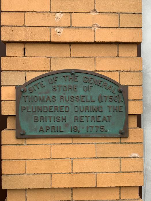


The constraints of a small geographic area–one block–also seem a reasonable way to make manageable the coding and analysis of an increasingly large number of images gathered from a broad geographic area and allow testing of synthesis methods. The block under investigation primarily includes public and business spaces, leaving residential message posting analysis to another frame.
Context
Sociologist Henri Lefebvre introduced the idea that space is socially produced. For example, two critical places of contention, protest, and memorial in the United States in 2020/21 are George Floyd Square and Black Lives Matter Plaza in Washington, DC.
In Boston, MA, large-scale graffiti marked the Boston Commons and Downtown Crossing retail area, and many storefronts were vandalized as a result of the George Floyd protests in the Spring of 2020. However, this visual evidence of frustration and protest was almost immediately erased and cleaned up in the city’s, highly visible central areas. In Boston, resulting

 George Floyd memorial at the intersection of Chicago Ave and E 38th St in Minneapolis, MN


plywood storefront barricades were short-lived, but artists painted some, such as the Boston Apple Store, in memory of George Floyd and others killed by police. In addition, artists and communities painted many largescale George Floyd and Black Lives Matter murals throughout US cities over the following months. They mark space memorably and visibly, allowing a community to reflect, remember, and plan sustainable change collectively.
Ephemeral and Mundane
Ephemeral is defined as lasting a brief time, short-lived, or transitory. This project looks at less visible, smaller-scale, more mundane visual communication, in dialogue, often placed anonymously in local environs to be consumed by others when the communicator is not present. Sticker and graffiti writing cultures operate in similar ways, but the uncertainty created by the COVID-19 pandemic response and physical distancing led to a proliferation of absentia messages. Individuals posted messages in the public realm and private residential, institutional, and commercial spaces—strategically positioned for community consumption. These postings included a proliferation of support, thanks, and behavior guidelines posted in direct response to isolation, shifting COVID-19 regulations, plus calls for change in response to revisiting the consequences of systematic racism and the upcoming US presidential election cycle.
Boston Commons aftermath of George Floyd Protests, June 1, 2020 Black Lives Matter mural and memorial painted on Apple Store plywood barricade, Boylston Street Boston MA, June 2020 Boston Downtown Crossing aftermath of George Floyd Protests, June 1, 2020 Artist Jason “Swat” Talbot was invited to paint a mural on Posto restaurant exterior, Davis Square, Somerville MAResearch methods to date include observation and photography of public-facing visual communication informed by grounded theory and semiotic landscapes approaches. As part of the project, an evolving tagging and coding system (including temporal and locative data) plus background research and interviews with key individuals are underway to add context to the gathered images. The decision to frame a close study of this particular intersection came sometime into the process. Hence, the data gathered is not all-encompassing nor comprehensive, but includes visits to the site every three to four days for an extended period beginning in early 2021 and less frequent visits prior throughout 2020.
The project questions the role of designer versus social scientist in research and synthesis. An open-ended designerly approach allows connections, systems, and perspectives embedded in visual storytelling and potentially a more narrative journalistic approach to attempt to make sense of this collection of images as a time capsule of the recent 18 months. Design research methods courses could further consider the impact of designers using ethnographic methods to research a physical area (and its inhabitants) to gain social and cultural understanding–removing the typical design frame of proposing a design intervention or placemaking.
In observing, capturing, and interpreting the meaning of discourses via visual communications placed in space over time, there is much to be learned from the social science research methodologies of linguistic landscapes and geosemiotics. A linguistic landscape approach aims to study a defined multilingual region, often in transition, via visually displayed language usage on public and commercial signs. Geosemiotics is “an integrative view of ... multiple semiotic systems which together form the meanings which we call place.” (Scollen and Scollen) Four factors to consider in geosemiotics are the social actor, interaction order, visual semiotics, and place semiotics. Geosemiotics offers a system for analyzing the material substance of signs, the physical location, and language placed in the world. (Scollen and Scollen) Ongoing research in this area calls upon various fields such as geography, social psychology, ethnography, media studies, urban planning, and design.


Arlington, MA, northwest of Boston, MA


Place and Context
Arlington was formerly called West Cambridge and, before that, its indigenous name Menotomy, which some believe means swift running water. In 1867 the town was named Arlington, in honor of local Civil War dead buried at Arlington National Cemetery.
Politically Massachusetts is considered a liberal-leaning blue state. In the 2020 US Presidential elections, Cambridge, MA voted 92% Democratic for Biden and Arlington 83%. The Boston area was very mask-compliant, and almost 74% had received at least one dose of the COVID-19 vaccine as of June 2021.
Arlington is an upper-middle-class, well-educated, predominantly white (70%) town or suburb just NW of Boston. It is primarily a residential area with single, two- and multi-family condo/apartment buildings. Massachusetts Ave (or Mass Ave) and Pleasant and Mystic Streets intersection is a confluence of auto traffic routes and bicycle and pedestrian activity. Mass Ave is a major thoroughfare through Boston and towns northwest with commercial activity for much of its length. The Minuteman Bikeway is a shared-use path in a former rail bed that allows pedestrians and bicyclists to travel northwest along a traffic-free, treelined way. The Minuteman Bikeway detours onto Mass Ave at this intersection.
In the early 1980s, Arlington residents voted against a subway extension along the defunct railway tracks, citing fear of congestion and outsiders entering the then tight-knit, predominately working-class community. Arlington has an older median


 Mass Ave in magenta Pleasant and Mystic Streets in pink
This project is located on the ancestral lands of the Massachusett Tribe, the tribe of Indigenous peoples from whom the Colony and Commonwealth have taken their names
Detail of Uncle Sam Memorial Sculpture located in a plaza at the intersection
Remnant of railway tracks located in Whittemore Park at the intersection
Mass Ave in magenta Pleasant and Mystic Streets in pink
This project is located on the ancestral lands of the Massachusett Tribe, the tribe of Indigenous peoples from whom the Colony and Commonwealth have taken their names
Detail of Uncle Sam Memorial Sculpture located in a plaza at the intersection
Remnant of railway tracks located in Whittemore Park at the intersection


age and lacks the bars, music, and entertainment venues that typically attract music band stickers. As a result, Arlington does not appear to be a sticker community in the way that nearby Cambridge and Somerville are. Arlington appears to clean or cover graffiti quickly. There are limited surfaces on which to post in public, primarily limited to sidewalks and poles and windows and fences of businesses, institutions, and residences.
Those who live or work in much more densely populated locales with a palimpsest of visuals may wonder about the attention to a place where there is nothing to see. However, there is a rich history within this block, including two corner plazas/parks with historical markers with connections to the US Revolutionary War and complex relations with Indigenous peoples that can be explored further regarding the permanence and impermanence of messages and land. This block is surveilled space via the ubiquitous camera hovering over the intersection and an overnight police car detail parked a block away. This intersection is a space of control. Signs, signals, and pavement markings regulate the behavior or dance between pedestrians, bicyclists, and cars. There are also audio guides, including varied beeping patterns and voice

 Store side wall elsewhere in Arlington MA
Sign back, Somerville MA Mailbox, Cambridge MA
Mass Ave at Pleasant and Mystic Streets intersection
Surfaces: sidewalk pavement, and poles
Store side wall elsewhere in Arlington MA
Sign back, Somerville MA Mailbox, Cambridge MA
Mass Ave at Pleasant and Mystic Streets intersection
Surfaces: sidewalk pavement, and poles


announcements to assist sight-challenged individuals in crossing and church bells marking the hour. There are few observed ruptures of control–one can observe a minimal amount of trash, rust, stickers, graffiti, and pedestrians and bicyclists ignoring the light sequence signals. In studying all the ephemeral messages found in this intersection and block, we could include messages on discarded trash, utility markings, graphics and text on trucks and buses passing through, and changeable electronic signs. These are in contrast to the more permanent signs which mark the space as a tightly controlled environment.


 How ephemeral? Which ephemeral messages should be included?


One consideration in examining ephemeral messages posted in this intersection is that bicyclists and pedestrians stop for a prolonged light change, as three phases are needed to complete an entire light cycle.
An empty storefront around the corner displays a ‘Townie: Arlington MA’ sticker, which alludes to identification or pride in birthplace or perhaps even an underlying frustration with outsiders and ongoing changes in Arlington. As the real estate prices across the area have increased, the town has transitioned as more newcomers move in, often from more expensive places like Cambridge and Somerville. Some social media and local listserve posts relay a tension (made visible by this sticker) where residents claim generational roots in Arlington give them authority to envision its future over more ‘liberal’ newcomers.
In 2020 the pandemic curtailed many in-person celebrations and graduations. Instead, communities and families celebrated via signs. Like many towns (and individuals), Arlington thanked first responders and posted mask reminders and messages of community encouragement. As with many communities in the area, Arlington promoted the support of local businesses via visual campaigns. The city reclaimed parking spaces for outdoor restaurant seating and gathering, and signs representing a diverse-appearing community


promoted commercial exchange. Real estate brokers at this intersection also displayed electronic and temporary signs that signify that they welcome a diverse clientele. Due to pandemic-fueled economic realities, many empty storefronts now have space for lease signs in their windows, including one storefront incorporating a distinct voice to attract potential business owners.


 Arlington Chamber of Commerce and MA Economic Development Recovery Task Force
Small businesses needed to be highly agile to stay afloat during the shifting limitations imposed in response to the COVID-19 pandemic. The Kickstand Cafe, a local coffee shop with solid connections to the community that identifies as Arlington’s living room, is strategically located at a ‘T’ half a block from the main intersection just where the Minuteman Bikeway detours. The cafe enlarged its parking lot dining area and offered limited hours for pick-up and outdoor dining as the pandemic restrictions relaxed in late Spring 2020. In August 2020, they sponsored an anti-racism sign-making workshop and then posted a number of those signs physically in their storefront windows. In addition, the Kickstand Cafe used social media and handwritten storefront signs to continually update its hours and unique offerings, often posting photos of its physical signs on Instagram.
A temporal view of Kickstand’s ephemeral signs shows evidence of ever-changing conditions and their resilience. After deciding to close over the winter holidays to given staff a break and celebrate a successful year despite the restrictions of 2020, they announced January 6, 2021, as their reopening date. They did so physically on their window and virtually via their website and social media. Then on Facebook on January 4, they posted the following message “with the surge in COVID cases and the inevitable (and unpredictable) cold and wintry weather that makes our operations significantly harder, the responsible thing to do is close down so that


we can keep ourselves as safe as possible.” They then switched their hibernation reopening date to the end of February, then decided to wait until mid-March, and finally settled on April 1. All reopening date shifts were posted on their storefront.
When they finally reopened April 1, the Boston area weather did not cooperate with a business focused on pick-up orders and outdoor dining. Like several other nearby businesses, they still required masks for pick-ups despite the state removing mask requirements for vaccinated individuals as of May 29, 2021. However, by mid-June, they added signs indicating a modified masking policy. Their creativity in managing menu changes is evident in the Velcro changeable strip menu sign, continuously updated. A homemade local authenticity is expressed via voice and consistent use of brown paper and thick black marker letter-forms. They also used bright green tape arrows and lines to guide order/pick-up patterns and encourage traffic calming, matching their green umbrellas and pick-up tent. Unfortunately, some of these elements decayed relatively quickly due to weather conditions.
The First Parish Unitarian Universalist church located at a south corner of the intersection proclaims “All are Welcome” via a textual sign and multi-color square panels. Churches were not exempt from creating ephemeral signs to explain behaviors and closed and canceled events. However, the banners hung in their corner lawn carrying social justice messages—in support of local clean energy, ending hatred and division, and the recognition of Juneteenth—are the most visible ephemeral communication at this intersection. Frequently changing banner messages express the core of church beliefs: “our relationships with one another, with diverse peoples, races, and nations, should be governed by justice, equity, and compassion,” (UU Rev. Marta Flanagan) In August 2020, vandals defaced the church’s Black Lives Matter banner with ‘Black’ crossed out in black paint. Another Arlington church’s sign was defaced that same night, and KKK stickers were attached to several private residences’ BLM lawn signs. These incidents followed the July 2020 vandalization of a Black Lives Matter banner posted on the construction fence of the nearby Arlington High School. The Arlington Human Rights Commission recorded at least 13 reports of destruction, theft, and vandalization of Black Lives Matter banners and lawn signs around Arlington during late summer 2020.
In 2015 a Black Lives Matter banner in this same church location, the word ‘All’ covered the word ‘Black.’ At that time, Arlington police did not arrest or charge the identified individual, as he agreed to a restorative justice process.


There has been ongoing concern about racism in Arlington, and signs are one way to make visible a community’s collective stand on the issue. The Arlington Human Rights Commission found in 1993 advances “issues related to the fair and equal treatment of Town residents and addresses complaints arising out of these issues.” (AHRC) They distributed ‘Love Lives Here,’ and ‘Hate Has No Home Here’ signs throughout Arlington several years before the summer of 2020 after previously reported incidents of hate graffiti, anti-Black, -Jewish and -Hindu, at a middle school and the high school.
Residents posted many positive-message lawn signs and window posters throughout Arlington over the two years preceding the 2020 pandemic lockdown and killing of George Floyd. The ‘Hate Has No Home Here’ sign project began with neighbors from a Chicago area neighborhood characterized by its diversity addressing hate incidents. Hate Has No Home Here “encourages other communities to participate in combating hateful messages and behavior in their neighborhoods by going beyond the poster or sign.” (HHNHH)
In the summer of 2020, numerous flyers were posted near the intersection and across town, attempting to educate residents about systematic racism and individual’s role in perpetuating racism and addressing change. Small and large-


scale taping, chalking, and graffiti writing of BLM or Black Lives Matter appeared on poles and pavement surfaces
Vigils
Mass Ave and particularly this intersection have been the site of ongoing vigils for social justice subsequent to the killing of George Floyd. Residents of Arlington could readily attend protests in Boston, but many lined Mass Ave for planned 6-7:00pm vigils on repeated dates in the summer of 2020. Twice a week vigils at this intersection continue into 2021, but many times involve small groups of people holding signs. This project does not include protest signs connected to people’s bodies. However, it does include signs from the vigils left at the intersection and in a niche outside the Church.
Case Study: #Pedrini Must Go
The communication impact of many posted signs includes their virtual connections. For example, there was an ephemeral sticker campaign in the summer of 2020 to promote the removal of Lt Rick Pedrini from the Arlington Police Department and demand accountability. More than a year later, there are still identifiable remnants of the ‘#Pedrini Must Go’ campaign throughout Arlington, MA. Additional postings aimed at explaining the issue were titled
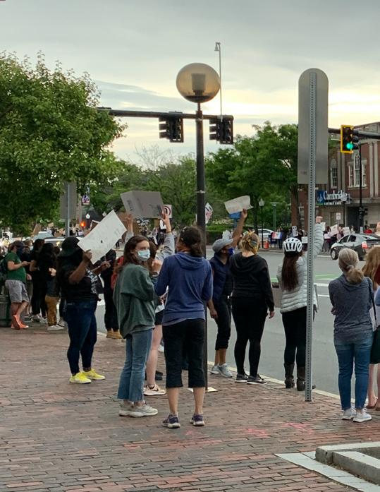


‘We have a racist in the Arlington Police Dept’ quoting a concerning excerpt from an article he authored in a police publication, “Let’s meet violence with violence and get the job done.” ‘Arlington, it’s happening here’ quoting Pedrini again, “It’s time we forget about “restraint,” “measured responses,” “procedural justice,” and a QR code link to anti-racism resources for white people.
In Fall 2018, Lt. Rick Pedrini, a 20-plus-year veteran of the Arlington Police Department, was suspended after it was exposed that he had published a series of racist columns in a police trade publication as part of the Massachusetts Police Association. Lt Pedrini was not fired, but a restorative justice process was put in place, including a public meeting (held via Zoom in September 2020). Arlington Fights Racism, formed in 2019 by a group of concerned Arlington citizens in response to local racist and hate-filled writings, launched a petition in summer 2020. They collected over a thousand signatures, demanding that Pedrini remain
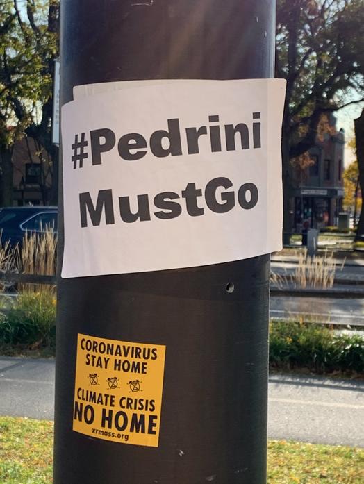


on desk duty for the foreseeable future, given his history and the BLM protests happening locally and nationally.
The majority of the ‘#Pedrini Must Go’ stickers were defaced or blacked out, and then a subsequent round of stickers was posted. The adhesive sticker material and bold black-on-white letters meant that recognizable fragments withstood the weather and were easily identifiable. Subsequently into winter of 2020, Arlington Fights Racism organized a virtual series of conversations titled ‘Building Community Series: Connecting & Engaging’ co-sponsored by a wide range of groups: Arlington High School AHS Anti-Racism Working Group, AHS Young Progressives, ArCS Cluster (Arlington, Cambridge, Somerville refugee support group), Arlington Center for the Arts (ACA), Black Alums, Council on AmericanIslamic Relations (CAIR-MA) Diversity and Inclusion Groups (DIGs), and Envision Arlington’s Diversity Task Group (DTG). The flyers posted for the conversation series on large traffic signal poles at the intersection were crossed out and defaced. Remnants of the adhesive flyer remain well into 2021. In April 2021, new’ #Pedrini Must Go’ stickers were posted as part of the palimpsest, but quickly disappeared.


In September 2020, Arlington Fights Racism (AFR) organized a counter-protest to a Back the Blue rally organized in part by Lt Pedrini’s sister. Small scale ACAB (All Cops Are Bastards) graffiti writing remains on the back of signs and a pole within this one block area. Chalking and stickers displaying messages ‘Police Not Welcome’ and ‘Defund the Police’ and opposing flyers ‘Defend the Police’ were posted. Then in October 2020, a sticker campaign repurposing ACAB to read ‘Arlington Cops Are Beautiful’ was visible throughout this one block central Arlington area. The ‘Arlington Cops Are Beautiful’ stickers layered over the ‘#Pedrini Must Go’ stickers and over ‘Love Lives Here’ signs and missing cat flyers. These opposing protests mirrored national tensions on a hyper-local level the polarizing stances fostering extremism and divisiveness forcing identification with either BLM or the police.


Annually, the Arlington Commission on Arts and Culture (ACAC) and the Gracie James Foundation sponsor an Arlington Youth Banner Initiative to engage middle and high school students in the visual arts and the public art program. In the Spring of 2021, the theme presented to students was ‘Protest: Lifting Voices.’ The selected banners addressed social justice protests, climate change, and food justice. When the winning banners were hung, a banner depicting a white police officer with a face shield, baton, and tear gas facing a young BIPOC with a megaphone brought calls for its removal. Some social media and listserve posters claimed it was offensive and attacked and insulted Arlington police. ACAC released two statements in support of the banners and process clarifying that the “banners reflect our student artists’ commentary on national and international events” and “one of the roles of public art is to catalyze conversation, even, sometimes, uncomfortable conversations.” (ACAC) Despite the demands for removal by a small number of voices, the banners remained up for the scheduled period.
Discourse
A large sticker covered in clear tape and posted high out of reach on one of the intersection’s main signal pole states ‘Love Lives Here.’ Materiality and


If you tell a lie big enough and keep repeating it people will eventually come to believe it


decay suggest that the ‘Love Lives Here’ message has staying power over the t.me/jointhewhiterose sponsored sticker ‘If you tell a lie big enough and keep repeating it, people will eventually come to believe it’ pasted over it. The sticker’s sponsor group name refers to a propaganda technique used by Adolph Hitler in Nazi Germany, and the sticker alludes to COVID-19 as the big lie. The Pedrini Must go sticker campaign was clearly hyperlocal. However, others such as various White Rose stickers–sponsored by COVID-19 deniers against mask mandates–were disseminated via the internet, and postings of the stickers were reported in Canada and Europe. The layering of messages and counter messages and the blackout and defacement of stickers and flyers were prevalent within this block in 2020/21. The erasure of messages included a wide range of issues such as Climate Change, pro/con Trump, Voting Matters, and Antifa.
Marking Territory
Even though Arlington citizens voted overwhelmingly Democratic for Biden (83%) in the 2020 presidential election, individuals in the town and region hold varied views. It is an oversimplification to assume that the discourse observed via physical visual communications fully represents progressive political leanings predominant in the area, with minority opinions countering. In addition, how do we factor in a Townie POV where some have expressed via social media that longevity or roots in an area give one more authority or voice in envisioning a town’s future over
"local-level communications mirrored national themes
newcomers or high school age students. Despite a left-leaning majority, posted ephemeral communications make visible tensions beneath the surface and make visible how one community with a predominantly white demographic initiated or furthered a discourse concerning their role in addressing systematic racism. Unless researchers are ever-present or video surveilling a space, how do we know when ephemeral items appear or are changed and who has acted? Whether the


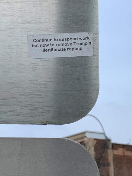


sources are a few individuals or many? The ephemeral signs observed in this one block area represent insertions into a highly controlled environment. The temporal nature of stickers and flyers–repeated waves or layers of opinions, crossing out and defacing, and posting again–represents a surface of everchanging voices. The Minuteman Bikeway passing through this intersection and the bicycle and pedestrian traffic slowing on the detour may mean a flow of opinions and ideas passing through representing the broader region.
Nationally and internationally, many individuals collected and posted to Instagram images of ‘signs of the time’ (COVID edition), and the Smithsonian and the Victoria & Albert Museum publicized efforts to collect visual artifacts and signs of COVID-19 and current social and political movements as a way to record our collective experiences. This project celebrates a temporal view of the ephemeral and mundane messages and making by individuals trying to connect. Locally in Arlington, MA, and regionally beyond the scope of this one-block area, there is a more complex network of social media posts and threats, often including signs to be considered via ongoing research, including social media posts that accused others of being racist. A local Facebook group formed in response to posts deleted as too political on the topic of a Kickstand tip jar sign explaining that all tips for the day would go to a group that promotes the Black Lives Matter movement. Even if one takes only posted signs as a beginning point of investigation in understanding a community at a particular time, there is much to learn. There is an opportunity to build on geosemiotic methods and develop visualization methods to reveal temporal connections between physical artifacts, actors’ intent, reception, attention, and virtual discourse dimensions.
The signs Kickstand Cafe posted over the last 18 months represent an authentic visual expression of a local cafe’s struggles and resilience throughout the pandemic. There are many examples in Arlington (and beyond) of small ephemeral creative acts of making and sharing in response to or despite pandemic constraints. One example is an Arlington resident who posted daily inspirational quotes on a chalkboard attached to a fence at his residence (located a few blocks outside this one-block area). He shared a meaningful quote daily for the entire year and then posted an additional sign stating that May 29, 2021, would be his last day to post as Massachusetts was reopening from the pandemic and mask restrictions that day. However, he passed the board to another resident of Arlington (who lives further east) to continue the tradition of physically sharing inspirational quotes with the community in absentia. The temporal nature of stickers, flyers, and graffiti makes visible back and forth discourse in formal and informal communication channels. The In Absentia project makes connections beyond this community and this one block, but also narrows


to consider even a super hyper-local study of how one pole’s postings over time relate to area history and broader dialogues. Additional investigation offers a potentially rich time capsule. Background research and interviews underway will unpack relationships further and aid in expressing the temporal shifts key to our experience of the last 18 months.
Resources
Annear, S. (May 28, 2021) He wrote inspirational messages on a chalkboard every day during the pandemic. Now, he’s symbolically retiring the sign—The Boston Globe. BostonGlobe.Com. Retrieved June 4, 2021, from https://www.bostonglobe.com/2021/05/28/metro/he-wroteinspirational-messages-chalkboard-every-day-during-pandemic-now-hes-symbolically-retiring-sign/ Arlington Center. (n.d.). Arlington Center. Retrieved June 4, 2021, from https://www.google.com/maps/@42.4155155,-71.1533104,18z
Arlington Human Rights Commission. (n.d.). AHRC. Retrieved June 4, 2021, from https://www. arlingtonhumanrights.org/copy-of-about and https://www.arlingtonhumanrights.org/yardsigns Bryant, A., & Charmaz, K. (2019). The SAGE Handbook of Current Developments in Grounded Theory. SAGE Publications Ltd.
First Parish of Arlington MA, Unitarian Universalist What We Believe, Rev. Marta Flanagan (n.d.). Retrieved June 4, 2021, from https://firstparish.info/about-unitarian-universalism/what-we-believe/ Joseph Goebbels On the “Big Lie.” (n.d.). Retrieved June 4, 2021, from https:// www.jewishvirtuallibrary.org/joseph-goebbels-on-the-quot-big-lie-quot
Hate Has No Home Here—What is Hate Has No Home Here About? (n.d.). Retrieved June 4, 2021, from https://hatehasnohome.org/index.html#about
Peter Hedlund, an Arlington resident, posted daily inspirational quotes on a chalkboard on a fence outside his residence.Jaworski, A., & Thurlow, C. (eds). (2011). Semiotic landscapes: Language, image, space. Continuum.
Kickstand Cafe | Facebook. (n.d.). Retrieved June 4, 2021, from https://www.facebook.com/thekickstandcafe/
Kickstand Cafe (@kickstandcafe) • Instagram photos and videos. (n.d.). Retrieved June 4, 2021, from https://www.instagram.com/kickstandcafe/
Lefebvre, H. (2014). Critique of Everyday Life (Translation edition). Verso.
Map: See How Your Town Or City Voted In The 2020 Election. (n.d.). Retrieved June 4, 2021, from https://www.wbur.org/news/2020/11/03/2020-massachusetts-election-map
May 4, 2020. (2020, May 4). Pandemic Objects: Home-Made Signs • V&A Blog. V&A Blog. https://www.vam.ac.uk/blog/design-and-society/pandemic-objects-home-made-signs
Red Tape: Why the Red Line Stopped Short | Tufts Observer. (n.d.). Retrieved June 4, 2021, from https://tuftsobserver.org/red-tape-why-the-red-line-stopped-short/
Scollon, R., & Scollon, S. W. (2003). Discourses in Place: Language in the Material World. Routledge.
Smith, R. P. (April 15,2020). How Smithsonian Curators Are Rising to the Challenge of COVID-19. Smithsonian Magazine. Retrieved May 4, 2021, from https://www.smithsonianmag.com/ smithsonian-institution/how-smithsonian-curators-are-rising-challenge-covid-19-180974638/
U.S. Census Bureau QuickFacts: Arlington town, Middlesex County, Massachusetts. (n.d.). Retrieved June 4, 2021, from https://www.census.gov/quickfacts/fact/ table/arlingtontownmiddlesexcountymassachusetts/VET605219
Youth Banner Initiative. (n.d.). Arts Arlington. Retrieved June 4, 2021, from http://artsarlington.org/youth-banners-2021/
Image: Black Lives Matter Plaza. (2021). In Wikipedia. https://en.wikipedia.org/w/ index.php?title=Black_Lives_Matter_Plaza&oldid=1027420031
Image: George Floyd Square. (2021). In Wikipedia. https://en.wikipedia.org/w/ index.php?title=George_Floyd_Square&oldid=1028789894
Associate professor and Postdoctoral researcher, Art Academy of Latvia, Latvia Visiting researcher, Technological University Dublin, Ireland
Abstract
Designers say that ‘design adds value’, but no evidence-based indicators have shown design’s impacts on society. The findings discussed in this paper are from a global/local case study based on a qualitative and mixed-methods study. The results clarify the added value of design from the user’s perspective across five generations and four socio-economic class groups by recommending perceived design value indicators that measure personal satisfaction, happiness and well-being as end results of product and service usage.
Category: XGD Process & Methodologies
Keywords: perceived design value indicators, design added value.
Design professionals say that “design adds value,” but no evidence-based indicators have shown this (Thomson and Koskinen 2012). Design is recognized as an approach to solving a problem or as a challenge aimed at creating a better future. It is often said that ‘good design always creates good value’ (Cramer and Simpson 2004, 155), but who the recipient is and how to witness it are unanswered questions. Design is a method of identifying a real need and provides solutions that result in happiness and satisfaction (Freimane, 2020).
This local/global case study’s results clarify the added value of design from the perspectives of users spanning five generations (WMFC, 2018) and four socioeconomic class groups (Savage 2015). The results recommend perceived value indicators of design that measure cultural and personal satisfaction, happiness, and well-being as results of product and service usage. The outcomes also give input for design-driven entrepreneurship and may help businesses, governments, and society for applying design more consciously and mindfully to determine the value proposition as a customer-perceived value and total customer benefit. Some studies suggest that total customer value or benefit can be broken down as follows: product benefit (the benefit that the consumer receives by using the product or service), service benefit (the experience of using the product or service), personal or human benefit (the experience of the product- or servicebuying process) and image benefit (the brand name or image the company creates) (Kotler and Scheff 1997). Total customer benefit includes values that arise from the consumption, use, experience and acquisition of a product or service, as well as its visual, perceptual, symbolic and aesthetic values. Total customer benefits arise from personally perceived values (Bevalo, Gofman and Moskowitz 2011), and hence, they are crucial sources for defining the perceived value of design. Emotional factors that are truly personal, consumer psychology and product quality are considered to have a higher impact than product price does on customer-perceived value (Hassan 2017). Aspects of total customer benefit in line with a positive experience, satisfaction and sense of well-being, emotional attachment and aesthetic qualities form the impact of design from the human-centred viewpoint. Design, as a discipline among other disciplines, is a method, whereas design itself is a complex system, thus explained as a methodology of paradigms and methods (Figure 1) (Freimane, 2020).
The umbrella challenge of the study was addressing the need to measure the socioeconomic impacts of design and its role alongside other intangible assets in value creation, as identified by the European Commission (European Commission 2013). Design’s added value has been discussed from the professional designer’s viewpoint and stated as a benefit to businesses as design maturity matrices (Freimane, 2018), but there was little evidence from the perspective of the design user or value recipient. The sub-challenge was to design a communication strategy and visualize the research results.
I propose defining design as a method of moving toward the happiness and satisfaction that are end results of a feeling or experience created by positive emotions and memories when products, services, or systems are used in line with social interaction.
The innovation of the results is an applied design research strategy for analyzing and interpreting the perceived value attributes of design as defined by users, segmented along five generations and four socioeconomic classes. By applying qualitative and mixed-methods research, the novelty of the study lies in interlinking the approaches of subjective theory of value and the context of qualitative valuation strategy adapted from the World Happiness Report (Veenhoven, 2018) as a measurement of subjective well-being and perceived value. The decoding of perceived design value indicators is in line with the methodology of the Happiness Index in asking respondents, as users, to name subjective qualities of design that add value to their everyday lives. Theories of happiness and value surveys; studies of sustainable consumption; production/ management in line with design for sustainable social well-being; and behavioral and cultural studies based in psychology, sociology, anthropology, business,

and innovation management formed valuable input for the multidisciplinary research and led to defining perceptions of design among users.
Creative and intuitive research sense was the key to designing 48 experimental open- and closed-ended questions for online qualitative and mixed-methods interviews with 250 respondents during March–September 2019, of which 202 were analyzed in September 2019–June 2020. The questions allowed users to formulate up to five self-reported perceived qualities of products and services as the value attributes of design that would later be extracted and transmitted as perceived design value indicators. The research data were analyzed in MAXQDA qualitative data analysis software, with a multiphase data validation process in an extreme external context. Respondents were asked to participate in the study voluntarily and anonymously.
Value can be perceived from positions of both power and wealth and by the quality of experiences. As value can differ among individual customers and diverse customer segments, defining the perceived value indicators of design can help businesses determine their value proposition.
Perceived value attributes of design demonstrate people’s perceptions as seeing and feeling certain qualities of the products and services they use. Indicators that define design’s added value were decoded by involving respondents as product/service end users.
To determine whether there were common perceived design value indicators, a list was generated of all product and service indicators among generations and socio-economic classes. It demonstrated that indicators were convergent rather than divergent with regard to what brings satisfaction, a positive experience, emotional attachment and a sense of a product’s or service’s usability, despite the user segmentation and analysed subjects. Perceived value attributes of design that were not included in the perceived design value indicators list are as follows:
• ‘Quality’, which was excluded because it is used to describe general qualities and perceptions of a product or service.
• ‘Professional’ service was left aside because the term is related to the training and education of the service provider. Although both ‘quality’ and ‘professional’ are related to the perception of products and services, and were named as most important to users, they should be regarded as general rather than specific and detailed indicators.
• ‘Intuitive’, which was assigned as a perceived value attribute of design under ‘convenient’ as a product indicator and ‘intelligible’ as a service indicator.
• ‘Needed’ was assigned to the indicator ‘useful’ because it referred to practical purposes.
A perceived value attribute of design that was included despite being not featured and ranked in the top five attributes by respondents was ‘product and service safety’, and it was assigned to both products and services. During the perceived design value indicator validation phase, ‘safe’ as an indicator correlated to the most external context and external impact on respondents’ everyday lives. The data validation case, conducted during the global COVID-19 pandemic, demonstrated perceived design value indicators’ relevance and the dependency of the sociocultural, political and economic impacts.
‘Safe’ was particularly valued as a product indicator among Generation Z and Baby Boomers, and the emergent service sector, traditional working class and newly affluent workers’ socio-economic class groups. Generation Z valued ‘safe’ as a quality that brings positive experiences, satisfaction and a sense of well-being. For Baby Boomers, ‘safe’ is a quality that brings positive experiences, satisfaction and a sense of well-being and product usability. ‘Safe’ as a quality that brings positive experiences, satisfaction and a sense of well-being was valued by the traditional working class and newly affluent workers and as product usability by the emergent service sector and newly affluent workers socio-economic class groups.
As aesthetic experience is individual and ranges from purely visual qualities to emotional and functional ones, perceived value attributes of design, describing aesthetic responses, were not included separately. Rather, they were coded under the sole indicator of aesthetic.
‘Convenient’, ‘useful’ and ‘aesthetic’ were perceived as the most important design added value indicators of products by all generations and socioeconomic classes. They were followed by ‘durable’, which ranked as the fourth perceived design value indicator. The fifth indicator was ‘singular’ for user stratification among generations and socio-economic classes. Safe was the least common perceived design value indicator for products.
‘Accessible’ was the most important design added value indicator perceived by all generations and socio-economic classes, followed by ‘perceivable’. The third most common indicator for both generations and socioeconomic classes was ‘experienceable’. ‘Intelligible’ and ‘timely’ were the next most common indicators defined by all generations and socioeconomic classes. ‘Safe’ was identified only by socio-economic classes.
‘Convenient’, ‘aesthetic’, ‘useful’, ‘durable’, ‘safe’ and ‘singular’ are common perceived design value indicators for products that create a positive experience, satisfaction and sense of well-being to both generations and
"Convenient’, ‘aesthetic’, ‘useful’, ‘durable’, ‘safe’ and ‘singular’ are common perceived design value indicators for
"socio-economic class groups. The same can be observed in terms of the indicators that create an emotional attachment—the ‘aesthetic’, ‘useful’ and ‘convenient’ indicators vary, but ‘experienceable’ is marginal.
Among the generations, the most esteemed perceived design value product indicators were ‘convenient’ and ‘useful’. As a top indicator that describes positive experience, satisfaction and sense of well-being, an emotional attachment and usability of products, ‘aesthetic’ was valued by Generation Z and Generation X. ‘Aesthetic’ was the most valued indicator by the socio-economic class groups except the emergent service sector. ‘Convenient’ and ‘useful’ were named as top indicators that describe positive experience, satisfaction and sense of wellbeing, an emotional attachment and usability of products by all generations.
‘Durable’ and ‘singular’ were the second most valued perceived design value indicators by all generations. In contrast, ‘safe’ was valued by Baby Boomers, in particular, and all socio-economic class groups except the precariat.
‘Singular’ and ‘useful’ were named among perceived design value indicators for services. ‘Singular’ was valued by Generation Z, the traditional working class and newly affluent workers, but ‘useful’ was valued by Millennials and Generation X.
There was a minor ranking in perceived design value indicators among generations. The spectrum of indicators was more consistent among socio-economic class groups. The analysis brings up a discussion of the need to apply user segmentation as a product design target audience if there is not much difference in perceived design value.
‘Intelligible’, ‘accessible’, ‘perceivable’, ‘timely’ and ‘experienceable’ were perceived design value indicators characterizing services that create a positive experience, satisfaction and sense of well-being for both generations and socio-economic class groups. ‘Perceivable’ was the only indicator ranked as superlative that creates an emotional attachment for all socio-economic class groups. ‘Timely’, ‘experienceable’, ‘accessible’ and ‘intelligible’ were indicators that characterized an emotional attachment to services among generations and socio-economic class groups. ‘Intelligible’, ‘accessible’, ‘experienceable’, ‘useful’, ‘perceivable’ and ‘timely’ were perceived design value indicators characterizing service usability, but ‘safe’ was perceived as marginal.
Among the generations, the most valued service indicators were ‘accessible’ and ‘perceivable’. ‘Experienceable’ was mentioned as a top indicator and mostly valued by Generation Z and the Silent Generation. ‘Intelligible’ was particularly valued by Generation Z. The next most common perceived design added value indicators among all of the generations except Generation Z were ‘perceivable’ and ‘timely’.
‘Accessible’ was the most valued indicator by all socio-economic class groups except the emergent service sector. ‘Perceivable’ was highlighted by the precariat and emergent service sectors, ‘intelligible’ by the emergent service sector and newly affluent workers and ‘timely’ by the precariat. ‘Experienceable’ was the second most valued perceived design value indicator of services by all socio-economic classes. ‘Perceivable’ and ‘timely’ were named twice by traditional working class and new affluent workers. ‘Timely’ was important to all generations, and ‘safe’ was valued only by the emergent service sector.
"‘Intelligible’, ‘accessible’, ‘perceivable’, ‘timely’ and ‘experienceable’ were perceived design value indicators characterizing services
There was consistency in the perceived design value indicators among generations and socio-economic class groups to decode design added value to products and services. At the same time, there was a minor difference among preferences of perceived design value indicators among the socio-economic groups.
Further research and data validation are needed among diverse cultures and nations around the globe.
Epistemic values impact user or customer intentions and have a positive influence on customer satisfaction and loyalty (Hassan 2017). According to Bondy (2020), ‘An object is instrumentally valuable if and only if it brings about something else that is valuable. An object is finally valuable if and only if it’s valuable for its own sake’. A product and a service as instrumental value can create memorabilia— personally perceived value as a product, service, human or image benefit, where image benefit comes as a value proposition, a mission statement or an objective of the company’s product or service. At the same time, products and services as final value can bring value to the company as an image benefit. As such, products and services as instrumental values have a valuable impact on all levels of total customer benefit and perception. As Bondy (2020) stated, ‘Subjective value is a matter of the satisfaction of people’s desires, whereas objective value is a kind of value which doesn’t depend on what people desire, care about, plan to do, etc.’ Subjective value as satisfaction with product, service, human and image benefits is directly linked to the perceived value of design, whereas objective value is linked to an image benefit for the company or its own sake. This indicates that the company or designer can create ‘added value by design’, but the user as a subject cannot be able to define or perceive it. Products and services have only subjective value when objective value cannot be objectively and subjectively valued. Hence, subjective and perceived values are crucial for defining how design adds value and creates a socio-economic impact on design-driven entrepreneurship. Epistemic, emotional, social, conditional and functional values (Figure 2) form perception and affect consumer choices and beliefs (Sheth, Newman and Gross 1991); thus, they are related to the total customer value chain. Functional values consider what the product or service does for the user, clarifying how it fulfills a person’s practical needs. Functional values are instrumentally valued and are concerned with the extent to which a product or service is useful, performs and has the appropriate desired function, attributes and characteristics. Conversely, emotional values are embodied in feeling good and being happy, and should be argued for in the context of human perceived and subjective value as finally valuable rather than in the context of business and objective value as

instrumentally valuable aspect. Social value has a multi-layered impact on businesses, investors and societies (Bentley 2018). Perceived social values have a significant positive impact on customer satisfaction, whereas conditional values are perceived benefits gained in a specific situation and arise when a need is fulfilled by using a specific product or service (Hassan 2017). Epistemic value connects true beliefs, justified beliefs, knowledge and understanding.
Perceived value indicators of design reveal the assumption that design adds value and correspond to not only conditional subjective values, but also to external context, adding conditional objective value to the subjective value chain. Perceived value indicators of design are conditionally subjective and difficult to validate in a consistent flow situation. Validation of perceived design value indicators during the COVID-19 global pandemic gave confirmation of evidence-based conditional objective and subjective value impacts on the importance of decoded design value indicators. The greatest significance of perceived design value importance under an extreme external context was demonstrated with the indicator ‘safe’.
From the least valued, it became significantly valued in both products and services. ‘Convenient’ and ‘useful’ were rated as top priorities both before and during the pandemic as an extreme external condition. In the extreme external context, ‘aesthetic’ as a perceived design product value becomes less important than product safety. Qualities of product durability are more
" Hence, subjective and perceived values are crucial for defining how design adds value and creates a socio-economic impact on design-driven entrepreneurship.
important in an extreme context than in ordinary everyday life. ‘Intelligible’ as a perceived design service value indicator became more important in the extreme context than before it, whereas ‘aesthetic’, ‘perceivable’ and ‘experienceable’ lost valued meaning during extreme external conditions.
Validation of perceived design value indicators shows that ranking of values varies in accordance with external conditions and context (Figure 3).


The COVID-19 global pandemic brought in an external context that favoured the validation of perceived design value indicators under extreme conditional circumstances. Validation of indicators as a case study during the global pandemic demonstrated perceived design value indicators’ relevance to and dependence on external contexts, along with the sociocultural, political and economic impacts. Validation of indicators during the COVID-19 pandemic and slightly after the pandemic period shows that external context matters and impacts perception of design’s added value. Perceived value indicators of design correspond to the situation when a need is fulfilled by a specific product or service under conditional values and perceived benefits.
Perceived value indicators for design respond to the subjective value as satisfaction with products and services through epistemic, emotional, social, conditional, and functional values, thus giving weight to the saying that design adds value from the user’s perspective, based on the diamond–water paradox as the “value in use” and “value in exchange”. The study demonstrated that perceived value indicators for design are convergent despite user segmentation, a variety of analyzed subjects, and divergent decoding of product or service values. Decoded perceived value indicators of design contribute to developing user-centered, design-driven businesses by understanding the meanings that people feel, sense, and receive when using products and services. Design adds value merely conditionally and subjectively (Figure 4). User (consumer) choices and beliefs are affected and perceptions formed by a perceived value of design that corresponds to total customer values as product, service and human (personal) benefit. Perceived value indicators of design respond to the subjective value as satisfaction with products and services through epistemic, emotional, social, conditional and functional values, thus giving focus to the saying that design adds value from the user’s perspective.
"Perceived value indicators of design correspond to the situation when a need is fulfilled by a specific product or service under conditional values and perceived benefits.
This study was a global/locally-based, culture-specific case study that overcame the lack of decoding of evidence-based design value by proposing indicators of design’s socio-economic impact based on perceived design value attributes. Perceived value indicators of design identify design’s socio-economic impact and clarify how design adds value according to the perceptions of individual users belonging to five generations and four socio-economic class groups (Figure 5).
 Figure 5 Correlation of the study’s results
There was consistency in the perceived design value indicators among generations and socio-economic class groups to decode design’s added value to products and services. Thus, stratification of users as a product/service target audience according to generations or socio-economic status raises an issue of relevance. This leads to proposing that defining target audiences by demographic and socioeconomic data and that ‘personal’ design and marketing methods are becoming a minor aspect of the product and service development process, which now gives priority to the subjective and conditional perceived values of design. Design is directly linked to the subjective theory of value and, thus, opens up a discussion of consistent and objective measurement of design’s value, perception and impact. It can be argued that design’s enhancement of happiness and satisfaction can be measured under conditional objective and subjective contexts. Decoded perceived design value indicators form an interdependent circle, clarifying the idea that design adds value to the happiness and satisfaction of humans as an end result of the design. Perceived design value indicators reveal the assumption that design adds value and corresponds to the conditional subjective values and to the external context, adding conditional objective value to the subjective value chain. Total customer value can be analysed as product—what the consumer receives by using the product or service—the experience of using the product or service and its benefits, qualities and values. Subjective value, defined as satisfaction with a product or service and human and image benefits, is directly linked with the perceived design value, whereas objective value is linked with an image benefit for the company or for its own sake and does not say anything about subjective (perceived) value; rather, it relates to delivered value. Hence, decoded perceived value indicators of products—‘useful’, ‘convenient’, ‘safe’, ‘durable’, ‘aesthetic’ and ‘singular’—and services—‘intelligible’, ‘accessible’, ‘safe’, ‘timely’ and ‘perceivable’ as the outcomes of the case study give an input to design contribution and the design value impact of design-driven entrepreneurship. Perceived value indicators of design reflect the impact of design’s value cultural and personal satisfaction, happiness and well-being as end results of product and service usage and provides implications for the product/service innovation process in design-driven entrepreneurship. Perceived design value indicators can help businesses determine their value proposition as customer-perceived value and total customer benefit.
Author’s note
This research was conducted in Latvia. I acknowledge that cultural differences may influence perceived value of design. Further research will be done to explore to what extent the presented perceived design value indicators are applicable in other countries.
Acknowledgements
The author thanks prof. PhD Andris Teikmanis and prof. John O’Connor for support and inspiration, and strong backing throughout the journey in the research world. This research was supported by a fellowship grant from the European Regional Development Fund’s Growth and Employment Program for Latvia (1.1.1.2/VIAA/1/16/125). The paper was prepared by a support of the research project CARD (VPP-KM-LKRVA-2020/1-0003).
"Perceived design value indicators reveal the assumption that design adds value and correspond to the conditional subjective values and to the external context, adding conditional objective value to the subjective value chain.
"
Bentley, C. (2018, May 25). https://socialvalueint.org. Retrieved from https://socialvalueint.org/ wp-content/uploads/2018/05/Principles-of-Social-Value_Pages.pdf: https://socialvalueint.org
Bevalo, M., Gofman, A., & Moskowitz, H. (2011). Premium by Design. How to Understand, Design and Market High end Products. Surrey: Gower.
Bondy, P. (2020, April 28). Epistemic Value. The Internet Encyclopedia of Philosophy. Cornell University, USA: ISSN 2161-0002, https://www.iep.utm.edu. Retrieved from https://www.iep.utm.edu/ep-value/#H1: https://www.iep.utm.edu
Cramer, J. P., & Simpson, S. (2004). How firms succeed. A Field Guide to Design Management. Atlanta: Ostberg.
European Commission. (2013, September 23). Implementing an Action Plan for DesignDriven Innovation. Commission Staff working document. SWD(2013) 380 final. Brussels.
Freimane, A. (2018). How to Witness Design. Proceedings of the 20th International Conference on Engineering and Product Design Education (E&PDE 2018), eds. Erik Bohemia, Ahmed Kovacevic, Lyndon Buck, Peter Childs, Stephen Green, Ashley Hall, Aran Dasan, The Design Society, Institution of Engineerin (pp. 211-217). London: The Design Society, Institution of Engineering Designers.
Freimane, A. (2020). Perceived design value. The socio-economic impact of Design. Rīga: Latvijas Mākslas akadēmija. Retrieved from https://www.merriam-webster. com/dictionary/public%20service: https://www.merriam-webster.com
Hassan, Z. (2017). Impact of Social, Epistemic and Conditional Values on Customer Satisfaction and Loyalty in Automobile Industry: a Structural Equation Modelling. Journal of Marketing and Consumer Behaviour in Emerging Markets 1(5), 29-44.
Kotler, P., & Scheff, J. (1997). Standing Room Only. Strategies for Marketing the Performing Arts. Boston: Harvard Business School Press.
Savage, M. (2015). Social Class in the 21st century. Milton Keynes: Penguin Random House UK.
Sheth, J. N., Newman, B., & Gross, B. L. (1991). Why we buy what we buy: A theory of consumption values. Journal of business research, 22 (2), 159-170.
Thomson, M., & Koskinen, T. (2012). Design for Growth & Prosperity. Report and Recommendations of the European Design Leadership Board. Helsinki: Unigrafia.
Veenhoven, R. (2018, November 3). World database of happiness: continous register of scientific research on subjective enjoyment of life. Retrieved from https:// worlddatabaseofhappiness.eur.nl/: https://worlddatabaseofhappiness.eur.nl/
WMFC. (2018, December 8). http://www.wmfc.org/uploads/GenerationalDifferencesChart. pdf. Retrieved from http://www.wmfc.org: http://www.wmfc.org
Zauner, A., Koller, M., & Hatak, I. (2015). Customer perceived value—Conceptualization and avenues for future research. Cogent psychology, 2(1061782), 1-17.